Dusty Trails: Corporal Smith by Dusty Trail Toys

This week of Toy Closet finds chugs along and our next stop is 2003. Ah, 2003. It was the heyday of my trips to the KB Toy Liquidators at the local Outlet Mall. GI Joe was featuring SpyTroops, those Ninja Turtles were still representing, and <sniff> Palisades <sniff> was still alive and churning out those awesome muppets, none of which I ever bought. You also had McFarlane Toys trying to let adults know that it was ok to buy action figures, so long as they were basically just statues. Personally, I was always skeptical, but some companies jumped on board this philosophy and Dusty Trail Toys was one of them. Kicking off their short time in the sun, the company produced “Dusty Trail, Action Series 1” which was a collection of six action figures statues based on an odd mix of generic historical characters ranging from WWII Soldiers to Pirates all represented in about a 6-inch scale. I actually owned three of these, but the Gunfighter and the Pirate were broken somehow, leaving me with just Corporal Smith, whom I never got around to opening… until now. Let’s do it!!!

Just look at the packaging! The sealed clamshell case with printed insert has got McFarlane wannabe written all over it. It also hasn’t aged well as the clamshell has gained a nice hearty yellow tint that makes it look as if it spent the last decade fermenting in a bucket of piss. The back of the insert has shots of the other statues in the line and a little blurb about Corporal Smith. I think they would have been better off just calling him “WWII American Pathfinder,” rather than drumming up some hokey character name like Smith, but I won’t hold that against him. Speaking of holding, the sickly color of the package is making me nervous, so I’m going to hold this thing far away from my face when I cut into it. I’ve opened plenty of toys a lot older than this one, but I’m seriously afraid I’m going to let loose some kind of dangerous bacteriological plague.

With the package opened, there were thankfully no spores, but I did get that same overpowering plastic smell that comes with opening any McFarlane clamshell for the first time. Will the similarities never end? The package promises “some assembly required” but all you have to do is plug the huge peg on Smith’s left boot into the base and put his Thompson submachine gun in his hands. Getting Smith pegged into the stand was a trial in itself. I’m not sure if the peg expanded over time, but it seemed way too big for the hole. Giggity.

Ok, there’s actually a lot I like about this piece, so let me get the one glaring problem I have with it out of the way: His pose. Smith is designed so he’s stepping off the base and I absolutely hate that. What’s the point of having the base at all if he’s going to be hanging off of it like that? Is it supposed to be some metaphor about the toy being so action packed that he’s jumping right off his own base? Probably not. The other problem is that judging from the pictures, the foot that’s extending off the base is supposed to be hovering and in reality it just rests on the display surface, which means Smith is almost more horizontal than vertical. I realize that I’d probably hunch down pretty low if I had a bunch of krauts (hey, I’m allowed to say that, I’m German!) shooting at me, but I think he’s leaning forward way too much for the pose to look natural.

With the negativity out of the way, I have to say this statue represents some very impressive sculpting, and I’m not even going to qualify that by pointing out that it’s a 10 years old piece made by a small upstart toy company. They myriad of gear strapped all over Smith is recreated in stunning clarity and detail. He’s got a backpack, a canteen, a “U.S.” embossed holster for his .45 automatic. He’s got his web belt, entrenching tool, combat knife, and at least a half dozen other pouches, which I cannot identify but in no way do I doubt their authenticity. Included amongst all that detail are the various wrinkles in his fatigues and the meticulous recreation of the netting and camouflage on his helmet. Even the head sculpt is phenomenal. Smith’s expression is a visceral, war-weary battle cry frozen in time. Magnificent!

Incredibly enough, the paintwork manages to live up to the sculpting. The camo pattern on Smith’s fatigues looks great, the brown for the leather of his knife sheath and pistol holster looks totally authentic, and the tiniest of details are painted right down to some of the stitching and buttons and clasps. The shoulder patches are also crisp and even though the print is tiny, you can still easily read, “Airborne.” If you hold the figure up and peek in just under his left armpit, you can read the gold painted lettering on his smoke grenade. It’s almost totally hidden on the statue, and yet these guys took the time and care to paint it. Cool.

Corporal Smith’s base doesn’t quite live up to the rest of the statue’s perfection. It’s designed to be part grass and part sandbags. The grass pattern is sculpted and painted, but the sculpt is rather soft. The Thompson submachine gun, on the other hand, is a gorgeous little piece that outshines most other 6-inch scale weapons I’ve seen. The sculpting is detailed right down to the receiver action and the wood stock and grips are all carefully painted. It practically looks like a Hot Toys weapon shrunken down.

Sadly, the Dusty Trails line was quickly swept off to the clearance and closeouts stores, which is where I picked up mine. In terms of quality of paint and sculpt, Corporal Smith deserved better than that. This is a piece that could go toe to toe with some of the best offerings in its class, but I can’t deny it was a strange assortment of statues and I’m guessing that the marketing just wasn’t there. Maybe had they decided to do a wave of WWII based statues, then a wave of Gunfighters, then Pirates, there would have been a little more of a feeling of cohesion for collectors to get their arms around. Either way, we’ll never know and Dusty Trail Toys has since gone down that dusty trail and into the sunset. As for Corporal Smith, well I have an entire bookcase in my library devoted to WWII history and I do believe he’s going to live out his days on one of those shelves.

Vintage Vault: Bionic Six Madame-O by LJN

Sigma Six. Bionic Six. Coincidence? Yes, actually it is. I’m not doing any kind of thing with sixes this week. It’s just that I realized it’s been about five months since “Vintage Vault” was a regular feature around these parts. And since then I’ve only done it two times. Sadly, I’m not prepared to bring it back regularly yet, but I did find some goodies and today we’ll look at one of them for this week of Toy Closet Finds. Who’s my favorite femme fatale from Bionic Six? Why it’s Madame-O, daaahling!


And there’s the Bionic Six packaging in all its misspent glory and questionable design. Seriously, LJN, what were you thinking? The cartoon was so beautifully drawn and animated, particularly the intro, and this psychedelic B&W pattern and second-rate character art was the best you can do? Shame on you! On the plus side, with cardbacks this ugly, I don’t care about tearing them open. The back panel shows off every figure the line had to offer. There were a couple of vehicles and a playset too, but they’re not pictured. I’d take this opportunity to offer that Madame-O was another one of those cartoon characters that I had a crush on as a kid, but then I wasn’t quite a kid anymore when this cartoon first aired, so let’s just forget I said anything about it. Awkward!


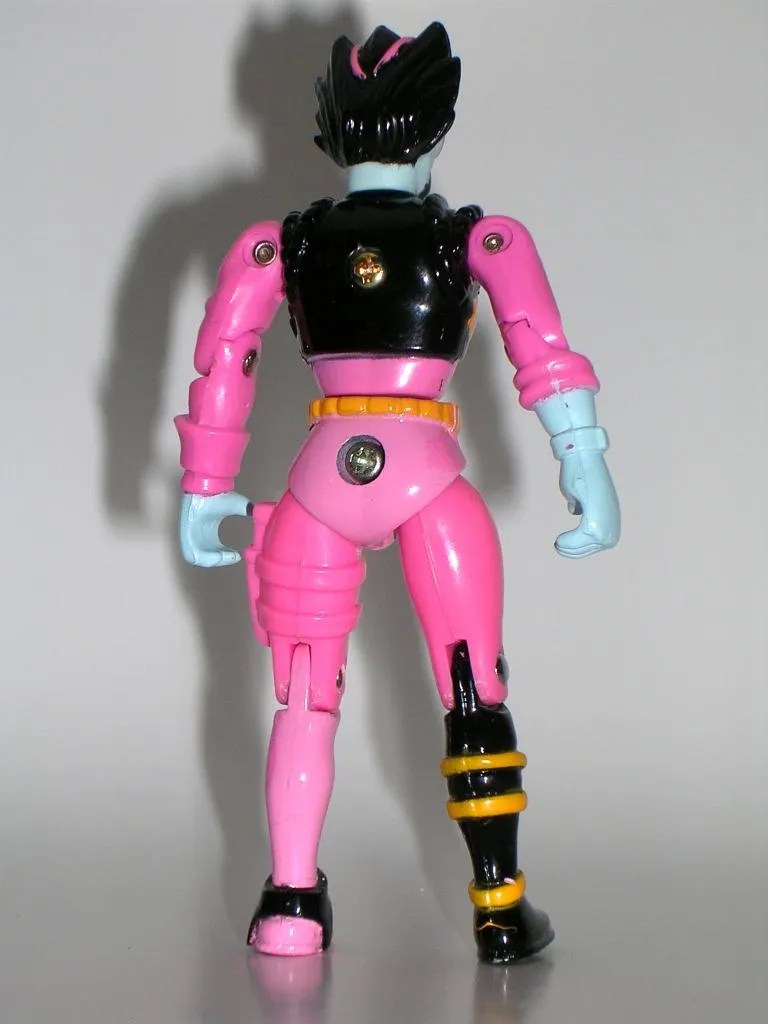
Some of LJN’s Bionic Six figures were pretty faithful to their animated counterparts, but unfortunately Madame O isn’t one of those examples. I mean… woof! Just check out her head! The hair and the goggles and the mask are all vaguely correct, but Madame-O was all about her alluring eyes and, well how do I put this? THE FIGURE HAS NO EYES!!! In fact, it looks like her face is just one big blank. I can’t help but hope someone in the LJN factories at some point held one of these packaged figures looked at the figure and then across at the character art and wondered how they could have messed up so badly. How hard was it to just paint a couple of eyes on there? Even if they didn’t look like her line art, at least she’d have eyes!

The rest of the figure is actually decent enough. She sports her pink track suit with Scarab insignia on her chest, yellow belt, and her one black boot betrays her obvious hatred for symmetry. She hates symmetry, daaahling!

If you’ve read any of my past Bionic Six features, then you know I’m not a big fan of the die-cast parts in these figures. And I’m particularly not fond of it being used on the Scarab figures. There’s no reason for parts of Madame-O to be metal. She wasn’t bionic. I imagine LJN kept it in all the figures as a bit of a running gimmick and to add some consistency, but die-cast is hard to paint well and it chips too easily. That having been said, Madame-O here has the best looking paint of any of the B6 figures in my collection, and virtually all of them came new and in the package. Her coloring is nice and bright and there’s no chipping at all.


Madame-O comes with a clip-on jetpack and a gun, but I seem to remember that in the cartoon she had a trademark lute or harp or something so she could trade destructive notes with Rock-1. Ah, screw it, these are cool accessories. I’m not going to complain about her not coming with a harp when she doesn’t even have any goddamn eyes.

Jeez, this is a frustrating line of action figures. I collect them because I enjoy the cartoon so much and because they’re all that’s available. As already mentioned, I was a little bit beyond playing with action figures at the time this cartoon and toy line came out, so maybe I’m just not being blinded by the same nostalgia as I am other 80’s toy lines. Either way, they just do not hold up well, and I find myself wanting better. If I had one toy-related wish, I might very well spend it on a full set of these figures recreated in the DCUC style. Well, either that or Kidd Video toys. I always wanted me some Kidd Video toys.

GI Joe Sigma 6: Cobra HISS Tank by Hasbro

Many collectors would argue that Hasbro’s Sigma 6 figures are the red-headed stepchild of the GI Joe franchise. If that’s the case than the Sigma 6 2 ½” scale sub-line of vehicles and figures would be that red-headed stepchild’s red-headed stepchild. These things clogged the pegs and shelves of my local Target and Walmart, perplexing kids and collectors alike. What was the point? What was Hasbro going for here? If they wanted to do Sigma 6 with vehicles, why didn’t they just keep the line 3 ¾-scale? Was this Hasbro trying to have its cake and eat it too? Why am I asking so many questions? It’s because this line confounds and confuses me. It created some really cool vehicles (not to mention one truly amazing toy, the Dragonhawk, which I promise to feature someday), but its mix of cool vehicles and shitty little figures made it a difficult concept to get behind. Let’s get an idea of what this line was all about by looking at its treatment of one of GI Joe’s truly iconic vehicles: The Cobra HISS


I’ve got to say, I dig this packaging. It’s a mostly closed box with two windows on the front to show off the figures. This was a bold move, Hasbro, since the figures are easily the weakest part of these sets and you probably shouldn’t be displaying them with pride. On the other hand, at least the windows let potential buyers know what they were getting. I totally dig the illustrated metal frame deco that surrounds the box and the artwork on the front is excellent. This presentation is damned exciting! I remember when I first saw it on the shelf it made me want to buy the toy even though something inside my head was telling me to drop it and back away. The back panel has a great photo, showing you everything you get inside. Once again, Hasbro was really good about letting you know what you were getting yourself into.


That’s what I like to see! Bags of parts and a sticker sheet! Stuff to put together! I miss the days of having to assemble and sticker toys. It really added to the anticipation. Actually, the stickers here are a bit disappointing. Many of them have white outlines, which don’t look good on the toy so I left them off. At least the instrumentation and the hazards stripes look ok. But before we put together the HISS, let’s look at those figures.


Ok, you get Cobra Commander and a Cobra Trooper. Cobra Commander is a decent enough design and sculpt, but he represents a lot of what was wrong with these figures. Specifically, he’s perpetually standing there pointing and holding his bendy, warped scepter. He does have four points of articulation, which consist of swivels in his shoulders, his neck and his waist, but it’s all mostly useless. The Cobra Trooper fares a little better with the basic five points: Shoulders, hips and neck, but man his design and coloring is shit. Even with two Cobra emblems, he doesn’t look like a Cobra Trooper to me. Nope, he reminds me of some knock-off Hoth Trooper. Keep in mind, these are amongst the best figures this line had to offer, as many of them were even more pre-posed and static. I’m not going to blame the small scale. It was clearly a deliberate style choice on Hasbro’s part, because we’ve seen figures in this scale executed a lot better. Now where was that? Well, I’m sure it’ll come to me before the end.

Once assembled, this HISS should look familiar to most Joe collectors. It’s the same design as the one used for the Direct-To-Consumer HISS and that is not at all a bad thing because I really dig this design and all the features it has to offer. The overall configuration is the same as the original vintage HISS, but this model comes loaded for bear with dual missile launchers on either side of the cockpit and four missile launchers mounted up on the turret. Joes seeing this thing barreling toward them would surely have shit their pants. There are also two smaller swivel guns, one of which can be swapped out for a Cobra flag. The cockpit is designed to lower closer to the ground for easy boarding. The hull features some minimal panel lining and Cobra emblems, and the canopy has a cool painted frame, which is something I always thought the original HISS should have had. There’s no two ways about it, the profile for this vehicle is one hundred percent bad ass.

Just like the DTC HISS, the back compartment opens up on either side and there’s a hatch that drops down out of the back to unload troops. In fairness, with the turret in place there isn’t a lot of room back there for personnel. You can take the turret out to make room and that leaves a port for them to emerge and take pot shots at the Joes. This feature was one of my favorite things about the DTC HISS as it converts the fast attack tank into a vehicle that can charge across enemy lines, deliver the shock and awe of a missile barrage, safely insert a squad of Cobra Troops into a critical position, and all without sacrificing any of its original design. And honestly, if I were on Cobra’s payroll with Joes shooting at me, I’d much rather ride inside the thing then hang off the back.


The conversion gimmick involves taking off the top of the back compartment and unfolding it to turn it into an armed bunker. It’s not the most innovative gimmick around, but it does give you some play and display options. You can position the “bunker” into a straight wall fortification (my favorite) or you could angle it. The bunker can arm itself with two of the missile launchers as well as the smaller guns. The main turret of the HISS has fold down stabilizers to turn it into a missle battery emplacement. As much as it may seem like a tacked on extra, this bonus bunker mode actually makes sense to me. I can imagine HISS Tanks could be used to gain ground and then set up these fortifications to hold it while the remaining part of the HISS goes back to get outfitted again for another charge. All in all, it’s a pretty cool idea.


And yeah, about that other line of 2 ½” figures… Like all the vehicles in this line, the HISS’ scale meshes almost perfectly with Kenner’s old MASK line. This HISS blends especially well because of its converting ability. I really dig this cross-compatibility of these vehicles and it’s probably the core reason as to why I’m ultimately a fan of the line. Unfortunately, I can’t help but think of how much cooler it would have been to have had the Sigma 6 figures been in the same style as the MASK figures.

And that’s the Sigma 6 HISS. If you can accept the figures for being what they are, I call them lost opportunities, the vehicle itself is pretty damn cool. The design looks great and it’s a nice quality construction that can get banged around pretty good. If you give this thing a chance it’s definitely a well-designed toy, but then most of the other little Sigma 6 vehicles were too. I’ll eventually get around to looking at the rest of the line, but tomorrow we continue Toy Closet Finds week with another treasure from the abyss.

Star Wars Vintage Collection: R2-D2 (“Jabba’s Sail Barge”) by Hasbro

Way back in October of 2010 I scored Hasbro’s awesome Jabba’s Throne set and ever since then I’ve been meaning to rebuild my once great collection of Jabba’s denizens. In the years since, I’ve been picking them up here and there, but mostly relegating them to storage totes until I could get motivated to start opening them and piecing the display back together again. Well, cleaning out the Toy Closet this weekend, I stumbled upon some of those figures and have been putting them aside so I can start opening them and looking at them here. And so, the first feature of this week’s Toy Closet Finds, might seem like an unlikely start, but I felt like opening me up an R2 figure and he just so happens to be the version from Jabba’s sail barge.

God, I love this packaging and it’s a crying shame that Hasbro is doing away with it this year. As superficial as it sounds, the vintage packaging is probably the only reason I even look at the Star Wars pegs anymore. Of course, I don’t buy a lot of them because it actually makes me sad to open them, and that’s coming from someone who usually doesn’t give a crap about tearing open his action figures. I’ve managed to shake a lot of the hold Star Wars figures have had on me since I was a kid, but even I can’t resist the appeal of the figures when they’re carded on pure nostalgia. When Vintage Collection came back I started to buy doubles, but space concerns being what they are, that strategy couldn’t last. And so, even now, I don’t want to open this figure, but like taking off a band aid, I’m just going to do it fast so it doesn’t hurt so much.

It has been AGES since I bought an R2 figure. In fact, the last one was probably the one from the Original Trilogy Vintage Collection, and I never opened it. It’s still stacked on a shelf with the other VOTC figures sealed in the clamshell. Having been out of the Star Wars scene for a while now, I couldn’t begin to follow all the repacks and slight modifications R2 figures have gone through over the years. Thankfully, I don’t have to, because this R2 is a completely new figure. That means this little droid should be a whole lot better than the last one I opened, right? I was pretty anxious to play around with him and see what Hasbro has done with him lately.


Make no mistake, this R2 is full of gimmickry, a lot of which intrudes on the articulation and aesthetics of the figure, so before we get into those, let’s start with the sculpt first. R2 has always been one of those figures that looks perfectly fine to me until the next release comes along and emphasizes everything that was wrong with the last one. That having been said, I think this one looks pretty solid. It seems like there’s still a little room for improvement on the dome, and I wish Hasbro could figure a way to not have seams running up the sides of it. But the body has all the appropriate sculpted panel lines, vents, ports, and doo-dads, front and back. For some reason the cables on R2’s feet have always been a sticking point with me and his figures, but they look good here. On the downside, he’s way too big for the Vintage Collection 3PO, but then I wasn’t a big fan of that figure anyway. That’s about as far as I can go without starting to talk about the gimmicks so let’s get to them.

Hasbro tried to make this a pretty versatile representation of R2 as seen in Return of the Jedi. In addition to the obvious drink tray and serving arm, he has a retractable servo arm, a sensor scope, and a lightsaber. About the only thing missing from the movie is the Ewok zapper and the buzzsaw.  Easily the most unsightly of the gimmicks is the servo arm, which is poorly concealed behind the lower blue horizontal servo arm on his chest. In the movies, this blue piece is the actual arm that closes up flush with his body. In the figure, the whole panel opens one way and the servo arm swings out the other way. Considering the door doesn’t close properly and it isn’t screen accurate, I’d rather Hasbro left this one out and went with one of the vertical arm hatches instead.


The third leg gimmick is bewilderingly tied in to the sensor scope. To extend the leg, you have to put the sensor scope into the open panel on R2’s head and push it all the way down. The scope conceals nicely, but if you leave it in there you can’t turn R2’s dome. You can, however, use the scope to extend the leg and then pull it out to regain dome movement. Because the two gimmicks are connected, in order to display the sensor scope extended, R2’s dome has to be centered and the third leg has to be retracted. That having been said, the scope looks really good and since it just sits in the socket, you can rotate it. The lightsaber… wait isn’t that Obi-Wan’s lightsaber? Ahem… the lightsaber also just sits in the same socket as if R2 is preparing to launch it to Luke.

The drink tray is definitely the coolest piece of all the gimmicks, but then I guess it’s more of an accessory than a gimmick. It’s wonderfully sculpted and far surpasses the crappy one that Hasbro released previously. It sits snugly on R2’s shoulders and the drink serving arm plugs right into the socket on the top of his head. Amazingly enough, the drinking glasses are actually removable.


I won’t deny this is an ambitious and, in some ways, fun little figure. He will definitely look great dispensing drinks to Jabba’s minions, but I was also hoping this R2 would be a definitive version and clearly he’s not. I think Hasbro packed a few too many gimmicks into him and the figure struggles under the weight of its own over-engineering. But I think in the end, it’s the loose front servo arm hatch that bugs me the most about him. Ah, but a little super glue should soon fix that.

Star Trek Starship Legends: USS Enterprise NCC-1701-D by Diamond Select

As I mentioned last Saturday, the fine folks at Diamond Select have taken pity on those of us who missed out on their Starship Legends line by reissuing the ships with some minor tweaks and refreshed packaging. I was quick to jump on board and pre-order the “Wrath of Khan” Enterprise and the “Next Gen” Enterprise-D. I’ve got a little while to wait on WoK Enterprise, but 1701-D showed up at my door this week in a giant slab of a shipping box. I’ve been jonesing after this thing for a long while now, so I couldn’t wait to get her inside and open her up. This is a big ship, there’s a lot to talk about, and there will be some bumps along the way, so sit tight and engage your inertial dampeners…

The huge window box is actually not quite as big as the Bird of Prey’s package, but it is deeper. It’s the same style of blue cloudy star field deco only this time you get a shot of Captain Jean-Luc Picard, with arms crossed, staring out approvingly at you, as if to say, “Well done on buying this ship.” That makes me happy. After all, deep down don’t we all really just want approval from Captain Picard? The Star Trek logo is in “The Original Series” font with “The Next Generation” below it. Wait… they can’t do that… can they? I’ll confess the mixing of the two generations looks weird, like it’s a knock off package or something. The front panel of the box is cut out to show the bulk of the ship, while still hiding the two pieces of shit stands in the lower right corner. There’s a “Try Me” hole in the window so little bastards can run down the batteries when they see it at their local comic shop. The back panel of the box shows a shot of the model with a couple of paragraphs on the series and the ship. It also seems to take great pleasure in chronicling the fact that the mightiest ship in the Starfleet, the Flagship, was destroyed by a small rogue Bird of Prey after Picard gave Riker the keys and Troi crashed it into a planet. Cue Picard Facepalm.

The ship is packaged fully assembled. You just have to clip the wire ties to get it off the tray, and that’s where the fun starts. I honestly didn’t expect to have anything bad to say about this thing, and yet we’re going to start off with one major annoyance. As expected, the ship comes packaged in “Try Me” mode and to get the full effect of the electronics you need to switch it over to “Play Mode.” Unfortunately, the switch is inside the battery compartment on the bottom of the Star Drive section. Some may argue that’s a good thing because the ship doesn’t have a switch exposed on it anywhere, but it didn’t bother me so much with the Bird of Prey. Anyway, this situation sent me scrambling throughout the house to find one of my tiny screwdrivers, which by now I should keep in a very prominent place, but I can never remember where I left it. After about ten minutes of swearing under my breath and rummaging through every junk drawer and catch-all I have in the house, I got my hands on it only to find that I couldn’t budge the screw. Diamond obviously used some kind of self-sealing stembolt (Right? Get it?) to secure the hatch down. I went back to searching until I turned up a pair of vice grips so I could get enough torque and break the seal on the screw. After that it was easy. I also noticed the super shit batteries they put in here, so I’m going to have to go get a couple of packs of the best AAA batteries I can find for the Enterprise and Bird of Prey so they don’t shit battery goo all over the inside of my precious ships. But wait! We’re not done yet! You also need to take off a second battery cover on the top of the Saucer Section right over the main Shuttle Bay and flip a switch under it in order to get the Saucer Separation SFX to work. Yes, the Enterprise is also powered by three additional button batteries in the Saucer. This cover is slid back by inserting a thin implement into a notch and pushing back. It’s a jarring ordeal because I had to apply just a bit more force than I was comfortable with. Keep in mind, as annoying as this all was, it’s just something to deal with during the initial unboxing and not something that’s going to really spoil the enjoyment of the model once you’ve done it. Ok, now that I’ve put everybody to sleep with exciting battery talk, let’s look at the ship.

I was expecting a lot of detail, but I’ll confess the finished sculpt still exceeds my expectations. The Enterprise-D has a lot of surface space, and every bit of it is covered with panel lines. I mean, damn, you can practically see every single plate of tritanium-duranium alloy that went into the hull’s construction. The Escape Pod hatches are sculpted, the ridges on the Shuttle Bay doors, even the little docking hatches on the sides of the Torpedo Bay launchers. If Art Asylum left any details out, I sure as hell can’t find them. There is a little more assembly seaming on this ship than was evident on the Bird of Prey. It’s mostly noticeable along the aft edges of the ship and where the back of the neck meets the front two pieces. They aren’t terrible, but worth mentioning.

The paintwork compliments the sculpted detail wonderfully. Every window is painted onto the ship’s skin from the random windows of crew quarters to the line of panels that runs across the wall of the Conference Room and even the viewports of Ten Forward. The Escape Pod hatches are painted tan and you’ve got a darker grey on the Shuttle Bay doors and the Phaser Array strips. The lettering is all crisp and hugs the hull better than what I remember seeing in the test shots. Of all the tiny details, I think the one that impresses me the most are the tiny scoring lines that run along the perimeter of all the Phaser Arrays. Holy shit that’s cool!

The Saucer Section is secured to the Star Drive Section with some of the most insanely powerful magnets I think I’ve ever seen in a toy. Separating the ship is as easy as pulling them apart. When you go to connect them up again, the magnets will aggressively grab at each other and do the rest. Connecting and reconnecting the two sections give you a sound and light show, which we’ll talk about in a little bit. Obviously reconnecting the two halves of the ship will lead to rubbing on the surface so I’ll probably avoid doing it to excess. I’ll point out here that Diamond stamped a bunch of large type copyright information inside the area where the Saucer Section connects to the neck. It’s annoying and I’m pretty sure it wasn’t there on the original release.

The Enterprise comes with two display stands and they are the biggest pieces of shit I’ve ever seen. They’re basically the same style of thin, opaque plastic pieces as the one that came with the Bird of Prey, only these feature the ball joint under the connection points and are sculpted with the Starfleet “Comm Badge” style insignia. They look cheap, but that’s not the problem I have with them. While the Bird of Prey used a fixed connection that works perfectly, these stands use ball joints and they work well until you manipulate them a couple of times and then they fail miserably. The ball joint just can’t handle the weird weight displacement of the ship and it constantly wants to drop the ship forward onto the Saucer Section. They will work fine if you want to pose the ship in an upward climb, but forget about getting it displayed parallel to the surface its standing on. You see those two side shots of the ship? Well, the stands won’t do that anymore. Hey guys, what the hell is the point of a poseable ball joint if it can only hold the ship in one position???  I’ve tried gumming it up with blue tack, which didn’t work.  I may try some nail polish next.

So two stands? Yes, The complete Enterprise displays on either stand by plugging it into the hole closest to the Deflector Dish. You can also display the Enterprise separated by plugging the smaller stand into the middle hole of the Star Drive section and using the larger stand for the Saucer Section. While I doubt I’ll ever display the ship separated, it’s very cool to have this option. The instructions show a plug that can be put into the hole of the Saucer Section to cover it up when you are displaying the ship as one piece. It’s a great idea, but sadly no such plug was included in my box.

Ok, let’s talk electronics and we’ll start with the lights. By pressing and holding the concealed button just below the main Impulse Engine on the Star Drive section, you can put all the lights into “Display Mode” and they’ll stay lit until you press it again. You get red LEDs in all three Impulse Engines and the front of both Warp Nacelles. Blue LEDs light up in the front Deflector Dish and in the strips around the Warp Nacelles. The lights are all bright and gorgeous, particularly the fronts of the Nacelles. There’s one more light, a white Bridge light on the top of the Saucer Sections dome. Alas, this one bleeds through the paint and plastic around it quite a bit. I can sort of convince myself that the light bleeding through is just the light reflecting off the hull. Yeah… sort of.

The sound effects and voice clips aren’t quite as loud and clear as the Bird of Prey’s SFX, but they’re still pretty good. The sounds and voice are activated by pressing the top dome of the Saucer Section and the lights will come on when the sound is activated. One thing I do not like at all is the way the blue Nacelle lights blink to match the speech or sound effect. It’s just like the lights on the top of a Dalek when it talks. What is the point of this, Diamond? WHY? At least all the lights don’t do it. The sounds and voice clips play in the same order and if you hold the button down it’ll run through everything in one long sequence. All of the voice clips are from Captain Picard himself. Here’s what you get…

  • “Open a hailing frequency. This is Captain Jean-Luc Picard.”
  • “Energize.” [Transporter SFX]
  • “Scan for life forms.”
  • “Shields up! Red Alert!” [Red Alert SFX]
  • [Phaser Alarm. Phasers Firing.]
  • “Make it so.”
  • [Warp Drive Engaging]
  • “Tea. Earl Grey. Hot.” [Replicator SFX]
  • “Dispersal pattern Sierra and fire!” [Torpedoes SFX]
  •  “Transferring command to the battle bridge.”
  • [Impulse Flyby]
  • “Continual fire, all phasers!” [Phaser Alarm. Phasers Firing]
  •  “Damage report!”
  • “Warp 9, Engage!” [Warp SFX]
  • “Let’s make sure history never forgets the name… Enterprise!”

I could have done without the Earl Grey quote, but I adore the way the sequence ends with Picard’s memorable battle cry from “Yesterday’s Enterprise.” The weapon sequences are so awesome that I really wish there was a way to select them specifically to avoid the following scenario: “Hey, wanna hear the Enterprise-D kick some ass?” “Sure!” “Ok, here we go.” [pushes button] “Tea. Earl Grey. Hot!” “Oh…”

Separating the Saucer section plays, “Prepare for emergency saucer sep” and engages the lights and sounds. Reconnecting plays the sound of the moorings locking down. Very cool!

If it sounds like I’m nitpicking the Enterprise more than I did the Bird of Prey, well that’s because I probably am. The Bird of Prey didn’t have as many issues. Besides, this is the goddamn Enterprise after all and I’m going to hold it to higher standards. My issues with some of the electronic SFX are fairly minor and in one case (the lights flashing in time to the voice) just a matter of personal preference. The stands, however, are just poorly executed and considering this is the second time this ship has been released, they should have been fixed. I’d much rather have a stand that gave me less display options but actually worked well. I would even have been willing to pay a little extra for a ratcheting stand. In terms of the ship itself, however, well it’s absolutely gorgeous. I love it so much that even with all the other hiccups, I’m still so very glad that I finally own it. When you consider what the old Playmates Enterprise-D goes for these days, picking up this Diamond version is a no-brainer. At $70 shipped, it’s just worth every penny, horrible stands and all! Now if only I can find a place to display it so I don’t have to put it back in the box.

And that’s going to wrap me up for this week. Tomorrow is my day of rest and I’ll actually be continuing to clean out and organize one of my bottomless toy closets. Next week is going to be a complete run of some of the stuff I find so it should be an interesting mish-mash of who knows what!

DC Comics: Bishoujo Power Girl Statue by Kotobukiya

It’s been over a month since I last checked in with Koto and their awesome line of Bishoujo statues. Yes, I still have some older ones to look at, but Power Girl just arrived on my stoop yesterday, and I was plenty anxious to check her out. Giggity! Surprisingly, she’s actually my first Bishoujo statue from the DC side of the fence. I pre-ordered her a ways back, completely forgot that she had been released, and found that she was sitting around in my Pile of Loot, so I quickly gave the go-ahead to send her on her way to me. I love Power Girl. Even though I’ve converted to reading my funnybooks exclusively by way of digital device, she’s one of the few DC characters that I still have complete runs of bagged and boarded and I’ll still buy any books  she appears in if I come across them at the comic shops.

bishpgirl1

bishpgirl2

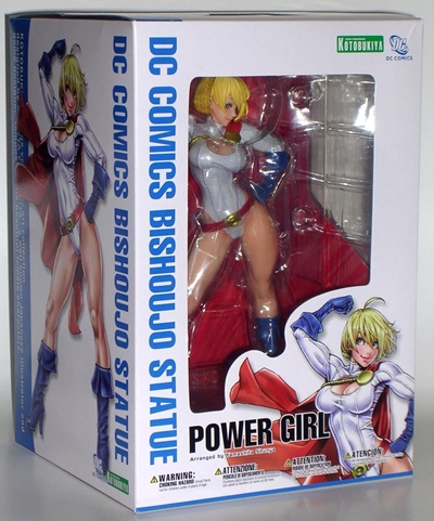
Yep, Koto does packaging well. Looming space concerns make me really picky about the packages I save, but I never toss a Koto package. Besides being collector friendly, the Bishoujo packages feature the gorgeous concept art that I simply have to keep. If you’ve purchased these statues before, you should know what to expect in terms of packaged presentation. Power Girl comes in a white box with windows on the top, front and right side panel. The left panel has a huge color illustration inspired by the work of Yamashita Shunya. The back panel has a comparison of concept art to statue and a great blurb about Power Girl and the statue on the bottom. And, Oooooh, The Huntress is coming soon! Giggity! Ok, that’s the last giggity, I promise. Of course, despite the three windows she’s still wrapped in plastic, you really need to open it up and remove her from her plastic trays to get the full effect. So let’s go ahead and do it.

pwrgbish6

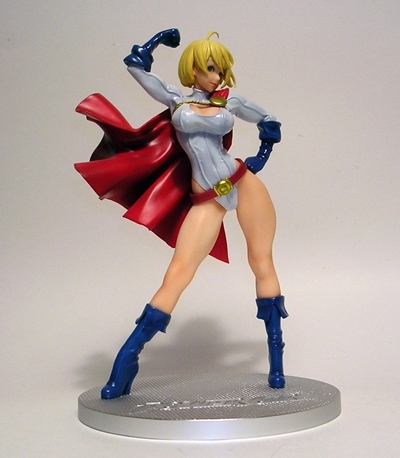
Some Koto statues require minimal assembly, but Power Girl comes out of the box all ready for display. While many of my favorite Bishoujo statues have been based on candid action shots, there’s something to be said for an obvious pose. I really liked the sultry and gratuitous stance Koto used for their vastly underappreciated Ghostbusters Lucy statue, and I’m totally digging the one they used for Power Girl every bit as much. I just love the fact that she’s blatantly mugging for the invisible camera, tossing her hip to one side and flexing her arm. She’s just the right mix of Kryptonian muscle and curves and the pose is coy, sexy, boastful, heroic… it’s brilliant.

pwrgbish5

pwrgbish4

Kara’s been made over with the typical bishoujo face with big blue eyes and a sweet little smile. She’s turning her head to the side, but her eyes are looking straight at the invisible camera. Her short blonde hair is ruffled by the wind and looks awesome, with one strand protruding upward. I’m really glad Koto didn’t go with the transparent effect for her hair. It works sometimes, but I don’t think it was necessary for short hair like this.

pwrgbish3

pwrgbish2

pwrgbish1

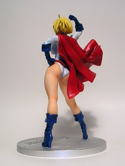
Power Girl’s outfit consists of her white skintight one-piece with her iconic boob window, blue gloves and high heeled boots, a red cape and a red belt that hangs off her hip. The metallic gold belt buckle and cape clasp round out the package nicely. Koto went in an interesting direction with her one-piece as the glossy finish and exaggerated seams make it look like it’s intended to be leather. I’ve always imagined it was just spandex or cloth, but I’m seriously digging on this look and I’m not some freak with a rubber fetish… at least not one that I was previously aware of. The boots and gloves have the same great glossy leather finish. The sheen of Kara’s outfit really contrasts beautifully with the soft matte flesh tones. And with her legs, cleavage, and flash of derriere, Kara’s showing an ample amount of skin. Much of my Koto collection happens to involve a lot of black and drab outfits, so it’s nice to have Power Girl to add some color to my shelf, and I absolutely adore the coloring on this statue.

bishpgirl11

For the base, Koto went with a silver textured disc that looks like it’s supposed to be stainless steel. The texture is cool and it’s embossed with “Power Girl” in case you couldn’t quite recognize her… um… face. It’s a simple, clean looking design that compliments the statue’s bright, beautiful colors.

bishpgirl10

bishpgirl9

And that’s the Bishoujo take on Power Girl! Back when I first started collecting this line, there were certain Marvel and DC characters, which I thought were a perfect fit. My beloved Power Girl was one of those and I knew Koto would get around to making her sooner or later. She’s a lot simpler than some of the other statues I’ve looked at, but there’s a certain minimalist elegance that works well for this piece. There was no need to complicate her with an elaborate base or diorama set up, because she does just fine all on her own. She’s also packed with personality that strides both the familiar character from the comics and this new bishoujo version. Well, done, guys… she’s outstanding! Now, I’m kind of anxious to pick up the Supergirl or Wonder Woman to go with her.

Star Trek Starfleet Academy: Picard, Data, and Worf by Playmates

I’ve got some social obligations today, folks, which means that I can’t stay home and drink, I have to go out and drink. It’s jarring and unsettling, but people tell me that spending too much time at home drinking among crowds of fake plastic people is not good for my psyche. As a result, I was looking for something quick and dirty for today’s feature. I’m going to parse out three figures from a recent Lot of Playmates Star Trek that I recently bought on Ebay just because nobody was bidding on it and I wanted to give these guys a good home. It was basically a bag of about 20 loose figures with no accessories and a handful of stands, most of which didn’t even match the figures in the Lot. I don’t usually like to buy Playmates Trek loose because they’re so damn cheap when they’re new and carded, but then the ones we’re looking at today I would have probably never picked up any other way.

Yes, the Starfleet Academy line! Somehow Playmates thought that even after scraping the bottom of the barrel for questionable releases like Vedek Bareil (DS9) and that smug Benzite dickhead from “A Matter of Honor” (TNG) they still just weren’t making enough Star Trek figures and so they had to think outside the box and create this kind of Expanded Universe sub-line featuring our favorite Next Gen crewmembers as Academy Cadets. Jim Henson’s Trek Babies? The packages boasted “All new Starfleet Crew Members as young cadets!” C’mon, Playmates, it was hard enough to get kids to play with Star Trek figures without exposing them to this terrible idea. I’m the biggest Star Trek whore ever and even I didn’t want to buy these. Anyway, some of these figures came on a “Starfleet Academy” cardback with a CD-ROM game and the typical crappy Playmates accessories, none of which came with mine. Cadet Data was released a couple of years later (along with Cadets Troi and Crusher) as part of the generic “Warp Factor” series. I did get a single figure stand from the series, which is actually kind of cool because it’s made to look like the Academy badge complete with the Golden Gate Bridge. Too bad it’s molded in purple plastic with yellow paints. Oh, Playmates.

Let’s start out with this guy. I swear I thought this was Riker, but a little research tells me he’s actually “John” Picard. I’m not going to quibble about the likeness, but it is somewhat of a novelty to have a Picard figure with hair. He’s wearing a “Standard Starfleet Issue Flight Training Suit” which I have to reluctantly admit is kind of cool. It’s grey and has the same black shoulders and collar as the regular uniforms, which makes it a little Starfleety. There are also holes near the belt and arm, which I presume was for tubes or something.

Next up is Cadet Worf and ain’t he just adorable? I’ll actually concede that Playmates did a pretty good job sculpting his likeness as a younger Worf, even though he still has the beard. Unfortunately, Worf is wearing what Playmates calls “Starfleet Night Recon Gear” which makes this figure all kinds of stupid. What the hell kind of night recon gear involves wearing the brightest white gloves and boots I’ve ever seen? Even the bulk of the outfit is light grey and the only thing appropriately dark is the belt and cross strap. I’m guessing that Worf was the victim of a lot of hazing, with him being the only Klingon at Starfleet Academy, and some of his peers thought it would be funny to give him arctic gear and tell them it was for night recon ops. I’m also guessing that those pranksters were later found behind one of the lecture halls with their spines removed.

And last up is Cadet Data. I understand that it’s canon that Data graduated from Starfleet Academy, but I honestly can’t imagine how that worked since he was constructed to be super strong and remember every piece of information that he was exposed to. Maybe the idea was to have him spend time interacting with other cadets rather than just download every course into his neural net and get his commission. Anyway, since Data doesn’t age, he looks pretty much the same as his other figures. I might even go so far as to say this figure’s head sculpt is better than my regular Data. I have no idea what his outfit is supposed to be, but I have to say, this is my favorite figure of the three and the fact that his gear doesn’t have a Starfleet insignia anywhere on it means that I can use him as Lore or even B4. YES!

And there you have it. I doubt I’ll ever circle back to pick up complete versions of these three figures, but being the nutter that I am, I won’t discount the possibility that the other cadet figures won’t show up here at some point in time. Looking at incomplete figures really aggravates my OCD, but there are a bunch of figures in this Lot so chances are I’ll pick out another handful of them to check out next week.

Doctor Who: Character Options Shows New Who at UK Toy Fair

I know, I know, I don’t do news and even my coverage of next month’s NY Toy Fair will likely only add up to a couple of lists of what I like and don’t like. But Doctor Who going to 3 ¾” scale this year is undoubtedly going to be my biggest industry event of 2013, so I thought I’d chime in with what’s been shown.

To see the pictures, hop on over to the excellent photos on The Doctor Who Site.

50th Anniversary Dalek: A giant Dalek deco’ed out with the flag of the United Kingdom and a big “50.” It looks like it’s a repaint of one of the RC Daleks. It’s kitchy, it’s crazy, I like it, but probably not enough to buy it. CO is hinting at other possible variants. I can’t imagine what they’re going to be.

More 5” Scale Talking Daleks: I don’t own any of the last wave of these, but I did get a chance to play around with a couple. I love them, but at around $25 per Dalek, that’s just too steep for me. On the other hand, I noticed that one of Bracewell’s Ironsides from “Victory of the Daleks” is in the new assortment. If that thing actually screams, “WOULD YOU LIKE SOME TEA???” then I’m already sold.

The 3 ¾” Scale TARDIS: It looks fantastic and I’m buying it as soon as I see it. First, it’s going to be part of a GI JOE caravan with Cobra trying to steal it. Next up, Indiana Jones will likely team up with The Doctor for a trip to the present, and lastly, Cable and Deadpool are going to take it for a joyride. Thank you 3 ¾” scale… so many possibilities!!!

3 ¾” Figures: So, CO showed off The Doctor, Clara (or whatever her next name will be), a Weeping Angel, a new Cyberman, and a modern Dalek. I think these look really great. Well, Clara’s accessory looks like crap, but the figures themselves look great. I really dig the finish on the Cyberman and HOLY SHIT IT’S A DALEK ON A FLIGHT PLATFORM LIKE IN THE OLD COMIC BOOKS!!! Yes, I still lament that we won’t be getting Clara or the new coated Doctor in 5-inch scale, but I do really like what I’m seeing here and I am most definitely on board. C’mon CO, bring on the new console room playset!

5” Iconic Scenes Collector Sets: They’re basically Classic Who 2-packs, a Doctor and an enemy, with a diorama backdrop. These look really cool, but I don’t know if I’ll buy any. The Doctor figures don’t appear to be variants, and while the backdrops look cool and I could always go for more aliens, I think they’ll be too expensive. I’m concerned about CO taking a beating on these because so many collectors already have the figures and won’t want to double-dip any more then they’ve already had to. I just hope they aren’t going to gauge the popularity of the Classic figures based on the sales of these sets.

There is also tale of a new 11 Doctors set and they showed off some weird Stress Balls shaped like the heads of Ice Warriors and Weeping Angels. Yeah, odd. These goodies are due to start hitting around May or June and I am officially excited. I am, however, also a little dismayed at the lack of new Classics figures and I’ve been putting a lot of hopes in the idea that CO will do some kind of Classic console room playset for the 50th. I know the fact that these things weren’t shown doesn’t make them impossible, but it would have been cool to see some confirmation.

DC Universe Signature Collection: Saint Walker by Mattel

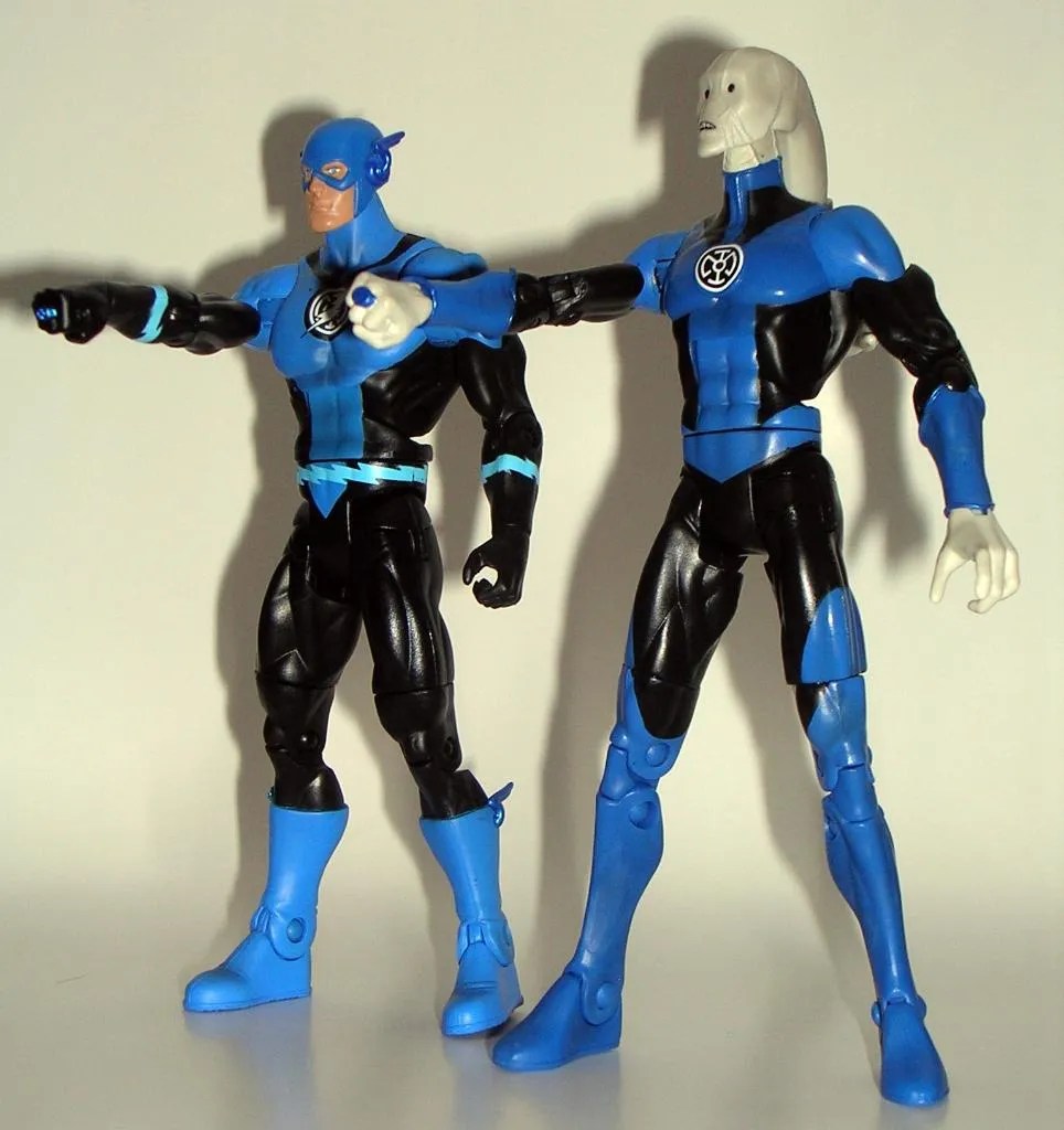
Hey, folks! It’s the first figure of the year from Matty’s Club Infinite Earths! Last year’s inaugural figure was the much coveted Jay Garrick Flash. Obviously, Matty realized he would be a tough act to top for 2013, so they didn’t even try. Yes, this year’s first figure is Saint Walker, and this guy wasn’t anywhere near my list of wanted characters. In fact, he actually set around here for a couple of days before I got around to opening him. Toss in the fact that I’m still reeling from all the Lantern Corps stuff Mattel has pushed down our throats over the past couple of years, and I honestly couldn’t be less excited about this figure. Let’s do it…

I’ve been pretty consistent in my praise for the Signature Collection packaging, so at least I can be excited about seeing another one of these pleasing boxes… oh, wait… Matty redesigned the packaging. Well, ain’t that a kick in the nuts! The redesign is more of a tweak than a total overhaul. The overall configuration of the box is mostly the same with a big window on the front, wrapping around to the side panel, and another window on the top. The deco is what’s changed. There’s now an illustrated leather-like pattern with a hexagonal grid trim. That f’ugly new DC Comics logo appears on one side panel. Seriously, guys? Your business is basically selling artwork and this logo is the best you could do?

The back panel of the box is mostly the same as the old style, complete with bio, and the character artwork is still great. It may take me a couple of releases before I decide whether or not I really dig this new look, but I can’t say as I hate it. I’m still at the point with these boxes where I’m fooling myself into thinking that I’m going to keep saving them all, when in truth I just don’t have the space. I can see the point coming soon where I’m going to clip the backs off and keep them like cardbacks and probably only keep the complete packages for the oversized figures.


My only experience with Saint Walker is based on his appearances in Final Crisis and Blackest Night. I haven’t read any of his appearances in the New 52, but then right now my sustained readings in the New 52 only amounts to about six books, and I’ve been shying away from most anything concerning the Lantern Corps. I dig his backstory, but as I already mentioned, he’s not a character that I was jonesing to have in figure form, other than the fact that he helps fill out my Lantern Corp leaders and I guess that’s a cool thing. I guess I also still dig the idea of having more alien Lanterns in the DCUC style and Saint Walker certainly fits that bill.

Ok, let me start out by saying that I don’t like the head sculpt very much. Saint Walker is usually drawn one of two ways: You’ve got him with the round “crash test dummy” dots for eyes or sometimes with more almond shaped eyes. DC Direct went with the almond eyes for their Saint Walker bust and I think it looks so much better. Hell, even the artwork on this box features that version and it looks so much better. Maybe, this is a matter of personal preference, but at the very least, Mattel should have had the styling of the box art and the figure agree with each other. Even the configuration of the sculpted lines on Bro’Dee’s face doesn’t really match the artwork. Am I being too hard on the likeness? I don’t hate it, but in light of the many excellent head sculpts we’ve been getting in the Signature Collection, I think it could have been so much better.

On the other hand, I love the body on this figure, and since a lot of what I love about it is the articulation, let’s start there. The arms are ball jointed at the shoulders, have swivels at the biceps, double-hinges at the elbows, and swivels and hinges at the wrists. The legs feature the usual DCUC style hip joints, swivel at the thighs, have double-hinged knees, and hinged ankles. The torso has an ab crunch hinge, swivels at the waist, and the head is ball jointed. You also get a swivel cut in his head-tail. This is really phenomenal articulation and all the joints are strong and sans warping. Honestly, the only thing I could possibly think to add would have been ankle rockers.

Saint Walker’s costume itself is comprised almost solely of paint apps and the paintwork is excellent. I do adore the rich, deep shade of blue Mattel uses for the Blue Lantern costumes and the overall deco when mixed with the black really looks striking on the figure. The white Lantern Corps emblem tampo on the chest really ties everything together. Bro’Dee’s left hand is obviously sculpted in a fist so he can wield his power ring and his right hand is sculpted so he can hold his lantern.


So, Saint Walker is a bit of a mixed bag. If he were a figure that ranked high on my want list, I would have probably taken further issue with the head sculpt, but as he’s just going to be another face in the crowd on my Lantern Corps shelf, I can live with it. Make no mistake, there’s a lot to love about this figure, particularly if you prefer this style of portrait and I hope to see this style of articulation in more figures this year. But I still cannot help but look at the figure next to the character art and say “No!” He’s one of only a select few figures that have appeared in CIE that I wouldn’t have purchased if I wasn’t a subscriber, especially when you consider the fact that he was $28 after shipping.

Doctor Who: “The Three Doctors” Collectors’ Set by Character Options, Part 2

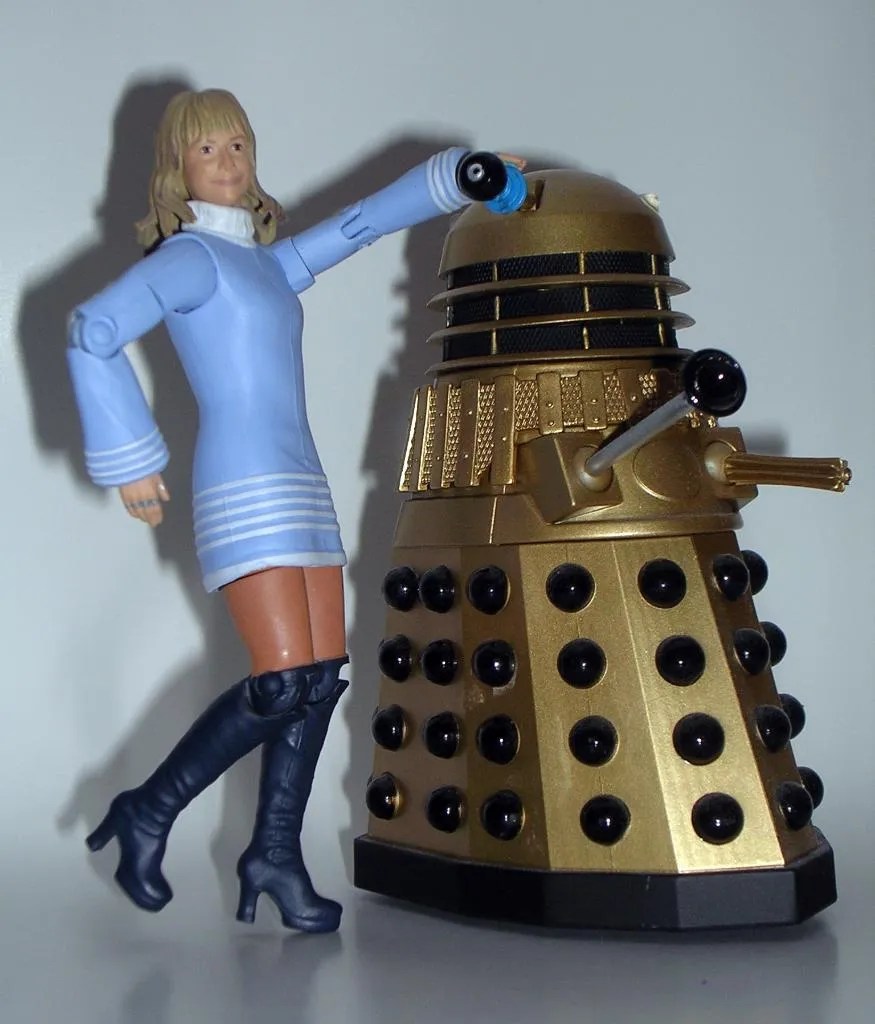
So, last time I got a little sidetracked over my bromance with The Brigadier. Today, let’s set that aside and actually look at the figures. Having gassed on a lot about The Brig, I don’t want to sell the other figures in this set short, so I’m actually going to start with them and save Alistair for last. In fact, let’s get what is probably the least anticipated “figure” out of the way first. The Gel Guard!


Yes, it’s a lump of bubbles with a single eye and a crab claw, but I don’t want to hate on him, because I think he’s cool. The Gel Guards were globs of anti-matter that Omega was able to conjure up and animate with his pure will. He used them as scouts to venture into our Universe and further his plot to escape his anti-matter exile. One of the things I always loved about Doctor Who was the show’s unwillingness to just glue some ridges on a person’s nose and call them an alien. Nope, aliens were truly alien looking, even if that meant an actor crawling around in a bin liner. The Gel Guard represents all that is awesome about Doctor Who’s truly alien aliens.

Sure, he’s rotocast, which makes him a bit like a glorified hollow chew toy, but I can’t deny he looks great and he actually does feature one whole point of articulation, which is rather impressive for the design of the monster. You can even pop a small mag light in him and he’ll light up! It’s only natural that this guy would take a back bench to the other highly demanded figures in this set, but that doesn’t make him an unwelcome addition to my collection. In fact, I’d rather like two more, so CO can feel free to repack him with a Mike Yates or Sgt. Benton and I’ll fork over the monies.


And then there’s the lovely Josephine Grant. I’ll confess Jo was never one of my favorite companions, probably because I resented her for replacing Liz Shaw, even though it wasn’t Jo’s fault. Nonetheless, I will gladly scarf up every companion figure CO releases (yes, even Adric and Turlough… and Mel… well, probably Mel… well, maybe Mel… on clearance.) and Jo was part of UNIT so she can’t be all bad. Early test shots of this figure have been floating around the Interwebs forever and even actress Katy Manning played fast and loose with her figure by twittering it all around. Based on early shots, I was concerned about the head sculpt but now that the figure is in hand, most of my fears have been dissuaded. The likeness is ok, albeit not perfect. I think the eyes are too small and if you’ve seen Katy recently, I think you’ll agree that the figure looks more like her older self. Still, all in all I’m happy with the portrait.

Jo features the outfit she wore in “The Three Doctors”: A lavender outfit with a furry coat and her trademark platform Go-Go boots. It’s a good recreation of the outfit, and CO even went the extra mile by allowing collectors to display her with her jacket off. Yes, she comes with an extra set of arms without the sculpted jacket sleeves. All you have to do is pop out the arms, take off the jacket, and pop the other arms on. I think I like the jacketed look better, but she has better articulation without the jacket. Either way, the ability to display her in two ways is really going above and beyond for CO, especially considering this set doesn’t rely on repacks or repaints. My only complaint with Jo is that her left leg pops off rather easy at the thigh swivel. It plugs right back in, but it’s worth noting nonetheless.


Jo’s articulation features ball joints in the neck and shoulders. Both sets of arms have swivels in the biceps and wrists, and hinges in her elbows, but the elbow hinges on the coat arms are virtually useless. Her legs feature movement at the hips, which is mostly marred by her dress, swivels in the thighs, and hinges in the knees.


And then, there’s The Brig and he is one outstanding looking figure. The likeness to a young Nicholas Courtney is perfect, and he sports that wonderfully stoic look that only he can pull off when being faced with a weekly alien invasion. He has his peaked officer’s cap, which is not removable, but does appear to be sculpted separately, which means The Brig in a beret may not be far behind! Either way, I think this is one of CO’s best likenesses.

The Brig’s uniform is an amazing piece of work. Every little detail is sculpted on from the epaulettes, pockets and buttons, rank and medals, sidearm holster, gloves, belt and shoulder strap. Yes, even the UNIT patch on his arm is accounted for. It’s all here and he looks every bit the dashing hero! Aside from a small black mark on his left elbow, the paintwork on this figure is otherwise immaculate and there is quite a bit of fine paint detail, right down to the buttons and buckles. The Brig does come with his automatic sidearm, but sadly no swagger stick. I’ll also toss in that the holster is non-functional.


Alas, The Brigadier’s articulation conforms more to the older Who figures, meaning you don’t get ball joints in the shoulders. I’ll admit this is rather disappointing, since I was hoping to get some cool dynamic poses out of him. Let’s run down the articulation: The arms rotate at the shoulders, have swivels in the biceps and wrists, and hinges in the elbows. The legs have universal movement at the hips (although the tunic hinders it quite a bit), swivels in the thighs, and hinges in the knees. The head rotates. Part of me wants to bitch about the lack of ball joints in the shoulders, but when I look at how awesome and unlikely this figure is, I’m content to shut the hell up and be thankful.


There have been a lot of outstanding Classic Who Collector Sets, but I’m going to go out on a limb and say that this is probably the best of the bunch. The sculpts are all excellent and the paintwork (black elbow mark notwithstanding) is among the best quality that CO has ever done. These figures are gorgeous! Between the overall quality and the great extra touches, this set really gives me a renewed confidence that CO will continue to pour the love into the Classic Who line even after the NuWho figures have gone to their new scale. And beyond the quality and the workmanship, this set crosses two very important characters off my need list and tosses in a cool monster as well. CO, if you guys were to produce only three or four Classic Who sets of this quality over the course of 2013, I would be a very happy Whovian.