DC Page Punchers: Ocean Master and Black Manta by McFarlane

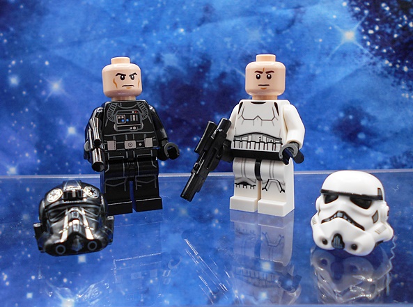
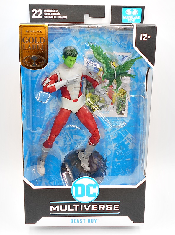
I’ll confess, I don’t really understand McFarlane’s Page Punchers line, other than they’re figures bundled with comics. I guess they even come in different scales now. Even weirder is that they have DC Direct on the packaging, which really brings me back to the old days of DC figure collecting. Regardless, the Page Punchers that I’ve been picking up are the ones that are scaled with the DC Multiverse series, and today we’re checking out two infamous scourges of Atlantis: Ocean Master and Black Manta!

The figures come in packages with huge windows! Take that Hasbro!!! You get the figure and accessories on a clear tray set in front of a copy of an Aquaman comic, each with cover art of the respective figure. It looks great and it’s collector friendly, and hey… free comic! Yes, it’s the same comic with different covers, and it appears to be made exclusively for these figure releases. It’s got some solid art and recounts a showdown between Black Manta and Aquaman. You also get the standard black disk stand and collector cards that come with the DC Multiverse figures. Ocean Master just gets a quick cameo in the comic, but let’s start with his figure anyway!

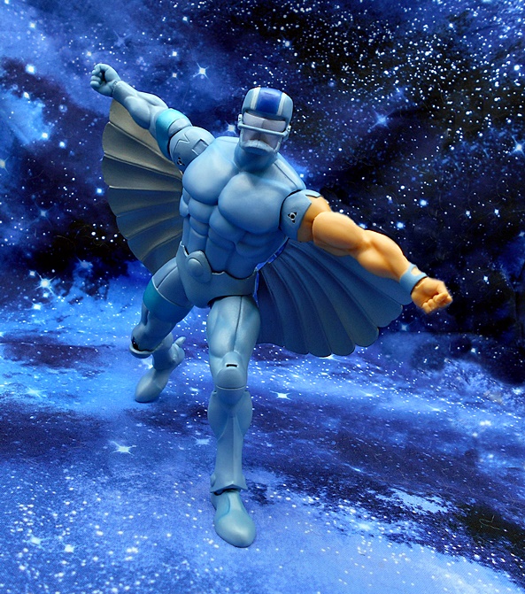
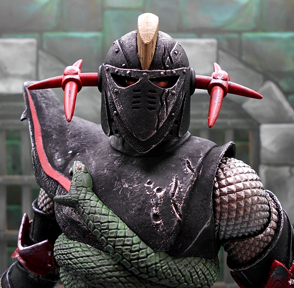
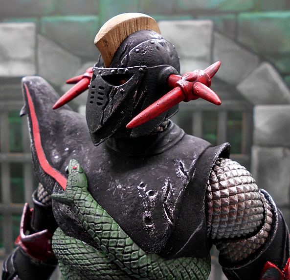
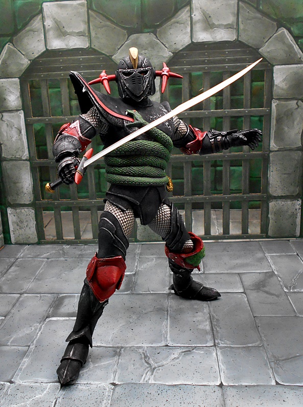
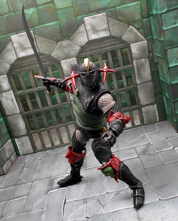
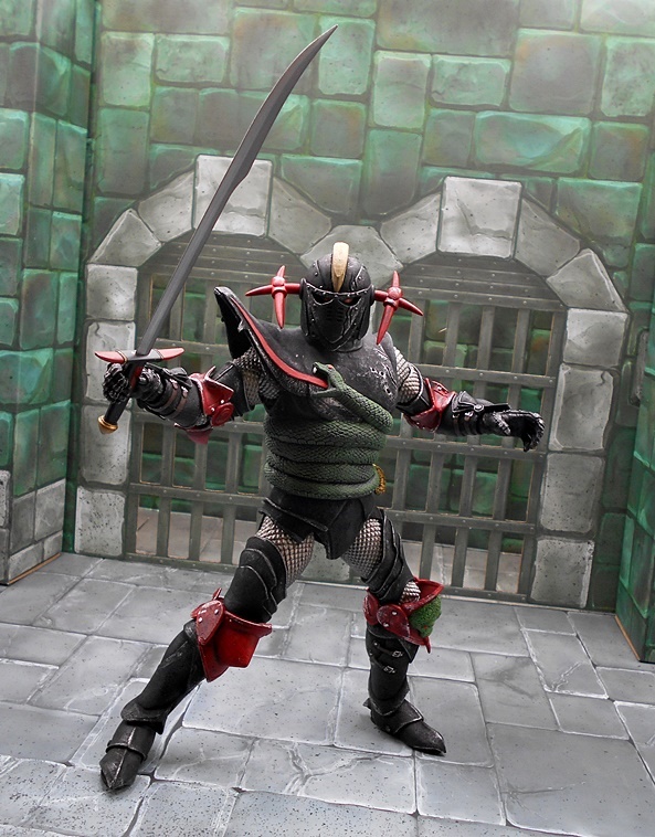
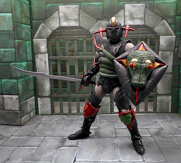
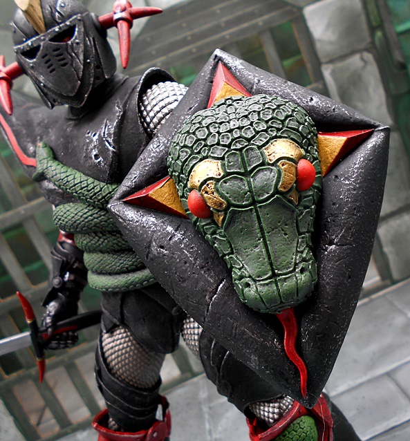
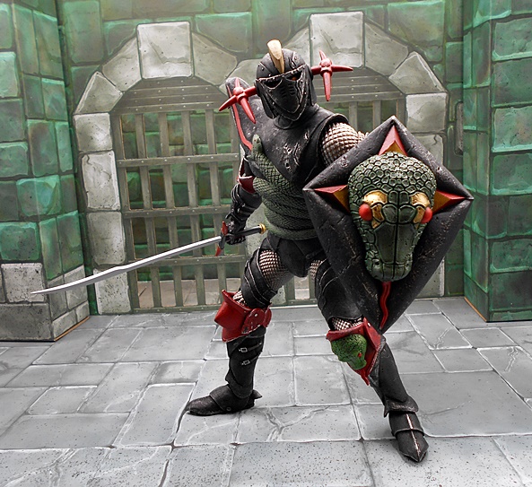
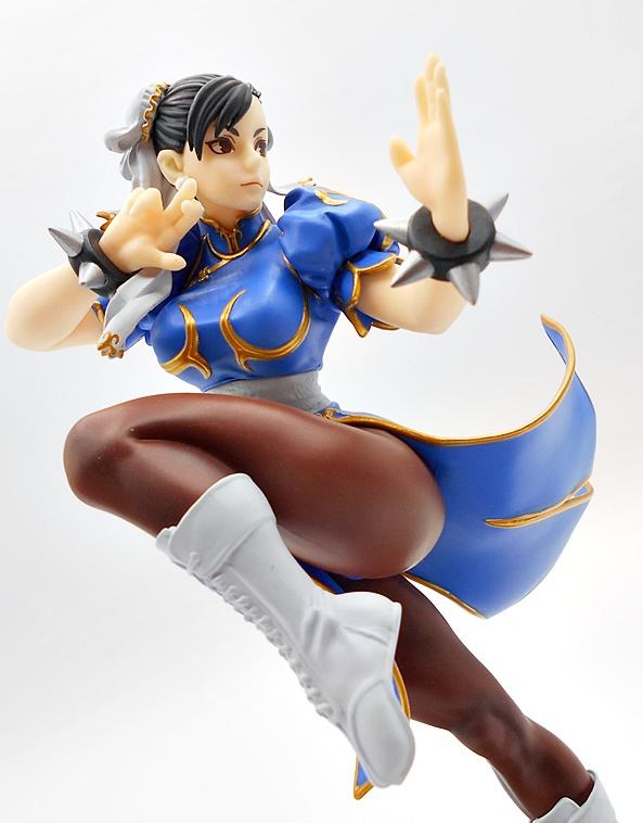
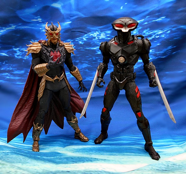
Damn, I really love this design for him and the sculpt is outstanding! The costume retains many of the broad strokes of his classic costume, but with a healthy slathering of gritty realism. Orm’s outfit consists of a black body suit with several different types of texture. There’s a cracked surface from the waist down, a finer chain mail texture for the arms and abs, and a jagged shell-like armor for the upper torso. The boots, arm bracers, shoulders, and belt are all finished off in an antiqued gold paint that looks very nice, and you get more of that jagged shell-like motif on these pieces, especially the shoulders. Finally, there’s a red crest on his chest, which matches his cape. I really like the sculpt of the cape with the finer rumples up near the top, where it’s bunched up and it slowly fans out around his feet to a jagged bottom edge.

The mask also borrows from the classic look, but dialed all the way up to nightmare. There is something that is so damn creepy about this head sculpt, and boy do I dig it! The gold mask has horns pointing up and down, a flat triangular piece over the nose, and fins fanning out over the ears. He’s got a super creepy fishy upper lip and the two bulbous red eyes just stare straight into my soul. This is top notch stuff!

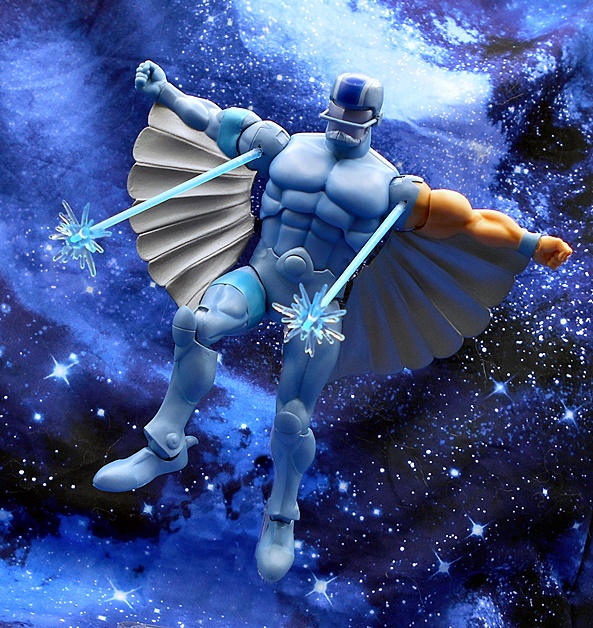
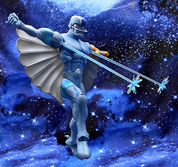
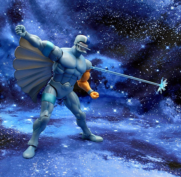
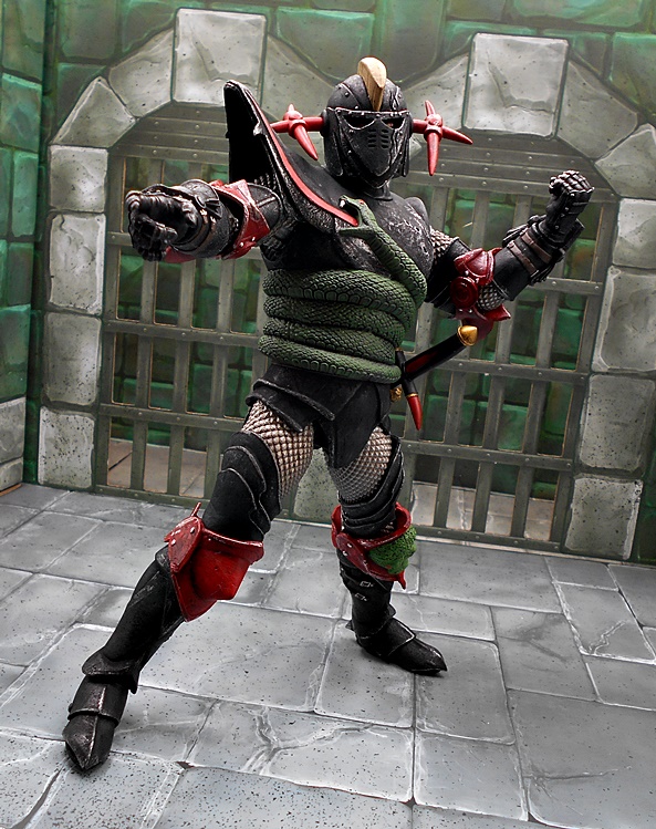
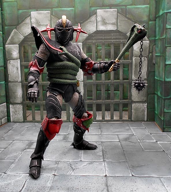
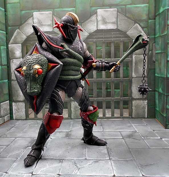
In addition to the standard DC Multiverse articulation, Ocean Master sports an extra set of hands, which is pretty unusual for McFarlane’s DC releases. These include a set of relaxed graspy hands and a set of hands to hold his trident.

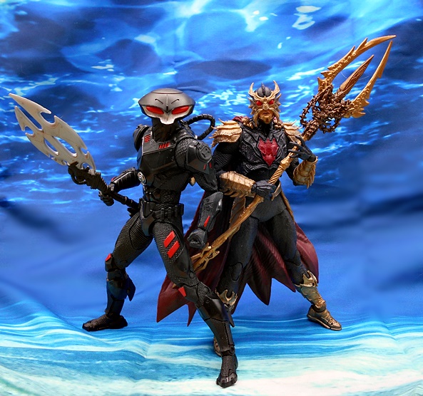
And the trident is indeed a very cool accessory. It’s cast in gold plastic and has some wonderful sculpted detail all over, including what looks like some old chain wrapped around the base of the forks. The plastic is a bit bendy, but it’s not too bad. This is an absolutely fantastic take on the character and a beautifully executed figure. I genuinely love every single thing about it, and it’s hard to believe this is the first time the character has made an appearance here on FFZ since the Matty Signature Series figure ten years ago! So, let’s slide on over to Black Manta! This dude has always been a favorite of mine since the Super Friends cartoon and yet I’ve only checked out two of his figures here on FFZ before. The first was part of the DC Universe Classics Undersea Assault set back in 2010. The other was from the DC Collectibles Super-Villains wave.

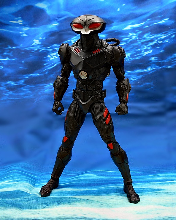
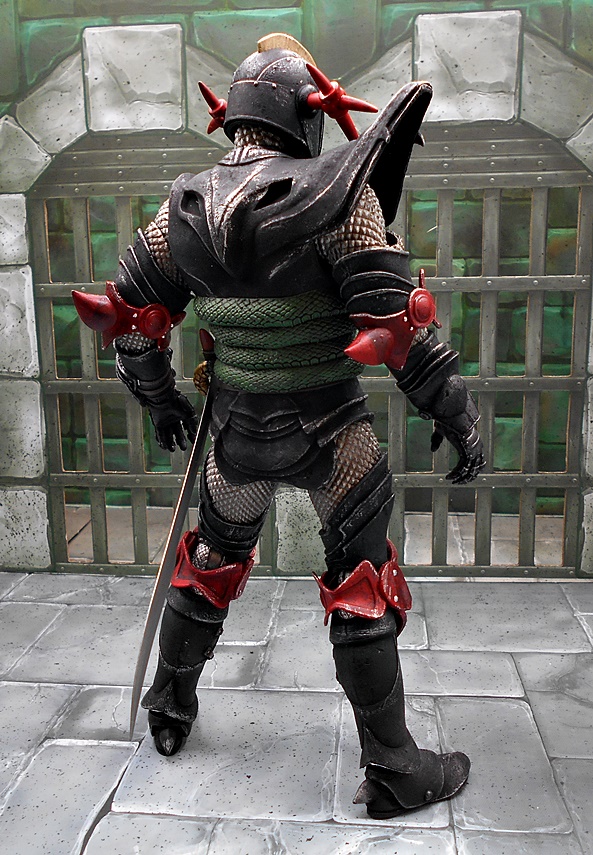
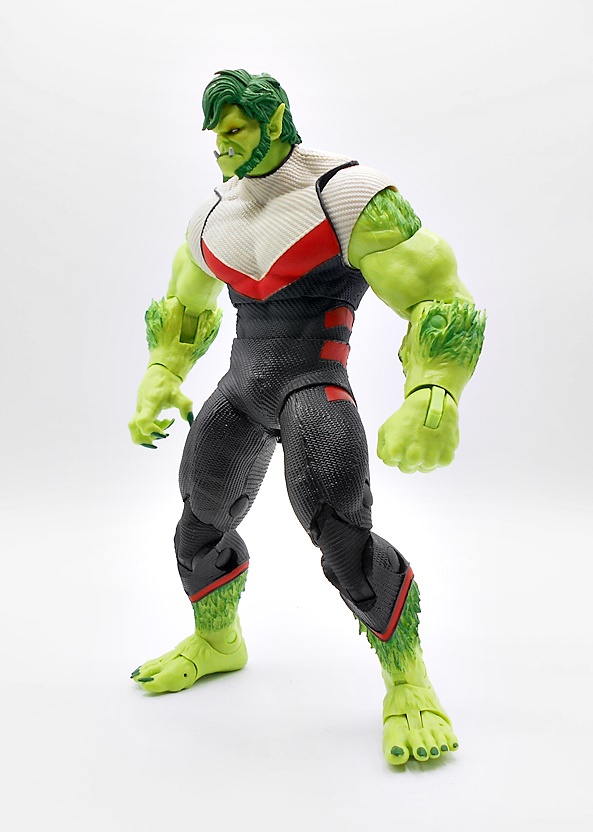
And hot damn is he looking good! Like Ocean Master, this figure takes a lot of the character’s classic beats and just gives it a kick of modern realism. The proportions of the suit give him a bit of a creepy lanky vibe in the limbs. The bulk of the suit has a chain mail like texture and even some of the sculpted plates have a bit of coarse finish. He’s all black with some red panels here and there and a silver disk in the center of the chest piece to make him pop. On the back he has a rather understated breather unit on his back with the tubes leading into the helmet, and there are two silver exhaust ports. angled downward.

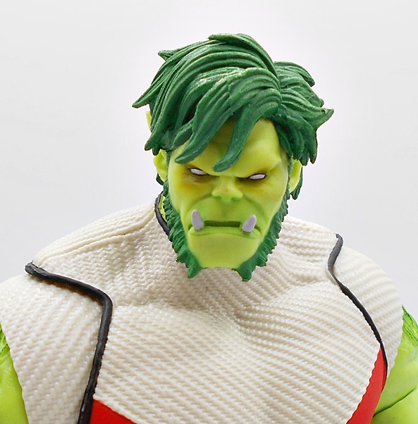
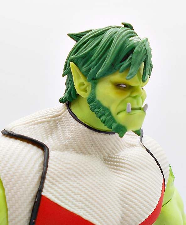
The helmet still has the familiar saucer shape to it from his more classic appearances, with a scooped out silver “face” and two elongated red lenses. It looks great, albeit a lot less exaggerated and bulbous than some of his older designs, and while I do like it a lot, it’s not going to replace the classic look as my favorite anytime soon.

Manta comes with twin blades which can be pegged into his arms to look like they are being retracted and deployed. These attach very securely and he looks all sorts of bad-ass while wielding them.

You also get a bladed pole-arm with some sexy curves in the shaft and in all black with red accents to match the suit. The blade is painted silver with some cut-outs in the blade and a vicious double-pointed tip. Unlike Ocean Master, Manta only comes with one set of hands, so you get a left fist and a right gripping hand for the spear.

It’s safe to say that I am completely blown away by this pair of figures. Not only are they cool modern designs for the characters, but the figures are executed brilliantly. These are some crazy complex sculpts with some lovely detailing and texture work on both. The paint is sharp and clean, and they just look fantastic on the shelf together. The rest of this wave consisted of Aquaman and Aqualad, which I’m waiting to see if I can find at discount. I already have the Endless Winter version as an all around excellent Aquaman for my DC Multiverse shelf, but the Aqualad looks good and is pretty tempting.

Silverhawks Ultimates: Steelwill and Stronghold by Super7

A new wave of Silverhawks Ultimates are on their way to me from the Limbo Galaxy, so I better get cracking on wrapping up my look at the first wave. And yes, technically this is the second wave, with the intended first wave being the one on the way. So far I have checked out Mon-Star and Bluegrass and today I’m having a look at the first of the Steelhart Twins… Steelwill! Strap in fellas, this one is going to be a rollercoaster of a ride!

Here’s Steelwill in his package. Just like Bluegrass, you get a silver foil sleeve that lifts off the top to reveal the window box. The packaging looks outstanding and does a great job displaying the figure and all those goodies packed inside. And now is about as good a time as any to say this is the second time I’m opening this figure because the first one’s right bicep joint snapped. Keep in mind, I already knew this was an issue so I soaked the arm in hot water worked it a bit, rinsed and repeated, working it a bit more and it still eventually snapped anyway. I contacted the retailer and they sent me off another one. I repeated the ritual, but no matter what I did, I was pretty sure it was still going to snap again, so I didn’t risk it. Between the two figures, I’m able to make things work, but it’s still absolutely unacceptable and it makes me fearful of whether the same will be the case with Quicksilver and Steelheart. It wasn’t an issue with Bluegrass, because the bicep has to be swapped out for the wing mode, and Bluegrass doesn’t have wings. Anyway, I’m tossing this out at the beginning of the review, because I’m going to have some nice things to say about this figure, but none of it makes this kind of QC issue OK.

So here’s Steelwill out of the box and I think he looks great! I discussed the paint that Super7 went with when I reviewed Bluegrass, and I’m not going to go through all that again. Suffice it to say, Super7 went for something that looked close to the cartoon appearance as opposed to the super shiny toys, and I think they nailed it perfectly. The blue finish has just a bit of sheen to it and I think it matches the animated model quite well. Keep in mind, I watched the show as a kid, but never had the toys, so this is definitely the style I was looking for. You get plenty of musculature sculpted into the body leaving no question that Steelwill is a powerhouse of a jock. His left arm is still flesh and blood with a nice warm flesh tone painted on, and he’s got metallic blue bands painted on his right bicep and right thigh. I had a few minor blemishes on my Bluegrass figure, but both of the Steelwill figures I wound up with are pretty close to immaculate, save for some paint rubbing around the joints.

You get three different heads to choose from. The first being a fairly serious expression, the second is smiling, and the final is his football-helmet masked mode. The unmasked heads really capture the character and personality very well. The sculpts are solid and the paint is very sharp and crisp. Yes, Bluegrass came with three expressive portraits and you only get two here, but Bluegrass also didn’t have a mask in the cartoon, so here the third head is used for Steelwill’s masked mode.

The masked head is pretty fun, with the face guard bar running across the center of the plate, a thin visor and face plate itself mostly featureless. There’s a wide blue stripe running down the center of the helmet with white trim on either side. I always loved this helmet and Super7 did a nice job recreating it here.

The articulation here holds nothing new. You get all the same points found on Bluegrass. I will say that I dig that the Silverhawks use a ball joint under the chest as opposed to the ab-crunch hinge they went with for the GI JOE line. It doesn’t have as much range, but it looks much cleaner and blends very well with the armor. Apart from the aforementioned bicep snap, the rest of the joints work fine. Even the bicep on my second one will turn about 90-degrees in either direction before offering resistance and I won’t force it. On the downside, because of his pronounced muscles, Steelwill’s elbows can’t quite even manage 90-degrees, and that’s a bit disappointing. You get a total of five pairs of hands, including fists, relaxed, fingers tight together, and some accessory holding hands. OK, Steelwill… LET’S WING IT!!!

The wings come on completely different arms with no articulation in the elbows and the open gun ports on the shoulder piece. The only reason to swap out the shoulder pieces is if you want to give gun ports to the articulated arms with no wings. This gives you the option of having the gun ports open in either mode. It’s a pretty minor concession that caused a big problem, but at least I can appreciate what they were trying to do. Neither of my figures had an issue with sapping out the shoulder piece on the flesh arm, so I’m thinking the problem lies in the blue paint gumming up the works, but who knows? The wings look great and I think they look much better than if they had tried attaching them to the back of the figure. In the cartoon the characters would simply touch their arms to their sides and the wings would emerge as they brought them back up and this replicates that pretty well.

There are translucent blue laser beam effects that plug into the open gun ports on the shoulders and these stay in place very well and look cool. These are the same piece that came with Bluegrass to plug into his guitar. There’s some question over whether the starbursts are supposed to be positioned as the lasers leave the gunports, or if they’re supposed to be impacting on something. Official solicitation photos suggest the latter, but you can really make it work either way.

Steelwill comes with two additional weapons, a big cannon and a comical chattering teeth gun. I’ve been through my DVDs of the whole series again last year, and have been watching some episodes sporadically this year, and I still don’t remember either of these, but I’m sure they’re in the show somewhere. The regular gun is green with a big black barrel and some yellow indicator lights painted on the side. It also has a translucent blast effect that can be plugged into the barrel.

The chattering teeth gun has two sets of teeth: One open and one closed. This bizarre gun is super silly but it’s a really nicely sculpted and painted piece so I’ll allow it. I’ll also have to watch a shit ton of episodes again so I can find it. Maybe I’ll end up giving this one to one of my McFarlane Jokers.

Steelwill’s bird buddy is Stronghold and just like Sideman with Bluegreass, you get two versions of Stronghold: Wings closed and wings spread. These are static pieces, but both them are absolutely fantastic looking birds. I love the sculpt and paint on these, and Stronghold has some nice big talons to grip around Steelwill’s beefy arms.

Steelwill is an absolutely awesome figure held back by those pesky QC issues that are confined to the removable shoulder gimmick. If I had only one break, I would have noted it as unfortunate and moved on, but with the second ready to do the same, it’s clearly something that should have been looked at before sending the figure to production. Even if it meant sending out an extra set of arms so those pieces didn’t need to be swapped. At $55, this isn’t a cheap figure, and for that price I don’t expect these kinds of shenanigans. I’m still very happy with what we got, but I’ll confess to being a more than a little worried with running into similar problems with Steelheart and Quicksilver. Next week, I’ll finish up this wave with Windhammer, and by then the new figures should be here!

Marvel Avengers: Rocket Mech Armor (#76243) by LEGO

Happy Friday, folks! I’m kicking off a three-day weekend today, but I didn’t have a lot of time leading up to it, so today’s review is going to be a bit on the short and sweet side. But, I did have so much fun building and playing around with this tiny LEGO set, that I wanted to share it here, and today seemed like a perfect time!

Yes, this is a small set, weighing in at just under 100 pieces in two tiny bags. That builds the Rocket Mech Suit and includes the Rocket Raccoon Minifig. I normally don’t go after LEGO sets this small, because they’re just a big tease. By the time I start getting into it and enjoying the build, it’s all over. But, this one just caught my eye and I like to fiddle with stuff while I watch TV, so I cracked it open and wound up assembling it in about 15 or 20 minutes. Let’s start with the Minifig!

This Minifig certainly does Rocket proud… mostly. There is something missing and that’s his tail, but as we’ll see in a few seconds, the set makes up for that. The head sculpt is very nice with some excellent printing and his mischievous grin gives him a lot of personality. He’s got some gold printing on his orange jumpsuit showing the front and back of his vest. He also comes with a nice big gun, which is assembled from three different pieces. Very cool stuff!

And then there’s the Mech Suit, which I absolutely adore. The chest hinges down to reveal the cockpit for the Minifig to stand in. It would have been cool to put in some of those control sticks pieces, but you just have to use your imagination that he’s controlling it. The chest hinges closed leaving just Rocket’s head peeking out of the Suit.

The Mech is mostly orange and brown with some black and gray trim. There’s also a printed piece for the chest. And for a simple set, this Mech has some really fun articulation with ball joints at the shoulders, hips, and ankles, and four hinged fingers on the left hand. The suit can also pivot 360-degrees at the waist. The arms and legs are made out of the same solid, bent orange pieces, so there’s no articulation in the elbows or knees, but it still makes for a surprisingly fun figure to play with. And there’s there’s that big tail to compensate for the Minifig’s shortcomings! The tail is all spikey and full of bristles and it makes me grin like an idiot knowing that Rocket intentionally put a racoon tail on his Mech Suit because… why not? I also love the two thrusters on the back with the blue engines, and these can also articulate a bit.

Thanks to the ball joints in the ankles, the Mech has surprisingly good balance and the friction in the ball joints is sufficient to hold the limbs in place and not have it flop over.

Of course, the big attention getter here is the giant 6-stud cannon that he has in place of a right hand, because we all know how much Rocket loves his guns!

And that’s it! This set was an impulse buy at just under $15 and I am so very glad I decided to let it follow me home. Sure, the build wasn’t the most satisfying, as it was practically over before it started, but it was short-lived fun nonetheless. And in this case the finished model is where the fun really kicks in. I’ll likely have this Raging Raccoon Mech Suit on my desk for a long time to give me something to fiddle around with between projects. This one is highly recommended. It also won’t break the bank, which is pretty rare for a good LEGO set these days!

Transformers Legacy Evolution: Scraphook by Hasbro

I have pulled waaay back on collecting Transformers, mainly because Hasbro has been drifting away from the G1 stuff in favor of other eras. And that’s fine! They’ve given me most of what I’ve wanted in terms of G1 remakes, and it’s time to spread some of that love to the collectors who are nostalgic for the Unicron Trilogy stuff. Plus, it saves me money so it’s a Win-Win. But, I do have a backlog of convertorobots that I have not checked out on FFZ, and I’m going to try to give them the spotlight here and there, even if some of them are pretty dated by now. I especially want to get to those Legacy Stunticons! But today I’m keeping it small and simple with a new Deluxe Class Junkion!

The Legacy packaging is kind of a mixed bag to me. It’s a lot more eye catching than some of the previous lines’ packaging, but it starts to melt my retinas if I look at it too long. I also have no idea what this Evolution stuff is all about. We’re still on the windowless packaging, and instead of a fully enclosed box part of the toy is open to the air so kids can put their sticky, disgusting fingers all over the toy before you buy it. I should note that Scraphook is an unusual figure in that he’s somewhat similar to the Weaponizers that we got during the Siege line. He does transform, but he’s also meant to be taken apart and mixed and matched with other toys. That’s probably fun for the kids, but it’s really not my bag. Anyway, let’s start with the alt mode.

Scraphook’s vehicle mode looks like a tow truck from a Mad Max film, and I am totally down with that! He’s got a delightfully drab deco of rust brown and dark gray, with a little orange to spice things up. The windows are all reinforced with armored vents, the front has some vicious looking ramming blades, the engine is exposed through the hood, there are some bitchin exhaust pipes on the back, and he’s got a spiked tire on the back, along with his big tow hook. Everything about this truck is just too cool!

Oddly enough, Scraphook’s alt mode struck me as being really small when I got him, but comparing it to some other Deluxes showed me that it really isn’t the case. I’ll do some comparisons at the end with another Deluxe Autobot tow truck, Hoist. Scraphook doesn’t actually come with any weapons to plug into his vehicle mode, but there are plenty of ports if you want to borrow some guns from another figure. All in all, this is just a great sculpt and a super fun vehicle that’s perfect for a Junkion.

Before transforming Scraphook, you have to strip him of some of his parts, and some more traditional Transformers fans may not be happy about that. But he’s not really a parts-former, because all of the stuff that comes off is just kind of extras. The parts include his two sets of exhaust pipes, his tow hook, his spiked tire, and his engine, which splits into two parts. You can omit all of these pieces and still transform Scraphook into his bot mode, but his robot mode is definitely enhanced by these extra bits.

And here he is all transformed and looking pretty damn good… and small! I may have been mistaken about thinking his alt mode was small, but his robot mode actually is pretty tiny for a Deluxe. Here, I’ve attached his exhaust pipes to his shoulders, put his spiked wheel on his left arm, attached his tow hook to the back, and we’ll get to the engine block pieces in a bit. Now, I really dig this robot mode a lot and just like his alt mode, it makes for a great looking Junkion. The robot mode casts off some of that rust brown and shows a lot more orange, which makes the figure pop a lot more in this mode. My only nitpick of the design is the long flat feet are kind of weird when viewed from the side or back. I do wish these folded up and tabbed into the backs of the lower legs. I think that would have looked a lot better. And keep in mind, there are sockets all over this guy, so what you do with those extra pieces is up to you. This is just my preferred look for him.

Scraphook has some pretty good poseability and thanks to some nice ankle rockers, he can keep those big slabs of feet flat on the ground in wide stances. My figure does have some issues with his elbows, which are simple friction hinges that love to pop off and are extremely loose. I can get his arms to stay bent for a while, but they will eventually flop down if given enough time. I’m not sure if this is a problem with my figure or the design in general, but at $25, it shouldn’t be an issue.

Hasbro went all out on the head sculpt for this guy. He’s got a rounded brown “helmet” with a pronounced mohawk-like crest in the middle I also dig that he’s got a plate bolted over his left eye. Scraphook also has some sculpted facial hair in the form of a mustache and goatee, which became all the rage after Transformers: The Movie. I’ve never been a huge fan of that, but it kind of fits with the Junkions, I guess. The face paint is dark gray instead of the silver we’re used to seeing, which is also pretty fitting for a Junkion. All in all, this portrait has a ton of personality and I love it!

The two pieces of his engine become handguns, which is pretty cool. Or you can socket these on his body in various places. Not bad!

And as I mentioned earlier, Scraphook is designed to come apart at the shoulders and knees. You can use this to mix and match with other compatible figures in either robot or vehicle modes. Like I said, this gimmick isn’t really my bag, but it’s probably fun for the kiddos. The connections stay put pretty well when fiddling with him in alt mode, but they did separate a few times while I was transforming him.

I like Scraphook, but I fall just short of loving him. He gets major points for great looking alt and robot modes, but his robot mode is way too small for a $25 Deluxe. Add to that the issues with the shoulders, and he just feels grossly overpriced. It’s also a shame that he doesn’t display well with the Studio Series Junkions, but having a tow truck about half the size of a motorcycle is a bummer. Yeah, I know. Transformers scaling has always been wonky, and that’s true. These are also from two completely different lines, so there’s no reason they should be able to cohabitate on the shelves, but with a design this cool it would have been nice to see him in that larger scale. Maybe I will pick up Crashbar to at least have another Junkion that scales well with him as a bot. This guy is also being remolded and repainted into what I believe will be the first Decepticon Junkion, so that may be worth a look too!

Dungeons & Dragons: Ultimate Grimsword by NECA

Just to show how behind I am on unfinished business, it’s been over TWO MONTHS since I checked out Warduke, from NECA’s first wave of Ultimate Dungeons & Dragons figures. Poor Grimsword has been waiting all this time to get the spotlight and he’s probably starting to take the snub personally. And seeing as how this is a guy I probably don’t want to piss off, let’s give him his due today…

Like Warduke, Grimsword comes in what appears to be a fully enclosed box, but it’s actually got a front flap that opens to reveal a window to show off the goods. It’s the same thing NECA has been using for their Ultimate figures since the beginning. The artwork on the front is nothing terribly gripping, but it gets the job done. You get a diagonal band at the top left corner pointing out that he is yet another EVIL action figure, so thankfully we’re going to get at least one hero in the next wave.

And here is Grimsword freed from his cardboard tomb and ready to prowl the dungeon looking for Do-Gooders to slay! Grimsword is a brute of figure, being overall bigger and bulkier than even the mighty Warduke. He also looks like some kind of evil golem clad in armor cursed with a snake fetish, and ready to do his evil master’s bidding. But, according to his bio, he’s just another evil warrior looking for trouble. What I love the most about this figure is how NECA managed to take what was a pretty silly looking design and make it both imposing and scary without actually changing any of the design elements of the original LJN figure. And there is indeed so much great stuff here, I don’t know where to begin.

Perhaps the coolest thing here is the weathered finish on the black plate armor. It has a rich and almost chalky look to it that practically radiates evil. Worked into all that black is some silver wear at the edges and overall scuffing that reveals the bare steel underneath it all. The gauntlets have sculpted brown straps with silver painted fixtures, along with rivets and detailed segments in each of the fingers. Similar straps are sculpted onto the greaves. The elbow and knee guards are painted red with silver bolts and his left knee has a green snake’s head. Another green snake motif coils itself around Grimsword’s abdomen, with it’s head reaching up and flicking a red tongue, which becomes a stripe for the flared right shoulder guard. The lower left shoulder is battered with markings from previous battles. The sculpted texture on the snake’s body is simply superb and really transforms what was kind of goofy on the LJN figure into something pretty badass. The armor is finished off with textured silver chainmail exposed on his upper thighs, his shoulders, and more peeking out around his elbow guards.

The head has also been amped up for a more realistic and sinister visage. Grimsword’s head is encased entirely in the same deep dark armor to match his body. There are sculpted bolts and some nasty gashes. The top of the helmet is crested with a mohawk-like comb of tan bristles and red barbed spikes protrude from the sides of the helmet. These can be angled in different ways, but I prefer them pointing forward and slightly down. From inside the deep set eyeholes of the helmet’s mask, you can make out two glowing red eyes.

Grimsword packs the same articulation as Warduke, so I won’t run through it all again here. I will say that as a chonky boi, he’s fun to play with, but the range of motion in his elbows is somewhat hindered by all that armor. He comes with a bevy of hand options, including fists, pointing finger hands, relaxed hands, and several designed to work with his accessories.

As for weapons, Grimsword comes with a scimitar, which can be worn on the golden hook on his left hip, which is a direct callback to the vintage figure. There’s no scabbard for the sword, so it just slides in there, but it stays put pretty well. The grip is simple, with a gold pommel and red crossguards. The silver blade has a sweeping curve, swells a bit toward the point and looks like it would be pretty fierce for slashing at foes. NECA really took some liberties with the simple LJN accessory, and I like it a lot, even if it feels a little too elegant and stylish for this brute.

His other weapon option is definitely a lot better suited to him. His spiked flail continues the running snake theme with the shaft being a hooded cobra and the handle a golden rattle. Yes, he’s mixing his snake metaphors, but I’m not going to be the one to tell him. Like the snake coiling itself around Grimsword’s armor, this flail is a beautifully sculpted piece with the nasty spiked ball hanging from an actual chain. I love it!

And finally, Grimsword comes with his shield, and boy is this a real showpiece of an accessory! It’s a giant snake head in the center of more of that awesome blackened steel. I’d like to think that this is an actual giant snake head taken as a trophy in battle, but that could probably get pretty messy every time he deflects a blow with it. Nonetheless, the sculpting and paint on it are both gorgeous, and once again NECA managed to take a pretty goofy looking aspect of the LJN figure and make it stunningly cool! The reverse of the shield has two arm straps, which secures it well enough without the hand needing to grip anything.

I kind of feel sorry for Grimsword. He is an absolutely fantastic figure, but he had to share a wave with Warduke, and as great as he is, there’s no way he could compete with that Warduke figure. I doubt anyone could. Warduke just has a lot more potential for detail in his design, more accessories, and he remains quite possibly the best figure in this scale that I’ve seen this year from any license or manufacturer. On the other hand, with Grimsword NECA was able to take a design that looked like bad Renaissance Festival cosplay and make it into an absolutely fierce and formidable design. They were practically able to reinvent him without really changing any of his trademark details. Warduke made me feel like NECA presented the best this line could offer right out of the gate, but Grimsword makes me very eager to see what amazing things they can do with some of the other LJN character designs. We’ve got Strongheart and Zarak coming next, and boy do I hope this line keeps going well beyond that!

G. I. JOE Ultimates Cobra Commander by Super7

So many figures and so little time! It’s been over a month since I checked out the first of Super7’s GI JOE Ultimates with Snake Eyes, so I’m long overdue to get back to this assortment. It would be nice to get through it all before the next wave ships. And since we did one of the JOEs last time, we’ll give Cobra turn with The Commander himself!

The packaging is similar in design to what we saw last time, but now the camo pattern is in blue instead of green and we get a big red Cobra emblem printed on the front. You still get a lot of distressed markings to make it look like paint worn off of a steel canister, which is pretty cool. Lift off the sleeve and you get a window box showing you the goods inside. Cobra Commander comes with a lot of goodies, some representing deep cuts into the cartoon. But before we get to those…

Here’s The Commander looking like he just stepped off the Sunbow cartoon series, or at least he’s pretty damn close. I love the color they used for his uniform and it looks great combined with the glossy black used for the boots and gauntlets. Some of the early pictures I saw made the uniform look too dark, but it looks spot-on perfect in hand. He’s got a teal colored shirt peeking out from behind his crossed lapels, a black belt under a gray one, some pouches, and a pair of straps on his left thigh, and some faked-out stirrups for his boots. The Cobra emblem on the left side of his chest should have been bigger to be truly accurate, but it still looks pretty good. Sculpted detail on the figure itself is a bit minimal, but that’s in keeping with the animated look. Some folks have nitpicked the accuracy of this figure to death, but I think he looks iconic as hell and I’m very pleased.

There are two heads to choose from, and no, one of them is not a hood. They are both the same combo of silver face plate and helmet, with the big difference being the silver stripe on the top, which is seen in the cartoon. This is also the helmet I’ll be displaying him with all the time and in all of the pictures of this review. Seriously, the other head just feels like a waste of plastic to me. The silver paint for the face plate looks good, and while certainly not offering a mirror polish, it’s plenty shiny!

The articulation holds no surprises. It is what it is for the Ultimates line, which means a lot of rotating hinges in all the right places, but not as much range of motion in some of those as I would have liked. What we get makes for a cleaner look for the figure, but it sure would have been nice to get better than 90-degrees in those elbows and swivels in those thighs. I’m not a huge fan of the use of an ab-crunch instead of a ball joint, as it looks a bit unsightly on a simple animated design like this. It didn’t bother me so much on Snake Eyes, but it was partially obscured by his shoulder straps. As is the case with most Super7 Ultimates figures, Cobra Commander comes with a ton of hands. There are fists, relaxed hands, pointing hands, and a bunch of hands designed to work with the accessories. So let’s check out all those goodies!

First off, you get this softgoods cape and some regal ceremonial trappings. The cape is very nicely tailored and includes wire running through the bottom edge and around the neck and shoulders. The neck wire is the only thing that holds it on the figure, and it does a surprisingly good job at that. The color does look more pink than red to me, which is a little odd. Also, the one I remember him wearing the most had a black outside and a red liner, but he was depicted wearing one like this as well. Either way, it’s pretty cool, and I’ll likely switch off displaying him with and without it.

You get a golden cobra-headed scepter for The Commander to parade around with, as well as a globe with a snake surrounding it. This last piece is from one of the cartoon intros, I believe, and I suppose it’s kind of like Cobra’s version of the globus cruciger that used to be held by Kings or Popes in the old days. It’s very regal and imperial looking, while obviously representing Cobra’s desire to control the world. Sure, the globe is kind of silly, but I just adore all the work that Super7 put into it. The paint and sculpt are both excellent and even the continents on the globe are sculpted rather than just painted on. You get a right hand designed expressly for holding the scepter nice and tight and a left hand with a peg to attach the serpent and globe. Both of these pieces look really good with the cape.

Moving on to guns! Cobra Commander comes with two pistols and a rifle. The rifle is from the second cartoon intro where Cobra Commander is about to use it to take out Lady Jaye. Take out as in Bang Bang, not you wanna catch dinner and a movie. It’s a really cool nod to that sequence and the gun has a great, simple animated look to it.

Next is this simple pistol with a very sci-fi-ish design. Honestly, I’m not a fan of this one at all. The big bubble between the receiver and the barrel is weird and it’s kind of just too out there for me. I’m not sure if this was a design used in the cartoon or not, but I don’t remember it. It’s certainly not as distinctive as the hair-dryer gun that came with the original Real American Hero figure.

The second pistol offering is awesome. The design is more compact and credible and you get a raised Cobra insignia on it as well as a ribbed pistol grip that looks like a snake’s belly. The red paint hits look nice, and I will likely display The Commander wielding this gun most of the time. And that’s all the weapons… now for some assorted gadgets!

These spiffy, high tech binoculars sport a soft rubber neck strap and of course they’re branded with an embossed Cobra logo. I think this works well with the pointy finger hand, like he’s spotted the JOEs with the binoculars and now he’s barking orders at his troops to go get them. I’m sure these were featured in at least one episode of the cartoon, but I couldn’t tell you which one.

And now we start getting into the real deep cuts. The Neutralizer was a Synthoid Control Box, which is hilariously simple for what it does. It just has a single sliding level with an array of color coded settings. Actually, the only thing I remember this device doing was melting them into goo. This is peak Sunbow gizmo design and I love it!

The next device was called Hi-Freq and it comes from the episode Cobra’s Creatures and it allowed Cobra to take control of animals, including some of the JOE team’s pets. This is another wonderful piece of Sunbow tech which included a massive computer with an unintentionally comical keyboard of animal pictures, which was used to set the device to that particular animal. The accessory has some great detail like the tiny painted gauges and the cheesy dog silhouette on the target screen, which was shown when they used it to control Junkyard. So good!

Finally, you get this… detonator device? Yeah, that’s what I’m going with. I don’t remember which episode this is from, but it looks like it’s designed to blow something up. There’s some very nice detail here including some switches and a tiny Cobra emblem on the screen.

I think Super7 did a beautiful job on this figure! He shares all the usual limitations of the Ultimates articulation design, but it’s safe to say that I’ve been looking for a Sunbow accurate Cobra Commander figure like this ever since I was a kid and I’m just chuffed to finally own one. I’m also really pleased with the accessory selection and how many nods are made to specific episodes of the cartoon. No, most of these won’t be used for display that often, but it’s fun to have the options and to own little versions of some of Cobra’s wacky devices. I do wish they had offered a throne for him like they did with Mon-Star in the Silverhawks line, but who knows? Maybe something like that could be coming later on down the road. Will we get a hooded version? I think it’s unlikely. Hasbro still dictates the licensing terms and I don’t think they’re too keen on doing the hood, or allowing anyone else to either. Now a Battle Armor version? That might fall outside the Sunbow based scope of this line’s intentions, but you never know! Next time I visit with this line, we’ll take a look at Duke!

Star Wars: TIE Fighter (#75300) by LEGO

If you follow me on Twitter, you may have seen me doing a lot of LEGO Rebuilds the past couple of weeks. One of those was the X-Wing (#9493) from around 2013 or so. I was so impressed with this set, even building it the second time, that I hopped online and ordered the TIE Fighter that’s on the shelves now to go with it.

I’ve seen this set in the LEGO aisle countless times and I’ve always passed it up. I think I just had the mindset that it was going to be a boring and largely redundant build. Turns out I was mostly wrong. The set has a total of 432 pieces, which builds the TIE Fighter and three Minifigs. Guess what? We’re going to start with the Minifigs! You probably guessed.

LEGO could have just slapped a TIE Pilot in here and called it a day, but you also get a Stormtrooper and an Imperial Droid called NI-L8. The Stormtrooper is excellent and I dig the TIE Pilot a lot too. My only complaint about him is that the back of the helmet doesn’t cover his entire head, which is really kind of weird. NI-L8 looks like a black version of what I knew as a Death Star Droid when I was growing up.

The Stormtrooper and TIE Pilot each come with blasters and they have printed faces under their removable helmets. The TIE Pilot looks very mean and nasty while the Stormtrooper only looks slightly cross.

Here’s the TIE Fighter all complete and I have to say that this was a pretty interesting build. The first bag of bricks builds the body, which was a lot of fun. The remaining bags build the wing panels, and the design here is cool enough that I did not mind building them twice. The result is a TIE Fighter that resembles the old Kenner toy with the shorter wings. And that’s fine, because growing up playing with that toy it still feels more familiar to me than the taller panel on screen models. I should also note that this set uses ZERO stickers, which really floored me, as even the $150 Raiders of the Lost Ark set used stickers over printed pieces. You not only get printed detail on the top dome and front window, but also the central caps on the wing panels… not bad for a lower price range set.

The wing panel builds are really clever. You build the top and bottom and then mesh them together before adding all the bits for detail and the support struts. The edges are pretty neat too. You build them as hinged strips, clip them in the top and the angle down and clip again at the bottom. The inner panels are largely unfinished, but the outer surface is a nice mixture of studs and smooth panels. I initially thought the panels would be too thick, but they actually look fine as well as being nice and sturdy.

The cockpit opens up at the top and front to give you a great access to the interior. Nah, there’s not a lot going on in there, but plenty of place to sit the figure. I dig how the two red console pieces fold down too. I think my only real gripe about this model is that the top and front hatches don’t actually clip together in any way. They do stay put pretty well, but I would have liked some type of fastener. The wing panels are attached with Technic clips, so if you want to reproduce the ejected wing panels from the old Kenner toy it’s pretty easy to pull them off and stick them back on again.

Finally, you get two translucent green flick-fire missiles that shoot out where the laser cannons should be. They actually look like laser cannons when inserted and if you pull them out a bit they kind of look like lasers being fired, which makes for a cool effect.

I got this set on sale for $35, and I think that was a pretty good deal. It’s a fairly quick build and I was able to do it in about an hour or so. The limited colors in the bricks make it a bit more of a hunt for pieces, especially if you like to open all your bags at once. But I built it bag by bag, so it was no big deal. The ship looks great and Droid and Stormtrooper Minifigs feel like nice bonuses. If LEGO released this set in white, I would probably buy it again. Hell, I’m pretty sure I have all the pieces needed to build it in white, but I don’t like mixing up my sets! There’s a TIE Bomber set floating out there, and I’ll probably pick that up next!

DC Multiverse (Titans): Beast Boys by McFarlane

Today’s review was supposed to go up last Friday, but real life stuff intervened as it sometimes does. So… today, I’m checking out A Tale of Two Beast Boys. The first is the Collect & Build figure from the Titans Wave and the second is the Walmart Exclusive Gold Label release. The parts for the C&B figure were included with Arsenal, Raven, Donna Troy, and Nightwing and since it’s a loose end from my look at that wave, let’s start with him first.

Yup, he’s a big boy! Is this what Beast Boy looks like in the current comics or is this just some jacked up half-beast form? I have no idea. I poked around a bit to try to find out, and I could honestly find nothing that looks like this from the comics, but that’s OK. One of my favorite mantras is that I don’t have to be familiar with the source material to enjoy a figure, and boy do I really like this figure! Many have pointed out the similarities the costume shares with Hulk in the temporal suit from Avengers Endgame, and yeah it’s hard not to see that. The suit does have some fantastic texture to the black and cream-colored portions with some smooth red trim to make it pop. But what I really dig is the coloring of the skin, with some vibrant light green on the smooth bits and some darker green on the sculpted fringe. Sure, it looks a bit more like roided out broccoli than it does beast fur, but I still love it.

There’s plenty to love in this head sculpt too. Once again you get that beautiful light green on the skin, but here you have some really breathtaking gradients of slightly darker green and a bit of red in the cheeks and dark shading around the pupil-less eyes. The sculpted tuft of dark green hair is very nicely done, as is the hairy fringe that extends from his sideburns to around his jawline. The pointed ears look great and he’s got two tusk-like teeth protruding from the bottom jaw. Everything about this portrait is just superb!

Despite being a big chonky C&B figure, Beast Boy sports most of the usual articulation that comes standard with most regular DC Multiverse releases. That includes rotating hinges in the shoulders, bicep swivels, only single hinges in the elbows, and hinged pegs in the wrists. There are rotating hinges up in the hips, double hinges in the knees, rotating hinges int he ankles, and hinges in the feet about halfway to the toes. There’s a ball joint under the chest and another in the neck. He has a pretty good range of motion, with the elbows being the most restrictive and only doing about 90-degrees. Still, he’s loads of fun to play with. His right hand is sculpted into a fist and his left hand is a grasping claw for all your punching and grabbing needs!

I absolutely love everything about this figure. The heft is satisfying, the colors are gorgeous, it sports an amazing portrait, and it just has a wonderful shelf presence. It also ties this wave together really nicely, because they look phenomenal when grouped together on the shelf. But, just in case this Big Beast Boi doesn’t float your boat, The Toddfather gave us another option…

Yup, a lot of folks seemed to be confused and disappointed by the Collect & Build figure’s reveal, so I’m glad I wasn’t alone in not recognizing it. But as if planning the whole thing, McFarlane let fly a few days later with a look at a more familiar and normal sized version of Beast Boy. The only downside? He’s a Gold Label release, and they can be hard to get hold of. I was pretty sure I was never going to find him, but he did turn up online long enough for me to grab him and have the best of both worlds. Just as an aside, I really can’t wrap my head around the whole Gold Label concept. I was fine with them being repaints or maybe even alternate head variants, but to release an entirely unique figure of a popular character like this? That just doesn’t make sense. Anyway… there’s not much to say about the packaging, other than it has the foil Gold Label seal at the upper left corner and you get the usual black figure stand and collector card. Let’s tear in and see what we got!

This more reasonably sized Beast Boy sports a pretty simple outfit that gets by with paint paint and no unique sculpting that I can see. And that’s fine, because it’s meant to be a simpleoutfit. The slightly off-white and crimson pairs really well together and the paint lines here are pretty sharp and clean. The rubber diapers don’t usually bother me much in this line, but here it seems a bit more prominent than usual. Still, it’s not an obstacle to me enjoying the figure. I am happy to see that the pins are all painted correctly.

The head sculpt is also more in line with the Beast Boy I know from the comic panels. The vibrant green skin color looks great and and the hair is sculpted separately from the head to give him a well-defined hairline. You get some razor sharp printing for the eyes and eyebrows, and a slight smile to the mouth. Overall, this portrait has an appropriately clean and youthful appearance that works really well for the character.

There’s nothing new to say about the articulation, and I’ve reviewed enough of these figures to where running through the articulation is starting to get redundant. The joints all feel good, but my figure came out of the tray with a little bit of bowing to the legs, which should straighten out with a little heat. Beast Boy sports a fist on his left hand and what looks like a reaching hand on his right.

You do get one accessory here, and that’s Beast Boy in eagle form. The eagle is cast in translucent green plastic, which has a really rich color. The sculpt here is exceptionally nice and sharp with the individual feathers standing out despite the use of clear plastic. I suppose you could also use this as a Green Lantern construct too!

And while he’s not really part of the Titans wave, I think he fits in pretty well with the rest of the bunch!

I would have been fine with just the C&B Beast Boy on my shelf, but I’m very happy to have picked up the Gold Label release as well. I know that McFarlane tends to just do waves of four for their C&B figures, which is admittedly a lot more manageable than Hasbro’s five or six, but maybe this was a case where they should have included regular Beast Boy and gave him some of the parts. The only thing missing here is Starfire, so I’m not sure if she’s just absent from the current Titans book or if they just didn’t want to do her. The next time I check out one of McFarlane’s Collect & Build Waves, we’ll be building us a Bane from The Dark Knight Trilogy!

Star Trek (The Motion Picture): Admiral James T. Kirk Sixth-Scale Figure by EXO-6

EXO-6 is a company that has been stirring up a lot of noise in the Sixth-Scale figure market, and that’s not an easy thing to do with the Hot Toys and Sideshow juggernauts used to hogging all the attention. They’ve also managed to fill a huge void in the Sixth-Scale marketplace by snapping up the Star Trek license and releasing some pretty impressive figures based on The Next Generation, Voyager, Deep Space Nine, and soon even Enterprise. And now the original crew films with Admiral James T. Kirk himself as he appeared in the original motion picture. It’s a movie that would get overshadowed by it’s sequel, but still one that I will defend until my dying day. To me, Star Trek: The Motion Picture will always ne the most faithful piece of Star Trek ever created. It’s a film about exploration and discovery, and finding one’s place in the vast Universe. In its more than two hour running time, not a single shot is fired in anger. Sure, I love me a good space battle, but that’s never been what Star Trek is supposed to be about. And for you younger fans, you just can’t imagine what it was like to see the upgraded Enterprise and see the crew united for the first time in ten years. So let’s take a look at this figure!

The packaging is pure class! You get a heavy duty shoebox with a trifold top that secures with magnets. The front cover has the iconic rainbow from The Motion Picture’s poster with the original logo, the Enterprise and a picture of the figure’s portrait in the center. There’s a gold foil band across the top with Kirk’s name and a silver foil band across the bottom declaring this a “One Sixth-Scale Museum Grade Collectible Figure” all in the familiar Star Trek font. I also love that the sides of the box are emblazoned with a gold foil Starfleet Museum logo featuring the familiar Delta symbol. Open the box and you get an illustrated insert showing the hatch on The Enterprise where the shuttlepod docks after the inspection. Beneath that, The Admiral is nestled in a black foam tray. The stand requires a little assembly, but otherwise this figure is all set to go.

I have to admit, I was kind of speechless when I got this figure out of the box and in hand. Never in a million years did I ever think that this version of Kirk would get a high end collectible figure treatment, and yet here we are… and it looks quite stunning! I make no bones about the fact that the burgundy uniforms introduced in Wrath of Khan are my favorite uniforms in all of Starfleet history, but with that having been said, I really loved this design as well. It has that clean and minimalist look that gels so perfectly with late 70’s sci-fi. I think this design also bridges the gap beautifully from what we saw in the TV series to what would come in the next film. The Admiral’s tunic is crafted in a nice, heavy material with immaculate stitching along the borders that separate the gray from white. You get golden cuffs on the sleeves signifying rank, very much in line with the original uniforms. There are smart looking epaulets on the shoulders, a metal Delta insignia badge, and the black “belt buckle” device, which was referred to as a bio monitor. The gray trousers are simple and have stirrups that anchor the cuffs to the boots. Sure, Kirk spent the bulk of the film in a more casual short-sleeved shirt, but I sure am glad that this is the look EXO-9 decided to go with.

And then there’s the head sculpt, and oh boy is this an absolute masterpiece in every conceivable way. Not only did they get the likeness to Shatner at this age down beautifully, but they even managed to imbue the portrait with plenty of personality. Kirk offers a slight approving smirk and an overall friendly demeaner. Just the kind of look you flash when you deliver the news that you’re taking over the ship and demoting the Captain to science officer. And then demoting him again when the real science officer shows up! But seriously, I adore everything about this portrait, and I have to say I doubt even the wizards at Hot Toys could have done any better. Either way, I couldn’t be happier with it.

So what’s the downside to this beautiful figure? It comes with absolutely zero accessories. You do get two pairs of hands: Relaxed and fists, but nothing else. Now, granted, the usual gear doesn’t really apply here. It doesn’t make much sense to give him a phaser or a tricorder. But the one big oversight is his lack of a communicator. The Motion Picture used a one-off communicator design that the crew wore on their wrists like a watch and it seems like that accessory should have been a no-brainer. If for no other reason than to at least give him something!

EXO-9 sort of makes up for that with the figure stand. It’s a pretty standard base and post affair, with a wire crotch cradle to support the figure and hexagonal base. The base has a clear acrylic top and a design meant to resemble a transporter pad. The really nic ebonus here is a 1:1 scale replica of the Delta insignia worn in the movie. This piece is designed to be buttoned onto a shirt, but the base also comes with a foam cut out so that the insignia can be pinned to it and I think it looks fantastic.

Admiral Kirk retailed for $175, which is a pretty reasonable price for a licensed Sixth-Scale figure of this quality. Even Sideshow and Big Chief have been topping the $200 mark most of the time these days. Sure, you can argue that value is lost in the lack of accessories, but with how amazing this figure looks, I got over that pretty quickly. It also warmed my heart to see the reception for this figure. The Motion Picture is not nearly as well remembered these days as I think it deserves, and yet this figure quickly sold through pre-orders at just about every retailer I saw. By the time it started shipping, the only options to purchase seemed to be through Ebay. At present, EXO-9 is only planning to do one more figure from The Motion Picture, and that’s Spock in his Kolinahr Robes, and that one also looks to have sold through the pre-orders! In a couple weeks, I’ll revisit with EXO-9’s Star Trek line with a look at another of Starfleet’s truly finest… Captain Benjamin Sisko!


Popup Parade (Street Fighter) Chun-Li and Cammy by Max Factory

It’s been a while since I hung up my hat on collecting prize figures. I don’t really watch a lot of anime anymore and I had to start trimming out some areas to keep my collection from getting even more out of hand. With that having been said, the not-so-local comic shop did a “buy one and get one at half-off” deal on their Pop-Up Parade figures, and much to my surprise it included some new releases, so I fell off the wagon. Today I’m going to check out a couple of ladies from Street Fighter, Chun-Li and Cammy.

I think Popup Parade is meant to bridge the gap between prize figures and scaled figures, at least in terms of quality. But despite the high pedigree of Max Factory, to me these will always just be middle of the road prize figures. I owned Kotobukiya’s Bishoujo versions of both Cammy and Chun-Li, but the last time I moved, I was keen on culling a lot of my collection and I wound up selling off my entire Koto Street Fighter Collection. I can’t say as I regret it, as I got decent money for them, but when I saw these I decided I wanted some of these gals on a shelf in my Game Cave again, so here we are! The figures are roughly 7-inch scale and come in plastic packaging that really lets the figures do all the talking. There’s absolutely no character art anywhere to be found and even the character names are pretty low key. The figures display really well in their packages, although Cammy comes with her braids detached. Let’s start with her!

Sure, I love playing Cammy in the Street Fighter series, but she’s also star of one of my all-time favorite Dreamcast games, Cannon Spike, so not having her represented in my collection was criminal. The pose they chose for her here is pretty subdued, but I think it captures some of her best um, assets. The statue is best displayed with her body facing about two o’clock, her head partially turned and gazing over her right shoulder, and those ass cheeks on full display. It’s good to see her in her OG Street Fighter II costume, sans camo on the legs and with the additional tactical web gear and a leg pouch.

The colors on this piece look great, with bright matte green for her one-piece, glossy red for her gauntlets and matte black for her kicks and gear. You can even see a bit of her red socks peeping out the tops of her boots and a touch of silver paint on the buckle for her cross-strap. The skin tone is where a lot of these prize figures tend to falter, with it being waxy, but it’s nice and smooth here and not bad at all. The base is a simple black disk, which the foot pegs insert into.

The portrait is excellent, looking like it’s been grabbed straight from a character select screen. The eyes are printed perfectly and the I particularly love the way they blended the hair sculpt with the rest of the head. She has a scar on her left cheek and her long braids snake down past each of her shoulders. Her beret is a separate sculpt and worn on top of the head.

I love pretty much everything here. The sculpt is solid and the colors are beautiful. The paint lines could have been a little sharper, especially around the edges of the fingerless gloves, but overall I’m pretty happy with the way this one came out. Let’s move on to Chun-Li!

Chun-Li has a much more kinetic pose with her left leg drawn up and her hands at the ready, she’s definitely preparing to go a round or two. This figure sports a far more complex sculpt than Cammy, but that’s down to the costume design. There’s just a lot more going on here, which gave the sculptors a lot more to work with, and I think they did a beautiful job! I particularly love the way the tail end of her qipao kicks up in the wind. Some of the fringe on her dress is sculpted and while the sculpt on her boots is a little soft, it’s still got a lot of detail. You also get some nice muscle work, particularly in her famous thighs. I also really dig the sculpt on her poufed out shoulders.

Once again, the coloring here his superb. The electric blue of her qipao contrasts nicely with the gold leaf paint on the trim. There’s some shading in her stockings and some sharp silver paint on her spiked wrist cuffs. As for the quality, most of the paint here is sharp and clean, so I’ve got no complaints.

As with Cammy, the portrait here is very well done, and quite complex when you include the hair and the hair ties. The eyes are printed perfectly and she has an ever so slight smirk to her simple line of a mouth. She even has a pair of pearl earrings.

Chun-Li is easily the more interesting figure to look at, just because there’s more to take in, and as such it feels like maybe you’re getting a little more bang for your buck here. A such, I think she edges out Cammy as my favorite of the two, which surprised even me, because I tend to like Cammy more overall.

The figures retail at about $35, which puts them at the upper range of most prize figures. The quality is certainly there, so long as you aren’t expecting anything approaching a proper scaled figure. However, I think there are definitely better values out there when it comes to these types of figures, and I’d argue that companies like Banpresto are delivering a bit more for the money. I’m reminded of some of their recent One Piece figures that are slightly bigger have possibly more complex sculpts, and retail for about $10 less. Still, if you want a nice version of Cammy or Chun-Li for your shelf, these will certainly fit the bill nicely.