ReAction Horror Series: Freddy Kreuger, Michael Meyers, and Jason Voorhees by Funko

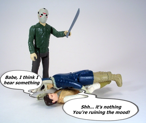
Happy Halloween, Toyhounds!

For someone who absolutely loves horror films, it’s odd that I own precious few horror based toys and action figures. I’m not entirely sure why that is, but in the past it’s prevented me from doing much in the way of Halloween themed features. This year, however, I’m ready with a trio of retro-style figures based on my three favorite 80’s Slashers: Jason Vorhees, Freddy Krueger, and Michael Meyers. As sick as it may sound, I practically grew up with these guys. My parents were pretty cool about letting me watch horror films and by the time I was in my teens I had a nice collection of VHS horror flicks recorded off of Cinemax, HBO, or Showtime. My bread and butter were the films starring these three slashers. There are installments of Friday the 13th and Nightmare on Elm Street that I know my heart, and the same could be said for the first three Halloween films. I know, Meyers wasn’t in Season of the Witch, but I still really dig that flick!

slashers4

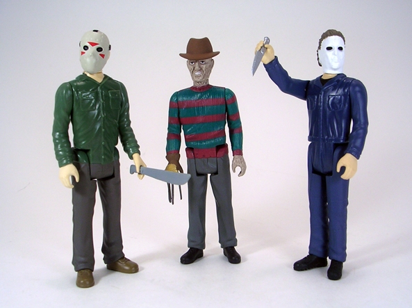
And there they are as part of the ReAction Horror Series. Back in the day, Kenner planned on releasing a line of 3 3/4” figures based on the film, Alien, but they were never released. Was it because the larger alien figure didn’t sell well? Or did they come to their senses and realize that it wasn’t a movie suitable for children’s toys? Either way, the molds were eventually obtained by Super7 and released as a retro-styled “ReAction” line. The Alien figures were well received by collectors and now Funko is trying to ride that gravy train by releasing all sorts of licensed figures under the “ReAction” line. I’ve already looked at their Rockeer figure and have since stayed away. But when confronted with the three most notorious slashers from the 80’s, I couldn’t resist. Let’s start with Freddy Kreuger…

slashers3

I like the artwork they went with for Freddy Kreuger. It’s a really nice promo shot with him clutching his left shoulder with his gloved hand. I don’t think they could have picked a better picture and the movie logo sure looks great on a vintage style card. Freddy comes in his bubble with his fedora trapped off to the side in a little bubble compartment to keep it from rattling around. My only complaint here is that the card arrived creased, but then if it hadn’t, I might have opted to keep all three of these sealed.

slashers5

slashers6

slashers8

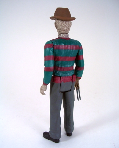
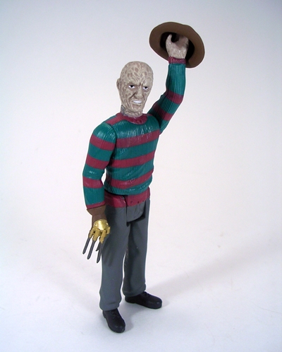
Yup, if Kenner produced a Freddy figure way back in 1984, I have to imagine that this is a pretty good representation of what it would look like. The figure hits all the right points from the slightly oversized head to the rigid 5-POA body. Yes, all three of these figures feature the same vintage style articulation. For a quick scale comparison, I included a shot of him terrorizing Kenner’s own Princess Leia in Hoth Outfit. Freddy’s a tiny bit taller than Leia, but then he was never a big guy so it seems about right.

slashers7

slashers9

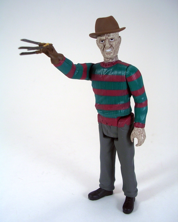
If anything this mock up of Retro Freddy might look a little too good. The detail work on the face and glove are actually quite impressive for a figure of this type and the fact that the fedora is removable is a cool bonus, but if you ask Kenner Indiana Jones, he’d tell you that’s a feature that probably wouldn’t have made the cut back in the early 80’s. The pants and shoes are pretty basic stuff, but the sculpted texture on the sweater is nicely done and you even get some ragged areas along the waist. The paintwork is excellent, with clean lines on the red and green sweater stripes and you get some nice coppery paint on his glove. Speaking of which, the glove blades are soft plastic so I don’t have to worry about them snapping off like they did on my 3 3/4” Freddy figure from Mezco’s “Cinema of Fear” line. All in all, I label this figure as a win.

slashers2

Next up is Michael Meyers and once again I think Funko did a great job choosing the still shot for the card art. You get Michael with his masked face, half in the shadow, and his butcher knife on full display. Halloween didn’t really have a very notable logo, so I don’t get the same sense of awe about seeing the title on the card here, but all in all I think this is a solid presentation. My figure has his head turned to the side but I’m not sure if they’re all packaged like that or not. He seems to have plenty of clearance in the bubble so I don’t see any reason for it. Also worth noting, while his butcher knife was taped to the side of the bubble, mine is rattling around loose inside. That was *excuse* reason enough for me to consider this an inferior packaged example and rip this guy open too.

slashers10

slashers11

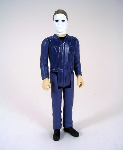
Michael is a much simpler figure than Freddy, but I still think they nailed the character perfectly in this style. The head is still a bit oversized but the sculpting on the mask is almost too good for a retro-style figure like this. From the soulless black eyes to the expressionless white plastic, I would have absolutely no problem identifying who this was supposed to be, even if someone handed me just the head.

slashers12

slashers13

slashers14

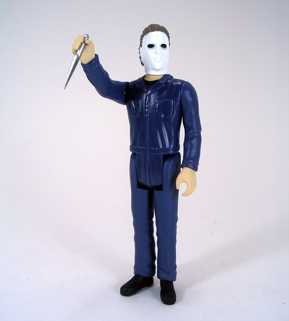
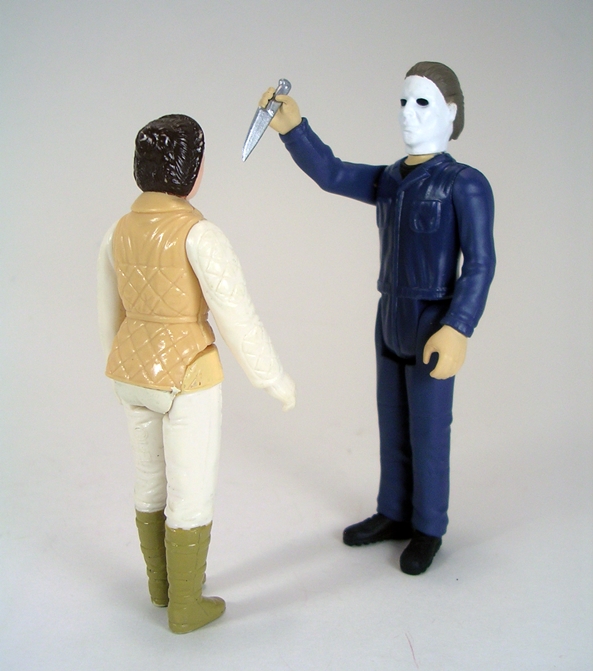
The body consists of just a blue jumpsuit with sculpted pockets on the chest, a cinched waist, a little wrinkling and not much else to speak of. The shoes do have sculpted laces and treads on the bottom. Like I said, it’s not as dynamic as Freddy, but it fits the character perfectly. You also get the tiny butcher knife, which Michael can hold perfectly in his right hand. What’s more, Michael is taller than Freddy and big enough to menace Kenner Leia. Ok, Funko… you’re two for two on these. Can you pull of a Triple Play? Let’s check in with Camp Crystal Lake’s favorite son and see…

slashers1

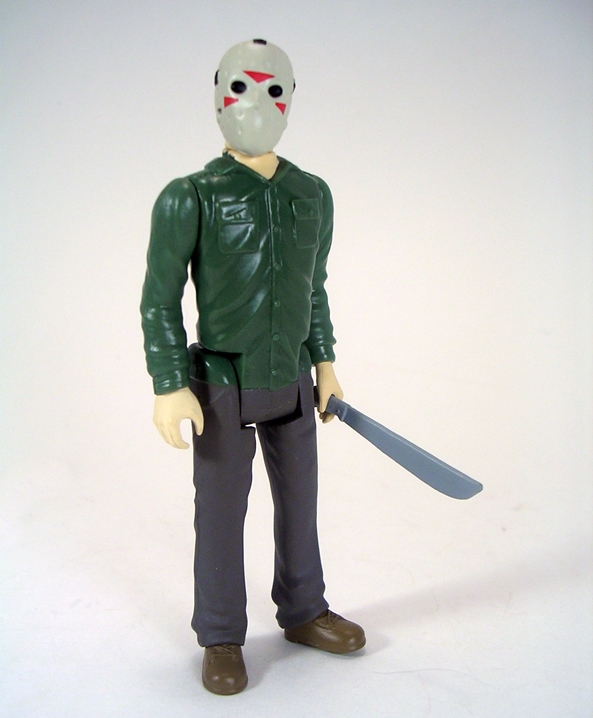
Yes, last but not least is Jason Vorhees and the card for this one is a total winner. While Freddy has more personality, Jason and I have been late night buds for a lot longer. He got me through many nights of insomnia and the two of us have a special bond. The still shot of Jason and the familiar logo both look amazing on the card, even if it isn’t the look that the figure is based on. I’m pretty sure that shot of Jason is from Part VI: Jason Lives as the mask is lacking the chevrons on the cheeks, which are clearly depicted on the figure. I’ll be honest, the condition of the card on this one is perfect and Jason’s machete is still taped to the bubble. I really don’t want to open him, but since I opened the other two… it’s slashing time! Chh chh chh chh, Ha ha ha ha!

slashers15

slashers16

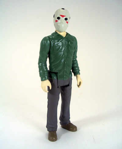
Like Michael Meyers, Jason is a pretty simple figure, but still manages to capture every thing there is about the character. In fact, he’s easily identifiable as from Part 3 because of his outfit and the aforementioned chevron marks on the mask’s cheeks. You get a green shirt with two sculpted pockets, gray trousers, and brown hiking boots. The mask has sculpted and painted straps permanently holding it onto the figure’s little bald and bulbous noggin. Adorable! Jason also clocks in at about the same height as Michael. Mr. Voorhees comes with his trusty machete, which he can hold loosely in his right hand and far more securely in his left.

slashers17

slashers18

slashers19

slasher20

I wasn’t overly impressed by the ReAction Rocketeer figure, but this trio of retro slashers has comfortably redeemed Funko’s efforts in my eyes. Don’t get me wrong, I think a lot of these ReAction figures look just plain awful, but these three figures are just plain awesome. For the most part they succeed in exactly what they intended to do: recreate hypothetical figures of serial killer maniacs for a parallel world where such things would be sold to kids. Hey, I had a poster of Freddy Krueger hanging on my wall, so there’s no question I would have bought this figure if it was available. At $10 a pop, I’m very happy I picked these up and they’ve actually given me the confidence I needed to try out some of their Universal Monsters. Hell, I may even try to get another set of these three to keep carded and hang on the wall.

Transformers Generations: Dreadwing (IDW Comic Pack) by Hasbro

Yes, it is indeed Transformers Thursday again and today I’m checking out the last figure I have from the Skids/Goldfire/Waspinator/Dreadwing wave. Dreadwing is a repaint of Stealth Bomber Megatron from what I believe was the last wave of comic packs. It’s a figure that I thought was pretty neat, but I was never sold on it as being Megatron. Nope, not even after having read the comic. If you want to start out in the proper context you can find that review HERE. And, holy shit, has it really been over a year since that figure came out??? Where does the time go? Anyway, I’m hoping that a new name, a fresh coat of paint, and some tweaks to the mold might make this release go down easier.

tfgdread1

As always the concept behind these IDW Comic Pack’s is a thing of beauty. The figure comes packaged in his robot mode with a G1 inspired card and a reprint comic book serving as the character art. I can sum up this whole idea in one word: Yum! Besides being based off the IDW portrayal of the character, Dreadwing is also an homage to the Generation 2 toy, a tactical bomber bundled with a smaller jet named Smokescreen. I never did own that G2 toy, but at one point I owned the sexy black Japanese Beast Wars repaint of BB with Starscream, and I still own the Universe repaint of Dreadwing and Smokejumper, which is a far less interesting deco, but still a wonderful set of toys. Anyway, let’s kick things off with Dreadwing’s alt mode.

tfgdread12

tfgdread14

tfgdread13

This stealth bomber alt mode looked good great before and still looks great here. If it’s your first time with the mold, you may find that getting all the panels to line up properly can be a bit of a chore as some of the tabs are prone to popping out unless you have everything positioned absolutely perfectly. Yes, there are a lot of seams running through the aircraft’s hull, but I find that it works well as panel lining and isn’t as terribly unsightly as it would be if it were on a car alt mode. There’s a tiny flip down landing gear on the front, but the aircraft really doesn’t need it to stand up properly.

tfgdread16

tfgdread15

While I think the black deco on the Megatron looked really good and certainly more appropriate, I can’t help but favor the purple and silver of this G2-inspired deco. It’s actually not as garish as some of the G2 decos, for that was a time when I’m convinced Hasbro design teams were getting high by huffing the fumes of neon highlighter markers. The deco is further enhanced by the bright red paint on the windows and the awesome G2-style Decepticon insignia neatly printed on either side of the cockpit area. Even the tips of the wings, where the translucent red plastic shows through the cracks, looks cool to me. It’s like this guy is pulsating with Energon.

tfgdread17

tfgdread3

I find transforming this mold to be a fidgety affair, thanks mostly to the flipping involved with the torso hings, but he’s much easier going into robot mode than the other way around. Parts-former alert! You do have to detach his wing tips, as they become the two halves of his arm cannon. His robot mode features a wide upper body with really broad shoulders and not much of a waist. Nonetheless, I think he looks great as long as he’s posed with a wide stance. I really dig the jet intakes on his shoulders and the way the cockpit splits to form his torso. Hasbro also graced this guy with a brand new head sculpt that is a perfect love letter to the original G2 toy. The high gloss paint on his new noggin looks great, I only wish that plate behind his head didn’t inhibit the light piping for his red visor. I did manage to get it to pop in few photos, but it wasn’t as easy as it could have been. Oh well, it’s still a fabulous portrait.

tfgdread5

In robot mode, Dreadwing’s deco pays an even stronger homage to the G2 toy’s coloring. You get the same purple, silver, and red only now with an extra dose of mint blue-green in the limbs. The crazy decos of the 90’s are usually love it or hate it affairs. Personally, I have a lot of fondness for the Transformers decos, but not so much when they applied this sort of thing to the GI Joe line. Either way, I think this figure’s colors are gorgeous.

tfgdread4

Dreadwing features some great articulation. The shoulders are ball jointed, the elbows are hinged, and he has swivels in the biceps. His legs are ball jointed at the hips, hinged at the knees, and have swivels in the thighs. He also has a ball joint in the neck. The only thing I find conspicuously absent is a swivel at the waist. I should also note that the joints on my figure are unusually tight, which makes for a pleasant surprise.

tfgdread10

tfgdread8

tfgdread7

I’m still on the fence over this mold’s arm cannon. Sometimes I dig it a lot and sometimes I think it looks like a forced use of kibble and takes away from the symmetry of the figure. I will say that I like it better on this figure because it isn’t trying to be a misguided homage to Megatron’s fusion cannon. In the end, I wish there was a way you could peg the two halves on his back just to get it out of the way when not using it as a cannon. Nonetheless, I will likely end up displaying the figure with the arm cannon attached.

tfgdread6

tfgdread11

If I were buying these IDW Comic Packs individually, instead of as entire waves, I certainly would have been happy to pass on the Megatron in favor of Dreadwing. I think it’s a great mold and while I think both figures look good, I’m much happier seeing this figure characterized as Dreadwing rather than Megatron. But hey, that’s just me. I don’t think you can really go wrong picking up either version and I’m certainly not sorry about having the Megatron in my collection.

tfgdread18


And that wraps up what has been a pretty solid wave of Deluxes with two great original figures (Waspinator and Skids), a damn fine repaint (Dreadwing) and a mediocre repaint (Goldfire) that at least improved on the original release. On a side note, I am once again fresh out of new Transformers and you know what that means? Yup, next week I’ll be digging my sweaty mitts into a storage tote and feeling around for an older figure to review. Actually, it might not be random this time, as I’m thinking of sending another box of Transformers to my nephew so I may dig out some figures that I’m read to let go and give them a proper send off on FFZ before I pack them up. But fear not, I should have the current wave of IDW Deluxes in a couple of weeks, along with MP-14 Red Alert, so the interlude shouldn’t last too long.


Star Wars Black: Deluxe Jabba the Hutt by Hasbro

I finally got the most recent wave of Hasbro’s 6-inch Star Wars Black figures, but before I can dig into it, I have some unfinished business with the assortment case of the line’s first Deluxe Wave, which consisted of two Biker Scouts and one Jabba the Hutt. I bought the case because I really wanted a couple of Biker Scouts and I thought they were going to be as tough to get at reasonable prices as the Stormtroopers. Surely people would be troop building these things too, right? The result was sucking down a 6-inch scale Jabba the Hutt figure that I didn’t really want so I could get the two Scouts and Bikes at MSRP. That probably wasn’t such a bright idea, seeing as how the Biker Scout and Speeder Bike are readily available right now on Amazon for $5 under retail and free shipping. Oh well, as they say hindsight is 20-20.

swbjab1

Of course, when I said Jabba was a figure I didn’t really want, I should clarify that I didn’t want the figure in this incomplete form. The bland and boring window box grants a great look at the figure inside and confirmation of what we all already knew… the figure is the only thing inside. Hasbro couldn’t even be bothered to illustrate the cardboard tray with the backdrop of his palace printed on it. Now before you say, “well you should have paid extra to get the SDCC version,” I’ll kindly point out that as far as I’m concerned that one was incomplete too. Sure, it came with the hookah pipe and Salacious Crumb, but as far as I’m concerned this figure never should have been released without a plastic dais. But hey, at this point I’m just stating the obvious and probably preaching to the choir. So let’s open up this box and check out this slimy piece of worm-ridden filth.

swbjab5

swbjab8

I was expecting a giant chew toy and that’s pretty much what the lower half of Jabba’s body is. It’s hollow, static, and if you squeeze it you can hear air escaping from around the neck cut. The figure does, however, have a nice heft to it, most of which comes from the head. In terms of sculpt and paint I will certainly concede that Jabba looks outstanding. The body is literally covered with creases, ridges, suckers, and folds of flesh. The coloring is a mix of green and tan and also looks fantastic. Even the tattoo on his right arm is present, both sculpted and painted onto the figure.

swbjab6

The head looks exceptionally good. A lot of pictures I saw early on showed the mouth more open, we’ll get to that in a sec, but in hand the only issue I have with the likeness is the eyes. The way the eyes of the actual Jabba puppet looked still amazes me every time I watch Jedi and this figure doesn’t convey that at all. I think Jabba’s peepers are begging for a clear coat of glossy paint to bring them to life. But hey, it’s not like this is a $40 premium collector figure… oh wait, yes it is.

swbjab7

But maybe those couple of dabs of paint didn’t cost out in production because Hasbro was too busy pumping a needless play gimmick feature into this thing. When you move the arms up and down at the shoulder the mouth opens and closes. If you go back to my review of the SWB 6-inch scale R2-D2, you’ll find a rant about how I think these play gimmicks have no place in collector line like this one and I’ll echo those sentiments here: I think these play gimmicks have no place in a collector line like this one. There. Yes, I’m actually kind of impressed at the way the soft rubber waddle under his chin moves with the mouth, but this is money that could have been spent on other things, like putting a wire in his tail and making it poseable, or… oh, I don’t know… packing Salacious Crumb and the hookah pipe into the regular retail release. I’ll also point out that while it’s nice they actually sculpted a tongue into his mouth, the lack of any convincing paintwork in the mouth kind of kills the effect for me.

swbjab9

Thankfully Jabba’s arms still have shoulder articulation thanks to some ridiculously loud ratcheting joints. You also get rotating hinges in both the elbows and the wrists. The head also rotates, but the paint pattern is very specific about having Jabba’s head facing in one direction. You can turn it and put him in his “walking” pose from that terrible “Special Edition” added scene, but it looks off because the paint doesn’t match up.

swbjab3

swbjab2

swbjab4

So, I am going to toss Hasbro just a little bit of slack on this set. Now that I have the figure in hand, I get a good sense of just how big the dais would have to be to accommodate him. It would be pretty huge. An even if they made it rotocast, it would add a significant amount of plastic and cost to this set. But even if it doubled the price of the set, I would have been all in for a complete 6-inch scale Jabba at $80 if it was a complete set. Other than whining about what’s not in the box, I’ll say that this is a pretty nice looking figure and as much as I love the Walmart Exclusive 3 3/4” scale Deluxe Jabba set I do believe that Hasbro took advantage of the scale here to make what is overall a better looking figure. Sure, there’s room for improvement, most notably the paint on the eyes, a poseable tail, and getting rid of the stupid gimmick, but all in all I’m satisfied with the final product. But without the proper accoutrements, I have no idea where or how I’ll ever display him. Actually, I do have a few ideas…

swbjab10

The first experiment will be taking six VHS tapes and covering them in stone patterned contact paper. Then I’m going to try to find some small lion head cabinet or drapery fixtures for the front and maybe some scraps of cloth for the top. If that doesn’t work, I may just go to a garden shop and try to buy a stone brick.

By figurefanzero

Masters of the Universe Classics: Light Hope by Mattel

While October may be almost over, I’m only now getting to the first of three figures that arrived this month from my Matty Subscriptions. They all look like excellent figures, but the one I was most excited about getting in hand was the Club Etheria Exclusive figure, Light Hope. This is an interesting release since as far as I know the design of the figure is completely original. Light Hope only appeared as a shimmering rainbow light thingy in the Princess of Power cartoon, and I’m not aware of the character ever taking on corporal form in any comics. As a result, Matty tasked The Four Horsemen to give him this humanoid form and that is just plain neat. I fell in love with this figure the moment I saw the initial pictures of it, and now that I have him in hand, I’m actually even happier with the way he came out.

lhope1

Yup, there’s the packaging we all know and love. It features the Princess of Power sticker on the bubble and Light Hope’s tag line on the insert is, “Magical Protector of The Crystal Castle.” I’m not all up on my She-Ra cartoon lore, but if I recall correctly Light Hope basically did on Etheria what The Sorceress did on Eternia. Anyway, I got nothing new to say, so let’s just check out the back and see how I’m doing with my collection…

lhope2

Clean sweep! It doesn’t happen often, but I actually have all the figures pictured on the back. Nice! You also get the bio of Light Hope, most of which is over my head because of my lacking familiarity with Masters of the Universe continuity. As you might guess, I have no real attachment to the character of Light Hope, so this is one of those figures that has me excited based entirely on how completely amazing it looks.

lhope3

lhope4

lhope5

And hot damn, he does indeed look amazing! In fact, I’d dare say he’s a breathtaking figure! Light Hope’s body is cast entirely in a faintly rose colored translucent plastic. It feels like good quality stuff and it retains all the articulation of a regular MOTUC buck. His armor consists of sculpted boots, a belt and skirt, forearm bracers, and chest and shoulder pieces. All the armor is painted in slightly tarnished bronze finish. I like it because it looks somewhat antiqued and I think it brings out the intricate sculpt in the armor a lot better than if Matty had gone with a bright and metallic gold. The armor is decorated with sculpted scrollwork on the thigh pieces and chest and there’s a crystal in the center of his chest that’s cast in the same plastic as the figure’s body.

lhope6

The duality of translucent plastic and bronze armor is jazzed up a bit with some glossy red paint hits for the stones inlaid on the thigh armor, the arm bracers, the headdress, and the back of his neck, as well as the jewel in the center of his belt. He also has a sculpted white sash hanging down between his legs and a great looking cape that cleverly dips in the middle to allow for some light piping to come through the translucent bit in the center of his chest and back.

lhope8

lhope7

The head sculpt is also cast in the same translucent rose tinted plastic with the headdress painted to match the armor and permanently attached to his spectral noggin. The portrait consists of a noble, bearded visage and while the details are a little soft when you get in close you can make out some nice sculpt work in there as well as the two white painted eyes. The detailed sculpt of the headdress is particularly noteworthy and it really nails the latticework motif that I tend to identify with the Princess of Power designs. Everything about this guy’s armor ensemble looks like it could have stepped out of the pages of Antiquity and I love it!

lhope9

lhope10

Light Hope comes with a gorgeous staff that comes close to matching the figure’s deco. The translucent plastic used for the staff and the crystals is milky white, rather than rosy pink, but the elaborate top of the staff is painted with the very same bronze finish as the figure’s armor.

lhope11

lhope12

lhope14

lhope15

lhope13

Light Hope is an absolutely stunning figure and a wonderful surprise. I was admittedly sold on the Club Etheria subscription right off the bat, but if that wasn’t the case, I’m sure that having Light Hope as the exclusive incentive figure would have won me over. In fact, he even more than makes up for having to buy that dreadful Double-Mischief figure. I think it’s awesome that T4H were given the opportunity to lend their design talents to create what is a completely fresh and new take on a character that couldn’t have otherwise been realized in action figure form. Even if you aren’t an MOTUC collector, Light Hope is worthy of a look based solely on his aesthetics alone. He’s a fantastic concept that’s executed perfectly and I’d dare say he’ll likely stand out as one of the absolute finest figures on my admittedly overflowing MOTUC shelves.

Muv Luv Alternative Total Eclipse: Inia Sestina Pilot Suit Statue by Kotobukiya

I promised myself I would try to put some things to bed before the end of the month and that included wrapping up my look at Kotobukiya’s three statues based on the anime series Muv Luv Alternative: Total Eclipse. I started with Yui back in September and then Cryska and now it’s time to look at the younger half of the Scarlet Twins, Inia.

kotoinia1

kotoinia2

By now we know what to expect from the packaging for this line. The box features windows to let you get a peek at the statue inside and the deco relies on pictures of the statue itself, rather than any character art from the anime. It’s also worth noting that these boxes are a lot less Western-friendly than Koto’s Bishoujo and ArtFX+ packaging. In other words there’s very little English apart from the name fo the series and statue. Because of the orientation of the statues, Yui’s box was very tall, Cryska’s was landscaped, and Inia’s is a little bit in between. As always, the box is collector friendly and the statue comes wrapped in plastic and between two clear plastic trays. The only assembly required is attaching the figure to the base.

kotoinia3

kotoinia4

kotoinia5

The composition of this piece has Inia sitting on a little mound of shattered concrete rubble with her legs out in front of her. She has one hand resting on the base and the other drawn up to her left shoulder. I think it’s a great pose because it shows off the suit really well and compliments the other two statues beautifully. Inia is the youngest of the three ladies, and it’s reflected in her slightly smaller stature, but not so much in her rather outrageous measurements.

kotoinia6

kotoinia7

kotoinia8

The Crimson Twins are co-pilots and as such their pilot suits are designed en suite making them almost identical. The only profound difference that I can see is that Inia is missing the pauldron that’s present on Cryska’s left shoulder. Otherwise, you get the same great contrasts of curvy skin-tight latex with the bulkier boots and a few slightly armored bits here and there. I liked this suit a lot on Cryska and it still looks great on Inia.

kotoinia12

The portrait here features Inia’s unmistakable wide and innocent eyes that reflect her younger age. Despite having nearly identical suits, there’s certainly no mistaking which pilot is which. The face sculpt is intentionally soft, as with the other two statues, but the paint used for the eyes is sharp and immaculate. Inia has much longer hair than Cryska and Koto went all out showcasing that. They do love their windblown hair effects and in this case I think they outdid themselves. It splays out all around Inia’s back almost like a cape and it looks fabulous. I especially like the one collection of strands that snakes across her front just below her chin. Inia’s hair is the same pale purple as Cryska’s, but it has more of a silvery metallic sheen to it which looks great.

kotoinia9

kotoinia10

kotoinia11

Speaking of paint, the deco on Inia’s suit is identical to that of Cryska’s. You get the same slight matte purple and black along with high gloss pale blue and some mint green accents. Once again, the paintwork here is excellent just about all the paint lines are incorporated into the sculpt, making them sharp and better defined. It’s not as flashy as Yui’s suit, but it sure does look nice.

kotoinia13

While the bases of the three statues are not inter-connective, it’s obvious that Koto designed these three to display together. Besides the three bases sharing the same appropriate ruined concrete theme, each statue is orientated to a different height from Cryska lying on the ground to Inia reclining on a wall, to Yui standing straight up. It’s a nice bit of planning and I’ll confess that had Koto not done such a great job of coordinating the three pieces, I may have been content to just buy Yui. Of course, if you just fancy the Scarlet Twins, they look mighty good together as set too, but… aw, who am I kidding? I was always compelled to get all three. Unlike Cryska, Inia actually does get secured to her base via a tab in her left hand.

kotoinia14

kotoinia15

If you’ve been kicking around FFZ for any length of time then you probably already know that I’m an unabashed Kotobukiya fanatic. They do amazing workmanship for reasonable prices and they often touch on many of my favorite properties. When I first saw that they were working on statues for Total Eclipse, I knew I was going to have to pick them up. It took me a little while to get around to it, but now that these three ladies are on my shelf I’m so very glad that I did. Kotobukiya also released an additional two pilot suit statues from Muv Luv Alternative, although not from the Total Eclipse series: Meiya Mitsurugi and Kagami Sumika. Unlike Yui, Cryska, and Inia, these are characters that I’m not as familiar with, but I’m still considering adding them to my collection because I think they would look great with the trio I already have. Of course, Figma has also produced some figures based off the ladies of Total Eclipse, but that’s a rabbit hole I’m trying to avoid.


Feral Rex (Reformatted Series) by Mastermind Creations: Combined Mode and Final Thoughts

So, it’s been a whole year and now my Feral Cons are finally complete. It’s time to get these guys combined and see just how impressive Feral Rex (aka Not-Predaking) actually turned out. Transforming these guys into their component parts holds no real surprises. The arms and legs are more or less the beast modes with the legs folded in, and some other tweaks and bobs, and the torso is Leo Dux with his legs and shoulders acting as connecting points. It’s very Voltron-y in it’s flavor and as a result the combiner transformations feel pretty natural if you’re already used to bringing each of the figures from their robot to beast modes and back. Like his G1 inspiration, Feral Rex features some parts-forming. The backpack weapons that came with Bovis and Fortis are used for the hands and feet and the shield used for Leo becomes the groin. And obviously, Talon’s wings are removed to be placed on the back. It’s no more time consuming then you might expect transforming five different figures to be and it certainly goes quicker for me than forming Fansproject’s Causality figures into Not-Menasor. And the results… well, the results are pretty tough to argue with…

rex6

rex5

Magnificent is the word that comes instantly to mind. From a design standpoint Feral Rex certainly satisfies the updated G1 Predaking aesthetic that I was looking for. Rex hits all those points that make the original toy design so damned iconic. You get the same dual cannon toes in each of his feet, Talon’s wings coming off the back making him look like a giant angel of death, and you can’t beat those bull and rhino head kneecaps. Leo Dux’s lion head is worn prominently on the chest and the groin armor has the same gold plated bling that all giant robots wish they had on their crotches. Of course the main difference in Rex’s aesthetic is that all of these iconic points are applied to fully realized proportions and that’s the most amazing thing about Feral Rex. It doesn’t feel like anything was compromised to deliver a truly awesome looking figure.

rex4

The head sculpt is fairly simple but still excellent. I love the detail put into his “helmet” and I do believe there’s an LED in that noggin to light up his visor, but I’m not going to mess with installing batteries at this point. It’s a nice bonus feature that I may make use of at some point. I should also note that the cannons that rise up from Rex’s back can be angled forward to give him some extra firepower. You do have to remove Talon’s wings to do it, but you can snap them right back on once the cannons are in firing mode.

rex20

Of course, one of the key failings with a lot of combiners is their overall fragility. A combined mode can look great, but if it falls apart when you touch it… well, that’s no fun. But Feral Rex is damned solid. The connection ports lock quite well so there’s virtually no chance of limbs accidentally disconnecting when you’re playing with him and happily they aren’t too scary-tight to pull apart either. What’s more there aren’t a lot of bits to fall off, which was one of my primary gripes with TFC’s Uranos combiner. The only exception is the wrap around crotch piece. I have a habit of grabbing the figure from the center of gravity and that usually means putting at least one of my fingers on Feral Rex’s robot diaper, which will indeed make it pop loose. Pick him up from under the arms, and you’ve got no worries.

rex7

Feral Rex features a good amount of articulation for a gestalt mode. You can get a wide stance out of him and he has nice strong ratcheting hinges in the knees that hold his massive weight with little difficulty. The feet are ball jointed to keep them flat most of the time and the way the connection ports are designed he has a good amount of lode bearing strength in those ankles. His arms do run into some problems where the sculpts interrupt the articulation, but nothing too bad. His shoulders rotate quite well and he has a bit of lateral movement there too. His elbows are hinged and there are swivels, and his fingers are individually ball jointed. He can rotate at the waist and his head is naturally ball jointed too. Standing Feral Rex is quite easy, although he is ever so slightly back heavy. Nonetheless, a little tweaking gets him standing just fine in a variety of poses and while I will be displaying my Feral Cons in their individual bot modes, I wouldn’t be apprehensive about standing him in combined mode as I don’t think he’d be prone to shelf diving. With that having been said, where a $500 toy is concerned, I’d still probably invest in a support stand of some sort.

rex21

rex15

While Rex is perfectly capable of just stomping on his enemies, picking them up and throwing them, or blasting them to bits with his shoulder cannons, he would be lacking without his extra weapons and that’s why he can combine all of the Feral Cons weapons into a giant sword and gun. Let’s start with the gun…

rex9

rex8

It’s fairly simple to put together and it uses all the guns from the individual figures with Tigris’ being the core of the weapon. Putting it together is easy, but taking it apart can be tough because Fortis’ two guns fit together really tight. When you’re done you get a nice beefy looking cannon that mounts onto Feral Rex’s left arm and it looks pretty damn imposing. I really like the idea of Rex having a gun that still frees up both his hands, because…

rex1

rex2

He’s also got that big damn sword! I threw in Legends Class Swerve to convey a sense of scale on this thing. By pooling together all the knives plus Leo Dux’s mace and swords you can build Feral Rex’s ridiculously massive sword. This is a vicious looking design expressing sheer art expressed in the form of giant robot cutlery. And despite it being formed from lots of knives, it holds together with no problems. With the help of some tabs and Rex’s hinged fingers he can hold it securely in either hand and holy crap does he look amazing when he’s wielding it. Between the length of the sword and Feral Rex’s bulk, shooting pictures of him with his weapon really strained the capacity of my staging and lighting area, which wasn’t built with a figure this big in mind.

rex11

rex12

rex16

rex14

As massive as Rex’s sword is, his joints are up to the challenge. He can wield it in just about any pose I put him in without the arm dropping. I know I ragged on poor Tigris for being scrawny and the runt of the litter, but damn if he isn’t one tough little sonvabitch. His arm mode takes the full weight of that sword without even breaking an energon sweat. I take back everything I said about you, Tigris! You da man!!!

Final Thoughts:

It’s funny to look back to a point when I was struggling to get up the nerve and invest in a Third Party Transformer. Never did I imagine I’d reach a point where I was happily plunking down $100 for a Voyager sized figure, let alone $500 for a combiner team. But that’s a testament to what a fine job some of these 3P companies are producing these days and with the entire Feral Con team now on my shelf, I’m confident in placing Mastermind Creations at the top of the 3P pyramid. Sure, they may be sharing that spot with Fansproject right now, but that certainly puts them in good company. The Ferals represent everything I could have asked for in a set of Masterpiece Predacons. The individual figures are fantastic and the combined mode is stunning and inspired. It literally feels like nothing was sacrificed or compromised in delivering a great team of figures and a magnificent combined mode.

rex18

The Feral Cons have represented a quality and well thought out product from the very beginning. Besides looking great and sporting high quality plastic, MMC designed these guys with some wonderful touches. The way the weapons interact with the figures has been fantastic and I love finding new places to stick them on and store them. These toys may be expensive collector pieces, but they are also so much fun to play with. Their transformations aren’t overly complex and never do I feel like converting them is a chore, even when I was combining them for this feature and then changing them into beast modes, and then back into robot modes. There’s nothing about manipulating them that feels scary or intimidating. They’re just plain fun.

rex17

But if I were to pick out a favorite thing about this series it would be how unified the design has been throughout. It must be hard enough designing a single transformer, it must be even tougher making a set of combiners work, but when you can do it and actually make all the figures look like a cohesive team as these fellas do… that’s just so damn impressive to me. This set of figures represents careful planning from the start and some really deft and clever engineering.

rex13

The last thing that I wanted to mention was how awesome MMC is as a company and the fact that they listen to their fans. From the very beginning of this series, they kept a constant eye on the way the collectors received their product. The Ferals have had some minor QC opportunities and by monitoring message boards and collecting specific consumer feedback, they addressed all these issues with each subsequent release. Some people were finding that the gears on Bovis’ elbow joints were getting flattened and so they supplied replacement parts with Fortis… and so on. Even the Completion Kit that came with Tigris was an amazing bonus as it addressed something that I doubt any fans were complaining about (filling in the hollow arm cavities), and supplied some optional parts to improve your toys and tossed in bonus weapons too. It was the last figure in the line. They already had you for $500+ dollars, but they still threw in that lovely little bonus.

rex10

I haven’t decided yet whether I’m going to do a “Favorites and Most Disappointing” list for 2014. I hate doing those. But if I do, it’s hard to imagine me not combining a top slot for Feral Rex. Looking back, I can only say that this was money well spent and I’m happy to let these figures stand in my collection as my Masterpiece Predacons. If Takara wants to take a stab at it, I’ll be happy to take a look, but it’s hard to believe that they could improve on what Mastermind Creations has achieved here. And just as a parting note, I will be revisiting the Ferals one last time in a couple of months when MMC releases the unofficial sixth member of the team… Felisaber!


Feral Rex (Reformatted Series): R-06 Tigris (Shock Trooper) by Mastermind Creations

It was exactly a year and a couple of weeks ago that I featured, Bovis, the very first of MMC’s Feral Cons here on FFZ. It’s been a long road, but here we five figures later with the final member of this combiner team, Tigris (Yeah, he’s not really the final figure if you want to count Felisaber, a figure that is an optional addition to the team). Not only does Tigris round out the team, but he finally allows me to merge them together into Feral Rex. I’m going to knock out my look at Tigris today and tomorrow I’ll be back to look at Feral Rex and give my final thoughts on this series. This figure has been sitting here waiting to be featured for a couple of weeks now, so let’s get to it…

mmctig25

mmctig26

mmctig27

There’s the packaging. As per the rest of this series, Tigris comes in a large box with a front flap that opens to reveal the window that shows off the figure in his robot mode. I’ve gone on record saying that I’m not all that fond of the deco on these, but that’s just my own personal taste. There’s nothing wrong with it, it’s totally collector friendly, and the side panels of the boxes denote the figure inside, which is great for storing the boxes all lined up on a bookshelf. Let’s go ahead and start with Tigris’ robot mode!

mmctig6

mmctig7

So, Tigris definitely looks like the runt of the litter, but he’s actually no slighter of body than Talon, as the two share some of the same body parts. It’s just that Talon’s majestic wings give him a lot more bulk and a far more interesting profile leaving Tigris’ stature feeling a tad wanting and doubly so when compared to his comrades, Bovis, Fortis, and Leo Dux. That’s no really a criticism, but more an observation. Obviously Tigris and Talon had to be scaled back a bit to make their arm modes properly proportional. I didn’t get the same wow factor when taking him out of the box, but he definitely has his own charms, most notably his very clean appearance and very humanoid silhouette. That having been said, I would have liked it if the spikes on the back of his shoulders orientated toward the front as it would have given him more of a foreboding look to help combat the somewhat scrawny vibe that he gives off.

mmctig8

Like Leo Dux, Tigris wears his beast head on his chest. He also sports the same socketed thigh guards that function as holsters so you can peg his weapons or knives in there. This seemingly throwaway feature has been one of my favorite little design touches of this set and I’m glad they made it onto every figure. From the back, Tigris has a bit of an unfinished look with his connection port on full display, although he does have some sockets there and I like to store his big gun diagonally across his back to fill this area in. The head sculpt here is clean and simple, just two eyes and a huge face plate, but it definitely has the least character of any of the robots on this team.

mmctig18

Tigris’ deco consists mostly of red, orange, and black plastic. I’m sure I’ve said before how much I love the quality of plastic that MMC used on these guys and how well it holds the colors. That having been said, Tigris’ deco is the least interesting to me. The other figures seemed to have that one extra color to help break up the pattern. For Bovis it was grey, for Fortis it was yellow, etc. He’s still a striking and colorful looking bot, but I think the deco could have used something more. There are at least some very nice silver paint apps on his chest plates, his knees, and some of the rivets.

mmctig12

mmctig11

mmctig10

Tigris comes with two hand guns, two knives, and a big cannon. At first, I thought the guns were repacks of the ones that came with Bovis, but nope, they are original sculpts and they look great. Not only can he dual wield them or store them on his hips, but he can also store them pegged onto his back, or they can be pegged onto his big cannon to add even more firepower.

mmctig15

mmctig17

mmctig16

The cannon is a beast of a weapon and has an extending barrel. It looks fine on its own, but those two hand guns look like they were meant to be part of it. It’s kind of ironic that the small fry of the Ferals gets the biggest gun, but hey, it gives him plenty of character.

mmctig13

mmctig14

The knives are similar to what we’ve been getting all along. They are new designs but all the knives in this set have shared the same elements to help them mesh better when combining into Feral Rex’s giant sword. On the downside, Tigris doesn’t have any sockets on his forearms to plug them into, so he’s left either wielding them in his hands, or storing them pegged on his thighs or on his back.

mmctig30

If all that isn’t enough, Tigris also comes with an extra baggie of parts that fill in the hollow forearms of the entire team and allows you to peg in some additional weapons and stuff. Additionally, the bag contains a replacement face with a red painted mouth plate. I’m sticking with the stock yellow one just because it adds some much needed diversity to the Tigris’ color palette. Ok, so enough about the robot mode and all the goodies, let’s get him transformed and check out his beast mode…

mmctig1

mmctig2

mmctig3

While a lot slighter in build than Bovis and Fortis, Tigris’ beast mode follows the same basic patterns of transformation with the robot arms becoming the front legs and the robot legs packing up to form the back half of the animal. The deco remains mostly the same as in robot mode with a lot of orange and red plastic and a little black plastic and silver paint apps showing. Tigris’ jaws are articulated and you get the same great poseability out of the legs as we’ve seen all throughout this line. It’s not a bad tiger mode, but I don’t think the proportions work as well. Maybe it’s because his head is sort of tiny, but mostly I just think the bull and rhino translate better to chunky robots than a lithe tiger.

mmctig4

mmctig5

One way I like to remedy that is just to weaponize the crap out of him. Tigris can wear his big cannon on his back and man, does he look great wearing it. It not only breaks up the color by adding a lot more black, but I think it helps by bullking him out a little more. I also like to attach the knives to his front “shoulders” because I think that would make most enemies want to get the hell out of his way.

mmctig28

It sounds strange to me to say it, but Tigris is my least favorite of all the Feral Cons. It’s strange because he’s still another fantastic figure in MMC’s Feral Con series and I love him a lot, but his comrades have all set the bar really high and Tigris doesn’t quite reach the heights that the others have. Neither the tiger or robot modes are as impressive and the color scheme feels a little bland by comparison. But even with all that having been said, he’s an excellent figure in his own right and continues the high standards of quality and engineering that this series has delivered on from the very beginning. Tomorrow, I’ll be back with a look at the Feral Cons combined mode and offer up some final thoughts on this team as a whole.

Transformers Generations: Waspinator (IDW Comic Pack) by Hasbro

It’s Transformers Thursday again and I’m still chipping away at my last wave of IDW Comic Packs. There were two figures in this wave that I was really excited to get: The first was Skids and the second was good old Waspinator here. I’m still not a steady reader of IDW’s Robots in Disguise comic, but at some point I will get to reading my stack of RiD TPBs. I promise! I haven’t been terribly impressed with the half dozen or so issues that I have read, but then it’s kind of been eclipsed by the brilliance of More Than Meets The Eye. One thing I will applaud about the comic is IDW’s willingness to bring characters from other continuities into the fold. Sure, we got a straight up Beast Wars version of Rhinox in Generations, but he was a Voyager and as far as Deluxes go, right now it seems that Hasbro is predicating the releases in this size assortment as part of the comic packs, at least where the Generations toys are concerned.

tfgwasp2

And there’s nothing wrong with that because as I’m so fond of pointing out, I think any kind of action figure comic pack is just amazing. Ok, so yeah it’s a little odd to see Waspinator on a G1-inspired cardback, but this isn’t the first time we’ve seen Beast Wars figures in the Classics-Universe-Generations lines. Anyway, I’ve gushed on and on about my infatuation with the presentation of the Generations Comic Pack long enough in the past and so let’s just move on to the figure. I’m going to buck the trend here and I’m actually going to start with Waspinator’s robot mode.

tfgwasp3

tfgwasp4

So, perfection isn’t a word I throw around a lot when talking about action figures, and I’m going to come just short of doing it here today. But damn, if this Waspinator figure doesn’t come close. There are minor nits to pick, the exposed hollow portion of the wasp butt between the legs is a little unsightly, but when you consider what a complex and difficult character design this is to reproduce at a Deluxe Class level, I’m willing to overlook whatever minor blemishes there may be. I love the way the wasp head splits to form the chest and even the bug leg kibble feels like it belongs there rather then getting in the way. I couldn’t even begin to imagine how I would sit down and design a transforming figure like this one, and that makes it all the more impressive to me. So, how could I possibly improve on this figure? Give him a sound chip that says, “Wazzzpinator has planzzzzz.”

tfgwasp6

tfgwasp11

The head sculpt is poetry in plastic. It has a remarkable amount of depth to it, particularly around the mandibles. I love the white plastic light piping in the eyes. I don’t recall seeing white plastic light piping on any previous Transformers, but it sure looks great here. Alas, there is a little chipping to the yellow paint on my Waspy’s noggin, but I don’t think it’s going to bother me enough to make me try for a better one.

tfgwasp5

If I have one significant gripe, it comes in the articulation, but not in the individual points. No, my only real issue is with how loose the joints are on this guy, particularly in the hips. If I put him in too wide of a stance, he’s likely to buckle and do the splits. It’s nothing that a little nail polish won’t fix, but still worth pointing out. As to the rest of the articulation, Waspinator features ball joints a plenty which not only gives him great articulation, but also makes for a nice nod back to the Beast Wars figures where ball joints started appearing as the order of the day.

tfgwasp9

tfgwasp10

tfgwasp7

Waspinator comes with one accessory and that’s his little handgun that transforms from his wasp stinger. The barrel is made of the same milky translucent plastic that they used for the light piping in his eyes. It looks cool enough and he can hold it well in either hand. You can also store it by pegging it into his wasp butt.

tfgwasp14

tfgwasp16

With how good Waspinator’s robot mode is I was expecting the beast mode to be a terrible afterthought. I was pleasantly surprised. Sure, it’s apparent that the designers went for the robot mode first and the wasp second, but it’s still a remarkably solid alt mode. Not only can he stand perfectly on his insect legs, supporting the full weight of his body, but the engineering includes a plethora of tabs and slots and pegs to secure this mode together quite nicely. Everything has an obvious and intentional place to go and it’s all intuitive enough that I didn’t even have to look at the instructions once. And you’ve just got to love the way his gun becomes his stinger.

tfgwasp15

Yes, he’s rather blocky under the wasp head, yes you can see through parts of him from the side, and yes, you can see his robot arms and hands pretty clearly, but I’m willing to forgive all of that for the sake of having such a great robot mode.

tfgwasp17

I didn’t talk a lot about the deco in robot mode, but it remains pretty much the same in both modes, so let’s discuss it here. You get the same two tones of green, the beautiful and bright yellow striped butt, and touches of brown for the legs, antenna, and other bits. I also really dig the paint they used for his huge compound eyes. Oh yeah, you get a perfect little Predacon insignia stamped on his back. The translucent wings include sculpted veins and look pretty good and by working the button on his back you can make them flap. I didn’t really need that gimmick in the toy, but then it really doesn’t hurt anything either. The wings are still connected with ball joints so you can angle them in a variety of ways.

tfgwasp13

tfgwasp18

tfgwasp1

Waspinator was easily one of my favorite characters in the Beast Wars series because he always made me laugh, and that shouldn’t be discounted. Comic relief characters are hard to do properly, particularly in a series aimed at kids. Just ask Jar Jar Binks! But Waspinator worked. He was endearing and he was the one Predacon I always felt bad for even though he was a bad guy. He was just trying to get by and could never get a break. It’s no surprise I had high hopes for this figure to turn out well and I’m so pleased that Hasbro did such a great job on him. Primus knows that Hasbro has put out some amazing figures this year in the Generations line, but Waspinator is definitely vying for the top spot as one of my favorite Deluxes this year. How about that? Never in a million years did I think I’d be raving about a Generations figure of Waspinator.

The Avengers: Captain America ArtFX+ Statue by Kotobukiya

I’m double dipping on Marvel this week because The Big M got shafted here for the last couple of weeks. Plus, I’ve had this Cap statue sitting on my receivings pile for so long that the next statue, Hawkeye, has already started shipping. It’s long past time I get Steve here under the FFZ Spotlight. If you haven’t been keeping score, I’ve already looked at Koto’s entire run of Justice League ArtFX+ statues and Cap is the third release in their Avengers Marvel NOW! Line. These statues are roughly 1/10 scale and have been absolutely stunning. If you aren’t up to date with this line, you might want to check out The Hulk and Black Widow first, otherwise let’s jump right in and see what Cap is all about…

arfxcap15

Cap comes in a very traditional and enclosed box. The deco consists of a combination of concept art and photos of the statue with monochrome comic panels making up the backdrop. I know some collectors were smitten with the snazzy clear plastic packaging Koto used for their DC ArtFX+ line, but I much prefer these Marvel boxes. They’re far more sturdy, more collector friendly, and I am keeping them whereas the I pitched all the fragile DC boxes.

arfxcap16

Inside the box are two clear plastic trays which contain the statue’s four pieces and the base. Each piece is carefully wrapped in plastic. Assembly consists of plugging the legs into the torso and the arms into the shoulders. Getting the legs into place made for a rather snug fit, but the arms went in fine. Once together everything stays put, although you can still take the statue apart fairly easily for storage.

arfxcap1

arfxcap2

While the Justice League statues featured what were more or less museum poses, Koto has been having a little more fun with the composition of this Avenger’s line and I like it a lot. Cap strikes a rather heroic pose, leaning forward on his left leg with his shield held down by his hip, but ready for action at a moment’s notice. His left arm is slightly bent at the elbow with his hand balled into a tight fist. His expression is one that I would describe as stoic determination. It’s all about courage and patriotism, soldier! And this statue has it in spades!

arfxcap3

arfxcap4

arfxcap5

The sculpting here is beautiful and really accentuates the tactile nature of his modern costume. The only part of the outfit that isn’t reflected in the sculpt is the midriff area, which gets by with simple paintwork. The pants feature scupted piping, knee pads, and ribbed areas behind the knees. The boots include sculpted laces and what appear to be extended spats. The belt is understated with a selection of small pouches. Ah, but what I really love is the sculpted honeycomb pattern in his chest and shoulders. It not only adds a some complexity to what is a fairly simple costume design, but it makes the star on his chest and back stand out all the more.

arfxcap6

arfxcap7

arfxcap8

The sculpted work on the interior of his shield is also damn amazing. It has a large harness attaching it to his arm and circular bars running around the interior circumference. I’d like to think these are some kind of shock absorbers to give that vibranium a little extra cushion and prevent Cap’s arm from shattering under those particularly hard hitting attacks. Either way, it’s a nice change up from the more traditional straps and it gives the impression that a lot more modern tech went into the design of the shield. I like it!

arfxcap10

arfxcap9

I’ve already talked a little about Cap’s expression, but it’s worth noting that the head sculpt is all around excellent. The helmet is made to look as if it’s separate from the hood and there’s some great detail in the chin strap. The wings and the “A” are not part of the sculpt, but rather just neatly stamped onto the helmet. There’s a tiny bit of transfer of the flesh tone paint around the chin strap, but it’s very minor and it’s the only notable flaw in the paint on the entire piece.

arfxcap12

While the coloring on the statue is naturally limited to red, white and blue, the paint uses various tones to make things more interesting. The pants, for example, are matte blue whereas the chest and shoulder armor are slightly more metallic. One of my favorite little touches on this statue is the way the material that the form fitting hood is matte and contrasts nicely with the metallic finish of the chest armor and helmet. It goes a long way to demonstrate that while the statue is all plastic, the costume is meant to be made of different materials. The white and red used for the midriff and the white on the sleeves are all a simple matte finish as is the brownish red used for his boots and gloves. You get some additional silver paint hits for the buckles on his gloves and the back of the shield. Of course, the front of the shield makes use of high gloss red, white and blue and the paint is flawless. Lastly, the star on his chest and back feature a nice pearlescent white.

arfxcap11

The base is a simple square black slab of metal that works with the magnets in the statues feet to hold him firm, but then if you own any of Koto’s ArtFX+ statues then you should know what to expect here. You can position Cap anywhere on the base that you like or even combine the bases with the other statues and have them overlap and straddle multiple bases if you want the figures displayed in a tighter formation.

arfxcap13

arfxcap14

While I would easily recommend this piece to any fan of Cap, it’s really perfect for that statue collector on a budget. If you fancy a collection of comic based statues but don’t have the funds to drop $250+ on each piece and don’t have the room for a bunch of Premium Formats, the ArtFX+ line is a perfect solution. While I think the MSRP on this is around $50 you should be able to find it in the $40-45 range if you hunt around online. Either way, you get a lot of quality and craftsmanship for your buck, but then that’s been what Kotobukiya has always been all about. And while Cap is a wonderful stand alone piece he looks particularly good displayed alongside Hulk and Natasha. Yup, Koto’s Avengers are certainly shaping up nicely. I’ll give it another week or so and then I’ll swing back to this line to check out Hawkeye!

Star Wars Black: Imperial Shadow Squadron (Target Exclusive) by Hasbro

Well, it didn’t take long to for Hasbro to repaint the Star Wars Black 6-inch Speeder Bike and Biker Scout. I just got around to looking at that set last week and now this new set landed on my doorstep. This new box is a Target Exclusive and contains black repaints of the Biker Scout and Bike along with a repainted Sandtrooper. Why? Because they’re SHADOW SQUADRON! I’m not usually up for these sort of repaints, but I happened to be online when this set dropped onto the website (it didn’t take too long to sell out) and I had a Target Giftcard with some monies left on it, so I figured why the hell not? Let’s check it out…

swbshad1

It may be a special exclusive, but the box is still mostly black and featureless. It’s pretty similar to what we got with the Speeder Bike set only elongated to include the extra figure and weapons. The back drop is illustrated with a still from A New Hope where the Falcon was sitting in The Death Star’s hanger bay. Yup, these Shadow Troops are so damn stealthy we couldn’t even see them in the movie. Why did they have a Speeder Bike sitting on the deck there? Because… shut up! Anyway, the box is still collector friendly and I may just save this package to keep the figures in there because I’m not sure how well they will fit into my regular 6-inch Black display.

swbshad8

swbshad9

Let’s start with the Shadow Scout and Speeder Bike. I just looked at the original versions of these things last week and so I’ll try to be brief. It’s obviously the same figure with a new coat of paint and the new deco consists of black armor with dark gray used for the bodysuit and the abdominal area. You also get some gray and silver paint hits to pick out the details in the sculpt and an Imperial insignia neatly printed on the left of his chest armor. The black alternates between a straight matte finish and some areas with bit more gloss. I really dig how the ankle holster and straps are painted to stand out from the boots. I’m really impressed with the way the deco on this guy came out.

swbshad10

swbshad12

I’ll defer on a rundown of the articulation and just point you toward my review of the regular figure for that. The joints aren’t at all mushy and he is lots of fun to pose. And yes, he still comes with his little pistol and I did manage to avoid snapping the trigger guard this time.

swbshad15

swbshad14

If the Shadow Scout impressed me, the new deco on the Speeder Bike absolutely wowed the hell out of me. I mean… damn. The paint finish on this thing is absolutely fantastic. Once again you get a couple different styles of black, both matte and glossy and the combination makes this piece really shine. Toss in some gray plastic and some silver paint hits and you’ve got a piece that pops like crazy. The Bike also comes decked out with Imperial insignia stamped on each side of the back and a smaller one dead center between the handlebars. If Hot Black Desiato, the lead singer of Disaster Area, owned a Speeder Bike, you could be damn sure this would be it! And yes, I like to think that Hitchhikers exists in the same universe as Star Wars.

swbshad17

swbshad18

The handlebars are a bit warped on mine, but if I display it with the Shadow Scout riding it, it’s impossible to tell. It also comes with the same tringular stand. Yes, the stand still feels all soft and cheap as hell, but damn if it doesn’t work great and add some options to the display.

swbshad3

swbshad4

Lastly, you get the Shadow Stormtrooper Commander looking equally dapper in his black and dark gray deco. This is actually a repaint of the Sandtrooper, rather than the straight Stormtrooper (yes, there are differences in those two sculpts) and he also comes with the pauldron. Once again the deco here just looks phenomenal. The deco still consists of a mix of matte black and slightly glossier black with the bodysuit in dark gray and some grey and silver paint hints to pick out the details in the helmet.. The pauldron looks exceptionally sharp with a matte black surface surrounded by a glossy border. I guess my only complaint here is that he didn’t get an Imperial insignia stamp. I think one would have looked good on his chest armor and that way my OCD wouldn’t be acting up over the fact that the Scout has one and the Stormy doesn’t.

swbshad2

swbshad7

I think it would have been cool if Hasbro had included the holster for the E-11 blaster on this guy. No chance to add a functional holster to a figure should ever be ignored and doing so would have given us a cool hybrid Stormy that was unique for something other than his deco.

swbshad19

swbshad20

The Shadow Stormy comes with his E-11 Blaster and you also get the rifle that came with the original Sandtrooper and the one that came with the original Stormy. The E-11 comes in the Shadow Stormy’s hand, but the rifles are mounted between the figures in a community pot, so I guess they’re up for grabs. I seem to remember in the Battlefront games the Biker Scouts were also snipers, so I’ll likely give him one of the rifles.

swbshad22

swbshad23

This set retails for $50, which is pretty damn good considering the Speeder Bike and Biker Scout alone went for $40. Between free shipping, a 5% Redcard discount, and some scraps left on a Target gift card, I netted this set for $30. I thought when I got it I would feel like a sucker for buying the ubiquitous “cool” black repaints, but once I got these toys open and out of the box I knew I did the right thing. By every right, this set should have been nothing more than a quick and dirty repaint cash grab, but I have to give it to Hasbro, they did a really nice job on it. Sure, they exist because they’re black and black Imperial armor look bad ass, but it genuinely feels like care was put into the re-deco and a lot more that was put into some of the regular stand alone figures… I’m looking at you Prequel Obi-Wan!