Marvel Legends (Super Skrull Wave): Doctor Doom by Hasbro

Yeah, once again I missed posting new content on Friday last week. Sorry about that. Wednesdays and Thursdays toss me some weird work hours, so it’s bound to happen now and then. But, it’s a spanking new week and I’m about to open the last figure in the Fantastic Four themed assortment of Marvel Legends. Are you ready for Doom???

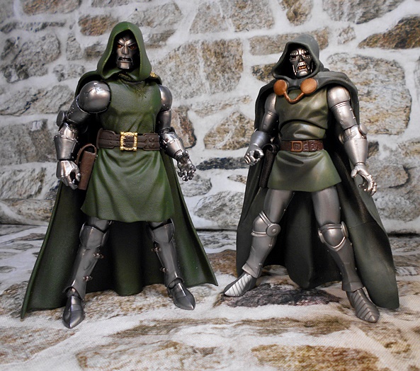
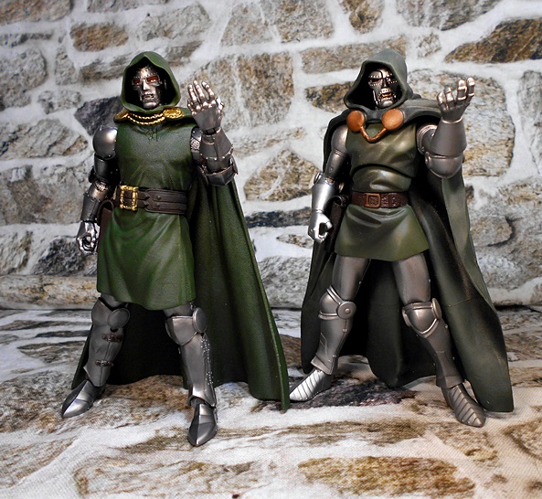
I sure as hell am!!! I’ve been a fan of The Fantastic Four since I was a wee lad, and Doctor Doom was a big part of my love for Marvel’s First Family’s book. He’s remained one of my all-time favorite Marvel villains. The iron-fisted monarch of Latveria was last seen in Marvel Legends all the way back in 2012, in the very early days of the line’s reboot. He’s also been seen again since in a Retro Carded release. I had plenty of good things to say about the 2012 figure, so let’s release doom from his Capitalist Retail Prison and see how this one stacks up!

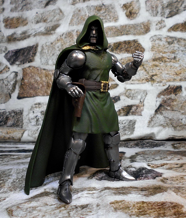
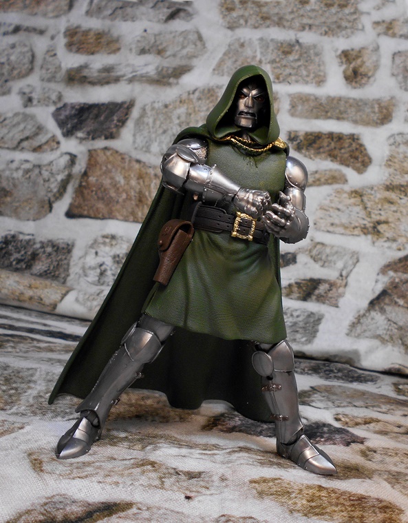
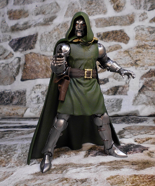
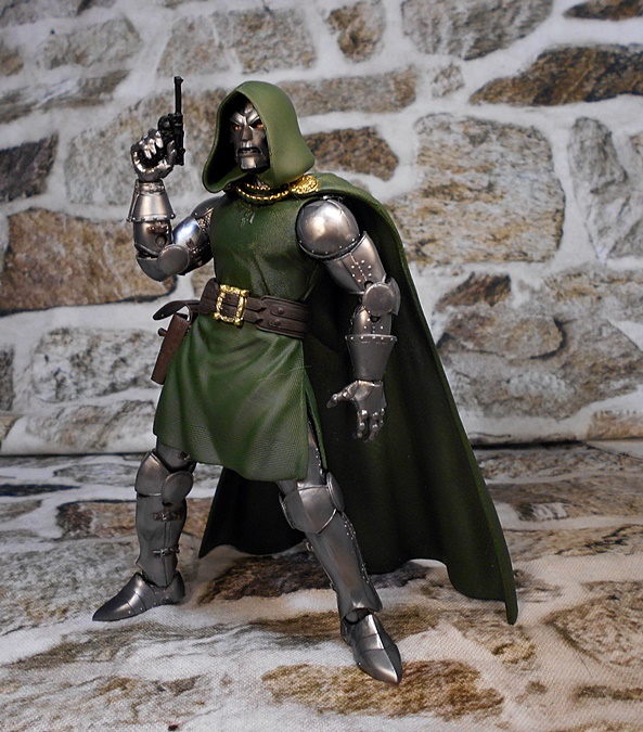
I was expecting a somewhat retooled figure, but what we got is a completely new one. And I guess that’s to be expected since it has been almost ten years. TEN YEARS!!! This is a more modern version with a lot more realism applied to the detail. So, if you like a more clean and classic look, you may still want to hang on to the older release, but even still, I think this one is a vast improvement on almost every level. He still looks as iconic as ever with his hunter green tunic, hood, and cape, and his armored limbs. The tunic has some great looking sculpted folds, and it’s textured throughout to make it look pretty convincing for plastic fabric. The wide belt has an ornate gold buckle, and a functional holster on his right hip. The holster is possibly the only thing about the older figure that I prefer over this one, because it had a strap on the top flap that fed through a loop, rather than a peg. This one is still fine, though, and even has an D monogram on the top flap.

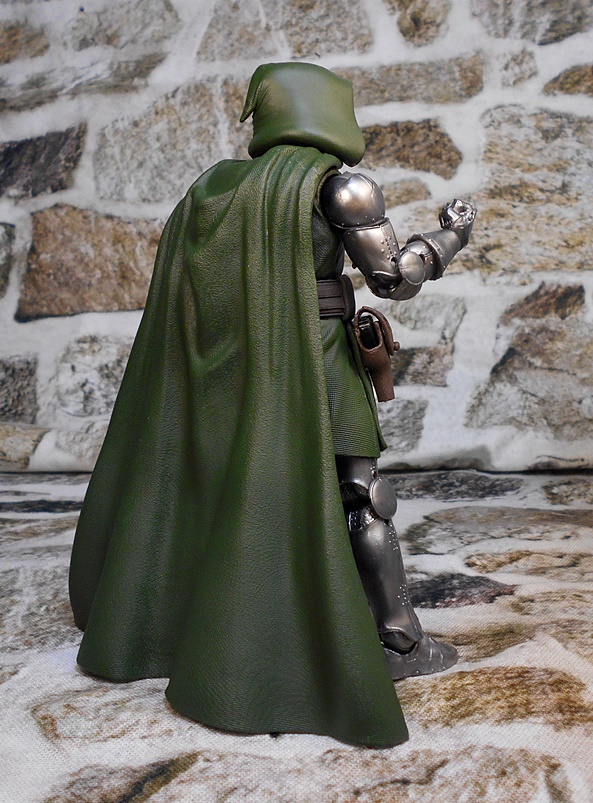
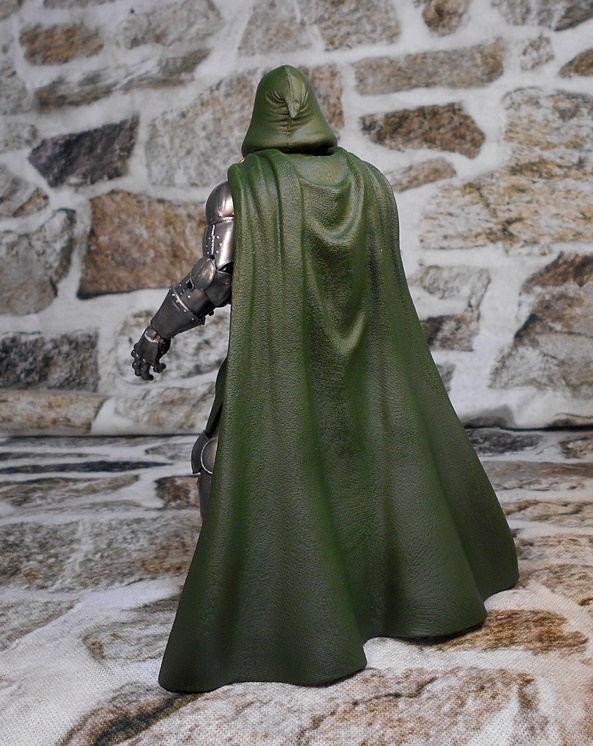
The cape on the previous figure was cast in one piece with the hood, and that was not such a great idea. It meant that the hood popped up any time the cape bumped on the floor, or the figure rested its weight on it. It also meant that the hood didn’t turn with the head. Here, they’re separate, and that’s definitely the way to go. Like the tunic, the cape is textured and has some excellent sculpted folds to make it look like fabric that is falling about the figure naturally. IT does extend all the way to the floor, but can be angled backward for those wider stances, and not be too obtrusive. It actually helps support him in some poses. The cape hangs around Doom’s neck via two sculpted golden chains and two large medallions. It looks great!

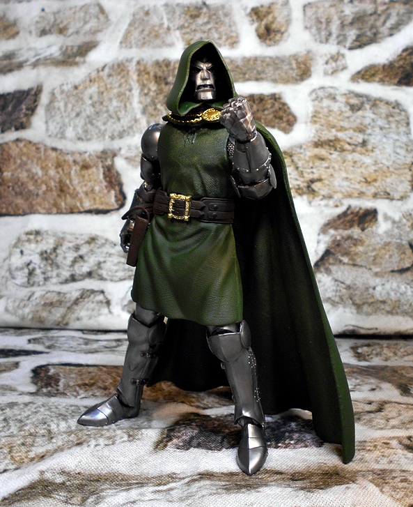
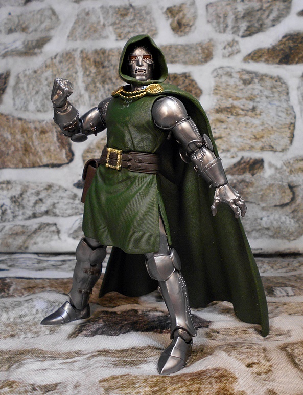
The armor is beautifully colored with a metallic silver finish. The plates are a mix of smooth curves and angled folds. There are sculpted rivets and hinges, and I really like the way the knee and elbow guards are designed. You can also see sculpted chain mail peeking out inbetween the plates.

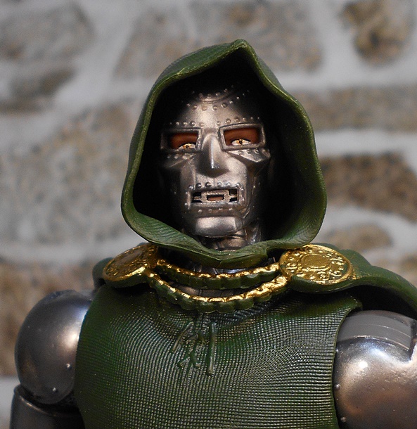
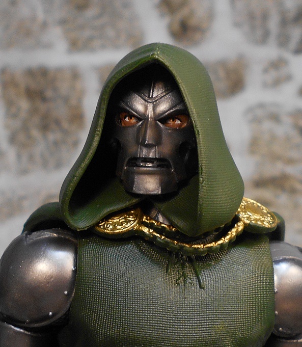
You get two choices when it comes to portraits, and I’m a bit torn on which one I prefer. One strikes me as a more classic look, and it features the sculpted rivets holding the plates together, and a more rounded hood. The other is all smooth, sans rivets, and has a more sinister expression thanks to the eye holes having a downturned brow. Even the mouth hole is scowling. The mask was removable on the previous figure, but that’s not the case here on either head. The hood here billows out more near the bottom, giving it an Emperor Palpatine kind of vibe. Ultimately, I think I will go with this one for display. I like the rivets, but this one has a more villainous visage.

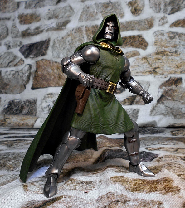
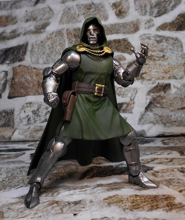
Articulation is mostly standard stuff, although it’s worth noting that the torso articulation is concealed as a ball joint under the belt, whereas it was under the chest and clearly visible on the older figure. Also unusual is the neck piece, which is ball jointed where it meets the body, and then ball jointed and hinged where it meets the head! The legs have rotating hinges in the hips, swivels in the thighs, double-hinges in the knees, and both hinges and lateral rockers in the ankles. The arms have rotating hinges in the shoulders, swivels in the biceps, double-hinges in the elbows, and hinged pegs for the wrists. You get two pairs of hands, which include one set of fists, a gun-holding right hand, and an evil graspy left hand.

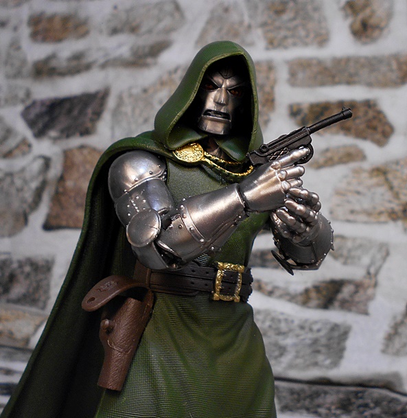
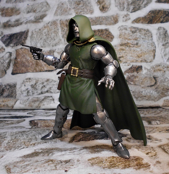
Doom’s one accessory is his pistol, which is very similar to the one issued with the previous Doom, but it is still a new sculpt, and cast all in black. If you’re looking for a Doom with more accessories, you might want to look into the Retro Carded release. And yeah, I’ll get around to looking at that one eventually!

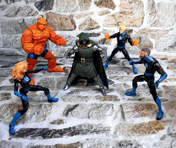
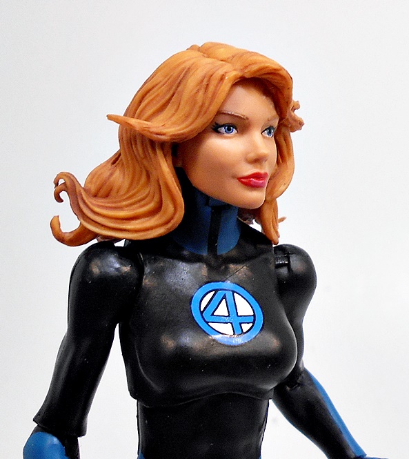
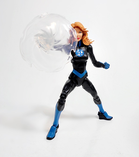
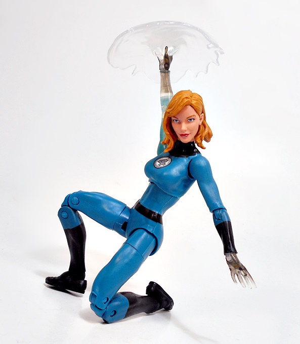
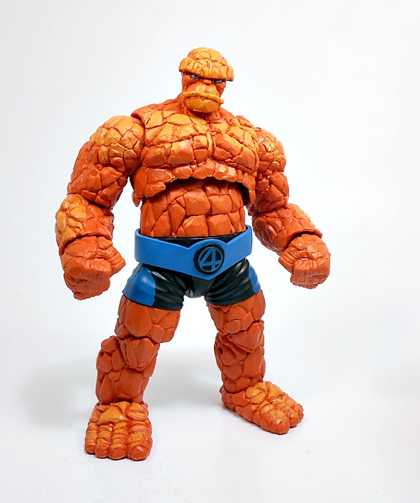
Doom is easily my favorite figure in this wave, and I’ll likely be displaying him with the Walgreens versions of The Fantastic Four. And eventually, I’ll have the Haslab Galactus looming behind them all. Don’t forget, kids… the Big Boi’s campaign ends tonight! The sculpting on this guy is just top notch, and they did a beautiful job on him all around. On the downside, he was impossible for me to find at the stores around here, and I wound up having to pay a bit extra for him from a second-hand seller online. I was apprehensive about doing that, since I already had the older version, but now that he’s in hand I think it was totally worth it! And that’s a wrap for the boxed figures in this wave, come on back next Monday and we’ll have a look at the Super Skrull Build-A-Figure!


Halo: 12-inch Master Chief by Jazwares

I’ve had a bit of an unintentional video game theme going these last couple weeks. First it was Pac-Man, then The Witcher, and now Halo. Well, I wouldn’t read too much into it. I stumbled upon this figure for a crazy low price and decided to make it an impulse buy. Ages ago, I had that Joyride Master Chief figure, which was excellent, but did not survive a shelf-dive. Sadly, his leg exploded against the shock of the carpet, and he was beyond fixing. Sobbing, I turned to The Ebays to replace him, saw how much it was going for now, and gave that shit a big HECK, NO! But hey, now I’ve got The Chief back in the collection. Let’s see if this cheap sum’bitch is any good.

Straightaway, this release reminds me of those cheap 12-inch figures that Hasbro has done for Star Wars and Marvel. They’re sometimes referred to as Shampoo Bottle Figures, I guess because they’re hollow and cheap, and feel like the novelty themed recepticals that you might find containing kids shampoo. Most of those are terrible, some are OK, but this one looked a little better. But make no mistake, cheap this figure is! I got him off Amazon for $11, although I think the MSRP is around $20. And yes, that is about twice as much as Hasbro’s Shampoo Bottle Figures, so maybe it’s not fair comparison. The packaging is consists of a very long and narrow window box, that’s barely big enough to contain his Spartan might, but is otherwise serviceable. There’s a J-hook so he can hang from a peg, but I’ve never seen this guy in the Toy Aisles around here.

Out of the box, this figure actually impresses me. Now, let’s qualify that a bit, because my expectations were pretty low. The sculpt is excellent. Sure he’s got some unsightly seams, but they’re not any worse than any number of other figures on the market these days. And all the detail in the armor is certainly there. The plates have panel lines, and all the little bits and bobs that I remember seeing from the last time I played a Halo game, albeit that was probably five years ago. The green looks a bit bright under the studio lights, but in hand under normal lighting it looks fine. The undersuit is black with some texturing, and you actually get some silver dry brushing on the armor to signify wear and tear. It actually looks about on par with the stuff Hasbro was doing on their Transformers Siege figures. Take that how you want, but I think it looks fine. If I’m going to nitpick anything here, I don’t remember Master Chief having such small feet, but I’m really reaching for something to complain about.

The helmet also looks pretty good, with more of those silver abraisions on the green finish. The gold paint used for his visor looks excellent. I should also note that while the figure is hollow and not all that hefty, it doesn’t feel like junk either. And there ya go, Jazwares! Feel free to use that as a pull quote for the box!

What surprised me the most about this guy was his articulation. I was expecting retro five points of articulation, like Hasbro’s big bois, but this guy actually has rotating hinges in the shoulders, elbows, hips, and knees, and swivels in the wrists, and in the neck. He’s fun to play with, although give me a little articulation and I just want more. He would have been amazing if they sprang for a waist swivel and some ankle tilts. Still, what’s here is great, and he has a pretty decent balance.

Master Chief comes with one accessory and that’s his trusty assault rifle. Sadly, the weapon is not as impressive as the figure. The big fail for me was having it silver. Jazwares may have been trying to add a little more color to the package, but I would have much rather they left it black, and it would have saved them some money too. It’s fairly well detailed, even if the sculpt is very soft. It fits perfectly into his right hand, and it even has a peg that allows Master Chief to carry it on his back.

There have been plenty of good Master Chief figures on the market over the years, so if you’re looking for a nice collectible you can sure do a lot better than this guy. But, if you’re looking for a big, rugged Master Chief toy to knock around and have some fun with, I think you could do a lot worse than this guy. Hell, if Hasbro’s 12-inchers were more like this in terms of quality and articulation, I’d probably actually own some of those. Jazwares has a few other Halo figures in this line, but Master Chief is enough for me. He was definitely worth the $11 I paid for him, and hell, I’d even go so far as to recommend him at $20.

Marvel Legends (Super Skrull Wave): Grey She-Hulk by Hasbro

If you came by Friday looking for new content, than you know I took a long weekend away from toy bloggery to recoup from a long work week. But here I am, back in the saddle, somewhat rested and ready for Marvel Monday! I’m up to the second to last figure in my jaunt through this Fantastic Four-themed wave of Marvel Legends, so let’s check out some hawt Shulkie action!

I’m not terribly familiar with this version of She-Hulk, other than she went all Grey and savage after duking it out with Thanos? I think that’s right. Anyway, considering that we’ve already had a Marvel Legends Red She-Hulk way back near the beginning of the current series, and now Grey She-Hulk, my obvious complaint is that we still don’t have regular GREEN She-Hulk, but that has since been remedied by a one-off release, which I’ll get around to looking at in the weeks ahead.

But grey or not… Wow what a figure! Jennifer looks like she’s sporting all new sculpting, and she is ripped! Literally and figuratively! This tall girl features the remnants of her tattered blue jeans sculpted onto her legs, and the top half of her shredded blouse covering her shulkies. The blouse is sculpted separately out of soft plastic and attached to the figure, which really gives it a wonderful bit of added depth, as opposed to if it were just sculped as part of the body like the jeans are. Not that they’re bad. They actually have some decent texturing and the paintlines between the blue denim and her grey skin are pretty sharp. She-Hulk is sporting a serously tight six-pack, and the bare feet are possibly also new sculpts. About the only thing I don’t like here are the slashes of neon green paint, which look like an afterthought, and don’t do much for what is an otherwise great looking effort.

And as good as Shulkie’s bod turned out, the portrait is every bit its equal! Hasbro did a fantastic job with this head sculpt. This head puts the SAVAGE in She-Hulk while still managing to retain Jennifer’s beauty. She’s brandishing the best set of choppers her law firm’s dental plan can buy, and I really dig the wrinkle in the bridge of her nose and the severe eyebrows that join it. Her eyes are green and lack pupils adding to her fierce visage. The hair sculpt is also worthy of praise. It’s wild and chaotic and looks amazing. You get some green wash mixed in with the black to match her green lips. And yeah, unfortunately you also get a rather prominant neon green slash across her nose, which I could have done without.

There are no big surprises in the articulation, and what we got is generally pretty good. I’ll pitch my usual fit over the use of rotating hinges in the elbows instead of double-hinges like the guys get. I realize that Hasbro probably does that because the gals arms are thinner, but that’s certainly not the case here. I’m also not crazy about the designs of the hinges in these elbows as they can be rather unsightly. Everything else is business as usual, though, making Shulkie a fun figure to play around with.

Jennifer comes with two sets of hands: Fists and grapple hands, and both are quite welcome. I thought I remembered Hasbro teasing a second head with this figure, but it isn’t here. It did, however, turn up in the Green She-Hulk. I guess that makes sense given this one comes with a BAF part, and the Green Shulkie does not.

When I bought this figure, the Green version had not yet been revealed, although I knew it was inevitably coming. I assumed that when it did, I would feel cheated that I had to buy this one to get a BAF part. But, this is such a great figure, that it’s hard to really feel bad about having it in my collection. Sure, I absolutely wish that Green She-Hulk was in this wave and this Grey version was the one-off exclusive, but I’m not going to get too upset about that. This figure just looks so good, that I don’t mind owning two of the same sculpt.

The Witcher: Geralt of Rivia (Gold Label) by McFarlane

I remember buying the original Witcher game, hoping to slum it with the graphics turned all the way down, but even then my computer at the time just laughed and spat out the disc. A short while later, The Witcher II came to the Xbox 360, and I rejoiced, as I would finally get to sample the series I heard so much about. But after jumping in, I quickly felt like I was dropped into the middle of the dense lore and missing out on a lot of backstory, so I decided that I would shelf the game until I could eventually experience the first. Time passed and eventually even my new mediocre computer was capable of running the original Witcher, which was at that point a rather old game. With all the settings turned up, I quickly lost myself in the deep and rewarding game world, and it was everything I hoped it would be. And the rest is history. I still haven’t made the time to play Witcher 3, but I have since enjoyed the hell out of the comics and the TV series was… well, it was OK. And that brings us to McFarlane’s Geralt figure!

his is the Gold Label release, which is proudly called out with gold foil on the top left corner of the box. What’s that mean? I dunno. It seems like just a repaint of the regular version. I think these were supposed to be some kind of premium chase figures, but I got mine on clearance at Gamestop, so I’m not sure how difficult that chase was. They had both versions, but I went with this one just because I thought the more colorful deco showcased the sculpt a little better. The window box is collector friendly, unless you want the stand, which is secured to the back of the insert under a sealed bubble. For that, you’ll have to rip and tear!

And here he is, Geralt of Rivia, looking intimidating as all hell. Straightaway I’ll say that I absolutely love the sculpting they did here, but then McFarlane has always been known for delivering great sculpts! As I already intimated, I’ve spent a ridiculous amount of time in the first two games, but have still yet to crack open my copy of Witcher 3. That having been said, his armor appears to be patterened after the suit he starts the game with, and the one featured in most of the game shots I’ve seen, so I’m at least passingly familiar with it. The sculpt features some intricate detail in the chain mail, as well as some textured quilting in the upper legs. There’s stitching recreated on the leather bits, and boots, and the armor is layered onto the figure to make for a very complex and convincing look. When it comes to detail, it seems like nothing was overlooked. The torso armor is sculpted in soft plastic and wrapped around the figure, concealing the articulation in the chest. It’s executed very well, without making the figure look too bulky or throw off his proportions. Other cool little additions are his tiny amulet and the trophy hook hanging from his belt.

On his back, Geralt has two functional scabbards for his swords. These are partially open on the side facing his back, which is unfortunately a little unsightly, but they acommodate the swords very well. The scabbards are also the only place on the figure where the paint disappoints a bit. It just isn’t as sharp as it could be. The original version of this figure was quite drab and dark, but this Gold Label release features a more colorful tan and brown deco, which as I said earlier, really brings out the detail in the sculpt. The boots are black, he’s got a reddish-brown belt, and the silver paint used for the chainmail and the fixtures, is quite striking. I may still look at picking up the regular release, but right now I’m pleased that I went with this one.

They did a beautiful job on this portrait, recreating a solid likeness to the in-game model. The rather intricate hair sculpt is cast separate from the rest of the head, making for a clean hairline. His scar is carved right into the plastic, there are some subtle lines in his face, and the facial hair is quite remarkable. But beyond an excellent sculpt, the paint really turned out to be amazing. From the gray used for his hair to the gloss on his bottom lip, the life-like eyes and the razor sharp deep crimson gash, everything here is just superb. Even the skin tone is nuanced.

I was most curious to see what the articulation was going to be like, since the last time I was collecting McFarlane figures, they were little more than semi-poseable statues. Well, that certainly isn’t the case any more. The articulation here is well thought out and feels great. The double hinges in the elbows and knees are chunky and allow for tight bends. I was especially surprised to find there were even hinges in the toe of the boots! He’s capable of wide stances in the legs and his arms have the ability to reach back to draw his swords. My only gripe here is that the neck doesn’t allow for the head to look up enough. And that’s probably mostly because of the long hair.

Naturally, Geralt comes with his two swords. The “silver” sword features a sharply downturned crossguard, whereas the “steel” sword has the straight guard. These each have painted grips, but unfortunately the blades and hilts were left as bare gray plastic. I really think these needed actual silver paint to make them look more snappy, especially for a premium Gold Label release. Heck, even if they just painted the silver one to distinguish it, that would have been cool. The sculpts on the weapons are fine, and the blades aren’t too bendy, but they just look rather unfinished without the extra paint.

Geralt’s hands are sculpted so that he can wield the swords in either hand, or dual wield at the same time, for those particularly desparate battles against both humans and monsters! The articulation also allows for him to wield either weapon two-handed, which is excellent!

Other than the swords, Geralt comes with bubkis, so he’s a little light on the accessories. I would have liked to see a magic effect part or maybe some daggers. He does come with a branded figure stand, but it’s pretty small and unimpressive. Maybe I’ll dig into my Marvel Legeds effects parts to give him an Igni spell.

I was really close to passing on this line, since I’m trying to limit myself to what I’m already collecting, and not expand into new areas. But, when I’m face to face with a great looking figure on clearance, you just know it’s going to come home with me. And I’m glad I made that decision, because this is an all around wonderful figure. Yes, the unpainted swords irk me, but it’s nothing I can’t fix with a silver Sharpie. In the end, the best compliment I can pay Geralt here is that after playing around with him for about an hour, I went ahead and bought the rest of the line!

Marvel Legends (Super Skrull Wave): The Invisible Woman and The Thing by Hasbro

Last week I kicked off a look at the Super Skrull Wave with Mr Fantastic and The Human Torch, and as promised I’m back on this Marvel Monday to check out the second half of The Fantastic Four with Sue Storm and Ben Grimm!

I’ve got nothing new to say about the packaging, so let me take this moment to point out that Hasbro has just solicited pre-orders for their third round of Marvel’s First Family. First, we had the Walgreen’s Exclusives in their classic blue and black. The Wave I’m looking at today is the more modern black and blue, and the upcoming figures will feature their blue and white costumes made famous by Roger Corman! Er, I mean John Byrne!!! OK, let’s start with Sue Storm!

The Invisible Woman utilizes the same body as her predecessor, with the exception of her new feet. These feature wedge-heels and the same spikes on the bottoms as the other figures in these costumes, making her stand a bit taller than the Walgreens Exclusive figure. Obviously, you get the same black buck with the blue bits painted on, and I’m happy to note that the blue is a lot cleaner on this figure than it is on my Reed and Johnny. Also, since the female buck uses rotating hinges in the elbows, you don’t get the unpainted pins that the guys have.

Unlike the previous Sue, this one does not feature the semi-translucent arms, which is fine. I liked that feature on the other one, but it’s nice to have a fully solid version as well. She only has one set of hands, a powers casting hand on the right and a fist on the left.

I really dig the portrait here, Sue is as pretty as ever, but if I compare it with the older one, than I think I like that one a bit more. The lips are sharper on the Walgreens release, but yeah I’m really nitpicking to find a reason to favor one over the other. And if you like your superpowered MILFs with fuller lips, than this one might scratch your personal itch. Both of their hair looks great, the new version’s hair is a little darker and longer and a little more dynamic, making her coif the standout improvement here. But again, it’s all a matter of personal taste.

It probably goes without saying that this new release does not include HERBIE, like the last one did. It does, however, include a forcefield effect part, which is designed to plug into her right hand. It looks great, but I think it looks even better with Walgreens Sue, thanks to her translucent arm. Let’s move on to The Thing!

Grimmy uses mostly the same body as the previous release, but mixes things up with the paint. Walgreens’ Thing was a darker and more matte orange with some heavy wash to bring out the individual crags and creases. That black wash is gone here, although the crevices are sculpted well enough that they still stand out just fine. In addition to being a lighter orange, there’s also some yellowish wash around the chest, shoulder, and arms. It looks OK, but I’m going to give the nod to the older one as my favorite. And I have to throw it out there, that this is still an absolutely superb sculpt, so you really can’t go wrong with either one.

Ben’s wardrobe gets most of the new sculpting here, as instead of just wearing a pair of shorts, he’s now got a wide belt with a 4-logo in the center. The belt is blue, while the shorts are blue and black. Honestly, I think this belt and shorts combo would work fine with either set of costumes.

The head sculpt appears to be new, or at the very least has a much more promiently sculpted lower lip, making Ben look extra pouty. I’m not hating it, but I don’t think it’s as nice as either of the heads that came with the Walgreens release. And yes, that’s right. You only get the one head with this one.

And while we’re on the subject, you also don’t get any extra hands with this release either. Instead, The Thing just comes with a pair of fists. So, I guess it’s always Clobberin’ Time! Despite the color shift, the old hands look like they would match fairly well on this figure, but I could not for the life of me get the fists on this figure to come off, and I didn’t want to force them.

So, just like last time, I prefer the previous Walgreens releases to these new ones, but I will say that I like this pair a bit more than I did Johnny and Reed. Sue just looks great in any costume (Ahem, Malice in bondage outfit, Hasbro. Please!) and her forcefield effect part is a great bonus. Meanwhile, The Thing is such an amazing figure, even this somewhat lacklustre repaint can’t diminish him. It’s a shame that Hasbro didn’t throw in the extra hands, but in fairness they had to leave room for the BAF parts, I guess. All in all, I don’t dislike these costume designs or the figures, but these will not be my first choice to represent the Fantastic Four on my shelf.

And, we still have two more figures in this wave to look at! So, come on back next Monday and we’ll keep this wave rolling along with a look at Shulkie. GREY Shulkie!

Transformers Kingdom: Blackarachnia by Hasbro

I swore I wasn’t going to be buying any of the Beasts in the Kingdom line, because I’m running out of display and storage space. Plus, while I love the Beast Wars TV series, I was never all that into the toys. But it’s also no secret that I’ve rarely ever been able to keep my word when it comes to not buying toys. And for me, the deciding factor was when I fired up the Netflix series and started giving it a watch. The very next day, I was browsing the toy aisles at Target and Blackarachnia followed me home.

I have not been able to get into the other two Netflix series: Siege and Earthrise. I think they look great and I love how the animation models follow the toys so perfectly. But to be honest, they are so depressing to watch. I think they try way too hard to be grim-dark, and it just doesn’t work for me. I made it through most of Siege, but only about half of Earthrise. I wasn’t going to watch Kingdom at all, but I was really curious how they were going to work both Beasts and conventional Transformers into the same series. The result was interesting, and so has been the series so far. I don’t love it, but it does have me coming back for more. So, let’s check out my first Beast… The Predacon Blackarachnia! And as usual, we’ll start with the alt mode!

I’m going to be extremely generous when looking at this alt mode, because it just can’t be that easy to make a very humanoid robot transform into a realistic spider. And with that having been said, I think this figure does a pretty good job at it. The body has some robot kibble showing on the sides, but come on… it’s a spider and it looks fine! The engineering here isn’t mindblowing, as the bot basically folds up into a ball with the shoulders crunching under the spider head, and the arms and legs partially gathering under a body shell. It holds together fairly well, although one of my figure’s legs doesn’t lock up like it should. It’s not a critical problem, but it does make it harder to tighten up the seams in her body.

The body and legs are black with some nice texturing, and she has red spots on her back and a bunch of red eyes peppering her little spider face. The spider butt has something that I guess sort of resembles spinnerettes, protruding underneith. There are also a bunch of yellow bumps that sort of look like eyes. I’m no doctor of spiderology, but I don’t think spiders have peepers on their hineys, so I’m not sure what those are supposed to be. The black and red of the body is nicely offset by the yellow bits, which kind of look like the color of the goo that would come out if she were squished.

Blackarachnia’s legs have some pretty useful articulation. Each cluster of legs attaches to the body with one hinge, but then each leg is ball jointed further on down so it can be posed independently. The legs also do a pretty good job of holding the weight of the figure. All in all, I think this mode delivers pretty well for a Deluxe. So how about that robot mode?

Clearly, the robot mode was the design focus for this figure, because it’s outstanding! And seeing it really makes me appreciate the spider mode even more. Blackarachnia is clearly both all spider and all woman, with organic curves to her legs, wide hips, a narrow waist, and some rather impressive venom sacs. The spider’s butt lumps wind up on her pelvis, and what passed for spinnerettes become her claw-like hands. I also love the striking black and yellow coloring. She even looks great from the back, with the exception of those holes in her lower legs. Her spider body folds up neatly to form a backplate. What’s more her sizeable feet make her easy to balance, despite that leg kibble.

Yes, she’s got leg kibble for days, and I absolutely love how this design just owns it. The legs look really cool and aggressive in the way they angle away from her body, almost like skeletal wings. Granted, they have to be tweaked almost every time I pose her, but it’s worth the effort. I seem to remember in the TV show that Tarantulus’ leg kibble actually functioning as guns, but I can’t remember of Blackarachnia’s shared that function or not.

The head sculpt is excellent, and should satisfy fans of the Beast Wars series. At first, I though the sculpt was a little soft, but it’s really not. There’s plenty of detail in there. I like that they used a lighter shade of yellow for her mouth area, and she even got a little lick of red paint on her “crown.” I also dig the Predacon emblem painted on her collar.

Blackarachnia’s articulation is absolutely fabulous. She’s got rotating hinges in the shoulders, swivels in the biceps, hinges in the elbows, ball joints in the hips, swivels in the thighs, double hinges in the knees, and hinges and lateral rockers in the ankles. Some of these points are in service to her transformation, others are just there to make her loads of fun to play with.

Of course, Blackarachnia comes with her trademark crossbow-type weapon, which pegs surprisingly well into either of her claw hands.

I have to say, I’m glad I weakened, overcame my self-imposed Beast Bot Ban, and picked up this figure! She’s been on my desk ever since I first opened her up, and I’ve been messing around with her a lot in my downtime. The transformation isn’t too fiddly, although I do wish that one leg locked up properly in her spider mode. Even still, she looks fine in her alt mode, and exceptionally good in her femme-bot mode. But, the real question is… do I like her enough to buy more Beast Bots? Time will tell!

S.H. Figuarts Pac-Man by Ban Dai

I was still a young’un when Pac-Man made it’s arcade debut in the United States, and boy was I into it. It was easy to learn how to play, and that combined with the colorful graphics, and cartoony characters, had it sucking away every quarter I could wrestle from my poor parents’ pockets. But Pac-Man’s popularity quickly transcended the arcades, and it’s absolutely impossible to overemphasize how powerful and invasive Pac-Man Fever became. There were books, stickers, candy, t-shirts, ballcaps, games, puzzles, ice cream bars, gumball machines, pasta, a cartoon series, and even a hit record. It was nuts! And despite all that, there weren’t really any action figures, and that was disappointing. Many decades later, I’m an old man and I still love me some Pac-Man, and luckily the yellow chomper has had the staying power to still be crazy popular in an era where just about everything can get an action figure!

Enter S.H. Figuarts… OK, I wasn’t expecting that! It’s a brand known for some highly articulated collectible figures. When I first discovered Figuarts, it was mainly focused on anime characters, but it’s since branched out to include lots of different franchise. Pac-Man comes in a beautiful little window box that shows off the figure inside and features some nice artwork of the maze, as well an approving Pac-man on the front. Obviously, Pac-Man sports a rather unique character, so I’m pretty excited to see what they did with him!

Out of the package, and we get Pac-Man’s large spherical head-body with short arms and lugs jutting out from it. The eyes and eyebrows are sculpted as well as painted, and the mouth has some depth to it and includes a big red tongue in there. His portrait is rounded out by a jutting nose. Pac-Man has been stylized in a lot of ways over the years, but I’m really glad SHF went with this one. It’s simple, it’s iconic, and I think it captures the character perfectly. It’s also the design used for Namco’s 3D Pac-Man games on the PlayStation, and I really dig those games a lot.

For such a simple design, SHF managed to cram a decent amount of useful articulation in here. There are rotating hinges in the shoulders, elbows, upper legs, and knees. The hands are mounted on ball joints, so they can be swapped out, and the ankles are not only hinged, but also have lateral rockers to keep his feet flat in wide stances. Also impressive is the way the legs can shift forward and back on tracks along the bottom of his body. These tracks help to put him in running poses. All this makes him a surprisingly fun figure to play around with!

Pac-Man comes equpped with two bulbous fist mittens, and these can be swapped out with a set of open handed mittens, and even a right hand giving the thumbs-up!

You also get a swappable face plate, which is actually the entire front hemisphere of Pac-Man’s head-body. This extra face has Pac-Man offering a wink, and while it’s a bit limited as far as expressions go, it does look fantastic with the thumbs up hand! I can easily see this being the way I display him most of the time.

Pac-Man does feature a socket where his Pac-Anus should be, and that’s to attach him to a standard SHF-compatible figure stand. No, he doesn’t come with one, which feels kind of like a big omission, but I’ll come back to that at the end of the review. He absolutely does not need support to stand in most poses, but it’s a nice option for some more dynamic stuff.

Pac-Man does come with a couple of simple accessories: Some pixelated cherries and a Ghost. The cherries are a nice display piece, and they have a socket in the back to suspend them using an SHF stand. The Ghost is just too small to be any fun, but it looks good displayed beside him, and it can also be socketed into a stand. No pellets are included, but I found that Airsoft pellets are a decent stand in.

Honestly, the only downside to this set is that I want Ghosts! I’m actually kicking myself for not picking up the Funko Pop! Ghosts, because they would have displayed pretty well with him and now they go for crazy money. I’d love to see them get the SHF treatment, even if the only articulation would be in their arms, and how about a Ms. Pac-Man? And while we’re on the subject, I would be all on board Figuarts doing similar figures based off the Saturday morning cartoon designs. Sure, I griped about not getting a stand, but not really, because this figure cost $20, and that’s a pretty amazing deal for this quality of toy. I’ve wanted a figure like this my whole life, and to finally get it for so cheap, I can’t be anything but happy!

Marvel Legends (Super Skrull Wave): Mr Fantastic and The Human Torch by Hasbro

Today, I’m jumping in the Wayback Machine and setting the destination to Unfinished Business! Averaging one Marvel Legends review a week is not nearly enough to keep up with this prolific toy line, and waves do sometimes fall by the wayside. Some of these I may let go, but others I plan on getting back to. And since it’s The Fantastic Four‘s 60th Anniversary, why not return to the Super Skrull Wave! Marvel’s First Family remains one of my all time favorite comic books for the majority of my life, and along with Spider-Man, it was the first Marvel Comic that I began reading regularly when I was a wee lad. There was no way I wasn’t going to come back to these figures eventually!

I had planned on doing all of the Fantastic Four in one review, but I’m coming off a brutal six-day work week, and I just didn’t have the time to complete it, so today I’m taking what I do have, and having a look at Reed Richards and Johnny Storm! We last saw these characters in Marvel Legends as part of a series of Walgreens Exclusive releases, where they turned up in their Classic blue and black uniforms. Now we’re getting them in their more moden black and blue uniforms! Let’s start with Reed!

The body here seems to be mostly recycled from the previous Mr. Fantastic, which means the costume is achieved mostly through paint, and that works. We do get some new sculpting in the feet, including their weird spikey boots. Honestly, I don’t dislike the costumes, as they’re kind of a palate swap with a few added stylistic flairs, and the blue and black still look quite striking when contrasted off each other. That’s not to say these come even close to the classic costumes in my realm of personal taste. They aren’t as drastic as The Future Foundation re-design, nor are they terrible like the red and black re-design. They’re just different. As for the painted costume on the figure, well the paint lines could have been sharper, the blue scratches pretty easily, and the lower pins in the elbows aren’t painted to match. In short, it’s OK, but nothing special.

It remember it took me a while to get used to Reed with a beard, but I got eventually warmed up to it. Still, I’m not crazy about how it turned out on this figure. It looks like an odd mix of sculpt and paint, and the gray printing doesn’t look natural, and I think the mustache looks the most off-putting. This isn’t a terrible portrait, but it’s not a great one either. Legends has proven itself capable of much better, and I vastly prefer the classic portrait on the Walgreens Exclusive figure.

Articulation holds no surprises, so let’s jump straight to the effect parts. This version of Reed comes with stretchy fingers. Yeah. extra hands with stretched fingers. These are friggin creepy and I don’t like them. The previous release of Mr. Fantastic had some cool and massive stretched arms. These just feel like a huge step down in comparison. Reed Richards has one of the coolest and most useful super powers out there and here it looks like he’s about to use them to reach up the chute and steal candy bars from a vending machine. Thank you, but no sir.Let’s have a look at The Human Torch.

The Walgreens Exclusive gave us Johnny Storm in full Flame On! mode, so I was excited to get this release of him just wearing his costume. And it’s a pretty solid figure. Everything I said about Reed’s costume holds true here, although the blue didn’t hold up quite as well on this one. I do have to give Hasbro credit for not cheaping out and using the same body for both figures. Johnny actually features the lateral crunches in the shoulders, giving him a bit more articulation. Otherwise, there’s not much else to say here.

The portrait is decent, but again not exceptional. I like that they gave him a little smirk. The hair is sculpted separately from the rest of the head, giving him a seam for a clean hairline. The eyes could have used a bit more precision when they were painted, but all in all, this isn’t bad.

Johnny comes with swappable flame hands, a right fist and an open left, as well as flame effect parts to snake around his arms. They are kind of subtle, but I think they look great. Of course, if you have the previous release, you can mix and match for some real fun.

The heads do indeed swap and the shoulder flame piece fits just fine. I really love the way it looks on this figure. And you can also plop this head onto the fully flamed Johnny as well. In the end, though, this release really just makes me wish Hasbro had given us a Johnny Storm in the classic suit.

There’s another flame piece included that is designed for the Super Skrull BAF, but it can also be used with Johnny to give him some extra oompf.

I may sound like quite a downer in this review, but to be fair the Walgreens Exclusive versions were a tough act to follow. The classic suits meant that I was always going to like those better, and there’s nothing about this pair that makes me want to love the modern suits on these figures. I haven’t priced the Walgreens figures lately, but if they’re crazy money these days, at least these guys can fill that Fantastic Four shaped hole in your collection without breaking the bank. Next week, I’ll have a look at Sue Storm and The Thing!

Doctor Who (The Abominable Snowmen): The 2nd Doctor & TARDIS by Character Options

Much like the good Doctor himself, Character Options’ 5 1/2-inch Doctor Who action figure line continues to defy death. Despite being more-or-less cancelled a while back, CO manages to let a slow drip of releases trickle out each year. Sure, many of these are repacks and repaints, but some are new! I’ve been picking up a lot of these sets over the last year or so, but with how bad the show has been these last two series, I wasn’t too eager to start opening them. Luckily, when I was recently on vacation I got a couple new Classic Who Blu-Ray palate cleansers and now I’m psyched up and ready to start tackling some of these!

Today I’m checking out the latest release, which is The Second Doctor and TARDIS from the 1967 serial, The Abominable Snowmen. CO teased this one, along with a prototype of The Yeti a long while back, and while I’m sad to say there’s no Yeti in here, I’m glad to see The Doctor figure finally made it out! If you’ve picked up any of the MANY of these Doctor and TARDIS releases, you should know what to expect. The goods come in a window box with the toys positioned against a printed background, making for a wonderful display if you are inclined to leave it sealed. Sadly, my box got a bumped corner while making its way across The Pond. Character Options shipped it fast, but put no packing in the box whatsoever.

Yup, while most of the recent releases have been widely available online, this one is a Character Online Exclusive, so I had to go right to the source to get it. The back of the package has a copious amount of copy about the story, which sadly remains one of the lost ones. About the only thing I don’t like about the packaging is that it’s branded for the current series. I’m not a fan of the logo, and I think one of the Classic logos would have been a lot more appropriate here. If you haven’t experienced this story, The Abominable Snowmen is currently available as an audio track drama, there are some pretty cool fan recreations online, and I’ve enjoyed the story at least a couple of times through the novelization. OK, let’s get this open! And if you stick with me until the end, I’m going to do a little bonus comparison and bonus mini-review of the last Second Doctor and TARDIS release from The War Games!

The TARDIS lands in The Himalayas in Tibet (Not India, Victoria!!!), and before going out on his expedition, The Doctor dons a mighty fur coat, which later leads to Jamie mistaking him as a Great Hairy Beastie! This coat has become something of an iconic look for The Second Doctor, probably because he wore a variation of it in The Five Doctors, which makes this figure a double treat! And what a great figure it is! The sculpting on the coat is absolutely magnificent. The texturing is brilliantly done, and the darker patches are not only painted in, but part of the sculpt as well. The wooly garment is cast in soft plastic and attached over a standard Second Doctor figure, resulting in some nice depth, while also making it look appropriately bulky. You can see his collar and tie peeking out from the top, while his checkered trousers protrude from the bottom to his brown shoes. The sleeves are sculpted as part of the new arms and match the coat perfectly. The sculpted string that ties the coat closed is a little understated. I may actually tie a real string around it for better statement.

Character Options has delivered some great portraits of Patrick Troughton in this line, and this one is another cracker! Actually, they may be all the same sculpt! His facial details are nice and sharp, as is the sculpted hair. It’s the usual serious expression that we’ve seen in the past, and while I’d love to see a smiling portrait for The Second Doctor, I realize that CO is dependent on recycling parts to keep the cost of these sets low.

The articulation here harkens back to the older figures in the line, which mainly means that the shoulders simply rotate and do not have any lateral movement. In fairness, I don’t think CO has turned out anyof the older Doctors with the updated articulation, and I’m not sure how well that would have worked with the fur coat anyway. In addition to those rotating shoulders, the arms have bicep swivels and elbow hinges which can do a full 90-degrees, which is impressive with the bulk of the coat. His wrists swivel, and I love how the hands are half obscured by the sleeves. The legs are the normal t-crotch, thigh swivels, and hinged knees, but with the coat going all the way down to the knees, the hip articulation is rendered inert. At least the knees allow him to go into a walking pose. The Doctor doesn’t come with any accessories, and while I understand that the only thing making these possible is CO doing them on the cheap, I can’t help but wish they had included the sacred Ghanta in there. Ok, let’s move on to the TARDIS!

I was extremely excited to get this TARDIS, because it’s the Error TARDIS that was used when the BBC crew rebuilt the doors on the prop and put the sign on the right door instead of the left. It appeared that way for a bunch of stories, and as such it makes this an extremely unique addition to my fleet of CO TARDISes. As we’ll see in the comparison shots in a bit, this is just a redress of The War Games TARDIS, which includes the flat roof. Although this one does omit the handle and simply has the keyhole. After watching a lot of modern Who, it’s sometimes shocking to see just how battered the old Type-40 often was in Classic Who. I actually liked it better that way. It made the TARDIS look appropriately ancient and well-traveled.

So naturally, it’s the deco that really makes this one sing to me! The distressed paint job is fantastic and really hammers home the decrepid look of some of those early TARDIS props. It appears to use a white wash in with the blue to give it that look and I just love it. Each window has two of the six panes frosted, and the POLICE BOX signs are appropriately faded stickers. As usual, the back of the TARDIS features the rather unsightly speaker. These piercings have been included on the TARDIS releases that were gutted of the electronics, but here we see the triumphant return of the lights and sounds! With the help of three AAA batteries, the roof lamp will flash yellow and the glorious wease of the engines will sound when you either pick up or put down the toy. It sounds great and, I gotta tell you, I still smile from ear to ear like a kid whenever I activate it. I simply couldn’t have imagined owning a toy like this back in the day.

Once upon a time, CO used to use printed inserts inside these TARDIS toys to show the interior, and I really wish they still did that. It would probably be pretty simple to print out an image, at least for someone with more time and motivation than me! As it is, the interior is completely unfinished. I may be content with just putting some black construction paper in there. As usual, the right door is spring loaded and will lock open, and uses a button on the floor to slam it closed. OK, let’s bring in The War Games set for some comparisons!

We get the same basic sculpt, but different coats and arm sculpts. The new release has a touch of blue in his collar, and the trousers and shoes are different colors. For the life of me, I can’t tell if the head sculpts are the same or not. They look different, but I’m possibly attributing that to the dramatic variations in the paint. The War Games release has a much more heavy handed paint job. It’s not bad, but I definitely prefer the newer release, as it just looks more natural to me. Either way, both are excellent figures.

As I mentioned, the TARDISes are the same sculpt, with the exception of the handle appearing on this one, and the older one missing the light in the roof lamp. The War Games TARDIS has a darker and more uniform paint job. Interestingly, the front POLICE BOX sign is black lettering on a white background, but that’s inverted for the other three sides. I never noticed that before getting this toy in hand. These signs are still well worn, but much easier to read than the ones on the newer release. Obviously, the PULL TO OPEN sign is back where it belongs on the left door, and it is printed with white letters on a blue backdrop with a much neater presentation. And, as I mentioned earlier, the speaker is still there despite no electronics, and the battery door is glued shut.

Any Classic Who set that Character Options releases is an instant buy for me, and The Abominable Snowmen set is an absolute treat. I had all but given up on this ever seeing the light of day. Yes, I wish it came with the Yeti we saw a while back, but getting the Error TARDIS ain’t too shabby. Besides, I would not put it past CO to re-release this Doctor with The Yeti at some point down the road, and I will happily throw my money at it if they did. Who knows? Maybe even with Victoria or Jamie. Hey, CO just revealed that we’re finally getting Ian Chesterton, so anything is possible! And with that note, I really enjoyed reviewing this release, so I’m going to make it a habit to start working some of the Doctor Who sets that I picked up over the last year or so back into my normal rotation!

Transformers Kingdom: Tracks by Hasbro


My backlog of Transformers reviews is growing, and while I’d like to get to some of the older stuff, I’m always tempted to check out a new figure that arrives. Maybe I’ll do a Backlog Week and hit some of the really old figures I missed. As for Tracks, well he was getting a pretty lukewarm reception among collector circles by the time my pre-order arrived, so I was a little apprehensive about checking him out.

Here he is in the Kingdom packaging, and I still don’t know what the intention of this line is. Cars? Beasts? It’s just a free for all! But I’m going to start watching the Netflix series this week, so we’ll see what it’s all about. We last saw tracks about ten years ago in the Reveal The Shield line, so I think this figure is more than overdue, and I’ll do a comparison between the two figures at the end. For now, let’s get started with his alt mode.

I don’t usually start by commenting on the transformation, but I think it’s justified here. Transforming Tracks can be a little annoying when you’re going into car mode. There’s a lot of precise positioning, which we haven’t seen a lot of in the Deluxe Class toys of recent years, and even when you get it all correct, the results are problematic. I can get just about everything to lock in perfectly, but the two front quarter-panels always refuse to peg in flush with the hood. Squeeze them into place, they keep popping back out, and apparently this isn’t just an issue with my particular figure, but pretty much all of them. It makes me wonder whether this was an issue on the prototype, and they just said screw it, or whether it was an issue that cropped up during production. Solcitation pictures don’t show the problem, so I’m guessing it’s the later.

And that’s a real shame, because looking past that, the rest of the car looks great. There’s no license markings, but it’s clearly a close approximation of Tracks’ G1 Corvette mode. It’s got some sexy curves, and sure there are a lot of seams from the interlocking plates, but that’s often par for the course. The vibrant electric blue plastic, along with the crimson flame on the hood and the Autobot insignia make for a knockout deco. The windows are smoked, there are some gray bumpers, and black grills under the headlamps. and the wheels are painted silver. There are some exposed pins that can be a little distracting, but it’s hard to nitpick them when the car doesn’t even lock together properly.

You get some weapon ports on the sides front quarter panels, another back near the trunk, and one in the back, where you can plug in a blast effect to mimic flaming thrust. Pretty cool! Tracks doesn’t come with a blast effect, but you do get a black gun and a rack of white missiles.

Tracks can still convert into his flying car mode, which looks fine. It would have been nice if the arm pieces tabbed into the car, but I guess that’s not a big deal, as they stay in place pretty well. I’ll throw out here my apologies for shooting Tracks against a white backdrop. I wanted to really bring out the gorgeous blue plastic in the pictures, but it makes his white parts, like the wings, really hard to see. And while we’re on the subject, I would have really liked a couple of red stripes on those wings.

The robot mode is not too shabby, but I think it lacks the cleaner and more refined modes that we’ve been seeing in other recent Deluxe Class bots. I think this bot is a better homage to his G1 toy than his animated counterpart, and that’s definitely not a bad thing. Plus, he looks fine right alongside his fellow Kingdom and Earthrise Autobots. The chest is faked out, as the actual roof of the car is folded up into his backpack. Some people cry foul at this practice, but it doesn’t bother me. It allows for better proportions, and in this case, it also allows for the Autobot symbol to appear on the chest, but not on the car. The backpack locks into place, and gives his missile rack a place to plug into. From behind, he’s mostly a slab of car plates, which is fine. His legs do close up all around, but I’m not terribly keen on the gaps for his feet. I know, he’s a robot, but it’s at odds with the G1 aesthetic.

The head is perfect, I wouldn’t change a thing. Tracks’ mix of red face and white “helmet” is so bizarre and unique that it’s become iconic. The shoulders are a little broad, but that’s always been the case for Tracks. It’s hard to help it with the wheels positioned the way they are. I do wish the wings were attached to his body and not the shoulders, because they move when you articulate his arms, and I’d much prefer they stay put.

I’ve seen some complaints about Tracks’ legs being super loose. It’s true that they are pretty loose on my figure, but I haven’t had any problems getting them to hold his weight in a variety of poses. He hasn’t done the splits or collapsed on me once. Sometimes I miss the good old days of ball joints, as loose joints could be easily fixed, and that’s not so easy when you’re dealing with pins, but it can still be done. Mine just isn’t an issue, so I’m not going to mess with it.

As we saw in the alt mode, Tracks comes with a pistol, which looks like a shortened version of his Black Beam Rifle.

Bringing in Reveal The Shield Tracks, it’s always shocking to see how much bigger the Deluxe figures were back then. The old Tracks sure had a bitchin’ auto mode, and all his panels held together just fine. The deeper blue looks nice, and while the added color to the hood decals make for a dynamic deco, I think I prefer the simpler look on the newer figure. Obviously, these car models are from very different eras, and while I can appreciate a modern Tracks, the Classic, early 80’s design works better for me. With all that having been said, the older Tracks in car mode is just an all around better toy.

I think things get a lot more up for debate in robot mode. I think RTS Tracks is still a great looking figure, but he’s going for a very different aesthetic. He looks more Alternators inspired than anything else, and that’s nothing to be ashamed of. There’s also some really clever stuff going on with his transformation, which really delighted me when I transformed him for the first time in years. Not to mention, that RTS Tracks shares his body with RTS Wheeljack! Still, he’s got little baby arms, and stubby little wings that hang of fhis doors. Kingdom Tracks is just so much cleaner and really a fine compromise between toy and cartoon aesthetic. In the end, I’m going to give the nod to new Tracks, but it’s worth mentioning that I expected to sell off RTS Tracks when I got the new one, but now I think I’ll end up keeping him.

It’s impossible to give Kingdom Tracks’ alt mode a pass. It never should have gone to production like that. It’s especially tragic when you look at how great the rest of the car looks. The robot mode, however, is pretty damn sweet, and to be fair that’s the way I display these figures most of the time anyway. I’m sure that I come across as a Hasbro shill most of the time, and this next comment won’t help any, but if this Tracks’ gaps are the biggest Transformers screw up Hasbro has done, I think they’re doing OK. I mean, at least they aren’t making any of these Transformers figures impossible to get store exclusives, right?