DC Comics Super-Villains: “New 52” Captain Cold by DC Collectibles

The New 52 may be a thing of the past, but I still have some unfinished business with its action figure legacy. DC Collectibles has certainly done their part to immortalize this controversial era in plastic form and among these lines, one of my favorites has been DC Comics Super-Villains. I recently found a box of these stashed up on a shelf in one of my closets from just before Christmas. It’s been almost a year since I last looked at any figures from this line, so today I’m going to open up Captain Cold!

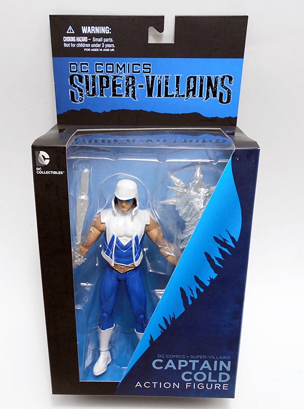
The window box is right in line with what DCC was using for most of their figures at the time of this release. It’s pretty generic, but it’s also crisp and snappy and I kind of like it. The window shows off the figure very well, you get a shot of the figure on one of the side panels, which is perfect if you want to keep these boxed and line them up on a shelf. You also get an extended back with a J-hook if you want to pin them to the wall. The box is black to give it that Super-Villains vibe and DCC always threw in a splash of color on these boxes to coordinate them match the figure. In this case it’s a really nice shade of blue. As always, everything is collector friendly, but I don’t save these boxes. I barely have space for the figures!

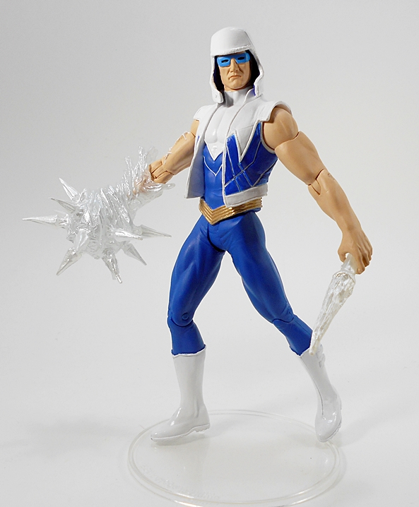
And here’s Snart out of the box. While I tend to be OK with a lot of the costume changes in the New 52 Era (Yes, I realize that’s a minority opinion to hold), I was not overly pleased with Snart’s. In fact, next to New 52’s first version of Poison Ivy, Captain Cold’s look is one of my least favorite of the whole shebang. With his weird hat-hood, his sleeveless jacket, and his Art Deco vibe, I’m just not sure what they were going for here when they designed it. That’s not to say the figure doesn’t look good. DCC did a fine job translating this look to figure form. The white paint is super clean, the shade of blue is gorgeous, and the gold belt really makes the figure pop all the more. Overall, the paint lines are pretty clean too.

My one complaint is that they really cheaped out on his jacket, as it’s molded as part of the torso. It looks fine from the back, but the open flaps on the front are chunky and not terribly convincing. DCC has done plenty of jackets by overlaying a separate plastic vest onto the figure, and since this one is sleeveless, not going that route here seems like a huge missed opportunity.

The head sculpt here is quite good and the distinctive glasses at least provide some link to Snart’s more classic look. I’m still not a fan of that weird hood-hat, though. As for articulation… Well, DCC has made some major strides in articulation since the DC Direct days, but you wouldn’t really know it from this figure. His arms feature rotating hinges in the shoulders, swivels in the biceps, and hinges in the elbows. His right hand has a swivel, but that’s only because it pegs in, as the left wrist has no articulation. The hips feature a standard T-crotch, which at this point is a terribly dated design. The leg articulation is rounded out by simple hinges in the knees. The head may be ball jointed, but I can only get a swivel out of it. Truth be told, this is still better than what we usually got with DC Direct, but not by much.

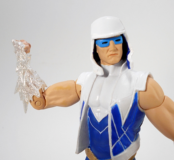
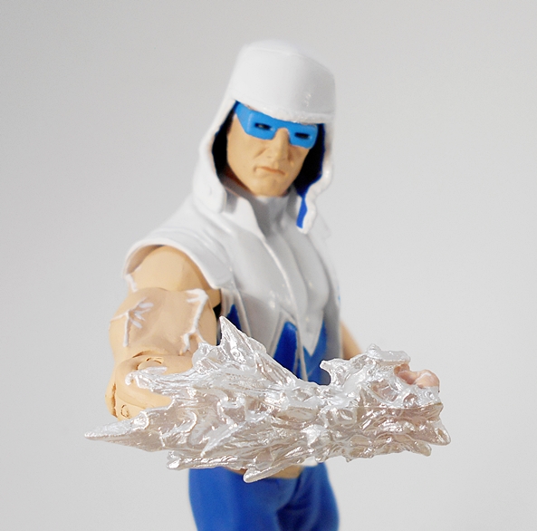
Luckily, this figure really shines through his effect parts. For starters, the forearm is all iced over and it looks fantastic. It’s cast in jagged, shimmery plastic and it’s probably the most convincing ice I’ve ever seen in plastic. It’s also sharp as hell in some parts. I also really dig how they painted the icy veins in the bicep as part of the effect. This is great stuff. As already mentioned, this forearm is designed to pop off so you can swap it out with his other ice effect…

A spiked ice ball!  This thing is a pretty big accessory, and because of it, Snart here probably uses more plastic than any other standard release in this line. This thing looks every bit as good as the other ice arm and those spikes are really sharp. I got a couple of ouchies when I was trying to peg it into the arm.

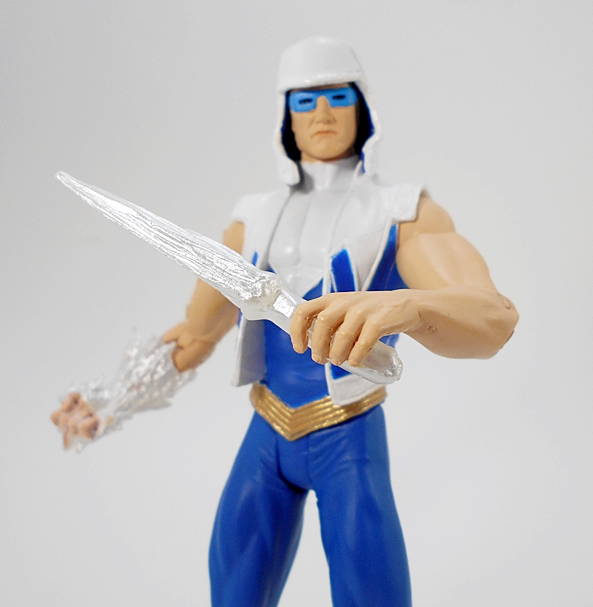
Finally, Captain Cold comes with an ice dagger that he can hold in his left hand. While not as impressive a sculpt as the other two ice pieces, it’s still pretty cool.

The Super-Villains figures tended to run around $21 a pop. Some have gone up in the meantime, others have gone down. I remember picking up Captain Cold and some others before Christmas for under $10, and a deal like that can certainly temper my expectations for a figure. That having been said, this guy is just a roller coaster of ups and downs. I don’t dig the look all that much, but I really loved Snart in his Post-Forever Evil Justice League appearances with Lex Luthor. The articulation isn’t great, but stand him up there on the shelf with his ice effects, and he looks pretty damn good. If nothing else, he can keep my New 52 Flash figure company.

Transformers Titans Return: Legends Class Bumblebee by Hasbro

It’s Transformers Thursday and today I’m opening up another figure in the first wave of Titans Return Legends Class releases. Bumblebee was going to be an pass for me, but I found it easier and cheaper to buy the entire assortment in order to get my hands on Kickback and Gnaw. Let’s find out how that turned out for me…

It seems like we just had a Legends Bumblebee, but it looks like that last one was back in 2014. That Generations release was a damn fine little toy and even after two years, it’s going to be a tough act to follow. Granted, that one was going for more of a Fall of Cybertron look, whereas this one is definitely G1 inspired. The packaging shows off the figure in its robot mode and features some of the best character art for Bumblebee that I’ve seen on a toy package. I’ve also gotta say how much I love that they included his original G1 motto on the back of the package. Reading it literally made me smile.

The auto mode holds no surprises and I don’t have a whole lot to say about it. Hasbro went for a generic, yellow compact, which is about as close as you can get to a VW Bug without having to pay out for the license. There’s quite a bit of ugly seaming on the hood, especially for a Legends Class toy, but all in all I’m content with this alt mode. It displays particularly well with some of the Generations Legends cars like Windcharger and Swerve.

The yellow plastic is bright and fresh and matches the yellow paint pretty closely. The deco is rounded out with some black windows and striping. In addition to the Autobot emblem on the roof, Bumblebee even features some silver and red paint operations. As much as I’d love to see a Legends Class VW Bumblebee, this is a fair substitute.

The transformation here is not as overly complex as some of the Legends and the resulting robot mode reflects that. It’s a very traditional looking G1 Bumblebee, almost to a fault. You get the roof chest and the hood split into feet. All that is somewhat refreshing and the head sculpt is a total winner.

He even looks pretty clean from the back, albeit with some unsightly hollow feet. I wish they could have sculpted that disc he had on his back in the Sunbow cartoon, but I guess they needed somewhere to put all that COO and copyright crap.

Unfortunately, I’m having a problem getting past those arms. The bulky and over-sized biceps with those stubby little forearms make for a really bad combination. Do they ruin the figure for me? Yeah, I’m going to have to say they kind of do. Surely they had some engineering to spare that they could have used to fix those things. Instead, what we got feels a little lazy. I know that we’ve seen worse on bigger Transformers in the past, but I feel as if this little guy could have been a total winner if they had just found a way to fix those biceps.

In the end, I would have been totally fine with passing on this figure, but I don’t really mind owning him. I don’t have time or patience for toy hunting like I used to, but the few times I’ve ducked into a toy aisle, none of these Legends were on the pegs. Nope, not even this one, which seems like he should be warming those pegs. That’s Bumblebee’s job isn’t it? Anyway, I just kind of look at it like spending a little extra to get Gnaw and Kickback, and getting Bumblebee tossed in for free. Hey, whatever helps me sleep at night, right? And I probably shouldn’t be too hard on this little guy. I’ve certainly paid more for worse Transformers in my collection. It’s also a little easier to be more forgiving of a Legends Class, both in terms of complexity and price. On the other hand, the previous Legends Bumblebee, while certainly going for a very different style, is also a much better proportioned and engineered figure, so I probably shouldn’t be apologizing for this one.

Mythic Legions (Covenant of Shadows): Silverhorn Sentry by The Four Horsemen

Last week, the Backer Kits for the second Mythic Legions Kickstarter, Advent of Decay, went out. I put in for 35 figures and now there’s nothing left to do but wait. Wait thirteen agonizing months. And that’s not accounting for the inevitable delays that often occur with these things. Thankfully, I still have a few figures left to open to tide me over. Not to mention a giant Troll that has not yet tasted sweet freedom from his window-box prison. Nope, no Troll today. Today I’m checking out a figure that I came very close to passing on, The Silverhorn Sentry.

In the beginning, I wasn’t at all into the bios or the fiction of this line, but with each successive assortment of figures, the canon of Mythic Legions interests me more and more. For example, this fellow’s bio notes that The Sentries of Castle Silverhorn are under the command of The Forest Elemental, Faunus. Why is that relevant? Because Faunus is one of the figures I’ve got coming in the Advent of Decay series and he’s already got a place in the continuity of my shelves. In the meantime, The Sentry will be taking his orders from Captain of the Silverhorn Guard, Asterionn, a figure that was issued in the original Kickstarter.

Silverhorn Sentry represents the usual reshuffling of parts that we’ve been seeing out of the later run figures. That’s not a dig or a complaint, mind you, because just look at this guy… he’s amazing. He uses a combination of the full chest plate torso from the knights with the lower tabard piece to make a belt sash. In fact, everything below the waist is re-purposed from Sir Gideon, with the exception of the hooves for feet, which I first encountered on the Minotaur, Asterionn. The deco consists of a rich, metallic brown, almost like a very deep copper color, for the armor. When you pair that with the gold and pale emerald decorations, and the hunter green sash, the whole figure has a very earthy flavor that meshes perfectly with the antlers and his task of guarding the forests around Silverhorn Castle. As always, the shoulders are optional, but in this case I think they’re a must, for reasons I’m going to get into right now…

One of the things I liked most about this figure when T4H first showed him was the fact that it uses the helmeted Dwarf head on a full body and it looks splendid. The shape of it, however, makes it a little hollow in the back, but these shoulders with the high ridges help to fix that a bit. Those antlers, which are the same ones we saw on Gorgo’s helmet, also make him out to be quite the imposing chap. I would not want to be up to mischief in the forest and run into this guy. And if, for some reason, this helmet doesn’t do it for you…

T4H were also generous enough to toss in a variant head with this figure. It’s something that they seem to be doing a lot with the Advent of Decay figures, and I’m not about to protest extra heads! In this case, it’s a repaint of Gorgo’s helmet. I like it, it looks great, but I’m really too sold on the stock helmet here to even consider swapping it out for display. Also, combining the same antlers with the same helmet as Gorgo makes for too many similarities for my taste.

Weapons! What good would a forest sentry be without them, eh? This guy comes with the two-handed sword that we’ve seen plenty of times before. The hilt is painted gold and It features a down-turned cross-guard and a pointed, skull-crushing pommel. I love this sword a lot and it really suits this figure. I might have opted for a different color hilt. Maybe green to match his sash? But now I’m nitpicking. Of course, the sword comes with the standard brown belt so it can be worn on his hip or slung across his back.

The spear is another very familiar piece and one that I think really goes well with this figure. I also really appreciate that they painted the shaft a different color from the head. The single colored spears have been one of my very few bugaboos about this line.

And finally he comes with a brand new shield! Well, it’s actually one that was released among the weapon packs, but I didn’t get any of those, so this is the first time I’ve seen this shield among the twenty-seven or so Mythic Legions figures I own. The sculpted wood face with the painted, reinforced metal is a welcome change from the same knightly shields we’ve been seeing over and over again. And like his weapons, this shield feels like it’s perfect for the Sentry. This is a great piece, and I wish that T4H had included it with a couple more of the figures.

Before wrapping up, I’d be remiss if I didn’t mention a few QC quirks with this figure. Firstly, the hip joints were totally loosey-goosey out of the package. I know that this has been a problem for some collectors on several figures in this line, but this is the first time I really encountered it. It’s an easy fix, just a little floor polish on those ball joints and he’s right as rain. Secondly, the paint came off the back of the knee hinges very quickly. I’ve had some rubbing on other figures, and I think that’s inevitable, but here it wore down to the plastic almost immediately. It’s a minor cosmetic flaw to me, in a very discrete area, but still worth mentioning.

Passing on The Silverhorn Sentry the first time around cost me a little, as I got this one from a re-seller and paid an extra fifteen bucks for him. That’s quite the mark up, but the reality is that most of the figures from the first Kickstarter are going for crazy money now, and I’m betting it’s only a matter of time before the Covenant of Shadows releases catch up to those. BBTS has some of these guys for $50, and that’s actually not bad considering the Ebay listings that are out there. Either way, I was comfortable spending it when I got the chance and now that he’s in hand, I glad I did it. This guy is a solid addition to my lineup, and he’s going to look damn cool standing off to the side of Faunus when he arrives next year.

Marvel Legends (Space Venom Wave): Hobgoblin by Hasbro

It’s another Marvel Monday and I’m continuing with my very untimely slog through the Space Venom Wave. Will I ever be current with this line? Well, I’m no math expert, but I think the numbers are against me. Maybe I’ll do a Marvel Legends themed week at some point and bust out a whole wave to help get caught up. In the meantime today I’m checking out Roderick Kingsley as The Hobgoblin!

And here’s a quick look at him in the package before I tear it to shreds. You’ll note that his name doesn’t appear on the front, as he shares this slot with Electro as one of Spider-Man’s “Evil Adversaries!” It feels like only yesterday that we got the Phil Ulrich version of Hobgoblin as a Build-A-Figure, but that was back in 2015. Wow… how time flies. No wonder I have so many of these damn things waiting to be opened. I wonder how many unopened Marvel Legends they’ll be pulling out of my home after I die? Anyway, the Ulrich Hobgoblin was a fantastic figure, but it seemed like a lot of fans were crying foul that we got that version released before this one. Well, everybody can calm down now, because Kingsley Hobbie is out and he’s pretty damn fantastic.

If you were expecting a lot of reuse here, you should be pleasantly surprised to find that’s not the case. This Hobbie looks appropriately beefier and features a good deal of new sculpting. Most notably, the scale-mail on his arms and legs is all sculpted in and looks great. I think he borrowed it from Deathstroke. I dig the amount of detail in the gauntlets and buccaneer boots, particularly the sculpted fraying of his boot cuffs and the upturned toes. Finally, you get a wide belt sculpted onto the tunic. There isn’t a whole lot of paint on the buck, but the metallic blue looks fantastic and it compliments the orange nicely.

Hasbro did a particularly nice job on the cape. It’s ragged and shredded and it’s painted with a grimy wash to match the hood perfectly. It’s also removable simply by popping off the head.

The stock head is a fantastic sculpt and appropriately less stylized than the Ulrich Hobbie head. The vacant red eyes are awesome, and while the paint on the teeth could certainly have been better applied, It doesn’t really detract from the portrait much for me. The hood is completely separate from the head itself and you can even take it off. But, what’s that? This head isn’t maniacal enough for you. You want a fully cracked-out look with more tongue. No problem!

The alternate head features a protruding tongue flanked top and bottom by walls of vicious looking teeth. This head also features some yellow pupils painted in on the eyes. This is some great work, and it pains me to say that I’ll probably never really use this head for display, but it’s nice that Hasbro through it in there.

Overall, the articulation here is pretty good, although I have a tiny quibble about the shoulders. The rotating hinges there feel a bit ratchety and there’s really no reason for it that nonsense in a figure this scale. Otherwise, the points include: Double hinges in the elbows and knees, swivels in the biceps, thighs, and boots, rotating hinges in the wrists, ball joints in the hips, hinges and lateral rockers in the ankles, a swivel in the chest, an ab crunch hinge, and both a ball joint and hinge in the neck.

In addition to the extra head, Hobgoblin also comes with some excellent accessories. You get his satchel, which hangs off his shoulder. It’s a great little sculpt and features some silver paint on the buckles. Hobbie’s metrosexual man bag allows him to carry his spare bombs, and maybe a few sundry items for when he wants to freshen up.

Yup, bombs! Hobgoblin comes with a single glowy yellow bomb, which he can hold pretty well in either hand. And no, you can’t put it in his man bag.

And finally, he comes with his glider. Yes, it’s a very simple piece, molded in pretty soft gray plastic, and maybe a little undersized, but he looks great on it. There are loops to stick his feet through and the upturned toes of the boots help lock them into place.

Other than a few tweaks in the shoulders I’ve got nothing but praise for Hobbie here. He’s no doubt an important figure, and when you consider how many Spidey-themed waves we’ve had, it’s surprising that it took Hasbro this long to get to him. It’s even more surprising that they released the Ulrich Hobgoblin before this one, and both of them before The Green Goblin. What? No, the Ultimate Green Goblin BAF doesn’t count! Honestly, though, the priority of releases here really doesn’t bother me. I’m in Marvel Legends for the long haul, and at the rate Hasbro is pumping out the releases, they’ll get around to everyone sooner or later. I just hope that Squirrel Girl is going to be sooner rather than later.


KanColle: 41cm Twin Gun Mount for Nagato “Super Premium” Figure by SEGA

Welcome to another relaxing Anime Saturday Morning! Back in February, I took a look at SEGA’s Battleship Nagato “Super Premium” Prize Figure. I loved the figure, but lamented the fact that the seller screwed me out of her Gun Mount. Well, after some hunting I was able to find a Japanese seller with reasonable shipping and after a little wait, I finally have Nagato all kitted out. So, consider today the second part of that feature, and if you happened to miss it the first time, I recommend checking out the figure review before reading this review for what is essentially an add-on piece.

To clear up any confusion, most of the KanColle prize figures put out by Taito and SEGA are not fully outfitted with their weapons, and I certainly don’t mind that. It makes the armed ones all the sweeter. But, SEGA’s SPM Battleship Nagato was one of the rare occasions where they gave collectors the option to buy her armaments separately and that’s what we’re checking out today. The kit comes in a fully enclosed box very similar to Nagato’s. Even with the slight amount of English copy on the box, they still do a good job of indicating what’s in the box. It’s also worth mentioning that this kit is designed so that you can display it on its own, without the figure, or perhaps beside Nagato. I’m not sure why anybody would want to do that, but I’ll start there anyway.

There’s a fair amount of assembly required here, but the rig goes together very smoothly and when you’re all done you have a pretty cool display piece that rests on its own stand. I like the fact that the stand doesn’t feel like an afterthought. Even though, I will likely never use this stand again, it’s clear that SEGA put some work into it, sculpting it in a smoked, semi-transparent plastic and giving it a gantry style look. There’s also a name plate (in Japanese of course!) and the entire gun mount tabs right into the stand for easy removal.

The guns are overall pretty clean, with only a slight degree of weathering here and there. There’s also some useful articulation, with each of the eight gun barrels are independently hinged and the all four turrets able to swivel. And that brings us to the moment of truth…

Awww, YEAH! The rig tabs right into Nagato’s back and holds in place very well. It also looks amazing on her. Sure, I can get this same look with my Nagato Figma (a figure I still need to review here one day), but this version is so much bigger and awe inspiring. The guns perfectly compliment her pose as she looks like she’s about to unload with all her weapons. There’s even a spot on Nagato’s stand if you want to transfer the little name plate.

This add on kit ran me $30 shipped, which was a pretty good deal considering I had to get it shipped from Japan. When you combine it with the cost of the figure, that brings the whole piece to about $70. It’s a lot to pay for a prize figure, but then this is no ordinary prize figure. She’s fully scaled and so far beyond what I tend to think of when I think of prize figures. SEGA absolutely outdid themselves with this one and she is most definitely the showpiece of my Kancolle collection. The only shame here is that SEGA didn’t do fellow Battleship, Mutsu in the same scale and style.

Cover Girls of the DC Universe: Starfire by DC Collectibles

The current incarnation of Cover Girls of the DC Universe is running out of time. There are only three more statues due to release before it reboots in favor of a new artist. Conversely, there are only three previously released Cover Girls that I need in order to get all caught up, and I’m opening one of those today. I hope you like Tamaranean T&A, because it’s time to check out the lovely Princess Koriand’r!

I’ve showcased enough of these statues by now that I have precious little left to say about the packaging. Starfire comes in a fully enclosed box and sandwiched between two styrofoam trays. It’s not the snazziest presentation out there, but it’s collector friendly, and I’ve yet to receive one of these pieces damaged, so obviously the packing is doing its job. Starfire requires no assembly. She’s already attached to her base and ready to go.

And WOW! Starfire hovers in mid-flight supported by the toe of her right boot, which dips into the fiery trail left behind by her hair. There are so many things I love about the composition of this piece. The graceful flow of her body, tapering off to her outstretched right hand is absolute poetry and the way her hair arcs alongside her is stunning. It’s not only a great comic statue, but a wonderful study of the female form. The balance (both literal and figurative) of the statue is also fantastic, as Starfire looks like she’s defying gravity. Cover Girls is so often about museum-style posing, but every now and then DCC lets loose and delivers a release like this one. It’s definitely one of the most kinetic statues in the line, and yet she still feels right at home when displayed among her fellow Cover Girls.

The costume is lifted directly from her appearances in Red Hood and the Outlaws, although purple and skimpy has almost always been the order of the day for Koriand’r, so this New 52 look isn’t a huge departure from her more classic appearances. Granted, she covered up a bit more once she got her own book by Amanda Connor, but that’s another statue for another day. It’s perhaps worth noting that there isn’t a lot of sculpted muscle definition here. I only tend to notice it around her abs area where it’s totally smooth. Not a problem for me, but I thought it was an interesting choice on the part of the sculptor and I feel it gives her a slightly more animated appearance.

From the neck down, the paint on this piece is quite good, both in terms of quality and application. The metallic purple used for her costume is right on the money and is nicely complimented by the silver borders. Her distinctive orange skin is just the right shade as well as being smooth, warm, and even. There are a few areas on mine where the paint lines don’t quite conform to the sculpted lines, but I really had to scrutinize her carefully to notice them. Needless to say whatever tiny flubs are here, don’t bother me at all.

And as long as we’re doing paint checks… nothing wrong back here!

I like the portrait a lot, but I think there are just a few areas for improvement here. Normally, I wouldn’t bother mentioning them, but since all I’m doing is gushing over this piece, I’ll play devil’s advocate for a bit. The first is just my personal preference that I would have liked to see a little smirk or smile on her face. As it is, it’s a very neutral expression, and that’s fine. There’s so much great stuff going on here, that I’m not immediately drawn to her expression anyway. Secondly concerns the paint application, which is a tad off on the hairline and the lips, both of which are only really an issue if I get in super close and start to scrutinize it. Still, it’s not bad and I’ve seen far worse paint applications on far more expensive “premium” statues.

The base manages to maintain the uniform oval generic theme of this line, while still going above and beyond. For most of the Cover Girls, the bases are just something for the figures to stand on, but here, it’s an integral part of the presentation, as her hair flows down and transitions into the fire effect. It’s beautifully done and genuinely hard to tell where the cold-cast porcelain ends and the translucent plastic begins. The effect is quite similar to what we saw with Bleez’s fire base and Mera’s water base. It’s an effect that could easily make or break the statue, but here it succeeds brilliantly. As always, the limitation is hand numbered on the bottom of the base. Mine is 2,223 of 5,200.

Starfire’s MSRP is right in line with the other Cover Girls at around $100. It’s certainly a fair price for what you’re getting, but I try to do a little bargain hunting when it comes to this line, and was able to pick her up for just under $70. Between the elaborate marrying of hair and base, the vibrant combination of colors, and just the overall beauty of her form, I think this is one piece that really sticks out, even in a display case full of Cover Girls releases. It’s also a piece that makes for a great stand-alone representation of Koriand’r for someone who isn’t collecting the line. And considering that Kotobukiya’s Bishoujo Starfire is now selling for well over $100, this one is a damn good value too.

Transformers Titans Return: Legends Class Kickback by Hasbro

Hooray, it’s the return of Transformers Thursday! And anyone who says, “Oh, but it’s only a Legends Class figure,” watch out because I’m gonna slap your face! I love the Legends Class figures! They’re great fun and I can stuff them in my pocket and take them to work and have robot battles on my desk. I love them even more lately because I have some ginormous robots for them to interact with! And today’s little change-o-bot is even more special, because Kickback finally completes the trio of Legends Class Insecticons, which Hasbro started way back in 2014 with the release of Skrapnel. Bombshell followed in 2015, and here we are in 2017 with Kickback.

Yup, these little fellas span three different lines: Generations, Combiner Wars, and now Titans Return. If I were a mint-on-card collector, this shit would irritate me to no end. Of course, there’s something else about this figure that does that, but I don’t want to get ahead of myself. Let’s bust him open and start with his insect mode!

Is he a locust, a grasshopper, or a cricket? Don’t look at me, I ain’t no bug scientist! I do, however, hold an honorary degree in toy robot bug appreciationology, and as such I give this alt mode my stamp of supreme approval. In fact, if these wings were painted silver, this Kickback would be a perfect update to the original G1 toy’s bug mode. The black and purple plastic looks fantastic (although he does sport a lot more purple than his G1 namesake) and the additional silver and yellow accents consist of more paint operations than some of the bigger bots get.

And.. OMG, THAT TRANSLUCENT YELLOW CHEST PANEL, I LOVE IT SO MUCH! Also… OMG, THAT TRANSLUCENT YELLOW CHEST PANEL, I HATE IT SO MUCH!!! Yeah, the chest panel really elevates the whole figure tremendously. Unfortunately, it also poops all over the painted chest panels on the other two Legends Insecticons, and it’s that lack of consistency that really… dare I say it? It bugs me! Sure, the gold and yellow chests never matched between Bomshell and Skrapnel anyway, but they were at least somewhat close. Kickback busts the whole deal wide open. The reasoning here might have been to accommodate a Titan Master, but by furthering the inconsistency between the three decos, it it’s also very irritating.

Transforming Kickback feels slightly more involved than it need be, but the results are overall good. In fact, my only real complaint here is the way the wings sit behind the shoulders, rather than be integrated into them. On the flip-side, it does give you the option of sweeping them down instead of up. Us G1 old-timers will likely stick with the up position, but I can see just as many younger fans happy to point them down and out of the way. Other than that, I really am very pleased with this figure. It may not be as clean as the original toy’s robot mode, but I think it skirts that fine line between old and new quite well and the passel of ball joints make him lots of fun to play with.

Rating Kickback on his own, I give him very high marks, and I’m a bit surprised by that, because I’ve heard a lot of people dumping on him. On the other hand, put him with the other Insecticons and the mismatched gold, yellow, and translucent yellow on the decos bothers me more than I wish it did. Because of the designs of Bombshell and Skrapnel, there’s no way to reverse engineer them with the matching translucent yellow parts they deserve. So, if Hasbro or Takara ever does decide to release these three in a more uniform deco, the best I can hope for is a repaint of Kickback’s chest to yellow, and that would be a shame. It would be basically reducing the better figure of the three to match the lesser two.

And so, finally getting Kickback into my collection has been rather bitter-sweet. Yes, it gives me a sense of closure and I think he’s a very good figure, but as soon as this little trio is complete, I find myself longing for another attempt. I feel like these three should have been designed and issued a lot closer together. And considering how much I adore the Insecticons, I find myself tempted to come out of retirement from buying third-party figures, and hunt down one of those sets of unofficial bug-bots.

Kenner Aliens: Gorilla Alien by NECA

Yes, Gorilla Alien, my friends. What more of an introduction do you need to make you want to venture forward with today’s review? NECA went all the way back to Kenner’s Aliens figures from the 90’s and worked their magic with some of those wacky designs to bring us this spectacular wave. If you want the full preamble, I’ll refer you back to my look at the Mantis Alien from last month. On the other hand, if you’re like me and can’t wait to have a look at this bad boy, then let’s get started…

Oh, shit. I got a little ahead of myself and opened this guy up before taking the packaged shot. Well, can you blame me? I tried to put him back on his tray, but I have no idea how they had this huge figure folded up to fit in there. At least you can still enjoy that rad artwork and there’s still some lovely plastic fumes left for me to snort. Check out how they re-worked the NECA logo to match the old Kenner logo on the bottom right hand corner. Cool!

And just check this fellow out! Kenner’s line was all about coming up with different cross-species of Xenomorphs and the name of this guy says it all. Now, unlike the Mantis Alien, the host animal on which this Xenomorph is based isn’t quite as apparent. Nope, nothing really about this guy screams Gorilla to me, but that’s OK. He’s still a bigger, beefier Xeno, and he’s got plenty of unique design elements. Just check out those pronounced tubular nodes coming off of his forearms as well as a triple-spiked tail. Also, check out all the beautiful work they put into his claws! While the snazzy translucent green plastic of Mantis makes that figure stand out a little more, there’s no denying that this one is just as much a work of art.

Yup, no matter how many of NECA’s Xenos I open, I never tire of taking in all that incredible detail that they sculpt into these bodies. Every little element of HR Giger’s infamous bio-tech design comes alive in this plastic and all of it is picked out by sumptuous blue paint wash, which invokes the crazy colors of the original toy and comic, while still managing to stay grounded in the realism of NECA’s re-imagining. Damn, I just adore the coloring on this Xeno! In addition to the black and blue deco, you get some silver highlights here and there.

And of all that isn’t enough to make you Xeno-Fans cream your jeans, just check out the head on this sexy beast! Yes, I called him sexy, because look at it! The contours are beautiful and there’s a wonderful contrast between the smooth dome and the intricate bits of the lower head and jaw. I really dig how the head sweeps up at the end and crowns with four prongs, giving him a powerful, regal look. Naturally, the mouth opens up and you can pull out the secondary set of jaws within. All this is great stuff, but rather than rest on their laurels, NECA included a second dome, offering another display option. But before I swap them, let’s take this one off and see what’s going on under the hood.

Nightmare fuel! Removing the stock dome reveals a very ape-like skull with tubes protruding from its empty eye sockets. The skull stretches back the full length of the head and it is magnificently painted. By the way, did you know that NECA just released a life-size foam Xenomorph skull? It’s huge and almost $300, and I hate the fact that I would have nowhere to display it if I bought it. Anyway… the alternate dome is a clear, somewhat smokey plastic.

Popping it on gives you a nice homage to the Big Chap from the original Alien film. It’s a nice tease, as you can just barely make out the details inside. I should point out that while I stuck with the black dome for most of the pictures, that shouldn’t be taken as any indication that its my favorite of the two. Truth be told, I haven’t decided which one to display the figure with yet, and in the end I’ll probably just buy a second so I don’t have to decide.

The articulation here is everything I’ve come to expect out of my NECA Xenos. You get rotating hinges in the shoulders, elbows, wrists, hips, and ankles. The legs are double jointed, there are swivels in the biceps and at the hips. There’s a ball joint in the chest and another in the neck. The tail is made of the usual bendy plastic, presumably with a wire in it so that it can hold whatever position you put it in. He’s a pretty well balanced figure and I was able to get him to hold a lot of neat poses, but you can always rely on using the tail to prop him up if you have to.

In case you’re still not convinced that you need this figure, NECA also threw in a facehugger painted to match this guy and a mini comic book showcasing this beast in action on the infested jungle planet of Zeevan.

I feel as if the Gorilla Alien is one of those cases where I could have just posted a bunch of pictures followed by the command, “BUY IT!” While I love gassing on about NECA’s beautiful Xenos, the truth is that with how beautiful this figure is, he practically reviews himself. Keep in mind, I was barely aware of Kenner’s Aliens toys back in the 90s, so nothing about my love for this figure is being driven by nostalgia. It’s all about the gorgeous workmanship that NECA put into him. And at about the price of one of Hasbro’s 6-inch Black Series figures, you’re getting a lot more craftsmanship for your toy buying dollars.

Marvel Legends (Space Venom Wave): Spider-Woman (Ashley Barton) by Hasbro

If you’re a casual comic fan and collector of Marvel Legends, then sorting out the who’s who with some of these Spider-Man themed figures is likely to bring on some migraines of epic spidey-sense proportions. A lot of this confusion can be blamed on Spider-Verse, which threw together a wide range of characters from a wide range of universes. I found it to be a great read and I’m really stoked that we’re getting our share of figures from the fallout. Enter Ashley Barton. Bad-ass descendant of Peter Parker’s daughter and Clint Barton from one of them other universes, and who’s figure I happen to be opening today!

Ashley shares her slot with Silk, so her name doesn’t appear on the front of the package, instead it just says “Web-Slinging Heroines.” In fact, her name doesn’t really appear on the back either, so this figure is aimed at people who are up on their funny books. Everyone else is just going to be scratching their heads. And as expected, Hasbro opted to not go with printing “Spider-Bitch” on the package, although seeing that in the toy aisles would have been a hoot and certainly would have brought a whole herd of outraged Florida moms out from their dens. Oh yeah, see all that empty space in the bubble above the BAF part? That would have been a perfect place for some extra hands, but let me come back to that point, because I’m getting ahead of myself.

I really dig this character design and I think Hasbro did a fine job translating it to action figure form. Granted, this is achieved mostly through paint, and I would have liked to see some sculpting to separate the bare shoulders and biceps from the sleeves, but what we got here still works well enough. The darker tones of red and blue really suit the character and I’ll confess to being a little envious of where the spider emblem has parked itself. There are a few smudges on my figure, but overall the paint is pretty sharp, and that’s impressive seeing as how intricate the web pattern is. Hell, even the pins in the knee joints are painted properly, something that we can’t always take for granted with these figures.

And speaking of details… I’d know that Barton family ass anywhere. Spectacular!

The head sculpt is something else that I really dig about this figure. They captured Ashley’s look perfectly, right down to the multiple earrings. Here we do get some sculpted lines separating where the mask ends and her skin begins. I love the way the sculpted hair covers over part of the mask. I’d definitely rank this portrait pretty high on the list of greats.

The articulation here is pretty standard stuff for the female Legends bucks, which means its serviceable, but not exceptional. You get rotating hinges in the shoulders, elbows, and wrists. There are swivels in the thighs, but none in the biceps or lower legs. The knees are ball jointed, and the ankles have both hinges and lateral rockers. There’s no swivel in the waist, and just a ball joint under the chest. The neck has the usual ball joint and hinge combo. This buck seems a little lacking under normal circumstances, but when its a member of the Spider-Family, it just doesn’t feel agile enough. I can’t even get her leg up for those really high kicks.

And then there are the hands. Hasbro got me used to expecting a passel of extra hands with my Spidey figures. Ashley here has no extras, just the one fist and one accessory-holding hand with no accessory to put in it. If they weren’t going to give her multiple hand options, I’m not sure these were really the way to go here. It just seems oddly limiting.

It may sound like I’ve had more than my usual share of complaints here, but truth be told I like this figure. She looks great on the shelf and lately I’m all about picking up the figures based on characters that are new to me. It’s all about the Universe building, right? Or in this case, the Spider-Verse building. I would have liked to see Hasbro retire this female buck by now in favor of some double-hinged elbows and bicep cuts, but at this point, I don’t think its going to happen any time soon. And when a figure looks this good, I guess I’m OK with that.

Sword Art Online: Asuna Loading Figure by Taito

It’s Anime Saturday again! I’ve come here to open anime figures and drink coffee, and I’m all out of coffee. Nah, not really. I just put on a fresh pot. And just to remind you that these Saturdays aren’t always about adding to my beloved KanColle collection, I thought I’d check out something new from Sword Art Online. I’ve looked at plenty of Asuna figures, including both Figmas and prize figures, but this one is another cool little piece from Taito and it features her dialing into the game and downloading her outfit.

The packaging holds no surprises, as we’ve seen this sort of thing before. It’s a fully enclosed box with perforations on the sides for handles. It’s colorful, it’s collector friendly, and the figure inside comes wrapped in plastic. Unwrap her, plug her foot into her base and she’s all set to go!

Here we see Asuna, accessing the interface for the game and I presume she’s loading her avatar’s Knights of Blood outfit from the top down, because the lower part of her jacket is clear, as if its in the process of downloading, and she’s barefoot, so I presume her boots are next to materialize. This is a clever idea for a variant and I think the way they did it turned out splendidly. From the skirt up, her outfit is fully realized, and I’ve made it no secret that this is my favorite look for Asuna.

The paint on this piece is very well done, particularly all the red trim on the white costume, with just a little bit of yellow. It’s a beautiful deco. If I had one minor complaint it would be that some of the plastic on her coat looks a little waxier than usual, but it’s nothing that I’m really all that upset about and it probably isn’t even worth my mentioning it.

I like the portrait, although I’m not one hundred percent sure what they were going for here. She looks surprised. Maybe Kirito walked in on her changing? Whatever the case, it’s cute and it’s definitely Asuna. As always, her eyes are beautifully printed, and I really dig the dynamic flow of her hair.

The game interface is pretty cool too. It’s basically just a slab of translucent plastic with a little paintwork to suggest she’s accessing her character screen. Considering that this is a budget prize figure, I think they pulled off the effect quite well.

The base is as simple as you can get. It’s just a clear plastic disc with a raised incline to plug her left foot into. Part of me wishes that Taito would just stick with one kind of base for each series of figures. As it is we get all different shapes and sizes, some clear and some opaque, some with logos, some without. Oh well, it’s too late for that now.

Let’s face it, every figure company under the sun has had their crack at Asuna. I could probably fill a shelf just on the releases of her in her Blood Knight outfit alone. So it’s nice to know that some companies are trying for some that are unusual, like her Aincrad Fencer outfit and this Loading version. The figure is excellent, and at this point I expect nothing less from Taito’s work. And at a ridiculously low price $16 shipped, I couldn’t be happier with her on my shelf.