I started checking out Exo-6’s Sixth-Scale Enterprise line back in March with Captain Jonathan Archer, and I have a couple more on preorder. And while it’s been a long road getting from there to here, there was one figure that shipped in between that has yet to get the spotlight here. And believe me I feel terrible for keeping the great Jeffrey Combs waiting so long, so let’s jump right in and check out Thy’lek Shran! And I will confess that as much of a huge fan I am of Enterprise, this was the first I learned that Shran’s first name is Thy’lek. Of course, the Andorian Imperial Guard Commander was a recurring character on the series and it was fun to see his relationship with Archer turn from enemies to… well, frenemies. I don’t know that they were down for watching any water polo matches together of ice fishing in the Blue Taiga Region on Andoria, but it’s probably accurate to say they learned to respect and rely on each other. I loved seeing the updated look for the Andorians, including the wriggling antenna, and all I have to say about Jeffrey Combs is that the man elevates everything he appears in, and despite playing nearly a dozen different characters on Trek, he always manages to make each one uniquely memorable.

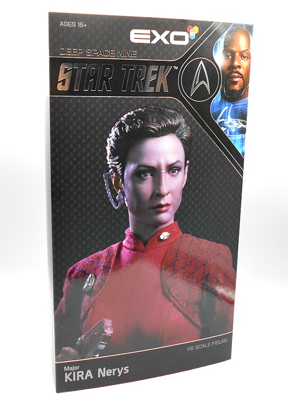
The package is right in line with what we saw with Archer, consisting of a window box with an outer sleeve that lifts off the top or bottom. The figure is nestled in a vac-formed plastic tray with the extra bits around him. It’s nothing terribly flashy, but it gets the job done. I will note that this is one of the few occasions where the photo on the front of the box doesn’t horribly misrepresent the figure by looking terrible, but the finished product is still lots better.


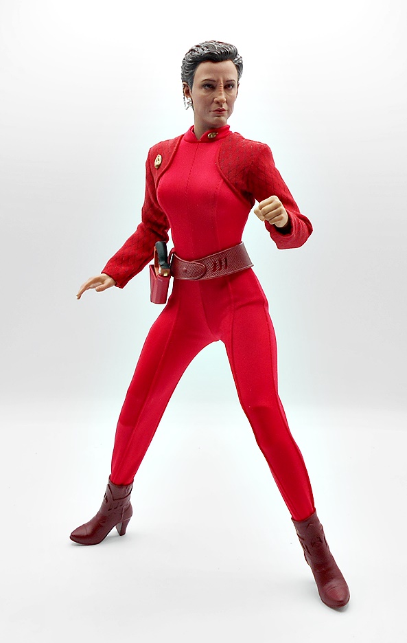
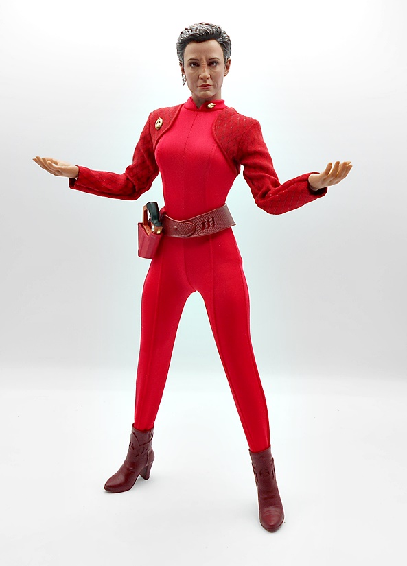
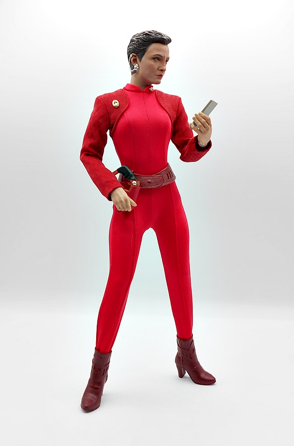
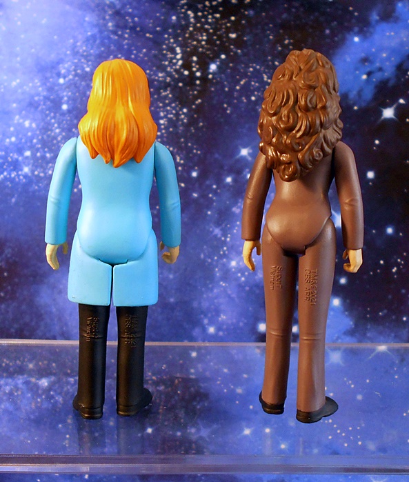
Shran comes out of the box all ready to go and I have to say Exo-6 continues to kill it with this line. Sure, you could argue that the Andorian uniform design in Enterprise isn’t the most flashy thing around, but I do love how it extrapolates the simplicity of The Original Series and just adds some texture for modern high definition screens. Here you get the slightly glossy pleather of the trousers and three-quarters of the tunic, with the other part of the tunic done in a soft, furry material, mixing future style with an almost primitive, tribal feel. Finally, the reinforced belt, shoulder strap, and armband adds that military vibe. And most curious is the complete lack of insignia, reflected in the original design. There may be nothing in this costume to get terribly excited about, but it’s executed wonderfully, with immaculate stitching and a really good fit. The boots are soft plastic and they are sculpted in one solid piece, which means they look seamless, but there isn’t much range in the ankle joint that’s buried inside. You also get a permanent hard case holster on his right hip for his sidearm.


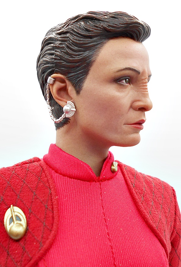
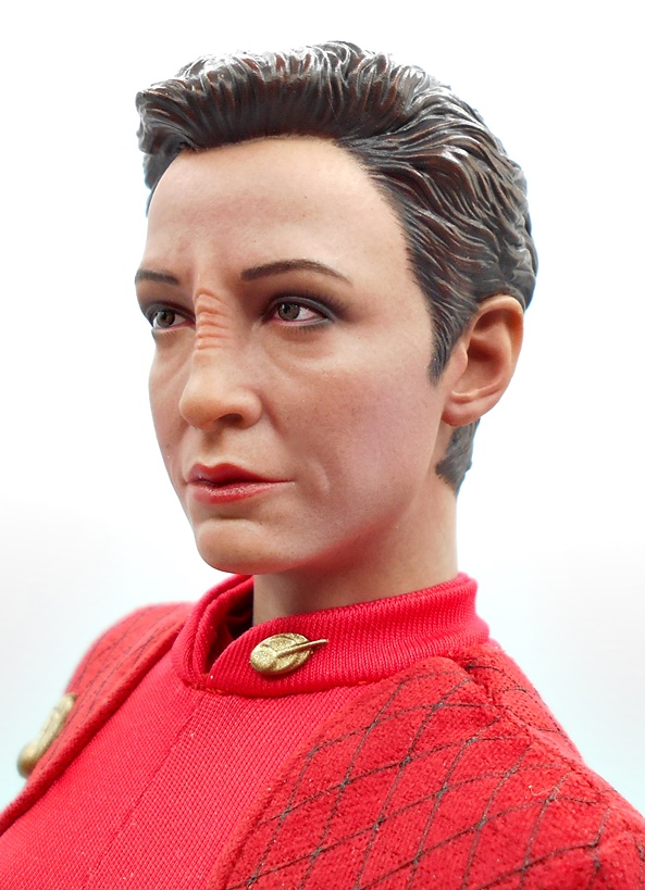
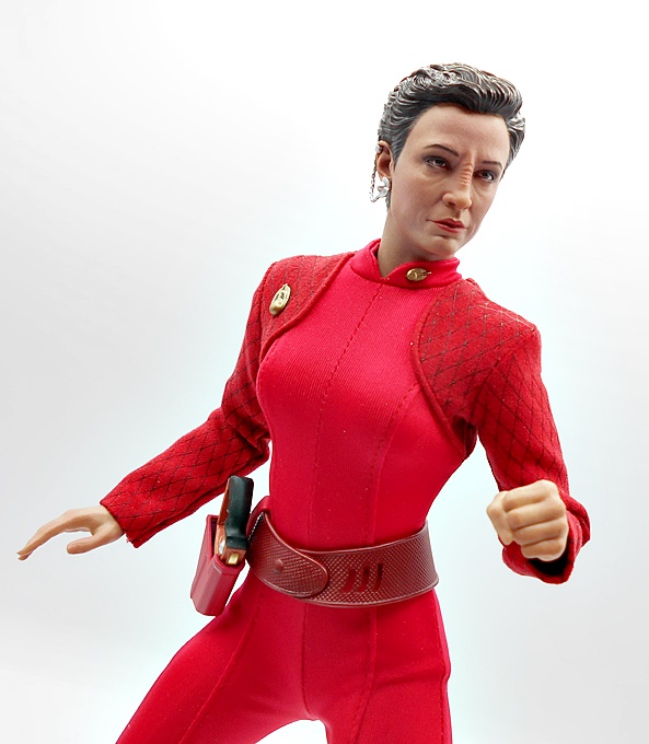
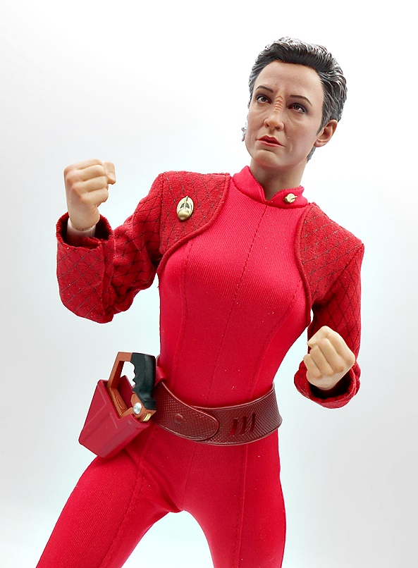
The portrait is outstanding, both in sculpt and paint. They really nailed the likeness of Combs in the makeup, and I often wonder if that’s more or less challenging to do rather than just the straight likeness. Shran sports a powerful brow, deep set eyes, tight lips, and some rather pronounced creasing. The detail in the hair sculpt is extremely sharp and the antenna are cast in a permanent arc, almost pointing at each other. Yeah, it’s a shame they couldn’t have done them in soft plastic with wires to make them poseable. The pale blue skin tone is pitch perfect and there’s some really nice texturing to the skin itself. With over half a dozen of Exo-6’s Trek figures on my shelf, I haven’t had a lot to nitpick when it comes to the portraits, and that’s not going to change today.


If there’s one place this figure disappoints a bit is how restrictive the uniform turned out, particularly in the groin and shoulders. I expect this from a lot of Sixth-Scale lines, but the uniforms in Trek tend to be a bit more forgiving than the comic heroes and whatnot. Here it’s just a matter of the pleather not giving to allow those wide action stances I would like, at least not without feeling like I’m going to pop some stitches. I can get 90-degrees out of the shoulders, but that’s it, and I’ve already talked about the ankles. At least the knees and elbows are easy to work with! Of course, you get several set of hands, including fists, relaxed hands, trigger-finger hands, and an accessory holding hand.


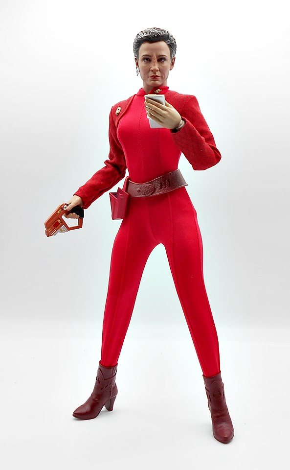
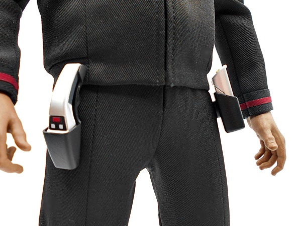
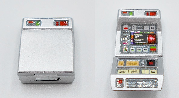
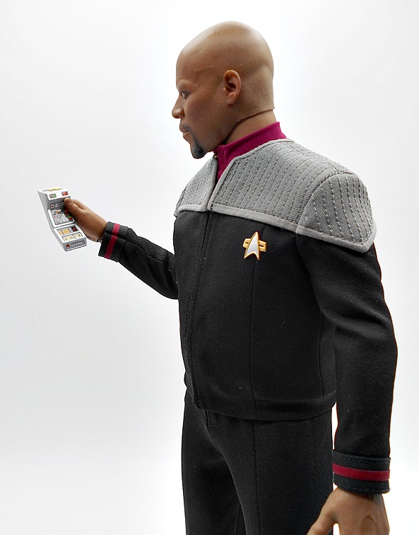
Exo-6 does tend to be a little stingey and redundant with the accessories in this line, but Shran here made out pretty damn good. Starting with the least interesting piece first, you get this tiny communicator. The design mimics the retro-tech of the series pretty well and what can I say, it is what it is.


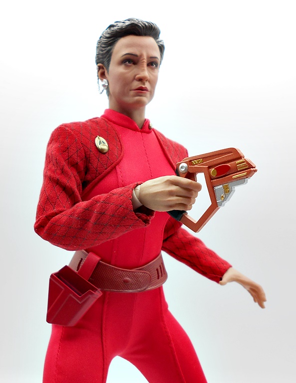
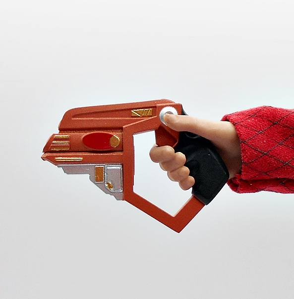
Far more interesting are Shran’s two weapons, both of which I believe were first seen in The Andorian Incident. First, he comes with a standard issue Imperial phaser pistol. It’s a super clean looking design with a silver finish, electric blue paint applied to the power coil, and some nice overall nice sculpted detail.


Secondly, he has a plasma carbine. Yes, this is technically called a rifle, but I think it qualifies more as a carbine, as it’s barely bigger than the pistol. It has a very similar design aesthetic to the pistol, right down to the silver finish and blue power coil. This one has a skeletal stock. It would have been cool to get a shoulder strap with it, so he could carry it, but I can’t remember if that was a thing in the show or not.


And finally you get a set of Ushaan-tor, which are basically serrated ice mining tools that the Andorians also used as weapons and to fight duels. These are coupled with a set of gauntlets worn on the non-blade wielding hand. These have ringlets to attach a cable, as was shown in the episode, Unity, when Shran and Archer fought each other and their gauntlets were tethered to each other. I love that these are included, and I’d love to see more one-off, episode specific, accessories like these bundled in with future figures.

And our final stop on these reviews is always the stand, and this is the same type that Exo-6 has been including with pretty much all their Trek figures, regardless of the series. I probably have enough of these now to assemble together into a transporter pad, and I’ll really have to give that a go when all these figures get unpacked again. The figure is held by a standard crotch-cradle post and you get clips to connect multiple bases together.


I was probably as surprised as anyone to see Shran released as the second figure in the Enterprise line up. I was sure that would have been either T’Pol or Tucker. Not that I was unhappy to see him, as I smashed that preorder button the moment he went up. Shran retailed at $215, which isn’t too bad for a Sixth-Scale licensed figure these days and as is the case with most of these Exo-6 Trek figures, he sold out pretty fast. So far both T’Pol and Hoshi Sato have been put up for preorder, and I do believe that T’Pol is scheduled to arrive first. And yup, I’m All-In on this line! Is it too much to dream that we’ll get a Tellarite for Shran to fight with? Probably, but you never know!