Avengers: Captain America Quarter-Scale Figure by NECA

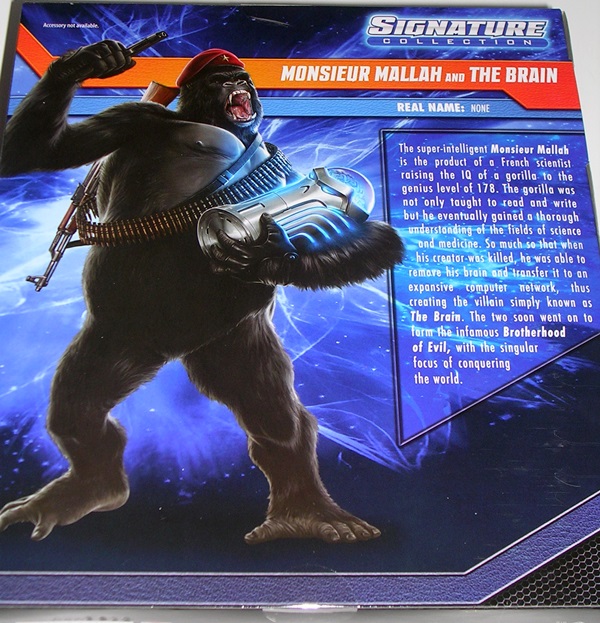
Yeah, I know, yesterday was Marvel Monday, but I’ve decided to keep the week going with a trifecta of Marvel stuff, because that’s just how I roll. The availability of space has always been at odds with my collecting habit. So, what do I go and do? I buy a goddamn quarter-scale Captain America figure, that’s what! It’s the first purchase that I’ve made in a while that had me starting to wonder if I have a serious problem. The saner voices in my head told me that buying this thing was against all reason, because I have nowhere to put him and he’s probably destined to hang out in his box by my Mezco Thundercats Mega-Scale figures. On the other hand, everything about this guy is EPIC, and I have a lack of willpower, and that combination is the unholy formula that brings us to today’s feature.

DSCN0990

Cap here is my first quarter-scale figure. Yes, I knew how tall he was when I ordered him, but it wasn’t until I got him in hand that I really comprehended it. The box is massive and it doesn’t waste a lot of space. I’ve included my 3 3/4” Hasbro Cap for comparison. I love the deco on the box; it’s colorful and really captures everything that Cap is all about. Given how huge the box is, I expected mine to be pretty messed up in shipping, but it’s pretty heavy duty and apart from a ding on the top and some scratching on the large window, it’s not bad at all.

DSCN0989

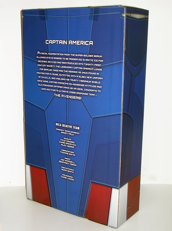
The back has a list of people who worked on the figure, not unlike you might find on a Hot Toys box, which is pretty cool because if something’s messed up you know who to blame. The box is totally collector friendly as Cap is just tied to the tray, which slides right out. A fair word of warning, the plastic fumes from a regular NECA figure are bad enough, now magnify that by about six times. When I pulled the tray out and the fumes hit me, I was afraid I was going to pass out and wake up 50 years later. Because… like Cap got frozen… and he slept a long time… the fumes… they were… ok, moving on.

DSCN0996

DSCN0997

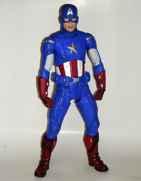
Out of the box and Cap is one remarkably solid hunk of plastic. There’s a lot of heft here. I could seriously wield this thing like a weapon and do a lot of damage with it. Just to further put his size in perspective, your average Sixth-Scale figure comes up to his belt! It’s amazing to me that the durability on this piece matches its size. If he weren’t so expensive I’d be tempted to grab him by the leg and drag him around the neighborhood and have adventures with him. But I wouldn’t want to wreck him by doing that. And also, I’m 40.

DSCN1001

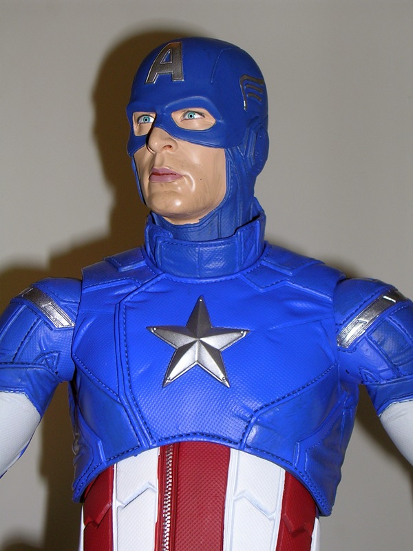
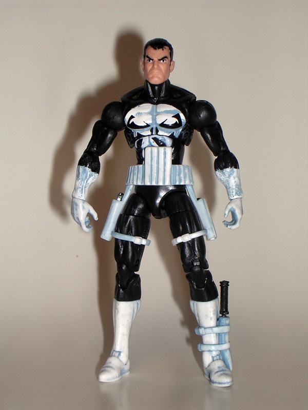
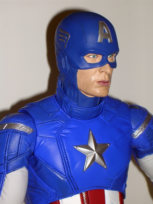
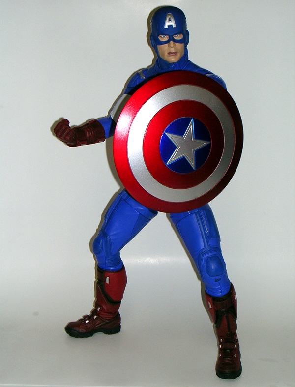
Ok, so he’s big and he’s heavy… how’s he look? Fantastic! Let’s start with the portrait. NECA did a great job with the likeness to Chris Evans and the way the mask is sculpted there’s a lot of convincing depth to it, even though the whole head is molded in one piece of plastic. The flesh paint on the face looks solid and while there’s a little slop under his chin, the rest of the paintwork on the head is just about flawless. The wings and the “A” are all part of the sculpt and they’re meticulously painted in a high gloss silver.

DSCN0999

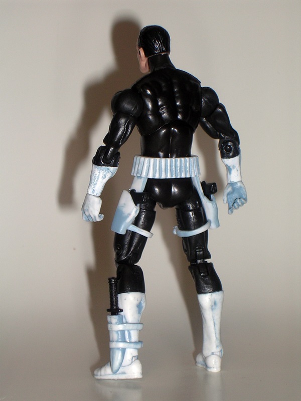
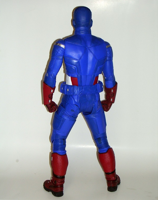
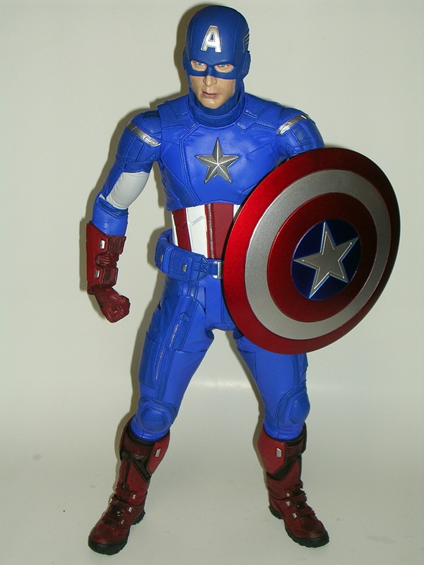
The rest of the costume is faithfully recreated with all the little loving details. Every tiny square millimeter of the costume is textured, giving it a seriously realistic look. In fact, I’ll go one better. The Cap costume in the movie looked a little too puffy, like soft padding to me. The texturing on this figure makes it look more rugged and credible, like there’s a body-armor quality to it and it would have a chance of surviving an engagement with an enemy. But besides the texturing all the little seams and stitches are present, and oddly enough, I think I’m most impressed by the sculpted teeth on the zippers. The gloves look great and even the treads on the soles of his boots are sculpted as if they’re a prominently visible part of the figure. I have zero complaints about the sculpt on this guy… it’s every bit as epic as the size of the figure.

DSCN0993

The paint is vibrant and gorgeous. The combination of deep blue, bright white, and the crimson captures everything that is Captain America. The extra little touches of silver on the star and epaulets and zippers and fasteners all really make the figure pop. However, the paint is not perfect. There’s a tiny bit of bleed around the red and white vertical striping on his torso. There’s also a little rubbing on the white vertical panel on his left side, thankfully behind the shield. There’s a few tiny marks of red spray on his belt. All these imperfections are minor to say the least, and pretty understandable when you consider the amount of surface space being painted here. I’m also reminding myself that this guy clocks in at under $100, and honestly, I’ve seen similar little paint issues on far more expensive pieces, so I’m not complaining.

DSCN0991

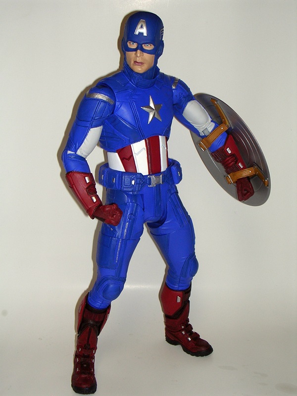
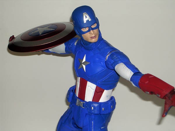
Cap comes with his shield (well, duh!) and two interchangeable hands. The figure is boxed with his fists on, while the extra hands include a right hand designed to hold the shield as if he’s about to throw it, and a left hand that’s just splayed out. The hands are attached with pegs and just pop in and out. The first time I did it a bunch of red paint flakes appeared and I freaked out, but they were just from the inner post. Phew!

DSCN0994

The shield itself is an impressive piece. The paint on the front surface is metallic, and while it’s not as vibrant as the Hot Toys shields, it is very attractive. I was worried whether NECA was going to be able to pull off an acceptable metallic paint job across a surface as large as this shield, but they certainly did. If you look really closely, you can see some scratches on the inner red circle above the star, but you really need to get in close to see those imperfections.

DSCN0992

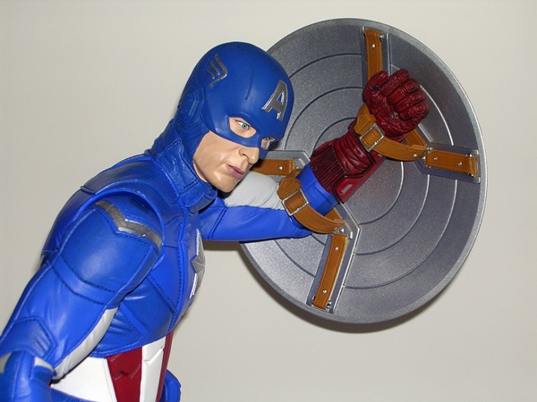
The back of the shield is fully sculpted and features two permanently attached soft plastic belts. To get Cap to hold the shield, you just need to pop off the hand and slide the loops through the arm. Some may take issue that the hand isn’t actually holding the inner strap, but I think it looks fine the way it is, and the shield stays in place quite well.

DSCN0995

Cap has a ton of good articulation, but he is by no means what I would call “super” articulated. Make no mistake, this is an action figure and not a statue. You can get him into a lot of great poses, but some of his joints don’t have the same range of motion as you would find on a smaller figure with similar joints. Here’s what you get… There are ball joints in the neck, shoulders, elbows, wrists, knees, and ankles. The legs feature hip joints not unlike Mattel’s DCUC style, which allows for a wide stance. You also get swivel cuts in the thighs. The torso features a swivel in the waist and a ball joint in the torso. About the only joint here that isn’t terribly useful is the torso ball joint. It offers very slight movement, which is why I’m particularly glad that the waist swivel is there. Swivels in the biceps would have went a long way, but the ball joints in the elbows help a bit in their absence. Overall, what’s here is really good and serves to make Cap as fun to play around with as he is impressive to look at.

DSCN1002

And there you have it… am I at all sorry I bought this figure? Nope. Do I have any idea where I’m going to put it? Nope. In the end, my guts told me he was too spectacular to pass up, and now that I have him, I can say it was a great decision because I absolutely adore this figure. NECA supposedly limited this guy to a production run of 7500, but he’s still readily available at a number of e-tailers and his price hasn’t even begun creeping up yet. Quite the contrary, the MSRP was $99, but I got him from BBTS for $85. You get a lot of figure for that price, and while I was a little late at getting my Pre-Order in for the Quarter-Scale Iron Man, I’m hoping I can still get it fulfilled. If I do get Iron Man, I’ll likely pull a shelf out of one of my bookcases so the pair can be displayed as they deserve to be.

Marvel Universe: The Punisher by Hasbro

I started Marvel Mondays many weeks ago to force me to get through the huge stack of Marvel Universe figures that I had building up in my receivings pile. I eventually got through them all and started padding it out with some Marvel Legends. But last week my BBTS Pile of Loot arrived bearing enough Marvel Universe figures to keep this going for another month or so. Today we’re looking at The Punisher. Much like Steve Rogers from a few weeks back, Punisher is an MU figure that has been released in the new Legends format as well. Also like that Steve Rogers, I found the ML version of Punisher to be an absolutely fantastic figure. Does this little guy have the chops to stand up to his bigger version? Let’s find out!

DSCN0974

There’s the packaging. If you’re buying Marvel Universe Punisher from a reseller, make sure the package looks like that. You don’t want to get Hasbro’s first attempt at this guy because it was total ass. Seriously, he had a big slab of pinched ham for a head and looked like Masters of the Universe reject, Punish-Or. On the downside, this new release has no figure stand or Fury File, just a crappy little piece of cardboard with a comic cover printed on it. Hasbro, you’re not fooling anyone by trying to pass off little “comic shots” as anything that adds value to the figure. It really crosses the line, Hasbro, and Frank Castle shows no mercy to anyone who crosses the line. It says so right on your own package.

DSCN0975

I’ll confess that I enjoy the running gag through each wave that has a Marvel character imploring you to collect all the figures. In this case it’s MODOK demanding that you turn them all into AIM soldiers. There’s something so strangely appropriate about MODOK schilling Hasbro products.

DSCN0981

DSCN0982

Kicking it off with a look at the portrait, The MU version of Frank Castle is very close to the Legends version. It’s the same great “I’m determined to make you dead” expression and it works quite well. This is a man that is inviting you to a bullet buffet and it’s all you can eat. This 3 ¾” version is clean shaven, and I think it’s a good thing Hasbro didn’t attempt the five-o-clock shadow on the smaller figure. I’m really quite happy with the head sculpt the way it is. I don’t think I’d change a thing.

DSCN0983

Punisher makes use of a standard, painted buck with some extra parts for his gear. Alas, I’ve never big a big fan of Hasbro’s heavy use of blue wash on the white parts of the costume. I get what Hasbro is trying to do here, but it never really looks right and it gives me fevered flashbacks to the Stormtroopers in those initial Star Wars comic packs. I can live with it on the boots and gloves and belt, but it really works against the skull emblem on his chest. On the up side, I love the belt and holster rig. It fits the figure well and the FUNCTIONAL holsters have thigh straps. Hey, MODOK, you know what I always say about functional holsters?

DSCN0975b

Damn straight, dude! You also get a working sheath on his boot for his combat knife. All of this is so cool that I’m willing to overlook the unfortunate paint wash.

DSCN0984

DSCN0985

Speaking of holsters and sheaths, Frank comes with a decent assortment of artillery. You get his two automatic pistols, a combat knife, and a machine gun. The pistols seem kind of small for Frank’s overstated tastes, but I do enjoy the fact that Hasbro bothered to paint the receivers silver. I believe the machine gun is an MP-5, which is a nice addition. The combat knife has a serrated blade, for when Frank wants to get up close and personal, or possibly just sign his work. One thing worth noting is that Frank’s hands do not have the trigger fingers sculpted separately. That makes it very difficult for him to hold his weapons properly. It’s an easy fix. Just take a razor blade and cut between the trigger finger and the rest of the hand. It makes a huge difference!

DSCN0986

Punisher is based on one of the better bucks, so he features excellent articulation. The neck is ball jointed and also has the extra hinge for a wider range of up and down movement. The arms feature ball joints in the shoulders, swivels in the biceps, hinges in the elbows, and swivels in the wrists. The legs feature ball joints in the hips, swivels in the thighs and again at the top of the boots, double hinges in the knees, and hinges in the elbows. There’s a ball joint in the torso and he can swivel at the waist. I’ll also happily note that my figure is free of any warping or QC issues in the joints.

DSCN0980

The MU Punisher doesn’t quite capture all the amazing qualities of his Legends cousin, at least not as well as the Steve Rogers figures do. Nonetheless, I’m still very happy with the way this guy turned out. The paint wash is certainly disappointing and mars what could have been a perfect figure, but there’s always hope for a repaint or tweak later on down the road. In the interim, I’m certainly happy to have this guy in the 3 ¾” scale. He’s lots of fun to play around with and a worthy addition to any Marvel Universe collection.

Sunday Funday: My Ten Favorite Things About Last Night’s Doctor Who!

Wow, yesterday’s “Journey to the Centre of the TARDIS” was a cracker of an episode. I loved it to death and since I’ll probably spend today watching it again, I thought I’d run off a  quick list of the things I loved most about it… If you haven’t seen it yet… SPOILERS!!!

3663_637043966309634_420340300_n

  • The Doctor tricking the salvage team into thinking they had only 30 minutes to rescue Clara before he blew up the TARDIS was brilliant… The set up was even more so… “Behind those doors is the salvage of a lifetime!”
  • “We’re in trouble, Clara… proper trouble!” LOL.
  • Matt Smith is unbelievably brilliant even in the mediocre episodes, but give him something like this one and there’s no stopping him!
  • Validium!!! The “living metal” invented by the Time Lords and featured prominently in the 7th Doctor story “Silver Nemesis.” Ok, it wasn’t mentioned by name, but we saw where it’s used by the TARDIS as part of her ability to alter her own internal geography. So cool!
  • Even trashed, the new console room looked absolutely gorgeous in this episode.
  • The Eye of Harmony… ‘nuff said.
  • The bit where you hear all the voices that the TARDIS remembers hearing inside her console room. In addition to various incarnation of The Doctor, you get to hear Susan and Ian Chesterton. That put a huge smile on my face.
  • Clara’s skirt!!! 😉
  • There’s an Encyclopedia Gallifrey and it’s in liquid form and stored in bottles! Which brings me to…
  • Holy Christ, there’s a leather-bound History of the Time War in the TARDIS library!!!!! I love this on so many levels. First, I love and collect antique books. I spent eight years of my life buying and selling them for a living. I would LOVE to have that prop! Secondly, I think it’s hilarious that there’s a “history” of something that has been Time Locked and therefore effectively removed from time itself. It’s almost like having a history of something that was erased from history. 

Great stuff! I can’t wait until next week’s!

Transformers Cybertron: Metroplex by Hasbro

I don’t know about y’all, but I’m pretty damned psyched to get my hands on the new Metroplex that Hasbro showed off at Toy Fair this year. It’s a brand new size called a Titan Class and it will supposedly stand about two feet tall and feature both city and battle station modes, and yes it’ll be just a smidge taller than that certain huge combining robot that Mattel offered up last year. But talk about bad timing. Hey Hasbro, why do you want to go and take the piss out of Takara’s Encore Fort Max by upstaging what was the largest official Transformer of all time by a couple of inches? Anyway, I’m not here to debate the politics of the decision, nor am I suggesting that G1 Fort Max is any less amazing for it. Instead we’re here to take a look at the last big Metroplex figure that Hasbro delivered back in 2006 as part of their Cybertron line. While he’s got some issues, I like this figure a lot. He’s one of those select favorites that rarely ever gets rotated out of my active display. I don’t have an in-package shot, so let’s just go ahead and start with his alt mode.

DSCN0925

Metroplex is a… ahh… hmm. Well, he’s supposed to be a giant alien excavator, which sort of flies in the face of the fact that Metroplex, by his very name, should at least have some kind of city mode. Sure, it’s big and powerful looking, but it also feels like the alt mode is a second thought and if you look at it long enough, it’s easy to see that it’s more or less just a robot on all fours. Obviously, this was the biggest sticking point for fans accepting this version of Metroplex into their hearts. I don’t have a problem with a Transformer excavator, but I’m not sure it needed to be named Metroplex. I try to remind myself that the Cybertron toys were heavily tied into the cartoon series, but no matter how much alcohol is involved, my attempts to consume that particular fiction have all failed. Apparently, this Metroplex comes from the Giant Planet where Transformers grow to be really big and everyone seems overly obsessed with the unending task of building massive cities on top of old ones. Hey, at least there’s a city tie-in somewhere, right?

DSCN0926

DSCN0927

With all that having been said, Metroplex’s alt mode is still kind of fun and fairly impressive looking, even if some of it doesn’t make sense. Based on the position of the digging wheel, the cockpit seems to be facing the wrong way. Of course, it works to slightly modify it into a crawling death machine with a giant chomping claw. Eat your heart out Jayce and the Wheeled Warriors… this is f’cking armed force on steroids! Yeah, well… it’s Metroplex’s robot modes that make me keep him on the shelf and out of the storage totes. Wait, did you say robot modes, plural? I did indeed. Metroplex has two robot modes, which I believe were referred to as work mode and combat mode. They’re fairly similar, but one is significantly taller than the other. Let’s start with the smaller of the two.

DSCN0928

DSCN0929

Metroplex’s work mode is one big and chunky bot, supported by a marvelous system of heavy ratcheting joints. The joints are so ridiculously strong and noisy, that he practically makes that iconic G1 transforming noise just from the ratcheting joints alone. I’ve long forgotten what the official modes for Metroplex look like, but I do like using his cockpit head for his work mode. It’s a little nod to Omega Supreme and it also makes him look like one of the old Starriors figures from Tomy (Note to self: Do some Vintage Vault features with Starriors!). Sure, he’s got huge feet, but apart from that I really dig this guy’s proportions and overall aesthetic. There isn’t much of a G1 Metroplex homage at work here, but that’s ok with me, because not everything needs to be a nod back to something else for me to like it. The coloring is great, and the quality and finish of the white plastic used here is really nice. His deco is rounded out by a pair of sharp little Autobot insignia on his shoulders.

DSCN0933

DSCN0934

DSCN0935

Changing Metroplex into his battle mode involves some nifty engineering that unfolds the legs and the torso. In fact, it’s far more clever than what’s involved changing him from his alt mode. You do indeed get a much taller robot, and while the arms are more or less the same, there are enough changes here to make him stand out from his previous mode. Here’s where I like to roll out the true head, and therein lies the biggest G1 homage on the figure. I just love this dude’s head sculpt. He’s got the antenna on each side, similar to G1 Plexy and some cool light piping in the eyes. He also looks like he just stepped on a Decepticon and now needs to scrape it off the bottom of his foot.

DSCN0936

You may have noticed that a big part of Metroplex’s alt mode is conspicuously missing from from both his robot modes. Yes, the excavating arm detaches and actually turns into his weapon: A weapon that is gloriously named, Sparkdrinker. I think Sparkdrinker is supposed to be an axe, but it looks more like a mace to me. Inserting the Cyber Key causes the digger wheel to expand a bit. It’s not a terribly dramatic conversion, but I don’t care because as a weapon Sparkdrinker is both ridiculous and beautiful. It’s not terribly graceful or easy for him to wield, but if he hits you with it, you will most certainly die.

DSCN0931

DSCN0932

DSCN0930

The last thing worth mentioning here is Metroplex’s minicon, Drillbit. I love minicons, and I really do miss them. Drillbit is one of my all-time favorite minicons, probably right behind Leader-1. He has a great looking robot mode, and a pretty cool little drill tank mode. He can also clip on to Metroplex’s arms and make a convincing looking gun, or a drill weapon that basically drills into your face as he punches you. Awesome!

DSCN0937

And that, my friends, is 2006 Metroplex. I’m not terribly in tune with the ebb and flow of the Transformers community, but I get the sense that this guy isn’t terribly well revered and I think that’s ridiculous. He’s a huge, fun toy with great poseability and I never get tired of playing around with him or having my Classics Decepticons try to attack him en masse and fail miserably. I love his sculpt and deco and he just looks so majestic sitting there on my shelf. Granted, if you’re looking for a G1 homage, this isn’t it, but he’s a fantastic toy all on his own.

Lego Minifigs Series 9 Crapshoot #1

It’s time to spin the fickle Wheel of Fate with another handful of blind bagged Lego minifigs. I picked up three of these at Walmart the other day. That’s three bags of mystery containing either joy or terror. What will they be? Opening these is like closing your eyes and sticking your face into a box that may or may not contain a rabid badger. Actually, it’s really nothing at all like that. Scratch that, forget I mentioned it.

DSCN0938

Anyway, I haven’t exactly been consistent in collecting these, which should be apparent since the last Minifig Crapshoot I did was way back in November and that was Series 8. This time we’re moving on to Series 9. I like to do three at a time, so I can keep score and see how I did. With three there can’t be a tie. Let’s get the ball rolling and see what’s in baggie number one…

DSCN0944

Hell and Yes! It’s Chicken Suit Guy!!! I have been following the minifig scene enough to know that there have been several figs of people in animal costumes. I haven’t been lucky enough to get any of them until now. Chicken Suit Guy is a pretty good place to start and a strong first showing for today’s Minifig Crapshoot. Yes, with only four pieces plus the stand, he’s a very simple figure, but I’m into the spirit of CSG more than anything else. He’ll also fit right in with some of my Lego Police sets, because I’m going to have those guys arrest him for being a public nuisance and beat the living shit out of him while he’s in custody. I’m almost afraid to move on to the second bag. Surely a score like Chicken Suit Guy can only be followed by disappointment and rage. Oh, the anticipation… let me take a swig of Jameson.

DSCN0943

Holy shit balls… I don’t recall this ever happening before, but yes… doubles! DOUBLES!!! It is indeed another Chicken Suit Guy! If you tell me you saw that coming I would brand you a filthy liar and kick you down the stairs! In all the years of doing Minifig Crapshoot (actually, I’ve only done two) this is totally unprecedented. I don’t even know how to score this. One Chicken Suit Guy is clearly a win, but two? Did I need two?? Ugh… Minifig Crapshoot is blowing my mind. What does this mean? I’m almost tempted to just forget it and not tempt fate with the third bag, but I must. And it’s… it’s…

DSCN0945

Oh, snap… Here come the Judge! It’s the British Magistrate and he is glorious. Not only does he have a nice printed torso, but he has a cool cape and sash on the front that I’ve never seen employed on a Lego minifig before. He’s also got that amazing powdered wig and a gavel and his little Lego face just stares at you disapprovingly. I absolutely love this little guy. Not only is he just a great little minfig, but there is no way I would ever have a Lego set that would possibly include anything like him. Plus, once the cops arrest the Chicken Suit Twins, he can sentence them to hard time. British Magistrate has no patience for the antics of the Chicken Suit Twins, and he shall hand down a harsh sentence indeed! It all makes sense now!

DSCN0946

Overall, I’m scoring today’s Minifig Crapshoot as a win. Yes, against all odds, I got doubles, but I think the quality of the individual figures outweigh that unfortunate circumstance. Also, having a look through the checklist has really motivated me to have another go, because there are actually a bunch of figures in this series I would love to have.

By figurefanzero Tagged

DC Universe Signature Collection: Monsieur Mallah and The Brain

Ok, here’s where we separate the boys from the men, the dabblers from the collectors. It’s an action figure of Monsieur Mallah. Who ever thought it would come to this? I never dreamed Matty would ever have the balls to do a release like this one, but they upped the game. They said, “Oh? You like DC Comics? You like to get some action figures based on characters in some of those comics you read? Get a Superman or a Batman? Hmm? Maybe get some backbenchers? Some B-listers and C-listers. Hmm? Make you feel hardcore?” (If you didn’t read that in Stewie’s voice you’re doing it wrong) “Well how about this… we’re making Mallah and The Brain, muthf’ckers!  Are you hardcore enough to put that on yo’shelves?” Well, I guess I don’t have any choice, because they’re the Sub Exclusive. I’ll confess I am inexplicably delighted at this release, not for any overwhelming affection for these characters, but just because they’re such an unlikely release, I need them in my collection.

DSCN0956

DSCN0958

The occasional enemy of the Doom Patrol and Teen Titans, this pair comes in a large and wide window box, similar to the one that housed Metron and his Mobius Chair. I was actually surprised at how big the box was, mostly because The Brain is much bigger than I expected him to be. As always, the box shows off the figures quite nicely, with Mallah’s gun mounted behind his head, but still visible above The Brain. The character art is solid, but probably not among the best we’ve seen in this series. I guess when you’re drawing a gorilla wearing a beret and a bandoleer strap of ammo, and holding a brain in a cybernetic container, you don’t feel the need to go all out. I also noticed the bio didn’t mention anything about the romantic connection between these two. It’s possible that Mattel left that bit out because they didn’t want to be responsible for people’s heads exploding when they read the package.

DSCN0965

DSCN0966

Let’s face it, there’s no shortage of action figures of gun-toting gorillas wearing berets on the market today, and yet Mallah still manages to stand out. The realism of the sculpt is dead impressive. The stoic determined expression of the sculpt is only to be matched by the amazing paintwork on the eyes. You’d think the initial reaction to seeing an ape in a red beret would be comedy, but Mallah pulls it off with quiet dignity. No, my first reaction to seeing Mallah would not be to laugh, it would be to shit my pants and run. In any event, this figure is gorgeous.

DSCN0967

Mallah’s body is recycled from the DCUC Collect & Connect Gorilla Grodd. What? You didn’t expect Mattel to churn out an entirely new gorilla body, did you? It’s a good reuse of that figure, and since I sadly don’t own a Grodd, it won’t be apparent when Mallah is displayed on my shelf. The body is big and powerful and the sculpted hair and feet and hands all match the convincing realism of the head fairly well. Mallah’s ensemble is rounded out with the belt of ammunition that hangs loose over one shoulder and a rather unique looking machine gun. Once again, I’m quite impressed with the work Mattel did on this guy.

DSCN0968

DSCN0969

Being a giant gorilla, Mallah’s articulation is a little different from your average DCUC style figure. He has no torso articulation at all, but I wouldn’t have expected it. I can’t imagine the engineering it would have taken to get an ab crunch into this beast. His neck is ball jointed, and offers a nice range of motion. His arms are ball jointed at the shoulders, have swivels in the biceps (suck on that, Larfleeze!), hinges in the elbows, and swivels and hinges in the wrists. His legs feature swivel cuts up at the hips and again at the ankles.

DSCN0970

DSCN0972

DSCN0971

And then there’s The Brain. Obviously, this is more than an accessory than an actual figure. It’s just a silver tube with some sculpted detail, a skull like face, and a clear dome housing… well… the brain. It’s a nice looking piece, but it is greatly at odds with the artwork used for the packaging. It seems like Mattel neglected to get everyone on the same page for this one. Nonetheless, it’s fine for what it is and Mallah can certainly hold it fairly well.

DSCN0973

I really think Mallah and The Brain was a great choice for a Sub Exclusive. If you didn’t Sub, you aren’t missing out on a crucial character, but you are missing out on a great figure. Sure, there are plenty of more important characters that need to be made, but Club Infinite Earth has been filling its share of holes, and I’d argue that this pair is exactly the sort of thing that the Club should be working on as well. Mallah represents a logical reuse of parts combined with some new sculpting that results in a truly fantastic looking figure that I’ll be happy to put up on my shelf.

DC Universe Signature Collection: Larfleeze by Mattel

April was a busy month on Matty Collector. For starters, they offered up a crap load of Masters figures. I’m happy to report that despite really wanting to get Mosquitor and Webstor through my Early Access privileges, I was able to resist. $27 a figure plus shipping? The stink of desperation is upon you, Matty, and you’re going to ruin a good thing with your greed. Speaking of greed (I LOVE SEGUES!!), Larfleeze was this month’s Club Infinite Earth figure, along with the Sub Exclusive, Monsieur Mallah and The Brain. Today we’ll check out Larfleeze and tomorrow I’ll double back to Mallah. Let’s go!

DSCN0954

You know the deal by now. The Signature Collection features nice window boxes that show off the figure very well. The box is totally collector friendly, but for space concerns, I now only keep the boxes for the oversized figures. Later today I’ll take a scissors to this one, cut off the back panel for keepsies and pitch the rest. Hey, I gotta do what I gotta do. Anyway, I really dig the character art here, even if it is drawing from the Larfleeze design that I like the least, but we’ll come back around to that in a minute.

DSCN0955

Aside from way back in Blackest Night, I haven’t encountered Larfleeze much in my regular funnybook readings, but then I’ve only read the first couple issues of the current Lantern books. Most of The New 52 Green Lantern and New Guardians are still stowed away on my Kindle waiting to be read. In fact, the last time I can recall seeing this fellow was in the delightful Larfleeze’s Christmas Special, a one shot which really betrays Geoff Johns’ bewildering and endearing love for this character. It was a lot of fun for what it was, and it even contained a recipe for Larfleeze’s Orange Lantern Cookies and other fun activities. DC really needs to turn that into a thirty minute animated special that I can pop in around the holidays.

DSCN0959

DSCN0960

So, the first thing worth mentioning about this figure is his portrait. The character has gone through some artistic changes over the years and this one is certainly at odds with his appearance in the aforementioned Christmas Special, which happens to be my preferred look for him. Gone is the horse face, and I’m not sure I’m all that happy about it. I’ll grant you that the head sculpt is very impressive, particularly the rictus grin with all those wonderful teeth, but I don’t think it has the same personality as the more elongated face. Although, this one is definitely a lot scarier. Maybe this would have been a good opportunity for Matty to have provided a swappable head. Either way, what’s here is definitely good.

DSCN0962

As expected with these Lantern figures, The body is a very simple sculpt, with most of the detail of the costume being painted on. There are raised discs for the emblem tampos on his chest and shoulders, and sculpted rings to segment his arm bracers, but the bulk of this body is just cast in orange plastic and has some black paint on the arms and torso. The paintwork is ok, although there is certainly some slop around the lines and the paint on the arms doesn’t quite match the orange plastic in the torso. There’s nothing spectacular here, but he gets by.

DSCN0961

Larfleeze’s articulation consists of ball joints in the neck and shoulders. The arms feature double hinges in the elbows and hinges and swivels in the wrists. The legs have the usual DCUC style hip joints, which allow for lateral movement, hinges in the knees and ankles, and swivels in the thighs just above the knees. The torso has a swivel in the waist and an ab crunch hinge. What’s missing? The bicep swivels. Seriously Mattel? You cut out the bicep swivels? That pisses me off beyond belief. These figures are supposed to be based on the DCUC style and that has always included bicep articulation in the male bucks. Cutting that out is unacceptable to me. I should also mention that there’s so little clearance in the ankle hinges, they might as well not be there either.

DSCN0964

Of course, Larfleeze comes with the Orange Lantern of Avarice. It’s more or less the same lantern we’ve seen before only with an orange coat of paint. But wait a minute… isn’t the orange lantern not supposed to have a handle? You managed to get that right in the super shitty Orange Lantern Lex Luthor figure, why’d didn’t you just recycle that piece? Hmm… Well, it’s probably a good thing that it does, because without those bicep swivels, it’s hard to get him in a good pose where he’s hugging it close to him.

DSCN0963

I’ll grant you, Larfleeze is a little disappointing. The portrait is what it is. It may not be the look I preferred, but I can’t argue with what is an excellent head sculpt. But cutting out crucial articulation is just not cool. I love the DC Signature Collection to death, but if Mattel starts making a practice of doing these little cost cuts in articulation, they’re going to find themselves with one less subscription next year. Still, considering, the only other Orange Lantern is Lex Luthor, and I probably hate him more than any other figure in my entire collection, it’s nice having Larfleeze representing on my shelf. Normally, I’d toss in a little bitching about the cost of the figure with shipping being way too much, but this month I got to split the shipping between him and the Sub Exclusive, so in the end, he probably only averaged around $20. Still a lot for one figure, but I am an irrevocable DC whore so it’s not like I have much choice.

I’ll be back tomorrow to check out the wonder that is Monsieur Mallah in all his improbable action figure glory.

Star Wars Unleashed: Clone Trooper by Hasbro

I had a lot of fun looking at those two Target Exclusive Star Wars Unleashed statues, so I thought I’d trot out the only other one that I still have in my collection. It’s the Clone Trooper from Attack of the Clones. I’ll confess, it may seem like an odd one for me to have kept, considering how many of the far more iconic ones that I sold off during The Great Star Wars Collection Purge. But just taking this statue off my shelf, I can instantly see why I kept it. It’s brilliant. Ok, granted, I’m guessing the real reason was because it wasn’t worth much in resale value, but that doesn’t change the fact that it’s brilliant.

DSC_0404_zps3fd86696

I’ll throw some recognition to “Unknown Completed Ebay Auction” for providing me with an in-package shot. Mine has been loose since the day I got it. Usually, I’m fine with skipping the in-package shot if I don’t have one, but in this case I just wanted to show off how these statues were originally released when not in those snazzy Target or Walmart Exclusive drums. The presentation is far more functional, and the statues were packaged off their base, but it is damn impressive that Hasbro was able to get these things into a carded package. Granted, it was a very heavy carded package with a very big bubble. Nonetheless, between the artwork and the actual statue, the packages just screamed excitement!  

DSCN0917

Once again, Hasbro blows me away with the design here. Anyone can do a statue, but to create a scene with this much energy and feeling is impressive. Here we have one clone buggering on among the mud and misery, and with a less fortunate fallen comrade at his feet. It’s a classic war scene, which just happens to be clones from Star Wars, but it could have just as easily been depicting any real war with real soldiers. In the end, I think that’s what I love so much about this piece.

DSCN0920

I’m not a huge fan of Attack of the Clones, but I do love that phase of clone armor far better than the designs used for Revenge of the Sith. Part of it is because it’s more Mandalorian and less Stormtrooper, but in the end I think it comes down to the more pronounced fin on top… that’s just fab! I do prefer the all-white look, but I can live with the fact that one of these guys has some red unit paint.

DSCN0919

The sculpt on the advancing trooper is fairly simple, maybe a little soft, but it works and all the important details are here. His pose is excellent, as it looks like he’s just reached the top of a hill and he’s about to continue the charge against the damnable clankers. His weapon is unfortunately pretty soft plastic, and mine has warped a bit over time. I can get it to straighten out pretty well, but eventually it will return to a slightly curved position. And again, I’m talking about the gun here… on the statue.

DSCN0918

Of all the Unleashed Statues I owned, this one features the most impressive base, because it’s like getting an extra figure in the statue. The rock is sculpted and painted particularly nicely, but it’s the fallen clone that makes this base work so well. The rag doll manner in which his limbs are splayed out around him is pretty gruesome and he’s got a couple of laser blasts painted onto his chest plate. The only thing here that doesn’t look so hot is the shattered glass on his visor. It looks more like spider-webs than broken glass.

DSCN0921

The paintwork is probably the least impressive thing about this piece, only because of the dirt wash over the legs. It’s rather heavy handed and similar to that hokey spray effect Hasbro loved to use during the POTF2 period. I think it’s passable here, just because it matches the rock base fairly well, but it’s one of those things that definitely reminds me that this is a very low end statue. Apart from that there’s not a lot of paintwork here, just the red striping and black parts of the armor.

DSCN0922

Even during the times when I had all the remnants of my Star Wars collection put away, this statue has had a place on display somewhere. It’s just one of those pieces that I can put on a shelf or end table and it doesn’t require companion pieces or any explanation as to why it’s there. It’s just a great looking statue that I can acknowledge as such, and I don’t have to apologize for it because it’s from those Prequels. The sculpt and paint are decidedly average, but it’s the design of this piece that I appreciate the most. Just looking at it makes me want to start hunting down some of the Unleashed Statues that I let go. But right now I’m resisting. For once I start down that dark path, forever will it dominate my destiny.   

Marvel (Iron Man) Legends: Classic Iron Man by Hasbro

It’s Marvel Monday! I did ship my Pile of Loot from BBTS last week and there are a handful of Marvel Universe figures in it, so hopefully next Monday we’ll come round and start looking at MU stuff again. In the meantime, let’s finish off the first half of Hasbro’s Iron Man-themed Marvel Legends wave. As I’ve no doubt said in the past, I wasn’t terribly excited to get any of the figures in the first half of this wave, but once in hand the first two have been pleasant surprises. Let’s see if Hasbro can keep that ball rolling with… Classic Iron Man!

DSCN0908

Yep, that’s the packaging we’ve seen the last two times. Not much new to say here. The figure comes mounted on the tray beside one of Iron Monger’s legs, as well as a swappable variant helmet mounted on the other side. It’s worth noting here that Classic Iron Man is another repack, as he was originally released as a TRU Exclusive some time ago. That puts Heroic Iron Man as the only genuinely new figure out of the three. In this case, I don’t mind so much since I’ve never seen the TRU version of the figure, and I don’t have a 6-inch Iron Man on my shelf.

DSCN0909

DSCN0910

Before we get to the rest of the figure, Iron Man is packaged with his “horned” helmet, which is a look that I’m not crazy about. It’s nice to have options, but I’m popping that baby off right now and forgetting it exists.

DSCN0911

Ah, that’s better. Over the decades, I’ve gone back and forth over my feelings for the classic armor aesthetic. I loved it as a kid, probably because that’s all there was. I turned on it at some point in the 90’s, and lately I guess nostalgia has kicked in because I’m back to digging it a lot. It’s those ribbed boots and gloves and the organic looking gold limbs that really drive home that memory of peddling my bike down to the Woolworths and leafing through comic books until I was thrown out for not buying anything. Part of what I dig most about it is that it looks appropriately primitive besides the various other armors and it’s cool to line them up “Hall of Armors” style to see the progression. But yeah, the rest is pure nostalgia. It’s that same clean and classic look that makes me love a lot of vintage sci-fi designs.

DSCN0914

There’s not a lot to say about the sculpt, other than it is fabulous. The muscles look great, particularly his abs and his back. That great ribbing, I mentioned earlier, is sculpted into the boots, gloves, and pelvic area. Unfortunately, the discs on his hips aren’t hinged so they will interfere with some wider stances, and I’m afraid to go too far lest I pop them off. As usual, Iron Man has one hand sculpted in mid repulsor blast and the other balled into a fist for punching fools. The soles of his boots are sculpted with repulsors and some panel lining too.

DSCN0913

Threre’s actually very little paint on this figure to speak of. Hasbro molded the bulk of him in red and gold plastics. The faceplate is painted gold, as are the little bit of forearms before the gloves. The paint matches the gold plastic fairly well. The red plastic looks more metallic than the gold, but all in all it’s a fairly attractive deco.

DSCN0912

Classic Iron Man features some very nice articulation. The neck is ball jointed, plus you get the extra hinge. The arms feature ball joints in the shoulders, swivels in the biceps, double hinged elbows, and swivels and hinges in the wrists. The legs are ball jointed at the hips, have double hinges in the knees, and swivels and hinges in the ankles. The torso swivels at the waist and features an ab crunch hinge. My only complaint here is the awkward ball joints in the hips. Sure they’re poseable, but you really need to work to get them to do what you want. Hasbro… stop using these!!!

DSCN0916

I didn’t include a shot of the BAF progress when I looked at Heroic Age Iron Man, but now that I’ve got two legs and a torso, I thought I’d put together what I can. Holy hell, Hasbro, why is it so difficult to snap the legs on this goddamn thing? I seriously had to put the torso against a wall and lean on the leg to finally get it to pop on. Apart from that, Iron Monger is looking mighty damn cool.

DSCN0915

And so, I tried to resist this trio of figures, but they turned out to be a nice little set, and Classic Iron Man here is certainly a worthy addition to my Hall of Armors. It’s worth noting that these were a lot easier to find on the pegs than other Marvel Legends waves. All three figures were plentiful at both the Target and Walmart in my area, so I didn’t have to hunt for any of them. They were all pretty much just impulse buys. Hopefully that will be the case with the second half of the wave, because those are three figures that I’m really excited about getting. Alas, if these three don’t start selling down, the second half of the wave will likely rot in the backrooms, and I’ll wind up paying a premium for those online in order to complete my Iron Monger.


Sunday Funday: Star Trek “Countdown to Darkness” Comic Prequel

During the build-up to the 2009 JJ Abrams Star Trek movie, I was one of the haters. Star Trek is something that is nearly sacred to me and the idea that it should be “rebooted for the masses” pissed me off. I’m not saying it is necessarily a bad thing for Nerd Culture to become popular. I love the fact that The Avengers is the top third best grossing movie of all time, but the property shouldn’t be compromised or beaten into submission to make it palatable to the average joe, and that seemed to be the mission statement behind the Star Trek reboot.

Ultimately, I enjoyed the movie a lot, but I find it ironic that it had the most baggage of any of the Trek movies to come before. Sure, it helped to have seen “Space Seed” before watching “Wrath of Khan,” but it wasn’t at all necessary to enjoy the movie. Abrams’ Trek, on the other hand, spun a tortured plot in order to shoehorn Spock Prime into the movie and make the reboot part of the story. Star Trek and Doctor Who are two of the major staples of my Nerd diet, I’m used to timey-wimey multiverse shit, and even I thought the story behind Abrams’ Trek was a jumbled mess. Nonetheless, the movie did very well, but I think that’s because the average movie goer experience may have started with “What the hell is going on?” but that confusion was quickly swept away by “Ooooh, lens flare! Oh, snap. He’s hiding that green bitch under his bed! Oooh, people are shooting and shit is blowing up!” I think a clean break would have been better. But in the end, I bought tickets, I bought the Blu-Ray, I bought some of the toys, and I am very excited for the sequel. So, congratulations, Abrams. You win this round.

count4

Which brings me to how I spent a chunk of my weekend… reading IDW’s four-issue mini-series, “Countdown to Darkness,” a series designed to build up to the new movie. Normally, I don’t read movie-comic tie-ins. There are way too many unread comics on my nightstand to add more. Besides, generally speaking they just aren’t that good. But the rabid supporters of the first movie would have you believe that if you read the comic prequel, “Nero,” you could have better understood the story. Yes, folks, the alleged “reboot for the masses” required you to read comic books prior to seeing the movie to fully understand what was going on! Brilliant! But this time, I thought I’d give it a whirl, because it was only four comics and most importantly a friend of mine lent them to me so I didn’t have to buy them. So how is Countdown to Darkness? How about Countdown to my Ass!!! This thing sucked on every level.

count1

Where to begin? It’s years after the events of the first movie and the Enterprise has logged some time doing all the boring shit that we don’t want to see in a movie, like scanning gas clouds and mapping stars. They wind up at an undeveloped planet that’s inhabited by bug people and protected by the Prime Directive. Their mission is to scan it and move on, but Kirk is tired of sitting around and decides to beam down to look at stuff. I realize that Kirk has always played it fast and loose with regulations, but he usually does so for very good reasons, not because he’s tired of sitting on the bridge. It makes this Kirk look like a whiny, spoiled brat who is willing to risk violating the cornerstone of Federation Law just because he’s bored. It’s a different Kirk, fair enough. But if I’m going to see movies about him, I need to like him, and I don’t like the Kirk in this book. Hey Starfleet, this is what you get when you recruit your commanding officers from drunks in bars.

count5

Of course, they wind up getting in the middle of a Civil War between two factions on the planet only to learn that the former Captain of the former Enterprise, Robert April, is stirring up the shit and that he’s in league with a femme fatale gunrunner, who happens to be the daughter of Harry Mudd. This is not professional comic book writing, this is late night Internet fanwank in its most basest of forms. But I’m more concerned with the continuity established here. There was another Enterprise 20 years before this one… and in the flashback panel it looks exactly the same as the one in the movie??? And I loved Robert April. I read two of the novels he appeared in. “Final Frontier” and “Best Destiny” were awesome. Now he’s a shitbag and we’re treated to snotty little Kirk lecturing him. Sigh. Anyway, April and Mudd take over The Enterprise and offer it up to the Klingons as compensation if they agree to name April the Governor of the planet and run it as part of the Klingon Empire. Holy shit, what? What? WHAT????? At that point, I had to stop and coif an entire tumbler full of Jameson.

count3

The real reason this mini-series got any notoriety is that it promised a sneak peak at the Abramsverse Klingons that we see ever so briefly (and tiny) in the trailer. The smart ones will just look at the cover to issue number four and be done with it. But, no. By now I’ve suffered through three issues of this dreck, featuring the whole rogue Captain who disagrees with the Prime Directive, which we’ve seen a hundred times before. Might as well keep going! In issue four the Klingons finally show up. They’re wearing battle helmets, they bluster, and they (*gasp!*) betray April. Kirk and Spock storm the bridge and Scotty resolves everything by rebooting (oh sweet irony!) the Enterprise so that Kirk can turn tail and warp away. April is in custody, Starfleet tells Kirk to dump him at a Starbase and forget about the entire thing, and in the last panels we’re treated to John Harrison (Benedict Cumberbatch in the film) accessing a computer in London. If that last bit is the only reason that this whole god-awful mess is an actual tie-in to the movie, it would be a crime for people who bought the comic for that very purpose. On the other hand, I hope it is the only tie-in, because if any of this other bullshit works its way into the movie, I’ll be seriously pissed off. Ultimately, I imagine that Harrison’s motivation for his terrorism will be because he disagrees with The Prime Directive and that will be the tie-in. We’ll see!

count2

Ok, so let’s quickly talk contributors. I’m not going to rag on writer Mike Johnson too much. I don’t know how much of this mess was forced on him by Roberto Orci to shoehorn it into a prequel, but I suspect it was a lot of it. Then again, Johnson’s resume doesn’t have a lot of noteworthy books in it. But hey, I guess you have to start somewhere. Besides a story that reads like bad fan-fiction, most of the dialogue just doesn’t suit the characters. Indeed, really the only writing that I found worthwhile was April’s monologue about The Prime Directive in issue four, as it was actually extremely well-written and even quotable. But even in the face of a good argument, Kirk just dismisses him as being crazy because he’s been away from Earth too long. HUH? And then just a few pages later he tells Spock that April made some good points. HUH????? Everybody wants to serve under Captain Indecisive… No way that’s going to get us killed at some point! At least it’s good to know this will continue to be the creative team behind IDW’s Star Trek ongoing book, as they will be adapting Original Series scripts into the Abramsverse. I can save a lot of time and money by not reading that book. Of course, if anyone is reading Ongoing and wants to convince me otherwise, feel free to have at it!

count6

As for the art, it’s passable, but nothing spectacular. There’s little resemblance in most of the portraits, but Kirk in particular looks nothing like Chris Pine to me. Some of the backgrounds are ok, particularly the bridge, but the Enterprise itself looks like minimalist garbage and if we see a Bird of Prey in the film, I hope to hell it doesn’t look like the piece of shit drawn in the comic. But, hey… lens flare! There’s plenty of lens flare! Just try comparing this book to some of the stuff coming out of Marvel and DC right now and it looks like hack work by comparison. It’s not to single out this book, I find it’s the case with a lot of IDW’s books (not including GI JOE). Hey, IDW… you need to open up that checkbook and get some noteworthy artists on the payroll! I usually pride myself on my comic book chops, and while the name David Messina was familiar, I couldn’t place him. A quick trip to Wiki reminded me that… yep, he did “Nero” the mini-series leading up to the 2009 Trek film. Apparently, he also did some Angel comics and… I shit you not… a bunch of “erotic parodies” including one of Harry Potter. Folks, it’s going to take half a bottle of Jameson to wash that out of my brain.

Ok so Sunday Funday wasn’t all that fun today. Unlike 90% of the Internet, I really don’t enjoy hating on stuff, but there was just nothing to enjoy here, and I’m kind of pissed at myself for taking the time out from reading the good stuff on my pile and detouring into this drainage ditch of a mini-series.

Ah well, I’m still really looking forward to the movie next month!

Images used are the copyright of IDW Publishing and are reproduced here for review purposes only. If you love comic books, support the artists and writers by BUYING them, either digitally or in print. Better yet, buy them in print and support your local comic shop too!