Nightmare on Elm Street (Freddy’s Revenge) Ultimate Freddy Krueger by NECA

A Nightmare on Elm Street 2 is a weird movie. It has some really cool imagery that makes it worth watching, but it comes from that transitional period where ANoES was taking its first step into becoming a franchise. A lot of it makes no sense. It’s nowhere near as scary or impactful as the original, and it doesn’t have the charm or personality of the later installments. It does have a psychotic exploding parakeet, so there’s that. It is undoubtedly the one movie in the franchise that I revisit the least, but as an Elm Street movie it still has some merit. And no, the remake doesn’t count, BECAUSE I HAVE NEVER REVISITED IT! Of course, when it comes to buying action figures, none of this matters to me. As long as NECA keeps putting out horror icons of the 80’s, I will keep supporting them. And that goes double for Freddy. I’m always ready for Freddy.

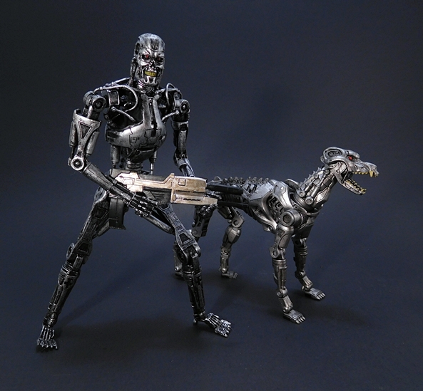
This is a the third time NECA has awarded Freddy the Ultimate release treatment. The first was the 30th Anniversary figure and the second was from Part 3: The Dream Warriors. The figure comes in a premium window box with a front flap that covers the window and is secured by velcro. And yes, when you hear that velcro tear, you know this is premium packaging. The front has some fantastic poster art for the flick, the back panel has some shots of the contents, and the whole thing feels like an oversized VHS sleeve. In this case, it’s extra over-sized, because Freddy comes with a couple of buddies. But I don’t want to get ahead of myself. Let’s start with Freddy.

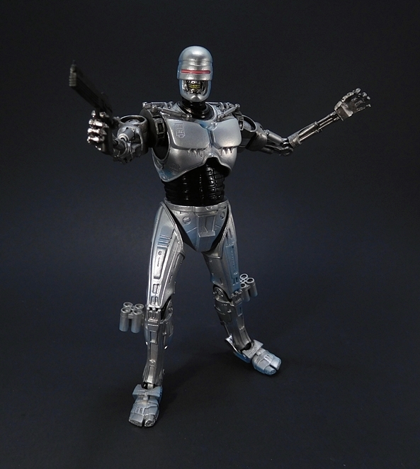
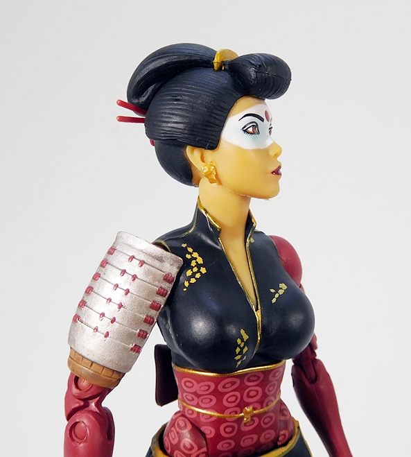
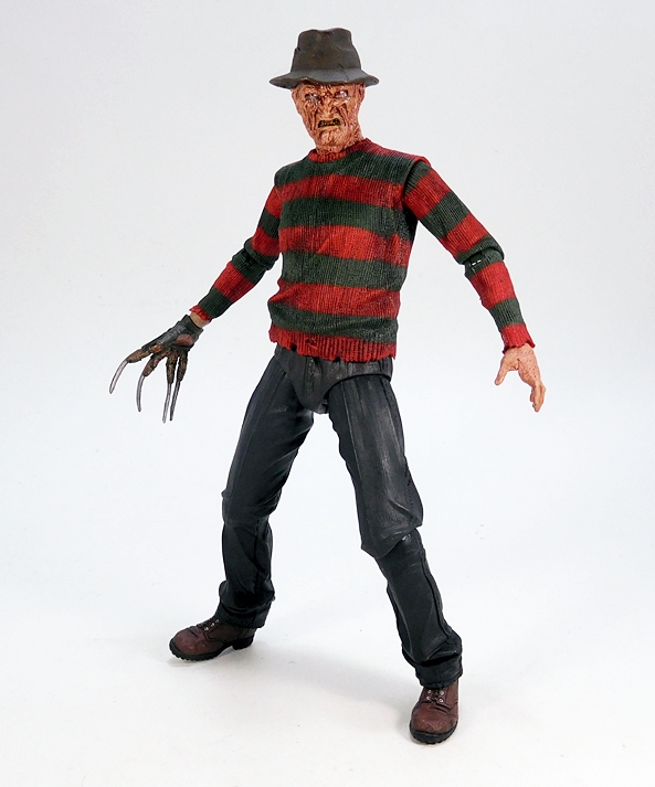
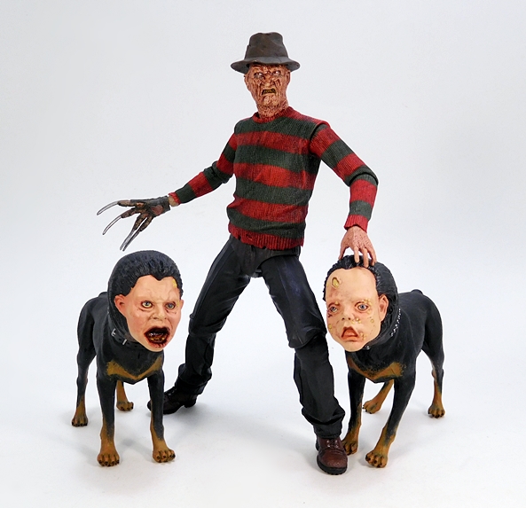
So, this is largely the same body sculpt as we saw for the Dream Warriors release. The biggest difference being that figure’s torso was designed so you could take off the front and swap it out with the exposed chest showing the faces of his victims. I thought that gimmick was well worthy of having some seams on the shoulders and down the sides, but if that bothered you, here’s the same body without the seams. Beyond that, the paint on this Freddy’s sweater is a little darker and dirtier, which is keeping with the darker look of the film. Conversely, he is easily distinguished from the 30th Anniversary figure as that one did not have the striping on the sweater sleeves. It’s worth noting how the sculpted sweater looks great, with a realistic knitted texture and some nice tattering at the edges. Beyond that from the waist down this release appears to be identical to Dream Warriors Freddy, with the same wonderful attention to detail in the boots.

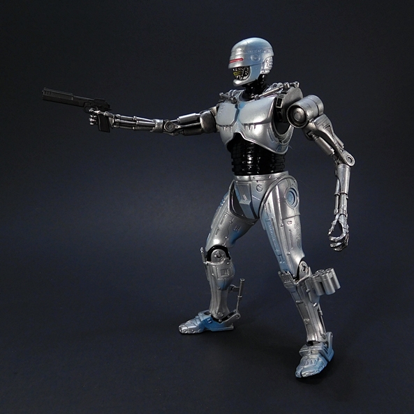
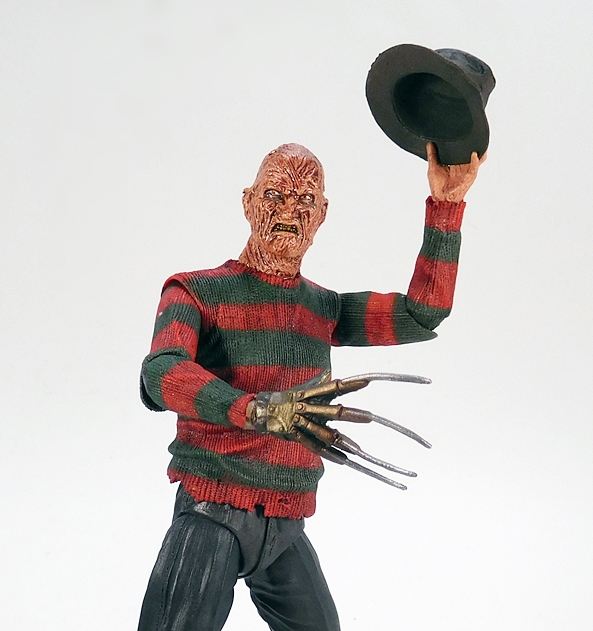
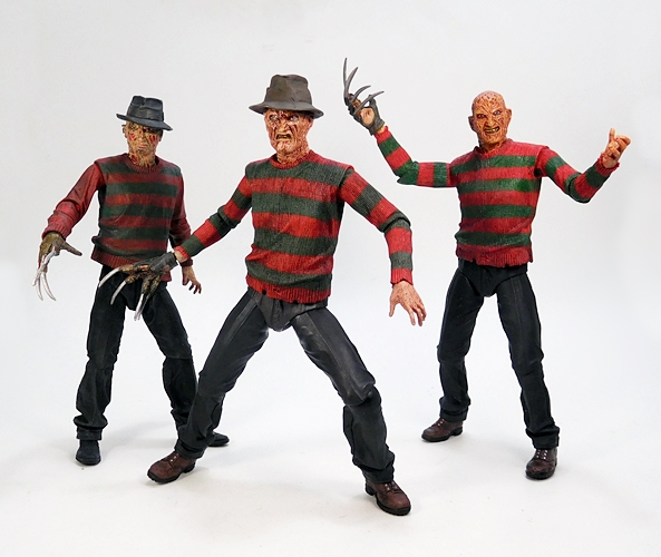
You get three different heads and the fedora is a separate piece so he can wear it no matter what head you’re using. The stock head is probably my favorite. It’s a good pissed off look for Freddy with some beautiful attention to detail in the burned skin. That goes for all these heads. The teeth are appropriately nasty, and the whole thing has a juicy, glossy finish. Yum!

The next head is probably my least favorite of the three, but it certainly isn’t bad. He has a snarling expression that shows more teeth, but this time the teeth are painted really dark, like Freddy’s been drinking a toner cartridge. The eyes are a bit more sloppy on this one too.

And finally, we get all out raging Freddy, and the more I look at it this one, it may be tied with the first as my favorite. They really did a beautiful job with his open mouth and the tongue sticking out. You can make out the bottom row of teeth in there too. Superb! It’s worth noting that I found the heads very easy to pop and swap on this figure. That hasn’t always been the case with this Ultimate line.

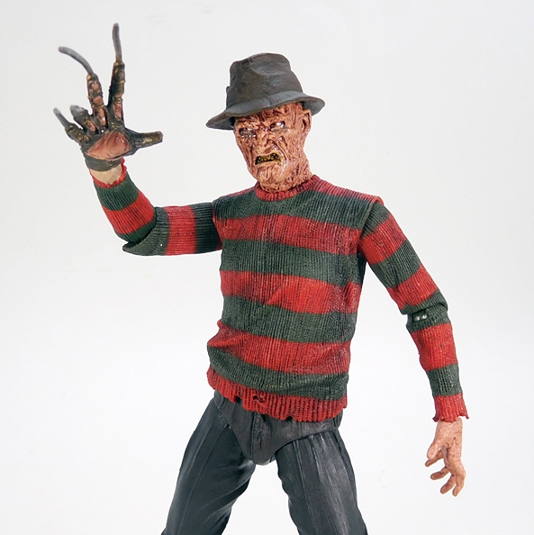
Freddy also includes two bladed right hands, one with the blades coming out of his fingers, and the other with the more traditional glove. Yeah, I definitely prefer the gloved hand. The glove is Freddy’s trademark, and if he can just grow the blades out of his fingers, why does he need it? So, it’s a nice extra, but not something I’m going to be using a lot. The blades on both hands are a little bendy and don’t always look straight, but I’ll take that over the hard plastic ones that Mezco used on their 3 3/4-inch Freddy a while back. The blades on mine snapped off almost instantly and there’s no worries about that happening here.

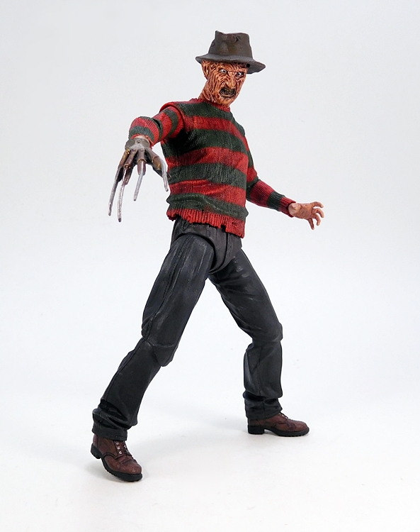
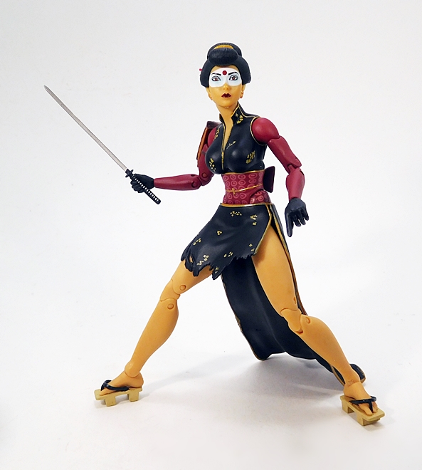
Of course, same body means the same articulation, and in this case that’s not a bad thing. Freddy features rotating hinges in the shoulders, elbows, wrists, hips, knees, and ankles. The neck is ball jointed, and there’s a ball joint hidden under his sweater just above the waist.

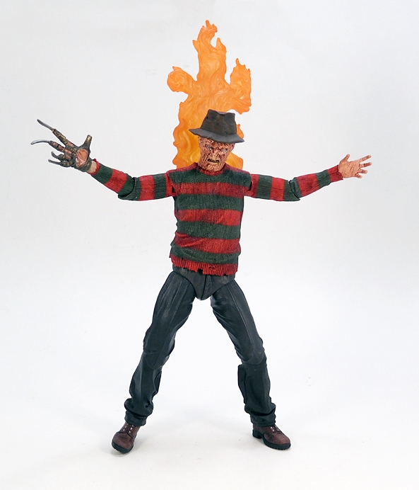
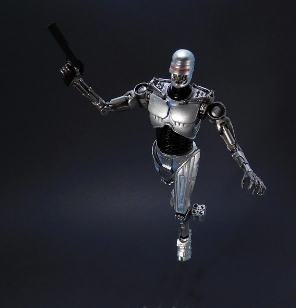
In addition to the heads and hands, Freddy comes with a flaming effect part to attach to his back and recreate one of the iconic scenes from the film. It’s OK. The piece is designed to attach to Freddy’s back with a magnet, but it just barely holds in place. It also makes Freddy very back heavy. It looks pretty cool, and I give NECA props for including it, but I can’t see me displaying him with this piece a lot. Maybe if I eventually do a full display of Freddys I’ll throw it on him just to distinguish him from the others. Personally, I liked the smaller accessories that came with the other two releases better than this. But that’s fine, because this box also has a couple of other cool extras…

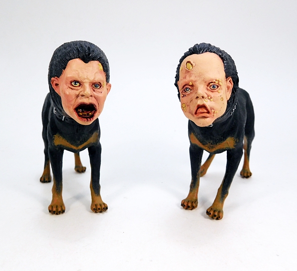
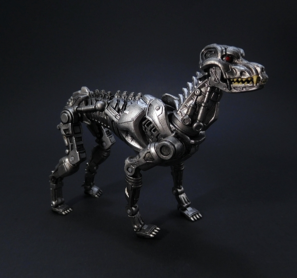
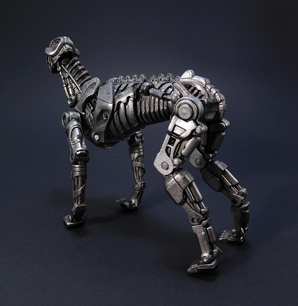
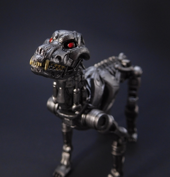
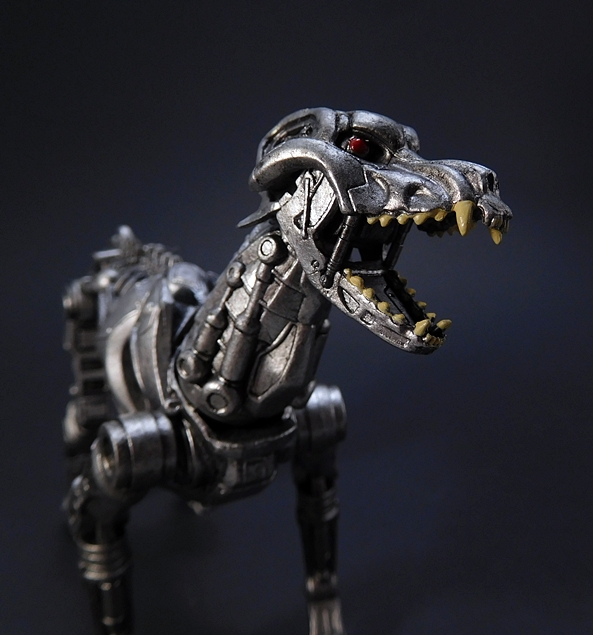
HOLY SHIT! So, what makes the box extra big is the inclusion of the two Demon Dogs that make a very brief appearance in the film and do absolutely nothing of consequence but add to the creep factor. Here’s a fun fact about me, I have a thing about human-faced dogs that started way back when I saw the Invasion of the Body Snatchers remake as a kid and I flipped out. Seriously, my parents had to calm me down, as I was crying and just mumbling, “Why?” a lot. Funny, but now that I think about it that Man-Dog didn’t really do anything in the film other than show up. What’s with all the human-faced dog cameos??? Anyway, as an adult, terror gave way to fascination. So that’s one reason why I love these extras, but the other is that NECA had the passion to make them and add them to this box.

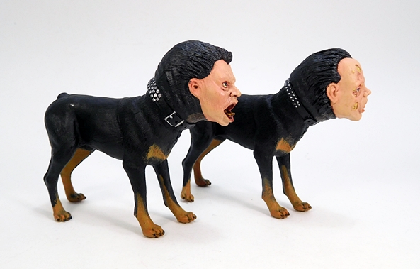
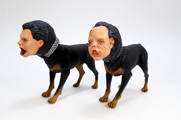
And these things are seriously disturbing. The faces are disgusting with some kind of lesions or growths or pustules or some goddamn shit all over them. GAH! I can’t believe I had to use the word pustules in an action figure review. Anyway, they share the same canine bodies with sculpted fur and some nice brown paint applications around the feet and chests. The collars are different and the only articulation here is at the head where they can tilt their heads like when a dog hears a funny sound. These are amazing bonuses and well worthy of the little bit of extra charge on this one. Still, I’ve got to admit I’m glad I keep these figures in their boxes, because I don’t need this pair staring at me from the shelves all day.

Most companies would see an opportunity to release a bunch of different versions of the same character as a way to cheap out and grab some extra cash. But NECA always goes that extra mile with these things, and this Freddy’s Revenge version of the “Bastard Son of 100 Maniacs” is a fine example of that. It’s also the reason why I’ll keep buying as many Freddy figures as NECA is willing to pump out. I’m rather obsessed with the idea of having one from each movie. Of course, this one is also a must-have pick up if you missed out on the others and want an excellent Freddy for your shelf. I may not love the film, but I do absolutely love this figure.

Marvel Legends (Man-Thing Wave): Blade by Hasbro

It’s Monday and I got a short week at work and then I’ll be cruising into my second vacation in two months. Life is good. Even better, since I’m opening a brand new Marvel Legends figure. And while I’m chomping at the bit to get to the Black Panther-inspired wave, I’ve got to finish what’s on my plate first. What’s that? The Infinity War and Deadpool Waves are already hitting? OMG, I’M NEVER GOING TO GET CAUGHT UP!!! Anyway, I’ve already checked out the Netflix-inspired portion of this wave and now I’m starting to look at the pair of comic-based figures so I can assemble my Man-Thing.

Behold, it’s Blade! It says so right on the package in that awesome font! It seems like ages ago (maybe 2013?) that we were promised Blade as a running-change variant to The Punisher. We all know how that worked out. But some four years later, we’re actually getting a modern Blade in the modern Legends line. It’s not the same figure we were shown back then, but maybe that’s not a bad thing.

Because… damn! Check him out! I maybe biased because I was really looking forward to this figure, but in hand I’ve got to say Hasbro did him proud. The Daywalker comes wearing a tactical vest with some heavy texturing and silver painted clasps around the shoulders and sides. He has a fairly non-descript pair of pants with knee guards and high boots. His arms are sleeveless, but he does have fingerless gloves on his hands, which is not smart when you’re fighting vampires because it makes it just that little bit easier for them to bite your fingers off. Separately sculpted pieces include a strap on his left thigh with what look like silver stakes, and he has a bandoleer strap across his chest with good old fashioned wooden stakes. The paint is pretty subdued, but the silver apps give him a little well needed pop.

From the back we can see that the bandoleer also holds the scabbard for his katana sword, as well as even more stakes running down his back. The scabbard features some sculpted ties securing it to the strap and there’s no tip, so you can see the point of the sword peeking out at you. Oddly enough, the scabbard looked pretty straight when I got the figure out and I was worried that the curved sword blade wasn’t going to fit, but it goes in real easy and stays put. The sword hangs on his back a little low, but he can still grab the hilt to draw it out.

Blade includes two heads to choose from. One features a standard looking haircut, groovy pink shades, and a handlebar mustache. It’s also an absolutely amazing face sculpt. The definition in the details is superbly executed and the paint is damn near perfect. Also, unlike the new facial printing Hasbro has been using, this is not a paint job that suffers breaking down as you get in real close. Absolutely fantastic!

The alternate head features a bit of a crazier haircut, if you can call it that. Here, Blade is mostly bald and just has a pair of lightning bolts cut into his hair. I’m all for options, but I prefer the first one, which makes this head a bit of a waste for me. The expression and the glasses are identical, and I would have much rather got a second head showing some more emotion. Screaming or smirking or anything but just a different haircut. Of course, if you prefer this hairstyle, then you may likely feel the same way about the other head. It just seems like a wasted opportunity.

As for articulation, Blade has all the points he needs to get all rough and tumble with the nightstalkers of the Marvel Universe. The arms feature rotating hinges in the shoulders and wrists, double hinges in the elbows, and swivels in the biceps. The torso has a rotating waist, an ab crunch hinge just under the chest, and both a ball joint and hinge in the neck. The legs are ball jointed at the hips, have swivels in the thighs, double hinges in the knees, and the ankles have both hinges and rockers. The joints feel great on this guy, and he’s loads of fun to play with and pose.

Blade’s one accessory is… his blade! The katana sword includes a silver blade with a gold tsuba guard. The sculpted wrap on the hilt is painted black with some gold peeking through underneath it. The blade is pretty bendy, but mine doesn’t seem to have a problem staying straight. Blade’s hands are sculpted so that he can hold the sword in either one, and his articulation allows him to wield it with both hands, if that’s your preference.

In the end, this release really hits home for me. Not only am I a fan of the character and his comics, I’m a big fan of vampire comics in general, and I’ll confess I still enjoy the Blade movies a lot, even if they do seem hopelessly dated now. The character is also almost as old as I am, first appearing in Tomb of Dracula #10 in 1973, the year after I was born. And, oh man, would I love to get a Legends figure of him in his original costume, complete with that green jacket that was pure 70’s! Blade is simply one of Marvel’s most bad-ass heroes and while it was tough to wait this long to finally get him in Legends, I think the wait was well worth it. I’m much happier with this figure than the one that was previously shown off.

One Piece: “Flag Diamond Ship” Nami by Banpresto

It’s the weekend! And I’m actually off this weekend! I had every intention of reviewing a Figma today, but this past week turned into a real shit-show and what little spare time I had I spent playing video games to relieve stress. To put it another way, reviewing Figmas takes time, and I didn’t have time. But, I wasn’t about to let my streak of Anime Saturday reviews die, so here I am with another prize figure from Banpresto’s Flag Diamond Ship series. Last time it was Boa Hancock, this time it’s Nami!

Just like Boa’s packaging, the box here is sizable, as the figure inside is roughly 9-inch scale and comes mostly assembled. All you have to do is remove it from the plastic, put Nami’s head onto her body and plug her into the base. There are some additional stand parts if you want them, but I’ll come back to that toward the end of the review. I don’t have much more to say about the box, other than it has plenty of photos of the figure inside and it’s made of super flimsy cardboard, so mine got beat up pretty bad in transit. Also, it’s worth repeating the mission statement for this series, which is printed in English on the front of the box. “Our aim was to create a figure that exudes the female form, including an amazing hourglass figure, ideal lady curves, and proportional balance.” You sold me, Banpresto! Let’s take a look!

And here she is all set up and ready to go, and I must say she is pretty exquisite and for a prize figure, the quality here is excellent. The shapely Straw Hat navigator stands on one leg as she adjusts the heel of her left sandal with her right hand. Her other hand resting on what little there is of her shorty-short shorts. Her head is turned and she offers an alluring little side glance. In addition to her denim-style shorts and orange high-heeled sandals, she sports a super skimpy red bikini top and a rather magnificently plumed pirate hat. In terms of a traditional look for the character, I don’t think this costume takes as many liberties as they did with Boa Hancock, although I’m definitely sensing a giant pirate hat theme in this series. As for the composition, well the pose certainly has sex appeal, and I always get a little extra enjoyment out of statues that are posed in a way that exhibits perfect balance.

The paint quality is quite good, with a lush and glossy crimson for her bikini top. The paint applications for the strings could have been a wee bit sharper, but it’s nothing that I’m going to get upset about. The shorts feature a very realistic blue that replicates the denim material rather nicely, along with a lighter blue used for the ragged cut fringe. Even the black lines of her g-string are pretty sharp. The plastic used for her skin tone is warm and smooth, although under certain lighting it can look a tad waxy. There are some seam lines running up the sides of the figure, but they’re pretty subtle and you have to get in pretty close to notice them. Let’s take a closer look at some of the details…

I love the attention to detail expressed in her rings and bracelets. Each individual ring on her fingers is unique and neatly painted. The sculpt on the brown leather wrist wrap is pretty intricate and it contrasts nicely with the candy-colored red and white bracelet. Moving on to her left arm, she has the updated version of her Log Pose with the three globed needles to help her navigate the New World. The red beaded bracelet is painted neatly, but if you get in close enough you can see where the sculpt is not painted around the skin and it looks a little strange. And yes, I’m really looking for stuff to nitpick here. Also note that her fingernails are painted pink.

And let’s take a quick look at the back of her shorts so that we can soak in the… um, detail. The sculpted stitching includes the pockets, belt loops, and various seam lines, and I think they did a nice job with the ragged edges. The sides of the jeans are laced together with sculpted string, which is carefully painted.

And here’s a look at her trademark blue tattoo, which is neatly printed on her left arm. This shot also offers a good look at the painted plumage in her pirate hat. The feathers are red, yellow, and blue, the hat is painted with a leather-like brown finish, and there’s a nice gold border painted around the edges of the brim.

And that brings us to the portrait, which achieves Nami-levels of cute. In fact, based on my patented Namiometer, I’d rate this one with a cuteness factor of 9. The combination of her wide, perfectly printed eyes and her knowing smirk, punctuated by her mischievous eyebrows really sums up the character perfectly. And while the pirate hat itself is quite nice, I can’t help but have my attention stolen away by the wild sculpt of her beautiful orange hair. Fantastic!

The base is a simple translucent black disk, which eschews the creativity of Boa’s treasure stand for something a lot more functional. Nami’s right foot pegs into it and it holds her up perfectly straight. If you note the socket behind her foot, that’s for an additional post with a clip that’s designed to go around her upper right leg to hold her steady. I’m hesitant to use it because I’m afraid it might mark or scratch the skin tone. It’s also a bit unsightly and totally unnecessary as she stands fine without it. I don’t want to dump all over the creativity used for Boa’s stand, but I think I prefer this one and I wish Banpresto had used a standard style base for this series.

Despite the CRANEKING logo stamped on the box, this figure really blurs that line between cheap prize figure and premium scaled figure. But then the somewhat inflated price reflects that. While I paid the higher price of $30 for Boa Hancock, Nami here was $35, and while that’s a bit pricey for a mere prize figure, I can’t say it wasn’t money well spent. She’s big and she looks fantastic on the shelf. As much as I’d love to adorn my shelves with $150-200 Nami statues, I collect way too much stuff to be able to pump that kind of cash into my anime collectibles. Maybe someday I’ll invest in that one special Nami figure, and I suppose I’ll know that one when I see it. But for now, this is a really well done figure, and I’m really digging this Flag Diamond Ship series. Some of my usual haunts have Vinsmoke Reiju up for pre-order as the next figure gracing this series, but sadly not until September.

Battlestar Galactica: Lt. Athena by Bif Bang Pow!

In case you missed the memo, DC Friday is on hiatus for a little bit, as I’m all caught up and waiting to pick up some new statues or figures. It’ll return, but probably not as a regular ongoing thing. In the meantime, it’s almost Spring, and I’ve been getting a jump on my Spring Cleaning. That means going through boxes of stuff, deciding what, if anything, is going off to Ebay to make room for more toys, and also discovering things that I totally forgot I had. It also means I have a busy weekend ahead of me, so let’s get started! One of the boxes I discovered contained a whole bunch of Bif Bang Pow’s Mego-style figures from Battlestar Galactica and Doctor Who! I looked at BBP’s Starbuck and Apollo from this series waaay back in 2015, where I also reminisced a bit about what Mego meant to me. I won’t rehash it all here, but I’ll just say that if my love of toys were an epidemic, Mego would be patient zero. It all started back when my uncle gave my brother and I his Mego DC, Star Trek, Planet of the Apes, and Gabriel Lone Ranger figures, and ever since this format has been like a super concentrated shot of nostalgia. And while Battlestar Galactica had its own vintage toy line, the series is so perfect for the Mego treatment. Hell, if these figures don’t look like they jumped right out of the late 70’s, well then I’ll be the son of a daggit.

The packaging is identical to what we saw for Apollo and Starbuck. The cards are generic with head shots of the characters on the front and a “Collect Them All” style layout on the back. The character’s name appears at the bottom, and sometimes this was done with a sticker. The figure itself comes in a big bubble with her flight helmet in front of her. I have to hand it to BBP, because the presentation feels so damn authentic. The only thing that would have probably been different is that her helmet would have been loose in the bubble with her and not secured with a smaller plastic piece. I’m not usually one that hesitates to open toys, but this is one where it gave me some pangs of regret. Partly because she looks so damn good in the package, and partly for reasons I’ll come back to at the end.

Out of the package, Athena comes wearing a more demure version of the Colonial flightsuit that we saw with Apollo and Starbuck. Naturally, it’s been reduced to fit the fashion doll proportions of Athena’s body, but there are also some changes, like the color of her pants and boots. The jacket is made of the same material, which looks like a dead ringer for the jackets worn on the show, and comes complete with sculpted plastic buttons running up the sides of the front flaps. On the downside, Athena’s flight jacket doesn’t have the reinforced strips on the shoulders, nor does it have the patches. It’s likely that BBP couldn’t make these work on the smaller jacket, or maybe they just didn’t want to bother. The underlying shirt is a softer cloth, it’s also sleeveless so that the jacket sleeves fit the figure better. Taking it off for display isn’t advised, as the jacket has transferred some brown die to the figure’s arms.

While Apollo and Starbuck has surprisingly good likenesses for this style of figure, I don’t think BBP was attempting accuracy for Athena. Or at least I hope not, because this looks nothing like her. The head is typical fashion doll style with some passable paint apps, and a copious coif of rooted hair. It can be tough to keep it under control, but I’m glad they went with it. It’s probably the one thing here that most resembles Athena in the series, and I think it also adds to the authenticity of the Mego stylings.

If I’m not counting the lack of likeness, the biggest disappointment about this figure is the gun belt and holster. It’s the same rig used for the guys so the fit is absolutely terrible. The belt itself has a whole bunch left over in the back to hang free, and likewise the thigh strap for the holster is way too big and just kind of hangs there around her leg. The holster came secured with a clear rubber band, and I’ve opted to leave it on just to keep holding the holster in place. This aspect of the figure just feels like a cheap cop out on BBP’s part, but I seem to recall Athena being one of the later figures released in the line, so they may have just been eager to wrap up the line and call it a day.

The Colonial blaster is identical to the ones that came with Starbuck and Apollo. It’s a pretty good sculpt for a Mego style accessory and the paint is fairly good. Another major drawback for this figure is that her hands aren’t sculpted so that she can hold it.

Athena’s other accessory is her flight helmet and this is the same piece that came with the other pilots. I think BBP did a nice job on these. I was afraid it would be really loose on Athena, but it fits her pretty well thanks to all that hair. I suppose you could tuck it all into the helmet, but it looks fine with the hair hanging out the back as well. The plastic on the helmet feels rather light, but that’s all part of the faux-Mego charm.

This is all about the nostalgia, folks. If Mego doesn’t give you the warm and fuzzies, then nothing about this figure is likely to be appealing. No doubt, there are a few disappointments here, most of which revolve around her blaster and holster rig, but overall, I think she still displays well and she looks great alongside the boys. On the downside, I don’t think BBP produced a large number of this figure (or Lucifer) and so Athena can be crazy tough to find. Just for shits and giggles I tried finding one on Ebay and was only able to uncover a single sold listing. Hell, it took some doing for me to find her back when she was originally released. Is she worth hunting down and paying a premium for? Not on her own, no. But if you’re looking for a complete set, or at least a nicely fleshed out display, then I think she’s a must have for this collection. Just looking up at this trio on my shelf makes me wish BBP had some kind of laminated cardboard hanger deck to display them on.

RoboCop Vs Terminator: Endocop and Terminator Dog by NECA

I know, most of you came here to see a Transformers Thursday review, but until the new wave of Hasbro’s official convertorobots starts showing up, TF Thursday will have to go on hiatus. I do need to get caught up on my Masterpiece figures, so maybe I’ll add one of them to the collection this month. In the meantime, we’re almost two months into the new year and I still haven’t done a NECA review. And with all the cool shit they showed off at Toy Fair, I do believe I had better get cracking on getting caught up. So let’s remedy that today by checking out the recently released Endocop and Terminator Dog from the RoboCop Vs Terminator comic by Dark Horse!

Holy shit, look at that snazzy packaging!!! I gotta be honest, there could be nothing in that box and I would probably have still bought it. The artwork is fantastic and the logo is printed in a brilliantly reflective foil lettering that screams, “I’M COOL, BUY ME!!!!” Granted, I don’t think I’ve read this comic more than a couple times since it came out. I remember being pretty stoked at finding all four issues at a used book store on the way home from one of my classes one day. I remember tearing into it and being so intrigued by the cross-over and digging the time travel elements, but it just wasn’t something I went back to a lot. Nowadays, when I think of RvT, I tend to think of the video game more then anything else. But that going to stop me from enjoying these figures.

I don’t know if this technically counts as one of NECA’s Ultimate Series releases, but the packaging is very similar, complete with the folding front flap covering the window. The presentation is top notch and everything is collector friendly and that’s a good thing, because while I toss most of my action figure packages, I like to keep all these NECA boxes lined up on my shelves for easy access. The packaging also showcases Future RoboCop as coming soon and indeed, he’s already here! Inside the box, Endocop comes on a tray with the Termitator Dog (T-Dog, hereafter) positioned in front of his legs. Let’s start with Endocop!

The Endocop looks like a kitbash, and that’s totally appropriate since these guys are basically RoboCop’s own design augmented by Terminator parts. And so it’s only natural that NECA raided the cupboard for some parts for this figure. The torso and legs are taken from their regular RoboCop figure, with the biggest change being the rocket boosters added to his lower legs. The chest might be knew, as this one looks a little smaller than the one on my original figure. Either way, you still get all that amazing detail in the sculpt, right down to the OCP logos and the working pistons that connect his legs to his ankles. The silver paint job is a little more dynamic than the original RoboCop release as well. It has some blue spray here and there to simulate that blue-purple sheen that the costume had when seen under just the right lighting. The pelvis is also painted silver here instead of black.

The new arms are patterned after the Terminator Endoskeleton designs. I’m pretty sure these are newly sculpted parts, because they’re a lot beefier and a lot less fragile than the arms on my most recent NECA Endoskeleton. Most notably, the shoulders are much bigger and more pronounced. The arms also include some articulated pistons in the biceps, which are cool enough that they justify the lack of a bicep swivel. Every time I play around with my Endoskeleton I get worried I’m going to break something, but Endocop presents no such worries. He’s a solid dude!

The head sculpt is brand new and it is creepy as all hell. It’s basically Robo’s helmet, but with the grim visage of the lower half of an Endoskeleton’s face where Murphy’s face should be. Here’s where I let you all in on a little secret. Robots with real human looking teeth really freak me the hell out. You ever see those dolls dentists practice on? I’m talking nightmare fuel! Anyway, I really dig the extra parts fitted to the torso to help support the arms. These include some discs where the shoulders attach, and the pistons that sword of resemble a human clavicle. Very cool!

The Endocop comes with Murphy’s Auto-9 pistol, which fits quite well into the right hand, and the trigger finger is soft enough so that it can go through the trigger guard. I’m having a lot of trouble keeping track of some of the story elements from this comic, and I can’t for the life of me remember why Murphy would replicate his gun for his Endocops, but whatever. Keep in mind, since this figure uses the earlier RoboCop release, it does not include the spring-loaded leg holster, so there isn’t anywhere to put the gun when he isn’t holding it. That’s probably for the best as that thing was really crazy fragile. All in all, I think NECA did a beautiful job with this figure, and while it does reuse some parts, they still went the extra mile to make the figure feel fresh and new. It would have been a worthy pick up all by himself, and that brings us to the awesome bonus. The T-Dog!

While I was pretty excited about getting The Endocop, The T-Dog was a case of love at first sight. He was the first to come out of the box and I’d say the Endocop didn’t come out until about twenty minutes later because I was busy playing with my new killer robot dog. This sculpt is absolutely magnificent and I found myself just turning the figure over in my hands so that I could drink it in from every angle. Make no mistake, this is a full-fledged figure and not some pack-in accessory. Indeed, I could have seen any number of toy companies stamping out a mostly static PVC piece for this dog, maybe giving it rotation at the tops of the legs, and calling it a day. But NECA just poured the love into this killer mutt. Besides the exquisite sculpt, the articulation goes above and beyond. The legs feature four points each, including ball joints in the feet. You also get a few points of articulation in the body, two points in the neck, and a hinged jaw.

Look at that face! The piercing red eyes and realistically painted teeth make him all the more terrifying! Remember what I said about robots with human teeth? Well apparently it goes for robots with animal teeth too. The T-Dog is no little lap dog either. If you stand him up on his hind legs he’s as tall as the Endocop. He’s also very sturdy and has a nice heft to him. The paint finish is a little less dynamic than The Endocop’s, but it looks like real metal with a little wash to give it a worn patina.

As a two-pack, this release set me back a little more than the usual NECA boxed figure. I was able to get it for $35 from one of the major online retailers, and I’m guessing that’s about what the MSRP is. Considering that the single packed figures go for $22-25 these days, I think this is a pretty good deal. And as excited as I was to get it, this set impressed me even more once I had the figures out and in hand. From the art direction on the box to the little touches of detail on the figures, this is yet another love letter to the fans, and I love NECA for that. So much so, that I can see picking up a second one of these is in my future. And speaking of future, I’ll have a review of the RvT Future RoboCop coming up either next week or the week after.

Star Wars Black: Imperial Royal Guard by Hasbro

Oh, Star Wars Black Series, why can’t I quit you? You are a line of figures I really want to walk away from, because you’re all over the place when it comes to sculpts and paint and actor likenesses. But whenever I try to leave you, I keep getting pulled back in by some figure that turned out pretty damn good. And even if I did quit today, I’d still have a good half-dozen or so figures waiting to be reviewed, so let’s get to it. Today I’m looking at a figure that I was really looking forward to, even if he really doesn’t have a place on my display shelf. The Emperor’s Royal Guard!

Or, apparently he goes by Imperial Royal Guard these days, at least according to the box. There was something about the magic of Star Wars that could capture our imaginations with just a cool costume design flashed on a couple of frames of film. Thanks to the old Kenner action figures, I could spend countless hours speculating on a background character, just because I had an action figure of him and needed to invent a backstory. Nowadays the crushing weight of the Expanded Universe canon spoon fed to us by the InterWebs does that for us, but back in the day it was all up to our imaginations. Case in point, these Royal Guards remain one of my favorite troop designs in the whole series. I find these guys to be intimidating and badass. But that’s all based on mystery spiced by my own whimsical extrapolations, because the Royal Guards were merely window dressing in Return of the Jedi. Or more accurately, elevator dressing? Either way, I’ve owned every version of these guys that Kenner or Hasbro have put out and I’ve loved all of them. Suffice it to say, I was eager to see how the Black Series version would turn out.

Softgoods! The Black Series hasn’t always taken advantage of this scale to incorporate softgoods, but I think it was a no-brainer for this figure. The Royal Guard’s majestic cloak is fashioned from a nice soft and brilliant red fabric that falls pretty naturally around the figure. It can bunch up at the shoulders a bit, but all in all I think it looks really good. The only sculpted plastic this guy is showing is his very distinctive helmet. The sculpt for the helmet matches all of the sexy and sinister curves I remember, but the paint used for the black visor could have been a little crisper. It doesn’t even fill out the entire area that’s supposed to be black. Come on, Hasbro. There is literally one paint application showing on this entire figure and it turned out a bit dodgy. Eh, the truth is it’s only really noticeable if you get in close, so let’s give him a pass. As for what’s under the cloak? My guess would be they cheaped out with just a blank buck, but let’s take a peek…

OH MY GOD!!! You’re just going to have to believe me on this one, folks. I haven’t read or watched any reviews of this guy, so taking him out of the box and lifting his robe is the first time I saw what was going on under there and I am in awe. Not only does he have a fully detailed and sculpted suit of armor under there, it is absolutely beautiful in both its design and execution. It’s not quite the Imperial Guard from the Shadow of the Empire, but it’s close enough for me to use as a stand in. Hell, we’re going to have to get rid of those robes and take a closer look at his business!

Removing the robes is as simple as popping off the head and popping it back on and I’m actually surprised that the figure looks as good as it does with the robes off and the regular head reattached. I will, however, throw it out there that Hasbro should have included the Shadows of the Empire Imperial Guard helmet as a swap out because that would have been amazing. But I digress. Getting the cloak off this guy is like I’m seeing him for the first time, and I really dig what I see. He’s wearing a sculpted dark maroon suit with bright crimson armor pieces sculpted onto it. Little touches include the painted buckles on the straps holding on his shin guards, pouches on his belt, and a holster for a pistol that I did not even realize these guys carried. I really am impressed and yet also supremely disappointed that we never got to see these guys cast off their robes and show off their fighting skills like the Praetorian Guards in The Last Jedi did.

The Royal Guard comes with two accessories, the blaster pistol and a force pike. The pistol looks identical to the one carried by the Biker Scouts, but I don’t have that one handy to do a comparison. Either way, the Guard’s left hand is sculpted to hold it pretty well, but I had no luck getting it into his right hand. The cross draw required for the holster on the right hip isn’t unheard of, but as we’ll see in a bit, the cloak makes wielding the pistol in that hand a little problematic. The force pike, on the other hand, is a new weapon and Hasbro put a lot of effort into the sculpt. I’ve only really seen this accessory before in the 3 3/4-inch scale, so it’s cool to see it fleshed out with some of the finer details.

The articulation includes rotating hinges in the shoulders, elbows, and wrists. The legs are ball jointed at the hips, have swivels in the thighs, double hinges in the knees, and hinges and rockers in the ankles. There’s a ball joint in the chest and the neck is ball jointed, but the helmet doesn’t offer a whole lot of range of motion. So my big question is, how well does the articulation and accessories work with the cloaked figure. Let’s put it back on and find out.

Most of the time, these guys tend to stand there with their force pike in hand and flank The Emperor. Let’s face it, how many times do you think some random Joe takes a pop at Papa Palpatine? Probably not often. So I tend to think of these guards as mostly for show. Anyway, thanks to a slit running down the right side of the robes, the right arm is accessible for him to hold the weapon in his most iconic of poses. I’m not sure why they went with the pointy index finger in his right hand, but maybe it was so you can get a bit of an angle on the way he’s holding the weapon.

Of course, if you want him to start busting out the action poses, it helps to roll the cloak back over his shoulders. I didn’t think this would work that well, but it’s actually not too bad. However, the left arm with the gun can still be a little awkward. If I can grab another one of these, I may try out slitting the robe up the left side as well to offer a little more easy access. I’d like to think that the Royal Guards just drop the cloaks when the occasion for combat presents itself.

I started out by saying this was a figure that has no real place on my display shelves, and that’s kind of true. I skipped the Black Series Emperor, because I honestly didn’t think it looked very good and now I’ve got an Emperor’s Guard with no Emperor for him to guard. It’s something that I can’t easily remedy because Palpy is now going for a shit ton of Republic Credits on the secondary market, and if I wasn’t going to buy him for $20, I sure as hell am not going to pay more. That having been said, this figure has both surprised and delighted me by all the work Hasbro did on the body under those robes. I expected him to look good standing there at attention with his force pike, but not much else. Who would have thought that a simple figure like this could have just possibly rekindled my love for this line.

Marvel Legends (Man-Thing Wave): Elektra by Hasbro

Here I go once again, assuaging the hurt of Monday by opening up a new Marvel Legends action figure in a little thing that I like to call Marvel Monday. Also… I saw Black Panther last Thursday and it was amazing and I wish I was talking about that wave of figures, but rules are rules and I have to finish going through this wave before moving on to another. ARGGGGHHHH!

Sorry, Elektra, I’m not intentionally downplaying how amazing it is that we’re getting Legends figures based on the various Netflix MCU series, but that’s the conundrum with Marvel these days. So many great movies, so many great figures, so many great characters, so many great comics! Oh, wait. Scratch that last one. The current crop of Marvel comics are still garbage books largely written by hacks, but I have hopes that Marvel will turn that around eventually. Until then at least we have the movies and toys and a HUGE backlog of older and better comics! Anyway, let’s check out the last of the Netflix figures in this wave… Elektra!

This is Elektra as she appeared in Daredevil Season 2, which is a perfect place to start, because I felt she began to overstay her welcome a bit in The Defenders. But that’s a discussion for another day. Elektra here is a pretty fab example of a figure with some simple sculpting and paintwork that still gets the job done. I’m pretty sure the pelvis and abs are recycled from Jessica Jones, and if that’s the case it works just fine. You get the same sculpted pockets, belt loops, and a painted button in the front. The new upper body features a V-neck vest revealing a sculpted red turtleneck underneath it. Her bare arms are a tad lumpy. I get the sense they were avoiding the super skinny female arms they usually do and tried to give her some muscles. It looks OK at some angles, but from others, those elbows look kind of strange. Her outfit is capped off by a pair of red and black sculpted gloves. Again, it’s a simple buck with simple coloring, but I think she looks great.

Elektra features two heads, one masked and one un-masked, and both are pretty good likenesses to the lovely Élodie Yung. Although, it should be noted that this new face printing thing that Hasbro is doing looks fantastic with the figure in hand, but is not terribly flattering when you get up close with the camera. Also, Elektra avoids the ugly seam that Jessica has running down the middle of her neck. Thank God for that!

The masked head is probably my favorite of the two, mainly because the likeness is impressive enough to still be recognizable even when half her face is covered. It’s all in the eyes! My only nitpick here is that I seem to recall her mask just being her collar pulled up to hide the bottom half of her face. That’s obviously not the case here, but I’m not going to let that bother me. The hair sculpt seems more or less identical on either head, and that’s not a bad thing because it’s quite well done.

Obviously, Elektra is a figure that needs to be super-articulated, and while what’s here is good, I would have liked some changes. From the waist down, it’s all good. She has ball jointed hips, swivels in the thighs, double hinges in the knees, and rockers and hinges in the ankles. A waist swivel would have been nice, but at least she has the ball joint under her chest, and her neck is both hinged and ball jointed. It’s the arms where I take some issue. She’s got rotating hinges in the shoulders, elbows, and wrists, which seems to be pretty typical for the Marvel Legends ladies. I think bicep swivels and double hinges in the elbows would have gone a long way to make Elektra a little more flexible. With that having been said, she’s still plenty of fun to play with.

Elektra comes with her trademark Sai, which the series teased us with for I can’t remember how many episodes, before finally putting them into her hands. These are simple, but cool looking, weapons with a gray finish and black painted grips. She can hold them in either hand, but I really dig how her right hand is sculpted so you can pass the blade through her grip and have the fingers hooked over the guard. It’s a beautiful little touch that goes a long way.

I think Hasbro did a nice job with this figure, even if there are a few things I would have done differently with the articulation. She isn’t likely to blow anyone away with complexity of sculpt or paint, but what’s here is damn solid. A beefier selection of weapons would have been cool, or even an extra set of hands, but I have to imagine that actor licensing on the MCU figures cut into the costs for extras, so I won’t complain too much. Nor should I, because not too long ago I would have bet against us getting any Marvel Legends from the Netflix series and now we have four! I hope this little assortment isn’t the end, although I couldn’t help but notice Hasbro didn’t show off any more Netflix figures at Toy Fair this past weekend. But did you see those 10 Year Anniversary MCU figures! Holy hell, they look great!

Next time I’ll start dipping into the comic-based figures in this wave.

Eight Years and Still Going!

I’m not someone who is big on celebrations, that should be evident by me going for eight years without much acknowledgement to any of those anniversaries, but for whatever reason I thought I’d mark the occasion this year. Maybe it’s because two years is a long time, and I didn’t want to wait for The Big 10. Or maybe it’s because I’ve surprised even myself by my persistence in churning out over 2,100 reviews on a topic no sane adult should care about. Whatever the case, FigureFanZero is eight years old today and I got myself a really nice bottle of Jameson and I’m going to sit here and gas on for a bit. If you have a bottle of spirits handy, pour yourself a little something, while I reminisce.

My First Review on FFZ… The Robots of Death! 

It was eight years ago that I opened the virtual doors to FigureFanZero and said come inside and partake of my wondrous madness. It seems only fitting that the first review featured some Doctor Who action figures, because Character Options’ now all but defunct 5-inch Doctor Who line was exactly the sort of thing that I longed for as a kid. It’s also oddly fitting that it’s the weekend of Toy Fair and I’ve been spending it gazing at some amazing reveals. But how did FFZ come about? What motivated me to start this nonsense, and to keep it going for so long?

Review #1,000 – Diamond Select Kirk & Khan!

For that story, we have to journey back about about 18 years ago, when I found myself reacquainted with buying toys. I was only 27, but I was in the process of shuttering a business that I started when I was 20, and I think I was going through the equivalent of a mid-life crisis. And yes, I realize that means I’ll be dead at 54. The point is, I was starting life over and to cope I had been immersing myself back into video games. So much so, that I started collecting some video game-based action figures. I can remember picking up McFarlane’s set of Metal Gear Solid figures, as well as the Quake and Duke Nukem figures from Resaurus, and displaying them proudly above my game consoles. It was toy collecting, but not really. I wasn’t really seeing them as toys, but just plastic tokens that expressed my love of a facet of pop culture at the time.

I didn’t really get the toy collecting bug until that fateful day when I took a shortcut through a toy aisle in Target one Saturday afternoon. I was on my way to pick up whatever new video game had released. It was probably a Dreamcast or PlayStation title, but I can’t remember which. I was advancing through the aisle and headed toward the Electronics Department when I literally did a double-take. There I was, face to face with with Transformers!

Review #2,000 – Cover Girls of the DC Universe Wonder Woman

The line was called Robots in Disguise and what really drew my attention was seeing all five of the Combaticons hanging on the pegs. I picked one up and pondered it. They were repaints of the exact same toys that I never owned as a kid. Alas, my only G1 combiner was Devastator. I left the store that day with a couple of video games, but I spent the rest of the night thinking about those toys. The next day I went back and bought the set and there on my kitchen table, something awakened inside me. It was the nostalgia of recaptured youth. In the coming weeks I would pick up the rest of the Transformers that were on the shelves. Eventually, I would stop finding new ones and disappointed about going home empty handed, I started to notice some of the other call-backs to my childhood that peppered the toy aisles. There were GI Joe figures and Star Wars figures and soon I was buying them all and it was making me very happy. Then one day I discovered the KayBee Toys Outlet, and all bets were off. I was buying anything that interested me, and for pennies on the dollar!

My First Stab at Toy Bloggery

Four years later and my newfound love of toys was beginning to overtake my love of video games. I had started a great new job (And I’m still there!) and my premature midlife crisis was behind me. But I was still collecting toys! At the time I was also running a floundering video game site on Geocities called TechnoCothica that nobody ever visited. I decided to shut it down and reinvent it as a toy review site. Only two things remained the same: The name and the fact that nobody ever visited it. Not a lot of it still exists, but I managed to dig up some of its remains. Eventually, I migrated to LiveJournal, where I adopted the name FigureFan. It was a moniker that I registered under at some toy forum somewhere just so I could post a reply and help someone identify an action figure accessory. If I knew it was going to stick, I probably would have picked something better.

My last post on LiveJournal.

In 2010, I landed on WordPress adding a Zero to my name, partly to identify as something new and partly because at the time I was eagerly awaiting the release of the MegaMan Zero collection on the Nintendo DS. I also thought it only fitting that the name reflect the marriage between video games and toys that got me started down this long road. The rest of the story? Well, that’s all available for anyone to peruse on these pages. Throwing together four to five reviews a week isn’t always easy, but it never feels like a chore. It consumes a lot of my free time, and while I’ve tried cutting back, it never really sticks. Still, I’m going to try to cut back again this year and we’ll see what happens. Ideally, I’d like to steady out to three reviews a week so I can get a little more creative and maybe work on some related projects that I’ve been meaning to finish.

Before I wrap up, I wanted to reprint one of the old reviews from TechnoCothica. I’ve been going through my old archive and as rough as a lot of it is, I’ve been getting some inspiration from it. I decided to go with my review of Hasbro’s Original Trilogy Millennium Falcon, mainly because I never got around to reviewing it here on FFZ. Some of the picture files don’t exist any more, which is probably for the best because back then I was shooting on a piece of plastic shelving in the corner of my bedroom with with flash lighting. Nonetheless, I’ve reconstructed what I could just for shits and giggles. I hope to eventually set up a page devoted to what I can recover from the old site.

I hope you’re still with me, because before signing off I just wanted to send out a sincerest THANK YOU to everyone who stops by now and again to partake in my love of toys and collectibles. Toy reviews are a crazy big thing on the InterWeb these days. I hear tell some people even do it now with moving picture recordings on something called “The YuuToobs,” and make big bucks at it. I never started this to turn a profit, but the time has still been priceless for me because I’ve met some wonderful people through emails, comments on here, and conversations on Twitter, and if you’re reading this that includes you! I love ya all. Here’s to another eight years… if I’ve got it in me.

By figurefanzero

One Piece “Flag Diamond Ship” Boa Hancock by Banpresto

Did you know that one of my favorite pastimes is drinking a bunch of Jameson and trawling the Interwebs for prize figures? Yup, I’m a man of simple pleasures. They tend to be pretty cheap, so I can’t get into too much trouble, but as a rule I keep seeing a lot of the same stuff over and over again so I don’t end up buying a lot. But just often enough something new pops in and surprises me, and last time it was this Flag Diamond Ship series by Banpresto. I call it a series, but I’ve only been able to find two so far, Boa and Nami, and I snapped up both of them pretty quickly. Maybe there will be more, who knows? I want to go straight for the Nami, but since I just looked at her Variable Action Hero a couple weeks back, I’m going to open up Boa today for Anime Saturday!

The box is pretty typical prize figure fare, albeit it’s bigger to house this 9-inch scale figure. Yeah, when it comes to prize figures, I tend to think 6-inches or smaller, but despite the CRANEKING logo on the box, Boa is not your average prize figure. The enclosed box shows plenty of photos of the figure inside, although it’s a bit on the flimsy side and mine showed up a little rough around the edges. As for what this series is all about, I’ll let the box speak for itself, “Our aim was to create a figure that exudes the female form, including an amazing hourglass figure, ideal lady curves, and proportional balance.” OK! That’s quite a mission statement… and in English no less! Inside the box, Boa comes wrapped in plastic and with a little assembly required. Her head needs to be attached and her right foot needs to be fitted to the base.

Out of the box, Boa strikes a pose with her right foot on a pile of gold, her hands resting on her hips, and her formidable cannons out front and center. It’s nothing terribly creative from a composition standpoint, but at least they resisted the urge to full on Captain Morgan and have her knee up higher and her foot up on a chest. As for “exuding the female form,” I think they’ve achieved their goal at least within the framework of the ridiculously sensationalized anime perspective. In short, I love it!

The costume is not a traditional look for Boa, but rather a sexy take on the swashbuckling pirate look that I really enjoy. She’s got a ragged cut top that just manages to contain her ample chest, and is tied in the front. The rest of the costume consists of a a skimpy pair of black panties which are mostly obscured by a pair of wide belts, thigh-high high-heeled boots, lots of bling on her arms, and a very iconic looking tri-corner pirate hat.

The sculpted detail here is pretty fantastic. The buccaneer boots have rumples in all the right places, as well as ornate golden fixtures on the heels, toes, and backs of the ankles. You get little sculpted cross-stitches on the backs of the thigh cuffs. The use of gradient shades of brown on the boots looks especially nice. The belts are sculpted as separate pieces and include all sorts of fixtures and ornamentation. As good as the sculpt is, there are some solid paint applications to back it up. From individually painted bracelets to the fingernail polish, they really went all out on this figure.

The portrait offers a solid recreation of the character from the series with perfectly printed eyes and lips. My only main nitpick here would be that she’s void of all expression. I’d like to see a little smirk or smile, or determination, but she’s kind of just a blank slate. I guess this figure has enough personality in the outfit to carry the day. I’ll also say that the hair sculpt could have been a little more refined, especially the strands that spill down the side of her face. The earrings are a nice touch and I really dig the pirate hat, which features some leather-like texturing.

The base is kind of a mixed bag. I appreciate them trying something a little different from the usual disk, but what we got doesn’t work all that well. It’s basically just a little pile of treasure that you slip her foot into. The problem is that if I slip her foot so it’s flush with the bottom, she doesn’t stand straight, so I had to experiment a bit to get it to work and when it is working, the base itself isn’t usually even with the surface it’s standing on. So, points for creativity, but I have to take them back again for pure execution.

The base notwithstanding, I’m really impressed with this figure. She cost me around $30, which is admittedly a lot more than I usually spend on prize figures, but when you consider the larger scale and that this figure really sports some premium paint, I think the price is justified. Since it was the first time I saw her and I was pretty inebriated, I didn’t really do a lot of deal hunting. Also, this is the first Boa Hancock figure in my collection, so I feel good that I’m expanding beyond Nami for a change. Next week, I’m probably going to check out another Figma, and after that I’ll circle back to open up Flag Diamond Ship Nami.

DC Bombshells (DC Designer Series): Katana by DC Collectibles

It’s DC Friday again, folks, and after today the regularity of DC Friday may become a little spotty. But I’ll save that little editorial for the end of the review. In the meantime, today I’m checking out the final figure in the second wave of the DC Bombshells line. If you’re not up to date, these are action figures based off of statues, which in turn are based off original designs inspired by 1940’s and 50’s pin-up art, which also in turn has spawned a really good comic series. Phew… that’s a lot of exposition!  Anyway, today’s character is none other then Katana, and I saved her for last because I was pretty excited about her.

There you have the typical DC Designer Series packaging. It’s mostly white, it has a cool window front with one end angled. There’s character art on the side panel, and everything is collector friendly. Katana is also number 8 out of 8 in the series. I really dig Katana in general, and I loved her Bombshell design so much, that I almost picked up her statue, but she was one of the ones that sold out pretty quickly and has since really shot up in price on the secondary market. Maybe they’ll do a Deluxe version of her at some point down the road. Anyway, let’s get this open and check out the figure!

So, straightaway, I think DCC did a great job recreating the look of Katana’s Bombshell costume for the figure. I do, however, think this one is pretty detached from the scope of the Bombshell’s art. I get it, though. Most of the characters are based on western art and fashion in and around World War II, so going to the other side for material might have been a little problematic. Also, the source material has changed and expanded a bit since the line’s original inception. With that having been said, this figure shows off some of the more impressive sculpt and variety of paintwork that we’ve seen in this wave for sure, and possibly the line as a whole.

The dress is primarily maroon and black with gold borders around the black areas. The front part of the lower half of the dress features a gold floral motif and it’s torn off about halfway down, allowing Katana to show more leg and thus continuing the cheesecake factor of this line. The waist features what looks almost like a target pattern and has a big sculpted bow on the back. Her arms are painted to match the maroon of the rest of the dress, and she has a piece of segmented armor on her right shoulder. The silver paint on the armor looks especially nice, and each of the sculpted laces are neatly painted red. I really dig the plastic DCC is using for the flesh tones in this line, as it’s very warm and even. Katana’s lower right leg features an elaborate dragon tattoo and she’s wearing a pair of traditional wooden sandals on her feet. Just about everything that made me fall in love with the statue is recreated here quite well.

I say just about everything, because the one big disappointment for me is the dragon tattoo, which is actually a decal. The decal has a bit of a shine to it, making it really stand out against the matte finish of the plastic, especially around the areas where it’s cut out. Also, the edge near the tip of the dragon’s tail is starting to peel a bit on my figure, right out of the box. I don’t have a lot of hopes for that decal standing the test of time, and I can’t believe they didn’t just tampo the design directly onto the figure. What a shame.

On the plus side, Katana features what I believe is the best portrait this line has produced, and that’s quite a complement, because there have been a lot of great looking head sculpts. She’s absolutely beautiful, she has an appropriately stoic expression and the paint is absolutely fantastic. Her lips and eyes are perfect, and the red Rising Sun against the white makeup looks quite striking. They even did a beautiful job sculpting her hair. I couldn’t be happier with how this turned out.

Katana’s articulation is right in line with the rest of the second wave figures, which includes the absence of thigh swivels. I’ll direct you to any one of the three previous figure reviews if you need to get caught up on the points of articulation. I will say that the ankles on my figure wouldn’t budge, and after having one of Mera’s feet snap off right out of the box, I was pretty apprehensive about trying to get them to work. A little time in front of a space heater eventually did the trick. So long as we’re talking articulation and posing, here’s a good time to point out that Katana’s left hand is sculpted in a pointing position to recreate the pose used for the statue. That would be all well and good if she came with extra hands like the first wave figures. But since she doesn’t, that left hand isn’t all that helpful for many poses. In the end, I just didn’t find Katana as much fun to play around with as her fellow Bombshells in this wave.

The only accessory Katana comes with is her… um, katana. Soultaker is a pretty nice sculpt with bright silver paint on the blade, but it does feel a little undersized and unimpressive for what is supposed to be an epic and enchanted blade. She can technically hold it in either hand, although as already mentioned, the left hand has that pointing finger extended so the sword looks a little funny in that hand. And since I’ve also already touched on her lack of extra hands, here’s where I’ll point out another couple of obvious missed opportunities in the accessory department. If you’re going to be so specific and give her the pointing figure from the statue, why not give her a swap-out foot and the samurai helmet, so you can completely recreate the look of her with one foot arched and resting atop the helmet? The answer, I’m sure is budget cuts.

If it sounds like I’m being extra hard on Katana, it’s because I was really excited to get her open and play around with her. And to be fair, there’s plenty of great stuff going on here. The overall sculpt and paint approach the highest levels this line has offered. But little signs of cutbacks like a cheap decal for the tattoo, and a lack of extras in the box really holds this figure back from being the masterpiece it could have been. And that’s been a running theme for this entire second wave. These are really good figures, but it really shows that DC Collectibles wasn’t willing or able to invest the same level of value into them as they did in the first wave. What a shame. DCC has already cancelled two of the upcoming Bombshells, Bumblebee and Supergirl, although they claim the line is not dead. Although, DCC released their highlights for Toy Fair yesterday, and there is only one release announced for Bombshells in 2018, and that’s a Joker and Harley two-pack. Bummer!

And now for some words about the future of DC Fridays. I love DC Comics. These days I love DC Comics sooooo much more than any of the garbage books that Marvel is pumping out. But DC is making it hard for me to express that love with my toy/collectible buying dollars. DC Collectibles has killed off the DC Icons figures, it looks like DC Cover Girls is either retiring or slowing to a crawl, and I’ve seen nothing about the DC Essentials line that makes me want to re-invest in a brand new line of figures at $22 a pop just to have it get cancelled again. And with how many collectors no doubt feel the same, that line is going to have an uphill battle. Meanwhile, Mattel’s Multiverse line continues to disappoint, and even if it didn’t, the distribution here is terrible and the figures tend to go for scalper prices on Amazon. What I’m getting at is that DC Friday’s is going to have to switch to some kind of rotation from here on in. I’m tapped out and the supply of incoming has been reduced to a trickle. As I get new DC related items, I’ll push them to the head of the line. I still have some figures and statues on my “To Buy” list. But don’t be surprised to see other things dropping in on Fridays from here on out.