ThunderCats Ultimates: Jaga by Super7

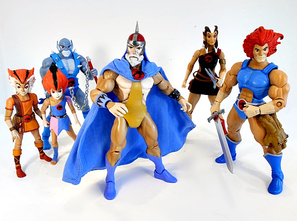
I just got notice that the next wave of Super7’s Ultimate ThunderCats has shipped, and that made me realize that I still had one figure left from the previous assortment to review here. This assortment consisted of Captain Cracker, Slithe, and the Elder of the ThunderCats himself… Jaga!

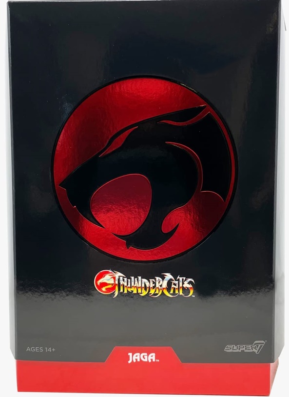
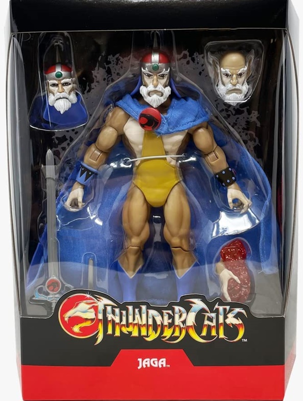
Once again, the figure comes in some super spiffy packaging, which includes a black outer slipcase with a beautiful red foil Eye of Thundera emblazoned on the front. The inner packaging is a window box with the ThunderCats logo and the character’s name on the front, and some character art and a little blurb about them on the back. Everything is collector friendly, which is a big plus in my book, although I will likely just be keeping the packaging for Mumm-Ra and Lion-O and pitching the rest.

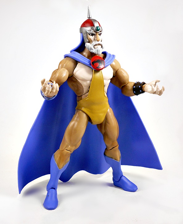
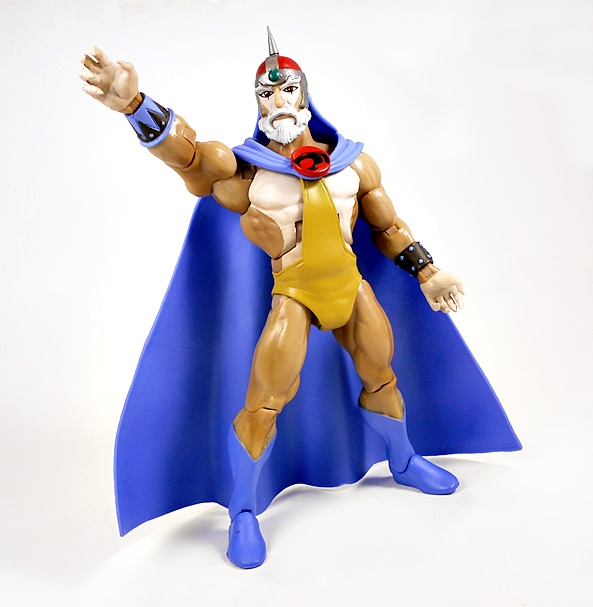
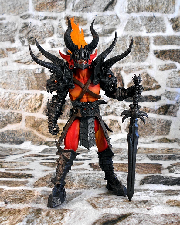
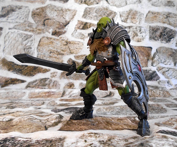
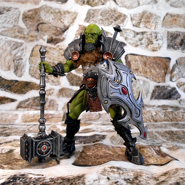
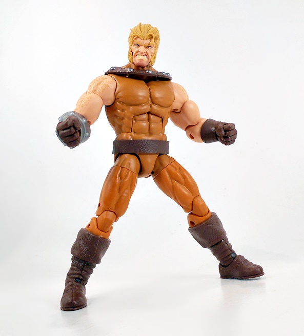
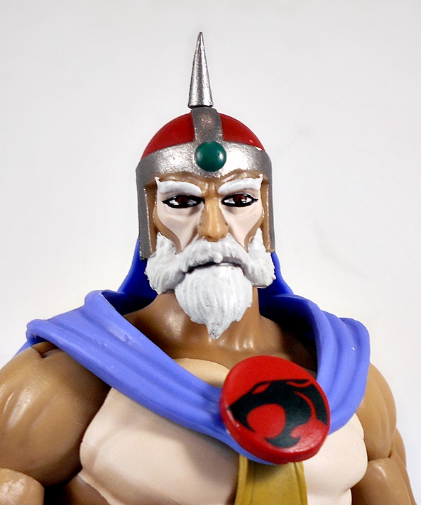
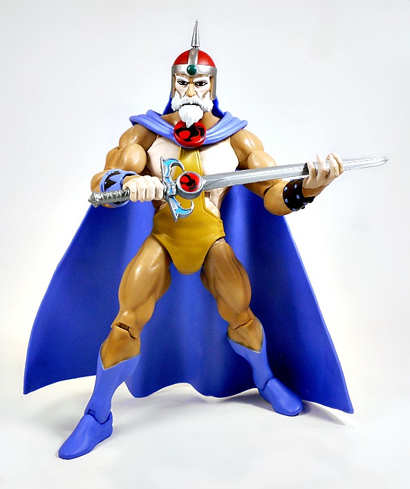
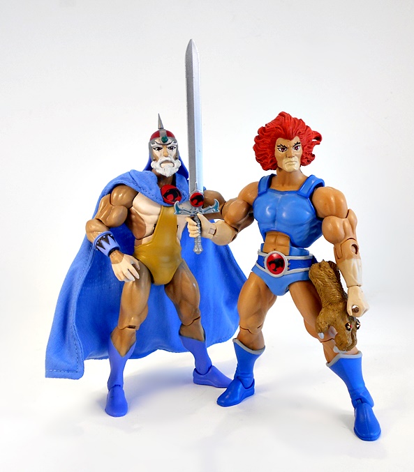
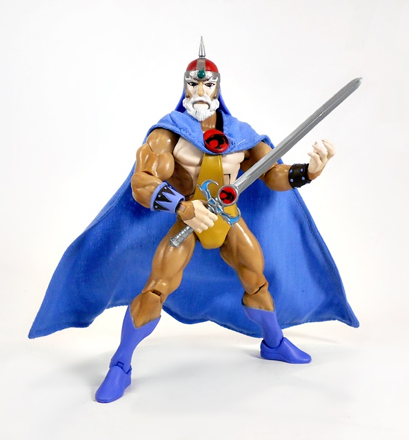
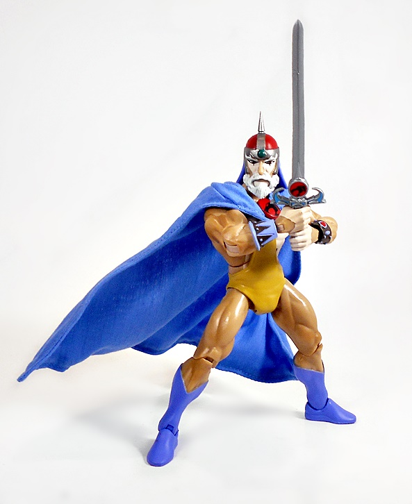
Here’s Jaga out of the box and looking like he stepped right out of the screen into my living room and making me spit out my Fruit Loops. Super7 has been doing a great job nailing the simple animated styles on these figures, and Jaga is another fine example of that. His body is brown and off-white, with some bright blue boots, a pair of mismatched wrist bracers, and an unusual gold belt-undie combo, which reaches up to his neck and clips onto his blue cape, just under the bold ThunderCats emblem. And Jaga is looking pretty good for an old cat, as he’s positively ripped with muscles! The cape is plastic, but you get a bonus soft-goods cape, which we’ll check out at the end. Some of the paint lines could have been a little sharper on my figure, mostly where the brown and off-white patterns of his body meet. There’s nothing outrageously sloppy, but at the same time, there’s room for improvement.

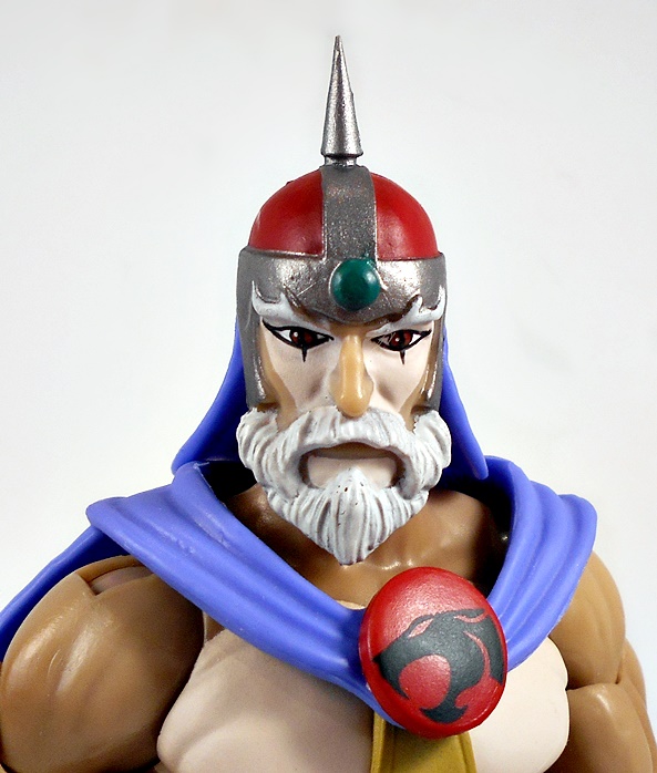
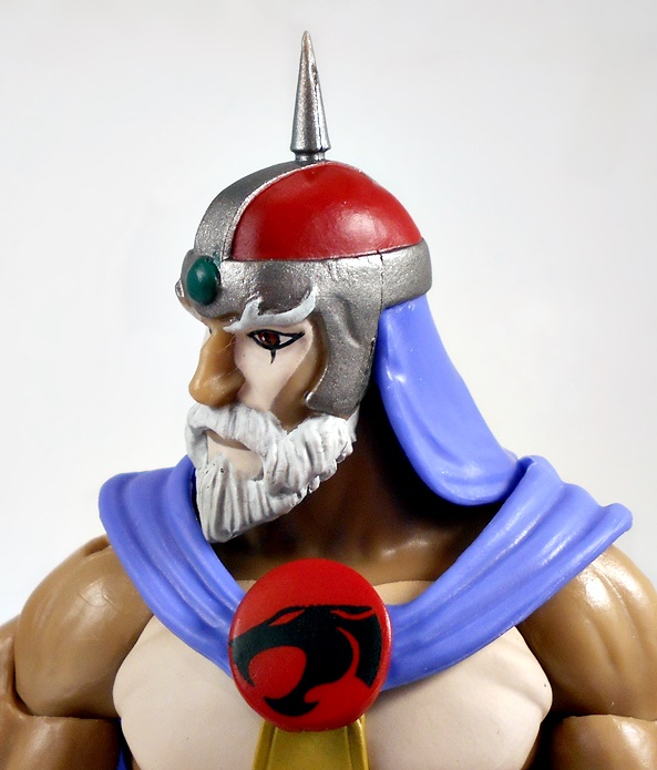
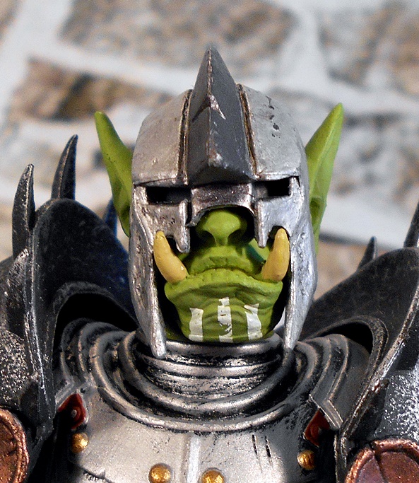
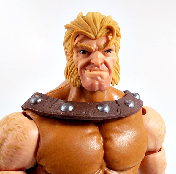
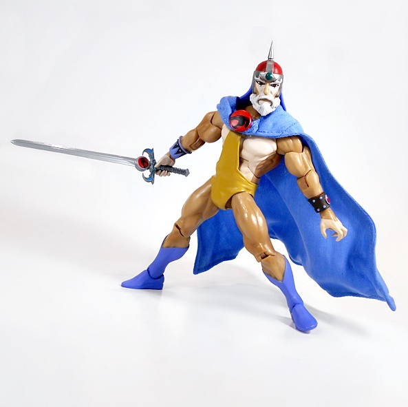
You get a whopping three heads with this figure. The one that he has on in the package is your regular vanilla Jaga. It’s my guess that this will be the default for a lot of collectors out there, and it looks great. You get some sharp printing on the eyes, a well-sculpted beard, bold nose, and his skull cap helmet with a pike jutting up from the top.

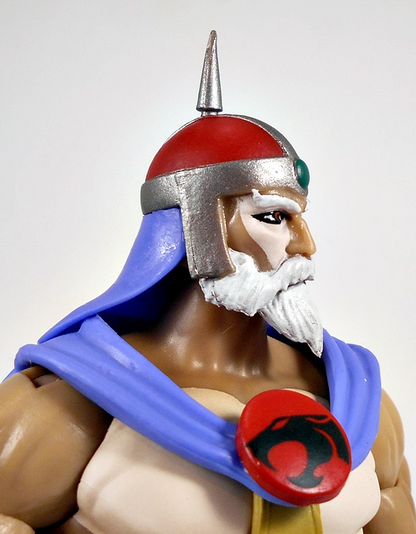
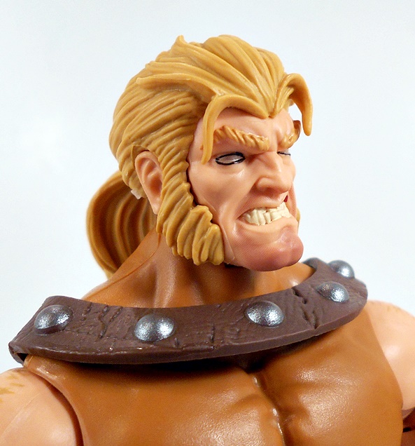
The second head is old man Jaga, and I happen to like this one a lot too. He looks a little more gaunt, with his cheeks sucked in quite a bit. He lacks the vertical hashes under his eyes, and his eyes are a little narrower and lack a bit of the spark from the younger version. His eyebrows are less stylized, and his beard is a bit more bushy and unkept. He also looks like he might be just a wee bit tired of Lion-O’s shit. The helmet, on the other hand, is the same as the previous head. I may actually go with this one as my default display head, but I haven’t decided yet.

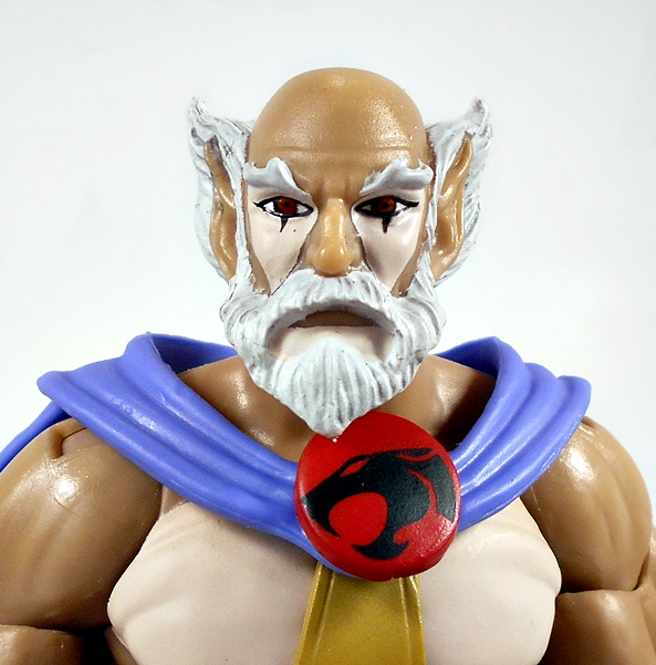
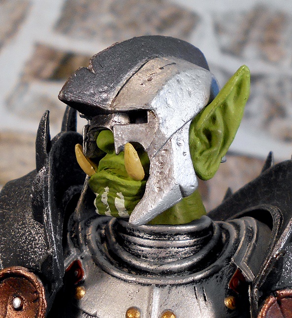
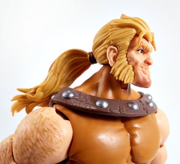
And finally, you get a head sans helmet, and this one looks great too. This is clearly meant to be the younger version, but now you can see his pointed ears, and his bald pate. I like the way his hair flares up with his ears. It’s a nice piece of work, but I don’t think this one will get a lot of display time, unless I wind up picking up a second Jaga figure to display it on.

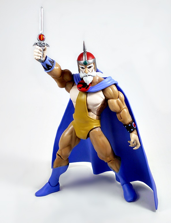
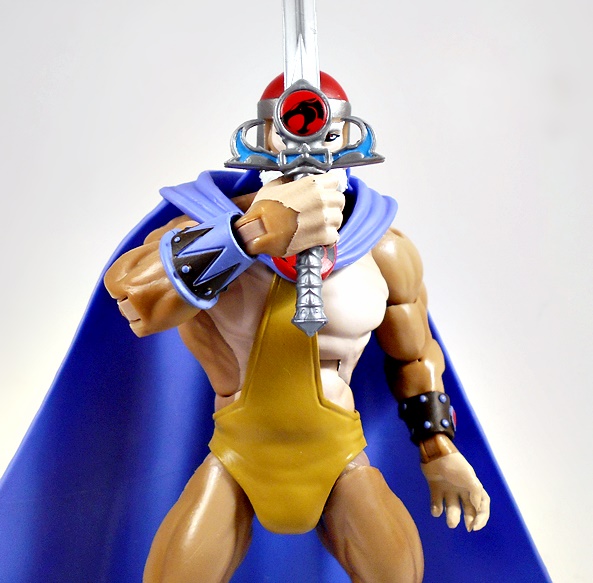
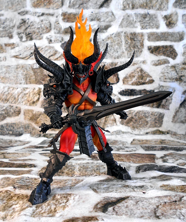
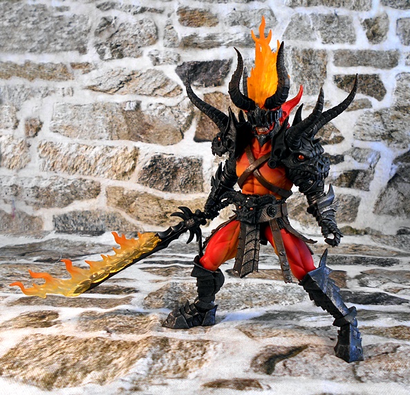
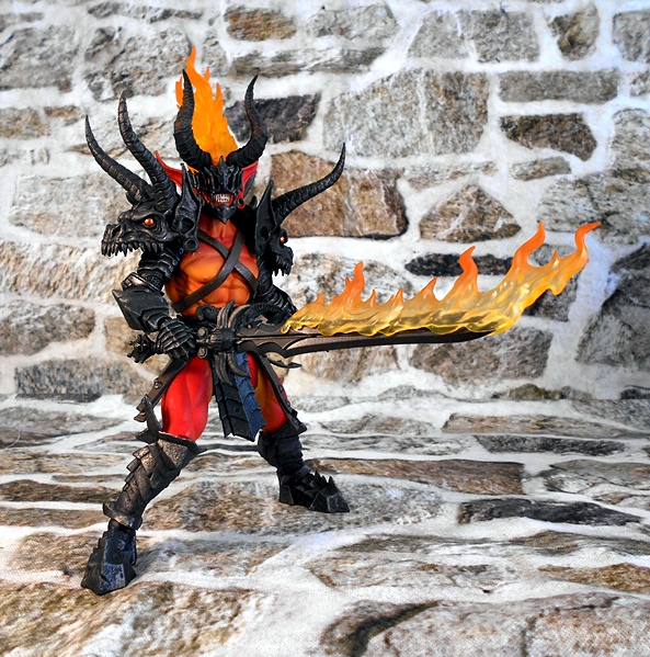
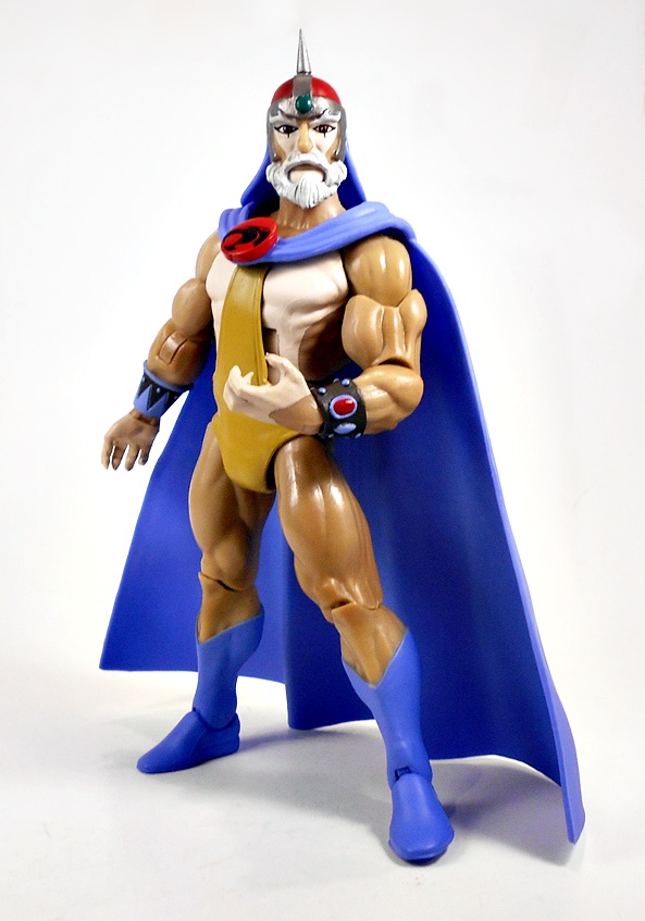
Jaga comes with a few accessories, but two of them I’ve seen before. Sort of. You get the Sword of Omens in both the sleeping dagger version and its aroused sword form. In addition to his relaxed hands, Jaga comes with two additional pairs to help him interact with the swords: One has forward hinges, and the other the normal side-to-side hinges.

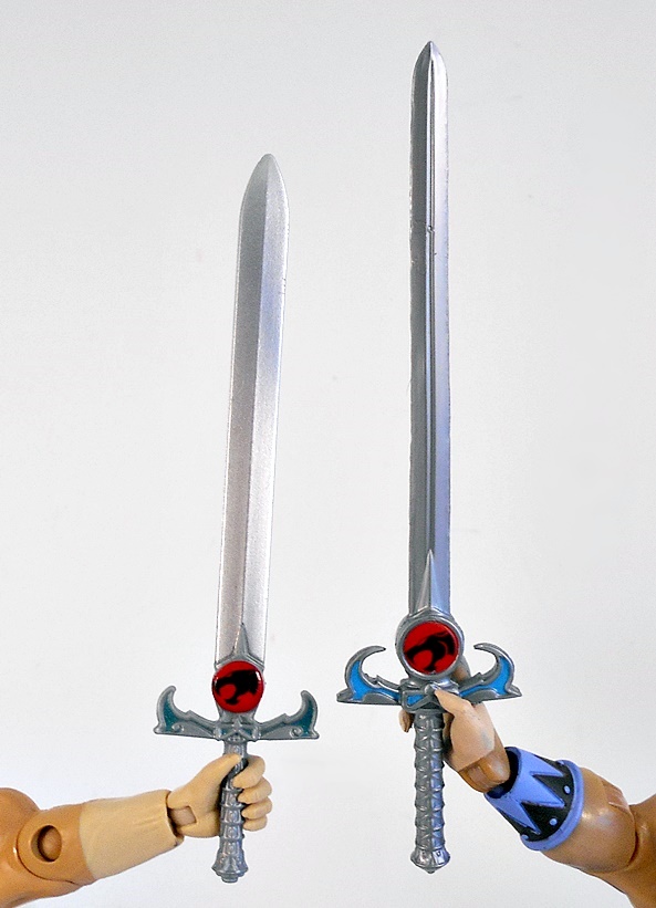
I have yet to receive my Super7 Ultimates Lion-O, so currently, I only have the sword that came with the original Matty Lion-O to compare this one to, and it is a completely new and vastly improved sculpt. The hilt is bigger and has sharper detail, as well as a much more pronounced and better painted Eye of Thundera. I also like how the cross-guard is curled in a little more to give you that proper Sight-Beyond-Sight configuration. The blade is longer, and has a central fuller instead of a diamond cross-section. The only thing I prefer about the Matty version is the silver paint on the blade, which I think looks a bit nicer.

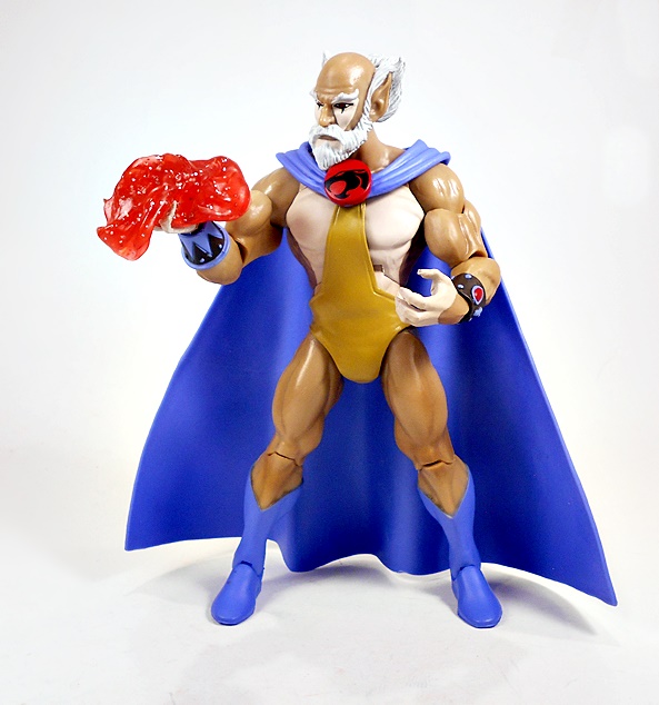
You also get an effect part hand, depicting jaga clothing the ThunderCats team with the magic cloth. This is one of those really cool bonus accessories that I absolutely love, and yet will probably never actual use for display purposes.

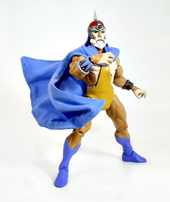
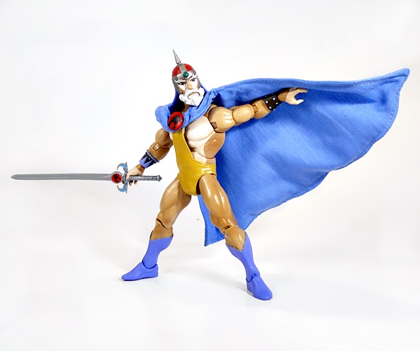
Our last stop in the review is the soft-goods cape, which actually comes on the figure in the package. Both capes have pegs behind the ThunderCats emblem that plugs into the top of Jaga’s outfit. It works OK, but I would have appreciated a pet hole in the chest too, so it would anchor it down better. As it is, the peg can press against the figure’s chest and pop out, although it doesn’t happen all that frequently. The soft cape is beautifully tailored with some immaculate stitching and a pretty close match for the blue plastic used for the boots. It also has a wire to assist with some dynamic poses.

Jaga was a great choice for this wave, as he’s one of my favorite figures in the line from outside the core team. While there are some opportunities to clean up some of the paint lines, I still think that this figure turned out looking fabulous. The two additional heads add a lot of value to the package, and I was both surprised and delighted to see the improvements to The Sword of Omens. I’ll likely hand it over to Lion-O as his new default accessory. I should have the next litter of cats here by next week, and I can’t wait to start cracking into those!

Mythic Legions (Advent of Decay): Brother Mandibulus by The Four Horsemen

Having finally finished going through the recent Arethyr Wave, I’m ready to start digging back to some of the earlier Mythic Legions releases that I’ve missed. Today we’ll set the Wayback Machine to the Advent of Decay, which was the second big dump of Legions figures, with a look at Brother Mandibulus!

It’s no secret, I do love me some Skeletons, and Mythic Legions has given us some truly memorable bone warriors. Brother to Morgolyth and Malleus (two figures I have yet to review here), Mandibulus is billed as being ruthless and focused on destroying all who oppose his family’s legacy!

And, oh boy, is this a creepy fellow! Mandibulus is an intriguing combination of the Orc’s armored limbs, and the sculpted tabards worn by some of the Knights. His armored bits are painted with a dark and rusty finish, which goes great with these pitted and jagged pieces. He has plate armor skirt to protect his hips, and crude and imposing shoulder pieces, all of which we’ve seen many times before. The tabard is painted with a black and red pattern, along with some muddy splatter down below the belt. And while the tattered red and black softgoods pieces are technically supposed to be a skirt, I actually prefer using them as a short cape.

The head sculpt is all new, and it’s pretty damn great! Mandi’s got a simple copper colored skull cap with a sculpted chainmail coif spilling down from it to cover the sides of his skull. One curved horn protrudes from the left side, while the right one is broken off just above the base, and a spike juts out the back between the two. His eyes are covered by a visor, and the armored collar that circles his neck obscures the lower half of his face.

The visor can be flipped up to get a better look at what’s going on under there, showing Mandibulus’ mouth is locked in a perpetual scream. There’s some beautiful paintwork on his skull, giving it a brownish rotted finish. You also get a regular skull as a substitute head if you want, but why would you want to replace this masterpiece of a portrait?

Mandibulus comes with an excellent assortment of weapons, starting with the Orc scimitar. I liked this crude piece of cutlery as an Orc weapon, but I think it works equally well in the hands of a skeleton warrior. The sweeping blade swells into a clever-like point with a circle punched through it to lighten it a bit. The hilt is comprised of three curved bone horns, or perhaps fangs, and the blade has a rusty finish with several nicks taken out of the blade to show it’s seen a lot of action.

Next up, he comes with a stout, flanged mace for crushing the heads of the vile fleshies! The blackened head has painted brass rivets, and the shaft is sculpted with a wood finish and a butt cap. It’s a dark, knightly weapon appropriate for a dark skeletal knight!

And finally, we get this spear-axe type thing. We’ve seen this before as well, I believe last encountered with one of the Goblins. It’s another one of my favorite weapons, and I think it pairs perfectly with Mandibulus!

Mandibulus is an excellent addition to my Skeleton Legions, and yet another fine example of just how adept The Four Horsemen can be with mixing and matching parts, some new paint, and a new portrait. This guy oozes a lot of personality for a Skeleton and he instantly looks like he should be leading the other boney brutes into battle. Is he my favorite so far? Well, I don’t think anyone will ever rival Skapular The Cryptbreaker as my favorite Mythic Legions skeleton, but I’d still rank Mandibulus pretty high on my list.

Buzzworthy Bumblebee: Origin Bumblebee by Hasbro

While I have been focusing exclusively on the Generations-style stuff, Hasbro has been maintaining a few different lines of their profitable change-o-bots, one of those being this Buzzworthy Bumblebee series. I don’t get it. At first, I thought this was a tie-in for some streaming cartoon directed at the younger Transformers fans, but apparently that’s not the case. So, yeah… I really don’t get it and the stupid name inexplicably makes me angry, so I’ve been largely ignoring it. That is until I saw they did a version of Bumblebee based on his Cybertronian appearance in the first episode of the More Than Meets The Eye mini-series.

Well, the packaging design is nice! We get a bright yellow box, with the Transformers logo in black, and some various shots of Bumblebee on the side. What I don’t like here is the lack of a plastic window over the toy. Yes, I understand it’s an environmental thing, but I don’t like the idea that kids can come along and stick boogers on my action figure. DAMN KIDS… STAY OUT OF THE TOY AISLE… YOU THINK TOYS ARE FOR KIDS? GO PLAY YOUR FORTCRAFTING APP!!! I would much rather Hasbro just used a completely enclosed box. If I’m willing to spend $200 on a Titan Class figure and not get to see it until I open it, I think I’d be OK taking a gamble on a $20 Deluxe Class, knowing a kid didn’t touch it with his peanut butter fingers. But, enough complaining… let’s start with the alt mode!

Wow, this is a pretty cool little representation of Bumblebee’s Cybertron mode in the Sunbow style and one that I would have loved to have as a kid. It’s sleek and smooth, with stubby wings and a single blue windshield. It kind of looks like what you would get if you took his Earth mode, removed the wheels and squished it. Come to think of it, it was pretty damn convenient that Cybertron’s alt modes each had a suitable Earth mode counterpart.

Yes, it certainly has a mess of seams from the transformation, but that doesn’t bother me too much. Some of them mix well with the existing panel lines in the sculpt, and to be fair, the network of seams signify that a decent amount of thought and engineering went into this little toy, rather than just go for a lazy shell-former. And while you can’t tell yet, I was particularly impressed that the hood section with the Autobot emblem actually becomes the chest in robot mode, rather than being entirely faked out. Overall, the toy locks together pretty well, and I couldn’t be more pleased!

There are three sockets on the vehicle to plug weapons into, but since I’m a fan of symmetry, I just plugged Bumblebee’s gun into the one on the top.

And here he is in robot mode, and I have to say the transformation is pretty clever, fairly intuitive, and not at all too finicky. As I’m sure I’ve said before, my favorite thing to do with new Transformers is to try to figure them out without looking at the instructions. I wasn’t sure that was going to work here, but I made it happen. And yes, we have a fair amount of ugly kibble on those lower legs. I’m not a fan of it, but I can certainly understand that it had to go somewhere, and to be fair, that’s pretty much all of it. He wears the vehicle roof on his back, like a lot of Autobot cars, and just like in the cartoon, the chest piece is stylized to have the VW windows we’re used to seeing on Bumblebee, despite him not taking on that alt mode yet.

The head sculpt is excellent! I think I actually like this one a bit more than the one we got on the War For Cybertron figure, although that one isn’t too bad either. Here we get a little smirk and a fatter, more stylized helmet. This one just screams a little more Sunbow style to me!

Bumblebee comes with a pistol and a jetpack. The jetpack was initially shown off in silver, and I would have preferred it, but what we got is just black plastic. I guess it matches his deco better.

And you also get some of the conductor rods that Bumblebee and Wheeljack were scavenging in the beginning of the first episode. These are a pretty cool bonus accessory, although honestly it doesn’t look like there is enough energy in them to last a quartrex.

In terms of size, in robot mode this figure comes up at almost the exact same height as the War For Cybertron Volkswagen version. His vehicle mode, on the other hand, is a wee bit bigger.

All in all, this is a fun little figure, and one that I didn’t think we’d ever see realized. Despite all the Bumblebee figures Hasbro produces, he’s gotten the short end of the stick when it comes to Cybertron alt modes, and I’m glad they chose this one when they finally got around to doing one. I passed this one up on the pegs a couple times, before eventually grabbing him one day when I couldn’t find anything else and didn’t want to go home empty handed. And I’m mighty glad I did!

Marvel Legends (Colossus Wave): Cyclops and Rogue by Hasbro

I’m in the process of making my way through the second Age of Apocalypse themed wave of Marvel Legends. So far I’ve checked out Magneto and Sabretooth, and today I’m doubling up with a look at Earth-295’s Cyclops and Rogue!

The figures feature some great character art on the side panels and the X-Men logo on the fronts. I think it would have been cool if they did a little more branding for Age of Apocalypse, but I throw these packages out anyway, so it’s no big deal. Each figure comes with one of Colossus’ limbs, and Rogue comes with an extra Colossus hand. Let’s start with Cyclops!

I think Cyclops’ AoA makeover is pretty fun. He’s no longer the clean-cut, straight-arrow, as his dystopian reality (and the glory of mid-90’s comic design) has taken its toll on him. The base figure here is quite simple, with generic blue buck, representing his sleeveless bodysuit. His arms are left bare, but he has some painted gloves to match his suit. The bulk of the new sculpting comes in his gold belt with shoulder armor strap, as well as the reinforced armor on his right glove, and a full armored sleeve on his left. The electric blue used for his suit is absolutely gorgeous and makes for a nice contrast with the gold used for his extra bits. I’m not usually a big fan of the type of gold plastic Hasbro used here, but they did add some scrapes and scuffs to the armor pieces, and I think it actually looks quite good.

The head sculpt is of course new, and like Magneto, Cyclops has trouble finding a barber in Earth-295. I’m actually getting a little bit of a Tommy Wiseau vibe off of this portrait, which is kind of awesome. The copious coif of brown hair is parted to the left to expose the additional gear attached to his visor, and the lone crimson lens covering his remaining eye, while it hangs over his missing peeper. A grim expression is chiseled into the exposed lower half of his face.

Cyclops features pretty standard articulation for this line. The arms have rotating hinges in the shoulders, swivels in the biceps, double-hinges in the elbows, and hinged pegs in the wrists. The legs are ball jointed in the hips, have swivels in the thighs and lower legs, double-hinges in the knees, and hinges and lateral rockers in the ankles. You get a waist swivel and ab-crunch hinge in the torso, and the neck is both hinged and ball jointed. Cyclops comes equipped with a pair of fists, but sadly no other hands. Let’s move on to Rogue!

Wow, these colors! Despite her grim surroundings, Rogue went for some eye-assaulting colors on this outfit. You still get the usual yellow, but here it’s mixed with some dark green for her upper sleeves, reinforced panels on her hips and thighs, and electric green for the rest. She has a pair of yellow wrist bangles, and one wide yellow thigh strap on her right leg. We got a fair amount of new sculpting for this figure, mostly evident on her baggie upper sleeves, and her chunky yellow boots, complete with red oval fixtures on the fronts. Lastly, she has a loose green collar resting on her shoulders, with silver studs.

And then there’s the head sculpt. You know how some people say there are comics that are un-filmable? Well, this may be a case of a comic hairdo that’s un-sculptable. I’m sure Hasbro did their best, but this thing is just a mess. And it doesn’t help that they also had to give her a giraffe neck to make it work. The face itself is OK. She looks kind of gaunt next to the Earth-616 Rogue, but maybe it’s because she isn’t on a steady diet of Gambit’s gumbo.

Articulation here is in line with most of the Marvel ladies, which means you get rotating hinges in the elbows, instead of double-hinges and bicep swivels. You get a ball joint under the chest, instead of a waist swivel and ab-crunch hinge. And Rogue has swivels in the thighs, but not in the lower legs.

Unlike Cyclops, Rogue actually does come with a second set of hands, so you get fists, and the same style of splayed finger hands that we got with the previous Rogue.

Coming into this duo, I expected to like Rogue a lot, and not care for Scott Summers at all, but the truth turned out to be the opposite. I think Cyclops is a great looking figure with a style that really tickles my nostalgia for 90’s comic tropes. Rogue is by no means a terrible figure, but it’s just hard for me to get past that hair sculpt.

Mythic Legions (Arethyr) Arethyr and Aethon by The Four Horsemen

It’s Mythoss Monday again, and I’m up to checking out the very last figures that I bought from the Arethyr Wave. It took a lot of self control, but I saved the Big Daddy of them all for last! Arethyr is the reason for the season, as they say, and all the figures in this assortment have been leading up to his return!

This fiery manifestation of war itself was available alone, or bundled with his mighty steed Aethon, and I went for the bundle. The result is the biggest Mythic Legions box yet. The Demon Warlord and horse come resting in a tray beside each other, with a secondary tray underneath to hold some accessories. Let’s bust these figures open, and we’ll start with Arethyr himself!

It’s no wonder the inhabitants of Mythoss are up in arms against Arethyr’s coming, because he does not look like the kind of guy you want to have show up on your doorstep. Everything about this guy just screams bad news! Now, considering he’s one of the major players in the Mythic Legions struggle for power, I was surprised to see that he does recycle a number of common parts. But, with that having been said, it all works so well together, I’m not going to complain! The obvious recycling comes from the armored full sleeves on the arms and the armor on the lower legs. These are all finished off in a dark iron color, looking like they were tempered in the fires of hell itself… probably while he was wearing them! You get the typical bare torso and upper legs, this time painted a bright crimson with some orange highlights.

And then there’s all the new stuff… and it’s great! The first thing that draws in my eye are the massive shoulders, forged to look like the heads of some unknown massive demon beasts. They kind of look like the skulls of Chinese Dragons, with their squished noses and string of jagged teeth. The horns that protrude off of each make Arethyr look to be a prickly sort, and definitely adds an intimidation factor to his overall look. Arethyr has crossed straps on his torso and a new belt that includes a sculpted demon head sigil for a belt buckle. All of these pieces are finished in the same black iron color, but the shoulders and belt have shining red eyes.

Arethyr’s portrait is something straight out of the depths of hell itself. The top half of his face is covered with a twisted visor, while his jaw is covered in a jutting plate, each framing his creepy wall of exposed teeth. His exaggerated, pointed ears fan out on each side of his head and have loops stretching out his earlobes. Meanwhile, two horns rise majestically from the top of his head, with a blaze of orange flame nesting between them. Damn, this is great stuff!

The visor is removable, as it is pegged in on each side of his head. It seems like it should be able to flip up, but the horns prevent that. Under the visor is a nightmarish skull with the reddish-orange demon skin stretched thin over it. His nose is a lump with four nostrils, and his wide yellow eyes are staring right into my soul. I think I’ll put the visor back on now.

Arethyr comes with the fearsome Aetherblade, a two-handed sword of untold demonic powers. This weapon is finished entirely in black, has a double cross-guard, which curves toward the blade and a skull topped pommel. It’s a great weapon design for a demon king, and I’m thinking that this might be a one-off accessory, unless it’s been bundled in one of the accessory sets.

You also get a flame effect for The Aetherblade. This piece slots into one side of the blade and stays put quite well. The translucent yellow and orange flame effect looks outstanding!

And what Demon Lord would be complete without a set of wings? Most will probably argue that Arethyr should always be displayed with these, but truth be told, they are a little hard to manage. They connect to him using one of the back adapters that come with practically every Mythic Legions figure, and yet this one of just a few times I’ve had any use for them. You simply peg the wings into the adapter and then tab that into the slot on the figure’s back. Now, it does stay put fairly well, and I don’t think I will have problems displaying him with the wings, but they are problematic when handling and posing the figure, as they are apt to pop out. With that having been said, they look absolutely amazing. The paintwork on the wings is simply incredible, and they feature a decent amount of articulation, with pegged hinges at the connection points, and hinges up near the crest of each wing. He’s also fairly well balanced with the wings, as I was able to get some decent shots without having to resort to any additional support. OK, let’s move on to Arethyr’s demon steed!

Aetheon is a remold and repaint of Balius, which I reviewed a little while ago. His brown coat has been repainted to a more hellish red, and he’s got extra fur added to his lower legs, which are reminiscent of flame with their bright yellow and orange paint. He also has a newly sculpted mane, which is a bit more wild and painted in the same orange/yellow, with the tail also matching.

The head sculpt is thoroughly demonic, with exposed teeth and horns reminiscent of the Taun Tauns from Star Wars. The eyes are painted yellow with no pupils, and he’s wearing a spiked horsey helmet, which adds to the more sinister vibe of this beast. I also dig that the reins have been changed to black chain. I’m guessing this beast probably eats eyeballs instead of sugar cubes and fingers instead of carrots.

The tack is somewhat different, lacking the bedroll and the blanket that we saw on Balius. Unfortunately a few of the pieces of the tack have given me problems. The stirrups peg in over some flaps that also peg in right under them. Well, one of the stirrups and one of those flaps popped out and ever since, they do not want to stay put. I may eventually just resort to gluing them in place. Aetheon also comes with two extra swords and shields, which can be carried in the straps, similar to Balius. These are just nice extras, which I’ll probably hand off to some Legion Builders, or just display on a weapons rack.

Arethyr fits onto his steed quite well, although I did remove his groin armor to make him fit better. That piece just tabs in and can be swapped in and out easily. I have to say, these two make for quite an awesome site. The moment they entered the battlefield, I think I’d adopt the play dead strategy and hope Arethyr and his evil hordes just roll past me. Oh, and I was a little skeptical over how well he would stay on the horse with his wings attached, but it actually works quite well. I just found that getting him seated first and attaching the wings after was the best way to go.

And that’s a wrap for this wave! Arethyr turned out to be another fantastic assortment of figures from The Four Horsemen. There was a wonderful selection of different characters (and we got our first horses!), but I will concede that Arethyr and Atheon stand out as my favorites. I’d like to think that even fans of fantasy figures who aren’t in over their head with collecting this line (unlike me!) might consider adding this set to their collection as a stand alone piece. It really is that impressive! And now that I’m caught up with all the more recent Mythic Legions, I can spend a few Mythic Mondays going back to some of the earlier figures that I haven’t had time to get to!

Space 1999: Eagle-1 Transporter by Eaglemoss

Last week Eaglemoss ran some sales, which persuaded me to pick up some of their models for the first time in a little while. I got some Star Trek and some Doctor Who, but today I’m going to check out their Eagle Transporter from Space 1999! I think this is probably the first time anything from Space 1999 has been featured here on FFZ. It’s a property that hasn’t stood up in the public eye nearly as well as some of its contemporaries, and that’s a shame because it’s a fantastic series, especially the first season! My first exposure to it was when I was young and my Uncle gave me his Eagle-1 Transporter from Mattel and I was blown away by the thing! It was HUGE, it had plenty of great play features, and came with three action figures. I played with that thing for years until most of it got lost or eventually broken, and I hadn’t even seen the show yet! Later on when I was a teenager, I started watching reruns of it on one of the local channels and it hooked me. It didn’t have the same polished charm or optimism of Star Trek, but it was gripping stuff, nonetheless. And at times, I even found it to be downright terrifying. What’s more the sets and the props were absolutely amazing! And while I’m not as fond of the second season changes, it did add Catherine Schell as Maya, which was reason enough to watch!

Eaglemoss’ model comes in a fully enclosed box with a color magazine offering some great information about the series and the Eagle Transporters. The Eagles were certainly not as sexy as anything in Star Trek or Battlestar Galactica, but I found the designs to be every bit as iconic. They were the workhorses of Moonbase Alpha, and able to be refit with different equipment packages for a various degree of specialties. From hauling cargo to mobile laboratory, these things could do it all. They could even engage in battle when necessary. Space 1999 had a rather unique take on space exploration, as the Moon itself was blasted out of orbit after a nuclear accident and sent hurdling through the Galaxy. The Eagle Transporters allowed them to launch exploratory, scientific, and resupply expeditions to the planets that they passed.

And here she is out of the box! As with all Eaglemoss models, The Eagle-1 uses a combination of diecast metal and plastic, giving it the best of both worlds. You get the heft of the diecast parts and the fine sculpting that can better be achieved in plastic. It’s a fully finished model, without any assembly required. And at about 10-inches in scale, this ship is the perfect size to offer a great level of detail, without requiring a crazy amount of shelf space. The Eagle-1 includes a black diecast stand with a clear plastic post and platform to rest the ship on. The stand doesn’t actually secure itself to the ship in any way, but it holds it sure and steady. Just try not to bump it!

I think my favorite thing about the Eagle-1 design is just how seated in realism it is. With it’s exposed framework on the top, fixed landing gear, and array of thruster cones on the back and undercarriage, everything here is so utilitarian. As a kid, this design looked totally credible to me as something we would be using to explore space in the distant year of 1999! For a show about people travelling through space on the moon, these Eagle designs were remarkably grounded.

The bulk of the model is presented in an off-white finish, with some occasional panels painted differently to make it look like it’s constructed of hundreds of panels. It’s not as complex as the aztec patterns we see on later Star Trek ships, but it works to add that extra level of realism to the finish. Other paint operations include the black and red striping on the front and back of the dorsal frame, the black windows above the center cabin, and the gunmetal gray used for the thrusters. You also get some sharp, printed Moonbase Alpha insignia on various points of the hull. It feels like every time I take a moment to study it, some new little detail is brought to my attention and I love that! This is an excellent representation of the ship in every way! Alas, the cockpit and booster sections don’t detach and connect like they did in the Mattel toy, but that wasn’t canon anyway.

It’s probably worth mentioning that Space 1999 has an unbelievably dedicated modeling fandom, and there have been a number of absolutely stellar Eagle-1 models available, both as professional and hobby grade builds. I’ve spent many a night haunting forums and drooling over some of the amazing work that’s been done recreating these intrepid Eagles in all their variants. In light of that, Eaglemoss’ release is far from the best you can get, especially if price is not an option! But with that being said, I couldn’t be happier that I added this ship to my collection. It’s the perfect size and the level of detail is quite impressive. There are a few different model variations available, but I’d love to see Eaglemoss release one in the vintage Mattel colors. I’d probably jump on that in a heartbeat! I seem to recall the MRSP on this model being around $80, but it was being blown out at $25 for the sale, and I couldn’t say no to that!

Masters of the Universe Origins: Stinkor and Webstor by Mattel

One of the coolest thing about MOTU Origins for me is getting a crack at figures that I missed out on during the Classics line. Case in point, Classics Stinkor and Webstor are among a small handful of Skeletor’s minions that sold out on Matty Collector before I could get them, and now sell for ridiculous money. Meanwhile, here are the Origins versions just swinging on the pegs down the toy aisle at Target!

As always, these look great on the retro-style cards. The backs show some of the figures’ play features and some other figures that are available. You also get a Mini-Comic bundled with each figure, which is a nice bonus as well. Let’s start with Stinkor!

The package says he stinks, and I was expecting to get hit with a ripe dose of patchouli oil when I tore open the bubble, but that wasn’t the case at all. I even put his whole hand all up into my nose and I could only barely smell much of anything. Not that I’m complaining, because I really don’t want my toys smelling like dirty hippies. I’d just as soon use my imagination. In any event, Skeletor’s Man-Skunk looks great with his high tech stink-activated armor, complete with nose extension. The bright orange armor matches his gauntlets, webbed monster feet, and even his belt and furry diaper are all orange. The outfit contrasts nicely with the black matte of his arms and legs, and white jagged stripes running up his arms to his shoulders.

Mattel did a fine job with Stinkor’s ugly mug, from his perky, pointed ears to his creepy down-turned fang-infested maw. His yellow peepers have cat-like irises, pulling an expression that makes him look like he’s shocked by his own stink. You get some white around his eyes, and a stripe that runs from his nose up the center of his head and down to the back of his neck.

Unless you count his super-weak smell, Stinkor only comes with one accessory and that’s his blue shield, which seems to work best when tucked into his right open hand, allowing him to parry and spray! Yup, Stinkor is a pretty simple figure without a lot going on, but I dig him all the same! Moving on to Webstor…

Of course, Webstor is a creepy Spider-Man, but not one of the friendly neighborhood variety. And WOW, do I love this figure! The dark blue plastic that Mattel used for his skin is just gorgeous. He’s got the same monster feet as Stinkor, but now colored purple to match his chest armor. His belt is orange, his furry diaper is black, and he’s got orange and red emblems painted on his chest. Flip him around, and he’s got a big backpack to accommodate his giant grapple hook. If he’s a spider man, why doesn’t he just shoot web? I dunno!!!

Webstor’s head sculpt is super creepy, with a pushed in bat-like nose, fangs pointing up and down, two giant soulless red eyes with two smaller ones up above on his forehead. PErsonally, I always thought Webstor could have used a few more eyes, but that’s just nitpicking, I think this is a great looking head!

The backpack includes a generous amount of string, which runs through it, allowing Webstor to climb, repel, or just zip-line into action!

And if the zipline isn’t enough to make Stinkor feel like he missed out on accessory day, Webstor also comes with an orange rifle.

Every new MOTU Origins figure is a treat that brightens my day! This line is so simple, and yet so damn fun! And it feels damn good to be collecting a line of figures that are under $20 these days. Stinkor is cool and all, but Webstor has always been a favorite of mine, and he’s easily the stand out figure of this pair. Not having the Classics Webstor really hurt a lot, and while I’d still love to add him to my collection some day, I’m a lot more comfortable with Origins Webstor at $17 over the $200 or so that I’ve seen the Classics figure going for these days!

Mythic Legions (Arethyr): Vorthogg by The Four Horsemen

Hey, it’s another Mythoss Monday, and I feel like I’m finally getting back into the swing of things! Today I’m checking out the penultimate figure in my series of reviews from the Arethyr Wave. While this assortment was named for the Demon Horde that invaded Mythoss, it also gave us a nice variety of Mythoss’ non-demonic inhabitants, including today’s Orc Warlord: Vorthogg!

According to his bio, Vorthogg was responsible for training the Legion of Arethyr, but his true allegiance still lies with The Orc Queen, Urkzaa. I’m not sure how that works, as the bio is a little vague on the matter. Is Vorthogg just playing one side against the other? Training the Legion to go up against his enemies? Was he an employee or an independent contractor? Does it really matter? Nah. Let’s tear this package open and see what we got!

I see some new stuff! Keep in mind, if it’s new to me, it’s just because I haven’t seen it on another figure that I reviewed yet, so your experiences may differ! Now, with that having been said, I don’t recall seeing this cuirass, belt, and hip armor before, and I think it’s pretty damn cool! The cuirass is painted a lighter silver than most of the Orc armor, suggesting Vorthogg actually takes care of some of his equipment. It has some wonderful gold rivets, and painted brown straps. You also get some pretty cool scrapes on his left breast where it came in contact with enemy blades. I love that little touch! The belt is pretty elaborate, and while the hip armor has some bright silver plates and copper chainmail showing through, it’s mostly painted in the dark iron finish that we see on a lot of the Orc armor.

Everything else from the waist down is stuff we’ve seen before plenty of times. The upper arms and upper legs are bare and painted in your standard shade of orc green. The forearm bracers and lower leg armor are jagged, crude, and pitted like I’m used to seeing on Orc gear. It’s also worth noting that Vorthogg comes out of the package with bare feet, but he also has booted feet, which I’m going to use to display him.

You get two head sculpts with the figure, the first is sans helmet, offering a great look at Vorthogg’s ugly mug. He has a full beard, which is painted black but left with some green highlights, and a bald pate framed by his tall, pointed ears. His facial features make for a bold sculpt, with deep lines, a protruding bottom lip, and yellow teeth jutting up out of each corner of his broad mouth. He’s got deep set yellow eyes, with some serious bags under them. This is an excellent portrait that just oozes character. We’ll check out the other head in just a bit.

As usual, you get a pair of shoulders, but you also get a piece of fur to put around his neck, and boy do these look great together! The shoulders are finished with the same dark iron and pitted finish as his extremities’ armor, with tall spikes surrounding his head to keep him from getting easily decapitated by a lucky opportunistic opponent. The front corners have copper painted discs and the fur piece hangs down between them to keep him warm on those cold Mythoss nights. Or maybe that’s Queen Urkzaa’s job? Either way, this guy just looks phenomenal when he’s all kitted out! Let’s have a look at the rest of his gear!

Vorthogg’s features the large and stout sword that we first saw associated with the Dwarves. It’s painted to match the dark portions of his armor, and I have to say I think this blade suits him better than it does the Dwarves! It’s both crude and massive, and it looks right at home in Vorthogg’s hands! Besides, it’s not a sword that gets recycled a lot, so it still feels nice and fresh to me!

Next up is Vorthogg’s shield, which is borrowed from the Elves. This one I think is a tad bit more of a reach. My first assessment is that this ornate and highly stylized design feels a bit too fancy for an Orc Warlord, but I think the paint job makes it work. The lighter matte steel finish looks great and the brass rivets and red stones add just the right touch of color. Of course, I can always write these accessory choices off as characters picking up trophies from the battlefield, and I’d like to think Vorthogg had to slay a pretty important Elf to claim this shield. Either way, this is another accessory that isn’t seen a lot, so I’m happy to have another!

And last on the accessory list is a very old and familiar one… The original war hammer! It seemed like everyone released in the original Kickstarter either had one of these, or the ubiquitous battle ax. I’ll confess I got tired of seeing this so often back in the day, but I can’t say as I mind seeing it again now. It’s still a beautiful sculpt and it definitely suits Vorthogg!

And before wrapping up, here’s a look at the alternate head. This one also hails from the very beginnings of Mythic Legions and it isn’t terribly exciting to me, as we’ve seen it many times. Not that there’s nothing wrong with it. I still enjoy all the little dents in the helmet and the one nick taken out of the crest. I also like the war paint added to the chin here. I just can’t imagine displaying the figure with this head, seeing as the other one has so much personality.

Upon opening this figure, I silently challenged The Four Horsemen to get me excited about another Orc and by God they sure did it! Vorthogg is probably my favorite Orc released in the line so far, and I’d like to think that’s based on his merits, and not because whatever new Mythic Legions figure I open is automatically my new favorite. Although, that may not be far off the mark. But in this case, I think the design just acme together so perfectly, and I definitely get a strong Warcraft vibe off of him, which sure ain’t a bad thing! I think he almost got cut from my purchases in this assortment, as I was trying to stick to a budget, but I’m damn sure he made the cut in the end. Next Monday, I’ll wrap up the Arethyr with the big boi himself. Arethyr is coming… and his horse too!!

Transformers (Studio Series 86): Gnaw by Hasbro

Hasbro has been turning out some excellent figures from the original Transformers animated movie through their Studio Series. I’ve covered quite a few of these, but I’ve still got some catching up to do, so today I’m going to have a look at Gnaw the Sharkticon!

It was about five years ago when we last saw Gnaw on the pegs, and that release was a tiny Legends Class, whereas now Gnaw is getting a proper Deluxe Class treatment. As always, the character art for the Studio Series packaging looks great, although I’m still not a fan of the black and red deco with the Transformers logo running up the side in sterile typeface. Also, it looks like something was gnaw-ing at the top of this box, which is fine because I’m about to shred it open. One thing I dig here is the Quintesson faction symbol next to Gnaw’s name. I’ve never noticed Hasbro using that piece of art before and It looks pretty badass! I think I’ll break tradition here and start with Gnaw’s robot mode.

In robot mode, the Sharkticons are the oompa loompas of the scrapyards. They’re short and stocky, and they don’t look too dangerous when they’re solo, but get a pack together and they just overwhelm. Hasbro did a beautiful job here updating the original toy, which has a robot mode that has not aged well. Here we see some great proportions, nice sculpted detail and beautiful colors. Hasbro borrowed the mauve and blue, dark gray and off-white from the original toy and streamlined it to resemble the animated model a lot more. Still, I would have loved to see some silver paint in place of the chrome from the original toy. At least on the teeth!

From the back, this guy is pretty damn tight, with his back dominated by a slab of black, almost like a turtle shell, and his tiny beastly arms hanging off his shoulders. All the beast mode kibble here is well placed, looking like they were style choices, rather than just some random place to tuck them. Everything about this bot mode feels polished to a fine shine. And for such a stocky guy, there’s some great articulation here, right down to the ankle tilts to keep his feet flat on the ground.

The head is a great homage to the original toy’s noggin, sporting a very distinctive “helmet” and a broad face. There’s a lot more detail here and a very displeased expression. I like to imagine that the Sharkticons are just in bad moods all the time because they’re always hungry for more Energon. I also love how well protected this guy’s head is. It’s right in the middle off a perimeter of teeth! I think the only thing I would have changed here would be to get some bright crimson paint on those eyes.

The Sharkticon comes with two weapons for his robot mode. The first is a rather large blaster rifle, which is almost as long as he is tall. The second is a spiked flail, which forms his tail in his beast mode. And speaking of which, let’s check out that beast mode!

I really like what we got here, even if it feels like the emphasis was on the robot mode over this one. The transformation is pretty simple, and yet rather clever at the same time, and everything locks together to make a solid little eating machine. The legs are set pretty far back, but they do a nice job balancing him upright. The hip joints have a habit of dropping him every now and then, but for the most part he stays standing, even without using his tail as a support.

The face is spot on perfect to me, with it’s metallic green bug yes and it’s giant maw of teeth. The jaw is hinged so he can bite, although there isn’t a whole lot of room inside that mouth. On that note, the robot head is unfortunately right inside, albeit facing down. You don’t really see his face, and I suppose the back of the head just works as some kind of weird bulbous tongue. Still, I would have liked to have seen it fold up inside the body, rather than be hanging out there. My only other nitpick is the arms. They swivel at the shoulders and have hinges in the elbows, which isn’t bad, but the shoulders should have been ball jointed.

As mentioned, the flail weapon becomes the tail, and you can also plug the rifle into the Sharkticon’s side to give him some extra firepower.

And here’s a couple comparison shots of the new Gnaw with the previous release. I seem to recall liking the Legends Gnaw when it came out, and to be honest I still do. As a Legends Class toy, it’s a lot simpler, but I think it did a fine job for what it is. And I think it displays really well with the new release, as some sort of less developed version of the Quintessons’ attack dogs.

Also, in keeping with the past Studio Series releases, the package does include a little display backdrop. I really love these, but if I’m being honest with myself, I probably won’t keep them. It would just take up way too much space to display each figure on one of these, and I don’t really want a whole tote full of them taking up more space in the closets.

The 86 movie Transformers figures hit the shelves at a time where I was still watching the cartoon and still taking note of the toys, but I wasn’t really playing with or buying them anymore. As a result, I never owned the original, and I’m happy to see this guy get such an gnawesome treatment. I grabbed up three of them to match the number of the Legends Class version I have, and I think that’ll probably be enough, although if I can find them at a good deal, I won’t say no to a couple more.

Marvel Legends (Colossus Wave): Sabretooth by Hasbro

I had originally planned on tackling this second Age of Apocalypse-themed wave by doubling up each review, and that’s still the plan going forward. But I was at a loss for time last week, so I gave Magneto his own review, and now I’m doing the same for Sabretooth!

Magneto did not come with a BAF part, but Sabretooth comes with Colossus’ head and a second piece for the tie on his mask. I was surprised to see that this is the first time Sabretooth is getting the spotlight here on FFZ, as I never did get around to reviewing his release in the Apocalypse Wave, but I will bring in that figure for a comparison picture at the end.

Besides the new look, this Sabretooth is a helluva lot bulkier than the previous release. He’s a big boy with a decent mix of generic figure buck and some fresh sculpting for his costume. The torso, goin, and legs are all just standard muscle, cast in a light tan, which borderlines on orange. The boots and left gauntlet are dark brown, and all have some nice texturing to look like rough leather, and he has a simple belt to match. The right gauntlet has a matched hand, but the gauntlet sleeve is reinforced to look like metal, with heavy bolts and an extension to fortify the back of Sabretooth’s hand. The final piece of the costume includes a dark brown collar that extends out to his shoulders, and has silver bolts. Meanwhile, the arms are cast in flesh-tone plastic and have sculpted and painted hair, similar to what we’ve seen in some past Wolverine figures!

You get two head sculpts, and I really dig both of them a lot! It’s packed with personality. with a wonderful smirk, exposing just a hint of tooth. The eyes are deep set with big bushy eyebrows, and the well-detailed face is punctuated with a glorious butt-chin. The hair sculpt is also worthy of praise. It’s a separate sculpt, which gives it a clean hairline, parts around the ears, and there’s a plug in ponytail that can swivel.

The second portrait is all business, with his pupils gone, and his mouth drawn up into a big, toothy snarl. You also get a second ponytail to plug into the back of this head as well. That may seem like a no-brainer, but you never know with Hasbro these days. They could have opted to save a few pennies and only include one.

Articulation here is textbook for this bulkier Legends buck. That includes rotating hinges in the shoulders and hips, swivels in the biceps and thighs, hinged pegs for the wrists, hinges and lateral rockers in the ankles, double hinges in the knees, and elbows, a waist swivel, an ab crunch hinge, and the neck is both hinged and ball jointed. Sabretooth also includes two pairs of hands: One pair of fists, and one pair relaxed. There aren’t any other accessories here, but I can’t say he’s really missing any.

I love this look for Sabretooth. It’s clean and tight and just the right mix of generic buck and new sculpt. I also think he looks great on the bigger, bulkier body. And while he still looks pretty damn tough, he appropriately lacks the savage and terrifying expression of the Earth-616 Sabretooth. So far, this Wave is hitting it’s mark two-for-two. Next week, I’ll double up with a look at a couple more!