Femme Fatales: Darkchylde by Diamond Select

Just a few weeks ago I liberated one of Diamond’s Femme Fatales statues from my local comic shop. Steampunk Lexi intrigued me enough each time I was there that I decided I should let her come home and live on my shelf. It was a good decision, as I think she is a fine statue. Good enough that I decided to order another release in the line. This time it’s Ariel Chylde, aka Darkchylde. I’ve been a casual fan of Randy Queen’s Darkchylde comic ever since I saw an art print of her at a comic convention and I decided to check out a few issues. Fast forward to today and I’ve got more than a few Darkchylde books on my shelf and even a couple of action figures. This statue seemed like a good fit. Let’s see if she stacks up to Lexi.

ffdchylde1

ffdchylde2

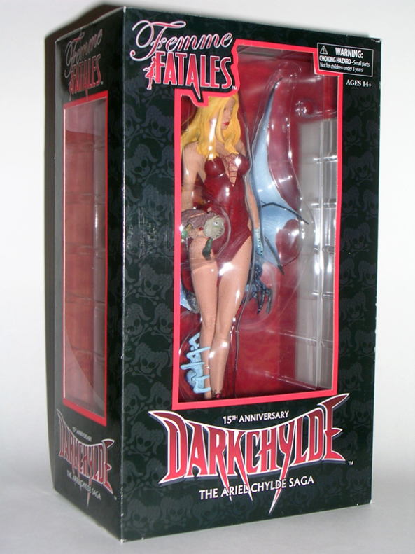
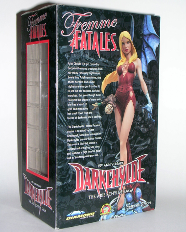
The package is identical to what we saw last time. It’s a simple window box and nothing at all special, but at least all the boxes in the line share a uniform deco which pleases the OCD in me. The back panel has a shot of the statue and a blurb about Ariel. The statue comes nested between two plastic trays and the wings come detached so she can fit a standard Femme Fatales box. Everything is collector friendly so you can return the statue to the box for storage or display or whatever.

ffarieal5

ffarieal6

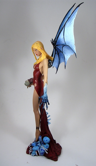
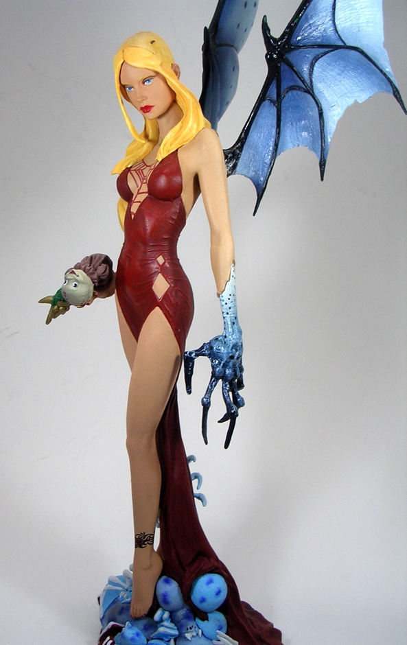
I ordered this statue expecting her to be about the same size as Lexi from base to wing tips, but she’s actually in the same scale, which means with the wings attached she’s considerably taller. That was a nice surprise. What wasn’t such a nice surprise is that part of the statue broke off the moment it came out of the package. It was the ponytail on the doll. Granted, it’s not a crucial piece, if you don’t know it was there you wouldn’t miss it at all, but no one wants a collectible to break the moment it comes out of the box. Sorry, Ariel, we’re not off to a good start.

ffarieal7

ffarieal8

ffarieal9

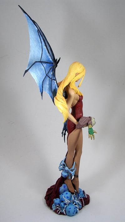
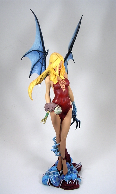
The design of the statue is quite nice. Yes, I have issues with the base, but I’ll come back to that. Ariel is standing atop a raised base, in a tight dress, holding her doll in one hand and her other hand is morphing into her demon form. Her head is cocked slightly to the side, her long blonde hair is windswept to the other side, and her demon wings rise majestically from her back. I like the way the lower part of her dress is concealed between and behind her legs because, well let’s face it, she has nice legs. All in all, this design is a very typical look for Ariel, as it shows both her beautiful human side while also allowing us to glimpse her demon aspects. I don’t think I would change anything about the pose or the design here, but it’s a couple of the finer points where I’m about to take issue.

ffarieal1

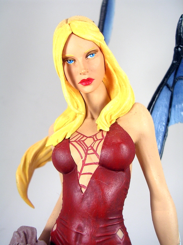
My first stop is the portrait. Technically, I think the head sculpt is great. She’s definitely pretty. The way the hair is flowing looks quite good, although I’ll concede a little more texture to the hair would have helped. The paintwork on the face is immaculate, particularly the lips and eyes. I think it’s the likeness that I have to take a little issue with. Maybe she looks a little too old. Maybe the shape of the face is a little off. If I’m not a reader of the comic and I just look at this statue without knowing the character, I’d probably be perfectly fine with it. In fairness, I don’t even think Sideshow got her likeness quite right with their high end pieces, but ironically, I do think CS Moore Studios managed to nail it with their low end action figure.

ffarieal2

ffarieal3

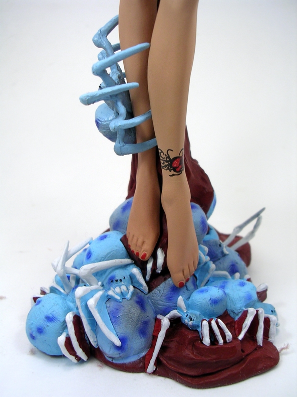
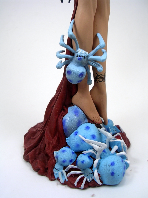
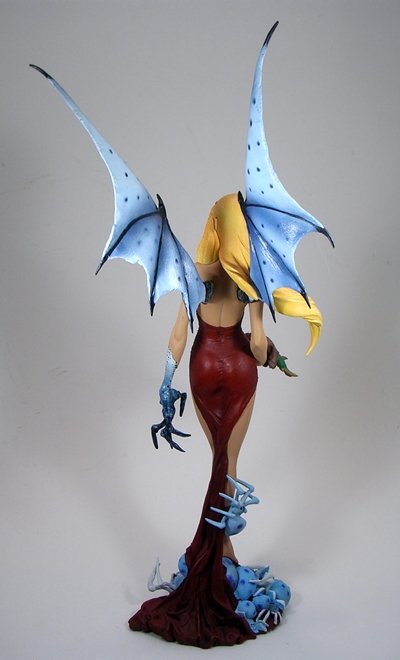
Next up, is the base. I dig the way the base is just an extension of her dress. On the other hand, I’m not a big fan of the spiders on the base. They look too cartoony, both in sculpt and paint. Yes, I know this is a statue based off a comic, but when you compare the detail the rest of the statue with the spiders, they just don’t mesh well. Also, the one crawling up her leg is totally unconvincing. It looks like it was just stuck on there. The spiders could have been a great idea, but they needed to be executed better than this.

ffarieal4

ffarieal11

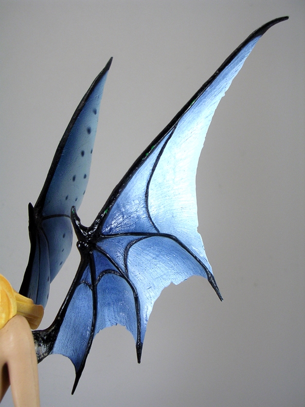
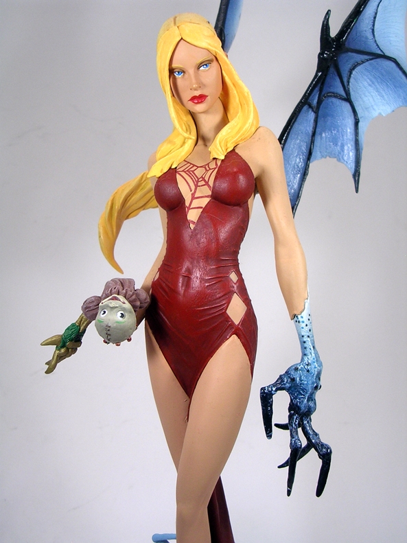
Those gripes aside, Ariel’s demon parts turned out really well. I already mentioned the realism of the claw sculpt and I really dig the way you can see a little bit of skin overlapping from where she shed it. The wings are exceptionally well done. I like the way they are swept back and not spread outward as it really compliments the pose and contours of Ariel’s shapely form. On the downside, they’re so tall, right now I’m forced to display the statue with the wings off because they won’t fit on the shelf where my similar statues are currently residing.

ffarieal12

I like this statue but I don’t love it. There’s some solid work on display here mixed with just enough hiccups to hold it back. Darkchylde is definitely not the slam dunk for me that Steampunk Lexi is. Maybe that’s because Lexi was an original design and Darkchylde is a character that I have history with. On the other hand, the qualifier here is that I picked up Ariel for $17 shipped, so it’s kind of easy to overlook the gripes I have with this piece. At the original $40-45 I probably would have been less forgiving.

Doctor Who: Cyber Controller and Guards by Character Options

There aren’t many Doctor Who figures in my collection that haven’t been featured here on FFZ, but somehow this beauty of a set was missed. I’m dusting my shelves today, so I decided to pull it down and have a looksee. It was way back in 2006 that the Cybermen made their first appearance on NuWho with a two-part story called “Rise of the Cybermen” and “Age of Steel.” As much as I love the Daleks, I think I was more excited to see the Cybermen return and I really dig this story, particularly the way they were reintroduced in a parallel Earth. It was precisely the sort of creative story-telling that has been absent from a lot of the Dalek and Cybermen stories of old, which often resorted to, “Oh, hey look, it’s time to bring this enemy back… write me a story for it.” Nope, these were the Cybermen… but they weren’t… it was just the kind of mind-bending shit that I love in my Doctor Who. Lumic was a really great villain too. He was an interesting mix of a sympathetic character and bat-shit crazy megalomaniac. Of course, he got his comeuppance when he was upgraded to the Cyber Controller, who happens to be the centerpiece of this set.

character-options-cyber-controller-with-cyber-throne-and-guards

I’ve had this thing for a long time and the packaging is long gone, but I cribbed a picture off of The Ebays for reference. I can still remember being so excited when I got this thing. Back then I was still in shock that we were getting proper Doctor Who figures, and when CO started releasing larger sets like this, my mind practically exploded. The set came in a window box with deco inspired by the credit sequence that would stay with the show all the way to the end of Tennant’s reign as the 10th Doctor. It’s a great presentation and part of me wishes that I had saved the box because it’s perfectly collector friendly. Inside you get The Cyber Controller and his throne plus two Cybermen Guards. Let’s start out with the Guards.

cocont1

cocont2

The Guards are just typical Cybermen, which is great for troop builders as they are identical to each other and any other standard Cybies released in the series. I liked the redesign of the NuWho Cybermen a lot and I’ll go one step further and say that I think these figures look even better than the onscreen counterparts because they don’t have the fabric bodysuit showing between the joints. Instead it’s sculpted to look more like wires or just flexible metal. These guys also have the wrist gun sculpted onto their right forearms and the Cybus emblem on their chests. The silvery finish gives them a nice metallic look without being too shiny. I probably have four or five of these guys total and I always regret not picking up some more.

cocont3

cocont4

The articulation on this pair is pretty good, especially considering the Cybermen of the period were not terribly agile. You get a rotating head, which appears to have a tiny bit of up and down movement. The arms rotate at the shoulders, have hinged elbows, and swivels in the wrists. The legs are balljointed at the hips, have hinged knees, and ball joints in the ankles. I do wish you could swivel their arms to make their firing position a little more convincing. For some reason I want the gun arm on the top, but hey it still works.

cocont7

cocont5

The Cyber Controller was unique to this set and I’m pretty sure he hasn’t been re-released since. I originally presumed he would be sculpted into the throne, but nope, he’s a bona fide figure. He’s basically a slight resculpt of the regular Cybermen we just looked with a brand new head. The only difference about his body is the lack of a gun on his arm and the six connection ports on his upper chest and shoulders. These are used to wire him into the throne. The head features a transparent dome with his brain exposed and the eyes are painted blue instead of black.

cocont9

cocont10

DSCN2133

cocont11

The throne is one big piece of plastic with a ton of wires and cables sculpted into it and it has a little bit of an HR Giger feel to me. The chair itself has a rough texture and there’s a Cybus emblem near the base. The Controller doesn’t so much sit in it as lean back into it and bend his legs, but he will stay put pretty well and he looks great. Every now and again he’ll slip down so a tiny blob of blue tack on his butt helps him stay planted. The wires flexible wires all plug into his access ports to help integrate him into the chair.

cocont6

cocont8

If you love your Cybermen as much as I do, you really need this set in your Who collection. I think it’s one of the coolest Deluxe sets Character Options pumped out during the time. I seem to recall paying about fifty bucks for it, which even now doesn’t seem too bad considering the Cybermen were often selling for around $20 each when they were available. Right now this set is just chilling on my NuWho shelf, but one of these days, when I get more display space, it’s going to be the centerpiece of my evolution of the Cybermen display.

Transformers Generations: Sandstorm by Hasbro

What do you do if you’re Hasbro and you just turned out one of the best Transformers figures you’ve put out in years? You milk that mold, that’s what! Take the amazing Triple-Changer, Springer… a little recolored plastic, a little lot of retooling, and voila… You have Sandstorm! The question is can you take a toy that is so distinctively and undeniably Springer and make it work as a completely different character? Let’s find out, peeps!

sstorm1

The packaging is the same window box we saw for Springer and Blitzwing. I like the G1-inspired deco, but I’m getting tired of the artsy-fartsy diagonal edge. You’re a box! Be squared off, be boxy! Don’t be ashamed of what you are!!

sstorm2

The back of the box shows the figure and the alt modes. In G1, Sandstorm’s alt modes were a Dune Buggy and a helicopter, so using the Springer mold certainly makes sense, although his helicopter mode has been upgraded to a VTOL gunship. I can’t say as I’ve ever been a big fan of this guy from the old days. I never had the G1 toy and I don’t recall him featuring prominently in the cartoon or comic. Fortunately, I don’t require familiarity with a character to enjoy my Transformers toys. Since, he’s a Triple-Changer, we’re going to break tradition and start with Sandstorm’s robot mode.

gensstorm11

gensstorm12

Ok, so to call Sandstorm a remold seems hardly fair. I mean, it is, but Hasbro has shown some ridiculously clever abilities with their remolding talents (just look back to Tracks and Wheeljack for a great example of that) and Sandstorm is the next great example of that genius. He may be built on the same body and he may transform mostly the same, but stand him next to Springer and there’s no doubt that he is his own bot. And you know what? I dig him more than Springer. Sacrilege? Maybe, but it’s the truth… I absolutely adore this figure!

gensstorm13

gensstorm15

gensstorm14

Where to begin? The new head sculpt is really nice. It’s a very traditional Autobot look and features fantastic light piping for his blue eyes. Sandstorm is a lot bulkier than Springer in his upper body. Besides the additional VTOL wings behind his shoulders, his upper arms are beefier and he has a completely new remolded chest. His legs are also redesigned, as they don’t have the back wheels and they have more traditional knee plates over Springer’s knee fins. If Springer looks more like a lithe and agile fighter, Sandstorm looks more like an armored powerhouse and the contrast is certainly welcome. I must say I also find the yellow, orange and black color scheme very satisfying. As with Springer, Sandstorm’s deco is mostly from colored plastic over paint apps and he looks stellar.

gensstorm1

gensstorm2

gensstorm4

Moving on to the Dune Buggy mode, the similarities between the two molds are more apparent here, but there are still plenty of tweaks to make them worthy of being displayed side by side. Sandstorm has a new ramming bar piece over his front gril, he’s got armor plating that cover his side windows, and new sculpted pieces for the front quarter-panels. He’s also got massively huge back wheels. If there’s anything about this toy that fans may take issue with it’s probably going to be those huge back wheels, but the sculpt is impressive and they add to the overall rugged battle wagon look of the vehicle. As with Springer, you can peg Sandstorm’s gun into the roof. It’s kind of big, but I like the way it can turn and angle so it can fire independently of whatever direction Sandstorm is driving. This is a seriously bitchin’ alt mode.

gensstorm8

gensstorm9

The Gunship mode also shows a lot of similarities to Springer’s chopper form, but makes nice use of the largest remolded pieces… those VTOL engines. It’s definitely a cool looking mode, but it also has the same cobbled together look as the Dune Buggy and it works better for that mode than this one. I’m not saying I don’t dig the Gunship, I actually love it, but it does lack the cleaner charm of Springer’s more familiar helicopter mode. In terms of personal appeal, this mode is the only aspect of Sandstorm that loses out to Springer, and it’s still pretty close.

gensstorm6

While Springer came with a sword and a gun, Sandstorm just comes with his missile firing gun. You can still mount it under his chin in VTOL mode, and as already mentioned it will peg into the roof of his Dune Buggy form. You can also peg it into his back for storage when he’s in robot mode.

gensstorm7

gensstorm5

gensstorm16

gensstorm17

Sandstorm is probably the biggest surprise my Transformers collection has had in a long while. I knew he was coming, and I expected very little from him. I wasn’t even going to actively hunt for him. Nonetheless, in hand I think he’s the best Transformer I’ve picked up this year. He’s not only an amazing stand-alone figure, but I can’t help but appreciate and respect the engineering and planning that went into building him off of Springer’s body. Taking a figure as loved and distinctive as Springer and building another totally unique and equally amazing figure from it is a work of toy-crafting genius that deserves to be recognized.

Avengers: Thor Movie Masterpiece 1:6 Scale Figure by Hot Toys

While I am most certainly not going for an entire set of Hot Toys Avengers, (sadly, my wallet won that fight) I have been cherry picking the characters I want the most. I kicked myself for not picking up the first Hot Toys Thor, but as was the case with Black Widow, sometimes taking a pass on a first effort pays off later. The Avengers Thor is said to be a huge improvement over the initial release and looking at photos of the figure online finally wore me down to the point where I threw him on Flex Pay. Four months later and the God of Thunder has shown up at my doorstep. I often do these figures in two parts, but Thor is a pretty simple, albeit spectacular, figure so I think I can probably do him justice in just one shot.

htmmthor1

The packaging is designed to mesh with all the Hot Toys Avengers. You get a sleeve with a B&W shot of the character’s portrait and “The Avengers” in foil lettering. The top of the box has Thor’s name in big type and the sides have his Mjolnir symbol.  Pull the sleeve off and you reveal a window box showing off the goods. It’s a very basic presentation compared to some of Hot Toys’ previous efforts. I suppose it’s fair to expect a lot of bells and whistles in the packaging for a $200 figure, but honestly the simplicity doesn’t bother me a whole hell of a lot. Besides, the $200 price point is pretty much Hot Toys’ new bottom line. Sure, I do keep the boxes for these figures, but mainly as a means of storing the extra parts and in case I ever need to put the entire figure away at some point down the road. At the very least, your Avengers boxes will look nice and uniform on the shelf if you are collecting the whole line.

htmmthor2

The layout of the figure in the tray should be readily familiar to anyone who has picked up one of Hot Toys products before. The figure comes partially wrapped in plastic with the extra hands and accessories flanking him on both sides. In this case, the cape is passed through a slit in the tray, which seemed to do a nice job keeping it from getting all rumpled. The personalized figure stand is placed between the legs. Everything fits into the tray snugly. It’s a good economy of space without making everything seemed cramped.

htmmthor4

While Thor’s appearance varied a bit throughout The Avengers, Hot Toys recreated him in his full sleeved armor. I think that was a good choice because I absolutely love the scale armor turned out for the sleeves. It’s rubbery and looks dead on to the movie outfit. They also hide the joints, which would have been the big downside of a bare armed version. I suppose you could take the sleeves off if you wanted, but I tend to follow this rule about futzing too much with my $200 figures: I don’t do it. The arms also feature bracers on his wrists, which are strapped around bright red cloth sleeves. Yes, the rubbery sleeves do inhibit the arm movement, but not much more than First Avenger Cap’s uniform shoulders did. Sure, it would be nice to pose him with Mjolnir above his head calling down the thunder, but I knew that was an issue going in, so it wasn’t really surprising or disappointing. Articulation whores will certainly take issue at this, but I think the trade off was a worthy one.

htmmthor6

The chest armor looks outstanding. It’s sculpted with cutouts to show the garment underneath, giving the outfit a very convincing and layered look. I am a big fan of the armor design from the movie and it’s captured really well here. The pleather trousers have stitched stripes and the boots are actually two parts. You get the ball jointed feet plugged into the ankles and the top of the boot is separate. It still looks great and serves to offer a little more poseability in the ankles than stiff boots would have allowed. The trade off is that the ankle joints require you to fiddle about a bit to get him to stand in some positions. And then there’s the cape… by Odin’s beard, I love the cape! It’s bright red fabric and the way it hangs over the shoulder armor gives it that iconic hovering look that we’re so used to seeing in Thor’s design. The back of it is tailored to hang in folded layers. I was a little concerned that the cape was going to require a whole lot of adjusting to make it look right, but it’s designed to look fine right out of the box.

htmmthor5

Thor’s portrait has come a long way since HT first showed him off. Early shots were a bit spotty but the final product turned out just fine and I think the likeness to Chris Hemsworth is up to their usual impeccable standards. Yes, from certain angles the mouth can look a bit derpy, but let’s face it Thor isn’t necessarily the braintrust of The Avengers team. The hair is the only minor issue I have with the figure and that’s just because sculpted hair this long tends to take away from the realism of the rest of the head sculpt. But when you consider the alternative is rooted, I’ll take the lesser of two evils. The truth is it still looks fine and it’s flexible enough so as not to inhibit the head movement too much.

htmmthor14

htmmthor7

htmmthor9

If you’re looking for an abundance of accessories, Thor will disappoint. You get a copious amount of hands (more on that in a bit)  and just two other items. But seriously, what does Thor need other than Mjolnir? It’s the one thing that was absolutely required to come with the figure and it is indeed a very nice piece. I knew the head was going to be die cast metal, but I was still surprised by how satisfyingly heavy it is. The grip on the handle is sculpted and painted and there’s a lanyard attached to the end.

htmmthor13

htmmthor11

htmmthor10

The other cool piece is the Cosmic Cube in the containment tube. Ha! That rhymes! Like Mjolnir, this is an extremely nicely crafted accessory. It’s also one that was really not necessary and so it makes for a great bonus. I had originally though this accessory came with Loki and not with Thor. Maybe it was issued with both figures, and I just missed that.

And no discussion of a Hot Toys figure would be complete without… HANDS! Seriously, does anyone actually use all these hands? Thor comes boxed with a pair of fists, but there are three additional pairs, which include two open hands, two partially open hands, two hands for holding Mjolnir. You also get an extra left hand, which seems to be designed for holding Mjolnir out at an angle. I’m not sure what that one is all about. It might be the one designed to hold half the containment tube so that Loki can hold the other. I’m not big on swapping hands. Obviously the right Mjolnir hand will stay put. The left one may vary between a fist and the open hand. You also get a couple of extra wrist posts in case you snap the ones on the figure by swapping out all these hands.

htmmthor15

htmmthor3

No doubt about it, Thor is another amazing effort from Hot Toys. I always have those little twinges of trepidation when ordering these things, but whenever they show up I’m always glad I did. He looks amazing on my shelf, and I really envy the collectors that are putting together this entire team because those displays are going to be EPIC! Granted, at $200 Thor ain’t cheap. He doesn’t come with a lot of stuff, but there’s nothing conspicuously absent either. Like I said earlier, $200 is the new bottom line for Hot Toys and for the most part, the days of the $160 figures are probably over. But hell, I still think he’s well worth it. The only downside is that now I’m seriously re-considering whether I need Loki on my shelf… and he is still available at a few retailers.

Masters of the Universe Classics: Icer by Mattel

Hey, it’s been a while since I’ve featured any MOTUC figures on FFZ. I’ve only purchased two this year, and one of those was an older figure off of Ebay. Truth be told, I had completely forgotten that the Filmation Sub was a thing and that I had subscribed to it. I’m pretty sure I was drunk when I did it, because I’ve never subbed the regular Club Eternia, so committing to this line seemed like a rather unusual thing for me to do if I were sober. Nonetheless, the first figure was released this month and arrived on my stoop this week. It’s Icer. I have absolutely no recollection of this guy from the cartoon, but I’m going to remedy that right now. Here, read this bit about the packaging, and I’ll be right back…

icer1

While technically part of a separate sub, Icer comes in the standard MOTUC packaging. There’s nothing on it anywhere to differentiate it from the rest of the line. Seems like at least a sticker saying “Look! It’s Filmation, Bitches!” might have been in order, but the packaging is about to be shredded and trashed, so I really don’t mind. It’s been a while since I last opened an MOTUC figure, so I’ll take the opportunity here to point out once again how much I love the presentation here. Big bubble, great Greyskull inspired deco, and a bio card on the back. I’m glad Matty never tinkered with the package designs, because they nailed it from day one.

icer9

Ok, so Icer appeared in “The Ice Age Cometh” Cometh? So, Masters of the Universe is Shakespeare all of the sudden? Well, believe you me, after watching that I can attest to the fact that it is not. Even as a kid, I found the Masters cartoon hard to stomach and since I’m writing this at 6:30 in the morning, I didn’t even have my pal Jameson to help me through it. Things start off shaky with 12-year old, Philip the Guard guarding the parking lot of Castle Eternia and Whiplash walking around the castle grounds in plain daylight like he owns the place and trying to jack royal vehicles. Philip messes up and promptly gets exiled to a weather control station in Eternian Siberia where he runs afoul of Skeletor’s minion, Icer. Seems harsh… does this kid have parents? Icer can melt himself to pass under doors and is understandably immune to the freeze rods, which the Eternian guard bewilderingly uses as their main defensive tool in Eternian Siberia… where everything is already f’cking freezing. He also talks in a monotone voice and makes lots of cold puns. After that, um… things happen… and, look, I’ll be honest, I couldn’t get through the whole episode… Let’s just look at the damn figure.

icer3

icer4

This figure is awesome! Icer is a fantastic use of a standard MOTUC buck, with minimal added sculpting for the head, fur cuffs and boots. What makes this figure work so well is the superb frosty ice effect of the semi-translucent plastic. The plastic varies from milky clear white to bright blue and has a snowy dusting over it that really makes Icer look like he’s been hanging out in the back of my freezer for too long. If Matty couldn’t pull of the ice effect, this figure would have crashed and burned, but they totally nailed it. Kudos!

icer5

The head sculpt features an angular chiseled shape, which works very well. There’s a little spray of snow frost on his forehead and the sculpted fur on his hood looks great, as does all the fur on the figure. Filmation purists may be pissed that Matty opted to not paint in his pupils, but I’m so very glad they didn’t. Truth is this figure doesn’t look much at all like the boring character art from the episode. Nope, Matty took the idea of the character and ran with it and we got a better figure for their efforts.

Icer features pretty standard MOTUC articulation. That means you get ball joints in the neck, shoulders, and hips. The arms have swivels in the biceps and wrists, and hinged elbow. The legs have hinged knees and ankles, and swivels just above the boots. Icer can also swivel at the waist and he has an ab crunch hinge in the torso.

Accessories! Icer comes with an icicle spear and a staff. The spear is cast in the same awesome icy looking plastic as the rest of him. The gold staff has a trident-like head and a little sculpted skull on each side. Both are excellent pieces.

icer8

icer2

icer6

icer7

I’m not sure what mindset I was in when I subbed Club Filmation, but right now I’m sure glad I did. Icer is a fantastic figure and while he didn’t break any records, he did sell out within a few days of the sale. I really only have one little gripe about Icer and that’s a stroke of metallic gold paint on his back. It’s no biggie, but a reminder nonetheless that Matty still needs to work on their QC, especially when they’re charging so much for these figures. I obviously don’t give two shits about the character from the show, but I love this figure and I’m thrilled to have him on my Masters shelf. Above all, getting him really reminded me how much I still adore this line, even though I haven’t been buying a lot of the figures lately.

Transformers Energon: Cliffjumper by Hasbro

Welcome to the first official Transformers Thursday. This will be the ongoing day of the week where I roll up my sleeve, dig deep into a random tote of Transformers and pull out something to feature. As promised during last Friday’s Ironhide feature, I’m back to look at Energon Cliffjumper, if for no other reason, so I can actually try out this combining gimmick. You see, kids, when two Voyager Class Energon Transformers love each other, they… well, let’s just say that one of them wears the other one as pants. There’s no package shot, so let’s jump right to Cliffjumper’s alt mode.

enercj7

enercj9

Ugh. I can usually find a lot of love in my heart for Transformers, but I seriously hate this alt mode. It’s like a completely unnecessary cross between a Dune Buggy and a Formula-1 racer. If I squint hard enough, I can kind of see a little Road Warrior battle-wagon thing going on, but it’s not enough to save my disdain for this vehicle. Funny enough, I think what really bothers me the most about it is it’s just so obnoxiously big. It’s like the designers were so proud of this monstrosity that they had to super-size it. Ironhide is a friggin truck and Cliffjumper practically dwarfs him. If this were a Deluxe figure, I might have been more accepting, but suffice it to say this is one Transformer that I would never display in his alt mode.

enercj8

enercj10

Unwarranted size aside, Cliffjumper looks like he’s a patchwork vehicle. The canopy doesn’t look like it belongs on the chassis, the spoiler hanging off the back looks out of place, and there’s that big gap between the back wheels and the side panels where the designers just gave up and left it open. The f’ugly deco doesn’t help matters either. What color is that canopy… ochre? With red windows? Toss in the brown and green chassis and some gold and grey highlights and the color palette used here is an absolute mess. Clearly this vehicle was designed with a hatred for life and little kids. Yes, the mold was recolored more sensibly as Beachcomber, but we’ll have to save him for another time.

enercj6

Transforming Cliffjumper has a few original ideas working for it, and fortunately when you get him into robot mode things improve a little. I do recommend caution with his missile launchers. They have hair triggers and almost always go off when I’m transforming him. I’m amazed I still have both the missiles. Anyway, like Ironhide, Cliffjumper has two configurations for his legs. The configuration shown above is what he’s supposed to look like, but I hate the stubby legs and the huge disfigured knees. Fortunately, you can extend his legs out to the combined configuration…

enercj3

Yup, I think that looks much better. Truth be told, I dig Cliffjumper’s robot mode. The spoiler may look odd on his alt mode, but it makes for a cool angled chest panel. I like the way his shoulders angle upward and the way his front wheels fold onto the front of his legs. The official mode has his back wheels angled to the front, but I prefer to tuck them behind his shoulders for a cleaner look. I’m not a huge fan of Cliffjumper’s head sculpt. The visor looks kind of goofy and the rest of the face is pretty non-descript. Still, all in all, this is a pretty solid and imposing looking robot. He can even wield his missile launchers in both hands.

enercj5

enercj4

And then there’s the combining gimmick. Each Energon Autobot could combine with another Autobot in their same size class, which basically amounts to one becoming the top half and one becoming the bottom. If that’s not enough for you, each toy could do either half. It was certainly an ambitious gimmick, but sadly it rarely worked well and sometimes intruded on the engineering of the toys as stand-alone figures. I’m going to give it a go here, and it should be interesting since I don’t have the instructions anymore and I can’t remember the last time I ever attempted this. I’m mating him with Powerlinx Ironhide because the color scheme on the two is fairly agreeable. Let’s try it first with Cliffjumper on top. Ok, that sounded wrong.

enercj1

Oh boy. First off, this took me forever. I finally resorted to some pictures of the combined mode and even then it took me a while to figure it out. The Jameson probably didn’t help. It’s clearly not worth the effort either. Cliffjumper’s torso mode doesn’t look too bad, but his arms are just riddled with awkward kibble. And what you can’t see is the back half of poor Ironhide hanging off the ass of this abomination begging for the release of sweet death. I’m not sure how this gimmick got green lit, but let’s try it the other way around and see if it’s any better.

enercj2

Ok, I would say that’s better, but given the alternative, that’s not saying a lot. There’s less kibble for the arms at least. On the other hand, the top half of Cliffjumper is still hanging off the back of the figure in a crumpled mess. I still don’t like it.

So, Cliffjumper’s crappy alt mode is just about redeemed by a rather cool robot mode. When I do have my Energon Transformers on display, I’m usually happy to have Cliff standing in the background towering over the Deluxes. He looks cool, so long as I never transform him and certainly never combine him with anyone else. In fact, I’ll likely be covering plenty of other Energon figures on Transformers Thursday, but I’m probably going to ignore the combined gimmick in most cases. It’s just not worth the effort to me, at least not with the Voyagers.

DC Universe Signature Collection: Freddy Freeman by Mattel

It’s time for another release from the Club Infinite Earths sub, and Matty is keeping on point by delivering another figure that is conspicuously missing from our shelves. Captain Marvel, Jr. was definitely on my list of characters that I needed for my display. Maybe he wasn’t high on that list, but he was definitely on there! His arrival also reminds me that Captain Marvel himself is vacant from my DCUC lineup. Yes, somehow I own both versions of Mary Batson, but there’s still a gaping hole in my collection where Captain Marvel should be. Note to self: Pick up the Black Adam and Captain Marvel 2-pack. Anyway, let’s check him out… oh yeah, and… KRAKOOOM!

cieff1

cieff2

Once again, the Signature Collection packaging consists of a delightful little window box. It’s collector friendly, it shows off the figure quite nicely, and it sports some rather excellent character art. No, wait… scratch that last bit… force of habit. I am not really digging the character art here. Freddy looks a little too Alfred E. Neumann to me. Anyway, there’s a bio blurb on the back, which contains the amazingly awesome phrase, “Captain Nazi killed his grandfather.” Oh yeah, shit just got real. Now that you’ve mentioned Captain Nazi on a package, you have to make the figure Mattel. YOU HAVE TO! Sorry, I don’t make the rules.

cieff3

cieff4

cieff7

Let’s kick things off with the portrait. I like the head sculpt here a lot. It doesn’t look much like the character art on the package, and as we’ve established, that’s a good thing. Mattel also resisted the urge to sculpt Freddy with a vapid, “I just took six halcion so I can pose for holiday pictures with the in-laws” smile like they did with Mary Batson. It’s not their best head sculpt of late, but to be fair, they’ve been doing a bang up job lately, so in this case even average is pretty good. I do like the way the tussled hair came out and all in all, they’ve managed to capture the youthful look of the character quite well.

cieff6

Freddy is appropriately built on the smaller DCUC body. I know that should be obvious, but I’ve learned not to take scale for granted in a DCUC-based line. I find it to be a good fit for the character, not too big and not too muscular. He’s just a smidge shorter than Mary. There isn’t a whole lot of unique sculpting here. Beyond the belt, boots and wrists bracers, the blue costume gets by with just the “Shazam!” lightning bolt painted on his chest. Aside from that, you have a new cape, which is excellent. The braid, border, and fleurs are all sculpted and painted.

cieff5

There are no surprises in the articulation department. You get a ball joint on the neck and shoulders. The arms have swivels in the biceps and wrists, and hinges in the elbows. The legs have the usual DCUC hip-joints going on, swivels in the thighs, and hinges in the knees and ankles.

cieff8

Freddy Freeman is what the Club Infinite Earths line is all about, folks. He’s another character sorely missing from the DCUC roster and he helps to complete a team. Ok, so he’s not the most exciting figure around, but in the spirit of turning a pithy DC-related motto on its ear… sometimes we get the figure we need and not the one we deserve. I’ll admit, with the CIE sub open right now, Mattel may have been better served delivering some more exciting figures to drum up interest, but then for a company often accused of playing games and dealing dirty, I applaud them for not doing so. Politics and business tactics aside, this figure is another solid addition to my shelves. He turned out great and I’m very glad to have him.


Reorganizing Shelves!

I had the day off today and I’m not proud to say I spent a good part of it near my computer checking Hasbro’s toy shop to see if the SDCC Exclusives would drop today. Guess what? They didn’t! Oh well… It was no big loss since the real reason I was waiting at home was for UPS to bring these beauties…

970430_201412330019392_1820409778_n

Of course, that led to some reorganizing of the only two display cases of toys that I allow in my Den-slash-Library. Still got some room to work with, which is a good thing because I’ve got a shit-ton of stuff on pre-order and I have a couple more Bishoujos and Mezco’s Cheetara sitting in my Pile of Loot at BBTS. I think I’m going to have to ship that this week.

DSCN2087

In case you wonder what takes up the rest of the room in my Den…

DSCN2089

Books!

DSCN2088

And books…

313048_10150367360573421_1072990514_n

And books…

302277_10150367352693421_498098153_n

And more books!

By figurefanzero

Marvel (Iron Man) Legends: Iron Monger Build-A-Figure by Hasbro

So, I was originally planning on doing Iron Monger next Monday and making that the last Marvel Monday, but I got an unexpected invite to The Pub tonight and I needed a feature that wouldn’t require a whole lot of time. Iron Monger is just that figure, so that’s why I decided to bump him up to today. Iron Monger’s pieces were spread throughout the Iron Man Legends wave, so to build him, you needed to buy Classic Iron Man, Heroic Age Iron Man, Mark 42 Iron Man, both versions of Iron Patriot and Ultron. We’ve got all the parts, so let’s pop him together! And by “pop him together,” I mean, almost break all the bones in my hand trying to get his legs attached to his torso. Holy hell, this guy ain’t coming apart again anytime soon!

mimlim2

mimlim3

Sweet Christmas, I love this figure! He’s not all that much taller than your average Marvel Legends, but what he lacks in length, he makes up for with girth. Giggity! Let’s start out with the plastic. I’ve given Hasbro some grief over their quality of plastics lately, particularly the crap they used for Ultron in this very wave. This stuff is glorious. It’s a deep, midnight blue with a subtle metallic sheen. Yes, it has that swirly pattern that I generally don’t like, but on the darker plastic, I think it looks phenomenal. Like Ultron, this figure has almost zero paint apps. You get a little red for his chest and visor, and some black on his arm cables. The look of the plastic was crucial, and the result is glorious.

mimlim4

As a comic based figure, Iron Monger is a great mix of minimalism and hyper-detail. You get large smooth surfaces like his shoulder armor, his chest and even his head. But then you also get some wonderfully sculpted detail on his lower abdomen and the access port on his back. The sculpting for the segmented fists are crazy detailed and even the soles of his feet have detail and thrusters. The particulars of the sculpt are all wrapped up in a figure that is superbly proportioned. You needn’t bother with any crazy poses, because he looks amazing, just standing right there on the shelf.

mimlim7

mimlim1

What’s that? You do want to bother with crazy poses? Well, that’s Ok, because Iron Monger brings some solid articulation to the table. You get ball joints in the neck, shoulders, elbows, hips, and ankles. The arms have swivels in the biceps and wrists. The legs feature swivels in the thighs and double hinges in the knees. Lastly, you get a very versatile ball joint in the torso. No doubt, this is a fun figure to play around with.

mimlim6

mimlim5

As far as I’m concerned, the whole point of BAFs and C&Cs is to deliver figures that are too big to fit in a regular carded figure’s package and price point. I’m looking at you Hit Monkey… You should have been a pack-in!!! Iron Monger was a good choice, because he’s certainly a big bulky slab of a figure. He’s a fantastic looking piece that will find a prominent place on my Iron Man shelf and while not every figure in this wave was a hit, even the weaker ones were worth buying to piece together this bad boy!

Marvel (Iron Man) Legends: Iron Man Mark 42 Armor by Hasbro

Yes, Marvel Monday is going on hiatus for a little while, folks. It was originally introduced to get through the huge backlog of Marvel Universe figures that I had to open, but now I’m more or less caught up, so I’m going to free up Monday for other things. When I do get some more MU figures, I’ll likely just deal with them whenever I can slip them into the week. Anyway, today we look at the last packaged figure in the Marvel Legends “Iron Monger Series” and tomorrow we’ll check out the Build-A-Figure himself.

mlmk42i

There’s the packaging. We’ve seen it before, I like it a lot, but I’ve got nothing new to add. I will take this opportunity to say that I have not been a big fan of the Mark 42 armor design. I thought it looked terrible the first time I saw it in stills from the movie and I didn’t like it at all when I saw the initial product images of the forthcoming Hot Toys figure. But here? For some reason I’m really digging it in this scale. That’s either a testament to the quality of this figure or proof that my initial feelings about the design were all gut reactions. Actually, it’s probably a little of both. Let’s get him out of the package and see what he’s all about…

mlmk42a

mlmk42e
So, my original issues with the Mark 42 design lie squarely in the deco. There’s just too much gold versus red. And the gold is more matte than it should be. Maybe I would have accepted it more initially if it were designed as one of the off-beat specialty armors, but no, it was being billed as the main armor for Iron Man 3. The deco hasn’t changed, so why doesn’t it bother me so much here? I think there are two reasons.

mlmk42g

mlmk42f
First, the sculpted detail helps to break it up a lot. Hasbro did a very nice job on this guy, and the figure is replete with plates and panel lines that make the gold a little less intrusive to me and maybe a little more logically placed. There’s a little more red in the legs then I remembered too, and that helps a lot. Overall, the intricacies of the figure’s sculpt persevere over the deco and make it work. The other issue is the size. On the big screen, on a big 1:6 scale figure, there’s just so much more of it. On this smaller scale it just isn’t that bad. I still think the figure would have worked better if the gold was more brilliant, but either way it still works for me. It’s kind of a shame that Hasbro didn’t produce a worthwhile 3 3/4″ scale version, of the same quality as the Iron Man 2 figures, because I probably would have liked it even more.

mlmk42c

mlmk42d
Hasbro packed the Mark 42 with lots of useful articulation. The neck is ball jointed and has an added ratcheting hinge, which works splendidly. The arms feature ball jointed shoulders, swivels in the biceps, double hinges in the elbows, and ball joints in the wrists. The only issue here is that the armor plates on the back of his hands do inhibit the wrist articulation a bit. It’s the same issue I had with the movie Iron Monger in this same wave. The legs have ball joints and swivels in the hips, double hinges in the knees, and hinges and rocker joints in the ankles. Alas, the hips are the funky hip joints that Hasbro will not give up on. Also, the sculpting of the thigh armor inhibits the movement a bit. You can’t really get him into that deep ground-pounding pose. But even despite some of the limitations, there’s a lot of nice potential here for posing this figure.

mlmk42h

The second half of this wave was certainly a strange one. Ultron was the figure I was anticipating the most and I was buying the Mark 42 just to complete my BAF. As it turned out Ultron was my least favorite and the Mark 42 was the shining star of this trio of figures for me. He’s probably tied with the Rhodes Iron Patriot as my two favorites in this assortment.  Sure, it’s still my least favorite of the movie armors, but Hasbro did some nice work on this guy and in the end it really won me over on the design. I’ll be back tomorrow for a quick look at the Iron Monger BAF.