Transformers Generations: Trailcutter (IDW Comic Pack) by Hasbro

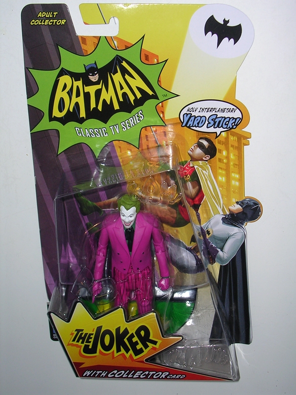
It seems like forever ago that I got Hasbro’s wave of IDW Deluxes and yet I’m still working my way through them. Today we’re going to check out Trailcutter, better known to some of us old GeeWunners as Trailbreaker. This release is a double payoff for me because a) We never got Trailbreaker in the Classics format and b) He’s a Hasbro release based on a Transformer as he appears in a comic that I’m actually reading!

tfgtrailcut1

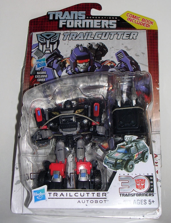
I’ve spilled a ton of electric ink on how much I love the idea of comic packs, so I’ll try not to waste a lot more time doing it here. Suffice it to say the packaging on this guy is fantastic. Trailcutter comes packaged in his robot mode in front of a spotlight comic and on a very G1-inspired cardback. An action figure and a comic… how can you go wrong? I’ve been no stranger to Transformers comics off and on over the decades. I was a faithful reader of the original Marvel book right up until the end… more or less. I dabbled in some of the stuff that followed and even found that old Armada comic to be surprisingly good. I enjoyed The War Within and I loved The Last Stand of the Wreckers. But it wasn’t until More Than Meets The Eye that I once again went all in on a Transformers title. MTMTE isn’t just a great Transformers comic, it’s one of the best comics I’ve ever read… and I’ve read a lot of comics in my 40+ years on this planet. On paper it sounds like the dumbest idea for a TF comic ever and yet in execution, every panel is like gold. This included issue, a Spotlight on Trailcutter, gives you just a mere morsel of that book’s awesomeness. Trust me, if you aren’t reading MTMTE go read it and come back. The first four volumes are available already in TPB. Go now… I’ll wait!

tfgtrailcut10

tfgtrailcut11

tfgtrailcut12

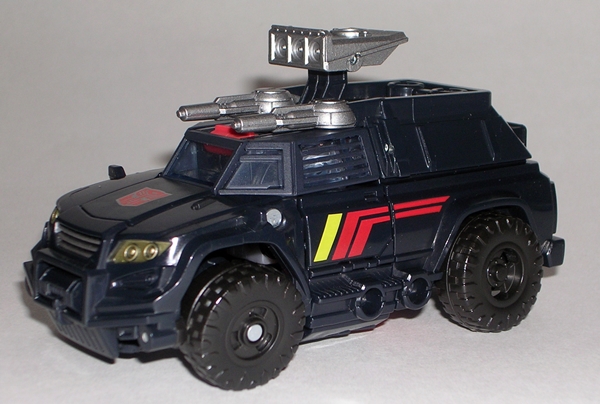
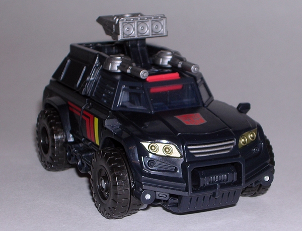
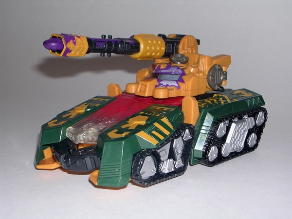
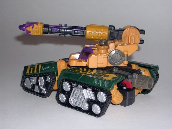
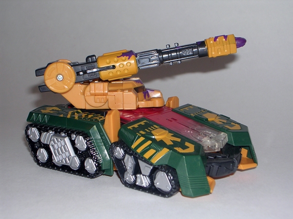
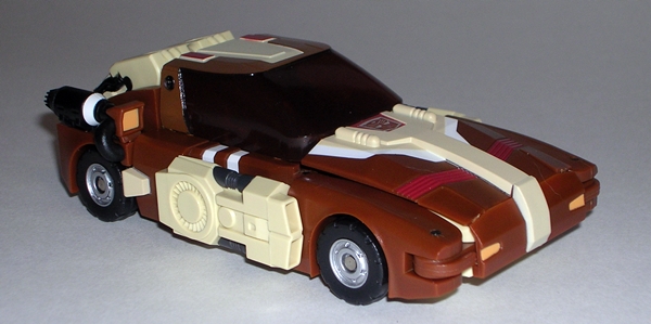
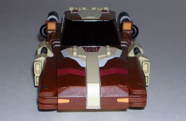
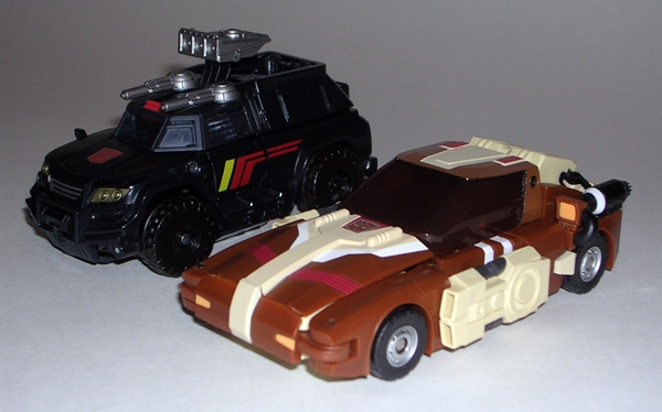
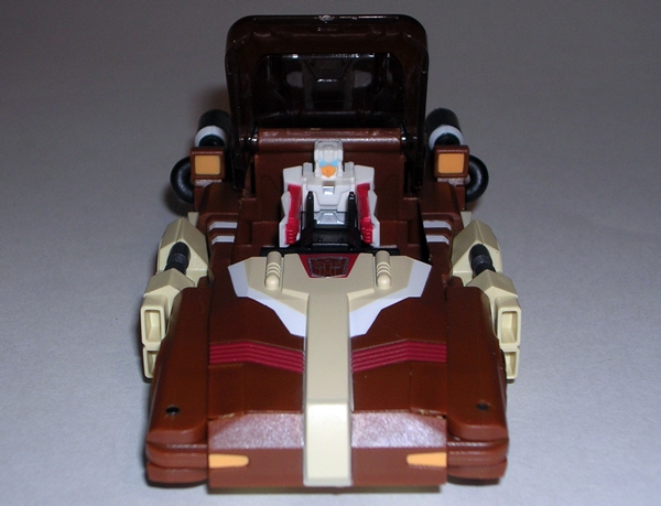
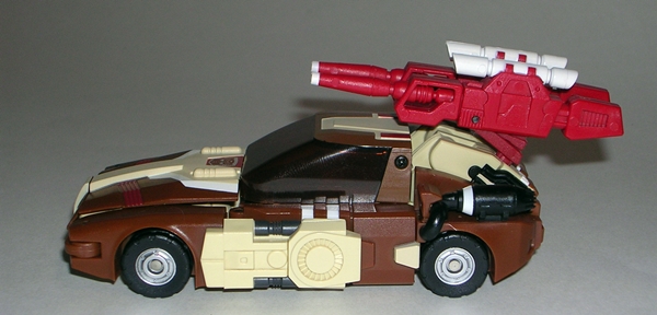
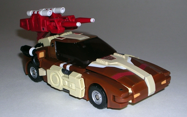
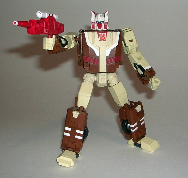
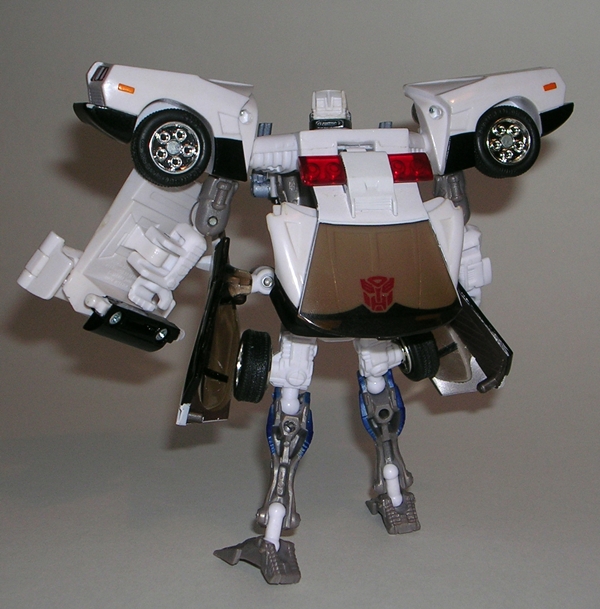
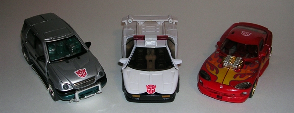
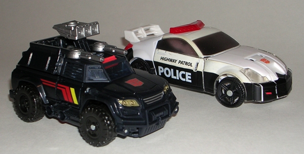
Oh shit, I forgot. We’re here to talk about a toy. So… moving on to the figure itself, let’s start with Trailcutter’s vehicle mode. In keeping with tradition, he’s still a black SUV. For some reason this guy reminds me a lot of Generations Perceptor, although Trailcutter has four wheels and isn’t a halftrack. I dig the countours of the front of the vehicle and the sculpted winch on the bumper. Also, the striping on the sides and the bold Autobot emblem on the hood all give the eye something a little more than just black to look at. Trailcutter isn’t your typical SUV out to bring the kids to a soccer match either. Nope, he’s got his big forcefield emitter sticking up off the top of the roof and two guns facing forward. If you want to make him a little less threatening and more street accessible, you can take the cap off the back of the SUV and remove his guns, but the emitter remains. He’s a nice looking vehicle, but he does share a common problem with many Deluxe Transformers these days… he’s kind of small. He’s close to the same size as many of the Classic/Universe/Generations cars of yesteryear, but he’s an SUV, so he should be bigger.

tfgtrailcut3

tfgtrailcut4

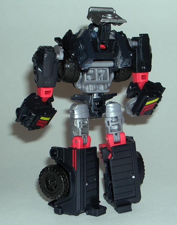
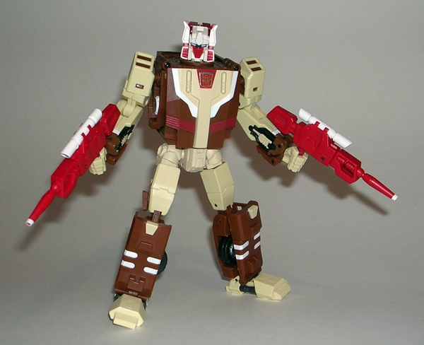
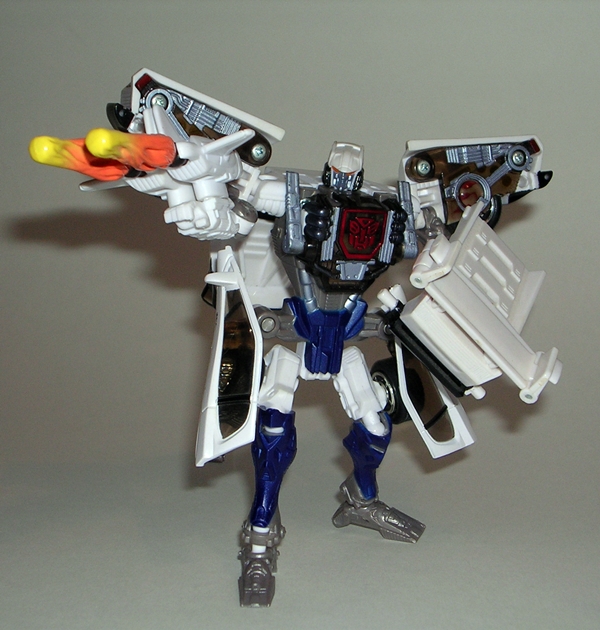
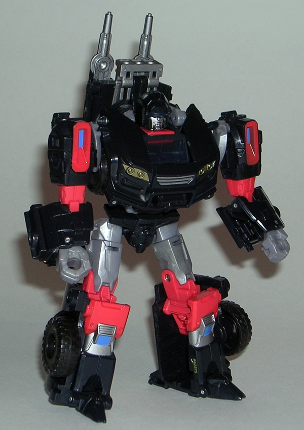
Transforming Trailcutter into his vehicle mode is a little fidgety. He’s one of those figures where everything needs to be just perfect to get him to fit together in alt mode and even then, it’s a little tough to close all the gaps. Getting him into robot mode, on the other hand, is pretty easy. The result is overall good, but I he’s not getting away from me without getting a few nits picked. Let’s deal with those first. He doesn’t have an Autobot symbol on him in robot mode. It’s a tiny oversight that just bugs me a bit, so let’s let it go because the bigger issue is size. Just like his vehicle mode, his robot mode is small. Yes, it’s been an ongoing issue with Deluxes ever since TF: Prime rolled onto the scene. It doesn’t always bother me, but Trailcutter should be at least as big as most of his Autobot peers. He stands just as tall as your average Classic Deluxe, but that’s including his forcefield emitter. In reality his head comes up to the shoulders of most of his peers. He still displays just fine with my Classics figures, but in perfect world he would have been bigger.

tfgtrailcut6

tfgtrailcut8

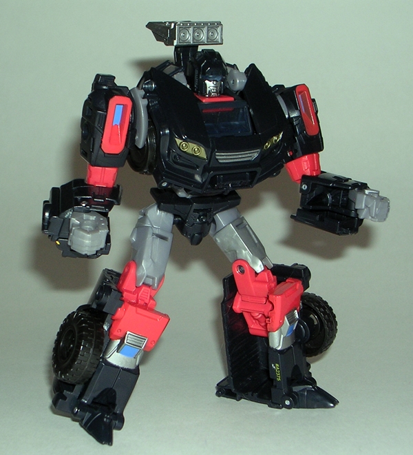
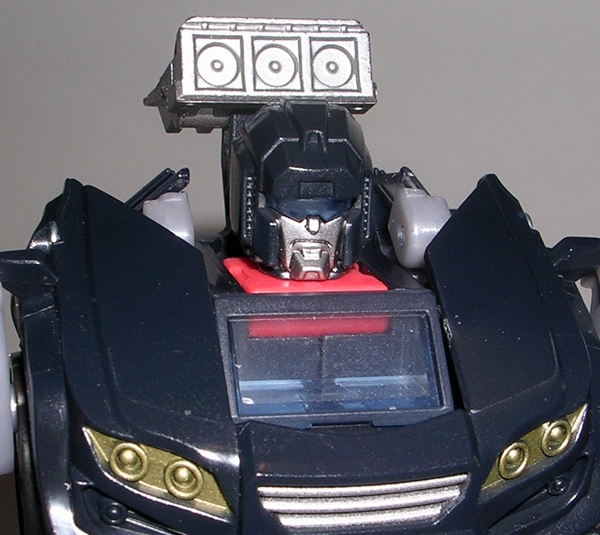
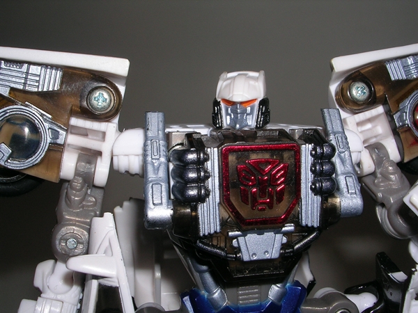
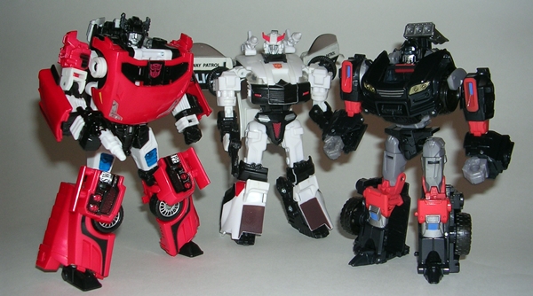
All that aside, I really dig Trailcutter’s robot mode. He has a nice and powerful broad-shouldered look that doesn’t come away as being stocky despite his relatively shorter height. The way the front of the vehicle forms his chest is just the kind of classic Autobot design that I can never get enough of. And the headsculpt is a home run, which I’m happy to say homages the G1 style a little more than the comic style. As much as I love the current crop of Nick Roche IDW art, I’m not always so enamored with the organic quality of the faces. I know why they do it, to make the characters more expressive and easier to relate to, but I prefer something more mechanical and G1 in my figures’ portraits. The deco here is phenomenal and driven mostly by the color of the plastic over actual paint apps. You still get plenty of the black from the SUV showing up, but it’s now mixed with some beautiful red and grey accents and just a smidgen of blue.

tfgtrailcut9

tfgtrailcut5

tfgtrailcut7

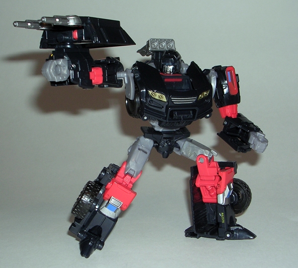
Trailcutter comes with a shield-gun thingy that basically forms the cap of his SUV mode. Some of you might have thought I was going to call him out on this piece, but, I don’t have a big issue with it. It’s not integrated into the robot mode, so you can set it aside if you want. There are also a couple of different ways you can peg it onto his back if you want to store it.

tfgtrailcut13

tfgtrailcut2

So, yeah, Trailcutter has his shortcomings… see what I did there? But I still like him a lot. In fact, he’s definitely my favorite of the IDW Comic Pack wave so far. He has a great design in both modes and Hasbro’s team did a phenomenal job reverse engineering this guy from the IDW artwork and making him into a great looking and ultimately fun figure to play with. He’s already got a spot on my Classics shelf, filling a hole that has been vacant for far too long. Now I’m chomping at the bit to find Hoist, so my original Autobot updates can be yet one more step closer to being completed.

That’s three down, and one more IDW Comic Pack from the intiial assotment to go. Next week, we’ll check out Orion Pax!

Marvel Legends: Hawkeye and Rocket Raccoon by Hasbro

I started this week with Marvel Legends, so I might as well end it that way. Hawkeye is the last carded figure in this wave that I have yet to cover, and I’m long overdue putting this assortment to bed. I usually look at the Build-A-Figures in a separate feature, but Rocket Raccoon is a pretty small and simple figure, so I’ll tack him on at the end.

mlhawk1

Here’s the Marvel Legend’s packaging. Hard to believe this stuff has been out for so long already. I still dig the presentation here a lot, but the character art seems to be taking a dive on the recent release. The art for Hawkeye makes him look more like a Sigma Six character to me, rather than Marvel’s famous master archer. Oh well, it’s all getting chucked in the garbage anyway. Hawkeye fills out his bubble quite nicely, particularly with his compound bow and quiver situated on either side of him. You’ll note that he comes with no raccoon parts.

mlhawk2

mlhawk3

Obviously, this figure references the modern version of Hawkeye. I’ve seen a lot of hating on this design, but I have absolutely no problem with it at all. It definitely leans more toward the feature film Hawkeye than the Classic version of the character we all know and love, but change isn’t always a bad thing. Hawkeye is built on a slight muscular buck, which gets by mostly using the paintwork in order to define his costume. In fact, apart from the new head sculpt, the only new sculpting here is in the belt and shoulder harness, which are separate pieces. The bulk of the buck is black with some really snappy metallic purple paint for the chest and boots. His gloves and arm bracers are painted on as well.

mlhawk4

As for the head sculpt, I really like the portrait on this figure. Maybe there’s a little Jeremy Renner in there, and maybe it’s intentional. Either way, I just dig the quality of what Hasbro did here. The hair and glasses are particularly well done. Why does an archer wear sunglasses? Duh! They’re special anti-glare specs with a built in LCD display by developed by Stark Industries to further enhance his already uncanny marksmanship skills. All that was complete bullshit, but I like the sound of it!

 mlhawk6

Hawkeye features a great level of articulation. The arms are ball jointed at the shoulders, double hinged at the elbows, swivel at the biceps and have both hinges and swivels in the wrists. The legs are ball jointed at the hips, have swivels in the thighs and boots, double hinges in the knees, and the ankles are hinged and have slight rockers. His torso features an ab crunch hinge, a swivel at the waist, and his neck is both hinged and ball jointed. The figure does suffer a bit from soft hinges in the elbows and knees, making posing him feel tad mushy at times.

mlhawk8

mlhawk7

Obviously, Hawkeye comes with his bow and quiver. The quiver pegs into the hole on his back. The bow is my only real issue with this figure. It looks great, but it’s kind of hard to get him to grip it well. It doesn’t look like there’s any specific area where he is supposed to grip it. Obviously, I know jack shit about compound bows, so I’m sure it’s just my ignorance at work here. I’m just glad they didn’t sculpt it with an arrow already nocked.

mlhawk5

Soft joints aside, Hawkeye is probably my second favorite figure out of this batch, right behind Wrecker. I don’t mind the modern look of the character and I think this figure pulls it off brilliantly. What’s more he is lots of fun to play around with and I think he looks great posed alongside Steve Rogers, Black Panther and Modern Age Thor. Hopefully we’ll get that Legends scale Black Widow soon.

mlhawk10

mlhawk11

mlhawk12

mlhawk13

And, as promised, here’s a quick look at the BAF, Rocket Raccoon. You only needed to buy three figures (Jean Grey, Black Panther, and Wrecker) in this wave to build him. His parts consist of a head, two arms, a body, a tail, and his gun. The figure is quite similar to the tiny Rocket that came with the Marvel Universe Guardians of the Galaxy boxed set. His articulation is limited to ball joints at the shoulders, neck, and tail… and a hinged mouth!!! All in all, he’s very well sculpted and a nice looking piece. He also displays quite well next to Drax, but in the end he just makes me want a comic accurate Legends scale Star-Lord all the more.

mlhawk9

Phew, and that finally puts an end to this wave of Marvel Legends. All in all, I think this was a solid wave. Even Scarlet Spider, my least favorite in the bunch isn’t a bad figure if you take away the scaling issues. Anyway, with these guys behind me, now I can start going back and picking up the rest of the Hit Monkey wave. I’ll likely be doing that one figure at a time, so it may take a while.  

Batman (Classic TV Series): Penguin by Mattel

Honest, folks, I am trying to get through my new receivings in a timely manner. Averaging six features a week seems like a lot, but not when the pile of unopened figures in the corner is slowly growing rather than shrinking. Anyway, if you read my look at The 1966 Joker figure than you know what Ceaser Romero’s portrayal of the character meant to me. Well, that’s a thousand times truer for Burgess Meredith as The Penguin. This is likely the case, not only because Meredith was brilliant in the role, but because I just don’t think there have been any iconic portrayals of the character since. Danny Devito’s version was too influenced by Tim Burton’s weirdness for my taste. I can love Romero’s Joker and still respect what Ledger and Nicholson and the like did afterwards, but I can’t imagine anyone other than Burgess Meredith ever being The Penguin to me.

bctvspeng1

bctvspeng2

There’s the packaging. We’ve seen it three times already, so I don’t have a lot of new stuff to add. Robin’s stupid quote has changed and there’s new artwork and copy on the back of the card. I still enjoy the fact that they bothered to emboss the bubble with the classic comic-inspired fight exposition gibberish that was such a big part of the show. I’ve been hankering to open this guy for over a week now, so I’m going to get right to it…

bctvspeng3

bctvspeng4

Penguin is built on an appropriately tubby buck, which suits the character quite well. The tux is a little bland, but I can’t fault it, because it sticks to the source material pretty closely. I like the little details like the ill-fitting pants, the spats on his shoes, the sculpted gloves, and the coat tails that hang off the back. The layered on clothes work so much better for Penguin than for Joker, just because it adds weight to a character that is supposed to be stocky. The bland, white expanse that makes up his shirt could have used a little more something. Maybe sculpted wrinkles or a little texture, but for what is essentially a mass market figure in this price range, I’m pretty happy with the body.

bctvspeng9

The head sculpt requires me to offer a little more give and take in my acceptance. Yes, I do think it’s a pretty good likeness of Burgess Meredith in the role. The silly make-up used on the show certainly helps the caricature quality of the sculpt. The monocle is rather odd. It’s like the eye was sculpted to hold a monocle, but instead of putting one in Mattel just painted the rim. It looks fine if you don’t get too close, but on closer inspection, if I didn’t know better, it almost looks like something might have fallen off in the package. And then there’s the cigarette holder. It was a bold move to attempt it, since it is part of this Penguin’s iconic look, but they had to make it way too thick and there’s no white paint app for the cigarette at the end. I’ve gone back and forth on this one, and in the end I think I’m still glad they did it, even if it didn’t come out as well as I had hoped. I should also note that my Penguin has a stray black paint mark on the top of his hat. I have high hopes that Magic Eraser will save the day.

bctvspeng5

If you were worried about a portly fella like Penguin getting shafted on articulation, fear not. Sure, it’s pretty obvious there’s no ab-crunch, but everything else in the DCUC style made it intact. The arms are ball jointed at the shoulders, have swivels in the wrists and biceps, and hinges in the elbows. The legs have the DCUC style hip joints, swivels in the thighs, and hinges in the knees and ankles. Penguin’s neck is ball jointed and he can swivel at the waist. Not too shabby.

bctvspeng6

bctvspeng7

bctvspeng10

What’s this??? An accessory for The Penguin??? Yeah, these figures have been light on accessories (ie. Nonexistent, except for Batman’s surf board) but they couldn’t very well have released Penguin without his umbrella. It is a nicely sculpted piece with a painted tip and a bendy handle that helps get into either of his hands. You also get the same style stand that we saw with the other figures. Penguin’s says “AWK!” which I like because it kind of sounds like a bird noise.

bctvspeng8

Of course, you also get the collectible card that doubles as a backdrop for the stand. One one side it features another panel in a Batcave scene. I’ll get a picture of them all together for the last feature in this wave. The front has a portrait of Penguin on a podium. I’m really digging these cards as extras, probably because I used to enjoy the old collectible Lobby Cards from the cinemas. The artwork is quite good and it’s an overall nice and well-executed bonus.

bctvspenga

bctvspengb

So, Penguin is pretty good, although there are a few little tweaks that could have improved him a lot. If you aren’t sold on this line, Penguin probably isn’t going to be the figure that pushes you in favor of collecting them. On the other hand, he’s about what I was expecting so I can’t say he disappointed me. I’d say he’s roughly on par with The Joker and not at all a bad figure, so long as my nostalgia goggles are affixed firmly to my head.

I’ve only got one more figure in this wave to look at, The Riddler, and I’ll try to get back to him early next week.

Transformers Universe: Tankor by Hasbro

I had planned on keeping the Robots in Disguise thing going for Transformers Thursday, but I ran a little light on time this week, so instead I dug around in one of my drawers for a quick suitable substitute. Today we’re revisiting Hasbro’s Universe line. Not Universe 2.0, mind you, but the one that came before that. The one that consisted mostly of questionable repaints of a lot of toys few collectors ever wanted to see again. One of those releases came to us from the pages of Beast Machines and it was a boxed set of Tankor and Obsidian repaints. I have no idea what happened to the Obsidian figure (no great loss!) but the Tankor mold has always been one of my favorites. I looked at the Beast Machines version on FFZ a long while ago, so let’s see how Universe treated him.

tfutankor1

tfutankor3

Why do I love Tankor so much? Because he’s a kick ass Cybertronian tank and for unknown reasons that may have little to do with his configuration, his turret and cannon remind me of the tanks from the original Tron. I dig his four sets of treads, all brimming with sculpted detail, his front capture claw, and the Cylon-like visor and grill on the front of the turret. He just looks all sorts of mean and nasty. It’s a fantastic design, which was obviously the result of a lot of love. Of course, the turret turns and the cannon can raise and lower and it also fires a missile that is sculpted to look like an energy blast.

tfutankor2

tfutankor9

Tankor had a pretty wild paint scheme to begin with, so his Universe counterpart isn’t too bad off. The green is a slightly different shade, the grey and red has been replaced with a weird tan, and he has some crazy purple and silver splotches that I like to think of as some kind of energon damage. All the great striping and chevrons that were on the original toy’s fenders are still here, the pallet has just been changed up a bit. And yes, if you’re wondering, the hatch that opened to reveal his Predacon spark crystal on the original toy, now opens to reveal a painted Decepticon insignia. Cool!

tfutankor5

tfutankor6

Transforming Tankor into robot mode is both simple and clever. His legs do a cool flip to wind up on the other side of his torso and the translucent red plates wind up as armor for his arms and shoulders. As a robot, Tankor’s design is just as grizzly and warlike. His huge, bulky arms have built in saw blades and his hands are serrated lobster claws of death. You do not want a hug from Tankor. It’ll f’ck you up! The deco remains about the same as when he’s in tank mode with the tan replacing the grey and some gold detailing on his chest rather than the yellow from the Beast Machines figure. I can’t say I like it better than the original toy, but it’s cool that it makes him unique amidst my little army of Tankors.

tfutankor7

The head sculpt is fantastic! Tankor sports a deep set visor with light piping that reveals a single Cylon eye and if you move his head it seems to travel from one side to the other. He also has a giant bear trap of a jaw that is articulated. Mounted on his left shoulder is his enormous cannon, proving that he doesn’t lose any firepower no matter which mode you find him in.

tfutankor4

tfutankor8

And so in the end, Tankor didn’t do too badly at the hands of the crazed colorists in charge of the Universe line. It’s not an improvement, but like I said, having one uniquely colored Tankor gives me a commander for my drones, and that’s cool. I will, however, concede that this release was a wasted opportunity for a better repaint. I would absolutely love to get this guy in traditional black and purple Decepticon colors, or maybe just black and steel grey. But truth be told, I love Tankor no matter what color he is, and I try not to think about how sad it is that he’s a perverted reincarnation of poor, noble Rhinox.

DC Universe Signature Collection: Huntress by Mattel

Yes folks, Club Infinite Earths continues to wind down. After this month’s figure, there are only three releases left and truth be told Huntress here is the last one that I was really looking forward to. That means that assuming every figure that has come before has been a homerun, in the end I had little interest in about a quarter of the entire 2013 lineup. It’s no wonder that the 2014 sub didn’t make it. Anyway, let’s try not to piss in Huntress’ cornflakes over Matty Politics, let’s just check out the figure…

sighunt15

It’s the same compact little window box we’ve been seeing all year. While I liked the packaging better before this year’s revision, I’m still fan of this style. If I had the space and these figures weren’t going directly into my DCUC display shelves, I would have certainly kept all of these boxes, but as it stands I’ve just been clipping out the back panels and tossing the rest.

sighunt16

The back panel has a little bio for the character and some artwork. I’m usually a big fan of the Signature Collection character art, but every now and then they stumble and I think this is one of those cases. Huntress doesn’t look bad, but there’s something off about her face to me. She looks like someone doing cosplay at a convention and it’s the morning after the big drinking binge. It’s certainly not the art that was the basis for the figure’s sculpt and that makes for a strange detachment between package and product. It’s not the first time we’ve seen this, but it’s a pretty minor problem for me.

sighunt14

sighunt2

Out of the package and Huntress is certainly a very solid figure. When I usually get a new DCUC style figure my mind begins to automatically dissect it to identify all the reused parts. Which body is it? Where’d he get that cape? Etc. etc. That wasn’t the case with this gal. While there’s obviously a standard female buck under there, she’s just brimming with newly sculpted bits and paintwork. The boots and gloves are brand new, as is the belt and the thigh straps and cape. The result is what feels like a totally fresh, new, and original figure. I love DCUC to death, but after years of collecting, that sense of new and original is not what I usually feel when getting a new figure in the line. All the newly sculpted bits here are quite good. The padded look of the boots, along with their straps and buckles, is executed particularly well. I love the scalloped look of her gloves, the holstered gun on her right leg, and all the pouches on her belt and thighs are nifty. The cape isn’t long enough to get in the way of posing, but it does make a nice support when trying to get her to stand in some tricky positions. Initial shots of the figure made me fear she was going to be a little chunky, but in hand, she looks great.

sighunt4

The head sculpt is also something that I was a little uneasy about early on. The final result is quite good. I wouldn’t call it one of CIE’s best efforts, but it gets the job done rather nicely. In fairness, between the mask and her hair, there’s a lot going on with her portrait. I do like the way her hair is sculpted to hang down over part of her mask and the face is certainly pretty with clean paintwork. If I’m assessing Huntress’ head sculpt a little lower than the norm, it probably says more about the outstanding quality of other portraits in the line than it does about any real failings on this one.

sighunt3

Overall, the paintwork here is pretty good. Unfortunately the only spot of slop on the whole figure is in a rather conspicuous spot, on her right shoulder, but even that isn’t all that big a deal unless you’re getting in real close with a camera. The white cross painted against her black top is nice and sharp, as is the border around the window that shows off her tummy. The shade of purple used is excellent and every little snap on the pouches and buckle on her boots has been carefully painted. Even the small parts of the gun in the holster are brushed with a metallic finish.

sighunt8

sighunt6

Huntress features all the articulation I expect in this line. The arms are ball jointed at the shoulders, hinged at the elbows, and have swivels in the biceps and wrists. The legs have the usual DCUC style hinge at the hips, hinges in the knees and ankles, and the thigh swivels are cleverly hidden just under the straps and above the knees. She can swivel at the waist, has an ab-crunch hinge, and a ball jointed neck.

sighunt5

sighunt10

Naturally, Huntress comes with her trusty crossbow. It’s a simple piece, sculpted in soft plastic, but it’s a solid enough sculpt and painted with a nice shade of metallic purple. Both of her hands are sculpted so as to hold it securely and she can even grip it in one hand and cradle it in the other.

sighunt11

sighunt9

sighunt12

Huntress is an awesome figure and it’s kind of sad to see this kind of craftsmanship coming out of the line in its dying months. If Mattel was able to deliver a figure like this every month, I have no doubt Club Infinite Earths would have flourished for years to come. There are few figures that I regret getting, but Huntress is still one of the only ones that feel like she’s actually worth the price of $27 shipped. That having been said, I understand a little about how costing things out works in the business and it takes a lot of simple repaints and kitbashes to bankroll so much new tooling on a figure like this, but with more subscribers it wouldn’t have been as big an issue. Maybe that’s a Catch 22… I don’t know. What I do know is that this figure belongs is a high point in the line and she belongs in every DCUC collection. When considered with just a few other releases, Huntress easily justified the entire 2013 sub for me.

Function X-1: Code by Fansproject

Every now and then every collector suffers one of those missed opportunities. You hesitate, you lose out, and you brood over it. It doesn’t happen that often to me, but Fansproject’s Code (aka Not-Chromedome) was one of those times. I didn’t pre-order him because I honestly didn’t expect him to be that hot an item. When he was released and I was ready to buy, he was gone. I got into a few bidding wars on Ebay later only to find that this one had gone beyond what I was willing to pay for him. It was time to let him go. Well, Primus smiled upon me last week as e-tailer TF Source got some extra Codes in stock and I was able to toss him in with my order of Quadruple-U. I realize that it would have been more topical to look at Quadruple-U first, since he’s a brand new release, but the truth is, I couldn’t wait to bust open Code and check him out.

fpfx1code19

fpfx1code20

Until now, the only Fansproject figures in my collection have been the Causality figures. I was a little surprised that the Function line (which seems to be focused on “Not-Headmaster” releases) comes in a very different type of package. There’s no window box with colorful artwork this time. Nope, Code comes in what is sort of like a plain brown shoebox with a folding cover. The artwork and lettering are all printed in white on a clear sleeve, which fits snugly around the box. Like I said, it’s a very different style of presentation, and while I don’t like it as much as the more traditional window box, it does have its charms, and it does make the item feel more special and limited, as opposed to something that would look at home on a big box retailer’s toy shelf.

fpfx1code21

fpfx1code22

Open the box and you get the figure in his robot mode nestled between two plastic trays. His weapons are bagged and the folded instruction sheet is on the bottom of the box. Everything is totally collector friendly, which is cool because for now I tend to keep my third-party transforming robots in their original packaging. Let’s stick to tradition and start out with his vehicle mode.

fpfx1code1

fpfx1code2

fpfx1code3

fpfx1code7

Code is a somewhat Cybertronian car, very similar to the original G1 Chromedome toy. He’s about the size of a large Deluxe Transformer, which makes him bigger than FP’s Causality figures, but as a vehicle he scales rather well with Hasbro’s recent Generations Deluxes. His auto mode isn’t terribly sexy, the brown and cream colored deco is far from flashy, but the homage is as solid as it could be. There are very few paint apps here, as most of the coloring is in the plastic, which is always a good thing in my book. I think the front bumper and headlights could have been better defined, and it doesn’t roll all that well, but otherwise I’m really happy with this alt mode.

fpfx1code5

fpfx1code6

fpfx1code8

fpfx1code9

There are a couple of noteworthy features to Code’s auto mode. First off, the cockpit does lift open to reveal a space for his Headmaster buddy (oh, let’s call him… Not-Stylor) to sit inside. He pegs in between his legs and there’s a fold up steering yoke for him to grab. Very cool! You can also attach Code’s two guns to the back of the car to give him some nice alt-mode firepower, just like with the G1 Chromedome toy. His guns are hinged at the handles so the barrels can be leveled straight forward. It’s this kind of little bits of engineering that really impress me. Adding a couple of hinges to the guns may sound like nothing, but there’s a reason why toy companies are cutting articulation to the bone… it’s expensive.

fpfx1code4

As for Not-Stylor, he’s about what I expected from a Headmaster figure. He looks quite good for what he is and he just folds up into a ball to form Code’s familiar looking noggin. I was worried he might feel flimsy, but he’s got the same high quality plastic feel as the rest of the toy.

fpfx1code11

fpfx1code13

Code’s transformation is both clever and amazing. I’ll confess, I thought it a bit overly complex the first time I attempted it, but then it’s so cool the way the hood travels along the little track, passes off to the pelvis so that it can rotate around and do what seems impossible and become his chest. I can’t help but appreciate what the designers did here and it provided me with a real gee-whiz moment the first time I did it. The plastic is high quality and nothing about the transformation feels dubious or risky. On the contrary, considering what’s involved it feels quite comfy and after a few times, I was able to do it rather quickly. Everything fits together nicely.

fpfx1code12

And yes, the payoff is certainly worth it. Code has a beautiful robot mode that makes him look like the latest in Takara’s masterpiece line. He’s a wonderful amalgam of the G1 toy and the IDW art. It’s the clean, boxy G1 feel of this guy that really grabs me and makes him look like he just stepped out of the Sunbow cartoon or a panel of a comic. Thanks to his clever transformation, his hood is actually his chest and not faked out, and his cockpit lands neatly on his back. The wheels pack into his legs and into his torso quite well leaving virtually no kibble or blights on his bot body. The end result is he appears more like a non-transforming articulated figure rather than a working transformer. The headmaster’s excellent head mode really ties the whole figure together wonderfully. His robot mode stands a little larger than the current crop of Hasbro Deluxes, but not so much that it wouldn’t work in a display.

fpfx1code14

The headmaster plugs right into a notch in the middle of a rotating plate so that you can still turn his head. The downside is that it isn’t ball jointed, so he can’t look up. The rest of the articulation includes ball joints in the shoulders and hips. The arms have swivels in the biceps and wrists, and double hinged elbows. The legs swivel at the thighs and have double-hinged knees. I would have really liked some rockers in the ankles, but he’s an exceptionally well-balanced figure so can still stand quite well in various poses without them. And this is definitely a fun figure to fiddle about with and pose.

fpfx1code18

fpfx1code17

Code comes with his two red rifles, which are nice sculpts and include some white paint on the scopes and barrel tips. He can hold them in both of his hands making him ready to dish out the hurt on Decepticon fools.

fpfx1code15

fpfx1code16

fpfx1code10

I seem to recall Code originally sold for around sixty bucks. I paid $90 for the re-stock and that’s a lot less than I would have paid had I kept bidding on him on Ebay. As far as third-party robots go, it’s not that bad a price. I paid $60 a pop for FP’s Not-Stunticons, and they are notably smaller than Code. The truth is, I would have probably still been totally happy with him if I paid a lot more. It’s worth mentioning here that I never owned Chromedome as a kid. I did have him in the vintage G1 collection that I had about 15 years ago, but that collection is long gone. I liked him well enough, but it wasn’t until I started reading the More Than Meets The Eye comic that I had a desire to own him again. Fansproject brought Code along at just the right time and this figure does that character justice in every conceivable way. I absolutely adore this figure and I’m so happy to have had the opportunity to pick him up without getting killed on the price!

Marvel Legends: Jean Grey by Hasbro

I’m pressing on with my look at the Rocket Raccoon wave of Hasbro’s Marvel Legends. Today it’s all about Jean Grey. Back in the 90’s when I was an X-Men whore, I couldn’t get enough of this character. That fondness has dulled a bit, along with my X-Men fetish, but that doesn’t mean I’m not happy to add her to my Legends shelf… especially since this is the long awaited Jim Lee version. Forgive me if today is brief and incoherent, but I’m coming to you all with absolutely no sleep in the last 28 hours… Yay!

mljgrey1

Here’s the Marvel Legends packaging and I don’t have a lot new to say about it. Word is that Hasbro was planning three variants as running changes for this figure, but only the one version of Jean appears on the card art. Jean comes packaged beside a raccoon body and tail! Let’s get Jean out of the package and we’ll set the raccoon parts aside for a later feature…

mljgrey2

mljgrey3

Wow, am I torn on this figure so let me start there. When I first got her open, I went round and round in my head over the buck used here. After seeing the magnificent female buck used for the Thunderbolts ladies, this one seems scrawny and ill-proportioned by comparison. But then I flipped through some of my old X-Men comics and I’m thinking… No, if we’re going by the art, the body used here actually works. I’ll come back to some of my issues with the buck when I talk articulation.

mljgrey5

Jean looks pretty good. There isn’t a ton of original sculpting here. You get pouches sculpted into her thighs, bracers on her wrists, and the shoulder pads, all of which look fine. The combination of yellow plastic and yellow paint looks great. Hasbro, why can’t you use this yellow plastic for your Bumblebee figures? And the pearlescent blue used for the other half of her deco really makes the figure pop. It just goes to show you there’s a right time and place for this swirly plastic. I hated it on Ultron, but I loved it on Iron Monger, and I love it here too. The subtle metallic paint on the thigh pouches is a pretty nice little touch.

mljgrey9

The head sculpt is OK. I am not crazy about her eyes. They’re narrow and they look like she just woke up. The rest of it, however, is fine. The copious hair looks great and I dig the way her hood is executed. It all conspires with the long neck to make for a very iconic looking figure. Her hands are sculpted with one in a fist and one in a “I’m using telekinesis on you” manner. The open hand seems a tad big, but it’s not something that ruins the figure for me.

mljgrey4

mljgrey8

Ok, so here’s the breakdown on articulation. The arms have ball joints in the shoulders, hinges in the knees, and swivels in the wrists. The legs feature those crazy ball joints in the hips, swivels at the hips, double hinged knees, and hinges and rockers in the ankles. Her torso features a ball joint and her neck is ball jointed. There’s obviously some stuff missing here, and the biggest offender for me is the lack of bicep swivels. Hasbro, bicep swivels in a six-inch scale figure should be mandatory now… even if it is a female! I also find the lack of hinge in the neck rather conspicuous. She’s also very top heavy, which makes her not a lot of fun to play around with because she just keeps falling over. Thankfully, I have a lot of stands from a previous Legends wave.

mljgrey7

It may not sound like it, but I dig this figure well enough. Since it’s rebirth, Legends for me has had three main categories. There have been a good number of Triple-A releases, there have been a larger number of adequate releases, and just a few total duds. Jean falls squarely in the adequate releases. She looks fine standing on my shelf amidst the other figures, but unlike the top tier releases, I don’t want to have her on my desk to play with. If I was still a huge fan of the character, I suppose I would be a tad disappointed, but there’s nothing terribly wrong with her either.

Femme Fatales: Anne Bonny by Diamond Select

If there’s one undeniable thing about Diamond’s Femme Fatales line of statues is that it draws its source material from a deep well. So far I’ve looked at one original design, one comic based figure, and now we’re digging into the pages of history itself with the 18th Century bad girl of the seas, Irish pirate lass Anne Bonny. In my experience thus far, I’ve found this series to dabble between excellence and mediocrity, so let’s see where Anne falls along the spectrum. I should warn you, however, I enjoy me some pirates and sexy ladies, so this piece is starting off with bonus points. Warnings aside, let me also apologize. Cat hair is the bane of my collection, and copious amounts of it have snuck its way into a couple of these pictures. I didn’t see it until editing the shots. Anne’s whip and boobs seemed to be particularly prone to it. I’ll reshoot when I have time.

bonnyff1

bonnyff2

Anne comes in a window box that is identical in style to the last two Femme Fatales statues I featured. The front window shows off the statue fairly well and the top window lets some light in. The back panel has a blurb about the character and a shot of the statue itself. The credit for this piece goes to Uriel Caton for the design and the great Jean St. Jean as the sculptor. The box is totally collector friendly and the piece comes nestled between two plastic trays. Let’s get her out and set her up… ARRRRRRRR!

bonnyff3

bonnyff4

bonnyff5

Anne comes out of the package attached to her base and all ready for display. She is also followed by a pungent aroma of plastic and paint. If you think opening a NECA or McFarlane clamshell is bad, you need to experience this! It’s rather overpowering and not something I experienced when opening Lexi or Ariel. It is, however, historically accurate, as I understand 18th Century pirates didn’t bathe very often. Right off the bat, it’s worth noting that this is a large piece. She’s only about half a head taller than Lexi and the base doesn’t gain her much height, but she just looks a lot more imposing. She is, however, still scaled fairly well, so if you display the two together, Lexi just looks petite.

bonnyff6

bonnyff7

Anne strikes a classic Captain Morgan pose with one stiletto-heeled boot on a treasure chest. She’s holding either a whip or a piece of rope in her hands. It’s a very effective pose, albeit rather clichéd. The outfit, on the other hand, does not consist of any of the typical pirate duds that I’ve seen in history books. In addition to the aforementioned boots, Anne is donning the 18th Century equivalent of hot pants, a rather revealing red corset and a long brown naval greatcoat. Her hair is tied in a red bandanna. For obvious reasons, I’m a big fan of this costume’s design. Sure, it shows off a lot of skin, but it isn’t totally off the wall and just a little part of me, the part that doesn’t have a Masters Degree in History, would like to think that pirate chicks actually roamed the seas dressed like this.

bonnyff12

bonnyff13

ARRRR… THERE BE CAT HAIR IN THAT THAR PICTURE!!! The sculpt here is quite good, and that’s something I was worried about. Normally, I would have picked up a statue like this without hesitation, but there are very few photos of her at e-tailers that do her justice and I’ve never seen the statue in person at a comic shop or convention. In person, it looks great and the detail work on her outfit is particularly nice. The boots and coat show all the proper creasing and wear, you can make out the little line of sculpted fringe along her shorts, and the scrollwork on her corset are great little touches.

bonnyff10

ARRR… BY NEPTUNE’S BEARD… ENOUGH WITH THE CAT HAIR YE SCURVY DOG! The portrait is very distinctive. Anne is wearing a devilish smirk and glancing out of the corner of her eyes. The nose is surprisingly evocative of J. Scott Campbell’s work, not a bad thing as far as I’m concerned, and the little sculpted dimples are a nice touch. She has one ear exposed and fitted with a gold earring, and her hair is ratty with some of her bangs coming down out of the bandanna to cover her right eye.

bonnyff8

The paintwork here is rather subdued. Apart from a lot of flesh tone, you get the same brown on her boots, her coat, and the rope, and the same red on her shorts, bandanna and top. There is a little gold paint on her belt buckle, corset laces and necklace, as well as the white frilly cuffs on the jacket help to mix things up a little. What’s here is good, but I think there are some missed opportunities. The fringe on the front of her greatcoat could have been painted, and there’s a bangle around her left ankle that also could have used a little brushwork. It just seems like if you’re going to take the trouble to sculpt those little details you should draw attention to them with some paint. I will note that there was a very limited NY Comic Con exclusive version of Anne with a far more colorful deco and one which has the paint apps I feel are missing here.

bonnyff9

The base is just big enough to support the figure and it features a nice patch of sea washed sand with a couple of shells and a starfish, as well as the treasure chest. They put a lot of work into the chest sculpt, which is a nice surprise because it’s one of the last things that draws the eye. It’s also a little ironic that the paintwork on the shells is some of the best on the entire piece.

bonnyff11

I picked up Anne on clearance for $20. It seems like very few of these statues hold their value, as I’ve yet to pay more than $25 for any and they all start out closer to $40. I think she’s definitely worth the money. She’s a satisfyingly large piece with a great sculpt and an adequate paint job. I’ll even go so far as to say that I don’t think I would have been disappointed paying full retail for her. In a market that’s flooded with anime statues and comic book characters, it’s kind of refreshing to see something like Anne come along every once and a while, and while the Femme Fatales portion of my shelf is starting to look mighty eclectic, that’s not necessarily a bad thing.

Batman (Classic TV Series): The Joker by Mattel

A few memorable actors have walked in The Joker’s clown shoes since the 1966 Batman TV Series and they’ve all left their mark on the character. But while the younger fans of Ledger and Nicholson and Hammill all argue for their individual champions, they tend to overlook the pioneer work of Cesar Romero. For the first half of my life, Romero was The Joker. By the time Nicholson donned the white grease paint in 1989, I was already nearly 20 years old. Toss in the fact that Romero played The Joker in something like 20 episodes and a movie, the truth is he will always be the most familiar portrayal of the character that I fall back on. And it doesn’t hurt that Romero did a f’cking fantastic job with the role. This figure is long overdue.

bctvsjoker1

bctvsjoker2

The Joker comes on the same style of card that we saw earlier this week when looking at Batman. There’s a new Robin quote on the front and the back of the card is character specific. The artwork is based on the animated opening credits. I think it works better for Batman and Robin than it does for The Joker here. Apart from that, there’s nothing new to talk about here, so let’s just bust him open.

bctvsjoker3

bctvsjoker4

I’m not going to mince words… I love this figure, but that does not mean it does not have its share of issues. The outfit matches his regular purple suit rather well and it’s layered on with soft plastic to give the figure some convincing depth and allow his coat tails to hang down the back of his legs. The downside of that is that he looks too bulky to me in his top half. Also, so much of his black tie is showing through his coat that it’s hard to tell he’s not just wearing a black top under that, when in fact he has a green shirt peeking out as well. These are not crippling issues, just things I think worth mentioning. If I wasn’t as starved as I am for this figure, I might be less forgiving.

bctvsjoker7

The head sculpt is great, although it’s worth noting that Mattel didn’t follow through on Romero’s sculpted mustache. A little detail like that was a big selling point for this line with collectors and the fact that it was cut in the end is a tad disappointing. Mattel still makes the nod with a little paint app under his nose. It works OK, but it’s not quite the same. Still, everything else about The Joker’s mug works so well for me that I’m willing to accept the change. His expression is just priceless!

bctvsjoker6

Lastly, I do think the one pointing finger is a strange choice. I’ll grant you, it’s amazing how many poses you can make it work in. I think a swap-out hand would have been a great idea here. I do like the idea of the pointing finger, but not so much if it’s my only option.

bctvsjoker5

Joker retains most of the articulation we saw with the Batman figures. He has ball joints in his shoulders, swivels in his biceps and wrists, and hinges in his elbows. His legs have the DCUC style hip joint, swivels in the thighs, and hinges in the knees and ankles. He can swivel at the waist and his neck is ball jointed. He may have an ab-crunch buried under that suit, but if he does it’s rendered useless.

bctvsjoker10

Joker comes with his own collectible card and I absolutely love it. It’s a great illustration and it reminds me of the kind of collectible Lobby Cards they used to have at the cinema ages and ages ago. It can also be flipped around to form the third panel of the Batmobile display for the figure stand.

bctvsjoker12

bctvsjoker11

Yes, Joker also has the same style figure stand as the two Batman figures. His says, “ZAP!!” I’m not sure if I’ll be using these in my display, but I do really dig that Mattel included them with the figures.

bctvsjoker8

bctvsjoker9

bctvsjokes

I could be a lot more critical of this figure, but the truth is nostalgia is blinding me here. Sure, there’s always room for improvement and I’ve pointed out all those particular areas that I thought could have been tweaked. That having been said, this is still, more or less, The Joker figure that I was hoping for. He definitely looks the part and he displays wonderfully next to his nemesis, Batman. I can’t wait to get him set up with some of his partners in crime. Next week, I’ll try to get to both Penguin and Riddler.

Transformers Robots in Disguise: Prowl by Hasbro

I know, we just looked at a Transformer figure yesterday, but he was new and Transformers Thursday is all about the figures of yesteryear. This week we’re wrapping up the Autobot Car Brothers with Prowl. I saved him for last because I recall him being my favorite. It’s been a year or so since I’ve had him out, so let’s see if that holds up! Like the others, he was released in two versions during the Robots in Disguise run and it looks like I kept the original, which is odd because I recall liking the deco on the second version better. Sometimes I don’t even understand myself.

ridprowl8

ridprowl9

In alt mode, Prowl is a Lamborghini police car, which is only odd if you have problems accepting G1 Red Alert as a Lamborghini Fire vehicle. Like his brothers, Prowl features a pretty realistic looking car mode, complete with clear windows, chromed out wheels, and real rubber tires, which are stamped “Transformers” on the sides. If you look inside the car, you can see that even his robot feet are sculpted to look like carseats. I love that! He has a rear spoiler and a police-style lightbar on the roof.

ridprowl10

ridprowl11

Prowl has a similar deco to the G1 Datsun version of the character, as he’s mostly white with a little black around the bottom. He also has Japanese lettering on the doors, which I was never all that keen on. Now, if he had the markings from G1 Prowl’s doors, I would have lost my shit with delight. Other than an Autobot insignia stamped on the hood, there isn’t much else to the deco here. Prowl comes with two missile launchers and you can clip these onto the spoiler to give him some added firepower in vehicle mode.

ridprowl2

ridprowl6

And there he is in robot mode… Wow, do I remember this guy differently. He’s still got a lot going for him, but for some reason I recalled him being the least kibbly of the trio, but my memory was being rather generous. Let’s look at the good stuff first. I like his torso, particularly the way the two tailpipes slant back and the way his chest looks like a giant engine block with an Autobot emblem on it. That’s classy. The shoulders are pretty cool. They’re stylish and there’s a lot of great sculpted detail in them. The legs might be a little scrawny for that big torso, but other than that they’re fine.

ridprowl7

Yes, Prowl wears part of his car as a shield. All three of the Car Brothers seem to have been born with deformed left arms. In this case, it’s not so bad. It actually looks like shield being worn on his arm, and not like poor X-Brawn, where it looks like his arm is a snake digesting the front of an SUV. Surprisingly, my biggest issues with this figure are the doors and the way they hang off his hips. They’re on double ball joints, so you can move them all over the place, but nothing really seems to get them out of the goddamn way.

ridprowl3

ridprowl4

Prowl’s missile launchers can both be clipped to his right arm and they look good there and do a nice job complementing the shield. However, you can also clip them to the spoiler on the shield and give him one giant double barreled super weapon. Both ways have their merits, I suppose.

ridprowl5

As with his brothers, Prowl features a lot of ball joints, which makes him a fun figure to pose, at least in theory. In practice, I find his kibble interferes a lot with what he can do. Again, it’s mainly the fault of those damn door hips. CURSE YOU DOOR HIPS!!!

ridprowl12

ridprowl1

Obviously, hindsight in this case wasn’t 20-20. I was blinded by a lot of nostalgia and Prowl isn’t quite the amazing figure I remembered him to be. In fact, I don’t even think he’s my favorite of the three anymore. On the other hand, it’s hard to pick from this kibbletastic trio. I can’t hate on any one of them, but Prowl disappointed me the most and that’s probably because I remembered having such low opinions of Side Burn and X-Brawn. These figures each still have some charm for me nowadays, but I guess I’m glad this chapter in Transformers history was a short lived one.

I’m not done with Robots in Disguise yet… next week we’ll take a look at some Decepticons from the line.