Vampirella (Asian Edition) Sixth-Scale Figure by Phicen

Happy Halloween, folks! I don’t always do special content for the holidays, but this time I remembered to save a figure for just this occasion: Phicen’s Sixth-Scale Vampirella! And when you take Vampirella’s scant outfit and pair it with Phicen’s seamless female body, well… I can’t think of a better match between license and figure producer! Vampirella is one of those timeless characters that’s been around a long time and has enjoyed varying forms of success and popularity, and yet she never really seems to hit it big. Debuting in 1969 (she’s only a few years older than me!) as the host for a series of horror themed comics (think The Crypt-Keeper, only a lot nicer to look at) before eventually evolving into a lead character in her own adventures. I first discovered her in a stack of comics and adult stowed in a top shelf of one of my uncle’s bookcases. It wasn’t until the fairly recent Dynamite Comics run that I really reconnected with her and I can’t recommend that series enough! I got this figure a little ways back and ever since she’s been on my display shelf begging for some attention, so let’s check her out.

The figure arrives in an extra large brown mailer box, which is designed to accommodate not only the figure’s box, but also the block of styrofoam containing her base. Note the “Asian Edition” on the box? It’s there to signify that this initial release of the figure features a portrait designed with Asian features. And believe me, I’ll touch on that more when I discuss the portrait.

The figure itself comes in an illustrated box with a front cover that wraps around the sides and is held on by magnets. You get plenty of shots of the figure on the front, back, and side panels and naturally everything is collector friendly. While still relatively simple, I have to say the quality of the box and presentation here feels better than the standard window box and sleeve we’ve been getting from Hot Toys these days. Lift off the top and it reveals a foam tray, which holds the figure and her accessories. As with most Phicen figures, the head needs to be attached, and in this case her jewelry has to be put on.

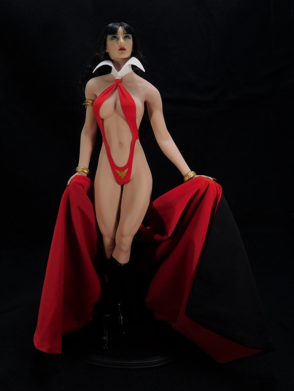
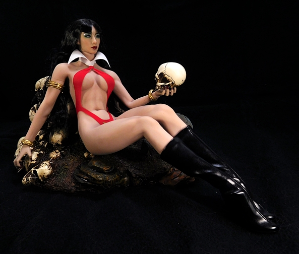
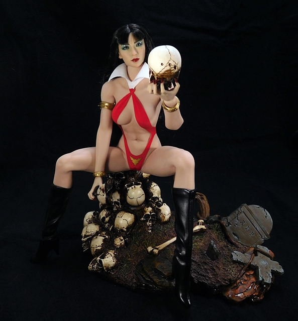
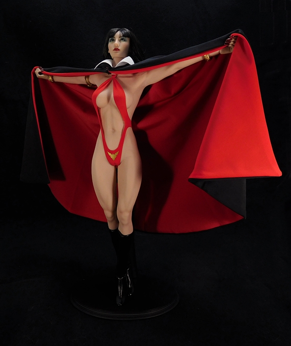
Vampirella comes wearing her iconic and skimpy costume. I am told on good authority that it’s called a monokini, which is a type of swimsuit. OK. That works. In this case it’s crafted of vibrant red fabric and fits the figure perfectly. And by perfectly, I mean it’s snug. So snug that it doesn’t take much scrutiny to recognize that these figures are anatomically correct. The garment terminates at her neck with a flared white collar, which always gives me a smirk. It’s like her creators wanted to give her something a little more vampire-y, so they just tacked the collar onto her outfit. Brilliant! The only ornamentation on her red modesty-sling consists of a gold triangular medallion strategically placed, um… right where you see it up there in the photo. Her outfit is rounded out by a pair of stiletto-heeled boots, which are made from a pleather-like material and end just below her knees, an ornamental golden bicep cuff on her right arm, and two golden bangles on her wrists.

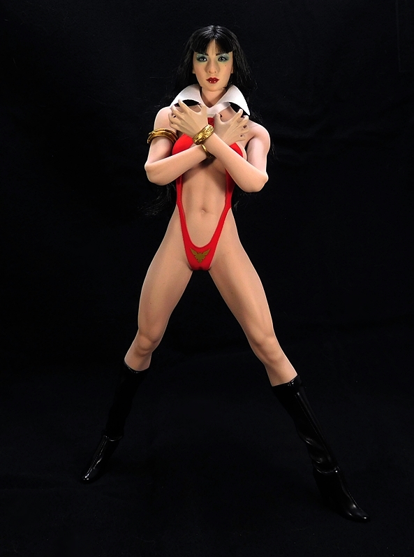
I’ve reviewed three Phicen figures this year, but if this is your first experience with them, then the thing to know is that the Phicen body consists of a fully articulated stainless steel skeleton wrapped in silicon that mimics not only the look (and sort of the feel) of skin, but also the musculature underneath it. What’s more, the skeleton is designed to articulate in a way that accurately reproduces the joints of a human being far better than just about any other action figure on the market. There are still some things they need to work on, like the elbows still look a bit flat to me when they bend, but other areas are downright incredible. I’m mesmerized by the way the torso can pivot and crunch and the way the ab muscles look so damn real. My other Phicen figures have much less-revealing costumes, so Vampirella is one of the first times I’m really getting to see everything at work on one of these bodies. Phicen has a number of different body types at their disposal and surprisingly they went for one of the more realistically proportioned ones for V here. Some have complained that her caboose doesn’t fill out the costume as well as it should, but it works fine for me.

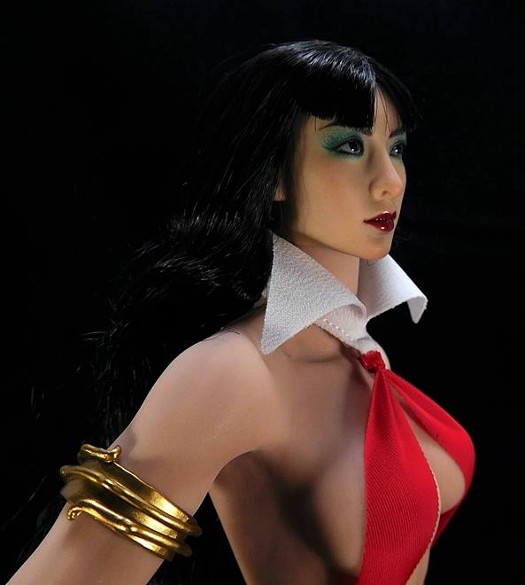
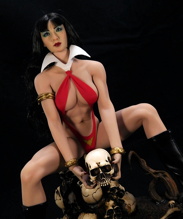
And speaking of complaints, one of the loudest choruses of whining came from the fact that this “Asian Edition” uses an Asian head. The obvious complaint here being that Vampirella has never been depicted as someone with Asian features, and I can understand why that might irk some people. In reality, V isn’t really Caucasian either. She’s an alien from the planet Drakulon. I’ve already mentioned this at the beginning of this review, and I’ll touch on it more at the end. For the time being, let me just say that this head sculpt has grown on me quite a bit, to the point where I don’t really even notice the Asian features being out of place for the character. She’s attractive, they did some cool and crazy shit with her eye makeup, and I love the quality of paint they used on her lips. She even has a cute little birthmark just above her left cheek. The rooted hair can be a bit of a chore. It’s prone to getting caught in the neck seam, but with a little care it looks fantastic. When I first bought her, I thought I’d be quick on the hunt for a replacement head, but it isn’t really a priority for me any longer.

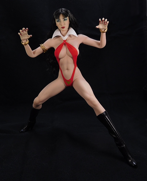
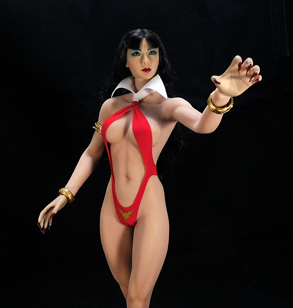
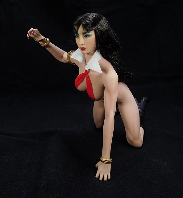
Vampirella comes with three sets of hands: Grasping, Relaxed, and what I can only describe as “Immagonnagetchu” clawing hands. If you read my previous Phicen reviews, than you may remember that I’ve had a hell of a time swapping out hands on these ladies. Instead of using a hinged peg, these hands go right onto the steel skeleton’s ball joint. Sometimes, they’re so hard to get out that the ball comes with them, and then you’ve got a whole world of headaches getting things right again. In the case of V, her hands pop off easily and go back on just as well. No fuss, no muss. And if the wrist seams on what is an otherwise seamless body bother you, those wrist bangles are nice to strategically cover them up. All of her hand sets feature really long and sharp fingernails, which require a bit of care, when having them interact with her delicate skin. I think a lot of what has been said about the extreme delicacy of these figures has been overstated, but you still have to be more careful with these than you would a regular plastic figure. Anyway, my favorites are the claw hands, although they don’t really match the serene expression on her face.

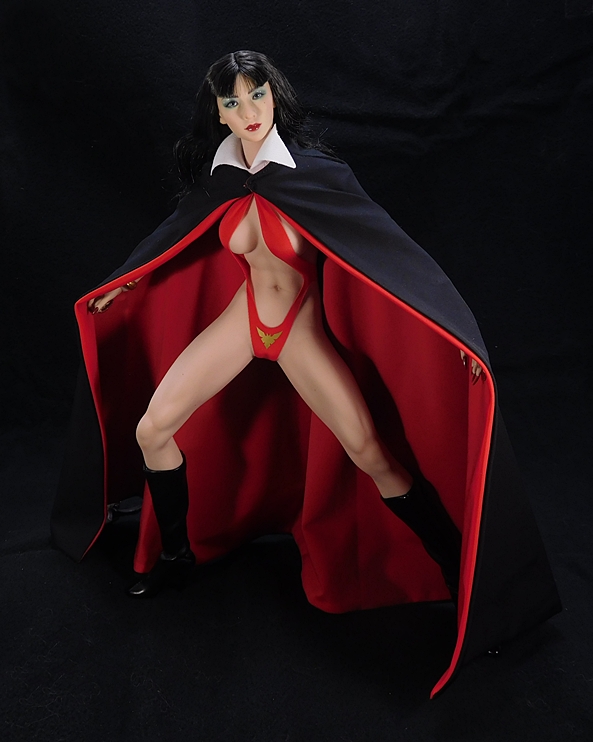
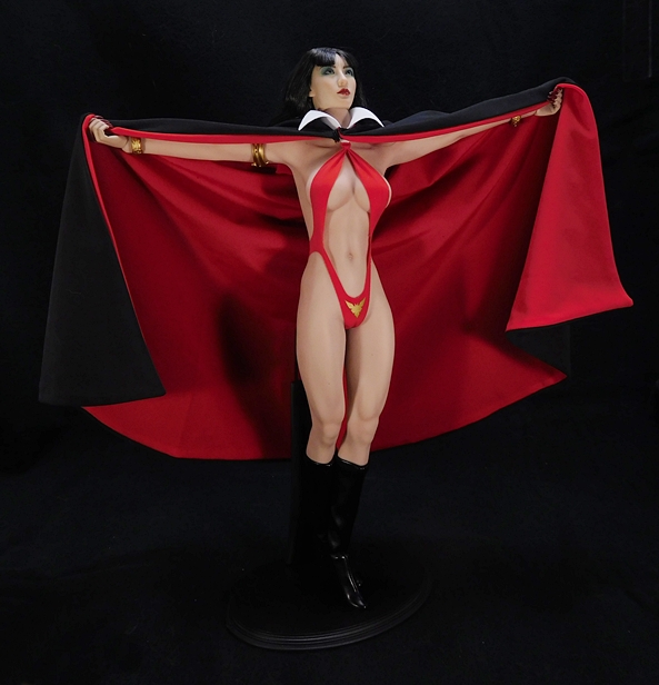
There is one more aspect to Vampirella’s costume that I neglected to mention, and that’s her cape. It fastens easily around her neck with a snap-clasp, and it is an absolutely beautiful little garment. It’s made of super soft material, and it’s black with a stitched red lining. It has a remarkable weight to it that allows it to fall about the figure in a very realistic manner, despite the scale. Also, this is where her grasping hands come in. They’re designed so that you can place the cape between her fingers and have her hold it out at arm’s length for some wonderful poses.

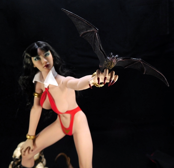
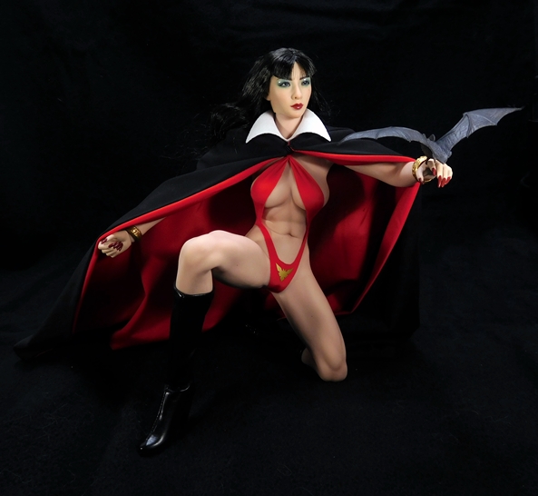
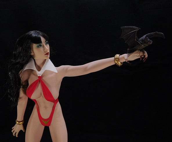
In addition to the hands and cape, Vampirella comes with a vampire skull, a vampire bat, and a diorama base. The skull and bat are just cool little props to use while displaying her. The bat has a clip near its feet so it can be clipped onto one of V’s fingers. It’s a nice looking piece, with excellent sculpted detail and paintwork, but the clip is ridiculously delicate and I can see it breaking very easily.

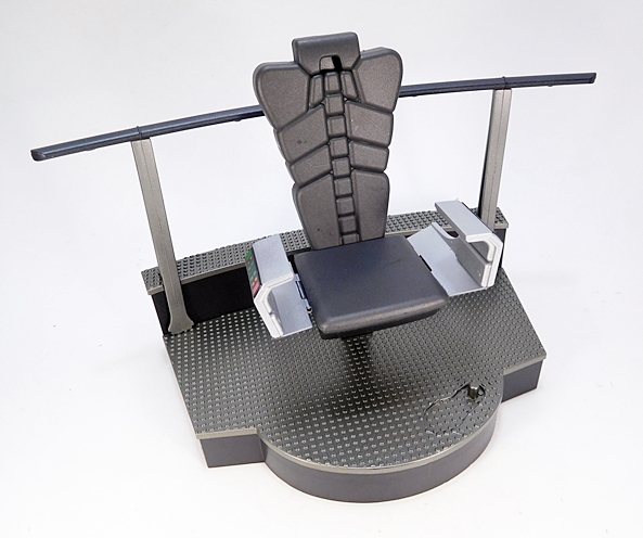
The base is easily the showpiece of V’s extras. It’s large and heavy and features a felt lined bottom. There’s a muddy patch of grass with some rocks and creepy vines, a pile of skulls, and a bone, and a couple of decrepit grave markers. This piece is so large that it comes encased in its own styrofoam brick inside the mailer box, but beside the actual figure’s packaging. It’s beautifully painted and I was really blown away by the quality of it. Hot Toys could learn something here, because with over 30 Hot Toys figures in my collection, I can honestly say that none of them have come with a base or stand as cool as this piece.

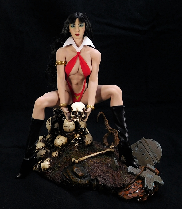
Now, on the downside, it doesn’t have any pegs (yes, Phicen figures have peg holes in the bottoms of their feet), which at first seemed like an oversight, however, the mound of skulls is actually intended to be something for her to sit on. She can also stand on the base very well, but with nothing supporting her, I wouldn’t trust displaying her like that, as she’s liable to take a shelf dive.

I picked up Vampirella for $145, which feels like a great deal in a market where it’s getting harder and harder to get a quality Sixth-Scale figure for under $200. Indeed, with Phicen’s bodies selling for around $100 by themselves, I’d say Vampirella and her accessories alone were worth the price, and it feels like the diorama base was a freebie. Now, here’s the sticking point around the whole “Asian Edition” controversy. I pre-ordered V when she was first solicited, because several of Phicen’s boxed figures have been selling out upon release lately. Was there eventually going to be a Non-“Asian Edition?” Nobody knew… until a couple of weeks ago when the “Western Edition” was revealed at the Shanghai Comic Con (of all places) and subsequently went up for pre-order at all the regular sites for around ten bucks more than the “Asian Edition.” Would I have preferred that version? Yes. Am I going to double-dip on this figure because of it? Probably not. Hey, these are the pitfalls of being an early adopter. When I pulled the trigger, I asked myself if I would be happy with this figure no matter what, and the answer was yes. And now that I have her in hand, I’m still very happy with her. She’s a great looking figure and I’m happy to have the character so beautifully represented in my collection.

Marvel Legends (Vulture Wings Wave) Vulture by Hasbro

Welcome back for a second helping of Marvel Monday! I’m at the final stop on this trip through this somewhat Homecoming-inspired wave of Marvel Legends. It should be obvious that I saved Vulture for last, so that I can include his wing assembly in this review, so let’s start with a look at the final boxed figure in the assortment… Adrian Toomes!

Here’s a last look at this wave’s packaging, which is pretty much the same as we’ve been getting in this line for a while now. I still have not had a chance to re-watch Homecoming since it’s home release, but that’s OK, because I caught it three times in the theater and I’m hoping I’ll have time to pop in the Blu-Ray sometime this week. Michael Keaton was an excellent piece of casting and I don’t think I was alone in being surprised at how Vulture has become the second best villain in the MCU. Granted, the competition wasn’t very steep. It’s amazing how a little motive, sympathy, and charisma can make a villain great. Oh, and it doesn’t hurt that Keaton is just stupendous.

Unfortunately we don’t get to see him here, but I’ll come back to that in a minute. The figure features Vulture in his movie flight suit and I really dig this design a lot. This is, of course, not the first winged flight suit we’ve seen in the MCU, but this one has a lot more character and more of a homebrew flavor than Sam Wilson’s EXO-7 Falcon. The top half features a vintage-style bomber jacket with a sculpted fur-lined collar, zippers, and chest harness. Below the knees, Toomes is wearing a pair of metallic boots with talon-like feet to help him grasp objects (or people) while in flight. It’s a great modern and “realistic” update to a pretty outlandish costume we all knew we weren’t going to see on screen.

From the back we can see the back plate that attaches to the wings, as well as those vicious talons that come off the backs of his boots. The overall paint on this figure is very well done. The jacket is painted in glossy brown and the pants in glossy green. A matte might have been a better choice for the trousers, but what we got certainly doesn’t look bad. The metal finish on the boots looks outstanding, and little touches, like the gold paint on the zippers and buckles, are appreciated.

Yes, it’s a shame that Hasbro couldn’t get the likeness rights for Keaton. At least, I’m assuming that’s why we only got the masked head. Maybe it was more than they wanted to spend, I honestly don’t know, but they did the best with what they had available to them. The flight helmet features breather tubes coming off the face mask and a clear plastic visor fixed over the two piercing green night vision goggles. This thing has a cool, sinister look to it and I love it.

And finally, let’s run through the articulation. The arms have rotating hinges in the shoulders and wrists, double hinges in the elbows, and swivels in the biceps. The legs are ball jointed at the hips, have double hinges in the knees, swivels in the thighs, and both hinges and lateral rockers in the ankles. there’s a swivel in the waist, an ab crunch hinge in the chest, and the neck is both hinged and ball jointed. It would have been cool to add some articulation to those feet so he could actually grasp something, but I guess it didn’t cost out. All in all, this is a really solid figure on its own, but what good is Vulture without his wings, eh?

The wings arrive in seven parts, spread out among the figures in this wave, and Vulture also comes with a semi-transparent plastic stand. I can’t say enough about how much I love the idea of Hasbro doing something different with the collect-and-connect concept. Build-A-Figures are fine, but this felt like something special, and I’m sure there are more creative outlets like this out there to consider as future possibilities. Remember when Mattel did the C&C Justice League building with their 4-inch line of Young Justice figures? I’d be totally down for some dioramas. Anyway, let’s get these wings assembled…

I’ve got to confess, when I was putting these together I had some pangs of disappointment. The pieces felt soft, and I worried a bit about how this experiment was going to turn out. However, once I figured out how to cobble them together and got them on display, I was a lot happier. Yes, they do feel flimsier than I would have liked, but they look so great on the figure, and they’re so much fun to play with, that I’m willing to let the quality of construction slide. For starters, there is a lot of great detail in the sculpt. Not only are the wings themselves littered with feather-like panel lines, but the actual piece that plugs into the figure is particularly intricate in its detail.

The pieces are cast in a dark green plastic with some lighter green paint used on the panels, somewhat sparingly on the undercarriage, but there’s quite a bit of it on the top face. There’s also some really cool paint used to simulate the thruster being lit up. The stand cradles the bottom point of the wings at just the right level to attach to the figure, so it can be used to display the wings by themselves, or stabilize them while Toomes is wearing them. Pretty cool!

Each of the wings are designed to articulate in three places. They’re hinged where they attach to the backpack, hinged again where they join at the middle, and there’s also a swivel hinge so they can open or collapse a bit. It makes for some pretty fun posing opportunities.

Additionally, each of the VTOL propellers can spin, their housings can hinge away from the wings, and the propellers themselves can also angle within the housings to simulate their use in multi-directional flight.

Despite being held onto the figure by only a peg, I haven’t had any difficulty with it disconnecting, even when I was using various stands to hold him up by only the wings. It’s pretty impressive when you consider that some Marvel Legends can’t even hang on to a pegged cape all that well without it popping off.

So, yeah… consider me impressed. I’ll concede that had Hasbro done this figure in a box set, they might have been able to design the wings to feel a little sturdier, but it would have been out of the scope of the current Legends pricing model. Besides, I think these came out fine in the end. Maybe we can get some kind of Build-A-Thone for Thanos when Infinity War comes out. Whatever the case, I think this was a particularly solid wave of figures and I continue to really enjoy Hasbro’s practice of mixing the relevant MCU characters with comic characters in each wave. These give us the best of both worlds, and continue to push Legends as a fantastic universe-building line. With Thor: Ragnarok hitting theaters this week (Got my ticket for Thursday night!) I hope to start in on the Gladiator Hulk Wave next Monday!

Marvel Legends (Vulture Wings Wave): “Homecoming” Spider-Man by Hasbro

It’s Marvel Monday again, folks, and I am in the middle of a hellacious work week. But the show must go on, and I’ve got not one, not two, but THREE reviews to get to today, as well as wrap up work on a special Halloween review for tomorrow, so I hope you don’t mind if I skip the preamble and jump right in. Let’s check out Spider-Man in his Homecoming Stark Tech suit.

Spider-Man has had some great suits in his various cinematic outings. I loved the Raimi movies (well, two of them) and I really liked the suit design in them. I hated the Amazing Spider-Man movies, but really loved the suit design in those. And with Homecoming, I finally have an agreement in opinion: Loved the movie, loved the suit! I realize it bothered a lot of people that Spidey’s suit was developed by Stark, but I’m not sure why. The MCU has always done its own thing, and it’s not like Tony never built a suit for Peter Parker in the comics. Either way, I had no problem with it, especially since the film addressed the issue of Peter relying too heavily on it by having him wear his powerless Hoodie Suit for the final battle.

The good news? Hasbro went all out on this guy with a brand new buck and sculpt. Not only do you get cut web patterns and a subtle texture, but every single detail on this suit is incorporated into the sculpt from the black chevrons on his shoulders to the spider emblems on his chest and back. The buck is nicely proportioned and skews toward the teenage sized bucks we saw recently with the younger comic version of Peter Parker and Miles Morales.

The coloring is also very good. I’d argue the red could have been a little brighter, but I had that issue with Hoodie Spidey too, so I’m beginning to think it might just be me. The paintwork is overall fairly solid and it looks fine with the figure in hand, although it does break down a bit when you get in really close. That issue is mostly with the paint on the webbing, and it’s not something I’m going to make a big deal about. What I know some people will make a huge deal about is that the pins in the elbow joints aren’t painted to match the costume. This doesn’t tend to be a sticking issue with me, but I get why it irks people. When you put so much work into the rest of the figure an oversight like that seems lazy.

You get two head sculpts, representing the variable apertures of Spidey’s peepers. I can’t believe how many people I’ve talked to had issues with the eyes articulating in the suit. I thought it was a great way to give him that same expressive quality he has in the comics. I also thought it was worth it for the gag outside the girls’ tent when the eye mechanisms freak out. What can I say, I’m easily entertained. Anyway, I like that we got options here, but I’ll be sticking with the larger eye head for my displays. Not only do I like the look better, but the paint on the narrow eyes head is a little rough on mine.

In addition to two heads, Spidey comes with two pairs of hands: Thwippy hands and fists. He comes out of the package with one of each on the figure and let me tell you, I had a hell of a time getting them off. Things went a little easier after I swapped them in and out a few times.

The articulation here is superb. Here’s a rundown… Rotating hinges in the shoulders, double hinges in the elbows and knees, hinged pegs in the wrists, swivels in the biceps and thighs, ball joints in the hips, and both hinges and lateral rockers in the ankles. The torso features a waist swivel, an ab crunch hinge, and the neck is both ball jointed and hinged. Spidey also features butterfly hinges in the shoulders.

Finally, you get a pair of web-wings, and oh boy are these things hot garbage. They’re cast in a frosted white-clear plastic and they’re supposed to tab into the slots in his biceps. Just one look at how small the tabs are and how giant the slots are told me these weren’t going to work. Not only will they not hold in place when reposing the arms, but they’ll usually just fall out if I move the figure at all. Hasbro was able to make web-wings work with other Spider-Man related figures, so I’m not sure what happened here, but they’re unfortunately worthless.

Overall, Homecoming Spider-Man is a pretty solid figure. I really dig this costume and the folks at Hasbro did a nice job re-creating it here in 6-inch action figure form. They spared no expense with the sculpt, but it’s a shame that the web-wings don’t work. For me, it’s a relatively minor hiccup in an otherwise fine piece of work. On the other hand, if you were dead set on displaying them on, you might want to invest in some poster putty to keep them in place. Come on back later tonight and I’ll wrap up this wave with a look at Vulture and his assembled wings!

Lost Exo-Realm Severo (LER-04 DX Edition) by Fansproject, Part 2

Welcome back, Convertorobo Fans, to the second part of my look at the fourth release in Fansproject’s Lost Exo-Realm series of Not-Dinobots. It’s Severo, a figure that is under no circumstances meant to resemble a certain Transformer named Grimlock. Yesterday, I checked out his T-Rex mode and now I’m all ready to get him into robot mode. Transforming Severo is very similar to many past Grimlock figures. The dino legs become the arms, the robot legs fold out of the tail, the dino chest splits in half, and the neck and head are worn down the back. The tolerances and clearances on this figure are all fine, but it does take a little work to disengage the tabs that lock him together in his dino mode. With that having been said, I was able to change this guy from robot to dino and back for the first time in a while without having to consult instructions, so I consider that to be fairly intuitive. In fact, I’d say he’s the second easiest of the LER figures to transform, with Volar/Swoop being the easiest.

Behold, Severo in his robot mode. I freaking love this guy! He looks like a goddamn powerhouse and he walks that fine line between hitting all the important Grimlock tropes while still offering something of a unique edge to his design. The gold chest with clear chest-plate is easily recognizable, as are the dino claws that frame his fists on the tops and bottoms of his chunky forearms. The proportions on this big guy are perfect to me, and that goes a long way to make up for some of the sacrifices made to the T-Rex mode’s proportions. I think my favorite design element here are those high and massive shoulders. Not only do they look damn imposing, but they’re practical in that they help protect his head from getting knocked off in a melee fight. The robot mode retains a lot of the same deco as his T-Rex mode, but also adds some very bright red to his abs and pelvis.

From the back, we can see some more familiar Grimlock elements. The two halves of the T-Rex chest form “wings,” but here they actually peg into place to keep them from flopping around. And while they look like a hollow eyesore now, I’ll come back to them in a bit with a way to fill them out as weapons storage. The dino hands can be positioned in a number of ways, but I prefer them straight out with the claws pointing down. By turning the T-Rex head around it tucks in pretty nicely along his back. Although this piece does not peg into place, it tends to stay put pretty well. The lower legs are a little unsightly from the back, and you can easily see where the tail folds up. Oh yeah, they can be a little tough to see, Severo has some exhaust ports coming off the back of his shoulders, which make for a nice homage to War Within Grimlock.

The head sculpt borrows heavily from the Grimlock we all know and love, it’s just more stylized and angular and looks terrific. He has a lovely translucent red visor with two light piping panels on the top of his head. Sadly, these don’t seem to work that well. Even with a direct light source, I can’t seem to get his visor to illuminate. Oh well. The head shot above also gives a closer look at the plates that the shoulders connect to. I’m going to assume that these were meant as another homage to War Within Grimmy, as they look to be sculpted a bit like treads. Even if it wasn’t intentional, I can sure see a connection in the design and I love it.

Severo’s articulation is excellent for a bulky guy and I’m happy to say that he’s bristling with strong ratchet joints. This is probably a bit of overcompensation brought on my Columpio’s somewhat loose hips. In addition to rotating ratchets in his shoulders and hips, he has double hinges in his elbows, hinges in his knees, swivels in his wrists, biceps, and thighs. His head is ball jointed, he has a waist swivel, and his ankles feature feature swiveling hinges to help keep his feet flat, even in those wider stances. His fingers are also hinged with all the fingers fused as one. Severo has a fair amount of lateral movement in his arms. He can’t quite get them up at a 90-degree angle from his shoulder, but what’s here fine for me. Now, let’s check out some weapons!

I showed off the giant mini-guns with his T-Rex mode and obviously he can dual wield them in his robot mode as well. Severo is already a formidable looking bot, so what do you get when you equip him with these bad boys? Probably a lot of Decepticons shitting their pants. The mini-guns peg right into his fists and they have hinged trigger guards that close up over the knuckles on the hands. These weapons feature nicely detailed sculpts as well as some translucent red pieces near the breeches, which do include a nice light piping effect. Equipping both of the giant mini-guns also shows how well those ratchet joints hold up.

Did I mention Severo can store most of his weapons on his person when he’s not using them? The mini-guns tab securely into slots on his “wings” which makes them angle up over his shoulders and gives him a cool and very distinctive silhouette. They also help fill up that hollow look behind the wings that I mentioned earlier.

If the mini-guns are a little too overstated for you, Severo comes with a double-barrel rifle that’s very reminiscent of Grimlock’s trademark weapon. It’s a single molded piece of black plastic with two translucent red pieces that plug into the ends of the barrels. This thing looks OK, but I feel like maybe it’s a little too big and the red tips on the barrels look a little obnoxious to me. It’s nice to have it, but I doubt I’ll be displaying him with it a lot.

Severo can store the rifle behind either shoulder by pegging it into either of his “wings,” but you can’t store it there if his mini-guns are in place. Technically, you could have him wear it on his hip, by pegging it into the socket there, but it’s very unwieldy and I wouldn’t recommend it. Besides, the hip works much better as a place to store our next weapon…

Next up is his sword. Each of the LER figures came with an energy sword, and each one has been a completely new design and sculpt. Severo’s is a no-nonsense weapon with a simple cross-guard and some great detail work in the blade. He can hold it well in either hand, although the top claw can sometimes get in the way of the cross-guard, so it helps to angle it.

Much of the promotional art shows Severo wearing the sword on his shoulder. That’s certainly an option, but I think it looks rather awkward there. Thankfully, he also has ports on each of his hips, so he can wear the sword in a more normal fashion. I really love being able to store it on his hip and I wish all the other LER figures were capable of doing this as well. Let’s move on to his last weapon, the Weapon Masters War Hammer!

Remember these goofy guys? Well, they combine into this…

Now, I’m not going to get into the ethics of one sentient robot using other sentient robot beings as a bludgeoning implement, but if you don’t think too hard about it, it’s pretty bad ass. It’s not the prettiest weapon in the world, it’s just a big block of destruction with spikes sticking out of it, but it’s ridiculously heavy looking and Severo looks great wielding it. I would imagine it could make quick work of a Decepticon head. It’s really the perfect weapon for a prehistoric robot warrior. But Severo is not just any robot warrior, he’s king. And every king needs a throne…

The throne is the biggest incentive to go for the Deluxe release of the figure, and it is indeed quite the showpiece. It’s cast in durable plastic with the back portion hollow and unfinished. The front and sides feature all sorts of panel lines, exposed pipes, vents and other bits of detail. It’s also painted with a wash to give it a dirty, oily, and overall well-worn look. The hole in the back is there to accommodate the T-Rex head hanging off Severo’s back. Not only does it allow him to sit, but it helps hold him in place quite nicely too.

It’s impressive to me that such a bulky figure design can not only sit on this thing, but look great doing it. Originally, I wasn’t sure I was going to go for the Deluxe version, because the whole Grimlock wearing a crown and sitting on a throne gimmick doesn’t do a lot for me. But seeing him seated on it, really sells it. There are also a bunch of peg holes on the throne so that you can hang his mini-guns on it, and you can even place all the LER Dinobot swords on it, Game of Thrones style.

There is room for one more sword too, in case Fansproject ever gets around to releasing Snarl. Fabulous!

And yes, he does come with a crown too, if that’s your thing. I’m glad they stopped short of giving him an apron and a tea tray.

Phew… even for a two-parter, this was a lot to talk about, and my thanks to those of you who are still with me! The Deluxe version of Severo retailed at most sellers for around $139.99, which was only about $20 more than the regular version. Of all the LER Dinobots, he’s the only one that seems to have sold out at the regular places I visit, at least the last time I checked. I’ve enjoyed each and every one of the releases in this series quite a bit and now that I have the LER versions of the original three Dinobots, as well as Swoop, I’m all the more pleased. These make for a damned impressive display, which only begs the question… where’s the LER version of Snarl? Well, Fansproject actually showed off a painted prototype of Snarl, designated LER-06 and named Pinchar, sometime last year. Although since then the LER-05 and LER-06 slots have been taken up by a couple of Femme-Dinobots that transform into raptors. These are slated to be released any time now, and I like the idea that they’re thinking outside the box. Again, my favorite thing about these dinos is that they’re original interpretations and not just straight copies. But it’s undeniably frustrating to be getting those before Snarl. And there’s still some question over whether or not Pinchar is going to release at all. Fansproject is claiming it will happen, but the longer the delays get, the less likely it seems.

Lost Exo-Realm Severo (LER-04 DX Edition) by Fansproject, Part 1

Today, I’m rolling out a blast from the past! I embarked on collecting Fansproject’s Lost Exo-Realm Not-Dinobots back in 2014 with the first release, Columpio. I’ve been grabbing them up and reviewing them as each one released up until the fourth figure, Severo (aka Not-Grimlock) and he kind of got lost in the shuffle. It wasn’t that I forgot about reviewing him, but rather I could never find the time needed to transform all his brothers for the group and comparison shots that I would inevitably need to do. And so, he kept getting pushed back and pushed back. But with the final quarter of the year looming, I’m trying to wrap up any loose ends and happily Severo is now going to be one of them. As with the past LER figures, I’m going to break this up into two parts, which works out fine since I didn’t have anything new for DC Friday tomorrow anyhow. Today I’m going to look at the packaging, the T-Rex mode, and his little robot Weapon Masters, and tomorrow I’ll come back with his robot mode, throne, and other accessories!

So, I should point out that I’m looking at the Deluxe Edition of the figure, which means he comes with some extra stuff and requires a much bigger box than the regular release and his dino-brothers. The artwork is still very similar to previous releases, but instead of a landscape box, this one is closer to being a cube. The front flap is secured with velcro and opens to reveal the figure in his robot mode, and sitting on his massive throne. The back panel shows photos of the contents, including Severo in both his modes. Inside the box, you get the figure, an instruction booklet, the throne, a bunch of weapons, and his Weapon Master twins, Pottad and Kottav. The exclusive items here are the throne, and the on extra Weapon Master. Most of the weapons are intended for his robot mode, but we will get to take a look at a couple today.

And here is Severo in his T-Rex mode. There’s a lot for me to love here and some things for me to gripe about. For starters, his design matches his brothers perfectly. From the concave VTOL-style shoulders in the legs, to the various cut lines and panels, there’s no denying that these fellas are all intended to be a matched set. The coloring is also as great as ever. The gray plastic is rich and mimics a steel finish pretty well. There’s some red and green panels painted in, as well as some translucent red parts covering exposed areas. One deviation in the deco can be found in the use of metallic gold. The previous releases used metallic gold for the exclusives and a satin gold finish for the regular retail releases. Severo marries the two together by using the satin gold for the claws, but the metallic gold for his neck and back plates. I think it works pretty well. You also get some metallic silver for the arms. The paint quality on this line has been top notch from the beginning and after four figures, it has yet to disappoint.

Severo looks like a powerhouse when viewed from certain angles, but from the sides he looks like his body and tail are somewhat atrophied. It almost makes him look like a T-Rex/Raptor Hybrid. It’s kind of the reverse of what we got with MP Grimlock  In fact, let’s have a quick look…

The Lost Exo-Realm dinos are scaled for the Generations line, so Severo isn’t quite as tall as Grimlock, but he comes closer than I originally imagined. But where MP Grimlock has a powerful, beefy body, and rather understated legs, Severo has the reverse. His legs look big and powerful, and his body a little puny. Note that I have his mini-guns attached in the picture above, which bulks him out a little more, and I’ll come back to those in a bit. The legs feature articulation in the shoulders, knees, and ankles and he can balance quite well, which is a good thing, because his tail tends to be off the ground. As always, the LER figures are meant to be Fansproject’s interpretations of the Dinobots, not direct copies, like some of the other 3P efforts, and while I would have preferred a bulkier body, I still really like the direction they took this T-Rex mode.

The dino head looks great and can angle from side to side. The jaws open and he’s got a flame nozzle inside his mouth. It’s pretty rad and makes me wish he came with a flame effect part to plug in there. I won’t hold that against him, though, because in fairness, there’s a hell of a lot of other stuff in this box. The arms are ball jointed at the shoulders and the fingers are molded together and hinged. And speaking of other stuff in the box…

The mini-guns tab together and peg into Severo’s back. Chances are Severo will spend most of his time displayed in robot mode, but if I ever do choose to display him in T-Rex mode, you can bet he’s going to have these babies on him. Not only do they fill him out better, but why would you not want twin gatling guns on your robot dino? Of course, these are only the official placement.

They can also be pegged in further up where they can independently swivel. While not as compact, I like this look a lot. Not only can they aim independently, but they also have a lot more clearance. Want more?

Well, you can also plug them into the sides of his legs. This looks like it would be pretty effective too, but he’s already wide in the hips, and this just adds to that even more, so it’s not one of my favorite looks for him. What’s that? You like your giant robot T-Rex’s to be more hands on?

Yes, Severo can actually wield his giant miniguns in his adorable little T-Rex hands. My friends, this is almost everything I’ve ever wanted in a Dinobot. I can’t even calculate how much this raises the coolness factor of this toy for me. Well done, Fansproject. Well done. Let’s move on to Severo’s Twin Weapon Masters…

Pottad and Kottav are identical twins and they’re quite sturdy and well made for these types of figures. They’re squat and stocky designs gives them a bit of a primitive look that works well with the Dinobot theme. They’re comprised of black, gray, and red plastic, with some gold and red paint hits to spruce things up. The articulation is pretty good too, with plenty of hinges and ball joints in all the right places. These fellas can transform and combine to form a pretty big war hammer for Severo, but we’ll look at that tomorrow. The Weapon Masters have never been a big draw for me about this line, but after four releases, they have grown on me quite a bit. It’s just a neat little extra that Fansproject threw in and it definitely makes the LER series stand more distinctive in sea of 3P Not-Dinobots. OK, let’s wrap up today with some group shots of all four of the LER figures in their dino modes.

Hell, yeah! I think these guys look amazing together and I’m really happy I took this plunge way back when. The decos and styles match beautifully and they scale pretty well with my Generations figures. As for Severo, I think the T-Rex mode is overall very good, but the smaller body holds him back from being great. From certain angles he looks fine, but from others I think his alt mode falls behind those of the other LER Dinobots. On the other hand, he more than makes up for it with play value as well as all the work Fansproject put into his sculpting and deco. And as we’ll see tomorrow, his robot mode rises to the occasion to make up for any deficiencies in this mode. Come on back tomorrow and we’ll wrap this up. There’s still plenty to talk about!

Star Trek “The Wrath of Khan:” Khan Collector Figure by Diamond Select

If you follow me on Twitter than you know that I’ve had a lot of Star Trek on the brain lately, and it’s all because of CBS’ new series Discovery. Now, it’s not what you might think. You see, I hate the show. In fact, I’m not sure hate is even a strong enough word. But in a way I’m almost thankful for it, because it’s gotten me so worked up about Star Trek that I’ve been back into watching one or two episodes a night of everything from The Original Series to Voyager and I’ve been falling in love all over again. I’m not sure how much of any of that really factors into today’s review, because truth be told DST’s Khan Noonian Singh just popped up in my Amazon Recommendations for a crazy good price, so I bought him. Probably would have happened anyway.

If you’re not familiar with these Trek Select releases, they fall somewhere between action figures and statues, and favor swappable parts over articulation. In fact, Khan here actually has less articulation than the Original Series Kirk and Spock sets that were released earlier. I reviewed the Kirk set over four years ago and it left me a little befuddled. To be honest, I bought this one mainly for the Movie Era Captain’s Chair. But I’m getting ahead of myself. Let’s talk packaging… I have been pretty critical of DST’s action figure packaging in the past, particularly with their Muppets line, because it’s so big and wasteful. Here, I think it’s totally warranted because there’s a whole lot of stuff in this box and I don’t think they could have crammed it into a smaller bubble. The cardback features a wrap-around with a picture of Khan on the side panel and the Star Trek 50th Anniversary logo running up the front. The back of the card has a satisfying and lengthy piece of background copy and shows some of the other figures in this line. Also, check out the picture of the Reliant on the bubble insert. That sure looks like it might be a painted prototype of a Starship Legends Defiant. WHERE IS MY STARSHIP LEGENDS DEFIANT, DIAMOND???

Did I mention I bought this mainly for the chair? Well, the chair is quite nice. The deck piece is made out of very sturdy plastic with slots to plug in the chair and the railing. It features a textured deck plate, which looks great, and a rather unfortunate footprint and peg to show you where to put Khan’s foot, which doesn’t look so great. The chair doesn’t swivel, but it does feature two hinged armrests with painted controls panels. DST has been including some cardboard pieces with some of their sets, most notably the Kirk with Engineering section in this line and their Seven of Nine Femme Fatales statue. It would have been cool to get a standee showing the back of the bridge behind the chair, but alas, it was not to be. I guess we might as well take a look at the Khan figure too. I’ll start him off in his standing pose.

We’ve got to start somewhere, so here he is proffering, “I make you a counter-proposal, I will agree to your terms, if…” and pointing his finger in the air. Overall, I think this is a really solid sculpt, but I’ll talk about it more at the end, when I do some comparisons with DST’s actual Khan figure from 2007 or so. For now I just want to run through all the different combinations of poses and parts!

Here I simply swapped out the calm head for the angrier portrait and traded his left pointing hand for a fist. Not a huge difference, but it does change up the scene a little bit. I’m a bigger fan of the calmer face over this one, although I think it’s passable. Let’s try swapping out both arms and going back to the calmer portrait…

Now this look I dig a lot. The folded arms are first thing we’ve seen that an articulated action figure would not have been able to do, and I think this pose looks great. Chances are I’m going to be giving the chair to Kirk, but if I do wind up displaying Khan, this is most likely the look I’ll be going for. Now let’s pop the legs off at the waist and get him seated in the chair…

He fits into the chair pretty well, but considering he was sculpted specifically to sit in it, I think it could have been a bit of a better fit. He has a right arm that is made specifically to rest atop the armrest and his left arm looks pretty good resting the elbow with his fist clenched in anticipation. He looks pretty good in the chair, but displaying him this way shows just what a bad design choice that footprint and peg in the deck-plate was. The footprint is totally unnecessary and it would have been much better to just put the peg in the foot and a less unsightly hole in the deck.

Swapping out the head and left hand and rotating the arm up at the shoulder offers a couple different gestures and expressions. I think both of these look pretty good.

You can also go with the crossed arms while he’s in the chair. Not bad at all. And so while clearly not an action figure, I was able to get at least seven fairly unique display options out of him with the parts provided. I’ve got to admit, it’s kind of fun seeing what you can do, but not so much fun that I’m a big advocate of this concept. As I mentioned earlier, the Kirk and Spock figures had full articulation in their arms, but were static below the waist. Here, the only purposeful articulation is in the ball jointed neck, while the rest are just rotating cuts as a byproduct of the parts swapping.

So, here’s a shot of this guy with the original, and fully articulated, DST Khan figure. In terms of sculpt and paintwork, I think the new one is an improvement on just about every level, but then again we’re talking about a difference of ten years. The tunic on the new one properly reflects the wear and tear a lot better, the glove is more screen accurate, as is his wrist communicator and delta necklace. The flesh tones on the chest of the older figure are not painted very well at all, whereas the new one is much improved.

The portraits are overall better and more detailed too, although they work for me from some angles and not so well from others. I think the calm expression head is far more successful than the angry one. The features are much sharper on the new sculpts, both in the facial features and hair. I also really appreciate the better attention to paint in the face, even if it is a little heavy handed around the eyes. But again, nearly ten years separate these figures, so these improvements aren’t so much a triumph of craftsmanship, but more an expected march of improvements.

And while this version of Khan scales slightly bigger than the original DST Wrath of Khan figures, the chair does indeed make for a good fit with those previous releases. Indeed, I think the articulated Khan actually fits a bit better in the chair than the one designed for it. And since the command chairs in the Reliant and Enterprise were basically the same, I’m happy to pop Admiral Kirk in there.

Back when I reviewed the original Kirk set, I came away saying I didn’t really understand its purpose and that still applies here. And it must be repeated that I did buy this mainly for the chair and also because it was on deep discount at Amazon. I’m glad I bought it, the chair was definitely worth the thirteen bucks I paid, and the Khan figure has its charms too. But if you want an actual Khan figure, the original release can still be had for surprisingly low prices if you hunt around on Ebay. Sadly, that’s more than can be said about the rest of the crew!

Marvel Legends (Vulture Wings Wave): Moon Knight by Hasbro

Spider-Man Homecoming made its own homecoming last week on Blu-Ray, but I only just picked up my copy today. Whether I get to actually watch it again today remains to be seen. The plan was to be wrapping up this partially Homecoming-inspired wave when the Blu-Ray hit, and I’m not too far off schedule. Today I’m checking out Moon Knight and next week we’ll finish things off with a look at Spider-Man as well as Vulture and his wings.

The reveal of this release was bitter-sweet for me. I’m a big fan of Spector and the Bendis run of Moon Knight back in 2011 remains among my favorites. The art, the story, the dialogue, it all gelled so beautifully and while it’s nice to own the whole shebang in two trades, it broke my heart that it didn’t last longer. Critically, it was well received, but for whatever reason the book just didn’t sell. Of course, this figure is not that version of Moon Knight, and to be honest, I couldn’t tell you from which book Hasbro pulled this costume. I’m going to assume it’s from last year’s run. That’s my dilemma right now. I love the movies and action figures, but I’m avoiding most of Marvel’s current comics until they get their house in order. As a result, every now and then I get a figure where the design is lost on me.

But, unfamiliar or not, I really dig this costume a lot! Moon Knight is built on a glossy black buck with some beautiful pearlescent white plastic strategically attached as armor. These areas include his boots, lower legs and forearms, gloves, hips, chest, and shoulders. The crescent designs of his segmented arm and leg armor is pretty sweet and he features a crescent moon emblem outlined in black on his chest plate. This is a clean and modern look that gives him a lot of agility. Ultimately, I still prefer the all white suit, but like I said, this works for me too!

The cape pegs into the back, although it really doesn’t need to because it also encircles the neck. It’s fairly flexible and doesn’t throw the figure off balance too badly. The pleating on the top looks great and it has a nice swirling and billowing effect on the bottom.

The head is a simple masked black sculpt with two piercing blue eyes. I’m sure we’ve seen this head before, I just can’t place exactly where. I love when Hasbro sculpts the facial details under the mask like they have here. The hood is a separate piece and permanently attached to the head so as not to inhibit the neck articulation. This is a big improvement over the ToyBiz Legends Moon Knight, which had the cape and hood as one piece.

Speaking of articulation, Moon Knight has got everything you might expect. The legs are ball jointed at the hips, have double hinges in the knees, and swivels in the thighs. The ankles have both hinges and lateral rockers. The torso has a swivel at the waist and an ab crunch hinge under the chest. The arms have rotating hinges in the shoulders, double hinges in the elbows, swivels in the biceps, and pegged hinges in the wrists. The neck has both a hinge and a ball joint.

Moon Knight comes with some weapons and a pair of extra hands to help him use them. First off, you get his crescent darts, three small ones and one bigger one. The knuckles on his fists are slotted to hold the smaller ones, so you can make it like he’s about to fling up to three at a time. In practice it works OK, but they tend to fall out pretty easily and it’s kind of hard to see he’s even holding anything. And since these are so tiny and there’s nowhere to store them on his person, I can see them getting lost pretty easily.

The larger one is a little more fun to play with. He can hold it in his regular grasping hands. Again, there’s nowhere to stow it on him and that’s a bummer.

Also included is Marc’s baton, which can split into two. Yup, we’ve seen this piece many times with different figures, Hellcat and Daredevil to name a couple. He can hold these pretty well in his graspy hands. And once again, there’s nowhere to put them on him. Do I sense a theme? Chances are I’m just going to display him with his larger crescent dart and put the rest away somewhere.

Why is Moon Knight in a Spider-Man wave? I couldn’t tell you. Do I care? Nope. This is a great looking figure and he’s loads of fun to play around with. He’s also a character that I am very happy to finally get on my Legends shelf again. If I had to complain, I’d say that I’m not going to get a lot of use out of the tiny darts, but I can’t see of any way Hasbro could have implemented them much better. As of now, this figure is ranking in as one of my favorites of this wave.

DC Bombshells: Deluxe Harley Quinn Statue by DC Collectibles

I really wanted to get in on the DC Bombshells statues, but at the time I was still building my collection of DC Cover Girls and the last thing that my wallet and living space needed was a new line of statues to collect. By the time I was caught up on Cover Girls, Bombshells was in full swing and most of the early A-Listers were way too pricey for me to go back to. And so I happily settled on the action figures, which turned out to be great! Fast forward to now and DC Collectibles is revisiting some of those main characters and producing them in new Deluxe versions. They’re larger, more elaborate, and of course a bit more expensive. When Harley went up for pre-order, I jumped on it right away.

The statue comes in a fully enclosed and mostly white cardboard box. It’s much bigger than the Cover Girls boxes, but very similar in size and style to the DC Designer Statues. In this case, the box also features a sticker indicating that it’s Harley’s 25th Anniversary. Harley isn’t quite in the Sixth-Scale range, but with the base and the one arm up in the air, she still measures over 12-inches tall. The statue itself is based off original art by Ant Lucia and the “Gotham or Bust” art print is available from QMx designs. I picked up one of the prints shortly after getting the statue and I’ll say a few things about it at the end.

And here is Harley all set up! She comes in three pieces, all individually wrapped in plastic, and sandwiched between two pieces of styrofoam. The set up requires you to plug her into the base via two metal rods and attach her right arm via a magnet. Getting her slotted into the base was a little troublesome. At first I thought she wasn’t going to stand flush at all, but I gently coaxed the pegs out and tried again and again and one more time, and eventually got there. The magnet that holds the arm in is not very strong, but it is attached to a tab, so between the tab going into the socket and the magnet, the arm stays in place very well.

It’s impossible for me to begin anywhere else but the composition, because that’s what made me fall in love with this piece at first sight. Harley surfs through the sky atop a descending WWII-era bomb, tethered to it with a bat grappling hook in one hand and her other hand flying free, waving her pop gun in the air. It’s a scene reminiscent of Dr. Strangelove and also perfectly fits the 1940’s aircraft nose art and pin-up art styles that fuels this series. The whole piece has a wonderful sense of balance to it and almost seems to defy gravity. But that’s not to say this statue favors composition over craftsmanship, and style over substance. The sculpt and paint quality here are both top notch, and I’ll lay it out right now that I have no complaints about either.

Harley’s wearing the same costume we saw in the original Bombshells statue and in her action figure and they did a beautiful job detailing it here. She’s got a pair of really short and pretty tight black shorts, secured with a golden batman utility belt with red and black pouches. Her feet feature a pair of brown boots worn with socks over red and black stockings. And she’s got a black and red bikini top with a vintage-style bomber jacket and red gloves. There’s some wonderful sculpted detail to be found in her wardrobe, from the knitted pattern of her socks, to the wear on her boots.

They also packed some great touches in the outfit include the Joker card that’s tucked into her left stocking and the Joker-style medal pinned to her jacket, some wing medals on her lapel, and stars pinned to her epaulets. The “Joker’s Wild” painting on the back of her jacket is a work of art all by itself. It makes me want to get a mirror to put behind her, because sadly, it won’t be visible when viewed from the front.

And that brings us to the portrait, which is excellent. Somehow they’ve managed to keep a little bit of Harley’s crazy and still maintain the homage they were going for. She looks absolutely delighted that she’s about to steer a bomb right into some unsuspecting target in Gotham’s cityscape. Her pigtails fly up behind her in the wind, and she has a pair of goggles secured to the top of her head. The paintwork on the face is as solid as the rest of the statue with immaculately painted eyes and lips. The white face paint isn’t overdone, and it’s worth mentioning here that the flesh tones on the rest of the figure are warm, even, and clean. I also love the pink tips on the ends of her blonde hair. It’s worth mentioning that because of the nature of the composition, Harley is looking down, so this is a piece that is going to best be displayed at eye level, or a little higher.

Her pop gun is beautifully sculpted and painted with a silver finish and black grips with a cork stuffed into the barrel. You gotta love the tiny Batman dangler that’s tied to the lanyard loop of the butt.

The base consists of the bomb sitting on an angle in a smokey-clear cloud with additional motion effects streaking off the back fins. The smoke is frosted clear plastic with some white paint and a rough texture. Effects like this are tough to do in this format, and I think it came out pretty good, but if I get in real close, the illusion tends to break down. The trailing effect parts are pretty delicate. One got knocked off, even while I was re-positioning the statue very carefully, but they’re tabbed in and it went right back on easily.  The artwork on the bomb includes the “Gotham or Bust” slogan along with Harley’s initials, a bat symbol with a line through it and a “Cherry Bomb” sticker on the tail. I just love the whole look of this thing!

Of course, the statue has a limited production run, in this case 5,000 were produced, so it’s not really that limited, but still a couple hundred less than when DC Collectibles was doing 5,200 of almost everything. As usual, the limitation is indicated on the bottom of the base. In this case, mine is 3,223 of 5,000.

Deluxe Harley retails at about $160, which makes her the most expensive DC Collectibles piece I own, but only by about twenty bucks. Was she worth it? Hell yeah. She also seems to be doing well because the place I got her from sold out quickly and she’s back to pre-order status. This is one of those “love at first sight” statues for me, which has also given me a second chance to own Bombshell Harley in the statue format, without having to blow the $350+ that the original is now going for. I have to say, I’m not quite as smitten with the early shots of the Bombshells Wonder Woman Deluxe, but having Harley on my shelf may get me to pick up a few more of the regular Bombshells releases to keep her company.

Oh yeah… the “Gotham or Bust” print is available from QMx directly or any number of re-sellers. I got mine off of Amazon for about $13 shipped securely in a tube. It measures 18″ by 24″ so it’s easy to get a frame for it, and I think it really complements the statue wonderfully. The only problem will be finding someplace to display the both together, but these are nice problems to have.

Transformers Titans Return: Gatorface and Krok by Hasbro

I honestly never buy stuff just for the sake of reviewing it here. A couple of decades ago, I was guilty of doing that with my old website when there was a KayBee Toys Outlet a couple towns over and it lead to boxes and boxes of figures and toys I really had little interest in. I just bought them because they were there and they were cheap and I could write about them. So, why bring that up now? Because I pretty much just bought Krok for the sake of having something new for Transformers Thursday. I’m not proud of myself right now.

Here’s the packaging and yes, this is a straight repaint of a figure that I wasn’t terribly impressed with when I reviewed him over a year ago. I found Krok while hitting up a Walgreens looking for Marvel Legends figures and coffee creamer. There were no new Legends, so rather than come home empty handed I grabbed Krok and a bottle of Dunkin Donuts Extra-Extra. Neither the brand nor the flavor of creamer is relevant here, but I think I’m going to need to pad out my word count on this one. OK, let’s take a look…

Gator mode! Everything I loved about the sculpt last time still holds true. And to my surprise, this one pegs together a lot better than my Skullsmasher does. I still love the G1 mecha-animal aesthetic, and this guy captures it beautifully. And imagine this, I think I even like the deco on this sucker better than Skullsmasher’s. No, I’m not digging those Mountain Dew claws, but the rest of the colors are black and purple and as Decepticon as you can get. I also really love the translucent yellow-green plate on the head and hatch in the body. The whole thing is very reminiscent of those lovely Insecticons. If only the claws were painted silver, this would have been a home-run, homage be damned!

For a bit, I thought Krok’s mouth didn’t open like Skullsmasher’s does, but it was just really stuck. I eventually got those jaws apart and to my delight the teeth and tongue are all cast in transparent yellow-green plastic, which I think looks really cool. Are you taking notes? opaque Mello Yello plastic is bad. Translucent Mello Yello plastic is good. I can’t rationalize it for you, I can only tell you how it is.

The unfortunately named Gatorface is exactly what I’ve come to expect from these little Titan Masters. For some reason, I actually don’t mind the obnoxious coloring here, but it is really hard to make out any of the sculpted detail in his head. Just like Grax, he can sit in the hatch and pilot the giant robot gator. Well, so far, I’m not too upset that I bought Krok. Let’s get him transformed and see how the other mode is…

Krok’s robot mode is still a decent mold, but the deco introduces a whole hell of a lot more Mello Yello plastic, and that’s a shame. If we got some silver instead, this would have been a repaint that I could get behind. I know, I’m missing the point of the homage to the G1 Action Master Krok, but whatever. I do, however, love what they did with his abs. The red down the middle and the silver on the sides really brings out the sculpting in there. It’s something I didn’t really notice in the Skullsmasher release. Beyond the coloring, my figure is also spoiled by the loosey-goosey hips. They were a little annoying on Skullsmasher, but here they’re just intolerable. Shooting pictures of this guy was an exercise in frustration, not only because the yellow-green plastic was befuddling my shitty camera’s sensor, but because the figure kept doing the splits.

And this head! Even with a better deco, this sculpt isn’t winning me over. I can’t figure out what’s going on with the mouth plate. It looks like he’s constantly surprised. The pink on his head crest, eyes, and in his chest panels is kind of a weird addition too. Nice Decepticon logo, though. I wish Skullsmasher had that on his chest.

You get the exact same weapons that came with Skullsmasher. Well, obviously, since one is his tail.

Krok is a veritable roller-coaster ride of highs and lows. The deco here is aimed very squarely at all those Action Master fans out there, and I’m not really one of them. Don’t get me wrong, I would actually love a modern day sub-line of 6-inch scale Sunbow designed G1 Transformers that focused on accessories and super articulation at the expense of transformation. But this fellow is too obscure even for my tastes. Toss in the fact that I’m going to have to treat his hips with some nail polish, and I’m pretty much regretting having picked him up. I think I’ll just leave him in gator mode and set him in the back of my display shelf.

Star Wars Black: Death Squad Commander by Hasbro

Hooray for more bonus Wednesday content! Unless five days in a row is more than you can take of my inane toy banter, in which case… Boo! More bonus Wednesday content! The truth is, I really want to get through the last few Black Series versions of the original “Kenner Twelve.” Especially now, because getting the last two have been rather problematic. Again, the Jawa and Death Squad Commander have so far only been released on the 40th Anniversary vintage-style packaging and they never turned up in my area. Eventually, I bit the bullet, paid a couple of bucks extra, and picked up today’s figure online.

As much as I grumble about it, these figures sure do look amazing on the vintage cards. Believe me, if Star Wars was my one and only collecting focus, I would have picked up a set to hang on the wall. And I’m sure it will even gave me a slight pang of regret when I tear this baby open in a few seconds.  Although, I do think Hasbro missed a huge opportunity to release a vintage-style green uniformed version on the 40th Anniversary vintage card and release the black one in a regular box, but what do I knew, eh? Let’s get with the ripping!

Now, I may be biased because I do love me some Imperial figures, but I think this guy turned out great. Granted, there’s nothing terribly complex about him. He’s just a dude with a badass sounding name in a black uniform that pushes buttons all day. I mean, what does the Empire call its accountants? Murder Force Commandos? What’s that? These guys carry out the orders to blow up entire planets and kill billions? OK, fair enough. I guess their name is earned after all.

The sculpted uniform is very well done, complete with the front flap detailed on the tunic, and just a little bit of texturing to show off the material. I particularly love the use of matte black for the uniform and gloss black for the boots and gauntlets. There’s also a crisp silver Imperial emblem stamped on his left shoulder. The wide belt features the large silver plates on the front, which helps to break up all that black, and it includes a functional holster on his right hip. The proportions on the figure are perfect, and he looks very smart and trim in the uniform.

I’ve always thought that this helmet design was pretty cool, although as a kid I somehow never made the connection between this helmet design and Vader’s helmet. I can’t remember when I had that epiphany, but ever since I tend to look at these guys with a sense of wonder. Did they design the helmets as a tribute to Vader? If so, that’s odd, because Vader seemed more like just a right-hand man to Tarkin in the original Star Wars. Were they just both cribbed off of an old Samurai design and there is no in-universe explanation? Am I overthinking this way too much? Whatever the case, they did a really nice job with this helmet, although it does look like it would be really heavy and awkward to wear all day, especially when you spend most of your time at a computer terminal.

The helmet is removable, which I’ll admit I did not see that as a given, so it was a really nice surprise when I got him in hand. It fits the head well and the chin strap does it’s job. The generic head sculpt is also pretty well done, although he still suffers from the same extremely basic paintwork as most of these Black Series portraits. The paint isn’t bad, the eyes are fairly straight and the eyebrows and hairline are clean, but it’s nothing special either. And do I detect a little bit of guilt in that expression for having pushed the button that vaporized Alderaan? Nah, probably not.

The articulation here is pretty good. He features rotating hinges in the shoulders, elbows, and wrists, along with swivels in the biceps. The legs are ball jointed at the hips, with double hinges in the knees, and swivels in the thighs. The ankles are hinged and have lateral rockers. There’s a swivel in the waist and both a hinge and ball joint in the neck. The portion of the tunic that goes below his belt is fairly soft and I was pleased to see that he can easily go into a kneeling position. Alas, he does not have an articulated murder button finger, although the trigger finger on his right hand can work for gesturing or pressing buttons.

Death Squad Commander comes with a BlasTech DH-17 Blaster Pistol, or at least I’m pretty sure that’s what it is. This point confuses me because I generally associate this design with Rebel weapons and I think I would have preferred getting the more Imperial-looking E-11 Blaster with this guy. I seem to recall that’s what the vintage figure came with. I guess they were both made by BlasTech and there’s no reason why Rebels and Imperials wouldn’t use the same model. A friend and I bandied this about a little via texting while I was playing with this guy and he swears Imperials were seen using the weapon in the movies. That’s good enough for me. Either way, it’s a great sculpt of a cool design, and I appreciate the silver paint on the muzzle.

Obviously, I dig this figure a lot and I seriously hope that Hasbro gets around to putting him in a box as a regular release, because I’d definitely pick up a few more. That’s the other thing that pisses me off about the 40th Anniversary line. The only three figures that were new (Tusken Raider, Jawa, and this guy) are all potential troop builders and all very tough to find here. Thankfully, Hasbro has since rectified that with a boxed release of the Tusken Raider and his price has come down quite a lot since, so I’ll likely pick up a few more of those. If the same thing happens here, I’d grab two more of these as well. The Jawa? Well, that’s a whole different story, and I hope to get to checking him out next week.