Silverhawks Ultimates: Steelheart and Rayzor by Super7

If there’s one thing SDCC did this year (besides making me want to spend a lot of money), it’s give me a jumpstart to get through some of my backlog. Although Super7’s reveals for their Ultimates Silverhawks left me a bit cold. There were no new characters, just metalized reissues and repaints. But, it did remind me to get cracking on going through the second wave of figures here, and that brings us to today’s pick… Steelheart and her bird buddy Rayzor!

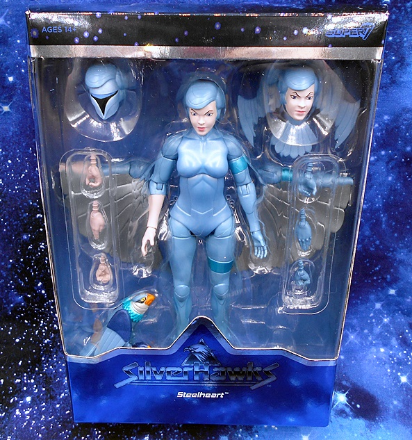
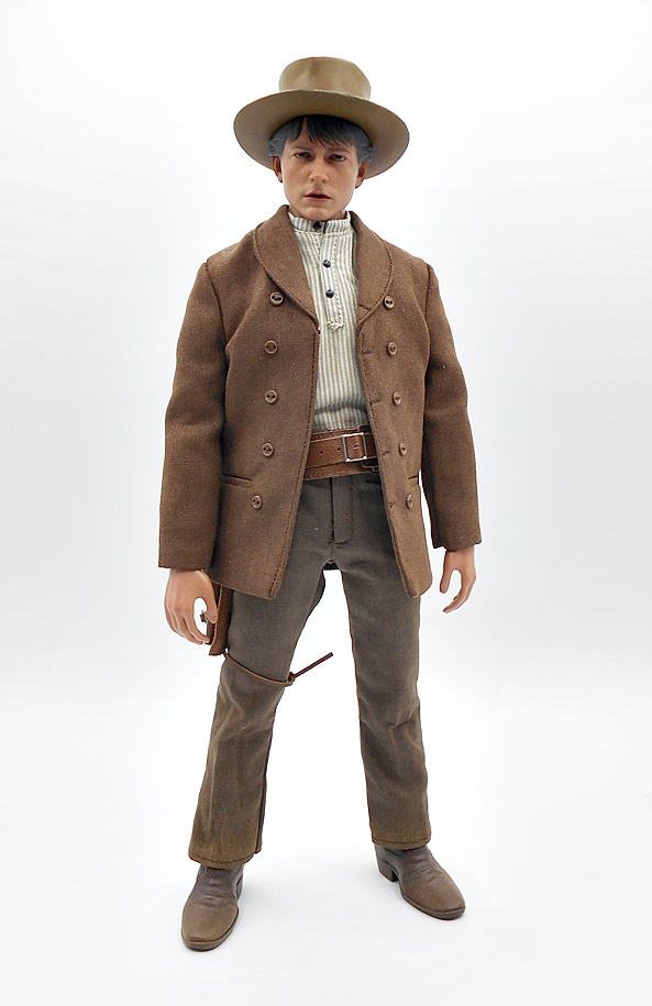
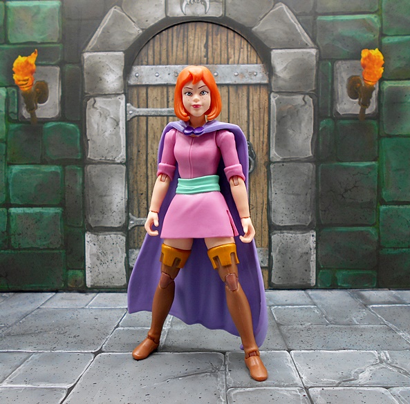
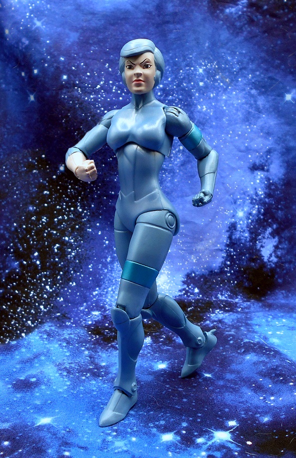
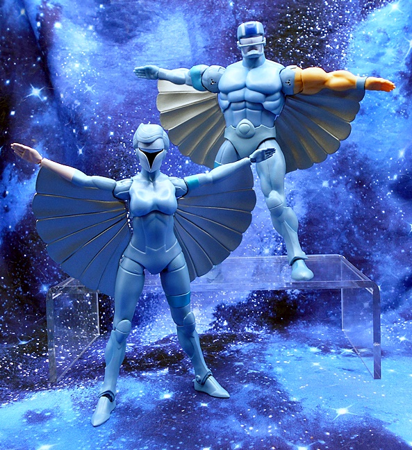
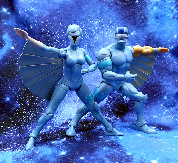
We’ve seen the packaging many times, so I won’t go into it again, other than to say it’s beautiful and collector friendly. If you need to get caught up, the first wave included Steelwill, Bluegrass, Mon-Star, and Windhammer. And yes, technically that was supposed to be the second wave and the one I’m starting today was supposed to be first. But let’s not get into that again. Steelheart is the sole female of the Silverhawks team and she’s also the twin sister of Steelwill. LET’S WING IT!!!

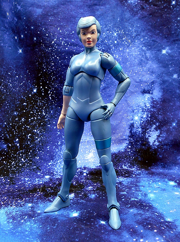
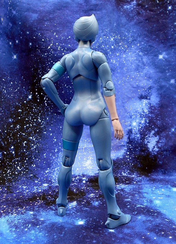
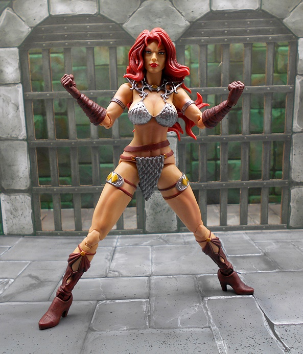
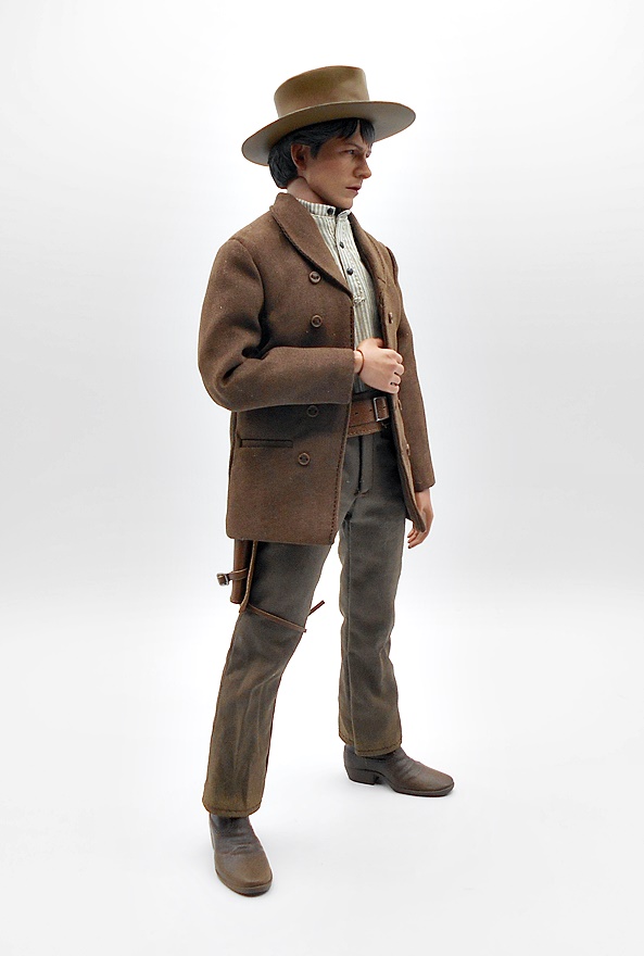
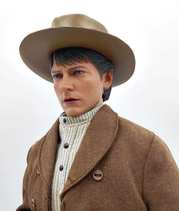
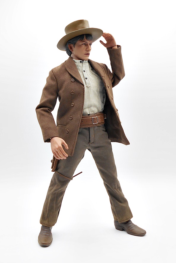
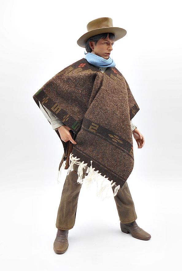
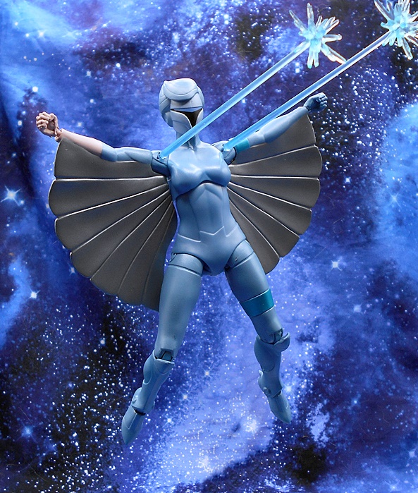
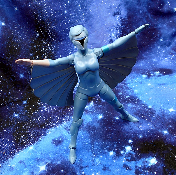
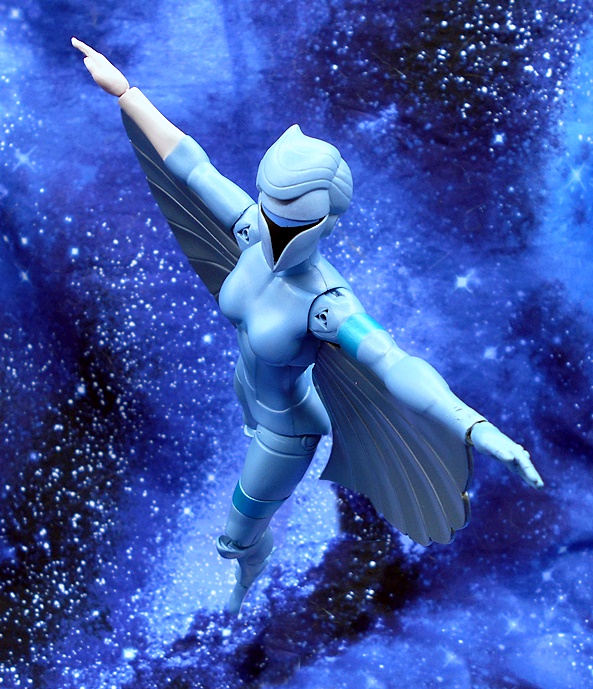
Steelheart follows this line’s very animated stylings, which means the paint is designed to approximate the look of their cartoon counterparts, rather than the vintage toys. I’ve gone on record supporting this direction, and I’ll talk a little bit more about that at the end with regard to the SDCC reveals. The blue finish has a bit of a sheen to it and you get some metallic blue bands around her left bicep and above the left knee. Steelheart also has her real flesh right arm exposed from below the elbow down. You do get some paint crunched in the shoulder joints, but after a bit of articulation it works itself out. The sculpt is simple enough with a few panel lines here and there, as well as talons on the backs of her heels. But overall the figure gets by mostly with smooth curves. I really love the way she looks.

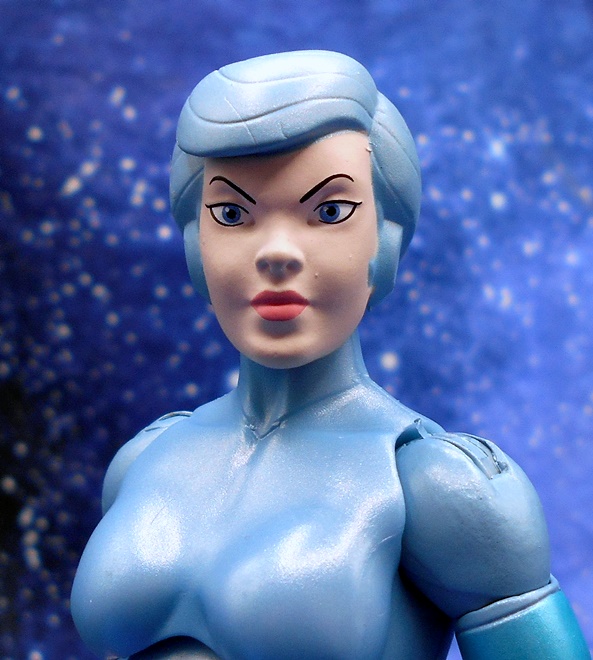
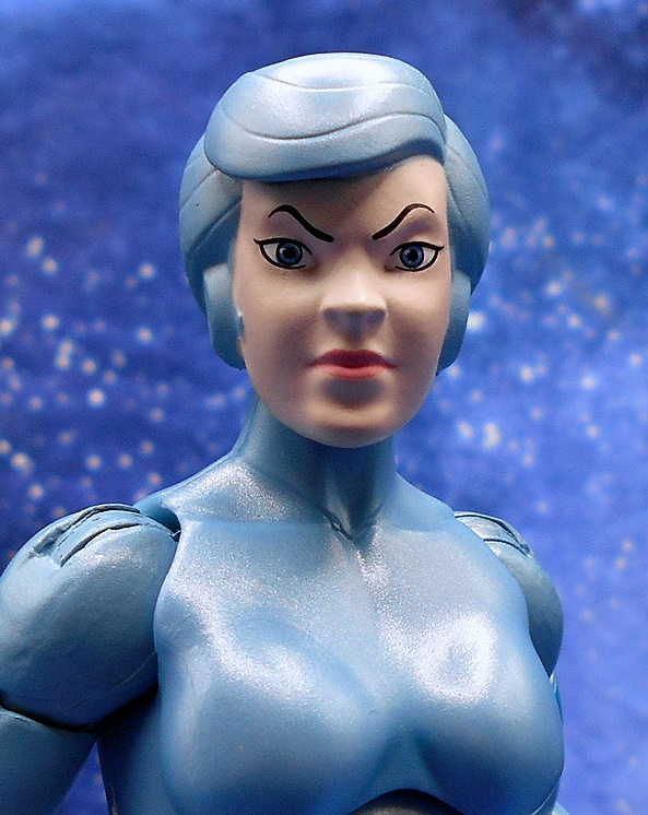
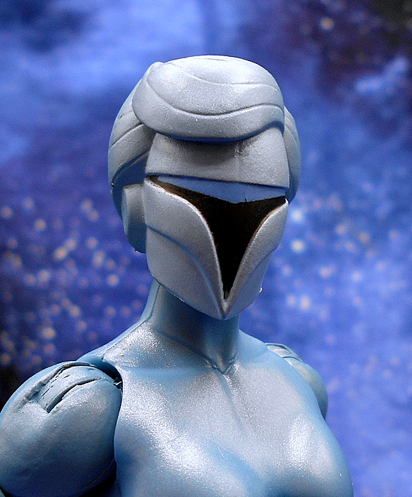
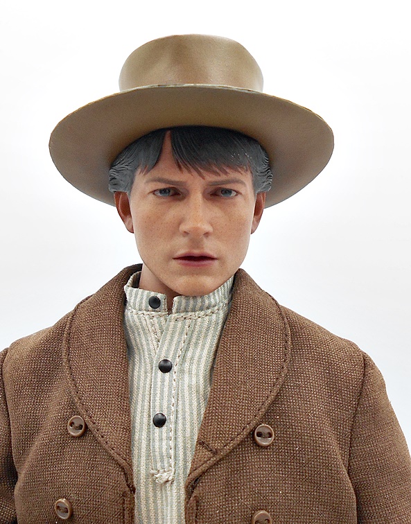
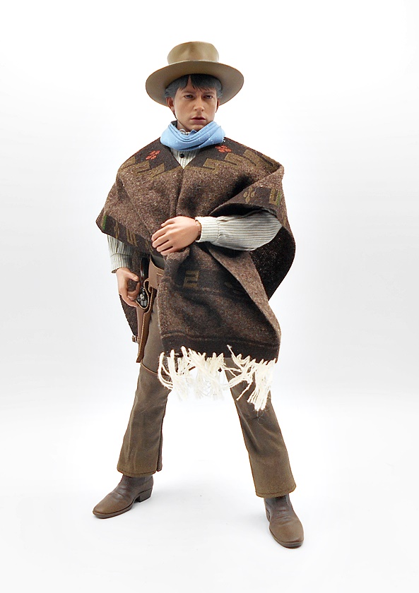
As with her brother, you get a choice of three different head sculpts. The one on the figure in the package is fairly neutral with the hint of a smile The second looks like they were going for something a little more serious, but I think the differences are very slight. And finally, you get her masked head. The paint is simple but clean and I think it does a decent job of conveying the cartoon character’s likeness. I just think there should have been a bigger difference between the expressions for the first two heads to justify including both.

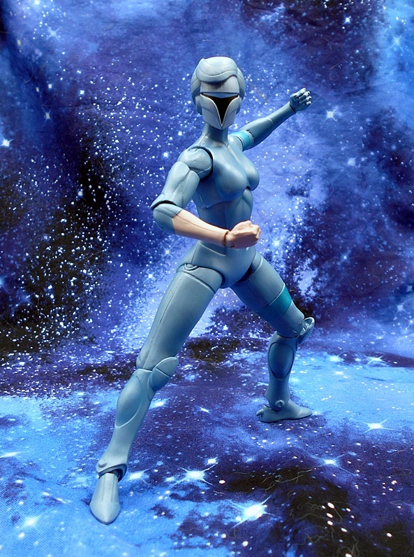
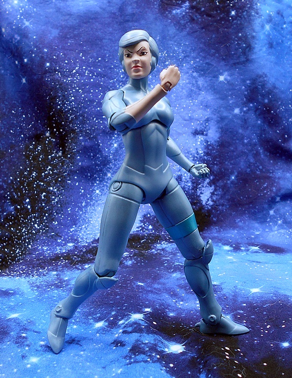
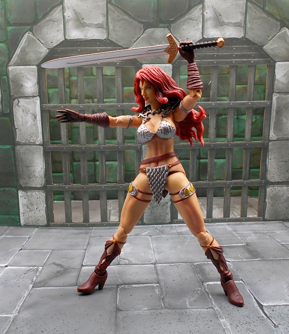
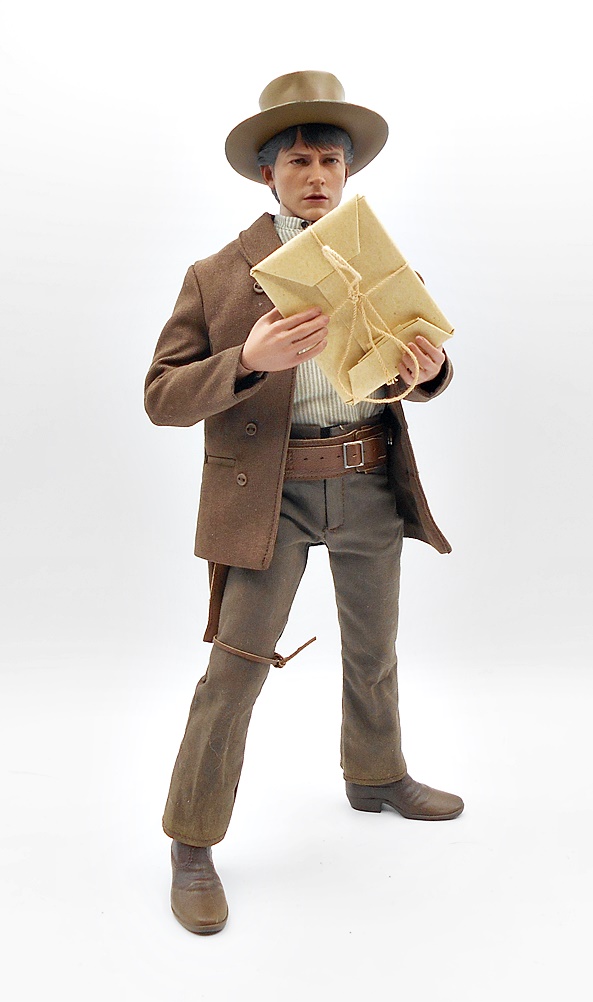
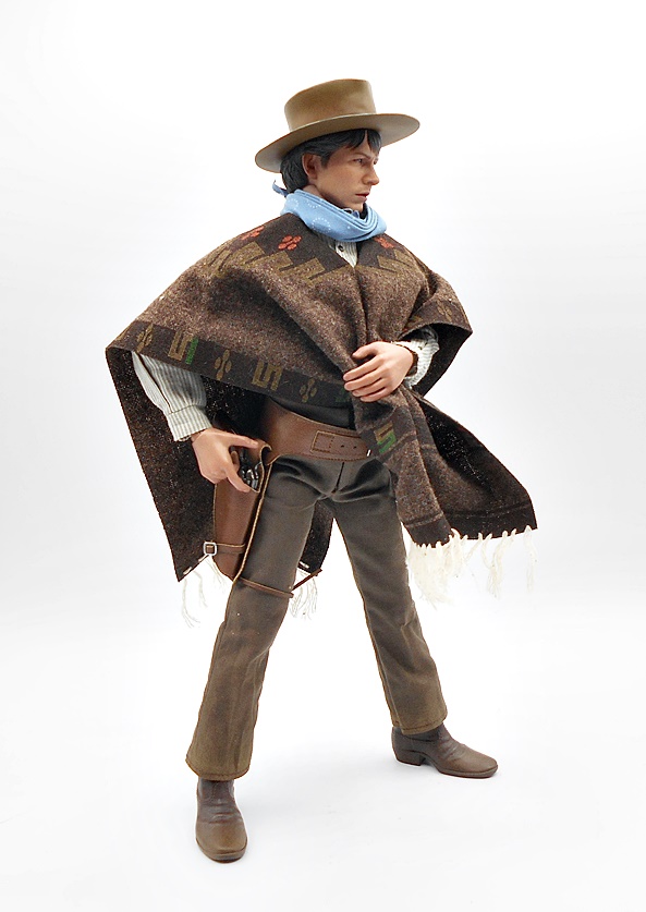
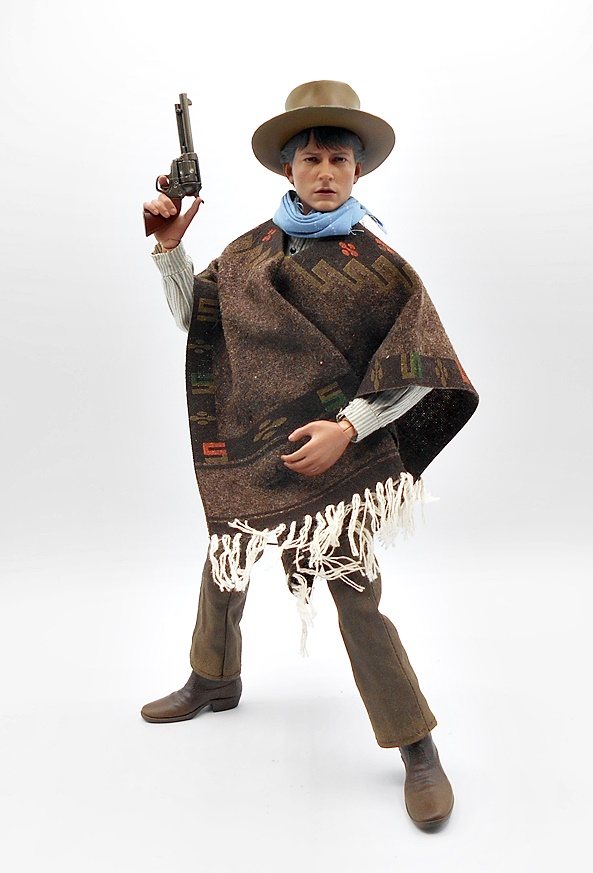
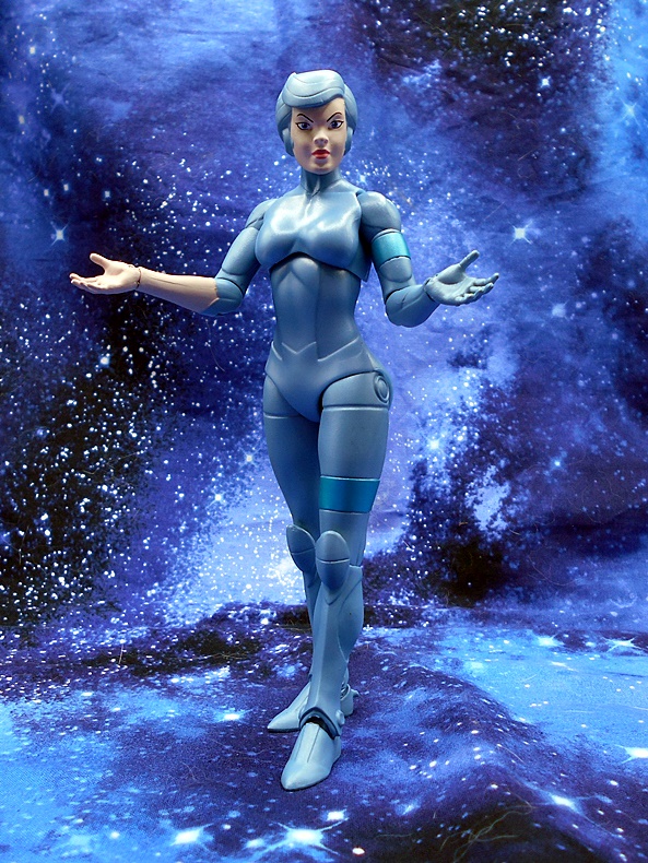
The articulation here is identical to what we’ve seen with the other Silverhawks. Super articulated these are not, but you do get a bunch of rotating hinges that get the job done. In the case of Steelheart, I do wish there was more movement in the ball joint under the chest, as it mainly just twists and offers almost no up and down movement. I also wish the head was capable of looking up a bit more for those flight poses. QC has been a little spotty on this line, especially with Steelheart’s brother, but I’m happy to say I didn’t have any scary stuck joints or breakage on Steelheart. Everything moved the way it was supposed to right out of the box. Naturally you get a nice assortment of hands with the figure. These include fists, relaxed hands, accessory holding hands, and karate-chop-flight hands.

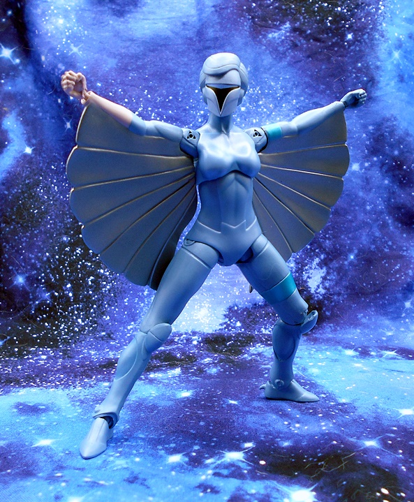
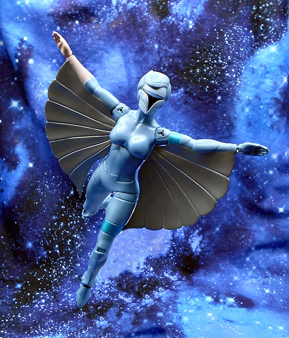
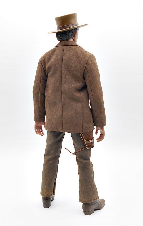
As with Steelwill, Steelheart comes with an extra pair of arms with the wings attached. These can be swapped out for winged flight poses and these arms are not articulated at the elbows. You can also still swap out the shoulders to have the open gun ports available for both the winged and non-winged arms, but I think that option is more trouble than its worth. I do have a question as to whether or not the wing arms came out as intended. If you look closely, the wings overlap the arms just a little bit, and it really feels like that should be on the back of the arms, but here it’s on the fronts. Why can’t you just swap them? Because Steelheart’s right forearm and hands are bare and because the wings would be concave in the wrong direction. This isn’t a huge deal, I’m not even 100% sure it’s an error, and I think the wings still look great, but it is another example of what may have been a factory issues with this line, and those do seem to be adding up.

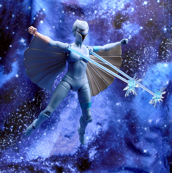
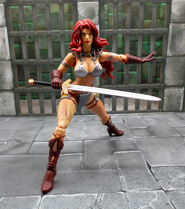
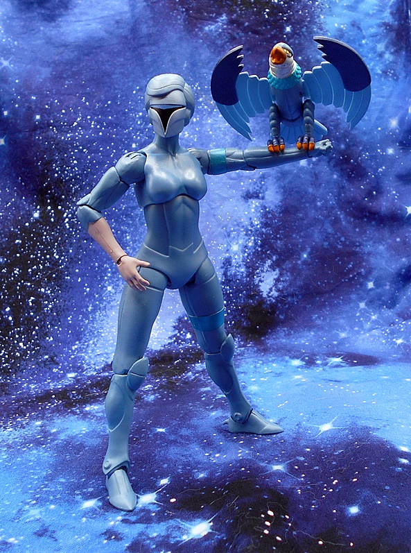
Oddly enough, Steelheart does not come with a lot of accessories. Her brother came with a couple of guns, Bluegrass came with his guitar, but apart from her bird buddy, Steelheart only comes with the blue laser beam effect parts that we saw with the other Silverhawks. These can be plugged into the gun ports on the shoulders, and I think they look cool.

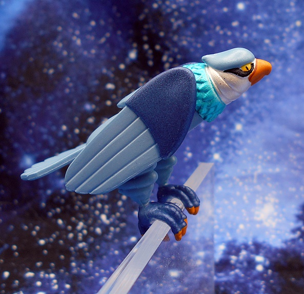
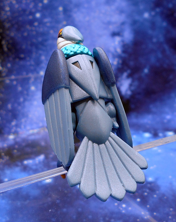
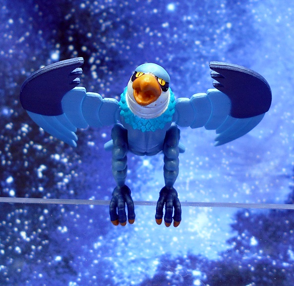
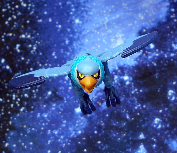
Steelheart’s bird is Rayzor and you get two versions of him: One perched and one in flight. Both versions have articulation in the legs and neck and they look pretty cool! The bird buddies were more of a thing in the toyline, and I don’t recall them even being introduced in the cartoon until pretty far into its run, so I think it’s great that we’re getting animated versions of them here.

Steelheart is a solid addition to the Silverhawks team. I was happy to have no paint flubs, frozen joints, or breakage, but then again that’s stuff that I shouldn’t even have to worry about when dealing with a $55 collector figure. But it does bring me to the issue of the SDCC reveals and why I’m probably going to opt out of the metallic reissues. Super7 just seems to be having a rough time with this line, and while I love the figures I have, and I’m looking forward to the next wave of new characters, I’m not really prepared to risk issues with repaints. Those paint jobs are going to have to be really pristine to look good and I’m not sure I want to take that gamble. If initial reviews look good, and they’re available, maybe I will bite. But right now I’m just happy with what we’ve got. And no… I’m not interested in Tiger Sharks. Next time I revisit this line, we’ll check out the powered up version of Mon-Star!

Red Sonja by LooseCollector

This has been one of those months where several really, really, REALLY old preorders have finally started to roll in. Last time we checked out some of Cosmic Legions, which had a two year wait time, and today I’m starting in on a trio of 1:12 scale comic figures by Executive Replicas/LooseCollector that I preordered back in October of 2021. So yeah, a little less than two years on these as well. Executive Replicas seems to handle licensing in partnership with a few action figure producers. In the past they have been hooked up with Phicen/TB League to produce a number of Sixth-Scale seamless figures from smaller comic properties. while LooseCollector seems to focus on these One-Twelve Scale figures, and I’ve looked at a few of those here as well. This latest assortment of femme fatales included Vampirella, Purgatori, and Red Sonja, and I’m checking out Red Sonja today.

The packaging for these figures is pretty simple but very nice and totally collector friendly. The figure comes in a window box set in a clear plastic tray with her extras laid out around her. You get character art on the front and the Red Sonja logo up at the top. There’s more character art on the side panels, and still more on the back panel along with a blurb about the character and figure. LooseCollector hasn’t really branded this series with a name, but the figures and packaging match up perfectly with the Legacy Series figures they did for Coffin Comics.

Here’s Red Sonja out of the box and looking fabulous! The body has the same feel of the Coffin Comics figures, but there are a few changes, which I’ll run down with the articulation. The sculpting here is excellent, giving our girl a toned and muscular body. She’s wearing her iconic silver scale chainmail bikini armor, which is sculpted as part of the body. There’s some excellent detail to the boots, and I love how they are designed to have openings in the fronts, as if she weren’t showing enough skin already. You also get some sculpted thigh plates, gauntlets that run up to her elbows, bicep rings, and a framework gorget on her shoulders.

The paintwork here is very well done. There’s a deep chocolate brown used for the boots, gauntlets and various straps and belts. The silver used for the armor pops nicely, as does the gold, which is used sparingly. Finally, the skin tone is warm and even throughout.

I really do love this portrait, although I would have really liked to see a second head with a more fierce expression. The one we got gives her a, “Oh yeah, this is going to be fun” expression as she’s about to go into battle. I think it really captures the determination and beauty of the character. Her brow is downturned, there’s a little wrinkle to the bridge of her nose, and her lips are slightly parted to show a flash of teeth. Her eyes are perfectly printed and I love the high gloss red they used on her lips. The flowing red hair is also great, with wild strands flowing everywhere, and there’s a bit of a gap from the shoulders so that it doesn’t impede the head movement too badly. And I have to throw some admiration at that gorget again. It’s a pretty intricate piece for this scale, and I love how it turned out.

The articulation is nearly identical to what we got in the Coffin Comics figures, which is overall very good. The legs are ball jointed at the hips, have swivels in the thighs, double hinges in the knees, and hinges and lateral rockers in the ankles. There’s a ball joint under the chest and at the top of the neck. The arms have rotating hinges in the shoulders, swivels in the biceps, hinged pegs in the wrists, and single hinges in the elbows. Now, the Coffin Comics figures changed up the single hinge elbows to rotating hinges when going from Lady Death to Hellwitch, and I would have preferred they kept that change here, but it still works fine. All the joints work fine right out of the box, which is more than I can say for some of the figures being produced by the big boys these days. I should also note that this figure has some incredible balance, especially considering her high-heeled boots. I had very little difficulty getting her to stand in some fairly dynamic action poses.

Red Sonja comes with a number of weapons, as well as three sets of hands. The hand options are fists, relaxed, and weapon gripping. Honestly, that’s the right number of hands. I get hand fatigue from some of these companies that include a thousand hands. It’s enough with the hands!!! As for the weapons, first off we have her beautiful double-handed sword, and this is gorgeous. The stout, blade is painted silver and the hilt has a gold pommel and crossguard with a black extended grip. There’s some beautiful scrollwork sculpted into the crossguard.

The articulation works well to get the figure to wield the sword with both hands.

Next up is a pair of crude fighting knives. These have dark, curved blades with a primitive hammered finish and the grips are sculpted to look like leather wrappings. I had completely forgotten that these were going to be includes, so they were a pretty cool surprise.

And finally, you get a pole-axe, which is a wonderful looking weapon. You get a single blade with a spiked back, a spiked pommel, and sculpted leather wrappings along the length of the shaft. It’s definitely an attention getter!

Red Sonja was definitely worth the wait! Granted, I had a good idea what to expect from my experience with Lady Death and Hellwitch, and I’m glad to see LooseCollector delivering on quality and consistency. And above all a figure that is an absolute joy to play around with. She looks great, the joints all behave the way they should, and there were zero QC issues, which sadly seems like an extra bonus these days. Sure, at $70 this figure clocks in at the far side of expensive, but that’s literally the price you have to pay for these smaller batched figures from smaller companies. LooseCollector has already put up some more figures for pre-order and I’m in on all of them. In the meantime, I’ll be showcasing more of this assortment in the very near future.

Cosmic Legions (Hvalkatar: Book One): Olek Thygar (Hvalkater and GraveRing) by The Four Horsemen

It’s finally here! After almost two years since the preorder closed, the first wave of Cosmic Legions figures arrived and I’m ready to start digging in. For those unfamiliar, they are basically a sci-fi version of T4H’s wildly popular fantasy based Mythic Legions figures, which have been going strong for a little while now. I went All-In on this first wave, although T4H didn’t pack one of the figures in the box, and I’m trying to solve that issue with them now. Wouldn’t you know it, it had to be one of the expensive ones! Anyway, I’m starting off with what seems to be the main protagonist of the wave, Olek Thygar, because we got two versions of him in this initial assortment.

Here’s the packaging for both figures. T4H has finally transitioned from bubbles on cardbacks to full on window boxes. I like these better, but they are putting the accessories on a tray mounted inside the side of the bubble, which is kind of awkward to get to. The left side panel has a blurb about the line’s narrative and the right has a blurb about the character. I’m not going to get terribly deep into the fiction of this line, but Hvalkatar appears to be an intergalactic prison where Olek finds himself thrown into, and eventually I guess leads a revolt. GraveRing is a particularly nasty Cell Block where the prisoners are made to fight in gladiatorial combat between bouts of hard labor. So, the GraveRing version of Olek sees him as a gladiator and the other version has him in a spacesuit with weapons, so I’m guessing it’s after the revolt? I really don’t know. Like Mythic Legions, the narrative and character bios are there to take or leave… let’s just enjoy the figures! We’re going to start with the Hvalkatar version as it is the more complex figure with the most accessories.

There are a few different display options for this figure, but I’m starting him off in his full-on space suit with the dome helmet. The detail on this figure is just mind blowing and while most of the intricate detailing of the suit is sculpted as part of the body, T4H have added some separately sculpted pieces here and there to add to that complexity, making for an exquisite layered effect of depth and interlocking plates. The articulation style here is pretty much identical to what we’ve seen in Mythic Legions, and the figure is still built on a modular model. For customizers who want to mix and match, Cosmic is compatible with Mythic, but that sort of thing is beyond what I’ll be looking at here. I am happy to report that neither of these figures had any joint issues and they articulated fine right out of the box.

The boots and gloves hint at Olek’s alien anatomy with only three fingers on each hand and what appears to be two giant toes. There are peg holes located on the gauntlets and the front and back of the torso. These are part of a new play mechanic that runs throughout this line, and we’ll explore these a further in a bit. The coloring here is quite beautiful. The armored pieces of the base suit are matte black and gray with an orange undersuit, shown mostly in the pants. You get some more orange trim throughout and some gorgeous metallic blue trim as well. All the paint operations are sharp and clean.

The helmet is removable and you can even remove the orange-tinted dome separately. This brings me to one issue with the figure and that’s the helmet not locking securely to the figure. Not only does it leave a gap in a few spaces, but it seems to be designed to be held on by friction alone, which does not do the job at all. It’s not a critical problem, but considering how much thought and design T4H puts into these figures, this one seems like a really uncharacteristic oversight.

And that brings us to Olek’s portrait, which is absolutely beautiful. He has a gorgeous blue color with bright red piercing globes for eyes. The skin is heavily scaled with deep fissures and definitely has a dragonesque motif, particularly in the scaling on the neck. Olek also has a gold fixture placed on his forehead, which I suppose could be ornamental for his race or perhaps serve some kind of purpose. I really love the sculpted detail inside the helmet, and there are even some paint apps in there too.

You get a completely different style helmet as well, which is a lot more streamlined. This head also comes with a separate neck piece, which is completely enclosed extension of the space suit. The helmet is designed to be form fitted to Olek’s head and it gives the figure even more of an alien profile, which is pretty cool. You also don’t have to deal with the fit issues of the larger domed helmet. The orange shield is even removable so you can get a better look at the fully sculpted face under it. This neck piece is also useable with the regular head and can be incorporated into the dome helmet for what I think makes for a better overall look. If you like display options, this figure certainly has you covered! Let’s start checking out accessories and weapons!

One of the coolest little extras is this holographic readout that plugs into the peg hole on either of the gauntlets. Similar pieces will be a recurring theme in this wave and this one makes for a really neat effect. It’s cast in translucent plastic with green tint at the bottom and a frame around the green text panel.

And while we’re on the subject of those arm peg holes, Olek comes with a pair of pop-up blasters for them as well. I really dig these a lot!

Olek comes with a matched pair of pistols, and here’s where we can get into the other peg holes on the suit. The figures come with an assortment of translucent pegs (two short and two longer) and these clear cylinders can be placed into the ports to secure weapons to them. In this case, the pistols work pretty well attached to the peg holes on the back. I have yet to find a good use for the peg holes on the front of the suit, as those seem to be oddly placed to attach anything.

The pistols sport some excellent detail and are painted in a speckled gray finish. They work really well with the included trigger finger hands, and I guess I should point out here that Olek comes with two sets of trigger hands, one designed to hinge up and down and one side to side. If you want to beef these guns up, you can also plug the arm blasters into the peg holes on the sides.

Next up is his heavy blaster rifle, which again is intricately sculpted and finished to match the pistols. This has a scope, a non-removable magazine and looks totally bad ass. It also has a peg hole, but I haven’t found a really good place to attach it. Again, you can beef it up by adding one of the arm blasters to the side. I have to say, I am really digging the gun designs in this line so far.

The final accessory is a big one! It’s listed as an extra heavy blaster, but to me it looks like it’s a digging tool, like a jackhammer. I’d like to think this is a piece of equipment that the guards gave to the prisoners to go out and mine asteroids as it has a big chisel-like wedge at the end. Maybe Olek is using it as a weapon like Isaac Clarke in Dead Space. Either way, this is a gorgeous piece of kit with lots of sculpted detail and lots of paint hits to the shell and the various components. There’s a grip on the back and a grab bar on the front so he can hold it like a chain gun and use it to pulverize rock or prison guards. And that covers this version of Olek, let’s move on and check out the GraveRing version…

And here he is, stripped of his space suit and ready for gladiatorial prison combat. There isn’t as much to talk about here as with the previous figure. This version of Olek reuses the belt and legs from the space suit, as well as the arm bracers from the gauntlets. His feet, hands, and upper torso are all bare showing off that beautiful blue scaled skin, and I am absolutely in love with the gradients of blue used here, it’s just so gorgeous! I also really dig that Cardassian-like neck. And holy crap is the sculpting for his back scales just incredible. This version comes with several more pairs of hands than the last one, including relaxed hands and various types to hold accessories.

The head sculpt is partially resculpted and it’s kind of fun to speculate as to why. The gold fixture is missing and in its place is what looks like three more exposed eyes. It actually looks like the gold piece was ripped out and this is a wound left behind. His horns are also grown longer. Maybe his species normally cuts these and he left them to grow long for combat? Either way this is a beautiful portrait!

Now in terms of accessories, this version comes up really short when compared to the last version. You get a new hologram piece for his gauntlet, this time it looks like an image of a spaceship. It’s cast in translucent green plastic and has some very nice detail. I just really dig the way these hologram pieces look.

You get a staff, which is kind of plain looking and strikes me as a Mythic Legions throwback. I guess the guards don’t want the gladiators to have powerful weapons. Makes sense. This one does, however transform into a flail.

Well, not really, but it’s supposed to and you get the pieces to make it look like the top comes off and connects to another piece with a chain. It looks like it would come in handy for whacking opponents in the head or tripping them up so you can make the kill.

I remember really being on the fence about picking up both versions of Oleg, but in the end I’m glad I did. The first version is definitely the more interesting figure, but that’s to be expected because at $48 he sold for $11 more than the second version. Meanwhile, the second has it’s own charms with all that exposed blue scaly skin. So far, I dig the peg system for attaching weapons and accessories to the figures, as it gives me a nostalgic feel for the old Centurions line by Kenner. So far Cosmic Legions manages to secure its own identity, while still being planted firmly in the Mythic Legions system. Indeed, I think we’ve already seen a Dragon Man figure teased using parts from Olek and it will be interesting to see what other crossover T4H and customizers can do.

G.I. JOE Classified: Bazooka by Hasbro

It’s hard to believe that I haven’t revisited the Classified line since April, but then again I have been getting caught up on the Super7 G.I. JOE Ultimates line, so that’s the excuse I’m going with. Nevertheless the Classified figures have been piling up and it’s time to remedy that today as we look at David Katzenbogen, aka Bazooka!

Yeah, I am not a fan of this art. This might be cool as an art print, but why Hasbro thinks this is a good way to convey what’s in the box for an action figure line is beyond me. It looks like something you’d find hanging on the wall at wine and cheese night at the community college art show. At least you get a small picture of the figure on the front and more on the back panel. I was excited to get Bazooka because I was a big fan of the vintage figure, and I always thought the cartoon did him dirty. The Bazooka figure I played with was a fast and decisive thinker, just like his filecard noted, and not a slow, dimwitted guy who could barely articulate his thoughts into the English language. G.I. JOE was supposed to be the best of the best, and my vision of this character fit that ideal a little better.

In terms of sculpting, Bazooka was one of the simpler figures for Hasbro to produce, but he still looks great. His standard issue trousers have some sculpted pockets and are tucked into high black boots. This is all contrasted by his bright red football jersey with blue and white numbering and sleeve stripes. Yeah, the numbering is interrupted by the cut for his chest ball joint, but it’s not like that could be helped. He has a pair of green wrist cuffs and a black belt with silver buckle that is attached around his waist. This looks good, but it can have a habit of riding up when posing him. I really dig the build Hasbro gave him, as he’s a pretty buff figure all around with some nice muscle definition in his arms.

While Bazooka has standard Classified male articulation, the jointing on this guy feels a little weird. The joints offer a little more resistance and sometimes when I thought I had tweaked them, they revert back to the way they were. I’ve found that working the figure has resolved this a bit, and I’m hoping that the more I play around with him, the more cooperative his joints will get. Because of his dual handed weapon, Bazooka comes with two trigger finger hands, and that’s cool because these can double as fists well enough.

The portrait is really good, even if it strays a bit into caricature, I’m not looking for super realism on my Classified figures and I dig when they get a bit stylized. He’s got a power house of a neck, a beefy cleft chin, high cheek bones, and a bushy mustache and eyebrows. The paint could be lined up on that stache a little better, but it’s not too bad. The helmet has some sculpted wrinkles to show it’s got a cover on it and I love how one of the chin straps flies off to the side. There ain’t no way those straps are going under that monument of a chin anyway! The helmet is removable and you get a neatly combed coif with a sharply defined part.

All of Bazooka’s accessories fit on his back, which is pretty cool. You get the backpack that holds four of his bazooka rounds and two arms to attach the bazooka across the back. The pack is cast in olive green plastic with some nice detail. The four compartments up top house the bazooka rounds, of which two are left plain, one has a painted yellow tip, and the other has some nose art on it. The bazooka has some excellent detail too and the padding on the side is painted black.

There’s also a sling if you prefer to have the bazooka over his shoulder. I imagine it can be difficult to get through doors with it stored horizontal on the pack.

The back of the bazooka is pegged and swings open so you can load in one of the rounds. I think this is a great idea, but this piece comes off way too easily. You can also have a round peeking out the front as if it’s about to fire or in the process of firing. I like to pop the yellow tip in there because it’s easier to see. I think Hasbro really missed an opportunity here not to give us a smoke trail to show the round leaving the tube and a blowback effect part for the back. They’re doing some amazing effect parts with the multi-packs and Bazooka would have been a great opportunity to introduce some here.

Lack of effect parts aside, I think Hasbro did a great job on this figure. He’s a great mix of realistic military MOS with the colorful characters that the G.I. JOE brand brings to the table. His gear is fun to play with and it’s always a plus for me when a figure can carry everything they come with. Now if we can get Alpine and Quick Kick to display by his side, I’ll be even happier!

J. Scott Campbell’s Fairytale Fantasies: Alice in Wonderland (Autographed Edition) by Sideshow

Sideshow dropped a huge reveal this week (at least it was huge to me) in the form of a preview of the newest statue in J. Scott Campbell’s Fairtytale Fantasies: Princess Sultana from The Arabian Nights! She looks absolutely stunning and it was great to hear JSC talk about it a bit on Sideshow’s channel. Of course, that got me to thinking about how I’m not caught up on my reviews of this series, so today I’m going to roll out one that I’ve had on my shelf for a little while. Let’s check out Alice in Wonderland!

Alas, I have the box for this one in storage, but here’s a shot of an art print that I have hanging above where I display her. This was offered a little while back on J. Scott Campbell’s store, which is also where I happened to get the Exclusive Autographed Edition of this statue. I’ve reviewed some of these out of order, with three so far under my belt: The Little Mermaid, Red Riding Hood, and Tinkerbell. But I think, Alice was the third piece released in the series, preceding Red Riding Hood, the most recent release. If you own any Sideshow statues, you should know the drill. She comes sandwiched between two big styrofoam bricks and there’s a little assembly required. Connections are achieved through easily fitted tabs and magnets, and it takes only two shakes of a Cheshire Cat’s tale to get the Alice ready for display!

Alice is a satisfyingly large piece, not necessarily because of her nearly 14-inches in height but the sheer weight of her mushroom base is quite impressive, especially when displayed next to Tinkerbell and Ariel. Every time I move this statue to dust, I’m taken back by how heavy this solid chunk of polyresin is. Alice sits poised on the giant mushroom with her skirt blowing up and a piece of the mushroom in each hand as if deciding which one to eat. Meanwhile, the monstrous Cheshire Cat coils around the base looking up at her with its rictus grimace. The composition is very nicely done with the serene Alice contrasted by the dark and foreboding goings on down below. And as with many of Sideshow’s previous JSC pieces, the colors here are to die for. The blue is so vibrant, matched only by the turquoise and purple of the Cat. Alice’s pale blonde hair has some nice gradient tones and all the paint lines are sharp and immaculate. I particularly dig the high gloss black they used for her shoes. Meanwhile, the mushroom has a bit of a dirty finish on it perhaps suggesting something nefarious about its nature.

Alice’s outfit exhibits that uncanny JSC style of mixing of the cute and innocent nature of Disney with a healthy dose of sex appeal. The striped high stockings with black bow-ties give way to a bare thighs as the frilled trim of her skirt blows up and reveals a flash of panties. Up top you get bare shoulders and an ample dose of cleavages, punctuated with another bowtie front and center and a super glossy red heart pendant hanging around her neck on a sculpted gold chain. The puffy effect on her sleeves is also well done.

And this portrait… oh boy! One of the things I love most about this line is the way the sculptors have captured the 2D style of JSC’s portraits in 3D, and Alice here is just another great example of that. The sweeping curve of her nose, the big, beautiful blue eyes, and the perfect pursed lips are all just dead on gorgeous. What’s more, the paint used for her skin tone is so soft and warm, especially in the cheeks. I may be guilty of saying this every time, but in terms of the portraits, I think this is my favorite of the series so far.

And shifting from the beautiful to the grotesque, check out the mug on the Cheshire Cat! The unsettling wall of teeth are painted with a high gloss to give them a slick, saliva coated sheen. He rests his head on his left front paw while admiring the view above like the dirty kitty he is. Either that or he’s about to bite off her dangling foot. I really dig the way he seems to blend with the mist as if he’s just materialized and his fur has a really cool and surreal look almost akin to crepe paper. The cracks in the edges of the mushroom look great and you get some ribbed texture in the stalk as it rises up out of the swirling mist.

The statue is autographed by Campbell on the back of the mushroom in an almost neon blue marker. Some may have preferred it be more front and center, but I kind of like having it in the back so as not to disrupt the aesthetics of the piece. This way you can have your shroom and eat it too. It’s also somewhat humorous to have the signature right below the panty flash. The Autographed Edition was available in two runs, one with a metal art card and one without. The art card edition was sold out by the time I could get to the website, but I was happy to get this one. This run was 4000 pieces and is hand numbered on the bottom of the base. I got #48 which is by far the lowest numbered Sideshow piece in my collection. It also came with the standard Certificate that is included if you buy signed comics from the JSC store.

Is this my favorite Fairytale Fantasies statue so far? Wow, that’s so hard to say. I do absolutely love it and I think the portrait is up there as one of, if not the best. I also have to give this one props for having such a complex base that really adds a lot of character. Still, I may have to give the nod to Tinkerbell as still being my favorite. I just love the way she’s standing on a compass and her wings are really pretty. It’s so hard to choose one, and I don’t want to hurt any of these ladies’ feelings. Anyway, the regular version of Alice retailed for around $375 and has long since sold out at Sideshow, while this one was just a smidge more at $399 for the Autographed Edition. And as you can see from my display, I have one more in the collection to look at here before I’m all caught up, so maybe I’ll bump Cinderella up to get her time in the spotlight soon.

DC Super Powers: Wonder Woman and Invisible Jet by McFarlane

I’ve really been enjoying McFarlane’s retro DC Super Powers line, even if some of the figures have been maddeningly difficult for me to find. Luckily the vehicles have been pretty easy to preorder and this week I got all caught up on those. Previously, I checked out a bunch of the figures and the Batwing and today I’m having a look at Wonder Woman and her Invisible Jet!

Egads, I love this packaging! It’s so cool to see the old Super Powers logo of exploding stars again and the blue and yellow retina-blinding colors are enough to make my memory water. Diana looks absolutely striking on the card and I really dig the character art they used. It pained me a bit to tear this figure open, but I’m going to keep an eye out for another to keep carded. The jet requires some assembly: Attaching the tail and the two wings. The tail is a permanent attachment, but the wings can slide off again, allowing the toy to be stored in the box, which is always a big plus for me! Let’s start with the figure…

So, these are basically more modern interpretations of the characters done in the retro format. Part of me would have loved to see straight up re-do’s of the original figures, but I think these are plenty fun too. I’ll note here that Wonder Woman’s cape is not wired to the bubble like the caped figures in the first wave, and that’s a really good thing. McFarlane is usually pretty great about using fan feedback, and I think that message got through. As for the design, I love it! The red corset with the raised gold bands on the top and bottom give it a more modern flavor, while the star-speckled shorts really speak to Wonder Woman’s roots. I like the gold knee guards with the stripes that follow down to her toes and the silver wrist bracers look great too. The cape is held in place by a wire around the neck and is easily removable if you prefer your Wonder Woman capeless.

The head sculpt is really nice with a detailed gold tiara and some nice flow to the hair, particularly around the shoulders. The eyes are painted in a manner similar to the vintage figures, but there’s a lot more definition to the face and the lips are perfectly painted. As with the original Kenner figures, these have your basic articulation consisting of rotating neck and shoulders, a t-crotch for the hips, and hinges in the knees. Diana has a gripping right hand, but sadly no accessories, and that’s the only bummer here. The lack of her golden lasso is pretty conspicuous. Nonetheless, it should be easy to make one for her. OK… let’s move on to her Invisible Jet.

So, when I first started looking at the photos, I thought, “Oh crap, you can barely see it!” I almost scrapped the whole review, but then I was kind of delighted by the fact that it’s so hard to see the Invisible Jet, and I just went with it. The toy is indeed made of translucent plastic with a few bits of sculpted detail, like the WW logo in front of the cockpit. You can also see the mechanism and string for the capture claw, but even that is pretty subtle unless you’re looking at it from the side. I love the retro design of this thing, and yes it has an undeniable super-deformed style to it. It almost looks like a design from the Metal Slug games. That may turn some people off, but I think it works well for a toy in this size and price range.

When you press the WW emblem, the canopy springs open. The cockpit includes a WW-themed steering yoke and a fully sculpted pilot chair. She fits in it very well even with the cape still on her.

There’s no stand included, not that I expected one at this price point, but I improvised for the sake of some inflight pictures. Diana looks really cool in the plane and playing around with this thing brought me back to the glory days of my MEGO Invisible Jet, which was already pretty yellowed when I got it as a hand-me-down from my Uncle.

The capture claw stores in a recessed area under the jet. You simply pull it out and the string will feed out of the bottom of the jet. Press the tail fin and the claw will snap back up super fast. I do love that McFarlane is including action gimmicks with these vehicles. Sure, they are simple, but it really fits with the Kenner homage they are going for.

The Invisible Jet pre-order sold out at a lot of retailers very quickly. I was able to secure one at McFarlane’s online store, which seems to be a pretty good route to take these days. At $20, this is just a super fun toy that’s going to look great on the shelf with Wonder Woman inside. The Batmobile also arrived with it, so I’ll be looking at that in the near future. I also have to double back and do a review of the Supermobile in all it’s goofy glory!

Back to the Future III: Marty McFly Sixth-Scale Figure by Hot Toys

I’m continuing to try to pepper in some more Sixth-Scale figure reviews this Summer because I have a big backlog. But these take a lot more time than the other stuff I review, so I have to pace myself. There are some excellent releases coming in this second half of the year as well and today I’m bumping one of those new releases to the front of the line, because I was just really excited to get Hot Toys’ Marty from Back to the Future III! And in case you missed it, check out my look at Marty from the first film!

The figure comes in the standard shoebox-style package with a pretty cool old-timey style photo of Marty about to have his showdown with Mad Dog Tannen. The top lifts off and you get an illustrated insert depicting the DeLorean and under that are the goods in the usual black plastic tray. I feel like I surprise people when I declare that I like the third BTTF movie a lot more than the second. I’ll always consider the first a perfect film, the second was fun once or twice, but it gets way too over the top in the goofiness. I think I like the third one best because it scratches my Western itch and they actually go further back in time. It also kind of reminds me of the Classic Trek episode Spectre of the Gun where the protagonist is just desperate to escape the situation without having to engage in a gunfight he knows he can’t win. It was also nice to see Doc Brown get more of the movie to himself. Anyway, let’s get Marty out of the box!

The figure sports two different looks: One in his western suit and the other in his Clint Eastwood-style costume for the big gunfight. He comes out of the box pretty much ready for the first look, depending on whether you want to display him with his gun belt on or not. He didn’t wear it for a lot of the movie, but I put it on right away. The costume looks great and Hot Toys did a nice job conveying the cruder old-time style of the clothes. The trousers have an almost suede look to them and the brown fades a bit at the cuffs. The coat is a little ill-fitting, which I’m sure is intentional, with rounded lapels and rows of buttons running down each side of the flaps. The striped shirt underneath has a button flap running down to the chest and long sleeves with cuffs. The boots are pretty simple sculpts, but look nice and also have some fading to the brown near the toes. I doubt this costume was a big challenge for the tailoring wizards at Hot Toys, but it looks outstanding nonetheless.

The portrait includes the hat permanently attached to the head, and I’m fine with that. The expression is pretty much identical to the one from the first film with the lips slightly parted. The big difference is the sculpted hair is now pressed down over his forehead with some extremely light and delicate strands overlapping and letting some of the skin behind it show through, making for a very cool effect. Some of the freckling and pores in the skin are a little more evident in this portrait, and I think it looks great. Beyond that the likeness is just as solid as ever, but that’s to be expected as this certainly isn’t Hot Toys first time working with Michael J. Fox’s portrait.

Marty is one of those rare Hot Toys where the articulation is not at all inhibited by the costume, nor do you have to worry about the costume getting damaged by keeping him in any specific poses. As a result he is a lot of fun to play with. Naturally, you get a ton of hands to swap out, including fists, relaxed hands, and a bunch designed to work with some of the accessories. Speaking of which, let’s take a look at some of those accessories before swapping out his costume.

First up, you get the package that Doc mailed to Marty from the past. This is just a large flat parcel wrapped in brown paper and tied with a string. It also includes the photo of Doc Brown’s tombstone.

Hey… Frisbie! Far out!” Yes, you get the Frisbie’s Pie plate that Marty used to disarm Mad Dog when he was about to gun down Doc Brown. Definitely a fun accessory!

Next up is the walkie-talkie retro-fitted with the ridiculously large old-timey battery. It’s very nicely done and a cool bonus, but probably not essential. I doubt I’ll be posing him with it much.

One of the real beauties in the box is the Hover Board. I must have completely forgotten this was included, or maybe I never realized it. Either way, I was super surprised to see it when I opened the box. It’s not featured much in the film, but what a great pack in! It has an elastic foot strap and a sharp and colorful sticker on the front, while the reverse side has the hover disks. Very cool! Next we’ll check out the gun and belt, and to do that we’re going to take Marty’s coat off.

Here we get a better look at the shirt, but more importantly the gun belt. And if you were hoping for some closeups of Michael J. Fox’s ass we got that for you too! The belt has a nice leather-like texture to it and some immaculate stitching. The holster itself has a retaining strap to hold it against the leather backing and a rawhide tie that goes around Marty’s leg to keep it all in place. You also get a brace of sculpted .45 Long Colt cartridges, each one fully painted. The belt itself buckles pretty easily and stays put quite well.

And easily my favorite accessory here is the Colt Peacemaker, and boy is this a beautiful example of the gun in this scale. The finish is gorgeous and the sculpt includes fine details like the screws and even the ejector spring under the barrel. The cylinder rotates and you can even pull back the hammer. I would have liked to see a little woodgrain texture in the handle. But that’s a minor nitpick and this really is a wonderful piece! And now we’ll switch Marty over to his Clint Eastwood look. The coat stays off, but you add his poncho and neckerchief.

And damn, this looks great! The poncho is made of a pretty heavy wool-like material and features magnets inside to help it secure front to back on each side. It can also be cinched up for easy access to his holster. The neckerchief has some nice printing on it and you can even unravel it a bit and have Marty wear it like a mask.

And the final accessory that goes with the Clint Eastwood outfit is the iron stove door Marty used as a makeshift bulletproof vest. It has some sculpted decorations on the front and a bit of a rust-colored wash over the black paint. There is a crude looking piece of rope that’s used to hang it around his neck. Awesome!

And as always, what’s our final stop on these Hot Toys’ reviews? You got it… the figure stand! It has a rectangle base with beautiful printing of the DeLorean being pulled by the horses to try to get it up to 88mph, along with the BTTF 3 logo. I absolutely love the decision to go with this for the base art and I wish Hot Toys would get back into the habit of doing it for more movie figures. It’s so much more attractive than the printed ground texture that they use so often. The base also has a nameplate that looks like it’s printed on an old piece of leather. The only thing I don’t like about the figure stand is they used the waist grabber for the post instead of the crotch cradle, and I honestly can’t figure out why. This thing is such a pain in the ass to attach when dealing with the coat or the poncho and it gets caught on the gun belt to. I will likely swap it out for the crotch cradle from one of the figures I don’t have on display.

Hot Toys’ Marty is an absolutely fantastic figure with a couple of great display options for the costume and some fun accessories. But, this is also a figure that retails for $285 and holy shit, that’s just insane even by Hot Toys pricing. Based on the number of accessories, this is a figure I would have expected to retail closer to the $225 mark and not closer to the $300 price point. Now, I don’t regret buying him one bit, because I was hoping for a long time we would get BTTF3 versions of Doc and Marty. But then again, I’ve always had more money than sense. Hopefully BTTF3 Doc Brown will be shipping soon! Oh yeah… and I’ll get to a review of Sideshow’s Blondie from The Good, The Bad, and the Ugly soon too!

DC Multiverse (The Flash): Batman Statue by McFarlane

It’s been a long week at work, but I’m off for a couple of days and ready to start hitting the hooch. So today I’m doing a bit of a quickie. I haven’t picked up any of McFarlane’s DC Multiverse Statues, because I don’t have a whole lot of room to display more statues at this point, but being as smitten as I am with the Batman design from the Flash film, I decided to go ahead and pick this one up, so it’ll be a new experience for me.

The statue is still released under the DC Multiverse banner and even the packaging is identical to the window boxes used for the regular action figures, just bigger. It’s mostly collector friendly, but you will need to tear the base off the back tray and unlike the figures, you really do need it here. There’s also a character trading card just like the ones that come with the figures.

Batman comes out of the box ready for display. You just have to peg his feet into the large round base and he’s good to go. He measures about 10-inches tall and he’s in a bit of a crouched fighting stance, but still a bit shy of being a proper sixth-scale figure. He’s a hefty hunk of plastic and I’ve got to say this guy has a really nice shelf presence about him. With fists balled up, he’s ready to get nuts! This base has a big diameter, and even then it’s still pretty economical when it comes to taking up space with Batman’s left toe at the edge of the front and his right toe at the edge of the back. The cape is made of a very soft plastic and has some excellent texturing throughout. The left side hangs freely while the right corner licks up a bit in front of the leg he has drawn back.

Obviously, there’s not a lot of color here, but you do get some different paint finishes on the black ranging from high gloss to satin to matte. There’s also a muddy paint wash on his boots, which helps to mix things up a bit. The sculpt includes the natural muscle contours of his legs contrasted with the sculpted abs and pectorals of the chest armor. The utility belt has some nice detail work and I’m a big fan of the serrated looking fins on the gauntlets.

The portrait is pretty nice, albeit not a dead-ringer for Keaton. I like the exposed area around the eye holes in the mask are painted black and there’s some sharp edges between the cowl and his skin suggesting the face is sculpted separately. There’s a subtle curve to the ears and these seem to be stiff enough to not be susceptible to warping.

The only real color on the costume is the orange field around the bat symbol. It still feels a little weird for that to be orange and not yellow. Granted, I didn’t see the film, so I can’t comment on whether it’s film accurate or not, but it still looks good.

I think this statue originally retailed for around $40, but I grabbed it on sale at $30. If I were to compare it to something else on the market, I would probably go with Diamond Select’s Gallery series. This one is scaled a bit larger than those, but I’d say the quality is about the same, as is the level of detail in the sculpt and the paint finish. And that’s intended as high praise, because I honestly think that DST’s Gallery offerings are the best value to be had in the comic book statue market right now. I don’t know that I would rate this piece as a Must-Have, especially since I have both versions of the figure, but I’m glad I didn’t pass it up, because it looks really great on the shelf.

Star Trek (Deep Space Nine) Captain Benajmin Sisko (EX Version) Sixth-Scale Figure by Exo-6

With how much I adore Star Trek, it’s a shame there aren’t more toys out there to collect. And it seems like a portion of what is out there is focused on the new crop of Paramount+ Trek series, of which I am not a fan. And that’s putting it mildly. But Exo-6 has been producing a number of Sixth-Scale figures based on the various series and I’ve jumped on board some of these, starting with Admiral Kirk from Star Trek: The Motion Picture. I passed on The Next Generation figures, partly because the Picard series has kind of soured me on them for a bit, but I am planning on going all in on Deep Space Nine and Enterprise. So let’s kick things off today with Exo-6’s first figure from Deep Space Nine… Captain Sisko!

Oh boy do I love this guy! Everything about him feels so genuine and making him a single dad just upped the complexity of his character. He comes in a window box with a wrap-around sleeve showing a head shot of the figure. You get some foil lettering and the box calls out that this is the EX Version, which distinguishes it from the more expensive version that included a few more accessories. This one is also known as the Essentials Version. Exo-6 opted to go with the character as he appeared later in the series, so Sisko has his head shaved and sports a goatee. Also, he didn’t get promoted to Captain until the end of Season 3. He’s also wearing the uniform which debuted in Star Trek: First Contact, which means this is Sisko from Season 5 or later.

Sisko comes out of the box ready for display and looking damn sharp! I was surprised that Exo-6 went with this later series uniform, as they were already making figures from Voyager with the uniform that debuted at the beginning of DS9. For me, DS9 was love at first sight, so I relate to the aesthetics of any season of the show. But I will confess that I think the bald/goatee look works best for Sisko and these uniforms definitely gave the series more of an epic appearance. The uniform is composed of black dress trousers and a black overcoat. The turtle-neck shirt underneath is red to denote Sisko’s department as being Command. You also get red striping around the sleeves. The shoulders are quilted in gray material with some very neat stitching. The ensemble is capped off with the sculpted communicator badge and rank pips on the collar. Exo-6 has really perfected their sixth-scale tailoring skills and this uniform fits the figure perfectly and looks great.

Exo-6 uses some padding to bring, what I assume is a standard body, in line with Sisko’s impressive physique, and I think it does a pretty good job at that. On the downside the padding takes what should be an easy to work with uniform and makes the figure unnecessarily restrictive in the upper body. The same is true for the crotch, which I didn’t want to overstress with too wide a stance for fear of popping the stitching. I was able to get some decent phaser-firing poses out of him, but for the most part, he’s going to be adopting some pretty conservative poses standing at Ops or on the bridge of the Defiant. Some may be a lot more disappointed at this than I am, but I tend to expect limited articulation out of my high end sixth-scale figures. With that having been said, if you’re prepared to put a little more work and risk into it than I am, your results may vary.

The head sculpt is absolutely amazing. I think Exo-6 does overall great work in this area, but some of their TNG likenesses were off just enough to persuade me to skip them for now. Of course, I gushed on and on about their Admiral Kirk likeness, and now I’m going to do it again here with Sisko. They went with a fairly neutral expression with just a hint of a grin. I think that works great here because Sisko’s default expression was rather stoic. Granted, Exo-6 is not quite up to Hot Toys level when it comes to realism, but I think they’re getting pretty damn close. The likeness to Avery Brooks is one hundred percent here and I think just a little more work on the skin texture and bringing that uncanny spark of life to the eye paint is all that’s needed. Whatever the case, the sculptors and painters should be lauded for what is just a fantastic looking portrait. I love it!

You get three pairs of hands with the figure. These include a set of relaxed hands, a set of fists, and a set to work with his accessories. It’s definitely less hands than we get with some other sixth-scale figure companies, but if I’m being honest, I think a lot of companies just overdo it with the hands. It’s nice to have options, but a lot of those hands just stay in the box after I pick a pose to go with. With that said, I’m glad we got fists, because Sisko is a very physical Captain, and he needs his Q-punching hands. The relaxed hands work well for normal posing, and I’ll address the accessory hands with the accessories…

So, first off we get the baseball that Sisko keeps on his desk. A simple accessory? Yes. But if this one was not included in the EX version, I might have ponied up for the more expensive one. I just love Sisko’s passion for baseball and some episodes have made some rather clever use of this desk ornament for greater purpose. His left accessory holding hand does a pretty good job with the baseball, but you might want to use a small piece of poster putty to keep it in place.

Next up is the PADD, which are the tablets Starfleet uses for all sorts of purposes from reviewing reports to reading books. It’s a simple slab with stickers to convey the panels. The screen stickers are high gloss, which made it difficult for me to get a picture without the reflection looking like scratches. The piece is painted with a sharp silver metallic finish and all in all it’s a good approximation of the props used on screen. The right accessory hand seemed like the best bet for holding it.

His remaining accessories are his tricorder and phaser. Each of these come with holsters which attach to the figure with magnets. This was a great way to go, as they attach and detach easily and hold the accessories very well.

The tricorder is beautifully detailed, and again the reflections off the gloss finish on the stickers makes it hard to get a clear picture, but the screens look really nice and the silver finish looks great. Instead of going with a delicate hinge to open and close the tricorder, there are magnets holding it closed. To open it, you take the front off and attach it in the open position. I’m happy to not have to worry about breaking a hinge, but I think including an open and closed version would have worked just as well.

And the phaser is a beautiful recreation of Starfleet’s famous defensive weapon with some really sharp paint and detail. The right accessory hand holds it perfectly with the thumb hovering over the trigger button on top.

Sisko comes with the exact same transporter pad display stand we saw with Admiral Kirk. The only difference is that there’s no 1:1 scale insignia badge to display on the front. I get that the badge was a special thing for the Kirk release, but it would have been nice to get one here as well. You also get clips to connect multiple display stands together to make a transporter. A nameplate would have been nice, but heck if people don’t know who he is they can get the hell out of my house!!

This version of Sisko ran me $180, which feels about right. It’s getting pretty rare to find a licensed sixth-scale figure of this quality for under $200. My only complaint with Kirk was the complete lack of accessories, so I’m happy that even this cheaper EX Version comes with all the goodies I could want. I think the Deluxe was about $40 more and the only thing I really miss is the phaser rifle, and to be fair, I don’t really feel right displaying my Star Trek officers with big aggressive looking weapons. Sure, Sisko was Captain during a time of war, but Starfleet is still a peacekeeping armada and I like him better with just the defensive phaser on his hip and beloved baseball in his hand. So far, Quark is the only other DS9 figure that has gone up for pre-order and I’m hoping he ships soon because I’m excited for more! But most of all… Miles O’Brien! But next up for my Exo-6 collection will be Captain Jonathan Archer, who just shipped out!

Dungeons & Dragons (Cartoon Classics): Eric, Presto, and Sheila by Hasbro

Late last year, Hasbro began making one of this old kid’s dream come true by delivering action figures based on the Dungeons & Dragons cartoon. The show was great (still is!) and It was one of those rare instances where a pretty successful cartoon didn’t have any related toys. The first figures hit and included Hank, Diana, Bobby, and Uni, with Venger and Dungeon Master in a single set. And while the figures looked really good, it was a nightmare of QC issues and more broken limbs than a bad roll in a battle with a Bugbear. With the second wave completing the party, all I could do was wait and hope for the best.

And here they are! This assortment wraps up the party with Sheila the Thief, Eric the Cavalier, and Presto the Wizard. The figures come in the same style packaging as the previous releases, which is a mix of windowless box and card. As far as windowless packaging goes, I think these look really nice. The cartoon-style character art is wonderful and the pictures on the box are fairly accurate to what’s inside. I also really dig the side panels line up to create an interconnected image of the entire party. Each figure also comes with a die used in the actual tabletop game, which is shown on the front of the packaging. So, let’s get one thing out of the way first… I had zero QC issues with any of these figures and I didn’t even have to heat them up. All the joints worked perfectly right out of the package. And while it’s a shame to have to call that out as a win, at least maybe Hasbro got the message from the initial run of figures. Let’s start with Sheila…

I was extremely happy with this figure the moment it came out of the box, and I think Hasbro absolutely nailed everything about her. Indeed, I think she’s on par with her brother as being two of the best looking figures so far. The costume features a pink tunic cinched at the waist with an aqua-colored belt. The tunic and belt are made of soft plastic forming a skirt with slits up the sides so as not to inhibit the hip articulation too badly. Sheila’s high brown boots have sculpted bands around the edges at her thighs, and I like how pronounced these are, rather than just being painted on. She comes with two versions of her Cloak of Invisibility, the one seen above has the hood sculpted down behind her head and the whole thing is cast in lavender plastic. It’s held on simply by hanging around her neck and it looks great.

The head sculpt is very nice, and while Hasbro seems to be putting a little bit of their own spin on the cartoon designs, I still think this is a great likeness for Sheila in the cartoon. She’s got perfectly printed eyes and some freckles dotting her cheeks. The orange hair is a separate piece and it frames her face beautifully.

Articulation for all of these figures remains more or less the same, with just a few variations. With Sheila, you get rotating hinges in the shoulders, elbows, wrists, and ankles. There are ball joints in the hips, double-hinges in the knees, a ball joint in the waist and neck, and swivels in the thighs. Even with the plastic skirt, she has a nice range of motion.

The alternate Cloak includes a separate piece for the hood and the Cloak itself can be seen gradually turning invisible down near the bottom edge. It’s a nice effect for a power that is difficult to portray in action figure form. The hood fits the figure’s head very well and since it’s a separate piece it doesn’t inhibit her head movement. I was kind of hoping we might see an SDCC Exclusive clear variant of Sheila, but I suspect Hasbro is probably done with this line. Moving on to Eric…

So, where Sheila was a homerun, Eric is more like a walk with a runner on third. I was a bit disappointed when I got him out of the box, but to be honest, he’s grown on me quite a bit since then. The body is pretty good, with a yellow tunic and orange belt, treated much the same way as Sheila’s. You get some shiny silver paint for the arms with a very soft sculpt depicting the mail. The thighs are a little duller, and the boots and knee guards are just left bare gray plastic. The red cape looks really good and hangs well on the figure. My biggest complaint here is that the bare plastic for the lower legs looks a bit cheap.

The articulation here takes a step back from Sheila’s as Eric’s knees have rotating hinges rather than double-hinges. He also doesn’t have any thigh swivels, which makes his legs look a little weird when he’s standing straight. It’s not ideal, but I got used to it.

The head sculpt is… OK. I appreciate that they gave Eric a face that looks like it needs to be punched, because he was a real jerk in the cartoon. I don’t think the likeness is bad at all and I dig the little Alfalfa-like sprout of hair jutting off the top of his head. But this is one instance where I wish we got a second head with a scared expression, because Eric was such a sniveling coward.

Eric comes with his shield, which clips onto his arm. It’s cast in orange plastic with a painted griffon emblem on the front. It looks OK, but there’s a bit of black paint slop around the central emblem.

You also get a pretty cool magic effect piece, made of soft semi translucent plastic, which clips on around the edge of the shield. It goes on pretty easy and it looks fantastic. OK, let’s move on to the final figure, Presto!

Happily, I think Presto ranks up there with Sheila as being one of the best in the line. He’s got his green wizard robes, complete with dangly sleeves and a pouch, which maybe holds magical reagents or maybe his D&D dice. This figure sports the least amount of detail because of his simple toony outfit, but I like that Hasbro put a little rumple in the front and on the sleeves to break up that field of green. He has slits up the sides of his robes, but his legs are still more or less confined to under the robe, so most of the articulation is used to keep him standing up.

And like Sheila, Hasbro knocked it out of the park with this portrait. The glasses are sculpted as part of the face and that was definitely the way to go here. The paint on the thin frames is also pretty damn clean. They did a great job on the shape of his face and the ears and even the hair looks fantastic. The hat is attached to the hairpiece with a large tab, so to have him take off the hat, you swap out the hairpiece for one that doesn’t have the tab. This is pretty easy to do and a clever way to make the switch.

Presto’s left hand is designed to hold the hat and his right hand is a pointy-spell casting hand. You also get two magic effect parts, both cast in translucent purple plastic. The first depicts magic energy emerging from the hat.

The second is a stream of magical energy that runs from the hat to a clip that goes around Presto’s right wrist, and boy does this look awesome! It looks so awesome that I feel bad pointing out that it isn’t the same effect piece that’s shown on the front of the package which creates more of a spell shooting from his hand effect. I would have liked to get that one too, but man this one is so good, I’m not going to complain about it.

And with these three figures on my shelf, Hasbro really has made a dream come true for my toy collection. I’ve wanted figures like these ever since I was a kid and it seems like such a small miracle to get them all this time later. I mean, who the hell could have guessed that we’d get these forty years later? Yes, it’s a shame that the early figures were marred with QC issues, but Hasbro seemed to get their hands around that and pull it together at the end. Would I like to see the line continue? Of course! Do I think it’s going to… nah. It seems like a stretch to get figures from some of the one-off characters appearing in the various episodes. But I’m still holding out just a little hope that we might get Tiamat!