The Texas Chainsaw Massacre: Ultimate 40th Anniversary Leatherface by NECA

It’s Halloween and while I don’t usually get around to doing any special content on this holiday, I have been saving just the thing for today. NECA has been producing some truly amazing figures under their new “Ultimate” line and while they run the gamut of movie licenses, several have been pulled from the horror greats. Last year they did a killer job with Ultimate Freddy Krueger and this year, it’s Leatherface!

40thlf2

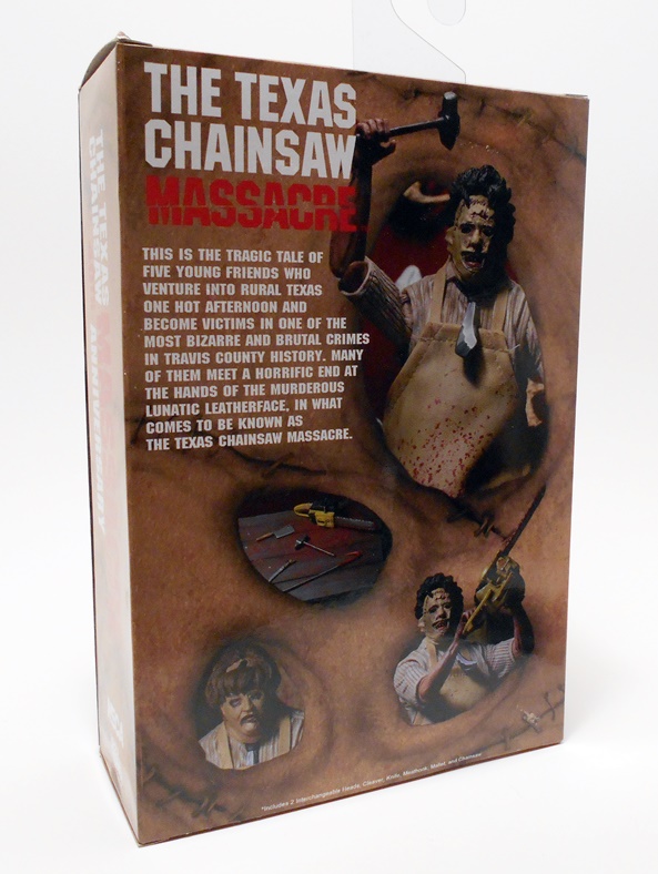
The packaging on this line has been fantastic and this release may even up the ante a little based solely on the box art. It comes in what appears to be an enclosed box, although the front is actually a velcro secured flap revealing a window and the figure within. Both side panels are lettered and that makes it perfect for sliding onto a bookshelf along with the other Ultimate releases, while the back and inside the front flap feature shots of the figure itself. The front flap has a great piece of promotional artwork from the movie poster, and what a freaking creepy ass movie it is.

40thlf3

Where do I even begin with this movie? I started as quite the horror hound early in life, gorging on Friday the 13ths and Nightmares on Elm Street, but the Texas Chainsaw movies always pressed the line of fun horror and ventured into damn disturbing territory. It felt like a found footage movie before they became trendy and almost ruined the horror film genre, and I mean that in every complimentary way. It’s hard to believe it’s been 40 years since this flick first haunted theater goers. Yes, in the current climate of torture porn, it’s rather tame by today’s standards, as a lot of the gore is implied, and yet it’s still one of the most powerful horror films I can remember. I still consider the scene where Leatherface bursts out of the house and grabs Pam to be one of the most effective horror scenes of all time. And while Jason and Freddy have both taken on a familiar and comfy identity for me, Leatherface has still remained a seriously scary muthaf’cker. Let’s bust this demented sicko out and have a look!

40thlf4

40thlf5

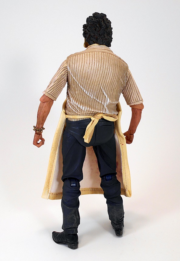
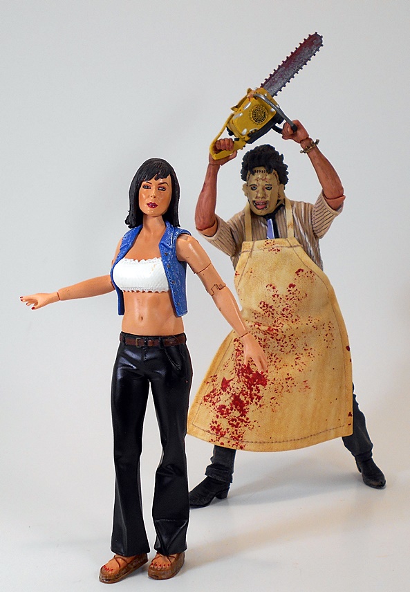
Yeah… Wow! First thing’s first, yes he is wearing a soft goods apron and that just kicks all kinds of ass. It’s made of some kind of very pliable leather-like material. It’s beautifully stitched and ties around his waist in a neat bow. It’s also splattered with blood, which looks wonderfully surreal against it’s light khaki color. The rest of the figure features a great sculpt of his dirty striped shirt, loose necktie, blue trousers and cowboy boots. The dangling bracelet on his right wrist rounds out the package nicely. Fantastic!

40thlf6

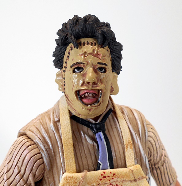
And there’s a face only a mother could love. The haphazard skin mask looks deliciously grotesque and with the exposed areas of the face appropriately sunken to make it look like he’s really wearing a mask, even though it’s all part of the same head sculpt. The paint here is excellent, particularly on his gnarly teeth and lips.

40thlf7

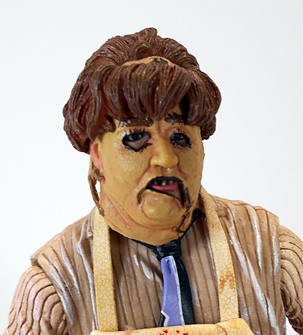
You also get the alternate old lady portrait, which is a very nice bonus and every bit as wonderfully executed as the regular stock head. Alas, this look just isn’t iconic enough for me to warrant displaying it, but I still really appreciate the craftsmanship that went into it and the fact that NECA bundled it with the figure, especially at this price point.

40thlf11

The articulation here is really solid. The arms feature rotating hinges in the shoulders, elbows, and wrists. The legs are ball jointed at the hips and he has rotating hinges in the knees. The ankles appear to also have rotating hinges, although there isn’t a whole lot of movement there other than in the lateral rockers. He has a ball joint in the waist and another in the neck. Not bad!

40thlf8

40thlf10

40thlf9

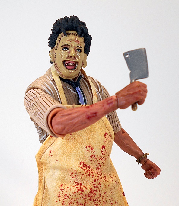
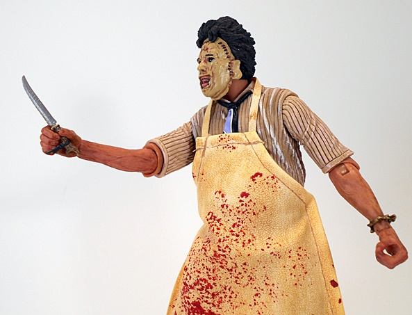
You want accessories? Leatherface comes with a wide variety of butchering implements. You get a meat clever, a skinning knife, a meat hook, and a hammer for breaking up them pesky bones, or just bonking dinner on the head when it’s trying to run out the front door. All these items are well done, but I think the little skinning knife is my favorite because of the attention to detail on the antler handle, despite it being such a tiny piece. Very nice! Oh, wait… Did I forget something?

40thlf14

40thlf12

Oh yeah, it’s the Texas Chainsaw Massacre and it wouldn’t be Leatherface without his trusty saw. I have to be honest, there are few things more terrifying to me than getting attacked with a chainsaw. I don’t even like being around them. NECA’s tribute to this horrific tool is a lovely piece of work, right down to the tiniest detail and the blood-splattered blade. And thanks to the hand grips and the figure’s articulation, he can hold it in any number of fantastic poses… not least of which is over the head for the Chainsaw Dance! I love it!

40thlf13

40thlf1

40thlf17

In fact, it would perhaps be more accurate to say that I love everything about this figure. After coming off of the sheer masterpiece that was their Ultimate T-800, Leatherface here just goes to show that care and craftsmanship is the order of the day for this line. And at the ridiculously low price of $22, NECA is not only producing a top notch collector grade product, but they’re offering some of the best value in the action figure market. The 40th Anniversary of a film franchise is no small potatoes and it’s nice to see that Leatherface was given his due. This is every bit a figure that is worthy of celebrating those four decades of horror tradition and it really makes me think they should have gone with the name Masterpiece over Ultimate to accurately describe this line. Jason Vorhees is the next horror icon to get the Ultimate treatment, and man, I can’t wait.

Femme Fatales “DC Animated Series:” Supergirl by Diamond Select

I’ve mostly been spending my DC Fridays looking at DC Collectibles’ figures, but anything DC is fair game and today I’m looking at the very first Bruce Timm inspired statue from Diamond’s Femme Fatales line. I’ve been a casual fan of the FF line for a little while now and I was thrilled when I heard that DST struck a deal to bring Animated versions of the DC ladies on board with the Timm art style. It seemed like a perfect match and they kicked it off with Supergirl. Rather good timing, too, as the Supergirl TV Series just premiered this week. It was my second time watching it and I enjoyed it quite a lot.

ffsupg1

ffsupg2

The statue comes in a window box, which has been standard for the line. You get additional windows on the sides and top to let in plenty of light and showcase the statue. The biggest departure here is found in the deco. Rather than using the same black box with red trim, they went for a bright yellow and orange which fits the comic book theme a lot better. The familiar Femme Fatales logo is still in the top right corner and the bottom features the logo for Superman: The Animated Series. The box is totally collector friendly and Supergirl comes fully assembled and ready for display.

ffsupg3

The first thing I noticed taking Supergirl out of the box is that she’s fairly larger and heftier than any of my previous Femme Fatales. She only slightly taller than my Anne Bonny statue and keep in mind that Kara is reclining a bit in mid flight and not standing straight. The scale change may annoy avid collectors of this line, but considering it’s a new sub-line and the animated style doesn’t really fit with previous releases, I’m perfectly fine with it so long as it remains uniform with all the upcoming DC ladies.

ffsupg4

ffsupg5

With size out of the way, I’ve got to say that I’m really impressed with the way this piece came out. The sculpt does a wonderful job capturing the animated look of the character and the proportions are great and the portrait is absolutely adorable. The pose has her hovering in mid flight, which would be absolutely perfect if it didn’t get a little confusing when placed in context with the base, but I’ll get back to that in a bit.

ffsupg6

ffsupg7

As for the outfit, Kara sports her white cut-off top, blue skirt, red boots, and short cape. The S-Shield on her top is sculpted on as well as painted, which is nice because the animated style of this piece doesn’t call for a lot of intricately sculpted details, and that’s where the paint becomes so critically important.

ffsupg8

ffsupg9

Happily the quality of paint holds up very well. The statue makes use of bright, vibrant colors to emphasize the look of the animated series. Everything looks very clean, and while I was afraid of visible brush strokes on the white top or yellow hair, there are none to be found. the eyes are straight and the lips and eye brows are tidy. There’s a stray stroke here and there along some of the lines, but overall what’s here is solid work.

ffsupg12

If there’s a fly in the ointment here, I’d say it’s the base, which is an odd bit of work. It’s obviously meant to look like the landscape far below, but having the sculpted mountain top and just a blue patch of paint on the otherwise featureless oval base isn’t terribly convincing. She could have also used some height over it, say maybe an inch of clear rod propping her up, because it still kind of looks like she’s standing on it and not hovering far above it. In no way does this ruin what is an otherwise beautiful piece, but I defintely would have preferred just a blank disc for a base.

ffsupg11

ffsupg13

ffsupg14

Supergirl falls right in line with the $40 price point on all the Femme Fatale releases. In the past I’ve been able to get some really good deals on these pieces, particuarly the non-licensed ones, but I’ve dropped pre-orders on all the DC Animated releases, so in this case I paid full price. I’m far more interested in supporting this line rather than shopping around for deals. And I’m even more pumped for these statues now that I have this inaugural release in hand. Poison Ivy is the next release in the series, but before I get to her, I’ll be checking out the SDCC version of the Supergirl statue next Friday.

Transformers Cybertron: Brakedown and Brakedown GTS by Hasbro

It’s time again where I’m between new releases and therefore must dip into the Bottomless Totes of Convertobots to come up with something to talk about on Transformers Thursdays. This serves a double purpose as I’m really looking to downsize my TF collection, so looking at some of these figures again helps me to decide whether to keep them, ship them off to my nephew, or try to get a couple bucks for them on Ebay. Today I dropped my hand into that copious pit of plastic and pulled out a baggie containing these two little Scout Class figures from the 2005 Cybertron series. Let’s start with Brakedown, and then check out his repainted form as Brakedown GTS!

tfcybd1

tfcybd2

Brakedown’s alt mode is a bitchin’ Cybertronian racer and it beautifully reflects some of the wonderful and imaginative alt modes that came out of a line where the designers weren’t constrained to just Earth vehicles. This thing is absolutely packed with detail and the brown and gold deco mixed with the translucent yellow pieces looks so good, it’s kind of a shame they went with just a light gray plastic for the rest of the trim. The big translucent yellow wheels gives me a warm and fuzzy Tron vibe too, which is always a good thing. What’s also cool about this car is the fact that when I first got it, I had no idea how it was going to transform, something that was not too common for the smaller Scout Class toys.

tfcybd3

tfcybd6

Of course, part of the mystery of Brakedown’s transformation comes from the removal of a size-able piece to form his gun. Some may cry foul at parts-forming, but the idea of taking out what could be the car’s engine to form a gun makes for a nice Targetmaster/Powermaster mash up to me.

tfcybd8

tfcybd9

Brakedown’s robot mode is all in all quite good with just a few blemishes to get in the way of greatness. I’m not a fan of the way the car’s front frame extends up over his back and he’s got tiny little forearms. Neither of these are dealbreakers for me, but that backpack does make him a bit back heavy and the ankle hinges on my figure have become a bit loose with age and those two things do not make for a happy combination. The head sculpt on this guy is pretty cool. I like the design of his “helmet” and those eyes feature some truly great light piping.

tfcybd7

tfcybd10

tfcybd11

The gun can be held in either hand and it can be activated with the use of a CyberKey, which just flips out the bayonet. Not one of the more spectacular or dynamic CyberKey conversions, but neat nonetheless.

tfcybd4

tfcybd12

tfcybd13

The repaint, Brakedown GTS, uses the same gray plastic parts, but updates the brown and gold to an aqua blue with red and yellow accents. Also, the yellow translucent plastic is replaced with regular black. In robot mode, you also get some sharp gold paint apps on the legs and arms and the “helmet” is painted silver. On the downside there’s no light piping in the eyes, just some tiny red painted peepers. The ankles on my GTS version are even looser than on the regular release, making this one a real challenge to stand up without his gun in hand to counterbalance his weight.

tfcybd5

tfcybd14

It’s hard to believe these figures are ten years old already. Where has the time gone? Looking back, I’ve found Cybertron to be a rather hit and miss line with me, but this pair definitely falls into the hit column. I love their alt modes and while the robots could have used a few simple tweaks, I still dig them a lot. My only other gripe here would have been to change them up as different characters, as I’m not a fan of having a repaint of the same character. Indeed, if I had my choice, I would have made regular Brakedown a Decepticon and kept the GTS version as an Autobot.

Star Wars “The Force Awakens:” (Space Mission) Poe Dameron and TIE Fighter Pilot by Hasbro

I’ll confess that last week’s trailer for Force Awakens has done its job and whipped me into some serious anticipation. It’s also motivated me to take my last look at the initial assortment of Force Awakens 3 3/4″ figures. So far, I’ve looked at two figures from each of the Desert, Jungle, and Snow Mission series and that just leaves the Space Mission Poe and TIE Fighter Pilot, so let’s blow this thing and go home.

tfaspace1

I’m still quite in love with this packaging. The cards look amazing and it’s so nice to see individualized character art on each one and not just a small headshot on a bubble insert. Alas, they are not collector friendly, which leads me to the admission that I really wish I hadn’t opened any of these. I know, at about eight bucks a pop, it wouldn’t break my bank to get doubles, but I’m not about to get involved in all that. Anyway, let’s start with Poe.

tfaspace2

tfaspace3

As this is the Space Mission Series, Poe comes in his X-Wing pilot gear, which pays homage to the OT flight suits, but still manages to be rather distinctive. The sculpt on the suit is pretty wonky and while there are some nice details, like the texturing and all the rumples, there’s something off about this figure to me. It kind of looks like it’s a poor custom job made from another figure using sculpey. The paint, especially around the white vest, is also rough. But hey, he does come with a little functional holster for his tiny pistol. I guess that’s something.

tfaspace4

And yet my biggest criticism here is the permanent helmet on the head. Hasbro has been doing removable helmets on their pilot figures for a while now, so this strikes me as a particularly cheap way to get collectors to buy the X-Wing, which includes a Poe figure sans helmet. It’s also worth noting that the head on my Poe is crazy loose. Top it off with the fact that it isn’t a paritcularly good head sculpt, what with the super thick visor.

tfaspace5

Poe’s Build-A-Weapon piece can peg into his back to form a kind of VTOL jetpack sort of thing. It’s kind of dopey, but still infinitely better than Finn’s shoulder-mounted machine guns. In case you can’t tell, this figure is not impressing me. Let’s try the TIE Fighter Pilot…

tfaspace6

tfaspace7

Now, this guy should have been a slam dunk, seeing as how all the 3 3/4″ Stormtroopers have been quite good, but here’s another one that I think Hasbro stumbled on. The body is fair enough with some decent detail and some minimal paint apps on his chest boxes and insignia on his shoulders, but the helmet sculpt is so soft, I can barely make out any of the details. Maybe it’s just the fact that it’s black on black on black, but I really have to get the light to shine on that head just right to pick out what’s going on there. He comes with a little pistol, but no holster to put it in.

tfaspace8

tfaspace9

The TIE Fighter Pilot’s Build-A-Weapon piece is a chair. I shit you not. It’s a chair. Getting the piece that comes with the Resistance Trooper will allow you to build a sort of gun turret kind of thing.

tfaspace10

tfaspace11

This Space Mission Series is easily the most disappointing assortment in the wave and really drives home why I wish I had kept these carded. On the cards, these figures were enhanced by some great packaging, loose they’re mediocre at best. Neither figure is all that remarkable and if you’re not already sold on this line, I doubt this pair will do it. At some point, I’m going to swing back and check out the Resistance Trooper from this assortment and Constable Zuvio, but I don’t have either figure yet and with the sour taste these two have left, I’m not in a big rush to pick them up.

Masters of the Universe Classics: Ceratus by Mattel

Club 200X is entering it’s final stretch, as today I’m looking at the first of the last three figures in this Mini-Sub. It’s been a great ride so far and I can honestly say that every figure has been a winner, even though I have no memory of almost any of these characters. Today is Ceratus, let’s see what he’s all about…

cerat1

Ceratus comes in the now intimately familiar Greyskull-style package, which we’ve probably seen 100 times by now. His tagline calls him the “Heroic Leader of Sub-Ternia” and his bio identifies his people as the Caligars. I dig the idea of getting more of these creatures as good guys. And yeah, I know, I’ve been saying all along that I’m going to use this Sub as an excuse to bust out my MYP Masters DVDs, and I still haven’t found time to do that. I suck. Maybe I’ll try to get it done before the final figure is released. Anyway, Ceratus comes with his tail detached, so you have to just plug it into his back piece when you get him out of the tray.

cerat2

Ceratus is something of a lizard-dude, but I think he’s got a lot more of an Orc or Goblin vibe going on with the head. It’s an interesting design and while it borrows heavily from Whiplash, nearly everything that’s reused has been re-sculpted. The craggy, scaled shoulders, for example, have hooked horns added, and while that’s probably the same torso buried under there, the chest piece is brand new and sports some fantastic sculpted detail. Ceratus dons a rather skimpy outfit that favors showing off a lot of well-toned lizard physique. What little he is wearing consists of a blue belt with matching wrist bracers and leather-like flaps that hang down from the belt, sort of like a skirt. The texturing on these pieces is well done and each one features a painted bronze button.

cerat4

cerat9

The familiar tail is also re-purposed from Whiplash, but again features some significant changes. Ceratus’ tail ends in a spiked ball, which matches the horned spikes that can be found on his arms and legs. The top piece of the tail that forms his back is also completely reworked, giving him a spiny ridge running down the middle. This is exactly the kind of parts recycling that I can appreciate, especially in a line that’s winding down. Mattel could have probably gotten away with a lot less, but they went that extra mile to give this character a lot of love.

cerat3

Speaking of love, the head sculpt here is outstanding. Not only does Ceratus sport a lot of personality in that mug of his, but check it out, he’s got real earrings. I’m pretty sure this is an action figure first for me. He’s also got a gold nose ring, but that’s part of the sculpt. The paint here is overall quite good with applications for his exposed teeth and his beady little yellow eyes.

cerat5

While articulation here is technically the same as any other MOTUC male buck, I find Ceratus’ poseability to be a bit more inhibited than usual, particularly in the hips. I’m not sure if it’s the skirt or something with the sculpt up there, but I can’t really get a lot of movement out of his legs. The rest of the points are all there and he has the additional point that allows his tail to rotate side to side.

cerat7

Ceratus comes with a single accessory, which is a very tribal looking bone mace. I’m assuming this is a weapon and not just some kind of ceremonial staff. Either way it looks like it would do a lot of damage if you hit someone with it. I dig this piece a lot as it’s obviously supposed to be made out of bone, but it’s got a rather alien look to it, reinforcing that it was crafted from the bones of some unknown Eternian animal. Very cool!

cerat6

cerat8

And so, Ceratus is yet another release that makes me very happy that I went for the 200X Sub. This guy is loaded with personality and features a great sculpt, sensible reuse of parts and a great paint job. These figures have been great additions to my Masteres shelves with each one packed with personality and featuring a healthy dose of new sculpting. Indeed, when put into the context of the regular Club Eternian releases like Buzzsaw Hordak, I’d say that this Mini Sub is where it’s all at right now.

Marvel Legends (Hobgoblin Wave): Spider-Man by Hasbro

Egads, it’s been a long trek through this wave of Marvel Legends, but here we are at the final boxed figure, and it is none other than old Web Head himself, Spider-Man. I was very happy Hasbro included him in this wave, because before now I didn’t have a plain old vanilla Spider-Man for my 6-inch shelf. I’ve got Raimi Spider-Man (a figure which has not aged well), Shitty Reboot Spider-Man (shitty reboot, but not a shitty figure), Superior Spider-Man, 2099 Spider-Man, but regular old comic book Spidey? Nope! So, here he is…

zaspidey1

It’s the same packaging we’ve been seeing here on Monday for weeks now and I’ve got nothing new to add, other than it contains some fun little extras, as well as the last piece I need to build my Hobbie figure.

zaspidey2

zaspidey3

We’ve got the same basic buck, with a few modifications, that we saw for Spidey 2099 and Superior Spider-Man with a brand new paint job. I don’t think there’s another Marvel costume that I like more than regular old Spider-Man, and it’s all in the colors. There’s just something about that red and blue mixed with the web pattern and the big white eyes that I find so aesthetically pleasing, and this figure drives it home.The shades of blue and red on this guy are just plain gorgeous. Sure, there are a few blemishes, like the unpainted pins in the inside of the arms, or the miffed web pattern on the lateral shoulder hinges, but overall, this is a great looking figure.

zaspidey11

zaspidey7

A familiar buck means familiar articulation! Spidey features rotating hinges in the shoulders on top of shoulder hinges. The rest of the arms feature double hinged elbows, rotating hinges in the wrists, and swivels in the biceps. The legs are ball jointed at the hips, double hinged at the knees, and have swivels in the thighs. The ankles are hinged and have lateral rockers. The torso swivels at the waist, has an ab crunch hinges, and the neck is both hinged and ball jointed. Not bad!

zaspidey4

zaspidey10

Accessories! It doesn’t always happen, but every once and a while Hasbro blows a kiss to one of these Legends releases and bestows upon it a passel of extras and that’s what works here to take a very good figure and make it just that much better. Spidey comes with a total of three pairs of hands: Fists, web thwip hands, and open hands. By now, you all know I’m not all that big on changing out hands, but Spidey is one of those few characters where I think it really is a must.

zaspidey9

You also get the goods that makes figure affectionately referred to as “Pizza Spidey.” That would be a slice of delicious pizza and a head with the mouth exposes so he can enjoy that delicious pizza. What’s cool here is the pizza is actually flavored plastic, so if you lick it it tastes like pepperoni. Go on try it! Haha, I got you to lick plastic for no reason. Sorry, I shouldn’t have done that. I hope I haven’t completely lost your trust.

zaspidey6

zaspidey12

zaspidey13

Considering how many versions of Spider-Man have been released in the Legends line since it’s return, it’s nice to finally get a standard version of the webslinger for my shelf. A few minor paint issues aside, this is a great figure and my 6-inch Spidey-Verse is just about at that critical mass where it’s going to need its own shelf. And that’s impressive, considering I still haven’t finished off the Amazing Spider-Man 2 Green Goblin BAF Wave. And speaking of BAFs, next Monday I’ll finally put this wave to bed with a look at the Build-A-Figure Hobgoblin!


New Gods: “New 52” Orion by DC Collectibles

If it’s Friday, it must be DC. At least around these here parts. Today, I’m opening another figure in the massive stack of DC Collectibles releases that is currently residing in the corner of my Man Cave. Most retailers are having fire sales on these figures, probably in preparation for the upcoming Icons line. Those figures look great, but they’re also in a different scale. Am I prepared to go through all this again from scratch? Not sure yet. It was one thing buying DCC’s figures after Mattel’s DC Universe Classics packed it in because most of these are the “New 52” designs and Mattel only produced a handful of the Justice League (and a truly terrible Darkseid figure) in the new format. The Icons line looks like it’ll be more of a mix of old and new, and I’m likely going to just wind up cherry picking it. Anyway, on to today’s figure…

dccorion1

Here’s the packaging, and I find it odd that they went with the “New Gods” moniker at the top, rather than just “Wonder Woman” where he first appeared in the “New 52.” I should note that I’m a crazy big fan of the New Gods as it was that whole aspect of the Mister Miracle comics that got me into reading DC way back when I was a wee lad. It was that comic that introduced me to Darkseid and Big Barda and Orion and all that jazz. On the other hand, while Wonder Woman has been my favorite book in the “New 52” I am not a huge fan of how they handled Orion in it. But that’s a whole different story…

dccorion2

dccorion3

While I take issue with his characterization, I’ve got no quibbles with his current look. It certainly pays homage to his old costume, while keeping in line with the younger, fresher new direction. It’s a relatively simple costume and kind of reminds me of a futuristic motorcycle outfit, which more or less fits his mode of transportation. The red tunic has a nice texture to it along with some black piping and globular shoulder guards. The figure uses matte black for his pants and a high gloss for his boots. Again, very simple, but a pretty neat design, nonetheless.

dccorion4

The head sculpt includes his helmet with the visor. It’s a little more downplayed than his classic look, but again, I dig it well enough. My figure has some nicks on the visor, which I’m going to write off as scars from debris while flying through a Boom Tube.

dccorion5

The visor is hinged and can lift up to reveal his entire face, which is certainly a nice option to have. He’s an angry looking sod, but then they don’t call him “The Dog of War” for nothing. All in all, this portrait is a pretty good effort. I especially like the flared nostrils and the partially open mouth.

dccorion6

Articulation here is quite good. at least by DCC’s standards. The arms are ball jointed at the shoulders, hinged at the elbows, and have swivels at the biceps and wrists. The legs feature a T-crotch at the hips, hinges at the knees, and there are swivels at the thighs and boots. Orion can swivel at the waist and his neck is ball jointed. Unfortunately, my figure does have two stuck swivels, one in his left bicep, and one in his right thigh. I’m sure I’ll be able to work these out with a little hot water.

dccorion7

Speaking of Boom Tubes, Orion comes with his trusty Astro-Harness and it’s a nice piece of kit. The new design is a lot sleeker than his classic ride and DCC did a nice job rendering it in this scale. The yellow paint pops beautifully with the silver and the little dash of “Kirby Krackle” in the center is a nice touch. This super sleek and streamlined version is a big departure from the almost ancient looking design of the classic Harness, but I still dig it a lot. I was afraid it was going to be super fragile, but it holds up quite well.

dccorion10

dccorion8

Orion is secured to the Harness via pegs on the pedals and his arms can grip the handlebars. He looks damn good riding it. It does help to have some kind of flight stand to really make it work, but I’m not complaining. I mean, let’s face it, DC Collectibles doesn’t tend to offer a lot of accessories with their figures, so it’s nice to know that when they have to, they go all out.

dccorion9

dccorion11

At the original MSRP of about $20, the addition of the Astro-Harness really fills out the price point nicely, making this figure a decent value. Of course, with these figures deep discounted now, I picked him up for $11 and that feels like a steal. Sure, he comes off as a kind of bumbling over-sexed oaf in the pages of Wonder Woman, but I’ve always liked the character, and I’m glad to have his new incarnation in action figure form.

Transformers Generations: Brainstorm by Hasbro

A couple of weeks back, I ducked into a Ross for the first time in ages to see what toys they had kicking around. They’re usually good for cheap Transformers every now and then and while they appeared to be picked pretty clean, I did manage to grab some Hero Mashers as well as Brainstorm, one of the few Generations figures I failed to pick up when he was out at the regular stores, mainly because I was quite satisfied with my Fansproject Smart Robin. But for ten bucks? Pfft, why not?

tfgbrain1

While the Combiner Wars packaging has grown on me, this Generation stuff was where it was at. Nostalgic G1 grid pattern? Check! Awesome character art? You got it. I love this deco so much. Brainstorm is packaged in his robot mode, but as usual, let’s start with his alt mode…

tfgbrain3

tfgbrain4

Brainstorm is a single seater starfighter, and it’s a passable design from certain angles. From the front, he’s kind of sleek with a nice set of twin blasters mounted on the nose, some stylishly angled wings, and a flip up canopy for his little robot pilot.

tfgbrain5

tfgbrain2

Unfortunately, as a whole package, this alt mode isn’t very good. I usually like to try changing my Transformers for the first time without the instructions, and I’m usually successful at it. Here, I was convinced I was doing something wrong and that was because the box doesn’t show the alt mode from the back. Once I looked at the instructions, I was able to see that I wasn’t doing anything wrong. It really is supposed to look like that. It looks unfinished, like it’s missing the top back of the ship. There’s no clever engineering or complexity here, it’s just the legs and arms folded back and that’s exactly what it looks like. You could argue that the original G1 toy transformed more or less the same, and I would agree. But then I think the original toy had an all around more solid looking alt mode.

tfgbrain6

Brainstorm’s little pilot, let’s just call him Arcana has a similar problem to his partner’s alt mode. He looks good from the front, but turn him a little bit and you realize he’s just an upside down head on legs. I’d also argue here that the original Arcana toy looked better than this in robot mode. That’s not just nostalgia talking. I’m looking at a picture of him right now.

tfgbrain7

tfgbrain8

tfgbrain9

In robot mode, it’s easy to see that the designers were working from this mode and going backwards. It shows because that iffy alt mode was sacrificed to deliver this damn great looking robot. Oh, I’m not terribly fond of the way the ungainly shoulder wings jut off to the sides, but they can be angled back or swept back all the way to fix that. The cockpit in the chest and the great proportions make for a beautifully bad-ass design. The coloring is pretty much the same in either mode with a pleasing mix of light blue, white, and gray plastics. The deco is rounded out with a little silver and red paint for trim and yellow and orange paint on the face.

tfgbrain14

Plugging Arcana into the neck causes the cockpit seat to flip down to display his stats just like in the old days. And yes, this noggin fixes the only complaint I had about my Fansproject Smart Robin. Mouth plate!

tfgbrain12

tfgbrain13

Brainstorm’s twin nose cannons are best detached during transformation and they can be wielded as dual handguns or, much like Smart Robin, they can be stored on his back, which is pretty cool.

tfgbrain10

tfgbrain11

tfgbrain15

tfgbrain16

Despite a lot of bitching, I wouldn’t say I was disappointed with this figure. The alt mode definitely shows a lot less thought than I’m used to seeing Hasbro put into their changebots, especially for a Voyager Class figure, but with a robot mode this good looking, it’s hard for me to do anything but love this guy. I’m still going to look to Smart Robin as an all around better designed figure, but Brainstorm sure looks nice standing alongside some of the other Voyager Class Generations Autobots on my shelf.

Marvel Comics: Wasp Bishoujo Statue by Kotobukiya

Kotobukiya continues to have their sites set on my wallet as they released no less than four Bishoujo statues in the last month or so. Marvel, DC, Tekken, Street Fighter, all the franchises have been represented and I’m dying over here. So far, I’ve picked up today’s statue and Zatanna, which I’ll look at next week, and I’ll likely be picking up Sakura and Anna Williams in the next couple of weeks. But for now, let’s check out the lovely Ms. Van Dyne…

kotwasp1

As usual, Koto’s comic based Bishoujos come in a white window box, decked out with the wonderful artwork of Shunya Yamashita, which inspired this piece. You get a great look at the statue inside the box and while the wings are detached, they are mounted in the tray to mimic how they will look on the statue when displayed. I’ll let you all in on a little secret. Janet was one of my first comic book crushes and I blame her for my lifelong attraction to chicks sporting a pixie cut. Wings have always been optional.

kotwasp2

The back of the package features some shots of the statue along with a little blurb about the character and the Bishoujo line itself. Everything is collector friendly, which is frustrating because it makes me save the packages and by now I have half a closet overflowing with my Bish Boxes. Also, Lady Deadpool from Deadpool Corps is coming soon. God dammit, Koto. You play rough. Wasp comes out of the package already attached to the base, so all you have to do is plug in those wings and she’s good to go.

kotwasp3

kotwasp4

kotwasp5

Oh yeah! Wasp is pretty adorable to begin with, so she was just made for this line and the design team obviously had a lot of fun with her. She’s sporting a playful, whimsical pose with one toe splashing down in a pool of water and the other foot kicking up behind her. Her arms are raised with palms out and fingers in a mischievous little flourish, her wings jut up behind her and she looks over her shoulder with an exuberant face that would light up the darkest dungeon of any secret AIM base.

kotwasp6

kotwasp7

kotwasp8

Janet is donning her modern costume, which is basically a skin-tight black bodysuit with the gold pattern cupping her breasts and running down to her nether regions. As far as costumes go, this one didn’t require a lot of detail, but I will say that I love how the pattern on the front of the costume is more than just slightly raised, When coupled with that sumptuous gold paint, which also appears on the insides of her gloves and the souls of her feet, this makes for a simple, yet quite striking piece. The paint is immaculate and contrasts beautifully with the slick, glossy black finish of the rest of the suit.

kotwasp17

The wings are also beautifully executed. They’re cast in a sturdy transparent plastic, which is nice because I had concerns about them being fragile. the top edges are neatly painted black along with the stems that come out from the suit. The wing membranes have a wonderful iridescent shimmer about them that catches the light to produce a myriad of colors.

kotwasp10

kotwasp11

The portrait is lovely and again reinforces how well the character works in the Bishoujo format. Her short hair is sculpted to look a bit tussled and I’m still noting the lack of Koto’s age-old trick of using transparent plastic near the edges. I always liked that, but Wasp’s hair is so short here that it didn’t really need it. Her big beautiful eyes are precisely painted as are her lips. Her mouth is open and you can even see a row of sculpted teeth in there. Lovely!

kotwasp12

Also, lovely. Damn, Mr. Pym, you were a lucky man while it lasted.

kotwasp13

I’ll confess that while it’s nicely executed, I find the base rather puzzling.  I’m not sure why they decided to go with water, other than maybe to provide a medium to show her in flight and just barely touching down. The sculpting on the splash, and the subsequent ripples, does add a bit of energy to the piece. It might have been cool to have gone with something that would have put her shrunken form in context. Ah, what am I saying? This is a gorgeous piece, and I shouldn’t be nitpicking it.

kotwasp15

kotwasp16

There are times when I think Koto has to work a little harder to make some characters fit the Bishoujo aesthetic, but The Wasp is one that is such a no-brainer that I’m surprised it took them this long to get around to her. I’ve been chomping at the bit to get this statue ever since the concept art was first revealed and in hand, she does not disappoint at all. I nabbed her via a pre-order for around $60, which is toward the higher end of what I usually pay to get my Bishoujo fix, but I feel like the value is still there. And with the way some of the few statues I’m missing are climbing in price on the secondary market, I’ve been less interested in hunting for bargains and more willing to drop pre-orders and not worrying about missing out. In the next week or so, I’ll swing back around and check out Zatanna, another lady that I’ve been desperately waiting to see make an appearance in this line.

Pop! Vinyls (Fallout): Male and Female Lone Wanderers by Funko

Yes, I am now officially part of the problem. I have shaken my head in disbelief over the truckloads of Pop! Vinyls that Funko releases on any given month. I have pondered how it was ever possible that these damn things have invaded every retail store from Target to Barnes & Noble. I have swore that never would one of these ridiculous pieces of tat ever soil my collection. And now I bought two of them. In my defense, they are Fallout Pop!s and up until a short while ago (before the Legacy Collection announcement), it didn’t look like we’d be getting any official Fallout action figures from anyone. I mean, I just bought a PS4 specifically so that I would be ready for Fallout 4’s release next month and considering that kind of commitment to the franchise, it should be no wonder that I dropped $20 on a couple more tokens of my affection to all things Fallout. Let’s check these stupid things out…

popwand1

If you’ve never seen Pop!s in their original packaging, you’re a liar. These are everywhere. I have seen pictures of people’s collection where an entire wall of their spare room was covered from floor to ceiling by boxed Pop!s. They come in colorful window boxes, that remind me of the kind of box a Christmas ornament would come in. The box decos seem pretty standard throughout the two billion different licenses that Funko makes Pop!s for, with the name of the license on top and the character name on the bottom. In this case, these “characters” are only known as The Lone Wanderer and I got one of each gender, because why not? I have played through nearly every Fallout game as a man and a woman, so I wasn’t about to commit to just one.

popwand2

I don’t pretend to understand the numbering system. These two figures are 47 and 48, which, by my reckoning of how many of these Funko turns out, seems to be missing about nine digits and a couple of commas. And yet they obviously haven’t made 48 Fallout Pop!s, so if anyone out there knows the madness behind the numbering, drop me a line. Let’s start with the dude.

popwand3

popwand4

Well, aren’t you just f’cking adorable. Big head and tiny body, that’s what these Pop!s are all about. True to form, this guy is missing a mouth and stares at me from behind two soul-less dots he calls eyes, but that’s all part of the charm, I guess. The head is pretty generic with it’s brown hair, but that’s kind of the whole point behind this nameless RPG avatar. The real effort goes into the body and in this case, Funko did a nice job on it. He dons the trademark blue jumpsuit with his vault number, 101, lettered in yellow on the back. He features some belts, straps, and a piece of shoulder armor that would do any Wasteland Walker proud. He’s also wearing his Pipboy and wielding a weapon in his right hand. I’m making it out to be the default Colt 10mm pistol. The paint is bright and colorful, but there’s an unfortunate black slash across the last digit of his vault number and that’s rather disappointing. On the other hand, I’m rather impressed that they painted all the tiny silver fixtures on his belt and pouches. Moving on to the lady…

popwand6

popwand7

This version of our hero, or heroine, has stylish blonde hair and some eye lashes added to her soulless peepers just so you know she’s a lady type. Her outfit is more or less the same, from the blue jumpsuit and down to the shoulder armor and 101 lettered on her back, only this time with immaculate paint all around. By way of body language, Ms Lone Wanderer has a lot more sass than her male counterpart, with one leg out and her weapon held up at the ready. Speaking of weapons, holy shit, she’s sporting the Railway Rifle from Fallout 3. I have to hand it to Funko, they did their research and sculpted the guns well enough to make them easily recognizable. They put a lot more care into these pieces of tat than I would have suspected before seeing them.

popwand8

These things are weird. And while I can respect the little touches that Funko put into this pair, at $10 a Pop! (see what I did there?), I’m not sure I see the broad appeal. But far be it from me to poke fun at anyone’s collecting habits. There are closets at my place that look like toy store stockrooms and I’m sure there’s stuff in there that would baffle plenty of people. So when I mock the Pop! Vinyl scene I’m doing it in jest, especially now that I own a couple. But now that I do, I’m not likely to be amassing hundreds and building an accent wall out of them, but I can easily see myself picking up some more of the Fallout releases, particularly the Power Armor and Vault Boy… and just maybe some of those Bioshock releases. So, yeah, the Pop!s will grace the pages of FFZ again at some point in the future.