Mythic Legions (Siege of Bjorngar): Bolthor The Tower by The Four Horsemen

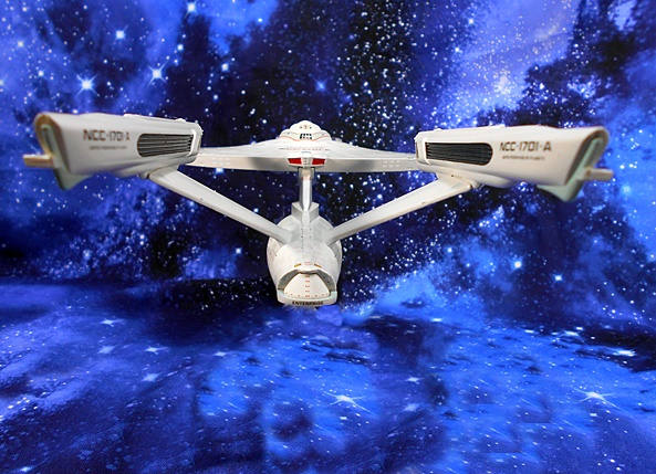
I couldn’t tell you exactly how long it’s been since my last Mythic Legions review, but I do know it’s been too long. That new wave (with the horsies!!!!) will be shipping before I know it, and I’m not getting any closer to being caught up. As memory serves I was still working my way through the Ogres introduced in the Siege of Bjorngar, so I’ll pick up where I left off by opening up the mighty Bolthor!

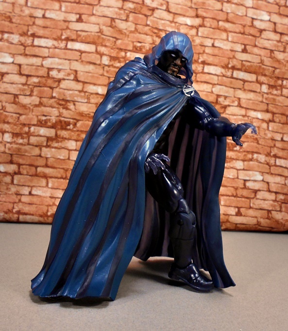
Yes, the Ogres were a brand new class of figure, somewhere between the regular-sized figures and the mammoth Trolls. They come in beautifully illustrated and collector friendly window boxes, which I probably won’t be keeping because I barely have space for all these figures let alone their packaging. And technically Bolthor isn’t really an Ogre, he’s a Giant! Well, actually he’s a Half-Giant! Wait, how are Half-Giant’s made? Do actual Giants (who are presumably much larger than Half-Giants) have sex with regular people? HOW THE HELL DOES THAT WORK??? Actually, I probably don’t want to know. From his little bio, Bolthor is said to be agreeable company as well as a powerful fighter, and he has aligned himself with the forces of none other than Attlus the Conqueror! Oh yeah, did I mention his nickname is The Tower?

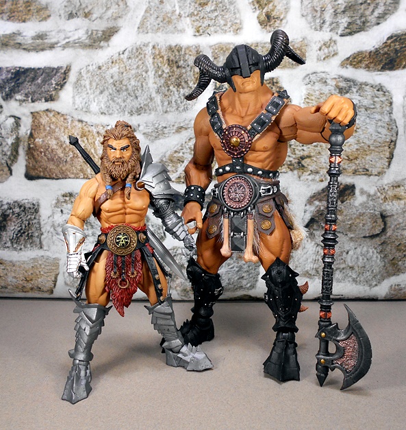
One of the key factors of Mythic Legions’ staggering success has been T4H’s ability to repaint and recombine parts into brand new figures, and Bolthor here is a perfect example of that, only heavy on the repainting and not so much the parts swapping. Both his body and outfit are directly borrowed from both the Ogre Legion Builder and Kkurzog. The only change-up is that he’s wearing the optional simpler wrist bands that came with the Legion Builder and the disc in his belt is the design of the Legion Builder as well, as opposed to the skull insignia worn by Kkurzog. But basically, if you have those two figures, than you’ve seen everything The Tower has to offer, at least from the neck down.

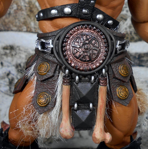
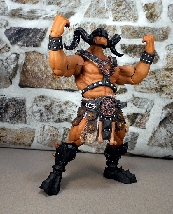
And so, I won’t go into too much detail with the sculpt, because I’ve covered it twice already, but I will say that it looks as amazing as ever with this new deco. The skin tone has been changed from Ogre green to a tanned human flesh, which still brings out all the muscles, sinew and veins that are in the sculpt. Bolthor’s outfit has a bit more of a bronze motif, and I’m still impressed by detail work in his harness. The plates on have individually sculpted and painted rivets, the straps have realistic leather texturing, and that elaborate belt remains a masterpiece. Each “leather” strap has a detailed bronze medallion, the bones look great, and the whole ensemble is worn above a furry barbarian diaper. Bolthor’s lower leg armor is colored the same as Kkurzog’s and still consists of the crude and jagged Orc-style armor with some kind of horns or teeth embedded in them. Unlike Kkurzog, who went barefoot, Bolthor has the heavy boots worn by the Ogre Legion Builder.

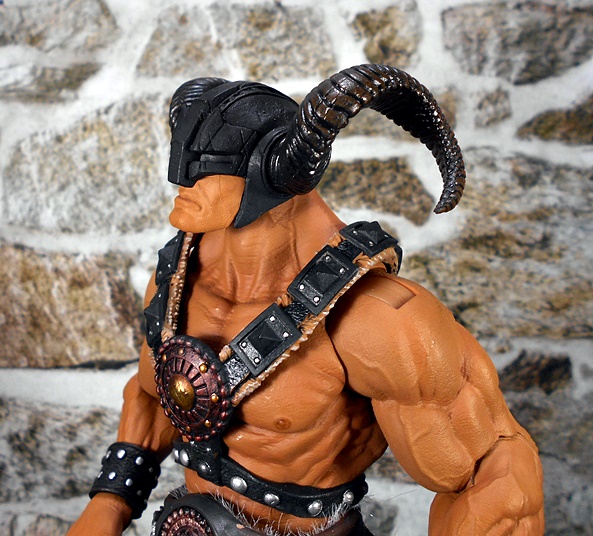
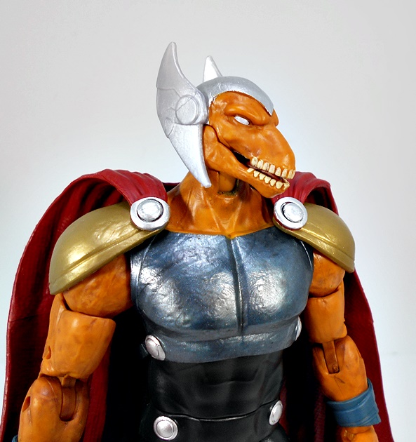
The head sculpt is brand new, with Bolthar wearing a helmet that only exposes the lower half of his face. His human-like visage has a pronounced chin and chiseled features. His down-turned mouth makes him look like he’s determined to hit something with a tree. The helmet is painted and textured to resemble iron, with plenty of pitting and cracks incorporated into the sculpt, and he has black ram horns protruding from each side.

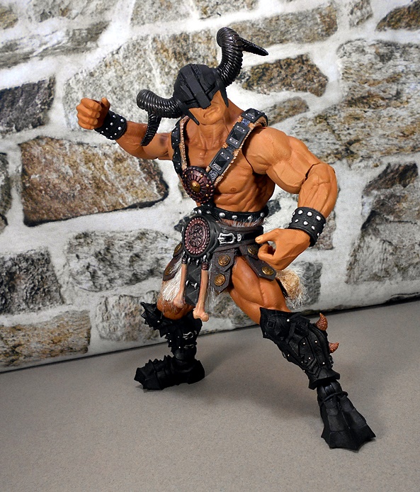
Unlike the big Trolls, which were roto-scoped, mostly hollow, and had more limited articulation, the Ogre body is built with the same articulation as the regular figures, in other words lots of rotating hinges. That makes these fellows highly poseable and pretty damn hefty too. T4H have been including warnings with these figures about the joints possibly being brittle and snapping unless they are carefully worked out. I haven’t really had any difficulties in that area with any of mine.

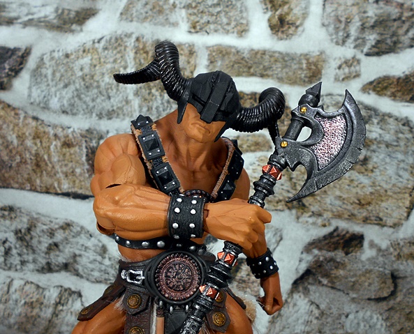
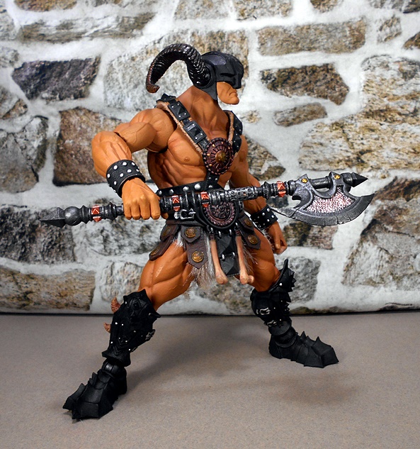
The weapon is a repaint of the poleaxe that came with Ogre Legion Builder, and here’s my only real gripe about this set. Seeing as how the three Ogres from Bjorngar recycled so many parts between them, it would have been cool to get unique weapons with each one. Plus, the shaft on the axe looks a little dainty for such a big guy. With that having been said, the axe is still a gorgeous sculpt with some nice copper paint accents. I also dig the ability to change up the pole and make it shorter or longer.


I’ve been impressed with this new class of figures ever since I opened the first, and that sentiment has yet to wear off. Bolthor is probably even a little more exciting because the two Ogres were a lot more similar to each other and Bolthar at least feels like something new. And it’s cool to add such a heavy hitter to Attlus the Conqueror’s Wasteland Army. And I’m still not quite done with these big guys. Not yet. Next time I revisit Mythic Legions, I’ll check out the last of these fellas with Argemedes, an Ogre sized Cyclops from the Wasteland assortment. And then maybe I can get back to opening some of the regular sized figures again!

Star Trek “Starships Collection:” USS Enterprise NCC-1701-A (XL) by Eaglemoss

It’s safe to say that I’m not a fan of what passes for Star Trek these days. For me the only good thing to come out of Discovery and Picard was that they reignited in me a desire to go back and watch the real stuff. Hell, even the worst of Voyager seems like a masterpiece now! I’ve also been building me a fleet of Eaglemoss ships and it’s long past time I open some of these up! And where else to start but with my favorite ship design in all of science fiction history… the singularly majestic Refit Enterprise!

My preference would have been to go with the original 1701, but I happened to find the 1701-A at a really good price and decided to compromise. This is the XL version, which makes it more than twice as big as Eaglemoss’ standard ships (in this case about 10 1/2-inches long), but it still features die-cast metal and plastic construction. It comes in a fully enclosed box with some pictures, including the fail of using a reversed image on the front, rendering the registry on the hull backwards. Ooops! Inside the box, The Enterprise is sandwiched between two styrofoam bricks, and the only assembly required is putting the stand together. Oh, and I’m shooting the ship without the stand for most of the review, for reasons I’ll get to at the end.

Oh what a beauty! I could pour myself a glass of Jameson and gaze lovingly at this ship for hours. When I call this my favorite ship design in sci-fi history, that’s not hyperbole. Them’s the facts. I just love to get lost in its iconic profile and the noble human drive for discovery that it represents. And boy is this a great model! The top half of the saucer is die-cast, giving this ship a hefty, albeit very front-heavy, feel. And if you’ve had some experience collecting Enterprise models, you may know one of the biggest fails tends to be the warp nacelles not aligning properly. Here, they are perfectly straight and parallel, giving the model a gorgeous three-quarter view.

The grills (thermal regulator system) laid into the nacelles looked black to me at first glance, which is how they are usually depicted on most models of this ship that I’ve owned. But much to my surprise, they’re actually cast in transparent blue plastic, which makes for a cool effect when held up to the light. The deflector dish is also cast in transparent blue plastic, which reflects light quite nicely. It doesn’t really resemble a glowing effect, but it does make it stand out. Meanwhile, the hull of the ship is a beautiful off-white, which is smooth and even throughout.

One of the things that really shows the model maker is committed to detail is the aztec pattern in the hull. Here it’s exquisitely executed and manages to be both easy to see and yet equally subtle. Additional paint applications are applied sparingly, but all the most notable points of interest are here. Particular stand outs include the bright yellow Antimatter Fill Port Hatch and the bright blue dual rows of observation windows. The dome on the impulse engine is painted blue, and they even printed the red outline for the cargo hatch under the shuttlebay. Other details include the gray paint on the emergency landing pads on the bottom of the saucer section, and the individual phaser turrets.

The sides of the secondary hull also include the delta emblems pointing toward the deflector dish, as well as the red racing stripes with some damn tiny printing between them. Here you can also see the two circular docking ports, circled by red rings in four segments. There are also some black painted windows scattered around the secondary hull.

The printed lettering on the saucer is sharp and crisp. Each character of both the registry and the name are outlined in red. A close up of the bridge module shows some more blue and red trim, some more tiny windows. The VIP lounge windows can be seen on the back of the bridge module, as well as the tiny bridge docking port. You also get more tiny printing along the edges of the saucer section.

That’s not to say this model is perfect. There are some details omitted, particularly around the edge of the saucer, and there is an unfortunate seam along the bottom of the secondary hull just below the observation windows. And yeah, now I’m really nitpicking. Because all in all, for a ship in this scale, I think they hit all the right points.

Finally, there’s the stand. I both love it and hate it! I love it because it is pretty rock solid and holds the model firmly. There’s no chance of this toppling over. Also, the bottom of the base is covered in swanky felt. On the downside, even though the stand is transparent, I don’t like how it ruins the profile. That’s why I didn’t use it for most of the pictures in this review. Also, sliding it on and off the saucer section makes me worry about scratches. That’s a problem because I constantly want to pick this thing up!

And for all the gushing I’ve done over this model, it had better be damn good, because it set me back $75. Was it worth it? Absolutely. I only need refer you back to what is sadly one of my most viewed reviews, where I trashed the Diamond Select Starship Legends Wrath of Khan Enterprise, and how disappointed I was with it. It was probably the single most disappointing purchase I’ve made in all my toy collecting years. I got into these XL Eaglemoss ships to finally replace that piece of junk and I’m so very glad I did. Sure, this Enterprise is smaller and has no electronics, but it’s beautifully made, extremely durable, and most importantly it looks so good on display. Maybe too good, because I’ve been keeping it on my computer desk for a few weeks now, and I constantly find myself picking it up and wooshing it around. For a non-articulated hunk of metal and plastic, this thing is still loads of fun to me.

Marvel Legends (Banner Hulk Wave): Beta Ray Bill by Hasbro

One of the great things about having such a deep backlog of Marvel Legends is when I dig my hand into my pile of shame, there’s no telling what will come out. Case in point, today we’re going back to the Banner Hulk Wave and opening up Beta Ray Bill. I knew Bill was in there somewhere, and I’ve been hoping to get him in a random pick for a while now!

This assortment remains one of only a few few Modern Legends waves that I didn’t hunt down too enthusiastically. I wasn’t all that excited about the Banner Hulk BAF and I wound up giving a lot of the parts to my nephew anyway, but I may borrow it someday to review here. Eh, probably not… I think I’ve got enough on my plate as it is! Anywho, I have to give Hasbro some major props for the branding on this package. The snappy logo used for Bill’s name could have easily convinced me that it’s a movie tie-in. Sadly, no such luck, but the future holds many possibilities. There’s not a lot that could get me to want to go see a Thor movie starring Natalie Portman, but slap Beta Ray Bill in it, and I’ll be there.

Behold! Beta Ray Bill out of the package and looking damn cool! I’ve always found his backstory to be a little wanting, but who needs a great backstory when you’re an epic space man-horse in Asgardian armor? Egads, I love comics! The armor in question is a lot simpler in design than what The God of Thunder is usually wearing, but it’s still easily recognizable as being cut from the same cloth. Or mythril. Or whatever Asgardians make armor out of. From below the chest down it’s just smooth and black and showing the details of Bill’s fine muscles. The chest armor is painted with a gun metal gray finish that has a bit of a hammered texture to it. You also get two sets of the silver discs, similar to the ones that appear on Thor’s armor. A set of burnished bronze shoulder armor and sculpted wrist wraps round out the ensemble nicely. Not to forget the cape, of course! From behind, Bill is basically just a wall of cape! But it’s a very nicely sculpted cape!

With a face any mother could love, the head sculpt was easily going to make or break this figure. Happily, Hasbro did not disappoint. His horse skull visage is so grim it’s adorable and they really nailed the way his pronounced brow frames those pupil-less eyes. His head is topped off with a silver Asgardian winged helmet and the best surprise is that he has a hinged jaw! The sculpted tongue was a nice touch as well. Superb!

Bill conforms to most of the usual points of articulation I’m used to seeing on my beefy horse-men. The legs are ball jointed at the hips, there are double-hinges in the knees, swivels in botht he thighs and the lower legs, and the ankles are hinged and have lateral rockers to keep his feet flat on those wide stances. The arms have rotating hinges in the shoulders and wrists, double-hinges in the elbows, and swivels in the biceps. The neck is both hinged and ball jointed, and I’ve already mentioned the hinge in the jaw. The biggest change up here is that he has a ball joint under the chest instead of the usual ab-crunch hinge.

Naturally, Bill comes with his trusty weapon, Stormbreaker, which makes me wonder what weapon he’ll have if he shows up in the MCU. Maybe he’ll just wind up with the Stormbreaker with the Groot handle. Either way, this mighty weapon is cast in gold plastic, has a ribbed grip, and a soft plastic lanyard coming out of the butt cap. Mine also has some ugly paint splotches on it. Boo!

Beta Ray Bill is one of those super fun characters who desperately needed an action figure. He’s also one of the stand-out figures for me from this assortment, and that’s saying something because there are some genuinely solid figures in this wave. So much so, that I may just work on wrapping up the remaining figures before moving on to more randomness.

The Rocketeer by Diamond Select

The folks at Diamond Select have been busy raiding old Disney movie licenses for action figure fodder. Not long ago I checked out their offerings from the 1979 sci-fi flop, The Black Hole, and I’ve yet to getting around to their Tron figures. Well, now I’m back to have a look at their figure from the 1991 film The Rocketeer! To my knowledge, I believe this figure was actually released as part of the same case assortment as the two Black Hole figures. At least I got them all in one assortment from an online retailer.

I’d say the packaging is overcompensating for the film’s poor Box Office take, but then Diamond uses this over-sized presentation for all their Select figures. It looks nice, but it’s not collector friendly and when I’m done opening these, it feels like there’s usually a lot more trash to throw out than toy to keep. And if you decide to keep it sealed, DST made the dubious decision to package him without his helmet on. More on that in a bit! Despite not garnering the reception Disney had hoped, The Rocketeer seems to have come into its own lately with fans rediscovering just what a fun and charming movie it is, and that’s cool because we’re seeing some of that expressed through the collectible market. Funko had a couple of tries with both a 3 3/4-inch ReAction figure and a 6-inch Legacy figure. The ReAction figure was OK, but I never bothered with the Legacy release. Let’s see how DST did!

As you can see from the packaged shot, he comes out of the package without the helmet on, but I’m starting with the helmeted head, because that’s the look that I was most excited about. To me, the design of Cliff Secord’s costume is so iconic that it practically transcends the comic and film it’s based on. The retro Flash Gordon look of leather tunic and Art Deco hood ornament helmet is such a thing of beauty. And I think DST did a pretty solid job recreating the costume here. The trousers flare at the thighs in military fashion and his high boots look fine even though there isn’t a lot of detail to them. The tunic has a glossy brown finish to give it a leathery look and the chest piece is surrounded by sculpted buttons. If I have one complaint here it’s mostly with the odd jointing that DST uses. So let’s touch on that before moving on.

The legs use rotating hinges in the knees and ankles, which is fine, but I’ll never understand why they go with these lateral hinges in the hips. They just look weird. I’m not sure if there’s any articulation in the torso, but mine doesn’t want to move and I’m not going to force the issue. So that means no waist swivel, ball joint, or ab crunch. That’s pretty disappointing. The arms feature rotating hinges in the shoulders, swivels in the biceps, and double-hinged elbows, which is fine, but the arms look a bit pinched and weird. Finally, the wrists and neck are pegged ball joints. You get a few sets of hands to swap out, including one pair without gloves. Some of the hand choices are odd. For example, there’s one that clearly looks like it’s meant to hold a gun.

With that out of the way, let’s get to the good stuff. The helmet looks great. The big bug-like eyes and the segmented mouth grill are painted in black, while the rest of the helmet is painted over with a weathered brass finish. Of course, the design looks best in profile to show off that lovely back-swept fin.

And he’s not called The Rocketeer for nothing! DST did a wonderful job recreating the rocket pack, in all it’s curvaceous and bulbous glory. It’s got grills and rivets, and I can even make out the fan under the circular grill in the middle. There are some exposed cables sculpted above the thruster modules, and yes they even sculpted and painted the piece of chewing gum used to plug the leak in the film. The silver finish has a nice metallic sheen to it and gives way to a more functional gray down below, while the tips of the two tanks are painted bronze to match the helmet. Sadly, the pack is not removable.

On a downside, the un-helmeted Secord head is kind of embarrassing, and I’m not even talking about the likeness. The sculpt is really soft, the expression is strangely derpy, and the paint is really amateur, giving it a mannequin-like appearance. When I first saw this head I was instantly reminded of the Vault Dweller figure that Funko did for their short lived Fallout line. And I can’t say enough about how much that isn’t a complement. This just looks wooden and not at all befitting of a $25 collector figure. On their worst day Hasbro is turning out much better portraits than this in either their Marvel or Star Wars figures.

In addition to the hands and the extra head, you also get a replacement chest flap where it’s partially unbuttoned and hanging off. It’s not a bad bonus, I guess but I’d rather that cost went into a better portrait. It’s also the most likely reason we didn’t get some articulation in the torso.

And the figure also comes with the blueprints for the rocket pack, which is beautifully printed on a stiff piece of thin cardboard. This is a pretty cool addition and it’s a lot more high quality than I expected it to be.

The figure also comes with some excellent effect parts. First, you get two thrust pieces that plug into the rocket pack’s thruster cones. They’re cast in semi-translucent plastic with a yellow-orange tint to them.

And saving the best for last, you get this blast off effect piece that doubles as a display stand. The sculpting here is excellent with all the swirls of the rocket thrust mingling with a chalky smoke at the bottom. It also does a great job of holding the figure.

If I had to recap this review in one sentence, I’d say that I like this figure, but I don’t love it. Now, while I confess that I do enjoy the movie, I was originally going to pass on this figure. The fact that it was bundled in with The Black Hole releases was what made me concede to just order the case. There’s some good stuff here, to be sure, but DST has been doing their Select line for a long time, they should be on top of their game by now, and some aspects of this figure just doesn’t reflect that. I think I wound up paying about $24 for this guy, and while you definitely get quite a bit in the package to add value, I’d rather some of that just went into fine-tuning the figure itself.

Transformers Siege: Smokescreen and Bluestreak by Hasbro

While I’ve already started dipping into the Earthrise reviews, I’ve still got unfinished business with Siege. As a result, I’ll continue to pepper some of those older releases in with the Earthrise figures now and again until I get fully caught up. Last week I did this with a look at Siege Ratchet and today I’m finishing off the Siege Datsuns (Well, Cybertronian Datsuns) with Smokescreen and Bluestreak.

Unlike Prowl, who was a regular release in Siege, these guys are a bit more confusing. Smokescreen was one of the Selects figures, which meant he came in an plain ugly box and I think he was exclusive to the Hasbro Pulse Shop. Bluestreak was released as part of the 35th Anniversary Collection, which seemed to be mostly repaints. but in only slightly altered packaging. This would piss me off to no end if I kept these in their boxes, but I don’t so I care not! Let’s start out with Bluestreak!

I already did a review on this mold when it was first released as Prowl and later Barricade, so I’ll stick to pointing out the differences, and in auto mode we’re just talking about the new paint jobs. I’m a little mixed on how Bluestreak came out. His deco consists primarily of bare gray plastic with some glossy black. It’s an interesting combination, but I’m just not all that crazy about how the finish on the gray looks so much more dull. Maybe Hasbro realized that, because they did give him some spiffy silver painted wheels. The red Autobot emblem on the hood toss in a splash of color, as does the red trim that can be seen through the transparent canopy. I don’t dislike the coloring here, I just feel like it could have been better with an all around glossy finish.

Smokescreen, on the other hand, well this is what I’m talking about. Sure, he has the advantage of a snappy red, white, and blue deco, but the finish looks great. In addition to the coloring, he also has some panels with Cybertronian writing, where the 38 appears on his traditional auto mode. I also really dig the black skeletal frame on the canopy and the way it emphasizes the sculpted detail inside. There’s no doubt about it, Smokescreen is the more attractive of the two, at least as far as I’m concerned.

Where Prowl just came with a gun to mount on the hood, these guys come with that gun plus two others, which can mount where the side mirrors would go. This combo makes for a particularly dangerous looking attack mode. Moving on to the robot modes!

I liked this mode well enough when it was Prowl and I like it just as much with these guys. With the bumper chest and the door wings, this is Autobot design at in its purist form. And I dig the deco here a lot more in robot mode. The duller gray plastic looks better on a robot than it does a car and the black with the addition of the red in the upper arms, upper legs, and abs makes for a quite striking combination. Yeah, this mold still looks a bit unfinished from the back, but all in all, I think the mold looks great in these colors.

The portrait looks to me to be the same as Prowl’s and that includes the “helmet” and those pronounced wings or horns or whatever you want to call them protruding from the central ridge. The silver paint looks great and the blue eyes are sharp and prominent despite the lack of light-piping. And unlike Prowl, Bluestreak has his twin shoulder guns, which we saw mounted on his auto mode. I think these look great and it bothered me a bit that they omitted them from Prowl. I guess in the end it serves to make the figures a little more distinctive from each other.

Smokescreen gets to keep all that beautiful blue and red paint from his auto mode, but the robot mode also adds a lot of black, which presents a pretty significant break from the colorful alt mode. I’m not saying I don’t like it, only that I find it interesting that Bluestreak got a bolder color statement going to robot and Smokescreen got muted. It still makes for a fantastic deco for the mold. Naturally, I would have liked it if Hasbro could have re-sculpted the hood and gave it that squared off apron, but this will still do just fine.

Smokescreen also gets an all new head sculpt, which suits him beautifully. The blue “helmet” is more rounded out and feels more integrated with his face. His brow wings are yellow and have an interesting cracked pattern sculpted into them. The silver used for his face is bright and lovely and he’s got some additional detail sculpted into the edges where his face meets the “helmet.” And as with Bluestreak, the twin guns we saw in his auto mode form his shoulder cannons.

When I reviewed Ratchet I’m pretty sure I commented about how I’m trying to get away from buying a lot of repaints with my Transformers. I easily passed on Soundblaster and I’ve yet to pick up the cell-shaded Optimus and Megatron (although those are still tempting), and I’m going to sit out all of the Netflix repaints that have popped up at Walmart. But when we’re talking about repaints that made up original characters? Well, those are always going to be fair game. The Datsuns were a cornerstone of my Transformers memories and Prowl was among my first Autobot figures when I was a kid. So yeah, I’m pretty much going to pick these guys up whenever Hasbro does them justice like this.

Miss Jones (Netflix Jessica Jones) Sixth-Scale Figure by Toys Works

I can hardly afford it because of my backlog, but I decided it was time to start mixing up Marvel Mondays with something other than Marvel Legends, and today I’m venturing into uncharted territory. Much like that illicit underground third-party Not-Transformers market (which is so underground you can buy them on just about any reputable online toy retailer) the Sixth-Scale action figure market also has its own copyright-bending thing going on. These rebel companies, seated in their secret hideouts deep in the East, turn out figures that are clearly based on popular franchises, with likenesses of famous actors. And it’s not all about raping other people’s copyrights for a quick buck. Nah, in a lot of cases, like today’s review, it’s about getting figures into the hands of collectors, that otherwise wouldn’t exist. Oh, and yeah… it’s also about raping other peoples’ copyrights for a quick buck. Hot Toys stepped up and gave us Netflix versions of The Punisher and Daredevil, but sadly they stopped there. And that brings us to Toys Works’ Miss Jones, a figure that steps up to fill a slot that Hot Toys failed to. Let’s take a look at Not-Jessica!

The box is suggestive of some tough times ahead. It’s totally utilitarian and in some ways rather humorous with it’s curious translations. The artwork is pretty faint, so much so that it’s hard to make out. The bottom of the front panel shows a cluttered desk and the back is a monochrome illustration of Miss Jones with her camera. The bulk of the box is a crossword puzzle of words, including gems like eye infidelity and woman lifestyle other odd throwaways include frustration, talking, and hat. All things that instantly come to mind when thinking about the Jessica Jones Netflix series! Only not at all. Not that I’m complaining, mind you, because once upon a time you’d be lucky to get a bootleg figure like this wrapped like a fish in old Chinese newspapers. Suffice it to say, the box here is totally serviceable and nothing more. The figure comes ready for display, so let’s check her out.

Jessica dons her trademark outfit, consisting of a pair of faded blue jeans, a tan T-shirt, black leather jacket, gray scarf, and black boots. The costume fits the figure very well and avoids that puffy look that we sometimes get with sixth-scale costumes when not done by Hot Toys or Sideshow (I’m looking at you, Big Chief!). Starting below the waist, the jeans feature immaculate white stitching, belt loops, and functional pockets! There are even tiny silver rivets on the back pockets. The boot feet, include sculpted laces up the sides, silver painted buckles, and even sculpted treads on the soles.

Above the waist, the shirt is snug enough to show off that she has an anatomically correct chest (more on that in a bit!), and it’s sleeveless like a tank-top, although It’s intended to be a full shirt. The leather jacket is nicely tailored with more of that tight stitching. The zipper is just painted on, and I’m fine with that. The lapels on the collar tend to jut out a bit, but not too bad. I may be tempted to pin these down at some point. The scarf is a loop of gray cloth and she also has a finger-less cloth glove on her left hand, which I discarded because it didn’t fit right. So all in all the outfit is solid enough, but it just lacks that extra filter of realism that the Sixth-Scale big dogs manages to achieve. It looks like well-made action figure clothes and not shrunken down real people clothes that we get from the experts.

The portrait is nothing special, but considering the source, I’m not totally hating it either. It’s obviously far from a dead ringer for Kristen Ritter, but there’s enough in there, at least from certain angles, that with the context of the outfit it manages to get by. It’s far from what I’m used to seeing in this scale, but much better than I would have expected from a third-party sculpt. Likewise, the paint is pretty good too. The eyes have a little of that spark of life and the eyebrows and lips are neatly painted and not overstated. The rooted hair falls naturally around the face, but it requires a lot of futzing to get it under control, and even then I’m not always successful. I’ll concede that I’m not doing this portrait any favors shooting under bright studio lights, but in hand and on the shelf, it looks a bit better.

The body isn’t a Phicen-style, at least not completely. The torso does feature the silicone-type skin, which means it does feel like real skin and it’s all sorts of squishy. The arms and legs, however, are hard plastic and feature what appear to be double-hinges in the knees and elbows, rotating hinges in the shoulders, and possibly ball joints or rotating hinges in the hips. With a costume like this, the figure doesn’t lose anything by going jointed rather than seamless. The body-type suits the character quite nicely and she scales pretty well next to my Hot Toys Daredevil. The wrists consist of the usual pegs and she has a total of three sets of hands to choose from.

Toy Works did not exactly weigh this figure down with a plethora of accessories. Indeed, she only comes with two: A satchel and a camera. The satchel is quite nice and features a canvas-like material and working straps. It fits over her shoulder and looks great on the figure.

The camera is just a hunk of sculpted plastic, but it looks good and features some printing on it to add detail to the sculpt. Her hands don’t seem to be made expressly for it, but they do work with it. One thing to note, the wrist pegs aren’t all that secure and sometimes they pop out when I’m trying to get her to hold stuff.

The biggest omission when it comes to accessories is booze. Fortunately, there are plenty of options online for Sixth-Scale liquor and beer bottles, so I was able to set her up with some libations. Just keep in mind that they aren’t included with the figure. A stand, however, is included and it’s the generic crotch-cradle type that Hot Toys used to use. There’s no branding on it at all.

With the Marvel Netflix Universe either done or in limbo, it didn’t seem likely that we were going to get a proper Jessica Jones from Hot Toys, so I was more than willing to take a chance with Toys Works’ version. On the one hand, I’m OK with what I got, but I don’t think I’ll be doing this again, unless I’m really desperate to put a particular neglected character on my shelf. The weakest thing here is easily the portrait, but it’s still fairly tolerable to me. Still, here’s a lesson as to why license approval is so important with those official figures. In the end, this one reminds me a lot of the early Sideshow stuff. At the time, those figures were amazing, but they haven’t aged well among the current competition. Miss Jones is almost there, but not quite.

Transformers Siege: Ratchet by Hasbro

With lots of Siege figures left for me to open, I’m trying to juggle these older reviews alongside the new Earthrise figures. Today I’m going back to one of my favorite characters from the G1 cartoon, Ratchet. It’s always a treat to get updates to Ratchet and Ironhide, because as a kid I was robbed of proper figures because their G1 toys were so damned weird. I was actually pleased with the CHUG versions when they came out, which just goes to show you how thirsty I was. I mean, Woof! Those haven’t aged well. Obviously Ratchet here is just a repaint/slight remold of Ironhide, which I reviewed a little while back, so some of this may feel like I’m covering old ground, but let’s take a look!

In kind of a dick move, Hasbro decided to make Ratchet a Walgreen’s Exclusive. Now, in fairness, he was pretty easy for me to find, so I probably shouldn’t complain, but I’m sure there are people out there who had problems because of the exclusivity. Bottom line, Hasbro… don’t be making important characters like my boy Ratchet an exclusive. Save that shit for Barricade. He was a cool figure, but not essential, IMHO. Anyway, despite being an exclusive, there’s no sticker or other indicator of that fact on the box. Naturally he comes packaged in robot mode, but let’s start out with his alt mode.

In vehicle mode, I expected Ratchet to be a straight-up repaint, but Hasbro actually did some reworking on his front bumper, as well as the area above and behind the tinted blue windshield, which is a welcome surprise. It’s not quite an ambulance light-bar, but it’s painted to resemble one. Maybe the Cybertronian equivalent, eh? The back panels are still kind of ugly and hollow, because they’re the bottoms of Ratchet’s feet, although if I try hard enough I can imagine that they’re supposed to be exhaust vents. Still, I’d rather it looked like he could open up to carry wounded Autobots. As for the rest of the vehicle, the white plastic looks good with the painted red panels, and the wheels are slightly more gray than white, which mixes things up a bit. The silver paint on the bumper head headlights looks good, as does the crisp Autobot insignia just under the windshield. You also get some brushed weathering near the back. It’s not an entirely different vehicle than Ironhide, but the subtle changes and the new paint job certainly sets it apart.

Hasbro also set Ratchet up with some new accessories, which can be used on Ratchet’s auto mode. He’s got a wrench-claw on an articulated arm, and a smaller gun, which can be part of the claw or mounted separately as a weapon. I dig both of these a lot, as it allows Ratchet to effect repairs while in his alt mode and laying down covering fire at the same time. I suppose the claw could also be used to grab hold of Autobots and drag them off the battlefield to safety.

As mostly a repaint, Ratchet transforms exactly the same as Ironhide. There is one nice surprise, however! The side panels don’t fall off like they do with my Ironhide EVERY SINGLE TIME I TRANSFORM HIM!!! Either way, Ratchet has a fantastic looking robot mode that’s well proportioned and just chunky enough to scratch my G1 itch. It’s not a dead-ringer for the original Sunbow character design, but it hits just enough points to make it work for me. Structurally, the only differences between him and his Autobot brother is the slight reconfiguration in the shoulders and the front bumper that rests behind his head. From behind he’s got a lot of hollow compartments, but he still manages to look rugged and sturdy. The deco doesn’t change much from his vehicle mode. It’s still mostly white with some red here and there.

The new head sculpt looks great, particularly with his rounded “helmet” and those big wings over his eyes. I like the features in his face, but I wish the face was painted silver to make it stand out a little more. There’s no light-piping in the blue eyes, but they still stand out remarkably well.

Ratchet’s weapon can be split up to give him a pistol, and you have some options if you want to attach the claw arm to him. I like pegging it into his back. It fills up that empty space a bit and it can be swiveled around to project up over his head or shoulder. What practical purpose it could serve? I have no idea. Maybe as an extra hand when he’s doing his repair work? Of course, you also have the option of just setting it aside when he’s in robot mode.

Ironhide was a great figure, so it should come as no surprise that Ratchet toes the line and also turned out fantastic. With display and storage space being what it is these days, I’m not that keen on buying a lot of repaints anymore, but with some of these old G1 guys, I have to make an exception. And with that having been said, we’re not done with this mold yet. It also got repainted into Crosshairs, and I wound up buying him too, so we will revisit the Ironhide/Ratchet mold again in the not too distant future.

One Piece: “Grandista” Grandline Lady Nami by Banpresto

Once upon a time there was a thing around these parts called Anime Saturday, wherein I would devote the day to opening new prize figures, scaled figures, Figmas or any sort of anime figures I happened to acquire. Well, I’ve kind of taken a few steps back from collecting these sorts of things these days, mostly because of limited space. But that’s not to say a few pre-orders haven’t slipped through this embargo. And maybe I do have a short stack of these figures in the corner of the closet left to be opened. Whatever the case, I had a little time this morning and I figured, what the hell… let’s do an Anime Saturday (on a Wednesday!) for old time’s sake. Besides, it feels like forever since I gave Nami some loving!

As you may know, I adore One Piece and I love Banpresto’s One Piece prize figures. They’re cheap, they’re beautiful, and they scratch that nasty itch for One Piece merch. Today I’m checking out Nami from Banpresto’s Grandista line. And since Nami is a lady that needs no introduction around here, let’s jump straight to the packaging. She comes in a colorful box with photos of the figure all around and both Eastern and Western lingo printed on the box. And don’t forget that hologram sticker proving that this is not some shoddy bootleg. Inside, she’s wrapped in plastic and comes in two halves, so you’ve got some simple assembly ahead of you. A lot of the the Nami figures I’ve looked at recently have featured some kind of new spin on the character, so it’s kind of refreshing that this figure takes us back to basics.

With Nami’s two halves plugged together, there are two things that immediately struck me as interesting about this figure. First, she’s really big. Most of the Banpresto prize figures I get are around 7 to 9-inch scale, whereas Nami here tops out at about 11-inches. Second, there’s no base and, quite miraculously, she doesn’t need one, as she stands just fine on her own, even in those high heels. Other than those two points, this figure holds few surprises. It features Nami wearing her trademark blue jeans, blue and white bikini top, and high-heeled orange sandals. This is traditional Nami through-and-through with her weight tossed to her left hip and her left hand resting on her fine backside.

The paint and sculpt here are both excellent. The jeans are wrinkled in all the right spots and have those double rings cut out of the hips. The stitching around the pockets and belt loops is all sculpted in place and they are fastened with a simple silver snap right under her belly button. The blue of the jeans contrasts nicely with the orange of her hair and shoes, and her skin is a warm and smooth without too much of a waxy finish, as we sometimes get in these cheaper figures. I think my only nitpick would be they went a little heavy with the shading around her lower midriff.

And all the necessary Nami-detail points are hit along the way. Her tattoo is neatly printed on her left shoulder, and she has both her Log Pose and a loose bangle around her left wrist. But that’s not surprising. Banpresto has been doing Nami for a while now, so they know her backwards and forwards.

The portrait is also as classic as you can get. She has a broad smile, with just a hint of mischief and her large eyes are perfectly printed. The hair sculpt flows down her back with the rest of it framing her face and partially covering her forehead.

Yup, today was a quickie, but there’s not much more to say about this lovely lady. If you’re up for a very traditional Nami figure, than it’s hard to beat this new one from Banpresto. At about eleven inches, she really stands out among her peers. The sculpt and coloring are both fab, and the quality of plastic is top notch. I think she’s also a perfect pick up if you just want that one excellent representation of the character on your shelf. Sure, there are plenty of scaled figures that outshine this offering, but when you’re talking around $200 versus the $25 this one cost, I think the value can’t be beat. And I gotta say it felt good to open one of these again! I’ll try not to wait as long before I do it again.

Marvel Legends (SP//dr Wave): Cloak and Dagger by Hasbro

It’s time to rev up that Wayback Machine, because for this week’s Marvel Monday, I dipped my grubby mitt into the stack of unopened Marvel Legends shame and came up with Dagger from the SP//dr Wave. Naturally, I had to dive back in to find Cloak because I can’t rightly review one without the other. This was like a lost wave to me. It came and went and I never saw most of it. Luckily I found Cloak and Dagger off of Amazon, and only now am I reminded that I reviewed Elektra from this wave back in 2018. Doc Ock is in my Pile of Shame somewhere, but he didn’t come with a BAF part. That leaves a couple of Spider-Man variants and Shadowland Daredevil, I think? Maybe one day I’ll build that SP//dr BAF but until then, I’m going to open up Cloak and Dagger.

I was about 13 when Ty and Tandy got their first four-issue miniseries but I was too into Spider-Man and Fantastic Four to notice. Actually, I think I fell in love with Dagger, but even my raging hormones and her fine booty didn’t get me too into the comic. It just wasn’t what I was looking for at the time. It wasn’t until a few years later that I found the entire run of their eleven issue series at a used book store downtown where I often trekked to on my bike to hunt comics. Slightly older me was a lot more game. It was dark and gritty shit that taught kids you could get super powers from heroin. Actually, I think that was the opposite of the message they were going for, but hey, it’s up to interpretation. Let’s start out with a look at Cloak!

Before I even had this figure in hand, I predicted it was going to be problematic because of that plastic cloak and I sure was right about it. The plastic cloak tightly encompasses the figure and renders him practically static. I can barely even get his hands to peek out without the clasp on the cloak snapping open. Now, with that having been said, I think the figure looks fantastic. The flowing cloak features a beautiful glossy dark blue finish with some matte black stripes emanating from the sculpted clasp. Beneath that there’s a fully articulated body, but none of that articulation is worth a damn unless you take the cloak off. And that’s no good because the body under it is just a featureless black and purple buck. Besides, what’s Cloak without his Cloak. How many damn times can I say cloak in one paragraph??? CLOAK!!! The only noteworthy thing going on under there is his hands, which are cast in a partially clear plastic and have a cool otherworldly look, if you can actually catch a glimpse of them.

The hood is sculpted separately from the rest of the cloak and attached to the head, so at least the neck articulation is useful. The hood is also partially transparent, similar to the hands, so it casts a cool purplish tint over Ty’s face. And what a great head sculpt this is! Tyrone projects a stoic expression with his perfectly painted goatee and stern, pupil-less eyes. I dig it!

But yeah, here’s a great example of where Hasbro should have introduced some softgoods to this line. I’m not saying it would have looked as good as the plastic cloak, but at least it would have allowed the figure some movement. Maybe some customizers out there have come up with something better, but as is, this figure looks great but is absolutely no fun at all. Let’s move on to Dagger.

Dagger is an extremely simple figure, with absolutely zero original sculpting from the neck down. The almost entirely white buck portrays her costume along with the flesh-painted crucifix that passes as the cut-out on the front. Her hands are also painted with skin-tone and has some white paint on the backs of her hands. This is about as basic as it gets for Marvel Legends, but does it work? Yeah, pretty much. I really don’t have any complaints when it comes to the costume. I do, however, have a couple of other nitpicks. First, I think the figure would have been better served using one of the younger and shorter bucks. Second, it’s my age old gripe over the use of rotating hinges in the elbows as opposed to hinged elbows and swivels in the biceps. Why do the dudes get it, but the gals don’t? There’s also no waist swivel, but Dagger does have a ball joint under her chest. Otherwise, the articulation is business as usual.

Overall, I like the head sculpt well enough, but the eyes do look a little too far apart. The white crescent around her right eye is sharp, as are all the paintwork on her facial features. Her hair is sculpted so as to bunch up around her shoulders, and it isn’t as restrictive of the neck articulation as I thought it might be.

Dagger comes with one accessory and that’s an effect part that clips onto her wrists. It’s supposed to simulate her throwing her light projectiles, but the alignment doesn’t really work for me. There have been a handful of other Legends figures that had similar style effect parts that work a lot better than this one.

Does it sound like I’m really down on this pair? I dunno, maybe. I think they look fantastic together on the shelf, and it’s pretty fun to pose Dagger and put her in front of Cloak, but in the end I guess this pair did fall a bit short of my expectations. I love the characters and I’m happy to have them represented on my Legends shelf, but I don’t think I’ll be taking them down and playing around with them a lot. Cloak feels more like an action-figure-sized accessory for Dagger, and I’m sure that’s not what Hasbro was going for here. And while Dagger gets the job done, there’s nothing about her that’s all that special.

Star Wars Black: Deluxe Imperial Probe Droid by Hasbro

If anyone was expecting me to do a Star Wars review on May the 4th, well then you shouldn’t underestimate the power of Marvel Monday. Bump Marvel Legends? In its moment of triumph? I think you overestimate my backlog! That was just never going to happen. I was actually trying to push for getting today’s review out on Wednesday, but this has been one those hell weeks at work, so it turned out to be a two-review kind of week. Plus, and to be quite honest, it’s been so hard for me to summon up a lot of enthusiasm for Star Wars these days. I’m not throwing in the towel, I’m still buying some of the toys, but after The Last Jedi and Rise of Skywalker I think I need to give it some time to replenish my batteries. I think that’s best illustrated in the lack of Star Wars content lately, and the giant stack of unopened Black Series figures in the Toy Closet. Maybe I need to get to work on some Star Wars Hot Toys reviews to get my excitement up again. Either way, the Black Series Deluxe Probe Droid wound up on my doorstep this week and I decided I would push it to the head of the line.

This is indeed one of the line’s Deluxe offerings, which means it comes in a bigger box and retails for around thirty bucks. Hasbro is tying this release into their 40th Anniversary of The Empire Strikes Back, and I have to say I love the addition of the old school logo on the box. Otherwise, the packaging gives you a good look at the figure and it is collector friendly. And that’s good, because I may actually keep this box. In addition to the figure, you get a stand which consists of a Hoth-style base and a clear plastic rod.

Free of his packaging and on the prowl, the Probe Droid looks quite spectacular! It’s crazy to think how iconic this droid has become considering what a tiny part he played in the film. He flew around on Hoth a bit, he fired off some shots at our heroes, and then he got toasted. He wasn’t very consequential and yet he’s become something of a droid star. It’s hard for me to come up with something equivalent in the new films, but I guess we’d have to wait a few decades to see whether any of the new designs take root and enjoy this kind of a legacy. And when I say we, I mean y’all because I don’t know that I have a few decades left in me. Nonetheless, over the decades I’ve had at least a couple of figures of this droid, most notably the original Kenner release that came in the Turret and Probot playset and the Power of the Force 2 version. Both were great figures. I can remember playing with the Kenner version long after the family dog had chewed it’s arms down to misshapen nubs. I used to just pretend he got mauled by the Wampa and barely escaped with his central processor intact.

I think it’s safe to say that Hasbro outdid themselves with this sculpt. There are plenty of panel lines, compartments, tanks, and little bits and bobs incorporated into the droid’s body. Look closely and you can see tiny sculpted rivets and pock marks, which suggest that these guys are collected by their Imperial masters, or they return to base on their own after their hunt so they could be re-used over and over again. I especially love all the spider-like eyes that litter it’s head. These shiny black soul-less orbs come in all shapes and sizes and are obviously designed to gather all sorts of information in a 360-degree spread as the droid makes its way across its hunting grounds. Between the head and body there’s a boxy blaster, which can swivel left and right to target interlopers. The dual antenna on the head can also raise and lower, although they don’t retract as far as they did in the film.

I wasn’t expecting a lot in terms of paint on this fellow. The droid is mostly just a gun-metal gray achieved through the color of the plastic. Still, Hasbro surprised me with some nice flourishes of paint. Most notably there’s a copious amount of silver dry brushing to give the droid a weathered look. Scuffs are scattered about the body and head and I feel it’s not overdone. There’s also some red paint here and there to pick out some of the panels and tubes on the body. Finally, there’s a fair amount of brown, which looks like it could be a combination of rust and dirty oil smeared in patches here and there. I think Hasbro could have gotten away with a much flatter deco on this toy, but they stepped up and did some fine work. It has a real used look to it.

In addition to the rotating head, the five mismatched legs feature quite a bit of articulation. Each leg can rotate where it connects to the body and some have as many as five hinges to them. These hinges are pretty sturdy and keep the legs in place no matter what configuration I put them in. The sculpts are good with sculpted hydraulics and an array of different types of claws and utensils, probably designed to take samplings of minerals, pick through ship wreckage, or whatever the droid happens to be investigating. The full articulation in the legs allow for a seemingly endless variety of display options for posing. I particularly like how they can be swept back as if he’s traveling quickly.

The figure stand is both simple and elegant. It’s just a clear rod and a base, but it works perfectly. I certainly don’t need anything more complicated than that. Although if I am going to gripe a bit. I think for the $30 price tag, Hasbro should have put a sound chip in this guy. The probe transmissions are so iconic and sound so cool, it’s a shame they couldn’t have made that work. I mean, I’ve had novelty key chains with sound effects that cost me next to nothing.

It’s funny. I began this review lamenting my bad case of Star Wars fatigue, but clearly it can’t be all that bad if I can drone on with affection over a Probe Droid that had about five minutes of screen time. But then this fellow is just another great example of how some of those robot and ship designs captured my imagination as a child. Not to mention why I’m still spending money on this shit when I’m pushing fifty. Either way, I think Hasbro did a fine job with this one and I’ll happily put him on the Hoth corner of my Black Series shelves. He looks great, he’s got a lot of articulation, and he’s just loads of fun to play with. I was actually going to wait on this one for a sale, and I did manage to grab it at a bit of a discount, but ultimately I’m pleased I didn’t wait.