Dungeons & Dragons: Beholder Boxed Set by Jada

I’ve been desperately trying to streamline my collecting these days, which is why my reviews have been pretty focused lately and rarely hold many surprises. It’s Hasbro, it’s Mythic Legions, it’s Phicen or Hot Toys, etc. etc. It’s mainly a question of the very finite amount of precious space I have remaining and what I am willing to spend it on. A far cry from the days when I would scour the clearance racks at Toys R Us and buy whatever was cheap and tickled my fancy. Still, every now and then something turns up out of left field and I just have to go for it. It also helps when that thing is a an assortment of tiny miniatures.

Dungeons & Dragons! When I was young I enjoyed the franchise through a Saturday morning cartoon and the LJN figure line. Later, it was a defining element of my early teenage years, right about the time I was getting out of playing with toys. I had a few friends that played and we would get together every other week to play. But for me D&D transcended the act of playing the game. I was obsessed with the books, the stats, the monsters, making maps, and yes collecting and painting the tiny miniatures. There was a store dedicated to paper and pencil RPGs and board games called The Compleat Strategist in the neighborhood mall that was like nirvana to me. Anywho, fast forward to my last trip to my Walmart’s dismal toy section, and I would have come away empty handed if it weren’t for finding this curious box of D&D miniatures from Jada Toys.

As far as I know, Jada is known for their diecast cars and miniature figures, so the D&D license seems like a no-brainer. And we all know Hasbro wasn’t doing a god damn thing with the license, right? This set of five painted miniatures comes in a window box, which pretty much lets the miniatures do all the talking. The D&D logo is downplayed, the bottom denotes who you’re getting, and the back has a pretty cool fantasy painting. The set gives you all you need to set up a little battle between your party of four adventurers and a vile beholder. Let’s open it up and have a look.

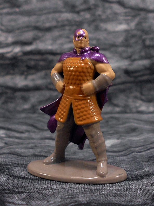
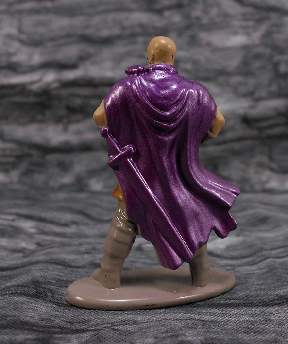
Oh yeah, did I mention that one of the party members IS FREAKING MINSC FROM BALDUR’S GATE??? He’s the only actual named member of the party on the package and yes, it includes his miniature giant space hamster, Boo! Well, sort of. Boo is just a purple glob on his shoulder. You really have to keep in mind that these are only a little over an inch and a half tall. With that having been said, the sculpt is OK, albeit pretty soft. It’s far from on par with some of the better D&D miniatures I used to have. MINSC is wearing a scale armor hauberk, a cape, and has a broadsword. He stands heroically with hands on hips.

I think the sculpt could have been helped out a lot more by better paint. MINSC is done up in a four color palate, which consists of brown for the hauberk, metallic purple for the cape and face tatts, flesh for his skin tone, and gray for the base, arm bracers, pants and boots. None of the finer details are distinguished, and I don’t mind that for the some stuff like the belt and boots, but it’s a shame they couldn’t paint the sword a different color than his cape. On my worst day I could have painted this figure better, and I was never good at painting these things.

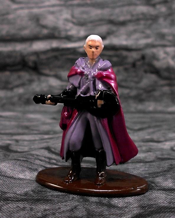
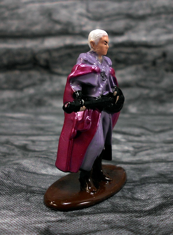
Next up we have the Elf Bard, which I think is overall a lot better than Minsc. The sculpt is still pretty soft, but it conveys the outfit fairly well and he is posed playing his lute. The color palate here is also a bit more varied. The outfit is lavender, the cape is purple, the boots and base are brown, the instrument is black, plus you get his flesh tone and white hair. Sure, he’s probably the least exciting figure in the bunch, but I guess it’s nice to have music while you’re fighting a beholder to the death.

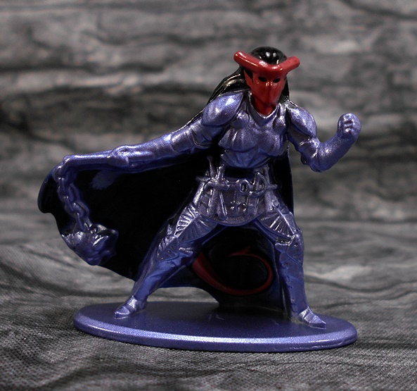
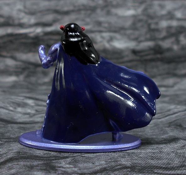
The third member of the party is the Tiefling Paladin and this is probably my favorite of the adventurers. The sculpt here is a lot more impressive than the previous two. You get some good detail in her armor and I really dig the crazy array of cutlery she has hanging off her belt. Her right hand is outstretched and about to strike with her flail, while her right hand is drawn into a fist. I also love her tail, which is sculpted as part of the cape interior between her legs. The paint on this one is limited to four colors: Metallic purple for the bulk of the figure and base, blue for the cape, black for her hair and belt, and red for her skin. This is a damn cool little figure.

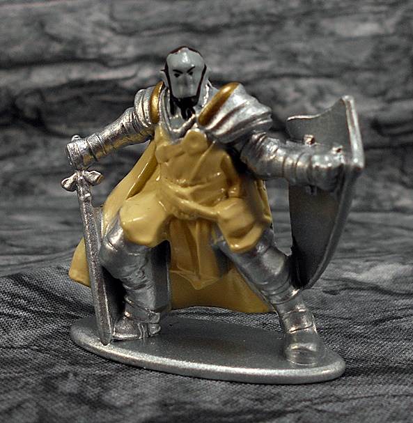
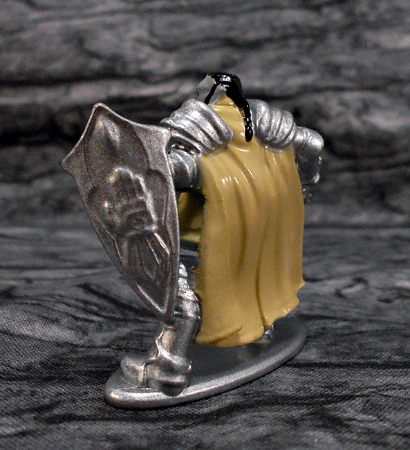
The final adventurer is the Orc Paladin and I’m really torn on this one. The sculpt is very soft, but I can make out some details like the belt and satchel. The armored pieces are a little better, but his face is just a mushy lump. I do like the pose a lot. The coloring here isn’t the best. You get a beige for the bulk of his body and cape. Silver for the armor, shield, sword, and base. His face is a grayish green with some black for his eyes and beard and hair.

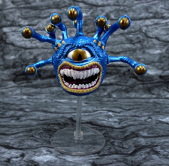
And the real showpiece of this collection is the Beholder, which comes floating on a translucent plastic stand. I’m not sure how much of this guy is actually diecast because he’s rather light. I know the eye stalks are all a bendable rubbery plastic. I can’t say enough good things about the sculpt here. It’s absolutely fantastic. They worked in a lot of his scales, some stubby little horns, and the teeth are absolutely terrifying. The only thing I will nitpick her is the choice of coloring. Metallic blue seems like an odd direction to go for his skin, as does the gold for his eyes. I can’t deny that it’s a striking color scheme, but it comes off looking a bit like those cheap novelty Christmas tree ornament you might find in a bin at Target. That sounds harsh, and I do really like this figure a lot, but I think it could have been so much better with a different deco. Indeed, the general choice to go with metallic paint in this set is a bit of a poser to me.

So what’s my overall feeling here? Eh, I don’t know. It’s really cool to find a set of D&D miniatures in the toy aisle of a major retailer and it makes a lot of sense for a company like Jada to do them. The sculpts are OK, but I think if these were painted with more care and detail this set could have gone from a mere curiosity to something really cool. Also keep in mind, this set was less than $10, which had a lot to do with me deciding to pick it up. It makes me a little more forgiving, but I would have happily paid another five or even ten bucks for decent paint. Ultimately, I think these are fun, and a little research turned up that they have another similar set of a adventurers facing off against a dragon. I might just have to check that one out too.

GI JOE Classified: Snake Eyes by Hasbro

Well, it took a little longer than I thought, but the final figure from the first assortment of GI JOE Classified arrived a few days back. Snake Eyes was the first figure revealed and the hardest one for me to get. I think I still have the Deluxe version on pre-order on Hasbro Pulse, but since I haven’t had a lot of luck with those pre-orders, I was happy to pick up this vanilla release just in case.

How many times can I say it? I love this packaging! You get a very attractive and colorful window box that shows off the figure and is totally collector friendly. The side panel displays the character’s abilities with a fun system of iconography and there’s a beautiful mural of characters and vehicles on the back. I don’t have the same obsession with Snake Eyes that a lot of JOE fans seem to have. It’s probably blasphemy to say it, but I was never a big fan of them forcing him into the whole Ninja slot. When I was a kid playing with my JOEs he was just a kick ass Commando with an Uzi and not a Ninja at all.

It doesn’t take a second look for me to realize why they chose Snake Eyes as the initial reveal. Even setting aside how popular he is as a character, this is an amazing looking figure. Sure he’s mostly black, but the figure makes great use of both matte and high gloss finishes for different parts of his outfit, as well as some sparing hits of silver and red paint. Plus, there’s some fine texture work in the sculpt as well. And that sculpt! Holy crap there is a lot going on here! The base body has features sculpted pants with knee pads, a lot of chiseled musculature in the torso, and armor plates on the arms and shoulders, There’s also several pieces sculpted out of softer plastic and worn by the figure, like the bicep straps with pouches, doubled up belts on the waist, a shoulder strap with pouches and sculpted grenades, and a holster and sheath attached with straps around his thighs. This guy is clearly ready for anything.

And that mask! Part of me was a little worried we’d get some big goofy rubber lips like we did with Rise of Cobra, but nope. This mask is as classic as it gets. He has the iconic segmented visor and the breathing holes over the lower half of his face. I also really dig the sculpted stitching up the neck. Beautiful!

Snake Eyes has a hole in his back and through the shoulder strap that can be used for a few accessories, but primarily his backpack. It’s cast in matte black plastic and like the figure it’s loaded with detail. It also features some silver paint operations on the buckles and snaps. Unlike Duke’s backpack, this one stays on extremely well. It also has a peg hole on the side so you can attach the sword scabbard.

If you want Snake Eyes to travel more lightly, the peg hole in the back can be used to secure his sword alone, or even his larger gun. And since we’re now talking about accessories… Let’s check out those accessories!

This retail version of Snake Eyes comes with a collection of weapons that pales in comparison to the Deluxe version, but you still get some cool stuff. For starters, he has a combat knife that’s very similar in design to what we saw with Scarlett. It has a saw back and the blade swells near the tip. It’s a little small for the figure’s hand, but he can hold it fairly well. Unfortunately, this thing will not fit into the sheath. It goes in about three-quarters of the way and then just stops. I could take something and try to clean it out in there, but for now it’s just not going in.

Next up, he has a pistol with a detachable suppressor, both of which can fit into his holster separately and I really dig that! I’m a little less enamored with the gun itself, mainly because of the big hole in the center. This looks like it’s designed for storage on a peg, but other than being able to attach it to the bigger gun (and why would I want to do that?), I don’t see the reason for it and it just looks goofy. I’ll likely be raiding my Marvel Legends figures for some better weapons for this guy.

Next up is his bigger gun and again, I’m just not liking the design here. I think it’s supposed to be a sci-fi take on an assault carbine, but like the smaller one it has that big hole in the center which is so off-putting. He really does need a proper Uzi.

And finally, Snake Eyes comes with his sword and scabbard. The scabbard has a wonderful texture to it and features the Arashikage symbol printed in red near the throat. The sword is a lot more stylized than I’m used to seeing him carry, but I don’t mind. The elongated grip works with one or two hands, and there’s a tiny finger loop in the guard for his trigger finger. There’s a saw-back area of the blade near the hilt, which is a little weird, and the the blade terminates into a clipped point.

Snake Eyes turned out to be an excellent figure, but I really never doubted that. And remember my blasphemous Commando/Ninja comment? Well, one thing I really dig about this figure is how it strides the line between the two. I can load him up with his backpack and guns if I want him to be a Commando, or I can strap a sword on his back and make him a Ninja. Which brings me to my only real gripe here is that I wish he came with his old school explosives pack, because when I was a kid playing with him, he was constantly using that to blow up Cobra installations and vehicles. I used to stick it to HISS tanks with a little dab of silly putty!

And that’s the first assortment of GI JOE Classified. This line is not perfect. There were some design choices I’m not 100% on board with, but what i can’t deny is that each and every one of them are very fun figures. I think the one thing that’s been hard to get used to is the way the line seems to pick and choose between old and iconic and fresh and new. Part of me wishes all the figures had toed that Real American Hero line a little closer, but then even the new designs have been growing on me. All I can say is BRING ON THE NEXT ASSORTMENT AND YO JOE!!!

Marvel Legends (Crimson Dynamo Wave): Black Widow by Hasbro

Welcome back to another Marvel Monday! Last week I began my trek through the fairly recent Crimson Dynamo Wave with a look at a very comic-based Crossbones and today I’m going to tackle the first of the figures from the upcoming Black Widow movie. And hell, let’s just go with Natasha Romanov herself. Fun fact, whenever I see her final scene in Endgame I always manage to get something stuck in my eye. Weird.

Hasbro did some pretty cool and stylish art for the boxes on this wave and I whole heartedly approve. And I’ll confess that as I’m tearing open this lovely box, I’m thinking about how strange it will be watching a flashback MCU movie where we know the character is dead. Well, I guess at least we know she won’t get killed in this one, eh? I honestly liked Natasha’s heroic end, but it just drives the point home for me that this movie should have happened a long time ago.

And here she is and while you might think I’d be sick and tired of another MCU Black Widow figure, truth be told… I really dig this one! I didn’t pay much attention to the first solicitation shots, but now that she’s in hand I think that this outfit design is a fantastic blend of comic and film. Imagine my surprise to find that she’s actually almost a complete repaint of the Deluxe Black Widow that I reviewed back in April. Going from all white to this new deco makes for a big change. The costume also eschews the all black look that Natasha usually favors for a gray and black mix, which makes for a far more interesting look. The bulk of the black and gray has a matte finish with some high gloss reserved for the boots and the shoulder armor pieces. She still has that piping running down the front from the earlier outfits but the two-tone deco makes them pop a lot more. And speaking of pop, the gold paint on her belt and her Black Widow Bite bracers really transforms this figure into something special. Her belt is cast in soft plastic and includes holsters for her pistols with retaining straps around her thighs.

And from the back we can see Black WIdow is sporting a hardshell backpack with slots to store her batons. I do love a figure that can wear all her accessories! So what was changed from the previous figure? Mostly the upper torso, which was re-sculpted to give her the backpack and also that padding up by her neckline. They also reworked the buckle on her belt making it a little more prominent.

I’m sure I said this the last time we checked out an MCU Black Widow, but Hasbro has come a long way when it comes to sculpting Scar-Jo’s likeness. I seem to recall the original effort being a little rough, but this one is quite possibly their best. Yes, it seems to be the same as the Deluxe figure, at least the hair sculpt is identical. There are some differences in the face, but that might just be variances and not a whole new sculpt. It’s hard to tell. Either way, it really captures her lips and nose and the printing used for her eyes and the rest of the features is solid. Here’ she’s sporting a coif that is a little closer to her original Avengers look than we’ve seen in a while and I do like it a lot.

When it comes to articulation, we pretty much know what to expect from the ladies. And while the poseabilty here is great, I am not a fan of these elbow joints. Yeah, I usually bitch about Hasbro’s refusal to give the gals double-hinged elbows, but in this case I’m actually referring to these weird elbow hinges that stick out the back. I think I first noticed these on one of the Spider-Woman figures. Otherwise, her arms feature rotating hinges in the shoulders and pegged hinges for the wrists, which can swap out between fists and accessory hands. The legs are ball jointed at the hips, have double-hinges in the knees, swivels in the thighs, and the ankles have hinges and lateral rockers. There’s a ball joint under her chest and her neck is both hinged and ball jointed.

As mentioned, Black Widow comes with a set of batons, which can store in her backpack. These are really simple accessories and there’s really not much I can say about them. They’re sculpted in really soft plastic, which makes them very bendy and as such they don’t always look that convincing in her hands. But hey, in fairness I don’t think there’s much else Hasbro could do with these at this scale.

In addition to her beat-down sticks, Natasha comes with her dual Glock 26S automatics. These are tiny little guns and can fit snugly into the holsters. I have mixed results with getting her to hold them straight. Her right hand seems to work better with them than her left, which always seems to want to practice trigger discipline. But all in all, these are pretty nice sculpts for such small accessories. Remember that one Black Widow figure where her guns were sculpted into her holsters. Yeah… that sucked.

And so my hat goes off to Hasbro for producing yet another Black Widow figure and still keeping my interest high. I just love everything about the look of this femme fatale. The costume redesign lends itself well to an action figure and the gold just totally sells it. And while I thought her white costume was a nice change, I think this one just brings out all the detail so much better. Will this be the last MCU based Black Widow figure we ever get in the Legends line? Well, if so at least she’s going out on a high note.

Transformers Siege: Starscream, Skywarp, and Thundercracker by Hasbro

It’s a fine testament to how far behind I am in my reviews that I just managed to assemble my trio of Decepticon Seekers from Transformers: Earthrise and I still haven’t reviewed the ones from Siege yet. This was a fact that came to light as I sat down to start writing the review of the newer figures. So, fair is fair. Today I’ll finally get around to taking a look at the three Decepticon Seekers from Siege! Of course, Siege features the Transformers in their original Cybertronian modes, and in this case the Seekers are based off of the Tetra Jet design that was introduced in the Sunbow cartoon and has since been more or less accepted as the official original alt forms of the Seekers. It’s a cool design, but since it was designed for a cartoon and without the restraints of practical toy design, these have been rather difficult to reproduce in action figure form. Hasbro approached something like it (but not really) with their figures based off the Fall of Cybertron figures. Third party designer Impossible Toys had a crack at it and managed to produce some really nice jet modes, but with some pretty janky robot modes. And here we are now back to Hasbro with something of a compromise.

And just to complicate things, the packaging and distribution of these figures varied. Starscream and Thundercracker were regular Voyager Class releases and as such they come in typical Siege style packaging. As always, these boxes look great, feature some amazing artwork and allow you to get a good look at the figure in robot mode before opening. Much to the chagrin of some collectors, Skywarp was offered later as an exclusive and has since been a bit tough to get a hold of at a reasonable price. He was also packaged differently, this time in boxed set called The Phantomstrike Squadron, and came with three little Weapon Masters figures. All three of the Seekers feature the exact same mold, except for some variations in the head, so let’s just take a look at Starscream’s alt mode first and then check out the different decos found on his comrades.

This is not a dead ringer for the Sunbow Tetrajet design and I’m not faulting Hasbro for that, because of the clear challenge that stems from working with the design. As we will soon see Hasbro clearly made some sacrifices to the jet mode to preserve the robot mode. Still, I’d say that this captures the spirit of that original Tetra Jet , and it’s likely as close as we’re going to get without interjecting insane Masterpiece levels of panel-shifting transformations. This design de-emphasizes equality of the jet’s four points by diminishing the wings and extending the snout, for lack of a better term. The result is something that evokes the basic design of the Colonial Viper from Battlestar Galactica more than the original Tetra Jet, especially with the three thrusters in the back, but I still dig it. It totally works for me as a Cybertron design in that it’s different enough to look like an alien vehicle, and yet it’s still similar to the Earth design that the Seekers later adopted.

On the downside, this alt mode is almost as much kibble as it is jet, with the bulk of the robot body hanging out in the undercarriage and the chest piece rather awkwardly on display from the back. The undercarriage junk doesn’t bother me so much. To be fair, the down-swept wings do conceal some of it and it does provide a nice platform for the jet to rest on. And because this is an alien design, who’s to say that’s not what it’s supposed to look like. Besides, Primus knows we’ve had plenty of regular jet modes over the years with as much robot undercarriage as these toys. But as much as I’ll defend that stuff, the chest piece on the back bugs me a lot, just because it’s so painfully obvious what it is, I’ve tried to tell myself that the two intake fans don’t look out of place there, and that the faked out cockpit could be some kind of generator, but it’s just impossible for me not see it for what it really is. Starscream also has a pair of guns that peg in under his wings.

Starscream’s coloring is similar to what we’re used to seeing on him in his Earth mode. The jet is mostly bare gray plastic with some red and blue painted trim. There’s also some darker gray around the cockpit and vents and the yellow cockpit looks great. He also has Decepticon emblems on each side near the back. The jet also includes Siege’s signature weathered look with some dirty markings scattered around the hull. It’s used sparingly here and I think it’s pretty effective. Finally, I have to compliment Hasbro on the detail in the panel lines on this toy. Siege has been all about they hyper-detail and that’s definitely still the case here. I just love how busy the sculpt is, especially on a design that’s relatively simple like this one. Let’s take a quick look at the decos for the other two Seekers!

No surprises here! Thundercracker remains true to form with his mostly blue colored plastic, and he shares the same red paint accents as Starscream has along the edges of his wings and near the sides of his cockpit. The cockpit frame itself is black, as is the blunt nose of the craft. He has the same yellow cockpit and Decepticon insignia, although his are a little muted against his the blue hull. Finally, Thundercrackers weathering is achieved through silver paint, which I think looks more like chipping and abrasions in his finish than Starscream’s dirt. It’s a bit over the top, but I don’t hate it. Like Starscream, I think the deco looks fantastic. Onward to Skywarp!

Skywarp adds the most color to the mix, making his deco a little atypical. His wing. Rather than being mostly black, it’s reserved for his wing area, with the snout of the jet being painted silver and the tip purple. You get more purple trim on the wings and around the sides near the yellow canopy, and more silver in the grills. It’s a striking deco that looks amazing, even if I’m used to seeing more black in my Skywarps. Like Thundercracker, SKywarp has a bunch of silver painted abrasions and wear, showing that he’s seen some action in his day.

OK, so now that we’ve checked out the alt modes, let’s turn back to Starscream and have a look at his robot mode!

Transforming these guys isn’t too bad, and there’s actually some pretty clever stuff going on, like the way the nose of the jet splits to become the familiar shoulder intakes. Indeed, the only gripe I have about the transformation is that the friction hinges that hold the chest piece on isn’t up to the task and I’ve yet to be able to transform Starscream without it falling off. The others are a little better, but it still probably pops off at least half of the time. Once transformed we get a very familiar G1 Seeker robot mode, which makes me appreciate the alt mode a lot more. I’m just all kinds of impressed they were able to get this robot mode out of that Tetra Jet. The proportions are great and even the articulation is solid and fun. Sure, we already know the cockpit chest is a feake-out, but I don’t have a problem with that. Indeed, my only real complaint here is that the unfinished side of the wings face forward, but Hasbro even tried to pretty them up by stamping Decepticon insignia on them and giving them a little painted trim. From behind he’s mostly a wall of wings, but a nicely finished one. Even his lower legs fill in!

The portrait is superb. I love the detail work that went into the “helmet,” the flashy silver paint used for the face, and the glaring red light-piping in the eyes. And once again, I have to call out how amazing all the panel lines are in the mold itself. Even the transparent cockpit in the chest features etched circuit-like patterns, and is flanked by those awesome looking fans. I also really dig how he’s got thrusters emerging from the middle of his feet, even though these aren’t really part of his Tetra Jet mode.

The deco continues to carry Starscream’s iconic colors, with more red and blue showing up in the robot mode. Some might argue that the weathering looks a little overdone here, and I’d be inclined to agree. It doesn’t ruin the figure for me at all, but I would have liked if they had toned it back on the legs a bit. I actually don’t mind the silver wear on his torso at all.

Starscream’s wing guns can be attached to the pegs in his shoulders or forearms. He can even hold them like regular guns if you want. There should be a configuration that pleases everyone, but I prefer them on the shoulders so he can aim them straight down his arm like he did in the Sunbow cartoon. In short, this is a great looking figure with some cool engineering and he’s loads of fun to play with. Let’s take a quick look at the other decos…

In robot mode, Thundercracker’s color scheme holds no surprises. He’s still mostly blue with some black trim and bare gray plastic making up the frame of his torso. The weathering here is all silver and he’s got a lot of it on his lower legs. I like to think that’s just Autobot blood that’s splashed all over him while he was kicking the shit out of one of them. Yeah, that got dark! G1 Thundercracker was the first Decepticon jet I owned as a kid, and the only one I had for a long while, so while his deco is probably the more boring of the three, he’ll always have a special place in my heart. So, other than the fact that this figure looks great, is there anything else to say?

Well, yeah. Thundercracker actually got his own unique portrait! The “helmet” is the same as on the other two figures, but Hasbro gave Thundercracker a big energon-eating grin. Or maybe it’s more of a smirk. Either way, I think it would have better suited Starscream, as he tended to have the most personality of the three. Curious that Hasbro decided to give it to Thundercracker.

And that brings us to Skywarp! While his deco stood out a bit in his Tetra Jet mode, as a robot everything falls more or less into place where I expected it. You basically take Thundercracker’s color palate and swap blue for black and black for purple. The only other real difference is that the fans in his chest are black as well. I’ve always been partial to Skywarp’s coloring, there’s nothing quite so striking as that sinister Decepticon blend of black and purple and it looks as great as ever here. Once again, there’s plenty of silver paint splattered around his lower legs, and I wouldn’t have minded if Hasbro held back on that a bit. And before we wrap things up, let’s take a look at Skywarp’s Weapon Masters!

Because why should Soundwave and Blaster be the only ones to have little robot pets? I’m not sure why Hasbro decided to give Skywarp these guys, but maybe it was just so they could get it to fit into a certain price point assortment. Either way these little guys from right to left are Fracas, Terror-Daxtyl, and Shrute. Each of these transform into a different weapon and each comes with some effect parts. And yes, I just realized that I didn’t take enough time to contemplate what a f’cking metal name Terror-Daxtyl really is. Sorry. I’ve been a little mixed on the Weapon Master figures. I like the idea of having little robots to interact with the bigger ones, but the weapons they turn into are often mixed bags. Let’s take a look…

Terror-Daxtyl transforms into an axe, which always brings me back to the eternal question: How much must it suck to be a robot that transforms into something you hit things with!?! It’s kind of a crazy idea, but he does make for a decent looking axe and the effect part is pretty impressive.

Both Fracas and Shrute transform into double-barrel blasters and while the molds are each different the engineering here is exactly the same. They’re a bit chunky but they work just fine. Shrute has a pair of bulbous yellow blast effects and Fracas has thinner blue electricity effect pieces.

Oh boy, I really dig these guys! I was perfectly content to keep the Fall of Cybertron versions as my Cybertronian Seekers, and while I still like those figures quite a bit, the Siege Seekers have quickly supplanted them and become my new favorites. Oh, there’s more than a few points worth picking at with these figures, particularly when it comes to the alt modes, but overall I think Hasbro made the necessary compromises in all the right places. We get some solid re-imaginings of the Tetra Jet designs while producing three superb robot modes, all of which manage to capture everything I love about the iconic G1 Seekers that I loved as a kid. It’ll be fun to do some side by side comparisons when I get around to looking at the Earthrise Seekers, and hopefully that won’t be too far off!

Star Trek “Starships Collection:” USS Excelsior NCC-2000 (XL) by Eaglemoss

It’s Wednesday, it’s been a tough week for me so far. So how about I pour a drink and we take a day to enjoy some Starship Porn! I’ve gassed on a plenty about my love for the Excelsior Class Starship. For more of that you can look back at my review of Diamond’s Starship Legends NX-2000. Suffice it to say, as a kid I was blown away by the reveal of The Excelsior in Star Trek III. You have to realize that before The Next Generation, we only got hints and illustrations about Starfleet’s other Starship Classes. The Reliant in Star Trek II was pretty much it, and that one borrowed heavily from the Constitution Class Refit’s design elements. The Excelsior was so new and so fresh and yet still so Star Trek. It was never going to replace that PERFECT Connie Refit in my eyes, but it was still pretty damn cool. We saw it numerous times in the spin-off series, and it finally got its true moment to shine in Star Trek VI under the command of Hikaru Sulu.

And it is indeed the NCC-2000 from Star Trek VI that Eaglemoss decided to base this model on. Yeah, I would have preferred the NX, but that’s fine. This release is part of the special XL releases, which means this ship measures about ten inches long, making it about twice the size of Eaglemoss’ regular ship releases. It’s constructed of both plastic and die-cast metal giving it a nice heft. The model comes in a fully enclosed box with the ship nestled between two bricks of Styrofoam. There’s no assembly required, other than putting it on its stand, so let’s get this beauty out of Space Dock and give her a shakedown cruise.


I consider myself to be fairly familiar with this design, having lusted after it in books and various other models, and I’m immediately impressed with what we got here. The design lacks that certain noble poetry of the Constitution Refit and instead strikes me as being more technical in her angled struts and diminished profile. It’s a design from the future’s future, intended to look more advanced than the Connie and it does indeed. But that doesn’t make it prettier in my mind. Sleek? Yes. Prettier? No. But who’s to say I can’t love both ships, eh? As with the Enterprise XL model,  the Excelsior features a die-cast saucer, which does make it a bit front-heavy, but it also makes it feel like a quality piece. The plastic warp nacelles are a little bit springy on their struts, but they are straight, parallel and look great.

The nacelles on this version got a bit of a redesign from the NX version, possibly from when they scrapped the Transwarp Drive, and they now have flared platforms at the ends. The vanes that bisect the nacelles, as well as the top cut-outs, are cast in a translucent blue plastic, which can catch the light rather nicely at times. The Deflector Dish is also cast in the same plastic, and while it’s a little harder to get it to catch the light because it’s recessed under the hull, it’s still capable of some nice light reflection.

I remember being very impressed by the aztec patterns on the XL Enterprise, and you get more of the same here. The Excelsior’s pattern is a little less subtle, but I think that’s in line with the screen appearance. You get some nice paintwork around the platform that connects the bridge to the Impulse Engines, including some blue-gray panels and the rather Egyptian-looking gold striping that makes up the horseshoe around this platform. The top surface of the Secondary Hull is painted gray with some additional applications around the vents on the connecting struts. The ventral section shows more blue-gray paint and a lot more of the rather busy aztec patterns.

The saucer features deep cut panel lines and a down-slope to the edges, with concentric rings painted in blue along the slope. Six thrusters are placed around the edge, each one outlined in red and painted yellow, and we get a similar deco for the five sets of phaser banks placed around the horseshoe. The ship’s name and registry is printed with crisp lettering and framed by a pair of red stripes that circle back to the rear of the saucer. The saucer’s undercarriage reveals more of the same, only with a wide blue circle about three-quarters of the way in from the edge and the emergency landing gear panels also painted blue. Finally, the cluster around the Lower Navigational Dome is really pronounced on this ship and that’s reflected on this model.

The sides of the Secondary Hull features the lettering “Starship U.S.S. Excelsior” and “United Federation of Planets” along with the delta and a set of racing stripes. The stout neck connecting the Primary and Secondary Hull is black and segmented and includes the two recessed Photon Torpedo tubes.

From the aft view, we can see the compartment in the Secondary Hull. I’ve seen so many back-and-forth discussions over what this thing is. Personally, I always assumed it was a Shuttle Bay, but I’ve also heard that in the NX version it was supposed to house the Transwarp Drive. Perhaps, it was repurposed for the Shuttle Bay after the ship underwent changes after being commissioned. Most blueprints I’ve looked at seem to suggest this to be the case. Either way it’s one of those rather distinctive features of this ship’s design.

The model includes a display stand, which does a fine job of holding the ship without obstructing too much of it from view. The base is made of die-cast metal and it has a felt bottom. so there’s no worries about it toppling over. Clear plastic arms grab the ship from the back of the saucer to suspend it. It’s designed very well in allowing the ship to be picked up and put back without a fuss. My only worry is that the friction will cause some paint wear over time if the ship is removed and replaced from the stand too many times.

As I’m sure I mentioned last time, I wasn’t immediately sold on these XL models when I first saw them advertised. At about $75 a pop for a model with no lights or electronics of any kind made me wonder how much value I was getting for my money. But after getting a ship like this in hand, it’s easy to see where that money goes. It may not have the flashy lights or voice clips and sound effects of Diamond’s ships, but these are still superior in every possible way. The size of the ship is just big enough to allow for the kind of detail I’m looking for, yet small enough that I can display several of these in the space required for just one of the DST Starship Legends. The attention to detail is fantastic, the paint work and printed lettering is excellent, and it just feels so satisfying to hold in my hand and maybe even woosh around the room a bit. But I suppose the best endorsement I can give is that while the Excelsior here was only my second XL Starship, but I’ve picked up at least half a dozen since then. And I’m excited about sharing each and every one of them here in the future!

Marvel Legends (Crimson Dynamo Wave): Crossbones by Hasbro

It’s been a while since I reviewed a wave of Marvel Legends that was anything even remotely current, so to switch things up a bit, I thought I’d tackle the Crimson Dynamo Wave, which is also sort of the unofficial sponsor of the as yet unreleased Black Widow movie. Sure, only about half the figures are from the movie, but that’s close enough. And thanks to movies being delayed because of The Coof, I’m actually getting to review these figures before the movie is out! Seriously, Disney, you should have just dumped this thing on your streaming service. You’re probably going to wind up having to do that anyway. But I digress… let’s start with one of the comic-based figures.

It’s Crossbones! And this is my second comic-based Crossbones figure from Modern Legends. The previous one was released as part of the Thunderbolts SDCC boxed set. I was quite pleased to see that this one isn’t just a repackage, but rather a brand new figure. It’s also pretty cool to finally be getting the comic version of the character in a wide-released retail wave and not just part of a limited exclusive set.

Crossbones uses one of the bigger than average Legends bucks, and he’s looking ready for action and as iconic as ever with a costume that is mostly just painted onto the figure. He has plain black trousers and a tank-top with his crossed bones emblem painted onto the chest. His boots are sculpted with studs on the soles and are painted in a high gloss black, which make them stand out from the rest of his outfit. And lastly, his hands have finger-less gloves painted onto them. It’s a clean comic look that distinguishes him from the more realistic detailed sculpt of the previous release.

The costume also includes a brown belt, sculpted in soft plastic, with two holsters secured to his thighs with straps. There are sculpted pouches running around the length of the belt and tiny sculpted buckles in the thigh straps. Finally, he has a pair of brown wrist cuffs, which are also lined with tiny sculpted pouches.

Crossbone’s head consists of a rather stylized skull motif painted onto his hood. It’s sharp, with hardly any bleed through from the underlying black, and looks fantastic. The loose ends from where the mask is tied behind his head trails off behind his right shoulder.

There are no surprises to be found in the articulation. The legs are ball jointed at the hips, have double-hinges in the knees, and swivels at the thighs and the tops of the boots. The ankles have both hinges and lateral rockers to accommodate those wider stances. The torso swivels at the waist and has an ab-crunch hinge under the chest. The arms have rotating hinges in the shoulders and wrists, swivels in the biceps, and double-hinges in the elbows. Finally, the neck is both hinged and ball jointed. The joints all feel solid, but I do have to report that those holsters do inhibit the hp movement just a little bit.

You get two pairs of weapons with this figure. The first is an awesome matched set of what I presume to be double-barrel shotgun pistols. These are cast entirely in black, and both of his hands are sculpted with trigger fingers so he can hold them perfectly. It is, however, really tough to get them into his hands because the plastic is really stiff. Either way, I love these things and they look like the perfect weapons for Crossbones to wield. It’s too bad they couldn’t have rigged him up with some holsters for these on his back, or maybe made the hip holsters work for both sets of weapons.

The second set of weapons is a pair of silver sci-fi-style pistols, which fit into the holsters on his belt. And man, I’m just not digging these things at all. I think the designs are just fine, but they feel out of place with Crossbones. They’re also molded in that kind of shitty plastic that we just saw used on Union Jack’s weapons. I think these will be spending most of the time in the holsters for sure.

Crossbones was a great choice for a new figure, especially since a lot of collectors probably missed out on the exclusive one. At the same time, since he’s a different enough take on the character, I don’t mind having another version in my collection. This one is cleaner and simpler than the exclusive version, and as a result strikes me as something a little more classic in design. He’s pretty fun to play around with, and I love those shotguns, I just wish they had given him something better than those silver guns. Next Monday, I’ll check out one of the movie figures!

GI JOE Classified: Duke by Hasbro

At some point my Classified Snake Eyes may actually ship out and arrive, but until then I’m now down to opening my last GI JOE Classified figure from the initial assortment. I started with Scarlett because she was one of my more anticipated, but Duke was easily the second, so I saved him for last.

Once again, the packaging for this series has been first rate. It’s colorful, it’s collector friendly, you get plenty of great artwork, and even some details about the character expressed through creative use of iconography. I wish I had the room to keep all these boxes, but sadly I do not, so let’s tear this open and see what Sgt. Hauser is all about.

So far, Classified has been a mix of old and new, with Duke’s design falling a little more in line with the familiar. He’s sporting a beige shirt, similar to his rather iconic look from the original Real American Hero figure and the Sunbow cartoon. It’s got an open collar, some black trim on the shoulders, and his medal pinned to the right side of his chest. Duke has one piece of elbow armor on his left arm, which is admittedly kind of weird. His sleeves are sculpted to be rolled up to his elbows, making it look like Duke is ready to get down to business. And that business is punching in Cobra fangs. The trousers have sculpted pockets, some reinforced patches, and he’s got gold and silver armor on his knees and shins, which have some light blue accents. Yeah, the gold armor thing is kind of an odd ongoing style choice with these figures. I don’t hate it, but I could probably have done without it too. It felt a little more natural on Scarlett, but here it feels like something they just tacked on to give him more of a sci-fi flavor.

Duke’s uniform also features some pieces that are sculpted separately from the actual figure. These include his belt, pistol holster, and bandoleer strap. These are each cast in green plastic with sculpted pouches and some nice detailing. The belt has a silver buckle, and the chest strap has some fixtures sculpted up near his left shoulder, similar to what we saw on Roadblock. Overall I do like the look of his uniform, even with the armor pieces. When I look at him my mind still goes back to the Duke design that I knew and loved as a kid, plus there’s enough new elements to keep him fresh for a new generation of collectors. Personally, I just would have added an American flag patch to his shoulder.

Likewise, the portrait here is quite reminiscent of the Duke of old. I’m not going to lie, I would have loved if we got something with a little more resemblance to 80’s Sunbow Duke, but I still think that this is a great head sculpt for the character. The blonde hair is sculpted into a short regulation-style coif, his eyes are blue, and his chiseled features include a jawline that goes on for miles, a cleft chin, and a mouth that is pressed together and sealed with determination. I also really dig the scar over his right eyebrow. This portrait has a ton of personality and it works fine for me as the Duke Hauser of the current era.

Duke is sporting some excellent articulation, which results in just a couple of drawbacks. The shoulders have rotating hinges set into some rather limited lateral crunches. The elbows are double-hinged, and he has swivels in his biceps. The wrists are odd in that they’re pegged and can be removed, but he only comes with one set of hands. His torso sports a swivel at the waist, and an ab-crunch similar to what we see in the Marvel Legends line. His legs are set on two ball joints up in the hips, with double-hinged knees, and swivels in the thighs. The ankles have both hinges and lateral rockers and the head is on both a hinge and a swivel. Besides the weird wrists, my only other gripe here is that the shoulders look odd at certain poses, like balls separated from their sockets. Sometimes it feels like Hasbro is experimenting with different articulation systems with this line and have yet to settle on a standard.

In terms of gear, Duke comes with a backpack, which is very reminiscent of the one that came with the original figure, and pegs right into his back. Unfortunately it has a habit of popping off on my figure. It might have helped if they had put a hole through the shoulder strap and have it line up with the hole in his back. The backpack is a very detailed sculpt with pouches and even two canteens, all cast in green plastic. There is also an entrenching tool (shovel!) in the middle of the pack, which is painted in a dark gray.

Duke comes with a set of binoculars, which can peg into the back left hole in his belt. This accessory is sculpted all in dark gray plastic and there isn’t a whole hell of a lot else I can say about it. It’s likely an homage to the more traditional binoculars that came with the original figure and could hang around his neck.

Next up is his pistol, which fits into his holster and can be held in either hand. It’s sculpted to look like a futuristic automatic with a gold slide. Hasbro seems to be content with giving all of these JOEs futuristic style weapons and quite frankly I’m fine with that. I grew up watching them fire laser guns in the cartoon, and the series cast off realism pretty early on in the game.

And finally, Duke comes with his rifle, which is clearly supposed to be some kind of laser gun because of the blue emitter at the muzzle. Happily, this weapon is also designed to look like it has ties to a realistic weapon with some AR-15 characteristics, so I’m OK with that. The level of detail is really nice. It has a skeletal style stock, a scope, a detailed magazine, and a foregrip. Like the pistol, the upper areas of this weapon are painted gold. I really appreciate that the figure’s articulation lets him draw the scope up to his eye for aiming poses. Very nice.

With Duke, Classified continues to toe that line between new and old. So far Destro is clearly the one figure that got the least amount of makeover, but Duke here isn’t all that much different to what I’m used to. And with four of these figures on my shelf I can safely say that I really like what we’ve got so far. Given my druthers, I would have preferred direct updates to the Real American Hero figures, or even realistic takes on the Sunbow designs, but I’ll still happily take these instead. They look great on display and are fun to play around with. Indeed, all the Classified JOEs have been residents of my desk since I got them. And I’ve had a blast fiddling about with them on my downtime. Hopefully I’ll be able to put Snake Eyes in the spotlight, if he ever does turn up.

Fate/Grand Order: Caster Nitocris “Super Premium” Figure by SEGA

I’ve recounted recently about how I’ve pulled back from buying Prize Figures, mostly because they were starting to get out of hand and I had no space to display them. All in all, I’ve been pretty well behaved on this newly imposed restriction, but I still had the odd pre-order pending here and there, and I decided to let most of them ride. I still dig these figures a lot, they look great, they’re inexpensive, and they come in handy for days like today where I don’t have a lot of time and need something quick and dirty to feed that content beast. So let’s check out this Caster Nitocris Super Premium Figure (SPM) from SEGA!

Nitocris hails from the Fate/Grand Order game, and I like to call this purchase a Consolation Prize Figure, because I really wanted to pick up Amakuni’s Scale Figure of her, but I just couldn’t bring myself to pull the trigger on that price, and so I satisfied myself with this figure instead. Yup, there’s more of that self control again. I’m not entirely hopeless. As with most of SEGA’s SPM figures, Nitocris comes in a very colorful and fully enclosed box, featuring some nice shots of the statue and a bit of English copy on the box to help you know what you’re looking at. Inside, the figure comes wrapped in plastic and requiring some minor assembly. Here you attach the head and the right arm at the elbow, plug in the support piece for her hair, and then plug the figure into the base. All told, she measures about 9-inches tall and now that she’s all set up, let’s have a look…

There’s something about chicks in Egyptian costume that does it for me, and this is indeed a very beautiful figure. Nitocris stands proudly with one leg in front of the other, her left hand resting on her hip, and her right hand clutching her staff. Her outfit doesn’t leave too much tot he imagination, and I ain’t complaining. She has a white top to cover her Upper Deltas and a sculpted blue sash to conceal her Lower Nile Valley. Her hips are covered in plastic pink “fabric” and the whole ensemble is held together by some sculpted beaded chains. She has some brown wraps on her forearms, and her plastform sandals have sculpted wraps that reach up to just under her knees.

Nitocris’ curvy figure is framed by her copious coif of cascading blue hair that balloons out in the middle and comes to an end with a chunky red ring. This hellacious waterfall of hair looks cool and distinctive from the front, but sadly covers her entirely from the rear view. Seriously, from behind she looks like just a big blob. Besides the excellent sculpted detail on this figure, I think the colors are probably what I dig the most. The combination of white, pink, and deep indigo blue all looks so lush and striking against mocha colored skin. But what really shines is the wonderful gold leaf paint they used. Just lovely!

The portrait is suitably adorable, as Nitocris features a pair of Anubis-like ears, large printed purple eyes, and some face paint on her cheeks. She has a cute pointed nose and her mouth is pressed into a grin. Her gold and blue gorget and headpiece both frame her portrait perfectly. And as if she didn’t have enough hair pouring down the back of her, she also has two bunches running down either side of her head and nearly reaching her hips.

Her ebony staff is quite striking and is permanently attached to her right hand. I also dig the loose bangles that hang on her wrists.

The base is a simple translucent disk with the game’s logo printed on it in vibrant blue lettering. It’s simple, functional, and doesn’t take away from the beauty of the figure.

And that’s it for this Wednesday’s admittedly brief review. It’s always a treat to take a look at a new Prize Figure, especially since I won’t be doing it all that frequently here any longer. If you’ve been kicking around with me on FFZ for a while then you probably already know that I’m a big fan of SEGA’s SPM figures. At around $20-25, they offer plenty of bang for the buck and Nitocris here is no exception to that. I’m not even a big fan of the game, but I do love me my Servants and this one in particular has been calling to me for a while. I pre-ordered this lady a little while back, but she’s been available on places like Amazon for a while, and to me this one makes for a nice alternative to those pricier Scale Figures. Now, if Max Factory should happen to release a Figma of her, well I’d probably have to come back for seconds.

Marvel Legends (Banner Hulk Wave): Union Jack by Hasbro

Hooray, it’s time to open the final figure in this very old and weirdly random wave of characters from both the funnybooks and the MCU. And after last week’s downer of a review, I’m glad to have one more to open so I don’t have to end things on a negative note. Sorry, Rock Python, but you kind of sucked! This time, it’s Union Jack giving us team building fans one more for The Invaders and another for MI-13! Don’t screw this one up, Hasbro!

Eh, it would be really hard for Hasbro to screw this one up, as they even did a fine job on Union Jack back in 2008. The blurb on the back of this package doesn’t say specifically, but I’m going to assume that this is Joseph Chapman, rather than one of the Falsworths, as the costume looks fairly modern. Sure, why not? Let’s go with that. And just a reminder, I’m not going to be reviewing the Endgame Hulk Build-A-Figure because I gave all those parts away. That’s all I got about the packaging, so let’s dive in and take a look!

The corporate directive with the comic-based figures in this wave seemed to be “Use as little new sculpting as possible!!!” as that’s what we get with Union Jack. Not a problem, though, since this is a costume that works well when it’s just painted onto a buck. Yes, most of the costume is just a giant um… union jack, painted onto his torso. The only tripping point would be how painting on a dark plastic body often turns out to be a train-wreck of bleed through. Thankfully, that isn’t the case here. It’s not perfect, the white isn’t as vibrant as it could be, but it’s not too bad and the red looks really good.

Jack includes some extra pieces to round out his costume, which include red cuffs on his wrists and ankles, and a bitchin utility belt. The brown military-style belt features some sculpted pouches, a working holster on the right hip and a working sheath on the left hip. The ankle cuffs are a pain in the arse, as they’re only held up by friction and often slide down to the ankle hinge, as can be seen in a lot of these photos.

The head sculpt is simple, but it’s exactly what it needs to be. The hood has some subtle sculpted stitching seams and you can just about make out the details of his face underneath it. The paintwork on his exposed eyes is particularly sharp. The sculpted concentric rings around the eye holes are a nice touch too!

Articulation is pretty important for a character like Union Jack, and Hasbro delivered with this nimble buck. The arms feature rotating hinges in the shoulders and wrists, double-hinges in the elbows, and swivels in the biceps. The legs are ball jointed at the hips, have double-hinges in the knees, swivels at both the thighs and lower legs, and both hinges and lateral rockers in the ankles. The torso sports an ab-crunch hinge, a swivel at the waist, and the neck is ball jointed and hinged. I think the lateral crunches we sometimes see in the shoulders would have been good for this character, but I don’t think it would have worked well with the flag pattern on the torso.

Union Jack comes with two weapons: A revolver and a fighting knife, both of which are cast in a really cheap looking silver plastic. At least they painted the grips black. It’s too bad because the sculpts aren’t bad, but the pistol is a huge step down from the excellent one that came with the 2008 version of Union Jack. Too bad I don’t still have mine. Of the two accessories included here, I think the knife fares a bit better.

Next to Loki, Union Jack was probably my most anticipated figure in this wave. I love the character, I love the teams he hangs out with, love the costume, and despite some sub-par weapons, I think he turned out great. This is the epitome of a simple but fun figure. For a lot of folks, this release may be overshadowed by the MCU figures in this assortment, and those were pretty damn good, but Union Jack is a stand-out figure for me.

And that puts this long overdue wave to bed! For next week’s Marvel Monday, I’m going to kick things back to something more current and topical and start tackling the Black Widow movie wave!

Transformers Earthrise: Optimus Prime and Trailer by Hasbro

One of the gripes I have with collecting Transformers is the frequency in which Hasbro releases new figures of the same old characters. Sure, it’s nice to get updates, but it frequently renders my existing figures obsolete and I wind up selling them off to make room for the new and improved versions. It’s not a big deal when these figures are five or six or even ten years apart, but when it happens within the space of a year, it can be a little annoying. Case in point, we just got a kick ass Optimus Prime figure in Siege last year and here we are getting a new one in Earthrise. Ah well, at least that one was a Voyager and this one is a Leader Class right? RIGHT???

Well, technically. If you’ve been picking up the Leader Class figures lately, you are no doubt aware that the trend is to use that price point to release Voyager-sized figures with extra parts that incorporate into their alt mode. And that’s the case with Earhtrise Prime here. He’s a Voyager sized figure, but he comes with his trailer and that bumps him up to the higher price assortment. So did we really need another Voyager Class Prime this soon? Especially when the last figure was so damn good? Let’s have a look. I’ll note here that I was tempted to make this primarily a comparison review, but then I decided Earthrise Prime deserves his own time in the spotlight, so I’ll first take a look at him on his own and then come back to the comparisons at the end. Let’s start with the alt mode.

I gotta say, this cab looks GREAT and it’s classic G1-inspired Prime through and through. You get the usual panel seams on the sides, but the cab is so detailed with panel lines that it serves to downplay those seams. From the front we get a big slab of glorious Freightliner, complete with silver paint on the grill and bumper and some translucent blue plastic used over the windshields and the headlamps, and again for the windows on the sides. The smokestacks are short (obviously for safety reasons) but they look fine, the gasoline drums on the sides are painted silver, and you get some weapon ports on each side to mount guns. I dig the sculpted vents on top of the hitch-up and overall the red and blue plastic they used looks superb.

The trailer is a huge draw here and it’s none too shabby. Sure, it’s basically a gray plastic box on wheels, but to me Prime always feels incomplete when all we get is a cab. This trailer pegs into the cab, allowing for a pivot at the junction. At first it felt a tad undersized for the cab, but after messing around with it for just a short while, I found that not to be a big problem. It does, after all, look great hooked up and all decked out with that familiar striping and the Autobot emblem emblazoned into the sides. The tailgate sports some nice sculpted detail and drops open to form a ramp and allow access to the interior. The trailer also has a set of swing down legs so it can rest when Prime transforms, because unfortunately this toy trailer does not magically disappear and reappear like it often did in the Sunbow cartoon.

And yes, there is enough room to roll your average Deluxe Class car into that trailer, even if it is a bit snug. Some of the older Basic and Scout Class cars would make for a better fit. The trailer also transforms, but I’ll come back to that in a bit. Let’s move on to robot mode…

Transforming this figure is satisfying without being too fiddly, and I was genuinely impressed with the way the engineering packs and unpacks many of the panels that make up the cab. When all is said and done, you get an absolutely amazing robot mode. Prime has a poetically trim profile, which keeps all his truck kibble in check. When viewed from the front, I have absolutely no complaints. His stout barrel chest is comprised of the actual windshield piece from the truck, while his abdomen with the grill is a fake-out in order to give it that tapered look. All those great looking panel lines and tiny rivets in the sculpt come across in the robot mode as well. The backside isn’t quite as polished, but it ain’t too shabby either. I love the way the cab wheels are stored on his lower back, even if it isn’t something I’m used to seeing on my G1-style Primes, and the gas tanks look great on the backs of his upper legs. I dig the way the lower legs fill in, but I do wish those panels were blue instead of gray.

Most of the coloring from the cab mode carries forward and that red and blue plastic still looks great here in robot mode, as does the gray plastic. The silver paint is sharp and appears not only on the grill and smokestacks, but also on the lower leg vents, forearms, and some neat trim around his windows and wipers. The deco is rounded out by an Autobot emblem printed on his left shoulder.

The head sculpt is very similar to what we got with Siege Prime. My only gripe here is that the eyes can be tough to see with the naked eye, possibly because the brow ridge is a little too prominent. Fortunately, the heads can be swapped, and in the end I may wind up doing just that.

Prime comes with a new version of his Buster Rifle, which is a little beefier than the Siege version. It’s mostly black but does have some gray pegs, one as a grip and another coming out of the side. Prime’s hands are hinged at the figures, forming a peg-hole when closed so he can hold the rifle in either hand. The rifle can fold up in the middle and the side peg allows it to be stored on Prime’s back when not in use.

The figure’s chest can also open to reveal a removable Matrix. I love the amount of detail they sculpted into the Matrix Chamber and it’s all painted over with that lovely silver paint. The Matrix itself is a solid piece with a gold housing and a translucent blue center.

Transforming the trailer is very similar in design to the old G1-version. It splits in the middle and opens to reveal a few possibilities for play and display, although there isn’t a lot going on in here. There’s a repair drone, but no Roller or consoles or anything else. To be fair, in this mode, the trailer is pretty underwhelming. There is some nice sculpted detail throughout the interior and some peg holes to place weapons or store blast effects, but I would have liked something more. Even the repair drone lacks any paint and there isn’t a lot of detail on him. As a result, the open trailer serves best as a repair bay. It can be opened horizontal to lay a damaged Autobot down and have the drone work on him in robot mode, or they can drive up there and get serviced in their alt mode. The only issue here is that since the struts on the trailer just fold down, they don’t support the sides like the swing-out struts on the original toy did.

You can also stand it up and use it as a repair gantry, and I think this mode works best for the bigger figures, like Prime. It’s not the most exciting execution of the transforming trailer gimmick, but it’s not bad either. OK, let’s wrap up with some comparisons between Earthrise Prime and Siege Prime.

Now in fairness, comparing the two cab modes mostly comes down to preferences in style. Technically Siege is supposed to be Prime’s Cybertronian mode, but come on, it’s really just an Earth truck that looks like it’s been modified a bit for battle. The translucent blue plastic covering Siege Prime’s grill, the four cannon-looking ports on his bumper, and the slab that covers his roof lend him a wee bit of a sci-fi flavor, but it’s still just a tweaked Freightliner FL86 that somehow inexplicably evolved on another planet. I don’t dislike it, but I do like the look of Earthrise Prime’s cab infinitely more. It’s just so so clean looking and pretty. Both cabs are scaled exactly the same, but sadly Siege Prime doesn’t have a socket to allow him to pull Earthrise Prime’s trailer. You can kind of fake it, but it’s not meant to be compatible.

Choosing a favorite in robot mode isn’t quite as clean cut for me. Both are fantastic looking figures, and scrutinizing them together, I find there are things I would pick and choose from each figure to make an Ultimate Prime! When it comes to Siege Prime, I dig the sculpted circuit patterns behind his windshield, and his pelvic piece is more streamlined. I also like the fact that his legs are more blue on the insides, and he has the lights on the roof painted yellow. I guess the slab on his back also makes it look cleaner than his successor. As for Earthrise Prime, well he doesn’t have all that f’ugly and annoying kibble hanging off his arms, and that’s a HUGE improvement for me. I also think his chest looks overall cleaner. From behind, the gas tanks on the backs of his legs look cool and his lower legs fill out better than his predecessors. It’s a really hard choice, but I gotta go with Earthrise Prime for the win here.

If it weren’t for the trailer, I would have easily passed on this Prime, but only because the previous one came out so recently and I really dig its robot mode. With that having been said, I’m glad I didn’t skip him because I think this figure turned out fantastic. It’s almost like a Mini-Masterpiece Prime. The engineering is great, and both his robot and alt modes are absolutely brilliant. I think the only real crime here is that Hasbro sold me a Voyager Class Prime a year ago, which is basically already obsolete. Sure, the alt modes are different, but not different enough for me to care about hanging on to the Siege version. And yet, as much as I do love the trailer, it doesn’t feel like there’s enough there to properly elevate this Voyager Class to a Leader Class price point. Maybe some more paint applications inside the trailer would have helped. I’ll also mention the fact that this figure was extremely difficult for me to find. I had just about given up on getting him, when I just so happened to spot him at Target and snatched him up!

Best Prime Hasbro has put out in ages? Yup! Without a doubt!