Figma “Arpeggio of the Blue Steel” Iona by Max Factory

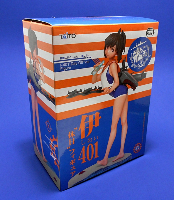
By now, y’all know how much I love me my Kantai Collection and the exploits of the Fleet Girls. Well, then it should come as no surprise, that I’m also extremely fond of Arpeggio of the Blue Steel. It too has WWII style ships, a naval war against alien fleets, and some adorable girls at the helm. In reality the two series are really quite different, but they’re both near and dear to my heart. Figma didn’t go too deep with AotBS, but they did produce a figure of Iona, the Mental Model of the renegade Fleet of Fog submarine I-401. Not to be confused with the I-401 from KanColle that I looked at last week. See? Similar, but different.

absiona12

Iona is #263 in the ongoing Figma line. She comes in one of the smaller and more compact window boxes with a blue and black deco. The window gives you a glimpse of the figure and all the goodies inside. As always, it’s collector friendly and even has one of those branded Figma ziploc bags to help you store all those parts if you don’t want to keep the box. I’ve been really pressed for time this week, so today’s Feature will be relatively quick, but Iona is a fairly simple figure, so I think I can do her justice in a short amount of time…

ionabs6

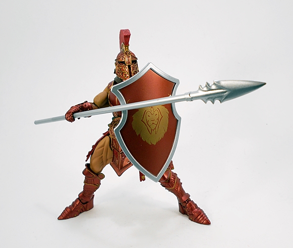
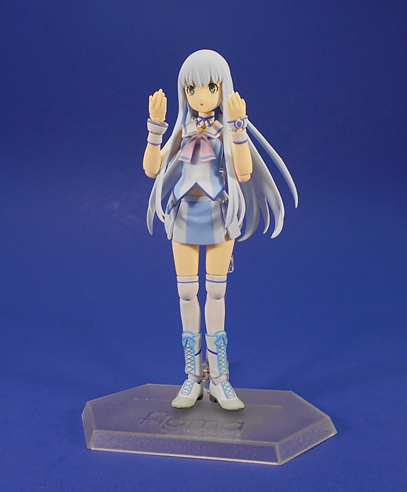
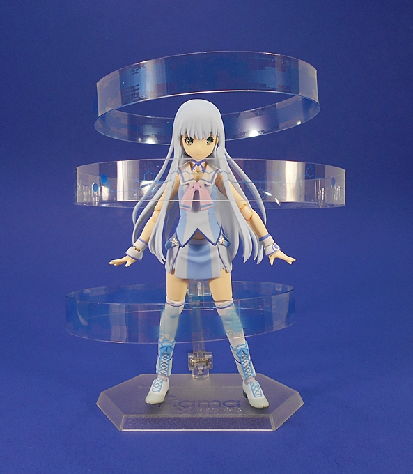
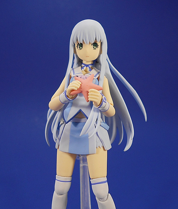
Here she is out of the box and looking pretty sweet. If you’re familiar with the anime, than the obvious thing to point out here is that this is not her better known, dark blue outfit. I actually like this look a lot, but I think it was an odd choice to go with for what will likely be her one and only Figma. Her outfit and hair consist of a matching powder blue, white, and lavender, all of which conspires to give her a very pale and almost ghostly appearance. That having been said, the detail here is quite nice, particularly on the laced boots and the straps that hang off her top and down across her hips.

ionabs7

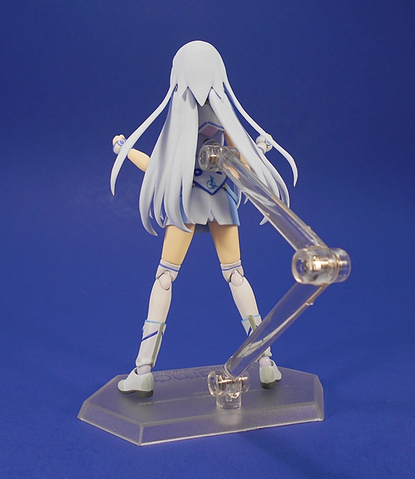
Of course, you get a standard Figma stand with the articulated arm. From the back, you can see that her long hair is articulated to allow the arm access to the peg hole in her back. If you look closely, you should be able to make out the Fleet Insignia printed just above her butt.

ionabs3

ionabs5

ionabs4

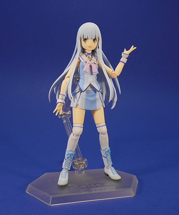
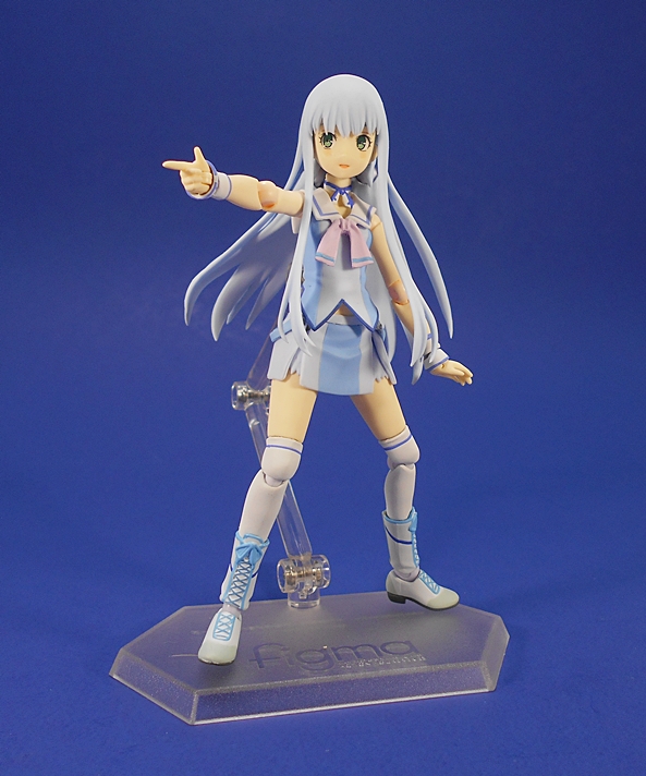
It wouldn’t be a Figma figure if it didn’t come with a whole bunch of hands. In this case, there are four pairs, including: Fists, relaxed hands, splayed finger hands, and accessory holding hands. You also get a pointing right hand, and another right hand that is permanently attached to a little tea cup. One thing to watch out for are her teeny-tiny wrist cuffs, which will fall off when you swap out the hands. Iona also comes with three different swap out faces, which include a surprised expression, a neutral expression, and one with a slight smile. Switching these is as easy as always, you just pull off the front hair piece, pull off the face, tab in the new face, and replace the hair. All of the expressions are pretty damn adorable, and her large green eyes are immaculately printed on each portrait.

ionabs1

ionabs2

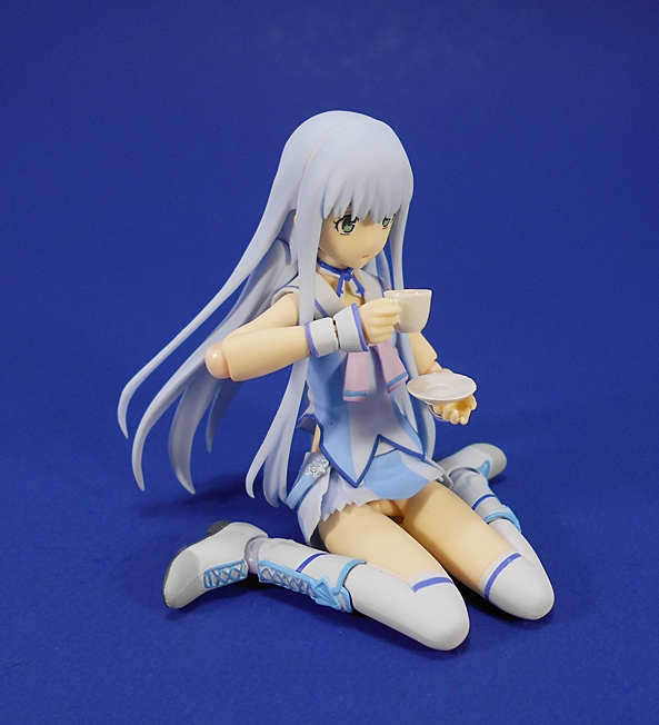
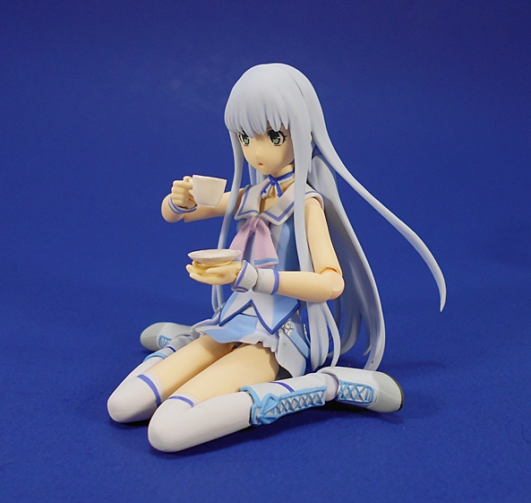
As if all that wasn’t enough, Iona also comes with an alternate lower half, which has her sitting down. This piece requires you to pop the boots off of her legs and attach them to these legs, then pull the figure apart at the waist and attach the upper half of the figure to this piece via a ball jointed peg. Here’s where I like to use the teacup and saucer that she comes with to have her taking some time off from running the I-401 and enjoy a nice cup of tea. Fair warning, the “tea” in the cup isn’t fixed in place and will fall out if you turn the cup over. If that happens, good luck finding it again!

absiona3

ionabs9

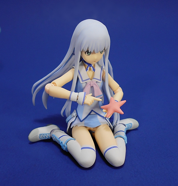
Iona comes with one other accessory and that’s a little pink starfish. She was rather obsessed with the squishy little animals in the series and those accessory holding hands work pretty well with it.

ionabs11

ionabs10

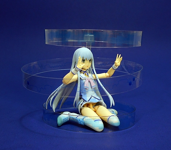
And last, but not least, Iona comes with a complex system of parts to replicate her holographic interface with the I-401. In the series, this consisted of three bands of data displays, which encircled her. Here it’s recreated with three translucent plastic strips that are attached to a special arm on the back of the figure stand. It works… sort of. I give Max Factory major credit for trying, but in the end, I had mixed results with this set up. It’s also extremely frustrating to work with and I could never get the data rings positioned just the way I wanted. A cool idea, nonetheless.

ionabs12

ionabs8

Iona is a very nice figure and I’m glad that the Figma line threw some support behind this anime, because I really do enjoy it a lot. At only 12 episodes, It’s a short run, but I’ve probably been through it three or four times. If you want more, there’s also a Manga and a couple of films. Obviously, I would have liked to see more of the Mental Models recreated in figure form, or even some of the crew of the I-401, but if they were only going to do one figure, Iona was the logical choice. She doesn’t come with as much stuff as a lot of my other recent Figma purchases, but at around $35 the price certainly reflects that. If I had one gripe, it would be the choice of costume, but I’m already eyeing some other figures of her, to get that more traditional look.

Son of Batman (DC Animated Movie Series): Batman by DC Collectibles

I know, a lot of you were probably expecting me to wrap up Wave 3 of DC Icons today on DC Friday. Pfft… like I’m going to buy Aquaman! Kidding! Kidding! Of course, I picked up Aquaman and he’s a fantastic figure. Truth be told, I’ve had a busy week and I didn’t have enough time to do Aquaman justice, so I opted to take a little detour and check out another one of the DC Animated Movie Series by DC Collectibles. These are pretty simple figures and don’t take nearly as long for me to look at. So let’s have a look at Batman from the Son of Batman movie! Hopefully his arm won’t fall off like Green Lantern’s did.

sonvabat1

It’s confession time! I haven’t seen Son of Batman yet, but I hear it’s pretty good. I actually bought this figure as a stand in for a Justice League War Batman that was never produced. Regardless, the figure comes carded in the same style as the JLW figures only with Son of Batman on the front insert and stills from the movie on the card behind the figure. The back of the card shows other figures in the line: Robin, Nightwing, and Deathstroke. If you’ll give me a moment, I’ll say a quick prayer to the QC Gods and get Bats out of his package.

sonvabat2

Alright! I’m happy to report that Batman made it out of the package without any breakage and looking pretty sharp. I was expecting a recycled buck from the JLW Hal Jordan or Barry Allen, but Batman looks mostly new. The overall shape and style of the body is similar, but Batman lacks the detailed muscles in the abs, making this look more like light armor. Most of the costume is achieved through paint apps. It’s a very dark charcoal gray with black painted panel lines, boots, gloves, and bat symbol on the chest. The gold belt is a mix of sculpt and paint and looks pretty good.In fact, all the paint on this figure is quite solid.

sonvabat3

The cape is particularly well done. I love the way it covers the shoulders rather tightly, it fans out just the right amount, and the scalloped edges end just a bit above the ground, so it’s not dragging. Nice!

sonvabat4

The head sculpts have been hit or miss in this line. We’ve had the sloppy Hal Jordan, the deformed Superman, and a pretty solid Wonder Woman and Cyborg. I’m happy to report that Batman can be counted with the better ones. Not only is the cowl excellent, but the exposed part of the face is clean and sharp and actually looks great.

sonvabat6

sonvabat7

The articulation on these figures is the same throughout all the male bucks. It’s OK, but not great. It’s loads better than what we used to get from DC Direct, but not quite up to snuff with the other modern DC Collectibles lines. You get rotating hinges in the shoulders and elbows, hinges in the knees, ball joints in the hips, and a ball joint in the neck. A couple of my figure’s joints were a little tight out of the package, but I was able to coax everything into moving without breaking.

sonvabat5

sonvabat8

That’s it! I said today was going to be quick and it was. I’d rate Batman among the best of these figures so far, or at least of the ones I’ve already opened. The stylized sculpt suits him beautifully, the paint is sharp and neat, the portrait is solid, and I’ve really got nothing at all to complain about. Well… at $20, the original price is a bit high for what you’re getting here, but I’ve been picking these up for ten bucks a pop, and I’m certainly satisfied here.So far, the best I can say is that I’d be happy to just own this one and Wonder Woman as stylized stand alone figures, but it’s not a line I’d recommend at anything other than deep discounts.

Transformers Unite Warriors: Combaticons (UW-07) Box Set by Takara, Part 2: Vortex and Blast Off

It’s Transformers Thursday again and I am continuing on with my look at Takara’s Unite Warriors Combaticons box set. Last time we looked at the packaging and Onslaught, today I’m starting in on the limbs, or more specifically, the Deluxe Class bots that will make up Bruticus’ arms. Let’s kick it off with the alt modes, and I’ll start with Vortex…

vortoff3

Originally released as Alpha Bravo for the Aerialbots and then Blades for the Protectobots, it should come as no surprise that this mold is being recycled yet again for Vortex. That’s not a bad thing, as I like this mold a lot and all of my original hostility toward it was fueled by the fact that he was a helicopter standing in for a jet on my Aerialbot team. I’ll even go so far as to say Vortex is probably the best use for this mold to date, seeing as how it comes armed to the teeth with a pair of rocket clusters. Structurally, the only real difference between Vortex and Blades is the new four-bladed rotor, which looks great in the chopper mode, but I’ll have some unkind things to say about it when we look at his robot mode.

vortoff4

The new color scheme is pretty nice. The primarily dark gray and black deco certainly gives him a sinister Decepticon look and I really dig the faction symbols near the doors to the cockpit. The lighter blue striping on the nose and rockets is an interesting choice. I wasn’t so sure about it at first, but it’s growing on me.

vortoff2

Vortex is one of the few instances in the Combiner Wars/Unite Warriors line where I find value in attaching one of the combiner parts to an alt mode. In this case, plugging the hand/foot with the twin chain guns into the bottom not only gives him a platform to rest on, but adds some major firepower without looking too stupid. Moving on to Blast Off…

vortoff5

If you haven’t figured it out by now, Hasbro likes to substitute impostors into our Combiner Teams and release the real ones later, or just leave it up to Takara. With the Aerialbots, Protectobots, and Stunticons, they did this by introducing an all new character. With the Combaticons, they just made Blast Off a repainted jet from the Aerialbots. And while a combat jet makes more sense in the team than a space shuttle, it was still unacceptable to me because I’m an unforgiving middle aged fan who does not want my childhood re-written. Sometimes, folks, you should be careful what you wish for…

vortoff6

vortoff7

Enter Takara’s Blast Off, a brand new mold and a proper space shuttle, yes, but not an alt mode that’s going to win any awards. This thing is actually pretty ugly with obvious arms running down the sides, a tail fin that doesn’t always stay pegged together, and a patchwork deco that isn’t helping the mold any. Am I being too hard on him? Probably. Truth be told, I’m happier having this toy, with all its flaws, in my Combaticons, than I would be having a repainted Aerialbot. I actually think a more reasonable deco could have helped this shuttle mode out a lot. In the end, I’m going to give it a pass, but just barely. Let’s move on to the robot modes, and we’ll jump back to Vortex…

vortoff12

As with his vehicle mode, Vortex’s bot mode is just a repaint of Blades with a new head, at least from the front. The coloring doesn’t change much from the chopper mode, although you do get a little more blue exposed in the upper legs and chest. And while the coloring overall looks pretty good here the paint on my figure has a few flubs on the right arm. The paint just doesn’t look as premium as I’m used to seeing in a Takara release. That having been said, this is still a huge improvement over the crazy coloring on Hasbro’s version. Besides the coloring, I still dig this mold a lot. You have the option of pivoting the tail boom left or right behind his head, but I prefer leaving it straight to preserve symmetry. The new head is absolutely fantastic. A solid tribute to the G1 version of the character.

vortoff13

From behind, things get a little shaky, thanks to the new set of rotors. With blades, you could fold up the two blades and tuck them neatly between the stabilizers on the tail boom and for the most part they stayed out of the way. Here you have two additional blades to deal with. The official transformation just leaves the bottom two blades flopping off to the sides. I’ve found that if I squeeze them in a little further, I can get the bottom blades to stay in position roughly in line with the top two blades. It’s possible, however, that this is causing some stress to the plastic, as they aren’t meant to be placed in that position, but it helps solve what is otherwise a detriment to the figure.

vortoff9

vortoff11

vortoff10

vortoff8

Vortex comes with a repaint of the same rifle as Blades, and it remains among my favorite weapons in this line. Of course, he also has a full bank of rockets mounted on each arm. When it comes to attack power, Vortex has got it covered. In the end, Vortex still feels like a relatively fresh figure to me, but a lot of that probably has to do with me skipping Alpha Bravo. The color scheme works well, the new head sculpt is perfect, and so long as I can get the rotors situated on his back just right, he’s aces in my book. So how about Blast Off’s bot mode?

vortoff14

Well, I’m surprised to say that despite the iffy shuttle mode, Blast Off’s bot mode is pretty damn great. I really dig the way the nosecone of the shuttle packs up so neatly into his chest. Yeah, it juts out a bit, but it still works for me. Likewise, the wings all pack up nicely on his lower legs and the thrusters as feet are a nice nod back to the Sunbow version. As far as the coloring goes, it’s easy to see they sacrificed any sense of coherence in the alt mode for a pretty spiffy deco in robot mode. I guess I’m OK with that. And like Vortex, Blast Off’s head sculpt is simply superb.

vortoff15

It’s interesting to check out Blast Off from the back and see how his backside looks pretty similar to the fronts of a lot of the CW/UW Deluxe limbs. Indeed, if for some reason you don’t like the chest, you can just spin the lower half around, re-position the arms and legs and have a more familiar looking bot that wears the nose cone assembly as a backpack. Me? I’m fine with the official mode.

vortoff16

vortoff17

Blast Off comes with a little black pistol, which isn’t as impressive as Vortex’s rifle, but it suits him just fine. And since he has thrusters in his fists, I like to think that those would serve him well as additional weapons. As much as I dig Vortex, Blast Off takes the prize as my favorite of this pair, at least in robot mode.

vortoff18

vortoff19

And there you have it, a couple of solid Deluxe Class figures who I am very content to call modern updates to their G1 Combaticon namesakes. If the snazzy paint job on Onslaught hadn’t already convinced me that Takara was the way to go here, this pair has even more so. Getting a proper shuttle mode for Blast Off is a treat, even if the shuttle mode ain’t all that great, because his robot mode more than makes up for it. I think he’s one of the more interesting Deluxes to come out of this line. And as for Vortex, even if the paint here doesn’t feel as premium as I would have expected out of Takara, the alternative deco on the Hasbro version is an absolute tragedy. So far I’m digging this set a lot. Next Thursday, I’ll be back to talk about Swindle and Brawl!

Mythic Legions: Asterionn by The Four Horsemen

Oh, how I look forward to Wednesdays now, when I can sit back and bask in the glory of yet another Mythic Legions figure from T4H. Today I’m checking out one of the more unique figures in the line. His name is Asterionn, and he’s a god damned Minotaur! And he’s one of the good guys!

mlaster16

I’ll continue to show packaged shots of these figures even though by now y’all should have a good idea of what to expect. It’s a simple and collector friendly bubble and card with an insert showing the name of the series on the front and a blurb about the character on the right panel. Slide out the card and you can get at the goods. It’s worth mentioning here that Asterionn is the one and only figure in this line that had some paint rubbing on the inside of the bubble from his nose. It’s not even noticeable on the figure, but the smudge is clearly visible on the bubble. That protruding snout just doesn’t have anywhere to go in the package, so it just ends up rubbing on the inside.

mlaster1

As usual, the figure comes packaged without the shoulder armor attached and in this case it gives us a nice look at the unique sculpting in the area where the fur from his bovine head gives way to man flesh. This part is cleverly done as the entire area from the chest medallion up to the neck is a separate piece fitted on top of the standard bare chested buck. That buck, as well as the upper legs and upper arms, are the same parts used for Urkku and Vitus. The parts reuse means that Alterionn features the same excellent standard of articulation as the previous figures in the line, which basically means you get rotating hinges all around and each of those hinges is a point where the corresponding part can be pulled off and swapped out with one off of another figure.

mlaster2

mlaster3

We saw the waist, hip, and groin armor back when I looked at the Dwarves, Thord and Bothar. Yes, the armor pieces used on the Dwarves work perfectly on this hulking dude. Proportionally, it shouldn’t work but it does. How cool is that? The shoulder armor consists of the same molds we first saw on Sir Gideon and both the gauntlets and grieves are repaints of the same pieces worn by Urkku. Asterionn does feature a new set of hooves for feet. And yes, you get the standard brown belt, which can be used on the waist or as a shoulder strap. The paint on Asterionn is just as fantastic as what we’ve been seeing all along. The armor pieces feature a very nice worn copper look with silver painted rivets and metallic blue scales over the groin, each with a neatly painted copper rivet. The same blue is used for the stone in the center of his chest medallion as well as some striking accents on the shoulders.

mlaster5

mlaster4

The portrait here is brand new and it is absolutely killer. The powerful bull head features some excellent sculpted hair and the glossy paint used for the eyes give him a delightful spark of life. The horns can be rotated or even pulled out and used in one of the other figures’ helmets. But I wouldn’t want to deprive this guy of his horns. I really like the deep chocolate brown paint they used on his head and the way it fades gradually into the skin tone.

mlaster6

mlaster7

mlaster8

Asterionn comes equipped with the standard shield that we’ve been seeing a lot of. In this case the surface features a blue stag head against a gold background. You also get the sword that we’ve previously seen included with Gorgo, Urkku, adn Bothar. This time it has a gold painted hilt, which matches the gold rim on the shield.

mlaster10

mlaster9

mlaster14

And finally, you get the axe that we’ve already seen a couple of times and which can be displayed with either a single or double blade. This one is decked out with gold, silver, and blue paint to match his armor. There’s also a cool weathering effect on the blade.

mlaster12

mlaster13

mlaster15

I’m really trying not to fall into the trap where every time I look at a new Mythic Legions figure, I proclaim it to be my new favorite, but that’s been more or less the case. I really do love everything about this guy. Having a Minotaur in the line is a perfect fit and while I confess that I haven’t been investing a lot in the fiction for the line just yet, I do like that they made him a good guy. Asterionn is a gorgeous figure and yet another fine example of how well T4H planned out the parts sharing in this line. There’s another Minotaur coming with the Wave 1.75 figures, but I decided to stick with this one. He’s more special to me if he’s the only one of his kind, and quite frankly I think they nailed this figure so well, I didn’t see a reason to add another.

Masters of the Universe Classics: Despara by Mattel

In case you haven’t heard, there’s been big doings over at Matty’s Castle. Matty Collector is officially closing down at the end of this year and the Adult Collector lines are being handed over to Super7. Right now it seems like Masters Classics will certainly continue under the new stewardship in some form, while the future of lines like ThunderCats, which haven’t even started shipping yet, are a bit more questionable. Either way, as we ponder the future of these lines, it seems only appropriate to be looking at one of my most anticipated figures from the Collectors’ Choice Sub. Let’s check out Despara!

motucdesp1

Will Super7 carry over this style of packaging? I hope so! These packages have become so iconic to me over the last handful of years. No more bios on the back, but we do get Despara’s tag line on the front, “Powerful Force Captain of the Evil Horde” and a Horde sticker on the bubble. An explosion on the side panel declares this figure is part of the Collectors’ Choice Subscription. I think there are still two more figures coming in this Sub and I still have one other waiting on deck to review. As I understand it, Despara is the name used by Adora in the DC Comic, when she was a Force Captain for The Horde. I’ve never read it, but I do remember her being affiliated with The Horde in the beginning of the She-Ra Filmation cartoon, although I seem to recall that she was just called Force Captain Adora and that she wore her regular clothes. I think I like the DC version better, because…

motucdesp2

Well, damn… just check her out! I don’t know about you, but being told that Force Captain Adora is coming to lay down some Horde law wouldn’t instill fear in me. Nor would I be trembling when some wholesome looking blonde shows up in a tunic and skirt. Now, you tell me Despara is coming to set fire to the village and this bitch turns up? I’m gonna get out my Bank of Etheria checkbook to pay my taxes right quick. This design is just so bad ass. Yeah, it’s basically just She-Hordak, but oh man, do I love it! You get that same sinister black and gray deco on her outfit and a little bit of red. Why no Horde emblem? I’m sure there must be a reason, no?

motucdesp3

The stepped shoulder armor is part of the cape, which just lays on her shoulders. If you pop the head you can lose the cape to give her a little more agility for battle. The cape also features a pair of loops for her twin swords, which I’ll get to in a bit. The paint on this figure isn’t quite as tight as what I’m used to seeing on most of my MOTUC figures. It’s by no means terrible, but some of the lines could be a little sharper. Also, it’s just my personal preference, but I wish the outside of the cape was black. But who am I to nitpick the Horde Queen’s color choices?

motucdesp4

The masked head is patterned after Hordak’s and it is every bit as ugly as it should be. Actually, it’s a wee bit uglier. The teeth look kind of sloppy in both sculpt and paint. Same goes for the cowl that frames the face. The truth is, we’ve seen better in this line. Just compare this portrait to any of the Hordaks and I think it comes up a little short. Again, not terrible, but I think Matty could have done better.

motucdesp16

As we saw in the packaged shot, Despara comes with an unmasked head. It’s basically Adora with a buzz cut and some war paint under her eyes. The portrait looks a little too friendly, but I guess that’s why she has the mask. The paint here is fairly solid. I like the gloss they used on her lips and the bright white for her teeth. There is some unfortunate and annoying mold flashing around the edges of her chin and her ears. I love that we got this extra portrait, but will I be displaying it on the figure a lot? Probably not.

motucdesp11

Articulation features the standard for MOTUC female bucks. That includes rotating hinges in the shoulders, swivels in the biceps and wrists, and hinged elbows. The legs are ball jointed at the hips, have hinges in the knees, swivels at the boots, and the ankles feature both hinges and lateral rockers. There’s a swivel in the waist, no ab-crunch, and a ball joint in the neck.

motucdesp7

motucdesp5

In addition to the extra head, Despara comes with her own Horde staff, which features an array of silver painted blades and a red tip. I like this thing. It’s a pretty cool mix of ceremonial piece and weapon.

motucdesp12

motucdesp9

motucdesp10

Despara also comes with her twin swords and here’s where we run into some problems. The swords themselves are fine. They have silver painted blades and the hilts are black and red to accessorize with her outfit. They look great! No, the problem here is that her hands are clearly not made to hold them very well. The grip is just a little too big and the swords wind up falling out of her mitts. I can squeeze the grips to close them and that works for about a minute or so before they go back to normal and drop her swords. Now is a good time to go digging through the trash and find those clear plastic rubber bands they used to hold them in her hands while she was in the package!

motucdesp15

motucdesp14

motucdesp17

motucdesp18

If it sounds like I nitpicked Despara more than I do most Masters Classics figures, you have to understand that I was really looking forward to this one. And what I got is in no way a bad figure. There are, however, a few things about her that didn’t live up to my expectations and I feel some of that has to do with her coming at the end of Matty’s run. I could be totally off base on this conclusion, but the little nitpicks about this figure point to her being rushed. Just stand her next to the original Hordak and the difference in care and craftsmanship feel like night and day. I think the paint could have been a little tighter, the head sculpt a little better, and those sword-dropping hands really are a nuisance. Disappointed is way too strong a word for how I feel. I dig this figure a lot, but I can’t help but believe that had she been released a year or so ago, she would have turned out a little better for it.

Marvel Legends (Juggernaut Wave): Wolverine by Hasbro

It’s time to start a brand new wave of Marvel Legends and I had several to choose from in my backlog. In the interest of being current for once, I’ve decided to skip ahead to the X-Men Wave featuring the Juggernaut Build-A-Figure. Aw, who am I kidding? Being current has nothing to do with it. I just couldn’t wait to start opening these! Looks like the Civil War Giant Man Wave will have to wait, and who knows when I’ll get to look at that Rhino Wave. Ah, X-Men… but where to begin? Considering this is perhaps the finest wave of Legends to date, there was no wrong answer. In the end, I decided to start with Wolverine because he’s the best at what he does!

DSCN8815

mlxmwolv1

While the Marvel Legends packaging is always attractive and collector friendly, I’ve never really been motivated to keep any of it until now. A combination of spiffy matching yellow coordination and some kick ass character art on the side panels make these look like something special. Together, these just don’t feel like a normal wave of Legends. With a never-ending flood of Iron Mans, Captain Americas, and Spider-Mans, it’s crazy to think that this is only the second time we’ve seen Logan in Legends since it’s return. And the previous release was part of that now impossible to find Jubilee Wave.

mlxmwolv10

mlxmwolv11

Wolverine comes in his oh-so-classic brown suit, and I wouldn’t have it any other way! I should also point out straightaway how relieved I am that Hasbro didn’t recycle the Dark Wolverine body from a while back. This one suits Logan well, features the lovely pointed flares on the tops of his boots, a solid yellow and brown painted deco, and classic wide red belt. When it comes to the comics, this is The Wolverine that scratches my itch. The only disappointing thing here is that he doesn’t have any claws!

mlxmwolv12

mlxmwolv13

Just kidding! Of course, you get a pair of regular fists and some snikt hands. Did we even need the fists? I can see maybe mixing them up at some point with one fist and one clawed hand held up, but even that’s stretching it. Wolvy needs his claws and while I love to have options, I doubt the fists are going to get much use, other than for fist-bumping Spider-Man. The claws are especially nice and not overly bendy or prone to warping. Although since many of my Legends figures get cycled into Totes now and again, I’m thinking I’ll put the fists on him for that so the claws don’t get all bent up or broken during Logan’s down time.

mlxmwolv8

mlxmwolv15

The portrait here is fairly solid. I think the mask portion looks great, especially the expressive eyes. He truly looks like he’s sick of your shit, bub. The unmasked part of the face is a little on the soft side. It reminds me a bit of some of the softer Captain America sculpts. Not bad, but I think that part could have been better. Oh, I suppose I could complain that there isn’t an unmasked portrait. After all, the Jubilee Wave came with one, but then that figure goes for well over $100 now! In fairness, I think Hasbro could have tossed it in here, but I’m not going to hold that against what is otherwise a fantastic classical figure of a character that was long overdue for an appointment with my Marvel shelf.

mlxmwolv2

mlxmwolv7

mlxmwolv17

The articulation here is top notch. You get all the regular points that we’re used to seeing in Legends. The arms have rotating hinges in the shoulders and wrists, double hinges in the elbows, and swivels in the biceps. The legs are ball jointed at the hips, have double hinges in the knees, and swivels in the thighs and again down int he boots. The ankles are hinged and have lateral rockers. The torso features a swivel at the waist and an ab-crunch hinge. The neck has both a ball joint and a hinge. The big addition are those wonderful shoulder crunches that we see crop up from time to time and they make a big difference! I’ll note that the upper elbow hinge on my figure’s right arm has a bit of a pull to it where the pin connects. It’s not too bad, but I might still pick up a replacement.

mlxmwolv3

mlxmwolv6

mlxmwolv16

DSCN8936

This figure hits the spot on every conceivable level. It was well past time we got Logan in the Legends line again (and with actual distribution this time!) especially since it seems like a handful of the A-list heroes have been getting more than their share of figures. Given the current state of The X-Men over at Marvel, it’s kind of odd to see this wave hit now, but you won’t hear me complaining about it.  This release is as simple and classic as it gets and I have a feeling he’s a pretty good indicator of the figures I’ll be opening over the next bunch of weeks!

KanColle: Aircraft Carrier Submarine I-401 (Day Off Figure) by Taito

Hey hey, it’s Saturday. Anime Saturday. And that means more KanColle! Ok, I’m done rhyming now. I had originally planned on looking at a new Sailor Moon Figuart today, but time caught me up, so I had to fall back on another Prize Figure from Kantai Collection. This Saturday, I’m back to Taito and another “Day Off” Figure, and like the last “Day Off” Figure, this one is from the Kantai Collection video game and not the Animation Sequence. She’s Aircraft Carrier Submarine I-401… but you can call her Shioi!

shioi1

As usual, Taito presents the figure in a colorful, fully enclosed box, which gives you plenty of shots of the figure inside. There’s not a lot of English, but the figure is identified on the top panel. I have to say I think this box is especially cool. There’s something about the art style that makes it look like a vintage pin-up and reminds me a bit of the old Vargas Girls art. As a character from the game, I’m not as familiar with her as the anime characters, but I tend to go in and read some of their dialogue as an indicator. In this case with phrases like, “CAN I DIVE YET? CAN I DIVE YET?” and “Please don’t touch my hangar tubes that much!” indicate that she’s adorable.

shioi2

shioi3

It doesn’t take long to get Shioi ready for display. You just peg her feet into the base, peg her submarine gear into her tushie, and peg each of the tiny planes onto the carrier deck. Toss the tiny crab (which I already lost!) onto the base and she’s ready to go! The “Day Off” figures are pretty self-explanatory, as they depict our fearless Fleet Girls enjoying some down time. In this case, Shioi is strolling along the beach in a one-piece swimsuit with a cover up that resembles the school uniforms they usually wear. She shoots a side glance as she brings a bottle of icy cold water (or perhaps Ramune?) up to her lips. The sculpt here for the costume is very simple, but the colors are excellent, particularly the soft skin tones, the deep blue, and the bright white of her cover up.

shioi4

shioi5

I was particularly anxious to get this statue because there aren’t any submarines in the anime and that seems like a missed opportunity. At the same time, I get excited whenever I see a reference to the Japanese I-400 Sub Aircraft Carriers, because they’re such a wonderful curiosity. As I understand it they saw virtually no action in the war and even as someone who enjoys doing a fair amount of reading about WWII, I rarely ever encounter any mention of them. The very concept of a submersible aircraft carrier still sounds like something out of science fiction. It’s just damn cool.

shioi9

shioi8

shioi11

The sculpt for the submarine component is solid but not exceptional. It looks a little soft, and there isn’t a whole lot of detail on it, but there’s enough here to get by, and it’s perfectly acceptable to me for a figure in this price range. On the other hand, they did a very nice job sculpting the three tiny Aichi M6A Seiran aircraft that perch on the launching gantry. Most of the Sub Aircarft Carriers were designed to launch recon planes, but these babies were meant for attack!

shioi13

The portrait here is very simple and functional, She’s cute, but nothing fancy. Shioi features large brown-printed eyes, short hair, and a wide smile. Her bottle is cast in translucent blue-green plastic.

shioi10

While the majority of the Taito Prize Figures in my collection have simple, featureless bases, Shioi’s is crafted to look like a stretch of beach, half sand and half water. The water surface has sculpted ripples and is cast in transparent blue plastic with the sand painted and textured. I haven’t lost hope in finding that tiny crab, but alas he remains MIA for this review.

shioi12

The I-401 “Day Off” figure set me back just under $20 shipped and I’ve got no complaints. In terms of sculpt, Shioi herself is probably the least impressive of my KanColle Taito figures. There’s nothing bad here, but the sculpt just isn’t quite as sharp and detailed as the others. On the other hand, the paint is quite solid and the execution of the submarine component with the planes and the beach environment on the base takes what could have been a very average figure and raises it up a couple of notches. Not too shabby!

DC Icons: (#12) Atomica by DC Collectibles

It’s another DC Friday and I’m winding my way through the most recent wave of DC Icons figures. I’ve already checked out Superman and Harley Quinn and today I’m opening up that traitorous bitch, Atomica! And yes, that’s a spoiler for an old comic.

dcitomica15

The packaging is the same as we’ve been seeing throughout the run of this series. It denotes that Atomica is the twelfth figure in the line and that she hails from the pages of Forever Evil, although she was in the company of The Justice League for a while before that. It was right before Forever Evil that she showed her true colors as a mole who was sent ahead to assist in allowing the Crime Syndicate to escape their Earth and conquer our own. Where the hell does The Atom fit into all this? Ray Palmer was busy screwing around in the pages of Frankenstein: Agents of SHADE, a book that got shit-canned after 16 issues, and if you ask me deservedly so. But don’t worry, Ray is in this box too… and so is Ryan Choi!

dcitomica7

dcitomica8

The beautiful and sadistic Rhonda Pineda dons her striking red and blue outfit, which gets by with very little in the way of sculpted detail other than the new belt. Now, with the first two ladies appearing in this assortment, it would be understandable to assume they were straight repaints of the same buck, but that’s actually not the case. The Harley figure features a number of slight rumples and wrinkles on her costume, whereas Atomica’s is totally smooth and skin tight, with just a handful of subtle sculpted lines. That’s not to say the lack of detail is an oversight, as the figure’s appearance is quite faithful to the costume as it appears in the panels and thanks to the vibrant colors, this is a beautiful figure in hand.

dcitomica9

And speaking of beautiful, the head sculpt here is no slouch. Her mask is part of the sculpt and she has her goggles up on her forehead. The hair is also nicely done, but as expected it can get in the way of the neck articulation. That can be frustrating at any time, but a little more here, since Atomica is a flyer and she can’t look up. I’ll also note here that the paint on the face is really curious in that through the lens, it looks really mottled up close, but in hand it looks really good. I noticed that a bit with Harley too. Weird!

dcitomica11

The rest of the articulation is unhindered and features everything we’ve seen in this line before. The arms have rotating hinges at the shoulders and wrists, swivels in the biceps, and double hinges in the elbows. The legs are ball jointed at the hips, double hinged at the knees, and feature both hinges and lateral rockers in the ankles. The neck, is ball jointed, there’s another ball joint just below the chest, and there’s an ab crunch hinge just above the waist. Still no swivels in the legs… Insert sigh here.

dcitomica10

Atomica’s only accessories are an extra pair of hands. These are sort of gripping hands, but not quite. Truth be told, they aren’t really different enough from the fists that come attached to the figure, so I doubt I’ll be swapping these out a lot.

dcitomica4

dcitomica5

You do, however, get two additional figures in the box, or at least one figure and one display piece. The figure is a mid-sized version of Ryan Choi. Both the paint and the sculpt on this little fella is pretty damn impressive considering his size. He also features a standard 5-POA articulation with points in the hips, shoulders, and neck.

dcitomica2

dcitomica3

And lastly, you get a super teeny-tiny Ray Palmer with a stand and translucent atom shrinking effect.  I really love the way this guy looks. The paint isn’t as clean as the other figures. Mine actually has a stroke of blue paint on the face, but considering the size and how close you need to get in to see any issues, I’m not bothered by it. I am, however, going to go on record and just say that I’d rather they given us a midsize and small versions of Atomica herself, as opposed to the other Atoms. Given the context of this figure, it just seems more appropriate.

dcitomica6

dcitomica13

dcitomica12

And so we have another DC Icons release, and another very solid figure. Of course, with this particular character, the mileage may vary. With a wave that includes very classic versions of A-Listers like Aquaman, Superman, and Harley Quinn, Atomica definitely feels like the odd figure out. As for me? While I was admittedly disappointed by the payoff of the whole Pandora’s Box thing in The New 52, I actually enjoyed Forever Evil and Trinity War quite a bit. The reveal of Atomica’s true nature was a neat little twist and both she and Johnny Quick were memorable characters to me, because they were just so damn twisted. In other words, I am very happy to get her, but also bummed that we’ll probably never see a Johnny Quick in this line to go with her. On the flipside, in DC Collectibles’ regular New 52 line, we got a Johnny Quick, but no Atomica. Bummer.

Transformers Unite Warriors: Combaticons (UW-07) Box Set by Takara, Part 1: Onslaught

I was going to make such a big deal about having new arrivals for Transformers Thursday, but then I see so many pictures of Titans Return figures in peoples’ hands and suddenly I don’t feel so special. But I do have a holdover from Combiner Wars… or, excuse me… Unite Warriors, in the form of the Japanese Combaticons box set! I can’t tell you how hard it’s been to keep passing up the Hasbro Combaticons on the pegs, knowing that I had this on pre-order. Thank Primus, it’s finally here! I’m going to use the same formula here as I used for the G2 Menasor set. Today I’ll look at the packaging and Onslaught, next week I’ll tackle the limbs two at a time, and we’ll wrap it up the following week with Bruticus.

uwslaught6

uwslaught7

The box design is very similar to the one used for the Unite Warriors Aerialbots, so if you’re a stickler about matching sets, you should be very happy to sit them next to each other on a shelf. There’s some absolutely bitchin’ and gritty artwork on the front of the box showing Bruticus stomping through a city and there’s a front flap that lifts open to reveal a window showing the goodies inside. Seeing the toys all laid out in their vehicle modes really takes me back to the glory days of the G1 giftsets. I never owned any of those, but they sure were pretty to look at! The back of the box has a large photo of Bruticus as well as photos of the individual figures in their robot and alt modes. The set is collector friendly, although getting everything back in place can require some patience. An instruction booklet is also included in the box. Let’s start with the alt mode!

uwslaught1

Onslaught is obviously the Voyager Class figure in the set and he’s built off of the Protectobot Hotspot mold. I don’t think that’s as apparent in his alt mode as it is his robot mode and the use of shared bodies here seems like a good choice. The alt mode is pretty true to his G1 roots, at least in the sense that he’s a military truck. The cab is more modernized and he lost a pair of wheels along the way, but I still have little trouble identifying the homage here. He features two large cannons, but don’t look too closely or you’ll see Bruticus’ head peeking back out at you trying to not be noticed. It’s not one of the most outrageous alt modes out there, but all things considered, I think it’s pretty solid even with the combiner head sitting up there like he’s on a parade float.

uwslaught2

Unfortunately, Unite Warriors Onslaught’s alt mode is not as versatile as his G1 namesake. I’m sure I could work out some iffy fan modes, but he’s not really designed for much else besides being a truck. With the pegs on the top of the cannons and the multiple peg holes on the bottom of Blast Off, I was hoping there would be an official way to make Onslaught carry him, but it looks like I’m out of luck unless I want to balance him up there. There’s sort of a flatbed area on the back, but it’s not really big enough to comfortably carry any of his chums. Ah well, sometimes a truck is just a truck… and a robot… and a torso. Never mind.

uwslaught4

The coloring here is quite nice, with the blue and brown doing a fine job of representing the G1 toy’s deco. I’m not going to spend a lot of time comparing the coloring between Hasbro and Takara on the limbs, but I will do it here because Takara’s Onslaught is just such a huge improvement over the Stateside release. The blue is much darker and richer here than on the Hasbro version, I like it better, but that’s really just a matter of taste. The biggest difference in paint, however, is the beautiful work Takara did on the package of torso parts that sits on the vehicle’s back. These parts were left as bland off-white plastic on the US release, whereas here you get some beautiful coloring, along a very striking shade of silver paint. The same goes for the guns. It really looks fantastic here, and as we’ll see in a few weeks, this will make an even bigger impact in the combined mode.

uwslaught3

Transforming Onslaught should be very familiar if you’ve spent any time with Combiner Wars Hotspot. If anything, Onslaught is a little easier because all those extra torso bits just stay where they are and are worn as a backpack. And obviously there’s no ladder to mess with. Yes, it’s always worth pointing out that despite the need for add-on hands and feet, these combiners are otherwise self-contained. The only other thing worth noting are the knees. As with Hotspot, there’s a trick to locking these in, and if your Onslaught’s knees keep buckling, it’s probably because he isn’t transformed properly.

uwslaught8

In robot mode, it isn’t too difficult to pick out the parts shared with Hotspot. The forearms and the legs are most obvious to me, although he does have new feet and the new deco helps fool the eye a bit, particularly around those knees. Regardless of the recycling, however, I think he works quite well as a send up to G1 Onslaught. Some high points for me include the detailed sculpt and paint in the chest panel, the painted coils in his arms, and the crisp Decepticon logo on his chest. The two circles painted on his pelvis area are also nice nods to the Sunbow animation design.

uwslaught9

All looks pretty good from the back too. Yeah, his lower legs are hollow, but I do like how all that combiner stuff packs neatly into a backpack. I also get a chuckle out of the fact that he wears Bruticus’ head on his ass. The guns store nicely on his back and help hammer home the homage of having the twin guns rising up behind Onslaught’s shoulders. Onslaught is a bit back heavy, and while those heel spurs help a bit, he’s still prone to toppling backwards. Now is as good a time as any to mention that Onslaught suffers from the same rather unforgiving ratchet joints in the hips. There isn’t a lot of finesse there, so posing him and getting him to balance in those poses can be an exercise in frustration.

uwslaught11

uwslaught10

The head sculpt is pretty straight forward, and he has a painted visor instead of light-piping. I will say that it’s a toss up for me as to whether I prefer the black head on the Hasbro version or this blue one. It’s too close for me to call. Here you can also get a better look at the distinctive paintwork in the chest panel. The colors on this guy really are beautiful!

uwslaught12

uwslaught13

Of course, Onslaught can dual wield his twin guns in his hands in order to live up to his name. Since these serve as Bruticus’ weapon too, they can be connected together to form a bigger rifle, and it isn’t too big for Onslaught to use. Ironically, the extra paint apps on the guns make it really apparent that the larger weapon is just two of the same gun stuck together.  For that reason, I think the combined guns worked better for Hotspot, as those are all black.

uwslaught5

uwslaught17

uwslaught15

uwslaught14

Onslaught has a few issues, but overall I like him a lot. In my mind, he’s definitely the best modern version of the character that we’ve seen from either Hasbro or Takara, but then I suppose that isn’t saying much. Nevertheless, it’s easy for me to overlook some of the flaws while admiring the fact that he’s a partially shared mold and a pretty clever one at that. To me that’s even more impressive when you see him in his torso mode. Ah, but I’m getting ahead of myself. Next week, we’ll bust into the Deluxe Class figures and check them out, starting with Blast Off and Vortex!

Mythic Legions: Vitus by The Four Horsemen

In the past five weeks of Mythic Legions Wednesdays I’ve delved into the Skeletons, Knights, Orcs, and Dwarves, but today I’m checking out one of the figures that doesn’t fit into any of the more conventional classifications. His name is Vitus and he is a lone warrior, the last survivor of his people, and an overall scourge of all evil!

mlvit25

Here’s a quick obligatory in-package shot. Once again, they are collector friendly, but I still haven’t decided if I’m keeping the cards and bubbles. Space is always a concern and I may just wind up saving the inserts with the names and bios.

mlvit1

Vitus is obviously themed off a Spartan warrior and he’s one of the best examples so far of how clever T4H are on the reuse of parts. Vitus uses the lower legs, boots, and gauntlets we saw on Sir Gideon and Gorgo. the torso and groin armor from Gorgo, the upper arms, upper legs, and belt from Urkku. This figure should look like a cobbled together mess, but this combination of parts and all new paint makes him look like a unique design that was build from scratch from the ground up.

mlvit2

mlvit5

New paint features smooth and even flesh tones on the arms and legs and a rather striking combination of metallic red and gold for the armor. The intricately sculpted belt, which looked old and tribal on Urkku looks flashy and ornamental on Vitus. The new deco just transforms it into something new. It’s amazing! It’s also worth noting that Vitus is the only figure I’ve looked at so far that does not include shoulder pieces, although the sockets are still there if you want to borrow someone else’s for him.

mlvit3

mlvit4

Vitus’ head sculpt features an intricately sculpted Greek-style helmet with a high crest comb. There’s some lovely raised scrollwork and all the details are painted gold against the metallic red backdrop.

mlvit11

mlvit6

The modular nature of Mythic Legions means the figures feature identical articulation straight across the board. Vitus features rotating hinges in the shoulders, elbows, wrists, hips, knees, and ankles, as well as lateral rockers in the ankles. There are also ball joints in the waist and neck. Seven figures in and I have not had any issues with stuck or funky joints. These guys are rock solid and oh, so fun to pose.

mlvit12

Vitus comes with the sword we last saw with Sir Gideon. This time it features a simple gold painted grip. You also get the brown belt we’ve seen with almost all the figures thus far. Since Vitus lacks the shoulder pieces, I like to use it as a shoulder strap and have him wear his sword behind his back. I also discovered that the belt has a loop so he can wear the sword on his right hip. This was present in Urkku too, as it’s the same belt, but I didn’t notice it back then. There’s always a sense of discovery around these figures, which is pretty exciting.

mlvit10

mlvit13

The shield is the same mold we’ve seen with almost all the figures so far, but with a new crest painted on the face. It’s a gold lion motif against a metallic red background to match the coloring of his armor. Once again, the arm clip pegs into the shield, which means you can orientate it any way you want no matter what position the arm is in.

mlvit9

mlvit18

mlvit7

Finally, Vitus comes with a spear that definitely suits his hoplite theme. The spears remain my only quibble with this line. Some paint on the shaft would have been nice.

mlvit8

mlvit14

mlvit16

mlvit15

Vitus is not only a gorgeous figure, but he’s a shining example of how well thought out and successful the parts sharing in this line is. Nothing about him looks out of place and I’d be hard pressed to tell you which parts were intended for him and which were borrowed from another design. I also like how T4H have worked some more unique designs into the line by producing characters that don’t fall into the knights, orcs, skeleton, dwarf demographic. Next time, we’ll check out another somewhat unique character in this initial line based off The Minotaur!