Sunday Funday: Hack/Slash!

Hooray for Sunday. This afternoon will consist of me, my patio, an H. Upmann Corona Major, a generous rock glass of Jameson, and the first three volumes of Tim Seeley’s Hack/Slash. This is the kind of stuff that makes slaving through the work week worthwhile.

sfhs1

I’m actually not going to spend a lot of time talking about the misadventures of Cassie and Vlad. Suffice it to say, I love this comic. Last year, I read them all digitally and now I’m buying the TPBs for my bookshelf. I’ll probably do a proper feature on them some Sunday in the future. I’ve got many more volumes to go.

Nope, I just wanted to give a shout out to the Ebay Seller Rivalrycomics, because they’re so professional and awesome. I bought Hack/Slash Vol. 3 from them and they quickly messaged me to let me know that it had some light shelf wear and a bumped corner and apologized and said if I wanted to cancel the order or take a discount they’d be fine with that. I know where they’re coming from. I owned and operated a book shop for eight years. I did a lot of Internet business, and I know how hard it is to accurately represent collectibles when it comes to condition. Collectors can be crazy picky!

Anywho, I said it was Ok because I was mainly looking for a nice reading copy, it was a really good price on the book to begin with and the shipping was free. Well, they still tossed in some extra comics, including a super cool reprint Tales from the Crypt issue. They must have read my mind, because I don’t think they could have possible selected a cooler bonus comic. It’s awesome!

sfhc2

And even after all that, the book I originally ordered was in great shape! So, it’s cool to see people who deal in collectibles who are so meticulous about condition. These guys get it. They’re professionals. They’re bros. They care. That’s the kind of people I love to do business with. I do a ton of business on Ebay, whether it be buying toys, comics, or old video games, and I’ve crossed path with my share of skunks and swindlers, so it’s all the better when you encounter some professionals. So, if you’re looking for some comics or video games, hit up their Ebay Store. Maybe they have something you’re looking for. I know I will be ordering from them again.

DC Universe Classics: Captain Boomerang by Mattel

My quest to fill in the holes in my DCUC collection continues. Today I’m celebrating the recent pick-up of Captain Boomerang from the Ebays at a pretty good price. He harkens back to Wave 18 and came to me loose, sans the Apache Chief C&C piece, but he was still clutching his boomerang, bless his little heart. The last time I saw Digger Harkness pre-reboot he was killed after murdering the shit out of Dick Grayson’s father to impress his own son, Owen. Yes, Identity Crisis had some lovely father-and-son bonding moments. And yes, he was resurrected after that. More recently, Boomer has been mixing it up with Deadshot in the pages of the “New 52” Suicide Squad comic, which I do enjoy quite a lot. As I said, there’s no packaging so we’re just going to dive right in with a look at the figure.

dcuccb1

dcuccb2

While technically, this is Digger Harkness, the figure works fine for Owen Mercer as well. For a villain, I always thought Boomerang had a dashing looking costume. Sure it’s all drab EVIL colors, but the combination of the trenchcoat, skullcap and flowing scarf really works for me. Besides, if you want to use him as Owen, he’s ain’t all bad anyway. Either way, Mattel did a bang-up job translating the ensemble into plastic form. The trenchcoat is designed as a vest with the arms sculpted to look like sleeves. Both Hasbro and Mattel use this trick a lot and I think it works fine in this scale. Digger has his trademark bandolier strap of boomerangs slung across his chest and each one is individually painted. I think it would have been cool if they had left one loop empty to tuck his loose one in, but oh well.

dcuccb3

Boomer’s head sculpt is definitely among my favorites in the DCUC line. The likeness is great and the expression is priceless. The unshaven look is sculpted right into his face, and the paintwork on his eyes and eyebrows is clean and vibrant. Even the texturing on his hat is cool. It’s a great portrait with a ton of personality.

dcuccb4

Articulation is standard DCUC fare, plus a couple of extra hinges. You get ball joints in the neck and shoulders. The arms have bicep swivels, wrist swivels, and DOUBLE-hinged elbows. The legs have the usual DCUC joint, thigh swivels, DOUBLE-hinges in the knees and hinged ankles. His torso swivels at the waist and has an ab crunch hinge. The nice thing about his coat design is that it doesn’t impede his articulation much at all!

Boomerang comes with… wait for it… a boomerang! Well, mine came with “A” boomerang, I’m not sure how many the figure originally came with. He can hold it fairly well in his right hand.

dcuccb20

I’m always happy to add another figure to my DCUC rogues gallery, especially when the figure turns out as well as Boomerang. It’s funny, but as I look at my shelves it’s apparent that Flash and Batman are winning with the most bad guys. But in all likelihood, Boomerang will be chilling with Deadshot a lot more than with Captain Cold, Mirror Master, or Zoom. Damn, I really need to get me a Gorilla Grod and Mattel, you really need to make a King Shark. Get on that, please.

Star Wars Expanded Universe: Kyle Katarn by Hasbro

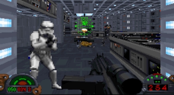
I’m opening some Star Wars figures this week, so I should be getting some related features up throughout the course of July, and I decided to kick it off with one of my favorite unsung heroes of the Expanded Universe… Mr. Kyle Katarn! The first half of the 90’s presented us PC gamers with all sorts of great outlets for our Star Wars love. I shudder to think how much time I spent, fingers gripping a flightstick, playing the X-Wing and Tie Fighter games. But when LucasArts took the first-person shooter gameplay of hits like Doom and Duke Nukem and interjected it into a brand new narrative set in the Star Wars universe, I was in heaven. If you wanted to know what a mid-90’s era Star Wars fanboy orgasm on the PC looked like, here it is…

sweudf1

Yup, it’s a pixelated mess… but it was the shit! I can still hear the glorious midi soundtrack building to a crescendo as I take out Stormtroopers with my E-11 Blaster. Yeah! Take that, bitches! Getting my hands on this game was a HUGE deal to me and I played it like crazy… over and over again. You know those hardcore Korean gamers that have to be ripped away from Starcraft to save them from dehydration? Well, that’s crazy… this wasn’t anything like that… forget that… I just really loved Dark Forces and played it a lot. And while sadly Dark Forces has yet to get the action figure attention of Shadows of the Empire, it wasn’t left out completely.

sweudf10

sweudf11

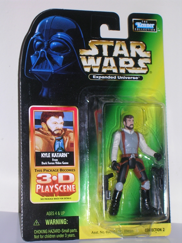
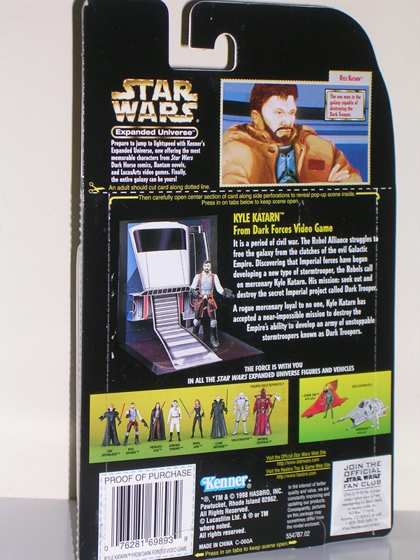
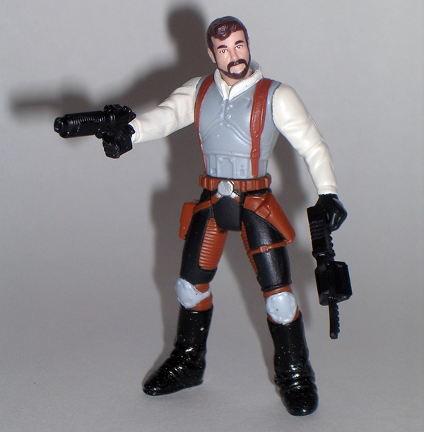
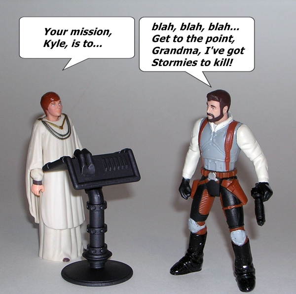
Vader looks so damn cute on the POTF2 cards. He looks like a pug wearing a helmet. While it doesn’t say so on the package, Katarn is basically part of the Power of the Force 2 line. Instead, the figure gets the “Expanded Universe” moniker, and while the package also suggests Kyle is from Dark Forces, I’m pretty sure he didn’t sport the beard until appearing in the subsequent pseudo-sequel Jedi Knight. I would have preferred a clean-shaven Kyle. Jedi Knight was a fine game and all, but I always liked the blaster-toting, space pirate mercenary aspect of Star Wars better than the mystical Jedi Knight bullshit, hence my love for Dark Forces. It was a shooter with no mystic bullshit.  As much as I liked seeing Kyle come back, did he really need to become a Jedi? DOES EVERYONE NEED TO BE A JEDI??? Anyway, you’ll also note the package proclaims it can be converted into a 3-D diorama! We’ll get to that in bit!

sweudf2

sweudf3

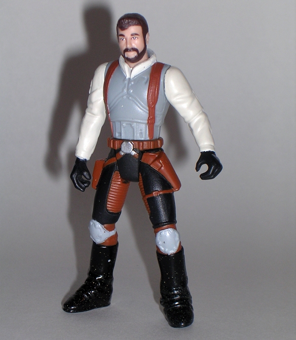
Kyle himself is a decent looking figure for the period. He isn’t nearly as ridiculously buff as some of the POTF2 figures and the sculpt really strides that line between vintage and modern. I dig Kyle’s outfit a lot. It definitely has a little Han Solo smuggler vibe to it, particularly in the belt and holsters, but the rest of the design is rather distinctive. He’s got an armor vest, kneepads, and some chunky boots. It’s an original looking ensemble, but one that definitely fits the Star Wars universe. There’s some unfortunate paint splatter on the back of my figure, and I’m not a fan of the spray used on his boots, but all in all, not bad!

sweudf4

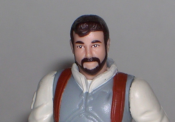
The likeness is good enough for a character that is based off a computer drawing, although later Katarn would be depicted in the flesh through FMV and the figure is even passable for the actor. The paintwork on the eyes and beard is all quite solid too. Granted, you don’t see a whole lot of Kyle in Dark Forces, as it’s a POV shooter, but the character has had plenty of face time since, and this figure does him proud. In the context of POTF2 figures, this is a pretty fantastic head sculpt.

sweudf12

Kyle features only six points of articulation. You get the usual head, shoulders and hips of the vintage figures, with an additional swivel in the waist. He’s a tad pre-posed with a wide stance. It makes him look great on the shelf, like he’s ready for action, but sadly it also makes him rather incompatible with most vehicle cockpits. But hey, it’s not like Hasbro ever gave us a Moldy Crow for him to ride in. By the way, Moldy Crow is the worst name for a spaceship ever. If Shipwreck from GI JOE had a spaceship, I’m pretty sure that’s what he would name it.

sweudf5

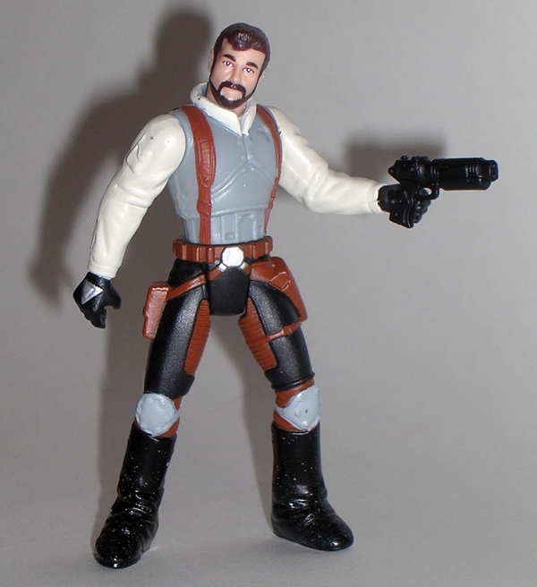
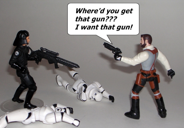
Weapons! Dark Forces was all about weapons, but Kyle only comes with two. First, you get his modified Bryar blaster pistol. It’s somewhat close to the pistol in the game, but it doesn’t have the magazine on the side. In terms of default FPS weapons, this one was pretty nice and accurate. The other weapon is either the Imperial Repeater or the Packered Mortar Gun? It doesn’t look much like either weapon model, as I remember them. Of course, my favorite weapon in the game was the E-11 Rifle. It’s understandable he doesn’t come with one and only fitting that he should have to kill one of my Stormtrooper figures and take theirs.

sweudf7

And then there’s the 3-D Play Scene! Yes, if you carefully follow the instructions, the cardback will fold out into this little display area with a landing bay and an Imperial Shuttle. Look, it’s a cool concept and pretty ambitious for a package that is just a cardback. It’s also a concept that Hasbro has made better use of since with boxed figures and vehicles. In practice, it’s not all that impressive, but I give Hasbro major points for the effort.

sweudf6

sweudf8

sweudf9

I picked up Kyle a couple months back at a toy show for a fiver, along with some other POTF2 era EU figures, all of which I’ll try to get to over the course of the coming weeks. Katarn later got an updated figure as part of a Comic Pack, which I probably would have picked up if it paired him with Jan Ors, as opposed to comic book adversary, Yuuzhan Vong. In hindsight, I probably let my bitterness over the lack of a Jan Ors figure overwhelm me on that decision, and I wouldn’t mind having a better version of Katarn in my collection. I’ll have to keep an eye open for him on the Ebays. But seriously, Hasbro, where the hell is Jan Ors?

The Dark Knight Rises: Movie Masters Batman by Mattel

It seems to be my week for buying figures based on movies I’m not a big fan of. Oh, Dark Knight Rises was ok, but suffice it to say, I didn’t go ga-ga over Nolan’s Batman films. Nonetheless, I picked up Bane and Catwoman when I found them for cheap at Ross, and so I knew that sooner or later I would be compelled to buy Batman. Just like with Zack Snyder’s Man of Steel, I don’t have to be a fan of the movie to like the costume design, and I do indeed love Batman’s costume in Dark Knight Rises. It’s Pub Night for me, so I’m going to try to roll through this quickly.

mmbats1

There’s the packaging. It’s as appropriately brooding and depressing as the movies themselves. We already saw it when I featured Bane and Catwoman a little while ago, so I won’t dwell on it. You do get a piece to build the Bat Signal, but since I’m not getting all the figures, the parts get chucked with the packaging. Let’s get Bats out and have a look…

mmdkr2

mmdknr3

As much as I loved the bat costume from DKR, I don’t think I really got a great look at all of its intricacies until holding this figure. It’s a stunning piece of work, with all sorts of little plates and gubbins making up Wayne’s protective armor. Mattel should be commended for getting this amount of detail into a figure in this scale. The sculpted mesh texture between the individual armor plates give the figure a beautiful sense of depth and credibility, while the mix of matte and gloss black further compliment the complexities of the figure. There are some cool little devices sculpted onto the utility belt, which is finished off with a metallic gold paint. The soft and rubbery cape is fairly narrow, which is nice as it stays out of the way when Batman is engaged in ass-kicking.

mmdkr8

There’s not as much to say about the portrait, since very little of the face is showing and not much is required in the way of likeness to the actor. That’s fine, as I was never sold on Christian Bale in the role.

mmdkr3

Articulation is close to Mattel’s DCUC standards. There are ball joints in the neck and shoulders. The arms have swivels in the biceps and wrists, and the elbows are hinged. The legs have hinges in the knees and ankles, swivels in the thighs, and the usual DCUC hips, which allow for lateral movement. There’s a swivel at the waist, but no ab-crunch hinge in the torso.

mmdkr4

mmdkr5

Bats comes with no accessories, just the previously mentioned Bat Signal part. I would have much rather had a figure stand. An EMP gun or a grapple gun would have been nice too.

mmdkr6

mmdkr7

mmdkr9

Batman is a beautiful figure and another fine addition to Mattel’s Movie Masters line. I’m happy to have him on my shelf beside Bane and Catwoman, and I’ll likely throw Man of Steel Superman into that display as well to round out my DC movie collection. Wait a minute… does this mean I need to finally break down and buy a Hal Jordan Movie Masters figure from that shitty Green Lantern movie. Oh, f’ck… I think it does.

Man of Steel: Movie Masters Superman by Mattel

I’ve scrapped the intro to this feature twice because both times it deteriorated into a rant on the new Man of Steel movie. Kicking movies that I don’t like is not something I enjoy doing, so I’m happy to abstain from it. The film is obviously a unique take on the character and one that doesn’t jive with what the character means to me. Fair enough. In the multiverse of Infinite Earth’s I’m perfectly fine setting aside one for the Zack Snyder Superman to reside on, so long as I don’t have to visit it ever again. Anyway, if there’s one thing I did like it’s the design of Supes himself, and so I still wanted a figure for my collection, and that’s what we’re here to talk about, so enough said about the movie… let’s talk toys.

mmsupe1

Mattel went with a very cool presentation for this line. The “Man of Steel” title is seriously underplayed. It’s type is even smaller than the “Adult Collector” label on the top of the card. The rest of the card features a large “S” Shield, making up the back of the bubble and a flowing red cape motif. The bubble is large and shaped like Superman’s shield crest. The insert follows along with the cape motif and has “Superman” printed across it in large lettering. The package certainly works for Supes, but I think the diminished title of the movie may be a little odd for the Jor-El and Zod figures. Whatever the case, this is an attractive package and it certainly draws one’s eye to the pegs.

mmsupe2

mmsupe3

As I already mentioned, I really like the movie version of Supe’s costume. It draws a bit on the “New 52” design in that he isn’t wearing his red undies. On the other hand, instead of the panel lined light blue suit, we get a darker blue suit with a basketball like texture. There’s also some dark grey piping that runs along the sides and the back. I like it, as it gives the suit a little bit of an alien motif, although most of it is concealed by his cape. The “S” Shield on his chest is actually sculpted into the figure. It’s textured like the rest of the costume and features some nice metallic gold paint. The cape is especially well done. It attaches over the front of his shoulders and flows wide behind him. I do miss the “S” Shield on the back of the cape, but I can live without it.

mmsupe6

The portrait is surprisingly good for a figure based on a real-world likeness. I may have a number of issues with the movie, but one thing that I can’t deny is that Cavill looks good in the suit and Mattel’s sculptors did a fine job reproducing his likeness in the head sculpt. It’s not the spitting image of the actor, but it’s closer than I would have expected. I’d dare say it’s one of their best.

mmsupe4

mmsupe5

The articulation here is very close to the DCUC style, with just one real notable omission. There are ball joints in the neck and shoulders. The arms feature swivels in the biceps and wrists, and have hinged elbows. The legs have the usual DCUC style hip joints, swivels in the thighs, and hinges in the knees and ankles. Superman can also swivel at the waist. The missing POA is the chest ab-crunch. It was probably sacrificed in favor of the added sculpting detail of the suit, and I’m fine with that.

mmsupe7

Superman comes with an “S” Shield figure stand. I’m always happy to get a figure stand, but I’m not sure that I’ll use it, as he stands just fine on his own. There are no other accessories. If you want a motorcycle for him to rip apart, you’ll need to look to the 3.75” line.

mmsupe8

If you want a Man of Steel figure for your shelf, you can’t go wrong with Supes here. He is an exceptionally nice figure with a great sculpt, excellent paint apps, and no QC issues to speak of. Can this really be a movie toy? From Mattel? Well, in fairness Mattel’s Movie Masters figures are usually solid efforts and Superman raises the bar a little higher. That having been said, this is probably the only figure I’ll buy from this line, because I’m not at all keen on the other character designs. Ok, maybe I’ll pick up Zod, just so I can have Superman punch him through a city block and thoughtlessly murder hundreds of human bystanders.

On a side note, while buying Superman, I also thought I might as well get a movie version of Batman to go with him, so I picked up the Movie Master version of Batman from The Dark Knight Rises… we’ll check him out tomorrow.

Transformers Classics: Optimus Prime by Hasbro

A couple of weeks ago, I looked at Classics Jetfire and realized that there were still quite a few Classics in my collection that have escaped being featured here on FFZ. Most notable of all is the big cheese himself, Optimus Prime. However, in Prime’s case, I think the omission may have been by design. I was hooked on the Classics line from day one, but I was never entirely smitten with this version of Prime. Let’s see if he’s grown on me any after all these years…

tfcprime1

tfcprime2

The packaging has been gone for a long time, so let’s jump right into Prime’s alt mode. Yep, he’s still a red semi-truck cab which offers a solid homage to the original character toy, but Hasbro certainly went off the reservation on a few significant points. He’s less boxy and more rounded at the edges, and his windows in particular are pretty stylized. It’s a slightly sexier and modern look and I’m cool with that. If I had to pick one thing that bothered me the most, it would be the windows. They just don’t seem to fit with the rest of the design and it’s obvious the discrepancy has to do with the transformation engineering. We’ll come back to that in a little bit.

tfcprime3

Initially, I wasn’t a big fan of the cap on the roof, but that’s grown on me a little bit. My main issue with the cap is that it’s basically there to hide the head and create an extra gun. I think the head could have been hidden with something a lot less cumbersome, and as we’ll see the gun that it forms isn’t a great pay off.

tfcprime4

I do like the deco used here quite a bit, as it’s fairly faithful to the original toy colors. He’s mostly red and blue, with some added silver. The grey used for the bumper and grill is a little jarring to me. I think it should have been painted closer to the side striping with a little metallic silver finish. My only other gripe here is the lack of a regular Autobot insignia. Prime does have a rub sign sticker, but I’ve never been a big fan of these. Still, combine this deco with the new design and I can appreciate Prime’s cab mode well enough. There are no miss steps to the reimagined design that I can’t forgive. Let’s transform him and see if the same holds true for his robot mode.

tfcop1

tfcop2

tfcop6

Prime in robot mode is a damn frustrating figure. He’s got so much great stuff going for him, but a couple points of lazy design detracts from him a lot. The first thing worth mentioning is that his transformation relies on a bit of fakery. The lower part of his torso is meant to look like his truck grill, but the real truck grill winds up on his back. I’m not a big fan of that kind of hocus-pocus in my Transformers engineering, but it isn’t a deal breaker for me if it’s done right. If we’re talking about Prime’s torso and legs… he’s done very right. There’s a great stylized design to him that makes the fakery well worthwhile. He looks fantastic and very much like the Prime toy that I’ve always wanted. The head sculpt isn’t among my favorite Prime heads, but it’s not at all bad. So what’s the problem?

tfcop5

First off, the horrible truck shell pieces that hang off his arms. They hang there, they flop around and get in the way. Basically, they’re ugly and awkward. An extra hinge to help them wrap around the arm may have helped. Maybe if they actually looked like armor and not just truck pieces hanging off of him. But whatever the case, he always looks like he’s mis-transformed or missing a step somewhere. It looks like the designers kept thinking, “Yeah, the arms… we’ll worry about them later” only later never came. I’m not a fan of parts-formers, but in this case, I would have been perfectly fine if you could have just pulled these pieces off, because they practically destroy the figure by being there.

tfcop3

Less of a problem is his backpack. It’s awkward and ugly, but I’m far more forgiving of a cumbersome backpack on a Transformer than the god-awful hideous limb kibble. Of course, you can also pull the backpack off, which brings me to Prime’s two transforming weapons…

tfcop4

tfcop8

tfcop7

Prime’s main weapon comes out of his smokestacks. It’s not his traditional looking rifle, but I do like it a lot. It’s a clever use of the smokestack part and I think he looks pretty good holding it. The cap/backpack gun is slightly more complex in transformation. It’s an ok gun, but rather unwieldy and I don’t like that it’s the same deco as Prime himself. Like I mentioned above, it isn’t worth the payoff of having the big cap on the truck cab.

tfcop9

Classics Prime is a fun toy, and he’s definitely one of the better Prime figures that Hasbro has put out since. I’ll concede that’s a bit of a loaded compliment, but I do think he deserves more kudos than scorn. That having been said, it’s hard to overlook the truck kibble on his arms. I can remember the first time I transformed him, I kept looking back at the instructions to see what I was doing wrong, only to find out that there was nothing wrong, that’s what his arms look like. If I’m blowing them out of proportion, I think the problem here was that I was so excited about Hasbro doing updates to G1 characters, my expectations were too high. In the end, I’m far more willing to dismiss a terrible figure than forgive one that mingles with greatness but falls flat because of one or two major flaws. Prime is sadly one of those figures that could have been close to perfect, but missed the mark because of some lazy design elements.

Marvel Universe: Jubilee by Hasbro

Ah, Jubilee… I don’t like her. I’ve always thought she was an annoying character with lame powers. I wasn’t reading X-Men at the time of her debut, and for a while, I actually thought she was created for the X-Men animated series to replace Rogue as someone the audience of kids could relate to. Why is it every time a film or series creates a character for the audience to relate to, they suck? Jubilee Fans, attach your hate mail to the comments section below! Later, when I got back into comics hardcore and spent a lot of time in back issues, I obviously learned otherwise. Anyway, like her or not, I can’t help myself from buying any X-Men figures Hasbro puts out in the Marvel Universe line, and so here we are… welcome to Marvel Monday!

mujub1

There’s the packaging. I do dig the character art and despite her rather demure size, Jubilee fills out her bubble fairly well with her effect part beside her on the tray. You get the usual “Comic Shot” which is an issue of X-Factor featuring Jubilee in a completely different costume. Excellent! Great job, Hasbro! At this point you might as well just grind up the Comic Shot into dust and pour it into my eyes.

mujub2

The back of the card has a little bio blurb and a shot of the other figures in this wave. I haven’t found Professor X yet, but next week, we’ll be looking at Blastaar. The collecting message of the wave comes from Dazzler. I would dig me a Dazzler figure, but if that ever happens, I’m sure she’ll wind up in some overpriced exclusive set. Boo!

mujub3

mujub4

With Jubilee out of the package, I continue to be impressed with the current crop of MU figures that Hasbro is churning out. Obviously, the most distinctive thing about her is the soft plastic yellow trenchcoat. The coat is executed in traditional Hasbro style by making it a vest with figure’s arms sculpted to look like the sleeves. It works fine for me, especially in this scale. Her body and legs are free of any sculpted detail and painted completely black. Her belt is a separate piece, but it’s glued into place instead of just hanging on her hips. I would have preferred her red top and blue shorts under the coat, but maybe that will be a quick-and-dirty variant later on down the road. Hasbro did a nice job with the head sculpt. Yes, she’s a bit wall-eyed, but that’s mostly thanks to the paint. The rest of the face is great, the hair is fantastic, and she has her sunglasses nestled into her hair and a pair of earrings.

mujub7

mujub6

Jubilee’s articulation is pretty solid. Her neck has a ball joint in addition to a hinge, which gives her head a lot of movement. Her arms have ball joints in the shoulders and elbows and swivels in her wrists. Unfortunately, the sculpted sleeves works against the range of motion in her arms. The legs are ball jointed at the hips, swivels in the thighs and boots, and double hinges in the knees. Her ankles have hinges and rockers too! The torso has a ball joint just under her chest.

mujub5

In addition to the crappy Comic Shot, Jubilee comes with a purple effect part for her hand. It looks like the same piece that came with Scarlet Witch. Either way, it’s already gone straight into the Bin of Forgotten Effect Parts, never to be seen again.

mujub8

So, Jubilee may not be one of my favorite characters, but Hasbro did her proud with this figure. They managed to take a very crappy 90’s distinctive character design and translate it into plastic perfectly. I’ve only seen her a few times on the pegs, and one of those times two middle aged guys were fighting over her. I wasn’t willing to sacrifice what little self-respect I have by jumping into that fray, and my patience paid off because she showed up again a few weeks later. Considering the abysmal Hasbro distribution in my area, finding any Marvel Universe figure in the wild is a rare treat, let alone one from a recent wave.

DC Universe Signature Collection: Red Hood by Mattel

It’s been a long week, I’m coming down with something, and I just want to flop onto the sofa and do very little of anything. It’s no coincidence that today I’m going to look at a figure based on a character I don’t care a hell of a lot about: Red Hood! Yeah, for the most part, I’ve been lucky with my Club Infinite Earth subscription. My interest in the DC Universe runs pretty broad and deep, but sooner or later I was bound to get a figure that I could have done without. And so, this guy arrived on my stoop this week in complete disregard for my apathy toward most Batman comics. Let’s get this over with, so that I can pop in a DVD and go back to being horizontal again.

cierh1

cierh2

There’s the packaging we’ve all come to either love or tolerate from DC’s Signature Collection. I still dig it. You get a nice window box that shows off the figure quite well and is totally collector friendly. The character art is usually excellent on the DCSC packaging, but in this case, it seems off. There’s just something about the character likeness that doesn’t work for me. Maybe it’s the head sculpt? I kid, I kid… Red Hood’s head is a giant Tylenol gel capsule. It’d be hard to screw up the likeness on the box art. It’s fine.

cierh3

cierh4

And here he is in all his glory. Red Hood is a f’cking terrible character design. It’s possible that he’s more credible in the comics, but as an action figure, he looks like he could have been one of the MOTU designs that lost to Fearless Photog back in the 80’s. But he is what he is, so I’m going to try to not beat up on the figure too badly. Oh, who am I kidding? Yes I am.

cierh5

Red Hood uses a standard DCUC style buck molded in pale grey plastic. His gloves are sculpted, but his boots are just painted on, as is the chest emblem. None of the paint lines are particularly sharp and there’s some mold flashing on the arms. The cape is plugged into a hole in the back of the buck and the head is just a big pill painted red. At the very least, Mattel could have used a clear dome for the head and painted the inside red to give it a little illusion of depth. What’s here looks like the quickest, cheapest, and dirtiest of cash grabs. On the bright side, at least you get two pistols. Too bad they’re so thin that they’re almost two-dimensional. Functional holsters might have helped nudge the figure up a notch in my eyes, but no. On the contrary, only one of his hands is sculpted with a trigger finger to hold the gun properly.

cierh6

cierh7

Articulation is the standard DCUC affair. The arms feature ball joints in the shoulders, swivels in the biceps and wrists, and hinged elbows. The legs have the usual DCUC style joint in the hips, hinges in the knees and ankles, and swivels in the thighs. The torso has a waist swivel and an ab crunch hinge. And yes… the dome will turn from side to side… brilliant!

cierh8

And that’s it… I’m spent. If you’re a big Jason Todd fan, then this figure might scratch your itch, but it’s the first one in the CIE sub that I would have preferred to have opted out of. In fact, he may still find his way onto Ebay. Despite acquiring a renewed love for the character, I hate this appearance. It just feels like  lazy character design, and the figure feels like a slop job. In the congested shelves of my DCUC display case, I’m not sure I even want to spare him any standing room. $28 for this guy?  Blah!

And that’ll do it for DC Week. I’ll try to mix things up a bit more next week, but I have a feeling the pendulum is going to swing the other way and we’re going to be in store for a fair amount of plastic Marvel tat. See ya’ll on Monday!

Cover Girls of the DC Universe: “New 52” Harley Quinn by DC Collectibles

Ok, folks, let me explain what’s going to happen here today. I’m going to say a lot of nice things about a statue that most people will automatically hate on principle. I get it. The New 52 ruined your precious Harley Quinn because you hate her new costume. And this statue practically rubs your noses in it by its very design. I’m not being sarcastic… I really do get it. I hate what DC did to Zatanna in Justice League Dark. If DC Collectibles comes out with a statue of her wearing her new biker-chick pants and trampling on her old magician hat, I’ll be irked too. It is what it is. However, as someone who tends to not read many Batman books, Harley has never been a sacred character to me, and it isn’t until Suicide Squad that I actually adopted a book that she’s in as regular reading. I really love that book, and this is how she appears in it. Hence I really wanted this piece on my shelf. If hearing nice things about New 52 Harley is going to cause you distress, you might want to get off the train here and come back tomorrow. You’ve been warned!

cgdcharley9

The statue comes in a pretty standard and boring box, similar to what we saw a few weeks back with the Cover Girls Catwoman statue. I’ve said my piece about how little I like DC Collectible’s package designs, so I’m not going to dwell on it here. Inside, the statue is wrapped in plastic and nestled between two styrofoam trays. The packaging is collector friendly and is handy to keep on hand if you ever want to put the statue into storage.

cgharl1

cgharl2

Starting off with the pose… I really dig it. Harley is standing on one foot, bent forward a bit, while using her other foot to proffer a giant hammer to an unseen opponent. All the while she’s got a pair of blades in her hands and behind her back. I think the pose captures the spirit of the character pretty well. She’s playful, she’s crazy, and she’s going make a game out of killing you. The pose also helps to accentuate Harley’s assets… and her frontssets too!

cgharl3

cgharl4

I find the sculpt here to be excellent. It probably helps a lot that I dig Harley’s stripper costume and it’s quite well executed here for a porcelain statue. Little touches include the loose straps on her pistol holsters, the bullets in her belt, the knit striping on her socks, and the loose lacing on her top. I’m particularly fond of the way her bangs hang over her face. A lot of the statues done in this media seem to have a problem with hair, but this one gets it right.

cgharl5

cgharl6

cgharl7

The paint is competent enough, with just a few little flubs. There’s a little bleeding between the flesh and outfit, but a lot of the little details, like the bullets, look great. Her eyes are a little off, (what’s with DC Collectible’s inability to paint a pair of straight eyes?) but only a little, and the fact that the bangs hang down the way they do keep it from being a major problem. The rest of the paint on the face is quite sharp and looks nice. The red and blue used for her hair and costume is suitably vibrant and I appreciate the use of both matte and gloss in the appropriate places.

cgharl8

So the base… yeah, that base. As already mentioned, it has Harley trampling her iconic costume. I think I get that DC was going for here. It’s a rebirth kind of thing In with the new Harley and out with the old. On the other hand, they really must have known that this was going to piss off a lot of fans. And let’s face it, Harley Quinn has a lot of fans. I can’t imagine there are many people like me who are following Harley for the first time in the New 52 and wouldn’t take this as a slap in the face. But hey, now I feel special… DC Collectibles designed a statue just for me. To add insult to injury, the trampled costume effect isn’t pulled off very well at all. It’s not terribly convincing and easily the weakest thing about this whole piece. Any way I look at it, I think it would have been best left out.

cgharl9

The last Cover Girls statue I featured, Catwoman, was decent, but decidedly average. I’m a lot more pleased with this one. It’s a shame that it’ll be so controversial to fans because from a technical standpoint, I think DC Collectibles did a fine job on her. I was able to pick her up for around $70. That still seems a bit high, considering I can get something fairly comparable from Kotobukiya for less, but I’m guessing that’s the difference between cold-cast porcelain and PVC plastic. Obviously, this statue isn’t for everyone, but I’m glad to have picked it up and she looks damn fine on my shelf.

Crisis on Infinite Earths: Psycho Pirate by DC Direct

Pushing forward on my effort to fill in some of the missing characters from my DCUC shelves, I delve once again into the DCD offerings with Psycho Pirate. Seriously, how the hell is it possible that DC Universe Classics went twenty waves without giving us Psycho Pirate? Well, I guess you could say that about a lot of DC characters. This poor guy has been hanging on a peg at my local comic shop for ages, and since guilt over buying some comics online forced me to spend some money there, I decided to liberate him and give him a good home. It feels like a Pub Night, so let’s see if I can run through this pretty quickly.

dcdpp1

Before going to sealed clamshells, DCD delivered their figures on cards and bubbles. I like this better because I can just rip the bugger open, although I’ll concede that I miss the heady hit of plastic fumes from the clamshells. The package is utilitarian at best, although I enjoy the way many of the DCD series used to use the figure stand in lieu of putting the title of the series on the package. It’s an economy of cleverness… or a cleverness of economy… it’s one of those things. Anyway, the package gives you a good idea of what you’re getting. Sadly, there is no included effect part of Psycho Pirate’s head being caved in by the rage of Black Adam. Oh wait, that’s Infinite Crisis.

dcdpp2

dcdpp8

DCD did a fine job with the sculpt. They really nailed the portrait. Roger looks pissed and his fingers are clutched in anger. He’s kind of lean and scrawny and the details in his costume are all part of the sculpt, rather than just paint. The cape looks great, complete with the high cowl.

dcdpp6

The paint on this guy is crap. The borders between the red and black are little sloppy. There’s also black smudging on the red and there’s a black gluey mess on his right shoulder that transferred from the cape lining. I do like that they bothered to use glossy paint for the boots and the interior of the cape and the mask tampos on his chest look good. It’s amazing how far DCD has come.

dcdpp9

Psycho Pirate’s articulation is competent enough. You get ball joints in the neck and shoulders. The arms feature hinged elbows and swivels in the wrists. There’s a T-crotch, hinges in the knees, and swivels at the top of the boots. There’s no torso articulation. It’s certainly not DCUC standards, but at least you can do a couple things with him. He can even sit down!

dcdpp5

dcdpp7

The accessories include the Medusa Mask, which fits pretty nicely over the figure’s face and the figure stand. The features the Crisis on Infinite Earths logo. It’s a nice stand, but since he’s going on my DCUC shelf, I’ll probably make due without it.

dcdpp4

Psycho Pirate’s an ok figure. The sculpt is fine, the articulation is passable, but I’ve found the quality of the paintwork has been a problem with many of the Crisis on Infinite Earth figures and this guy is no exception. Nonetheless, he was only ten bucks and he makes for a decent place holder on my shelf until Mattel decides to do this guy better, possibly through Club Infinite Earths.