Marvel Gallery: Angela by Diamond Select

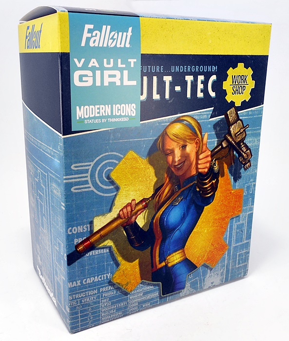
It was kind of a hectic weekend for me, so rather than my usual Monday Marvel Legends fare, I decided to go laid back and have a look at another one of Diamond Select’s Marvel Gallery statues. I have a few choices of statues to open, but since Angela doesn’t get a whole lot of merch love since joining the Marvel Universe, let’s go ahead and open her up. But first… the packaging!

As always, the statue comes in a collector friendly box with windows front, top, and on both side panels. And because the figure inside is enclosed in two clear plastic trays, the package itself works as a kind of display case, allowing you to see most of the ins and outs of what you’re getting. With so many statues these days coming in fully enclosed boxes, I like that DST is proud enough to show their pieces off. On the back panel you get a shot of the statue and a little blurb about Angela and how she fits into the Marvel Universe. If you’re new to this line, Angela is presented around the 9-inch scale and crafted from a durable PVC plastic.

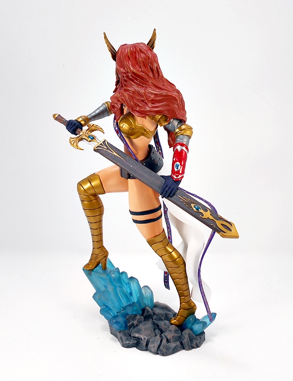
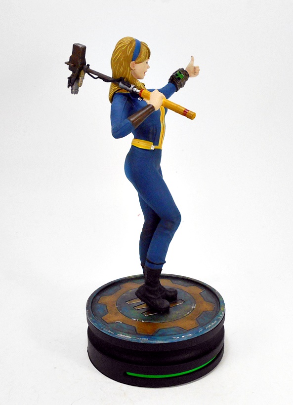
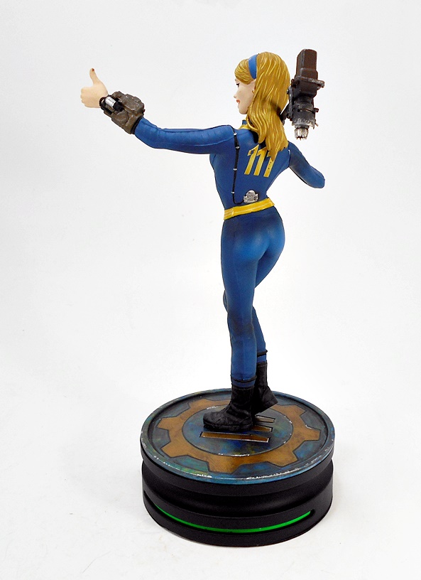
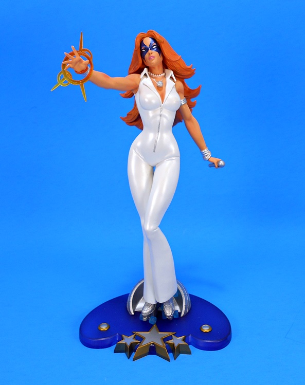
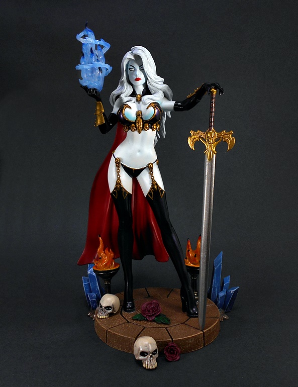
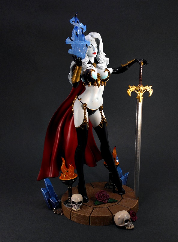
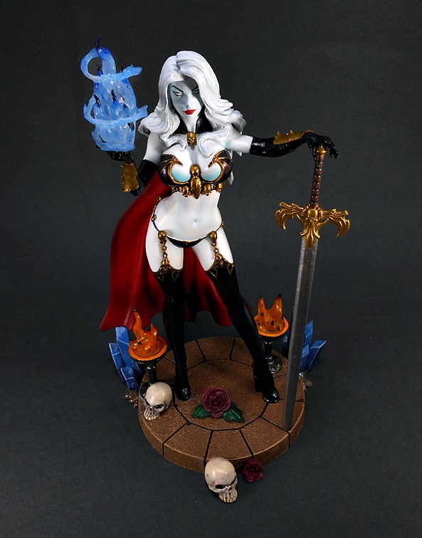
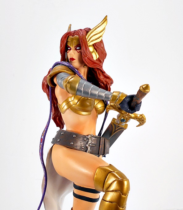
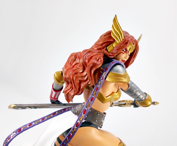
Hey Aldrif… did it hurt when you fell from Heven? Angela comes out of the box all ready for display, and looking both fierce and fine. The warrioress stands upon a plot of alien-looking (Asgardian?) landscape with one leg drawn up and her foot resting on a blue crystal outcrop. She turns to her right and begins to draw her mighty blade, Xiphos, from its scabbard. It’s a beautiful pose with a tantalizing hint of the action that’s to come. This composition exudes nobility, power, and it’s got sex appeal in spades. Generally speaking, I’m happy with most of DST’s poses in this line, but this one really shines.

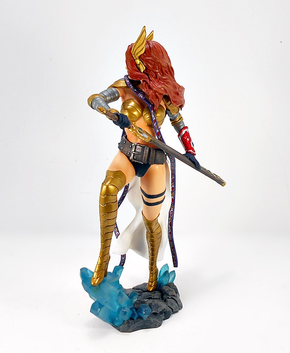
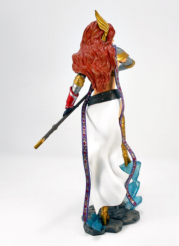
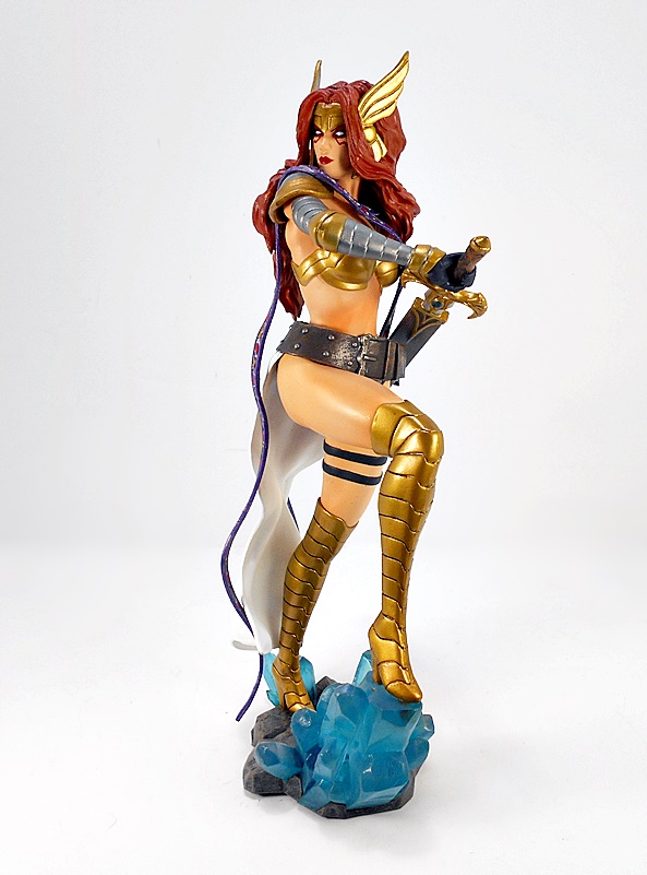
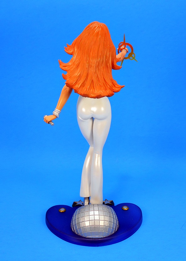
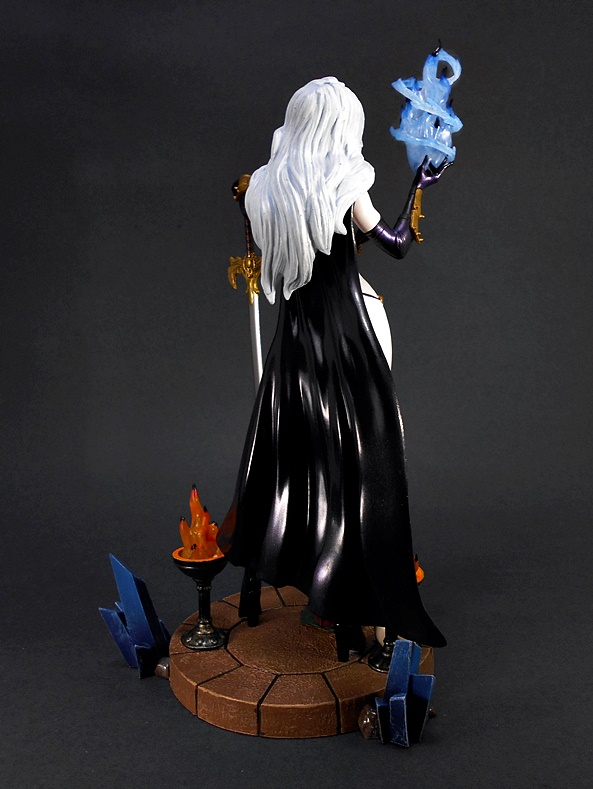
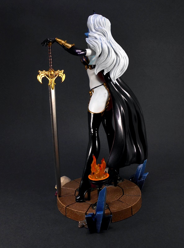
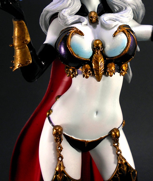
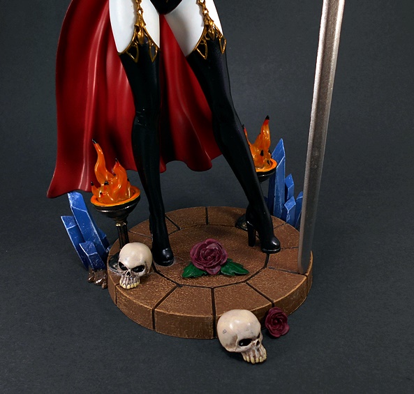
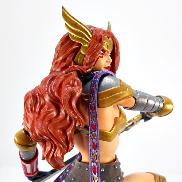
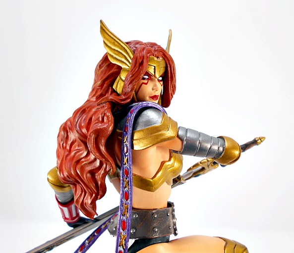
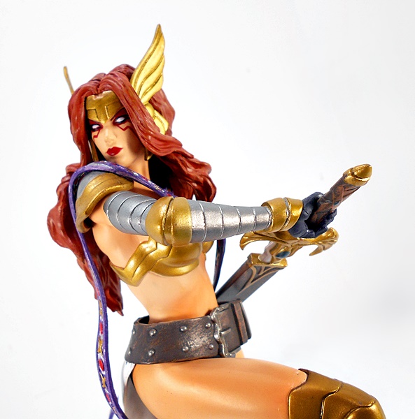
Every bit of Angela’s Heven Armor comes alive in the sculpt. From the segmented cuts of her thigh-high high-heeled gold boots, to her golden chest armor, and once again the segmented cuts of her armored sleeves, each of which terminate just below the scalloped pauldrons on her shoulders. She has a pair of sculpted bands encircling her left thigh and a pair of sculpted panties covered up by her wide belt and white sash. Both of these last articles are sculpted separately from the statue, which is somewhat unusual for this line, but I dig it. The belt rests on her hips, allowing the sash to trail down behind her left leg. The paintwork on the costume is beautifully executed, with a satin gold leaf and silver used for the armor pieces, and a warm and even shade used for the skin-tone. She even shows off a bit of metallic red for the bracer on her left wrist. I especially like the finish on the belt, which makes it look like worn leather with a weathered patina on the buckle and rivets.


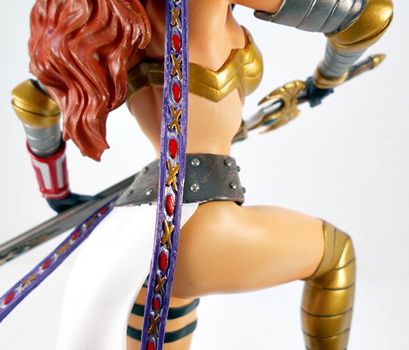
Another piece of the costume that is sculpted separately from the statue is her psychically charged Ribbon. Yeah, I guess you could also just call it a scarf. This long, thin purple strip wraps around her neck and the two strands sweep down off of her shoulders. It’s cast in a fairly soft plastic, but holds it’s shape well enough. The red and gold ornamentation is sculpted down a channel in the center for the entire length of the piece.

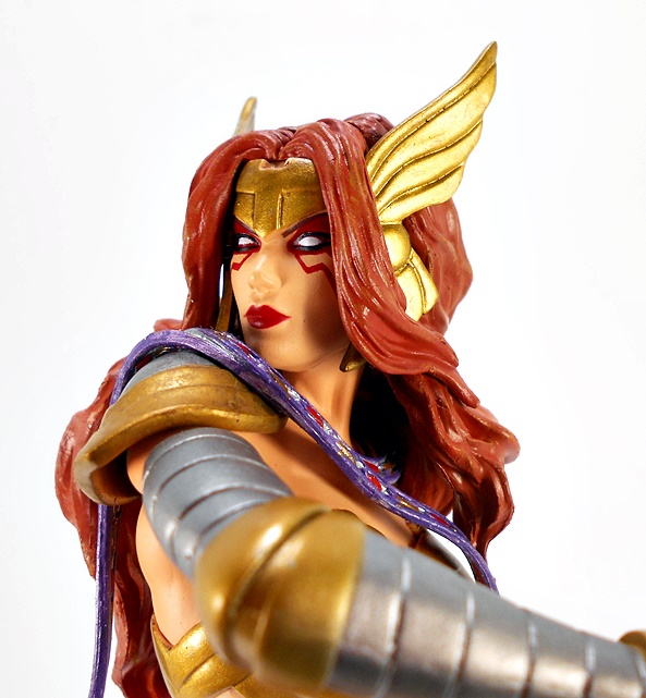
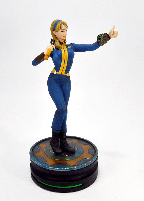
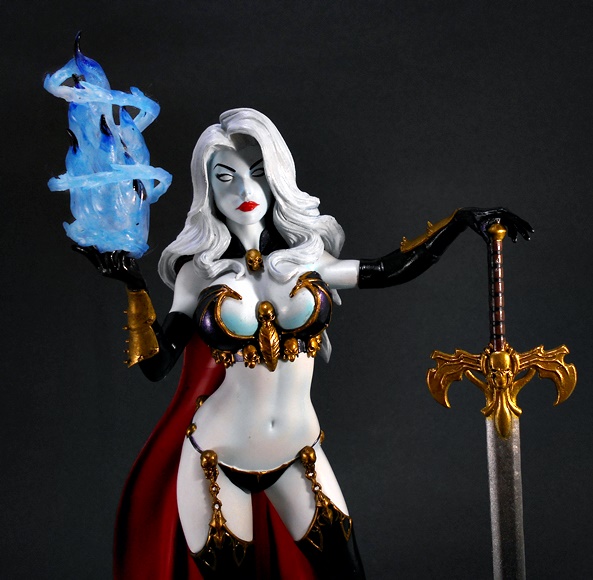
As far as portraits go, this one is a total homerun. She’s strikingly beautiful with bright crimson paint used for her lips and eye makeup. Her pupil-less eyes are framed by the copious strands of red hair, which spill out from the top of her winged headband and down the sides of her face, while the rest spills out down her back and onto her shoulders. I could easily see this portrait rivaling that of a much more expensive statue. It really did turn out that well.

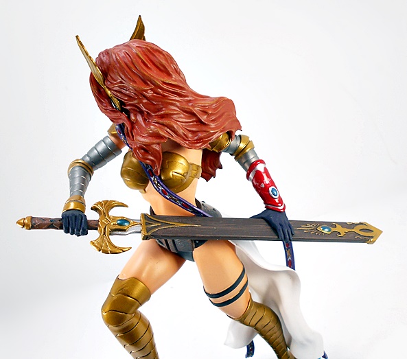
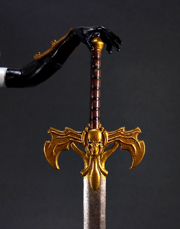
The last big attraction on the statue is Angel’s blade, Xiphos, The Sword of the Stars. It has an ornate gold cross-guard with a blue stone in the center, a simple scull-crushing pommel, and sculpted wrappings on the grip. Only a small section of the silver blade can be seen between the pommel and the throat of the wide scabbard.

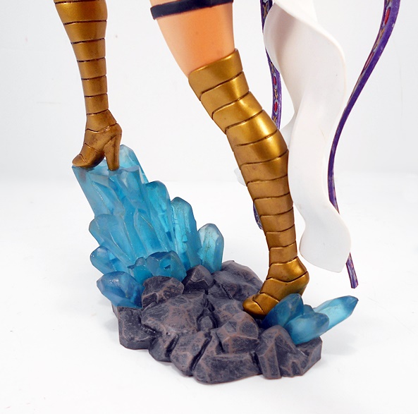
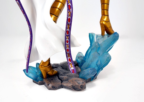
The base is both interesting and understated, and that’s meant as a compliment. It provides just enough context without upstaging the figure itself. You get a little patch of rocks, painted brown with a black wash to give them some nice texture. Jutting out from each side of the cluster are blue crystalline structures, one of which provides the pedestal for Angela’s right foot. If you’ve read some of my previous Gallery statue reviews, you may remember that the bases on these statues rarely impress me, but this one came out damn nice, both in design and execution.

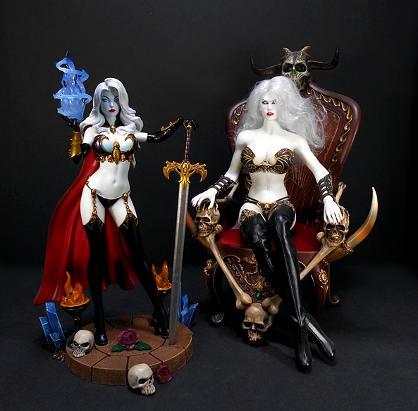
Angela is yet another fine example of why I simply cannot quit this line, despite having no room to display more statues. Granted, I’m far from a completest, but when DST continues to deliver quality and craftsmanship like this at such a reasonable price point, I find I just can’t say no. And with prices of collectible statues continuing to climb at an alarming rate (I’m looking at you, Kotobukiya!), it’s refreshing to be able to set something like piece on my shelf for about $40. What’s more, it’s nice to see DST continuing to dig a little deep for their character selection. I’m not really reading a lot of Marvel comics these days, because quite frankly they’re become so god-awful, but I did enjoy her introduction to the MU a little ways back in Guardians of the Galaxy. But hey, even if you’re just a fan of Spawn and McFarlane Comics, you might want to consider picking up this lovely statue. I’m very glad that I did!

Fallout: Vault Girl Statue by ThinkGeek

Fallout and I parted ways with the release of Fallout 76, but at least I can always relive my glory days with the franchise, whether it be on Steam with the PC originals, or on the consoles with the newer games. And that brings me to ThinkGeek, which has been turning out some Fallout statues as part of their Modern Icons series. Last year I had a look at their very cool Nuka Cola Pin-up statue and I was so happy with it, I pre-ordered their Vault Girl. Well, she’s been out a while, and sitting on my Pile of Shame, so let’s get her open and check her out.

This roughly 1/10 Scale “limited” PVC statue comes in a fully enclosed box with an outer sleeve to protect it. The art is pretty nice, including some great concept art for the Vault Girl herself, and a blueprint-style background. Inside the box, the statue comes fully assembled between two clear plastic trays.

And here she is, looking… OK. I dig the composition quite a bit. Vault Girl is posing with her sledge hammer on her shoulder, her left arm reaching out with a thumbs up, while she offers a cheesecake wink and a grin. Despite her wearing the classic blue Vault-Tec jumpsuit, it’s form-fitting enough to show off her curves and add some sex appeal. The back of her suit shows that she’s from Vault 111, making this a Fallout 4 statue, as the protagonist from that game was revived from cryogenic sleep in Vault 111.

What I’m not as keen over is the quality of the paint. The shades of bright blue and yellow are well chosen, but pretty much all the yellow suffers from the darker base bleeding through. I guess you could argue it looks dirty and everything is dirty in the Fallout world, but I’m positive that’s not what they were going for here. There are also some splotches of gloss on the blue of the jumpsuit, which I presume is from spilled glue or primer. The skin-tone is all flat and lifeless, and shows scratching here and there. The boots are matte black and they did provide some black shading over the blue suit to give it some texture.

They did a nice job recreating the Custom Super Sledge, a rocket-propelled sledge hammer perfect for knocking down those Feral Ghouls and Rad Scorpions. The paint and detail are both solid and it looks like it came straight out of the game. It’s definitely one of the higher points of Vault Girls ensemble.

The portrait is a huge let down. I think a big part of that is a combination of the awkward wink and smile. Instead of cute, she just comes across to me as creepy. The paint isn’t particularly sloppy, maybe a little uneven around the lips, but it’s all so flat, particularly in that one open eye. It completely lacks the depth and charm of the previous statue’s portrait, and that’s a real shame.

I do think that the Pipboy turned out pretty nice. Considering how small it is, they were still able to get some details into the nobs and vents and other little details. It’s given a silver wash to make it look worn and weathered and the screen has a green monochrome image of the Vault Boy himself returning Vault Girl’s thumbs up.

The base is pretty fantastic. It’s a simple circular platform, with the vault gear icon encircling the number 111. Yeah, it looks like it reads 11, but I’m assuming her foot is on the middle 1. There’s some beautiful weathering here, which looks rather beyond what the rest of the statues coloring offers. As I mentioned at the beginning, this is a “limited edition” piece, and that much is stated on the bottom of the base. But similar to Nuka-Girl, there’s no statement of limitation and the piece isn’t numbered.

Ultimately, there’s some good things here and some not so good, but I think it’s safe to say I’m disappointed with this one. Every little thing about it feels like a major step down from Nuka-Girl. Specific call outs include the sub-par paint and a portrait that is certainly nothing to brag about. It’s kind of ironic that I got the better one on sale at $25, and pre-ordered this one at $45. Sure, it qualifies as a budget statue, but that’s still about five bucks more than Diamond Select charges for their Gallery statues, and those have been superior to this one in every way. And so much like me and the Fallout franchise, I think it’s time for ThinkGeek’s Modern Icons and I to part ways. This one is probably going back in her box, but at least I’ll always have Nuka-Girl!

Freddy Vs Jason: Ultimate Jason Voorhees by NECA

If you’ve been kicking around FFZ for at least a little while, then you probably know that I was introduced to Slasher Films in my teenage years, and there were no bigger titans of the genre at the time than Jason Voorhees and Freddy Kruger. Well, if future me were to go back and tell teenage me that one day these two horror icons would face off against one another in a film, teenage me would have probably punched future me in the balls and called him a liar. Eh, called me a liar. Whatever. The point is, Freddy Vs Jason was absolutely huge for those of us who grew up on the Friday the 13th and Nightmare on Elm Street flicks. And with NECA seemingly dedicated to giving us an Ultimate action figure of every Jason Voorhees ever, it was only a matter of time before they got to this one!

By now you should know what the Ultimate series packaging is all about. The figure comes in a seemingly enclosed box, but the front panel is actually a flap held down by a spot of sweet, sweet Velcro, and opens to reveal a window. The box is collector friendly and features loads of pictures of the figure inside. I also really dig the art they used on the front panel. I can’t recall if it’s actually something that was used to promote the film, it actually looks a little too serious for the actual content. But it looks great and reminds me a bit of the style used for the Halloween (2018) film posters.

FvJ gave us what is probably the most haggard looking Jason yet, and that’s not surprising since the film opens with Jason being resurrected by Freddy. And I’m not talking a simple lightning bolt to the corpse, I’m talking full on re-constitution or organs and shit. He’s still plenty buffed out, but much of his clothes are practically rotting off of him. Here, Jason eschews his familiar rugged outdoorsman garb for a blue shirt under a badly tattered gray shirt, under a rotting jacket. The attention to detail in the jacket alone is worthy of praise, with all sorts of rips and tears sculpted in and a dirty paint wash to accentuate it. From the waist down, Jason’s duds have fared a little better. There isn’t a whole lot of distress showing on his black trousers or his thick-soled Herman Munster boots. The articulation consists of all the usual rotating hinges we’ve seen in past Jasons, so he’s not overly agile, but there are plenty of useful points here to make him a lot of fun.

Jason comes with no less than three different hockey masks. He comes wearing a “clean” mask for a very traditional look. Granted, clean is a relative term, as it’s still darkened with age to a brownish-yellow patina. The mask features the various venting holes, the red hash marks, and is properly held onto the figure’s head by soft plastic straps. It fits perfectly and looks great!

Next up, we have the bloodied mask. This one appears to be the same sculpt, but it’s missing the red hash marks on the previous one. I can’t remember if there’s an actual reason for that or if it’s just an oversight. Either way, this one is absolutely doused in blood, which is definitely a cool look for him. It reminds me of my favorite line in the film, “Dude, that goalie was pissed about something.”

And finally, he comes with a scarred mask from his battles with Freddy. Here, the red hash marks are back, the weathering is a lot more severe, and it’s covered with deep scratches from Freddy’s iconic bladed glove. Each of these masks have their own charms, but I think this one is my favorite and will be the one I use for regular display. The weathering suits the outfit the best, and since this is the FvJ Jason, why not give him the mask with Freddy’s glove marks all over it. It’s definitely the one mask that is most distinctive to this film.

Of course, there’s a fully sculpted portrait under those masks, and if I’m being honest, this is not my favorite look for Jason. the head is appropriately bulbous and misshapen, and the dark brown skin has a cool wash over it to bring out the details. I also like that they sculpted in the wisps of hair behind his left ear that are often prominent in the film. But in the end, I don’t think the sculpt itself has the same amount of depth to it that we’ve seen on some of NECA’s previous Jasons. Good? Yeah, for sure. Great? Mmm, not so much. I can’t say as I really display any of my Jasons without their masks (or hood), so it’s not that big a deal to me. Onward to the accessories!

This Jason doesn’t feel like he comes with quite as much as previous releases, but what’s here is pretty good. For starters, he has the teddy bear, which is a bit of an odd inclusion since it doesn’t actually appear in the film. Instead it references a behind the scenes picture. I don’t really mind getting this as an accessory, as the film tapped into Jason’s anguish as a child, and even managed to make him a sympathetic character in a few scenes. As a result, it certainly feels appropriate. Still, claiming this to be an essential accessory is going to be a bit of a reach for some.

As far as weapons go, Jason comes with two machetes. And by that I mean the same two machetes, with one clean and one painted with blood. The bloodied one is presumably meant to be used alone, and the clean one is meant to be used with an included fire effect, but you can use the fire effect with whichever one you like. Jason doesn’t come with any extra hands, but his right hand is sculpted to hold the machete quite well.

The fire effect piece references Jason’s attack on the rave in the cornfield where he got set on fire. This piece is grooved so it slides right onto the back edge of the machete and it stays put pretty well. As many of you know effect parts are often hit or miss with me, but this one is definitely a hit. It looks great, and I only wish they had included some more fire effect parts for him, like maybe one to fit on each shoulder. Hell, they could have put a magnet in his back and recycled the one that came with Freddy from ANoES2.

Does it sound like I found this figure a little wanting? Well, I don’t want to convey the wrong message, as I absolutely love this figure. But at the same time, I feel like it isn’t one of NECA’s strongest Jason releases. The body sculpt is great, I really dig the choice of masks, and while the unmasked portrait isn’t my favorite, it’s still solid work. The accessories, on the other hand, well that’s where this one begins to lose me. The flame effect is cool, but I don’t think including repaints of the same machete was all that necessary, nor is the teddy bear. The obvious missed opportunity here would be a pair of Freddy’s severed arms. Hell, they could have just recycled them from one of the Freddy figures and did a little re-sculpt at the shoulders. Still, in the and he’s a solid addition to the Jason lineup, and I’ll probably be picking up the one from the remake next.

Marvel Legends (Kingpin Wave): Kingpin Build-A-Figure by Hasbro

Yeah, it was all the way back in February when I first dipped into this wave with a review of Silver Sable. Of course, in my defense, my life turned to shit somewhere along the way and I was forced to put FFZ on hiatus. Now I’m back in action, more or less, and ready to wrap this puppy up. Let’s have a look at the Kingpin Build-A-Figure! Oh, boy have I been looking forward to this guy!

And here is Fisk in all his rotund glory. Kingpin is comprised of your six basic BAF parts: Torso, arms, legs, head and a few extras, which we’ll look at in a minute. He dons his trademark white linen (plastic) suit. Yeah, it surprises even me that I can get this excited over an action figure of a big, bald guy in a suit. But, as a character, Kingpin has a sense of frightening gravitas about him, and this figure conveys that perfectly. Indeed, this bulbous buck makes him look like an absolute powerhouse! The suit consists of a sculpted vest with a collard shirt and tie peeking out the top. The buttons on the vest are neatly painted gold, the shirt is black, and the tie is purple. The trousers show some sculpted rumples, especially where they rest on his giant black shoes. The suit’s coat is the usual trickery, where it is sculpted without sleeves and the sleeves are sculpted as part of the arms. In this case, it’s a little obvious, but I still dig it. Some other nice sculpted details include the ring on his left hand and the neatly folded handkerchief that’s sculpted peeking out of his coat pocket.

Kingpin comes with two heads, and they are both outstanding. The first portrait exhibits raw determination, and while I know this is a comic based sculpt, I can’t help but still see some of Vincent D’Oonofrio in there. I’m not sure if that was intentional, or if I’m just seeing it because he’s pretty much irrevocably connected to the character because of his amazing performance as Kingpin in the Daredevil series. Whatever the case, I dig it a lot. The second head, is pure rage and will work for pretty much any action pose I’m going to put him in.

As for articulation, Fisk has all the right points, but because of his portly sculpt, there’s some real limitations here. The arms work well with rotating hinges in the shoulders, elbows, and wrists. He also has a ball joint in his chest, but I can’t do too much with it. The legs are the most stymied. Even though they have rotating hinges in the hips, knees, swivels in the thighs, and hinges in the ankles, there’s still not a whole lot of range of motion there. That’s not really a complaint, as it’s totally expected. Finally, the neck has both a hinge and a ball joint.

Finally, Fisk comes with his cane, which is a simple accessory but looks great. It features a sharply tapered staff with a gold fixture to hold the frosted diamond at the end of it. He can hold it in his right hand, but in order to get a firm grip on it, he has to hold it right at the base of the gold fixture, otherwise it just slips out.

I can’t remember the last time I was looking forward to completing a BAF as much as this one. Kingpin is a villain that has been sorely missing from my Legends collection, and I’m happy to say now that he’s here, he’s absolutely fantastic. Clearly, a Build-A-Figure was the only way they were going to do him justice, and it was worth all the work to get him!

As for the wave itself? I’m not going to lie, this one was a real mixed bag for me. I couldn’t have cared less about Red Goblin or the modern Symbiote Suit Spidey. Black Cat is always a favorite of mine, but I’m just not a fan of this suit. On the flip-side Puma, Night Thrasher, and Silver Sable were all excellent, and Six-Arm Spidey is just a cool figure. Those last four were probably the only figures I would have purchased if it weren’t for needing those BAF parts, and Spidey didn’t even come with any! Ah, but who cares? I have my Kingpin completed, and it feels good to put another wave to bed.

Marvel Legends (Kingpin Wave): Six-Arm Spider-Man by Hasbro

Here we go, folks… it’s my absolute last, cross-my-heart, really mean it this time, figure for me to open in the Kingpin Wave. I was really tempted to build Fisk last week and review him, because Spidey here doesn’t come with a BAF part, but I decided to go ahead and finish off the wave before enjoying that sweet, sweet victory of building the Kingpin BAF. So let’s go ahead and have a look at Six-Arm Spidey! Oh yeah, I’m a little pressed for time today, but I think I can give this figure its due relatively quickly.

For Peter Parker to live, Spider-Man must die!!! The “Six-Arms Saga” is one of those wonderful, inspired, and bat-shit crazy comics that makes me wish I was born ten years earlier so I could have experienced it as it was happening. Sadly, it debuted on the comic stands the year before I was born, and I would have to wait another dozen or so years before carrying the first of these issues home on my bike from the used bookshop downtown. It gave us some genuine body horror, it introduced us to Morbius, The Living Vampire, and it was a helluva great ride. Oh, how happy I was when Hasbro decided to toss us this figure!

And yes, there is something that is both inherently silly and horrifically creepy about this guy! And given the nature of this figure, let’s talk articulation first! The figure is built around a newly designed trunk, which omits the usual waist swivel and ab-crunch in favor of four extra “shoulder” joints sticking out of his sides. So in terms of articulation, this is a “lose some to gain some” kind of scenario. Which is perfectly understandable given the design challenges. The two new sets of arms are bare with ragged pieces of Spidey’s suit painted around the “shoulders” to show where they <gasp> broke free of the suit while they were growing out of him. Each of these arms share identical articulation with Spidey’s regular arms, so you get rotating hinges in the shoulders, swivels in the biceps, double-hinges in the elbows, and hinged pegs in the wrists. The regular hands are both thwip hands, while the four new ones are all balled into fists. The rest of the articulation amounts to the usual stuff. You get ball joints in the hips, swivels in the thighs and lower legs, double-hinges in the knees, and both hinges and lateral rockers in the ankles. The neck is both ball jointed and hinged.

The suit itself is wonderful. It consists of the bright blue and red deco that I’ll always love the most. The red parts feature a web pattern, which is sculpted but not painted in. The spider emblem on his chest and back are sculpted and painted black, and as has often been the case, the hinges and pins in the wrists and elbows are left as bare red plastic and not painted to match the blue. Yeah, this is always a bone of contention with some people. Honestly, it never really bothered me much. Finally, the head features that same sculpted, but unpainted, web pattern and two big ‘ol white eyes with black boarders. Pure comic goodness!

The figure is loads of fun to play around with, but the absence of the torso articulation definitely limits the things he can do. I also wish he came with extra regular hands. I’m fine with all the extras being fists, but some relaxed hands and fists for his regular arms would have been pretty sweet. I know, they spent a lot more on this guy to give him extra arms and keep all that articulation, so I’m not making too big a deal about it.

I warned you, today’s review was going to be short, but I honestly don’t have a whole lot else to say about this figure. He’s definitely unique and a welcome addition to my collection. When Marvel Legends returned back in 2013, never in a million years did I expect it to be as prolific as it’s been. And while it’s had its share of Captain America and Iron Man variants clogging the pegs, the real beauty of this line is when it digs deep. Sure, it’s not like Six-Arm Spidey hasn’t resurfaced at least half a dozen times, and in different media, since ASM #101, but how cool is it that Hasbro is still digging this deep? Meet me back here tomorrow and I’ll put this wave to bed with a look at Kingpin!

Marvel Gallery: Dazzler by Diamond Select

Apparently this week is all about doubling-down. I started it with Marvel Monday and here we are back to Marvel content on Friday. Plus, I looked at a couple of the Diamond Select Real Ghostbusters on Wednesday, and here we are back to DST today. Honestly, I didn’t plan it like that, it just happened! Dazzler showed up at my door a few days ago, and since I also recently picked up a CGC graded copy of Dazzler #1, it seemed like I should bump her to the head of the stack. And so without further delay, let’s brush up on our 70’s vernacular, crank up the Bee Gees, and boogie on down!

And here she is in the package, can you dig it? Like all Marvel Gallery statues, Dazzler’s box has windows on the front, top and both side panels to let the light in and let you get a good look at what you’re getting. As always, I recommend picking up these statues at a comic shop whenever possible, that way you can scrutinize the piece and make sure you aren’t getting no jive-ass paint job. You also support your local comic shop while doing it and that’s groovy! Alas, there’s nowhere around me that sells them, so I have to take my chances online. Still, I am rarely disappointed in what I get. If you’re unfamiliar, these Gallery statues are roughly 9-inch scale and cast in durable PVC plastic.

Out of the box, Alison is looking totally fab. She stands with legs together, one knee slightly drawn up, her microphone in her left grasp and her right hand outstretched to display a bit of her mutant razzle-dazzle. I like the composition here a lot. It’s not quite a museum-style pose, it’s not terribly dynamic, but maybe just the best of both worlds. It definitely captures the essence of her character. Also, she also doesn’t require a lot of real estate to display. That’s pretty important to me, since I’m running out of space and probably shouldn’t be buying more statues.

Ms. Blaire’s threads consist of her classic costume, and that’s a very good thing, because this is undoubtedly my favorite look for Dazzler. She dons her radical pearlescent-white sleeveless pantsuit with a plunging collar up top and flared bottoms down below. It hugs her body showing off all her stellar curves. And finally, Dazzler swings onto the scene in a pair of skates with a crisscross pattern designed to emulate a disco ball. Nifty!

I’m happy to say that the paintwork on my statue is sound as a pound. No, the costume doesn’t require a lot of intricate paint, but it does have a nice sheen and it’s smooth and clean. Likewise, her skin-tone is even and warm. Other than the neat silver zipper line, you get some silver on her wrist bangles, bicep cuff, microphone skates, and the miniature disco ball that hangs around her neck. She also has a perfectly painted pearl choker.

The statue makes good use of some translucent plastic for her dazzle effect. It actually reminds me a bit of the pieces that were included with Hasbro’s Marvel Legends figure. It’s attached to her wrist, but looks like it’s suspended there. I think it would have been cool to do some kind of floating light effects behind her with wire or something, but that’s probably far beyond the scope of what is a budget line. Anyway, the wheels on her skates are also translucent blue plastic, which is a great touch and totally off the hook.

And check out the portrait! She’s a stone fox, man! Her face is painted with her trademark blue eye mask, which is sharp and has a subtle glittery finish to it. Alison’s pupil-less eyes have a silver sheen to match her costume, and her pink lipstick is a little understated. Finally her hair radical orange-blonde coif of hair flows nearly symmetrically behind her. I think I would have liked more of a yellow hue to her hair, but I’m still fine with what we got.

Our final stop on this statue is a look at the funkadelic base, I think DST did a great job designing this one. You get a blue platform with a couple of sculpted stage lights, a cluster of groovy gold and silver stars, and a partial mirror ball behind her feet. It’s not as elaborate as it could have been. I was thinking her balanced atop half a disco ball, but there’s something to be said for being understated. Either way, every bit of this base fits Dazzler to a tee.

There’s no doubt about it, Gallery Dazzler is one foxy mama, and it’s great to see DST continue to slip some not so prominent characters into their Gallery lineup. It’s a little risk taking like this that shows a company has confidence in their line. And it worked well enough on me, as I’m more likely to sit up and take notice of releases like Dazzler than I am the umpteenth version of an A-Lister. Of course, it doesn’t hurt that this statue captures the character perfectly, delivers up a solid sculpt, and some classy paint. “The man” hit me up for about forty bones on this one, and if you ask me it’s money well spent, and the Gallery series continues to offer some of the best values on the statue market today. Catch ya on the flipside!

The Real Ghostbusters: Egon Spengler and Winston Zeddemore by Diamond Select

Welcome to the next stop on the “OMG, I gotta get through my backlog” Express! When Diamond Select launched their line of Ghostbusters figures, I didn’t bite. I was reasonably happy with my set from Matty Collector, and the reviews I was reading pointed out quite a few issues with the figures. Not to mention, I didn’t want to go through all that again. I was a little more tempted by their Ghostbusters 2 figures, but I still managed self control. When their Real Ghosbusters figures were announced, I decided I would be happy with my MEGO-style versions and sit those out as well. Then I saw the pictures and all bets were off. I just loved the look of these guys! They shipped in two waves, and today I’m going to check out Egon and Winston from the first wave. Nope, I didn’t get Slimer. Never been a big Slimer fan. I blame the cartoon’s unfortunate transition to Slimer and The Real Ghostbusters for that! He’s the goddamn Scrappy Doo of the Ghostbusters Universe.

These packages are so damn big, I only had space to shoot one of them. HA! Yeah, I normally sum up DST’s Select Series action figure packaging as “impressive but wasteful.” I mean, it’s impossible to hold this giant bubble and card in hand and not be impressed, by it’s sheer size and presence, but after you open this thing you’re left with a mammoth pile of cardboard and plastic. Now, in this case, wasteful might be a bit hasty, because between the figure, the accessories, and the huge diorama piece, packaging this size is mostly justified, although there’s still plenty of room to shrink it. Maybe if they could have made it collector friendly I would see the point, but even then I wouldn’t have room to save these big packages. Let me go grab a Lawn & Leaf-sized outdoor trash bag so I can open these and take out the trash, and then I’ll be back!

The genius of this line is that it recycles the bucks from DST’s regular movie line and as a result, these take the animated style and give them an injection of realism, sort of similar to what Hasbro did with the Star Wars: Rebels designs in their 6-inch Black Series. I realize that this is going to put off some collectors, others will call it a cheap cop out designed to recycle parts, but I firmly believe that this is the only way these figures were going to get made, and I love the results, so I’m not about to quibble. Suffice it to say from the neck down, Egon and Winston share the same body, with each repainted to reflect the color-coded jumpsuits from the cartoon. I don’t own the film-based figures, so a close comparison is out of the question, but the coloring looks nice and other touches include silver paint on the zippers, buckles, and boot eyelets, gray paint on the elbow pads, and some yellow and blue on the belt devices to give them that cartoony look. The paint quality is OK, but it does get sloppy in some areas, and there’s a lot of rubbing on the jumpsuits, particularly Winston’s, which makes them look dirty in some areas. Although, most of this is only subject to close inspection and doesn’t really effect them when displayed on the shelf. And don’t forget those fresh and sharp Ghostbusters logos on their left shoulders! They look fab!

I think the portraits are excellent, and this is where the line could easily have bottomed out. I can’t imagine it’s easy to take 2D cartoon models and make them look good in three dimensions of plastic. These character designs were never meant for that. And yet, DST did a wonderful job with both of them, by somehow taking all the personality and charm of the cartoon characters and inject that into a couple of plastic noggins. Egon especially, with his ridiculous hair and glasses probably posed the biggest challenge, but I have no complaints about how he turned out. I particularly love the eternally perplexed expression on his face. On the other hand, I’m not happy about the large paint chip on the left of Egon’s neck.

The proton packs are all new with a complete animated face-lift. I went back to a still from the cartoon to check it out and I’m happy to say it holds up to the scrutiny quite well. The components are chunkier and more colorful, and I dig the big gauge on the top. The wand also looks great, and follows the design from the cartoon to a tee. The pack is also actually held onto the figure by the shoulder straps and waist belt. It looks like it would be removable, but you would have to snip the waist belt to do it. Alas, the way the wand attaches to the pack is a huge fail. It clips on by the handle, and this doesn’t work at all. The clip is made of softer plastic to keep it from stressing and snapping off, but after attaching and removing the wand just a few times, the clip has stretched to the point where it doesn’t hold the wand securely any longer. Winston’s is a little better than Egon’s, but either one will pop off with normal handling of the figure. If you look closely, you can probably see the little gob of poster putty I’m using to hold Egon’s wand in place. I can’t even begin to articulate how frustrating and annoying this is when playing around with the figures, let alone taking photos of them. The choice of hose material they used is also very questionable. Winston’s made out OK so far, but Egon’s crimped in a few places right out of the package, and I’m sure that will continue to happen with all the figures through normal handling.

The articulation on these guys is overall decent, but DST makes some odd choices with their joint design, particularly in the hips. Instead of using a simple rotating ball joint, the legs are attached to a t-crotch with swivels and hinges. It works, but it just feels rather clunky. The rest of the legs feature double-hinges in the knees, swivels in the thighs, and both hinges and lateral rockers in the ankles. The arms have rotating hinges in the shoulders, elbows, and hinged pegs in the wrists. There’s a ball joint under the chest, but I can’t get much more than a swivel out of it, and finally the necks are ball jointed. All in all, it’s functional, but I would have preferred swivels in the biceps and double-hinges in the elbows. As it is, the range of motion in the elbows isn’t all that it could be. You also get three pairs of hands with each figure, two sets with gloves and one without. Two of these pairs are designed to work with the particle throwers and the third have tighter grips to hold the PKE Meters. I think the right hands designed for the throwers aren’t quite right to do the job. Also, I would have liked to have seen these jointed to hinge up and down instead of front and back.

Yup, each figure does indeed come with a PKE Meter and boy do I have mixed feelings about this thing. Like the packs, it does follow the design of the device from the cartoon splendidly, and it sports some excellent detail, but there had to be a better way to do the indicator arms at the top. Here they’re just made out of two spaghetti strands of plastic. They’re floppy and warped and always in the down state. Where’s the fun in that? Who wants their Ghostbusters to never be detecting any ghosts? Maybe articulated arms was too much to ask for given the design, but since they included the meter with both figures, they could have at least made one with the arms down and one with them up.

Each figure also comes with a Ghost Trap, and unfortunately I’m not really impressed with this piece either. The paint and sculpt are fine, but once again the hose they used is just terrible. Mine is crimped in three or four places and it’s already nearly pulled out of the trap itself. [Edit: It finally did pull out of the trap before I was finished shooting pictures for this review!] It is designed to attach to the Proton Pack with a tab, and while that sort of works, it means you’re going to have to coil up the hose to hang it somewhere and that’s just going to lead to more crimping. Also, wants it’s coiled up, it’s never going to lay flat again for when you want to deploy the trap. Why then use a plastic hose that can’t take being coiled and uncoiled. Hell, why not just use gray string? This was just a terrible idea. Also, the trap doesn’t even open. I might not be as picky about this if it weren’t for the fact that Mattel’s traps opened, and those were in scale with much smaller 5 1/2-inch figures. What the hell?

The final accessory in each box is the particle stream, which attaches to the tip of the particle thrower. Fun fact! The original wave of DST’s movie Ghostbusters didn’t come with the connection pieces for the streams, so there was no way to actually attach them to the wands. Holy shit, what an oversight! Thankfully, these figures do come with a tiny clear adapter to fit on the end of the wands and attach the streams to. I actually think these look pretty cool, and each one is colored differently.

DST is also including diorama pieces with these figures, so that you can build the Ghostbusters Firehouse. In this case, I got two floor pieces and a couple of pieces of sign. I doubt I’m going to invest in enough figures to complete this, since you have to buy movie figures as well. Still, it’s a cool idea and I remember seeing pictures of the rooftop of the Gozer Building, their last Build-A-Diorama, and I was suitably impressed. For now, I guess I can use these pieces as rubble!

I can’t say I’m sorry I bought these, but they do have enough issues for me to admit that I’m disappointed in them. The figures themselves look great, and I’m still excited to get them all set up and displayed on the shelf, but DST made some really poor choices in the accessories and the way they function. The crimping hoses, the wands that don’t stay connected, traps that don’t even open, and PKE Meters with warped and floppy detector arms. Ultimately these figures were a frustrating chore to play with and photograph. I actually had to take a break a few times and walk away because I was getting angry with them. And I’m pretty sure you aren’t supposed to get angry with toys. At least not when they’re well designed. I could nitpick the paint quality too, but I think I’ve made my point. Give me a couple of weeks to recoup and cleanse the palette with other things, and I’ll eventually come back to finish up looking at the team with Ray, Peter, and the Stay Puft Marshmallow man.

Marvel Legends (Kingpin Wave): Night Thrasher by Hasbro

It’s another Marvel Monday, and I’m getting more and more comfortable about being back into the swing of things after my hiatus. Do I feel like I’m starting to make any progress at my ridiculous backlog of unopened Marvel Legends? Nah, not a chance. It’s like a digging a hole in the sand! Who knows, maybe I’ll do a few Legends-only weeks to give myself a leg up. In the meantime, and after a slight miscalculation last week, I’m here today with the actual penultimate figure in the Kingpin Wave. For reals this time! It’s Night Thrasher!

Dwayne Taylor showed up in the pages of Marvel comics during the waning days of my career as a teenage comic reader. In 1989, I was getting ready to go to college and trading in my boxes of comics for boxes of textbooks. Not literally, mind you. I just packed them away and put them in the attic. But, needless to say most of my encounters with Night Thrasher have been after the fact, when I got heavy back into comics in my thirties. As a result, Night Thrasher sits right up there with Silver Sable and Puma as one of the figures I was most excited about in this wave.

The design of Night Thrasher’s suit lends itself to a simple figure. The buck is mostly smooth, with chiseled, angular muscles sculpted into the chest, exaggerated elbow and knee pads, heavy treaded boots, and not much else in the way of detail. He does don a wide red belt, sculpted as a separate piece and worn tightly around the waist, and a red sash tied around his right leg, which is held up by friction. I really dig the subtle mix of gloss and matte black on this figure, with matte being used for the upper legs and hands, and the rest gleaming like polished ebony armor. That plus the red accessories make him pop rather nicely.

The head sculpt consists of a tight-fitting red and black helmet and mask with an open visor for his eyes. I don’t have a lot more to say about it, other than it’s pretty intimidating. TMNT’s Casey Jones or DC’s Guardian would certainly give their vigilante stamp of approval to this headgear.

Thrasher has a pair of holes on his back to secure his backpack, which is really just a shield-shaped slab of plastic designed to hold his accessories, the first of which is his pair of batons!

Yup, we’ve seen these before, particularly with Daredevil, Mockingbird. and even Hellcat! These weapons sure do get around! They are cast in black plastic and he can hold one in each hand. They’re not bad, and they definitely suit him, but I would have liked something fresh and new. When not in use, these batons can attach to the clips on either side of the backpack.

And, as always, these batons can peg together to form a longer pole-arm.

The really cool new accessory here is the skateboard. It’s cast all in black plastic with fully sculpted trucks, working wheels, and there’s a crazy amount of weathering in the sculpt. It can be hard to see without the right light, but there’s a ton of scrapes and scratches to show that this board has seen some serious action, was probably used as a shield more than a couple times, and quite probably connected with more than one villains’ jaw over the years. I will concede that it feels a bit small, or perhaps more accurately, he sometimes looks like an adult riding a kids skateboard. Also, there’s no way to attach him to it, so it’ll take a modicum of patience if you want to display him riding it, but it’s certainly not impossible.

The articulation here is pretty standard stuff. The legs are ball jointed at the hips, have swivels in the thighs, double-hinges in the knees, and both hinges and lateral rockers in the ankles. There is a swivel in the waist, an ab-crunch hinge in the torso, and the neck is hinged and ball jointed. The arms have rotating hinges in the shoulders and wrists, swivels in the biceps, and double-hinges in the elbows. His chunky armor does restrict some range of movement, but he’s still a pretty agile fellow.

Night Thrasher may be damn simple, but he’s also loads of fun. And as I’m playing around with him, I can’t help but think that this is sort of what a modern 6-inch GI JOE figure from Hasbro would feel like. Nope, I’m never going to let that dream die! The accessories are cool enough, even if I would have liked some new batons, and you can’t go wrong with a skateboard! It just adds plenty of fun to the mix. Now, can we get some more New Warriors, Hasbro? Please and thank you!

Femme Fatales: Lady Death by Diamond Select

I am excited to say that Brian Pulido just completed another wildly successful project on Kickstarter. Blasphemy Anthem needed something like $25k to fund it, and it wound up with $323k (for a comic book, folks!!!), proving yet again that Lady Death still has a significant fan-base with deep pockets. To celebrate, I thought I’d dip into my unopened stack of Diamond Select statues and check out their latest version of Lady Death.

Femme Fatales is where it all started! Out of this unassuming line of independent comic statues grew the now high profile and highly prolific DC and Marvel Gallery series. So, it’s good to see DST bringing this line back to its roots now and again. This is actually the second version of Lady Death to be released in this line, with the original going for some pretty crazy money these days. As always, the packaging is collector friendly and has plenty of windows to let the light in and allow you to see your new acquisition, even before opening it. If you are unfamiliar with these, they are roughly 9-inch scale PVC statues perfect for collectors on a budget.

And, WOW, what a statue!!! Lady Death stands with her right hip thrust slightly out to the side, holding a ball of flame in her right hand and with her left hand resting on her sword. Fans of more museum-style poses will definitely dig this one, and with the magical ball of flame in her hand, it still offers a bit of energy and a hint of action. Above all, I think it really captures the regal look of the character.

The figure’s costume is definitely one of the more impressive sculpts I’ve seen in the line. Let’s face it, a lot of the Gallery Statues deal with fairly simple comic character costumes, and the ornate nature of Lady Death’s skimpy outfit gives the sculptor a little something more to sink his skills into. Her black chest piece, for example has a delicate golden skeletal structure to mimic the wings of a bat. Tiny golden skulls decorate it, as well as serve as fixtures on the clasps holding up her stocking-like boots. She even has a tiny golden skull serving as a clasp to secure her cape. The armor plates on the backs of her forearms are studded with spikes, and there are some subtle wrinkles in her boots. They also did a particularly nice job with all her hellacious curves.

The paint on this piece is applied well, with sharp lines and very little bleeding or flubs. There’s a tiny bit of uneven line along her bikini bottom, but nothing I’m going to get upset about. I dig the high gloss coat used on the gloves and boots, the gold has a somewhat antiqued look to it, and the inside liner of her cape is a deep crimson. It wasn’t until closer scrutiny that I realized her top has a bit of a purple sheen to it. Her skin is chalky white with a hint of blue, and while it looks fine, I think the blue applied around the bottom of her breasts is a wee bit overstated. Yeah, I’m really looking hard to find anything to nitpick here. And as I’m often fond of observing with this line, I’ve seen far worse paint on much more expensive statues.

The portrait is beautiful and features some sharp paint for Lady Death’s ruby lips and black eyebrows. Her pupil-less eyes are framed by some immaculate eyeliner. They also did a wonderful job sculpting her hair. It frames her face perfectly casting a little shadow over her left eye and brow, and then cascades down about her shoulders. The expression is slightly stern, but not overdone.

Her sword is a thing of nightmarish beauty and extends from the base all the way up to her neck. It’s permanently attached to her left hand, but the tip simply rests on the base. The ornate golden cross-guard features a tiny skull in the middle, and the segmented grip is painted brown. The blade has a bit of a pitted and antiqued finish to it. The ball of blue flame is the least effective thing about the statue. It’s not easy to sculpt something like that in plastic and make it look convincing. I do dig how the tip of it snakes down around the body. It’s semi-transparent with some darker paint used on the tips of the mystical flame. It’s perfectly fine, but I think it could have been done better.

The bases in DST’s Gallery and Femme Fatales line don’t tend to impress me, but they really did a great job on this one. Lady D stands on a circular stone pattern with skulls and roses strewn about it. There are also some blue crystalline structures protruding from the sides and a pair of braziers burning at her feet.

Never forget where you came from! That’s good advice and I’m glad to see that DST’s statue line is taking it to heart. As I pointed out earlier, long before they secured the lucrative Marvel and DC licenses and transformed Femme Fatales into Gallery, characters like Pulido’s Lady Death were their bread and butter. It’s nice to see them returning to their roots. And it’s a testament to how great this line is, that no matter how hard I try I can’t seem to stop collecting it. Lack of display space be damned, I just can’t resist these pieces! Lady D set me back only $40 and that’s a damn fine value for this kind of craftsmanship.

Star Wars Black: Imperial Jumptrooper by Hasbro

Gamestop is not a company that I enjoy doing business with, and that’s a rant for another time. But even I have to get off my high horse for a $5 action figure clearance sale. Yes, even though I know full well that they’re going to take my order then cancel most of it later when they find they didn’t have enough inventory to fill it all. I’m convinced that it’s all just a big come-on to get you on the site to maybe buy a few things at full price. In this case, I ordered about ten figures, and four of the ten were cancelled with the excuse “Item not available.” And a 60% success rate is a lot better than I usually do at these sales. But still, it’s a pretty shitty way to run a business. One of the figures I ordered that actually got fulfilled was the Imperial Jumptrooper, so let’s check him out today!

This guy was supposedly a Gamestop Exclusive, although there’s no indication of that on the package. You can, however, tell it was exclusive to somewhere because there’s no number on the side panel. I had little hope of ever finding this guy in the store, since I try to avoid going in there, and when I do I find it to be pretty terribly stocked. Nonetheless, this wasn’t a figure that I wanted badly enough to go on their site and pay full price plus shipping. My last experience with the Jumptroopers was the 3 3/4-inch figures that were tied to the Force Unleashed game. Those were pretty cool. This one isn’t the same design, but rather it’s based on the look from Star Wars: Rebels. And I guess the older ones aren’t even official canon anymore, but screw that. I have proof it existed! You can’t take away my figures, Disney!!!

Unlike the previous Jumptrooper, this one features a heavy reuse of the regular Imperial Stormtrooper armor. Indeed, most of the body is just recycled from the Black Series Stormtrooper. The big differences include the elongated shoulder pauldrons, and the new helmet. This one also has unpainted lateral hinges in the ankles. Boo! I’m a big fan of the Black Series Stormtrooper, and most everything I dig about that figure can be said about this guy as well. The articulation is solid, albeit appropriately limited for a guy wearing armor. The sculpting is pretty convincing as pieces of armor over an underlying black bodysuit, at least it is for this scale, and the functional holster is a very welcome treat. The orange paint on the left pauldron adds a splash of color to the armor and includes an Imperial insignia stamped on it, as well as the right shoulder.

You can’t have a Jumptrooper without a jetpack, and to be honest, I find this one to be a little understated. I mean, in fairness I guess Boba Fett’s wasn’t that big either. This one has a tank on the top, which I presume is for oxygen, as it has two hoses leading from it and going into the helmet. The pack is mostly white and has minimalist detail, which I guess matches the design of the armor pretty well. The pack itself attaches to the figure simply by pegging into the back, and features a little red and black paint, including some scorch marks around the jet exhaust ports.

The new helmet instantly reminds me of some of the Imperial pilot helmets, like the TIE Pilot or the AT-AT Driver. It still retains a lot of the regular Stormtrooper helmet features, but here the eyes are a continuous visor, the breather tubes protrude from the front, and there’s a crest running up the top of the helmet. The side vents are neatly painted blue, and you get some gray and orange paint on the top. It’s a pretty cool variant that incorporates a number of different Imperial design tropes.

While he may be a specialist, the Jumptroooper still comes with the regular old E-11 Blaster. It’s an excellent sculpt, albeit the plastic is rather soft. Rather than just cast in black plastic, it has a bit of a gunmetal finish to it. He can hold it in his right hand, and it fits into the holster quite well. I don’t mind so much getting this weapon included, as it is the mainstay of the Imperial army, but I still feel like these elites should have been given some kind of special weapon as well.

There is a figure stand included, and this was a big disappointment, mainly because I expected it to be something it wasn’t. As a figure stand itself, it’s perfectly functional. The foot slips into it, and it does a decent job holding him up. I probably wouldn’t mind having a pack of these to prevent some of those action-figure-avalanches in my displays. But when I saw this in the package, I assumed it was going to be some kind of flight stand, with a second piece concealed at the bottom of the box. Obviously, that wasn’t the case and so it feels like a major missed opportunity here.

And as a jetpack trooper, this guy is a little underwhelming to play around with. The regular Stormtrooper armor makes him not terribly agile for those flying poses, which makes me think that maybe Jumptroopers should have more unique armor designed for them to maneuver in the air. Another big missed opportunity here is the lack of any jet blast effect parts to draw attention to that jetpack and really make him look like he’s blasting into action.

Does it sound like I’m down on this figure? Well, maybe. To be honest, I liked the design of the Force Unleashed Jumptrooper a lot better than this one, and I’m kind of sad to know that we’ll never get that one in the 6-inch Black Series. This figure is perfectly serviceable, but it also feels rather lazy. Sure, a lot of that has to do with the design from the show and it isn’t the figure’s fault, but there are also too many missed opportunities for extras. I suppose it’s a good Exclusive release, because I wouldn’t have felt left out if I was never able to get him. As a $5 clearance figure, I’m perfectly happy to have him, but ultimately I am coming away very underwhelmed by this guy.