Star Trek “Starships Collection:” Deep Space Nine by Eaglemoss

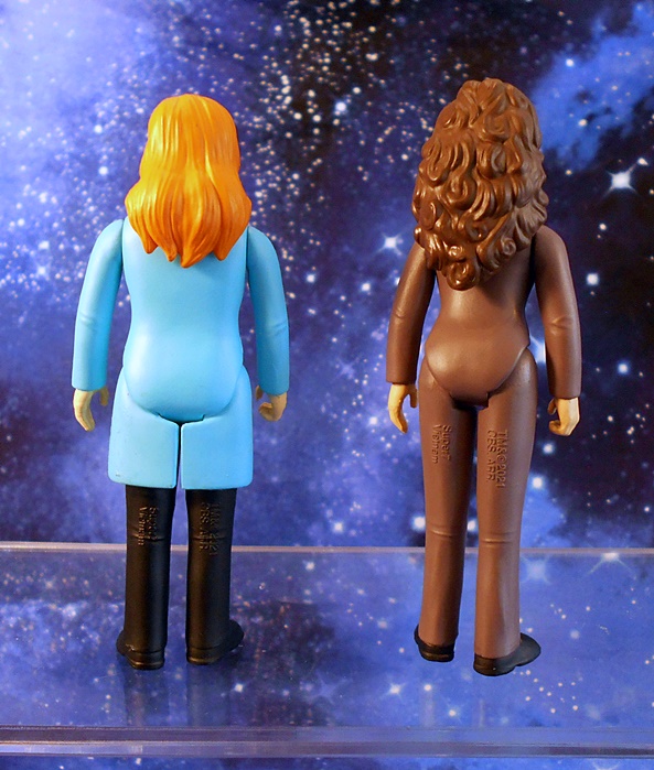
What’s this? Two consecutive weeks of Star Trek content? Well, as our beloved Doctor McCoy once jested, “It never rains, but it pours!” Today’s review has been on my mind for two reasons. Firstly, Eaglemoss has fallen on bad financial times, and the outlook for the company seems pretty dire. I guess we had plenty of clues, what with them running such deep discounts on product lately. Also, Deep Space Nine departed Netflix at the beginning of this month, and so I spent a great deal of June binging my favorite episodes, and I guess I’ll just have to hunt down a used set of the DVDs, because there’s no way in hell I’m paying for CBS/Paramount’s streaming service and have even the slightest possibility of any of their current garbage Trek shows violating the sanctity my home. Ahem… rant over. Let’s take a look at Eaglemoss’ Deep Space Nine model!

I titled this review as being part of their Starship Collection, but I don’t know if that’s accurate, since DS9 obviously isn’t a Starship, but let’s just go with that as an umbrella title covering all their Trek models. This is one of their big boys, with the model itself measuring at roughly 6-inches across. It’s too small to be in scale with Eaglemoss’ smaller ships, but if you have some Trek Micro Machines lying around, that will be a little closer. I’ve actually seen pictures of this model with a tiny Enterprise-D docked at it, but I’m not sure if that was an exclusive, or just something that didn’t make it into the final release. The station comes in a fully enclosed box and nestled between two styrofoam bricks. The only assembly required involves popping the stand together, and you get a nice color magazine-style booklet detailing some lore about the station, both behind the scenes, and in front of the camera.

And here’s DS9 all set up, and it’s amazing to me just how iconic this old Cardassian station has become to me. One look, and I can’t help but hear the melancholy, yet slightly triumphant, theme song swell up in my ears. And I can imagine a tiny Chief O’Brian running around inside trying to hold the thing together. The show creators took a lot of risks, not only setting this series on a space station rather than a starship, but on an alien station, stripping the show of almost any Federation comfort and familiarity. It sure was a gamble, and it paid off in spades. This old station saw some unprecedented growth for the Trek franchise, and showed us a new side of the Trek Universe, which TNG could only hint at. Suffice it to say, I absolutely love the design of Terok Nor, with it’s inhospitable arching tendrils, concentric circles, and jagged edges. It looks like some kind of bizarre sea creature floating in space. And boy, did Eaglemoss do a great job bringing that design to this model!

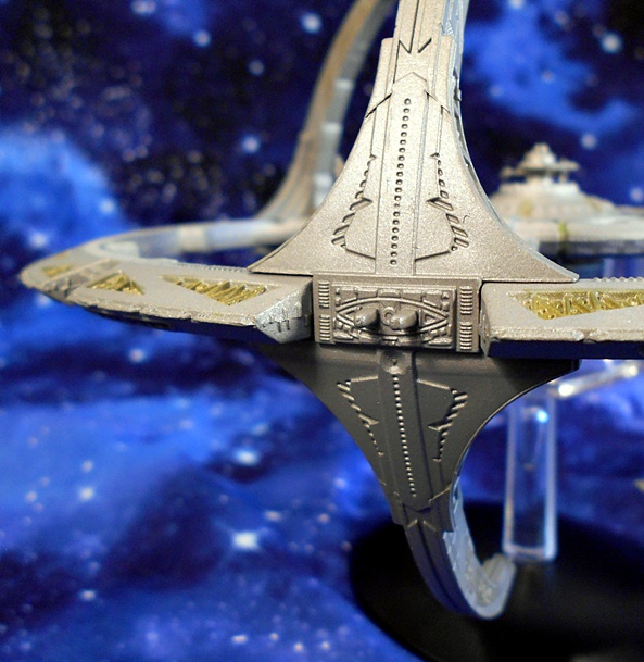
The mix of diecast metal and plastic gives the model a nice heft, while still allowing for some very sharp detail. Each of the tiny docking ports are present around the outer ring, you get the tiny hatches on the inner towers, signifying the hidden location of the torpedo launchers, and some really nice sculpting around the inner habitat ring. I think my favorite details on the whole model are the painted triangular cut-outs that show some more intricate details inside.

Eaglemoss really punched things up for the central core and Ops area. The three tiny deflector shield emitters are present, and actually a bit fragile too! I had to straighten mine a bit when it came out of the box. You can even make out the tiny windows of The Promenade, from where so many of the inhabitants have watched the Wormhole open and close.

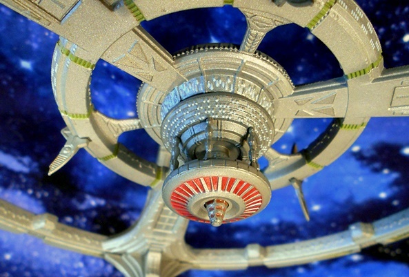
flip down to the undercarriage, and I found this area particularly interesting, since we didn’t often get a good look at it in the series. Here the station’s main fusion reactor hangs down, suspended by the power transfer conduit. We get some nice red paint surrounding this area, along with a central nub jutting out from the middle. The stand here is very well done, and consists of the same combination of translucent plastic stand and black diecast base, which cradles the station underneath, offering sturdy support without interfering with the look of the model.

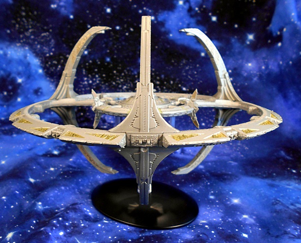
I’ve been after a new Deep Space Nine model ever since I lost my Playmates version when moving from NJ to Florida way back when. That was a very nice representation, and it included some lights and sounds, but I’m content to have this beauty take its place. I find that the size of this model is a perfect balance between being large enough to offer a good bit of detail, but small enough to fit on a shelf and not take up too much real estate. The original MSRP for the station was around $80, but I picked mine up during one of the half-off sales, and that was a deal that even a Ferengi would be envious of! I’ll be very sad to see Eaglemoss go, assuming they can’t restructure, but happily I’ve still got a whole lot of their models to check out here in the future!

Masters of the Universe Origins: Stridor by Mattel

My MOTU Origins backlog may not be nearly as bad as other lines, but there’s still a few things I’m behind on. Case in point, poor Stridor has been waiting to be opened for a while now, and it’s well past time we let this mecha-horsey out of the stable. And boy am I excited! I love animals, and I love robots, so it stands to reason that I love robot animals like Stridor!

The packaging for this line continues to kick all sorts of ass, thanks in no small part to the vintage-style artwork on the extended back panel. It shows He-Man charging into battle atop Stridor while Fisto gets ready to lay down some righteous fist on Skeletor, who approaches in The Roton! Oh yeah, baby! The Origins Roton is coming! Ah, but let’s not take any thunder from Stridor, because he looks all sorts of awesome on display in that window box! Give me a sec to carefully open this box (because it’s a keeper!) and let this electric equine out to trot!

Stridor comes out of the box more or less assembled. You really just have to attach his front guns and he’s good to go. The design is very faithful to the original vintage toy, but with a bit more detail in the sculpt, and now fully articulated legs! You still get the mostly brown body with some lovely silver paint on the neck, head, and ass. You also get some additional silver paint picking out the joints and hydraulics on the legs, which looks quite nice! The orange here looks a lot brighter than what I remember from the vintage toy, and I certainly dig that. The tail, front guns, and head armor all add some bright red to the colors, making this figure’s deco pop brilliantly! What a fantastic looking toy this is!

In addition to the sculpted vents and mechanical bits and bobs, the toy makes use of some well placed stickers to add some detail. These include the vents between the legs on the front, the instruments on the back of the seat and in front of the ass-cannon, the dash board controls, and the heraldic images on each side of the body. I’m not sure what the collector consensus is on the stickers, but I really dig them. They evoke the feel of the vintage toys, and I’m sure they help to keep the cost down on these toys as well.

Stridor comes with the vintage-style armor for his head, which can be removed and swapped out with a more modern look. The modern armor covers more of the head, encompassing the nose and adding holes for the robot horse to… breath? I dunno… maybe that’s where he expels exhaust. There’s a lot more sculpted detail in this armor, including interlocking scales around the top of the neck, and overlapping plates on the snout. The longer spike and the shape of the eyeholes conspire to make him look a lot more aggressive. I like them both, but I think I’ll go with the vintage one for display.

The added articulation in the legs is a welcome treat, with three joints in each leg: At the top, knees, and ankles. The back legs are also ratcheted, so they can easily hold Stridor as he rears up on them. The figure is also balanced well enough to pose like this without any support, which is pretty damn cool. There’s a little articulation in the neck, but not a lot of movement there. Stridor’s jaws will open and snap shut again, so watch your fingers when you’re feeding him sugar cubes, or energon cubes, or whatever! The ass-cannon can turn left and right, and the two front guns can raise and lower a little. I do have a bit of a gripe with the front guns, as they have a habit of falling out when rotated.

Naturally, Stridor has room for a rider, with the rider’s legs going into the body, more like a car than a horse. It works really well, and Stridor can pretty much handle any of the normal Origins figures. Sorry, Ram Man… Not you! You have to walk! Or bounce, or whatever the hell it is you do! Stridor comes with a set or reins, which are made out of rope and has a plastic bit that goes in his mouth, and two handles for the rider.

You also get some blast effect parts to go over the three guns. These are cast in translucent blue plastic, and they’re kind of big. It’s nice to have display options, but I just don’t know about these. I doubt I’ll use them much.

And finally, Stridor comes with a little stable, which consists of a green stone floor and a couple of hitching posts. It’s a cool extra, but I wish they had added a computer or something to make it look like Man-At-Arms could run diagnostics on him or program him or whatever. Maybe I’m being greedy. It’s fine.

The base also has an optional stand, which can hold Stridor in action poses, and that’s very cool!

I paid $30 for this magnificent robo-steed, which I think is the actual MSRP, and I think that’s a damn fine deal considering his size and all he comes with. Indeed, Stridor encapsulates everything that’s fun about the Origins line. He’s a big and satisfying toy, with plenty of display options. He’s a great figure all by himself, but he also interacts really well with the regular figures, giving them yet another option for riding into battle against Skeletor and his minions of evil. Now, bring on Night Stalker! God, I love this line!

Marvel Legends (The Watcher Wave): T’Challa Star Lord by Hasbro

Sorry, for crapping out on Friday content last week. At this point it would probably be best to assume I’m going to be missing a day here and there until I start feeling like myself again. Anyway, last week I started in on The Watcher Wave of Marvel Legends with Captain Carter, and today I’m going to check out T’Challa as Star Lord!

As I mentioned last time, I couldn’t get into the What If? series on Disney+, which these figures are based on. I had it on in the background while I was cleaning up around the house, and there were only a couple episodes that inspired me to sit down and watch for a while. I honestly thought the T’Challa Star Lord episode had some interesting ideas, but it still didn’t keep me hooked for the whole thing. Did I mention that I mainly bought this wave of figures for The Watcher BAF? Well, Captain Carter turned out great, so let’s see if the same can be said for T’Challa here.

So, straightaway, I’ll say that I like the stylized look of this figure. Captain Carter’s design works fine in with my MCU or comic based figures, but with T’Challa here, there’s no mistaking that this is intended to be an animated, or at the very least stylized comic-based figure. The limbs are a little over-contoured, and the whole figure has a clean and shiny vibe about him that screams modern animation. I also dig the colors here. The purple vest with gold accents looks very sharp, and contrasts nicely with the gray suit and brown high boots. The whole costume design is pretty damn cool, and has a polished futuristic vibe that I think works brilliantly. It’s definitely a departure from Peter Quill’s rough-and-tumble look. Unfortunately, all of that also makes this figure feel like a one-off, but I’ll discuss that more at the end.

Likewise, the portrait is an animated style through and through. I love it when viewed from the front, but in profile, I think they exaggerated the contours a bit too much. Even still,, it’s a well put together sculpt with some very clean paint, and I’d say the good definitely outweighs the bad here, and this is a nice animated homage to the Chadwick Bozeman likeness.

You also get a second head, with T’Challa wearing the Star Lord helmet. The helmet is clearly based on the MCU design worn by Peter Quill, with the main difference being the purple lenses in the goggles, which match the figure’s coat, and the gray and gold matching the rest of the outfit. It looks pretty snazzy.

You only get one set of hands here, and they are sculpted to hold the included pistols. These hands are pretty big, and they make me wish Hasbro had included a pair of fists with the figure as well. Come to think of it, I also wish the figure had tabs on the hips to holster his pistols like the Peter Quill figure had. Like the helmet, the pistol sculpts are based off of the MCU designs carried by Quill, and these too have been treated to a purple, gray, and gold paint job to accessorize them with his outfit. And once again, they look very snazzy!

I like the way this figure turned out, but it really doesn’t have a place in my collection, and I probably would have passed on it if it weren’t for The Watcher’s noggin being included in the package. I think Hasbro did a fine job here, but with the heavily animated style, he’s just going to look out of place on whatever shelf I put him. Indeed, he looks like he’s from a different action figure line completely. Hell, I couldn’t even think of any other figures to put him with, as I usually do a group shot at the end of the review. I kind of wish they had bridged the aesthetics gap a bit more with this figure, like they did with Captain Carter, but then I think a lot of what makes this figure as interesting as it is would have been lost. In the end, I suppose I’ll just group the What If? figures together in a corner and them all hang as a group.

ReAction Star Trek: The Next Generation (Wave Two) by Super7

It’s hard to believe that it’s been almost exactly one year since I checked out Super7’s first wave of Star Trek TNG ReAction figures. Well, minus Guinan, because I decided to wait to see if she turns up on clearance. The second wave has now hit and I’m back to check out this new assortment, but again minus one figure, because these are damn expensive and I’m trying to at least be a little selective. There are five figures here to look at, which more or less round out the main cast, so let’s get started!

This wave consists of Riker, Troi, LaForge, Dr. Crusher, and Q, as he appeared in his judge robes from the very first and last episodes. Also included in the wave was Armus, the tar creature who killed Lt. Yar on Vagra II. I skipped Armus because he’s just a one-off alien in a very terrible episode, and the figure didn’t look so hot anyway, but I’ll keep an eye out for him turning up on the cheap. I also thought it was in bad form to include the creature that killed Yar before even making Yar. I could also point out that while the crew are all depicted in their later season uniforms, Q and Armus are both from the first season, which just makes no sense to me at all.

The card designs are the same as the first wave, and they’re absolutely fantastic. You get the familiar TNG title logo up at the top with the Enterprise-D speeding out of the card with warp streaks all around it. Each card is personalized with individual character art inside a Delta insignia. The character art appears to be original and it looks great. There’s also some foil on the cards, which gives them a premium look, and they damn well should considering the price. I generally keep all my ReAction figures carded, and I was tempted to do so with these, but I opened the first wave, so let’s tear into these and check them out!

Starting out with Riker and LaForge, these figures utilize the same body that we saw last time for Worf, Picard, and Data. It’s unfortunate, since the cast were all very different heights, and Riker should not be as tall as LaForge. Sorry, but this kind of recycling would be acceptable on $10 retro figures, but not at nearly double that price. The paint on these are also not as tight as the first wave. Both of these figures have weird smudges on their backs, and LaForge has smudging on the front of his tunic as well. As expected, all the figures in this wave have the retro-style five points of articulation. And yeah, they should have given Riker one articulated knee, so he could do his signature pose.

Riker’s head sculpt isn’t great, but I guess it’s acceptable for a retro line like this. I like his blue eyes, but for some reason he looks a bit like an adult Wesley Crusher, which kind of makes me laugh. LaForge’s, on the other hand, is really quite good. Sure, he’s more recognizable because of his visor, but I think they did a great job on his facial features too. Both heads have paint issues, but Riker made out better with just some stray marks on his face. LaForge’s is an absolute mess, with silver paint from the visor on his nose and up near his eyebrows. It’s a shame, because the sculpt deserved better paint. Normally, I’m not very critical of paint on 3 3/4-inch figure portraits, because I punch in pretty close for these pictures, but the problems here are all noticeable with the figure in hand and viewed by the naked eye.

The ladies offer all new sculpting, but they do also share the same arms. The legs are almost the same, but Crusher’s have the bottom parts of her lab coat added. As a result, you have the same height issues going on, but in this case Troi is actually a bit taller than Crusher, because of her wall of hair. With that having been said, both of these sculpts are excellent for the line, and the paint here is actually not bad, making them stand out from the piss-poor paint on the dudes. They didn’t quite capture the magical contours of Troi’s tushie, but it is a retro line, so I’ll let it go. I am glad they put Crusher in her lab coat, and I think they did a great job working it into the retro sculpt. It would have been interesting to see them try it as a Kenner-style vinyl cape, but I’m not sure that would have worked.

The portraits here are pretty solid. I think Troi made out a little better in the likeness, but Crusher isn’t bad for a retro line. They also did a nice job with their hair. My only big complaint with Crusher is that she isn’t Dr. Pulaski. Crusher was easily the weakest character of the show to me, and I thought bringing in Pulaski punched things up a lot. Boy, was I pissed off when she only lasted one season. I would definitely have to buy a ReAction Pulaski if they made her, and then I could disappear Crusher!

And finally, we have Judge Q, and this is an excellent figure. I’m not sure the likeness is really there, but the costume is so distinctive, that there’s no denying who this is supposed to be. The robes are implemented in a fashion similar to Kenner’s Obi-Wan or Emperor, and they looks great. I like the paint and detail on his necklace, and all around this is solid work.

One of my big gripes with this line last time around was the lack of accessories, as all you got were some phasers. Here we have one step forward and one step back. Riker and LaForge come with the same phasers we saw last time, and they still can’t hold them very well. Crusher comes with a medical tricorder, and Troi and Q come with nothing. I’m fine with Troi and Q not including accessories, but that meant we should have had more come with the others. Could we at least get a diagnostic tool for LaForge? And maybe a regular tricorder so I could give it to Data? Not having a tricorder for Data pisses me off all the more when I see what a great job they did with Crusher’s medical tricorder. It may not look like much in the picture, but it’s so damn tiny that I think it’s impressive work. Either way, it’s not cool to skimp on accessories when you’re charging $18 a pop for 5-POA figures.

And last time I checked out these figures with Galoob’s Shuttlecraft, as both lines were scaled roughly the same. This time I pulled out the Playmates shuttle to see how that would work, and it works pretty damn well. Playmate’s shuttle was under-scaled for it’s own line, which makes these work even better. Of course, the giant single seat in the cockpit is completely out of whack, but I’ll be someone could 3D-print a set of two seats for it that would work even better. All in all, it makes for a great piece to display with these figures.

And that’s Wave Two of Super7’s TNG ReAction line! This assortment was a real mixed bag. Riker and LaForge should have been easy slam dunks, since they’re 95% recycled parts, but the QC on the paint was non-existent. At least the ladies and Q all came out fine. I haven’t seen anything about a third wave, and that’s fine by me, because I think I’m done with these. I would consider picking up some more aliens, and Yar if they ever do her, but my guess is that if we do get more figures, we’ll see some repaints, like LaForge in his Season One uniform, maybe a Thomas Riker, and at these prices, I’m not biting on those. If these were ten bucks a pop, I’d be willing to stick with it, but $18 for these is just way too much, making me wish I had just left them all carded. With Playmates releasing some new TNG figures soon, I’m interested to see how those turn out.

Marvel Legends (The Watcher Wave): Captain Carter and Captain Carter in Stealth Suit by Hasbro

In case you missed the memo, Marvel Mondays are back, and today I’m digging into The Watcher Wave, which came out forever ago! But that’s pretty much going to be the running theme here on Mondays, as I try to get caught up on opening figures that have been sitting around here, and decide if I’m going to keep going with collecting Marvel Legends, or call it a day. And because I’ve been missing a scheduled review here and there, I decided to double up and check out both versions of Captain Carter!

As the packaging suggests, this assortment is inspired by the Disney+ animated What If? series. I recently put this show on in the background while I was doing things around the house, but it never caught my interest enough to want to sit down and actually pay attention. The name is self-explanatory, as it’s inspired by the What If? comics that mixes up continuity and… well… asks the question What If? Duh! Captain Carter’s episode was focused around Peggy Carter taking the Super Soldier Serum and becoming Captain Carter (I guess there was already a Captain Britain in this reality?) and Steve Rogers adopting more of an Iron Man visage with The Hydra Stomper armor. The regular flavor release of Peggy came with some Watcher BAF parts, and we also got a Stealth Suit version that was a stand alone release, but still got the What If? branding. Let’s go with regular Peggy first!

Holy hell, this is an amazing looking figure on almost every front. I’m not sure if Hasbro was actually going for an animated look here, but I think it works pretty well either way, and I wouldn’t be opposed to displaying this Peggy in with my other MCU figures. A lot of that is tied up in the portrait, but let’s look at the body and costume first. Peggy is sporting a beautiful dark blue body suit, with tall brown boots, belt, shoulder straps, and gloves, and The Union Flag painted rather boldly on her front upper body. You also get some red striping on her shoulders and upper legs. The colors here are so vibrant, and overall look really nice. The Union Flag is actually part of the sculpt, and while it could have been painted a little sharper, it certainly doesn’t look bad. Some nice flourishes in the sculpt include the flared bottoms in her boots, and the little pouches on her belt. There’s also a lick of silver on her shoulder harness and her belt buckle.

Coming back to the portrait, there’s definitely an animated twist to it, especially in the somewhat simplified hair. Still, I think the rest of the sculpt could work as animated, comic, or even MCU, as there’s certainly a Haley Atwell likeness there. There’s a bit of unsightly mold flashing on the hair, but other than that this is an absolutely gorgeous head sculpt, enhanced with some solid haltone printing for the eyes and mouth. I’d go so far as to say this is one of Hasbro’s prettiest female sculpts, but it probably doesn’t hurt to have Atwell’s likeness to work off of. I also dig her high collar, which just looks really sharp!

And what’s this? The figure actually has the standard Marvel Legends dude articulation in the arms. Gone is the rotating hinge elbow, and in its place is a proper double-hinge paired up with a bicep swivel. I can’t begin to relate how happy I am to see Hasbro finally make this leap for the ladies. It looks fine, and I hope to see more of this going forward, assuming I’m still collecting these figures. Otherwise, Captain Carter does make use of a ball joint under her chest, rather than the ab-crunch hinge we see in the males, but otherwise she has all the usual points of articulation and is a very fun figure to play around with. On the downside, her left hand is sculpted so that it can hold her shield by the rim, and they wound up giving her a big monster hand. And the hand doesn’t even actually hold the shield, because the grip is too far open! Talk about an epic fail! I really wish, they had included a left fist to swap this one out, but it’s not a big enough issue to ruin the figure for me.

Of course, Captain Carter comes with her trusty shield, and this is a beautiful accessory. You get a really cool design based on the Union Flag with some crisp red, white, and blue paint. Everything is super glossy, giving the shield something akin to a shiny new car finish! The interior of the shield has two sculpted brown straps to slide the figure’s arm through. It works pretty well, and the giant monster hand will pop off to help get it through. On the downside, there is no way to attach the shield to the figure’s back, which is one of the trade-offs of not using the old peg and clip system. OK, let’s move on to Stealth Suit Carter!

The Stealth Suit version is a quick repaint with no new sculpting at all, and yet the fresh coat of paint really makes this figure stand out on her own. It seems to be going for the look of Captain America’s MCU STRIKE Suit and it’s definitely a cool design! You get a darker blue body suit with the Union Flag on her chest painted in silver. The red stripes on the shoulders are also changed to silver, while they are omitted altogether on her upper legs. The boots are now black with brown straps and silver buckles, and the gloves are now painted to be fingerless. And yup, you still have to deal with a giant monster hand here too.

The head sculpt is exactly the same, although this figure has been spared some of the mold flashing at the top center of her coif. It’s possible the hair here is just slightly darker, but even if that’s the case, I’m sure it’s just a natural variant from production, rather than being intentional. Good gosh, I just love these portraits! They are breathtaking!

The shield is now painted in silver and light blue, which looks very nice, but to me the double cross in the center no longer really resembles anything inspired by The Union Flag without the familiar red, white, and blue. I actually wound up getting this Stealth version before the regular release, so it’s tough to say whether I would have still picked up this figure had that not been the case. Probably not, as the regular release is definitely my favorite of the two, but I’m not regretting getting them both either.

And it goes without saying that either figure looks absolutely smashing with the HYDRA Stomper! I was always going to be all in on this wave for The Watcher BAF, but even if that weren’t the case, I still would have picked up this Captain Carter figure. And yeah, that’s saying a lot, since I didn’t really follow the series much at all, and I remember almost nothing about this particular episode. Although I guess we did get a look at her in the MCU in the otherwise dismal Multiverse of Madness! Whatever the case, I’m thrilled to add both Peggy figures to my shelf!

Transformers (Studio Series 86): Wreck-Gar and Junkheap by Hasbro

Sorry about missing Wednesday, but the lingering symptoms of Covid mixed with being back at work is wearing me out at night. And since I didn’t make it back for my usual midweek review, I thought I’d double up for today with a look at two more Studio Series Transformers. I’ve had Wreck-Gar kicking around and waiting to be opened for about a year, which absolutely blows my mind with how fast time is going! And since I just had Junkheap hit my doorstep last week, let’s just have a look at them both in one go!

I only have a boxed shot of Wreck-Gar, but both figures are in the fairly similar Studio Series packaging, and even share similar character art. The big difference in packaging is that Junkheap does not have the window, so your figure is exposed to the filthy peanut butter encrusted fingers of any toddler that decides to wander by and touch the toy you’re going to buy. How is that fair? That little shit can’t afford this toy? Anyway, I got mine from Amazon, so hopefully it just sat in a casepack until it was ready to ship out. Wreck-Gar is a prime example of how collecting Transformers can be frustrating to me, because it feels like I’m constantly replacing figures with improved versions. He was released in Reveal The Shield back in 2011, Power of the Primes in 2018, and in between those, I even picked up a third party version by DX9 Toys in 2017. The 2018 release is the only one I still own, and he’ll probably be going bye-bye after I’m done with this review. Let’s start with Wreck-Gar and his alt mode!

So, I’m not terribly pleased with this motorcycle mode, but I don’t really hate it either. It’s pretty damn ugly, but then he is a Junkion, so I guess I can kind of forgive that. I think my biggest problem is that it looks worse than the original G1 toy’s alt mode. It’s very possible that I don’t have all the parts lined up properly, but then this was a pretty frustrating transformation, and just wasn’t worth the end result. I do like the colors, as they match the traditional animated look of the motorcycle pretty well. The studs on the wheels are cool, as are the big spikes jutting off the sides, and the dual blasters under the windshield. There’s some nice detail on the console gauges, although the handlebars on my toy are warped. You can store his weapon by pegging it into the back of the bike, but I think it looks kind of goofy back there. Finally, you get a pair of fold out kick-stands to keep Wreck-Gar sitting upright.

If you have a f’ugly alt mode, than you pretty much have to have a great robot mode, and it’s clear here that the motorcycle was sacrificed for the robot. This figure looks fantastic, and certainly outclasses any of the previous releases that have passed through my collection, even that expensive third-party figure, which in fairness was a remold/repaint of the Gobot Leader Cy-Kill. The proportions here are excellent, and yes, I even like his Popeye-style forearms! The placement of the bike’s saddlebags on his hips is perfect for him to store extra bits or maybe some Energon Goodies. The spikes protruding from his knees and forearms provide places to put his wheels. I like to counter-balance them with one on each side, so one on the right knee, and the other on the left forearm as a shield. The bulbous gas tank from the motorcycle fills in his back, making this figure look just as solid from behind as he does from the front. And you have to love those nipple cannons, and the fact that they’re ball jointed and can be aimed independently, which is just delightfully creepy.

The head sculpt here is right on the money. I liked the Power of the Primes portrait as well, but that head was way too small for the body. Here we get a bigger and bolder noggin with all the personality of the animated design. The faked out front of the motorcycle makes for a great looking “helmet” and the facial features are sharp and well fleshed out. I’ve still never completely reconciled with the introduction of facial “hair” on my Transformers, but I have to admit, it looks great here. The red eye paint is very clean with some sharp black outlines.

Wreck-Gar comes with his pinwheel of death, which is a lot better than previous versions of this curious weapon. I really dig the way he looks with the weapon in one hand and the wheel shield on the opposing arm. Let’s move on to Junkheap…

I won’t spend a whole lot of time with Junkheap, as he is basically just a remold and repaint of Wreck-Gar. The motorcycle has additional side plates, and the piece under the windshield section has been remolded to omit the nipple cannons and just have some pipes angling out from the center. The pylons holding the front wheel are also new sculpts. The windshield area is more squared off this time and lacks the swooshes on the sides. I would have thought the added side plates would improve the look, but I think this one actually looks worse than Wreck-Gar’s alt mode. They also add a little more frustration to the transformation. The deco shares some common strokes with Wreck-Gar, mainly in the brown and orange, but it adds more gray to the mix, making him not as bright and vibrant, but it’s still a good looking deco. The transparent windscreen is also now tinted blue.

And just like Wreck-Gar, the robot mode here is absolutely fantastic! The changes I mentioned in the motorcycle mode are reflected here on the chest and arms. It’s honestly a lot more different than I would have expected, even if all of those changes are confined to the upper body. You can still position his wheels in the same manner as Wreck-Gar, but I like to keep both of Junkheap’s wheels on his legs, because of the options you now have with those side plates on the arms.

The side plates can reside on the shoulders, or be swing down to the forearms. While both look good, I prefer to keep the right plate up on the shoulder and have the left plate on the forearm, as it can serve as either a shield or a blaster. Either way, it just adds to the options you have to customize the look of this guy and make him all the bit more different than Wreck-Gar.

As with Wreck-Gar, Hasbro did a really nice job on this head sculpt. Since the “helmet” is supposed to be a mass-shifted front of the bike, it looks more squared off here. I also dig the shock absorber horns that protrude from the sides. These are ball jointed so you can adjust them to be rather expressive. The face features some sharp details and the oversized goggles are painted red.

Junkheap comes with the exact same Death Pinwheel as Wreck-Gar. I actually wouldn’t have minded a new weapon here, but considering all the other changes, it’s fine.

While I certainly do wish the motorcycle modes were a little tighter and looked a bit better, the robot modes here are more than enough to win me over. That is how I display most of these anyway, and I don’t see myself transforming these guys a lot in the future. I think these are some absolutely great looking robots. They’re big, hefty, and fun to play with, and I think Hasbro did just enough in the remolding to make them each stand on their own. I probably wouldn’t mind seeing a third Junkion created from this mold, and I’ll confess I was even tempted to pick up a second Junkheap, just to give Wreck-Gar a pair of them to fight with. But for now, I’m thrilled to add these Junkions to my 86 Movie shelf!

Marvel Legends: Doctor Strange by Hasbro

Marvel Monday is back, but I feel that its return needs a disclaimer! I have cut my Legends collecting way back for a couple of reasons. First and foremost, with how prolific this line has been, I’ve got a lot of the characters I was after, and now I’m willing to be a lot more selective when it comes to the comic characters. But also, I have not been a fan of the latest crop of MCU films and Disney+ shows. I couldn’t make it through either Shang-Chi or The Eternals on streaming, and I don’t plan on going out to see Love & Thunder. Similarly, I wasn’t able to get through a few episodes of Falcon & Winter Soldier, Loki, or Moon Knight. I feel like the best is behind us, and I’m just not interested in owning figures of any of this stuff. So, Marvel Mondays will be about wrapping up what I’ve got unopened, which consists of some multi-packs, a couple of waves, and some exclusives. And we’ll see what happens after that!

Today I’m opening the Walmart Exclusive classic comic version of Doctor Strange. The Walmarts here don’t carry this stuff, but I was lucky enough to get this release off of the website. It’s not tied to any wave and there’s no Build-A-Figure part, but you do get some great character art on the side panels, and a bunch of extras with the figure. This arrived a long while back and it’s been kicking around in the backseat of my car for months. I wasn’t even sure what it was when I finally opened the shipping box! It’s crazy to think that we haven’t had a classic comic version of Strange in Legends yet, or that this was released as a lone retail exclusive. The closest we’ve come was the two similar versions of the more modern comic Strange that came in the Dormammu Wave and the Hulkbuster Wave. But that only makes this one all the more of a welcome treat.

The first thing I have to talk about is the coloring, which is quite simply gorgeous. From the electric blue tunic, to the bright yellow, and deep crimson, this figure looks like it just leapt from a comic panel. The paint and plastic are so vibrant and sumptuous, and I absolutely love that in a comic book figure. There’s some new sculpting here, as well as some recycled parts, and I think the mix works out really well. New stuff includes the tunic, which has sculpted detail, rather than just paint, the yellow sash tied around the waist, and the lower part of the tunic, which forms a sort of skirt. The sleeves are rolled up just below the elbows, which looks cool, and reveals some lovely black Kirby Crackle on the sleeves of the gauntlets. The legs are generic and recycled, and all black, which looks fine.

The Cloak of Levitation is a repaint of the one sculpted for the more modern Strange, and that’s fine, because this is a really solid sculpt. It hangs beautifully off the figure, angling from the chest and over the shoulders, and the collar with it’s high points frame the figure’s head perfectly. It curls at the bottom edges, and billows out in all the right places, while not putting a damper on the figure’s articulation or making him too back heavy. The yellow paint could have been sharper in a few areas, but painting bright colors over darker plastic is rarely ever a good idea.

You get a whopping three heads with this figure, which include a standard portrait, a concentrating portrait, with Strange’s eyes closed. Both of these feature Strange with his mustache and sans goatee, which is a look I really like. You also get the gray wings in his hair just like Paulie Walnuts (God rest his soul). I think both are excellent sculpts, with some nice definition to the facial features. The portrait with the closed eyes has a bit of muss to the hair, which even has a few strands falling loose over his forehead, and that’s a nice touch!

The third head is a blue masked portrait, which is a nice bonus, but not one that I really associate with the character much, and so I probably won’t get much use out of it. Still, there’s got to be some fans out there who are thrilled to have this one included.

In addition to all those heads, Strange comes with two sets of hands, and a few extra accessories. One pair of hands features a left fist and a right accessory holding hand, while the other feature the same mystical spell-slinging hands that we saw with the modern comic Strange. These also work for making the OK symbol, or for gesticulating when you say capiche? HA! They said I couldn’t get two Sopranos references into a Doctor Strange action figure review. THEY WERE WRONG!!!

You also get a pair of spell effect parts, which we’ve seen many times over in recent years, and were also included with the modern comic Strange. These have two sets of clips, so that they can be attached at the wrists, or further up the arm. I dig this pair a lot, as rather than just be stamped out in one color of transparent plastic, there’s a nice mix of yellow and orange here, giving them more of a premium and dynamic look.

Next up, you get the wonderous Wand of Watoomb, which is a very welcome addition. The accessory is cast all in gold plastic, with a sculpted cross-thatch pattern on the rod and with horned spheres at each end.

And finally, you get the Axe of Angarruumus, which has some beautiful detail in the sculpted double-headed blade, and again at the pommel cap at the end of the shaft. I love the nicks and dings in the blade, suggesting that this mystical weapon is both ancient and has seen some serious shit in its day!

I can’t think of a better figure for me to have opened in order to whet my appetite for Marvel Legends again. This classic Strange is a beautiful figure with some great accessories, and above all fills a vacant slot that’s taken way too long for Hasbro to fill. It’s exactly this kind of release that can get me excited for the line all over again. And to think that if it weren’t for a timely tip that he was up on the website, I would have probably missed out on him entirely. No way, this one should have been an exclusive, and I’m rather surprised they didn’t work him into the Multiverse of Madness Wave.

Star Wars Black Series (The Mandalorian): Cobb Vanth by Hasbro

I doubt anyone as more surprised than me that I made it here for at least one review this week. On Saturday and Sunday I was so sick, I just wanted to die. Things got marginally better and than plateaued up until late Wednesday when everything downgraded to what felt like just the worst head cold I’ve ever had. Yesterday I shot some pictures and paid for it by lying down for a couple of hours. Today I’m feeling better, and I hope to be back at work tomorrow. I had a bunch of goodies hit my doorstep while I was laid out this week, so let’s have a look at one of the new Star Wars figures…

Cobb Vanth was introduced in the premier episode of The Mandalorian’s second season, and it still kills me that they didn’t call this episode The Ballad of Marshall Vanth, because I just think sounds all kinds of cool. Cobb’s big claim to fame was buying Boba Fett’s armor from some Jawas, running an evil mining company out of Mos Pelgo, and installing himself as The Marshall. I watched this one again while I opened the figure and really enjoyed it. It also reminded me that the drop in quality going from The Mandalorian to Book of Boba Fett and Obi-Wan is just shocking, but I’m not going to open that can of worms here.

Cobb’s Marshall space-western duds feature a dark brown trousers with lighter brown high-top boots, an orange shirt with Boba Fett’s cuirass and shoulder armor worn over it. He also managed to pick up the gauntlets, and one knee guard, in his deal with the Jawas. As a result, his outfit has a patchwork look to it, reminiscent of what characters in some RPGs look like when salvaging various pieces of armor from vanquished foes. It definitely fits the scavenger lifestyle on Tatooine.

There’s some very nice weathering on the chest armor, where most of the green paint has been worn down to the bare silver of the Beskar. There’s similar paint wear on the shoulder pieces, the gauntlets, and the knee piece. The back piece seems to have remained curiously unscathed, and I’m wondering if that’s just because Hasbro forgot to weather it. Cobb also sports an orange gunbelt, with a low slung holster hanging off his right hip.

The head sculpt here is excellent, and an all around solid likeness for Timothy Olyphant. The paint on his beard is a rather splotchy, and it doesn’t look like they used the half-tone printing for it, but the eyes and eyebrows look great and I have to say I really dig The Marshall’s coif. I may take a picture of him with me the next time I go to the barber and ask them to give me the Cobb. The Marshall also sports a sculpted plastic bandana, which hangs around his neck.

Extra Boba bits include the jetpack and the helmet. The jetpack pegs into the back of the figure, with two additional tabs to secure it. I’m not all that sold on the coloring here, although with the lighting in the episode, it’s hard for me to dismiss it out of hand. The blue bits looked more green to me, and the yellow and white too bright. Whatever the case, the paint here just looks a bit too bright and cheery. The silver weathering does, however, look on point. The rocket sculpt is certainly accurate to the one Cobb used to blow up the speeder full of Mining Guards, and it is removable.

The helmet, on the other hand, is just gorgeous in the way they recreated all the chipped paint and bubbling rust. I’m also very fond of the deep metallic red paint they used for the area surrounding the visor. The range finder is even hinged! Very nice!

Marshall Vanth comes with two weapons, the first of which is his pistol. This is really nothing special, as it’s a bit of a chunky sculpt with some soft details to it. The design at least retains the Western flavor, making it somewhat reminiscent of an old revolver. I like that it has a lanyard ring dangling off the bottom of the grip.

He also comes with a rifle, which is much more interesting. This one has plenty of detail and sculpted white wraps around the grip and up near the muzzle. and what appears to be some type of scope.

One of the things I dig about The Mandalorian so much was it’s steady stream of interesting and relatable side characters, and The Marshall is just another great example of this. Naturally, I was happy to see him get a figure in The Black Series, and doubly happy to see that Hasbro did him proud. I would have liked the jetpack coloring to be a little more sedate, and maybe have more detail in the pistol sculpt, but overall I think this figure turned out great. I’m not sure if I will pony up for a double-dip if Hasbro does him again without Fett’s armor, but I guess I’d have to see the figure first.

Taking a few days off…

Well, the Coof finally caught up to me, as I was feeling very sick the last couple days and today I got a positive test for the Beer Virus. Crazy to think I made it so long without contracting it, only to get hit now.

I’m happy to say that I don’t seem to have any lung involvement or breathing problems. I do have one of the worst sore throats I’ve ever had, which makes the sporadic coughing fits oh so much fun. I’ve got aches and pains all over and a fever that keeps breaking and coming back, making me alternate between the shivers and flop sweats. But… as sick as I am, if this is as bad as it is going to get, I’ll count myself lucky. I think the worst part of it all is the sore throat makes it impossible to sleep for more than a couple hours at a time.

As a result, I’m going to take a brief hiatus to recoup, so there will be no new content for Monday or Wednesday. I’m hoping I’m past the hump and it’ll be on its way out, and maybe Friday I can come back with a review.

Thanks for your understanding!

By figurefanzero

Battlestar Galactica: Classic Colonial Viper Mk I by Eaglemoss

Eaglemoss continues to run some pretty irresistible sales on Amazon every month or so, which means I’ve been stocking knocking a bunch of their ships off my Want List. A lot of them have been Starships from Star Trek, but today we’re taking a trip back to the Classic Battlestar Galactica series and having a look at the Colonial Viper Mk I!

This is one of the big boys, measuring in at a little over ten inches long, so naturally it comes in a fairly beefy box. The package is collector friendly, with the Viper coming fully assembled and secured between two halves of a styrofoam brick. All you need to do is pop the stand together, but if you’re like me, you’ll be whooshing this around the room before you even get to the stand. You also get a full color booklet that has some technical and behind the scenes info about this iconic ship. I don’t always bother with these books, but I thoroughly enjoyed reading this one.

And this ship is indeed so damn iconic to me. As a kid, BSG blew my little mind, as it truly felt like all the flash and spectacle of Star Wars, but as an ongoing series right in our living room. Hell, I can still marvel at how good the ships and battles look for the time. And while I’m sure it may be sacrilege to some, I would personally hold the design of this Colonial Viper up against that of the X-Wing any day of the week. It may not be quite as distinctive as Incom’s fighter, but I always thought this design looked more realistic and made more sense. It’s basically three big engines attached to a cockpit and fuselage. There’s something about it that just looks more rugged and durable.

The Viper is comprised of both Diecast metal and plastic, but despite it’s size there isn’t a whole lot of heft to this ship, so let’s say mostly plastic. That’s not necessarily a mark against it for me, but considering how heavy some of the Trek ships feel, this one just feels more like a plastic model garage kit. The paint is absolutely exquisite, particularly the weathering work, which really sells this thing. The hull is splotched with wear and tear that looks convincing enough for a studio model. There’s scorch marks around the engine intakes, possible scarring from Cylon laser hits, and of course you get the beautiful deep crimson striping and accents.

And the sculpt is certainly no slouch either. There’s panel lines with interlocking catches, rivets, pipes coming from the exposed parts of the engines, vents, and intakes. I love the cutouts were the front wings almost meet up with the fuselage, and the fact that the laser cannons just sort of float off the wing sections, leaving a stylish gap. I expected the canopy glass to be just painted black, but it’s actually a dark smoked transparent plastic. In just the right light you can almost see inside.

The stand is well designed, with angled transparent arms that slip just in front of the each lower engine. It offers a snug hold on the ship, ensuring that it won’t slip out or topple over, while not obstructing the view of the ship. But because it is pretty tight, it’s probably best to not remove it from the stand too many times as it could lead to some paint wear at the contact point.

I couldn’t be happier that Eaglemoss is doing Classic Battlestar Galactica ships, as I haven’t had an example of this Viper in my collection since I had Mattel’s little version as a kid. It’s perfectly sized to bring out the detail and really get noticed on the shelf, and the quality and craftsmanship is top notch. The MSRP on this fighter is around $70, but I got in on a Buy 2, Get 50% Off Deal, so I paired it up with the Classic Cylon Fighter, only paying $35 for each. And yeah, I’ll try to squeeze a look at the Cylon ship into the mix in the next couple of weeks!