DC Unlimited: Injustice Green Lantern by Mattel

It’s Friday, it’s been a long week and I have a long working weekend ahead of me. Next week is going to be something of a themed week so I was hoping to squeeze in MOTUC’s Battle Lion today and that didn’t happen. I haven’t even gotten around to opening him yet and I needed something quicker and easier for today so I could start drinking earlier than usual. Oh, hello Injustice Green Lantern! You’ve been sitting in the corner of the closet since before Christmas. Let’s open you up and check you out. This shouldn’t take long.

injgl1

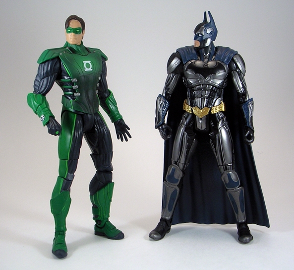
Ah, it’s refreshing to see this packaging again! I really do miss my 6-inch DC figure fix. Sure I’m planning on buying a lot of DC Collectibles figures this year, but on some level it just isn’t quite the same. As far as I’m concerned, the Unlimited off-shoot of DC Universe Classics had the best package design. That added panel of character art on the front really ties the whole thing together beautifully. I’ll note here that I still have not played Injustice, but I do have it and it is sitting on my rather copious pile of games. Maybe when I get tired of Dark Souls kicking my ass, I’ll finally unwrap it and pop it in. Anyway, I absolutely loved the Injustice Batman figure so I’ve got some high expectations for Green Lantern…

injgl2

injgl3

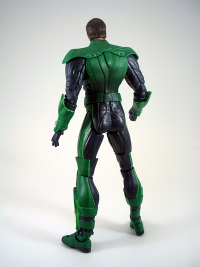
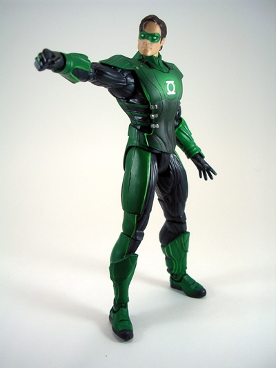
Oh… Ok. Obviously these figures are beholden to their character designs in the game and while Batman’s new digs were downright awesome, Green Lantern’s are a lot less exciting. No, scratch that. Injustice Green Lantern is just downright boring to me and that’s certainly going to color my reception of this figure. The redesign of his Lantern costume is kind of lazy. His shirt has been turned into a tunic with shoulder pads and side straps to hold it on, while the arms and legs are covered with exaggerated ribbed muscles. I just don’t find the redesign in any way creative or cool looking. Maybe the outfit doesn’t lend itself to the bad boy treatment as well as the others. Of course, even if you do like the design, this figure still isn’t all that great.

injgl8

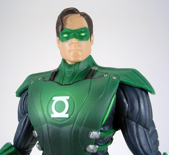
The portrait, for example, is another big stumbling block for me. The face sculpt is very soft for a DCUC figure. None of the detailing in the nose or mouth is very well defined at all. The paint around the mask and hairline is also pretty sloppy for a 6-inch figure. But beyond that the entire portrait just doesn’t work for me. This doesn’t look like Hal Jordan, it looks like the guy with the receding hairline that comes up from IT to fix the copier.

injgl6

injgl4

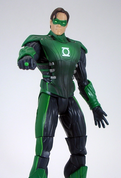
Aside from some sloppiness on the head, the paint on the figure is pretty solid overall. I’ll definitely give props to the way they painted his tunic around the Lantern emblem. The way the green gets darker as it moves away from the emblem does create a cool effect that the Lantern is actually illuminated. You also get some sharp emblems on his arm bracers and the power ring is painted.

injgl5

injgl7

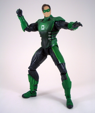
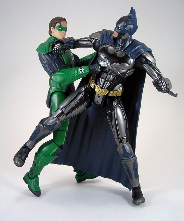
The articulation is in line with Injustice Batman, which means it’s missing some key points from the DCUC style. There’s no ab crunch, but more importantly there are no swivel cuts in the biceps. Those bicep swivels are pretty much non-negotiable for me and my 6-inch figures and it really pisses me off that Mattel nixed them from these figures. Hal comes off as feeling rather stiff and while you can certainly get him into some different poses, none of them are all that exciting.

injgl9

injgl10

injgl11

So, considering I only dropped about six bucks on this figure, I’m not too bummed out about it. He’s not terrible. Oh, we’ve seen some real shitty Green Lantern figures out of Mattel back when that movie was out and this figure doesn’t come close to being as bad as any of them. But it isn’t a figure that grabs me in any way. The real kicker is that Mattel only produced a handful of figures based on the Injustice video game and with all the cool character designs in that game, Green Lantern is one of the few they decided to produce. I would have much rather seen figures of Aquaman or Wonder Woman. But for figures of those characters, I’ll have to turn to those tiny DC Collectibles sets.

Transformers (2007 Movie): Brawl by Hasbro

It’s Transformers Thursday, and I believe this is Week #6 of TFT being held hostage by the Bayformer menace. Today my random grab into the Transformers Movie Tote pulled out Deluxe Class Brawl from the first movie. Or is that Devastator? Yeah, the people making this movie cared so little that they couldn’t even get the name of the character right. How did they not even clean that up for the home release for Chrissakes? Anyway, there’s no in-package shot so let’s jump right to Brawl’s alt mode.

07brawl1

07brawl2

Yup, he’s a tank. He’s actually a pretty nice looking tank too. You can say a lot of bad things about some of these movie toys, but for the most part they had really good alt modes. There’s some nice attention to detail in the sculpt, including bolts, hatches, mesh grating, and the individual wheels in the treads. Brawl sports a simple green camo deco that’s appropriately understated for his military nature. There’s nothing flashy or terribly special here, and certainly not a lot of visible paint apps, but it’s a solid effort that leaves me with no complaints.

07brawl3

Brawl’s tank mode even features a decent amount of articulation. The main turret will turn left and right as will the secondary turret on top of that so the smaller guns can track flanking Autobot targets while the main gun is pounding away at something else. You also get two small missile packs mounted on ball joints on top of the main turret. Brawl is basically guns on top of guns, and I can’t imagine a Decepticon would want it any other way. I should point out that Brawl’s main gun can fire a missile, but like most of my ’07 Transformers, I have no idea where that missile got to.

07brawl4

Transforming Brawl is surprisingly simple for a movie toy. The engineering here is so intuitive that’s it’s hard to believe the designers were able to get such a great robot and alt mode out of him. At heart, this robot mode is a great nod back to G1 Brawl with the front of the tank making up the chest and treads packing away neatly on his legs. The turret forms a backpack and it’s very clever the way his arms unfold from the turret so that the main gun from the tank lands on his right arm. You gotta love the arm cannon! It’s enough to make Megatron jealous. Another cool touch is the way the two guns peek up behind his shoulders just like G1 Onslaught. The plows on the front of the tank form a set of vicious chest armor, and he has a wicked claw weapon that folds out from his left wrist.

07brawl5

While I’m generally not a fan of the Bayformer portraits, I like Brawl’s headsculpt quite a bit. It downplays the whole insectoid look that some of the other bots have and there’s some pretty good light piping here too. I also really dig the way the treads land on his shoulders. It reminds me of the pieces that some medieval armor had to help prevent decapitations in combat.

07brawl7

Alrighty, so Brawl features a solid tank mode and a really great looking robot mode, but guess what? As a toy he’s still a piece of crap. Why? The shoulders! The shoulders are designed to tab into the torso and they simply will not stay locked into place. Get one in and the other pops out. Try to manipulate his arms and they pop right out. Stand him on the shelf and look at him funny and they pop right out. Dig a hole in the back yard and bury him… I’m going to guess they’ll still pop right out. Just trying to get some shots of him in robot mode with them still attached had me gritting my teeth in anger and frustration. Wait… why am I getting a sense of Deja Vous? Could it be that there was another Decepticon tank that had a floppy shoulder problem that ruined what was an otherwise fantastic figure? Of course there was… It was Generations Blitzwing. It’s nice to know that Hasbro learns from their mistakes.

07brawl6

And so what started out promising ends up a bust. Brawl has so many great things going for him, but it’s all for naught because of two goddamn tabs that won’t stay in place. It really hurts too because I wanted to love this figure so much. When I pulled him out of the tote I definitely recalled having some bad memories about this guy, but it wasn’t until I transformed him that I remembered those damn shoulders. But what really sucks is that I never ponied up for the Leader Class version of Brawl that now goes for ridiculous amounts on the secondary market. A design this cool deserves a solid figure and this Deluxe just ain’t it, but I hear that Leader version is quite a beauty.

Marvel Universe: Mysterio by Hasbro

I continue to push through the remaining unopened Marvel Universe figures in my collection so that I can start opening the Infinite figures in my collection. Today’s figure is one that I was very excited to get. When Mysterio was announced I thought for sure he’d be one of those “impossible to find anywhere but for $30 on the Interweb” figures. He was a little tough to locate for a short while, but eventually he turned up on Amazon for regular retail price. No arguments here. Anyway, I always loved the character and getting him in the 3 ¾” scale is awesome because he’s definitely going to be freelancing for Cobra. Let’s check him out!

mumyst1

Oh, how I’m going to miss this packaging. I’ll miss hardly ever seeing it on the pegs. I’ll miss how when I do see it on the pegs it’s the same damn Iron Man and Captain America figure over and over again. The new Infinity packaging bores me to tears, but I guess we’ll deal with that when I get to it. For now, let’s just bask in the colorful comic-book goodness of the now defunct MU packages. Mysterio’s card sports some great character art… or at least it would if he didn’t just have a dome for a head. Of course, these more recent releases didn’t come with a stand or much of anything else, so Mysterio is just left to go it alone in his bubble.

mumyst3

mumyst4

And there he is, out of the package and ready to work his illusions on us. Mysterio is the epitome of Hasbro’s successful MU formula: Paint a basic buck, sculpt some new parts, and make it a new character. That’s not really meant as a complaint. Obviously, It would be great if each figure was lovingly sculpted from scratch, but if this is what Hasbro needs to do to get us an action figure of a character like Mysterio, then I’m perfectly fine with that, even if this figure takes it to the extreme. Mysterio consists of a green buck with gold painted boots and hands. Damn, that gold paint is purdy. Apart from his helmet and cape ensemble, the only new parts here are his squared off bracers, which admittedly have some nice scrollwork sculpted into them. Yes, there is a head sculpt under that dome, and I’ve heard from numerous sources that it was intended for customizers as a Chameleon sculpt, but even if that’s the case it won’t matter to most collectors.

mumyst12

In fact, I’d have much preferred no head sculpt and having a more permanently attached cape and helmet because Mysterio’s mysterious ensemble falls apart way too easily. The cape uses simple gravity to rest on the figure’s shoulders and the dome fits into tabs on the front and back of the cape. These tabs do a pretty piss-poor job of holding the globe in place and the cape really could have used a peg or something in the back to make it more stable. That having been said, the cape is cast in a very cool semi-translucent purple plastic with painted gold fasteners and the frosted look of the globe helmet works beautifully. Honestly, a little strategic use of gorilla glue will solve this figure’s main issues.

mumyst7

mumyst8

As far as articulation goes, Mysterio is built on one of the modern and better articulated bucks. That means he features ball joints in the neck, shoulders and hips. He has hinges in the elbows and double-hinges in the knees. There are swivels in the biceps, wrists, waist, thighs, and boots. His ankles are hinged and feature rockers as well and he has a ball joint in the torso.

mumyst11

mumyst10

mumyst9

mumyst2

The minor gripes I have with Mysterio are easily fixed with glue and in the end I really dig this figure. I know some collectors will balk at the parts re-use and all that jazz, but I’m fine with it because in the end it works. I mean, hey, I have a 3 ¾” Mysterio figure. How cool is that? What were the odds of that happening? Poor He-Man can’t even make it in the toy aisles anymore, but there’s a character like Mysterio hanging on the pegs. It’s hard to wrap my head around that, but it’s cool that Hasbro can make it work.

Masters of the Universe Classics: Scorpia by Mattel

Like it or not, Matty seems to be focusing a lot on Princess of Power for 2014. I’m perfectly happy with that, not only because they’ve all been great figures, but it’s also nice to see a line put such an emphasis on female action figures. It took us forever just to get a 6-inch movie version of Black Widow out of Hasbro but Masters has been churning out the ladies in droves. I suppose that’s one of the benefits of not having to bend to the whims of retailers. For May, Matty doubled up with both a regular monthly figure and a quarterly beast. Today we’re checking out Scorpia and next week we’ll take a look at Battle Lion.

scorp1

You know the drill by now. Scorpia comes in the usual Greyskull-inspired package. She’s mounted inside the bubble on her side to accommodate that tail of hers. There’s a sticker on the bubble that signifies she is a member of “The Evil Horde” and her tagline is “Stinging Horde Enforcer!” The back of the card shows other Horde figures (Damn, I really need that Leech!) and the usual bio card. Wait… Scorpia’s real name is Lynda D’ream? There’s a stripper name if I ever heard one! Let’s get her open and check her out!

scorp3

scorp4

I never watched a lot of She-Ra, but for whatever reason I remember Scorpia really well. Maybe she made an impact on me or I just happened to catch her episodes the most. Either way, I was excited to get this figure and I’m extremely pleased with the way she turned out. Her costume really advertises her Horde alliance what with the black and red deco and the Horde emblem sculpted rather creatively into her belt and the way the wings seem to rise up and cradle her boobs. Even before we get to her scorpion parts, it feels like a lot of original work went into this figure. She just seems really fresh. The scorpion parts are made of textured red plastic and include her shoulder armor, her dainty little claw and that long, lean and sexy tail. Mmmm… nothing does it for me like arachnid parts on a woman.

scorp7

scorp2

The tail itself is surprisingly light. It’s made of very soft plastic and has one swivel cut in the first segment after it comes off her tushie. Some may complain that it isn’t actually articulated more, but I think what’s here works well. You can stretch it out and maneuver it into all sorts of positions and it will snap back to its natural state. It also doesn’t hinder the figure’s balance at all, but I’ll come back to that in a bit.

scorp14

The portrait here is fantastic. When I looked at Netossa last week I expressed a bit of fatigue over the sameness in many of the MOTUC lady portraits. That’s certainly not the case with Scorpia. Her face sculpt is as unique as they come. She’s just the right mix of scary and pretty, which is something I tend to attribute to my ex-fiancé. The paint apps on her face are also immaculate and I really dig the look of her exaggerated green eye shadow. Everything about this figure’s sculpt and paint are a homerun.

scorp8

scorp6

Moving on to articulation and yeah, it’s mostly the same old song. But while the points are mostly the same, Scorpia feels like her articulation is a lot more serviceable. I’m thinking it has to do with the fact that there isn’t anything hindering those hips, but whatever the case I had an unusually great amount of fun posing her and it doesn’t hurt that she’s an extremely well balanced figure. Even with a set of high heeled boots and a big tail hanging off her back, she’s still quite easy to keep standing.

scorp10

scorp11

You get one accessory with Scorpia and that’s her Horde crossbow.  Now, I’m quite partial to all the Horde crossbows so I was going to love this piece no matter what, but I still think this is one of the cooler ones. Scorpia may be part arachnid, but she’s also a girl and that means she needs to accessorize. Naturally, her crossbow is a custom piece with a very chic scorpion theme. The sculpt and paint on it are really beautiful and it clips onto her tiny little wrist quite well.

scorp12

scorp13

If you haven’t figured it out by now, I think Scorpia is an awesome figure and I’m happy to have her join Catra and Octavia as a trio of Evil Horde ladies on my shelf. I don’t keep a finger on the pulse of the Masters fandom, so I’m not sure whether those collectors have warmed up to the idea of lots of PoP figures invading their Classics line, but personally, I can’t get enough of these gals. As vintage toys, these were characters were basically dolls and didn’t mesh well with the vintage Masters figures, but to get them as actual action figures is just really cool. It’s no wonder I picked up the Club Etheria Sub too. Honestly, if we got nothing but PoP figures for the rest of the year, and they were all as good as Scorpia, I would be perfectly fine with that.

Farscape Series 1: John Crichton “Commander Crichton” by Toy Vault

There has been news on the Farscape front about a new TV movie being made. I’m not jumping for joy yet, but it did give me a lame excuse opportunity to trot out another Farscape figure that has thus far escaped the spotlight here on FFZ. I’ve already looked at several of these figures, and you’d think that John might have been among the first, but truth is he’s tough to find for a good price, and a month or so back I stumbled upon a carded one for under $20 and I jumped at the chance.

fsjohnc1

The packaging here is a pretty solid effort. You get a big organically shaped card and bubble that I presume are patterned after Moya’s bio-architecture. The large bubble gives you a great look at not only the figure but also the accessories surrounding him. I’ll also point out the odd notation on the insert that this figure is limited to 30,000 pieces. Ok, that’s not much of a frelling limitation there, chief! The back of the card uses screen grabs to show the other characters that are available in figure form. The packaging here is not at all collector friendly, so you mint-on-card collectors better avert your eyes, because I’m about to rip this baby open.

fsjohnc7

fsjohnc8

Now is as good a time as any to point out that I collect these figures because I love the show and these are all we got. Some have been quite good, some not so much, but it’s a line that really bugs me because of its inconsistencies and Commander Crichton here certainly does nothing to buck that trend. This figure represents a pretty versatile version of the character, and I’m thankful Toy Vault didn’t go with some ridiculous episode specific variant like they did with Aeryn Sun. Later variants of John followed, but if you want one Crichton for your shelf, this is the one to go with. There’s nothing at all remarkable about the sculpted outfit, it’s just a white shirt and khaki pants, although the occasional use of softgoods in this line does make it rather unique and I do think the cloth jacket looks pretty good on the figure. For a 7-inch scale figure, it’s pretty nicely tailored.

fsjohnc11

The portrait here isn’t a bad one. I think these companies have an easier time with aliens than they do humans, so I’m willing to cut them some slack. I think the cheeks are a bit puffy, but it’s a serviceable likeness to Ben Browder and the paintwork is certainly clean enough.

fsjohnc4

Crichton’s articulation is right in line with D’argo in that he is totally static from the waist down. Beyond that his arms can rotate at the shoulders, his wrists can swivel, he can swivel at the waist, and his head can turn. That’s it! He’s not terribly pre-posed, although his right arm is perpetually cocked at the elbow. You can stand him on the shelf, you can tweak him a bit, but that’s really all the “action” you’ll get out of this figure.

fsjohnc12

You get a decent handful of accessories with Crichton. First off, there’s his astronaut helmet. I like this piece a lot and it fits over the figure’s head quite well. There’s a soft plastic chinstrap and a clear eye mask. The deco includes some fine red and blue striping and a tampo of the Farscape project emblem. The white paint is a little blotchy, but I think that just adds some realism to the helmet and makes it look a little beat up.

fsjohnc13

Next up, Crichton has a pair of goggles, which I believe are the ones he wore on the planet surface in “Til The Blood Runs Clear.” They fit snugly onto the figure’s head and just like in the episode, they look absolutely ridiculous.

fsjohnc14

Now that we have the optional headwear behind us, we can get to the good stuff. DRDs! Yes, Crichton comes with a pair of the Diagnostic Repair Droids that always felt to me like a direct rip-off of the Scutters on Red Dwarf. Either way, these little guys were prominent in the show so it only seems right to get little plastic versions of them. The sculpting and paintwork on this pair is really nice, even if you flip them upside down. Sure, getting 1812 would have been a welcome treat, but let’s not forget this is “Series 1” Crichton, so 1812 was still a few years into his future.

fsjohnc3

fsjohnc5

fsjohnc9

Last up, you get Crichton’s carbine. It’s worth mentioning that while Toy Vault included the same model of carbine with Chiana, Aeryn, and now Crichton, each weapon has been a unique sculpt with some kind of modification. Crichton’s feels like the best sculpt of the bunch as it has a bit more detail and some extra doo-dads. He can hold it in his right hand and it comes with a strap so you can sling it over his shoulder. I’ll point out here that I’m disappointed he didn’t come with his trusy blaster, Winona, but I suppose I could let him borrow the one that came with Aeryn.

fsjohnc15

fsjohnc16

In the end, Crichton is what I’ve come to expect from this line. He’s not great, he’s not terrible, and he’s more statue than action figure. It would have been really cool if Diamond Select had secured the Farscape license, especially since they wound up doing likenesses of Ben Browder and Claudia Black for Stargate. We would have certainly had a more cohesive and consistent assortment of figures and possibly even saw figures of Stark, Sikozu and Jools.

fsjohnc2

And that’s where I wrap up my Farscape features. The two remaining characters, Scorpius and Crais, are way too expensive for what they are. I’m not willing to drop $50-60 just to complete a set of mediocre figures no matter how much I love the show. There are still a ton of variants of the characters I’ve already looked at, and maybe one day I’ll pick up some of those for cheap and revisit this line. Unfortunately, even if the new movie goes through, the characters will be different so there’s not much chance of new action figure treatments. Although, if Funko’s Legacy Collection takes off, and they do wind up doing Firefly figures… Maybe something like Farscape could be a possibility down the road.

Masters of the Universe Classics: Netossa by Mattel

This month Matty Collector gave fans another crack at picking up Netossa and I was all ready to be there for Early Access to scoop her up. Then I did a little research and found that I could get her from another seller off Amazon with free shipping and save about seven bucks so I got her there instead. I originally passed on this gal the first time because I was missing a couple of the Princess of Power characters and wasn’t sure whether I’d be able to get them, but now I’m up to date on almost all of Etheria’s rebellious ladies, so I decided to add her to the collection.

tossa1

There’s the packaging looking as smashing as ever with Netossa trapped beyond the bubble. Now the tables are turned, Netossa! How do you like being trapped, eh? The only thing worth pointing out here is the Princess of Power sticker on the bubble. Her tag line on the insert is “Captivating Beauty!” Oh, I see what you did there, Matty! The back of the card shows a bunch of other PoP characters available, including that controversial Star Sisters three-pack, which I may have just picked up today for ridiculously cheap. Bow is also missing from my collection, and one of these days I’m going to have to lay out more money to get him than I would like to. Anyway, let’s free Netossa and see what she’s all about.

tossa3

tossa4

Hailing from the far reaches of Etheria, Netossa is a Nubian beauty and her action figure certainly looks the part. I thought that the blue hair with her dark complexion took me a little getting used to, but I find myself digging it a lot. It adds to her exotic charm. Her outfit design is one of the more interesting of rebellion ladies. The flared out tops and the detail work on her tummy give it something of an art deco vibe and I like the long sash part of her skirt that drops down between her legs. The ensemble is rounded out by a pair of white bracers and white boots. A little added silver and blue paint adds just the right touch.

tossa2

The portrait here is very good, although I’m starting to feel a sense of sameness with Matty’s MOTUC female sculpts. Netossa’s features are probably the most unique we’ve seen yet and still the cheekbones and somewhat flatness of the face feels very similar to a lot of the other ladies going all the way back to Teela. Maybe that’s not so much a complaint as just an observation. I still like what we got here and I’m pleased to see that Tossa’s expression came out a lot less stern than it looked in the original pictures. Her modern redesign does a nice job incorporating the soft goods hood from the vintage figure into some stylish wings, which I presume are supposed to be part of the cape, but more on that in a sec. The paintwork on the eyes and lips is excellent and the hair sculpt is pretty basic stuff.

tossa5

tossa9

As her name suggests, Netossa’s big thing is tossing her net, which doubles as her cape. Of course, the cape is removable simply by popping off the head, but if you remove it, the wings on her head stay in place as they are sculpted as part of her noggin. I’m sure I’m going to display her with the cape on, so that’s not a huge deal for me, but considering the character is all about removing and tossing her cape, it’s something of an oversight in the design. I’ll also say that it would have been nice if they had incorporated some kind of handle or way for her to hold the cape like she’s tossing it. I tend to just hook her hand around the neck hole and it seems to work OK.

tossa8

The articulation here is exactly what you should expect by now from the female MOTUC bucks, but hey, let’s run through it anyway. The arms are ball jointed at the shoulders, hinged at the elbows and have swivels in the biceps and wrists. The legs are ball jointed at the hips, hinged at the knees and ankles, and she has rockers in the ankles. Netossa has a ball jointed neck and she can swivel at the waist. It’s worth mentioning that the knee joints on my figure are pretty loose so this one is probably going to be quite prone to taking shelf dives. I’ll have to make sure that she’s in the front row.

tossa6

Seeing how Netossa’s main accessory doubles as her cape, Mattel managed to get away without adding much in the way of extras. You do get a shield, which is a silver repaint of She-Ra’s shield with a blue crystal in it. I don’t mind the re-use here as it is indeed still a nice piece and it matches the figure well.

tossa7

All in all, Netossa is a cool enough figure and a nice addition to my Great Rebellion shelf. I find that she stands out nicely among what is already quite a motley crew of ladies. The design of her outfit is really well done and in the end I wound up liking her a lot more than I thought I would. I’m finding myself more and more pleased that Matty are giving us modern action figure updates to the more doll-like PoP toys as it makes me feel a little less self-conscious about collecting them and they do compliment the He-Man side of my collection remarkably well. Next week, I’ll check out the latest villain of the line… Scorpia!

Transformers (2007 Movie): Arcee by Hasbro

It’s Week #5 of Transformers Thursday held hostage and I’m looking at Transformers based on the live action films up until the release of Age of Extinction. And hey, lots of in hand pictures and reviews of the AoE figures have hit the Interwebbings last week and I’m now more comfy than ever about saying that I won’t be buying any of them. Anyway, today I reached my mitts into the dreaded Tote of Bayformers and I picked out Arcee from the first live action movie. Of course, she didn’t appear until Revenge of the Fallen, so this figure is one of those Expanded Universe kind of efforts. This figure is also another one in which I remain so very torn. Let’s take a look at her alt mode.

07arcee1

07arcee2

So someone, somewhere and at some point decided that Arcee was going to be motorcycle and that’s been the case ever since. I seem to recall that it was the Energon line that first gave her that alt mode, but please someone correct me if I’m wrong. In this case, Arcee is a sporty purple crotch rocket and I have to say this is one kick ass alt mode. I’ll concede that the use of what is a very Decepticon-ish deco of purple and black gave me pause at first, but the shade of plastic is so gorgeous that I just don’t care. Toss in some very sharp metallic gold and silver paintwork and you have a very sexy looking motorcycle.

07arcee3

But this bike shines even beyond the striking deco. The attention to detail here is just killer. The sculpting in the wheels, the engine, and even the chain on the motor is all dutifully recreated. The handlebars and brakes are sculpted, the rear view mirrors are there, and the contours of the front shield, seat and gas tank all look amazing. The piece is finished off nicely with some silver lettering, an Autobot insignia and a fully detailed license plate for Massachusetts. I’m not sure the significance of that, but I do appreciate the detail. There are a few minor bits of robot kibble visible, like her hands hanging off the back, but I’m still prepared to say that this is a Five Star vehicle mode.

07arcee4

And then there’s this. Ok, so I’m probably going to surprise some people when I say that I do not hate Arcee’s robot mode. It would be more accurate to say that it’s so close to being great, I hate the few lazy things about it that hold it back. Let’s go with the good stuff first. Hasbro did a really fine job transforming a motorcycle into what is a fairly feminine looking figure. She’s got the long legs, the shapely thighs, and the robot equivalent to high heeled boots. She’s even got a bit of a chest and the slender arms help hammer the gender of the robot home. Even the front of the motorcycle and the front wheel fold fairly neatly onto her back. And as with the motorcycle mode, Arcee’s deco in robot mode really shines. You get a lot of the same gorgeous purple plastic with black accents and some really attractive gold, silver, and blue apps all along her torso. I love the detailing on this figure and I love the way the color scheme and quality of paint compliment it.

07arcee5

So, for me the most aggravating thing about Arcee are the half wheels on her shoulders. They’re ungainly, awkward, and I don’t like the way that they just flop around using gravity to keep them pointed down. There are actually a couple things you can do with them, including folding them into her chest like this…

07arcee6

To me that looks better, but it severely stifles both the articulation and the proportions of her arms, so it’s not really a viable fix for me. What kills me about the wheel shoulders is if Hasbro had just made the hinge that they’re on able to bend back as well as forward, you could have neatly folded these back and out of the way and I think the figure would have been vastly improved by it. Granted, I don’t know what’s involved in costing out additional movement like this, but the hinge is already there for chrisakes. Just give it a little extra movemenet. Sheesh!

07arcee9

And then there’s that head sculpt. Arcee’s face looks kind of like a robot cartoon chicken. Or is that just me? Her lips look like a beak. Either that or possibly a sex doll… only because I read about those once. Needless to say, I’m not all that keen on Arcee’s portrait. I will say that the paintwork is nice and the blue light piping in the eyes is pretty good if you can get it just right.

07arcee8

The back of Arcee’s bike comes off during transformation and converts to a missile launcher. Alas, I couldn’t locate her missile, which usually isn’t a big deal, although in this case if you insert the missile the sides pop out to make it look like a crossbow. It’s a very cool weapon, but without the missile in place, it just looks like an arm blaster.

07arcee7

Arcee’s got some problems. You get an amazing motorcycle mode, some great coloring and quality paintwork, counterbalanced by a really bizarre head and some unfortunate shoulder kibble. The problems I have with this figure could have been easily fixed, but I’m not sure if they were lazy design elements or just poor design choices. Still, when you consider the monstrosity that was Revenge of the Fallen Arcee, this release doesn’t seem so bad at all.

Marvel Universe: Elektra by Harbro

I’m still trying to get through the last of the Marvel Universe figures that are stacked in the corner so that I can put the line to bed and move on to the Infinite line. To that end, I’m digging deep and checking out a figure that has been waiting to be opened for almost a year. Yes, it’s Elektra. Now, I find Elektra to be a pretty cool character in the comics, although I rarely encounter her in the books that I read, but the truth is I’ve been ruined on her. It all goes back to a flight to New Jersey where they showed the Jennifer Garner movie. At first I thought I was lucky. I like looking at Jennifer Garner, (who the hell doesn’t?) and I was curious about the movie. Soon I realized that I would have rather stared at the front seat in front of me than watch the movie in its entirety. I found myself wishing I had a parachute. But let’s not hold that against comic book Elektra…

muelektra1

Hey, there’s the Marvel Universe packaging! We won’t be seeing this many more times, which is kind of sad because I always loved these little cards and I’m not really sold on the bland design of the Infinite packages. Elektra’s card shows off some wonderful character art and the figure looks great it the bubble. I actually have some doubles of MU figures hanging on my wall. In another life, I could see myself collecting this line mint on card. Anyway, let’s get her out and see how she is…

muelektra2

muelektra3

As is often the case with the MU figures, Elektra uses a generic body and lets the paint do most of the work, although the addition of the sculpted sash around her waist goes a long way to make the figure look quite distinctive. Sure, the sash is a bit big and clunky, but I think it works fairly well for the scale. In addition to using red paint for her top and boots, Elektra also has red straps painted on her arms and thighs, all of which is extremely evocative of the Psylocke figure. There’s a wee bit of slop here and there, but all in all I’ve got no complaints about the paintwork here, especially when I think back to how bad it was on a figure like Warbird.

muelektra5

muelektra4

Hasbro went all out for the head sculpt on this figure. I really dig the face sculpt itself, but it’s the elaborate hair and bandanna that really makes this figure shine. The hair on her right side is split to fall partially over the front of her shoulder and the rest falls down her back reaching to her waist. I particularly like the long strands coming off from where her bandanna is tied. It’s all wonderfully punctuated with some beautifully crisp paintwork.

muelektra7

muelektra8

Elektra is one of the more articulated female figures in the line. The arms have ball joints at the shoulders, hinges at the elbows and swivels in the wrists. The legs have ball joints at the hips, double-hinged knees, swivels at the thighs and tops of the boots, and hinges and rockers in the ankles. She has a swivel just under her chest and her neck features both a ball joint and a hinge. There are, however, a few problems here. First off, the hinge in the neck is almost useless because of the sculpted hair. No surprise there. The more frustrating issue is the very limited range of motion in her hips. I think this is because of the pelvis sculpt, but you have to really work to get much movement in there. For an acrobatic character like Elektra, the range of motion at the hips is disappointing.

muelektra11

muelektra10

Elektra comes with her pair of trusty Si. These are wonderful and tiny little pieces, with silver blades and guards and painted handles. They can be tucked into the sash, either front or back, which is very cool. Another great little touch is that Elektra’s hands are sculpted so that her index fingers wrap around the guards to make her hold them better.

muelektra9

There’s no doubt that Elektra is a fantastic looking figure. Hasbro worked their usual magic with a lot of paint and a little fresh sculpting to portray the character perfectly. Yes, that articulation in the hips is damn frustrating. I wanted to spend a lot more time posing and shooting her, but the limitations got the better of me. Still, considering that most of the time my figures are just posed on the shelf, it’s not enough to ruin the figure for me. It’s also worth mentioning that despite being off the market, Elektra can be had for a pretty good price. I think I wound up paying $10 for her and she was definitely worth that. At least now I have someone to keep Daredevil company on the shelf.

Game of Thrones Legacy Collection: Eddard “Ned” Stark by Funko

It’s time to venture back to Westeros and visit with Funko’s line of Game of Thrones action figures. This time we’re checking out Ned Stark, who might not be at the top of everyone’s list because he’s been absent from the show for two whole seasons now. What? That’s not a spoiler! I didn’t say he was dead! Oops. Anyway, a big part of why I’m collecting these goes beyond my enjoyment of the books and the show. The truth is the history buff and me just really likes the idea of having some nice medieval style figures and Ned Stark certainly fits the bill.

DSCN6906

There’s the packaging, we’ve seen it three times now, so I don’t have a lot new to add. It is quite attractive with a simple, but effective deco. Ned comes with his scabbard attached to his belt and his two swords beside him. The package is totally collector friendly, and when you open it up you will likely be treated to an assault on your olfactory senses of a like you have never dreamed possible. In other words, these figures stink!

gotnstark2

gotnstark3

So far I’ve looked at a couple of figures in full armor, Jon Snow in his Black Watch garb, and now we’re seeing a figure in a plain medieval style ensemble. Ned wears a quilted tunic, which is extremely well crafted in soft plastic so as not to interfere with the leg articulation. Beyond that we’re just looking at a long sleeve shirt, trousers, and high boots. Ned has his Hand of the King pin affixed to the breast of his tunic. There’s nothing flashy or even terribly exciting about this figure. I can’t point to any particularly wonderful paintwork or outstanding attention to detail, but there’s nothing wrong with him either. I dig it because of its simplicity. He just looks like a Feudal Baron, which seems appropriate for the rather spartan stylings of The North.

gotnstark11

While the outfit is beautifully done, the portrait on this figure is easily the weakest of these figures that I own. I suppose I can sort of see Sean Bean in there… somewhere, but it is by no means a slam dunk portrait. The hair is rather bland and looks like clay and the paintwork on the face is pretty poor, particularly the beard. It just looks like a mess. I will say that the sculpt looks better from certain angles and it most definitely looks better in person than under the close scrutiny of a zoom lens.

gotnstark6

gotnstark10

gotnstark4

Once again, I scored a figure without any articulation issues. Ned had no stuck joints or anything like that. The points here are all good and serviceable. The arms have ball jointed shoulders and elbows with both hinges and swivels in the wrists. The legs are ball jointed at the hips, double-hinged at the knees, have swivels in the thighs, and both swivels and hinges in the ankles. There’s a bit of a swivel in the waist and the head is on a ball joint… so you can easily pop it off. See what I did there? I do wish there was a little more play in the elbow joints, as he can’t really hold his larger sword with both hands.

gotnstark5

And speaking of swords, Ned comes with two. He has a regular sword that fits into the scabbard on his belt. The sword slides in easily and so far the scabbard hasn’t torn off like the one did with my Hound figure. This sword has a pretty simple cruciform style hilt with a brown wrapped grip and copper colored pommel and crossguard. The larger sword is Ice and it’s fairly similar to the smaller one, but big enough for two handed use. I have to say I really love the swords that come with these figures. They look great and the blades are stout enough so they don’t warp like crazy. Plus, I dig functional scabbards on my action figures as much as I love functional holsters… and we all know how much that is! Lots!

gotnstark8

gotnstark1

All in all, I’m happy with Eddard here. The portrait could have been better, but overall the figure is quite nice and I’m very pleased that I haven’t been encountering any of QC horrors on the last two figures I bought. There are still two more figures in this first wave, and I haven’t decided whether or not I’m going to be a completist or just wait for some more of the characters I really want like Bronn, Baelish, The Onion Knight, Stannis, Jamie, and Breanne. Either way, you can bet I’ll be coming back with more features from this line eventually. I’m also getting really excited to see Funko’s Legacy Collection expand to some of those other licenses they promised. *cough* Firefly! *cough*

Doctor Who: Captain Jack Harkness (Re-issue) by Character Options

The 5-inch line of Doctor Who figures isn’t exactly alive and kicking, but it is limping along and still sputtering out some offerings, most of which are repacks and minor tweaks of existing figures. In particular, Character Options re-released a number of figures from the Tennant Era in new packaging. A little while ago I featured this reissue of The Tenth Doctor in his blue suit and now we’re going to check out Mr. Fixed-Point-In-Time himself, Captain Jack Harkness.

captjack1

I don’t have anything new to say about the packaging. We’ve seen this plenty of times before. I will, however, take this opportunity to point out how much I miss Jack’s appearances on the show. I could never get into Torchwood, but seeing Jack pop up on proper-Who was always a treat. I’ll be the first to admit that NuWho becomes way too parochial, and by that I mean that with all of space and time to explore, The Doctor keeps running into a lot of the same people, but I feel sad knowing that Jack never got to come back for at least one episode to meet Eleven. I think that would have been fun. Jack’s character can be a bit much sometimes, but I still think he was a great addition to the Whoniverse and John Barrowman seems like a really cool guy. But, getting back to the figure, the only Captain Jack I have in my collection was the original one from way back in 2006(?) and that one hasn’t aged all that well. That’s ironic if you think about it. Anyway, let’s check out this update.

captjack2

captjack3

This is definitely the more modern Captain Jack and I’m guessing he would pass for a Torchwood Jack as well. He has his long coat naval with those stylish epaulets, which is cast in soft rubber. CO even took the time to do a nice sculpt underneath, showing off his suspenders and his sculpted, non-functional (boo!) holster. All In all, Jack’s ensemble is well executed and followed up with some really tidy paintwork, right down to the individual buttons on his coat.

captjack6

The portrait is decent enough, but I wouldn’t classify it as a homerun. It’s certainly better than the chunky noggin we got on the first Captain Jack figure. I definitely recognize the likeness, but the expression is rather blank. I guess that would actually be a lack of expression. His complexion also looks extra shiny. Still, I’m pretty happy with what we got.

captjack4

The articulation on this guy holds no surprises. It’s a repack so don’t expect any ball joints in the shoulders. The arms only rotate at the shoulders, but they do feature hinged elbows and swivels in the wrists. The legs have universal movement at the hips, hinges in the knees, swivels in the thighs, and due to the sculpt of the pants cuffs, there isn’t any articulation in the ankles. He can swivel at the waist and his head rotates. Like I said… no surprises.

captjack7

captjack5

This Jack figure originally came with his trusty revolver and The Doctor’s hand in a jar. This time around you only get the trusty revolver. Cheap! J’accuse, Character Options! First no sonic screwdriver included with the Tenth Doctor repack and now no hand jar. That pisses me off! The pistol is a decent enough accessory and he can hold it pretty well in his right hand. You can even almost get his trigger finger through the trigger guard.

captjack8

That’s pretty much all I have to say about Captain Jack here. He’s a decent enough figure and I’m glad to get the opportunity to pick him up since I missed out on him last time. Now I can put my original Jack figure on my Ninth Doctor shelf and put this version with my Tenth Doctor figures. I paid about $15 for this figure, which is admittedly steep, especially when CO starts cutting accessories out, but my budget isn’t exactly getting blown on Doctor Who figures these days, so I was willing to splurge.