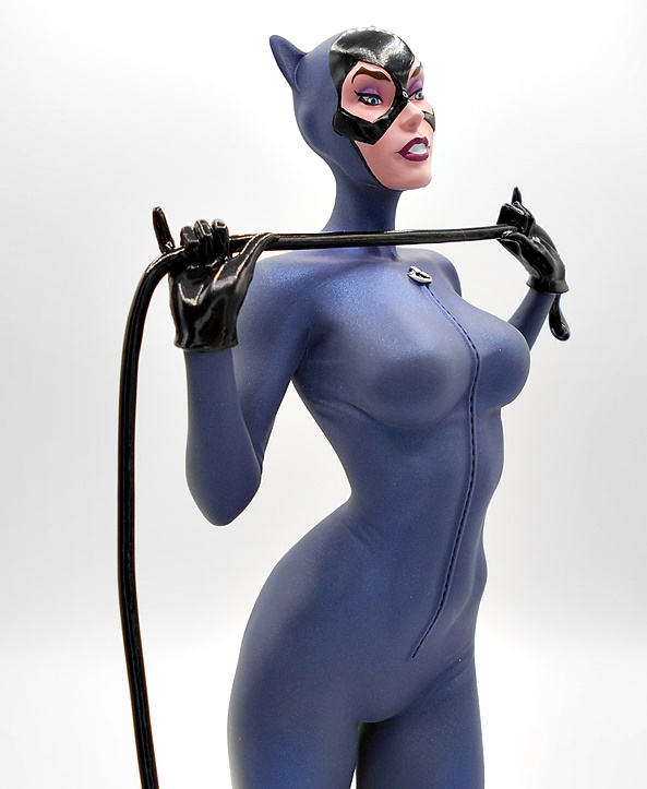
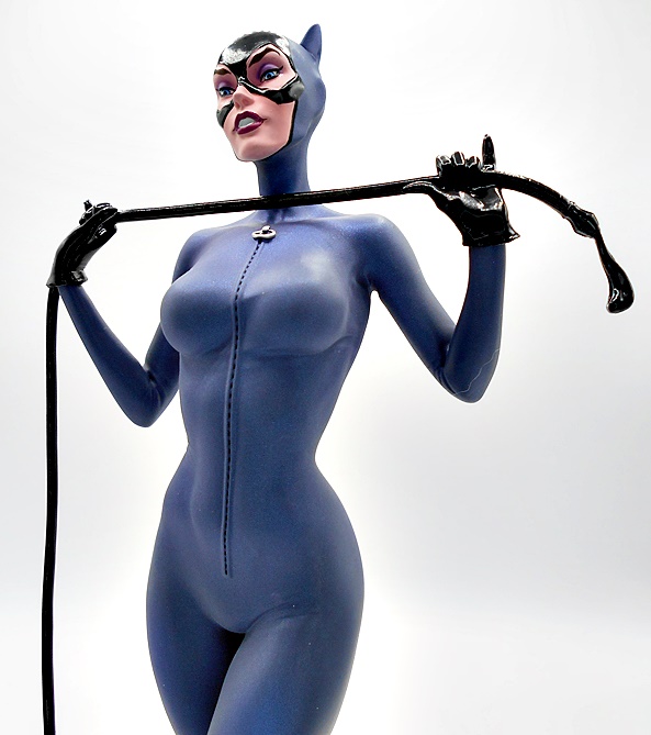
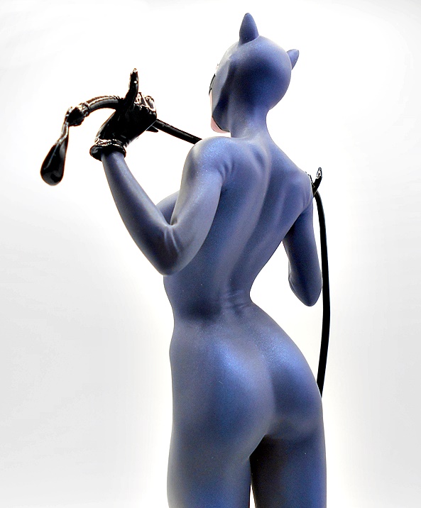
The DC Cover Girls line of statues has been around a long time now with different series showcasing different artist interpretation of some of comic’s greatest female heroes and villains. Hell, I reviewed my first purchase from this series here almost 12 years ago! The line went from DC Collectibles to DC Direct and now McFarlane has taken up the torch, although they still seem to be using the DC Direct name for whatever reasons. Also, the current series is showcasing one of my favorite comic artists of all time, J. Scott Campbell, and boy is ever about damn time! DC’s Mistress of Mysticism, Zatanna, is the third release in this series, with Catwoman and Wonder Woman preceding her, and Supergirl now up for preorder.

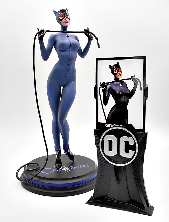
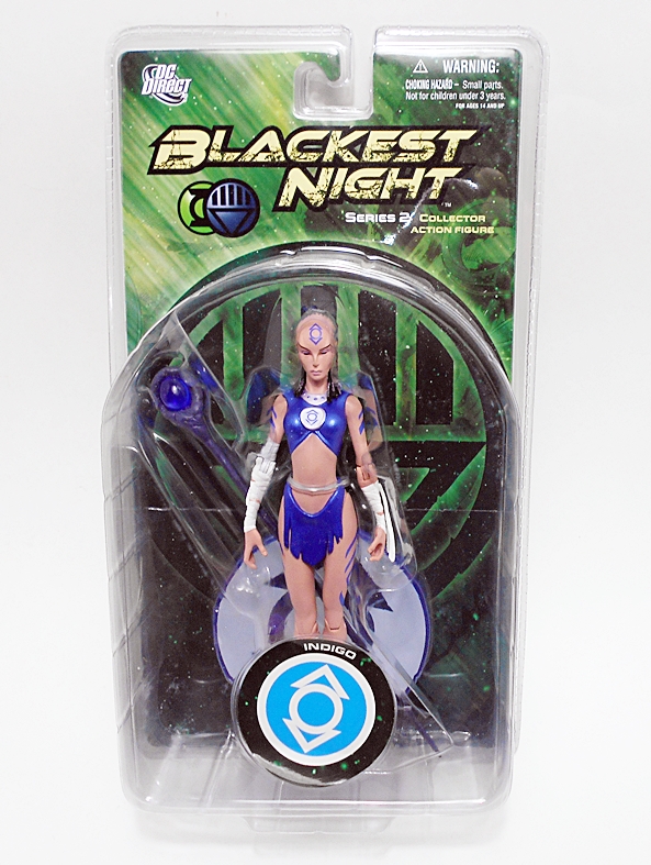
The packaging is pretty standard stuff, featuring a fully enclosed box with some shots of the statue and some artwork ghosted behind it. The box does state the limitation and you also get your piece’s individual number on the box as well. The statue comes nestled between two Styrofoam bricks for protection and there’s a little assembly required. Just peg Zatanna’s foot into the base and tab her wand into her hands and she is ready for her curtain call!


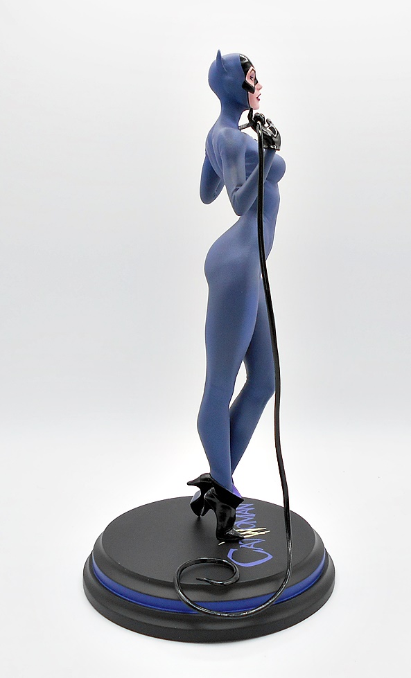
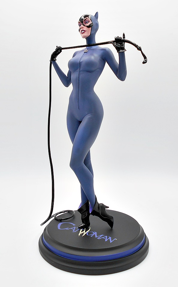
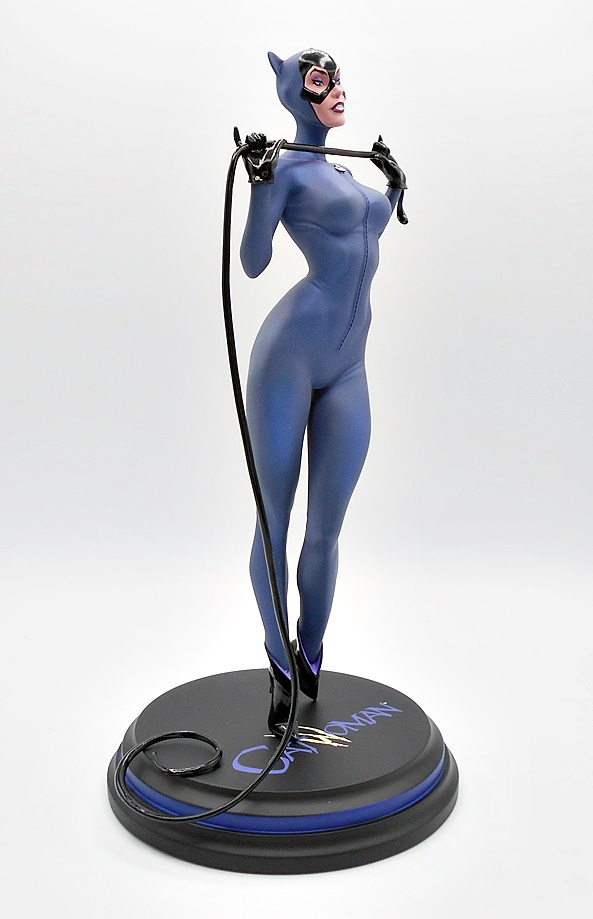
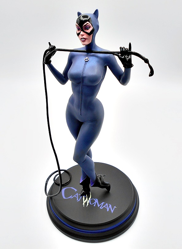
Of the three JSC statues so far, Zatanna comes the closest to a classic museum pose, but it suits her so perfectly. Catwoman was playfully readying her whip, Wonder Woman was deflecting a bullet, but Zatanna stands with her hands folded and resting on her cane/wand as if waiting for the magic show to begin. Feet apart, back arched, and head cocked, it’s a pose that conveys a sense of high confidence and professional showmanship.


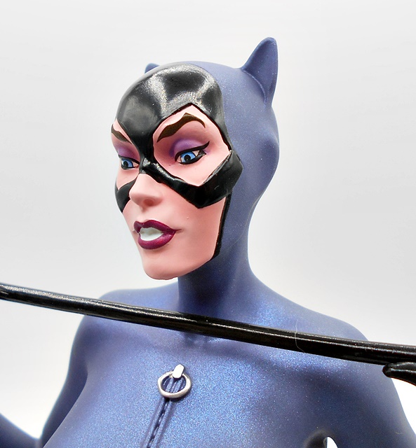
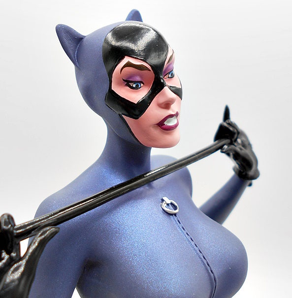
Zatanna’s costume represents my favorite look for the character. She’s got her black one piece with yellow and white corset over it and black tuxedo coat and tails over that. There’s a little sculpted ruffling to the middle of the corset while the low cut top shows ample cleavage, no doubt to distract from any slight of hand. The shoulders flare up stylishly, the lapels are painted blue, and she had a red carnation on the right lapel. The snappy tails of the coat hang down to the backs of her knees. She has a pair of shiny black heels and while her legs aren’t clad in actual fishnets, the skin is painted in a darker color to denote that she is wearing stockings. The paint lines on this piece are very sharp and the yellow, blue, red, and white all add some nice contrast to the black.


The head sculpt is very nice, even if I do think she got an unnecessary extra helping of eyebrows. The expression in the eyes is absolutely priceless. They’ve got a slightly sleepy quality to them, which also works as confidence bordering on boredom. It’s as if she’s sizing up an adversary and thinking,
“You’ve got to be kidding. You have no chance against my mystical arts.” I think there’s a tad less of Campbell’s style in this one, although it’s definitely there in the distinctive nose. The paint is immaculate, especially in the eyes and mascara and her bold lipstick. They seem to have toned down the shading around the eyes as seen on the box, and I think that was a great idea. The hair is beautifully sculpted and frames her face perfectly and it’s all capped off with the regal black top hat with blue band to match her coat’s lapels.


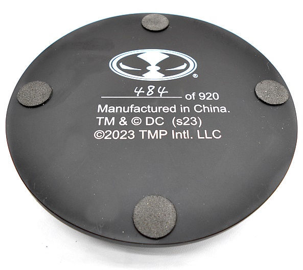
The base is designed to match the previous statues. It’s a circular raised platform in black with a gray stripe around the beveled edges. It’s simple and distinguished but the addition of the Zatanna logo gives it a kick of personality. These pieces are limited and hand numbered on the bottom of the base, and I have no idea where they are drawing the limitations for each. Catwoman started at 920, Wonder Woman went to 945, and now Zatanna shoots up to 1580. Back in the day, most Cover Girls were at a limitation of 5200, whereas these seem more random. Either way, mine is #509, which is lower than my Wonder Woman but higher than my Catwoman.


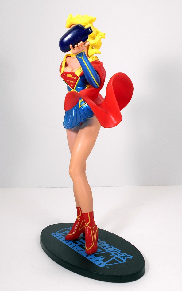
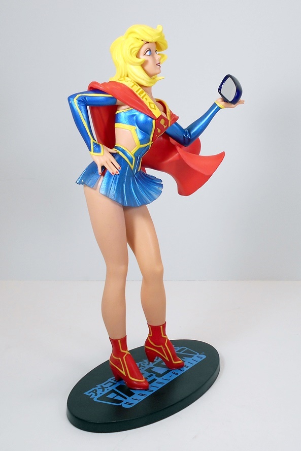
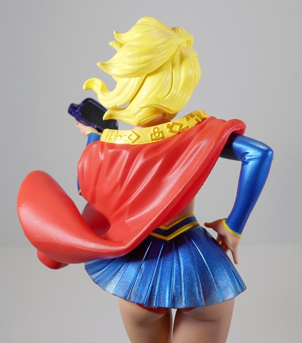
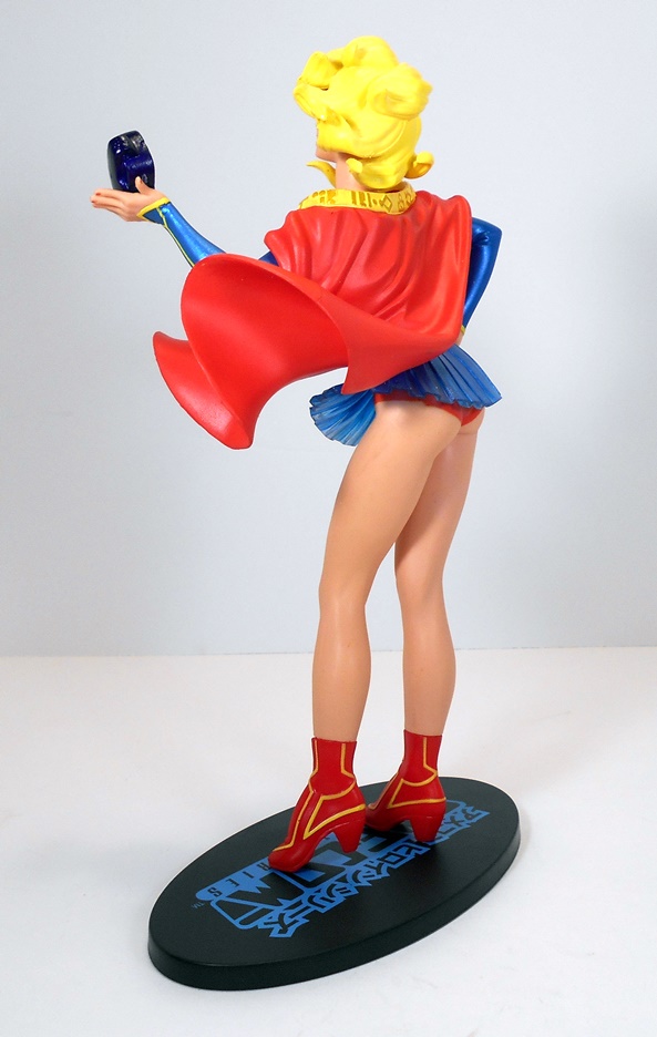
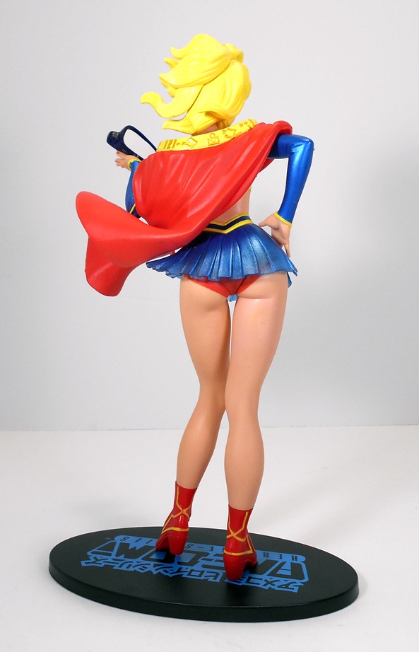
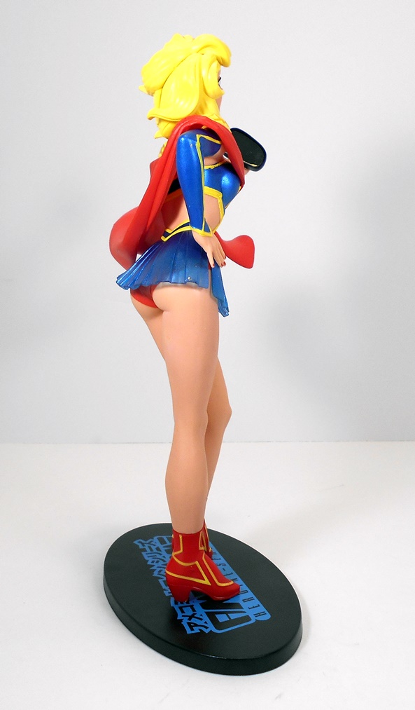
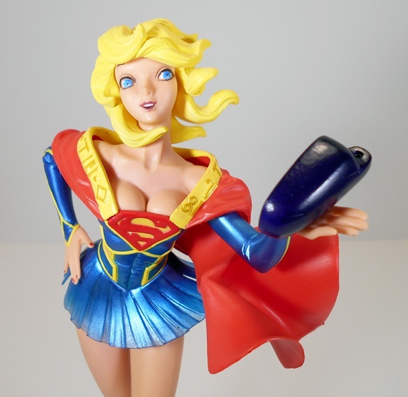
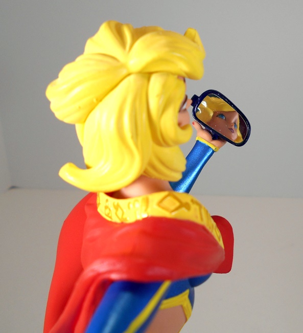
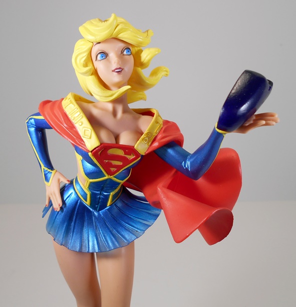
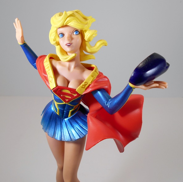
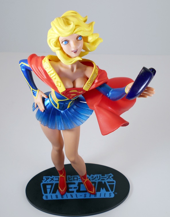
Over the years, some of my Cover Girls have left my collection, but I maintain a solid dozen or so on display at any one time. Needless to say I’m happy to see the line continue and it really seems to be in good hands with McFarlane. And naturally, I’m doubly happy to see my main man, J. Scott Campbell, finally get his turn at these ladies. I’ll confess that Catwoman was not a rock-solid start for this run, but she was still pretty good and both Wonder Woman and Zatanna more than make up for that somewhat shaky start. These retail at around $139.99, which feels right in line with what they’ve been going for in the past. Supergirl is next up on the roster, and as you can imagine, I already have her preordered.