Godspeed, Leonard Nimoy…

As everyone no doubt already knows, we lost a national treasure today when Leonard Nimoy passed away. Everyone who knows me or rummages around this silly blog should know that I’ve been a Star Trek fan all my life. I was raised that way because my Mom was a huge Star Trek fan and she raised her boy right to be one too. Growing up, the original series was in syndication and on at around 6pm every weekday and my brother and I used to gulp down dinner so we could sit in front of the TV and watch it. It was one of the few times we weren’t trying to kill each other. At least until after when we would pick up brooms and pretend they were Vulcan tribal weapons and beat the shit out of each other to win the hand of T’Pring (played by Arlene Martel, who happened to pass away last year). When my parents took me to see The Motion Picture, I was only about 8 years old, and it fascinated me. Ok, no it didn’t, it bored me to tears and the best part of that night was getting the Star Trek: The Motion Picture Happy Meal at McDonalds. No, it wasn’t until Wrath of Khan came out that I really got into the movies.

Spock,_2293

It might interest some people to know that I didn’t like Spock at first and a lot of that probably had to do with how well Leonard Nimoy portrayed the character. He was cold and alien and sometimes violent and he just creeped me out. It wasn’t until I got a little older that I learned to appreciate him. I found him to be particularly endearing in the films, starting with Wrath of Khan and by the end of that film I was ready to shed tears just like everyone else in the theater… and every single time I’ve watched the movie since. I can guarantee you that when I finally get around to watching Wrath of Khan again tomorrow night, I’m going to be blubbering like a helpless child. Nimoy became a focal point for the rest of the movies. The third was all about getting him back, he was perfect comedy relief in the fourth, the fifth was related to his misguided half-brother, and the sixth was him volunteering Kirk and the crew for a mission none of them wanted. Kirk may have been the Captain, but in the end, it was almost always about Spock and it’s hard to believe I’ll never see him don the pointed ears on screen ever again.

I can still remember where I was when we lost James Doohan and DeForest Kelley and I’ll certainly never forget today either. These people crafted characters that will forever be a part of what shaped my life. It’s a terrible thing to see so many heroes in your favorite fandom dying off and when you’re a fan of classic shows like Star Trek or Doctor Who, you have to endure a lot of it and sometimes it feels like memories of my childhood crumbling away. Right now I can relate to Kirk’s line in Wrath of Khan when Carol Marcus asked him to tell her what he was feeling. I feel old and worn out.

Anyway, it’s obvious that Leonard Nimoy took his own advice. He lived long and prospered and he will be sorely missed.

**Picture Credit: http://en.memory-alpha.org/wiki/Spock

By figurefanzero

Marvel Legends: Ms Marvel, Captain America, and Radioactive Man (Target Exclusive) by Hasbro

I just got in the new Allfather Wave of Marvel Legends, but before moving on to opening those, I have unfinished business in the Legends Universe. Some time last year Hasbro rolled out this Marvel three-pack as a Target Exclusive. I saw it a couple times on the shelves, but it didn’t seem worth the fifty bones they were asking for it. As it turns out a lot of people felt the same way because the set piled up on clearance and I was eventually able to grab it off the website for about $33 shipped. Since then it’s sat in my closet waiting for just the right day to be opened. I guess today’s that day.

mltarg3p1

mltarg3p2

The figures come in a fairly impressive window box with “Collector’s Edition” across the top and the characters names on the bottom. The set itself doesn’t really have a name, which aggrevates my OCD just a bit. There’s some nice comic art on the side panels and the back of the box has pictures of the figures and blurbs about the characters. The whole ensemble is fairly collector friendly, as you can simply open the side flap and slide out the tray. Space being the valuable commodity that it is for me, I certainly won’t be keeping the box. Let’s start with Captain America…

mltarg3p7

mltarg3p17

Who’s up for a kit-bash? Collectors of the Legends line should find this figure pretty familiar as it’s just a repaint and remold of the Ultimates Cap that came out in 2013 as part of the Hit Monkey Wave. Apart from the paint, the most notable differences are his jacket being swapped out for a shoulder rig and the holstered pistol missing from his right hip. The new paint includes swapping out the gray pants for blue ones and stars painted on his shoulders. I liked the original release of this figure a lot, but this one? Mmm… not so much. The paint isn’t nearly as good as the Ultimates Cap and those stars on the shoulders were a bad idea because they’re painted right on the hinges and only line up if his arms are positioned a certain way.

mltarg3p8

mltarg3p9

Cap comes with two accessories: First you get an alternate head, which is the same one used on the Steve Rogers that was included in the initial Wave of Legends’ return back in 2012. It’s a great head sculpt and probably the best way to go when displaying this figure to at least set it apart from the Ultimates Cap. The other accessory is obviously his shield, which is the exact same one that was bundled with Ultimates Cap.

mltarg3p11

mltarg3p10

Now don’t get me wrong, the sculpt on this figure is still good and I still really dig the detail on his equipment belt. The articulation is also great and he is most definitely a fun figure to play around with. In the interest of getting through all three figures in one Feature, I won’t run down the articulation, but rather just refer you back to my look at the Ultimates Cap. If you don’t own that figure, this is a decent pick up, but I’d still recommend the predecessor.

mltarg3p4

mltarg3p5

mltarg3p6

mltarg3p3

Next up is Dr. Chen Lu, Radioactive Man, and we’ve got another figure borrowing heavily from Hasbro’s toychest. The most obvious is the reuse of the head from the 2012 comic version of Drax the Destroyer released as part of the Arnim Zola Wave. While I was all for getting a Radioactive Man in the Legends scale, when I heard about the reused noggin I did not expect to be receptive to this figure at all. Turns out I like it just fine. The green translucent plastic used for the buck makes for a nice effect and the I have to say the Drax head works surprisingly well for me. I really don’t have anything else to say, except that he comes with no accessories and features the standard Legends style articulation, which is to say it’s quite good.

mltarg3p12

mltarg3p13

In case you haven’t guessed by now, I saved the figure I was looking forward to the most for last. In fact, it wouldn’t be inaccurate to say that I pretty much bought this set to get Ms. Marvel. This version of Carol, in her Warbird costume, had a less than stellar Marvel Universe treatment (mostly due to terrible paint) back in 2010 and given Hasbro’s proclivity to double dip on a lot of characters in both scales, I’m surprised it took this long to get her. Was it worth the wait? Mostly.

mltarg3p15

mltarg3p14

Ms Marvel appears to be built on the female buck that I first encountered as part of the SDCC Exclusive Thunderbolts set and used for Moonstone and Judith Chambers. It’s a great body (har har) with solid articulation and no mushy hinges. From a quality standpoint, this figure exhibits a little sloppiness. There’s mold flashing hanging off her feet and some of the flesh paint on her thighs and arms manages to be uneven, chipping and gloppy all at the same time. I wouldn’t say the paint issue is terrible, but it isn’t great either. It’s one of those figures that you can look at and tell it was part of a multi-pack because the quality just doesn’t live up to the single carded figures. On the other hand, Carol makes up for some of the low points with a solid head sculpt and the paint on the face and the tampo of the gold lightning bolt on her chest is pretty crisp. She also features her trademark red scarf tied around her waist. In this case, it’s a molded piece of plastic that hangs loose on her hips.

mltarg3p16

I can’t say this set was a “must have,” but at a deep discount of about eleven bucks a figure, I’m fairly satisfied with the purchase. I think Ms Marvel would have been better had she been issued as a single carded figure, but even as she is, she gets the job done. Radioactive Man is certainly a nice addition to my Avengers Rogue Gallery and as for Cap, well I could have done without him. He’s an interesting variant, but unlike the other two figures, certainly not one that I would have purchased on his own.

Transformers Generations: Legends Class Cosmos with Payload by Hasbro

It’s Transformers Thursday and I was going to look at Generations Arcee today, but I’m a little pressed for time. If only I had some more Legends Class figures to look at… Oh, wait. I do! I may be all out of Combiner Wars Legends, but I still have some unfinished business with the old Generations line. Today I’m looking at Cosmos and Payload. I couldn’t find this pair anywhere back when they first came out, but I was passing through the toy aisle the other day and there they were hanging on the pegs. Maybe the fine folks at WallyWorld were trying to get them out to make way for the Combiner Wars figures. Whatever the case, I’m glad to finally have him.

tfgcos14

Ah, there’s the lovely Generations packaging. I’ve still got a few more of these two-packs to look at so we’ll see it again, but sadly not for much longer. I love the G1-inspired grid deco and the character art is great. And you can’t beat getting two Transformers for eleven bucks, even if one is a small and simple Minicon. It doesn’t seem all that long ago that Cosmos had his first Legends Class figure. I used to think that one was pretty good, but with this new one in hand, there’s hardly any comparison. Let’s start with his alt mode.

tfgcos2

tfgcos3

Yup, he’s still the little green saucer that we all knew and loved and I really dig the modern update. Cosmos has a pair of yellow engines in the back with a stylish tail fin. The front has a set of viewscreens on the central hub and a pair of guns peeking out from under the front of the disk. The coloring here is pretty simple. He’s mostly green with some yellow arrow decos orientating him to the front. Cosmos also features some great panel lining sculpted into the hull.

tfgcos7

tfgcos8

Of course, flying saucer alt modes are easy, it’s getting them to turn into decent robots… that’s the tough part. Nonetheless, Hasbro nailed this robot mode beautifully. The proportions are surprisingly good and it captures the Sunbow look of the character better than I could have possibly expected out of a figure in this scale. Some of the particularly cool touches are the way the guns are placed on his knees, the way the fin and engines form a little jetpack, and the windows landing on his chest. He’s also got sculpted guns on his forearms. The green and yellow coloring is pure Cosmos as is that marveous little head sculpt.

tfgcos10

tfgcos9

The articulation is quite good for such a little guy. You get ball joints in the shoulders, elbows, and hips and double hinges in the knees. Cosmos can also swivel at the waist and turn his head. Nice!

tfgcos4

tfgcos5

Cosmos’ little buddy, Payload, is one of my favorite of these bundled Minicons. It’s not that there’s anything particularly great about him, but I just happen to like the sculpt and the coloring and his simple little transformation, which produces a clean little robot mode. I also like the idea of having a little space shuttle to fly around with Cosmos.

tfgcos13

tfgcos11

tfgcos12

Payload’s Targetmaster mode is also one of the better ones I’ve seen so far. It’s a double barreled gun which looks pretty good in Cosmos’ hand, although it does make him a little front heavy. It’s a lot of gun for a little guy, but I think it works even better when wielded by Deluxe Class figures. Damn, I really liked these Minicon Targetmasters. I wish they had carried over to the new line.

tfgcos1

tfgcos6

In the end I’ve got nothing but respect for this little figure. Cosmos hasn’t really been done right since his initial G1 release and I think this is the first time seeing him be all he could be. It’s all thanks to some clever engineering and that extra bit of love that Hasbro seems to have invested in these recent Legends Class figures. If I had one complaint it’s that the Legends Class scale keeps him from hanging out with the Deluxe Warpath and Bumblebee, and one day I’d still like to see all the old Mini-bots have their due as Deluxe Class toys. Still, at least he’s right at home chilling with Combiner Wars Powerglide and they do indeed look great together.

Magic The Gathering (Legacy Collection): Ajani Goldmane by Funko

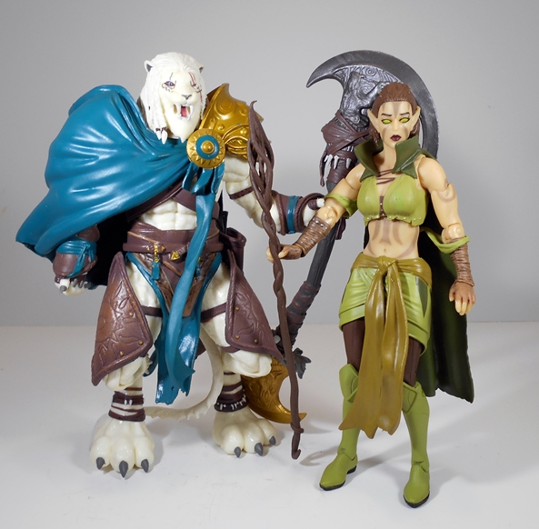
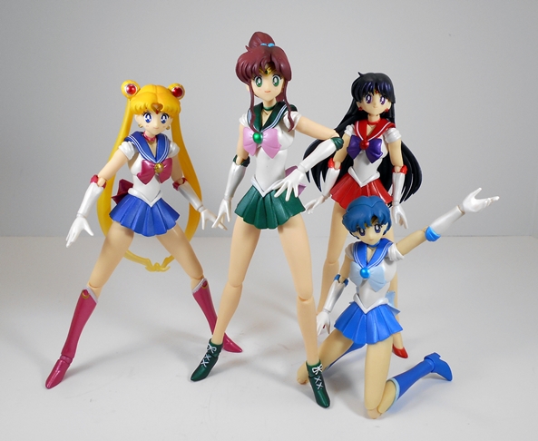
I’ve already checked out the three ladies from Funko’s MTG Legacy Collection and now I’m moving on to the dudes, starting with Ajani Goldmane. He’s not just a dude, he’s a LION dude, or more precisely an albino Nacatl Planeswalker, who specializes in spells that buff the health and strength of his allies. I don’t claim to have known any of that, nor is there any information about the character printed on the box, instead I consulted that all-knowing oracle of wisdom known as The InterWebs.

goldm1

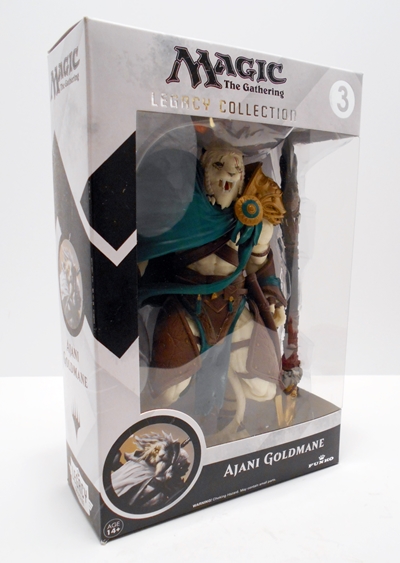
We’ve seen this packaging enough now that I don’t want to waste a lot of time dwelling on it. It’s a nice, collector friendly window box that lets you see the figure your getting and also has the figure’s identity printed on the side panel, which is a huge plus in my book. Unlike the ladies of the line, Goldmane and his huge accessory really fills out his box completely. There’s very little room in there for anything else.

goldm5

goldm7

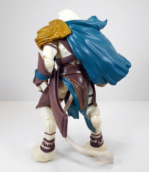
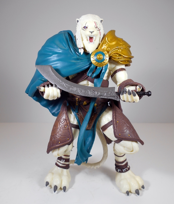
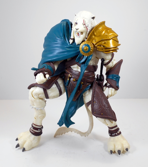
Out of the box this is one impressively large figure. Granted, he’s not much taller than the ladies, but he’s probably got about twice the bulk of Lil, Chandra, or Nissa. And because he’s got those funky hind animal legs, he can actually stand a lot taller when they are extended all the way out. The sculpt here is quite impressive with all sorts of musculature in the buck, a lot of which isn’t even readily visible under the outfit, but it’s there nonetheless and I really respect that. On the other hand, the fur texture on the body isn’t all that well defined, giving him that kind of smooth Thundercat appearance where it’s hard to tell whether he’s supposed to be furry or just have skin. I do, however, dig the adorable and giant kitty paws he has for feet and he has a very soft and pliable tail.

goldm10

The top part of Goldmane’s outfit consists of large golden pieces of shoulder armor with a sculpted bluish-green cloak covering the one on his right. Yeah, once again Funko went the extra mile by actually sculpted the armor under the cloak. It’s something you wouldn’t actually see unless you removed the cloak and left shoulder piece, but they did it anyway. They also sculpted and painted a necklace, which is barely visible under the outfit. The rest of his wardrobe consists of a brown “leather” belt around his waist and “leather” thigh armor and matching arm bracers. All the pieces intended to be leather are sculpted in soft plastic and they’re embossed with various designs. Goldmane also features some wraps around his ankles and hands, which are sculpted as part of the buck and painted. The complexity of the outfit is all quite impressive as it’s comprised of quite a few pieces, all layered quite convincingly onto the figure.

goldm6

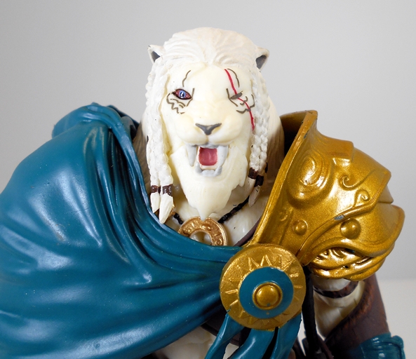
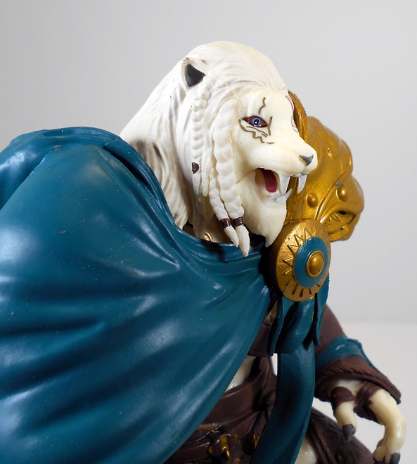
The portrait is good, albeit a little soft. Goldmane has one eye closed, presumeably from a wound, and his mouth open showing a pair of nasty fangs. I dig the braided hair that’s sculpted from his mane and the wrinkles around his nose are a nice touch. Still, as good a sculpt as it is, it falls a bit flat and I think that’s more down to the lack of paint apps than anything else.

goldm9

So let’s talk paint. There have been frequent complaints that the retail versions of the MTG figures are missing a lot of the paint apps that were seen on the prototypes. That’s not unusual as sometimes things just don’t cost out when items move from ideal vision to the mass production line. It didn’t bother me on any of the ladies, but I think it’s a lot more obvious on Goldmane, particularly where his fur is concerned. I get that he’s an albino, but even still the pure marshmallowy, white plastic buck comes off as rather bland and unfinished. A paint wash certainly would have helped things along, particularly on the head. This is a big figure with a complex sculpt, but when you get down to it the deco is just white, brown, blue-green, and gold and it falls a little short. There are also a few minor dings to the gold paint on my figure.

goldm8

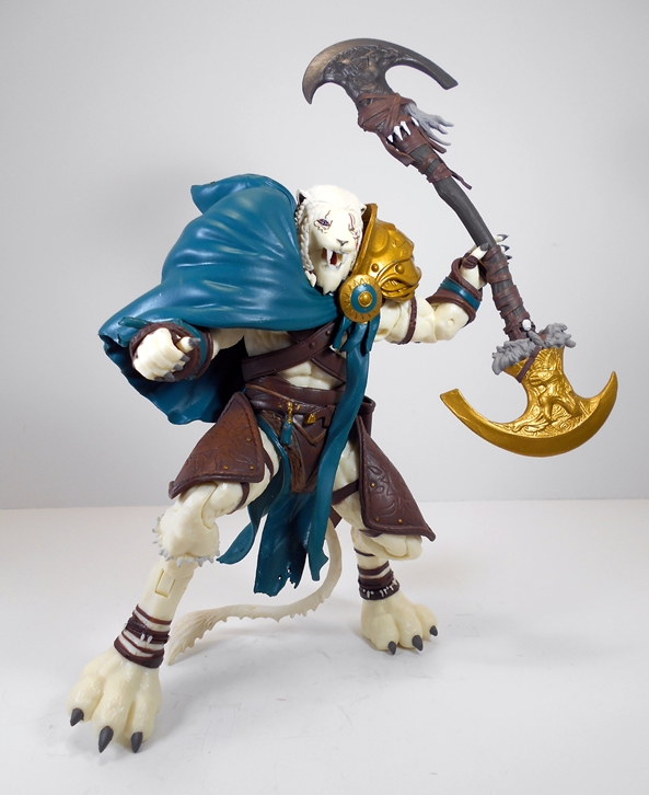
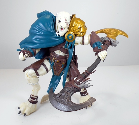
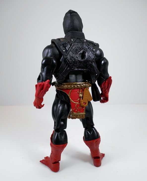
Goldmane sports plenty of useful points of articulation and my figure had no issues with frozen joints or breakage. The arms have rotating hinges at the shoulders, hinges in the elbows, and swivels in the biceps and wrists. The legs are ball jointed at the hips with hinges in both sets of knees (I don’t know what else to call them!) and swivels in the ankles and thighs. He’s got a ball joint cleverly concealed in his torso and one in the neck, although the sculpt of his mane severely restricts his neck articulation.

goldm11

goldm12

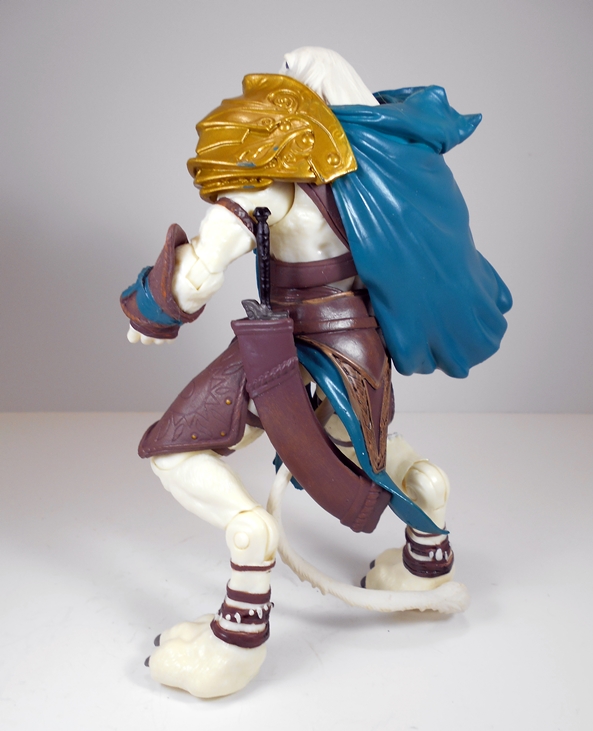
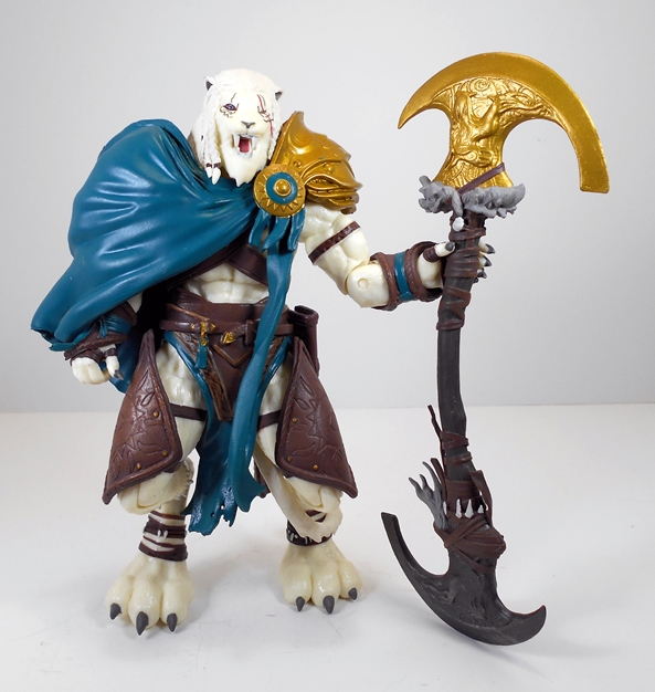
While the ladies of the line were rather lacking in accessories, Goldmane’s extras steal the show. He comes with a scimitar, which can fit into the brown sheath on his belt and he also comes with a massive double-headed ax. The sword is fairly simple, but it does feature some ornamentation etched in the blade as well as a raised leaping cat. The problem here is that Goldmane’s right hand is obviously sculpted to hold the narrow hilt, but the grip is so tight, it’s impossible for me to get the sword hilt into it. I’ve tried pulling his thum back just a bit and all I got for my efforts was stabbed by his super sharp claws. I’m sure a little blowdryer action would get to open, but I haven’t bothered with it yet.

goldm2

goldm3

The ax, on the other hand, is an absolute work of art. As if a giant lion man in armor isn’t intimidating enough, Goldmane carries around this thing. It’s very tribal looking with sculpted strips of leather wrapped around the handle and teeth and fur trim. The blades are gray and gold and both have raised cat motifs.

goldm4

goldm13

Goldmane earns another thumbs up from me for this line, although those thumbs aren’t held up quite as high as with the previous three figures. Yes, he could have used a few more strokes from the painter’s brush, but a lot of that has to do with his size and the impressive quality of the sculpt demanding a better quality deco. That’s not to say the paint that’s here is bad, I just wish there were more of it. Everything else about this guy is solid and I’d dare say he makes a great piece for any fantasty figure collection. Indeed, he even looks right at home amidst my Masters Classics figures. And even at the full retail of around twenty bucks, this is a lot of plastic for the money. At the $13 I spent on mine, the deal is all the sweeter.

Masters of the Universe Classics: Ninja Warrior by Mattel

Well, it is mighty nice to be all caught up and looking at a Matty Subscription figure in the same month that I received it. And that’s even with Matty’s slow shipping combined with February’s fewer days working against me. There were actually three figures for us Subbers in February, the first was Ninjor here and the other two were the Snake Armor He-Man and King Hssss 2-pack, which I’ll be holding over for next week. I gotta admit, I had absolutely no idea that Ninjor was a thing from the vintage line, but then I’ve never made my ignorance of all things MOTU to be a big secret. Another thing about me that isn’t a secret is I got tired real fast of what I like to call the “Ninja Saturation” of all the 80’s and 90’s toy lines. That shit practically took over GI Joe and can’t we all agree that straight up Teenage Mutant Turtles was so much better before Ninjas got involved? Wait, what?

njor1

There’s the packaging and it’s the same old awesome deco we’ve been seeing all along. There are, however, two things worth noting. First, it doesn’t say Ninjor on the front of the package, just “Ninja Warrior.” At first, I thought Ninjor just ran afoul of copyright law, but then I noticed he is referred to as Ninjor in the bio. What the hell, Matty? Of course, it concerns me not, as this package will be in the garbage two minutes after I bust this guy out. The other odd thing is the explosion of text that declares, “Uses special Ninja weapons to chop down foes!” Hey, Matty, I thought that exposition explosion was reserved for when you call reissued figures “The Original!” I just feel like up is down today. Anyway, I suppose one lone Ninja swimming in my Masters Classics soup can’t be all that bad. Let’s check him out…

njor2

njor3

Aww, yeah! This dude is bad ass! The black, red, silver and gold deco is so strikingly beautiful and that sculpted dragon and dagger emblem on his chest is superb. It almost looks like the dagger could be pulled out even though it can’t. Ninjor comes out of the package wearing one of those standard He-Man furry barbarian diapers, but he has a far more ornate belt and sash that you can attach around his waist. I think sans-belt sash is more of a vintage look, but there’s no way I’m ever displaying this guy without the sash. It’s gorgeously sculpted and painted and looks like the décor right out of a Chinese Restaurant lobby. Other finer points worth mentioning include the different texturing used for his shoulder straps and the little painted pins that are supposed to be securing his shoulder pads down. I wasn’t sure I was going to be sold on the creature feet, but in person I don’t mind them at all. They just make him look all the more freaky and intimidating. Yup, in the end, it’s obvious that a lot of love and attention was put into Ninjor’s costume and it surely paid off.

njor13

Ninjor includes two portraits. The stock head is masked allowing you to only see his narrow red pupil-less eyes and the bridge of his nose. With a quick head pop-and-swap, you also can display him with his unmasked head and might I say it is quite a phenomenal sculpt. Ninjor is sporting a fiendish looking stache and goatee and a pair of eyebrows that would make Peter Capaldi jealous. He also features some unfortunate male pattern baldness, but he compensates with a ponytail laced up and sticking straight out the back of his noggin. Toss in those gritting teeth and creepy red eyes and you’ve got one formidable looking foe wih loads of personality!

njor4

njor5

Despite his line of work, Ninjor isn’t any more nimble than any of the other male folk from Eternia. In other words, you get standard articulation here. The arms have rotating hinges at the shoulders, swivels at biceps and wrists, and hinges in the elbows. The legs are ball jointed at the hips and hinged at the knees. There are swivels at the tops of the boots and the ankles feature both hinges and lateral rockers. Ninjor can swivel at the waist, he has a ball joint at the neck, and despite his bulky vest, he can still make use of his ab crunch hinge.

njor10

njor11

Ninjor comes with a nice array of weapons to help him kill the good guys. You get a bow and arrow, a quiver of arrows, a katana sword, and a set of nunchuks. The bow and arrow is nothing special. It’s all sculpted in one piece and painted silver, so it doesn’t look particularly great and with Ninjor’s bulkiness and articulation being what it is, good luck getting him to hold it convincingly. I almost wish they had just sculpted it without the arrow knocked.

njor6

njor7

The sword and nunchuks on the other hand are both very cool. More then a few MOTUC accessories these days feel like they’ve been lacking paint apps, like… for example… oh, hey, the bow that I just looked at! That’s certainly not the case with the katana and chuks. The katana has a silver painted blade and the hilt and pommel are actually painted separately from the black braided grip making it a very impressive little piece of work. Even the simplistic paint job on the chuks, with the silver chain and black ends is a welcome treat.

njor8

njor9

Lastly, you have the quiver. It’s brown and textured to look like leather with silver painted arrows sculpted to look like they’re sticking out of the top. The coolest thing about the quiver is that it has clips for the bow and either the sword or chuks, so Ninjor can wield one weapon and comfortably wear the rest on his back. I always respect a figure that can carry all of their gear.

njor15

njor16

And so, Ninjor turned out to be the little Ninja that could. He won my heart over thanks to his great coloring, fantastic sculpt, and his fun little arsenal of killing tools. I’m going to be hard pressed to decide which head to display him with, as I love the work that went into the unmasked head, but the masked head looks great too. I’d be tempted to pick up a couple more and leave them masked as his goons, but Ninjor was a popular fella and he sold out. The only other downside of Ninjor is that he makes me wish I had picked up Jitsu back before he hit $75 on the secondary market. It would be cool to have a nemesis for Ninjor to fight, but even I have my limits on what I’m willing to spend on these figures. Too bad, Matty didn’t roll him out again for the February Sale. It seems like a missed opportunity.

The Avengers: Iron Man ArtFX+ Statue by Kotobukiya

This is finally it… Kotobukiya’s ArtFX+ Avengers have finally assembled with the release of the final statue, Iron Man. I’ve been loving each and every piece in this line, but I was getting really excited to finally get the team on display together. Iron Man was available in two decos. You could go for the comic accurate black and gold Marvel NOW! version or the more traditional red and gold variant. I’m actually a fan of the black and gold look, and if this was a stand-alone piece, I probably would have gone for that one. In the end, I picked up the variant only because with Hawkeye, Black Widow, and Thor sporting so much black I wanted to add a little more color to the team display.

afxpim1

afxpim2

I don’t really have anything new to say about the package. It’s a colorful and attractive fully enclosed box that protects the goods really well and looks damn nice on the shelf. I also dig the fact that the variant is what’s actually pictured on the box. Sometimes these things will simply be denoted with a sticker. Inside are two clear plastic trays securing all the parts to build Iron Man, including the torso, head, and all four limbs. Everything fits together snugly and I had no issues assembling my figure.

afxpim3

afxpim4

afxpim5

Koto has been quite conservative with the composition of these statues going more for iconic character poses rather than originality and Iron Man is certainly no exception. He stands with his right arm stretched out about to fire off a blast from his palm repulsor. He has a moderately wide stance and his left arm is balled up into a fist. Sure, we’ve seen Stark in this pose a thousand times, but I still love it and I think it’s particularly effective for a statue meant to be displayed with the entire Avengers team.

afxpim6

afxpim7

I’m also a fan of the style of this Marvel NOW! armor. I can see a lot of influences in it and in a way it strikes me as a more angular Extremis armor with the circular chest repulsor (my favorite) as opposed to the triangle. It features all the necessary segmentation between the plates and rather than go with a bunch of panel lines, the plates themselves are smooth and featureless giving it a very pleasing comic book vibe.

afxpim8

afxpim9

Koto rarely skimps on the paint quality, so it should be no surprise that Iron Man features a gorgeous coat of metallic red paint with gold metallic trim. The paint lines are clean and precise and there’s just a few very minor blemishes that I could spot under close scrutiny. The one area where the coloring on this piece isn’t all it could be are the repulsors on the chest and hips. These appear to be stickers and aren’t terribly convincing. They look rather Hasbro-ish to me, which is a tad disappointing in a fifty dollar collectors piece. Oddly enough, this is one the rarer instances where I think they look better in pictures than in person.

afxpim10

As always, you get the simple black square base. It’s metal and designed to work with the magnets in the statues feet. You can adjust him anywhere you want on the base or even connect the bases together and have him straddle two of them. Of course, Iron Man can stand just fine on his own too.

afxpim11

With the team all assembled, I have to say I’m so very glad that I started down this road last year. While any of these statues would work just fine as stand-alone pieces, nothing beats having them displayed together and Koto designed them with that in mind. There are a few ways to go when displaying the set, but I used the lineup on the back of the boxes as a guide and I think it looks pretty damn great. And they look all the better lined up on the shelf right above my ArtFX+ Justice League!

afxpim12

afxavg

At $50, Iron Man is second only to The Hulk in price and about ten bucks more than I paid for the others. The main reason I paid so much for Iron Man was because I was worried about limitation on the variant so I pre-ordered rather than shop around for a deal. That still seems to be the going price, but that’s subject to change after he’s been out for a little bit and as of now you can still grab all of these statues at or below their original MSRP if you hunt around. Forty to forty-five bucks is definitely the sweet spot for me and these ArtFX+ statues, but I don’t mind going over now and again if I have to because they are indeed awesome display pieces. It’ll be a little while before I revisit the Marvel ArtFX+ collection, but when I do it will be with none other than Deadpool!

Cover Girls of the DC Universe: Poison Ivy by DC Collectibles

A lot of this week’s Features have involved me revisiting with lines that I’ve been away from for a while, so I might as well keep that theme going with a new Cover Girls statue by DCC. Supergirl was the last time I looked at this line and that was way back in August of last year and I’m only now starting to get caught up. I figured Poison Ivy was the best place to start since I was totally blown away by the photos I’ve seen and have been looking forward to opening up this beauty for a long time. It’s worth noting that this is the second version of Poison Ivy since the reboot of the Cover Girls line. I didn’t care at all for the first one so I was mighty glad to see them take a second crack at her because the result is absolutey exquisite.

cgivybx1

cgivybx2

I’ve gone on record as being totally unimpressed by the package design DC Collectibles has adopted for this line. It’s mostly white and kind of bland, but it does at least offer you a good photo of the statue and a little blurb about the character on the back. Based soley on the aesthetics, I wouldn’t bother holding on to these boxes at all. However, the box is collector friendly and when combined with the brick of styrofoam inside, it’s a good thing to have if you ever need to store or transport the piece and so I do hang on to these. When you get Ivy out of the styrofoam the only assembly required is attaching the statue to the base via the metal pegs that come out of the bottoms of her feet. It was a little daunting as the holes were just a little too far apart and I had to pull her legs out a bit to get her in. Once the pegs went in, however, all was good and she stands perfectly on the base.

cgpvy1

cgpvy2

cgpvy3

All set up, this statue is drop dead gorgeous. Ivy is caught in a sexy stride with a single rose held seductively in her left hand, at her side, and her right hand pinching at the top of her leafy one-piece. She’s got a pair of thigh high boots and long gloves, both topped with foliage trim. The costume design is pretty simple, but the attention to detail in the leaves is well done and the two shades of green combined with the wonderful skin tone all make for a striking piece. Yum! I certainly dig this look a lot more than the black and green outfit she donned early on in Birds of Prey.

cgpvy6

cgpvy9

Of course, what’s really striking is the portrait. I’m totally in love with the face sculpt here. It’s so soft and beautiful and perfectly painted that I think it totally transcends what we’ve been seeing in this line so far. Her eyes are perfectly straight and the paint work on her green eye-liner and parted lips is exceptional. Ivy’s breathtaking face is framed by her lush red hair, which is peppered with leaves and cascades down her back. It’s all simply stunning.

cgpvy8

And it would be impossible to discuss this statue without talking boobs. Of course, all of the Cover Girls statues are sexualized to some degree, so boobs are certainly not new to this line. But, holy hell check these babies out! For once, I’m actually not trying to be an adolescent about the topic because quite frankly Ivy’s pair of lovelies are an amazing piece of work and they deserve better. Not only are they beautifully sculpted, but the coloring of the skin tone compliments them so well. I get the feeling that these were a labor of love and that the sculptor, Jack Mathews, had a good time doing it.

cgpvy4

cgpvy5

cgpvy10

It’s hard to top Ivy’s chest, so let’s just wrap it up with a quick look at her base. After releasing just a few statues in this line, DCC began making the bases more or less uniform and so we get simple ovoid platform, which is personalized with a green paint job and a leaf etched into the side. The limitation information is on the bottom and the base rests on four tiny felt pads. I mention the pads because one of them fell off my Supergirl statue shortly after featuring it here and I hope that’s not going to be the case here.

cgpvy11

Ivy has an MSRP of about a hundred bucks, but I was easily able to find her for $75, which certainly isn’t unreasonable. Sure, it’s no secret that this current Cover Girls line is considered to have lost some of the luster from the original Adam Hughes run of statues. There’s certainly some basis for that argument. I don’t think the statues have been as good, but I don’t think they’re bad either. I now have five of these ladies on my shelf and I’ve been satisfied with each and every one of them. Now, with that having been said, I think Ivy here is the first to come close to reclaiming the magic of the line’s former incarnation. In fact, I’ll go so far as to say I like this one better than the original Cover Girls release of the character. I don’t know if this is an instance of DCC upping their game or just the stars aligning to produce an exceptionally nice looking piece, but she’s definitely going to be taking a front row spot on my Cover Girls shelf.

Function X-4: Sigma-L by Fansproject

Oh, man. I’m so behind on this one that I’m even going to allow a Third Party Change-a-bot on today’s Transformers Thursday. Normally in February when I say something like, “I’ve had this figure sitting around since last year!” it doesn’t really mean that much. In this case, however, poor Sigma-L really has been hanging out for a long time and waiting for his day in the spotlight. It’s pretty crazy because I was anticipating this figure so much right up until it shipped and then it just kind of got lost in the craziness of my life that is The 4th Quarter. I was dusting my shelves the other day and saw him and it suddenly dawned on me that I hadn’t featured him here yet. So, by no means assume that the fact that I’m only now getting to talk about him reflects in any way poorly on my love of the Function series in general or this figure in particular, because he is indeed spectacular! Oh yeah, while some may say there’s a slight passing resemblance… Sigma-L is most definitely not Mindwipe, so don’t even think that.

siglbx1

siglbx2

Mindwipe Sigma-L comes in a package that eschews the normal window boxes meant to approximate something you’d see on the toy shelves, Fansproject has been using this rather unique presentation for their Function Series since X-01 Code was first rolled out. It’s a colored, and otherwise blank, shoebox affair with an illustrated clear plastic sleeve around it. I wouldn’t like to see this package design used for everything but I rather like it in the limited confines of this series. It feels rather classy and special. My only complaint here is that the clear sleeve on mine got scuffed up in transit, but that’s not such a big deal to me.

siglbx3

Inside the box, Sigma-L comes sandwiched between two clear plastic sleeves. You also get his weapons and a folded instruction sheet. Did I mention how much I love the smell of Fansproject’s figures when they come out of the box? I’m not sure if it’s the paint or the plastic or a combination of both, but that’s good stuff! I’m going to break with convention and actually start with his robot mode because I’m feeling just that crazy today.

sigl3

sigl1

Holy hell, this is one hot and sexy looking robot! Yeah, I said it and I’m not ashamed. There’s something about the aesthetics of Fansproject’s Function line that really just gets it. The figures manage to look modern and interesting and yet somehow still capture a bit of the boxy G1 designs. In this case, Sigma-L looks like he belongs to the whole Post-1986 movie aesthetic where the robots were getting a little more contoured and organic in their style. What I’m saying is that Sigma-L hits the sweet spot between those two style books that totally scratches my itch. This figure is also oozing personality from his sharp silver claws to his bat wings, which are fully accessible in robot mode, but can also be folded in for a more streamlined look. I honestly can’t decide which I prefer more, so I’d just like to think he deploys them when he’s ready to attack.

sigl4

Will ya just look at that head sculpt. It’s so damn gorgeous! I want to take that head sculpt out for a lobster dinner, bring it home and make sweet passionate love to it all night long. The detail in the face makes it quite possibly some of FP’s best work and yeah that’s saying a lot. It’s not a big noggin and yet they managed to pack plenty into it. The crown-like aspect of the helmet is pure love, the paint is crisp, and I’ll be damned if Sigma-L’s clear visor doesn’t raise and lower to give you the look you want. I am not being impulsive when I say this is undoubtedly among my Top Ten Transformer heads since I can remember. It really is that damn good! The fact that it also happens to be a Headmaster, which transforms into a tiny little robot makes this pudding all the more sweeter.

sigl8

Hell, even the Headmaster (don’t call him Vorath!) is a tiny little work of art that makes me wonder if Fansproject doesn’t have some kind of shrink ray to make these teeny bots. Not-Vorath sports a stylish silver bat symbol on his chest and he has points of articulation at his shoulders, hips, and knees.

sigl2

Sigma-L’s coloring takes what is an amazing sculpt and elevates it even further. You get those great traditional Decepticon colors of black and purple complimented by some beautiful silver paint, some redder purple plastic and a surprising bit of minty green trim, all capped off with translucent plastic on his legs. A lot of the coloring comes from the plastic itself, which is always a plus in my book, but what paint is here is precise and crisp making the colors look unbelievably good.

sigl9

sigl5

That which shall not be called Mindwipe comes with two weapons and they are indeed the Cybertronian equivalent of pump-action shotguns. I have only two things to say to that. Hell and Yeah! They’re simple enough guns, which fit comfortably into his hands and he looks mighty wicked when wielding them akimbo! And that brings us to…

sigl12

sigl13

Beast Mode! I love them mechanical beasties and Sigma-L pulls off his Cyber-Bat mode quite nicely. Unlike all the other Function figures I own, there’s nothing specific in Sigma’s transformation that wowed me as being super clever, but it is nonetheless a pretty fun and worry-free change. I suppose the coolest thing about the engineering is that it actually allows room for a cockpit that will fit Not-Vorath with the canopy splitting in the center to open up.

sigl15

sigl16

sigl17

sigl18

FP designed this bat mode to work either standing up or in flight with a simple adjustment to the head and both modes have their good points. Sigma-L’s little bat mouth is also hinged so that it can open. When standing on his little bat feetsies you can clearly make out the speakers that Sigma uses to beam hypnotic waves at his foes. So good! On the other hand, when in flight Sigma shows off his two shotguns quite nicely. Yes, we have here a robot bat with dual shotguns mounted to his wings. God, I love this toy!

sigl14

sigl19

sigl6

siglbx4

At $70 Sigma-L is certainly pricey for what is essentially a large Deluxe, but that’s all part of being a Third Party Convertobot collector. Besides, when I have him in hand it’s easy to see where the money went, not to mention he’s notable larger than previous Function figures. I make it no secret that I think Fansproject is one of the best 3P makers of robo-changers out there right now and Sigma-L is another prime example of why. He’s an absolute exquisite looking figure and everything about him reflects quality, care, and love. His transformation may not be as insanely clever as Code, Quadruple-U or Smart Robin, but there’s no shame in hat because it still works beautifully. It’s been a little while since we’ve seen anything new from this line of Not-Headmasters, but I’m looking forward to whatever FP has in store for us next.

Magic The Gathering (Legacy Series): Liliana Vess

Alrighty, today I’m checking out the final gal in Funko’s Magic The Gathering Legacy line. The first two figures, Chandra and Nissa, not only impressed me, but they’ve put almost all my fears to rest about quality issues in the Legacy Collection Firefly and Rocketeer figures that were shown off at Toy Fair this week. Hell, at this rate I may even take my chances with some more of their Game of Thrones figures. But today we’re here to talk about Liliana Vess, so let’s do it!

mtglil1

We’ve already seen the packaging for this line twice, so I won’t dwell on it much more. I like it a lot as it identifies the figure on the side of the box, shows off the goods inside pretty well, and is totally collector friendly. Once again, I will humbly suggest that putting character bios on the boxes would have been a nice idea. I can’t be the only one buying these figures who knows nothing about MTG. Or maybe I am. Either way, a consultation with Wizards of the Coast told me a little bit about our gal Lil. Apparently she’s a century old Necromancer, charismatic, charming, and witty and likes making deals with demons. Wooo hooo.. witch-ay woman… let’s see how high she flies.

mtglil2

mtglil3

And there she is in all her dark beauty. As great as the other two figures were, I’d say straightaway that Liliana is the most impressive at first sight, mainly because of the tattoo scroll work that is etched all over her visible skin. It’s not only a very cool design for the character, but it’s implemented very well on the figure. Ms. Vess’ mostly purple outfit has a bit of a gypsy flavor to me. She’s got a flowing skirt that’s slit up the side so we can see a little leg, and a top that exposes her midriff, (wow, Wizards of the Coast love their bare midriffs!) and a sash over her left shoulder that hooks at the back of her skirt and connects to each of her sleeves at the wrist. She’s also wearing greaves, which are painted with a metallic purple and a gold ram’s horn style tiara.

mtglil8

The portrait here is more complex than what we’ve seen with Chandra and Nissa. Besides the scroll work tatts on her face, Lil is the first of these ladies to have pupils in her eyes and they’re painted nice and straight. The paint used for her lips and eye brows is also crisp and expertly applied. I actually get a little Marina Sirtis vibe off of her,which ain’t a bad thing. After three figures, it’s safe to say that the guys at Funko (or in this case Gentle Giant) know how to craft a pretty female portrait in this scale.

mtglil6

mtglil7

Lilian’s articulation is identical to what we saw with Nissa, but I’ll run through it anyway. The arms have rotating hinges in the shoulders and wrists, swivels in the biceps and hinges in the elbows. The legs are ball jointed with swivels at the hips, double hinged at the knees, and have rotating swivels and lateral rockers in the ankles. She has a ball joint just under her chest and another in her neck. Once again, I had absolutely no troubles with frozen joints or breakage, although it’s worth noting that Lil’s magnificent mane of hair hinders her neck articulation.

mtglil4

mtglil5

If Liliana has a downside, it’s her total lack of accessories. So far none of the ladies in this line have been over-encumbered with extra goodies, but Nissa’s staff was nice and at least they threw in a fireball with Chandra. Some magic effect parts would have gone a long way to make this feel like a more complete package. I suppose you could argue that Lil’s costume is a bit more complex and uses more plastic than the other two. Either way, it’s not a deal breaker for me.

mtglil9

Well, that’s it for the three figures that I picked up from this line, but if you’ve liked what you’ve seen then fear not, I’ve already ordered the rest of the wave so there will be more Magic The Gathering to come. I mentioned at the start of these Features that I got these three figures for a deal, around $11 each, but I would have been pretty happy even if I had shelled out full retail. Indeed, two of the remaining figures ran me a lot closer to retail and I have no worries. If Funko can keep showing the improvements they’ve been making in the Legacy line, I look forward to having a lot more of these figures on my shelves. In fact, with how proficient they are at grabbing up licenses, I’m rather excited to see what the future holds for this line.

S.H. Figuarts: Sailor Jupiter by Bandai Tamashii Nations

Let’s see… by my reckoning it was way back in November that I last checked in with the Figuarts Sailor Moon line. I made my way up to Sailor Mars and then things just got lost in the shuffle. My pre-order for Sailor Uranos recently dropped and so I thought I’d better get cracking on getting caught up because I currently have two other Sailor Soldiers waiting to be opened. And that brings us to the next Sailor Scout to appear… Makoto. Cue transformation… JUPITER POWER MAKE-UP!!! The addition of Jupiter as the fourth Sailor Scout added another flavor to the ensemble. In addition to Sailor Moon we had brainy Mercury and the fiery Mars and to this we now add a little muscle to the mix. I like Jupiter, particularly her noble sense of justice and her willingness to dive into a scrape when the cause is right, (plus, I remind her of her old Sempai!) but I never quite bonded with her as I did Mercury or Mars. That’s not to say she’s not a great character and I was certainly looking forward to getting her figure on my shelf. I also totally dig the way she calls down the lightning with her antenna and fries her enemies with SUUUUPREME THUNDER!

shfj15

shfj16

shfj14

The package is the same compact little window box that we saw with the previous releases. It’s colorful and each box features a deco that is tailored to the Sailor Scout inside. In this case we get a lot of green. There’s a nice die-cut image of Jupiter on the front that obscures part of the window, but you still get a peek at the figure inside. The rest of the box is littered with pictures of the figure in action poses. Inside, a clear plastic tray holds the figure in the center and a secondary tray holds her extra bits off to the side. As always, the package is totally collector friendly, which helps a lot with keeping track of everything when you’re not using it.

shfj1

shfj3

Straightaway, one of the things I love the most about this figure is that it accurately reflects Jupiter’s height. A lot of toy companies would have been happy with a straight repaint of the body and hope nobody noticed, but not these guys. Jupiter stands about half a head taller than Sailor Moon and most of her added height comes from her longer torso. The rest of the costume is similar in sculpt to the other gals, complete with pleated skirt, large bows front and back, ruffled shoulders, and the sailor-style collar. The biggest difference in the outfits is found in the footwear, as Jupiter is sporting a pair of low boots laced up in the front. I really dig how they did Jupiter’s hair with the two loose strands hanging down either side of her face and an articulated pony tail.

shfj11

shfj6

The coloring and paintwork on this figure is top notch. You get the same pearlescent white on the blouse and gloves, a striking metallic green paint for the skirt, boots, and collar, and a shimmering pink for the bows. The paint on these figures has been pretty good throughout and Jupiter is right in line with the best of them. I can’t spot any splotches or flubs.

shfj7

shfj8

shfj10

I expect a lot of extra bits with my Sailor Scouts, and Jupiter isn’t one to disappoint. You get a total of five extra pairs of interchangeable hands and three extra swappable faces. Some of the hands are familiar, some are new, and they really do help to hammer home that special pose you might be looking for. The extra portraits include delighted Jupiter, slightly perturbed Jupiter, and shouty perturbed Jupiter. As always, the faces are swapped by removing the front of her hair.

shfj5

Speaking of which, Jupiter comes with an extra front hair piece that has her antenna extended. It looks great, but it’s not as rubbery as I would have expected. This means it doesn’t warp, but it also demands caution because I can see it snapping rather easily.

shfj9

And lastly, Jupiter comes with the same style stand we’ve been seeing since Sailor Moon was released. It’s a clear, heart-shaped base with an arm the pegs in to the back. The base is printed with Jupiter’s name and some stars and scroll work patterns, all in green. The arm is hinged in three places and has two little grabber arms. I’m still on the fence whether I prefer these to the peg-in-the-back style that Figmas use, but it’s still a nice, serviceable stand and it certainly comes in handy as it can be tricky to get Jupiter to stand on her tiny feet without it.

shfj12

shfj13

Jupiter ran me about $44 on Amazon, which is about average for what I’ve been paying for these figures. Even with four of these gals now on my shelf it still feels like a good value for what you’re getting. The quality is there, she’s got excellent poseability, and all the extra bits and bobs make me feel like I’m getting my money’s worth. I was wondering whether I’d get tired of this line a few figures in, since they do mostly share a lot of the same design elements, but so far that hasn’t been the case. I was just as excited opening Jupiter as I was her predecessors and I’m rather anxious to get to the next one.