The Lone Ranger: Stagecoach Escape (#79108) by Lego

When I was a wee lad I got a lot of “hand me down” toys from my uncle, which included the 1970’s Lone Rangers figures by Gabriel. Those figures were amazing and I’ve had a fascination with lawmen and gunslingers ever since. Of course, since then, I’ve became more about John Wayne and Clint Eastwood than The Lone Ranger and Tonto, but it was probably those very toys that made me the hardcore western fan I am today. With that all having been said, I have no interest in seeing Disney’s new Lone Ranger movie. It’s not a “you’re raping my childhood” kind of deal. Nah, I just didn’t enjoy the Pirates of the Caribbean movies and this looks to be more of the same only set in the Old West. Maybe I’ll check it out when it comes out on a free streaming service. Nonetheless, movie tie-in or not, I simply could not resist Lone Ranger based Lego and so I jumped on one of these sets as soon as I spotted it. I started out with the Stagecoach set because it’s one of those nice mid-range sets that give me a good feel for the line without costing too much money. A brand new line of Lego! I’m excited!!!

llrsce1

llrsce2

The packaging is very distinctive, mainly because of the yellow stripe across the top of the box. I’m not sure if they were going for a desert look or maybe old, weathered paper? I don’t know, but these sets really stand out on the shelves. There’s a big Disney logo and a head shot of the guy playing The Lone Ranger in the film. IMDB tells me his name is Armie Hammer, but I still don’t know who that is. I’m actually surprised they didn’t slap a picture of Johnny Depp as Jack “Tanto” Sparrow on the front too. Anyway, the box makes the set look crazy awesome. Let’s open it up!

llrsce3

Ah… Lego smell! It’s been way too long since I built a proper Lego set and I knew this was going to be fun, but I forgot how hard it is to keep the cat hair off it while building. Inside you get three numbered baggies containing a total of 279 pieces. You also get a sticker sheet, and an instruction booklet. Let’s see if I still remember how my Lego reviews work… oh yeah… we start with the minifigs!!!! The set is not stingy on the minifigs, as you get a total of five, which include: The Lone Ranger (hereafter TLR), Tonto, Jesus, Barret, and Red Harrington. Apart from TLR and Tonto, I have no idea who any of these people are, but suffice it to say Red is the lady passenger, and I’m guessing Jesus and Barret are bandits. Works for me! You also get three horses, two black and one brown, if you want to include them in the count of minifigs.

llrsce9

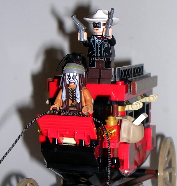
Kicking it off with our heroes… TLR doesn’t look like the character I remember, but he is a really nice cowboy minifig. He’s got a black printed suit complete with sheriff’s badge on it. He’s sporting his trademark black mask and white hat, and he’s got a pair of silver revolvers. He’s simple, but cool nonetheless. Tonto has a simple printed body and an elaborate headdress with a bird that pegs onto the top. He has two printed faces, one smiling and one surprised. He comes with a knife and a square brick with a pocket watch printed on it, which I assume has something to do with the movie. I would have liked Tanto to look like a more traditional Indian than one of the zombies from the last Pirates of the Caribbean movie, but Lego had to stick with the source material and they did a fine job with what they had to work with.

llrsce6

Moving on to Red and Jesus… Red Harrington has an elaborately printed dress and a clever use of a cloth cape, which when inserted between her torso and legs makes the back of her dress. It looks good, but it keeps her from being able to sit properly in the coach. She has a huge hair piece and a little hat that pegs on top. She has two printed faces, one smiling and one with the classic Lego anxiety expression. She also comes with a grey revolver. Jesus is the cowpoke in the brown vest. He’s got a brown hat and a cool kerchief-mask and is pretty stereotypically cowboy looking. I like that a lot, because I want a bunch of generic Lego cowboys. He comes with a knife.

llrsce7

llrsce8

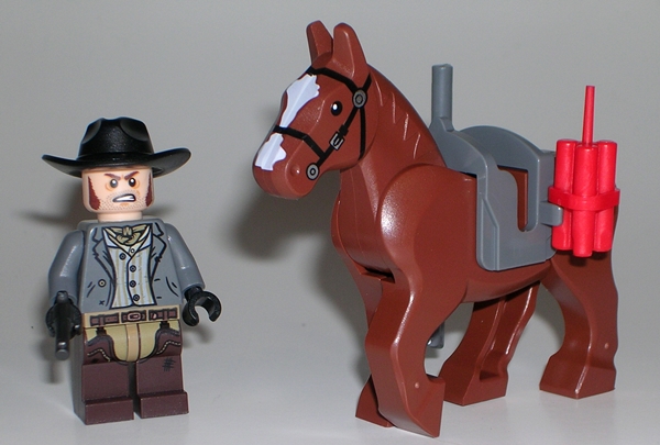
Last up, we’ve got Barret and the brown horse. Barret is the feller in the grey shirt. The box art suggests giving him a brown hat and kerchief-mask, but I think he looks better with the extra black hat I got and sans kerchief. Again, he’s a simple, printed figure, but he looks great. The brown horse comes with a saddle that can hold a set of dynamite and a rifle. It also comes with the extra horse bricks to fill out his middle if you don’t have anyone riding him. Speaking of extra bricks, there’s a ton of extra stuff in this set, and I’m not talking about just random extra bricks like usual. You get the extra black hat that I already mentioned, an extra revolver, an extra kerchief, and an extra pocket watch brick. Ok, that’s not a ton, but they are some useful extras. I’m pretty sure I’m going to have to mix some of these bits with my Lego Police and make Space Cowboys!

llrsce11

Of course, the showpiece here is the stagecoach. It’s a fun build and the finished model looks excellent. I was particularly interested in how the undercarriage was constructed as that and the horses take up all the parts in the first bag. There’s a ball joint connecting the horses to the carriage, and a string for the reigns. The front wheels of the coach turn and the back wheels actually have working struts! The harness for the horses makes use of the spaces where you usually put riders. You do get extra bricks to fill them in if you want to use them as just a couple of horses chilling around without huge bites taken out of their middles, or you can have the minifigs ride them. Extra horses are always a bonus and these may find their way into my Lego Kingdoms sets from time to time.

llrsce5

llrsce12

llrsce10

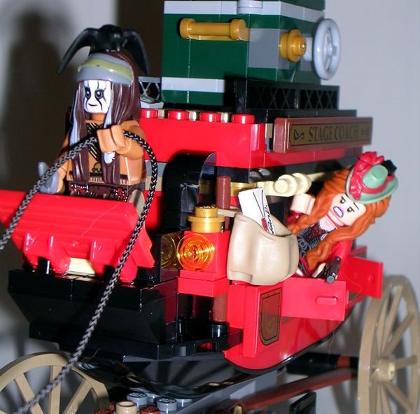
The cabin of the coach has opening doors on both sides and it can comfortably seat two minifigs, although you can pack more in there if you aren’t particular about comfort. There’s a seat up front for the driver, a mailbag with a letter, a safe that fits on the roof, complete with silver bar inside. There’s also a play feature where by tapping the back of the coach, you can launch a briefcase out of it! Yeah, I’m guessing that’s something that happens in the movie! This thing holds together fine and rolls along really well. The stickers are well thought out as they add the lettering to the top of the sides and some ornate designs.

llrsce13

llrsce4

There simply aren’t enough Old West toys these days, so Lego’s Lone Ranger fills a major hole in my compulsion to own toys based off of things I love. This one was a fun and satisfying build and in the end you get everything you need for a little stagecoach robbing fun. The brick count seems right for the $30 price tag, and yet in the end the size of the coach and all the horses and minifigs makes this set seem like a better value than usual. I’ll definitely be picking up more of these sets. I’m tempted to go right for the jugular and pick up the $100 train, but more likely I’ll grab a couple of the cavalry sets next.

Transformers Universe: King Atlas by Hasbro

I’m really trying to commit to featuring at least one Toy Closet Find each week, but I don’t want to confine it to one specific day. So today’s bit of random rummaging will take us into the realm of Transformers. It’s actually not so random, as I was thinking about how badly I want the rest of my TFC Uranos figures and that got me hankering to do a feature an Autobot jet. Before Transformers Universe became part of the Classics/Generations continuity, it existed as a weird composite line of toys that promised to draw from all corners of the Transformers mythos and introduce us to new versions of characters. In theory, it sounded promising, as Hasbro suggested that it would reintroduce old and uncommon molds to the toy shelves. In practice, it was more about awful repaints of toys we were already tired of seeing on the pegs and shelves. There were, however, some bright spots to the line. Is the subject of today’s feature is one of them? Well, that’s debatable.

tfuka1

Once upon a time I had a huge collection of G1 Transformers. It all eventually went out the door to help bankroll the startup costs of my business. It was a pretty standard collection, although it did occasionally stray into some uncommon corners of the Transformers world. One of those more uncommon pieces I had was a boxed Dai Atlas from Transformers: The Zone. I only bring it up now, because of how amazed and impressed I was that Hasbro actually released an homage to a toy that few mainstream TF collectors would even know about. And that brings us to today’s look at King Atlas, a repaint of the Starscream toy featured in Machine Wars, which in turn was a repaint of Skyquake. I can’t decide whether I hate this toy or love it. Maybe by the end of the feature, I’ll have worked it out.

tfuka7

tfuka8

Atlas’ alt mode is a gloriously huge bomber jet. It’s a friggin epic toy of an aircraft that looks like it’s designed solely to fly over your country and seriously f’ck your shit up. I don’t imagine it’s based on any real world aircraft, as it looks like a patchwork monstrosity of flying military hardware… but in a good way! Seriously, this thing looks like hate with wings… and bombs. One of the things I dig most about the aircraft mode is that it blurs the line of realism just enough that I could probably believe this is some kind of old Cybertronian mode. King Atlas comes with six yellow bombs that peg in around the aircraft. This mold was always a cool looking toy, even back in the Machine Wars era, but to see it released as an Autobot gives me a strange sense or ironic satisfaction. No part of this warplane looks like it should be a traditional Autobot, so I’ve always counted him among my Wreckers.

tfuka10

While it’s hard to argue with the black Decepticon coloring of the original Starscream toy, I really like what Hasbro did to this when rebranding it as an Autobot. The bulk of the aircraft is white, but there’s a very cool paint wash that gives it a grungy grey finish. When Hasbro attempts paint washes, they usually fail horribly, but this is a case where it really worked out amazingly well. He’s got yellow stripes on the sides that give him a bit of a Y-Wing vibe, red striping on the wings, and blue rear wings. Toss in some black and you’ve got a distinctive looking deco. The Autobot emblems on the wings are painted on and they look nice and sharp.

tfuka9

Besides just looking cool while parked on my shelf, King Atlas’ jet mode has a couple of interesting play features. One is the range finder in the back. You can flip a switch and put the rear thruster up to your eyeball and the mirror gives you an image of what’s below the toy, so you can target your bombing runs! You can also load the bombs into the cylinders in his wings and rotate the lever so Atlas can carpet bomb Decepticon fools below him. Finally, there’s a lever on his back that can open all the black hatches on his dorsal side to reveal translucent red panels. I never knew what the purpose of this feature was, but it’s still kind of cool. Ok, enough gushing about Atlas’ jet mode… let’s transform him and see what his bot mode is all about.

tfuka2

tfuka4

Wow! If you haven’t been around vintage Transformers in a while, this guy will come as a bit of a shock. Sure, as a 90’s toy he’s not exactly vintage, but he has a lot more in common with that era than the modern toys. It’s a perfect example of just how much the subsequent Beast Wars era revolutionized Transformers toys with their introduction of ball joints and actual articulation. King Atlas features a pretty simple transformation and the end result is a brick of a toy (his only articulation is in his shoulders) with a ton of kibble, not least of which is the huge range finder hanging off his back!

tfuka5

tfuka6

He’s also an unbelievably Japanese looking robot. I know, all Transformers are Japanese, but this guy seriously looks like he’s got more in common with a Chogokin or Gundam… particularly in the head sculpt, which is straight off the original Skyquake release. I think it’s a combination of the large horns, the crest, and the weird mouth plate. The asymmetrical split of the nosecone on the legs bugs me (did I mention I’m borderline OCD?), and look at those tiny feet! Why even bother? Also noteworthy is that he has two heel spurs that fold out the back to keep that huge range finder on his back from dragging him backwards. Is this the first example of a Transformer with heel spurs? Probably not, but it’s the earliest one I can think of. Oh yeah, you can also open up his chest and store his bombs in there. That’s pretty cool.

tfuka3

Every now and again, I cull some Transformers out of my collection. The ones I sell or trade off are usually recolors of duplicate molds, or just figures that I bought back when I was a completest and don’t want anymore. It’s always surprising to me that King Atlas here survives the cut every time. A lot of it probably has to do with his bitchin’ jet mode, but there’s also something about his robot mode that makes me keep him around. He’s just such a weird and unique looking piece that I can’t help but hang on to him.

Marvel: Black Cat Bishoujo Statue by Kotobukiya

Here’s a recent acquisition that I’m really happy about. Black Cat is one of those retired Bishoujo statues that recently began shooting up in price on the secondary market. She’s nowhere near as bad as Rogue or Batgirl or even Jean Grey, but the last time I priced her, I was looking at just under hundred bucks with shipping. Well, last weekend whilst doing some very ill-advised drunken Ebay browsing, I stumbled upon a listing for her with no bids at forty bucks. I dropped in a bid and surprisingly enough I got her for a very reasonable price of $48 shipped. It was a bit of a gamble as the seller had very little feedback and the description was lacking, but I took a chance, and she showed up at my door like brand new. I know, it’s kind of crass to start out a feature talking money, I usually save that for the end, but I’m just so excited to have been able to pick her up at such a reasonable price I couldn’t help but doing a little crowing about it!

bcatbish4

bcatbish5

Black Cat comes in a white window box. Not a big surprise here, although, I think this is the largest Bishoujo box in my collection. Maybe just a smidge bigger then the box for Black Widow? Either way, it’s a typical package for the line. It gives you a little peek at what the statue looks like.

bishbcat1

bishbcat2

One of the coolest things about this piece is that Black Cat has one of the most dynamic poses of all the statues on my Bishoujo shelf. Every little thing about her just exudes energy and action. Thanks to some clever design work, she isn’t even touching the base, but we’ll get to more on that in a few ticks. Felicia is captured in mid leap, presumably among the rooftops of the city. She’s holding aloft her latest score, a diamond of impressive size, and turning her head up to admire it. I tend to be at odds with which I prefer more in this line: Deliberate cheesecake poses or action scenes. There are certainly strong arguments for the former, such as Power Girl, but Black Cat here is definitely a fine example of the later. I’m always impressed when a static piece can capture this much energy.

bishbcat3

bishbcat4

There’s no doubt that this line excels when delivering it’s femme fatales clad in tight bodysuits, and that makes Black Cat a fine candidate for bishoujo fodder. The bulk of Felicia’s costume is a beautifully iridescent blue skintight suit with sculpted seams, a few wrinkles here and there, and a zipper drawn fairly low. Her boots and gloves are reproduced in a striking pearlescent finish and capped off by her trademark fur lining. The contrast between the smooth curves of her body and the wild strands of her costume’s fringe looks splendid, and I really can’t get over how great the mix of the blue and pearl coloring on this piece works. She’s definitely a statue that demands to be displayed under great lighting to be fully appreciated.

bishbcat5

Felicia’s face is appropriately adorable, although a lot of it is obscured by her wild sculpted white hair. The expression of triumphant joy and satisfaction over her new prize is priceless. It’s worth noting that she stands out from my other Bishoujos as having what appear to be separate clear pieces for the eyes, as opposed to ones merely painted on the statue. It’s an interesting effect that gives the eyes a more glossy sheen. It’s a nifty little touch, but I think I prefer the regular painted variety.

bishbcat6

bishbcat8

And then we come to the stand. Black Cat’s display base is a simple translucent disc painted like Spider-Man’s face. There was a time when the borderline OCD in me wished Koto used uniform bases in their Bishoujo line, but not anymore. I’ve really come to love the individualistic qualities that the unique bases give each piece and Felicia’s really stands out. There’s a stylized building on the base with a socket that you plug the clear peg in Felicia’s left foot. This suspends her over the base in mid jump. You can actually display the piece like this, but the instructions suggest you use additional support when displaying her for a long period of time. That additional support comes in the form of a clear post with a “Y” top to cradle her right leg. Before actually seeing the statue in person, I was pretty worried about how precarious this design was going to be, but it turns out that Black Cat is very stable when displayed with the extra support. No worries about warping in the plastic!

bishbcat7

I’ve wanted this one in my collection for a couple of years now and part of me was worried that she wasn’t going to live up to the anticipation. But nope, she certainly does! I really love everything about her. Black Cat is just one of those characters that lends herself so well to statue form. So much so that I’ve often been tempted to pick up her classic Bowen statue as well. I wouldn’t go so far as to call this a “grail piece,” but I’m sure I would have eventually paid top dollar for her (as I will one day for the Bishoujo Rogue or Emma Frost… those are my Bishoujo grail pieces!), but it’s nice to know that every once and a while the stars line up just right and I can actually wind up on Ebay getting a good deal for something I’ve wanted for a while now.

DC Universe Signature Collection: Wally West Flash by Mattel

Jeez, I had completely forgotten about my May Club Infinite Earth figure until it showed up at my door the other day. I guess I have a lot of things going on, and right now a huge Pile of Loot that I have coming from BBTS probably eclipsed the anticipation of this single arrival. It may also have to do with the fact that Wally West Flash isn’t high on my list of must-have DC figures. Oh, he’s on the list. You’ve got to have Wally on your shelf! He’s just pretty far down at the bottom. As big a fan of The Flash as I am, and I have a lot of versions of him on my shelf, I’ve always been all about Barry. Still, this was an easy figure for Mattel to toss out there, and there’s no doubt that he’s an essential for a lot of DC collectors out there. Let’s take a look…

wwfsh1

wwfsh2

Wally comes in the now typical Signature Collection window box and it shows off the figure quite nicely. Thank you, Mattel, for resisting the urge to package him in a running pose and warping his joints all to hell. The character art is quite excellent as usual, and you get a bio blurb on the back of the box. Not a lot else to say here, so let’s move on to the figure.

wwfsh3

wwfsh4

What we have here is as simple and easy a figure as Mattel can make. Wally makes use of the standard DCUC buck. The sculpt appears identical to my old Barry Allen figure, minus the wings on the boots. Is that a bad thing? Not really. My point is just that if you’re looking for any original sculpting on this figure, you must look to the head! The head is pretty good. The exposed part of Wally’s face features an ever so slight smirk that I really dig, and I love the look of the whited out eyes. The wings curve in ever so slightly, which may be by design or by the plastic warping, but either way I like it. There’s a little bit of slop between the flesh of  his face and the red of the hood, but nothing too terrible.

wwfsh7

Speaking of paint…. the coloring on Wally is gorgeous. It appears as if the entire figure is painted, and he features a gorgeous deep, rich red with a slight metallic sheen. The emblem on his chest is sharp, although the circle is a little dim… much dimmer in person than in these pictures. The gold painted lightning bolts around his arms and waist are also nice and crisp and his boots are painted with the same gilded finish. All in all, this guy really pops on the shelf.

wwfsh5

wwfsh6

Articulation? By now, you should know the drill. Wally features ball joints in the neck and shoulders. The arms have swivels in the biceps and wrists, and hinged elbows. The legs have the usual DCUC hip joints, swivels in the lower thighs, and hinges in the ankles and knees. He can swivel at the waist and he has the ab crunch hinge in the torso.

wwfsh8

wwfsh9

I’ll admit that I wasn’t tossing and turning at night over the absence of Wally West Flash in my collection. I’m still happy to have him on my shelf, even if I’m not sure yet where exactly he’s going to land. My DCUC case is getting pretty congested and it’s going to have to start expanding again soon. Anyway, I wasn’t expecting anything amazing out of this figure, but Mattel stepped up with a very good head sculpt and an exceptionally nice paint job.

Marvel Universe: World War Hulk by Hasbro

No sirs, I am not the biggest Hulk fan in the world. I dig him well enough as a supporting character, but I’ve rarely ever made any of his books part of my regular reading habits. In fact, it wasn’t until Planet Hulk and World War Hulk that the big green rage machine’s books actually found their way to my shelves, but boy did I love them. Surely a Hulk book good enough to draw me in deserves an action figure in my collection. And that brings us to today’s Marvel Monday…

wwhlk1

Today’s entry is a bit of an older figure, so we’re back to the days of the SHIELD logo, as opposed to those crappy little “Comic Shots.” Apart from that the packaging hasn’t changed a lot. I can’t say as I’m a big fan of the character art used here, but I don’t really need superb card art when I see how well Hulk fills up the bubble. My eyes are pretty much drawn right to the behemoth of a figure. In fact, this has got to be one of the heaviest MU figures released to date on a single card.

wwhlk2

The back of the card shows the other figures available in this assortment. I have Spider-Woman, but I missed out on Spider-Man 2099 and that Heroic Age Iron Man. I may need to swing back and pick them up. Anyway, Hulk looks angry and ready to bust out, so let’s not keep him waiting.

wwhlk3

wwhlk4

Where to begin with this thing of beauty? I guess with the base sculpt. Marvel Universe has had its share of ups and downs with The Hulk. The Secret Wars version is solid enough and remains my standard Hulk, although he’s starting to look rather dated. The next single carded release suffered from a terrible pinhead. The last one released was a big improvement, but one I didn’t deem necessary to buy. This Hulk is absolutely fantastic. The portrait is excellent, with a broad, grim expression and a sculpted headband. The rest of the body is suitably muscled and features armor sculpted onto the left arm, sculpted leg straps, and sandals. What’s more he has all sorts of little texturing and hash marks on his skin. Serious love went into this sculpt. The coloring is perfect. I adore this deep shade of green, and here’s an example of a paint wash that actually enhances the figure rather than detracting from it. And speaking of paint, the patina of rust on his arm armor is executed flawlessly.

wwhlk5

The belt, loincloth, shoulder rigging, and shoulder armor are all sculpted in separate pieces and fit the figure well. I really dig when figures have separate parts like these, not so much because they can theoretically be removed, but because it adds a lot of depth and credibility to the sculpt and don’t tend to interfere as much with articulation. The rigging features a functional scabbard. All the exceptional detail on this guy makes him feel like Hasbro took a Legends figure and shrunk it down to the Universe scale.

wwhlk10

Articulation? Oh, Hulk’s got articulation! You get ball joints in the neck, shoulders, hips and upper torso. His arms feature swivels in the biceps and wrists, and hinges in the elbows. The legs have double hinges in the knees, swivels in the thighs, and swivels and hinges in the ankles. Hulk can also swivel at the waist. That’s some damn fine poseability for a character that isn’t known for his ninja-like prowess.

wwhlk6

wwhlk7

wwhlk9

I don’t know what feels stranger, getting a Marvel Universe figure with this many accessories, or seeing The Hulk with this many accessories. Let’s just agree that both are pretty atypical. Still, the Planet/WW Hulk scenario that puts weapons into Hulk’s already-capable-of-mass-destruction-mitts makes me smile and I’m so happy to get a figure of Hulk in this guise. You get a two-handed broadsword, a battle axe and a shield. Both the sword and axe are nicely sculpted with pitting and nicks from wear in battle. The only downside is that neither fit tightly into his hand. He can hold them, but they rattle around a bit. Hey, I had to come up with something to nit pick here! The iron studded, wooden shield is also beautifully sculpted with scrapes and cuts and it clips securely onto the figure’s wrist. Hulk can carry all his gear on his back. The sword fits into the scabbard, the shield clips onto the scabbard and you can tuck the axe through the straps in his rigging. Very cool! Hulk also comes with a standard MU style figure stand. The kind we used to get before Hasbro cheaped out on us. It’s ironic because this figure has no need of it. He’s too big and he stands just fine on his own.

wwhlk8

If you’ve been reading my Marvel Monday features, you will no doubt have noted that I’ve become more and more impressed with Hasbro’s efforts with this line. Back when it first started and the novelty of 3 ¾” Marvel figures began to wane, I seriously questioned whether many of the figures were good enough to keep me collecting them. Needless to say, MU has come a long way with the recent waves. Hulk here is an older figure and he was probably one of their great breakaway releases. Compare this dude to most of the previous offerings and he seems way too good to be an MU figure. He set a new standard for the line, a standard that I’ve been seeing reflected more and more in the recent releases. The sculpt, the coloring, the gear, the accessories, the articulation… it’s all perfect. And that’s not a word I like to toss around all willy-nilly. And it’s not a word I use to placate Hulk so he won’t smash me. No, this is quite simply a gorgeous and amazing figure, and unlike a lot of MU releases, he’s a great value at ten bucks. Who would have thought that I could love a Hulk figure as much as I love this guy. Hulk… you will not be going into the Marvel Universe display case right away. No sir, you have earned a place of honor on my desk, so I can play with you on my down time.

Sunday Funday: Star Trek (2009) Blu-Ray

Today’s going to be a quickie, because I’m off this weekend, it’s a beautiful day here in sunny Florida, and I’d rather be out on the patio, drinking and reading my comics. Truth be told, I went through the entire Star Trek original crew movie series on Blu-Ray this week, but I’m looking at the 2009 movie today only because Sunday Funday is supposed to be about something I did over the weekend and I watched it last night. It’s also the only one that comes with a cool novelty package that I can talk about.

stbr1

stbr2

I won’t go into a lot about the movie. Suffice it to say, I liked it a lot more than I thought I would. That’s not a loaded compliment. I really enjoy this movie, despite the fact that I was nerd-raging against the concept from the start. The casting is great, the sets and ship designs are cool, the effects are amazing, and this disc is definitely in the top three best looking Blu-Ray’s in my collection. Seriously, whenever I want to impress people with my AV setup, I’m always most likely to bust out the Blu-Ray of Star Trek or The Avengers.

stbr3

Normally, I am not a fan of novelty Blu-Ray packaging. I am borderline OCD, which probably speaks volumes as to my collecting habits. But I do enjoy my shelves to look neat and orderly with all the cases lined up just right. So when you get something like a special case into the mix, it seriously throws off the feng shui of my media shelves and that’s just not cool. I try to avoid these most of the time. I still can’t look at my shelf of Arnold Schwarzenegger movies without shooting a hateful look at that absurd circular tin containing the old Total Recall Special Edition DVD.

stbr6

stbr4

I do, however, really enjoy the Star Trek package, which is basically a little model of the Enterprise with the discs cleverly held in the saucer section. It’s such an amazingly well-crafted little piece that owning it dissuaded me from spending the money on Playmates version of the 2009 Enterprise. No, it’s not electronic, but it displays just as well on the shelf. It doesn’t look like a Blu-Ray incentive at all. It just looks like a little model of the Enterprise that I would have on my shelf.

stbr5

The idea to store the discs in the saucer section is both obvious and genius at the same time. It makes the discs easily accessible, while exploiting the design of the model itself. It’s also worth noting that this Enterprise is remarkably sturdy, made out of great quality plastic, and sits perfectly on its stand, unlike a certain expensive Diamond Select Starship I bought a short while ago.

stbr7

And that’ll wrap up Star Trek Week. I had intended to come back to some of my 90’s Playmates Trek figures, since it’s been forever since I looked at any and they are piling up. I’ll have to make an effort to squeeze them back into my weekly routine. Maybe next week.

Star Trek: The Original Series Hand Phasers by Playmates and Diamond Select

I started my tribute to the new Trek film a couple weeks ago with a look at Playmates’ hand phaser from the 2009 movie series, so it seems only right to end Star Trek Week with a look back at The Original Series phaser. In terms of my own personal favorites, this original piece of Starfleet hardware is second only to the awesome design featured in the otherwise shitty fifth movie, The Final Frontier. Were they used again in Undiscovered Country in the infamous mashed potato attack scene? I think so, but I can’t remember for sure. I’m actually going to be doing a dual feature comparing the TOS phasers made available by both Playmates and Diamond Select. Phaser vs Phaser… FIGHT!

toshp11

toshp10

No package shot, because I’ve had these things for what seems like forever, but since I’m likely to get a little techno-babbly, I am including two pages from my trusty Starfleet Technical Manual as reference for the anatomy of a phaser. I first bought the Playmates one to replace an actual resin and metal prop phaser that I bought at a Trek Convention back in the late 80’s. I had to sell that one off because I was in need of monies for college, or some other stupid thing, and I had a ridiculously high standing offer on it from a friend of a friend. It killed me to sell it, but them’s the breaks. Anyway, I was never totally happy with the Playmates release, so when Diamond Select offered their version some time later, I was quick to pick it up.

toshp6

toshp3

First, let’s talk scale… both phasers are close to the proper feel for an adult hand, but the Playmates version is actually quite a bit chunkier than it should be. It’s not only the overall dimensions that are skewed, but the sculpted, “Type 1” phaser also looks a lot bigger than it should be. Now, if you just happened to be holding the Playmates version, the extra girth might not be readily apparent to you. It’s not that bad and it feels ok in the hand. But, if you compare it side by side with the properly scaled Diamond version, you can clearly see the difference.

toshp7

toshp4

In terms of sculpted detail, both phasers hit all the right points Both have nice looking translucent beam emitters with adjustable photon accelerators. Both pieces do a good job of replicating steel finish for the accelerators. The beam shield is a bit stubbier and thicker on the Playmates version, but it still looks fine. Both models feature an adjustable Dilithium Crystal Cell, although the Diamond one actually serves a purpose for the SFX, whereas the Playmates version just turns. Both have painted deflector shielding on the sides and rear. They both look good, but I prefer the Diamond a bit more, mostly because it fans out of the back in the proper fashion. Both pieces have exposed screwheads on one side, the Diamond has one on the top and one in the handle, the Playmates phaser has three in the top and one on the handle. The other big difference is the Type 1 phaser on the Diamond version is properly textured, whereas the Playmates one is left smooth.

toshp8

toshp9

Moving to the top down, it’s now worth pointing out that the Type 1 phaser in the Playmates version is sculpted on, whereas the Diamond one is actually removable. Obviously, this is a pretty huge difference. The Playmates version uses stickers for detail on the force indicator dials, and mine have long since fallen off. The Diamond version uses a printed paper sheet under the translucent piece and sculpted numbers and hash marks on the dial. Both look very nice. The Type 1 phaser on the Playmates version has somewhat unsightly speaker holes on the electron aspirator pile, and the trigger is just a sculpted piece, whereas it is a clear piece on the Diamond version. Both Type 1 phasers are missing the operational light between the force setting wheel and the force indicator dial, something that my prop did actually have.

toshp5

The electronics are about on par with both pieces. My batteries are drained on both so I’m going from memory here, but each phaser had different sounds for different settings. The Diamond version has working electronics in both the regular rig and the removable Type 1. I don’t recall having any issues with the sound on either piece.

toshp2

toshp1

I’ll freely admit it isn’t really fair to compare these two pieces. The Playmates version was more of a mass market roleplay toy, whereas the Diamond version was designed more with collectors in mind. As a result, the Diamond release clearly comes out on top across the board.  That having been said, neither version is anywhere near on par with my old prop phaser, but both have their merits. The Playmates phaser can often be had for under $20, and all it needs is a patch of velcro to make it an excellent cosplay piece that can take a beating while wandering the hotel lobby drunk out of your mind. Of course, the Diamond version can usually still be had for under $40, and it’s clearly the way to go for a better display piece or for putting together the better Starfleet ensemble. I display them both together and just use the Playmates as a slightly earlier and less sophisticated version. You know, the kind you give to Red Shirts who don’t stand a chance of surviving anyway!

Pages are reproduced from the Star Trek Stafleet Technical Manual. NY: Ballantine Books, 1975. Researched and compiled by Franz Joseph. Star Trek is a registered trademark of Paramount Pictures.

Star Trek (2009) Command Series: Dr. McCoy by Playmates

In keeping with Star Trek Week, tonight I’ll be going to The Pub and taking my liver where no liver has gone before. That means I don’t have a lot of time, but thanks to some careful planning, I don’t need a lot of time today. We’re looking at Playmates’ Command Series Dr. McCoy and a lot of what I have to say about this figure was already said in yesterday’s Captain Pike feature. Still no in-package shot, so let’s just get right to it, so that I can go out and hit the Aldebaran whiskey.

dlm1

dlm2

McCoy was definitely a high point in the Abrams films for me. Next to Quinto, I think Karl Urban does the best job owning his original Trek character without lampooning too much. I like Pegg as Scotty, but it’s not really the same Scotty at all. He’s just too wacky for it to feel like a legitimate treatment of the character. Ironically, I would have picked up a Command Series Scotty if Playmates did one. Ideally, I would have liked to have one in each of the shirts… Command, Science, and Engineering, but poor Scotty got stiffed and there were no Red Shirts released in this assortment. Anyway…

dlm5

The head sculpt is about on par with Pike’s. It’s soft, it’s rather cartoony, but there’s definitely a bit of the actor in there. The paintwork is pretty solid. Again, for a mass market retail figure in this scale, this is passable work. Not great, but passable.

The shirt is the blue version of what we saw yesterday. It’s a little long in the sleeves, but it looks nice from the front and has an ugly seam running up the back where it fastens. The sleeve stripes and chest insignia are all sewn on. The trousers and boot-feet are identical to Pike’s.

dlm3

McCoy makes use of the exact same body as Pike, and I presume the rest of the Command Series figures. It’s not exactly screen accurate as the barrel-chested body here seems a little bit buff for Karl Urban. That’s ok, though, as I didn’t expect Playmates to churn out a new body for each figure.

dlm4

dlm6

dlm7

Accessories? The same? Not quite. Yes, you get the same phaser and communicator, but you also get a tricorder. Really, Playmates? You couldn’t have just tossed in the tricorder with Pike too? Another odd thing worth pointing out: The belt clip for the communicator is painted silver on McCoy’s belt, but it’s left black on Pike’s. Weird.

dlm8

Hey, I told ya today would be fast. McCoy’s a decent enough figure for what he is, and you can still find him on clearance at a number of e-tailers. I still say we need some high end sixth-scale Trek figures, although my first choice wouldn’t be from the Abrams reboot. Now if Hot Toys would do movie versions of the Classic Crew? Yeah, I’d be all over most of them. No, it’s never going to happen, but I can dream. And with that I’m off to The Pub. I’ll catch you all tomorrow as I wrap up Star Trek Week with a nod back to the original series.

Star Trek (2009) Command Series: Captain Christopher Pike by Playmates

Star Trek Week presses on, and it seemed only fair to look at some toys from the 2009 movie series. Of course, Hasbro’s Not-Lego Kre-O aside, there are no proper toys from Star Trek Into Darkness. Why? Because Playmates’ 2009 Trek line was such an unmitigated disaster. Ironically, if you do want some Into Darkness toys, just go to your local Toys R Us, and you can still buy the 3-year old clearance figures from the first movie right off the pegs. I have looked at some of Playmates ’09 Trek toys before, The 6-inch figure line and more recently the hand phaser, but I never got around to checking out any of the sixth-scale line. Playmates produced a select few of the characters in this twelve-inch format: Kirk, Spock, McCoy, Sulu, Spock Prime, and Captain Pike.

ccp1

ccp2

I was never planning on going all-in with this scale. Originally, I was going to buy Kirk, Spock, and McCoy and be done with it. But Playmates just up-scaled the same terrible Kirk head for the larger figure and so I went with Pike instead. And that’s fine, because I really liked Captain Pike in that movie. This figure is part of the Command Series, which is what Playmates called the twelve-inchers. Alas, the packaging for this guy is long gone. I had a photo of it somewhere on the FigureFan Zero Mainframe, but I think it got deleted when I spilled Jameson on the HDD. Suffice it to say, it came in a pretty cool window box, which was fairly collector friendly. It’s been a year or so since I’ve had this figure out of storage, so let’s take a look.

ccp3

The portrait is decent enough for a figure in this price range. It at least bears a passing resemblance to actor Bruce Greenwood. You get little touches like creases in his forehead and around the eyes. He has a fairly neutral expression, which works for me. The paintwork is very precise. I dig the little grey added to his sideburns. I don’t know that I could recognize the likeness if the figure were dressed differently, but when I know what I’m looking at, I can see the resemblance. Yes, it is rather cartoony, but when you consider the horribly misshapen “man-baby” abomination that was Playmate’s Chris Pines headsculpt, this portrait is a welcome treat.

ccp9

The figure’s outfit is also fairly well executed. The new Starfleet shirts have a complex texture of tiny Starfleet emblems running throughout. Playmates managed to capture this effect with a simple pattern. It’s not quite screen accurate, but it looks good and I applaud them for making the effort, rather than just going what would have looked more like a Classic Series shirt. I’m happy to see that the stripes on the sleeves and the Starfleet emblem on the chest are both sewn on, rather than stickered as Playmates has done in the past. The shirt is a little long in the sleeves, and it’s rather unsightly in the back where it fastens, but otherwise fits the figure well. The trousers have a sewn pattern on the knees and the boots are simple sculpted rubber and make up the figure’s entire feet.

ccp4

Pike’s is built on a very serviceable 12-inch body. The proportions are good, with the possible exception of the hands, which are a tad too big. The head is ball jointed, the arms are ball jointed at the shoulders and elbows, and the wrists swivel. The legs are ball jointed at the hips, the knees are hinged, and there’s a swivel down by the boot. The chest has a ball joint which allows for swiveling and some limited up and back movement.

ccp6

ccp5

ccp7

Pike isn’t heavy on the accessories, but you do get the necessary basics. There’s an equipment belt, a phaser, and a communicator. The belt is easily removable and has a holster for the phaser and a slot for the communicator. The phaser is a very nice sculpt and painted in metallic silver. The communicator is just a block of plastic with a sculpted disc and Starfleet emblem. I’m not really a fan of the Abramsverse communicators. You also get a very basic figure stand sculpted to look like the Starfleet insignia. Only one of the figure’s feet are pegged for it. It works, but it’s rather awkward. I would have preferred just a straight disc stand.

ccp8

So, all in all, I gotta say… Pike’s not bad. Keeping in mind that this is a pretty “low end” over-the-counter 1:6 scale figure, and keeping in mind how sub-par most of Playmates ’09 Trek toys were, they did an Ok job with this one. I’m probably being extra forgiving because you just don’t see many sixth-scale figures at mass market retail anymore, so I’m grading with a curve. It also helps that I got this guy when he was slashed down to about nine dollars, as opposed to the $29.99 he was originally stickered at. Tomorrow, we’ll look at the only other one of these guys that I picked up… Doctor McCoy!

Star Trek II The Wrath of Khan: Khan Noonien Singh by Art Asylum

And we’re back with Day Two of Trek Week! The key to crafting any great screen rivalry is to create a villain worthy of the hero. In the case of Kirk, that wasn’t an easy task. But, thanks to a performance crafted by master thespian and scenery chewer, Ricardo Montalban, Khan not only held his own against Kirk on the big screen, but has become one of the quintessential villains in modern cinema. He’s so friggin formidable they made a whole movie just about his goddamn wrath. But we’re not here to talk about the movie, we’re here to talk about toys, so let’s take a look at Art Asylum’s take on Mr. Khan Noonian Singh.

kns9

It’s the exact same packaging that we saw yesterday with Admiral Kirk. The only difference is the bottom insert in the card is personalized with Khan’s name. Again, the presentation here is fantastic. I love the Starfleet insignia shaped bubble and the card art really takes me back to the 80’s movie poster stylings.

kns10

Yep, the back of the card is the same too! Lots of figures and many are now very expensive. One of these days I will have a full crew. I vow it… I will have the full crew!

wok1-vert

Anyway… moving on to the figure…

kns3

kns4

Khan’s portrait fares much better than Kirk’s. The head sculpt is a pretty solid representation of Montalban from the film, right down to his outrageous 80’s David Bowie hair. It must have been a challenge to sculpt hair like that, but I think the guys at AA did a solid effort. I also appreciate that the long hair doesn’t impede Khan’s neck articulation.

kns5

The rest of the figure is ok, but I think it stumbles in a few areas and mostly the paintwork is at fault. His ragged Ceti Alpha 5 outfit is reproduced with nice detail. He has all sorts of patchwork bits on his tunic and the Starfleet pendant he wore around his neck is sculpted into the chest. He has his one gloved hand, because it was the 80’s and cool people wore only one glove. I also dig his wrist communicator with the sculpted wire running up his arm. His boots have sculpted fur lining and are surprisingly detailed, considering I don’t remember ever getting a good look at them in the film.

The paintwork, on the other hand, makes use of too much gloss, particularly on his tunic and his bare chest. It’s just not right and it’s at odds with the matte dirty finish on the bare arms and the matte paint on the face. It also makes him look more toyish than the Starfleet figures in the line, which make an effort to distinguish matte from gloss.

kns1

kns2

Khan features the same articulation as Admiral Kirk. You get a ball joint in the neck. The arms are ball jointed at the shoulders, hinged at the elbows, and have swivels in the wrists and elbows. The hips feature a t-crotch, and the legs have hinges in the knees and ankles, and swivels in the thighs. Again, there’s no articulation in the torso at all.

kns8

Accessories! Khan comes with one extra opened glove hand to swap out his fist. You also get his Ceti Alpha eel, a bowl of baby eels, and a pair of forceps. The eel and bowl are about what you would expect. They’re ok for what they are. The forceps should have been sculpted into an extra left hand, because it’s really tough to get him to hold them in any convincing manner. Still, apart from bundling him with a Genesis torpedo, I can’t think of anything else they could have given him.

kns6

kns7

If it sounds like I’m picking on Khan, I don’t mean to. He’s actually a pretty cool figure. Khan has got a great head sculpt and an ok body, which makes him the opposite of the Kirk figure. And, hey, if you have any kind of customizing skills and some matte paint, you can probably fix most of the paint issues with this figure by getting rid of the inappropriate gloss. I picked up my Khan figure at a Toy Show from the same dealer I got Kirk and he was also $20. Not bad. If you aren’t willing to spend deeply on a bunch of WoK figures, but want some representations of the movie on your shelf, Khan and Kirk are a great way to go.