Marvel Legends (Banner Hulk Wave): Loki by Hasbro

After a brief detour to check out Klaue from Black Panther, I’m back to working my way through the Banner Hulk Wave. And with four figures under my belt, I’m more than halfway done! And here’s where the character selection in this wave really starts to descend into a free-for-all. There’s no theme or anything, just a semi-random assortment of characters here. Today we are having a look at The God of Mischief… Loki… And it’s a very classic comic version!

Even if you take into account how far behind I am in my reviews of this line, it still took a long time for Hasbro to get a comic-based Loki figure out of Modern Legends. I mean, I’ve got at least two MCU versions of him (only one of which I’ve reviewed) as well as the female Loki from the A-Force set on my shelf at this point. Nonetheless, he’s finally here and about as classic a version of Loki as anyone could ask for. Even the packaging window cannot contain the magnificence of those horns! And just a reminder, that Hulk leg went to my nephew, so I won’t likely be reviewing the BAF in this wave. I guess that makes me a good uncle, and a bad toy blog host.

Yup! For all the fans who discovered Marvel through the movies, and you’re just into Marvel Legends for the MCU stuff, Loki here is going to be like a bucket of cold water. He’s pure comic cheese from the early days but if you’re looking for some Jack Kirby goodness, there’s a lot to love here. On the other side, Hasbro played it pretty of lazy with this figure. There’s absolutely no character-specific sculpting to be found on the body, instead his costume is achieved nearly entirely by paint and colored plastic. His boots and gauntlets are yellow, his body suit is green, and the gold scales that make up his undies and run up through the center of his torso, are all painted on. Now with that having been said, the coloring on this figure is absolutely gorgeous. The green and yellow go so well together and the gold gives it that extra little pop.

You do get two separate pieces of fresh sculpting: His plain band of a belt and his starburst-like gorget, as final accent to the body. So, clearly this is one of the wave’s budget figures, and I’ll be the first to admit that the paintwork looks fine, but this is Loki, dammit! He really deserved more original sculpting. We’ve seen Hasbro’s sculpted scale mail on figures like Green Goblin, and I think that sort of thing would have looked great if applied here. I must be misremembering him wearing a cape with this costume, but to be fair this one is even way before my time, but it was still a design that I can remember seeing now and then in my childhood. Since this is a basic buck, there are no surprises in the articulation, so I won’t run down all the points, but I will point out that this body features the swivels in both the thighs and tops of the boots.

The head sculpt gets major props from me for Loki’s maniacal grimace and overall devilish expression. Hasbro does enjoy injecting their comic villains with tons of character and Loki is another great example of that. He looks absolutely deranged! His form-fitting cowl features his trademark horns, protruding proudly from his forehead and curling upwards. Meanwhile, his golden locks spill out the back in a long ponytail. The only downside here is I worry about those horns getting all warped. With over 300 Marvel Legends figures, I wind up having to rotate a lot of them in and out of display, which means Loki here will spend part of his life in bagged in a storage tote. Needless to say I have to make sure he resides at the top of the heap to keep those horns from going all wonky while in storage.

The God of Mischief comes with one accessory and that’s his sword. Yup, while the modern Loki favors daggers and throwing knives, old school Loki wielded a more conventional blade. It’s a great looking weapon with a yellow hilt, an extended grip, and a cross-guard that kind of resembles a bird stretching out it’s wings. The guard reaches up the blade just a bit and has a green gem or stone painted on it. The broad blade is painted silver. I thought this looked familiar, and a little searching reminded me that it’s a repaint of the sword that was included with Angela as part of the Titus Wave.

After all this waiting for a classic Loki, I find myself a little underwhelmed with this figure. He’s not a bad figure, quite the contrary, I think he looks great. But a figure as important as Loki should have had more attention. It’s doubtful that Hasbro will take a second crack at this version of him any time soon, and I think that they should shy away from using A-Lister characters as the budget figures in a wave. But with that having been said, I still dig him a lot and he looks fantastic displayed alongside the 80th Anniversary Thor.

GI JOE Classified: Scarlett by Hasbro

Folks, I can’t tell you how great it feels to be sitting down to review a brand new GI JOE figure from Hasbro. I have been a strong proponent for Hasbro to apply this once great franchise to their now tried-and-true 6-inch scale figure formula. I’ve been hoping against hope that we’d see familiar classic Real American Hero characters mixed with the accessories and play-ability of SIGMA SIX. Finally Hasbro listened and we have the new GI JOE Classified series. The first wave consists of Duke, Scarlett, Roadblock, and Snake Eyes, and I’m kicking things off with a look at Scarlett. Did this line seem like it’s going to be all that I hoped it would be? Not exactly. Is she a great figure? Well, at the risk of spoiling the review… Heck, yeah!

For starters, Hasbro gets major props for this packaging, and since this is the first time seeing it, I’ll spend a little while with it. It’s a simple window box similar to their Star Wars Black Series, only now infused with some amazing colors and artwork. We get an original character portrait on the front and the GI JOE logo and character name at the bottom. My only complaint here is that the three bars after the logo aren’t in red, white and blue.

The left side panel shows that these figures are numbered and also introduces this cool iconography for the characters, which suggest their specialties, with some being more obvious than others. The right side panel has a beautiful montage of Scarlett in action. Saving the best for last, the back panel has a gorgeous piece of art showing off characters and vehicles and giving us a glimpse at what some other characters will look like in this line. I love how iconic the vehicles look, and I can only hope that we’re going to get a Trouble Bubble or RAM Cycle down the road. But that’s me getting way ahead of myself, because here we are at the very first wave. Let’s have a look at Scarlett…

I’m not going to lie, I was hoping for a straight up RAH revival that took the basic look of the originals and just infused them with more detail and tons of accessories. That’s not what we got here. Instead Scarlett’s design takes the broad strokes of the character and than goes off in its own direction. The result is a figure that is both familiar and different. This approach is likely to vary from character to character. With Scarlett, I was only fairly satisfied with what I saw in the original solicitation pictures, but with the figure in hand, I’m absolutely in love with it. Her outfit is a mix of tactical suit and armor. I can get a whiff of her old yellow-cream-colored tactical onesie, boots, and gauntlet in the yellow armor here. Her red shoulder pad has migrated to her left and evolved into a full on armor piece, but hey, she still has her row of shuriken-like weapons on her left gauntlet. Maybe I’m reading too much into it, but I feel like Hasbro might have retained an element or two from their Overwatch figures. Damn, I really need to finish reviewing those some day!

I do like the body sculpt here. Hasbro uses some subtle textures on the underlying suit for some areas, while others are smooth with quilted panel lines. The armor pieces feature various panels and raised areas, and the detail on her gloves is quite nice. She has a belt that hangs on her hips with a gold buckle and a sculpted pouch on her left hip. She also has a separate shoulder strap that supports the quiver on her back and a functional knife sheath on the front. About the only thing on the uniform I don’t care for is the left shoulder piece. The star looks great, but this piece pops up too awkwardly for my taste. I wish it cupped her shoulder more closely. As for the colors… she’s certainly a flashy figure and there are a lot of colors on her, far more than I’m used to seeing on Hasbro’s other 6-inch lines. The gold and yellow are vibrant, while the red and blue add a nice kick. It’s pleasing to look at, but I’d like to see this figure repainted with a more subdued color palate. And if I know Hasbro, I’ll probably get it.

The head sculpt is a total winner. She’s cute, with a confident expression. The hair is especially nice as it partially covers her right eye and spills out the back in a ponytail. I could have stood it to be more red than orange, but I’m not going to split hairs. HA! I really dig the printed facial features and the freckles are a nice touch. She even has little earrings, which I’d like to think are tracking devices or micro-explosives or some other kind of cool spy gear.

For articulation, we do get a few new surprises. Her ball jointed hips appear to be anchored with dog-bone-style joints giving them a little extra range of movement. Otherwise the legs follow the Marvel Legends model with swivels in the thighs, double-hinges in the knees, and both hinges and lateral rockers in the ankles. Being a girl, Hasbro doesn’t believe Scarlett should have double-hinges in the elbows, so instead she gets rotating hinges in the elbows and no bicep swivels. Boo! Her wrists are on rotating hinges, and she only comes with the one set of hands. She has two ball joints in the torso, one in the waist and another under her chest. Nice! And finally her neck is ball jointed. It’s not a huge departure from what Hasbro’s been delivering, but there are some improvements.

Scarlett comes with four accessories and three of them are knives. I don’t usually associate Scarlett with packing a lot of blades, but knives are cool! Knives come in handy in a fight. I like knives! The smallest of the three fits into the sheath across her chest. It has a curved sculpted grip and something like a drop-point blade. It’s cast entirely in black plastic and she can hold it well in either hand.

The other two are a matched set and oddly enough these fit into the top of her quiver. These pieces of cutlery have similar handles and bigger, more imposing blades with saw-backs. They’re also sculpted entirely in black and I’m tempted to take a silver sharpie to their blades to give them a little more oomph. Maybe Hasbro blew the budget on the figure’s paint operations and didn’t have anything left for the knives. Or maybe they’re intentionally black so they don’t glint off the moonlight in night missions.

And finally we have Scarlett’s trusty crossbow pistol. It’s a chunky and detailed sculpt that breaks down into two pieces. And like the knives it’s also cast all in black plastic either for tactical reasons or to keep costs down… you decide!!! I like that it’s stout and not all frail and bendy. The two pieces do come apart sometimes, and I’m tempted to use a spot of glue to keep them together as I really don’t see any reason to ever separate them. There are no loose bolts to load into it, but she does have some sculpted bolts coming out the bottom of her quiver.

Scarlett’s new design is likely to make her a divisive figure, but she did manage to win me over and I’m hoping she will have the same success with other collectors. Her outfit is not what I was hoping for, but she is an absolutely fantastic figure showing off some great sculpting, quality paint applications, and fun articulation. I do wish the accessories rose to meet the days of SIGMA SIX, instead we get a decent assortment, but nothing mind-blowing. I’m still waiting on my Snake Eyes, which has been bumped back time and again by Hasbro’s own Pulse Shop. Indeed, I had all these figures pre-ordered on Pulse, but wound up cancelling them when they showed up on Amazon with that Fast & Free Prime Shipping. In the end, I wound up getting them in hand from Amazon probably a solid week before they would have ever even shipped from Hasbro. And that, Hasbro, is why when my Free Premier Membership with Pulse expires, I won’t be renewing it with a paid one. In any event, I’ll be back next week with a look at another one of these new JOES!

Transformers “Earthrise:” Cliffjumper by Hasbro

After taking a few detours back into the Transformers: Siege line, I’m switching back to a figure from the first wave of Earthrise Deluxe Classes. This time we’re checking out Cliffjumper, and man it feels like a while since this guy has had any love in the toy aisles! When I think about Cliffjumper, my mind goes to a smaller figure and, while that’s still the case here, Hasbro has upgraded him to a Deluxe Class. Was it justified? Eh, maybe. Let’s take a look…

We saw the Earthrise packaging last time with Hoist and I’ll just say once again how much I dig it. It’s collector friendly and I wouldn’t blame anyone for wanting to hang onto it for the bitchin’ artwork, but I don’t have the space to save a bunch of boxes, so I’m going to tear into it. He comes in his robot mode, but we’re going to start with his alt mode.

Cliffjumper is sort of faithful to his G1 roots, as he’s still a red sports car, but in this case with a bit of a Trans Am vibe. As such, this alt mode reminds me more of Windcharger than it does Cliffjumper. I was never really sure what Cliffjumper was supposed to be in his original super-deformed Minibot alt mode, but this isn’t it. That’s OK. I don’t mind Hasbro straying a bit with these designs. I do, however, kinda mind when they take a much smaller toy and release it in the Deluxe Class. Yes, Cliffjumper was originally a Mini-bot. And no, this toy isn’t small enough to be what was called a Basic or Scout Class in previous lines, but the size still feels wanting at this price point.

Size notwithstanding, I think this is a fine little alt mode. The red plastic looks great and there are some additional silver and black paint operations for the front and back. The wheels are also painted silver, the rear window is painted black, and the windshield and side windows are cast in translucent blue plastic. I’m not really a fan of different color windows, but whatever. An Autobot insignia stamped on the hood ties the whole thing together. Despite the usual seams, the car holds together pretty well and it feels solid.

As if to make up for the toy’s small size, Cliffjumper comes with a massive bazooka-style weapon similar to one he used when scouting with Hound in the original More Than Meets The Eye Sunbow miniseries. And this is a really clever modular design that can be broken down into several pieces and reconfigured to give him a version of the hydrofoil configuration used by the Autobots in the episode Atlantis, Arise! including turbine pontoons and skis for the front wheels. Cool! If only they used some of that engineering skill for the actual figure. Let’s get him transformed!

Broadly speaking, I think this is a pretty solid look for Cliffjumper, in that you get the car roof landing on his chest and the front of the car splitting to form the feet. One strange choice was to give him those circular, tube like biceps, which were seen on Bumblebee’s Sunbow model, but not Cliffjumper’s. I know, these aren’t really cartoon-based toys, but it makes me wonder if we’re going to see this toy recolored and remolded as Bumblebee in this line. I also find it odd that Cliffjumper has an Autobot insignia on his car mode, but not his robot mode. And to that point, I really wish they had printed it on his roof rather than his hood, because his robot mode looks naked without it. Oh yeah, and after just two or three transformations, the paint on my figure’s right shoulder is starting to chip.

Cliffjumper does sport a rather prominent backpack, which doesn’t bother me because it makes his back look tidy and it’s kind of stylish the way it angles outward behind his head. What does bother me is that this whole piece has to be removed for transformation and then reattached. I don’t mind this sort of thing if it’s on a complex figure or if it’s done for some mind-blowing reason, but when Hasbro does it as a basic step in transforming a small Deluxe Class toy? That rubs me the wrong way. If you don’t care for it, you can just leave it off the robot mode. I suppose you can also give it to him as a shield, but that wouldn’t be my first choice.

And then there’s them feets! The proportions on this guy are pretty good until you get down to his big clodhoppers. I actually really like the engineering for how the hood packs away the wheels to form the feet, but they’re just too big for such a small robot. At least we know he’ll always come in first in those Decepticon ass-kicking contests. None of these gripes are instant deal breakers, but they do start to add up.

At least the portrait is absolute perfection.  I love the rounded “helmet” with the horns and the way it frames his face. The silver paint looks fantastic as does the blue used for his eyes. The heads in Siege and Earthrise have really been on point.

And I do love the Bazooka! It features some brilliant silver paint, two hand grips, and it even has the bipod at the end to stabilize it. Of course, that didn’t help Cliffjumper’s accuracy in the cartoon when he used it to take a shot at Megatron, missed, and got his buddy Hound crippled as a result. Still, I gotta give him props to the writers for having him try to sneak-attack murder his enemy in a Saturday morning cartoon. When he’s not using the bazooka it can be stored on his back.

The weapon can also be broken down into a couple of big and beefy pistols and I dig the way these look a lot! You can also mount one or both on his backpack for a shoulder cannon, although it’s mainly just angled for taking out aerial Decepticons from the ground. Still, not bad!

After a whole lot of bitching, it may surprise you to learn that I don’t hate this figure. Not at all! I think Cliffjumper here would have ranked a lot higher in the context of some of the past lines, but Earthrise and Siege have been so damn good that maybe a figure that’s just decent feels a lot worse. I still think it’s kind of lazy to employ parts-forming in a toy this small and simple, but when all is said and done I really like this spunky little bot quite a bit.

Marvel Legends (M’Baku Wave): Ulysses Klaue by Hasbro

Last time on Marvel Monday, I started out saying that I was going to complete a review of the remaining figures in the Banner Hulk Wave, but by the end of the review I committed to having a look at Ulysses Klaue from the M’Baku Wave. Wow, way to undercut myself! Well, since I don’t want to make myself out to be a liar, at least not over something like this, let’s go ahead and check out Klaue from Black Panther! 

The M’Baku Wave almost passed me by completely. The only figures I found at retail were Killmonger and Klaue, which was a spot of luck because it was those two that I wanted the most. Will I ever double back to complete this Build-A-Figure? Who knows, maybe someday. There are some pretty solid figures in this wave, but I haven’t checked to see what they’re going for these days on the second-hand market. Klaue comes in the movie-branded package and with the huge torso for the M’Baku BAF. And since Killmonger didn’t come with a BAF part, this is actually my first piece  to build the figure.

Introduced in Age of Ultron, I was thrilled to see Klaue come back for Black Panther and not so thrilled to see him killed off. I think this may be the first time I saw Andy Serkis as a straight up actor rather than giving life to a CG character. Either way, I absolutely love his portrayal of Klaue in both movies. He was so bat-shit crazy and looked like he was having a great time being a bastard. But boy do I have mixed feelings about this figure! The body is pretty straight forward. Klaue is wearing glossy black boots, blue trousers, a white shirt with rolled up sleeves, and a blue and gray vest. So he’s basically wearing a suit, but has discarded the jacket. He’s got a sculpted pale blue tie and his collar is unbuttoned and disheveled. The issues I have here are basically in the torso. The vest is layered onto the figure in soft plastic so it looks kind of bulky. Maybe they did this to preserve torso articulation, but I think sculpting it as part of the figure might have worked better. And speaking of sculpt, the collar and tie just look bad. It’s a rough sculpt and the paint is sloppy. It almost looks like when someone without a lot of sills uses sculpey on a figure to do a custom. I do, however, appreciate that they printed all his tatts on his right arm and they even sculpted his watch!

Thankfully things look up when we get to the head sculpt. Serkis obviously had fun playing this role and he really hammed it up. I think Hasbro captured a lot of that in this crazy portrait. The likeness is definitely there and he’s all banged up with a bloody cut on his forehead and dirt and bruises on his face. The paint and sculpt on his teeth are especially well done. The printed detail on his beard looks terrible and splotchy when viewed up close with the camera, but it really does look fine when the figure is in hand and viewed with the naked eye.

The articulation takes some detours from what I’m used to seeing in my male Legends, although It’s business as usual from the waist down. I can’t speak to what’s going on under that vest, but it feels like it’s probably a ball joint. The double hinges that we usually see in the elbows have been replaced with rotating hinges, although he still has the usual bicep swivels. Part of the reason for the change in elbows is probably because of the rolled up sleeves, but the other is to accommodate the gimmick on his left arm.

His left forearm can be replaced with one that shows his prosthetic arm split open and revealing his sonic weapon. Anyone who happened to see Black Panther without seeing Age of Ultron, and wasn’t familiar with the comic character, probably had no idea what the hell was up when Klaue opened his arm and started shooting this thing. It was such a cool scene in the film and Hasbro did a nice job recreating it here. The detail on the mechanism inside the arm is great and they even painted each individual emitter.

And as if a hidden sonic arm weapon wasn’t enough, Hasbro also gave Klaue an automatic pistol, which he can hold in his right hand. Sadly he does not have anywhere to put it when he’s not brandishing it.

Klaue is a figure of highs and lows. He loses a lot of points for the sloppy work on his collar and the bulky vest, but everything else is done exceptionally well, However, in the end, I think the good outweighs the bad here. Besides, I’m just really glad Hasbro made him, because after the first Black Panther inspired wave had come and gone, I would have bet against it ever getting him later on down the road. Now if only the MCU had kept him around for one more film. Oh well! Next week, I’ll get back on track to finishing up the Banner Hulk Wave and then maybe I can take a look at a boxed set.

Star Trek “Starship Collection:” The Next Generation Edition (Part 1) by Eaglemoss

A little while ago I embarked on reviewing Eaglemoss’ Starship Collection with a look at the XL Enterprise-A. And before coming back to open some more of the larger ships, I thought I’d detour into some ships from the regular-sized fleet. And because these are smaller (roughly five inches long) and a little less detailed, I figured I’d cram as many as I could into one review. To get started, I selected five ships that I feel are the most iconic ships of The Next Generation, and also a pretty good survey of the different space powers. I’m also calling this Part 1 because, while I don’t know when Part 2 will come along, or what will be in it, I do know there will be plenty more TNG ships to look at later on down the road.

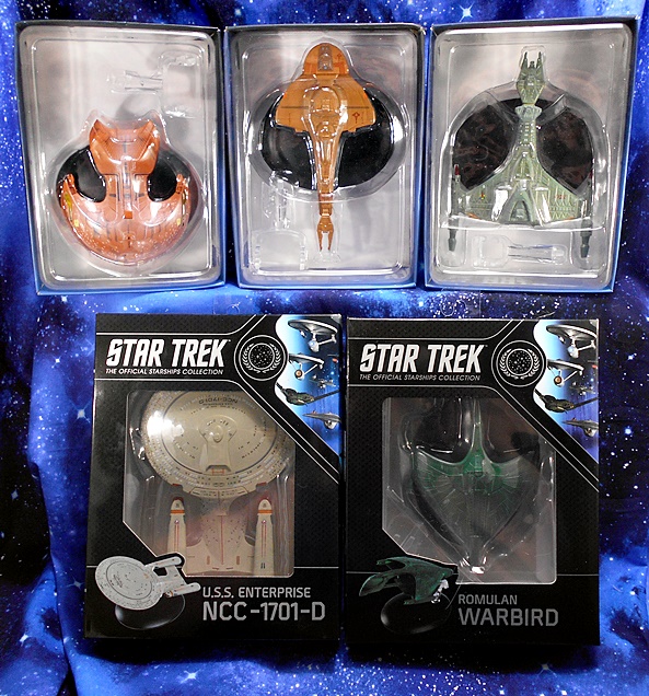
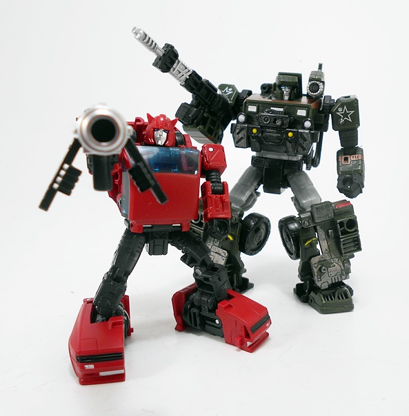
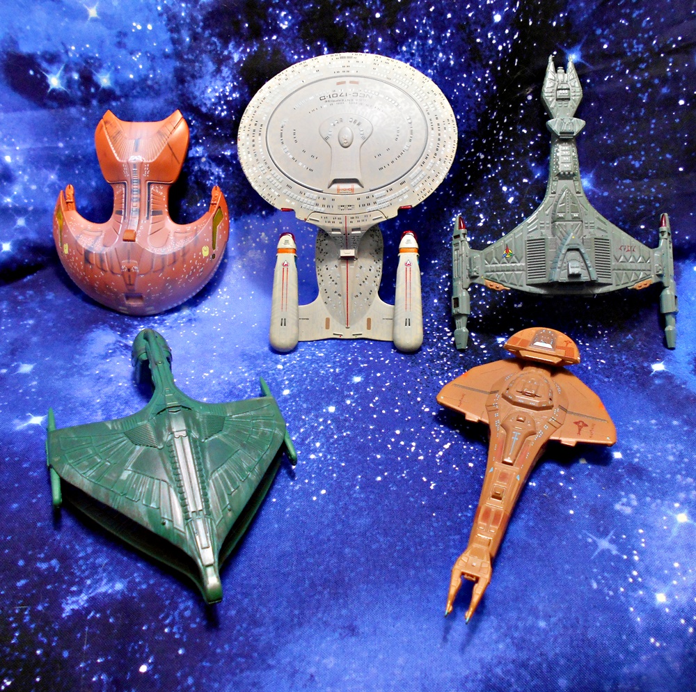
And here are they are! The Federation Flagship, The Romulan Warbird, The Klingon Vor’Cha Class Battlecruiser, The Ferengi Marauder, and the Cardassian Galor Class Cruiser. As you can see these come in two styles of packaging. The Enterprise and Warbird came in window boxes that are specific to the ship inside and include some nice artwork and a Collect Them All layout for the back panels. The other three ships come in generic boxes with no tops, just the clear cover for the plastic tray. I dig the window boxes more, but I have to respect the others that just let the models do all the talking. The Enterprise and Warbird come with booklets inside the boxes, while the others come with regular size magazines, usually in a bag with the box. The magazines are kind of hit or miss with me. I like the ones that focus on the ship, but clearly not all ships have enough backstory and details to fill a magazine so some just talk about the aliens or the stories they were featured in. Let’s start with the Flagship!

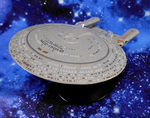
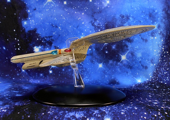
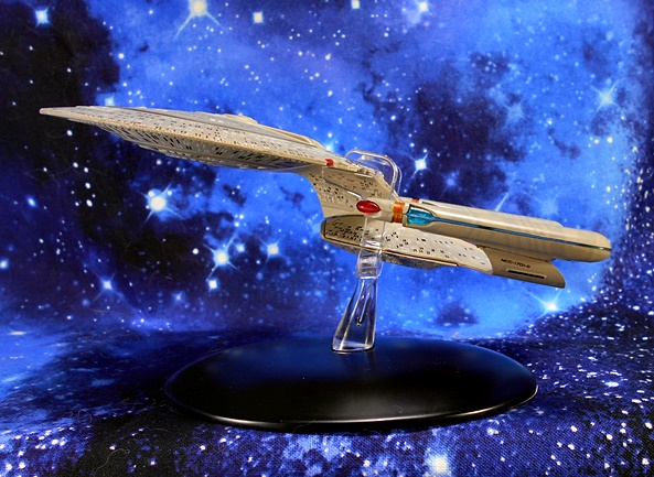
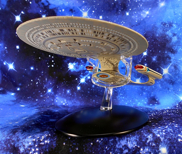
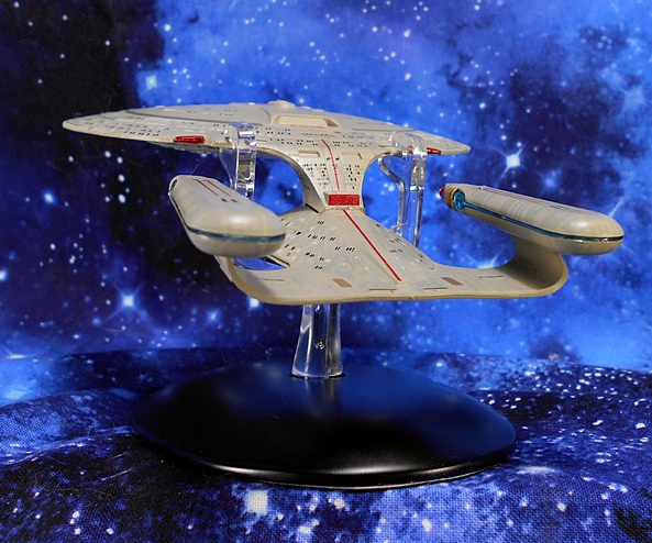
I’m going to save my long-winded opinions on the 1701-D, it’s design, and what the ship means to me for when I spotlight the XL version in the near future. For now let me just say that I’m blown away by the amount of detail Eaglemoss packed into this little ship. For the longest time, I didn’t collect this line because I just didn’t think the scale was capable of retaining the kind of details and quality of sculpt I was looking for. And we’ll see in a little bit that prejudice wasn’t entirely unfounded, but when it comes to this Enterprise, boy was I wrong! Just look at that saucer! Check out all the tiny windows individually painted either lit or dark! And escape pods! The crisp registry and sharp paint on the phaser ring! You even get some oh so subtle aztec-patterns. Granted, the Enterprise-D’s saucer is a pretty wide canvas to work on, but it’s still damn impressive.

They really nailed the profile of the ship as well. The tiny windows continue on to the Stardrive Section. You also get some purdy red and blue translucent plastic used in the warp nacelles and super tiny registry printed on the struts. If you look closely you can even see that they applied some of the subtle panel shading to the nacelles themselves. I’d also like to acknowledge that they did a nice job hiding the seams on this ship in plain sight by putting them in appropriate spots. The model is part metal, but mostly plastic and while it has a nice heft to it, those warp nacelles feel fragile!

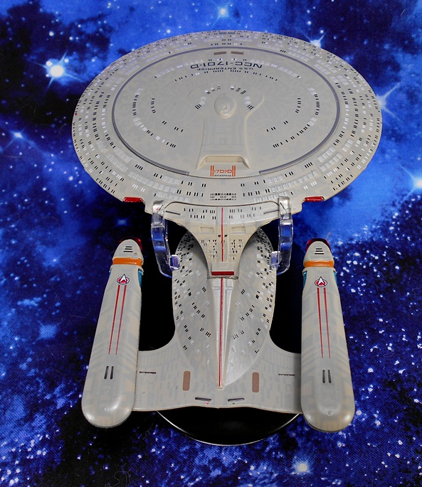
The same red translucent plastic used for the fronts of the warp nacelles is used for the three impulse engines. And there’s a sharp red racing stripe bisecting the ship from the saucer all the way down to the aft torpedo launcher. You also get the Deltas and racing stripes on tops of each warp nacelle the name printed on the horizontal face of the struts, and the name and registry printed in front of the Primary Shuttlebay Door. Want me to complain about something? The Shuttlebay Doors could have been more detailed. That’s all I got!

The deflector dish is comprised of more of that lovely red and blue translucent plastic, and the ventral side of the ship shares all the great detail as the dorsal section, complete with individually painted windows, and registry printed on the underside of the saucer. And before moving on to the next ship, this is also as good a place as any to talk about the stand, which is very high quality and very well designed. The base is heavy and made of metal with a felt bottom. The device that holds the ship up grabs the saucer beside each of the saucer impulse engines and also has notches for the Stardrive Section to rest on. It’s clear so it tries to obscure the view of the ship as little as possible. I took some issues with this style of stand when I looked at the XL Enterprise-A, but for a ship this size, I think it’s a pretty solid design that also lets you detach the ship and handle it without much trouble. Let’s have a look at the Romulan Warbird next.

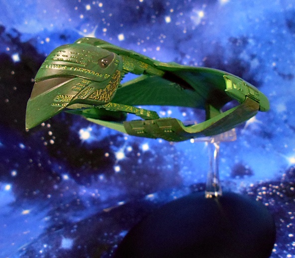
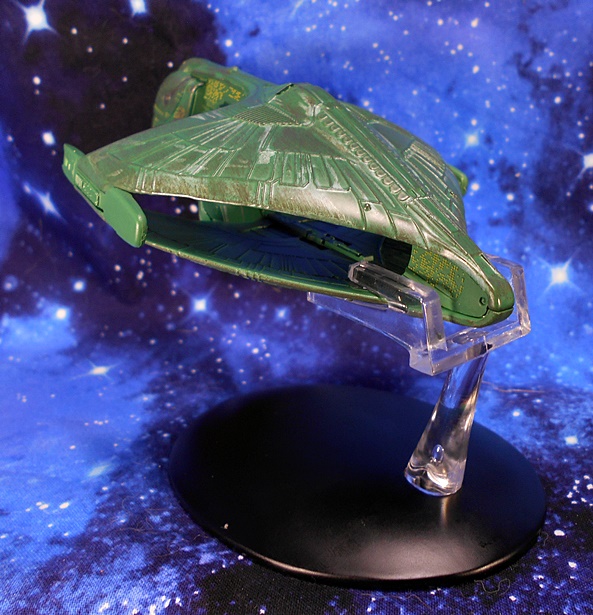
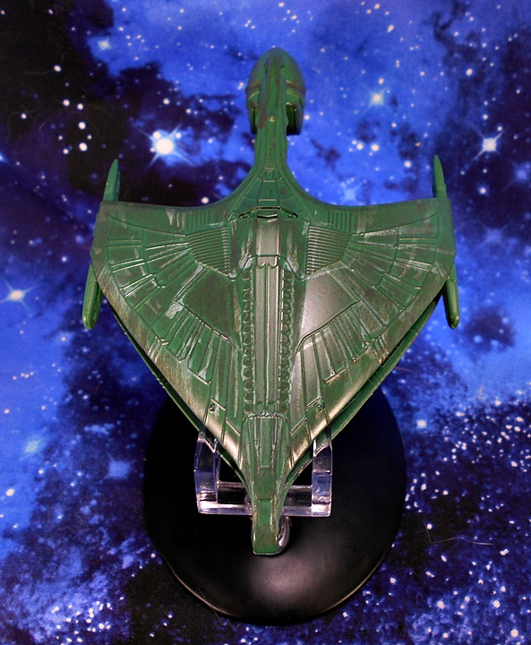
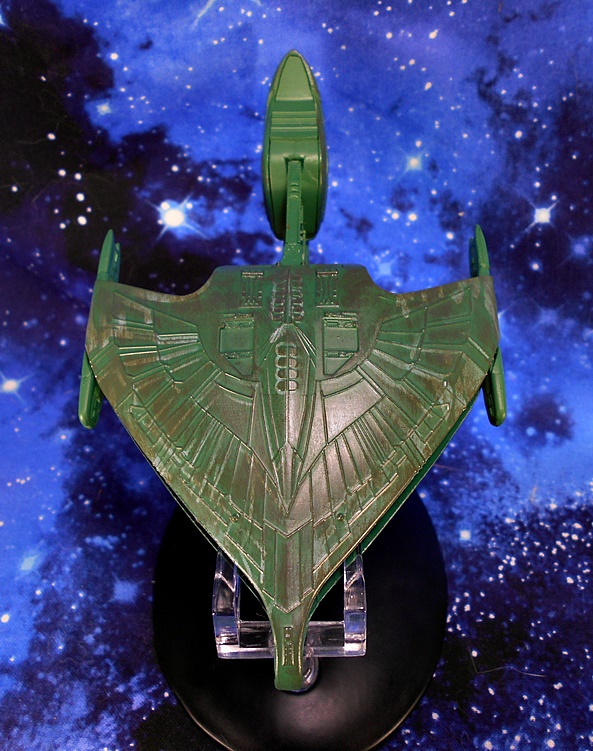
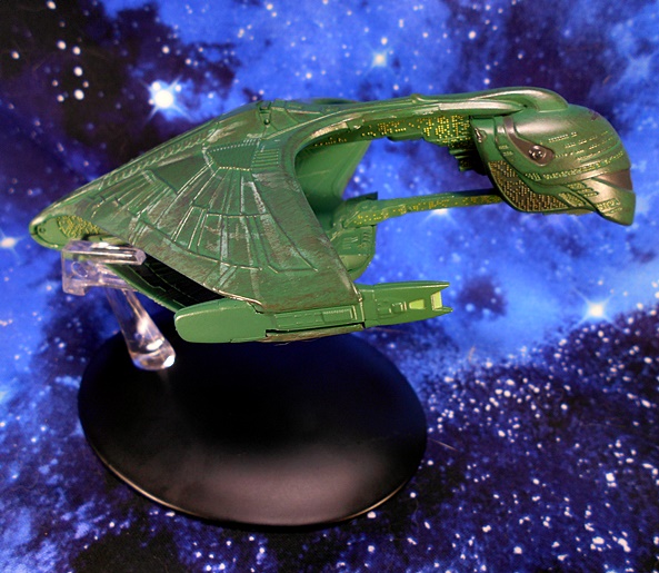
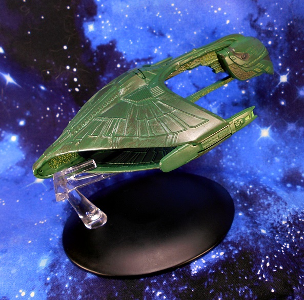
Oh boy do I love this design! Introduced in the Season 1 Finale, The D’deridex Class was fresh, original, menacing, and unlike anything we’ve seen before. And yet it has since become as iconic a Romulan ship design to me as the original Romulan Bird of Prey that I grew up with. And once again, Eaglemoss has done an amazing job recreating this behemoth battleship in a nearly pocket-sized scale. The green finish has a nice metallic sheen but it’s also washed over in some parts to help bring out some of the sculpted details and give it a bit of a weathered look, particularly along the rear edges of the top and bottom hulls. The ship always looked a little too new on the small screen, but this more seasoned version looks like it would have been at home on the big screen if the Warbird had ever made it into any of the TNG films.

There are panel lines a plenty on the outside and inside recreating a fanning feather-like pattern, as well as a segmented spine that runs up the center of the ship’s mighty back. It evokes the predatory bird motif without having to be quite as on the nose, and some might say cheesy, as the 1960’s Bird of Prey design.

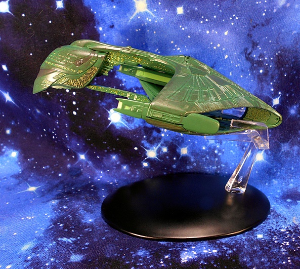
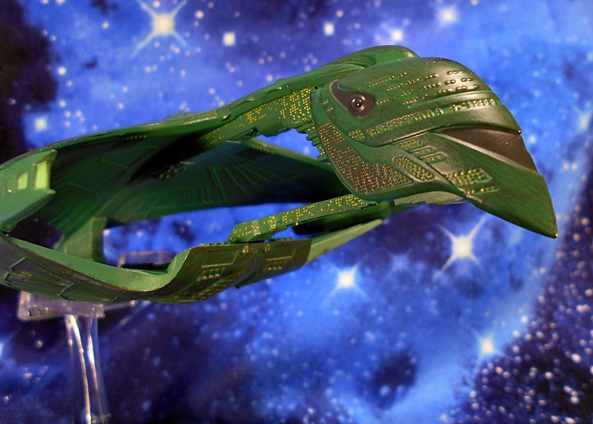
And much like the Enterprise, the craftsman of this model didn’t spare any expense when it came to windows. The hull is positively littered with them and it goes a long way to illustrating just how gigantic this ship is. Just look at all the windows on the strut connecting the bottom of the forward section to the bottom hull. Wow, this is a big ship! I was hoping we would get a little of that translucent plastic in the warp nacelles, but here it’s just a greenish-yellow paint. It looks fine, but it could have looked better.

The stand here mirrors the particulars of the Enterprise stand, although this one is a lot less obtrusive, as it grabs the ship from behind and gives it an upward incline. As a result you can view the ship on the stand from some of its best angles and not have to worry about it getting in the way. On the downside, my stand will not stay in the base, which is only a problem if I forget and go to pick up the ship, as the clear piece and ship will come right out of the base. But stand malfunction set aside, this is a great model of this fierce Romulan Warship. And from one mighty Empire to another, let’s turn next to the Klingon Vor’cha Class Battlecruiser!

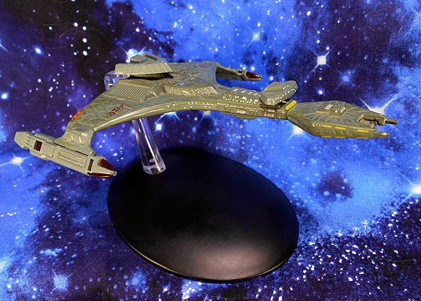
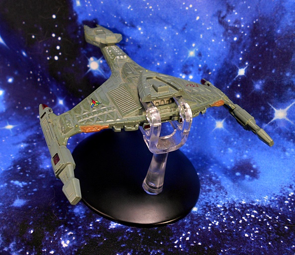
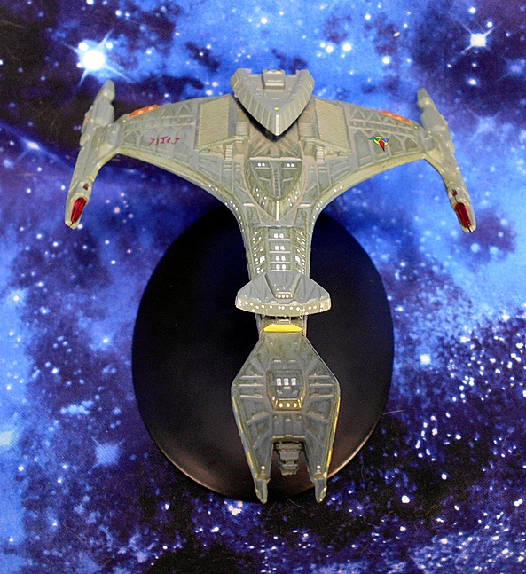
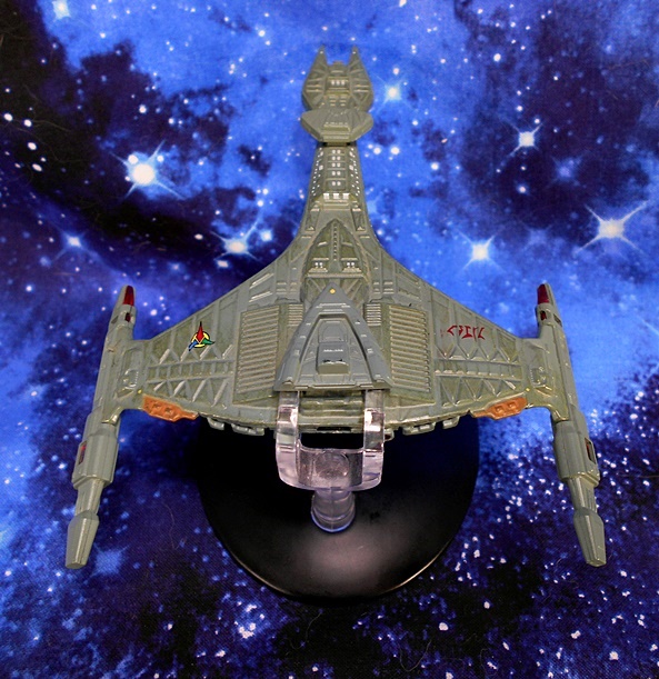
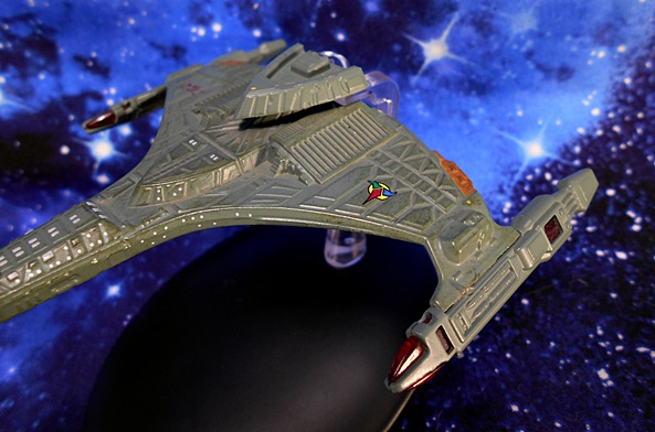
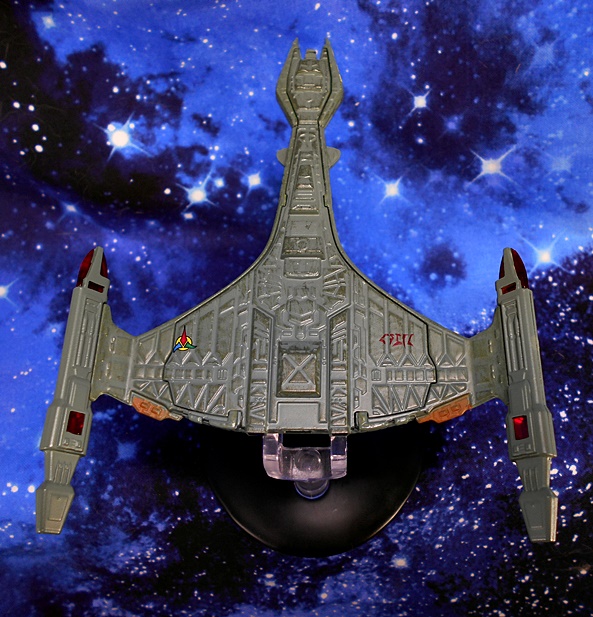
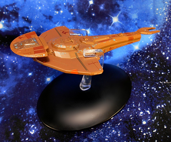
It’s no secret that TNG relied too heavily on the Klingon Bird of Prey. Oh, it’s an amazing ship design, but after being featured so prominently in Star Trek III, Star Trek IV, Star Trek V, Star Trek VI, oh yeah and Star Trek: Generations, it was nice to see a brand new Klingon ship eventually turn up in TNG, even if we had to wait until the 4th Season to get it. And The Vor’cha was an excellent design that invoked familiar Klingon elements while changing it up enough to make it still seem fresh to me. The Vor’cha is like a D7 on steroids with beefier engines and where the Command Deck on the D7 was at the terminal end of the boom, here it’s tacked on top and preceded by a Weapons Pod that looks like the Klingon equivalent of a giant Type-1 Hand Phaser. Ok, I guess that would be a Type-1 Hand Disruptor. But hopefully you get the point.

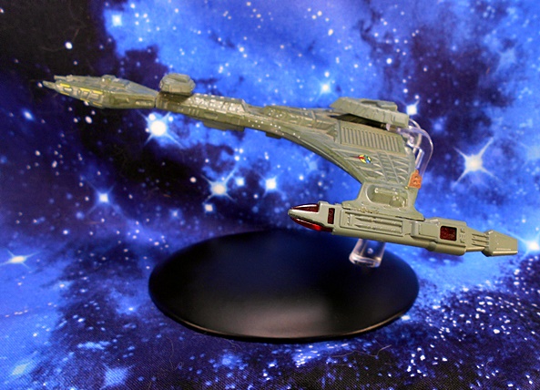
Once again there’s some excellent detailing on this little ship, although I’ll say straightaway that it doesn’t look quite as sharp or polished as either the Enterprise or the Warbird. Of course, that just may be that the Klingon ships tend to look a little grittier and less refined. The hull features very traditional Klingon Shield Plates, particularly in the wings leading out to the warp nacelles and in the area surrounding the Weapons Pod. In addition to lots of individual painted windows, you get the emblem of the Klingon Empire printed on the left wing and what I presume is the ship’s registry printed in Klingon on the right wing. Both of these last two details are also present on the undercarriage of the ship.

The warp nacelles makes use of that lovely red translucent plastic in the nacelles and it looks great, particularly with some light piping through them. You also get some orange paint on the Emergency Plasma Purge Vents located at the back edge of each wing. And like the Warbird, the Vor’cha has a wash that not only helps pick out the details in the sculpt but also gives it a well-weathered look suggesting that this Battleship has seen some action.

The stand here is very similar to the one used for the Warbird in that it grabs the ship from behind and allows you to view it from some of its best angles without getting in the way. And happily this stand holds together quite well. While this model doesn’t look as crisp as the first two ships, it certainly has a rugged and seasoned flavor about it that suits a ship in the Klingon Navy. And now that we’ve covered The Big Three, let’s work our way down to a couple of the lesser powers… starting with the Cardassian Galor Class Cruiser.

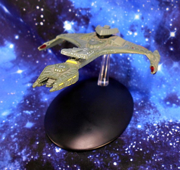
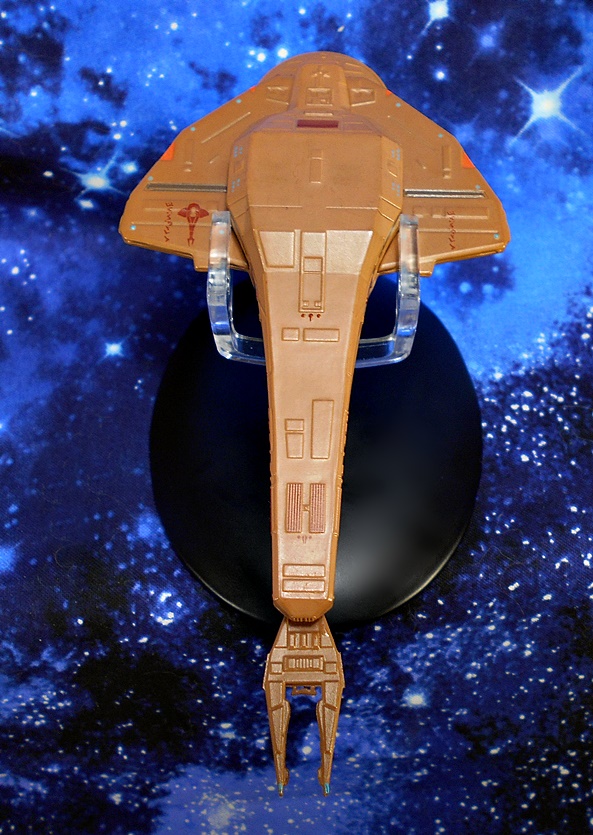
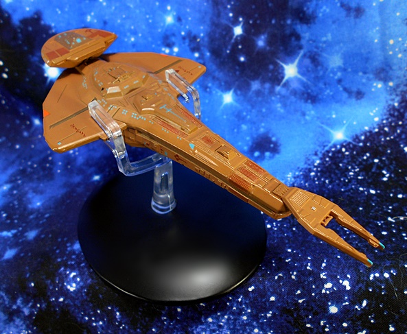
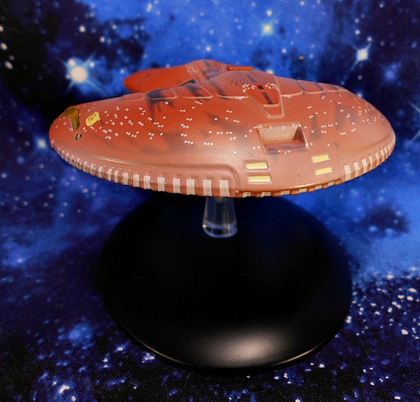
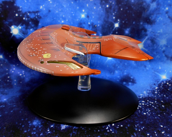
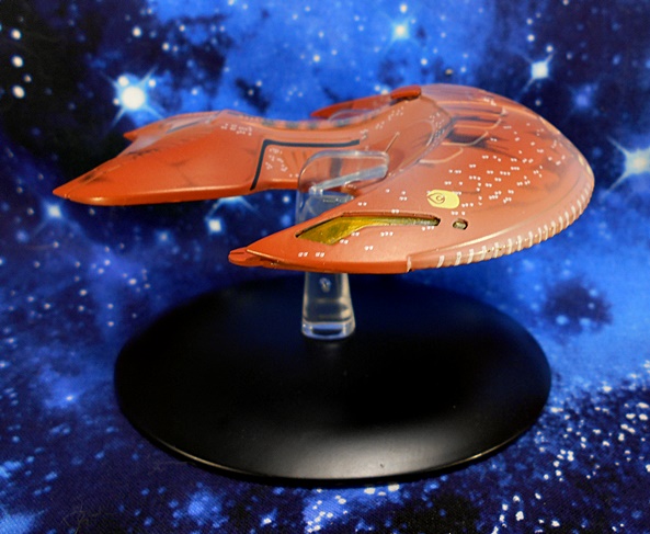
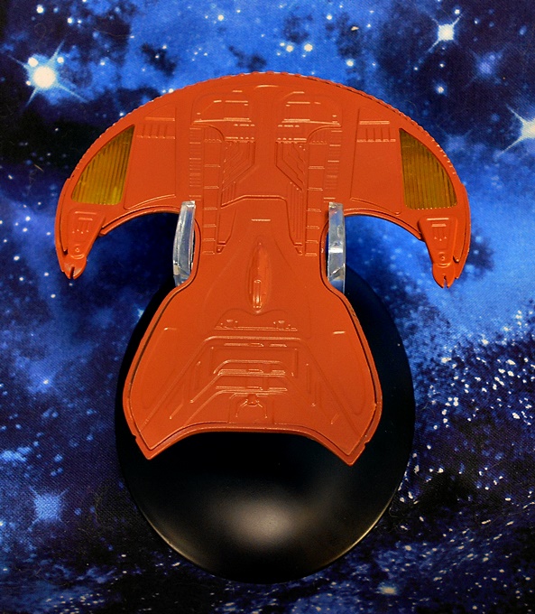
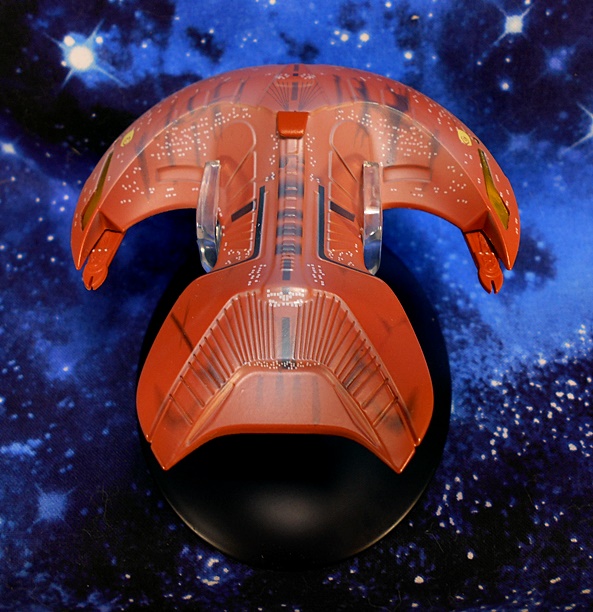
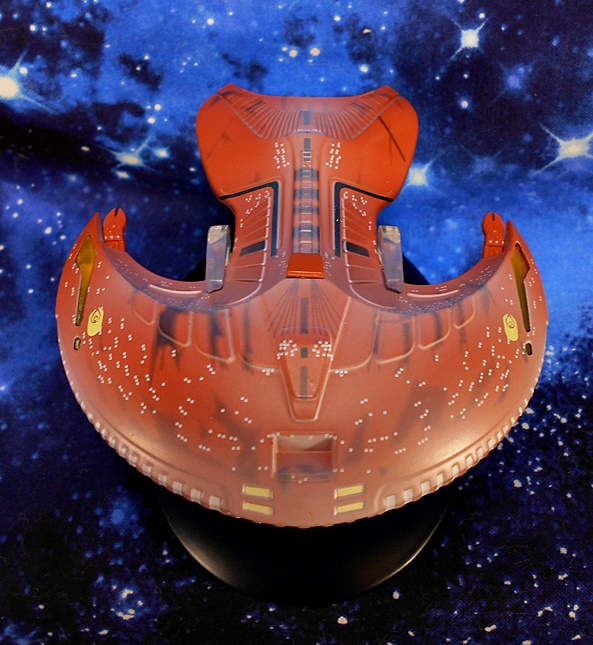
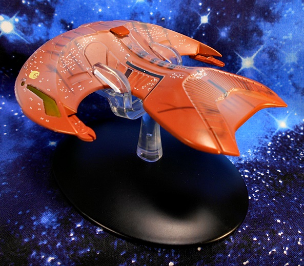
I was tempted to not include the Galor in this piece on iconic TNG ships because to me this ship really didn’t become iconic until Deep Space Nine and the Cardassians didn’t even show up until TNG was more than half over. Nonetheless, it first appeared in this series, so I’m throwing it in. I’ll also confess I was rather excited to look at it since I’ve never owned a model or toy of this ship before. The Galor is a very cool design, resembling an earwig and automatically giving me the willies. My only real nitpicks with it is that it doesn’t have that one sweet spot for a beauty shot like most other ships do. It doesn’t look like much when viewed at level profile or from dead on. Nonetheless, this is another great model for the line. On the surface, I thought this ship lacked detail, perhaps because it’s hull isn’t covered in panel lines. But once I got in close with the camera, it’s still got the same level of detail as the other ships including tiny windows, insignia and registry markings.

I really don’t know much about this ship’s anatomy, so I perused a set of blueprints so I could better understand I’m seeing. I presumed the orange triangles are weapon, but those are actually called out as the Warp Engines. How that works, I’m not sure, but cool! The model uses red translucent plastic for the Main Disruptor cannon, which apparently doubles as a Deflector Dish. Again, I’m not sure how that works, but cool! I really dig the hatches tucked under the wings, which are apparently for offloading cargo or troops.

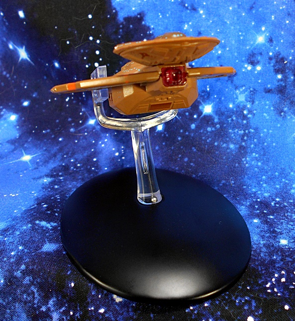
Once again, we have the same type of stand, only hear it’s designed to grab the ship from behind it’s wings. It does obstruct the view a bit, but that’s why it’s cast in clear plastic. And to be fair, there’s really nowhere else it could have grabbed the ship and adequately supported it. And that brings me to my last stop on this trek…

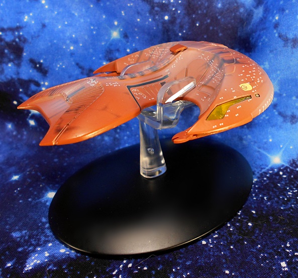
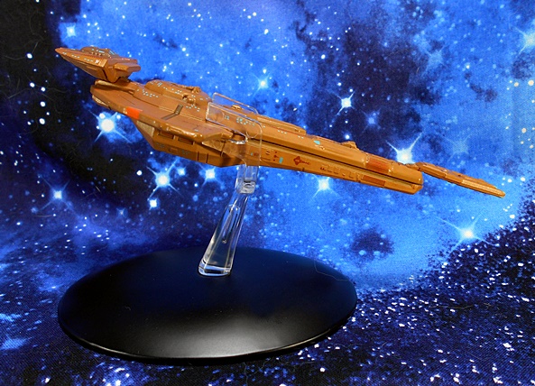
I was in love with the Ferengi Marauder the first time I saw it. It’s a shame the Ferengi didn’t work out quite as the writers had planned and we rarely got to see this ship, because I think it’s a really cool design. The model favors paint applications over actual sculpted detail, with most of the hull being smooth. And I’d say that’s probably a fair representation of the screen appearance. And like the Warbird, the painted windows on this ship do a fine job of portraying just how big this ship is supposed to be. Still, I don’t think it would be unfair to say that this survey of ships is offering diminishing returns when it comes to the amount of detail injected into them. I didn’t really plan it that way, but there you go!

The model makes use of translucent yellow plastic used for the warp engines, which can be seen from the sides and the undercarriage as well and look pretty damn sharp. You also get the emblem of the Ferengi Alliance printed on each side just above these engines. The weapon emitters at the tips of the wings look like little pincers, and the notches that run alongside the bottom edge of the ship’s aft hump are all painted.

Unfortunately, there are two things about this model that really bug me. The first is that when viewed from the front, the crescent hump that makes up the back section of the ship doesn’t look tall or steep enough. The screen appearance makes it look a lot more pronounced when compared to the Command Section. Now, maybe that’s just me or maybe a trick of the camera, because I’m sure these models are based on detailed research, but it just doesn’t quite look right to me. Secondly, and less subjective, is the white wash they used. It dulls the color of the hull and I can’t comprehend what kind of effect they were going for here. It bothers me a lot with the ship in hand and even in my pictures it looks like the results of harsh lighting. At least the other wash they did to denote weathering looks great. I’d be keen to see them take a stab at this ship in the larger XL line and without the white wash.

The stand grabs the ship from the front of it’s crescent and does a good job holding it and not being too obtrusive. I will, however, point out that, in the cases of all the stands, I worry about friction and how much taking the ships off and putting them back on will cause paint rubbing.

And there you have it, five iconic ships from The Next Generation all presented by Eaglemoss and, for the most part, they’re all very well done. Even the Marauder would be fine if they gave it a simple repaint. As a FASA miniature junkie from days long past, I’m always up for building me a fleet of little collectible Starships and Eaglemoss has me covered quite nicely with this series. These models are great examples of quality and craftsmanship and offer a fine alternative to fleet building if you’re looking for something more substantial than Micromachines and more varied than any other toy or model company has churned out. The magazines are a nice bonus, but they aren’t the high point of this line to me. The five ships I showcased today ran me between $17 and $25, which sure isn’t bad if you have that one (or handful of) special ship(s) you want to put on your desk. It does, however get rather pricey when you’re looking to Collect Them All, or at least a good chunk of them. On the other hand, it’s a big break from spending seventy-five bucks a pop for the bigger XL ships.

Star Wars Black (ESB 40th Anniversary): Rebel Hoth Soldier by Hasbro

Hasbro has rolled out some vintage style carded packaging for the 6-inch Black Series to celebrate Empire Strikes Back‘s 40th Anniverary. Most of these seem to be repacks, and I’m not double-dipping on any of these just because of the packages, but I sure as hell wanted some Hoth Troopers. Since I never find these on the shelves, and since I really don’t care about the package, I went ahead and pre-ordered this one on Amazon a while back, accepting the fact that it would arrive a crumpled mess, and I’ll just have to try my luck at the pegs to pick up a couple more.

All I see are horror story pictures on Twitter of collectors receiving these all mangled. Imagine my surprise when mine showed up in a simple padded mailer and yet still managed to arrive unscathed. Now don’t get me wrong, I do really dig the presentation here. The card looks great! It tickles me in the nostalgia zone and I like the foil 40th Anniversary box at the top. And as wonderful as it all looks, the figure looks every bit as good! But I got no room for keeping 6-inch carded figures, and this ain’t collector friendly, so let’s rip this baby open and have a look.

These fellas sure have gotten a lot more screen accurate since the Kenner days! Indeed, I’m beside myself with how much detail Hasbro packed into this guy. The arms and legs feature that familiar quilting that turns up on pretty much all of the Hoth Rebels, and I dig the crisscrossing straps on his boots. He has a sculpted pouch on his right bicep, just under what I’m going to guess is a unit designation. He also has his comm panel sculpted into his left gauntlet so he can all back to Echo Base and report Wampa sightings! The vest and lower part of his tunic are cast in soft plastic and attached to the figure to give the costume some nice depth. Dress in layers, it’s cold outside! There’s a sculpted military-style belt with a pouch and six grenades sculpted into the front right side of the tunic, as well as his rank insignia on the left side of his chest. He also has a functional holster for his pistol, and the kerchief around his neck is removable, but it’s cold on Hoth so I can’t imagine why he would want to take it off.

The backpack is an impressive piece of kit. It has a sculpted covering with all the little buttons and stitch marks and exposed sections of the packs instruments, along with cables feeding out of them and an antenna. The pack is removable, it simply pegs in the figure’s back and there are also two clips coming off the sides of the vest that tab into slots in the pack. The pack also has a hidden compartment, which houses a second face plate, just like that first Destro figure back in the old GI JOE: Real American Hero line!

The figure is packaged with the clean shaven face that I’ve been showing all along. It looks like this was Hasbro’s attempt to reproduce the soldier depicted on the card, and it does a pretty good job of it. He does look really young to me, but then Hoth wouldn’t be the first battle that sent kids off to fight. I also like that he’s got some rosy cheeks because it’s so cold! The helmet has a quilted hood with a comm device sculpted onto the side, a plastic scarf flap hanging off the other, and a pair of goggles on elastic that can be worn up or over the eyes. I think the goggles look better worn up than they do on over the eyes.

Hasbro took a page from the Figma/Figuarts book when it comes to the face plate. Pop off the top of the head and you can peel off one face and replace it with the other. The alternate face is bearded and looks more age appropriate for the horrors of ice trench warfare. I actually like this portrait a lot and until I can get a second one of these guys, I’m going to go with this face for regular display.

There are no surprises to be had in the articulation. The arms have rotating hinges in the shoulders, elbows, and wrists. The legs are ball jointed at the hips, have swivels in the thighs, and double hinges in the knees. The ankles have hinges and lateral rockers. There’s a ball joint hidden up under the vest, and the neck is ball jointed. The lower part of the tunic does get in the way of leg movement a bit, but the sides are slit and that helps a lot. I still prefer the double-hinged elbows and rotating hinges of Hasbro’s Marvel Legends line, especially when dealing with rifles, but what we get here certainly isn’t bad.

The Rebel Soldier comes with two weapons, a standard DH-17 pistol and an A280 rifle. Both of these are highly detailed sculpts and I even took a moment to admire how well the rifle matches the one seen in the film. My only nitpicks here are that they didn’t spare a little silver paint for the muzzle of the pistol and I would have liked a sling on the rifle. Hell, even the rifles that came with some of the Kenner Hoth figures had slings! The Rebel’s right hand is sculpted with a trigger finger that works well with both weapons and he can cradle the rifle in his off hand. The pistol fits very well in the holster.

I know I say this a lot, but I’m constantly teetering on whether or not to keep collecting this line. Too often, it feels like Hasbro is just phoning in the figures and not taking advantage of the larger scale. But then, just when I’m at that precipice and ready to jump off, Hasbro produces an amazing figure like this one. It’s kind of sad that they have released more than a few main characters in the line that don’t have the care and attention to detail that this nameless soldier does, but that doesn’t make me appreciate him any less. Quite the contrary. It’s releases like this that realize the potential of the line’s scale and status as “collector” figures, and keep me hanging around a little while longer. Now hopefully he’ll get a regular boxed release so I can get a couple more!

Marvel Legends (Banner Hulk Wave): Shuri by Hasbro

My last excursion into Marvel Legends (several Marvel Mondays ago) saw me randomly drew Beta Ray Bill from the Pile-O-Shame, and I decided that I might as well finish off that wave and open the remaining figures. Keep in mind, I’m not building the Hulk BAF (those parts went to my nephew), but I’d still like to put the rest of this assortment to bed, since it’s already pretty stale. And so today I’m checking out the Princess of Wakanda, Shuri from Infinity War!

Black Panther is a Marvel movie that I enjoy coming back to, but very rarely ever finish. The beginning of that flick (let’s say the first third or so) is easily it’s high point for me and I really dig the stuff between T’Challa and his deceased father, but by the time I get about halfway through it, it starts to lose me and the movie feels like it fizzles out. And the less said about the final battle the better. Sometimes, I’ll just finish it in multiple viewings, but it’s safe to say I’ve seen the first half of it a lot more times than the rest. With that having been said, Shuri was a fun character and I was glad she got some screen time in Infinity War and Endgame. I was irked that she was conspicuously absent from the Marvel Legends Black Panther-themed waves, but now all is forgiven.

And here she is looking fine in her Wakandan garb. The outfit is recreated with lots of sculpted detail and some very subtle texturing, which looks like some kind of advanced fabric weave. It’s so subtle that I really have to turn the figure around in the light to reveal it. I dig that! You also get some sculpted panel lines and some beautiful detail on the neck piece, shoulders, and chest. The deco is a mix of brown, tan, and glossy black along with some copper piping. Meanwhile the sculpted bicep bands are like a gun-metal gray. As always I appreciate the mix of gloss and matte finishes that Hasbro often does with these MCU costumes.

Shuri also sports a sculpted plastic sash around her waist, which drops down behind her legs. It’s textured like fabric with some sculpted stitch lines and a very fine frayed edge along the bottom. It’s meant to be held on by a sculpted belt-buckle looking device colored to match her arm bands. As much as I love the look of this waist garment, it does unfortunately impede her leg articulation.

Generally speaking, Hasbro’s MCU likenesses have been excellent and I think that’s the case here as well. It’s certainly recognizable to me as Letitia Wright. She has some sharply placed dotted face paint, and the hair sculpt is extremely well done, especially the patterns on the back of her neck.

Getting back to articulation, Shuri’s is pretty solid, with a couple of my usual nitpicks. The arms have the standard rotating hinges in the shoulders and wrists, but she’s a gal and we all know Hasbro only gives the ladies rotating hinges in the elbows, instead of the double-hinged elbow with bicep swivels that the dudes get. Shuri also has those weird elbow hinges that kind of stick out when the arms are bent at their 90-degree extremes. The rest is fine, though. She has ball joints in the hips, double hinges in the knees, swivels in the thighs, and both hinges and lateral rockers in the ankles. She has a ball joint under her chest and the neck is both hinged and ball jointed.

Shuri comes with her vibranium gauntlets, which clip onto her wrists. They hold on very well, but I think it would have been cool to have these swap out with her hands to make them fully enclose her forearms. Either way, the sculpts look great and they each have some translucent blue energy crackling from the ends.

Shuri is a great little figure and I’m so very glad we finally got her in the Legends format. Hasbro did quite a beautiful job on the her, but that’s par for the course with pretty much all of their Black Panther figures. Heck, adding her to my collection makes me want to double back and finish off that M’Baku Wave. And speaking of which, while I did say that I’ll be finishing up the rest of this wave, I think next week I’ll detour back to the M’Baku Wave so that I can finally open Ulysses Klaue.

TRON: Tron and Sark by Diamond Select Toys

In the past few weeks, I’ve taken a spin through the various figures based on the failed franchises that Diamond Select has raided from Disney’s dumpster. We saw figures from The Black Hole, we saw a figure of The Rocketeer, and now I’m checking out their figures from the original TRON. And yeah, TRON may have been a failed franchise, but I have an unending reservoir of love for it and it’s sequel. I can remember my poor parents hunting everywhere for those Tomy TRON figures and Lightcycles when I was a kid, and while I was beside myself with joy when I finally got them… Getting these DST figures as a kid would have been like a dream come true.

Here they are in their collector friendly window boxes, and like most of DST’s figures these Programs are about seven inches tall. The history and distribution behind these figures is a bit convoluted. I’m pretty sure that these are the same figures DST released as part of their Kingdom Hearts line, but I’ve never been a fan of those games, and so those passed me by. The pair I’m looking at today were available in different versions of this assortment. I found these at Walgreens, but there are other versions that include some effect parts. There was also a third figure, Flynn included in this assortment, and a red Infiltrator variant included with the others. Regular Flynn is supposed to be hard to find, but I managed to find one online just yesterday and I’ll probably review him to at some point. For now, let’s start with Tron.

He fights for the Users! I am still so smitten with the aesthetics of the original TRON, but I think it’s one of those things where you had to be there for it. The suits, which were lit up in post-production, are something that isn’t easy to translate into action figures. That’s probably why Tomy went with translucent colored plastic when they made their figures. It was a neat effect, but it didn’t really look like the characters on the screen. Here, DST has done a pretty fine job embracing the actual character designs. Tron features a body cast in pale gray with the piping and circuit patterns printed on in light blue. Sure, it lacks the vibrant lighting effect the Programs had on the screen, but it otherwise looks great. Some of the blue effects are part of the sculpt, but overall Tron’s body utilizes sculpted details sparingly. You get some rumpling and definition in the boots, he has his tubular arm bracers, which extend over the backs of his hands. and finally the armor pieces on his shoulders and biceps.

The portrait is a pretty solid likeness for Bruce Boxleitner. It’s a little over simplified, but I can definitely recognize him in there. I like the gray paint they used for his “skin,” although in some shots from the film it’s not much different from the pale gray of the suit. This is a case where it may not be 100% accurate, but it looks good on the figure. The helmet looks like it might be sculpted from a separate piece, which gives the whole head sculpt some appreciated depth, and it has more of those great blue piping and circuit patterns printed on it.

The articulation here is quite good, and I’m particularly pleased to see DST went with ball joints in the hips, rather than those weird lateral hinge and T-crotch they often favor. The arms have rotating hinges in the shoulders and wrists, there are swivels in the biceps, and the elbows have double-hinges capable of very tight bends. The legs have swivels in the thighs, double-hinges in the knees, and the ankles have hinges and lateral rockers. There’s a ball joint just under the chest and another in the neck. The joints are all strong and serviceable, making Tron lots of fun to pose and play with.

Tron comes with two accessories: His Identity Disc and a plain black stand. The Disc has a peg which allows it to be stored on his back, like in the film. He can sort of hold the disc by sticking the edge between his thumb and index finger, but it’s certainly not a tight grasp. I had to make use of some blue-tack to keep it in place for many of these pictures. Let’s move on to Sark…

Sadly, I don’t have as much to say about Sark because I’ve already covered it all with Tron. But don’t let the fool you into thinking that I don’t love this guy. General to The Master Control Program, Sark was a great villain and a pretty damn cool character design. Pretty much everything I said about Tron’s body rings true for Sark, only he features a darker gray plastic and red piping and circuit patterns. His suit is also a little more bulky than Tron’s, which makes him look a little more imposing. Despite the different suit, the articulation remains identical.

While Tron’s portrait was solid, I think Sark’s is spectacular. David Warner is my boi. He just makes everything he appears in better, and the folks at DST did a wonderful job with his likeness on this figure. I’m also a big fan of Sark’s elaborate helmet. It’s like a hood with extra bits added to protect his noggin when he’s engaging in those crazy games. I really can’t say enough good things about how well this head sculpt turned out.

And like Tron, Sark comes with his Identity Disc, which can be pegged into his back for storage or sort of held in his hands if you have a little patience and don’t jostle the table he’s standing on too hard. He also has a plain black figure stand, which really isn’t necessary since these guys stand great on their own.

If you can’t tell, I absolutely love these figures. Maybe some of that comes from the fact that these are fulfilling a wish that I’ve had since I was a little kid, but I think a lot of credit has to go to Diamond Select for the work. These feel like a labor of love, because why else would they release them? I doubt these are going to be best sellers for them, because despite the big-budget sequel, I feel like TRON continues to languish in a sort of cult status. Sure there are other middle aged nerds like me who remember it and appreciate it and will want to own the toys, but I don’t think that will translate to big sales. And as I write this, I’m kind of talking myself into buying the other versions, if not just for the extra effect parts, but also just to show DST how much I appreciate these and how badly I want a second wave with Ram, Yori, and a Warrior. Oh man, I can’t imagine how good a Warrior would look in this line.

One Piece “Treasure Cruise World Journey, Vol. 1:” Luffy, Nami, and Roronoa Zoro by Banpresto

I’ve come to face the sad fact that I’m going to have to give up buying prize figures. Yeah, it sucks, but space continues to grow tight and I refuse to rent a storage to throw toys into. Eventually something has to give and I’ve ultimately decided to make one of those cuts here. Now that doesn’t mean these will be the last prize figures I review here, because I still have a bunch left to open. It also doesn’t mean I won’t make the occasional exception and buy something that I can’t live without, but the casual buying stops here. No, really. I mean it!!! I know that’s a bummer way to start a review, but let’s press on and check out three fantastic figures from my favorite of guilty pleasures, One Piece!

Mosey on aboard, Pilgrim, and bring along, all your hopes and dreams, Pardner! It’s One Piece meets Wild West? Yes, please! That’s what World Journey Vol. 1 is all about. Banpresto has been delivering on some wonderful fresh takes on the One Piece crew and this one is just right up my ally. As usual, these figures are roughly 9-inch scale and come in fully enclosed boxes, which are very colorful and are confident enough to let pictures of the figures themselves do the talking. These are imports, but there’s enough English copy on the boxes to help you know what you’re getting. Each figure requires a little bit of simple assembly to get them ready for display. Let’s start with Luffy!

Our favorite rubber pirate comes donning his Old West duds and looking damn great! Luffy stands with confidence with his left hand resting on his gun belt and his right hand reaching for the brim of his hat. The figure gets his rather lanky proportions down quite well and the details in his outfit are exceptional for a figure in this price range. His cowboy boots feature scrollwork patterns, and I really dig how they’re sculpted so the jeans disappear into the tops of the boots. That really gives the figure some fabulous depth. The jeans show sculpted rumples and wrinkles, he’s got a red billowy sash tied to the back of his belt and a leather-like vest on top of his pale green shirt. The vest has sculpted buttons set in a zigzag pattern and frills hanging off the pockets. His shirt sleeves are cuffed just above his wrists and he’s wearing a pair of work gloves.

Luffy’s primary belt has a big gold belt buckle and his secondary gun belt hangs low on his hips with a holster attached to a sculpted thigh strap and a row of cartridges. The holster has two buckles and you can see his shootin’ iron protruding from the top and ready for a quick draw. I’d love to see this gun out of the holster, because with the way the grip is configured it almost looks like some kind of hybrid between a six-shooter and an old fashioned pirate pistol.

No matter what he’s wearing, it’s easy to recognize Luffy in this head sculpt. His saucer-like eyes and his broad slit of a mouth give it away. His neck is wrapped in a red scarf and his black hair  spills down out of his brown cowboy hat. I think they did a fantastic job transforming one of my favorite pirates into a cowpoke and Luffy looks like he was made for the role. I should note here that all three of the figures came with bases that attach to the feet, but the one I got with Luffy was sadly cracked. Fortunately, he doesn’t need it to stand. Next up… Roronoa Zoro!

The infamous swordsman sets aside his three katanas in exchange for a trusty lever-action rifle. He stands proudly with his right hand on his hip and his left hand cradling his rifle on his shoulder. Like Luffy, there’s some amazing detail work on this figure’s costume. The boots have sculpted brass-painted tips, his blue jeans are accompanied by a pair of black chaps, and just a little bit of his vest can be seen underneath the billowing duster. The flaps of the duster have individually painted gold clasps, while the sleeves feature reinforced elbow pads and the sleeves disappear into a pair of brown gauntlets. And the top half of his outfit is obscured by a red poncho-like garment.

Roanoa’s portrait is excellent. He’s expression exudes confidence as he peers out from his good eye. His green hair can be seen disappearing into his cowboy hat and he looks like he’s just itching for a fight. I know if I saw him enter the Saloon, I’d clear out the back lickity-split!

I love the detail they put into his rifle. The stock has a brass band sculpted around it along with a couple of plates stamped with X’s. There’s a sculpted saddle ring and sights. The stock and foregrip are painted in a deep brown finish and the rest of the weapon is in gun metal gray. And now that we’ve looked at The Good and The Bad, let’s check out The Beautiful…

Nami rounds out this trio of Straw Hat Plains Drifters looking as dead sexy as ever! She was actually the figure in this series that caught my eye first, which I’m sure is a surprise to no one. She may be dressed as a cowgirl, but she’s leaning forward, advertising her pirate booty, both aft and stern, while bringing her six-shooter up to the ready (practicing poor trigger discipline, I might add!) and offering an alluring wink. Down below, her outfit consists of high brown boots with scrollwork patterns, etched on the sides, and a pleated blue skirt, which leaves little to the imagination, Up above she’s got a glossy black top holding up her cowpokes and a sculpted red blouse open at the top and tied at the bottom. She has a full glove sculpted onto her shootin’ hand and a finger-less glove on her left.

Banpresto has become experts at sculpting the portraits of pretty much the entire Straw Hat crew, but I think they probably know Nami best of all. They always manage to capture her whimsy and spunk, no matter what outfit she happens to be in. I really dig the wild sculpt to her orange hair and the way her cowboy hat is perched almost on the back of her head.

I was already trying to swear off Prize Figures when this trio went up for pre-order, and even a whole wagon full of willpower wouldn’t have been able to stop me from buying these once I saw them. I’m a sucker for everything Old West, from history to fiction. I love shooting my old-timey single-actions revolvers and lever guns, and I scarcely let a weekend go by without having a Western playing on the TV. So naturally when you mash that up with One Piece, one of my biggest guilty pleasures, it’s money already spent. But thankfully not a whole lot, because these beauties set me back only $22 each and for the amount of detail and care that went into their design and execution, I couldn’t be happier with how they turned out. My only sadness is they didn’t work Usopp into this line.

Spider-Man Homecoming: Quarter-Scale Spider-Man by NECA

I decided to spend one more Marvel Monday on something else before returning to my Marvel Legends backlog, and today we’re going BIG! I love NECA’s Quarter-Scale figures, but they don’t love me back. Or more accurately, they don’t respect my available space. These figures are often amazing, but they need so much room to display, and that’s something that’s in constant short supply in the toy warehouse that I call a home. And so I swore off collecting this line a while back, and I probably swore it off again two or three more times since. I was good for a while, but then I found an amazing deal on the Quarter-Scale Homecoming Spider-Man and all bets were off. “Space be damned!” I shouted! “Get into my shopping cart, you magnificent wall-crawler!” And that brings us to today’s review!

These figures come in huge window boxes with lots of colorful artwork on the panels. They show off the figure very well, so if you’re buying one at a brick-and-mortar store you can really scrutinize the paint on the one your selecting. The packaging also does a great job of concealing the extras, which are trapped under a bubble inside the side panels of the inner tray. These are also the only aspect of the box that’s not collector friendly, but if you tear up the sides to get at them, it really doesn’t show and the figure will still display just fine in the box with the extra pieces rattling around on the bottom. And just to put the size of these Quarter-Scale figures into proper perspective, here’s a quick shot of this figure beside Hasbro’s 6-inch Marvel Legends Homecoming Spider-Man figure.

Yeah, he’s big! And with great size comes great heft. A lot of the so called “Big Figs” I have seen put out by other companies tend to be mostly hollow, but NECA’s are mostly solid chunks of plastic. As a result, this figure weighs a lot and feels so satisfyingly solid in hand. You could use it as a club and seriously hurt some. So please don’t do that!

It’s safe to say that I was a big fan of Homecoming, but even more so I absolutely loved the design of this suit. It manages to look fresh and new while still evoking a sense of the classic Spider-Man I know and love. Every bit of the figure’s surface is covered with a basketball-like texture, you get some raised panel lines in the blue sections, and the red sections have the sculpted and painted web pattern running throughout.  The black bands on the tops of the boots and the shoulders are sculpted, as are the black frames on his forearms that support his web shooters. I also absolutely love the detail in the black strips on his waist where he stores his extra cartridges of web fluid. The tiny sculpted spidey logo on his chest is the only thing I’m cool on when it comes to this design. I wish that was a bit bigger, but that’s not the figure’s fault. Happily, he does have a much bigger emblem on his back, which looks great in red against the blue background..

You get two head sculpts with the figure, one masked and one partially unmasked. I will mostly be displaying him with the masked head, but it’s nice to have options. The The masked head features regular wide open eyes and the unmasked has narrower eyes, but these are interchangeable between the two. You just plug them out of the head and peg them into the other. It’s not a huge difference, but I like that NECA incorporated that ability to swap them out.

While other companies are content to do their “Big Figs” with five points of articulation, and sometimes less, NECA really loads these things up. The arms have rotating hinges in the shoulders, double-hinges in the elbows, hinged pegs in the wrists, and swivels in the biceps. The legs have heavy ratchet joints in the hips to help Spidey stand in even wide stances, the knees have rotating hinges on top and an extra hinge below. There are no thigh swivels, but the upper knee joint and hip joints take care of that. The ankles have rotating hinges and the feet are hinged. There’s a well concealed swivel in the waist, a not-so-well concealed ab crunch hinge, and the neck has ball joints on the bottom where it meets the body and the top where it meets the head. In short, this guy may be big, but he’s loads of fun to play around with.

Spidey comes with a bunch of extra hands. Actually, these sets of hands pretty much account for nearly all his accessories. You get some relaxed hands, some hands with splayed fingers, some fists, some THWIP hands, and web-holding hands, which are basically fists with a hole running through the fingers. NECA did a beautiful job recreating the web-shooters on each of these hands.

The other accessories consist of two strands of webbing and these are the only disappointing thing about the figure. These thin wire-like strands are stiff with a frayed end. These are supposed to stick into the hole in the web shooter, but they don’t stay put very well at all. And even when they do there’s not a lot to do with them, so I only bothered to include one picture to show how it works. I think a better way to go here would have been have a pair of hands with a plastic web permanently attached. It’s not like this hefty boi was going to be swinging on webs anyway.

NECA’s Quarter-Scale figures tend to run from around $80 all the way up to $125, depending on where you look and how much in demand they are. I wound up getting Spider-Man for $75 and I even had a Gift Card, so he was basically free. These figures can be a real bitch to collect unless you have tons of space, but they’re a fantastic way to express your undying love for that one character you want showcased in your collection. I’ve had this fella sitting on the corner of my desk and he gets plenty of attention when visitors come round. The main reason I picked this one up was because I missed out on the Hot Toys version of this Spider-Man, so this big guy is kind of like a consolation prize for me. And not a bad one at that! He may not reach the levels of craftsmanship of a Hot Toys figure, but he sure makes a statement and he’s a lot more fun to play with. And as much as I love him, I am now once again swearing off buying any more of these. For reals this time. NO MORE!