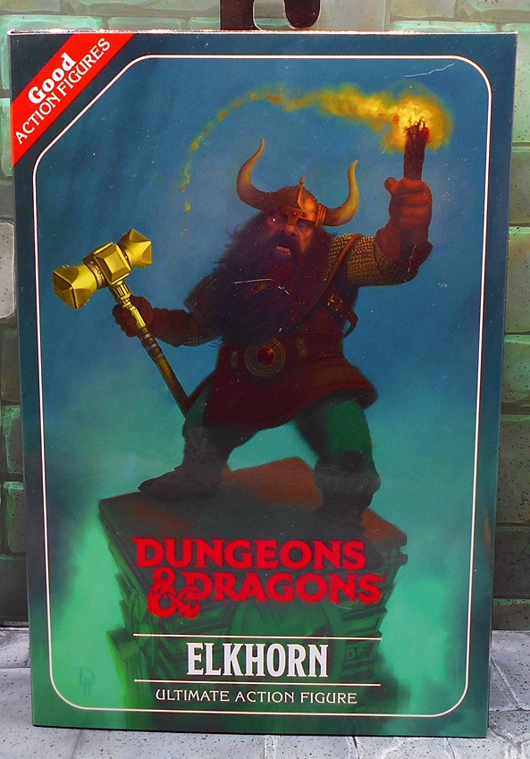
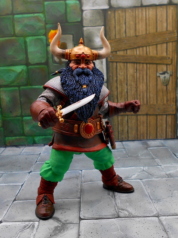
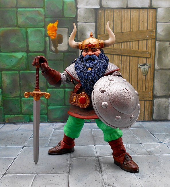
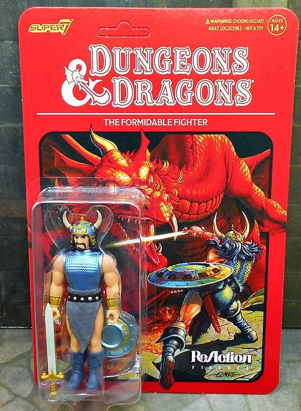
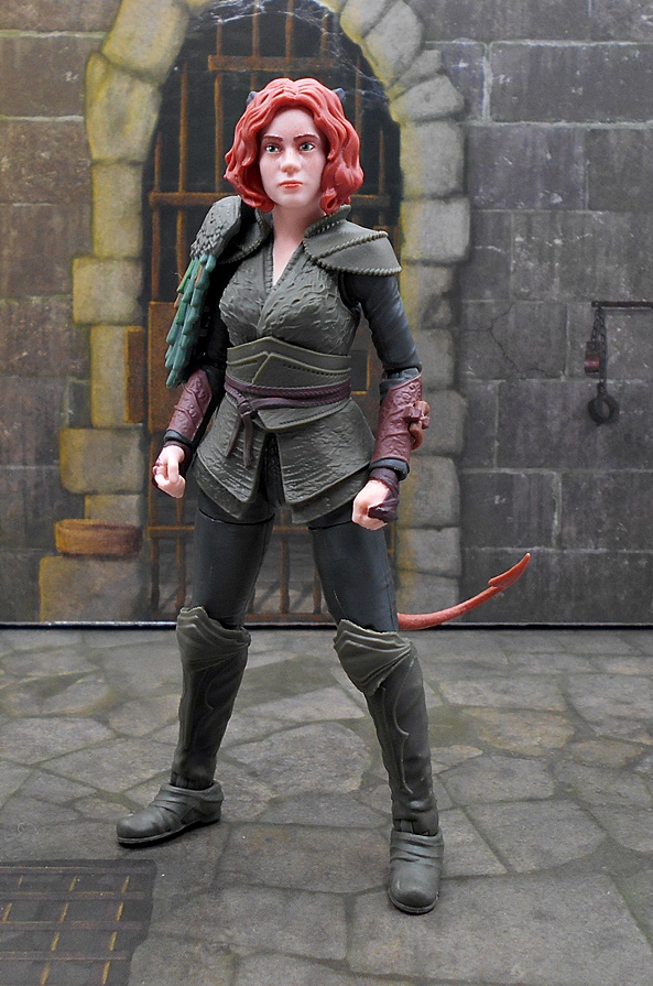
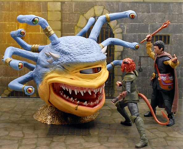
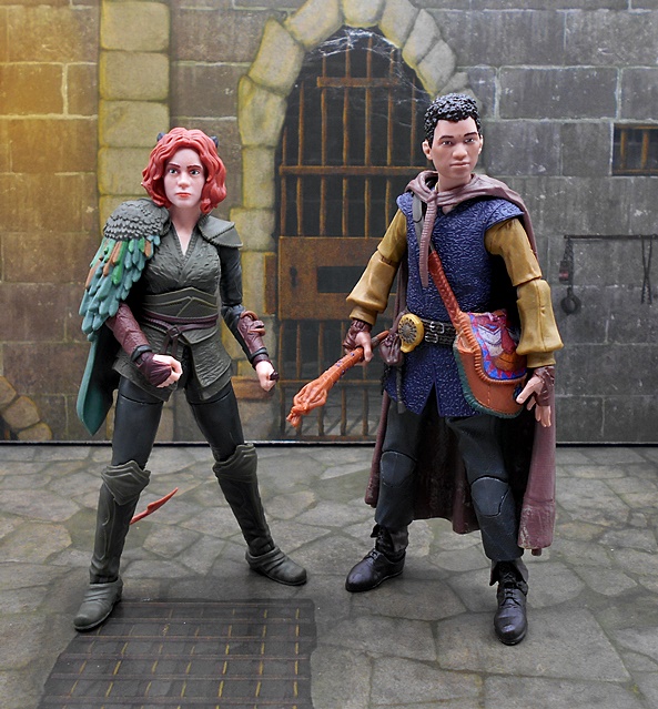
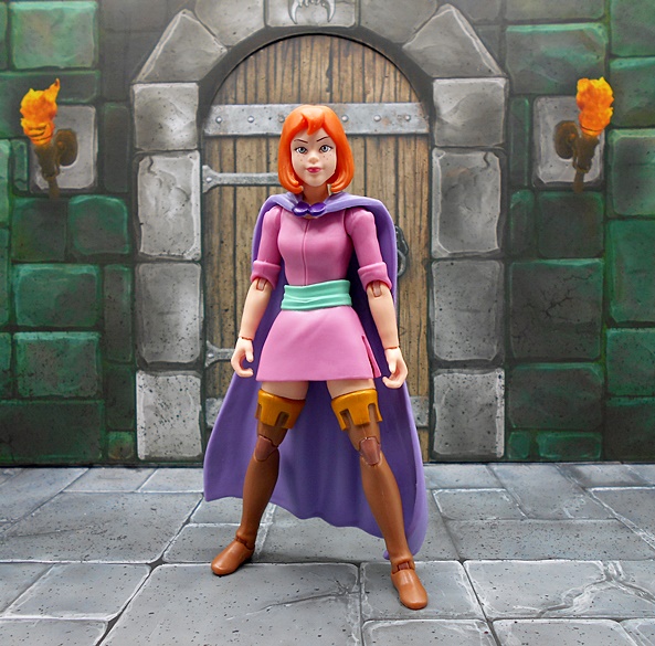
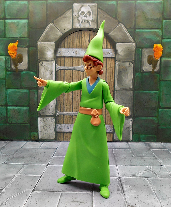
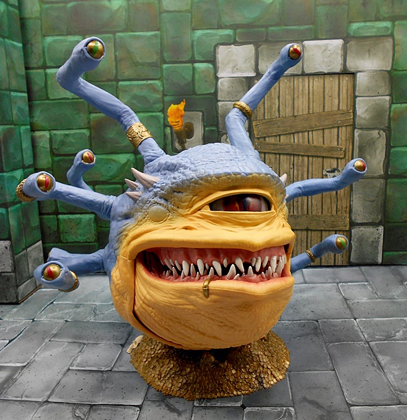
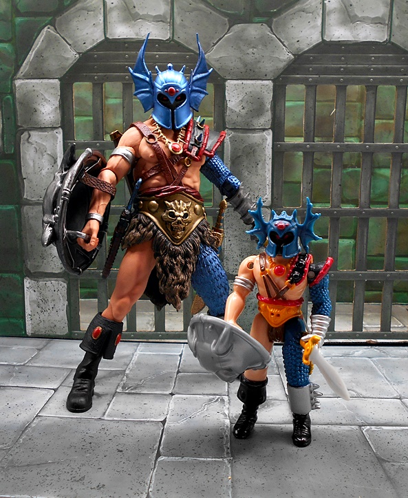
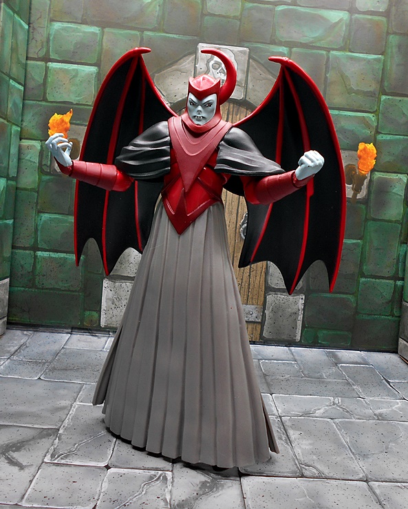
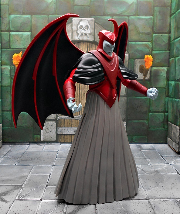
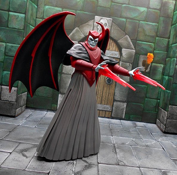
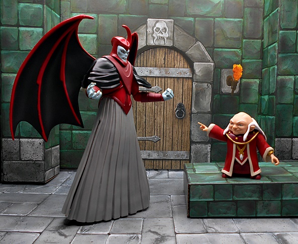
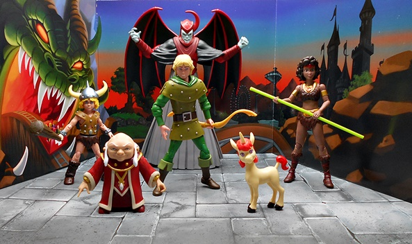
Yes, folks, I’m buried in Super7 GI JOE, ThunderCats, and Silverhawks Ultimates, so why not start collecting a new Ultimates line? Even better, why not collect a line of figures that I already bought when Hasbro did them? Sounds like a good plan to me! The truth is I was very happy with Hasbro’s D&D cartoon figures, but because I’ve been waiting for someone to do these for so long, I’m willing to double dip. Plus, it looks like Super7 is going deeper than Hasbro did with more of the minor characters, and yes a giant Tiamat, which God help me I did pre-order. The first wave includes two members of the adventuring party, Hank and Sheila plus Dekkion the Skeleton Warrior, and a pair of Shadow Demons. These are supposed to ship sometime in October, but we got a bit of a sneak peek with the release of the SDCC Exclusive invisible Sheila. This figure was available for purchase online after the convention and since she was easy to get, I decided to pick her up.


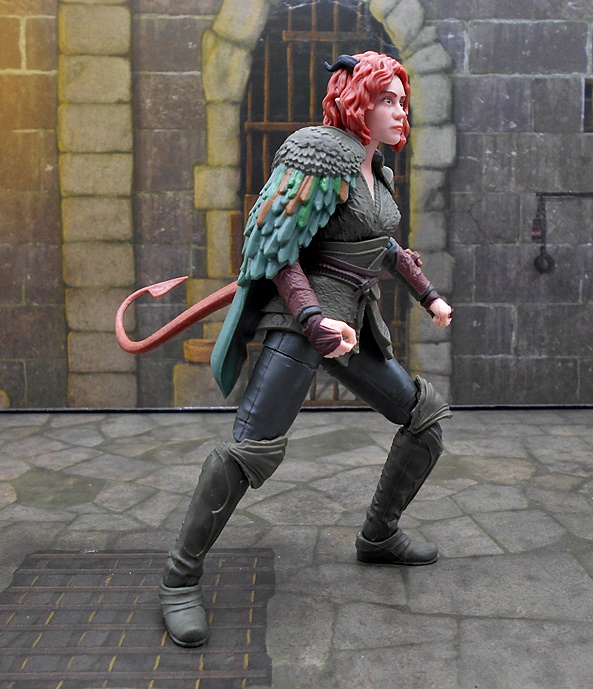
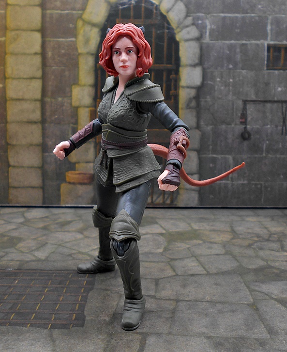
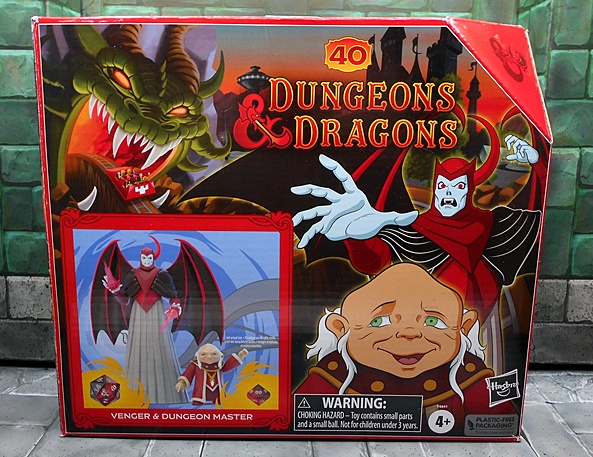
Oh wow, I really dig this packaging! The box is an homage to the entrance to the Dungeons & Dragons ride. There’s no slip cover, which I kind of figured since they’ve been deleting them from their longer running lines. The window shows off the goods nicely, which is impressive because she’s supposed to be invisible. The back of the packages have an actual character sheet for each character, and as an avid D&D player back in High School, I got a real kick out of this. Seriously, I had a big stupid grin on my face as I perused Sheila’s stats. Of course, this figure variant is based on Sheila’s special ability, using her magic cloak to render her invisible. A pretty useful skill for a thief, even if she didn’t do much thieving in the cartoon. I’m not gonna lie, this was a tough figure to photograph, so I’m not going to go too long today.


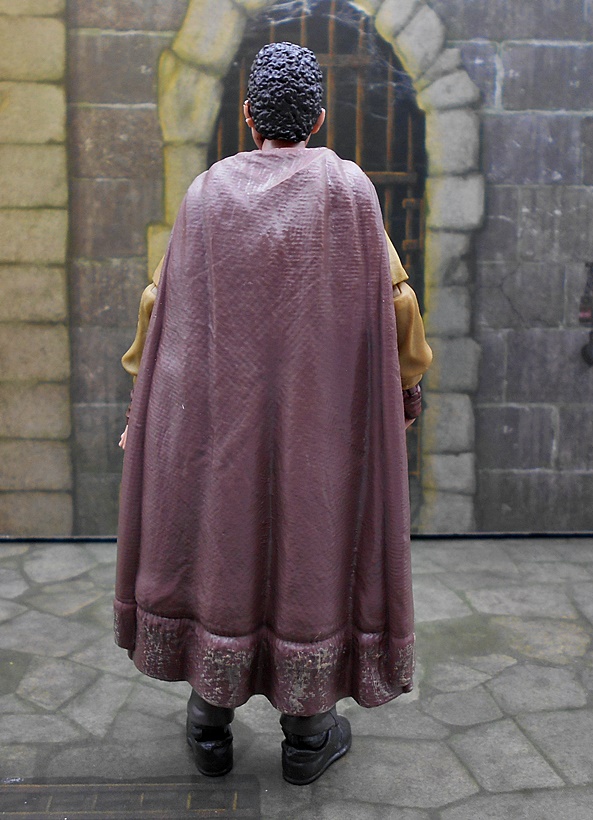
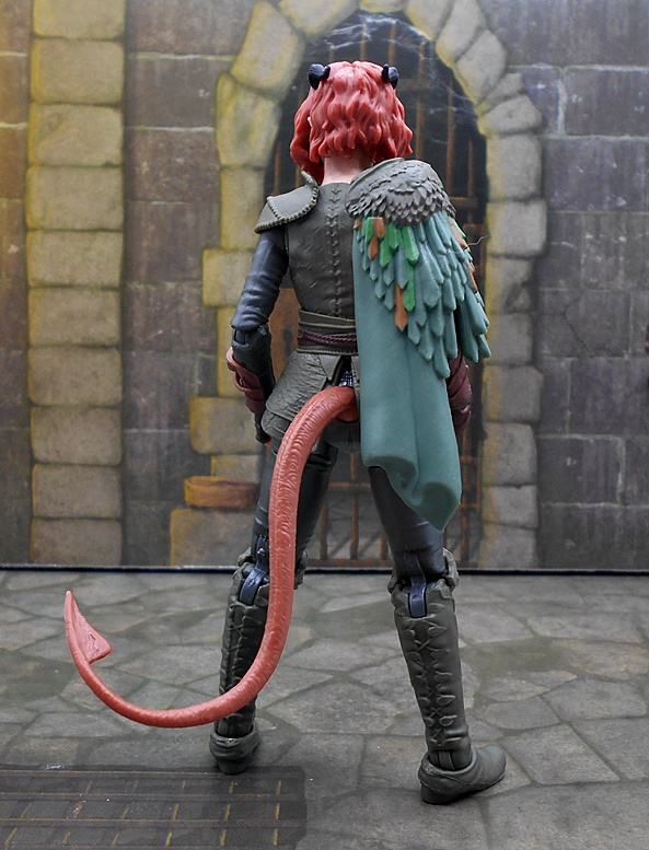
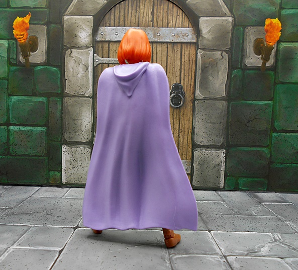
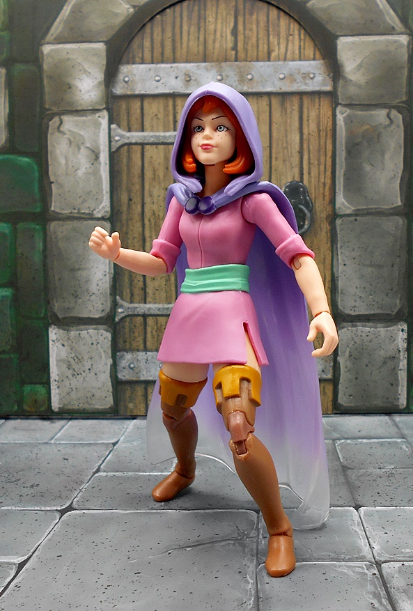
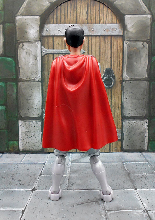
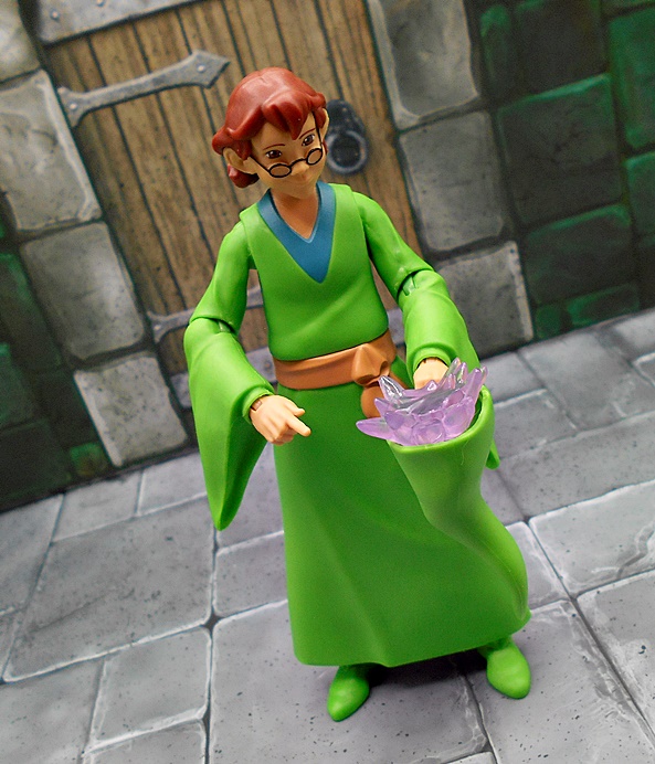
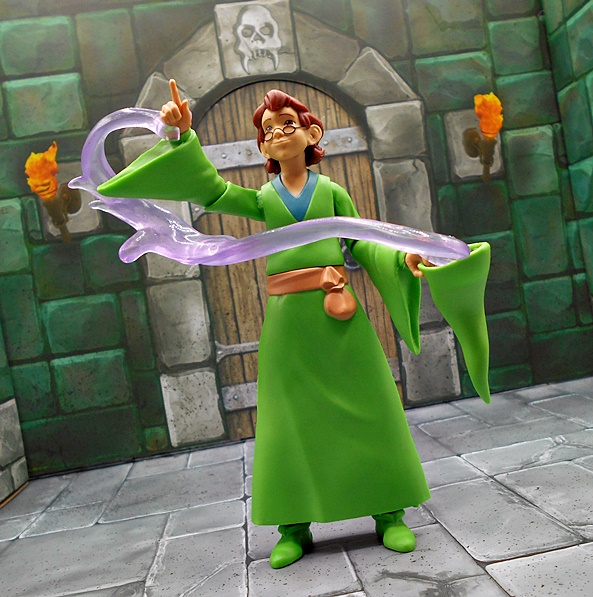
Sometimes when a cartoon depicts an invisible character, they just draw them as line art in white, but if I recall correctly when Sheila used her cloak in the cartoon, you couldn’t see her at all. So, S7 had to take some artistic liberties here. And what we get is the same figure we will be getting in October, only cast in translucent plastic and with a white cape. Does it work? Sorta? Kinda? The cape is made of a nice material, but the fact that it isn’t sheer really ruins the invisibility effect. Sure, you can take the cloak off, but that would break the rules, as she’s only supposed to be invisible with the cape on and the hood up. Also, the body does have a bit of a yellow tint to it, which I’m not sure was intentional, but I suppose it will save me the anxiety of waiting for it to turn yellow over time. One thing that I think is really cool here is how they even used thin translucent plastic for her skirt. I don’t recall ever seeing that sort of thing before.


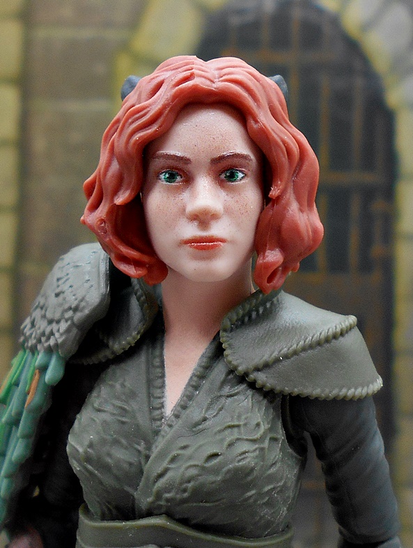
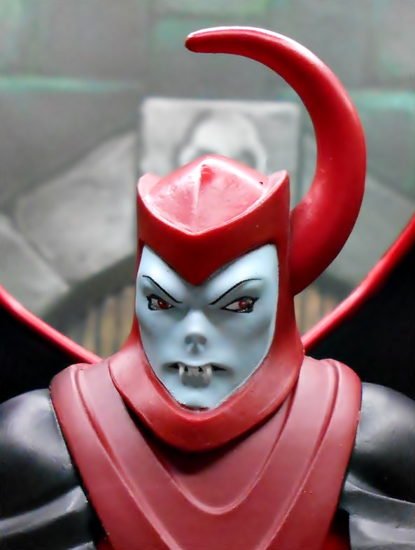
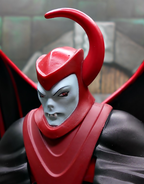
You get all three heads that will be included with the regular release: A smiling expression, a surprised expression, and a mischievous expression. I do like that they painted the facial features in white to help pick them out a little more, but as you can probably see, it’s still kind of tough to discern what’s going on with the sculpts. I do, however, think these are going to look great when they’re all painted up.


The articulation is still in line with what we’ve been seeing in the other Ultimates lines, and that means lots of rotating hinges with limited range. One of the big issues with this sort of transparent figure is that you can see how the sausage is made, meaning all the joints and even the wrist pegs are clearly visible. It gives the figure a very mechanical look. The joints on the figure all feel good, but translucent plastic can sometimes have a habit of becoming brittle, so I probably won’t spend a lot of time playing around with her. With that having been said, I didn’t have any issues swapping out the heads or hands.


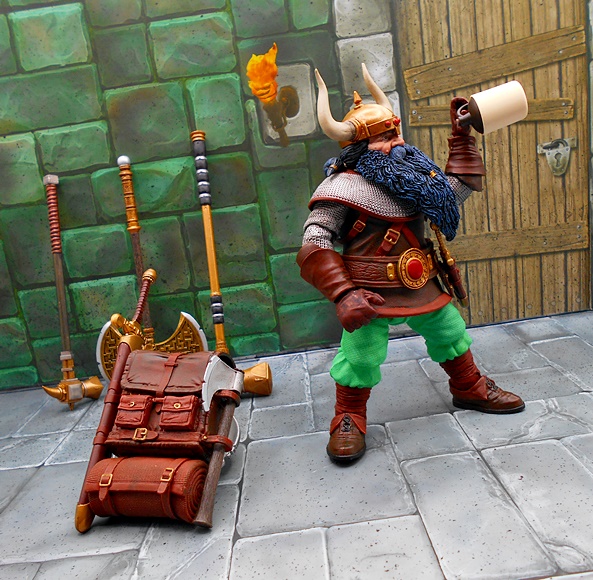
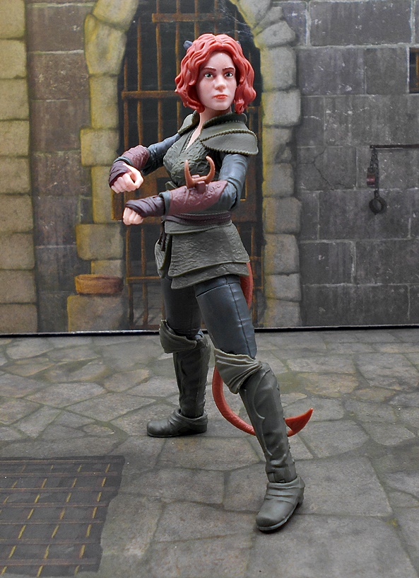
You get three sets of hands: Fists, a set intended to grip her hood for when she’s pulling it up or taking it off, a right hand with splayed fingers and a left gripping hand. But aside from the cloak there are no other accessories, which means they omitted the net accessory that will come with the regular release. That’s disappointing, especially since they didn’t replace it with some new accessory, maybe referencing a specific episode of the cartoon.


I don’t want to come down too hard on this figure, as it’s pretty tough to make the whole translucent thing work. You’re always going to see all the joints and inner workings of the figure and that kind of ruins the illusion. This kind of thing would most definitely work better as a statue. I’d love to see someone on Etsy with some sewing skillz make a sheer cloak for her that would make the illusion work better. With that being said, it’s a pretty good concept for an SDCC Exclusive, as I wouldn’t consider it essential to complete the collection and I would have been OK if I got shut out on it. As I write this, it’s still available on Super7’s website at $55, which is the going rate for all their regular-sized Ultimates. Still, I would only really recommend it if you’re going to be a completist. I’m not sorry I bought her, but I probably would have been better off putting that $55 towards the $300 price tag on Tiamat.