Marvel: X-Force Psylocke Bishoujo Statue by Kotobukiya

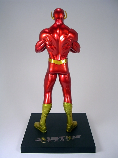
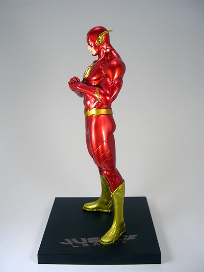
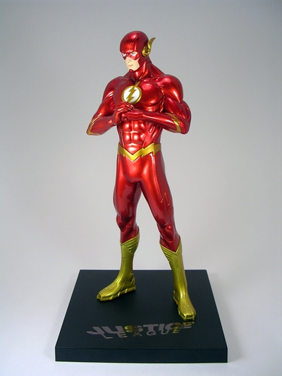
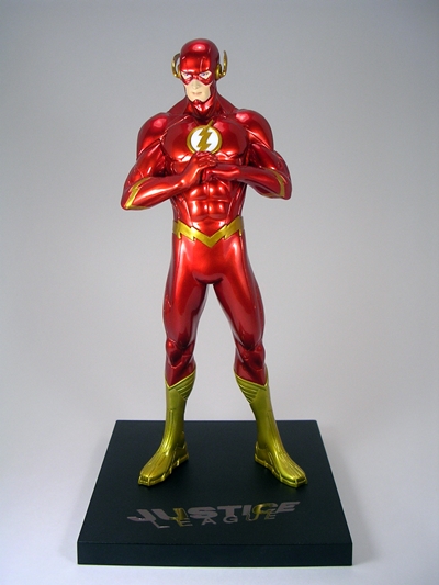
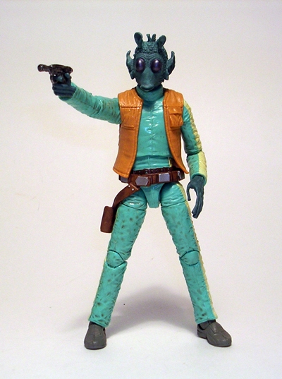
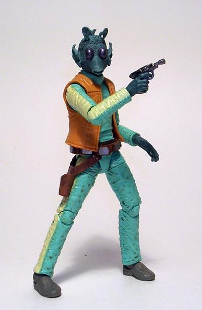
I ended last week with Kotobukiya and we’re starting this week with the same! The difference is that this week I’m giving the Justice League ArtFX+ statues a rest and instead turning my attention back to Koto’s Bishoujo line. Koto has a veritable shit-ton of amazing Bishoujo statues on deck for 2014-15. From Marvel to DC to Star Wars and Street Fighter, this line is going to get a lot of my money in the months ahead. And if their most recent release, Psylocke, is any indication it’s going to be a damn fine couple of years. This release is Psylocke’s second outing for the Bishoujo line and that’s a rather sore point for me because I missed the first statue and now it sells for crazy prices on the secondary market. I try not to look for it a lot because I kind of want it bad enough to pay a lot more than I should, and so it’s best to try to forget it exists. This all-new Psylocke release, however, serves as a mighty nice consolation prize, even if I’m not usually keen on the X-Force costumes.

kotopsy1

kotopsy2

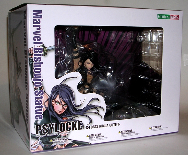
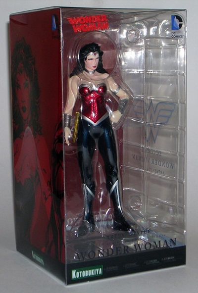
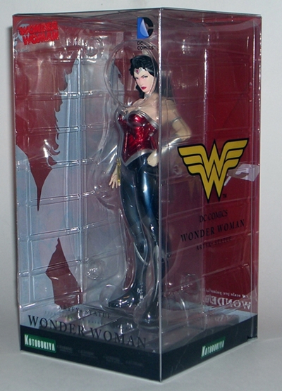
The box shares the same deco style as previous releases in this line, but it’s a little unusual as it is a landscape shaped box to fit the unusual orientation of the statue. As usual, there’s some great source artwork by Shunya Yamashita on the package and the windows give you a tease of what’s inside. The statue is wrapped in plastic and nestled between two plastic trays, so if you want to really get a good look you’ve got to take her out and unwrap her. Psylocke comes already attached to the base and the only assembly required is placing her katana in her hand.

kotopsy3

kotopsy4

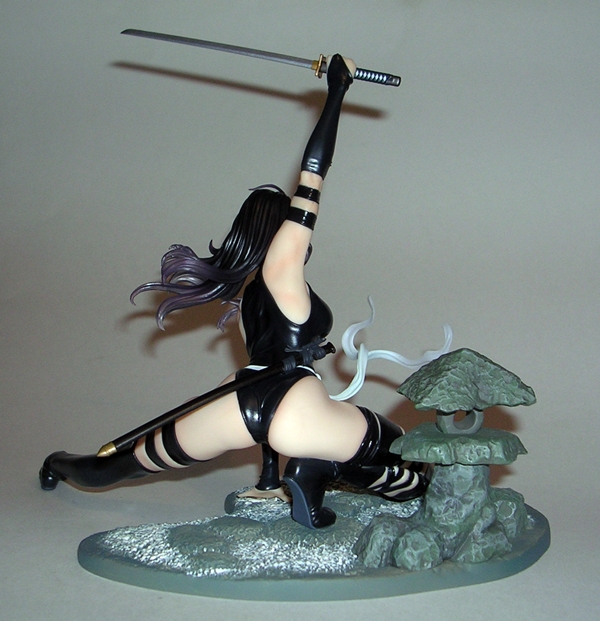
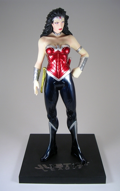
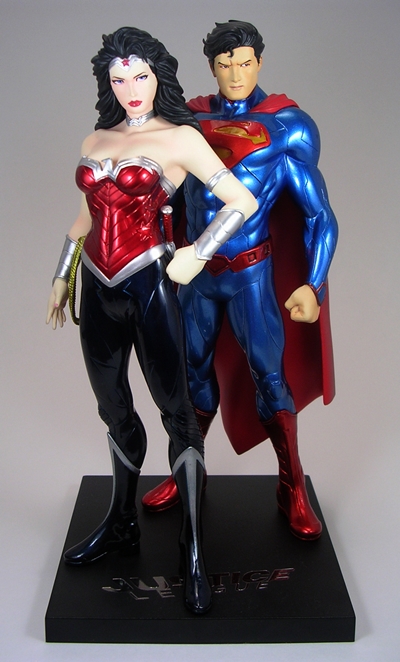
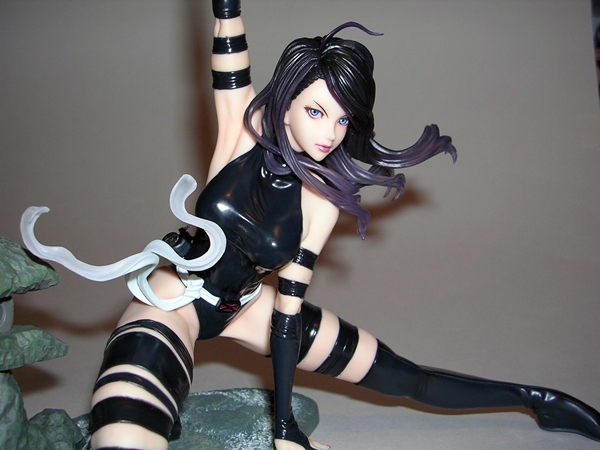
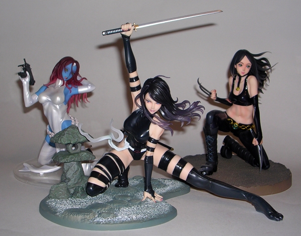
I’m always impressed by these statues, but Psylocke here absolutely blows me away. Seriously, I don’t want to downplay previous releases in the line, they’re pretty much all great, but I don’t think I’ve been this amazed by a Bishoujo since Wonder Woman. To see what all the fuss is about, first and foremost we have to look at the composition because in terms of pose this is some of Koto’s finest work. Psylocke is poised close to the ground, with one leg bent back under her and the other stretched out all the way so that it extends well beyond the base. She has one hand on the ground and the other holding her katana aloft. This is absolutely gorgeous composition work, so much so that it feels like it belongs among one of their larger and more expensive Fine Art statues. Speaking of size, Psylocke scales perfectly with my other Marvel ladies. Her head is close to the same height as the kneeling Mystique and X-23, but with her katana stretched above her the total height of the piece comes close to statues like Black Cat and Black Widow.

kotopsy6

kotopsy5

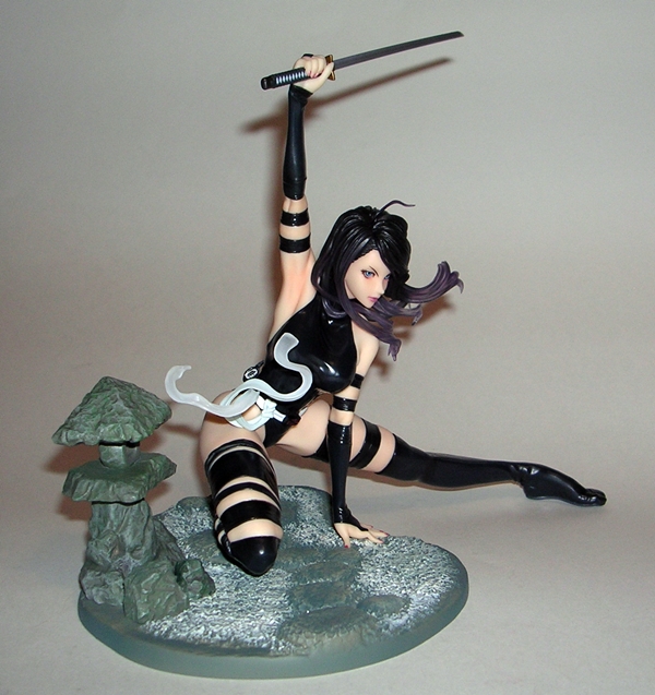
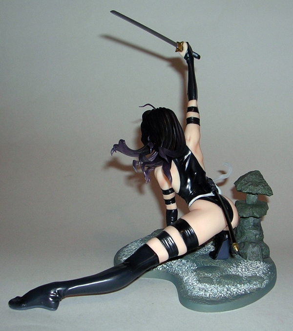
Of course, composition is only half the battle, and doesn’t mean much without a solid sculpt. Again, in this department, Psylocke outshines most other releases. The contours and curves of Psylocke’s body border on pure poetry and the muscle definition in her shoulders and… um, groin, are superb. The straps on her thighs and biceps are sculpted so that they ever so slightly constrict her skin and the rumbling of the costume adds that extra touch of realism. Even the way her white belt rises up in a frozen flurry conveys the kinetic energy on display here. Her scabbard is tethered to her belt with sculpted ties and is punctuated with a little brass cap. Truth be told, there isn’t a lot of complexity to Psylocke’s costume, but it feels like Koto went above and beyond with what little they had to work with.

kotopsy7

kotopsy9

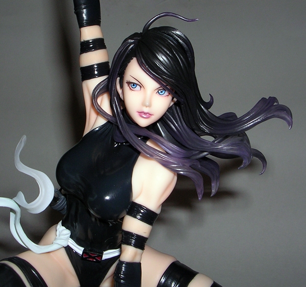
As for the portrait, I really like what they did here. Sure, you can argue that a lot of the Bishoujo portraits look alike, and I wouldn’t refute that. Psylocke here has slightly narrower eyes, giving her a more serious expression that better matches her action packed pose. It fits the statue better than the more frivolous portraits that Koto has used on some of the more cheesecake poses like Kitty Pryde or Sue Storm. I also dig that her face is looking straight up. The style with many of the Bishoujo statues is to have the girl looking slightly down and to the side. It’s part of the “pretty girl” motif, I get that, but it’s kind of nice to get a good look at the portrait from dead on for a change. Of course, Pyslocke’s hair is flowing outward with beautiful effect and the tips of her hair are partially transparent.

kotopsy10

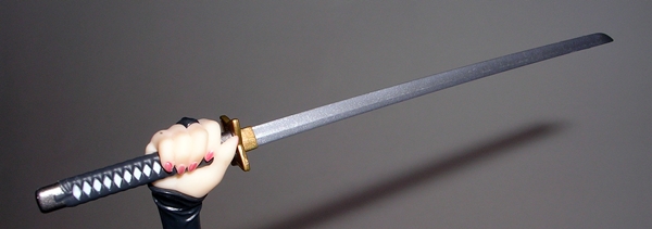
I don’t have a lot to say about the coloring here. The katana looks particularly good with a semi-steel finish on the blade, intricate paintwork on the grip and a bronze colored tsuba and ricasso. The X-Force costume is black and the high gloss contrasts beautifully with the soft matte plastic used for Psylocke’s bare skin. It looks good, but I would have so preferred this piece be her in the traditional purple costume. I suppose there’s always a chance that we could get a Comic Con recolor.

kotopsy8

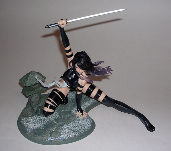
The base places Psylocke in what I think is supposed to be a Shinto Garden with a piece of sculpture off to the side. The base is textured to look and feel like stone with what looks like possibly snow covered grass. As mentioned, Psylocke’s leg stretches well beyond the base making her the least space efficient Bishoujo so far. She certainly demands a lot of real estate on the shelf, but she’s well worth it and she looks great in the front row with the taller statues behind her.

kotopsy11

Psylocke retailed at just under $60, which is a pretty solid value. Sure, sometimes the Bishoujo’s go down in price, but they also sometimes go up. Because of the fluctuations in price, I usually gamble and don’t pre-order this line, but I was pretty smitten with this piece when I first saw it and so I dropped a pre-order straight away. She’s the 13th Bishoujo statue in my collection and right now she’s definitely in league with Wonder Woman and Huntress in my top three favorite releases. That’s saying quite a bit since I’m not necessarily a big fan of the X-Force costume. This is just a case where Koto nailed the essence of the character perfectly in a breathtaking pose and followed through with a superb sculpt.

DC Comics: The Flash ArtFX+ Statue by Kotobukiya

Today I’m taking a look at the next addition to my Justice League ArtFX+ statues by Koto. This time it’s The Flash and he’s been sitting around waiting to be opened since just after Christmas. I think it’s well past time I get him out and add him to the team! I should note that there’s no particular order in which I’m picking these up. I’ve just been going for whichever ones turn up at special prices online.

afxflash13

afxflash14

There’s the packaging. It’s the same style used for Supes and Wonder Woman only this time with a Flash motif. Once again, the clear illustrated plastic box makes for a great presentation, but it is rather fragile. I worry about it surviving in the long term, but I still think the tradeoff was worth it. Besides, the character art all matches up with the other statues so chances are you’re going to opt to display the boxes behind the statues rather than put them away into storage. On the downside, I’m going to have to find a wider shelf to display them all because I estimate I’ll only be able to get five across in the display case they’re in now. I call that a First World Problem!

afxflash2

afxflash3

afxflash4

As with Supes and Wonder Woman, the pose here leans more toward “museum style” than it does action scene, and yet with each release, Koto has managed to work a little inferred energy into the character’s stance. In this case, Flash is standing with one fist punching his open palm. It’s a great pose as it conveys a “Let’s do this!” attitude, as if he’s getting ready to go up against a wave of Parademons.

afxflash5

afxflash6

afxflash7

If you aren’t up to speed on this line, it’s the “New 52” look and I’m quite partial to The Flash’s current costume. As I’m sure I’ve mentioned before, many of the current DC costumes were expressly designed with 3D modeling in mind and it really shows in a statue like this one. Every single detail on this piece relies on sculpt rather than just paint. As a result you get all the cut panel lines, the texturing on the boots, the raised chest emblem and even the belt is raised. On top of that Flash features some superb musculature, particularly in his back. You don’t get to see the back detail on Supes because of the cape, but here with Flash it looks pretty spectacular.

afxflash8

afxflash9

The portrait retains the same anime style as we saw with Superman and, to a lesser extent, Wonder Woman. I don’t think it’s quite as apparent here either, but mostly because Flash is looking slightly down and his mask does cover a great deal of his face. It works for me, but I know some have been put off the style. Either way, the coolest thing about Flash’s head sculpt for me are the lightning bolts. They’re slightly bent to follow the curve of Flash’s head, but each ends in a razor sharp point and boy do they look amazing.

afxflash10

And then there’s the coloring. No doubt, one of the high point of these statues for me has been the jaw dropping metallic paint jobs. I was a little concerned about Flash because the statue substitutes the gold for the yellow in his costume. It’s really the first time Koto had to make a significant color change to make the metallic finishes work and it obviously makes Barry Allen’s costume look more like old school Wally West’s. In hand, it doesn’t bother me so much, probably because I’m just smitten by how gorgeous it looks.

afxflash12

Once again, the included base is a simple black metal square with “Justice League” printed on the front. The magnets in Flash’s feet allow him to stand up without toppling over and you can position him on the stand anywhere you want without having to worry about the placement of peg holes or posts.

afxflash11

afxflash1

So far this line has not disappointed and these statues just look amazing alongside each other! Koto continues to deliver fantastic display pieces for extremely reasonable prices.  Flash retails at around $40-45, but like a lot of these statues, I was able to grab him for just under $30 and that’s quite a steal for the workmanship involved. Next week, I’m going to take a week off from the ArtFX+ statues to give the Kotobukiya slot to Bishoujo and then the following week we’ll swing back around to look at Aquaman!

Transformers Energon: Mirage by Hasbro

It’s Transformers Thursday again and as promised last week I’m back with a look at the Commander of my Sharkticons, Mirage. If you missed last week’s TFT, I gassed on about how I army built Energon Sharkticon and gave them to this guy as his own private armada. Basically, the Energon Sharkticons are the Sweeps to Mirage’s Scourge! But wait… Mirage? Mirage??? I’m usually fine with Hasbro recycling names of Transformers for the various series, but this instance just bugs me. To me, Mirage will forever be an Autobot Formula-1 racecar and taking that name for a Decepticon attack ship is something that I just can’t wrap my G1 head around. It’s too much of a leap. He was repainted later on as Dreadwing and that’s the name I tend to use for him. Anyway, let’s jump right in and check out his alt mode.

engmirage1

engmirage5

Mirage is a vicious looking warship. I don’t know what you’d classify him as, but he strikes me as a swift moving hit-and-run attack craft. Amidst the countless numbers of cars and jets, there aren’t a hell of a lot of seafaring Transformers so I’m always nice to get a new one. Mirage features an enclosed cockpit area and blade-like fins coming off the front and back of his hull. The front fins each hold two bombs (or maybe torpedoes?), which can detach. For additional firepower, he has two missile launchers mounted toward the back and two more on the front deck. The back launchers can fold out on wings and the front ones can pop up on a clear spring-loaded framework. I like to think that the folding rear wings make Mirage pretty suitable for use as a space faring ship as well as a sea craft.

engmirage2

The deco here is all over the place. There’s dark blue, light blue, orange, gold, grey, it’s just a crazy mix of colors that compliments the equally crazy colored Sharkticons fairly well. In terms of overall aesthetics, Dreadwing has a much better and more uniform paint job, but as the commander of my Sharkticon army, Mirage’s deco works just fine.

engmirage3

engmirage4

engmirage6

Mirage’s transformation can be a bit of a pill. It’s fairly complex and there are a lot of moving plates on ball jointed arms that have to be positioned just right. Things tend to flop around all over the place and if you don’t know what you’re doing it can be a disaster. The two halves of his hull also tend to get in the way and a lot of times I’ll just pop them out of the ball joints and set them aside until I’m done. If I haven’t picked this figure up in a while, it’s not uncommon for me to become frustrated with nothing but a half-transformed mess in my hands. It takes some fiddling, but eventually I get there.

engmirage8

engmirage9

Mirage’s robot mode is 100% Cybertron-Grade-A bad ass. The cockpit area of the ship forms a broad, boxy chest with a socket for an Energon chip dead center. It contrasts nicely with the sculpted organic contours of his legs. It’s a hybrid style aesthetic that reminds me a lot of the original G1 Transformers movie and I really dig it. The proportions are excellent, so much so that even his sizeable backpack doesn’t feel out of place or weigh him down. The side panels that make up his alt mode’s hull are left on double ball jointed arms so there’s a lot you can do with them to customize their look. I have seen some collectors that like to display him with these panels up, but I prefer to sweep them back like wings. That keeps them fairly out of the way and it also stabilizes him really well when standing.

engmirage12

Mirage’s head sculpt is mighty distinctive and definitely not very humanoid. I do get a vague nautical vibe off of it and while the helmet is completely different, he still reminds me a bit of Beast Wars Depth Charge. In retrospect, that would have made a better name for him than Mirage. Either way, this guy’s portrait ranks up there as one of my favorite Energon head sculpts. It also features some very effective light piping too!

engmirage13

engmirage14

The only real issues I have with this guy are the large panels that make up his arm launchers. From certain angles they look just fine, but it’s still hard to ignore the major kibble hanging off his arms. I think what frustrates me the most about these is that they could have probably been fixed with the addition of one extra hinge on each plate. It almost looks like that was the original design plan but it didn’t cost out at the end. Ah well, it’s not a deal breaker for me and I suppose he can use them as shields. The deck launchers that now reside on Mirage’s backpack can still be deployed by the push of a button and they angle straight over his head and shoulders. It’s cool that the design enables them to be used in robot mode, but they don’t rest evenly so they don’t look all that great. The one on his left is rather droopy.

engmirage10

engmirage11

I think Mirage’s deco improves a lot in his robot mode. The blue and orange parts are mostly confined to his back giving him a more cohesive black, purple and gold motif with the grey bits landing mostly on his limbs. Again, I think it makes for a pretty nice match with the Sharkticons.  Also, that sculpted Decepticon emblem on his chest is pure money. I was going to dig out Dreadwing and take a look at his deco, but sadly I ran out of time, so I’ll have to save him for another Thursday.

engmirage7

Mirage and Dreadwing represent many of the things that I loved about the Energon line. The mold has an imaginative and unusual alt mode and an absolutely bitchin’ robot mode. Above all, it’s a well-designed toy that only stumbles a bit in the floppy and confusing nature of the transformation along with some shell-former shenanigans. Nonetheless, this is a figure that represents Hasbro designers willing to think outside the box and the result is a truly unique figure that stands out as something very cool and very different. I still hate the name, but he’ll always have a place on my Transformers display shelves.

Next Thursday I’ll keep the nautical Decepticon theme rolling for one more week with a look at Cybertron Thunderblast!

Masters of the Universe Classics: Two Bad by Mattel

Holy shit, it’s 2014 and for the first time since the whole Matty Collector madness started I am an official Club Eternia subscriber: Smart move or pure idiocy? Folks, only time will tell. But right now I’m feeling pretty good about it because my Two Bad has arrived and I was able to let Sale Day pass me by without having to worry whether I would be in the middle of a management meeting at work when the gates opened. Of course Sale Day wouldn’t have mattered in Two Bad’s case because he was a Sub Only figure with no stock available for Day of Sale. It was kind of a dick move on Matty’s part, but at this point who isn’t used to it?

twobad2

I don’t usually bother with the mailer boxes, but I took a shot of this one because Matty has moved away from the familiar white mailers in favor of these new (and I assume cheaper) brown boxes. To date, I’ve only saved two mailer boxes and those were for the two vehicles, which I keep boxed. As a result I really don’t care about this decision, but I can imagine it might irk some MIB collectors.

twobad1

The actual package inside is what we’ve been seeing all along. The only thing I have to say about it is that it corrected my consistent urge to put a hyphen in Two Bad’s name when there isn’t supposed to be one. Sorry, Two Bad… My Bad! HA! I’ll also point out that I found his bio to be of particular interest. I’ve always been familiar with the vintage figure, but I never knew anything about the character. I love the fact that Two Bad was originally two people magically fused together by Skeletor because they failed to take out He-Man. Jeez, talk about a disproportionate response. If Skeletor did this every time his minions failed, he’d just have one giant ball of arms and legs and heads following him around. I also dig that their names, Tuvar and Badra fuse together to make Two Bad. Sort of. It’s like that episode of Star Trek Voyager where Tuvok and Neelix fused to become Tuvix. LOL… Voyager was shit. I’ve been drinking. Where was I? Oh yeah… Let’s rip open Two Bad and check him out.

twobad3

twobad4

twobad5

My first impression is that I expected Two Bad would be bigger. That’s not a complaint against the figure, just a misconception on my part. He’s actually not much bulkier than your average MOTUC figure and that’s fine by me. With that revelation out of the way, I’ve got to say the next thing that impresses me the most are the colors. I absolutely love the colors on this figure! These particular shades of blue and purple look amazing and when you toss in the silver paint on Tuvar’s gauntlet and boot, the bright red belt and the orange chest armor, it all makes for a very pleasing deco. Indeed, Two Bad’s coloring really gives Mantenna a run for his money and that’s high praise. He’s gorgeous!

twobad10

Not to be outdone by the coloring, the sculpt is right up there as well. The contrast between Tuvar’s smooth skin and Badra’s meticulously sculpted scales drives home the combined nature of the figure. I also really dig all the attention paid to the sculpt of Badra’s boot and gauntlet. They don’t stand out much because the dark brown blends in with the dark purple, but there’s some crazy attention to detail there. The boot has all kinds of medieval looking spikes and buckles and the glove has a reinforced band on the knuckles to deliver extra pain in his punches.

twobad6

And then there are the portraits! Usually when we talk about multiple portraits on a figure we’re talking about swappable heads, but in this case it’s two at the same time. How cool is that, eh? The head sculpts are each pretty well done, although I’m leaning toward Tuvar’s as my favorite mainly because of the paint. I’m not entirely sold on the orange eyebrow ridge on Badra and it also looks like there might be a bit of mold flashing on his noggin. I’ll also point out that there isn’t a lot of clearance between the heads, thanks to Badra’s ear spike thingies. If Tuvar is looking straight ahead then Badra can turn just fine, but if Tuvar’s head is off to the side there’s some rubbing. No big deal, and I’d prefer it this way than have their heads set tilting away from each other like on the vintage figure.

Unless you count the extra ball jointed neck, Two Bad has mostly the same articulation as any other MOTUC male buck. That includes ball joints in the shoulders and hips, hinges in the elbows, knees and ankles, swivels in the biceps and wrists, a swivel in the waist, and an ab crunch hinge in the torso. Oh yeah, he also has swivels at the top of each boot.   

twobad7

twobad8

Two Bad comes with two accessories. First, you get an orange shield with a really strange clip that’s made to work with the fins on Badra’s gauntlet. I like the shield, but it seems like it could have used some more paint apps. Plus, if you like to mix and match weapons you’re out of luck here because this thing is only going to work with Two Bad. Secondly, you get the two headed mace, which is a really goofy and unwieldy looking weapon. I get it, it’s got two heads just like Two Bad, I still think it’s kind strange.

twobad9

twobad11

Two-Bad is an amazing figure and I love him enough to say he comes close to beating out Mantenna as my favorite recent figure in this line. He’s colorful, quirky, and beautifully sculpted. It’s a shame Matty had to go and make him a Sub only figure because I realize there are tons of collectors without the means or willingness to do a whole sub. That having been said, you can still find him for sale through secondary online sellers and while he’s expensive, he’s still a ton cheaper than buying a Sub just for the one figure. Either way, he’s a great way to kick off 2014 and it’s figures like Two Bad along with the great releases from last year’s Filmation Club that convinced me to go in for a Sub this year. Hopefully I won’t be regretting it by the end of the year.

Star Wars Black: Princess Leia (Slave Outfit) by Hasbro

I’ve looked at Greedo and The Fett, and now it’s on to the third figure in Wave 2 of the Star Wars Back 6-inch line, today we’re looking at Slave Leia. As most have already pointed out, this was a really strange choice for such an early wave and certainly a peculiar choice to be the first version of Leia released in this line. I was certainly hoping for a Tantive IV version of her and I’m still really looking forward to that figure. It could be that Hasbro was betting that sci-fi’s favorite pin-up girl would be irresistible to Star Wars fans and collectors. Whatever the reason, we have Princess Leia making her debut in the 6-inch scale showing a lot of plastic skin… let’s take a look!

swb6slave16

Here’s the packaging and there’s not much new to say. Leia comes on her tray with her two staff weapons beside her. The back panel has a monochrome image of her kicking ass and taking names on top of Jabba’s sail barge. As always, the packaging is totally collector friendly and I appreciate how compact these boxes are. I still have all my SWB figures stored in them and I’m considering hanging them on a wall in the back of one of my Toy Closets.

swb6slave1b

swb6slave2b

And here she is out of the package. I’ve watched and read a few tepid reviews of this figure before getting mine, so I was rather worried about what to expect. Even the Vintage Collection 3 ¾” Slave Leia wasn’t what I would call a homerun. Would the larger scale accentuate the problems or give Hasbro’s sculptors more room to work their magic? In the end, I think it’s a little of both. Let’s start with the portrait…

swb6slave3b

Hasbro has had their history of flubs when it comes to female head sculpts. You need only look at their recent 3 ¾” Mara Jade for an example of that. Oh, wait, I haven’t gotten around to reviewing her yet, so forget I said that. Is this a great likeness of Carrie Fisher? Nope. Can I see her in there somewhere? Yeah. It looks as much like any of the hundreds of “Slave Leias” you might see at a Comic Con than the genuine article. On the other hand, I was expecting f’ugly, and this sculpt certainly isn’t that, although I’ll admit it does not photograph well at all. The face is attractive and the crisp paintwork, particularly on the eyes, helps to sell it. The hair is very well sculpted and the soft ponytail is executed flawlessly. She has her ubiquitous neck chain, which is cast in soft plastic and can be removed by popping off her head. All in all there’s room for improvement, but there’s also a lot for me to like here.

swb6slave5b

swb6slave4b

The same can be said for Leia’s body. It’s tough to do a figure showing this much skin and still feature an acceptable amount of articulation. By using ball joints in the shoulders, elbows, and wrists, Hasbro kept the ugly jointing down to minimum. They also managed to conceal her torso ball joint just under the bikini top. Even the double hinges in the knees and swivels in the thighs aren’t that off-putting. The proportions are also nicely done. Naturally there’s not a lot to her costume, but the boots and bikini look good and I applaud the use of softgoods for the skirt. Hasbro opted to cast the bulk of the figure in flesh tone plastic, which was a gamble. On the one hand it tends to come out looking waxy, but painted flesh tones often come away looking dirty. Here the compromise paid off because the skin tone looks good and they did a nice job matching the painted face to the rest of the body.

swb6slave6b

swb6slave7b

swb6slave8b

swb6slave9b

swb6slave10b

Leia comes with two weapons, which was honestly something of a surprise for me. I knew she was coming with the force-pike, but I didn’t know about the other one. The force-pike is one of my favorite weapons of the Star Wars Universe, which is a ridiculous thing to admit, but it probably stems from the Sarlaac execution being my favorite scene from any of the movies. I’m sure I’ve gone on and on about it in my various Skiff Guard figure reviews, so I’ll just leave it at that. I have absolutely no idea what the other thing is supposed to be. Is it some kind of rifle? I’ve been getting those things with Skiff Guard figures for decades now and they still leave me bewildered. I’m sure I’ve gone off about that issue in the past as well.

swb6slave11b

swb6slave12b

swb6slave13b

swb6slave14b

swb6slave15b

In the end, Slave Leia was a pleasant surprise. Based on early reactions I expected her to be a pretty poor offering, but I think she turned out quite good. I’ll concede that she is still the weakest of all the 6-inch offerings so far, but that says more about how exceptional this line has been than it does about the flaws of this figure. I’m willing to forgive the slightly unsightly jointing because, well there’s just no way around that unless you’re going to cover the figure with a rubber skin and we all know that wasn’t going to happen in this scale and price point. The head sculpt could have been better, but it could have been a lot worse too. I suspect, she’ll be an odd-figure-out for a while as I don’t see a lot of Return of the Jedi figures coming out in the line anytime soon, although Hasbro has been hinting about a 6-inch scale Jabba the Hutt, which would make this figure a very nice companion piece what would be a mighty epic display.

Bioshock Infinite: Motorized Patriot by NECA

It’s been a long time since I looked at NECA’s Bioshock figures, but then this offering is only their third release in the line and it took them a long time to get it out. I make it no secret that Bioshock Infinite was my favorite game of last year and it’s probably single handedly responsible for getting me back into gaming again… and I’ve come back to gaming hardcore. Once I played Infinite I knew I had to have some figures and NECA obliged by giving us Elizabeth and a Boy of Silence. Now they’re finally upping the ante with one of the game’s “Heavy Hitters.” It’s the Motorized Patriot and he cannot tell a lie… he’s going to murder the shit out of you motherf’ckers in the name of Freedom.

motpat1

Holy hell, that’s one gigantic blister pack. It’s possibly the largest I’ve ever seen. While lesser companies would have buckled and put this guy in a box, NECA stood their ground and vac-sealed this plastic behemoth sonvabitch into a perfect prison of plastic. Because the bubble takes up the entirety of the package, the presentation here lets the bubble insert do the talking and the back of the insert has a little blurb about this guy. The Motorized Patriots were a major pain in my ass in the game. They were relentless and they took a ton of damage before dropping. Plus, once I got used to fighting one of them, the game would start throwing a pair at me. On the other hand, it was always fun to take control of them and make them fight for me. Anyway, I’ve been waiting to get this figure in hand for what seems like an eternity, so let me go find a razor blade and slice this guy out… And back! Opening the seal on a normal sized NECA figure usually produces enough glorious plastic fumes to make me feel like I’m going to pass out. Imagine what opening something this big is like? I seriously think I slipped into an altered state of reality for a few moments. That smell of plastic is what tells you you’re getting your money’s worth. Well, that and the fact that this thing weighs a ton.

motpat7

motpat9

motpat17

If you’re unfamiliar with the game, the Motorized Patriot is basically a robot. Think of it like one of those animatronic figures from the Hall of Presidents, only this one carries a chain gun and wants to give you a patriotic suppository made out of white hot lead. NECA did an amazing job crafting this guy into action figure form. His Colonial Era outfit is recreated all in soft plastic with rips and tears in the knees and right elbow to reveal his robotic joints. The overcoat is layered onto the figure and it’s damn gorgeous. The sculpt features all the little buttons, clasps, wrinkles and stitching that I’ve come to expect out of NECA’s superb detail work. The huge brush-style epaulettes are glorious and he has clockwork gears and wheels exposed on his back and hips. The figure also features a lot of useful points of articulation. I’m not going to run through them all, because it’s tough to see what all is there under the layers of plastic clothing. I originally didn’t care because I thought I’d be content to always pose him firing his weapon, but the truth is there’s a lot more fun to be had with him.

motpat11

Patriot’s portrait is a grizzly visage of George Washington with a cracked porcelain style mask and a powdered wig. His noggin is nestled in the high collar of the coat, but you can still get some good movement out of the ball joint in there. Creepy!

motpat18

motpat10

motpat16

Of course, one of my favorite things about this figure is the set of soft goods flags that come with him. Each one is crafted to look old and tattered. They come attached to poles, which fit into sockets on the back of The Patriot. You can leave them hang free like a cape or you can tuck them into the gilded loops on his back to make them appear more like wings. I can’t remember the last time I’ve seen softgoods used this effectively to enhance the appearance of an action figure as these flags. They’re simply brilliant and they just look perfect on the figure.

motpat14

motpat12

motpat13

The Patriot features two extras: First off, you get a second head in which the mask and hair has been blown away revealing the robotic skull underneath. It’s made to look part metal but with a nose and jaw carved out of wood. There’s one fake human eye remaining and the other has been blown out of the socket. The skull matches the exposed robot joints on the body quite well, making for a great effect. The heads swap out pretty easily, although I thought it odd that that the post and ball joint is part of the head and not the body.

motpat8

motpat4

motpat6

The other accessory is his big ass chaingun. This weapon is a very cool piece and includes a working crank that rotates the gun barrels. On the downside, the handles are too big for his hands and the overall gun is ridiculously fragile. Those two things don’t mix well because you have to apply a lot of force to get the handles into his hands. The crank is designed to separate from the gun to avoid breaking, which is good, but the main handle isn’t, and that’s not so good. The handle on mine broke on the very first try to get it into his hand. In retrospect, it seems impossible for it not to break as it’s attached with such a thin point of plastic. I will likely be able to glue it back, and eventually I’m going to have to put a pin in there to keep it from breaking again. I think a swap out hand holding the handle that attached to the gun would have been a better way to do this.

motpat15

The Motorized Patriot retails for around $30-35 depending on where you get him. It seems right in line with NECA’s larger deluxe figures and yet it still feels like a pretty good value. Sure, I could bitch about the handle on the gun breaking. It’s a big deal and even in hindsight I don’t think I could have avoided it, but it is something that can be fixed. I could also probably take issue with his size as I think he should scale bigger when compared to Elizabeth or the Boy of Silence, but he’s so damn gorgeous I can’t help but love him. In fact, my only real complaint about this guy is I don’t have a Booker DeWitt figure to stand next to him on the shelf. NECA showed off an early test shot of a Booker figure a little while back. I do hope he’s still coming! I also still need to pick up one more Boy of Silence.

Transformers: Masterpiece Smokescreen (MP-19) by Takara

After languishing in my Pile of Loot over at BBTS for a while, Smokescreen has finally come home! Yes, the last of the Holy Datsun Trinity joins his brothers, Prowl and Streak. While Streak relied on a new paint job and a few slight tweaks to the mold to set him apart from Prowl, Smokescreen is rocking the most distinctive overhaul of the three Datsun Brothers. As a character, Prowl remains my favorite of the Datsuns, but Smokescreen easily ranks second. He definitely had the most personality and I recall his smokescreen got the Autobots out of a jam on at least a few occasions. I’m rather excited to get this guy opened up, so let’s get this party started…

mp19screen1

mp19screen2

mp19screen3

Smokescreen comes in a compact little box that is identical in deco to the previous Datsun releases. There’s really nothing new to say here, except the box is totally collector friendly and I love it despite the fact that I can’t read any of it. Inside the box, Smokescreen rests in a clear plastic tray in his vehicle mode, with his rifle and shoulder cannons positioned below him.

mp19screen6

mp19screen8

mp19screen9

mp19screen10

mp19screen11

I don’t mind telling you that I was pretty nervous about getting Smokescreen out of the package. He has the most dynamic deco of the three Datsuns with a lot of paint lines and graphics, all of which provided opportunities for Takara’s spotty QC to take their toll. I’m happy to say, however, that after close scrutiny I found mine to be absolutely perfect. The lines are sharp, the lettering and graphics are crisp, and the red, white and blue paint is clean and absolutely stunning. In fact, the progression from the minor paint flubs on my Prowl to the perfection that is Streak and Smokescreen has given me a renewed faith in the QC of the Masterpiece line. The passenger side rear view mirror panel was misaligned in the box, but it was just a glitch in the transformation that needed to be adjusted.

mp19screen4

mp19screen7

I’ve already gushed on about this mold when featuring Prowl and Streak, so I’ll limit myself here to the new stuff. The remolded areas include the extended apron on the front bumper and the spoiler on the back. They aren’t extensive changes to the mold, but they do go a long way to make Smokescreen look distinctive. Indeed, even after lining up all three of the Datsuns, I still think they are nicely varied and unique for what are basically repaints with some minor retooling. Smokescreen continues the trend of each release striking me as more beautiful than the last. The lush shades of red and blue complement each other perfectly.

mp19screen12

mp19screen13

By now I’m an old hand at transforming this mold and Smokescreen only holds a couple of surprises. First off, the shoulders are redesigned so that the wheels sit on top. It doesn’t really change the way you transform him much, but it’s a nice little touch to set him apart from the rest. The other difference is his set of shoulder cannons. He still has pieces that fold up from his back like Prowl and Streak, but instead of full on guns, they’re just little brackets to hold the separate guns in place. I’m sure some critics will cry foul over these being separate add-on pieces and how a Masterpiece toy should have them inclusive in the transformation, but I’m not going to jump on the wagon. I’d much rather Takara have them be separate pieces and get them looking right and in this case they surely did.

mp19screen15

In conjunction with the new shoulder guns, we get a brand new head sculpt and it is fantastic. MP-19’s noggin is the spitting image of his Sunbow portrait and certainly the most distinctive of all three Datsuns. The paintwork is spotless and the silver, blue and yellow really make his portrait pop beautifully. The rest of Smokescreen’s deco in robot mode is quite similar to the gob-smacking paint job of his auto mode. The only thing new is the silver paint on his thighs. The coloring is every bit as gorgeous and since I didn’t bring up the paintjob earlier, you can surmise that there were no QC surprises in the paint waiting for me when I transformed him.

mp19screen14

Original pictures of Smokescreen had me worried about the new bumper making him look too barrel-chested, but I think that effect was mostly from the perspective of the shots. In hand, the figure looks quite well proportioned, even when standing beside his comrades. As with the other Datsuns, Smokescreen’s door wings can be left straight back to mimic the G1 figure or swept upward to give him a more animated look.

mp19screen16

mp19screen18

mp19screen19

mp19screen17

In addition to his shoulder guns, Smokescreen comes with a rifle and it is an entirely new piece from what we got with Prowl and Streak. The brand new gun was a really nice surprise as I was assuming that we’d just get the same one packing in once again.

mp19screen21

mp19screen20

And thus endeth the Chronicle of the Datsun Trinity. I’m so very pleased to finally have these three guys standing on my shelf posed like Charlie’s Angels and ready for action. Prowl and Streak were both superb releases, so it’s no small compliment to say that Smokescreen is by far the prettiest of them all. The dynamic color scheme pushes him over the edge and the fact that it’s applied with such precision was a very welcome treat. It’s probably fitting that the same week I finish off this trio the first pictures of Masterpiece Wheeljack are starting to surface. He looks amazing, but before I move ahead, I need to move backward. I’ve already pre-ordered one of the second run of Lambors, and I hope this time the paint job will warrant me keeping the figure because this set of Datsuns makes me want more MP Autobots for my shelf.

DC Comics: Wonder Woman ArtFX+ Statue by Kotobukiya

Last week I started checking out Koto’s ArtFX+ Justice League statues with Supes himself and since we are dealing with the “New 52” verse, I thought it fitting to move on to his main squeeze Wonder Woman. This is also where I resist the urge to comment on any recent casting announcements made by Warner Bros. regarding a certain Amazon for their Man of Steel sequel in fear of pissing off any fans of that movie or that casting decision. Oh, look! We have a statue to look at!

afxww1

afxww2

afxww3

The packaging is similar to what we saw last time only now we get a Wonder Woman motif and her emblem looks particularly nice on the side panel. Everything I said about Superman’s box applies here as well. The printed art on the clear plastic looks great, and it’s designed that you can even display the statue pretty well while still in the package. On the downside it’s very fragile. Case in point, mine must have gotten bumped in shipment. The outer box is fine, but the inner tray was cracked at the bottom. The trays protected the statue just fine, but a regular cardboard box probably would have prevented any damage at all. I always keep my statue boxes and I’m rather concerned about these boxes getting scratched up or crushed over a long period of time.

afxww4

afxww5

afxww6

afxww7

Out of the package, WW looks gorgeous. I’ll get to her pose in a moment, but first I really need to gush about how beautifully the matte plastic used for her skin contrasts with the high gloss metallic paint used on her costume. Granted, she’s showing a lot less skin than the older and more iconic WW costume. Here she’s graduated to wearing full pants and a corset-style top leaving just her arms and shoulders bare, but the effect is still striking. I probably like WW’s “New 52” outfit least of all the Justice League member makeovers, but I do still like it. I miss the gold, I think the boots should still be red, and the darker blue and lack of colored stars mean that it’s not quite colorful enough for me, but Koto still did a wonderful job recreating the new look here and they even managed to include her short sword. Still, it’s the sculpting on the corset is what really grabs me. The eagle motif on top and the panel lining are both fantastic.

afxww8

afxww9

afxww10

afxww11

And then there’s the portrait. Koto is no stranger to sculpting some lovely looking ladies and Wonder Woman here is no exception. There’s still a bit of an anime influence here, but I don’t find it as overt as what we saw in Superman. She’s looking slightly down and off to the side, which is practically Koto’s trademark look by now, and sporting a stern and noble expression. The sculpted work on her hair is splendid and I love the way they carried it over to her face with paint apps. The tiny choker necklace and tiara tie the whole portrait together.

afxww13

afxww14

Like Superman, the pose here is very much “museum style” with just a hint of action. Wonder Woman is practically mugging for the camera with her left arm cocked and her fist is resting on her hip. Her right arm poised at the ready to grab her golden lasso. The way her back is arched is almost poetic and I think she looks best when positioned on her base at a slight angle with her left foot pointing forward.

afxww15

Speaking of bases, you get the exact same base that came with Superman. It’s a simple black metal square with “Justice League” on the front. The magnets in Wonder Woman’s feet help her to stand up, which is a good thing because she’s hard to keep standing without the assist. The magnet system also ensures that you can position her anywhere on the stand. She looks particularly nice when sharing a stand with Supes.

afxww12

I was already sold on this line with Superman, but with the acquisition of Wonder Woman I was further assured that there was no turning back now. She’s an absolutely gorgeous statue. Initially I had some minor doubts about the scale on these pieces. 1:10th scale seemed a bit too close to the action figures and I tend to associate Koto’s work with 1:8th scale and above. Those doubts, however, are starting to fade and I’m thinking that these statues are going to be the perfect size for assembling the entire team on my shelf. Wonder Woman originally retailed at around the $40-45 mark, but I was able to pick her up off of Amazon for just under $30. A very nice deal for a very nice statue! Next week, we’ll check out The Flash!

Transformers Energon: Sharkticon by Hasbro

It’s Transformers Thursday and today I’m turning the dial back to 2004 with a look at one of my favorite Deluxe figures from the Energon line. He’s Sharkticon, and while he was a single character on the show, the show’s fiction never meant much to me and I used this guy as an army builder. It seemed logical to me since the Sharkticons were Quintesson foot soldiers in the G1 continuity, but I actually paired these guys up with Energon Mirage to serve as his equivalent of The Sweeps. It may sound convoluted, but as a collector of the Unicron Trilogy toys that didn’t watch the shows, I was always looking to fill in the backstory for the new figures I got. I don’t have a packaged shot of this guy, but he was available in both the regular Energon card as well as the red Powerlinx packaging. Let’s start with his alt mode.

tfeshark1

tfeshark2

Sharkticon is a battle ship with some shark influences in his design. While I believe the intent was that he’s an ocean-going craft, I imagined these guys would be just as happy as a space-faring armada. I love so much about this toy’s design it’s hard to know where to begin. I think the elements of traditional battleship design are what appeals to me the most, particularly the rotating gun stations on top. He also has a bridge tower and two rotating gun turrets on the sides. The shark elements aren’t overdone and I think the fins on the back make him more credible to me as an air or space ship. Either way, it’s exactly this kind of wild imagination and creativity that makes me love so much of the Energon line.

tfeshark3

tfeshark4

The deco is quite striking. The hull is mostly black with silver paint apps used to accentuate some of the intricate sculpted detail. The purple accents work for me as does the giant Decepticon insignia plastered on the bow of the ship. I freaking love that! On the other hand, I could have probably done without the orange, it’s distinctive, but feels out of place. I also would have left the bridge tower black instead of the odd choice of white. But even a few questionable color choices can’t wreck this toy for me!

tfeshark5

Ah, but just when you thought we’d seen it all and it was time to move on to the robot mode, Sharkticon has two little surprises. You can pull out the side panels on his hull to reveal a pair of hidden missile launchers. Cool!

tfeshark6

tfeshark7

The transformation here is nothing too complex and yet fairly clever for a Deluxe. The back of the ship unfolds into his arms, the legs are obviously part of the undercarriage and the bulk of the battleship folds onto his back. Everything locks together wonderfully making him a fun figure to play about with. Sharkticon’s robot mode is pretty slick looking. There’s a nice blend of boxy design with a little bit of curvy organic feel thrown in. It’s the kind of aesthetic that I associate a lot with the G1 movie and I love it. The torso is brimming with sculpted detail and he has an Energon port right in the center of his chest so you can give him an Energon chip. He maintains a lot of his shark motif in robot mode with fins coming of his arms and legs and even the head sculpt is a bit evocative of the underwater predator. Even Sharkticon’s balance is well engineered. He’s wearing half the battleship on his back and yet he’s still easy to stand.

tfeshark8

The deco in this mode shows off less black and more orange and purple, plus there are silver and red accents. For the love of God, just look at how many paint apps are on this guy! And he’s a Deluxe! Nowadays you wouldn’t find this many paint operations on a Voyager. Surprisingly the orange doesn’t bother me as much in robot mode even though there’s more of it. He’s just gorgeous!

tfeshark9

The best compliment I can pay this figure is that I just kept buying him whenever I saw him on the pegs. At one point I had six or seven loose and even a couple carded. But after some trades and sell-offs I’ve paired that down to a simple squad of three now. There aren’t a lot of figures in the Transformers Universe that lend themselves to army building, so this was a case where I just invented my own opportunity. Of course, Energon also gave us the Terrorcons, and I don’t even want to tell you how many of those I have laying around. Next Thursday I’ll be checking out Mirage, the Decepticon who commands these guys in my own crazy homebrew Transformers fiction.

Star Wars Black: Greedo by Hasbro

I’m moving my way through Wave 2 of 6-inch Star Wars Black and our next stop is Greedo. I was a little surprised to see this character turn up so soon, but I’m all but guaranteed to buy any of the Original Trilogy characters that Hasbro deems worthy of this format. I was already pretty excited to get him, and the fact that he came in the same wave as “A New Hope” Han Solo definitely bumped up my interest even more. It also made me wish I had a 6-inch scale Cantina booth. Anyway, I was tempted to look at both Han and Greedo in the same feature, but I’ll have plenty to say about Han when he gets his turn, and as it turns out once I got Greedo out of the package, I thought was deserving of his own feature too.

swb6greed1

Speaking of packaging… here it is again: The Star Wars Black window box. I still love it, but I’ve got nothing new to say, so instead let me just take a moment to wax nostalgic about this guy. Greedo action figures and I go way back. I got my first one as part of the Kenner’s cardboard Creature Cantina set and I’m pretty sure I got a single carded version of him one Christmas because my parents bought a whole set of the figures that were at the store. Once “Empire Strikes Back” came out and bounty hunters were all the rage, I used my two Greedos as twin bounty hunters piling on in the search for Han. Later, I would use him as one of Jabba’s crooked accountants who embezzled money and was seeking asylum with the Rebel Alliance. I was a weird kid. I’m sure I’ve owned just about every subsequent version of him after that, including three or four of the POFT2 Greedos because there seemed to almost always be one of those thrown into every lot of Star Wars figures I ever bought off of Ebay. Hell, I bet if I dug through enough totes, I could still find one of those carded.

swb6greed2

swb6greed3

And so, behold 6-inch Greedo. The first thing that strikes me about this figure is that Hasbro didn’t half-ass him. The sculpt is quite striking and detailed, whether you’re talking about the rumpling in his outfit, the lines of stitching in his vest, or the intricate little bumps on his Rodian head. The vest is made of soft plastic and is removable. He also sports a separate gun belt with a low slung functional holster on his right hip. The pastel colors of Greedo’s outfit appear to be pretty accurate, although the Cantina was so poorly lit it’s hard to tell for sure. I’ll give Hasbro the benefit of the doubt here. Everything here is just beautifully done, but if I had to find something to pick at, I’d say that Greedo’s vest could have used some weathering.

swb6greed5

swb6greed4

The portrait is absolutely brilliant. The Rodians are among my favorite Star Wars aliens and this 6-inch scale really does him Greedo justice. Are the eyes the right color? Again, it’s hard to tell because of the Cantina lighting, but they look fine to me. The familiar contours of the Rodian face are superbly represented here and it’s all the tiny little bumps and bristles that really makes this guy stand out for me. This is a head sculpt that really benefits from the up-scaling of the line.

swb6greed11

swb6greed9

Greedo’s articulation features all the goodies I’ve come to expect from this line. The arms are ball jointed at the shoulders and feature hinges and swivels in both the elbows and wrists. The legs are ball jointed at the hips, have swivels in the thighs, and double hinges in the knees. The ankles feature ball joints as well as lateral rockers. The torso has a ball joint just above the waist and the neck is both ball jointed and hinged. There’s plenty of useful articulation here making Greedo a damn fun figure to fiddle about with.

swb6greed7

swb6greed8

swb6greed6

You get one accessory with Greedo and as you might have guessed it’s the pistol that he used to not shoot first. It’s a little snub nosed gun with a metallic finish. He can hold it comfortably in his right hand and naturally it fits in the holster.

swb6greed12

Even after opening a wave and a half, it still feels weird (in a good way!) to have these figures in this scale. That’s especially true for Greedo because, despite the fact that he actually had lines in the movie, we’re coming close to dabbling in back bench character selection. Not that I mind, because like I said… I freaking love Greedo and I freaking love this figure. Plus, every slot that’s filled by a minor Original Trilogy character over a major Prequel character makes my heart swell with happiness.