DC Universe Signature Collection: Phantom Stranger by Mattel

Last month’s Club Infinite Earths figure, Saint Walker, wasn’t exactly high on my want list. This month’s release was not only on my list, but I never thought Mattel would ever actually get around to creating and releasing him. He’s Phantom Stranger and he is exactly the kind of character that this line should be all about. Finishing teams is great, I certainly approve of that, but I can’t believe Phantom Stranger would ever have wound up on the pegs in the DCUC line. And if he did, you can bet it would he would come with a part for one hell of an essential C&C figure to make sure he sold to the masses. Sure, he’s already been available as a DC Direct release… but now he can feel right at home on my DCUC shelves… let’s take a look!

DSCN0312

DSCN0313

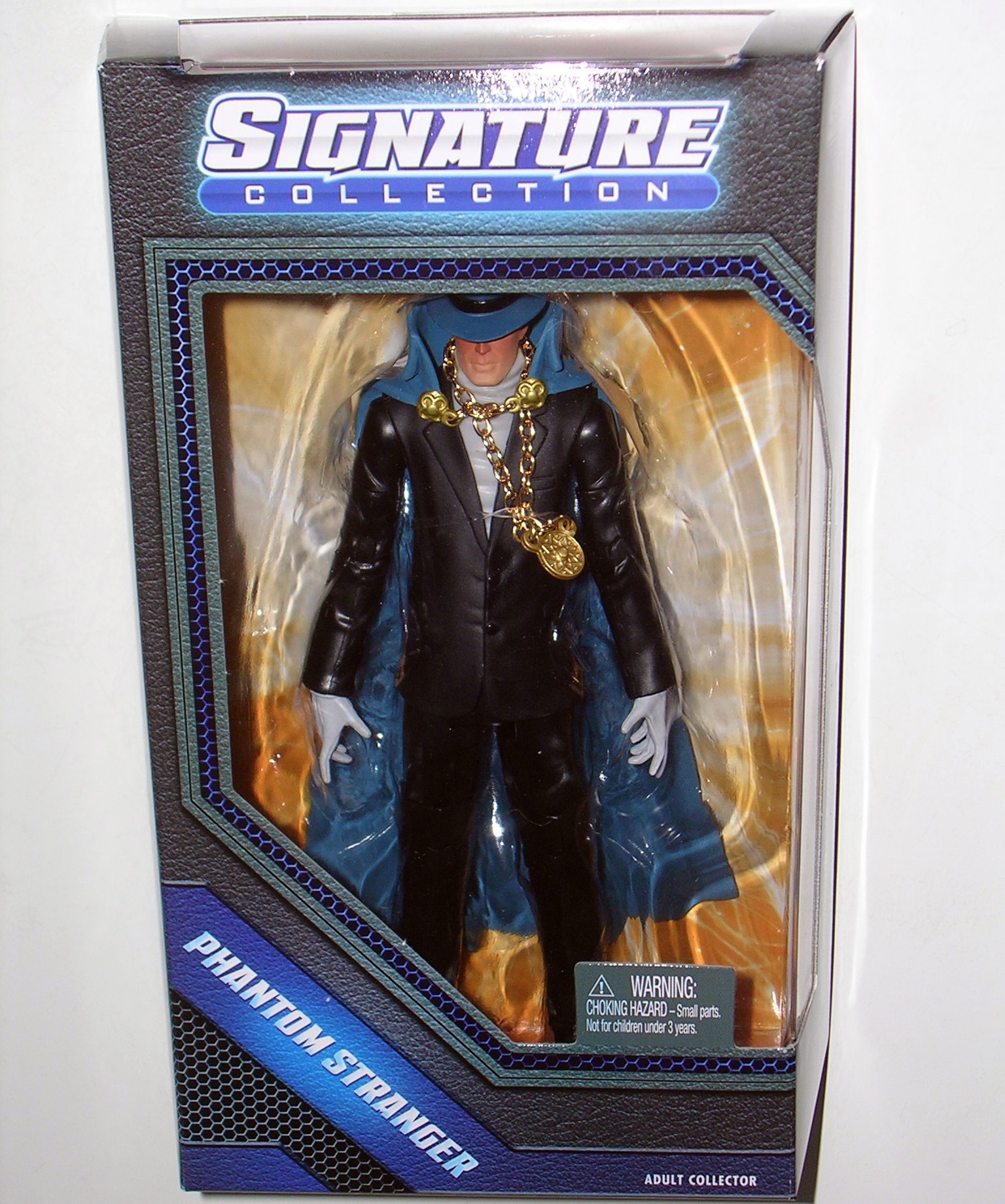
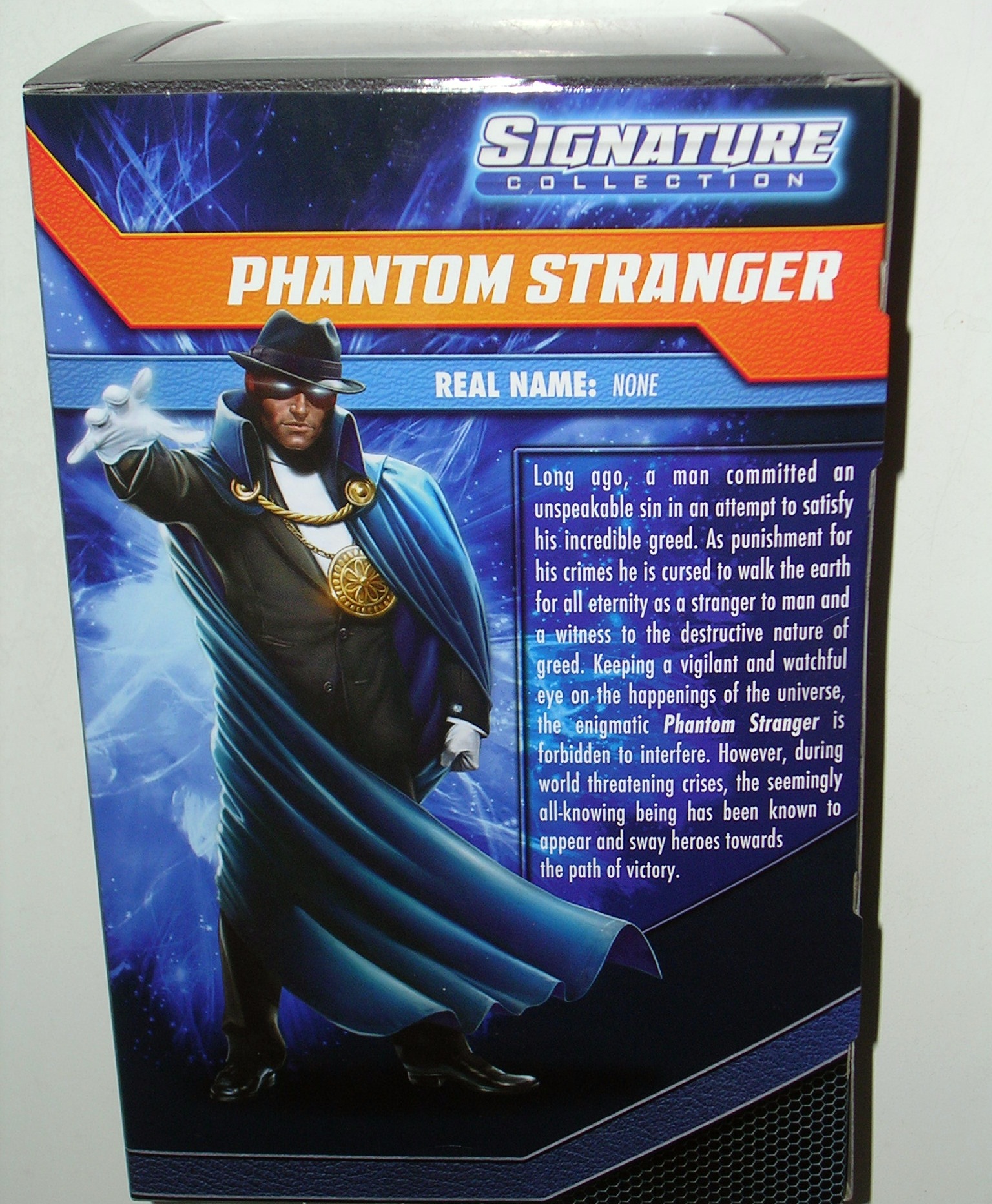
This figure is the second release in this year’s tweaked packaging. Since last month, I’ve been forced to ditch all the packages, except for the quarterly oversized figures, so the change doesn’t bother me as much. I am, still clipping out the backs so I can save the character art and bios. Speaking of bios, I was really curious to see how Mattel would approach Phantom Stranger’s, since the true nature of the character has never been decided. I often vacillate on which of his intriguing backstories I like the most. If I were in charge, I probably would have left the bio area for him blank, because he really is that much of an enigma. But at least they didn’t suggest he was Superman and Wonder Woman’s son from the future, so I’m happy.

DSCN0351

DSCN0356

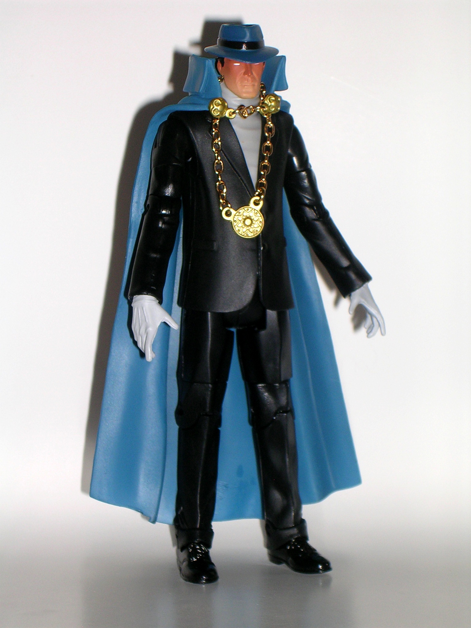
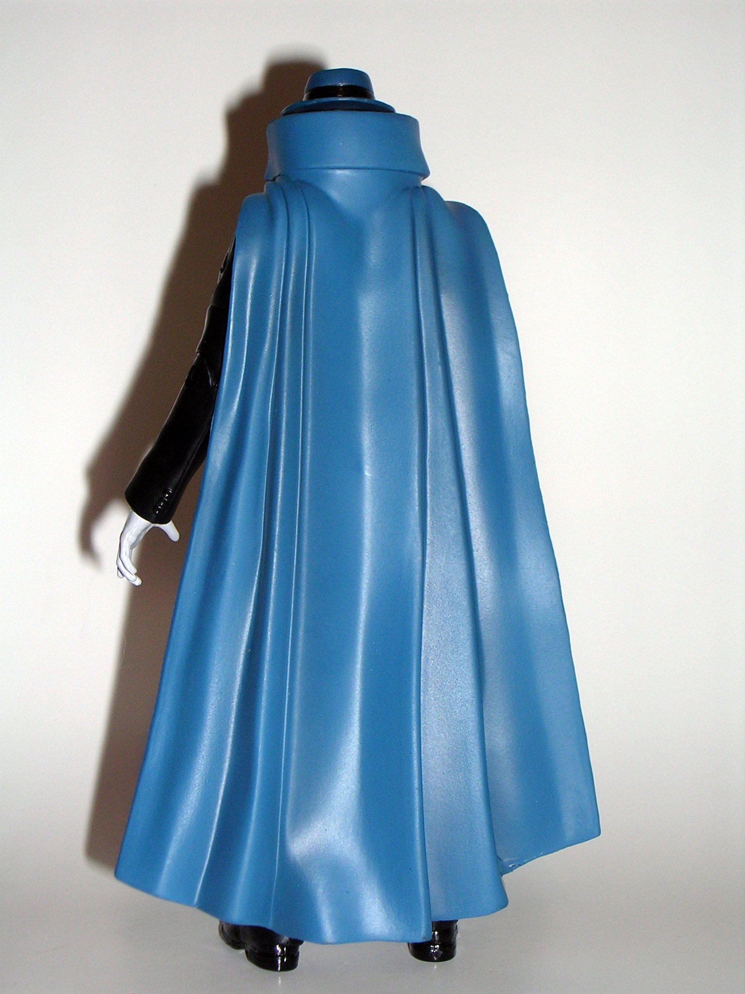
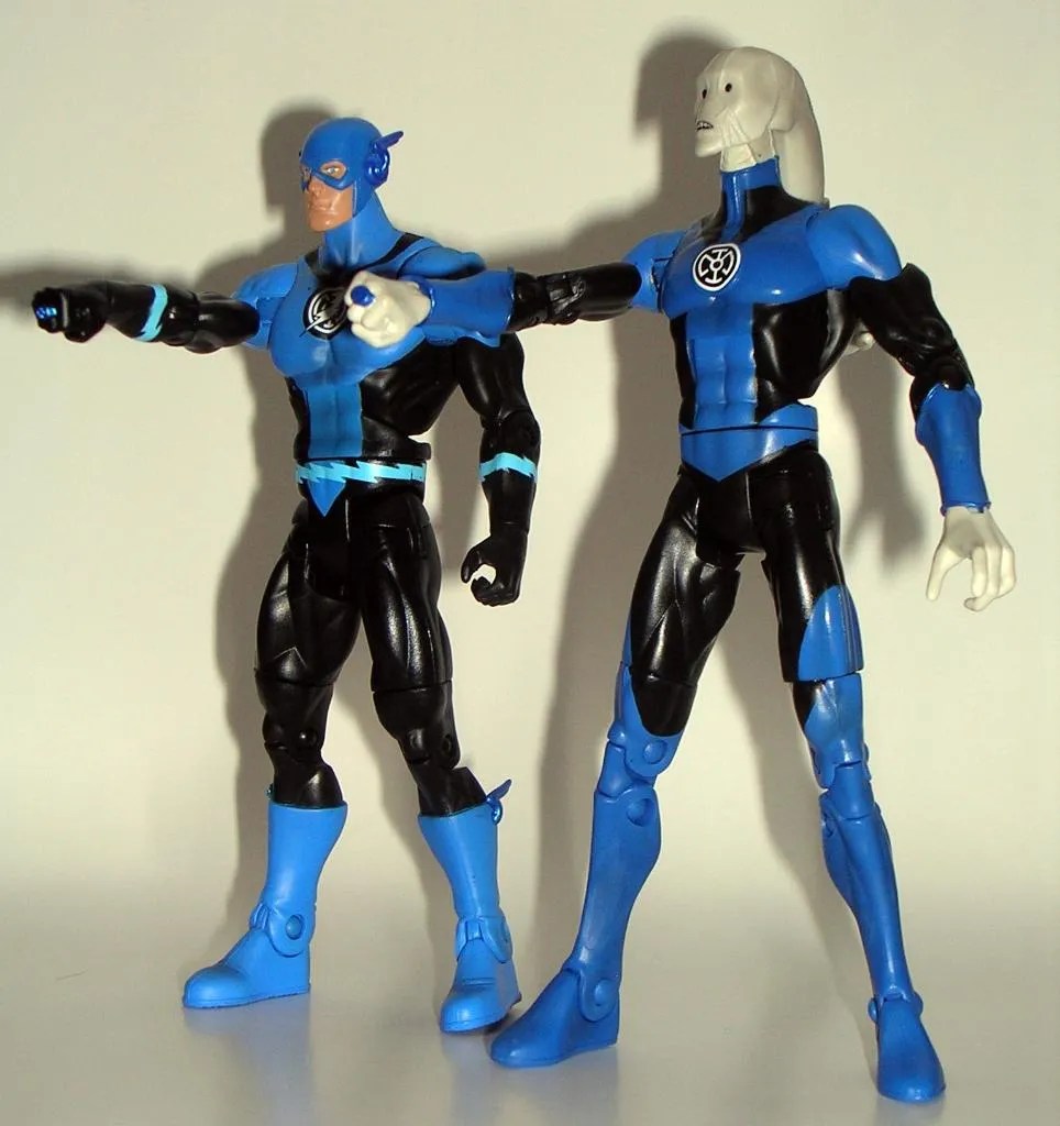
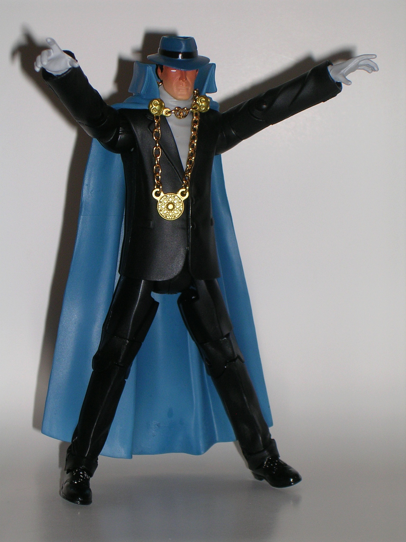
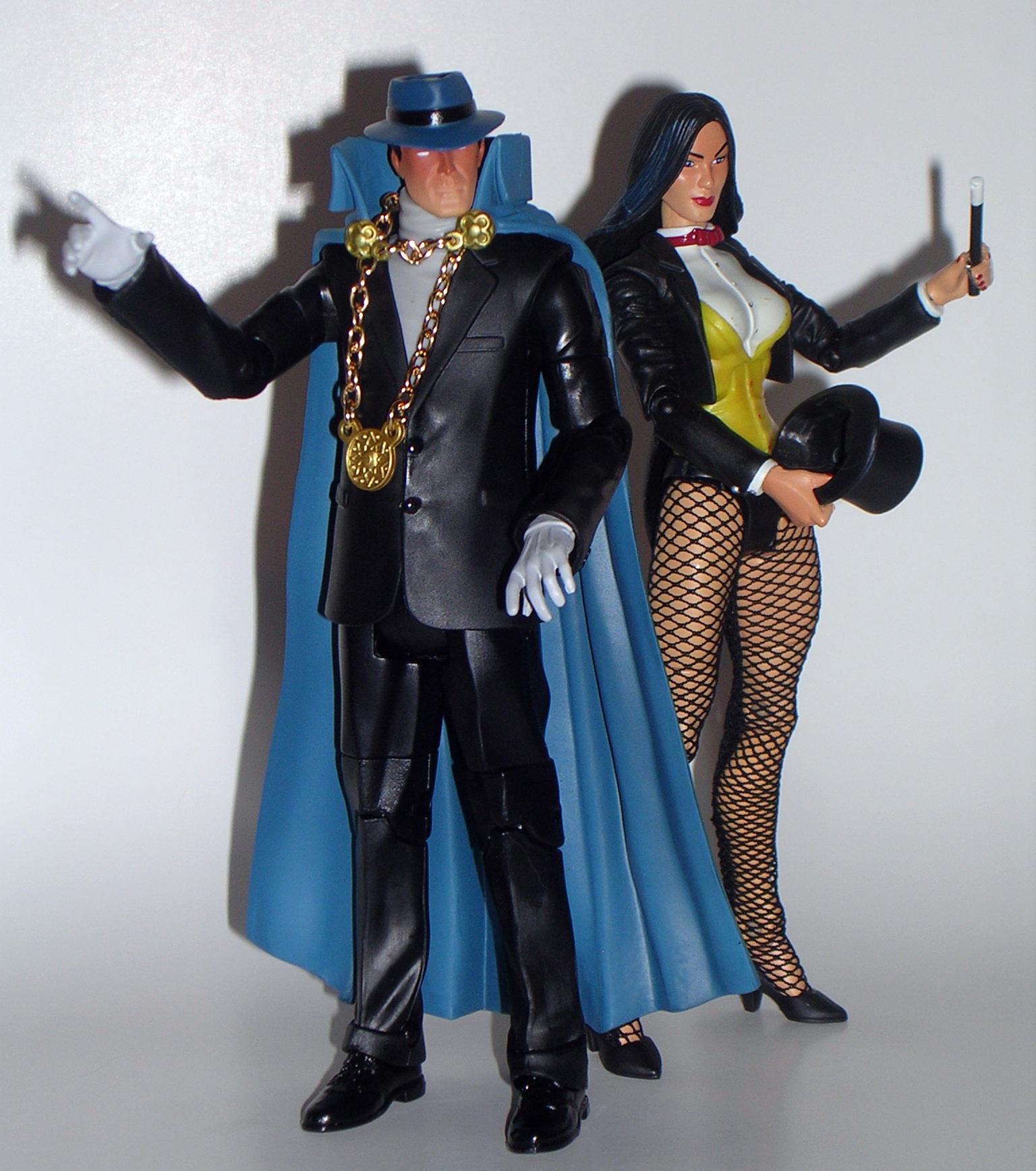
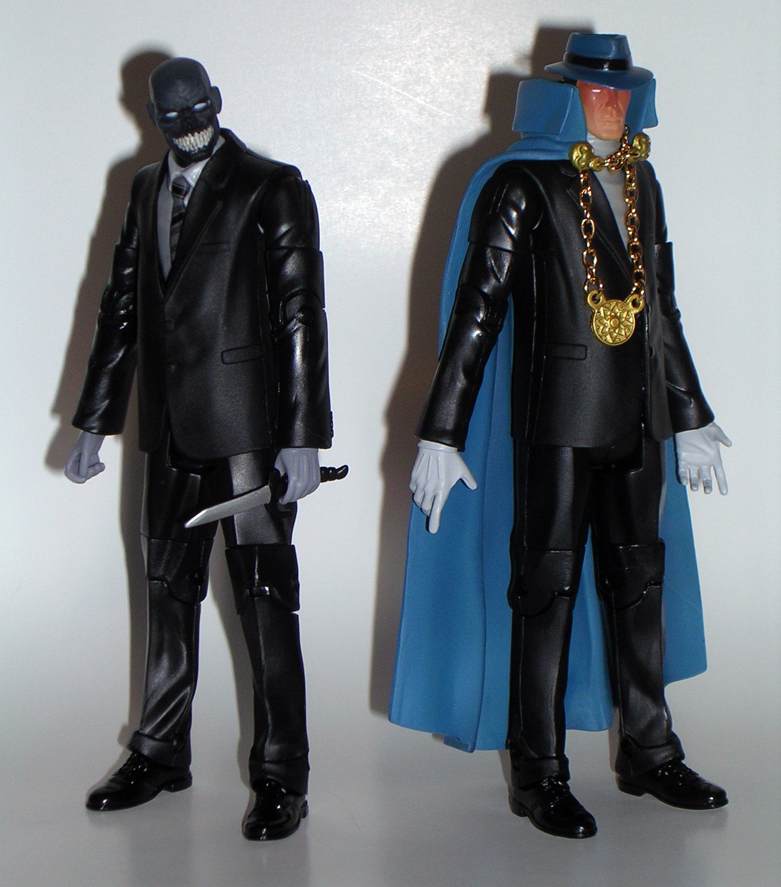
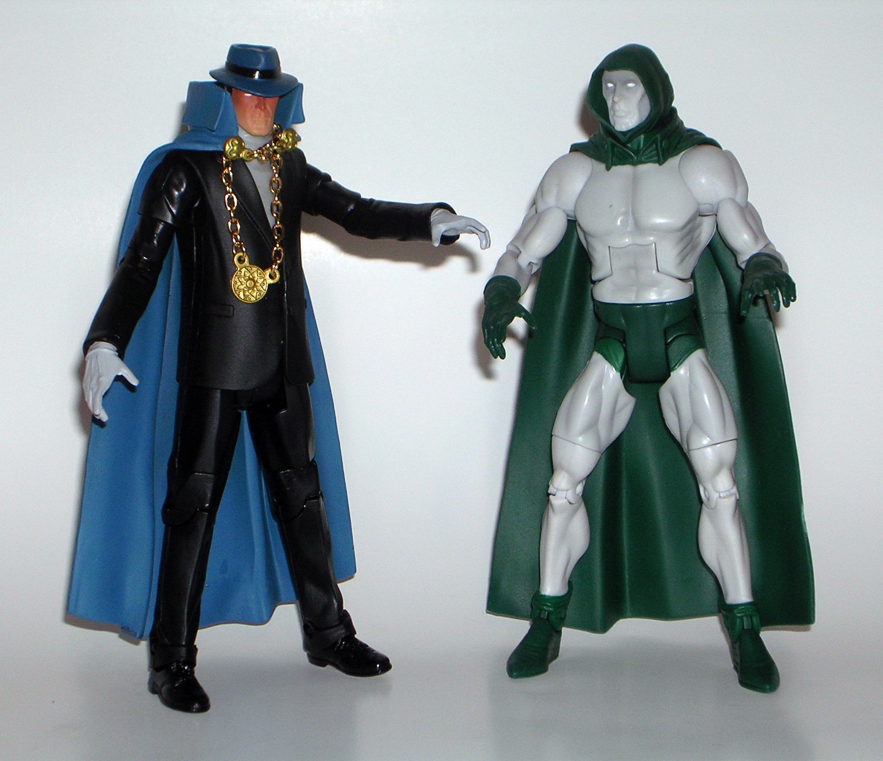
Phantom Stranger is a pretty obvious kitbash. I don’t mean, if you’ve been collecting DCUC for years you’ll probably recognize some parts. No, I mean, if you subbed Club Infinite Earths last year, you will easily recognize the entire body of this figure. It would be one thing to say Phantom Stranger reuses the repainted lower half of John Constantine, but it’s another to say he uses the exact same body as Black Mask, with only a re-sculpted turtleneck to stand out as new. Of course, if you’ve also been collecting DCUC for years than you’ll take note of the fedora used for Sandman and The Question, Martian Manhunter’s cape, and a pair of hands cribbed from The Spectre. In theory, everything should work well, but when I look at him, I can’t help but see all the individual components. I think I know why, so let’s talk…

DSCN0357

Coloring! I think the reason the kitbash elements stand out so much has a lot to do with the figure’s coloring. While character art for Phantom Stranger varies, I think it’s the fact that the blue cape and hat clash with the black suit, which makes the reuse on this figure stand out. I’ve seen plenty of art where his ensemble matches, and I think a more uniform appearance would make the borrowed parts look more cohesive. It doesn’t help that the cape is the same color as Manhunter’s and the fedora is the same color as The Question’s. I dare say, I think I would have liked the figure more in a suit that matched the hat and cape. Sure, all the parts suit the character, but as it stands, it still looks like the figure was cobbled together in someone’s basement.

DSCN0358

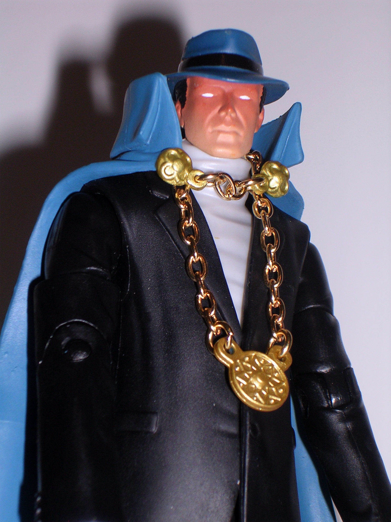
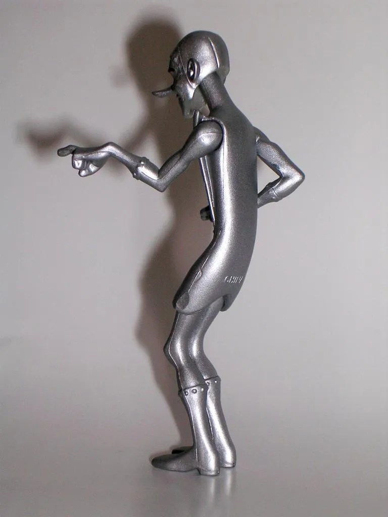
As for the new stuff… The head sculpt is good. I had my doubts about the wash used on the face for shadow effect, but it does look good on the figure in hand. Likewise, the chain used for his medallion looks less clunky and more appropriate in person. Oddly enough, the hands, while still recycled, garner special attention as really tying the figure together. It’s the hocus-pocus aspect of the fingers, which are really expressive and really suit the character beautifully. It probably helps that Spectre was released quite a while ago and so cribbing his hands doesn’t feel so much like double dipping.

DSCN0360

DSCN0361

DSCN0362

All things being equal, Phantom Stranger is a decent enough figure. He’s a character I wanted represented on my shelf, and in fairness the figure matches the source material quite well. As a kitbash released by the biggest toy company in the world, however, he just barely manages to scrape by. I’m usually perfectly fine with Mattel sharing parts. In fact, I usually enjoy seeing how they do it and I’m often impressed by how well they pull it off. Not so much here. A straight re-use of this much of a figure that we just got last year seems like it’s going just a bit too far and there’s not enough new here to justify a $30 figure. Is it just me? Maybe the prices on these guys are starting to get to me. Oh well. Chances are I will be subbing Matty’s Filmation line, so at least that will help defray some of the shipping costs. Either way, I have a feeling that next month’s CIE release will remedy the malaise of the last two months.

DC Universe Signature Collection: Saint Walker by Mattel

Hey, folks! It’s the first figure of the year from Matty’s Club Infinite Earths! Last year’s inaugural figure was the much coveted Jay Garrick Flash. Obviously, Matty realized he would be a tough act to top for 2013, so they didn’t even try. Yes, this year’s first figure is Saint Walker, and this guy wasn’t anywhere near my list of wanted characters. In fact, he actually set around here for a couple of days before I got around to opening him. Toss in the fact that I’m still reeling from all the Lantern Corps stuff Mattel has pushed down our throats over the past couple of years, and I honestly couldn’t be less excited about this figure. Let’s do it…

I’ve been pretty consistent in my praise for the Signature Collection packaging, so at least I can be excited about seeing another one of these pleasing boxes… oh, wait… Matty redesigned the packaging. Well, ain’t that a kick in the nuts! The redesign is more of a tweak than a total overhaul. The overall configuration of the box is mostly the same with a big window on the front, wrapping around to the side panel, and another window on the top. The deco is what’s changed. There’s now an illustrated leather-like pattern with a hexagonal grid trim. That f’ugly new DC Comics logo appears on one side panel. Seriously, guys? Your business is basically selling artwork and this logo is the best you could do?

The back panel of the box is mostly the same as the old style, complete with bio, and the character artwork is still great. It may take me a couple of releases before I decide whether or not I really dig this new look, but I can’t say as I hate it. I’m still at the point with these boxes where I’m fooling myself into thinking that I’m going to keep saving them all, when in truth I just don’t have the space. I can see the point coming soon where I’m going to clip the backs off and keep them like cardbacks and probably only keep the complete packages for the oversized figures.


My only experience with Saint Walker is based on his appearances in Final Crisis and Blackest Night. I haven’t read any of his appearances in the New 52, but then right now my sustained readings in the New 52 only amounts to about six books, and I’ve been shying away from most anything concerning the Lantern Corps. I dig his backstory, but as I already mentioned, he’s not a character that I was jonesing to have in figure form, other than the fact that he helps fill out my Lantern Corp leaders and I guess that’s a cool thing. I guess I also still dig the idea of having more alien Lanterns in the DCUC style and Saint Walker certainly fits that bill.

Ok, let me start out by saying that I don’t like the head sculpt very much. Saint Walker is usually drawn one of two ways: You’ve got him with the round “crash test dummy” dots for eyes or sometimes with more almond shaped eyes. DC Direct went with the almond eyes for their Saint Walker bust and I think it looks so much better. Hell, even the artwork on this box features that version and it looks so much better. Maybe, this is a matter of personal preference, but at the very least, Mattel should have had the styling of the box art and the figure agree with each other. Even the configuration of the sculpted lines on Bro’Dee’s face doesn’t really match the artwork. Am I being too hard on the likeness? I don’t hate it, but in light of the many excellent head sculpts we’ve been getting in the Signature Collection, I think it could have been so much better.

On the other hand, I love the body on this figure, and since a lot of what I love about it is the articulation, let’s start there. The arms are ball jointed at the shoulders, have swivels at the biceps, double-hinges at the elbows, and swivels and hinges at the wrists. The legs feature the usual DCUC style hip joints, swivel at the thighs, have double-hinged knees, and hinged ankles. The torso has an ab crunch hinge, swivels at the waist, and the head is ball jointed. You also get a swivel cut in his head-tail. This is really phenomenal articulation and all the joints are strong and sans warping. Honestly, the only thing I could possibly think to add would have been ankle rockers.

Saint Walker’s costume itself is comprised almost solely of paint apps and the paintwork is excellent. I do adore the rich, deep shade of blue Mattel uses for the Blue Lantern costumes and the overall deco when mixed with the black really looks striking on the figure. The white Lantern Corps emblem tampo on the chest really ties everything together. Bro’Dee’s left hand is obviously sculpted in a fist so he can wield his power ring and his right hand is sculpted so he can hold his lantern.


So, Saint Walker is a bit of a mixed bag. If he were a figure that ranked high on my want list, I would have probably taken further issue with the head sculpt, but as he’s just going to be another face in the crowd on my Lantern Corps shelf, I can live with it. Make no mistake, there’s a lot to love about this figure, particularly if you prefer this style of portrait and I hope to see this style of articulation in more figures this year. But I still cannot help but look at the figure next to the character art and say “No!” He’s one of only a select few figures that have appeared in CIE that I wouldn’t have purchased if I wasn’t a subscriber, especially when you consider the fact that he was $28 after shipping.

DC Universe Signature Collection: Lead by Mattel

Alrighty, let’s deal with the giant lead elephant in the room. Mattel has done it again and bestowed giant status on a figure that doesn’t warrant it. First we got the inexplicably huge Rocket Red and now Lead gets the giant treatment. Lead is built off of the C&C Darkseid buck, meaning he towers over the other Metal Men. While definitely the bruiser of the team, Lead was usually drawn the same size as the other Responsometer robots. I should be furious that Mattel took us all the way up to the last member of the team and then did something crazy like this. But I’m not. In fact, I’m willing to give this one a pass, because the Metal Men could change their size and shape at will, and quite frankly, I think he looks pretty good this big.


As a quarterly figure, Lead comes in a bigger version of the same style window box we saw yesterday. In this case, the character art is solid, but not as exceptional as it usually is. You get a little bio blurb about the character and, as expected, the package is completely collector friendly.

Starting off with Lead’s head sculpt, I definitely dig the portrait, which features Lead smiling broadly. He’s got a lot of personality and his nature of the big loveable lug really comes across in the sculpt. Mattel didn’t have to do a lot of new tooling for this figure, but what they did, they did well.


Moving on to the rest of the body… well, besides his obvious growth spurt, Lead’s use of the Darkseid buck also means that he retains the stony sculpted lines on the arms and legs. Mattel, these are the METAL Men not Rock Lords. Lead and stone are two different things and seeing the stone patterns on this figure is both wrong and distracting. Luckily the dark coloring of the figure makes them a little less obvious, but the fact that these are there bother me a lot more than Lead being an oversized figure. One I can explain away, the other I cannot.

Once I get past Lead’s stony limbs, the rest of the figure falls into place pretty well. The rubbery smock that makes up his skirt and chest plate looks good. He’s got heavy rivets sculpted into his triangular front plate, and again around his gauntlets and boots. Otherwise, there’s not a lot of original sculpting on the body, but I’ve come to expect that from this team, and in truth it isn’t necessary.

Lead is painted over in a satisfyingly dark grey wash with some faint swirly patterns that crop up here and there. It’s a good finish for him that’s pretty characteristic of the artwork. The only other paint apps on the figure are the black for his eyes and eyebrows, the “L” symbols on his chest and forehead, and the white for his teeth. I’m a little iffy on the white teeth. I’m thinking black would have worked better, but it’s not really a sticking point for me.

Even as a former C&C buck, Lead retains most of the articulation we come to expect from the DCUC line. His arms are ball jointed at the shoulders, hinged at the elbows, and have swivels in the biceps and wrists. His legs have the usual universal hip movement and feature hinges in the knees and ankles. There are, however, no swivels in the thighs. Lead’s neck is ball jointed, he can swivel at the waist, and he retains his ab crunch hinge, which is still fairly serviceable under his soft rubbery chest plate. The only other thing worth mentioning is that my Lead figure has really loose legs. He can stand ok, but they really flop around.

Mattel can be geniuses when it comes to reusing parts in this line. A quick look back to Uncle Sam certainly proves that to be true. Unfortunately, Lead is not one of those times. They had two good reasons not to reuse the C&C Darkseid buck for this figure: Size being one and the stony pattern in the sculpt being the other. I can get around the size on this one, in fact I even kind of like it, but the problem with the sculpt is tougher for me to get past. I like the figure well enough. I’m very glad to have a complete Metal Men team, but a lot about this figure stinks of laziness, and when you consider that it’s a more expensive quarterly figure, I find that hard to accept. With the first year of Club Infinite Earths in the bag, I’ve been overall extremely satisfied with this line. If Lead here is the biggest disappointment, than that’s not too bad. Still, it’s a shame the line had to end the year on a low.

DC Universe Signature Collection: Platinum and Tin by Mattel

When Iron came out, way back in DC Universe Classics Wave 12, I had little exposure to The Metal Men, other than their cameos in other comics, like 52. But the thing I always loved most about DCUC was the way it could send me scrambling to buy books I never would have otherwise read if it weren’t for a certain figure I liked. Shortly after buying Mercury, I happened upon a stack of the original 1960’s Metal Men comics at a used bookshop downtown. They were in terrible shape, but I got them for cheap, took them home and devoured all of them that night. A bit later, we got word that Mattel would be completing the team through Club Infinite Earths and so I tracked down the Walmart Exclusive Gold. Soon I was hotly anticipating completing a team that I barely knew a couple of years ago. And that brings us to December’s CIE monthly figure(s): Platinum and Tin.

It’s interesting that Mattel waited so long to do Platinum (aka Tina), because at the start of the original comic she was the most prominent of all of Dr. Magnus’ Responsometer creations. Issue #1 (“Rain of the Missile Men”) managed to endear her to me straight away. The issue starts out with Magnus donated her as a museum display for being too emotionally attached to him. Of course, she was promptly kicked out of the museum because she wouldn’t stop crying and the patrons concluded she was a fake because robots don’t cry. In addition to some fun bickering between her and the chauvinistic, dickhead (“I hate women – especially robot ones”) Mercury, Tina eventually becomes the object of lecherous desire from an alien robot who proceeds to attack Earth to get her as his queen. Fun! As for Tin… well, I found him to be a pretty annoying character even at the best of times, but I’m still happy to get him as a pack-in just to round out the team.

On to the packaging… As usual, the character art is fantastic and the window box is completely collector friendly. Sadly, I’ve amassed quite a few of these over the year, and most of the figures have been incorporated into my DCUC display shelves. I’m starting to feel the pinch for space and I’m resisting the sensible urge to ditch the packages. In the end, I may be forced to keep only the quarterly figure boxes. Anyway, I don’t have much new to say about the package, so let’s move on!


Tina’s design hasn’t changed all that much since she was introduced and the figure reflects that fact. The portrait is pretty good, although Tina looks a lot more confident and mature than the doe-eyed naïve and innocent metal woman from the early funnybooks. Either way, she’s quite pretty and certainly invokes the spirit of the modern appearances of the character. Tina has her little cap with her symbol and the sculptors did a fine job recreating her 60’s hairstyle. The rest of the figure is appropriately lacking in sculpted detail. Really, all you have are the rivets around the edges of her triangular front plate and some more around the tops of her boots. Both of her hands are sculpted into tiny fists, which are fine, but I really would have liked a set of attachable coil hands. All the other Metal Men up to this point got extra pieces that allowed their hands to morph. Tina’s trademark move was turning her arms to springs. I guess that extra plastic went into Tin.

Also keeping with the theme of the characters, Tina is washed over with a pleasing coat of shimmery silver paint. The only other paint apps on the figure are the black making up her eyes and eyebrows and the symbol on her cap. My only quibble about the paint would be the unpainted joints, but the base plastic is close enough that it isn’t jarring to the eye.

Platinum’s articulation includes everything you’d expect from a DCUC style figure. The arms feature ball jointed shoulders, hinged elbows, and swivels in the biceps and wrists. Her legs have universal hinges at the hips, hinges at the knees and ankles, and swivels in the thighs. She has a ball jointed neck, can swivel at the waist, and has the usual ab crunch hinge in her torso. The articulation looks good on paper, but her sculpted skirt really puts a damper on her upper leg movement. At least the torso design allows for her ab crunch to work.


And then there’s Tin. Remember that 3-pack of critters Mattel put out in Green Lantern Classics? Well, he’s not as bad as them, but the idea is about the same. He’s a cool little sculpt, which captures the goofy and awkward nature of the character. He’s mostly pre-posed, in an odd hunched over posture with knees bent. I’m not sure what they were going for with the pose, or what he’s supposed to be doing with his pointed fingers, but as a pack-in to finish off the team, I’m fairly happy with him. With rotating shoulders and head, he does have three points of articulation and he stands surprisingly well on his own.


Platinum was one of my most anticipated figures of this year’s CIE offerings, partly because I’ve grown to really love the characters and their books, and partly because my OCD really flares up when I have incomplete teams. In the end she didn’t disappoint. Granted, she wasn’t the hardest figure in the world to do, but at least Mattel didn’t do something crazy like make her into an inappropriately oversized figure like Rocket Red or… oh… well, we’ll talk about Lead tomorrow.

FigureFan’s Favorites 2012, Part 1


Happy New Year, folks! Let’s jump right in with the first five delectable items on my Favorites list. I’ll point out that these are not in any order because that would have taken more effort and the whole point of this song and dance was to get me a week off… let’s go!


Masters of the Universe Classics: The Wind Raider by Mattel… As much as I give Matty Collector a hard time, I can’t deny they produce some amazing toys and figures. But as I mentioned in a recent feature, I didn’t give a lot of attention to the MOTUC line in 2012. Nonetheless, I couldn’t resist grabbing the Wind Raider, and I’m certainly glad I did. Besides being the only vehicle released in the line so far, it is one big, beautiful, and very high-quality toy. At about $60 shipped, it certainly wasn’t cheap, and yet I was still totally impressed and satisfied with it when it came out of the box. The fact that Matty has managed to make it readily available for purchase throughout the year is even better. This piece really belongs in every MOTUC collection.

Teenage Mutant Ninja Turtles: Nickelodeon’s Ninja Turtles by Playmates… Yep, I’m cheating on this one, because I’m using one slot for four figures. I make no apologies, because how could I choose just one of the Heroes in a Half Shell? Some may be surprised to find the smaller, modern versions of the Turtles on this list, rather than the larger Classic-inspired figures, but when you get down to it, these little guys are just more amazing. The new designs are fantastic, the sculpts and articulation are great, and they’re also some of the best values hanging on the action figure pegs today. And this is coming from someone who doesn’t like the show they’re based on! It’s no surprise that the TMNT sections were cleaned out at most retailers in the weeks leading up to Christmas. I often lament the kids growing up today without the kind of kick-ass toys I had as a kid, but these figures actually make me jealous of those damn kids.

Marvel Legends: Steve Rogers & Thor by Hasbro… I really tried to break this tie, but in the end, I just couldn’t do it. In 2012 Hasbro brought Marvel Legends back with a vengeance, and there were lots of solid efforts. This entry originally started as a three-way tie with Arnim Zola finally getting edged out. Steve Rogers and Thor are both prime examples of what I look for in a great action figure. I’d say that of the two, Rogers is more fun to pick up and play with, but Thor’s heft and sculpt capture everything there is to say about the character. If anything, these two figures showed me that Hasbro was trying to do things right with Legends this time around.


Doctor Who: “The Chase” Collector Set by Character Options… You can call this my token Doctor Who slot if you wish, but I’m putting it here anyway. Based on an episode that aired in 1965, the bulk of this set is comprised of a Mechanoid, a robot that looks like a giant Christmas tree ornament that we saw once and never again. The bottom line is that it’s almost impossible that this set exists and yet it does, and for that I love it to pieces. Doctor Who may have grown into a huge international success, but classic and obscure items like this one are geared toward a very niche market, and I congratulate Character Options for making them. The fact that it had a couple of extra classic Daleks was just icing on the cake!

Transformers Commemorative Series:  Powermaster Optimus Prime by Hasbro… Sneaking onto the list as a technicality is this amazing Toys R Us exclusive. Hasbro released Powermaster Prime way back in 2003, but I featured him this year and he isn’t old enough to be a “Vintage Vault” entry, so here he is! Easily one of my favorite Transformers releases of all time, this set is so hefty and so beautifully packaged, that it puts most of the Transformers SDCC Exclusives to shame. This toy features a plethora of modes and all kinds of little custom tweaks to give it even more playability. There’s so much cool interchangeable stuff here that it reminds me of the glorious old Micronaut sets that I grew up with. This “Commemorative Edition” was also the first time that the superior Takara version of the toy was released stateside. I paid $50 for this beauty back in the day, which was a good enough deal that I eventually picked up a second set to leave packaged. Even during times when I have the bulk of my Transformers collection put away, Powermaster Prime is always out on display. I just love him that much.

Swing by tomorrow, and I’ll wrap up my Favorites List with the last five entries…

Masters of the Universe Classics: Vikor by Mattel

Ok, we’re up to the last of the MOTUC figures that I picked up from Matty’s Cyber Monday Sale. It’s Vikor, and I have absolutely no interest in this figure as an MOTUC character. But that’s fair enough, since he’s a figure that’s based on concept art with a subsequent bio retconned into the universe. Yes, like a lot of collectors, I bought him strictly because I dig Conan, and Vikor is now an unofficial Conan stand-in on my action figure shelves.

There’s the awesome MOTUC packaging. When will we see it again around these parts? Who can tell. Possibly not for a long time. The insert on mine has the explosion that says “The Original” which, in “Matty Speak,” means the exact opposite. This figure is not the original, it’s the re-issue. Anyway, I’m not even bothering with the bio on the back of the card, because Vikor here is just my generic Conan-like barbarian figure, and I’m not concerned with his tie-in to the Masters universe. There’s was something else I wanted to say here… now what was it? Oh yeah… VIKOR IS AN ABSOLUTE BITCH TO GET OFF THE TRAY!!! I don’t know what kind of tortured method the factories used to get this guy onto his tray, but his cape was passed through a narrow little slot and his sword also passes in front of and behind the plastic. Ultimately I had to get a pair of scissors and start hacking away until I could get the figure free. The fact that he’s wearing chains is somehow appropriate.


Out of the package, and it’s easy to see why Vikor is a perfect Conan stand in. Not the “Ahh’nold” Conan, or even the “Guy-From-Game-Of-Thrones-Who’s-Name-I-Can’t-Be-Bothered-To-Look-Up” Conan. Nope, he’s more like the awesome Frank Frazetta Conan. He’s a remarkably simple figure using the basic MOTUC male buck with just the right amount of original bits here and there to make him work so well as a barbarian warlord. He’s so chock full of barbarian goodness that he makes He-Man look like a girly-haired pussy by comparison.

First off, check out that head sculpt. The face is chiseled and harsh with a broad nose, prominent brow and narrow eyes that seem intent on figuring out the most spectacular way to eviscerate you. There’s a wonderful fierce nobility that comes across just like it does in Frazetta’s artwork. The horned helmet and long hair are both sculpted together and the helmet is ever so slightly crooked, making it look so much more convincing than if it were just sculpted as part of the head. It’s also pitted and dinged, making it one of the best sculpted pieces of armor this line has produced. The head is perfectly framed by the necklace of bones that holds on his cape, but more on that cape later.

As already mentioned, the body is a basic He-Man torso and legs. The chest is completely bare and the typical MOTU-style furry diaper is replaced with a ragged brown loincloth, front and back, held on with a sculpted coin-style belt on each side. The back of the sash has a loop to store his sword. Apart from this new modesty garment, Vikor is wearing straps on his biceps and manacles on his wrists, each with the remnants of real chains hanging down from them.

The molded fur cape fans out behind him and while I would have preferred it to be painted matte, rather than the less appropriate glossy brown, it still features a gorgeous amount of texture work and the bone necklace that attaches it around Vikor’s neck has a cool, rotting yellow finish. The downside of the cape is that it’s molded in very rigid plastic and it does tend to get in the way. Fortunately, you can pop off Vikor’s head and remove it, for when he plans on going apeshit with his axe and needs a little more elbow room to maneuver.


Speaking of going apeshit with weapons, Vikor comes with a sword, a shield, and a battle axe. The sword and axe are paired with the same style grips. They are very nice pieces, but I would have preferred something more primitive looking, like sculpted leather grips, over these green metallic grips. The weapons look a little too modern for the figure, and while I realize that mixing medieval with future tech is one of the charms of the MOTU universe, they’re a tad out of place for my Conan figure here. The shield also has bit of a modern vibe to it, although it matches the other weapons really well and can clip onto either of Vikor’s arms.


Vikor is a spectacular figure, and one I’d wholeheartedly recommend even to folks who aren’t collecting the MOTUC line. In fact, if you want a good representation of what makes this line of figures so great, Vikor makes a fantastic stand-alone piece to display on your shelf. I’m really glad I had another opportunity to pick him up, and the discounted price and shipping makes it all the better. Of course, the other reason I got him was to display with my Battleground Teela. The two figures look like they were made for each other, as both really transcend the MOTUC line and display beautifully together.

I’m all out of stuff that I scored from Matty’s Cyber Monday Sale, so tomorrow I’m going to shoehorn in another Mattel item that I picked up on sale from a different e-tailer that same week.

The Sandman: Death Statue by Mattel

Today we’re going to take a break from all the MOTUC stuff and check out one of the non-He-Man related things I picked up at Matty’s Sale: The sassy Death statue from Neil Gaiman’s Sandman series. I was first exposed to The Sandman comics back when I owned a used & out of print bookstore. I never knew what was going to come through the front door and one day it happened to be a guy with a panel van filled with 4,500 comics to unload. They were all bagged and boarded and ran the gamut from the 70’s to current stuff. I didn’t sell comics, but I couldn’t resist and we came to an arrangement. Eventually, I culled through the collection, keeping what I wanted and setting up the rest in the back corner of the store on card tables. Some of the ones I pulled were Neil Gaiman’s The Sandman.

smdeath1

I make no bones about being a Neil Gaiman fan. Besides really enjoying his original comic work, many of his efforts have spilled over into so many other mediums and franchises that I hold dear. When Mattel revealed their Death statue for the 2012 San Diego Comic Con, I was certainly interested, but with so many other things vying for my collecting dollars, I ultimately had to pass. Most of the time, when you pass on SDCC exclusives, the ship sails and second chances are expensive (Screw you, Sky Striker Starscream!!!). But every once and a while, the items are readily available afterwards at the same price. In this case, I was able to do even better, as Matty Collector had a ton of these still available for their Cyber Monday Sale.

smdeath2

smdeath3
While nowhere on the box does this statue claim to be an SDCC Exclusive, the gorgeous and elaborate packaging certainly betrays it as being some kind of special item. As with most Matty Collector items, Death comes in a mailer box, but rather than being a boring white carton, this one is all black with Death’s ankh printed on one side and a really nice minimalist portrait of her on the other.

smdeath5

smdeath4

smdeath6
Inside the tasteful mailer box, things only get better. The statue comes in a three-quarter window box with an elaborately illustrated frame and insert, placing Death in an animated graveyard environment. The back of the box has a portrait and a little blurb about the character.  She’s secured on a transparent tray and hovering slightly above her skull base, and the various windows let you enjoy the statue from every angle except the back. If ever there was an argument against opening a collectible, this presentation would be a pretty convincing one. I mean, I open everything, and even I was really tempted to leave Death mint in sealed box. However, after some really careful clipping, I was able to get Death out of her box without destroying the packaging.

smdeath7

So, the first thing to realize about this statue is that it’s molded out of regular old plastic. If you’re a collector of statues, you’re probably used to PVC, polystone, cold-cast porcelain, or pretty much anything other than this mass market grade plastic. Besides making the statue remarkably light (seriously, there’s no heft to this thing at all!), this kind of plastic shows seam lines and just can’t hold a sculpt as well as the more premium grade materials. Now, all that having been said, the sculpt is a solid enough effort, and this is by no means a bad looking piece.

smdeath8

Death is posed standing, with her right hand bent at the elbow and resting on her hip, and her other hand resting suspiciously close to her “hoo-hoo.” Actually, I think the designers were going for having her left thumb hooked into her belt and you can kind of see that. There are swivel cuts in her shoulders and torso, but Death is obviously sculpted to be in a very specific pose and I haven’t had any luck using the articulation to her benefit. Otherwise, there’s some good detail work in the sculpt. The laces on her boots and the buckles on her belt are all pronounced, and you get the little wrinkles on her tank top. She also has her ankh pendant hanging around from her neck on a string… OMG, that’s mixed media folks!!! Still, there’s nothing here you wouldn’t see done in a similar fashion on a well executed 6-inch action figure.

smdeath9

Death’s head is looking slightly downward and this is really the only thing that irks me about the pose because it kind of hides her face. The neck is ball jointed, but there’s no room for her to look up, only side to side. The ability to swivel the head is certainly more useful than the rest of the articulation, but I really would have preferred an option to have her looking forward and not perpetually downward. My guess is the designers wanted to make her look coy, and if you turn her head all the way to one side, it kind of works ok. The sculpting on the head is easily the best part of the statue, as it captures the character quite well and I particularly like that the hair is sculpted as a separate piece.

smdeath10

The paintwork has its ups and downs. The paint on the face is excellent. Her eyes and lips are perfect, and the grey wash on her hair is used sparingly and to good effect. The quality of the paint breaks down a bit between her tank top and her armpits. There’s definitely some slop going on there. There are also a few stray marks along the back of her pants. The lace holes on her boots are all painted silver, as are the studs and buckles on her belts.

smdeath11

Death comes separate from her base, with peg holes in her feet to secure her to it. Her feet aren’t sculpted to make her boots flush with the base, so I don’t really get the feeling that she’s naturally standing on it. Nevertheless, the skull base is a really great looking piece. There’s not a lot of paintwork, but the sculpt speaks for itself, and it does have a cool aged patina. Unfortunately, it’s hollow, so it adds to the lightweight feel of the statue.

smdeath13

smdeath12

If you collect statues, I’d caution you that Death probably isn’t going to meet your expectations. The lack of heft alone is likely to disappoint. On the other hand, if you just happen to be a Sandman fan and you’re looking for a good representation of Death to display on your shelf, this statue certainly gets the job done. It’s a competent piece, although it still feels like it started life as an action figure. As far as value goes, this statue originally retailed for $30 (closer to $40 if you ordered it off Matty and had it shipped). Now, normally that’s pretty cheap for a collectible statue, but for a plastic statue made by a mass market retailer like Mattel?  Eh, maybe not so much. In hand, however, the elaborate presentation of the packaging helps bolster the value quite a bit, and I can honestly tell you that I’ve seen far more expensive statues turn out a lot worse than this one. Ultimately, I’m glad I picked her up. She’ll look nice on my Bishoujo shelf, although more than likely she’ll wind up going back in her box for now, as I definitely want to keep the whole presentation intact.

Tomorrow I’ll turn my gaze back to the last MOTUC figure that I picked up from Matty’s sale… It’s Vikor!

Masters of the Universe Classics: Grizzlor by Mattel

Things got a little-long winded yesterday, so today I’m checking out one of the figures that I’m not likely to gas on about nearly so much. He’s Grizzlor, and I’ll be honest, the only reason I bought him was because I was already placing an order, he was cheap, and I wanted at least one more figure for my Horde shelf that wasn’t Leech. I can’t stand Leech. Seriously, don’t get me started on Leech. My fondness for Grizzlor doesn’t stretch much further back than his appearances on Robot Chicken, but hey, another Horde guy for $15… how could I go wrong?

It’s the MOTUC packaging we’ve seen a bunch of times here on FigureFan. I didn’t comment much on the deco yesterday, so let me just point out how awesome it still looks. I’m glad Matty hasn’t monkeyed with the design over the last couple of years, because they came up with a winner right out of the gate. If it ain’t broke don’t fix it, right? Granted, my MOTUC packages wind up shredded and in the garbage, but if ever there was a line of figures that I wouldn’t mind hanging on my wall mint-on-card, this would certainly be one of them.


Of course, Grizzlor’s gimmick is that he’s a hairy bastard and Mattel went all out with giving him real hair, just like the vintage toy. It was a bold move in an Adult Collector line, but if you ask me it was the only way they could go. How’d it turn out? Well… let’s take a look.

My first impression when looking at Grizzlor is… Norfin Troll. Sorry, Mattel, but I can’t get that image out of my mind. It’s like I should be rubbing his head for luck or something. His fur is just all over the place and at first it looks kind of awkward and funny, but then something tells me Grizzlor isn’t the kind of dude who would be combing himself out every day. His hair should be all over the place like a bad case of perpetual bed head. I think the weirdest thing about the figure is the blending of real hair and the sculpted hair on his arms and legs. The two don’t necessarily mesh all that well, but I’m trying not to be too critical here, because in the end, I think Grizzlor’s real hair works pretty well.

The face sculpt is classic. It’s probably not one of this line’s better sculpts, but the combination of fangs, red and yellow eyes, and his little smooshed ape nose all conspire to give Grizzlor a ton of personality. It’s kind of hard to figure out whether Grizzlor’s face is scary or cute, but I can’t deny that it is distinctive.

Grizzlor comes wearing his Horde harness with the huge sculpted Horde crest on the front and a backpack that can hold his impressive arsenal of weaponry, but we’ll get to that in a bit. He also comes with a sculpted primitive looking loin cloth, which I believe is intended to be closer to his 200x version. I don’t think I’ve ever seen 200x Grizzlor, so I’m taking a friend’s word on that. I think these accessories are intended to be worn in an “either-or” configuration, but I don’t think he looks at all bad when wearing both. And there’s no way I’m going to display him without that great backpack to hold all his killing gear. In the end, though, I think I’ll leave the loincloth piece off.


As far as articulation goes, Grizzlor doesn’t sacrifice any poseability in favor of his furry coat. You still get ball joints in the neck and shoulders; the arms are hinged at the elbows and have swivels in the biceps and wrists. His legs are ball jointed and have swivels at the hips, hinges in the knees and ankles, and rockers in the ankles. I can’t be certain, but it feels like he’s still got the ab crunch going on in there too, and he can still swivel at the waist as well.

One wouldn’t think that a giant, hairy beast would need a lot of weapons to go rampaging; nevertheless, Grizzlor packs himself out like he’s going to war. He comes with a long sword and a smaller chopping sword, both with matching hilts. He also comes with a battle axe and a Horde crossbow. And as mentioned above, all of it fits onto his backpack. God, I love that!

As it turns out, I dig Grizzlor a lot, although I think he’s one of those figures that you kind of have to want to like him going in. At the original $28-30 with shipping, I’m not sure I would have been quite so happy, but at the $18-20 I got him for, he’s a lot more appetizing. Heck, even a good chunk of his cost can be defrayed by his awesome collection of weapons. Look, Grizzlor is a total goof and he’s hard to take seriously with all that hair all over the place, but I’m glad Mattel went the way they did with him, because he does pay homage to the original vintage figure quite nicely. To make Grizzlor with no hair would have been akin to making Moss-Man without the flocking. It just wouldn’t have worked at all. I basically bought him to add another Horde member to my ranks, and he’ll certainly look nice displayed beside my Hordak.

Masters of the Universe Classics: Draego-Man by Mattel

2012 was the year I weaned myself off Masters of the Universe Classics. I picked up the Wind Raider and Sorceress, and I kept it in mind that if Ram-Man were obtainable for a reasonable price, I would buy him too. But for all intents and purposes, I have retired my collecting of this line. It was a great line, but I was always only in it for the main characters. Along the way, I picked up a few back-benchers just because they turned out exceptionally well, but I got out of it what I wanted to, it was time to stop, and I did really well in making good on that commitment to myself. Then Matty’s Cyber Monday Sale happened and I got a second chance at some figures that piqued my interest. I still resisted. Then Matty started slashing prices on the figures and shipping and I decided, “Oh what the hell, a couple more for old time sake!”

Draego-Man is one of those “fake” MOTU figures, created specifically for the 30th Anniversary. Yes, Mattel’s way of celebrating the 30thAnniversary of He-Man was to have a bunch of people create figures of characters that never existed before as a misguided nod back to the 1986 contest that let kids design their own character. The winner of the ’86 contest was supposed to get their character made into a figure, but it never happened until now when Matty finally made Fearless Photog as part of this celebration. Now, don’t get me wrong, I think that finally creating that figure as part of the 30th Anniversary was a pretty cool move on Mattel’s part, as this release was tied to a piece of the franchise’s history. However, when Mattel moved beyond that gesture, that’s where I think they missed the entire point.

You see, obviously, Mattel can’t tell the difference between kids entering a contest and having industry insiders sculpt bullshit figures and retcon them into the MOTU legacy. Not only is this one of the worst ideas on how to celebrate a milestone anniversary of the franchise, but it was the ultimate display of vanity and hubris, and a blatant excuse to let the brand manager get his own figure produced. Looking beyond the questionable motives, these “30th Anniversary Figures” ranged from the laughably bad (Mighty Spector and Sir Laserlot) to today’s excellent Draego-Man. But then, Draego-Man was designed by The Four Horseman, so there’s no surprise he turned out great.  Ok, enough editorializing, let’s look at the figure.


There’s the MOTUC packaging that we all know and love. The last time I featured it was way back in March when I looked at the Sorceress. It hasn’t changed much, although this one has a little explosion on the bottom insert pointing out that this figure was “Created by The Four Horsemen.” Neat! Draego-Man is a beast of a figure (quite literally!) and they were just barely able to stuff him into a standard sized bubble. Seriously, look inside that package and you’ll see that even with his tail and wings detached and his head turned to the side, there’s barely any room for anything else inside that cramped bubble compartment. The back of the card features some shots of other figures. Holy crap, I actually have all of them except Webstor! You also get a biography retconning Draego-Man into the MOTU continuity and pointing out that he is most decidedly evil, although he seems to waffle on who’s side he’s really on. Let’s bust this guy open and check him out!


Out of the package, the first thing you need to do is attach Draego-Man’s wings and his tail and then he’s all set to go. Damn, that is a beauty of a figure. He’s teaming with brand new sculpting, which meshes perfectly with the recycled MOTUC parts. The traditional MOTU loincloth is pretty obvious, the tail should look familiar, and I think the head sculpt has a hint of Filmation look to it, but otherwise, Draego-Man is definitely all his own figure, and he’s a majestic one at that.

Getting back to the head sculpt, it’s easily one of my favorite things about the figure. He’s got an elegant triangular noggin that starts at the back of his ebony horns and runs down to a point at the tip of his snout. Every little scale is sculpted on, along with little dragon bumps on his nose and chin. His staggered teeth protrude haphazardly from his closed mouth, reminiscent of an alligator. He has a really cool duality to his expression. Point his nose down and the shadows fall over his eyes and he looks like a vicious bastard. Point his nose up and he has more of a noble visage. Either way, T4H did a marvelous job with Draego’s head.

The body of the figure is equally impressive, with heavy segmented rings on his arms and legs and some really cool sculpted armor. The crest on his chestplate is a dragon’s face set atop the crossbones that are reminiscent of Skeletor’s insignia. His leg armor even has little sculpted fasteners for where they would strap around his legs. But the wings are my favorite thing about Draego’s body. They’re quintessential dragon wings, sculpted with a rough, leathery pattern and culminating in two little ebony claws at the tops. The wings are partially unfurled so you can get a pretty good idea of how menacing they are, without him taking up too much space on your display shelf.


The coloring on Draego-Man is brilliant. The deep red of his skin is coupled with a bright orange used for his undercarriage and the insides of his wings. On the body itself, you can really only see the orange  under his neck and under his tail, but I presume it’s meant to run down his chest in typical dragon fashion. The red contrasts nicely with the dark blue and purple of his armor and I’m particularly fond of the metallic paint used for the collar of his breastplate and his bracers. Beautiful!

Possibly Draego-Man’s only drawback is that he’s light in the accessories department. Matty had to omit his whip in order to keep the cost down and so all he comes with is his flaming sword. Now the sword is certainly a beautiful piece all on its own. I’m not usually a big fan of plastic sculpted flame motifs, as they don’t often look terribly convincing, but this one pulls it off really well. As for only coming with one accessory, with the additional wings and the amount of unique sculpting here, I can certainly forgive him that.

If you’re familiar with the MOTUC line, than you should know what to expect from Draego’s articulation. He has a ball jointed neck; his arms feature ball joints in the shoulders, swivels in the biceps and wrists, and hinges in the elbows. His legs are ball jointed and swivel at the hips, feature hinges in the knees and ankles, and he has rocker joints in the ankles. The only thing really new here are his wings, which rotate and feature hinges.

Draego-Man was the only figure of the bullshit 30th Anniversary releases that tempted me when he was first offered. He’s not only beautifully designed and sculpted, but he’s so good he practically transcends the line and works as his own stand-alone figure. It’s crazy to think that while Matty was piecing out original tooling to see what real MOTU characters they can afford to make, T4H were allowed to go fucking nuts on this guy. Nevertheless, I’m glad they did, because in terms of sculpt, design, and coloring, I honestly think Draego-Man is easily the most impressive figure to come out of the line. That’s saying an awful lot when you consider that a) I have no nostalgic connection to this character, and b) most figures in the line are excellent, so he has some stiff competition. Nonetheless, I adore everything about this guy and I’m so very happy I was able to double back and pick him up. The fact that he was on sale was just icing on the cake.

DC Universe Signature Collection: John Constantine by Mattel

It’s the last day of November, which means today’s my last chance to get the feature for the second November Club Infinite Earths figure in just under the wire. Ah, John Constantine. I adore this character so much. He’s one of those comic book personas that I can honestly say transcends his books, and that I read them for my love of who and what the character is and not so much the actual stories. And even beyond the panels of the funnybooks, there was so much potential to bring this character to live action and it was all squandered on that terrible movie. Anyway, it was the reveal of figures like Constantine that made me all the happier that I subbed Club Infinite Earths, and that’s saying a lot since this series has yet to really disappoint in character selection or execution.


We just saw the DCUSC packaging earlier in the week with Uncle Sam, so I won’t spend a lot of time on it here. I will say that this box is so far the sole instance where I’m not thrilled with the character art. It’s fine enough on its own, but it doesn’t match the figure’s portrait at all, and quite frankly I like the figure’s head sculpt a lot better, which is ironic because at first I wasn’t sure about it. As always, the figure looks great in the package and the collector friendly nature of the box means mint-in-box collectors can have their cake and eat it too.

Let’s start with Constantine’s portrait. It’s very stylized, especially compared to the character art on the box. I wasn’t sold on it when I first saw it in the promo pics and I still wasn’t when I first got the figure in hand. It has started to grow on me a lot, however. For a character that was originally designed to look like pop singer Sting, this figure does not, and in the end that’s probably for the better because nobody’s ever accused me of being a fan of Sting, at least not since he left The Police. I like the hair sculpt a lot and the prominent brow gives him a stern look, which is nicely counterbalanced by the slight smirk in his mouth. The scar is well implemented too. He does seem to have an extra helping of ears, but all in all, this is a really remarkable head sculpt that oozes personality. At this rate, if it keeps growing on me, it may turn into one of my favorites.


Obviously, Constantine is a dude in a trench coat, so I don’t think there was any doubt where Mattel was going to look to get parts for this figure… yup it was The Question! The Question was a great figure to begin with, so Constantine was in good hands. The trench coat, arms and legs are all straight grabs and they work very well. Constantine’s coat feels like it’s cast in a slightly more pliable plastic, which is a good thing, and it looks really good in the new tan color. Constantine stands a bit taller than The Question, making up the extra height in the torso.

The rest of the figure features some nice unique work, including a rumpled shirt and a necktie, separately sculpted so that it’s hanging down from the collar. It was sticking out quite a bit in the package, but fear not. If you don’t want your Constantine looking like Lou Costello dressed him, it will lay flat if you tuck it into the coat for a little while, or you can just use a tiny dab of blue tack. I’m not a big fan of Constantine’s hands. They look like they might be the same ones used for Uncle Sam, which means he looks like he’s meant to hold accessories that he doesn’t come with. A pack of smokes would have been cool, but I suppose I can understand why Mattel didn’t include something like that, even if this is an “Adult Collector” line. Ok, no I don’t. Mattel, you should have included a pack of smokes.

Constantine’s articulation is identical to what we saw on The Question and is pretty typical for all DCUC style figures. The neck and shoulders are ball jointed. The arms feature hinged elbows and swivels in the biceps and wrists. His legs feature the usual DCUC style hip joints, hinges in the knees and ankles, and swivels in the thighs. John can also swivel at the waist and still retains the ab crunch hinge under the trench coat.

John Constantine is a fantastic addition to the Club Infinite Earth roster and I’m kind of surprised he didn’t sell out. Even ten days after the sale, he’s still available. I can understand Uncle Sam not flying off the shelf, as he’s far more of a niche character, but even he is listed as “Almost Gone” now while there appears to be plenty Constantines left. Granted to the uninitiated, he’s just a cool looking guy in a trench coat, but I thought John here had more street cred than that, and it saddens me to see him lingering on Matty’s virtual pegs.