GI JOE: GI Joe Vs Cobra HISS Type IV Tank by Hasbro

I usually love talking about my toys, but its going to take me an extra couple of drinks, just to get through this entry. Ok, so I don’t remember a lot about the GI JOE Vs Cobra line. I was on my own little break from collecting Joes (and proabably all toys) at the time, and while I did go back and get some of these figures and vehicles, they all tend to blur together in my head with SpyTroops and whatever else was out at the time. I wound up selling off most of the shit from that era when the 25th Anniversary stuff came out and I realized that most Joes from this era were garbage compared to the awesome new stuff and neither I nor my closets have any real regrets about doing it. Anywho, among the things I kept were a pair of these god awful tanks known as the HISS Type IV’s. I think the main reason I kept these was because I couldn’t get enough money for them to make up for the trouble of packing and shipping them.

gijhs4d

Now, don’t get me wrong. The fact that the Hiss IV is decorated to look like a fucking snake is not really the reason that I hate these things. That stuff doesn’t bother me because its very much in line with the classic cartoon and comics. Cobra had cargo planes with snake heads, snake robots, and, Jesus, if Cobra can have a friggin zombie emperor that wears a snake suit, then putting a little snake motif on their tanks isn’t going to make me too upset. Its basically just like nose art taken to the extreme.

gijhs4e

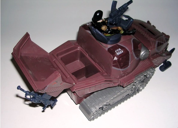
Besides, the overall sculpt on these toys is pretty nice. The triangular treads are very much in keeping with the classic HISS design. The snakeskin texturing and paint apps are really well executed. And hey, gotta love those giant fangs on the front. Or maybe not. I’ll also say that having an enclosed, armored cockpit as opposed to having the driver sitting in plain view under a glass canopy is probably a much better idea from a tactical standpoint. There’s also a few cool armaments, like a rocket launcher hanging off the side under the canopy and two firing missiles on each side of the front grill. But beyond that most everything else about this vehicle is pure balls. So let’s look at some of the stuff about this toy that really pisses me off.

gijhs4b

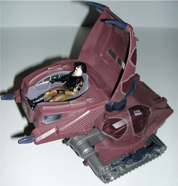
First off, what is the deal with the cockpit? It extends forward and then push a button and it flips up into the air on a set of extended stilts. What possible function does this serve? Its like they just put it in there because they could. Add to that the pointless fact that the canopy will not open unless its in this position. How the fuck is the driver supposed to get in and out? Sure, maybe on some scaffolding back at base. But how the hell does he get in and out in the field? Is this some kind of way Cobra instills bravery into their drivers? “Don’t sssssssscrew up, buddy, because you ain’t getting out until you get back to HQ!” Why would you design something like this? Its clearly the work of an insane person.

gijhs4c

Secondly, the Type IV design replaces the turret from the original HISS with a completely exposed gun seat. Yeah, it wasn’t bad enough that the poor gunner’s head was sticking up out of the top of the tank, Cobra’s engineers had to make it even more dangerous to be a HISS gunner. Now, you have virtually no cover at all. Unless GI Joe is aiming directly at the flimsy iron plating in front of the gun, he’s probably going to hit you. You’re just a sitting duck up there. But then at least if the thing is about to explode, you can get away fast. The guy trapped in the cockpit will be a goner for sure.

Next up, I hate the big ugly sockets all over this thing. If memory serves, these were part of the sound chip gimmick that made different sounds depending on what weapon you plugged into it. Its ugly and stupid. Also, mine doesn’t work anymore and I’m too lazy to put new batteries in it. One other feature of the Type IV HISS is the fact that the back opens up. This is sort of cool, as you can toss gear in there or prisoners or whatever, but in the end, this compartment just reminds me of the little space on the back of a Big Wheel where you could pack your snack if you were going out for a long ride. It was a potentially good idea, which ultimately saw fruition in the DTC HISS, but here its just not executed very well.

gijhs4

The HISS Type IV came bundled with a Neo Viper figure. As I recall it was a pretty cool figure, but I sure don’t have it anymore, which is why I’m using Major Bludd to show this thing off. I should also mention the packaging, which had no window to cover the toy and just left it hanging out there to collect dust on the shelf and have kids come along and peel off the stickers and rub boogers on it. I’ve never seen anything like it before or since.

This design was also repainted and recycled as part of the Valor Vs Venom line, where it got a pretty cool black and blue paint deco, but also a much bigger and dumber looking weapon mounted on the top. The new design made it look a bit more like a traditional Cobra vehicle, but this repaint was notoriously difficult to find as it came in on tail end of the series. I don’t mind owning this thing, or even two of them for that matter, mainly because they don’t  take up too much room and its cool to have a collected evolution of the HISS to display, even if that includes the lamer designs like this one. The real question is whether the new HISS will actually be worse than this one or not. I doubt it could be worse, but I did notice it has the same kind of elevating cockpit gimmick, so its good to know that Hasbro hasn’t learned from their mistakes.

GI Joe: DTC HISS Tank by Hasbro

As I’m sure a lot of you know, Hasbro showed off Cobra’s new HISS tank at this year’s Toy Fair. I remember that day well because in the very instant I first saw it, I both began to weep like a baby and threw up in my mouth a little bit. Then I was just overcome with guilt by the realization that I would probably still buy it anyway. Yeah, not a big fan. But, it gave me pause to rummage through my totes and dig out the last significant HISS redesign released by Hasbro.

Its somewhat fitting to follow a Sigma Six post with this HISS toy since it was part of Hasbro’s Direct To Consumer line after the 3 3/4″ Joes had disappeared from the toy aisles and Sigma Six reigned supreme. While the DTC figures were mostly shameless kitbashes of older figures, we actually got a couple of pretty good vehicles in this short lived line, and this HISS tank was damn sure one of them.

The coolest thing about the DTC HISS tank is that it wasn’t a complete redesign and it didn’t try to make itself look like a giant fucking snake. Its design takes the original tried-and-true HISS tank and makes some sensible modifications. The result is an all around better designed vehicle, with more playability, and dammit, it just looks awesome. What’s also cool is that this new HISS looks perfectly fine sitting next to the original. Because they work well together, I just like to refer to this one as my Special Weapons HISS or Heavy Assault HISS.

Instead of being all black, this HISS has a substantial amount of coppery trim. The missile launchers, the tread plates and the trim around the canopy are all matte copper colored and all of these pieces have some nice weathering to give the toy some character. Many of the stickers are reminiscent of the old HISS tank. One thing worth noting, the huge vacant surface under the canopy on the front looks like its screaming for detail, like it was supposed to get a sticker, but Hasbro forgot. I guess that’s fitting since for some reason I still haven’t put the stickers on my older HISS tank either.

While the old HISS design was content with just two laser cannons on the top, this model has a whopping eight firing missiles. Four of these take the place of the old HISS’ dorsal guns and can be rotated 360 degrees as well as elevated up for surface to air fire. The dorsal launchers can also be configured in two different ways, either with the gunner in front of the launchers or behind them like the old HISS guns. The other four missiles are “chasers” positioned broadside on each side of the canopy. Lastly, there’s two pivoting machine guns situated just under the nose. Yep, this thing is loaded for bear.

Probably the biggest and most practical change to this HISS design is the ability to fit troops into the back. The side panels open, or can be removed entirely, to allow access to the interior. There are benches along each side for troops to sit. Granted, you can’t fit a lot of them back here, and the shaft from the dorsal gun gets in the way, but its a really cool feature. It would have been nice if the tailgate dropped, but alas it does not.

The DTC HISS came with a figure, but it was a real piece of shit, and I traded him away or lost him, or did something with him a long time ago, so I can’t show him to you. He was basically just a red repaint of Night Creeper if that means anything to you. Why the fuck Hasbro decided to pack a ninja in with this vehicle is beyond me. Either way, he quickly got the boot in favor of a 25th Anniversary HISS driver. Which reminds me, while the pegs on this thing do not fit the current figures, everything else about this toy is modern era friendly, so you can use this tank with your 25th Anni. figures or even your ROC figures.


I have no idea how common this thing is these days or how much it goes for. I do remember that there was a time when I could have ordered all that I wanted for $20 each, but at the time I was taking a stand against army building, so I was content with the one. Besides online, Toys R Us continued to carry the DTC toys and figures during the dark times of Sigma Six, so it was possible to walk into a toy store and buy one of these, so long as it was a TRU.

If you already have one of these, then you know how friggin awesome it is. If you don’t, go find one. While the original HISS will always have a special place in my heart, this one is the only model to come after it that is worthy of the name.

Next time, we’ll look at a really shitty HISS tank design.

Oh, you know which one I’m talking about….

GI Joe: Sigma Six Zartan by Hasbro

Its been a slow week for new acquisitions, although I’m expecting all sorts of goodies in the mail soon. In the meantime, I went through some totes this weekend and I found some GI Joe stuff I wanted to post about, but then I realized it was going to take way too long to find all the shit that goes with the vehicles and get some figures together for the photos and I was just way too tired and half-drunk to do all that today. So, in keeping the GI Joe theme alive, I just grabbed one of my favorite Sigma Six figures instead.

Now, I know most people hated this line. I wasn’t too pleased with it when it was first introduced either, but it grew on me after a while. Granted, I didn’t start collecting them until they were being clearanced out, but before I was done, I did get quite a few of them. Whether or not you like their aesthetics is one thing, but its hard to deny that they are amazing toys. They’re beautifully made, have great articulation, and loads of accessories. To put it bluntly: They’re undeniably fun action figures.

I seriously think most of the hatred toward this line came from the fact that Hasbro was replacing the 3 3/4″ Joes with these. Sure, in hindsight we had nothing to worry about because the Joes we all know and love came back in a big way, plus that wacky “Direct To Consumer” line kept things going in a matter of speaking. But if it weren’t for all the anger and rage about our little Joes disappearing, I think Sigma Six might have been a bit better received.

But, enough about that…

I love Zartan. He’s always been one of my favorite Joe characters ever since he first appeared in the second mini-series, and coincidently he’s my favorite of all the Sigma Six figures. He retained a surprising amount of his original character design in the translation from RAH to S6 and in doing so, faired a lot better than some ofther characters.


Yeah, that sculpt is gorgeous. Sure’s he’s all angular and anime-ized, but there’s no denying that’s Zartan. The face is awesome, cleft jaw, hooked nose, and right down to the eye tattoos and his burgandy hood, which I always used to think was hair… huh, go figure. The armor is cool, although I wish they had toned down those huge wrist bracers a bit. Zartan’s shoulder armor is hinged and easily removable, his belt is also removable and he’s got two little elastic straps on his hip holding ammunition pouches. Zartan also has a number of sockets sculpted into him, which the Sigma Six figures used to clip on accessories and weapons and what-not. Zartan has these sockets on his bracers, his thighs and three on his back. A big part of the fun with these figures is mixing and matching weapons and accessories between the figures.

Articulation on these figures was the absolute shiz-nit. In a word… balljoints. Balljoints, balljoints, balljoints! Ok, his ankles are only hinged, but apart from that this figure is up for some serious action poses.

I really wish I stil had the packaging for this guy, or at least a shot of him in the packaging, because if you aren’t familiar with it, it was an amazing thing. Besides looking cool, the top and bottom halves of the package were plastic and could be fashioned into an equipment locker to hold the ridiculous amount of accessories he comes with. They also had a blinking LED, which invariably grabbed kids attentions as if to say, “Holy shit, Mom, there’s a bomb in there!” The other thing about these figures’ packaging was you had to shred it to pieces to get everything out. When you were finally done you were left with a huge mess of plastic and crap… and this…

Holy shit that’s a lot of stuff! Besides the aforementioned equipment locker, Zartan comes with a custom made double barrel rifle with two removable clips, a crossbow that would make Hordak jealous, a quiver with two crossbow bolts (one barbed and one explosive) and some kind of weird barbed grapple thingy… ah, I don’t know what the hell it is.

The rifle is really cool because it looks like something The Road Warrior would carry, as its all duck taped together, exactly like a rifle would be if it were fashioned by some evil bastard who lives in a swamp. Oh, and I wasn’t kidding about the crossbow either, I really think he stole this thing from Hordak.


The quiver is a really cool piece as it slips over Zartan’s shoulder with an elastic strap. Its nicely sculpted to look like he made it out of sticks and shit. The bolts slip into holes in the top of it and stay in place pretty well.


And that’s S6 Zartan in all his awesome glory. Its cool to look back on these figures without all the angst of thinking our 3 3/4″ Joes are gone for good. Besides, as it turned out, Sigma Six may have come along at just the right time to give the regular line of Joes a strategic hiatus. It gave Hasbro the chance to go back to the drawing board, because when the Joes did return to mainstream retail in their 3 3/4″ form they came back with the awesome 25th Anniversary line. Few people were probably sorry to see Sigma Six go, but I have to admit the line produced some really cool figures and an interesting little hiccup in the history of the GI Joe brand.

And rest assured, you haven’t seen the last of my Sigma Six figures… Mwahahahahaha!

Doctor Who: The End of Time, “The Narrator” Figure by Character Options

2009 was a surprisingly great year for Doctor Who figures considering that the show was on hiatus and we only got five specials instead of the regular thirteen episodes. Thankfully, the regular show is coming back this year and with it we’ll be getting a whole slew of new figures from Character Options. But before moving on to the 11th Doctor, CO took one more look backwards.

2010 kicked off with a small wave of four figures based on the two-part special “The End of Time,” unfortunately, the selection of figures left something to be desired. Its a pretty crazy world when we’re getting so many Doctor Who figures that I can afford to be picky, but out of the four figures, there was only one that I really wanted. The three I passed on consisted of yet another 10th Doctor (got enough of those, thank you), the first figure based on the 11th Doctor (cool, but I’ll wait until he’s released in his proper outfit), and The Master. Now, I love The Master but this figure is basically just John Simm with a bad bleach job wearing a hoodie. Pass! In fairness to Character Options, “The End of Time” didn’t exactly introduce a lot of desireable characters for action figure fodder, although Wilfred would have been a welcome addition, as would a few more Time Lords.

So anyway, the one figure I couldn’t resist was the Time Lord President, played by Timothy Dalton. There’s still a lot of speculation about who this character actually was. He was originally billed only as “The Narrator,” and that’s how his name appears on the figure’s packaging. I’m guessing this was done to prevent spoilers, but since the figures came out after the episodes aired, it didn’t seem necessary. He was also referred to once by The Doctor as Rassilon in the episode, and working out how the continuity of that could be possible makes my brain hurt. But those are debates better left for the dark recesses of nerd forums and since I refuse to call him The Narrator, Rassilon is good enough for me.

I certainly didn’t expect new packaging on this one-off series of four figures, but that’s exactly what we got. Its still a sealed clamshell, but almost everything else is different. This should be the last time we’ll see this Doctor Who logo, but apart from that the insert is completely new. It has a cool hologram style reflective finish that shows half of the 10th Doctor’s face on one side of the figure and half of Rassilon’s on the other. You can also make out bits of the TARDIS interior among the backdrop. The back panel shows the four figures in this series. The presentation here is so nice, I almost felt bad about tearing this baby open to get to my figure. Then again, if I was a MOC collector, I’d be kind of pissed that the name on the card is “The Narrator.”

First off, CO did a marvelous job on the likeness of Timothy Dalton as well as replicating his majestic Time Lord garb. Even without the trademark cowl often seen on members of Gallifreyan High Council, this figure is obviously a Time Lord through and through. I did think it interesting that the round seal on his chest isn’t recognizable as the Seal of Rassilon, but rather a new and different Time Lord symbol. His robes are nicely sculpted and feature gold leaf decorations around the trim. His clothes underneath are all black. About my only complaint is a little paint slop along his hairline.

Also worth noting is the sculpted gauntlet on Rassilon’s left hand. The very thing he used to obliterate an uppity Time Lady for speaking out of turn. This artifact was one of the many things that still gnaw at me about that episode. Its never been seen or mentioned before in almost 50 years of the show’s history, so what the hell was it? I suppose since there was a Sash of Rassilon and Key of Rassilon and Headpiece of Rassilon, why not a Gauntlet of Rassilon. Either way, its nicely represented on the figure.

Because Rassilon is a robed figure, CO could have easily skimped on his articulation, but instead they really decked him out. How much of it is actually useable is another story. His head rotates, his arms rotate at the shoulder, his elbows are hinged and he has swivel cuts in his biceps and his wrists. His upper legs are jointed, his knees are hinged and there are swivel cuts at the top of his boots. Basically, most of the articulation below his waist is hampered by his cloak.

Rassilon only comes with one accessory, his staff. The shaft is very thin, but he can hold it in his left hand quite well and the sculpting on the head is quite nice.

All in all, I’d say this figure makes up for the fact that I didn’t want any of the others. He looks great and at least now I have someone to keep my Time Lord figure company. On the downside, he didn’t come cheap. While you could easily get the complete set of four figures for around $55-60, Rassilon here cost me $20 all by himself. It seems I’m not alone in only wanting him out of the lot, so naturally he sells for the most. Granted, I’ve had to pay $20 for single Doctor Who figure before, but those were Classic Doctors and not figures from the current series. Still, this is fucking Timothy Dalton… playing Lord Rassilon… how the hell could I not by this figure.


Transformers Revenge of the Fallen: Breakdown and Skystalker by Hasbro

It doesn’t often happen that I come across Transformers on the pegs that I didn’t even know existed. With all the time I spend on the Interweb, I usually get the heads up on these things long before they’re ever released. Nonetheless, today I stumbled upon two brand new (at least to me) Scout Class Decepticons from the Revenge of the Fallen line. So far this assortment of smaller figures has really impressed me and Skystalker and, to a lesser extent, Breakdown keep that trend rolling right along.


Packaging is the same old stuff, with the figures packed in their robot forms. The presentation still looks good, but I’m getting a little tired of the bios on the back. Why does every character have to be paired with some kind of personal vendetta against another? Bah! Let’s start with Skystalker.


I can’t tell whether Skystalker is supposed to be a stealth bomber or just some little stealth tech drone. The little red eye on the front of his cockpit makes me think he’s supposed to be an unmanned device. Either way I absolutely love his aircraft mode. The design is fresh and original and we haven’t seen anything quite like it in the Transformers line yet. There’s an impressive amount of tooling on a figure this size, right down to the panel lines and rivets. The white ID numbers stenciled on the sides look great and I love the Decepticon logos with the wings. Apart from a folding front landing gear, Skystalker’s jet mode doesn’t do a whole lot, but it sure does look awesome.


It took me a bit to get this guy into his jet mode the first time, but once I knew what I was doing, transforming him is a breeze. In robot mode, Skystalker looks pretty creepy. He’s got huge feet, but the rest of him is pretty lean and lanky. His head is certainly reminiscent of G1 Shockwave and I really like how his eye in jet form is also his eye in robot form. Nice continuity there. I also have to point out all the nice details sculpted on the inside of his wings. Its just a fine example of Hasbro going the extra mile on these toys. Fantastic.

About the only thing I’m not crazy about with this figure is the way his wings hang off his arms. They’re on balljoints so they can be folded neatly to the back, but since they’re attached to his shoulders and not his back, every time you move his arms, you pretty much have to reposition his wings to keep them out of the way. Its not a huge deal for me, since I just display these guys, but I’m thinking it might interfere with the play value a bit.


Skystalker also has a pair of hooks or axes or some kind of hand weapons concealed in his wings. You can pop them out and put one in each of his hands. Doing so also creates some cool cut-out patterns on his wings while he’s in robot form. Generally speaking, i’m not a big fan of my Transformers having swords and axes and shit like that, but then again, weapons are always a nice bonus, so who am I to complain?

The articulation on this figure is excellent. He’s got balljoints in his neck, shoulders, elbows and upper legs. His knees are hinged and for some strange reason his feet are spring loaded and fold up as soon as you pick him up. Weird.

Next up is Breakdown.


Straight away, this guy gets extra points in my book for being a Decepticon car and an homage to a G1 Stunticon. Unfortunately, he needs that extra cred. His car mode is pretty simple, which I probably wouldn’t mind so much if I wasn’t looking at him at the same time as Skystalker. The difference in detail on these two figures is huge and the car design seems a little over stylized or even super deformed. Also, Breakdown’s colors, or lack thereof, aren’t helping him too much either. His white motif is pretty boring and the red patch on his hood looks like it was thrown in as an afterthought. I’m sure this figure will be repainted into something much more interesting, but that doesn’t mean that Breakdown here couldn’t have gotten a better treatment with the brush.


Overall, Breakdown is easy to transform and has a pretty good robot mode. The fact that his chest is made up from the back end of the car is at least something different and I really like his head sculpt. I’m not crazy about how far his hood hangs off his back, but at least its out of the way as is most of his car kibble. He’s a lot more colorful in robot form, as most of his hidden robot parts are blue, but I’m still not sure about the color scheme. The whole red, white and blue motif makes him look like he should have been a Red Alert figure, rather than an evil Stunticon homage.

Breakdown’s articulation includes balljoints in the neck, shoulders and upper legs, and hinged elbows, knees and ankles. He’s a fun little figure with nice balance and poseability, but with some of the incredible Scout Class figures we’ve been getting lately, he defintely comes up a little short.

And that’s about all I have to say about these guys. The Scout Class figures have come a long way since the launch of the Revenge of the Fallen toys. These guys were $7 a piece, and I think they were both worth it. Yeah, Breakdown could have been better, and I’m sure this sculpt will be put to better use with more interesting colors down the line, but either way I’m glad to have both of these new Decepticons in my collection.

Star Trek: Captain Kirk and Electronic Command Chair by Diamond Select

I’ve had my eye on this box set for a while now and the only thing staying my hand was the fact that I already own the Kirk figure, so I knew I’d be buying it just for the Command Chair, or to have two Kirks to recreate “The Enemy Within” or “What Little Girls are Made Of” or whatever other episodes happened to include a duplicate of the Captain. Well, this week I found it at TRU for only $15 and I decided that it was finally time.

Let’s get Kirk out of the way first, because he’s really old news to me as this is the exact same figure that was released by Diamond Select on at least two previous occaisions. I picked up this figure when it was offered by Diamond Select the second time around and double packed with Uhura. Its a good thing too, because the quality on the Kirk that came with my chair isn’t really up to par. His head sculpt and paint apps are fine, possibly even a smidgen better than on my carded Kirk, but his arms look kind of dirty and there’s some additional smudging on his back, some of which has come off, and some won’t. The rubbery uniform shirt doesn’t fit as well as it does on my other Kirk figure and it makes the ball joints on his shoulders look prominant and awkward like its obvious that the sculpted sleeves on his arms aren’t part of the “shirt.” The figure isn’t a disaster, but I can’t help but wonder if Diamond Select held back some of the poorer figures to bundle with this chair.

In case you don’t already have the Kirk figure, he sports the same excellent articulation as the other Classic Trek figures. There’s a ball jointed neck, ball jointed shoulders, swivel cuts in the biceps, hinged elbows, swivel wrists, swivel at the waist, the legs rotate at the pelvis, the knees are hinged, and there are swivel cuts in the thighs and just above the boots.

On the other hand, the quality control on the chair itself has a few issues too. The left arm piece feels like it could pull off given just a bit of coaxing. But what really sucks here is the paint and overall finish of the piece. The seat is full of scratches, which are thankfully masked so long as you have a figure sitting in it and the back has gray paint misting all over the black part. But the real eyesore is that the arms and front right hand corner of the base looks like they’re scuffed and worn. Maybe Diamond Select was going for recreating an exact replica of the chair prop after having been stored in a warehouse at NBC for 35 years, but I doubt it. If I bought this thing off of Ebay, I’d swear that someone banged it around, had their kids play with it, and then sealed it back up in the box. It just doesn’t look new.

Its a real shame, because other then that the chair is really, really cool. Besides the fact that Kirk looks great sitting in it (and I mean my other, cleaner, better Kirk figure), the control panels on the arms look very show accurate and the electronics are wonderfully done. The chair comes in a “Try Me” mode, so to get the full functionality you’ll have to take it out of the package and flip the switch on the bottom. You may also want to top it off with three fresh AAA batteries, although mine still had some life left to them.

Pressing the rear right panel activates a voice clip and the left rear panel activates a corresponding sound effect. The sound effect will not change until you hit the other panel and play a different voice clip. I like it better than if they each just fired off random clips. Each of the panels on the armrests also light up as the dialogue and sound effects are activated and the left panel even flashes between red and green. Oh yeah, if you hold down the right button for three seconds and let it go, you can hear the entire prologue to the show and the lights will stay lit for a short while afterwards. Very cool.

There are a total of eight phrases and eight contextual sound effects:

  • “Chekov, arm photon torpedoes.” [Torpedoes firing]
  • “Resume course to our next destination, Mr Sulu.” [Impulse engines]
  • “This is Captain James Kirk of the USS Enterprise.” [Computer bleeps]
  • “Lt. Uhura, open a channel to all decks.” [Intership comm whistle]
  • “Security alert to all decks, Kirk out.” [Red alert claxon]
  • “Kirk to Engineering, Mr. Scott report.” [Explosion]
  • “Position report, Mr. Spock.” [Computer bleeps]
  • “Prepare to attack. All hands to battlestations.” [Phasers firing]

While I’m disappointed by the overall quality control on this set, I can’t say I’m sorry I picked it up. I love the electronics, and its still a decent enough display piece. I’m just surprised that Diamond Select would ship out product in this poor condition. Plus, considering the accessories for these figures have already been sculpted, it wouldn’t have killed them to toss in a phaser and communicator. Although I did run into some similar QC problems with my Captain Picard and Command Chair, but I’ll save that for another time. At around $15 at TRU and many E-tailers, I’m still going to recommend it as a pick up.

The Blue Falcon and Dynomutt Figures by Toynami

Generally speaking, I consider my favorite cartoons to be products of the 80s. There were, however, a few 70’s cartoons that I remember fondly, and one of them which I would still consider one of my all time favorites and that’s The Dynomutt & Scooby Doo Comedy Hour that originally aired sometime around 1976 on ABC. All my life, I’ve been in love with the concept of robot dogs and Dynomutt was without a doubt the first one I was introduced to. I don’t think the cartoon or the characters are all that highly regarded these days, although the fact that they made an appearance on Cartoon Network a little while back at least goes to show that they haven’t been entirely forgotten.

In a lot of ways, the show was similar to the more recent and more popular Inspector Gadget, with Dynomutt playing the part of the bumbling robotic crimefighter who always managed to get his partner and straightman superhero, The Blue Falcon, into trouble. It was pure Hanna Barbara through and through and it was lots of fun to watch the interplay between The Falcon, who played out like a serious bonafide superhero, and Dynomutt (aka Dog Wonder) who could do nothing right.030610E

I have no idea what compelled Toynami to release a box set of these two figures about six or seven years back. It might have coincided with their appearances on Adult Swim, but whatever the case, I stumbled upon it when it was initially offered online and thought I’d pull them off the shelf for a looksy. A lot of the toys and figures in my collection get cycled into totes from time to time, but these two have been displayed on my shelf since the day I got them. They’re just a couple of those quirky and seemingly unimportant pieces of my collection that I have an unreasonably high level of attachment to. Either way, I really wish I saved the box for these, because it was spectacular. It was a simple window box, to be sure, but the figures were packaged standing against a cartoon street backdrop that made them look like the cartoon had come alive.

030610F

I’ll start off with Blue Falcon, because I don’t have as much to say about him as Dynomutt. He’s a great figure and he’s also perfectly scaled and sculpted for display with Mattel’s DC Universe Classics line, which I think is just plain awesome. The sculpting of his musculature is a little more simplified because of his vintage cartoon origins, but the colors and sculpt capture the character really well. His cape is made of molded, soft plastic and he comes with a talon claw accessory, which isn’t pictured because I don’t know where the hell it is. The paint apps are pretty simple, he’s basically blue and gold with flesh color on his face and hands and he’s got his red “F” on his chest, which does appear to be a little prone to peeling if you aren’t careful.

The Blue Falcon’s articulation isn’t quite on par with DCUC, but for a one-off figure like this its actually pretty darn good. His head turns from side to side, he has ball jointed shoulders, hinged elbows, his legs move at the pelvis, he has hinged knees and ankles, and he swivels at the waist. Like I said, not bad!

Ok, now on to the real star of this box set…

030610G

Dynomutt’s color and sculpting also capture the character perfectly, right down to the dopey but well-intentioned expression on his face. I really love the coloring on this figure. His body is two-tone gray and his cape, vest, boots and mask are all green. And of course he has his big “D” emblazoned in yellow on his chest. Toynami also did a particularly great job bringing this 2D character design into a 3D sculpt.

030610H

Dynomutt has a lot of little features to show off his robotic nature. Just like in the cartoon, his legs and head are all on telescoping rods (yep, just like Inspector Gadget). Alas, none of these pull out too far, but Toynami did a pretty good job with this gimmick considering the figure is just only three and a half inches high. Dynomutt also has a slot on his back where you can insert a radar dish (in the cartoon it came up out of his back) and his vest opens up to reveal some of his inner circuitry. His basic articulation consists of his head rotating 360 degrees and his legs rotating at the upper joints. His feet can also rotate at the boots.

030610I

I seem to recall paying about $20 for this set when it first came out, which needless to say I think was a great deal considering their somewhat limited appeal. The set still shows up from time to time on Ebay, although not all that often, and when it does its not uncommon for it to sell for $50+ which is why I never picked up a spare set to display MIB. The original cartoon, on the other hand, is readily available on DVD for dirt cheap, so if you haven’t seen it and you are a fan of vintage Hanna Barbara, you may want to check it out for a few yuks.

030610J

Star Trek: The Motion Picture Kirk and Spock 2-Pack by Diamond Select

The original Star Trek film isn’t all that highly regarded these days and I guess that’s pretty understandable. Watching it now it comes across as overly drawn out and there’s precious little action to help push it along. But if you put the film in its proper context, it really was quite the movie-going event. I’m just old enough to remember going to see it in the theaters, and I can still remember all the hype around it. This was the first time the cast of a very popular, but cancelled, TV series was reunited with a huge budget, and with the iconic ship newly designed. It was also released at a time when Star Wars had intensified the popularity of Sci-Fi movies. And while the special effects may not seem all that impressive today, watching it and realizing that all that visual splendor was done without the aid of today’s sophisticated computer effects, I can’t help but be in awe.

While definitely more cerebral and less action orientated than Star Wars, Star Trek: The Motion Picture was a pretty heavily merchandised film. I can still remember the Happy Meals that McDonalds dedicated to the film, and it had its own line of 3 3/4″ action figures and toys. Playmates later added Motion Picture figures to its own collection in the 90’s, and now Diamond Select has paid tribute with this 2-pack of Kirk and Spock donning their Motion Picture uniforms and equipment.030610A

Fans of Diamond Select’s 7″ scale Star Trek figures will be happy to know that the same quality went into these sculpts. The likeness of Shatner and Nimoy are nicely recreated and yet different enough from the ones they used on the Classic Series figures to make these unique. What also makes these figures unqiue is their uniforms. The style was only used for this one film before being retired for the burgandy tunics that were introduced in The Wrath of Khan and used throughout the rest of the original crew’s movies. Now, while I’m a big fan of the uniforms that replaced these, I do think these were pretty good designs for the time, albeit not all that flashy.

The two uniforms are sculpted almost identically. The only difference is the resculpt in the shoulders and collars. Kirk has a slight turtleneck thing going on as well as two rank insignia epulettes, whereas Spock has a stitched “V” pattern and a slightly raised collar with a notch in the front. The uniforms are sculpted with all the stitching and slight wrinkling for detail, the Starfleet insignia is part of the sculpt, as is the large belt buckle that supposedly served as some kind of sensor or identification device. Both figures seem to use the exact same hands, with their left hands balled into a fist and the right sculpted to hold their phaser weapons.

030610B

There is a really strange error in the mold used for my Kirk figure’s legs, which cause them to both bow in the same direction. He can still stand alright on his own, but he looks kind of funny, like he’s swaying. At first, I thought this issue was unique to my figure, but since then I’ve seen quite a few examples with the same thing going on. Its kind of strange since both figures seem to use the exact same legs, and yet Spock doesn’t have this problem.

While these figures are in the same scale as Diamond’s Classic Series Trek figures, they unfortunately do not share the same level of articulation. Like the Classic figures, they have ball jointed necks and shoulders, swivel cuts in the biceps, hinged elbows, swivel wrists, legs jointed at the pelvis, as well as hinged knees and ankles. They are missing the swivel in the waist as well as the swivel cut in the thighs and again in the shin.

The paint apps on these two figures vary quite a bit. My Spock figure is perfectly fine, although there isn’t that much here to mess up. His uniform is entirely gray, but the rank stripes on his sleeves are nicely painted in gold and the detail work on his belt buckle and insignia are both fine. Kirk, on the other hand, has a bit of slop. The Admiral’s uniform is slightly darker than Spock’s with the center of his tunic painted white on the front and back. The white portion has a lot of swirled brushwork and some smudging on the front and a bit of slop on the borders as well. At least the rank stripes on the sleeves are well done.

030610C

These figures come with two sets of accessories. Each figure gets one phaser and the wrist communicator used in the film. The wrist communicator is really nicely done, and I like that they made it a separate piece, rather than sculpting it into the figure’s arm. Its a cool piece of Trek history since, like the uniforms, this is the only time they were ever used. The phasers are pretty good and are the same style that were used for Diamond’s Wrath of Khan figures, which is film accurate. A tricorder for Spock would have been a nice bonus.

This set is readily available at many E-tailers for cheap. I picked up my set for only $12.99 and despite the flaws, I’m pretty happy to have these figures in my collection even if the overall quality isn’t up to par with Diamond’s other Trek figures. I think Diamond was wise not to pursue the original Motion Picture with an entire run, as I don’t think they would be all that popular, although I wouldn’t have minded seeing another 2-pack with Ilia and Decker, since they were characters unique to the film. A Spock in space suit would have been pretty sweet too.

030610D

Iron Man 2: Mark II and Mark IV Figures by Hasbro

Paramount’s release of Iron Man 2 may be a little while off yet, but that isn’t keeping Hasbro from flooding the aisles with the new Iron Man 2 toys this week. In addition to the usual host of roleplay items, stylized race cars and walkie talkies, Hasbro is releasing a line of 3 3/4″ figures based on the film. Now, I realize some of you are going to take issue with the scale change, since the figures for the first movie were in the 5″ scale, but at least Hasbro has a decent explanation. They are looking to unite all the Marvel movie tie-in figures with the Marvel Universe line. It sounds like a good plan to me.

As I originally feared, the initial waves of Iron Man 2 figures overwhelmingly consist of variants of the Iron Man armor. While many of these aren’t just repaints, the fact is that there could be a lot of Iron Man armors clogging the pegs for when Hasbro finally gets around to releasing a more diverse character line up. Just in the initial offering alone, I was unable to find an Iron Monger figure among the dozens of Mark III and IV armors. This doesn’t bode well for the future, and I’m seriously hoping that Hasbro isn’t poised to repeat the assortment mistakes of Rise of Cobra and Indiana Jones. The two initial figures I wound up grabbing were the Mark II and Mark IV armors, so let’s take a look.

030310M

First off, I really like the packaging on these. The artwork on the cardbacks really grabbed my attention and the large bubbles show off the figures really well. The back panel has an enlarged shot of the figure along with head shots of three other figures available in the same wave. I’m not really sure why the Mark IV card reads “2 Launching Missiles” as they both only have one. Oh yeah, there’s also a nice mention of the Avengers on the side of the cards. Sweet.

Before I even get into the figures, I wanted to give mention to the Armor Cards that are included with each figure, because I think these are a really neat idea. Each figure comes with three cards, two of which are clear overlays with different parts of the armor printed on them. When you lay them all together, it assembles a picture of the complete suit. These cards can be slotted into a holder on the figure stands to form a backdrop graphic behind your figure. Granted, the cards aren’t large enough to make a really effective backdrop, but the effect does look cool and its a pretty unique idea.

030310N

Both of these figures use the same basic body type that Hasbro has been using on the modern GI Joe figures and the Marvel Universe line. It offers a great amount of articulation for a figure in this small scale. There are just a few differences worth mentioning with these Iron Man 2 figures. First off, both figures have shoulder plates that inhibit some of the shoulder ball joint movement. Its not too bad, but it is worth mentioning. Secondly, both figures have really stiff joints out of the package and I really was afraid I was going to snap off some limbs as I was trying to limber the figures’ joints up. Fortunately, I was able to break them in without… well, breaking them. Its interesting, because the early GI Joe figures in the 25th Anniversary line had the exact opposite problem. Maybe this is just Hasbro overcompensating. Another thing worth mentioning is that the connecting pieces used for my Mark IV’s double knee joints are much softer plastic than I’ve seen used on figures in the past. They were a bit warped out of the package, giving his legs a bit of an odd stance. I’m not sure if this is unique to my figure or an issue with the packaging or what.

030310O

The sculpts on both of these figures is incredible for the 3 3/4″ scale. Not only is the angular sculpting of the armor excellent, but the detail right down to the panel lines is exceptional. Just check out the detail in the fingers and there are even treads sculpted into the bottom of the figures’ boots. Hasbro is continuing to push the envelope on their sculpts and Iron Man 2 is just another example of their continued progress.

The paint apps are equally impressive on each figure in their own way. The mostly silver Mark II could have been a really boring figure, but Hasbro included black highlights on all the panel lines of the armor as well as using paint apps to dot the rivets around the arms and chest piece. The Mark IV’s lush red and gold motif is brilliant. The gold is applied with precision, without any slop, and the red is like a high gloss lacquer that really recreates the highly reflective finish of the CG armor in the film and makes him shine like a new car in a showroom.

030310P

Pretty much any Hasbro figure you buy nowadays is going to come packaged with an obnoxiously large missile launcher. While these are the bane of a lot of collectors, I don’t mind them because they offer play value to the figure for kids, while not really defacing the figure for collectors. Bottom line, if you don’t like them you can just throw them away. The launchers included with the Iron Man 2 figures are actually a little better because they are styled to look like they are compatible with the armor and actually clip on to the figure’s arm. If you take the missile out, they just look like big cannons. I like the Mark II’s launcher better because the sculpt doesn’t interfere with the head like the Mark IV’s launcher does.

030310Q

030310R

All in all, I’m very happy with these figures, and I’ll definitely be adding more of them to my collection. I’ve already seen them at three different retailers, so you shouldn’t have any trouble finding them. They seem to be ranging in price between $6.99 and $7.99, which are right about where I would expect them alongside Star Wars and GI Joe. And they are just a smidgen cheaper than the elusive Marvel Universe figures, which surprised me a lot, since these figures seem much better sculpted and painted than their MU counterparts. I just really hope that Hasbro broadens the character selection in future waves. I would love to see a Tony Stark figure without the armor and a Pepper Potts would be cool too, in addition to the obvious Whiplash.

030310S