I’m down to just three more Super7 Silverhawks Ultimates figures to check out here before I’m caught up: Two of the Limbo Gang and the leader of the Silverhawks himself. And by the title of this review, you already know that today I’m going for the one and only, big daddy crime boss of Limbo Galaxy, Mon-Star in his powered up form. Say it with me, guys… Moon Star of Limbo, give me the might, the muscle, the menace of Mon-Star!
Yes, this is the second version of Mon-Star to be released, with the first being his regular form, which in all honesty is pretty terrifying enough. But that’s nothing compared to what we get here. The box is absolutely huge and follows the same design beats as what we’ve been seeing all along in this line. There’s a snappy crimson foil sleeve that covers the window box and the presentation here is just retina-meltingly gorgeous. It takes a lot to get me to save my action figure packaging, but I’m keeping the boxes for all of these! But… No prison or box can contain the might of Mon-Star, so let’s get him out and take a look!
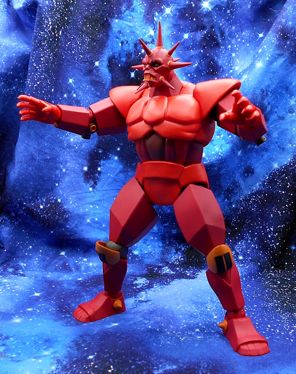
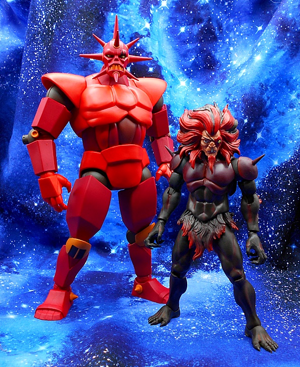
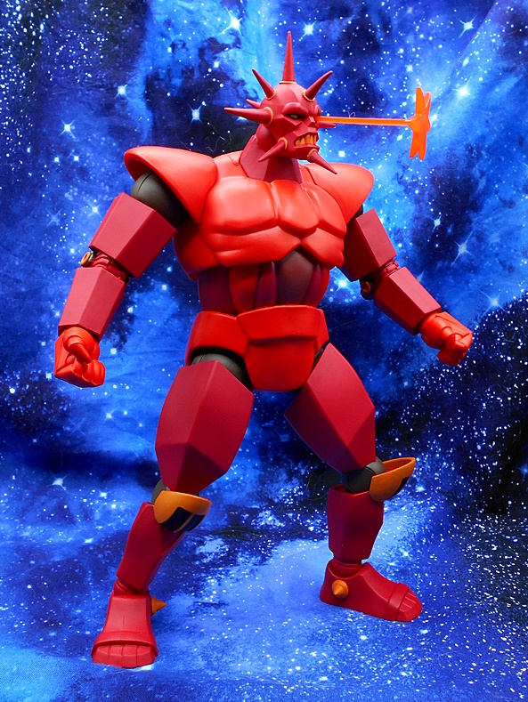
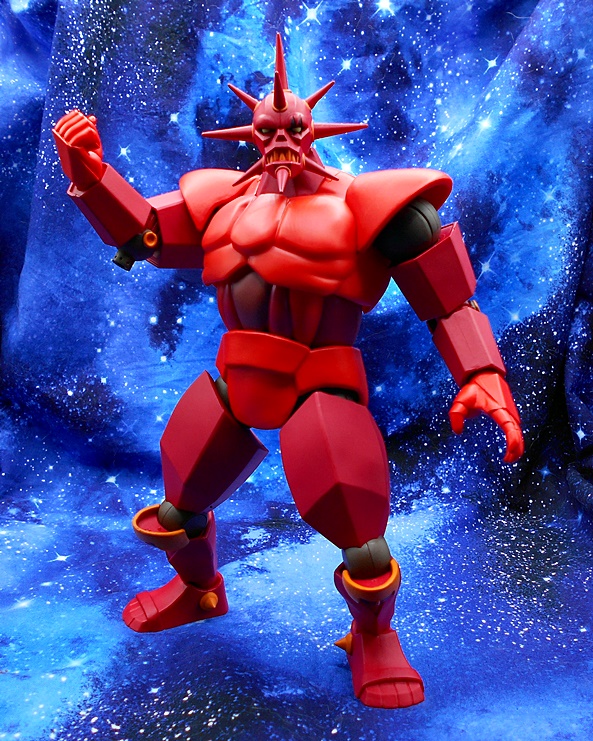
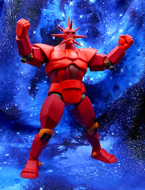
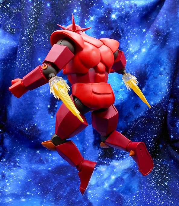
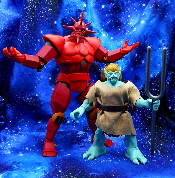
Mon-Star measures in at just over 11-inches, and that is beyond impressive for a 7-inch scale figure line. Just look at him next to his normal form. With the energies of the Moon Star’s light, Mon-Star goes from a pretty buff beast dude to this walking armored monstrosity. I love how clean this design is, with lots of smooth angled surfaces, but then you get the more organic sinewy looking stuff in his midriff and the chiseled chest and flared shoulders. The bulk of the suit is cast in different shades of crimson plastic, with black rotating hinges for the shoulders, elbows, knees and hips, and some orange points on the elbows and knees and the little spikes on his boots. All the joints feel great and he’s just an all around walking tank of terror!
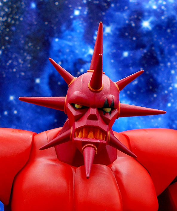
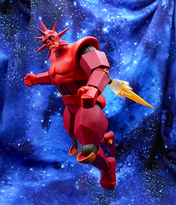
You get two heads and they’re both all kinds of pissed off. His face is a severe mash up of hard angles with a more rounded brow. His grill is a permanent grimace of sharp orange teeth and the array of spikes protruding from all sides of his head is warning sign to keep away.
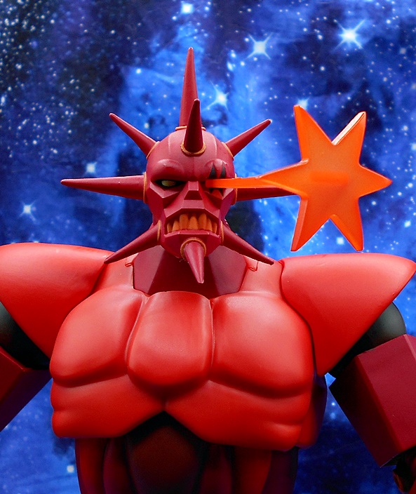
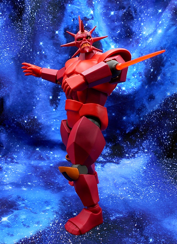
The alternate head is pretty much the same but it has a slot in place of his left eye so you can peg in the Moon Star effect part. It’s cast in semi-translucent orange plastic and looks pretty good.
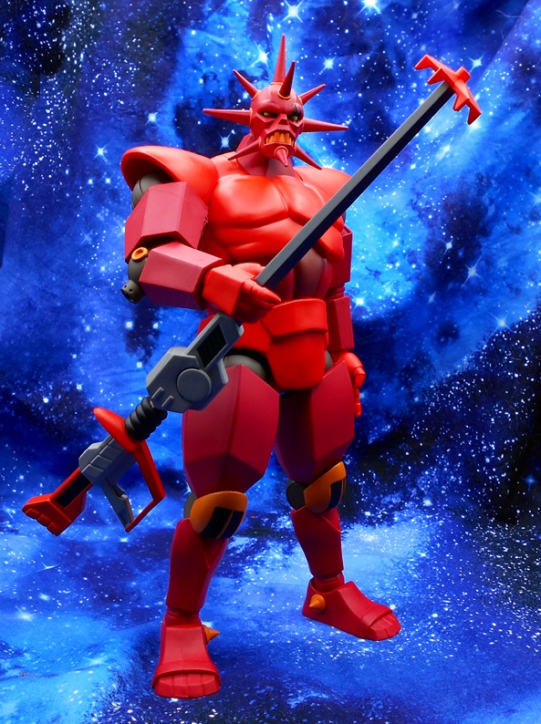
Despite his bulk, Mon-Star has some decent rotating hinges to keep him upright while posing. The range of motion in most of those joints is a bit limited, as we’ve come to expect in this line, but it doesn’t feel as limiting with Mon-Star because he’s just such a slab of armor that probably wouldn’t have much agility in real life either. You get a copious number of hand options with this guy, including pointing hands, accessory holding hands, fists, graspy hands, relaxed hands, adding up to five pairs total!
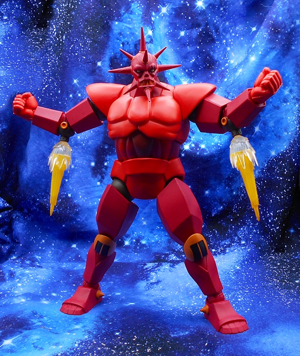
Mon-Star comes with two sets of effect parts for his elbows, which can double as thrusters or cannons. These simply peg into the sockets that jut out from the backs of his elbow joints. The thruster effects look really good!
I’m not as impressed with the blast effect pieces, but they’re OK. I honestly can’t remember him doing this in a single episode and I just re-watched the whole thing last year, so I think the Jameson is really starting to addle my brain.
You also get Mon-Star’s Laser Lance, which is a really great looking accessory. It captures the animated aesthetic of the show’s tech perfectly and you get quite a bit of paint on it as well. He can hold it with his trigger/pointing hands but it’s so damn long it’s hard for him to wield it comfortably, especially with limited range in those elbows.
And finally there is Sky Shadow! We saw the regular version of this guy with the previous Mon-Star release and now we get him in all his Cybernetic glory. I dig this fella a lot, even if he does look like a robot bat with lobster claws! There’s some limited articulation in the wings where they meet the body and he the turrets under his wings rotate.
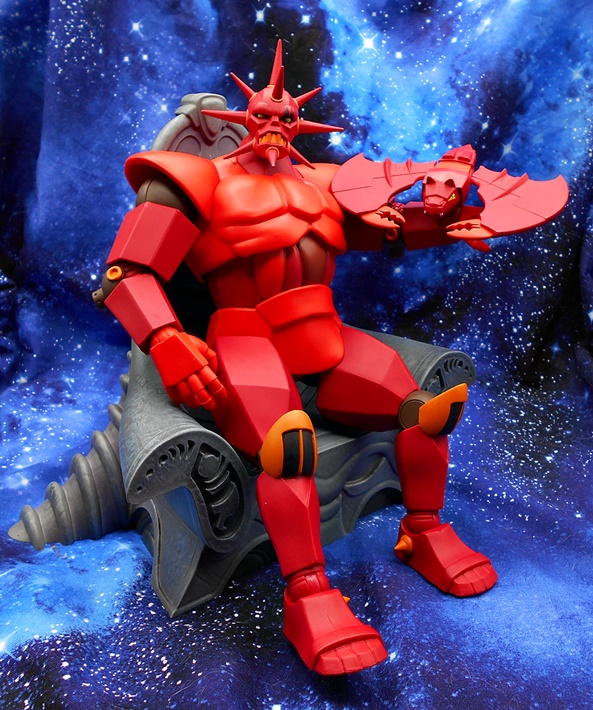
Holy hell what a cool figure! Monstar is huge, heavy, and overall imposing and another great addition to the Super7 Silverhawks line up. And he can even fit in the throne although it’s not quite as roomy as when he’s in his normal form. At $85 he’s the most expensive figure in the line and it’s easy to see where the money went because there is a lot of plastic here. I’ll try to swing back to revisit this line sooner rather than later. And with only two figures left… who will be next?
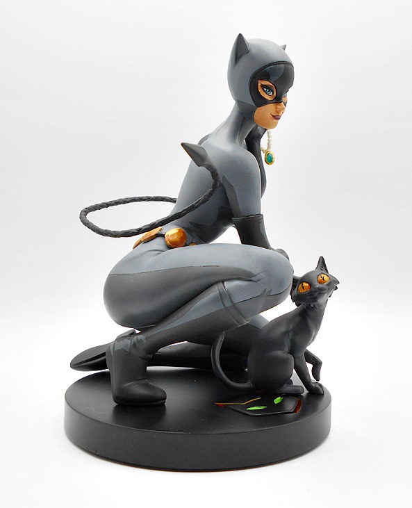
It’s hard to believe that it’s been about five years since I last featured a DC Designer Series statue here on FFZ. I used to fall for this line hard, especially where characters like Catwoman and Wonder Woman were concerned. But I only have room for so many statues so I’ve been trying to be a lot more picky. And yet every once and a while a sale turns up and today’s piece was just an offer that I couldn’t refuse. So let’s have a look at the DC Designer Catwoman by Stanley Artgerm.
Selina comes in a fully enclosed box and if you’ve picked up any of the DC Collectible statues in the past, you should know what to expect here. It’s a sizeable box, but despite being sixth-scale, Catwoman is crouched, so it may not be as big a box as you might expect. Styrofoam protects the resin statue and it comes in three pieces: The figure, the kitty cat, and the base. Assembly is easy peasy, with metal rods connecting the figure and kitty to the base, but a word of caution, the connection is a bit loose, so be careful when transporting the statue by the base as things can get a little wobbly. I am a huge fan of Stanley Lau’s work and I probably have a near complete run of his time doing the DC Cover Girls statues, many of which have been featured here in the past.
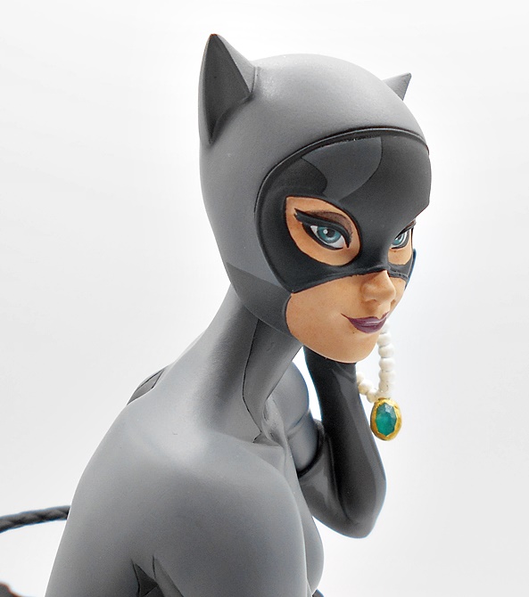
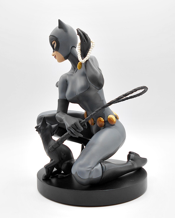
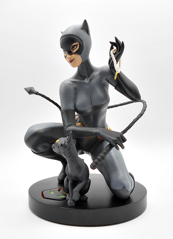
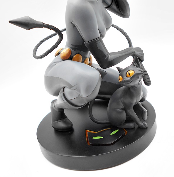
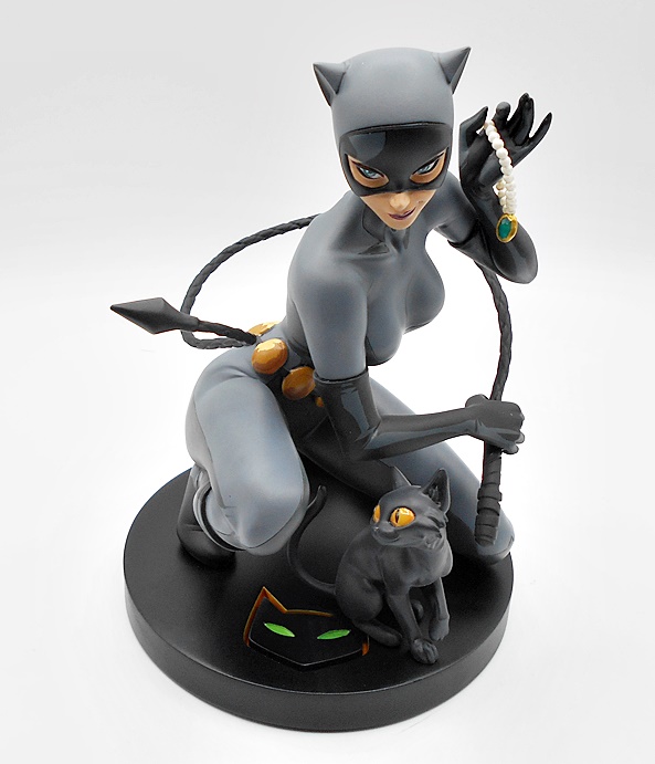
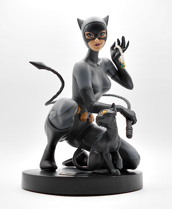
And here she is set up and ready for display and I really dig this piece a lot. This is a very animated-style Catwoman and I’ll admit I was a little hesitant because of the design choice to go with some cell-shading type paintwork, and I’ll come back to that in a tick. First off, I love the pose. Selina is down on one knee as if she just landed from a high leap. She wields her whip in one hand and her stolen prize, a pricey necklace in the other. Her catsuit leaves little to the imagination when it comes to the curves of her body. And despite all that, what almost steals the show for me is the way the kitty cat is fixated on the tail of her coiled whip, as if tracking it’s movement. The composition here is just killer with the staged pose and suggested kinetic energy giving up the best of both worlds.
And oh what a smirk! I love the crooked smile she gives as she holds up her treasure. There’s definitely some Bruce Timm influences in there, especially in the shape of the mask and design of the hood. Her almond eyes are perfectly painted as she no doubt taunts Batman with her latest illicit score. Selina has always been a dreamy kitty for me and this statue is no exception!
I mentioned the paint style and cell shading in figures and statues is not usually my cup of tea. Indeed, I recently backed out of pre-ordering McFarlane’s new animated Batman figures because of it. Thankfully, it’s not overdone here and I actually quite like most of it. There’s some gray washed onto the boot to suggest a glean, and some darker shadows on the gray to give it that comic panel look. I think the shading on the belt’s discs is especially well done. I’m not entirely sold on the gray swatch on her mask, but everything about the paint has been growing on me. Aside from all that, the paint quality and precision is very well executed.
The detail in the whip is very nice with a sculpted braid and an arrowhead style point. It’s almost poetic in the way it curves around her body, suspended in mid air. And once again, I have to just say how much in love I am with that cat’s expression. Maybe it’s because I’ve seen that look in my own cat’s eyes as something catches their interest. The base itself is a simple black disc with a cat face cut deeply into it with an orange outline and green eyes. It’s all stylish and understated and I dig that a lot. Production on this one was limited to 5000 pieces, if you can call that a limitation. Each one is hand numbered under the base. Mine is #2730 which figures because I waited so long to get her.
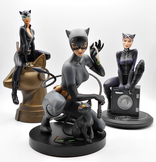
This piece originally retailed for around $170 and while I was smitten with it at the time of the original pre-orders, my willpower held. Of course, that willpower gave way when it was later offered for around $75 and I caved in. Honestly, I’m surprised it took that long since I’m an easy mark when it comes to Catwoman. This one is still available at several retailers at deep discount and I’m very glad I finally picked her up. She looks great with some of the other recent Catwoman pieces in my collection. And while I do love this one a lot, she doesn’t quite bump the Joelle Jones Cover Girls statue, pictured above on the right, as my current favorite.
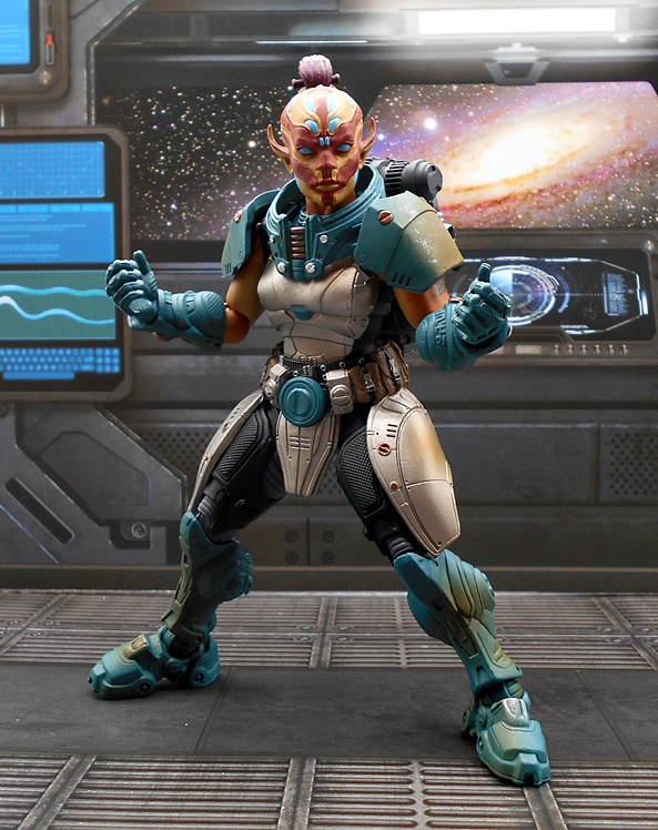
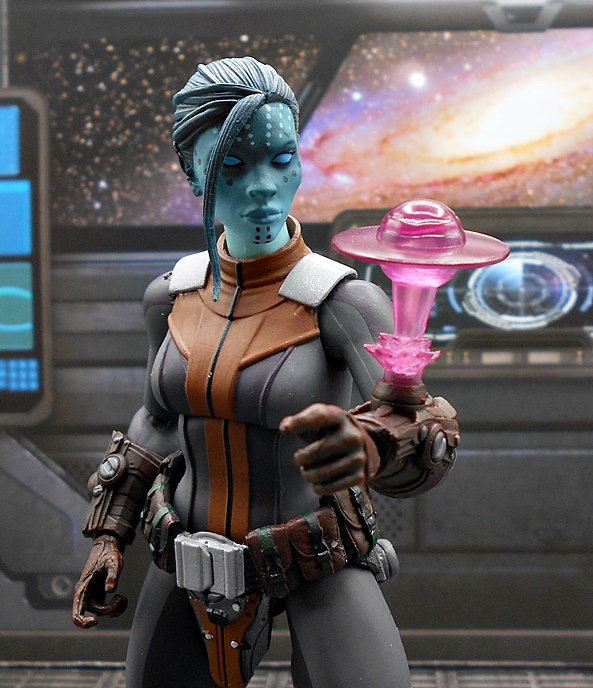
Even an evil organization like Cobra isn’t beyond the reach of having to take on a Diversity Compliance Specialist and as a result we get The Valkyries! That’s right, these Cobra reinforcements arrived over the weekend and I was very excited to take a look at them, so they got bumped to the head of the line. This is a two-pack of Cobra femme fatale troopers with lots of gear and effect parts. In the past, I went pretty nuts buying Cobra Troopers and Officers in this line, but I was able to limit myself to two of these sets for now and will pepper them throughout my Cobra forces. Let’s cue up some Wagner and take a look!
The Valks come in a fully enclosed box with some great renders on the front and a shot of all the accessories included. Inside, you get the figures on a cardboard tray as well as a cardboard footlocker containing paper baggies with all those pieces. There are a lot of tiny pieces in there, so be sure to check those bags thoroughly before pitching them!
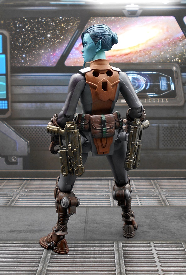
Here are the ladies out of the box and geared up. These feature the same body sculpt with most of the blue fatigues being smooth with some rumples, and some sculpted panels on their hips. There’s textured reinforcement on the biceps and up around the shoulders and upper chest, along with a sculpted Cobra emblem. Each figure has high boots, as well as sculpted armor plates for their knees and forearms. One Valk has these pieces painted all black, while the other has some tan paint for the straps on her boots and forearms. They each also have a good bit of separately sculpted pieces, which include the right hip holster, the belt with left cross-draw holster, left bicep strap, and shoulder rigs with a a right side sheath. Thanks to pegs on the backpacks, each Valkyrie can store all their gear, which is always a big plus in my book.
The backpacks have some excellent sculpted detail, but I wish they stayed on a bit better. Also, I’ll concede that I was not a big fan of the tan coloring on the one figure when these were introduced, and I’m still not all that crazy about it. I kind of appreciate Hasbro wanting to offer a little color variety between the two figures, but maybe grey would have been a better way to go. Honestly, I would have been happier if they were both the same black. No, it’s not a dealbreaker for me, but I just like the look of the entirely black and blue uniform better. Apart from that, I think these figures look great and I’ll throw in some pictures at the end to show how well they mix with the other Classified Cobra Troopers.
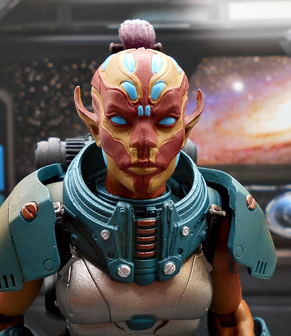
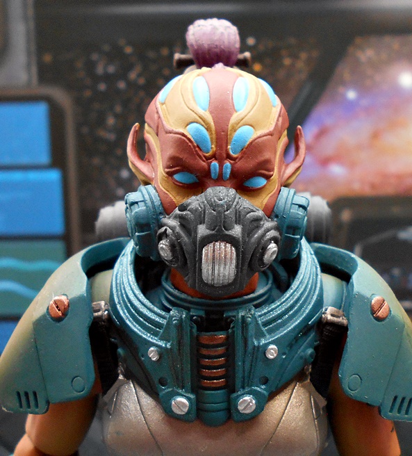
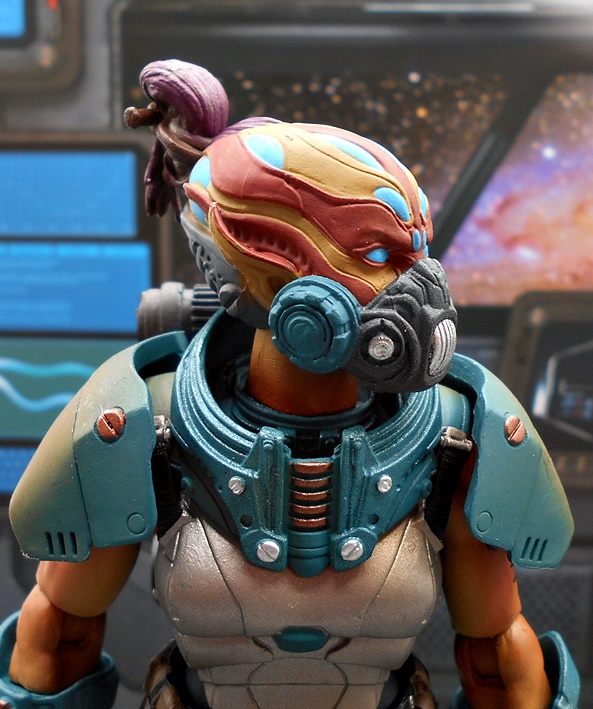
The set includes a total of three heads and three removable helmets. The two regular heads have face masks and tight fitting hoods similar to the Classified Cobra Troopers. The only other difference here is the sculpt around the exposed eyes. These are not only unique sculpts but one has dark skin and one has light skin.
You also get a gasmask style head with a red visor, which looks pretty damn rad. I do wish we got some completely unmasked heads like Hasbro is doing with their female SHIELD pack in Marvel Legends. You can swap heads with those Marvel Legends figures, but these ball joints are smaller so a bit of putty will be needed to make the replacement noggins a tight fit.
I mentioned three helmets, and the third has a silver badge on the front. V for Valkyrie? I guess this one one works for if you want to make one of the ladies an officer. The three helmets stay on the figures pretty well, but I found that they could get lopsided pretty often and I’m sure that came across in a few of my pictures here.
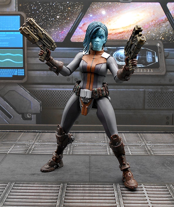
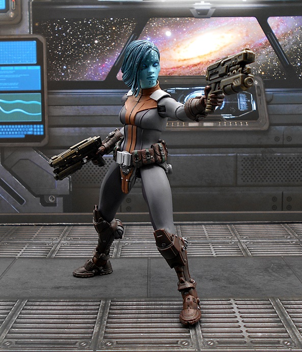
For weapons, each figure comes with the same arsenal with one set cast in black and the other in tan plastic. Again, still not a big fan of the tan, but I’ll live with it. In total you get two knives, four pistols, two sub-machine guns, and two machine guns. We’ll start small and work our way up. First up is the cutlery and these are pretty standard fighting knives with the blades painted silver and the hilts either black or tan. They’re fine, but not as impressive as some of the other blades we’ve seen recently. The right hand seems to hold them better than the left, even though both hands are designed for the guns.
The automatic pistols are a matched pair for each figure and these are pretty nice. They’re not too chunky and not too small. You get some nice detail in the sculpt and they fit well in either the hands or the holsters. In theory I really like the inclusion of the cross-draw holster, but in practice t doesn’t make much sense since the right hand would obviously just draw the weapon from the right holster.
I like the machine guns a lot. You get a pretty simple grease-gun style sub-machine gun with a removable stick magazine. This one has a flared muzzle and a scope. The scope seems like an odd choice for this kind of weapon, but it’s still a great design that reminds me a bit of the weapon design the Cobra troops often carried in the Sunbow cartoon. The alternative is an automatic rifle with an under the barrel grenade launcher. This is another excellent sculpt and you get a removable magazine as well. And yes, I I still think the scope should have been sculpted on this one.
Finally, the set includes a whole bunch of effect parts for the weapons. I think we’ve seen all of these before, and they tend to vary in how they look. Not that I’m complaining. I’ll take as many of these as I can get. All of the weapons have holes in their barrels and these parts just peg in. Some are designed to peg together for different combinations, and I particularly love the smoking barrel pieces. My only complaint here is that I couldn’t really make one work with the grenade launcher.
After the great Cobra Eel debackle, it’s nice to see that Hasbro is still capable of making good decisions with troop builders. Selling these in two-packs and making them easy to get is a great idea and it’s going to be tough to stick to just two. Not that I have much of a choice, as these did sell out. Hopefully Hasbro will do a restock, especially if they like money. Sure, Hasbro Pulse isn’t my first choice for online shopping, and I tend to stick to them only for exclusives like this, but I’ll admit that they’ve been pretty good about getting figures out and delivered in a timely manner. The price was $55, and that feels about right considering how many extras are included.
Happy Friday all! You may have noticed that there was no content on Wednesday as i was hunkered down for the hurricane, but it passed us by leaving just a nasty taste of tropical storm force winds and lots of rain. But, I am back today and I’m continuing my look at the initial wave of Cosmic Legions figures! If you need to get caught up you can take a look at the two versions of Oleg Thygar, the four-armed brute, Kraggnar, and the femme fatales, Vorgga and Zeerian Spyre. Today I’m turning my attention to the big daddy of the wave: Highwarden Slogg. He is the biggest figure by far and he looks like one nasty piece of business.
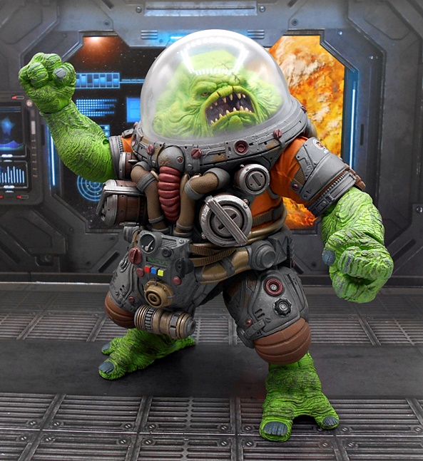
As with the previous figures, Slogg comes in a very attractive window box, but this one differs in that it is absolutely huge, even dwarfing Kraggnar’s box to some extent. As his title states, Slogg is in command of Hvalkatar Prison and his little bio tells us that he is encased in a suit that keeps him alive by moisturizing and treating his epidermis, which was severely burned when he was just a young blob. Let’s get him out of the box and have a look at him!
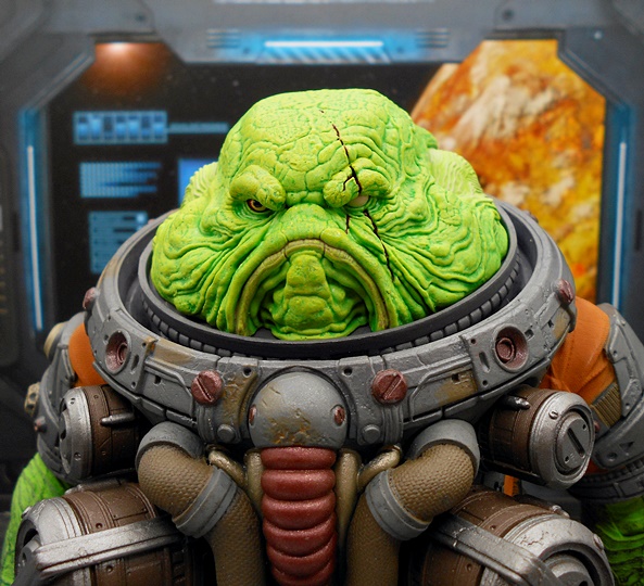
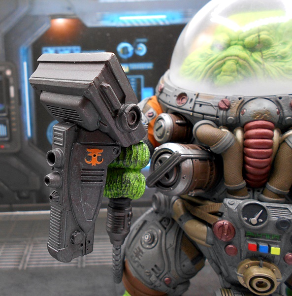
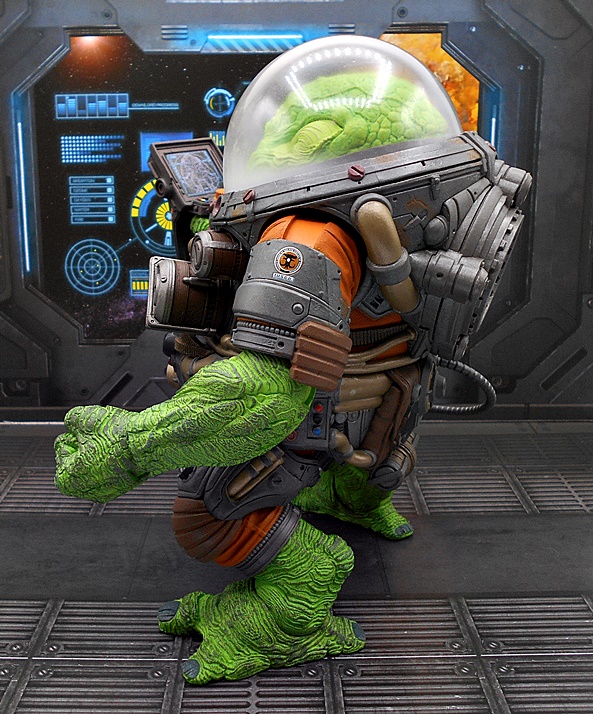
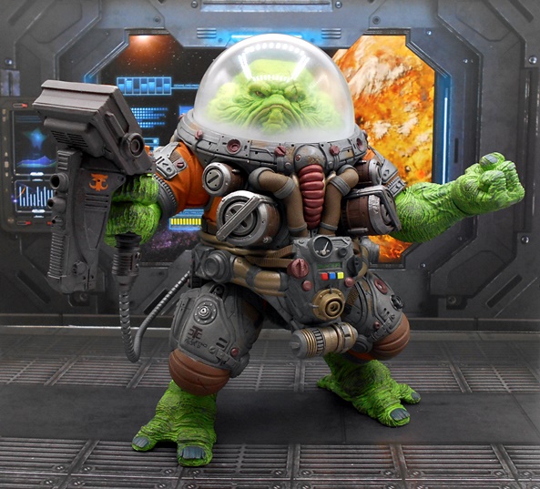
And yes indeed, he is one hefty hunk of plastic. Slogg’s impressive size is more girth than length, with most of it in his rather unique support suit. Slogg’s lower arms and legs are exposed showing his rough green skin, which is just covered with ridges and fissures. Meanwhile his bulbous head resides under a frosted dome that keeps him moist and flavorful. But how about the detail on that suit! You can just about make out the orange onesie that all the gear and equipment is grafted onto. Otherwise it’s a mess of tubes, hoses, pipes, fixtures, straps, buckles, gauges, and even a pair of what… nipple canisters? Sorry, I don’t know what else to call them. The dingy colors of the suit’s equipment looks great next to the bright green of the skin and the orange of the undersuit. You also get some bright red, blue, and yellow buttons down there in his groinular region. Gosh, there’s so much to see!
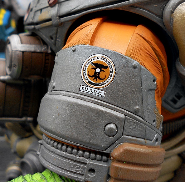
Indeed, when I first got Slogg out of the box I had a great time just turning the figure over and over in my hands and examining all the little bits and bobs. I really like the alien lettering stenciled here and there. Also, I’m pretty sure that’s a pee port located right in between his legs, possibly with an evacuation nozzle stored below it that has to be attached for him to relieve himself. I don’t know, folks, but I’m having fun making it up as I go. He also has a TU5CC badge on his shoulder, which stands for Trader’s Union of the Five Circles of Cosmerrium. Yeah, that’s a mouthful and we’ll learn more about it in the next Cosmic Legions review!
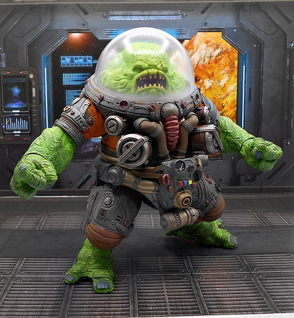
The murky dome can be a bit tricky to get off, but trust me it does come off! Removing it gives you a better look at Slogg’s disgusting melon. He kind of looks like The Gillman from The Black Lagoon hit up Five Guys a few too many times. There are so many gross folds in his skin that lead to that flappy mess of a mouth. His beady eyes peer out from beneath bloated brows, or at least one peers out. His left eye looks like it’s seen better days. There’s a scar running down the middle of it and the pupil is gone. Boy do I love the paintwork on Slogg’s noggin. It matches the rest of his skin, but also has some absolutely gorgeous gradient work where it wavers between darker green in some places and almost yellow in others. This portrait is a goddamn work of art.
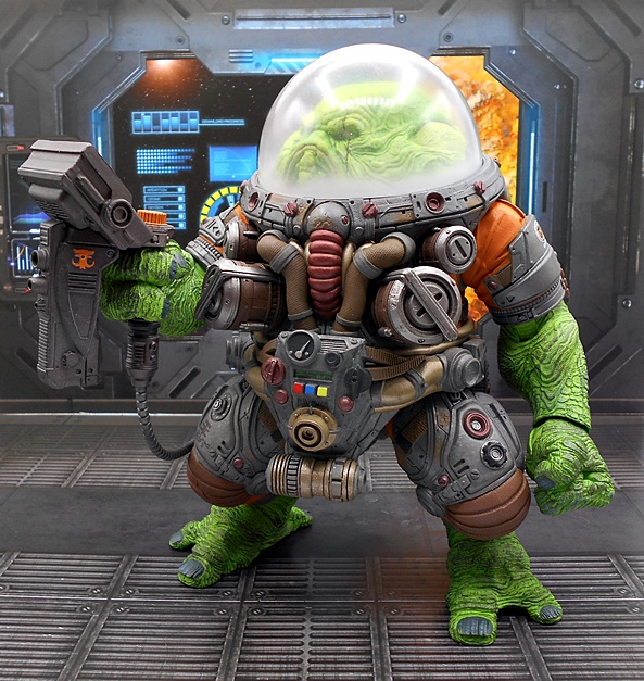
And if you like your green blobby space wardens a little more angry, T4H have you covered with a second head sculpt. And oh damn is he angry! This portrait has his mouth open showing his spikey teeth and even a bit of the insides in his disgusting maw. It’s an absolute crime that one of these heads has to sit in the box, so I may just wind up displaying it beside the figure on a riser or something.
Because Slogg has plenty of chonks, his articulation is a tad more limited, but most of that comes from the range of motion in what are most of the usual joints. Rotating hinges are the order of the day, and they’re found in his shoulders, elbows, wrists, and lower legs. His hips are ball jointed, he can swivel at the waist, and his giant head can rotate left and right. But yeah, you do have to pop his dome every time you want to change the direction of his head. The arms are great, but the legs are mostly for positioning so he can stand. Although he really doesn’t have a problem in that department. Slogg also comes with two sets of hands: One set of accessory holding and one set of fists.
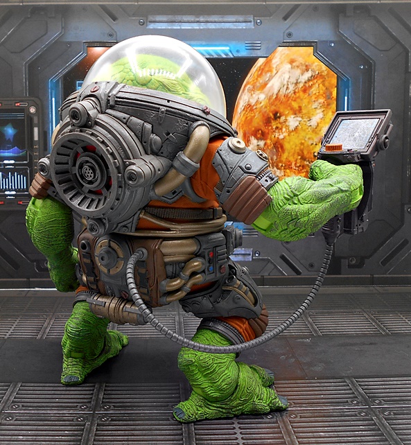
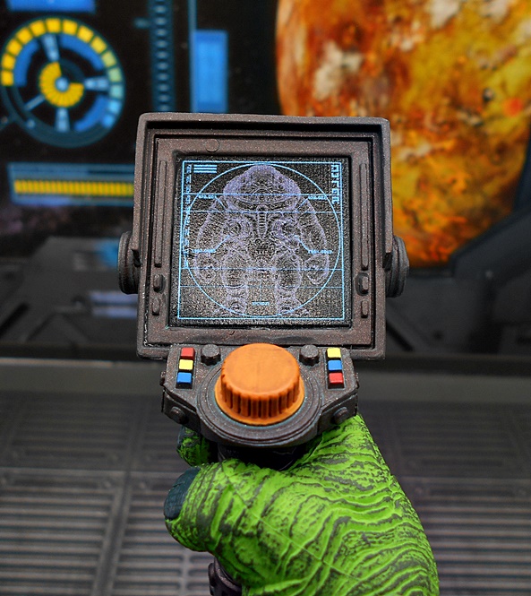
And that accessory is what T4H call a Data Screen. This device has a cable that plugs into one of the two holes on his butt, depending on which hand you want him to hold it in. Now, this looks to me like it’s a multipurpose device used to check on the status of his suit, as it looks like a suit schematic is displayed on the screen. It’s kind of a burdensome device to carry around for suit diagnostics, so I’d like to think it serves a double purpose.
A weapon, maybe? Yeah it appears there are possible beam emitters on the front that reminds me of the weapon design from Space 1999. Maybe the orange nob controls the beam intensity or maybe it just regulates how moist his suit makes him. And because Slogg is such a huge bastard and uses up so much plastic, that’s all you get for accessories. Still, for a figure this big extra hands, an extra head, and that big device ain’t too shabby.
There’s no doubt that from the very first solicitation pictures, Slogg struck me as a stand out figure in the wave and now that he’s in hand he does not disappoint. The sculpted detail and imagination that went into this figure makes it an absolute work of art. I’m extremely curious to see how the pieces to this guy will play out in future releases. In a modular line like Cosmic Legions, I have to imagine that T4H considers parts recycling when designing figure components, especially with big and costly figures like this. But, it’s hard to imagine a figure this distinctive will be easy to repurpose. I guess we’ll find out!
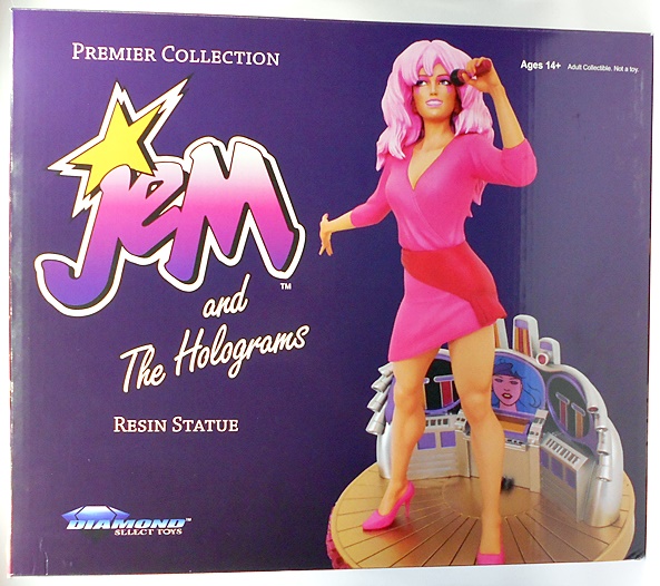
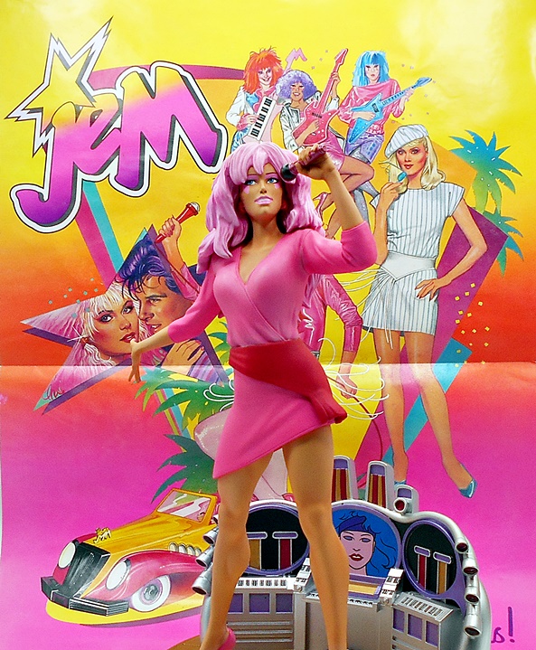
It might surprise some people to know that I am something of a Jem collector, although I haven’t featured any of the toys here on FFZ. At least not yet. My vintage Jem collection is pretty modest by some standards, but I have the essentials and I’ll share a few pictures right now before digging into the focus of today’s review.
I have pretty nice, and mostly complete examples of Jem, Aja, and Kimber, but no Shayna. I also have a second Jem dressed as Jerrica. On the Misfits side of things, I have Pizzazz, Roxy, and Stormer. I have a complete boxed Star Stage and a complete Rockin Roadster, both of which still play the cassettes!. I’m really happy with this collection, and Shayna is the only doll I still actively search for at a decent price. Anyway, I’m always on the lookout for new Jem merch and needless to say I got all hot and bothered when I saw Diamond was doing Jem in their higher end Premier Collection statue line.
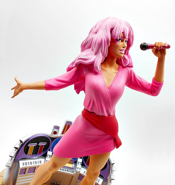
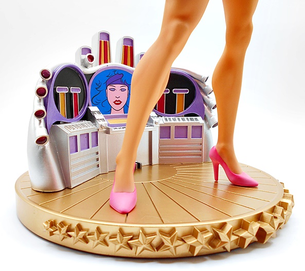
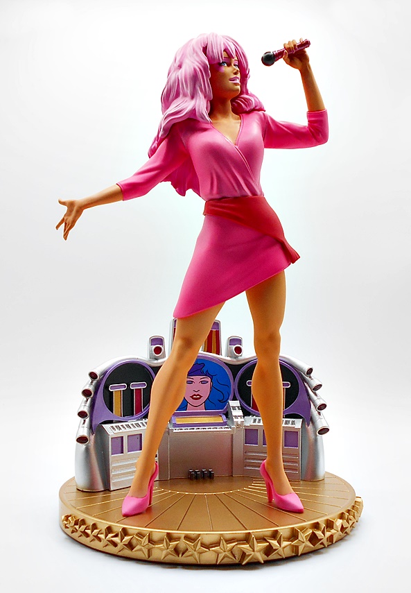
And here’s the box, which is quite big, as this is a roughly 11-inch scale figure on a decent sized base. DST started licensing some Hasbro franchises for their more budget friendly Gallery Series statues where we’ve seen a few GI JOE pieces so it only stands to reason that they would look at some of the other goodies in Hasbro’s stable. Sadly, Hasbro seems content to do nothing with leading rock ladies of the 80s, so they damn well should let other companies do it. Even Super7 got in on the action with a couple of ReAction figures and you can see those carded in one of my collection pictures above. And every day I dream that I will wake up and find out that Super7 is doing Jem in their Ultimates line. Wouldn’t that be something! Jem actually got a bit of a revival back in 2012 when Integrity Toys released a fairly extensive line of high end Jem fashion dolls. These were pretty damn expensive back then and they have grown to ridiculous prices now. Sadly, I do not have any and they are spectacular. But, I do have this statue, so let’s set her up and see what we’ve got!
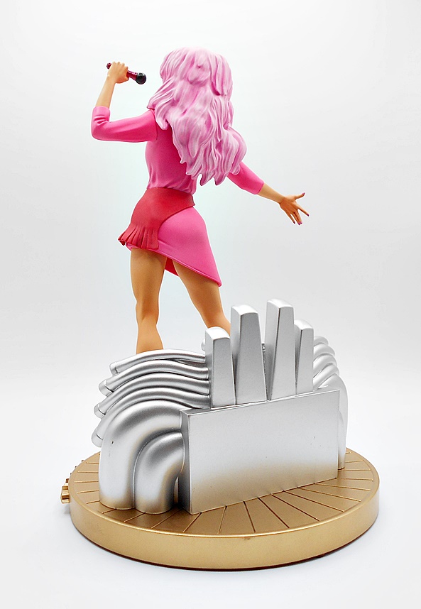
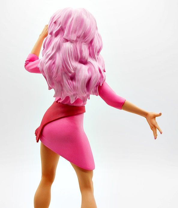
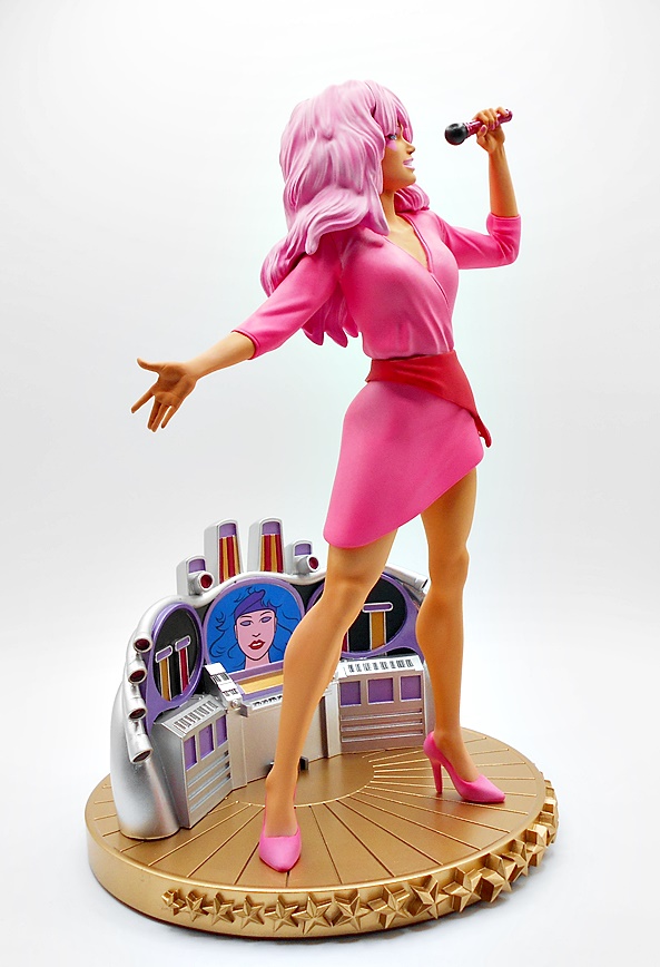
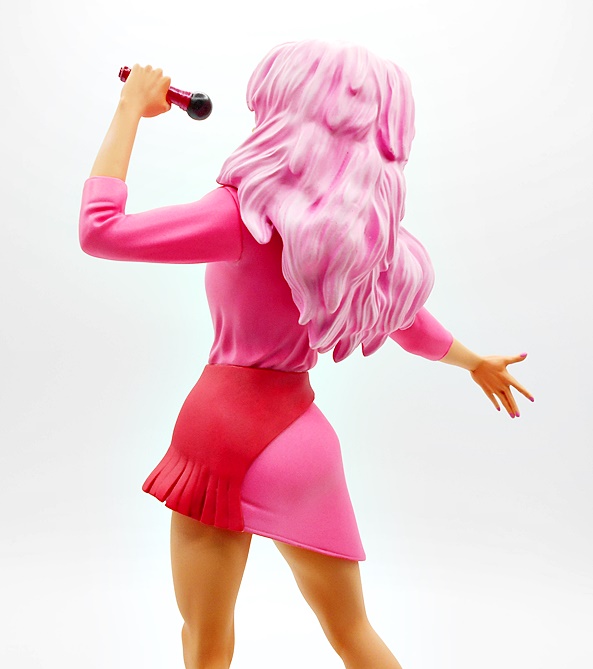
Here she is standing up on the stage, rocking out, and looking well… Outrageous! The figure comes as one piece and all you have to do is peg the rod on her left foot into the base and she’s ready to go. I’m really going to go into full-on gush mode, because I literally love every last thing about this statue and the way she turned out. The pose is absolutely superb and ripped right from the opening of the cartoon. She stands with legs apart (oh god, does she have great legs!), microphone raised, her free hand open behind her and strikes a pose worthy of a magazine cover… or even a statue!
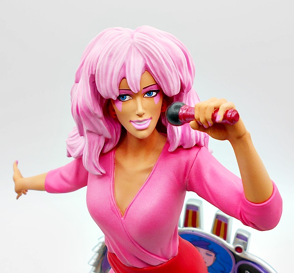
The costume colors and design follow her animated look, and I’ll do a comparison with the original Hasbro doll at the end. This means less sparkle and more pink and red. Her short dress is pink with the belt-sash thing being red and her high heeled shoes also pink. The skin tone is nice and even. The colors just pop so beautifully here and all the paintwork is excellent. Even her fingernails are painted pink and you get some lovely metallic gloss on the microphone.
The portrait could have made or broke this whole shebang but boy did they nail it here. Jem is absolutely beautiful and the paintwork for her eyes and makeup is all razor sharp. Her lovely face is framed by that beautiful big cotton-candy colored hair. Boy did I love me some 80’s rock ladies with big hair. Must have been what fueled all those teenage fantasies I had about the Wilson Sisters. These Dreams, indeed. Anyway… Where was I? Oh yeah… if you look close you can see her earrings under all that hair. It’s Showtime, Synergy!
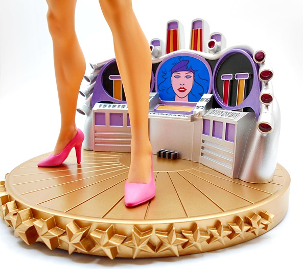
The base is also an inspired piece of work with the Synergy computer behind her on the circular stage. The computer casing is painted in a nice metallic silver and you get some purple panels and frames around the displays, and the sculpted musical keyboard and foot pedals. And best of all you get Synergy’s image in the central monitor, which looks like it was ripped right out of the cartoon. Don’t get me started on the huge disparity between Synergy’s doll and her cartoon look. I never liked the look of the doll and that’s why I don’t have it in my collection. Well, that and it’s pricey and hard to find in good condition. The satin gold finish on the stage is quite striking, and you’ll notice they left the stars on the front gold instead of painting them red like shown on the box. I’m all for the change. I think what we got just looks classier.
Like most Premier Collection statues, this piece is limited to a production run of 3,000. It’s numbered under the base and also on an art card you get in the box. And holy hell, did I come up with a low number! Not too shabby! I really like these cards as a bonus. It’s something that even Sideshow doesn’t do with their vastly more expensive limited statues. Good on you, DST!
If you can’t tell, I’m in love with this statue! But I was almost heartbroken, because when I got to my computer after work to pre-order, it was already sold out everywhere. I couldn’t believe it. Luckily a few weeks later one of those retailers put up some more and I got in on that action faster than Pizzazz kicking a puppy. At $199 this is definitely one of DST’s most expensive releases in their Premier Collection line, but honestly it was worth every penny and if they gave Pizzazz the same treatment, I’d be down for that for sure. Heck, I’d even love to see them do all the characters in the Gallery Series, because I’d buy every damn one of them! Well, not Rio because screw that guy. Jem is mine! And as for you, Hasbro… there’s clearly a demand for Jem merch and it’s long past time you should get to work on that. Or maybe Jem should get a new agent.
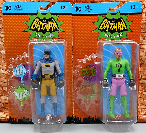
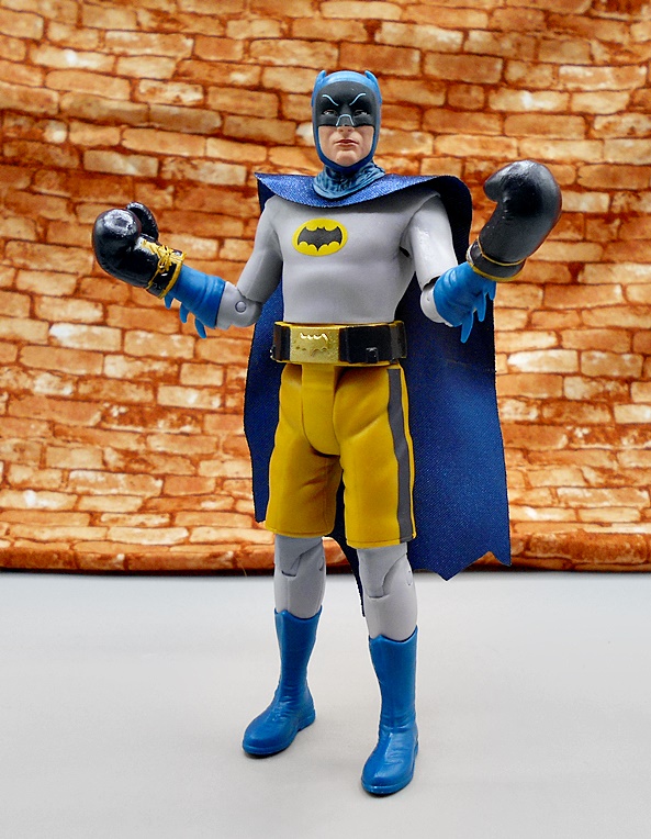
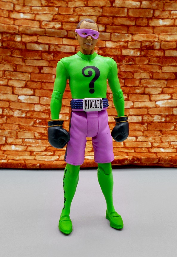
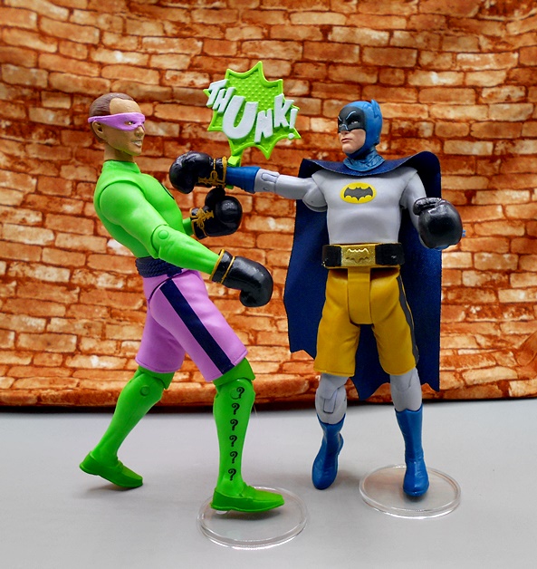
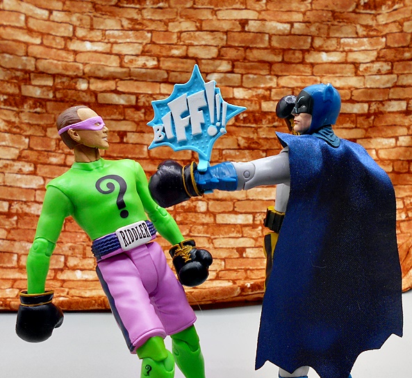
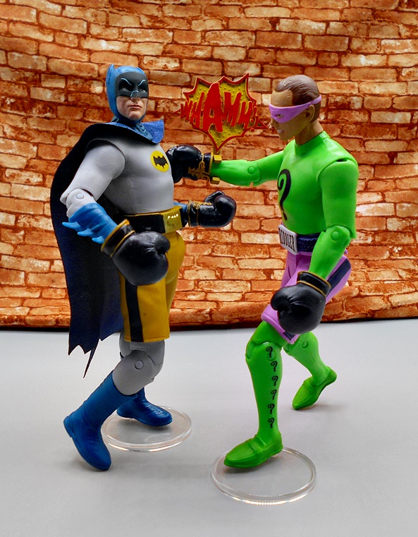
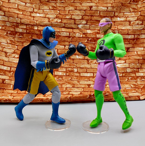
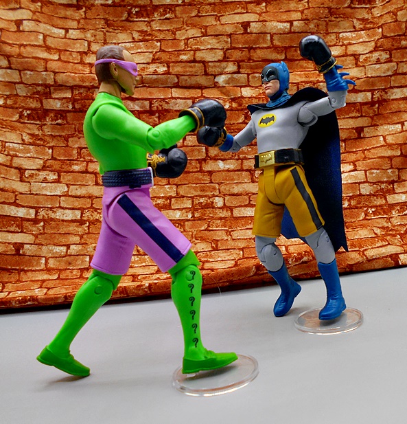
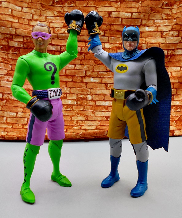
It’s hard for me to imagine what the 1966 Batman series must seem like to people who didn’t grow up watching it. But I sure as hell did and I loved it. My brother has always been the furthest thing from a comic book or sci-fi nerd as you can get, but two things we could always bond over was watching the original Star Trek series, and 1966 Batman. And maybe that’s why I still have so much love for this wacky series. I collected the Mattel line that was issued sometime around 2013, and it looks like now I’m collecting McFarlane’s line too. I’ve been playing a lot of catch up, since I literally only started collecting it once McFarlane opened pre-orders for re-issues of the first Batman and Robin figures, but I’ve been buying a lot of toys to make up for lost time. Anyway, today I’m kicking it off with the boxer versions of Batman and the Riddler.
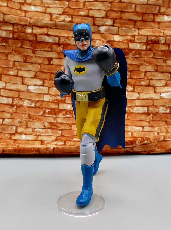
It probably seems strange to start with variants, especially since the excessive number of variants in this line ha been garnering its share of criticism, but it’s hard for me to nitpick when I see how deep the line is going on characters, vehicles and playsets. Plus, there’s the old adage, if you don’t like them don’t buy them. I’m not buying all of them, but I was pretty excited to get this pair from the Season 3 episode Ring Around The Riddler, where The Riddler tried to take control of the Gotham Boxing racket and the episode culminated in a boxing match between Batman and the Riddler. As far as goofiness goes, it’s par for the course, and as a kid the idea of seeing Batman box The Riddler was almost too much for my little brain to process. What’s that? Talk about the packaging? Oh yeah… these figures come on colorful cards with the Batman Classic TV Series logo. They kind of look a little like rack toy packaging, which might have been intentional, I don’t know. It’s charming to be sure, but nothing outrageously special. Still, I bought a double of Boxer Batman to keep sealed, so let’s rip these guys open.
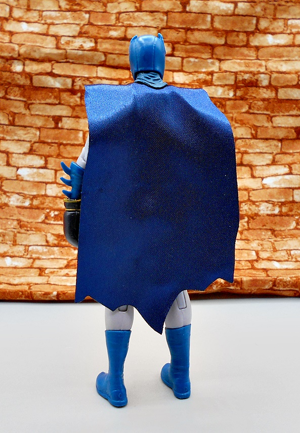
As you can imagine, these are cheap ways to reuse a lot of parts from the original releases of these characters, but to be fair there’s some nice new sculpting here too. Batman dons his usual costume but happens to be wearing a large pair of yellow boxing trunks over it. You also get a much exaggerated version of his belt with the gold buckle on the front. The boxer motif is rounded out by a pair of boxing gloves that he’s wearing over his regular bat gauntlets. Everything about this figure is deliciously ridiculous and honestly, if you wanted to buy just one figure that best sums up this show, I think this one would be a good choice. Apart from the boxing paraphernalia, the costume sculpt is pretty clean and simple, epitomizing the on-screen costume. The pale gray and blue really look good as does the yellow and black bat symbol printed on his chest. The softgoods cape looks pretty good from the front, but maybe not so much from the back.
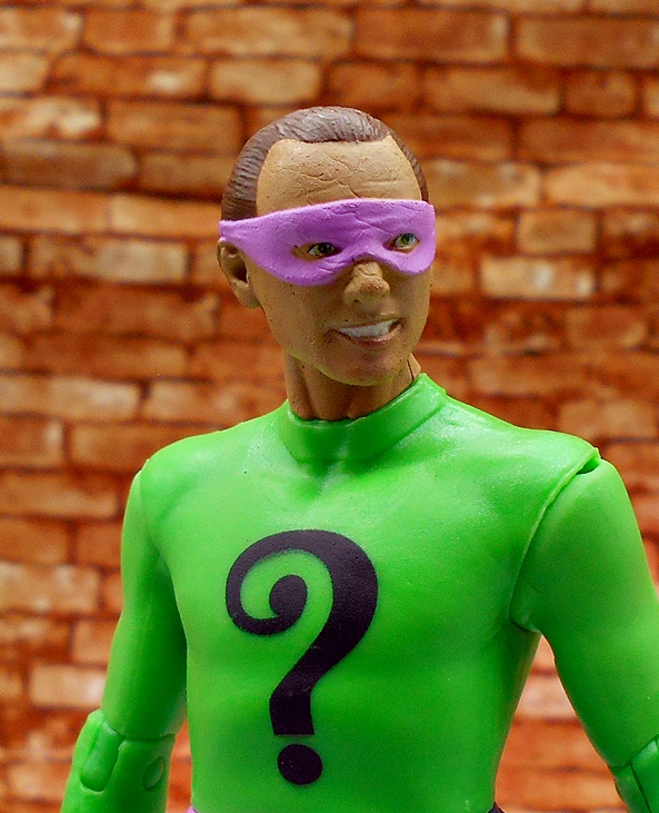
I think the head sculpt is fine for a retro-style figure, but I don’t see a lot of Adam West in it. The cowl does look very nice right down to the linework on the eyebrows and nose.
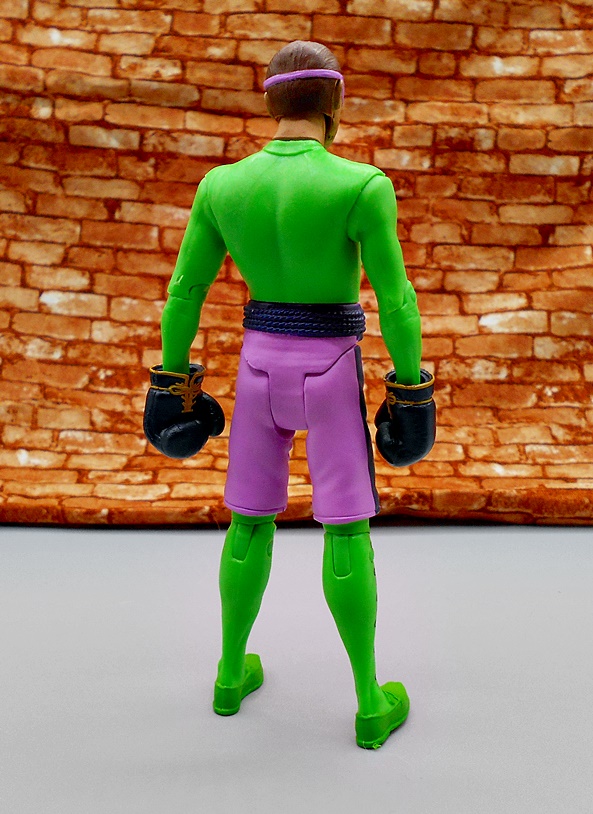
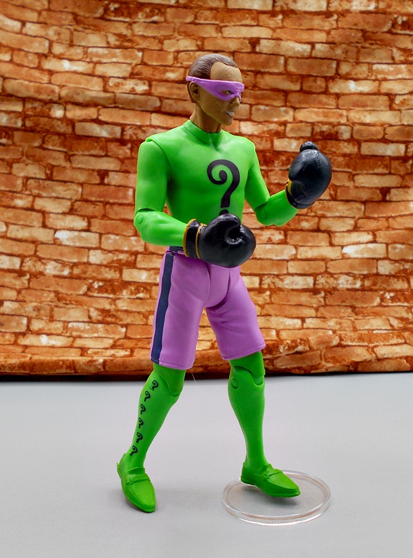
As with Batman, The Riddler is wearing his regular villain costume with the boxing trunks and gloves on top. His trunks are kind of mauve, which looks pretty snappy against his bright green outfit. I really love the giant RIDDLER belt buckle. The costume itself has very little in the way of sculpted detail, although I absolutely love how he’s just wearing a pair of regular loafers painted green. The printed question marks are all pretty crisp.
As for Riddler’s head sculpt, I think this is a better likeness than what we saw on Batman. Frank Gorshin will forever be The Riddler to me and I’d easily put him on par with Romero’s Joker in the series. He had a manic energy that was just wonderful to watch. I like the flash of teeth here and that the mask is sculpted rather than just painted on.
The fact that McFarlane calls this a Retro line probably refers to the articulation more than anything. It’s not as limited as it could have been, but it certainly has its limits when compared to the DC Multiverse series. Actually what’s most limiting is the use of the t-crotch, which doesn’t allow for any lateral movement in the hips and is definitely what feels most retro here. You do, however get rotating hinges in the elbows and knees, which is fairly modern. The head is ball jointed, the waist will swivel as will the wrists, but there’s no ankle or chest articulation. Nonetheless, I found these to still be pretty fun to play around with, especially when adding a figure stands to help them out in action poses.
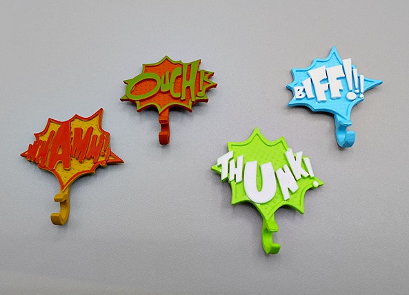
The only accessories included here are plastic versions of the comic-style exposition balloons that would appear on the screen during the fights. Batman comes with BIFF and THUNK while Riddler comes with WHAMM and OUCH. The have rings so you can clip them onto the figures’ wrists. These are OK, but I really want to like these more than I do. It’s a very nice effort, but in execution I think it falls kind of short. I actually wouldn’t be critical of them here as they don’t feel like they are replacing actual accessories, but that was the case with other figures, as we’ll see in the weeks ahead.
I really love these figures and I had a lot of fun opening them and playing around with them. I don’t know that the whole retro vibe is really there. Back in the day we had Mego Batman figures and some Corgi cars, but nothing like these. Honestly, the Retro tag is probably just to separate them from the DC Multiverse level of articulation. Either way, I’m really glad I finally plunged into this line and when I next visit with it we’ll be checking out an exclusive lunchbox full of figures!
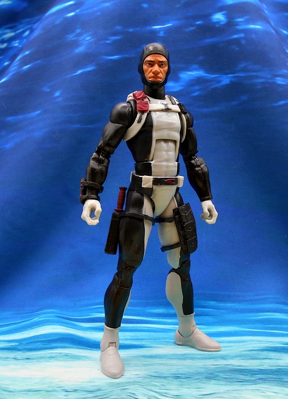
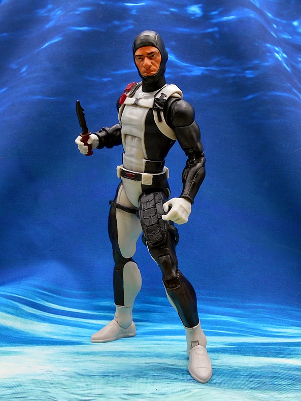
My pile of GI JOE Classified figures is stacking up, so I really need to double my efforts to get into these. Three reviews a week seems like a lot of work, but it isn’t enough to keep up with all the toys I want to look at. In a lot of cases, I’ve been doubling up on figures in each review, but I feel as if there’s too much great stuff to talk about with the Classified figures and I want to give each one their own review. So, let’s take a dive under the water today and check out Ed Leialoha, aka Torpedo!
I was probably around thirteen when I got the first Torpedo figure and he was one of my absolute favorites for a while. Keep in mind, my first experiences playing with GI JOE was with the 12-inch figures. My Uncle had given my brother and I his whole collection and we were always playing with them. When I started getting the new 3 3/4-inch JOEs, I tended to really take to the ones with a lot of gear, so figures like Snowjob and Torpedo were among my favorites because all their gear reminded me of playing with the bigger figures. Also, whenever I would get a new JOE my Dad would explain a lot of the filecard stuff to me, as he was a military history buff. I can still remember getting Torpedo and him telling me all about Navy SEALs and what they did. I think he was happy to see me move from playing with Star Wars to GI JOE because it was something he could relate to a little more… at least until things started getting really goofy. Anyway, Torpedo comes in a fully enclosed box with some excellent artwork. Inside you get a cardboard foot locker with all his gear in a tissue paper bag.
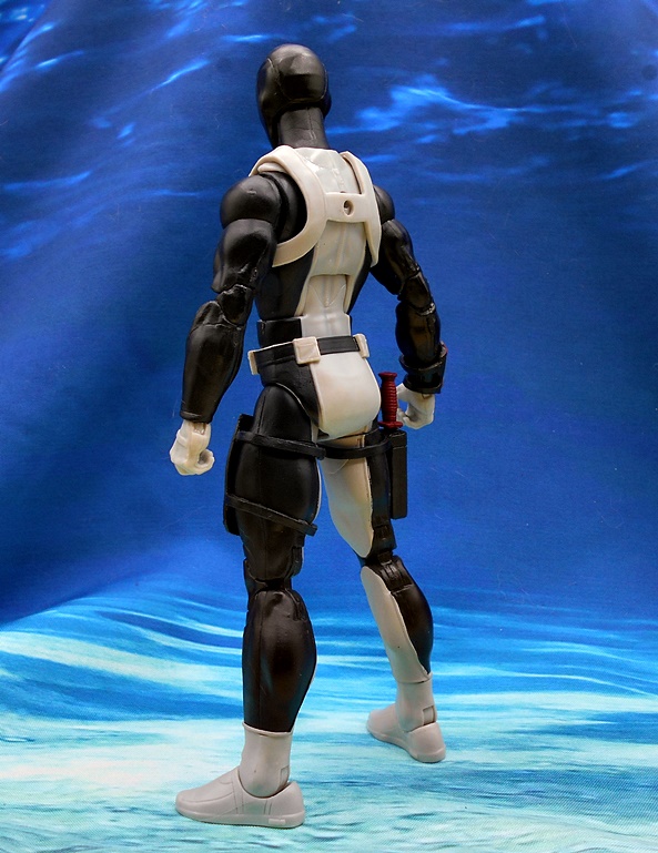
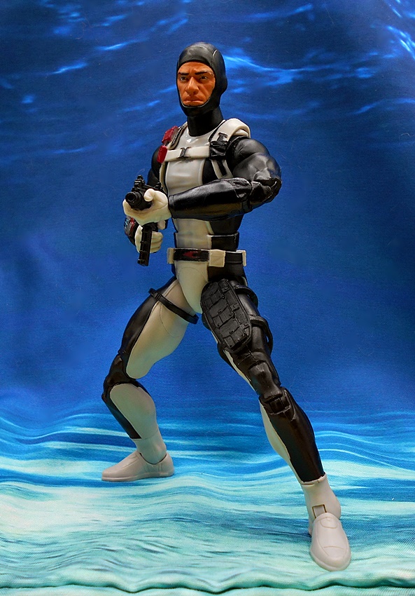
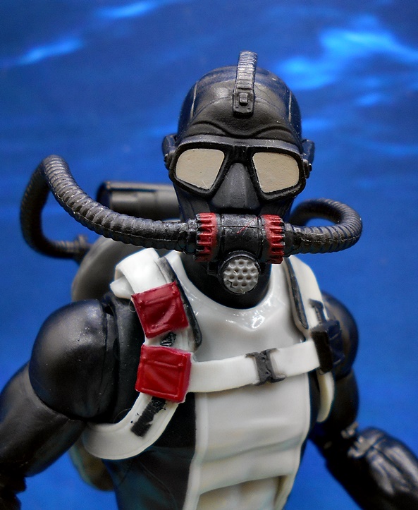
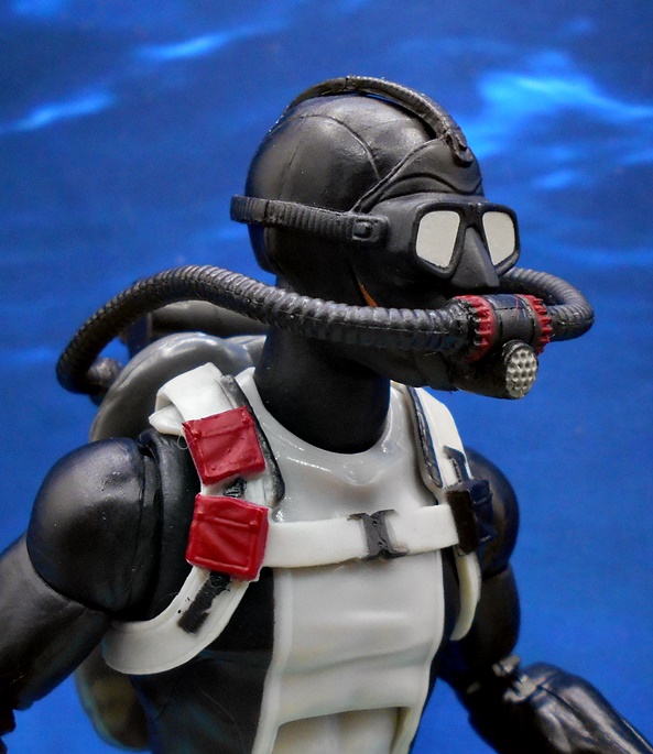
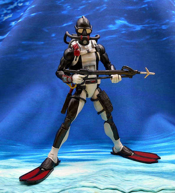
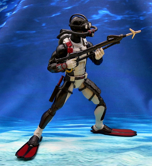
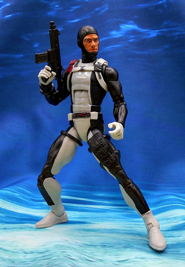
Here is the base figure before suiting up to dive under the waves and boy does he look great! Hasbro did very little to change that iconic black and gray suit, and I’m certainly happy about that. They did add some paint to the belt, which adds a bit of detail, but my favorite addition is the little sonar instrument he has attached to his right wrist. He also adds a brace of pouches strapped to his left thigh and a sheath for his combat knife on his right thigh. You get a soft plastic shoulder harness with a couple of red pouches added to his right shoulder, and a black one on the left. This is exactly how I like to see my Classified figures, with deep roots in the vintage original and just enough modern flourishes to make if feel fresh.
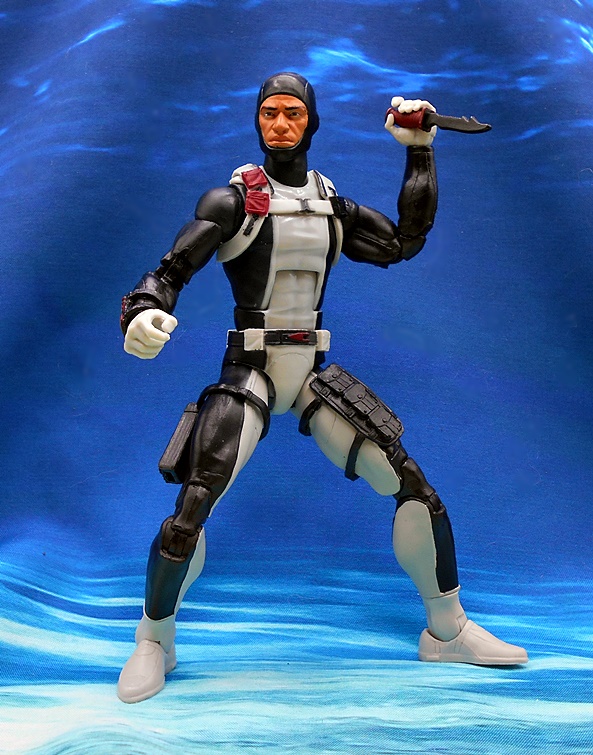
The head sculpt is pretty good, but I think they uglied Ed up a bit. Hey, not every JOE can be as handsome as Chuckles, and to be honest I think the portrait gives him a lot of personality. The skin tone is also excellent, especially considering my vintage Torpedo looked like he had jaundice. There is some pretty bad paint slop around the lines of the hood where the black paint is over sprayed onto his skin. It’s tolerable when the figure is in hand, but it looks absolutely terrible when you punch in close. If he shows up for clearance, I may try my luck on another, otherwise I can live with it. Let’s check out some of his weapons before he hits the water.
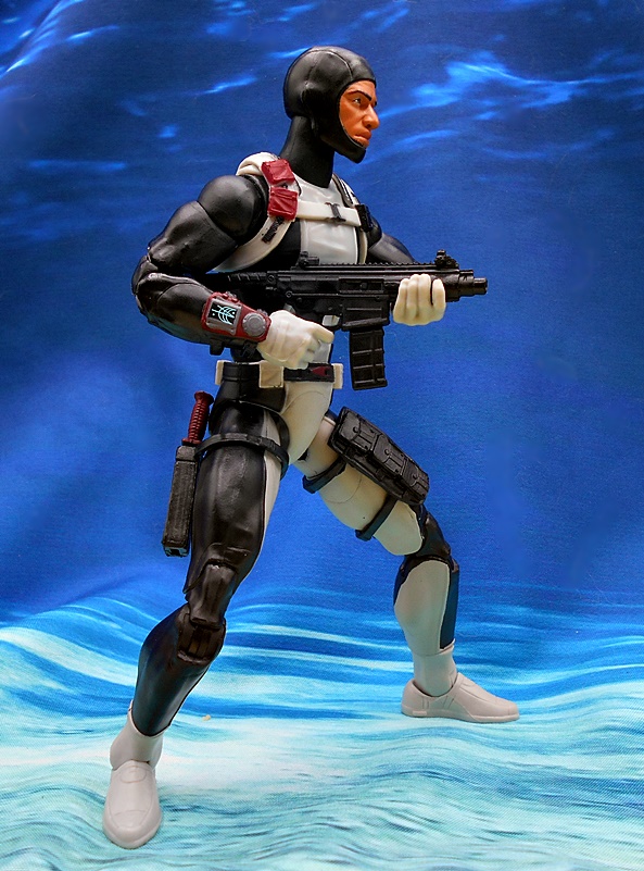
I really dig how Hasbro is improving the knives in this line. For a while we were just getting simple sculpts cast in black plastic, but here we get a red painted grip and a black blade with a serrated back and a nasty looking clip to the point. This fits perfectly in the sheath and he can comfortably wield it in either hand.
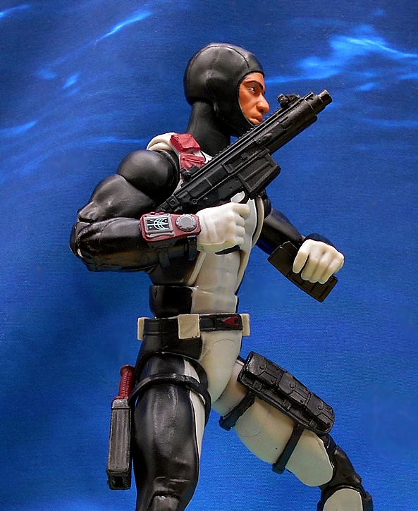
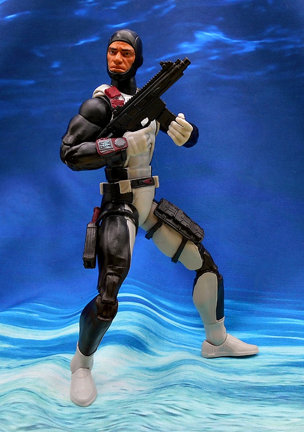
Next up we get a sweet little automatic short-barreled rifle with a removable magazine. This is a great bonus, since the original figure only came with his harpoon, and sometimes even divers have to exterminate Cobras on dry land. The sculpt on this little weapon is very detailed, and while I don’t recognize the model, the design definitely looks like it’s grounded in reality. OK… time to suit up and go below!
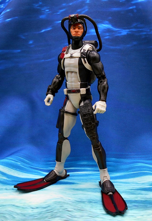
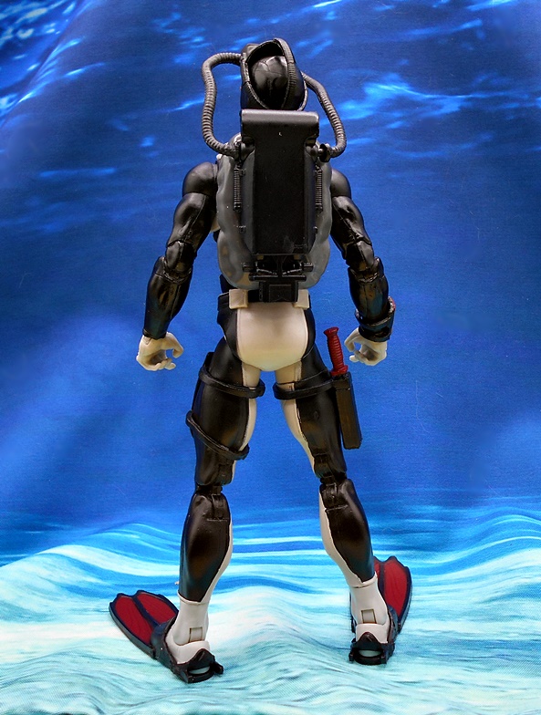
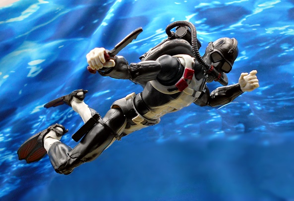
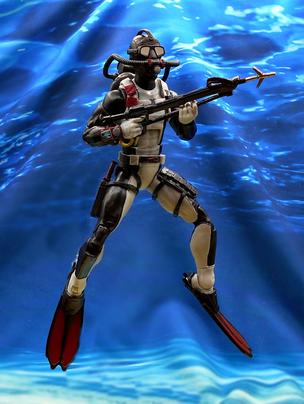
Much like the vintage figure, Classified Torpedo has a pair of flippers and an O2 tank for his back, but here we actually add a face mask. The backpack is a pretty big departure from the vintage design, but I still like it a lot. Gone are the thruster-like side pieces and the red tanks, all abandoned for a simple and streamlined black tank. The flippers are cast in soft plastic and actually fit around his feet, rather than just pegging into the bottoms. They also have holes so you still have access to the foot pegs, which is a great little touch.
The mask has hoses that peg into the O2 tank and it just fits right over the head with soft plastic straps. This is such a great addition to the figure, as I had to use my childhood imagination that there was some kind of shield over vintage Torpedo’s eyes. The goggle lenses are painted silver and you get some red gray paint hits on the breather apparatus. The tubes even seem to stay put when I articulate his head, which is a nice surprise, as I thought they’d be popping out left and right.
Finally, you get the harpoon gun. A lot of folks were complaining about how rubbery and warped this thing was, so I was a bit worried when I opened the bag of accessories. It is indeed rubbery and warpy, but mine is actually not too bad. I like the sculpted loop to hook it around his arm, and there’s a clip on the bottom of the O2 tank to store it horizontally across his lower back.
Dare I say that Classified Torpedo is a direct hit? Well he is in my book! He’s the textbook example of what I look for in these figures. The base body lines up beautifully with the vintage design, while the scuba gear is all given a well needed modern update. The bendy harpoon gun is a tad disappointing and the paint on the head could have been a lot cleaner, but there’s so much else to love here, I’m not going to let it sink my enjoyment of this figure. The only sad thing here is that I don’t have a Cobra Eel for him to fight, and who knows if I ever will. Hasbro decided to make it an Amazon exclusive and it sold out fast and scalpers are selling them at double the price or more. Still, I think I’ll keep the nautical theme going for my next Classified review… but will it be Cobra or another JOE? We’ll see…
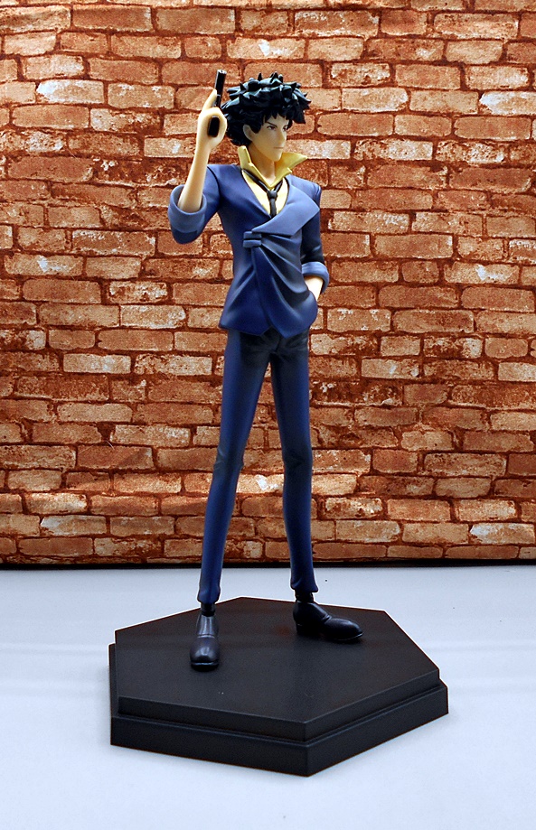
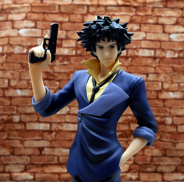
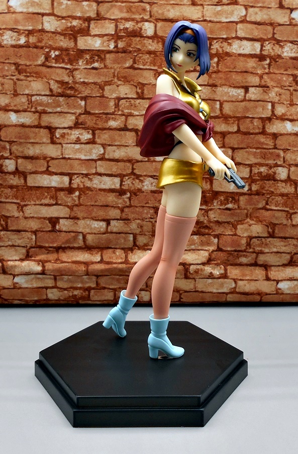
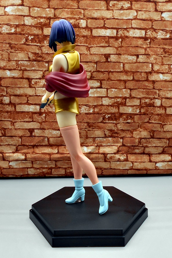
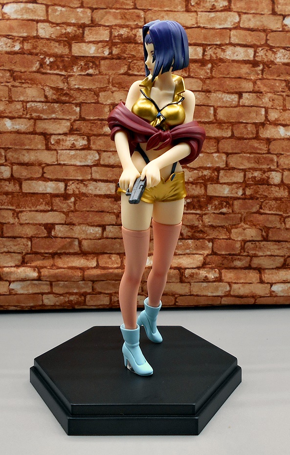
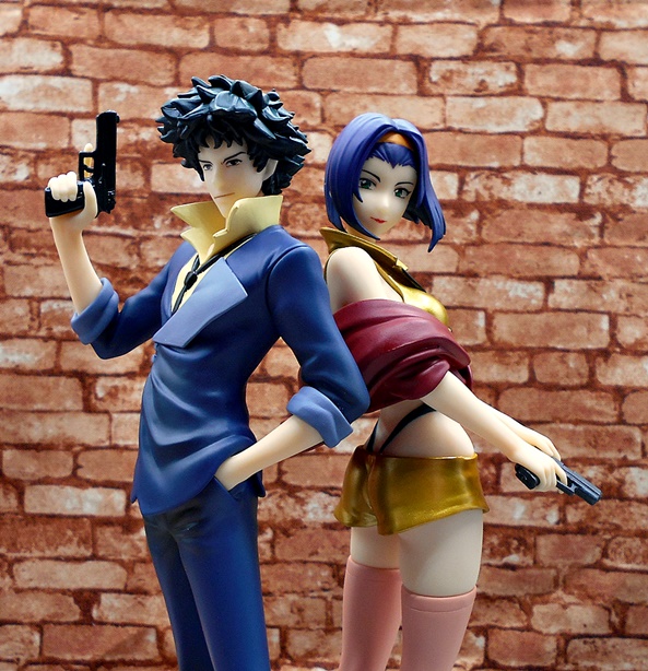
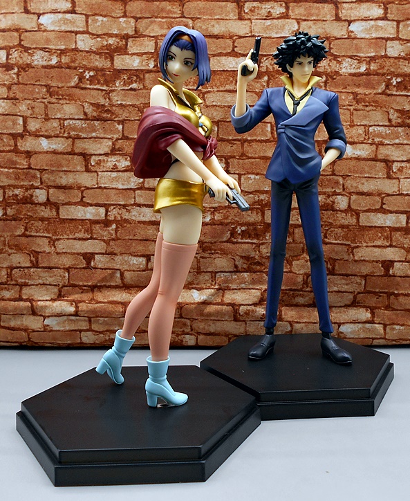
A short while back I picked up some Popup Parade figures at my not-so local comic shop and was pretty happy with them. Well, last week I was back in that area and they had some more at a bit of a discount and my impulse control failed me so I picked up a few more. Honestly, I think what did me in here was the fact that I have never been confronted with Cowboy Bebop figures while out and about, so I could hardly say no and quickly picked up the four they had. Actually, now that I think about it, these are probably the only Cowboy Bebop merch that I own, which goes to show you how little there is out there. Anyway, let’s have a look at Spike and Faye.
Popup Parade’s packaging has it’s ups and downs. I love how it’s almost all plastic (take that, Hasbro!) and that they actually work as their own display cases since all but the back of the figures are exposed and there’s plenty of room for light to get in. On the downside, the branding is really subtle with the character names in tiny fonts and nothing that shouts the Cowboy Bebop franchise. Still, everything here is collector friendly and I will likely display the figures in the packages for the time being. At roughly 7-inch scale, these are definitely in the prize figure class, and each come with generic black display bases to plug the figure into. Let’s start with Spike…
Be careful with this guy! My figure’s ankle snapped while I was gingerly inserting the pegs into the stand, and no wonder because they are very thin and delicate. I was able to glue it back with no problems, but who wants broken toys right out of the box? I like the pose they went with here. Spike exudes what I can only call his characteristic casual confidence, with one hand shoved in his pocket and the other arm drawing up his weapon. And might I add, it’s nice to see Spike exhibiting the proper trigger discipline! They really nailed his lanky proportions as well as the appearance of his suit, which isn’t heavy with detail, but does have some nice rumples and rolled up sleeves. The popped collar and the loose necktie are nice touches as well. The coloring on the suit looks pretty good, but the paint on the tie could have been sharper.
I think the portrait is a pretty good likeness, but it took a little bit for the hair sculpt to grow on me. At first it looked off, but the more I look at it, the more I like it. Spike’s chaotic coif is not something that is easy to reproduce in 3D, but I think what we got works well enough. Spike’s eyes are drawn very sharp and I love the little hint of a smirk on his broad thin line of a mouth. My biggest gripe with this figure is the skin tone which looks rather pale and waxy. It’s often a complaint that I have with lower end prize figures, but I’ve seen it done better at this price range. Still, all in all it’s a decent figure. How about Faye?
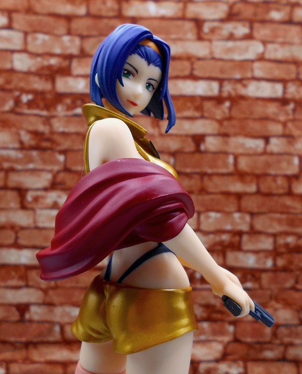
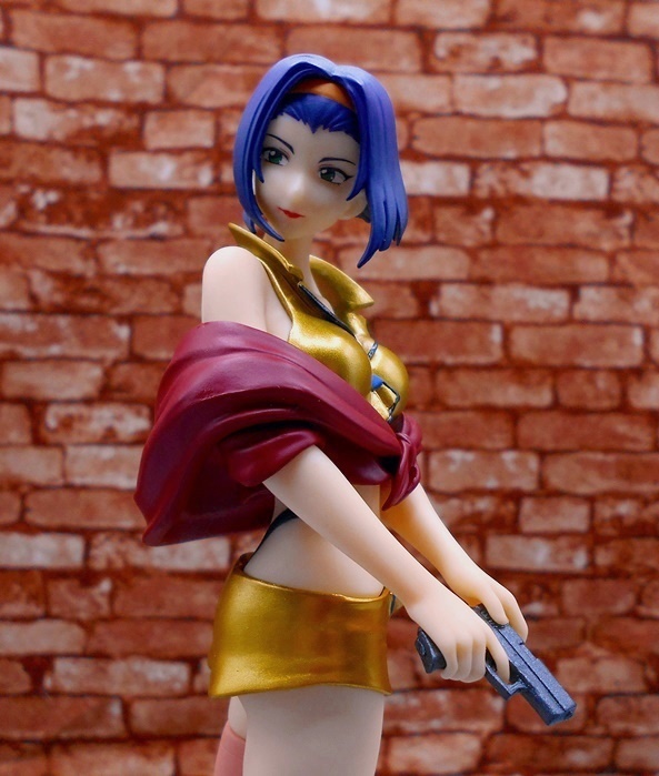
I’m happy to report there were no breakages with Faye, but then only one of her feet peg into the base, so there was no need to stress her. Once again, I think they did a great job with this pose Faye looks down over her shoulder, while shifting her weight to one foot as she racks the slide of her pistol and gets ready for action. This figure has several sweet spots to choose from when positioning her on the shelf. Her outfit is a lot more complex than Spike’s with the jacket tied around her and resting on her elbows and I like that they sculpted the tops of her stockings, rather than just paint them. There’s also a nice sense of depth to her boots, as her ankles disappear into them. I thought gold was an interesting choice for her top and shorts, as I would have gone with yellow, but it definitely makes the figure pop. No pun intended. The peach colored stockings, aqua colored boots, and red jacket all make for a great looking deco.
The head sculpt is a homerun and, just like Spike, her features are printed perfectly sharp. The hair looks fantastic as it billows out around her face a bit as if being tussled by a sudden head turn. But yeah, the skin tone looks even a bit more waxy here than on Spike, and it’s certainly more obvious because Faye is showing a lot of skin. Does it ruin the figure for me? Heck no. It’s just one of those things that these cheaper prize figures often struggle to get right.
I paid $30 each for this pair on sale, and that was down from the $45 they were stickered at. Thirty feels about right, while the original retail is way too high. I like them and I’m happy to have them on my shelf, but I think SEGA and TAITO are doing figures on par or in some cases a smidge better quality than these at even less. And while those are nice and all, they aren’t Cowboy Bebop characters, and that’s what ultimately won me over on this pair. Next week I’ll swing back and finish off the set with a look at Jet Black and Edward!
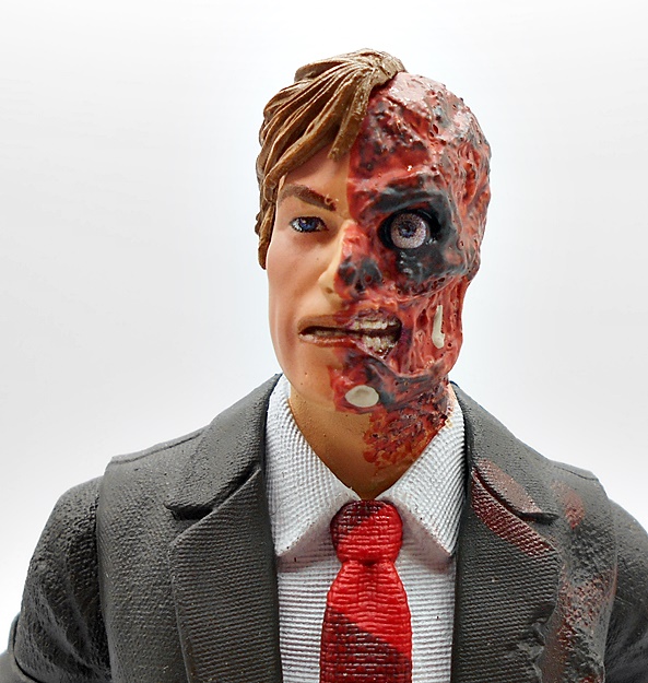
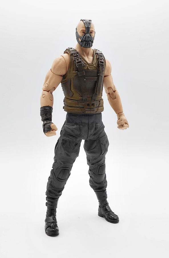
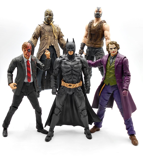
A couple weeks back I checked out the first half of McFarlane’s Dark Knight Trilogy figures with Batman and Scarecrow. Today, I’m looking at the second half of that wave with Joker and Two-Face, which also gives me the rest of the Collect-To-Build pieces to finish off Bane! The night is darkest just before the dawn, so let’s go…
I’ve got nothing new to say about the packaging, other than if it weren’t for the Bane figure parts, I probably would have just picked up Joker and Batman in this wave. But then I was very happy with how Scarecrow came out, so I have no regrets yet. I should note that I opened these figures a while ago and am using McFarlane’s official solicitation packaged shots, which shows a weird, almost metallic paint scheme for Joker and that’s obviously not what we got on the final figure. Two-Face comes with Bane’s torso and Joker comes with Bane’s head and three sets of his hands. Let’s start with Two-Face…
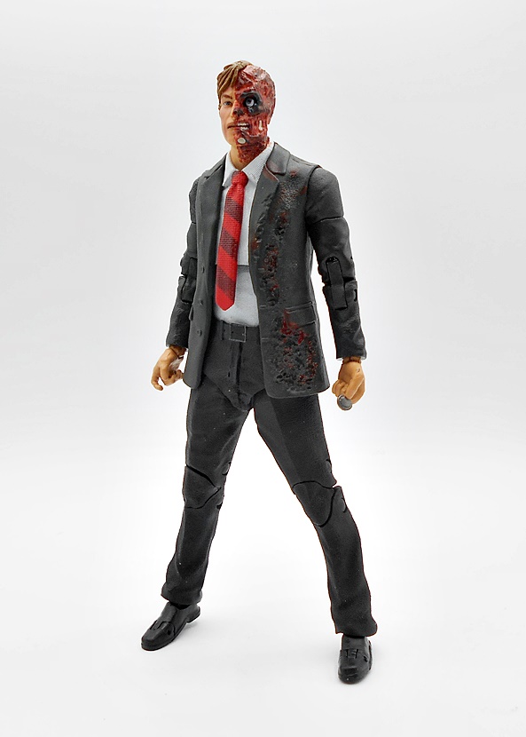
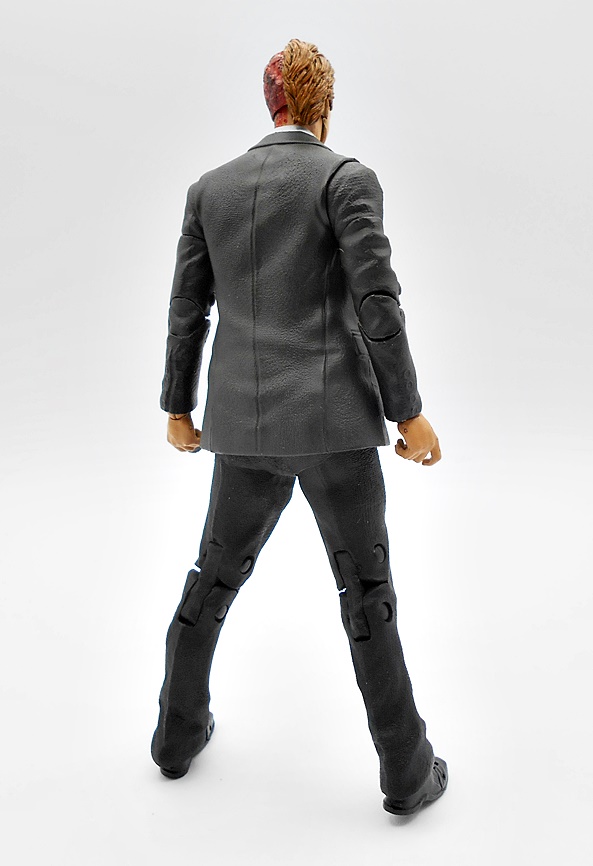
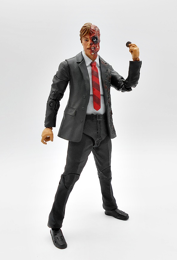
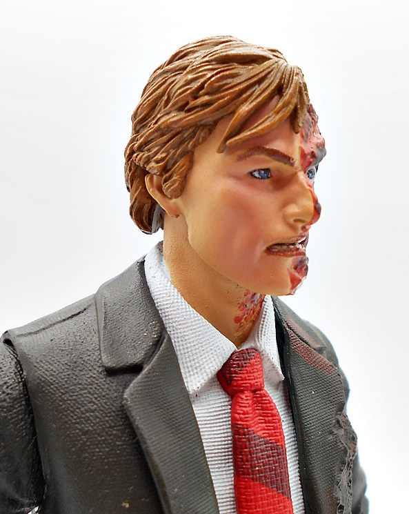
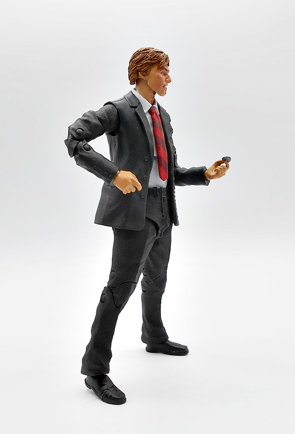
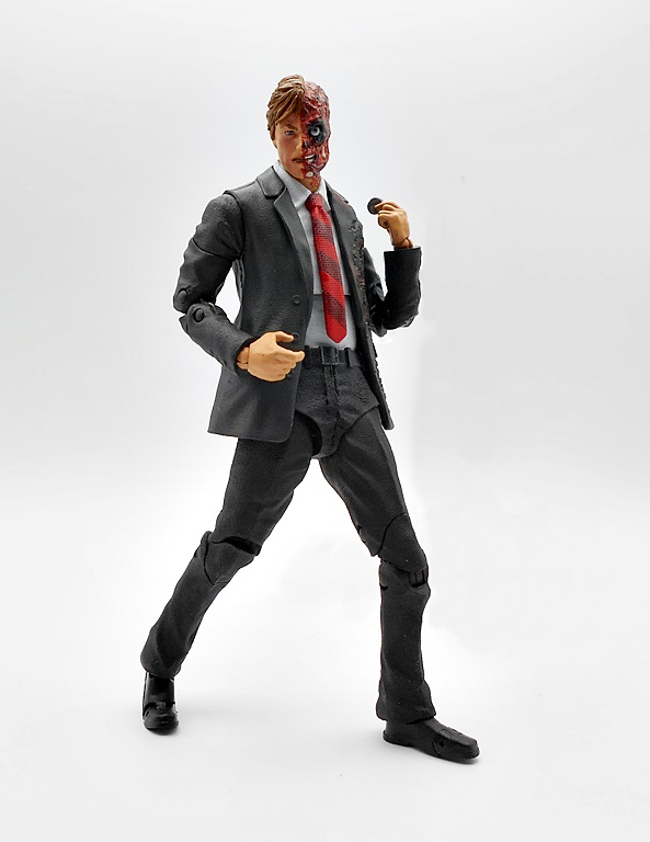
So, this is the figure in the wave that I was probably least excited about, but now that he’s in hand, I think he’s a pretty cool figure. Sure, he’s a guy in a suit, but I really like what McFarlane did with the damage to the jacket, which is both sculpted and painted on. Overall, I like McFarlane’s suit body a bit better than Hasbro’s Marvel Legends version, but I’d say they’re both more or less on the same level. The sculpted sleeves on the arms definitely match up with the suit-vest a lot better here. The jacket has a nice trim fit and the slacks have a hint of a crease running down the legs. The ball joint under the chest is handled well and the tie being sculpted separately looks great. You even get a little texture to the suit, shirt, and tie for that added pop.
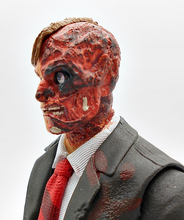
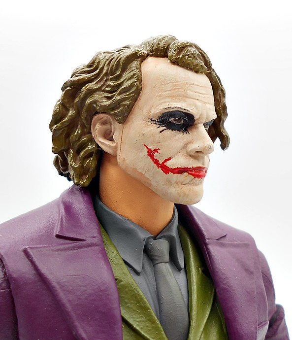
Of course, the head sculpt is the main draw here and it has it’s ups and downs. McFarlane’s portraits work great for comic characters, but they definitely fall short when it comes to their movie figures. There isn’t much of a likeness to Eckhart and the paint on that side of the face is too basic to look all that realistic. The damaged side is pretty horrific, and I mean that in a good way, although I think it could have used a glossy wash to bring out some of that gore. I think this portrait works fine for having a Two-Face in my DC Multiverse collection, but it’s probably going to disappoint people looking for a solid version from the film.
Articulation is standard stuff here for the Multiverse line, which is as solid as always. Dent’s left hand is sculpted with his coin, which was a great choice, while his right hand is sculpted with a trigger finger. Of course, you’ll have to pick up one of McFarlane’s gun-packs to give him a shooter for that hand. All in all, I like this figure a lot, but he didn’t surprise me into loving him , like Scarecrow did. If not for the Bane piece, I would have happily gambled on picking him up at clearance, but I’m sure not angry at picking him up at full price. Moving on to Joker…
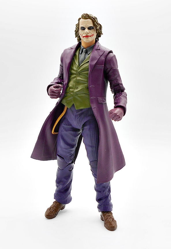
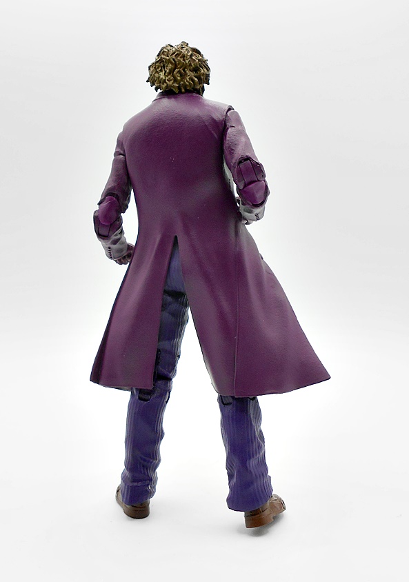
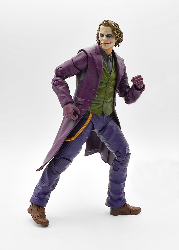
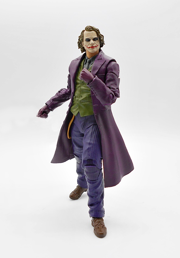
This is the figure I was looking forward to the most in this wave and he does not disappoint. I’ve seen a lot of gripes about how he turned out, and I honestly can’t understand them, because I think he looks fantastic. I really dig the billowy sculpt to his purple trench coat and the sculpted sleeves blend with it pretty well. The green vest and shirt collar and tie are all sculpted together, which still looks fine, although they are missing the patterns from the screen worn costume. Finally, the baggie purple striped pants lead down to his brown shoes. There’s also a sculpted gold chain leading from under the vest.
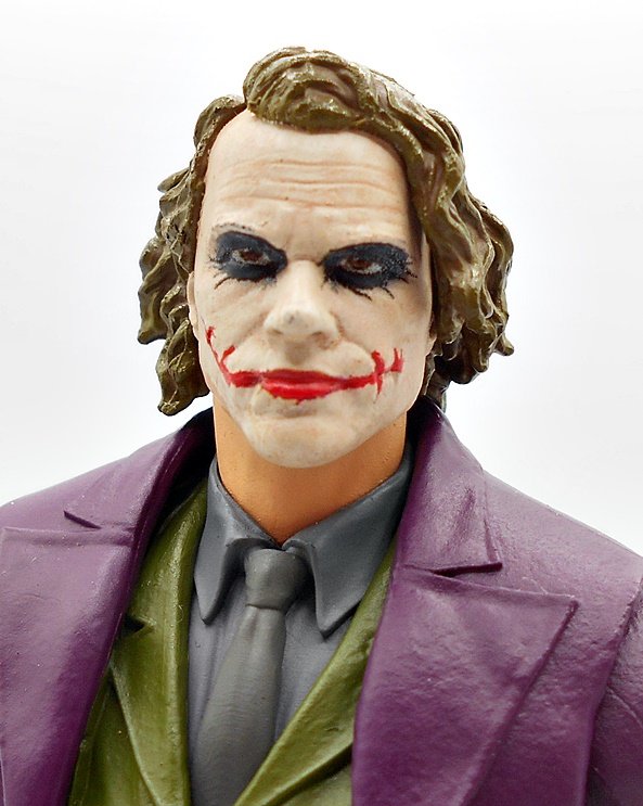
I think the portrait was a sticking point with some collectors’ early reactions, but I like how it turned out. It’s certainly not perfect. The makeup should have been more spotty and rough, but I’m still very happy with what we got. In terms of movie based likenesses, I’d say this is one of McFarlane’s better ones.
Like Two-Face, Joker comes with a trigger hand but no gun. Honestly, if McFarlane couldn’t give us a gun, they should have just given us a knife instead, which feels conspicuously absent from this set. Even a hand with a playing card sculpted into it would have been welcome. The left hand is sculpted into a fist.
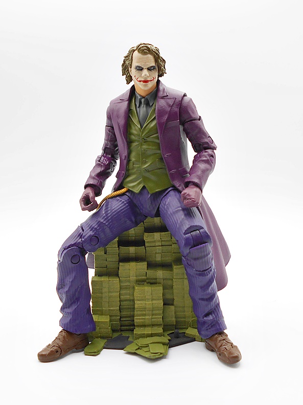
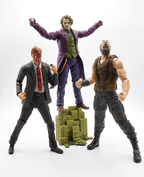
You do, however, get a big pile of cash, which is a damn cool accessory, and works great as a throne for him to sit on. So yeah, I’m going to go against the grain and say that I love how this figure turned out. A few tweaks could have made it even better, but I dig him. And that brings us to Bane!
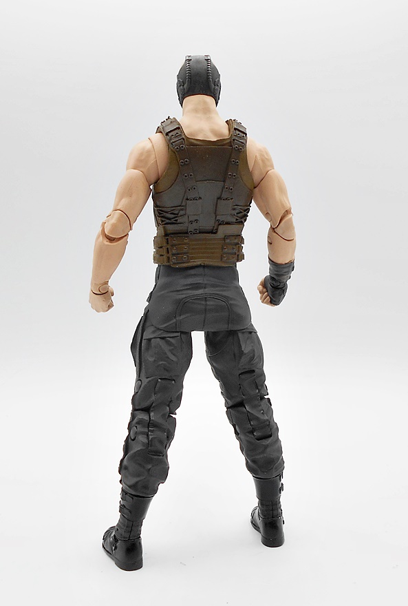
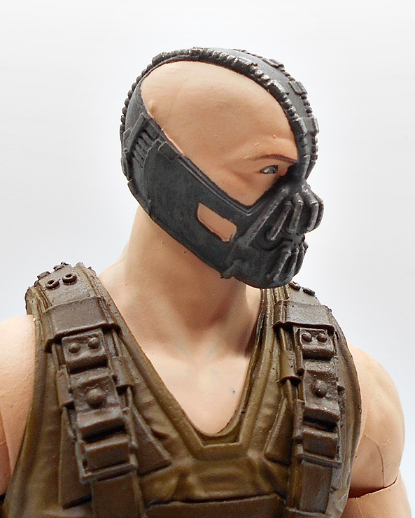
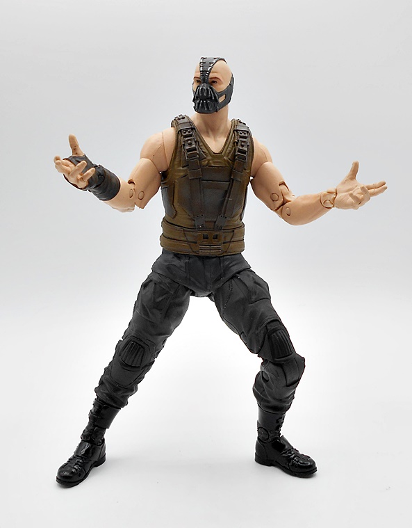
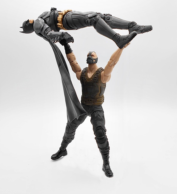
I’m a little saltier about this figure since McFarlane revealed the Gold Label Bane with his coat. It sold out fast and even if it didn’t, I wasn’t about to drop another $45 just to get the coat. I think it was a pretty shitty use of the Gold Label line and companies need to watch how they screw over collectors by reissuing better versions of figures so soon after the initial offerings. With that said, this one looks pretty good. The tactical vest has some pretty sharp detail, I love the wrappings around his right wrist and hand, and the rugged pants are replete with sculpted pockets. All in all pretty nice work!
The portrait is pretty good. It actually looks like the eyes are printed rather than painted. There’s also some nice dry brush weathering on the mask. The lines between his skin and the mask have a little slop here and there, but you have to punch in pretty close for it to be a problem.
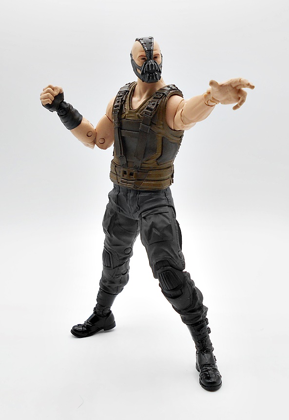
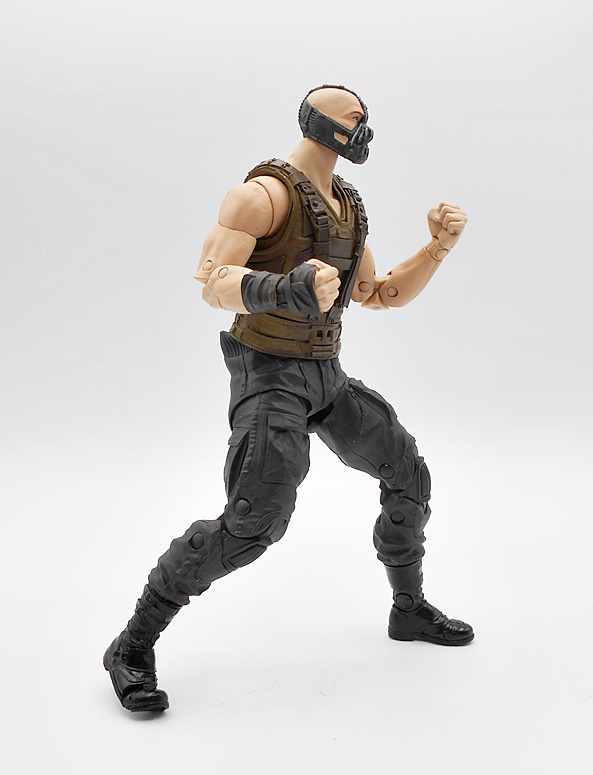
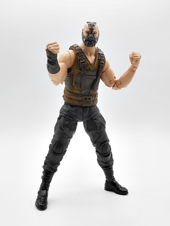
Despite being a Collect-To-Build, Bane has all the usual articulation seen in the Multiverse line. I did have some issues with the legs staying put with this figure, but after a lot of cursing and excessive force, I think I finally got them to stay put. You get three sets of hands with Bane, which feels a little excessive. These include fists, relaxed hands, and gesturing hands. I would have much rather we got a knife or playing card hand with Joker rather than these, but I’ll take them anyway.
I don’t buy a lot of Multiverse Waves when they first come out, but this one I jumped on and I’m still glad I did. Especially since these don’t seem to be dropping in price as fast as some of these figures tend to do. While I’m not as big a fan of these movies as most, I do love these versions of the characters and they are certainly a massive step up from the shitty Mattel ones I have from forever ago. Oh wait… we’re not quite done yet…
Yeah, I also bought the Gold Label Joker for some reason. It’s made even more ridiculous by the fact that this is a Jokerized Joker. Yup. I’m probably not going to open this one, and all I can say is it must have been the product of one of those nights of heavy drinking and retail therapy, because otherwise I’m not really sure why I bought it. I do really like the paint on this figure’s portrait, so that’s something. Also the Jokerized Bane head is kind of cool too. But I certainly will not picking up any of the other Jokerized figures in this wave.
I’m committing myself to getting through the first assortment of Cosmic Legions figures in a timely manner, so as not to create the backlog problem, I had with Mythic Legions. Heck, I still haven’t opened that last wave of Mythic Legions and I really want to get around to it sooner or later. As for Cosmic Legions, so far I’ve checked out Kraggnar and both versions of Olek Thygar. Today, I thought I’d tackle two of the ladies in the line with Vorgga and Zeerian Spyre!
As we saw last time, T4H have switched to using window boxes, which I like. The boxes are colorful, have dedicated character art, and blurbs about the story and character on the side panels. On the downside, the extras are all stored on a tray mounted inside the bubble. I’m not a fan of this, as they are a pain to get out and they leave a lot of open space on the trays. Just look at all that void in Zeerian’s packaging. It’s deceptive because she does come with a lot of goodies and I think the presentation would look better with them placed all around her. But, who knows if I’ll still have these boxes in a month or so, so it’s no big deal to me. Let’s start with Vorgga.
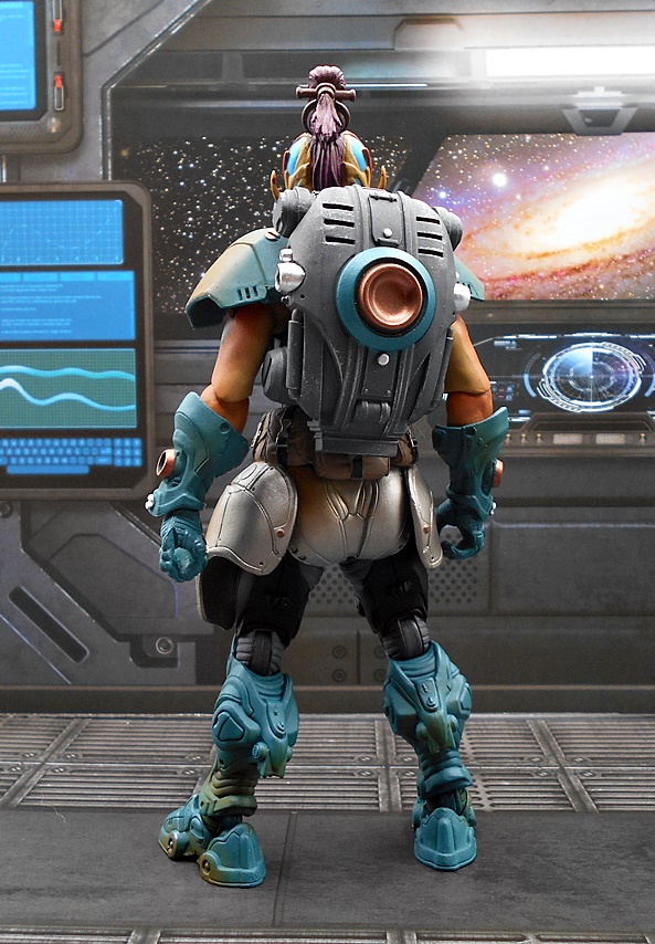
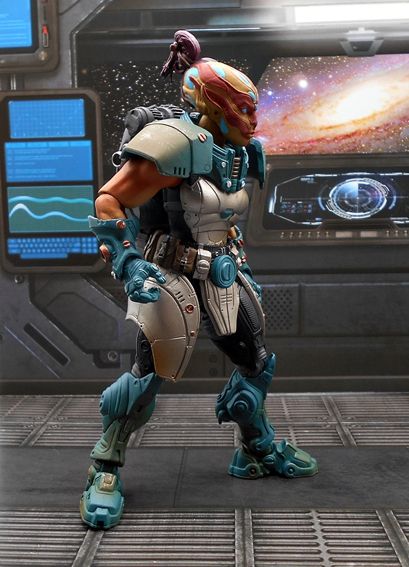
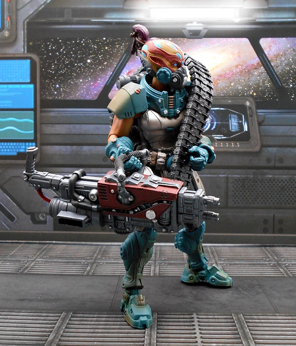
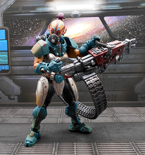
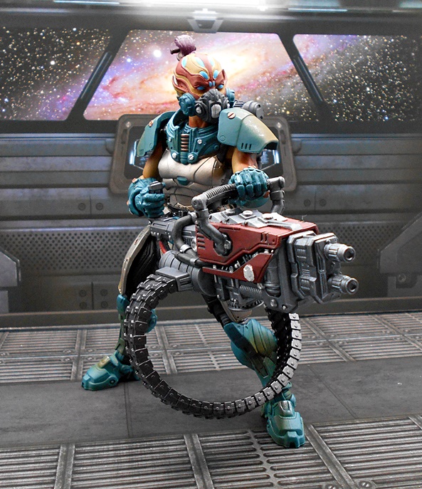
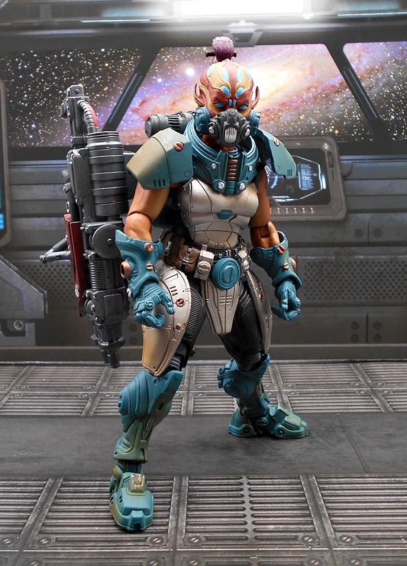
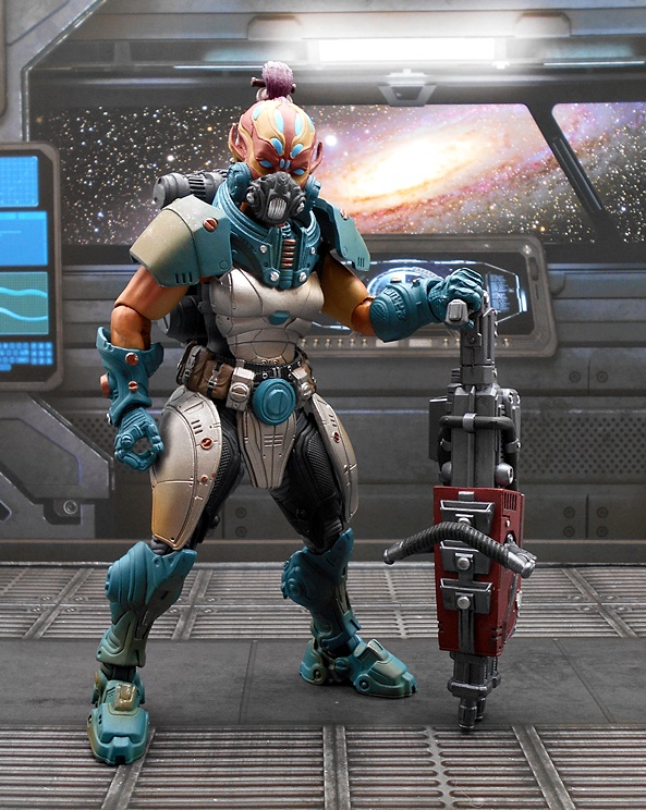
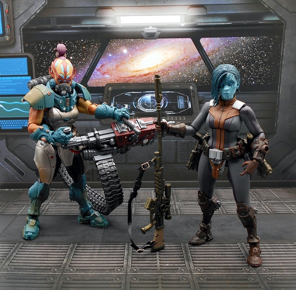
Vorgga looks like a badass, and that’s because she’s kind of a space special forces agent for the Interorbital Perimeter Guard. As such, she’s clad in a pretty cool suit of space armor. Her muscular arms are left exposed, she’s got shoulder pieces that peg into the back just like the Mythic Legions line uses, and a belt with lots of pouches, each with individually painted straps and buckles. The detail on the armor is quite nice, and most of it has a rounded and organic shape to it. She also has a rather large backpack, which is removable and works with her weapon, which we’ll see in a bit. The mix of teal and silver looks great on this figure and you also get some copper paint hits. I like the gradient colors on display in the boots, and there’s some brushed weathering on the shoulders.
You get two head sculpts to choose from, one with a breather mask and one without, both of which are quite beautiful. Vorgga has sculpted markings all over her face with a tan and red deco and various bright blue panels that match her blue pupiless eyes. Her skull is elongated in the back and terminates with a bound ponytail, and she has long pointed goblin-like ears. It’s a very distinctive looking portrait with some striking colors.
The head with the breather mask looks slightly angrier in the eyes and the lower half of the face and cheeks are encompassed by the mask, which looks absolutely phenomenal. As much as I dig the first head, I think I’ll be displaying her with this masked version most of the time.
Vorgga also has a rather distinctive tattoo printed on her upper left arm, which I think is a really cool touch.
Vorgga does not come with a lot of stuff, but she she goes for quality over quantity with an enormous heavy blaster. Yes, this is a slightly modified version of the jackhammer-like digging tool we saw bundled with Olek. This time it has a dual barrel on the front and a slot on the side to feed in what is either a charging cable or some kind of belt-fed ammo. The other end plugs into the bottom of the backpack, so I’d like to assume it’s just a big ass battery to power that gun.
The positioning of the wide ammo belt can sometimes be at odds with her legs, but it works OK most of the time. It’s possible that feeding it into the side would have worked better, but I’m no space weapon engineer, so who am I to nitpick the design? Either way she looks amazing when she’s wielding this thing and I can just imagine her clearing out entire corridors of rampaging alien scum.
Just like with the Olek figures, here you get a set of clear rod-like pegs that can fit into ports on the figure to secure things, but Vorgga really doesn’t have anything to secure to them. I don’t really see a use for the ones on her gauntlets, but you can use them on the backpack ports to attach the gun by pegging it into the slot for the ammo belt. I’m not sure if this was intended, but it works really well and despite the weapon’s big heft, she can take the weight just fine without toppling over.
Wow, do I love this figure! I dig the alien anatomy of her portrait and her armor is just gorgeous. A few more extras would have been nice, but there’s a lot of plastic in that heavy blaster, backpack and ammo belt, so I get it. At first I assumed Vorgga was meant to be some kind of security force for the prison, but having reviewed the narrative, I guess she was thrown into the GraveRing as well. Granted, I don’t hang too much on the narrative, I’m just here for the figures and I do hope we get some more Edgehounders like her in the line. Next up… let’s look at Zeerian Spyre!
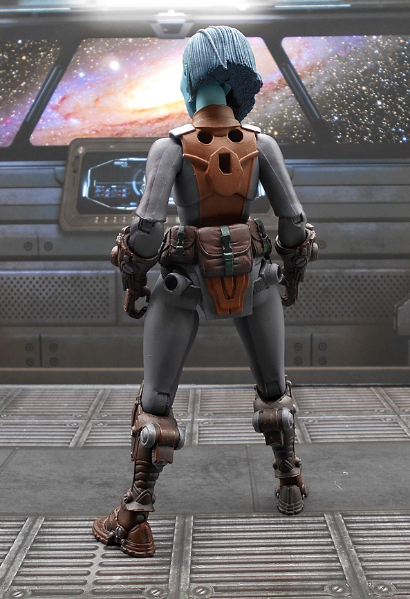
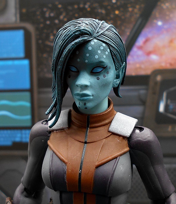
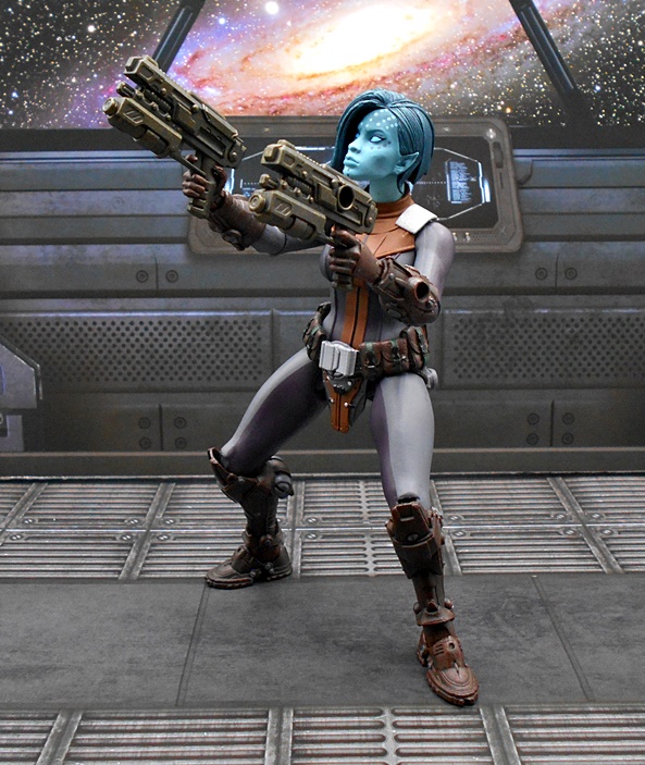
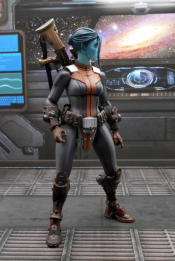
Zeerian has one of the most intriguing backgrounds in the narrative. A disgruntled scientist, she fled her homeworld and joined up with a mysterious organization called The Mortal Thorn, which ultimately landed her in the prison. The base figure here is pretty simple compared to Vorgga, but she makes up for it with more gear and some softgoods. The bulk of the body is a smooth bodysuit with a sculpted tabard sort of piece running from the shoulders down the center of her torso and connecting with the belt. The suit is mostly gray with the tabard being very light brown. The belt has a big buckle and lots of pouches on the sides and back. Her gauntlets and boots are really cool in that they have an angular sci-fi look to their sculpt, but are painted brown to look a little more pedestrian. I really dig the pieces at the top back of the boots which look like some kind of jump jets. My only real gripe here is that the sockets and slot in her back are very exposed and unsightly, but we’ll see some fixes for that in a bit.
You get two head sculpts here, with the main difference being the hair style. One has the left side sculpted all tidy and brushed back while the right side is grown long and cascades over that side of her face. The portrait itself is pretty with some soft features. The blue skin tone looks good and the spots are nice as well. The second head has the bulk of the hair on the right side of down to just a single group of strands, allowing you to see more of her face.
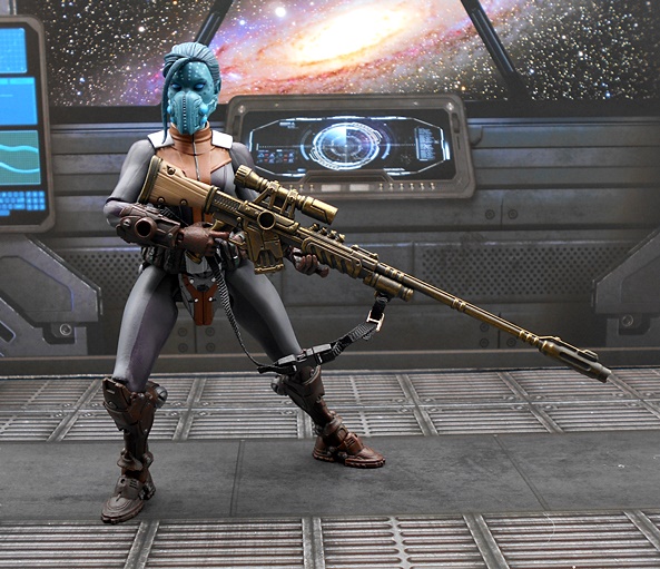
You also get a breather mask, which unlike Vorgga’s is an actual accessory and can be used on either head, but I find it works best on the second one. It looks cool, but it’s only held on by friction and has a habit of sliding off from time to time.
And then there’s the softgoods poncho, which I have mixed feelings about. It’s a nicely tailored piece with a hood and a large emblem on the back. Probably the best thing about it is that it has wires running through all the edges so you have plenty of opportunities to shape it as you want it. I plan on exploring it’s potential some more, but for now I’m probably going to display the figure without it.
You may remember that Olek came with a hologram piece for his gauntlet, and Zeerian sees a return to that with a translucent purple ringed planet. I love this effect and I’d be interested in T4H selling just a pack of these in different colors and sculpts.
As for weapons, Zeerian comes with the same pair of pistols we saw with Olek. These are great sculpts, but one running gripe with me and this assortment of figures is the heavy reuse of accessories. At least they are cast in a new color. Once again you can use the clear peg rods to attach them to the ports on the figure, and I think these look pretty good positioned back just behind her hips. Zeerian only comes with two sets of hands and they are both trigger-finger hands. The only difference is in the hinge where one rocks forward and back and the other side to side.
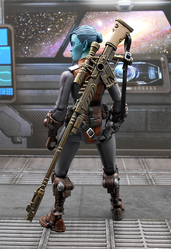
Her main weapon is this banger of a sniper rifle, which can be pegged into her back using the clear rods or by using the sling. If you go with the pegs, it actually attaches in the holes that are normally used for these figures’ shoulder armor, but since Zeerian doesn’t come with any shoulders, it’s a good opportunity to use them for something. The rifle is massive, measuring longer than Zeerian is tall. It’s packed with detail in the sculpt and the stock even has a bit of a woodgrain to the sculpt. The sling has a working clasp and the scope can be removed.
It’s a little tough to get her to shoulder it because it’s such a long boi, but I think it works. I’m guessing this thing has some pretty impressive reach.
While Zeevian is definitely one of the less complex looking figures in this assortment, I really love how she turned out and I have had a great time playing around with her. I think she packs a lot of personality, and that’s saying something considering the rather unique makeup of this assortment’s characters.
With five figures down, I have so far been absolutely delighted by Cosmic Legions’ debut. While the DNA doesn’t stray far from what makes Mythic Legions so great, this line wasted no time in developing a personality all its own. I’m almost at the halfway mark, and next week I’m going to bust out this wave’s biggest brute of them all!