J. Scott Campbell’s Fairytale Fantasies: Alice in Wonderland (Autographed Edition) by Sideshow

Sideshow dropped a huge reveal this week (at least it was huge to me) in the form of a preview of the newest statue in J. Scott Campbell’s Fairtytale Fantasies: Princess Sultana from The Arabian Nights! She looks absolutely stunning and it was great to hear JSC talk about it a bit on Sideshow’s channel. Of course, that got me to thinking about how I’m not caught up on my reviews of this series, so today I’m going to roll out one that I’ve had on my shelf for a little while. Let’s check out Alice in Wonderland!

Alas, I have the box for this one in storage, but here’s a shot of an art print that I have hanging above where I display her. This was offered a little while back on J. Scott Campbell’s store, which is also where I happened to get the Exclusive Autographed Edition of this statue. I’ve reviewed some of these out of order, with three so far under my belt: The Little Mermaid, Red Riding Hood, and Tinkerbell. But I think, Alice was the third piece released in the series, preceding Red Riding Hood, the most recent release. If you own any Sideshow statues, you should know the drill. She comes sandwiched between two big styrofoam bricks and there’s a little assembly required. Connections are achieved through easily fitted tabs and magnets, and it takes only two shakes of a Cheshire Cat’s tale to get the Alice ready for display!

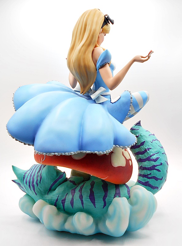
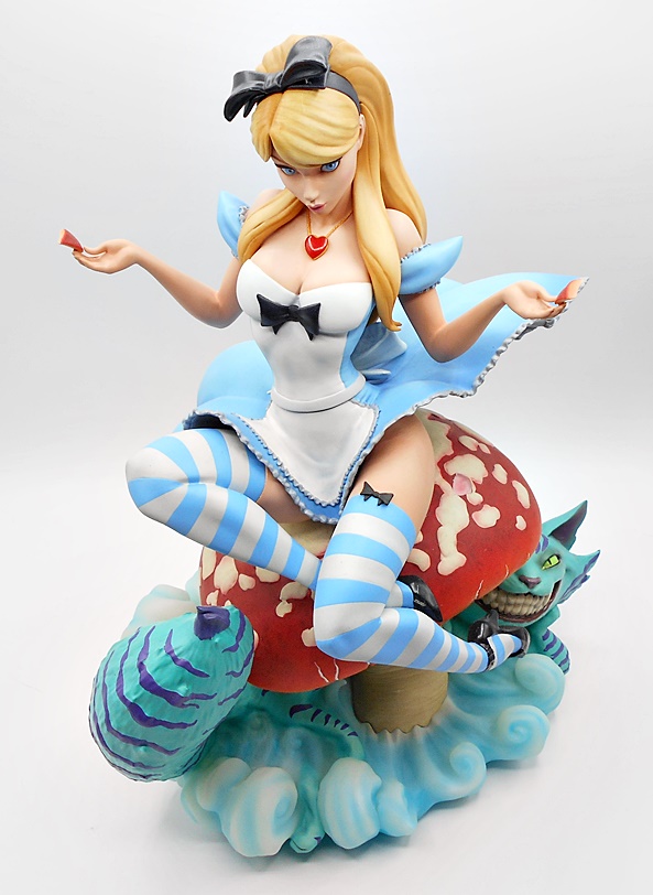
Alice is a satisfyingly large piece, not necessarily because of her nearly 14-inches in height but the sheer weight of her mushroom base is quite impressive, especially when displayed next to Tinkerbell and Ariel. Every time I move this statue to dust, I’m taken back by how heavy this solid chunk of polyresin is. Alice sits poised on the giant mushroom with her skirt blowing up and a piece of the mushroom in each hand as if deciding which one to eat. Meanwhile, the monstrous Cheshire Cat coils around the base looking up at her with its rictus grimace. The composition is very nicely done with the serene Alice contrasted by the dark and foreboding goings on down below. And as with many of Sideshow’s previous JSC pieces, the colors here are to die for. The blue is so vibrant, matched only by the turquoise and purple of the Cat. Alice’s pale blonde hair has some nice gradient tones and all the paint lines are sharp and immaculate. I particularly dig the high gloss black they used for her shoes. Meanwhile, the mushroom has a bit of a dirty finish on it perhaps suggesting something nefarious about its nature.

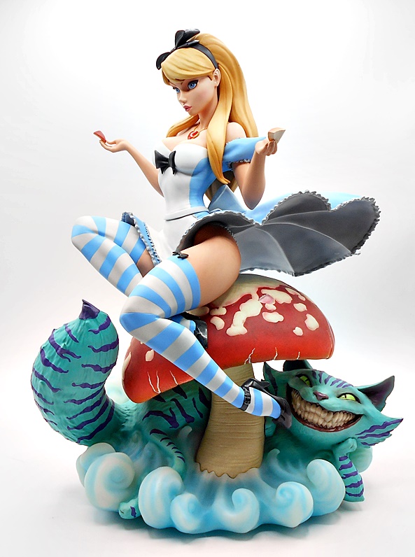
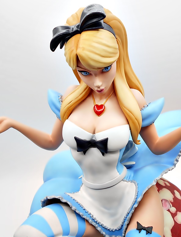
Alice’s outfit exhibits that uncanny JSC style of mixing of the cute and innocent nature of Disney with a healthy dose of sex appeal. The striped high stockings with black bow-ties give way to a bare thighs as the frilled trim of her skirt blows up and reveals a flash of panties. Up top you get bare shoulders and an ample dose of cleavages, punctuated with another bowtie front and center and a super glossy red heart pendant hanging around her neck on a sculpted gold chain. The puffy effect on her sleeves is also well done.

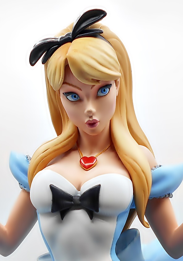
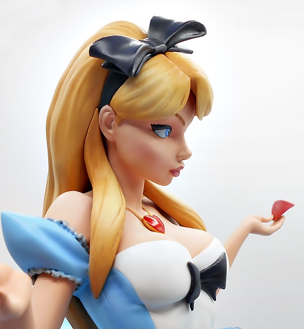
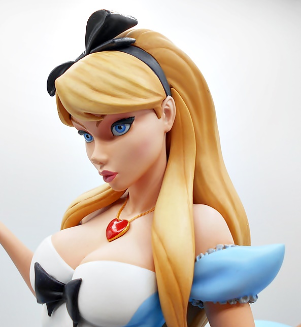
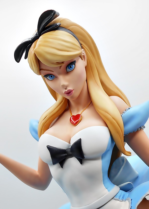
And this portrait… oh boy! One of the things I love most about this line is the way the sculptors have captured the 2D style of JSC’s portraits in 3D, and Alice here is just another great example of that. The sweeping curve of her nose, the big, beautiful blue eyes, and the perfect pursed lips are all just dead on gorgeous. What’s more, the paint used for her skin tone is so soft and warm, especially in the cheeks. I may be guilty of saying this every time, but in terms of the portraits, I think this is my favorite of the series so far.

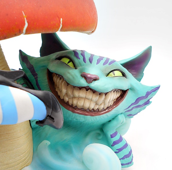
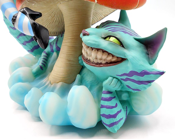
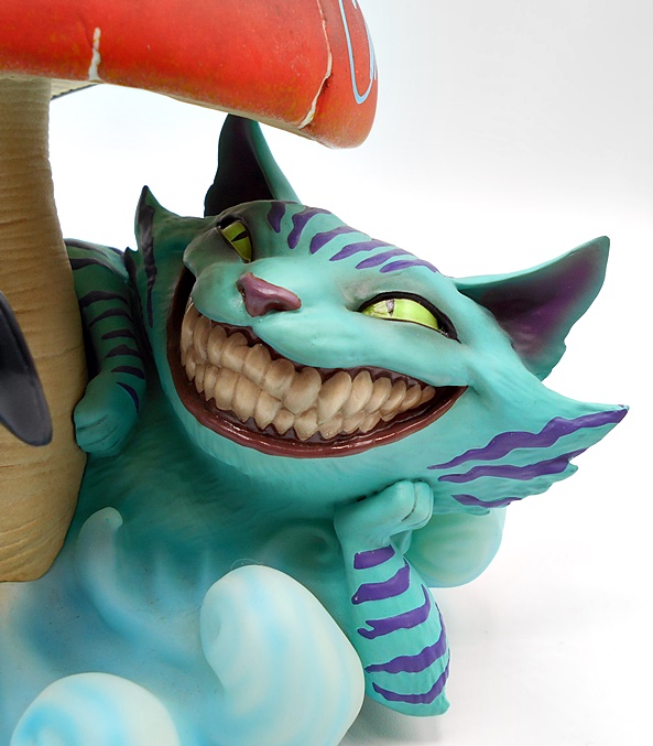
And shifting from the beautiful to the grotesque, check out the mug on the Cheshire Cat! The unsettling wall of teeth are painted with a high gloss to give them a slick, saliva coated sheen. He rests his head on his left front paw while admiring the view above like the dirty kitty he is. Either that or he’s about to bite off her dangling foot. I really dig the way he seems to blend with the mist as if he’s just materialized and his fur has a really cool and surreal look almost akin to crepe paper. The cracks in the edges of the mushroom look great and you get some ribbed texture in the stalk as it rises up out of the swirling mist.

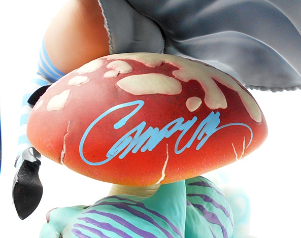
The statue is autographed by Campbell on the back of the mushroom in an almost neon blue marker. Some may have preferred it be more front and center, but I kind of like having it in the back so as not to disrupt the aesthetics of the piece. This way you can have your shroom and eat it too. It’s also somewhat humorous to have the signature right below the panty flash. The Autographed Edition was available in two runs, one with a metal art card and one without. The art card edition was sold out by the time I could get to the website, but I was happy to get this one. This run was 4000 pieces and is hand numbered on the bottom of the base. I got #48 which is by far the lowest numbered Sideshow piece in my collection. It also came with the standard Certificate that is included if you buy signed comics from the JSC store.

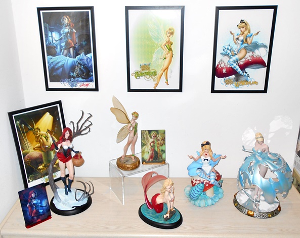
Is this my favorite Fairytale Fantasies statue so far? Wow, that’s so hard to say. I do absolutely love it and I think the portrait is up there as one of, if not the best. I also have to give this one props for having such a complex base that really adds a lot of character. Still, I may have to give the nod to Tinkerbell as still being my favorite. I just love the way she’s standing on a compass and her wings are really pretty. It’s so hard to choose one, and I don’t want to hurt any of these ladies’ feelings. Anyway, the regular version of Alice retailed for around $375 and has long since sold out at Sideshow, while this one was just a smidge more at $399 for the Autographed Edition. And as you can see from my display, I have one more in the collection to look at here before I’m all caught up, so maybe I’ll bump Cinderella up to get her time in the spotlight soon.

DC Super Powers: Wonder Woman and Invisible Jet by McFarlane

I’ve really been enjoying McFarlane’s retro DC Super Powers line, even if some of the figures have been maddeningly difficult for me to find. Luckily the vehicles have been pretty easy to preorder and this week I got all caught up on those. Previously, I checked out a bunch of the figures and the Batwing and today I’m having a look at Wonder Woman and her Invisible Jet!

Egads, I love this packaging! It’s so cool to see the old Super Powers logo of exploding stars again and the blue and yellow retina-blinding colors are enough to make my memory water. Diana looks absolutely striking on the card and I really dig the character art they used. It pained me a bit to tear this figure open, but I’m going to keep an eye out for another to keep carded. The jet requires some assembly: Attaching the tail and the two wings. The tail is a permanent attachment, but the wings can slide off again, allowing the toy to be stored in the box, which is always a big plus for me! Let’s start with the figure…

So, these are basically more modern interpretations of the characters done in the retro format. Part of me would have loved to see straight up re-do’s of the original figures, but I think these are plenty fun too. I’ll note here that Wonder Woman’s cape is not wired to the bubble like the caped figures in the first wave, and that’s a really good thing. McFarlane is usually pretty great about using fan feedback, and I think that message got through. As for the design, I love it! The red corset with the raised gold bands on the top and bottom give it a more modern flavor, while the star-speckled shorts really speak to Wonder Woman’s roots. I like the gold knee guards with the stripes that follow down to her toes and the silver wrist bracers look great too. The cape is held in place by a wire around the neck and is easily removable if you prefer your Wonder Woman capeless.

The head sculpt is really nice with a detailed gold tiara and some nice flow to the hair, particularly around the shoulders. The eyes are painted in a manner similar to the vintage figures, but there’s a lot more definition to the face and the lips are perfectly painted. As with the original Kenner figures, these have your basic articulation consisting of rotating neck and shoulders, a t-crotch for the hips, and hinges in the knees. Diana has a gripping right hand, but sadly no accessories, and that’s the only bummer here. The lack of her golden lasso is pretty conspicuous. Nonetheless, it should be easy to make one for her. OK… let’s move on to her Invisible Jet.

So, when I first started looking at the photos, I thought, “Oh crap, you can barely see it!” I almost scrapped the whole review, but then I was kind of delighted by the fact that it’s so hard to see the Invisible Jet, and I just went with it. The toy is indeed made of translucent plastic with a few bits of sculpted detail, like the WW logo in front of the cockpit. You can also see the mechanism and string for the capture claw, but even that is pretty subtle unless you’re looking at it from the side. I love the retro design of this thing, and yes it has an undeniable super-deformed style to it. It almost looks like a design from the Metal Slug games. That may turn some people off, but I think it works well for a toy in this size and price range.

When you press the WW emblem, the canopy springs open. The cockpit includes a WW-themed steering yoke and a fully sculpted pilot chair. She fits in it very well even with the cape still on her.

There’s no stand included, not that I expected one at this price point, but I improvised for the sake of some inflight pictures. Diana looks really cool in the plane and playing around with this thing brought me back to the glory days of my MEGO Invisible Jet, which was already pretty yellowed when I got it as a hand-me-down from my Uncle.

The capture claw stores in a recessed area under the jet. You simply pull it out and the string will feed out of the bottom of the jet. Press the tail fin and the claw will snap back up super fast. I do love that McFarlane is including action gimmicks with these vehicles. Sure, they are simple, but it really fits with the Kenner homage they are going for.

The Invisible Jet pre-order sold out at a lot of retailers very quickly. I was able to secure one at McFarlane’s online store, which seems to be a pretty good route to take these days. At $20, this is just a super fun toy that’s going to look great on the shelf with Wonder Woman inside. The Batmobile also arrived with it, so I’ll be looking at that in the near future. I also have to double back and do a review of the Supermobile in all it’s goofy glory!

Back to the Future III: Marty McFly Sixth-Scale Figure by Hot Toys

I’m continuing to try to pepper in some more Sixth-Scale figure reviews this Summer because I have a big backlog. But these take a lot more time than the other stuff I review, so I have to pace myself. There are some excellent releases coming in this second half of the year as well and today I’m bumping one of those new releases to the front of the line, because I was just really excited to get Hot Toys’ Marty from Back to the Future III! And in case you missed it, check out my look at Marty from the first film!

The figure comes in the standard shoebox-style package with a pretty cool old-timey style photo of Marty about to have his showdown with Mad Dog Tannen. The top lifts off and you get an illustrated insert depicting the DeLorean and under that are the goods in the usual black plastic tray. I feel like I surprise people when I declare that I like the third BTTF movie a lot more than the second. I’ll always consider the first a perfect film, the second was fun once or twice, but it gets way too over the top in the goofiness. I think I like the third one best because it scratches my Western itch and they actually go further back in time. It also kind of reminds me of the Classic Trek episode Spectre of the Gun where the protagonist is just desperate to escape the situation without having to engage in a gunfight he knows he can’t win. It was also nice to see Doc Brown get more of the movie to himself. Anyway, let’s get Marty out of the box!

The figure sports two different looks: One in his western suit and the other in his Clint Eastwood-style costume for the big gunfight. He comes out of the box pretty much ready for the first look, depending on whether you want to display him with his gun belt on or not. He didn’t wear it for a lot of the movie, but I put it on right away. The costume looks great and Hot Toys did a nice job conveying the cruder old-time style of the clothes. The trousers have an almost suede look to them and the brown fades a bit at the cuffs. The coat is a little ill-fitting, which I’m sure is intentional, with rounded lapels and rows of buttons running down each side of the flaps. The striped shirt underneath has a button flap running down to the chest and long sleeves with cuffs. The boots are pretty simple sculpts, but look nice and also have some fading to the brown near the toes. I doubt this costume was a big challenge for the tailoring wizards at Hot Toys, but it looks outstanding nonetheless.

The portrait includes the hat permanently attached to the head, and I’m fine with that. The expression is pretty much identical to the one from the first film with the lips slightly parted. The big difference is the sculpted hair is now pressed down over his forehead with some extremely light and delicate strands overlapping and letting some of the skin behind it show through, making for a very cool effect. Some of the freckling and pores in the skin are a little more evident in this portrait, and I think it looks great. Beyond that the likeness is just as solid as ever, but that’s to be expected as this certainly isn’t Hot Toys first time working with Michael J. Fox’s portrait.

Marty is one of those rare Hot Toys where the articulation is not at all inhibited by the costume, nor do you have to worry about the costume getting damaged by keeping him in any specific poses. As a result he is a lot of fun to play with. Naturally, you get a ton of hands to swap out, including fists, relaxed hands, and a bunch designed to work with some of the accessories. Speaking of which, let’s take a look at some of those accessories before swapping out his costume.

First up, you get the package that Doc mailed to Marty from the past. This is just a large flat parcel wrapped in brown paper and tied with a string. It also includes the photo of Doc Brown’s tombstone.

Hey… Frisbie! Far out!” Yes, you get the Frisbie’s Pie plate that Marty used to disarm Mad Dog when he was about to gun down Doc Brown. Definitely a fun accessory!

Next up is the walkie-talkie retro-fitted with the ridiculously large old-timey battery. It’s very nicely done and a cool bonus, but probably not essential. I doubt I’ll be posing him with it much.

One of the real beauties in the box is the Hover Board. I must have completely forgotten this was included, or maybe I never realized it. Either way, I was super surprised to see it when I opened the box. It’s not featured much in the film, but what a great pack in! It has an elastic foot strap and a sharp and colorful sticker on the front, while the reverse side has the hover disks. Very cool! Next we’ll check out the gun and belt, and to do that we’re going to take Marty’s coat off.

Here we get a better look at the shirt, but more importantly the gun belt. And if you were hoping for some closeups of Michael J. Fox’s ass we got that for you too! The belt has a nice leather-like texture to it and some immaculate stitching. The holster itself has a retaining strap to hold it against the leather backing and a rawhide tie that goes around Marty’s leg to keep it all in place. You also get a brace of sculpted .45 Long Colt cartridges, each one fully painted. The belt itself buckles pretty easily and stays put quite well.

And easily my favorite accessory here is the Colt Peacemaker, and boy is this a beautiful example of the gun in this scale. The finish is gorgeous and the sculpt includes fine details like the screws and even the ejector spring under the barrel. The cylinder rotates and you can even pull back the hammer. I would have liked to see a little woodgrain texture in the handle. But that’s a minor nitpick and this really is a wonderful piece! And now we’ll switch Marty over to his Clint Eastwood look. The coat stays off, but you add his poncho and neckerchief.

And damn, this looks great! The poncho is made of a pretty heavy wool-like material and features magnets inside to help it secure front to back on each side. It can also be cinched up for easy access to his holster. The neckerchief has some nice printing on it and you can even unravel it a bit and have Marty wear it like a mask.

And the final accessory that goes with the Clint Eastwood outfit is the iron stove door Marty used as a makeshift bulletproof vest. It has some sculpted decorations on the front and a bit of a rust-colored wash over the black paint. There is a crude looking piece of rope that’s used to hang it around his neck. Awesome!

And as always, what’s our final stop on these Hot Toys’ reviews? You got it… the figure stand! It has a rectangle base with beautiful printing of the DeLorean being pulled by the horses to try to get it up to 88mph, along with the BTTF 3 logo. I absolutely love the decision to go with this for the base art and I wish Hot Toys would get back into the habit of doing it for more movie figures. It’s so much more attractive than the printed ground texture that they use so often. The base also has a nameplate that looks like it’s printed on an old piece of leather. The only thing I don’t like about the figure stand is they used the waist grabber for the post instead of the crotch cradle, and I honestly can’t figure out why. This thing is such a pain in the ass to attach when dealing with the coat or the poncho and it gets caught on the gun belt to. I will likely swap it out for the crotch cradle from one of the figures I don’t have on display.

Hot Toys’ Marty is an absolutely fantastic figure with a couple of great display options for the costume and some fun accessories. But, this is also a figure that retails for $285 and holy shit, that’s just insane even by Hot Toys pricing. Based on the number of accessories, this is a figure I would have expected to retail closer to the $225 mark and not closer to the $300 price point. Now, I don’t regret buying him one bit, because I was hoping for a long time we would get BTTF3 versions of Doc and Marty. But then again, I’ve always had more money than sense. Hopefully BTTF3 Doc Brown will be shipping soon! Oh yeah… and I’ll get to a review of Sideshow’s Blondie from The Good, The Bad, and the Ugly soon too!

DC Multiverse (The Flash): Batman Statue by McFarlane

It’s been a long week at work, but I’m off for a couple of days and ready to start hitting the hooch. So today I’m doing a bit of a quickie. I haven’t picked up any of McFarlane’s DC Multiverse Statues, because I don’t have a whole lot of room to display more statues at this point, but being as smitten as I am with the Batman design from the Flash film, I decided to go ahead and pick this one up, so it’ll be a new experience for me.

The statue is still released under the DC Multiverse banner and even the packaging is identical to the window boxes used for the regular action figures, just bigger. It’s mostly collector friendly, but you will need to tear the base off the back tray and unlike the figures, you really do need it here. There’s also a character trading card just like the ones that come with the figures.

Batman comes out of the box ready for display. You just have to peg his feet into the large round base and he’s good to go. He measures about 10-inches tall and he’s in a bit of a crouched fighting stance, but still a bit shy of being a proper sixth-scale figure. He’s a hefty hunk of plastic and I’ve got to say this guy has a really nice shelf presence about him. With fists balled up, he’s ready to get nuts! This base has a big diameter, and even then it’s still pretty economical when it comes to taking up space with Batman’s left toe at the edge of the front and his right toe at the edge of the back. The cape is made of a very soft plastic and has some excellent texturing throughout. The left side hangs freely while the right corner licks up a bit in front of the leg he has drawn back.

Obviously, there’s not a lot of color here, but you do get some different paint finishes on the black ranging from high gloss to satin to matte. There’s also a muddy paint wash on his boots, which helps to mix things up a bit. The sculpt includes the natural muscle contours of his legs contrasted with the sculpted abs and pectorals of the chest armor. The utility belt has some nice detail work and I’m a big fan of the serrated looking fins on the gauntlets.

The portrait is pretty nice, albeit not a dead-ringer for Keaton. I like the exposed area around the eye holes in the mask are painted black and there’s some sharp edges between the cowl and his skin suggesting the face is sculpted separately. There’s a subtle curve to the ears and these seem to be stiff enough to not be susceptible to warping.

The only real color on the costume is the orange field around the bat symbol. It still feels a little weird for that to be orange and not yellow. Granted, I didn’t see the film, so I can’t comment on whether it’s film accurate or not, but it still looks good.

I think this statue originally retailed for around $40, but I grabbed it on sale at $30. If I were to compare it to something else on the market, I would probably go with Diamond Select’s Gallery series. This one is scaled a bit larger than those, but I’d say the quality is about the same, as is the level of detail in the sculpt and the paint finish. And that’s intended as high praise, because I honestly think that DST’s Gallery offerings are the best value to be had in the comic book statue market right now. I don’t know that I would rate this piece as a Must-Have, especially since I have both versions of the figure, but I’m glad I didn’t pass it up, because it looks really great on the shelf.

Star Trek (Deep Space Nine) Captain Benajmin Sisko (EX Version) Sixth-Scale Figure by Exo-6

With how much I adore Star Trek, it’s a shame there aren’t more toys out there to collect. And it seems like a portion of what is out there is focused on the new crop of Paramount+ Trek series, of which I am not a fan. And that’s putting it mildly. But Exo-6 has been producing a number of Sixth-Scale figures based on the various series and I’ve jumped on board some of these, starting with Admiral Kirk from Star Trek: The Motion Picture. I passed on The Next Generation figures, partly because the Picard series has kind of soured me on them for a bit, but I am planning on going all in on Deep Space Nine and Enterprise. So let’s kick things off today with Exo-6’s first figure from Deep Space Nine… Captain Sisko!

Oh boy do I love this guy! Everything about him feels so genuine and making him a single dad just upped the complexity of his character. He comes in a window box with a wrap-around sleeve showing a head shot of the figure. You get some foil lettering and the box calls out that this is the EX Version, which distinguishes it from the more expensive version that included a few more accessories. This one is also known as the Essentials Version. Exo-6 opted to go with the character as he appeared later in the series, so Sisko has his head shaved and sports a goatee. Also, he didn’t get promoted to Captain until the end of Season 3. He’s also wearing the uniform which debuted in Star Trek: First Contact, which means this is Sisko from Season 5 or later.

Sisko comes out of the box ready for display and looking damn sharp! I was surprised that Exo-6 went with this later series uniform, as they were already making figures from Voyager with the uniform that debuted at the beginning of DS9. For me, DS9 was love at first sight, so I relate to the aesthetics of any season of the show. But I will confess that I think the bald/goatee look works best for Sisko and these uniforms definitely gave the series more of an epic appearance. The uniform is composed of black dress trousers and a black overcoat. The turtle-neck shirt underneath is red to denote Sisko’s department as being Command. You also get red striping around the sleeves. The shoulders are quilted in gray material with some very neat stitching. The ensemble is capped off with the sculpted communicator badge and rank pips on the collar. Exo-6 has really perfected their sixth-scale tailoring skills and this uniform fits the figure perfectly and looks great.

Exo-6 uses some padding to bring, what I assume is a standard body, in line with Sisko’s impressive physique, and I think it does a pretty good job at that. On the downside the padding takes what should be an easy to work with uniform and makes the figure unnecessarily restrictive in the upper body. The same is true for the crotch, which I didn’t want to overstress with too wide a stance for fear of popping the stitching. I was able to get some decent phaser-firing poses out of him, but for the most part, he’s going to be adopting some pretty conservative poses standing at Ops or on the bridge of the Defiant. Some may be a lot more disappointed at this than I am, but I tend to expect limited articulation out of my high end sixth-scale figures. With that having been said, if you’re prepared to put a little more work and risk into it than I am, your results may vary.

The head sculpt is absolutely amazing. I think Exo-6 does overall great work in this area, but some of their TNG likenesses were off just enough to persuade me to skip them for now. Of course, I gushed on and on about their Admiral Kirk likeness, and now I’m going to do it again here with Sisko. They went with a fairly neutral expression with just a hint of a grin. I think that works great here because Sisko’s default expression was rather stoic. Granted, Exo-6 is not quite up to Hot Toys level when it comes to realism, but I think they’re getting pretty damn close. The likeness to Avery Brooks is one hundred percent here and I think just a little more work on the skin texture and bringing that uncanny spark of life to the eye paint is all that’s needed. Whatever the case, the sculptors and painters should be lauded for what is just a fantastic looking portrait. I love it!

You get three pairs of hands with the figure. These include a set of relaxed hands, a set of fists, and a set to work with his accessories. It’s definitely less hands than we get with some other sixth-scale figure companies, but if I’m being honest, I think a lot of companies just overdo it with the hands. It’s nice to have options, but a lot of those hands just stay in the box after I pick a pose to go with. With that said, I’m glad we got fists, because Sisko is a very physical Captain, and he needs his Q-punching hands. The relaxed hands work well for normal posing, and I’ll address the accessory hands with the accessories…

So, first off we get the baseball that Sisko keeps on his desk. A simple accessory? Yes. But if this one was not included in the EX version, I might have ponied up for the more expensive one. I just love Sisko’s passion for baseball and some episodes have made some rather clever use of this desk ornament for greater purpose. His left accessory holding hand does a pretty good job with the baseball, but you might want to use a small piece of poster putty to keep it in place.

Next up is the PADD, which are the tablets Starfleet uses for all sorts of purposes from reviewing reports to reading books. It’s a simple slab with stickers to convey the panels. The screen stickers are high gloss, which made it difficult for me to get a picture without the reflection looking like scratches. The piece is painted with a sharp silver metallic finish and all in all it’s a good approximation of the props used on screen. The right accessory hand seemed like the best bet for holding it.

His remaining accessories are his tricorder and phaser. Each of these come with holsters which attach to the figure with magnets. This was a great way to go, as they attach and detach easily and hold the accessories very well.

The tricorder is beautifully detailed, and again the reflections off the gloss finish on the stickers makes it hard to get a clear picture, but the screens look really nice and the silver finish looks great. Instead of going with a delicate hinge to open and close the tricorder, there are magnets holding it closed. To open it, you take the front off and attach it in the open position. I’m happy to not have to worry about breaking a hinge, but I think including an open and closed version would have worked just as well.

And the phaser is a beautiful recreation of Starfleet’s famous defensive weapon with some really sharp paint and detail. The right accessory hand holds it perfectly with the thumb hovering over the trigger button on top.

Sisko comes with the exact same transporter pad display stand we saw with Admiral Kirk. The only difference is that there’s no 1:1 scale insignia badge to display on the front. I get that the badge was a special thing for the Kirk release, but it would have been nice to get one here as well. You also get clips to connect multiple display stands together to make a transporter. A nameplate would have been nice, but heck if people don’t know who he is they can get the hell out of my house!!

This version of Sisko ran me $180, which feels about right. It’s getting pretty rare to find a licensed sixth-scale figure of this quality for under $200. My only complaint with Kirk was the complete lack of accessories, so I’m happy that even this cheaper EX Version comes with all the goodies I could want. I think the Deluxe was about $40 more and the only thing I really miss is the phaser rifle, and to be fair, I don’t really feel right displaying my Star Trek officers with big aggressive looking weapons. Sure, Sisko was Captain during a time of war, but Starfleet is still a peacekeeping armada and I like him better with just the defensive phaser on his hip and beloved baseball in his hand. So far, Quark is the only other DS9 figure that has gone up for pre-order and I’m hoping he ships soon because I’m excited for more! But most of all… Miles O’Brien! But next up for my Exo-6 collection will be Captain Jonathan Archer, who just shipped out!

Dungeons & Dragons (Cartoon Classics): Eric, Presto, and Sheila by Hasbro

Late last year, Hasbro began making one of this old kid’s dream come true by delivering action figures based on the Dungeons & Dragons cartoon. The show was great (still is!) and It was one of those rare instances where a pretty successful cartoon didn’t have any related toys. The first figures hit and included Hank, Diana, Bobby, and Uni, with Venger and Dungeon Master in a single set. And while the figures looked really good, it was a nightmare of QC issues and more broken limbs than a bad roll in a battle with a Bugbear. With the second wave completing the party, all I could do was wait and hope for the best.

And here they are! This assortment wraps up the party with Sheila the Thief, Eric the Cavalier, and Presto the Wizard. The figures come in the same style packaging as the previous releases, which is a mix of windowless box and card. As far as windowless packaging goes, I think these look really nice. The cartoon-style character art is wonderful and the pictures on the box are fairly accurate to what’s inside. I also really dig the side panels line up to create an interconnected image of the entire party. Each figure also comes with a die used in the actual tabletop game, which is shown on the front of the packaging. So, let’s get one thing out of the way first… I had zero QC issues with any of these figures and I didn’t even have to heat them up. All the joints worked perfectly right out of the package. And while it’s a shame to have to call that out as a win, at least maybe Hasbro got the message from the initial run of figures. Let’s start with Sheila…

I was extremely happy with this figure the moment it came out of the box, and I think Hasbro absolutely nailed everything about her. Indeed, I think she’s on par with her brother as being two of the best looking figures so far. The costume features a pink tunic cinched at the waist with an aqua-colored belt. The tunic and belt are made of soft plastic forming a skirt with slits up the sides so as not to inhibit the hip articulation too badly. Sheila’s high brown boots have sculpted bands around the edges at her thighs, and I like how pronounced these are, rather than just being painted on. She comes with two versions of her Cloak of Invisibility, the one seen above has the hood sculpted down behind her head and the whole thing is cast in lavender plastic. It’s held on simply by hanging around her neck and it looks great.

The head sculpt is very nice, and while Hasbro seems to be putting a little bit of their own spin on the cartoon designs, I still think this is a great likeness for Sheila in the cartoon. She’s got perfectly printed eyes and some freckles dotting her cheeks. The orange hair is a separate piece and it frames her face beautifully.

Articulation for all of these figures remains more or less the same, with just a few variations. With Sheila, you get rotating hinges in the shoulders, elbows, wrists, and ankles. There are ball joints in the hips, double-hinges in the knees, a ball joint in the waist and neck, and swivels in the thighs. Even with the plastic skirt, she has a nice range of motion.

The alternate Cloak includes a separate piece for the hood and the Cloak itself can be seen gradually turning invisible down near the bottom edge. It’s a nice effect for a power that is difficult to portray in action figure form. The hood fits the figure’s head very well and since it’s a separate piece it doesn’t inhibit her head movement. I was kind of hoping we might see an SDCC Exclusive clear variant of Sheila, but I suspect Hasbro is probably done with this line. Moving on to Eric…

So, where Sheila was a homerun, Eric is more like a walk with a runner on third. I was a bit disappointed when I got him out of the box, but to be honest, he’s grown on me quite a bit since then. The body is pretty good, with a yellow tunic and orange belt, treated much the same way as Sheila’s. You get some shiny silver paint for the arms with a very soft sculpt depicting the mail. The thighs are a little duller, and the boots and knee guards are just left bare gray plastic. The red cape looks really good and hangs well on the figure. My biggest complaint here is that the bare plastic for the lower legs looks a bit cheap.

The articulation here takes a step back from Sheila’s as Eric’s knees have rotating hinges rather than double-hinges. He also doesn’t have any thigh swivels, which makes his legs look a little weird when he’s standing straight. It’s not ideal, but I got used to it.

The head sculpt is… OK. I appreciate that they gave Eric a face that looks like it needs to be punched, because he was a real jerk in the cartoon. I don’t think the likeness is bad at all and I dig the little Alfalfa-like sprout of hair jutting off the top of his head. But this is one instance where I wish we got a second head with a scared expression, because Eric was such a sniveling coward.

Eric comes with his shield, which clips onto his arm. It’s cast in orange plastic with a painted griffon emblem on the front. It looks OK, but there’s a bit of black paint slop around the central emblem.

You also get a pretty cool magic effect piece, made of soft semi translucent plastic, which clips on around the edge of the shield. It goes on pretty easy and it looks fantastic. OK, let’s move on to the final figure, Presto!

Happily, I think Presto ranks up there with Sheila as being one of the best in the line. He’s got his green wizard robes, complete with dangly sleeves and a pouch, which maybe holds magical reagents or maybe his D&D dice. This figure sports the least amount of detail because of his simple toony outfit, but I like that Hasbro put a little rumple in the front and on the sleeves to break up that field of green. He has slits up the sides of his robes, but his legs are still more or less confined to under the robe, so most of the articulation is used to keep him standing up.

And like Sheila, Hasbro knocked it out of the park with this portrait. The glasses are sculpted as part of the face and that was definitely the way to go here. The paint on the thin frames is also pretty damn clean. They did a great job on the shape of his face and the ears and even the hair looks fantastic. The hat is attached to the hairpiece with a large tab, so to have him take off the hat, you swap out the hairpiece for one that doesn’t have the tab. This is pretty easy to do and a clever way to make the switch.

Presto’s left hand is designed to hold the hat and his right hand is a pointy-spell casting hand. You also get two magic effect parts, both cast in translucent purple plastic. The first depicts magic energy emerging from the hat.

The second is a stream of magical energy that runs from the hat to a clip that goes around Presto’s right wrist, and boy does this look awesome! It looks so awesome that I feel bad pointing out that it isn’t the same effect piece that’s shown on the front of the package which creates more of a spell shooting from his hand effect. I would have liked to get that one too, but man this one is so good, I’m not going to complain about it.

And with these three figures on my shelf, Hasbro really has made a dream come true for my toy collection. I’ve wanted figures like these ever since I was a kid and it seems like such a small miracle to get them all this time later. I mean, who the hell could have guessed that we’d get these forty years later? Yes, it’s a shame that the early figures were marred with QC issues, but Hasbro seemed to get their hands around that and pull it together at the end. Would I like to see the line continue? Of course! Do I think it’s going to… nah. It seems like a stretch to get figures from some of the one-off characters appearing in the various episodes. But I’m still holding out just a little hope that we might get Tiamat!

Marvel Legends (GotG v3): Kraglin, Adam Warlock and Cosmo BAF by Hasbro

Well, hello folks! I’ve been a bad host this week, but I’m happy I was able to show up before the end with at least one piece of content. I had my head buried in work with some big projects, which I swore up and down I would no longer be doing, but it is what it is. Anyway, I got some cool toys in this week and hope to have a full slate of reviews for next week. As for now, let’s wrap up the Guardians of the Galaxy 3 Wave with the last two packaged figures and the Build-A-Figure!

If you need to get caught up, the previous figures were Deluxe Groot, Star-Lord, Mantis, Drax, Nebula, and Rocket. Groot was not technically part of this wave, and Star-Lord did not have any BAF parts, but collecting the rest allow you to build the Russian Space Pooch, and we’ll check her out at the end. Let’s start with Adam Warlock…

Warlock was fine in the movie, but I wasn’t expecting too much out of him. He certainly wasn’t worth the tease that we got at the end of Guardians 2. As for the figure, this was probably the one I was least looking forward to in this entire assortment. But that doesn’t mean he’s a bad figure. The costume sculpt is actually quite impressive. There’s a nice layering effect from the super fine chain mail texture to the plates and contour lines which all add a very cool complexity to the base figure. This may be some of the best sculpting in any Legends MCU costume to date. But the MCU suit aesthetic is getting a bit threadbare and there’s just getting to be a general sameness about them to me. I feel like there are some similar design beats between this suit and Vision’s when they should be completely different. With that having been said, the coloring is very nice with a mix of glossy red and pale gold, and the printed pattern on the cape is sharp and snappy.

The head sculpt is pretty good. I was not familiar with the actor who played him, but the likeness here seems pretty good. I’m not thrilled with the gold plastic they used for his face and hair. It doesn’t really convey the same effect as the onscreen makeup, but it’s not bad either.

And that’s really all I have to say about this guy. The articulation is exactly what you would expect and the pinless joints are nice. I just can’t say I had a lot of fun posing him or playing around with him. If he didn’t come with a BAF part, I probably would have passed on him or waited until clearance. I also wish we had gotten a Ravager version of Gamora in his slot instead. But at the same time, I’m happy to add him to the shelf. Let’s move on to Kraglin…

Apparently even being the Director’s brother doesn’t guarantee you an action figure, at least not until you’ve been in all three movies. But here we are finally getting Kraglin in Marvel Legends. Granted, he’s had the biggest role in this last one, taking over the mantle (and fin) from his deceased Captain. I was pretty excited to get him and this figure does not disappoint. The attention to detail in the costume is very well done, with various textures and bits of padding in the sculpt. You also get some reinforced panels and a shoulder rig that includes a scabbard behind his shoulder and a sling for his arrow. There’s some extra fine sculpting in the zipper and I love the way his collar sits all folded up around his neck. But what the heck, Hasbro… we’re back to pins in the joints?

The head sculpt here is a pretty good likeness to Sean Gunn, although I don’t think they got his eyes quite right and the facial hair needed to be a touch more pronounced. Still, I like it a lot and it looks exceptionally good in profile. The fin is recreated beautifully with some nice panel lines and details. It’s also pretty gross how it sprouts out of his head like that.

The sheath behind the shoulder holds a tiny little knife, which his right hand can hold pretty well.

Kraglin’s other accessory is the arrow, which includes an energy trail to show it zipping through the air. The effect is very well done with a clear red plastic trail, but I really wish they had included a second arrow without the trail as well. It would have been a cheap and easy accessory that would have went a long way. Still, I like some of the poses you can do with the effect part arrow, so that’s cool. And that brings us to…

Cosmo the Space Dog! Usually I like my Build-A-Figures to be big figures that wouldn’t fit in a normal Legends sized box, but I can’t deny I’m happy to have Cosmo. There are actually nine separate pieces here which include the four legs, the tail, the body, the head, and two pieces for the space helmet, which does open and close. There’s something about animal legs that don’t always translate well to rotating ball joints, but these work OK. The suit looks great with some sculpted rumples and various bits of vintage space gear.

I had a lot of trouble getting the clear dome on the helmet to work, but eventually I got there. That may have just been me being an idiot. The head sculpt here is really quite fantastic for the first doggo in Marvel Legends. The sculpted fur looks really good as does the little flash of teeth in the corner of her jowls. The eyes are also excellent. Cosmo is a good dog!

And that’s the first complete wave of Marvel Legends for me this year! See how that works? I enjoyed Guardians 3 and that made me want this wave. Meanwhile there are absolutely no other MCU projects, film or otherwise that are even getting any of my interest. And with Hasbro dipping into stuff like Amadeus Cho Hulk for a Build-A-Figure, there’s little chance I’m going to be picking up any other current Legends waves. I still have some unopened older figures, and I may get to some of those this year, but with this Guardians 3 wave behind me, Legends is likely going to fall off the radar for a while now.

G. I. JOE Ultimates: Battle Android Trooper by Super7

Happy Friday, everyone! Well, I’m working through the weekend so that sucks, but at least I can still enjoy spending a bit of my Friday talking about toys. The second wave of Super7’s GI JOE Ultimates has arrived, and I’m eager to start digging into it, but before I do I have one last figure from the first wave to look at. So let’s check out Cobra’s Battle Android Trooper, better known as BAT to his close friends.

Here’s the awesome packaging, which is pretty much the same as what we saw for Cobra Commander, complete with a cover sleeve and blue camo pattern. The window shows off all the goodies and you get a little blurb about the BAT on the back panel. It’s no secret that I loved the BATs when they were introduced to the Sunbow cartoon. After having to suffer through dozens of episodes of Cobra troopers ducking enemy fire, the cartoon finally had an enemy that could be shot, blown to bits, impaled, crushed, and violently dispatched in every other way imaginable because they are only robots. But the real reason I love them is because they just look so damn cool.

And here’s the BAT fresh off the assembly line and ready for action! The black matte jumpsuit coupled with the blinding canary yellow for the boots, belt, and epaulets is such a bizarre combination for a combat trooper, and yet it looks so sharp and iconic. The Ultimates BAT also features some crisp metallic silver paint for the tops of the boots, the gauntlets, and just some general pop all around the figure, and I can’t overstate how great this paint looks. There’s a brown pistol holster on his left hip, a pair of sculpted grenades hanging from his shoulder strap, and does anyone know what that silver thing strapped to his right leg is supposed to be? Because I sure don’t.

The BAT carries a rather large backpack, which serves to carry his interchangeable arm attachments, and we sure will come back to those in a bit. The backpack clips into square peg holes on the figure’s epaulets, and it works fairly well, but if you pick up the figure with your fingers touching the backpack, it will likely pop off. It’s not that big a deal when posing and displaying the figure, but this is a case where maybe a peg in the back might have been preferable. Especially since, I really never display my BATs without the backpack on.

The helmet is pretty spot on for the Sunbow animated BAT design. Yo get a smooth and rounded noggin with a rather prominent T-shaped red face shield. And that emotionless blank slate of a face is a big part of what makes these things so scary to me.

One of the more iconic design beats of the Cobra BAT is the clear shield over the exposed bank of circuits on display in the chest, and it is very well done here. You get a wall of sculpted gray mechanisms with some green, yellow, red, and blue wires and devices embedded in there. The clear plate can also be removed and we’ll get to the purpose of that peg hole in a bit when we look at the damage display options.

While BATs are essentially walking weapons themselves, they do come with two standard issue guns. The first is the pistol that can be stored in the aforementioned holster. It’s got that great pseudo sci-fi design that a lot of the Sunbow pistols had and he can hold it in either of his gun hands quite well.

And he also comes with this rifle, which also sports a decidedly sci-fi flavor to it. both of these weapons are cast all in black plastic and they have that minimalist approach to sculpted detail that lends itself so well to being a cartoon model.

And now we get to the swiss-army-knife nature of the BAT’s arm attachments. There are three extra attachments that store in the backpack, which include a pincer claw, a driller arm, which I think is actually meant to be a laser, and what I think is supposed to be a torch of some kind. These attachments can be swapped out to replace either hand and they pop off pretty easily. The BAT also comes with a bunch of different regular hands, which include relaxed, fists, and gun toting hands. If the BAT is using one of his special attachments, you can even store the displaced hand in the backpack.

And since the cartoon had so much fun blowing up and damaging the BATs, Super7 included a number of damage options. You get an blue electrical discharge effect part that can be plugged into the hole in the chest compartment. You also get a damaged head with more of the blue electro discharge effect. And for total cranial destruction, you get just a neck stump with electro discharge spitting out of the top. Just be prepared to have to work to get that neck stump out of the figure once you put it in, because there isn’t a lot to grab onto.

You also get a severed left arm, and I like to pop the chest effect part into the arm stump. Not too shabby! The colored wires coming out of the damaged arm are a nice touch.

I think it’s safe to say that I really love this figure, since I wound up buying three of them, and there may be a couple more in my future. I can display this trio with a variety of attachments or even have one blown up and another partially damaged. There are definitely a lots of cool options!

And that wraps up the first wave of Super7’s GI JOE Ultimates and I am absolutely smitten with this line. The initial character assortment was pretty good, and while I loved each of these four figures, I think the BAT may be the stand out for me. Sure, I’d argue we should have had a Cobra Trooper in the line first, but I dig these so much that I’m not going to complain. As I said earlier, I’m eager to dive in to the second wave, but I’m going to take care of some business over on the Silverhawks side of things before coming back to JOE Ultimates in a week or so.

Indiana Jones Adventure Series (The Last Crusade): Indy, Kazim, and Donovan by Hasbro

The fifth Indiana Jones film hits theaters this weekend, and I’m still debating whether I want to see it in the theater or just wait for streaming. I wish I was more excited about it, but between its hugely troubled production history and the fact that even the trailer and John Williams score couldn’t get me excited, I’m just not feeling it at all. And that’s saying something since Raiders of the Lost Ark remains one of my all time favorite movies. But enough about all that, we’re here today to talk about action figures and The Last Crusade. It was the first Indy flick I was old enough to see on my own and I thought it did a great job toning down the darker themes of the second and embracing more of the rip-roaring adventure of the first. Throw Sean Connery into the mix, and you’ve just got a case of pure movie magic.

Hasbro released three figures so far based on Indy’s third outing. These were each stand alone releases not tied to any Build-An-Artifact gimmick. I’m also pretty sure these were each exclusive to various retailers. I was going to pass on these, as I don’t consider any of them to be absolute must-have releases… well, maybe one… but when it comes to Indiana Jones toys , I guess I’m an easy mark. The packaging is the same as what we saw with the Build-An-Ark Wave, so let’s just jump in and start with Indy himself.

This release was referred to as Professor Jones, but it’s really just the gray suit he wore while traveling to Venice. Obviously, this is not the most exciting looking action figure out there, but I’m surprised at how much I’ve taken to it. I think the pants and sleeves do look a little chunky, but overall the suit is executed pretty well, with the usual soft plastic vest and sleeves sculpted on the arms. The vest under the coat looks really nice, as does the striping on the shirt and the perfect bowtie. Bowties are cool! The outfit is rounded out with his brown leather shoes. There’s nothing extraordinary here, but it all looks pretty good.

The head sculpt is solid and this is the first time we’re getting Indy with no hat in this line. There’s some things I like about this portrait more than the regular Indy head, and I dig how prominent they made the scar on his chin.

Indy comes with three accessories, and surprisingly none of them are weapons! The first is the Grail Diary wrapped as a mail parcel. It’s simple enough, but well done with a sculpted string and some postage markings on one side. He can hold it pretty well in either hand. “I should have mailed it to the Marx Brothers!”

Next up is the rather grizzly makeshift torch that he constructed in the Venice sewer using a human bone. I love this piece and the flame effect looks really good. You could probably use this accessory in a number of different Further Adventures scenes as you play with your Indy figures!

And finally, you get one of the Grail Markers in the form of Sir Richard’s shield, and this piece is absolutely gorgeous. The large kite shield includes the inscriptions on the front with red and white paint, and a rather shabby looking back showing some rust and wear. The shield actually has two arm straps, so Indy could wield it like an actual shield, which would have been cool to see in that sequence. All in all, I think Hasbro delivered a solid figure here with all the right accessories to push it over the edge. Now let’s check out Kazim!

Kazim, member of The Brotherhood of the Cruciform Sword was a pretty cool side character. Having a secret organization designed to protect the artifact Indy was after was a new and interesting idea for the third adventure. And I have to admit, I’m amazed that we got a 6-inch scale figure of Kazim, because we didn’t even get him in Hasbro’s last 3 3/4-inch line, and that was pretty extensive. Kazim sports a striped double-breasted suit with a rose on his lapel and a sculpted collar and necktie under it. The suit looks a little puffy, but not too bad.

To me, the portrait looks a little more like a caricature than realistic. I can’t quite place the actor’s name but his fez is familiar. YEAH, I WENT THERE, DEAL WITH IT!!! Still, the face has a lot of character and I like the deep creases around his nose and the bushy mustache. To be honest, I was most excited about this figure because of the little arsenal he comes with, so let’s check out the guns!

First off, you get an awesome little C96 Mauser, which seemed to be the official weapon of The Order. I love the sculpt and the finish on this little pistol and it’s definitely a cool weapon to circulate around the Indy figures. The barrel is extremely thin and fragile though, so I gotta be really careful if I bag this figure with his accessories. I may wind up folding it in a piece of cardboard.

Next up is Mauser bolt action rifle, which looks to be a mish-mash of different styles. Even so, I think the detail in the sculpt is quite nice on this one, but it feels rather undersized to me. Even if it was intended to be a carbine, I think it would still be too small and besides, the barrel would look different. My only other grip here is that a little woodgrain sculpt or paint would have looked nice. Unfortunately, this one is a thumbs down for me. Although I was impressed that he could get into a pretty decent firing pose with it.

But all is redeemed with this sweet MP28. Yes, the sculpt feels a little toony and again I’d like to see some woodgrain on the stock, but I loved seeing this gun in action during the boat chase and I’m thrilled to have a version in this scale for my little plastic peoples. Kazim is a fun figure, but I probably should have waited until he turned up at clearance. Moving on to our last figure… Walter Donovan.

Donovan was a pretty cool villain for the third film, and I’ll admit I didn’t see his heel turn coming, but then I was a dumb kid when I saw this movie so that’s my excuse. It probably doesn’t hurt that I absolutely love Julian Glover and would you believe this is my third figure bearing his likeness? Obviously one of the others is General Veers from The Empire Strikes Back, and the third is Count Scarlioni from Doctor Who! Donovan comes sporting his desert expedition outfit, which consists of a military style coat, belted at the waist and some flared military-style trousers with high boots. The sculpting on the costume looks great and his black shirt and striped tie look really sharp.

The head sculpt is… OK. I don’t see a whole lot of Glover in it and I probably couldn’t guess who it was from just the head. It would probably go like this, “Who’s that?” “Julian Glover!” “Oooooh, right. I see it now.” I think the portrait is perhaps a little younger looking than it should be based on his appearance in the film. There’s a bit of slop on the gray paint along his hairline, but all in all I’m OK with what we got here.

You also get an alternate “He chose poorly” head, which is really cool. It’s not as mind-blowingly gruesome as Toht’s melting face from the first wave of figures, but it’s still pretty gnarly and a very nice bonus.

Donovan comes with three accessories, the first of which is a gun, which is a kind of piss-poor approximation of his Walther PPK. It’s just kind of chunky and bland and I don’t like it. But hey, it’s a gun.

Next is the piece of the Grail Marker tablet, and boy did Hasbro do a beautiful job on this piece. The lettering is so sharp and legible it just looks fantastic.

And finally, we have one of the false Grails that Elsa chose for Donovan to drink from. It’s a nice little sculpt and a pretty good representation of the screen used prop.

All three of these are pretty decent figures, but I think I would say that only Donovan is what I would consider a must-have, because it’s nice to have at least one villain from The Last Crusade. We did get Ernst Vogel in Hasbro’s last 3 3/4-inch line, so maybe it’s possible we’ll see him again, and Hasbro has already revealed that we’ll be getting an Elsa Schneider figure in a future wave, so that’s cool. Professor Indy wins me over with some excellent accessories, and while I like two of Kazim’s three guns, he’s the one I could take or leave. There was one more Exclusive released in this assortment, but it was Club Obi-Wan Indy from Temple of Doom. I haven’t picked that one up yet, but I probably will, and if so I’ll probably check him out with the rest of the Temple of Doom figures when they finally ship.

Marvel Legends (GotG v3): Nebula and Rocket by Hasbro

It’s another Marvel Monday this week as I am working my way through the somewhat recently released Build-A-Russian-Space-Pooch Wave of Marvel Legends. So far I’ve checked out Star-Lord, Drax, and Mantis from the BAF assortment, as well as the Deluxe Groot, which is admittedly a peripheral release but still part of the gang. Today I’m finishing up the Guardians proper with Nebula and Rocket, and that will just leave two more figures to go, plus the BAF.

I’ve said my piece about this packaging. I like it well enough but I’ll also be happy to see the end to these windowless boxes. It also baffles me as to why Hasbro didn’t list the figures in this wave on the back like they used to do, but I bought the wave all in one shot, so I guess it didn’t matter. As for the characters, let’s be honest, it Guardians 3 was Rocket’s movie, and perhaps even his trilogy all along, if a certain line of otter dialogue is to be believed. As for Nebula, I’ve really enjoyed her a lot more ever since Endgame and it was interesting to see her get a bigger role in this one, even over her sister Gamora, who is conspicuously absent from this wave of figures. Anyway… let’s start with Nebula!

It’s Hasbro, so I was expecting Nebula to share a body with Mantis, and that is certainly the case. Still, considering the amount of new sculpting in this wave, I can’t say as I really blame them. I loved this uniformed body on Mantis, and I love it here just the same. There’s some excellent sculpted detail in the costume and the blue and red just pop so beautifully. The belt is a separate sculps from the body and it’s nice and snug around the waist.

Of course, you do get a newly sculpted arm with some really cool detail that looks like some kind of synthetic muscular weave. Like the regular arm, it’s pinless in the elbow and has a really tight bend which I love.

The head sculpt is excellent and reflects the differences from the last time we saw her in the Legends line as part of the Mantis BAF wave. The sculpt here is a little soft but it works fine. Still, I’m not sure I like it more than the metallic paint and Borg-like eye business going on with the previous release. Still, that’s apples and oranges, because we’re dealing with two different versions fo the character. I’ll just say what we got here is fine and leave it at that.

Nebula makes out really well in the accessories department, as she comes with no less than three weapons. The first is this little pistol, which is a cool design, but probably the least interesting of the weapons. Also, it’s so small I almost wound up throwing it out with the tissue paper it was wrapped in.

Next up is a sword attachment for her cybernetic arm. This one just pegs in by replacing the hand for and gives off some awesome Terminator 2 vibes. The sculpt carries on the cyber-sinew pattern of the arm and has some orange paint on the edges. The sword really makes me wish they had given her a right gun hand so that she could wield both gun and sword, but it’s still pretty cool.

And finally, you get a nice big rifle. It’s cast in gray plastic and I love it. She can hold it really well too. I wish they had painted the hole in the barrel black, but I might go ahead and remedy that with a sharpie. Ok, let’s move on to Rocket Racoon!

YES! He finally uses is full name in the movie, and embraces his inner Racooness, which was fun to hear. And yes, this is easily the best Legends Rocket I’ve seen yet. Plus, he looks so damn adorable in his little uniform! Just about all the details survived being shrunk down to racoon size, including the Guardians emblem on his chest and the belt. The colors still look great here although the red is a little more muted. The uniform even has a hole in the butt where his floofy tail juts out.

The articulation here is pretty impressive for such a tiny body. You get rotating hinges in the shoulders, elbows, knees, and ankles. The hips are ball jointed, there are swivels in the thighs, and ball joints under the chest and in the neck. He can be a little tough to balance on his tiny feet, but you can always use the tail for support in a pinch.

The head sculpt is by far the best we’ve seen for Rocket in this scale. I’m blown away by the amount of detail in his exposed teeth.

Rocket comes with one accessory and that’s his the huge blaster that he’s been carrying since the first movie. This is such a cool and complex design. It’s also made to work well with Rocket’s tiny hands and has a loop in the stock that goes around and under his shoulder.

With the core team of Guardians assembled, I have to say this has been a fantastic wave. I was a little hesitant to pre-order these as opposed to waiting for clearance, but I’m glad I pulled the trigger, because these are going to get a prime display spot on one of my shelves. But we still have two more figures in the wave to check out and the BAF, so we’ll swing back for one more Marvel Monday next week to have a look at those!