Avengers: Iron Man Quarter-Scale Figure by NECA

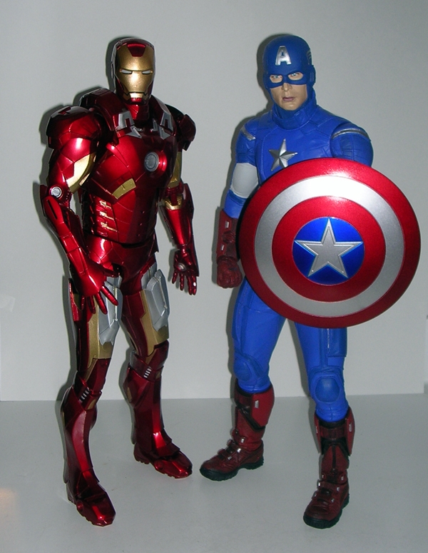
Lest you thought that NECA’s impressive quarter-scale Captain America figure was a one-shot deal, I present to you the second in their quarter-scale Avengers series: Iron Man! Donning the Mark VII, my favorite armor in his wardrobe, Tony Stark arrived this week to keep my gigantic Steve Rogers company on the shelf. I don’t think this guy needs much more of an introduction, so let’s just get to it!

nqsim2

Much like Cap, Iron Man comes packaged in a long window box, but this one has been completely redesigned to feature a red and gold motif to match the character. The window has some printed graphics, made to look like a HUD, that point out the LED effects. The back of the package features a little blurb about Stark in the Avengers and has a list of people who worked on the design of the figure.

nqsim3

Slide the tray out and you’ve got some work to do. Iron Man is held in with tons of twisty-ties. By the time I was finished I had a ridiculous pile of twisty-ties and black plastic bars on the floor beside me. Apart from the pair of swappable fists, that’s all that’s in the box. I was surprised there wasn’t an instruction sheet about the electronics or battery changing or something. I think I may swallow all the batteries just because I wasn’t warned not to. As with Cap, the package is totally collector friendly and you can just put the figure back in the tray and slide him back into the box for storage or display.

nqsim1

nqsim4

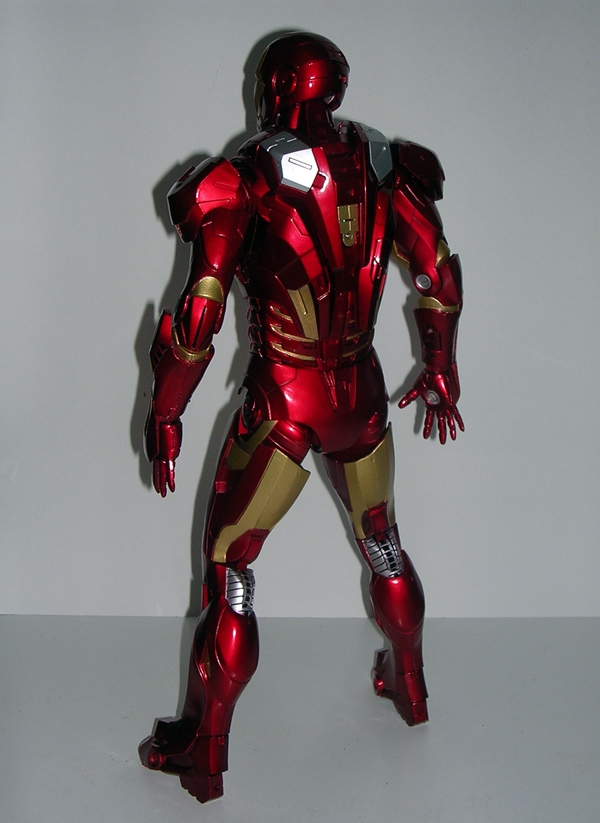
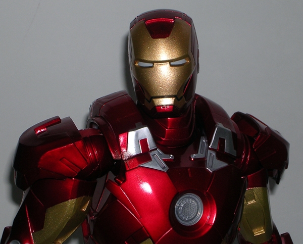
Ah, there’s a reason this armor is my favorite… it’s just gorgeous. I was a wee bit concerned that seeing it in this large scale might change my mind, but it’s only reinforced my love for the design. The mix of sweeping curves and angles scratches my itch right where it counts. The detail represented here doesn’t approach Hot Toys quality, but there’s plenty of fine touches to make it work. Some of the panel lines could have been cut a little deeper to be more convincing, but I’m only offering that up in an attempt to be critical of what is a quite marvelous sculpt. Iron Man stands at almost the exact same height as Cap. Some may point out that his legs are thinner, thus dispelling the illusion of a guy in a suit of armor. I can see that, but at this point, just about every Iron Man figure I’ve seen falls into this trap and I’m at the point where such things don’t bother me anymore.

The paint on the figure is excellent. The red is similar to that rich and beautiful stuff Hasbro used on their Iron Man 2 figures. It sports a  brilliant sheen and gives the Mark VII that great polished new car look. There are obviously different grades of plastic used here, some hard, some soft, but the red is consistent throughout the entire piece. The gold isn’t as brilliant as the red, but still works for me. The silver looks more like a brushed steel finish and it really ties the whole deco together nicely.

nqsim6

nqsim7

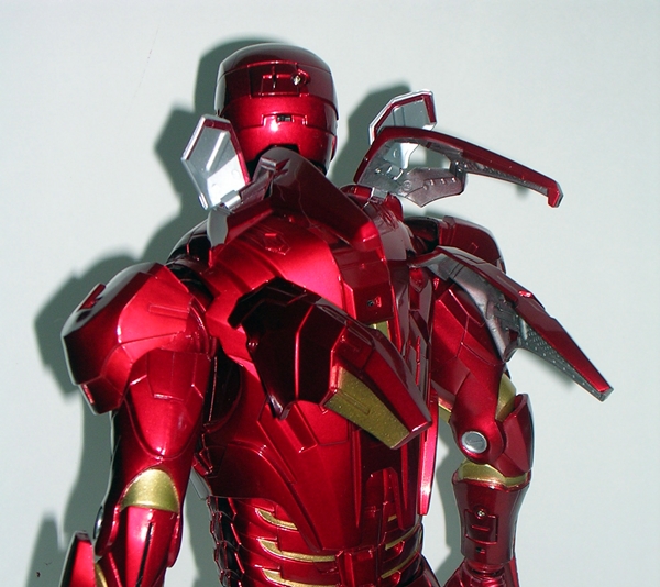
One of the cool things about doing the Mark VII in this scale is the ability to do justice to his flight backpack. The figure has six hinged flaps, which can be deployed upward to give Stark a little extra flight power. Very cool!

nqsim5

At this point, it’s worth mentioning that Iron Man feels like a far more delicate piece then Cap. Cap is a solid hunk of plastic, which I would have no problem swinging like a cudgel. Iron Man isn’t necessarily fragile, but there are more moving parts involved in the armor (particularly the shoulders and jet pack) and the smooth surfaces and metallic paint are probably more prone to scratches and dings. I have no doubt Cap would survive a shelf dive from the top of any bookcase and come away unscathed, Iron Man most certainly would not.

nqsim9

nqsim8

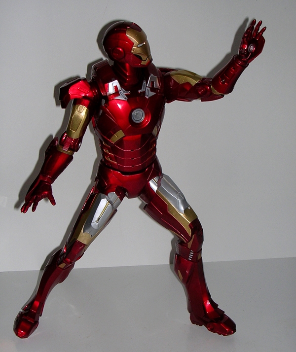
Iron Man sports a decent amount of articulation. He’s definitely a giant action figure, although you don’t get the same range of motion from some of these joints as you would in your average Marvel Legends. There are ball joints in his neck, shoulders, hips, wrists, and ankles. His arms feature bicep swivels and hinged elbows. The legs have swivels just below the hips, and double hinges in the knees, and his feet are hinged in the middle. His torso features what appear to be ball joints in the waist and torso, but apart from a little twisting in the torso, the movement here offers a lot of resistance, and quite frankly I don’t want to force it. As with Cap, the hip movement is probably the most restrictive, although you can still get a fairly wide stance. The foot hinges are useful because Iron Man is rather top heavy, so by bending the toes down a tiny bit, you can get him to stand quite solidly upright. His shoulder armor is hinged, and if you pop them out, you can clip them back on, but the clips are tiny, so I would not recommend stressing them. Ball jointed connecting arms might have worked better for the shoulders, allowing them to float, but what’s here still allows for an awful lot of arm movement. The bottom line: You won’t get this Iron Man into a punching the ground pose, but you can still get him to do some cool stuff.

Cap comes with two extra hands, both in fists. I’m not a big fan of swapping out hands unless it’s necessary for holding specific accessories. That’s especially the case here since the stock fists have the LEDs in them. Truth be told, I doubt I’ll ever swap the hands. Nonetheless, it is really impressive that NECA was able to deliver both lights in the hand repulsors AND allow for swappable hands.

nqsim13

nqsim12

So, how about them electronics? Iron Man features four (I’m counting the eyes as one) independent LED lights. By independent, I mean that there are four teeny-tiny switches: One on his back, one on the back of his helmet, and one on each of his forearms, near the wrists. Flip these on and the light show begins. The Arc Reactor light in the chest is ridiculously bright and the eye lights are not too shabby either. The palm repulsors are yellow and a lot dimmer, but still quite adequate. He certainly makes an impressive display when all lit up.

nqsim10

Like Cap, this figure is “limited” to 7,500. That may sound like a lot, and while the quarter-scale Cap was easy to get (he’s still available at most e-tailers), Iron Man seems to have sold like wildfire. His pre-order was sold out at my usual supplier, but I was able to sneak in a pre-order with the fine folks at Entertainment Earth before he sold out there as well. At about $90, he feels like a pretty solid value. I’m not just saying that because he’s huge. The quality of the figure is excellent and the electronics are surprisingly well implemented. In terms of engineering and construction, he’s a very different figure from Cap, and yet the two display wonderfully together. NECA appears to still be moving forward with the next installment in the line, a quarter-scale Thor, and while no pictures have been seen, the rumor is he has already been sculpted. He’ll certainly be more like Cap, although I’m hoping they go for a soft goods cape. NECA also does’t seem to be backing away from the outrageous claim that hey are doing a Hulk in this line as well!

DC Comics: “New 52” Darkseid by DC Collectibles

Boy have I had this guy on my want list for a long time. My first Darkseid figure came from Kenner’s old Superpowers line. He was eventually outdone when I completed the Collect & Connect Darkseid from the DC Universe Classic line. And now, even that generously sized Darkseid must take second seat to DC Collectibles magnificently mammoth version based on his appearance in the New 52 Justice League. I’ll go on record and say that I still prefer the classic style of the character. It’s the one I grew up with and it’ll always be my favorite. But with that having been said, I was mighty damn excited to see this new Jim Lee version turn up in Justice League #4 and I knew I needed this guy on my shelves in one form or another. Of course, I usually turn to Mattel’s line for my DC figures, but since the Unlimited version of Darkseid turned out all sorts of puny and shitty, I decided to go with DC Collectibles for this one.

dccdseid2

I am not a big fan of DC Collectibles package designs. They’re bland and boring and everything that a package for comic book-based collectible should not look like. Christ, people, you’re in the business of art and graphic design, why can’t you come up with something better than this? Look at Mattel’s Unlimited line… that’s how you do an exciting comic book figure package. Thankfully, Darkseid comes in a giant window box, so the beast of a figure can do all the talking. The package is completely collector friendly if you want to keep it around for storage, although it’s a bit flimsy so it’s likely to get beaten up pretty easily. Darkseid is tied down to the inner plastic tray with a thousand twisty ties, so it helps to have a pair of clippers handy or a set of finely tuned Omega Beams. The only other thing in the box is a sheet of instructions regarding his shoulder pads, but more on that later.

dccdseid1

Before getting to the particulars of the sculpt, let me say this: Holy crap, this guy’s heavy!! Sure he’s thirteen inches tall, but I still didn’t expect this much mass. I guess I’m used to stuff this big being rotocast, but Darkseid is like a solid brick of plastic, possibly with a core of dwarf star alloy at the center. I could probably launch this guy off the roof and while the shoulders will likely shoot off, I think the figure might come away unscathed and dent the pavement. The last time I was this impressed with the sheer weight of a figure was probably when I first held Hasbro’s Masterworks Galactus.

dccdseid3

Darkseid’s body features his New 52 armor. I think the armor looks great in the Jim Lee art, but it’s had mixed results in plastic form. The DC Unlimited version looks terrible to me because it’s basically a standard buck with his armor laid over the shoulders like football equipment. This version incorporates everything into a far beefier body. The shoulder and chest armor still stands out beautifully because it’s a different color than the torso, and it matches the gloves and boots nicely. The armor features weathered cracks and fractures all throughout the sculpt, and he has a translucent red crystal right in the middle of his chest. The torso and legs are black with sculpted muscles and some wrinkles here and there, and Darkseid’s bare arms feature the same stony texture as his face. The final touches of the deco include the gold edging to his belt and the piping on his torso and around his helmet.

dccdseid5

dccdseid6

Ok, onto the sculpt… the portrait is gorgeous, and by gorgeous I mean butt ugly, just the way he’s supposed to be. Darkseid looks appropriately pissed off, just like he’s always supposed to look. He’s gritting his teeth in rage, and narrowing his red eyes as if he’s about to focus his Omega Beams and fry some capes. The New 52 likeness features a more complex and craggy complexion than the older Darkseid, and it’s wonderfully reproduced here in every little evil nook and cranny. He looks positively ancient.

dccdseid4

How about articulation? Honestly, I don’t need much from my Darkseid, other than to just stand there and look menacing. That having been said, you do get a decent amount of posabilty out of this guy. He features ball joints in the neck, shoulders, and wrists. He has swivels in his biceps, forearms, and lower legs. He has a standard T-crotch, and hinges in his elbows and knees. The shoulder plates are attached with ball joints to allow them to lift and move with his arms. It works well, but they can detach if you move his shoulders too much. The included instruction sheet shows you how to reattach if they pop off, but apparently, it’s a bitch to get them back on. I’ve done quite a bit of posing with my figure and mine have yet to pop off, so it seems to just be a precautionary warning. The knee hinges are crazy strong ratcheting joints that require a lot of force to bend. There’s no worries about the legs giving out under the weight of the figure, but it can make posing them a little scary.

dccdseid7

dccdseid8

dccdseid9

As a Deluxe figure, Darkseid clocks in at around $85-90 at most retailers. Once I saw him, there was never any doubt that I was going to add him to my collection, and I’m glad I did. I love Jack Kirby and The New Gods and while I still prefer the Darkseid design that I grew up with, I really dig this one too. The fact that he’s so damn big is just the icing on the cake. He’s scaled quite nicely for the DC Collectibles Justice League figures, which in turn means he’s nicely scaled for display with my DCUC-style figures. In size and stature, he isn’t quite as impressive as Hasbro’s Masterwork Galactus, but he makes up for a lot of that in the beautiful detail of his sculpt and the overall quality feel of the piece.

Transformers Generations: Springer by Hasbro

I know, I just did two days of Transformers, but I wanted to get to Springer this week, so I decided to just make it a TF Trifecta and toss him in now…

Of Hasbro’s new Triple-changers, I was far more excited to get Blitzwing over Springer. Well, we all know how that turned out… but let’s not dwell on that any longer. It’s not that I have anything against Springer, but my interest in Transformers began to wane a bit after the movie, I never owned Springer’s original toy, and so I don’t have the same nostalgia toward his character as I do Blitzwing. Granted, IDW’s comics have done their part to make him a stand out character in my eyes. But either way, you don’t need to have a strong attachment to the character when his toy is as amazing as this one is.

tfgsp3

There’s the Generations packaging with an added 30th Anniversary logo. I do dig the presentation here. The window is large and shows off the figure in his robot form alongside a very nice piece of character art. The box also points out that Springer is a Triple-changer! There’s a bio on the back as well. As with Blitzwing, I’m going to break tradition and look at Springer’s robot mode first.

tfgsp7

tfgsp8

Springer’s bot mode is nothing short of glorious. Both the head sculpt and the general design of the body are both perfect for the character. I love the proportions on this guy. When I first saw pictures, I thought his hips were too narrow making his legs look funny, but now that I have the figure in hand, I find that not to be the case at all. There’s so many cool little things about his design, like the way the wheels end up on his shoulders and legs, the armor plates that fold down over his shoulder wheels, the front of the car/helicopter makes a perfect chest, the angle of the armor plates coming up from behind his shoulder, the fins that make up his knees. Even the head sculpt is perfect… I wouldn’t change a thing. I could go on and on gushing, but suffice it to say Hasbro hit a homerun here. It’s all the more impressive to say that a robot this beautiful is also a Triple-changer.

tfgsp9

Springer sticks fairly close to the G1 Springer deco. You get a pleasing mix of green, yellow, light grey and dark grey. Springer uses very few paint apps and makes use of colored plastic, which serves the figure very well. The yellow plastic is particularly beautiful and looks great alongside the green. He has an Autobot emblem stamped toward the bottom of his chest.

tfgsp1

tfgsp2

tfgsp4

Springer comes with two weapons. You get a sword and a rather large double barreled gun/missile launcher. Both weapons have places on his alt modes. The sword becomes the rotor blades for his helicopter form, and the gun can mount on top of his car mode or under the chin of his helicopter mode. Either one of the weapons can also peg into his back in robot mode for storage. Both weapons are excellent. The gun is appropriately oversized for a Wrecker and I have to admit the way his sword converts from the rotors is rather genius.

tfgsp10

tfgsp12

tfgsp13

Let’s move on to Springer’s armored car mode next. The package lists him as only a “2” in terms of difficulty, which surprised me, but it certainly turns out to be true. Springer is quite easy to convert. His car mode is pure bad ass with some sleek and sexy contouring matched with some rugged-looking armored sides and spoilers hanging off the back. I’ll concede that there are some issues getting everything locked together just right, but he does hold together quite well and rolls along great. This mode would be totally acceptable to me for a regular Transformer, so it’s all the more impressive from a Triple-changer.

tfgsp14

tfgsp15

tfgsp16

And then there’s the helicopter mode, which to me is the weaker of the three, but still acceptable. I love helicopters! I have stacks of books and magazines about them. I can easily lose myself in reading about their stats and designs. There are some butt-ugly real-word helicopters out there, so the fact that Springer’s chopper mode isn’t all that easy on the eye doesn’t bother me so much. It does a fairly good job of concealing the tires, and I do like the way the hood of the car splits to become the outriggers. It’s a perfectly passable helicopter, but this is the mode that screams Triple-changer to me.

tfgsp6

There’s no doubt in my mind that Springer is one of the best Transformers that Hasbro has put out in a while. He’s the perfect update to the character, he’s well designed and thankfully his engineering doesn’t suffer from any of the problems we saw with Blitzwing. I’d also point out that the careful use of colored plastic shows that Hasbro can cut back on paint apps without detracting from the figure at all. This figure is fun to transform, but more importantly he’s hard to put down in robot mode because he’s such a solid and highly poseable figure.

tfgsp11

It’s worth mentioning that Springer was one of the first characters created by the now prolific third-party not-Transformer toy companies. Fansproject’s Warbot Defender was created because there was a large demand for the character and yet Hasbro seemed unwilling to deliver. Well, now they have, and it’s almost like Hasbro had something to prove. If there is an undeclared war going on between Hasbro and the third-party companies, I’d say Springer is a major victory for the home team. He was a long time coming, but having him in hand, this $22 figure sure makes me happy I didn’t spend the $100 on Warbot Defender.

Transformers Kre-O: Optimus Prime by Hasbro, Part 2

And we’re back for the second half of a Kre-O Optimus Prime feature that is rapidly wearing on my patience. I say “second half” but this is going to go a lot quicker than yesterday. Having built Prime into his truck and trailer mode and shooting some pictures, last night I poured myself a generous glass of Jameson and set about to pulling him apart. I took the time to separate the parts by color, poured another glass, and dove in to rebuilding him as robot and battlestation. Having the parts separated was a huge help and overall this build went smoother and faster, but there were a lot more parts left over, so that might explain why. With a little perseverance, and two more glasses of Jamie, I was able to wrap up the build before turning in for the night. It would have been helpful to use the box as a tray for the parts, but after two days the cat has still not relinquished it.

kreopb9

Ok, so let’s start with Prime’s robot mode.

kreopb1

kreopb2

I like it a lot! I do wish I still had my Kre-O Bumblebee built so that I could compare the two in size, but after two days of wrestling with Kre-O, I would rather scrape my tongue with a cheese grater than build another one. So, sorry, but no comparison pictures. Prime strikes me as being about the same size, but a little less beefy and less complex. There are some really cool design features to him, like the way his chest is constructed, his smokestack backpack is neat, and oddly enough I really dig the construction of his feet. He’s very well proportioned and the head sculpt is particularly nice and a lot more evocative of G1 Prime than the Bayformer version. Only six of his wheels actually transfer to his robot mode, this may bother some people, but I’m ok with it. Still, he does look a tad skimpy in the arms and legs. Not bad, mind you, just like he could have used a little extra oomf.

kreopb3

kreopb4

Prime features ball joints in the neck, shoulders, elbows, hips, knees, and ankles, and his fists rotate. He has pretty good poseability and he holds together fairly well while I’m fiddling about with him. I know some people complain Kre-O doesn’t hold together, but that hasn’t been my experience.

kreopb8

kreopb7

kreopb6

The other part of this build is the “battlestation” which is really more of a little base for the human Kreons to hang out and do maintenance on their motorcycles. There aren’t any guns or anything else to suggest it is a station for battle. Keep in mind, I tried to use as many parts as I could to build this, so mine’s a bit of an enhanced custom job over the suggested model. It’s not bad for what it is. You get a control center, a maintenance area with a rack for the tools. I added a place for them to keep their helmets, and both bikes can fit in the base. You also get a pair of barricades. The whole ensemble sort of looks like something that Prime’s trailer can transform into. I’m vaguely reminded of other trailer base modes. I’m fairly certain, the base is built only from parts using the trailer, but since I already pulled everything apart, I won’t swear on that.

kreopb5

And that’s Kre-O Optimus Prime. He’s a cool set, but he definitely taxed my enthusiasm for building these things. All the modes are fairly well designed, and everything fit together pretty well, but building it still made me appreciate Lego all the more. Even the most complex Lego sets are still fun to build, because they’re carefully thought out with that purpose in mind. This Kre-O set felt like it was working against me and at times it plunged below my tolerances. It was originally around $60, which isn’t too bad considering all the parts and the play potential, but I picked up mine a while back on clearance for about $25, which is certainly a more appetizing price. Now, he’ll stand on a shelf for a couple of days before I can get the nerve up to break him down again and file him away with my other Kre-O, Lego, and Megabloks sets. I do know, that unless I can find some of the GI JOE sets, I’m going to be done with Kre-O for a while.

Transformers Kre-O: Optimus Prime by Hasbro, Part 1

I’ve had this beauty sitting in my closet for months waiting for the right time to build it, well I was on vacation last week and it seemed like a good time. While I have been more or less impressed with the three or four Transformers Kre-O kits that I have built, Prime here was the last one that I plan to pick up. The direction the new stuff has taken doesn’t interest me as much and I just think my brick-monies are better spent if I kept channeling them into Lego. Anyway, this thing is a beast of a set and, like all Kre-O Transformers, it needs to be built twice, so I’m doing this guy in two parts because considering the amount of time I had to spend on him, I’m damn well going to get two features out of him. Today I’ll kick it off with the packaging, Kreons, and the vehicle mode, and tomorrow I’ll be back to check out the robot and the battle station!

kreopp1

kreopp2

Holy hell, this box is HUGE. I guess that’s to be expected since I’m pretty sure this set is the largest Transformers Kre-O kit to date. Prime comes in the same briefcase style case that is designed to close up and store the pieces. The front shows off an illustration of the toy, while the back shows actual pictures of what you’re building. Keep in mind, if you want to put the stickers on as they are in the picture, you won’t be able to take the cab apart. Also, I’m not sure how their “3-in-1” math works out. You can build it as a vehicle or as the robot and battlestation. That’s more like “2-in1” in my book. Anyway, I’ve kept the boxes for all my other Kre-O sets, but I doubt I’ll keep this one. It’s been leaning up against the wall in one of my toy closets for a while now and I’m kind of anxious to get rid of it. Besides, once I break this set down again and put the pieces into baggies, it’ll take up a lot less space.

kreopp11

On second thought, I may have to keep it, as the cat has adopted it as his new bed… right in the middle of my attempt to build it. Here’s another illustration of why cats and Lego (or even imitation Lego) don’t mix. He may have thought he was helping because he did actually chew some of the parts off their sprues.

kreopp3

Inside the box (cat not included) you get two large color instruction books and like a thousand baggies of bricks. Ok, it’s probably not a thousand bags. It’s probably more like six or seven bags. They weren’t numbered so I can’t be sure. And therein is the true fun or torture of this set. Since the bags aren’t numbered, or even grouped in any special way, you have to dump them all together and that leads to a ton of sorting and searching and hunting. I actually kind of enjoyed the added challenge on the 200-300 piece sets, but Optimus is nearly 550 pieces and to be honest, it got to be a real pain in the ass after a while. The color coding in the instructions is also a bitch. It’s tough to tell what’s supposed to be black, grey, dark grey, or metallic grey, and since a lot of times you’re dealing with the same piece in multiple colors, you need to just go with your gut and hope for the best. There were times when I realized I probably used a dark grey 2×2 when I was supposed to use a light grey 2×2, because that’s all I had left. Most of the time it doesn’t matter, but it’s worth pointing out that building this was more challenging than any Lego set I’ve ever done. The recommended age group is 8 to 14, which I believe actually means that if an 8 year old starts it, he can be expected to finish it by the time he hits 14. Anyway, when you’re all done with the first build, you get five Kreons, two motorcycles, and Prime’s cab and trailer. Let’s start with the Kreons…

kreopp15

kreopp16

kreopp17

The set includes three Transformer Kreons and two human Kreons. The Transformers are the ones I really care about. They’re the original kind that are just cute little collectible figures and cannot transform. I adore these stupid little things and I think they lost a lot of their charm when Hasbro started making them with crappy alt modes. The set has Optimus Prime, Smokescreen, and Skywarp. It’s an eclectic mix, but I love them all. They’re all excellent, but I think Skywarp is my favorite. I like the way they did the wings and the doors on him and Smokescreen. Prime also has little clip-on smokestacks on his arms. All three of these little guys are excellent.

kreopp18

kreopp20

kreopp19

The humans are the same Kreon with their colors changed around. You get motorcycle helmets and hats for each, so they can be used to work in the battle station or drive the motorcycles. They’re ok. I’ll confess while I’m not a big fan of the human Kreon styles, it is nice to have some human figures in scale with the robots. The motorcycles are kind of shitty. They’re each made up of two ill-fitting halves with wheels popped on. I guess they’re ok for what they are, but I don’t have much use for them.

kreopp4

kreopp5

Generally, I find the vehicle modes of the past Kre-O sets I built to be a bit wanting. Prime’s cab, on the other hand, is excellent and took me the bulk of the time to build. It’s very involved and the end result is well worth the effort. The instructions get rather silly with the placement of Autobot stickers, suggesting that I put two on the hood and three on the roof. I opted for just one on the roof. For a Lego-style vehicle, I think this thing looks great.

kreopp6

kreopp7

The doors open and there’s room for one Kreon to sit at the wheel and yes, if you’re feeling wacky you can actually have Prime drive himself. The back portion of the cab can pull off to reveal a little workstation for the Kreons. I actually thought this would be part of the battlestation, so I didn’t shoot any pictures and then found that I had to cannibalize it for the second build. Oops!

kreopp8

The trailer is scaled just a little shorter than I would have liked, but it still looks really nice when hitched up to the cab. It holds together pretty well for what is basically a shell. The Autobot symbols and striping on the sides are printed on, which is a welcome treat since the Kre-O stickers don’t stay on for shit. The back door can drop down to form a ramp and you can put both motorcycles inside. You can also break it apart at the top and swing both halves apart to give you access inside. There’s not much going on in there and it seems like Hasbro could have delivered a little more, but it’s cool nonetheless. I’m tempted to cannibalize my Lego City Police Mobile Crime Lab for parts and load this thing out with equipment.

kreopp9

kreopp10

So far, this Kre-O Prime doesn’t disappoint. Yes, the build got on my nerves, and I definitely recommend doing a proper color-coded sort of the parts before tackling his build. It won’t eradicate all the frustration, because you’ll still spend some time guessing which color part to use next, but it will help. Once built, however, Prime is the best looking Kre-O vehicle I own, and I can’t deny that getting Kreons of Prime, Smokescreen, and Skywarp makes me very happy. Tomorrow, we’ll tear this bastard down and start all over again with his robot mode and his battlestation!

Marvel Universe: Hercules by Hasbro

Argh… it’s Monday and that means I’ve only got one more day of vacation left. It’s been a relaxing week, and I’m going to pick up a special bottle tonight and get properly legless in a final act of vacation-ending defiance. But getting back on track… if it’s Monday, it must be time for a Marvel Universe feature. Let’s check out my man, Hercules!

muherc1

muherc2

Herc is from one of the more recent waves. Not that recent, mind you, but the fact that I’m excited to have him should tell you what MU distribution is like around here. I really dig the character art on the card and as you might expect, Hercules fills out his bubble impressively with his bulky, manliness… er, godliness.  And let’s not forget the magnificent “Comic Shot” which is surely worth the ten bucks all by itself. I joke, but 20 years from now the irony will be that MU figures with the Comic Shots will be worth hundreds of dollars, just because most people, like me, just throw them away. The back of the card has a bio blurb and shows the other figures in the wave. I’m rather anxious to pick up Nova and Angel, but I can take or leave Puck. Oh yeah, Sasquatch takes over from the likes of Deadpool, MODOK, and Rocket Raccoon, to offer the humorous collecting quip.

muherc3

muherc4

Hasbro could have easily crapped out on this guy, but check him out! I think they did a fine job, considering he’s just a nearly naked dude. This is definitely one of the coolest muscled bucks I’ve seen in the 3 ¾” scale. The muscle definition is meticulously sculpted throughout and it does indeed look impressive. Herc’s “outfit” consists of a metallic green harness, which is a separate piece, brown leather bracers on his arms, sandals, and a green pair of briefs with his trademark giant “H” on his belt. Begin you’re 3 3/4″ He-Man customs now! It all looks great and the paintwork is excellent. Thankfully, Hasbro resisted the urge to use a paint wash and went with just a clean, bright flesh tone of the plastic. The sculpt stands out fine on its own without the help of the wash and Hasbro isn’t very good at doing them anyway. Yes, Hasbro, sometimes less is more!

muherc8

Equally impressive is the head sculpt. The hair, beard and headgear is all reproduced wonderfully and there’s a lot of personality in this tiny, little head sculpt. Herc is sporting a great, mischievous smile betraying how much he revels in action. Yup, when he kicks your ass, he’s going to enjoy it. Again, the paintwork is nice and sharp, particularly the eyes.

muherc6

muherc5

Hercules comes with his trusty mace. It’s a nice looking piece with a shiny gold finish and a sculpted lanyard at the handle. And of course… The Comic Shot!

muherc7

You get all the articulation we’ve come to expect from the current crop of MU figures. Herc’s arms have ball joints at the shoulders, swivels at the biceps, hinges in the knees, and hinges and swivels at the wrists. His legs are ball jointed at the hips, double hinged at the knees, hinges at the ankles, and swivels at the thighs and the tops of his sandals. There are also ball joints at the torso and neck. The plastic for the joints all feels really nice and strong and there’s no warping to speak of.

muherc9

I’ll confess, as much as I love Hercules’ character in Marvel’s funnybooks, his figure wasn’t high on my list. I guess I just didn’t think Hasbro could produce a stand-out figure of such a simple character design. In this case, it’s nice to be wrong. As soon as I had him in hand, I was thrilled with the way he turned out. And with Hercules, I am now completely caught up with features on my current Marvel Universe collection. I’ve been saving a Marvel Legends figure for next week’s Marvel Monday and I should have some new MU figures to look at in a couple of weeks.

Sunday Funday: Grimm’s Fairy Tales Omnibus!

Arriving just in time for the waning days of my vacation, Zenescope has finally released their mammoth Omnibus collection of their always twisted and sometimes sexy take on Grimm’s Fairy Tales. It’s actually been available for a little while as an exclusive from their booth at various conventions. Unfortunately, I live toward the tip of a peninsula where such conventions are mostly fairy tales themselves. See what I did there? If you haven’t delved into any of the 80+ issues of GFT and its rapidly expanding universe, here’s the deal: In what usually plays out like an after-hours Twilight Zone episode, characters are beaten over the head with moral lessons played out in Fairy Tales that usually draw to a delightfully gore-filled conclusion. Needless to say I’m spending a lot of time with this book this weekend and my cigar of choice this time is the always faithful, H. Upmann 1844 Special Reserve. Mmm… lovely.

sfdgft2

sfdgft1

GFT was the first comic that I started reading digitally on a tablet, and I’ll confess I didn’t take to the book right away. It lacks the pithy dialogue or sweeping stories that I usually go for in my comics. The humor is more subtle and I sometimes wonder how many of the chuckles I get out of this book are intentional. The first story was rather predictable and seemed to go nowhere, but I downloaded the first 10 issues as part of a sale and I pressed on. Before long, things got more interesting, and before I knew it, I was buying more downloads to see what kind of twisted shit they could come up with next. As it turns out, it’s an insidious book that slowly draws you in, making the stories more complex, and eventually pulling back the camera and revealing the two narrators, Sela and Belinda, as characters in a struggle against each other over the souls of their target of the month. If this whole thing was planned out, it’s rather clever, but also a risky move, because I imagine a number of people were tempted to drop the book from their pull lists before it really started to get good. As such, I think it’s one of those comics that may be best experienced in collected editions. On the other hand, if you stick with it through the individual issues, reading GFT is like being in that proverbial pot of slowly boiling water. I was getting hooked (or is that cooked?), but I didn’t realize it was happening until it was too late. Of course, all the Zenescope branded T&A in the art doesn’t hurt either. Yaknowatimean?

sfdgft6

sfdgft4

The Omnibus is an ambitious beast of a publication. At 1350 pages(!), it encompasses the first EIGHT collected volumes, meaning it contains the first FIFTY issues of the comic! I was a little concerned about how well a book of this size and weight would turn out, but I knew I wanted these collected in a print edition for my shelf, and getting eight volumes worth of comics in one book seemed like the easier (and less expensive way to go). It turned out to be a worthy gamble. The quality of the print is gorgeous and the binding seems to be of very good quality. Even at the center of the book, reading or enjoying the art near the binding is not a chore, and it doesn’t seem like creasing in the spine or loose pages will be a problem, so long as a modicum of care is taken while reading. Each reprinted volume retains the often heartfelt introductions, although individual variant covers are not included. While this could be a big deal to some, it’s understandable that some sacrifices had to be made. The variant covers alone would have added another 100+ pages to an already gargantuan tome.

sfdgft5

sfdgft3

The cover price for the Omnibus is $59.99, but I had my copy pre-ordered at Amazon for the ridiculously low price of $37 and they actually had it to me a few days before its scheduled release. GFT started out as a guilty pleasure, but it’s evolved beyond that for me and this collection makes me glad that I was content with my digital downloads and didn’t start going after the individual trades.  At this point, the only downside is that if I fall asleep reading with this thing on my chest, I’m liable to wake up thinking I’m having a heart attack.

Images used are the copyright of Zenescope and are reproduced here for review purposes only. If you love comic books, support the artists and writers by BUYING them, either digitally or in print. Better yet, buy them in print and support your local comic shop too!

Star Trek The Next Generation: Data & Geordi LaForge (in movie uniforms) by Playmates

Tonight is Pub Night. It’s the one night of the week where I put my excessive drinking on display by taking it public, and I’ve started early by finishing off the last of my Balvanie 18. That means I’m a little strapped for time and I’m looking for a quick something to feature today. I also haven’t done much with the 90’s Star Trek figures by Playmates lately and I have a whole box of these guys sitting in the corner and waiting to be featured so I can find a home for them on the shelves. Today we’ll look at Data and Geordi in their Generations movie uniforms.

stgdg6

I’m sure I’ve gassed on before about the Starfleet uniform debacle of Star Trek Generations. During that movie, The Enterprise was a come-as-you-are affair. Picard obviously called up Starfleet and said, we’ve saved the universe countless times, we’ll wear whatever the hell we want. I think there’s one scene on the bridge where you’ve got crew wearing the TNG uniforms, the DS9 uniforms, and a couple of 19th British naval uniforms from the Holodeck. The Helm Officer probably could have shown up for duty in his pajamas and nobody would have even blinked. The only uniforms that nobody is wearing are the original designs that were cooked up for the movie and scrapped later on. As a result, if you buy Playmates’ Generations figures, you get a complete set of the bridge crew wearing uniforms that were never actually seen on screen… ever! That all having been said, you can kind of tell that Starfleet was meant to be transitioning into the DS9 style jumpsuits during this time. Fortunately, Playmates made a mends by releasing some of the characters in the proper uniforms later on.

stgdg1

stgdg2

I bought these figures loose, so I don’t have any packaged shots, but each figure was billed as being in their “movie uniform” and came with their own Skybox trading cards. Actually, they each came with a number of cards. I also got cards for Worf, Ambassador K’Ehleyr, and a couple for Lore. I guess at this point Playmates was just stuffing a bunch into each baggie. Playmates also continues the preposterous practice of stamping “collector numbers” onto the packages and the figures.

stgdg4

Let’s start with Data. He’s an enormous improvement over the original Data figure. By this point in the line, Playmates was getting much better with the proportions and eschewing the more stylized caricature sculpts. This Data is taller and no longer suffers from those ridiculous monkey arms and huge hands. The head sculpt is updated only slightly, but I never had a problem with the original figure’s likeness, so this one is fine too. They nixed the opening access panels that were featured on the original figure, but that was clearly done so they could reuse the body. You also get sculpted rank pips on the collar and the newly designed communicator badge. I think my only gripe here is that his hands aren’t sculpted to hold any of his accessories.

stgdg3

But that’s ok, because as usual the accessories suck anyway. The equipment is all stamped out in a blue-green plastic. God, I hate that! You get a tricorder, a PADD and… ah… two other things. This is why it helps to have the cardback… it’s often the only way to tell what the hell some of the accessories are supposed to be. At least the phaser is silver, but it still has the stupid beam coming off the end, which I’ll be snipping off at my earliest convenience. Data also comes with a display stand shaped like the newer comm badge.

stgdg5

I don’t have nearly as much to say about Geordi, mainly because he uses the exact same body as Data, so it’s all been said already. The head sculpt is very similar to the original figure, although the VISOR is not meant to be removed. Geordi comes with a PADD, something else, and four diagnostic tools, all of which are appropriately stamped in purple plastic… wait, what? He also comes with the comm badge style figure stand.

stgdg7

As both figures are built on the same body, they each feature the same articulation. The arms rotate at the shoulders, have hinged elbows, and swivels in the biceps. The legs rotate at the hips and have hinged knees. There are also swivel cuts in the neck and waist.

tngerdg

tngerdg2

And there you have it… both of these are decent enough figures and they really show how far Playmates had come since the initial wave of Next Gen figures. I can’t say I like the DS9 style jumpsuits better than the Next Gen tunic, but it’s nice to finally have these characters in the proper uniforms which they wore in the movie. Plus, they look great displayed in my Generations Engine Room playset. There’s also a Captain Picard in this style uniform, which I still need to pick up… To the Ebays!!!

Transformers Generations: Blitzwing by Hasbro.

ARRRRRRRRRRRRRRRGHHHHHHHHHHHHHHHHHHHHHHHHHHHHHHH!

That sums up my feelings for this figure. Thanks for stopping by. Don’t forget to like me on Facebook. Please contribute to my Kickstarter Project to support my Blitzwing and Springer hardcore Slash Fic Novel, Tanks for the Reach Around. See y’all tomorrow…

Oh… ok, I’ll elaborate. If a figure sucks, it’s not a big deal to me. I can either not buy it or if I did buy it, just toss it into a bin and be done with it. It sucks, why should I bother with it? I move on. But when a figure shows glimmerings of greatness… when a figure teases with potential and yet stumbles because of stupid, easily fixed design flaws, it really cheeses me off. That’s especially the case when it’s a figure based on a character I love and have strong nostalgic feelings for. I love Blitzwing for a lot of reasons. One, he was the only Triple-changer that I owned as a kid and I loved playing with him. Two, “Triple Takeover” is one of my favorite episodes of the Sunbow series. In it, Blitzwing has that one classic line of dialogue where he says to a human, “Tell me what’s on your mind or I’ll splatter it on the wall and see for myself” It’s so bewilderingly and inappropriately brutal for a children’s cartoon that it makes me smile every time I hear it. And finally, Blitzwing is a jet that turns into a tank. He dominates in both land and air. Oh yeah, and his name is Blitzwing… that’s awesome. Hasbro finally gives him a greatly needed update and they stumble on some of the stupidest little things.

tfgbw1

I’ve got a lot to say, so I’m not going to waste time on the packaging. I’ll cover the packaging more when I do my feature on Springer next week. Let’s just dive in. And I’m going to break tradition here and start with Blitzwing’s robot mode…

tfgbw4

tfgbw5

…I think it’s fantastic. Look at him. He’s everything I would want in an update to Blitzwing. He’s well-proportioned, the treads look fine on his legs, and the sculpting and painted detail that flanks the cockpit on his chest resembles the stickers on the old toy. You also get some display options, like whether or not to point his shoulder wings out or fold them back (I prefer the later) and you can choose to display him with his tank barrel up or back. I think both look fine, but my old G1 toy was so loose from play that it usually defaulted to the down position. Blitzwing comes with a sword and a gun, both of which can be utilized in his alt modes. I’m not often a fan of swords with my Transformers, but I really like the sculpt on Blitzwing’s sword.

tfgbw6

Yes, Blitzwing has a controversial face change gimmick. I don’t care about the extra faces. It’s an unnecessary fanwank back to the TF: Animated figure in a figure that should be a nod back to the original G1 character. The faces are too difficult to change anyway. I did it once and I thought I was going to scrape the rubbery faces off with my thumb nail. Seriously, I’m not even going to photograph them. Forget about them. Some have groused over the default G1 style face, but I’m fine with it.

tfgbw2

tfgbw3

Of course, Blitzwing’s robot mode has one really shitty flaw. The shoulders do not stay pegged in. If I so much as touch his arms, they unpeg and flop around. I’ve tried fiddling with them. I’ve tried Peaugh’s trick, which sadly doesn’t work on my figure. I’ve even tried gumming them up with blue tack. Nothing works. If you squeeze the shoulders while manipulating his arms, they stay in place, but anything else and the entire shoulder assembly just crumbles apart. A simple tab that actually snapped into place would have fixed this whole fatal issue.

tfgbw10

tfgbw11

Let’s do Blitzwing’s jet mode next, because next to the problem shoulders, it’s here where I find the figure stumbles the most. For a Triple-changer, I think the jet mode looks pretty good, It was really tough for me to get everything to peg in the way it’s supposed to, but after a couple of times, I finally got it down. If you don’t do it exactly right the arms that make up the back of the aircraft constantly want to pop out and the instructions aren’t a whole lot of help. I’m also not really keen on the way his feet and rear wings just hang off the back on ball joints. You constantly have to adjust them to keep them looking right. I do, however, like the way you can clip his sword to his back to fill up what would otherwise be an unsightly hollow area, and you can even plug his gun on top of that to give him some extra firepower. Like I said, this is not a bad jet mode for a Triple-changer. So what’s the problem?

tfgbw8

The f’cking rubbery nosecone. It simply will not close up over his giant spring-loaded head no matter what I do. It never closes completely and given a little time it will default to the mess you see above. Fortunately, there’s a cheap fix for this…

tfgbw9

Yup, take off Blitzwing’s head. It slides right out. So, yeah… I have to decapitate him in order to transform him, and even then the nosecone doesn’t really lock up all that well. Here’s where I think Hasbro ‘s intrepid band of designers should have reasoned: “It’s very probable that the fans would rather have a robot with a head small enough to transform properly over one with a terribly executed face change gimmick.”  Seriously, I don’t mind the gimmick being there, but obviously if they had omitted it, the head could have been downsized enough to make the transformation work. And why make the entire nosecone out of that shitty rubber and not just the tip like on other Transformer jets? Ok, let’s move on to the tank mode.

tfgbw13

tfgbw14

I’ve heard people ragging on Blitzwing’s tank mode, but honestly, I think it works Ok. Again, he’s a Triple-changer and I’m willing to forgive certain design flaws. It pegs together fairly well and since the nosecone is concealed under the tank’s body, it tends to work for me a little better than the jet mode. The turret will turn, although it pivots awkwardly toward the front. You can plug his gun into the top and the barrel will fire a missile if you slide it back. There are peg holes on the side if you want to just plug his sword in there rather than have it loose.

tfgbw7

And so, my beloved Blitzwing… one of my most anticipated Transformers figures in a long while, turned out to be a bitter disappointment. Still, I am not in any way sorry I bought him. He looks AMAZING standing on the shelf in robot mode, and to be honest, that’s what he’ll spend most of his time doing anyway. In robot mode, he looks like everything I wanted in an update of the character. But I hate to look at a toy on my shelf and have to think about how poorly designed it is and what a bother it is to transform and know that if I pick him up and play with him his shoulders will fall apart. I’m tempted to buy another and just glue his shoulders in place. It’ll cripple his transformation, but at least I can play around with him in robot mode. Then again, I really don’t want to reward Hasbro for such shitty engineering. I think the saddest thing about Blitzwing is that there’s nothing wrong with this figure that couldn’t have been easily fixed had he spent a little more time on the drawing board.

Marvel: Mystique Bishoujo Statue by Kotobukiya

I’ve been dropping my bucket into Koto’s Bishoujo well a lot this past month and now that I have some momentum I’m really starting to aggressively fill out the missing pieces in my collection. Today we look at Koto’s sexy anime take on that blue shape-shifting femme fatale of the X-Men… It’s Mystique!

mysbish1

mysbish2

Hey, we’ve seen the Bishoujo line’s packaging here plenty of times and apart from being the smallest box in my collection, it’s business as usual. The box is mostly white with generous windows to show off the goods, although the statue is wrapped in plastic and snugly nestled between two plastic trays so you can’t get the full effect until you get Mystique out of there. She comes separate from her display base, so you just need to plug her in and you’re good to go. As usual, the artwork is gorgeous. The first thing I always enjoy doing with these statues is scrutinize the statue and the source art. It’s fun to do and it rarely disappoints. And just to show you that I always read all the copy on the back of the box, I actually learned something here. Mystique first appeared in Ms. Marvel in 1978. I like to assume I know a thing or two about the Marvel Universe, but that little nugget of knowledge was new to me.

mysbish9

I usually discuss the pose first, but in this case let me start by saying how happy I am that Koto went with the classic look here, as opposed to the more modern black outfit. It’s not that I dislike the newer look, but with X-23, Black Cat, and Black Widow on my Bishoujo shelf, I’m all for adding a little more color and Mystique teams up with the likes of Power Girl and Wonder Woman to brighten things up a lot. Besides, this outfit is far more iconic to me. That having been said, Mystique is posed on her knees, her back arched ever so slightly, Uzi submachine gun in one hand and her other hand running through her wild hair. It’s a fantastic pose, very seductive, and giving off a come hither look… come hither so I can murder you with my submachine gun! Also, since she’s shorter, she fits nicely in the front row of my display beside X-23 without blocking the view of statues in the back.

mysbish8

mysbish7

I really dig the portrait here, although I do find it borderlines on being a tad creepy. It’s all in the eyes. They’re appropriately yellow and marvelously unsettling. The paintwork on her lips and razor thin eyebrows is excellent and I’m impressed by the way her sculpted hair falls all around her shoulders and her left arm. There may be a little too much of the translucent effect on the hair for me here. I would have liked the hair to be a tad more vibrant, but I’m nitpicking. The adorable little skull on her widow’s peak finishes off the portrait perfectly.

mysbish6

mysbish5

The body features a gorgeous pearlescent plastic for her dress, gloves, and stiletto boots. The stitching and wrinkles are perfectly reproduced and remind me a bit of the Power Girl statue, although Kara’s outfit looked like heavier latex, whereas Mystiques looks like a lighter, shimmery material. If you look closely enough at the boots, you can see a subtle texturing that contrasts nicely with the smoother texture of her skin. It’s that little attention to detail that I love so much about this line. And speaking of skin, Koto used the perfect shade of blue. Even when displayed on a shelf of a dozen excellent statues, my eye is usually first drawn to the pearl and blue beauty of this piece. The skull belt is a separate piece and it hangs loosely on her hips, and the gun is removable from her right hand.

mysbish4

mysbish3

About the only let down to this piece is the display base. It’s a simple clear disc. At first, I thought Koto might have included an insert like they have with their Tekken Bishoujos, but alas no. Virtually all the pre-production shots featured this statue without a base at all, and I always wondered why. While there are tabs on the front and back of her dress to hold her in place on the base, you can actually display her without the base at all. I’ve recently come to appreciate the uniqueness and personality that Koto has given many of the statue basis in this line and quite frankly, I wish they had done something similar here.

mysbish10

Quibbles about the base aside, Mystique is another homerun for Koto and their Bishoujo line. The sculpt and pose really captures the essence of the character while still introducing the quirkiness of the anime stylings that this series is all about. She’s also still readily available at a lot of e-tailers and at pretty good prices too. I picked up mine for under fifty bucks and in a market where quality statues are usually closer to $100 and up, I find her to be a great value.