Star Wars Unleashed: General Grievous (Target Exclusive) by Hasbro

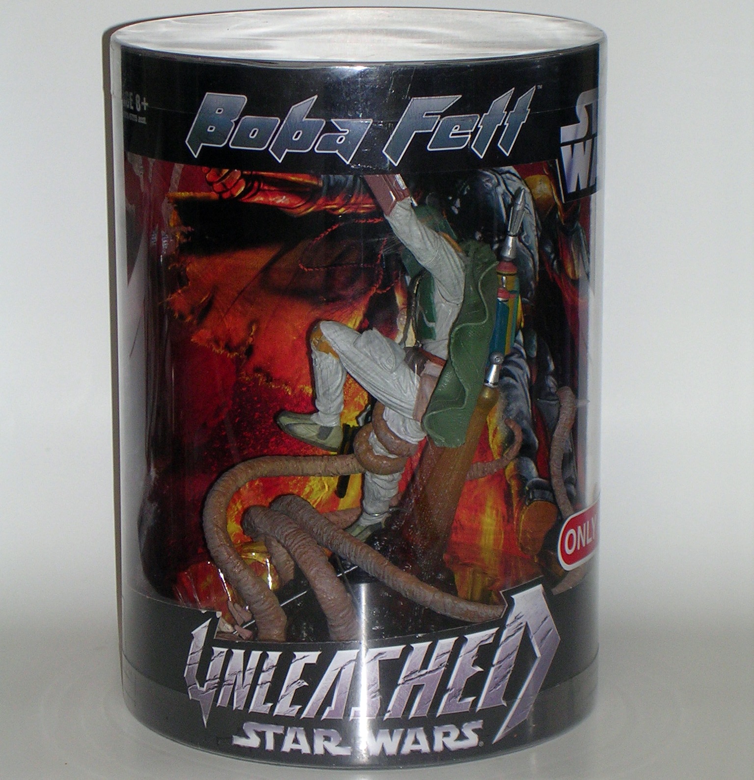
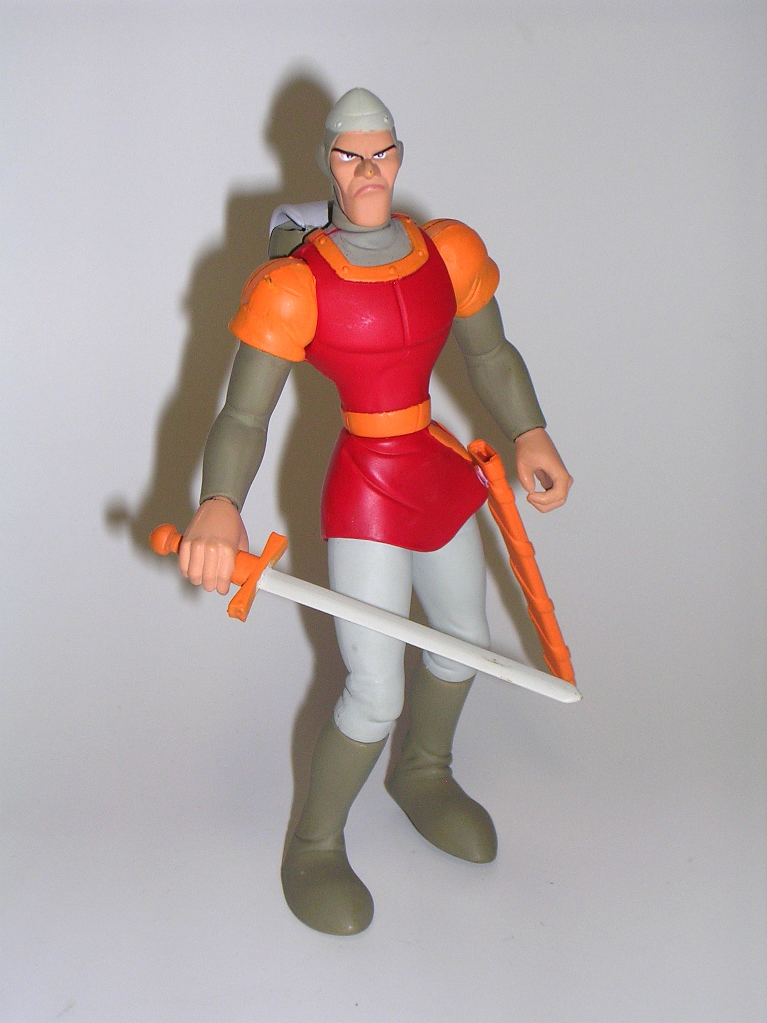
Last week I promised I’d check out the other 2006 Target Exclusive Unleashed statue from Hasbro, and so here we are. As with Boba Fett, this statue was originally released carded as part of the regular Unleashed line, but it got a special repackaged re-issue for Christmas. Neither of them sold well in my area and soon Target had an entire endcap full of them at ridiculously low clearance prices.

DSCN0849

The packaging is the same as what we saw last time. You get a big drum with a vintage style deco. It displays the statue very nicely and even has windows on the top to let light in. The inner backdrop of the drom features a really nice illustration and the outer back of the drum has a blurb about Grievous. I’ve done my fair share of shitting on the Prequels, but I’ll concede that there were some cool ideas at work and I always thought Grievous was one of them. He was certainly a more formidable presence than Darth Maul and whoever the hell the main bad guy was in Attack of the Clones. I think it was a fat bug guy, or Jango Fett, or the Trade Federation guys, or maybe Dooku or Palpatine… whoever it was they weren’t as cool as Grievous. I like this guy.

DSCN0850

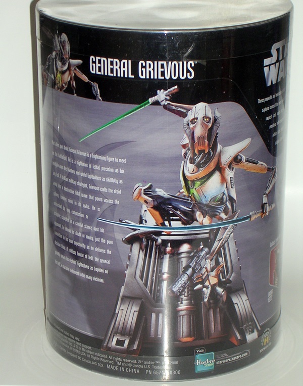
What I didn’t like was how difficult it was to get Grievous out of his drum. Boba’s tray lifted right out, but Grievous’ seemed to be affixed to the bottom of the drum. I had to go in with clippers and cut the twisty-ties. It took some effort, but I managed to get him out unscathed.

DSCN0851

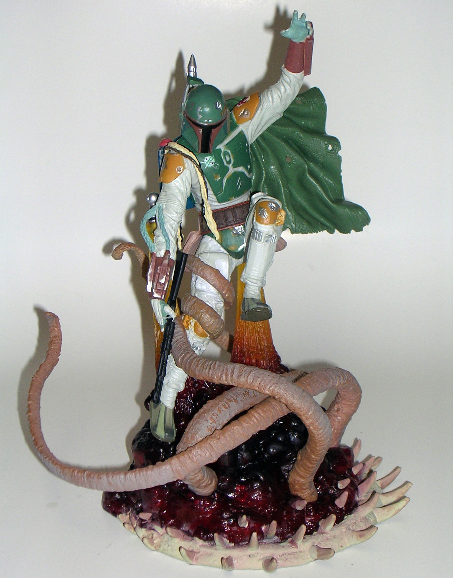
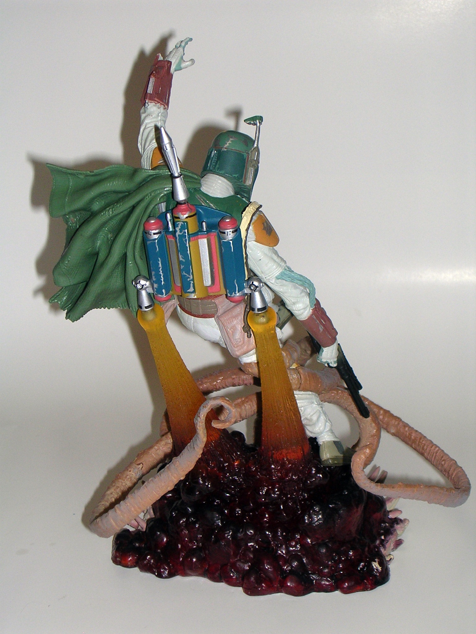
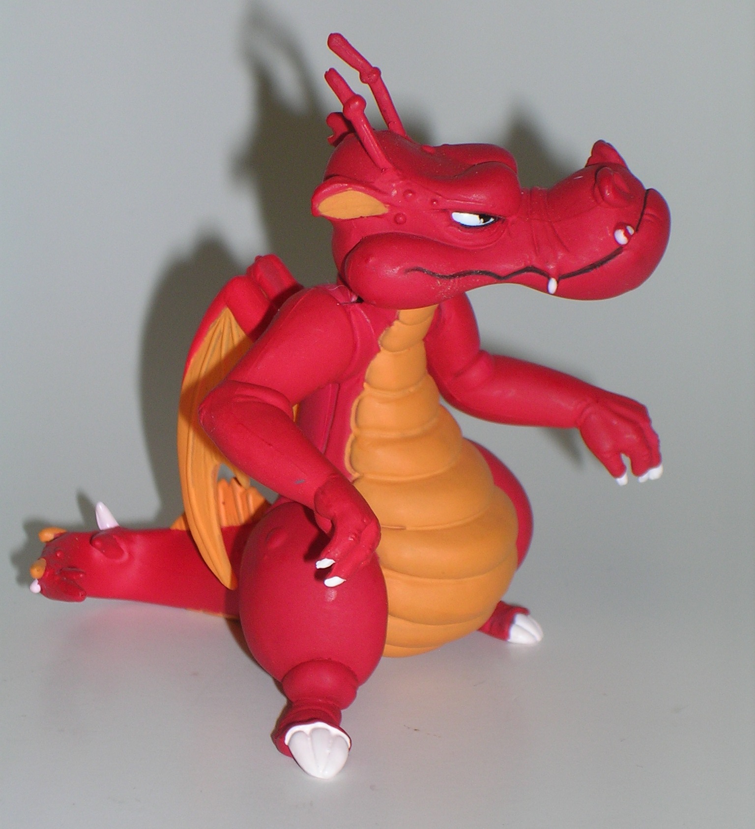
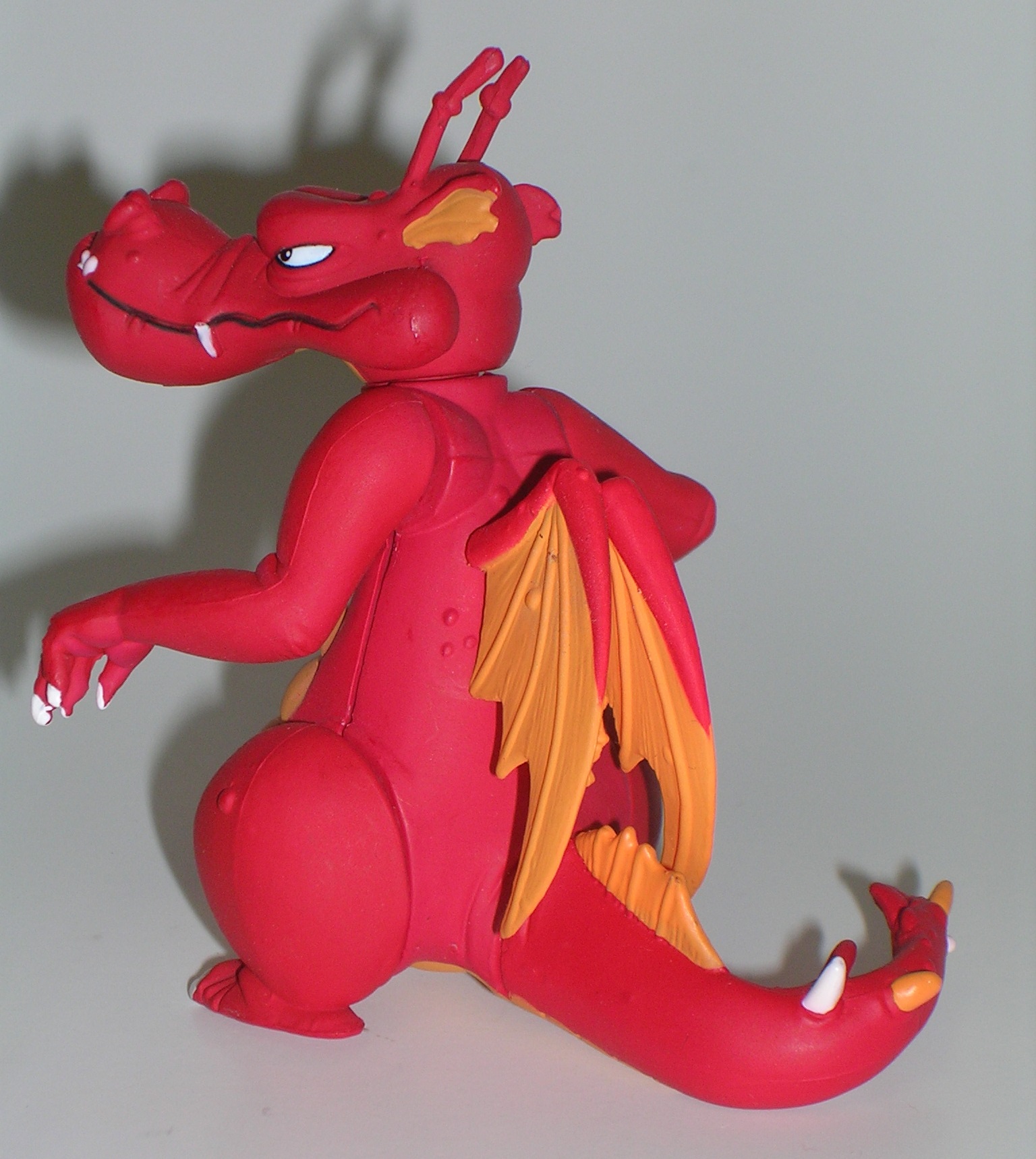
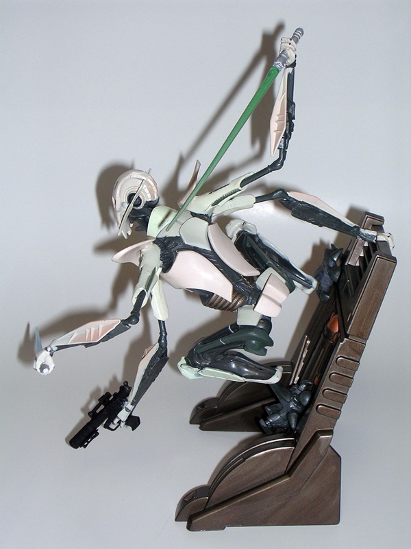
At first glance, Grievous doesn’t shock and awe as much as the Boba Fett statue. Maybe that’s because Boba’s more iconic to me, but that one just seemed like a far beefier and more majestic piece than this one. But the more I examine Grievous here, the more I can appreciate what Hasbro did. For starters, this is about as dynamic as you can get from a static piece. Grievous is hanging off the side of what appears to be a bulkhead and he’s poised to lunge at you like a rabid Dalmatian on crack. His four arms are deployed, two wielding lightsabers, one wielding a blaster, and the last holding on to some rails. His talon-like feet peg into the wall piece and the statue balances itself amazingly well for not having a proper horizontal base. This statue’s pose just oozes energy and excitement.

DSCN0852

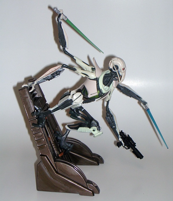
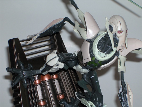
The sculpting on Grievous is adequate, but a lot softer than what we got for Boba. You can see some detail in the grey inner-workings of Grievous’ cybernetic limbs. The white armor plating is supposed to be mostly smooth and without a lot of detail. There are a few cracks sculpted into the armor here and there, but again they’re rather soft and not terribly striking. A lot of the really good detail that’s present is sculpted into the wall. It’s also worth mentioning that Grievous’ thin limbs really betray the quality of plastic. His arms are very bendy and I doubt this guy would survive well in storage without getting all warped.

DSCN0853

While the sculpt is ok, I think it’s the paintwork that fails this statue the most. The bulk of Grievous is cast in grey plastic, so most of what needed to be done was just paint the armor white. There are a fair number of brush strokes evident on the armor. That’s ok, I can let that slide as it tends to just look like weathering or possibly even what the paint would look like on the actual armor. There’s also a little variation between some of the armor that’s cast in a matte white plastic and the glossier paint used on other parts. But what’s more troubling is the slop. Granted, you need to get in pretty close to see it, but once you do, there’s an awful lot of it. The metallic green also seemed like a strange choice for the chest area.

DSCN0854

It may sound like I have a lot of gripes about Grievous, but the truth is, even with some flubs, this is still a pretty sweet display piece. When you consider he came off a retail shelf and was priced at about $20, I can be a lot more forgiving. If anything the exciting design of the pose makes up for the little technical gaffs, and I have to admit I would love to see this piece duplicated in a higher end statue. In fact, I’d go so far to say that I think the boys at Hasbro did a much better job with the design and pose on this statue than Sideshow did with their tribute to The General. If you’re a fan of the G-Man and you don’t want to blow the budget to represent him on your shelf, you can do a lot worse than tracking down one of these.

Marvel (Iron Man) Legends: Heroic Age Iron Man by Hasbro

It’s Monday. It’s Marvel. It’s Marvel Monday. I’m all out of Marvel Universe figures from my new receivings, but I do have some in my Pile of Loot at BBTS, so I’ll probably be shipping that soon. In the meantime, there’s still Marvel love to be had. I went out to Target to get coffee this morning and came home with another Iron Man Legends figure. Despite the fact that the grocery is in the front of the store and the toys are in the back, for some reason I always have to walk through the action figure aisle to get to the market area. I guess I was never all that good at geography.

DSCN0817

Hey, we’ve seen this before! It’s the same style packaging used for Iron Patriot. I dig it. It’s a little Marvel Legends, and a little Iron Man 3. It displays the figure well and you get to see that you’re also getting one of Iron Monger’s gams. Not a whole lot else to say here, so let’s shred it!

DSCN0820

DSCN0821

I am quite a big fan of the Heroic Age aesthetic, so this figure is right up my alley. It appears to be a brand new sculpt, but considering I haven’t collected Hasbro’s other 6-inch Iron Man lines in the past, there could have been an earlier release that got past me. Either way, it’s the proportions of this figure that really impress me. He’s sleek, but with just enough bulk to convince me that it’s a guy wearing armor. The sculpt hits all the right points as well. This armor isn’t replete with all the little panel lines as the current stuff, but there’s enough detail here to drive home the art styling featured in the comics.

DSCN0824

DSCN0822

The deco here is the familiar red and gold we see with most of Stark’s armors. The figure is cast in a pearlescent red plastic with the gold bits painted on and the overall effect is pretty nice. The red plastic looks good, but it is a little swirly in some areas and I don’t like it nearly as much as that glorious thick red glossy lacquer finish that appeared on the Iron Man 2 figures. The metallic gold finish is neatly applied and quite brilliant. The figure is rounded out with some little blue paint apps and white in the eyes. All in all, this guy’s coloring is decent enough and he really pops on the shelf.

DSCN0819

DSCN0818

Iron Man’s articulation is fantastic. He has ball joints in the neck, shoulders, and hips, and his neck features an extra hinge. His elbows and his knees are both double-hinged. He has swivels in his biceps, waist, and thighs. His wrists have swivels and hinges, and his ankles feature hinges and rocker joints. You also get an ab crunch hinge in the torso. I should point out that the hip joints are traditional ball joints and not those funky ones that Hasbro has been using a lot lately. Bottom line is that the articulation here feels solid and useful, and he is loads of fun to fiddle about with and pose.

Iron Man doesn’t come with any accessories or even a stand. Truth be told, he doesn’t need a stand. He’s such a solid and sure-footed figure he does just fine on his own. He does come with Iron Monger’s left leg.

DSCN0826

DSCN0825

I’ll admit that I’m as big a victim of Iron Man fatigue as anyone else. I expected to open this figure and say, “Yup, that’s another Iron Man!” and just relegate him to the shelf and forget about him. But that’s certainly not what happened here. Nope, this figure turned out to be a real homerun and a very pleasant surprise. He looks fantastic and I simply cannot put him down. In fact, he’s going to receive the ultimate in action figure honors… instead of going on the display shelves, he’s going on my desk so that I can play with him on my downtime. Sorry, Dogpound… you had a good run, but Heroic Age Iron Man is taking your place!

Sunday Funday: Mike Danger Comics!!!!

What do I do on my day off away from work and toys? I usually play video games or read comics, because…. Well, I’m 40 going on 13. Today will be spent reveling in my find at the used book store yesterday:  A stack of Mickey Spillane comics that I never knew existed!

DSCN0866

I’ve been a big Mickey Spillane fan for as long as I can remember. I love all the hard-boiled pulps, but for my money nobody did it better than Spillane. As a teenager, I had nasty, dog-eared paperback copies of his classics like “My Gun is Quick,” “I, The Jury” (held together by a rubber band!) and “One Lonely Night” and I read them over and over again. They were such fun reads and Mike Hammer was such a bad ass. When I owned my own antiquarian bookstore, I started getting into collecting his books in First Edition, especially his lesser known mystery series with the deliciously ridiculously named, Tiger Mann.

DSCN0865

I had the pleasure of meeting Spillane once and having him sign a few for me. When I told him I owned a bookshop he offered to just do simple signatures, thinking I was going to sell them. I told him, “oh no, these are for me, and please make them as personal and specific as you want because I’m never going to sell them.” I think he liked that. Unfortunately, Spillane died back in 2006, but he left quite the legacy.

DSCN0867

But comics? Yeah, while most people who remember Spillane know him for creating the pistol-whipping P.I. portrayed on TV by Stacey Keach, Spillane dabbled in a broad spectrum. In addition to pulps, he wrote a very cool children’s book, but he started his career as a comics writer. He was also a big fan of science fiction, and so it should be no surprise that it all eventually got blended together into Mike Danger, a yarn about a hard boiled cop from the 40’s who wakes up in the future. Mike Danger was published by the short-lived mid-90’s company, Tekno-Comix, an imprint that signed on concepts by big names, like Gene Roddenberry, Neil Gaiman and Spillane, but the actual stories were written in-house. Isn’t that kind of a cheat? Maybe, but I’m just happy that these books exist.

DSCN0868

Honestly, I bought these more for their context in Spillane’s career and to round out my collection of his bibliography and influences, but having just finished reading through the first two-part story, I have to say what’s here is pretty good. Shamus Award winning author Max Allan Collins was on board for the entire run as writer and it was a great choice. The man really knows the P.I. genre and his familiarity to it really helps play to the fish-out-of-water aspect of Mike Danger out of time. He’s also a man that did his research and knew Spillane’s work, as he included some great nods back to Spillane’s novels, particularly to the aforementioned Tiger Mann in the superbly titled “A Woman Called Mann.”

DSCN0871

The artwork tends to swerve all over the place, as it’s the work of several different artists. There’s nothing here that I hate, but there’s definitely some highs and lows throughout the course of the book. Steve Irwin, who has some DC and Malibu books under his belt, kicked things off pretty well. He handed the torch off to Jose Delbo, a name I only know from some Transformers books. But my favorite art in the entire run are some of the covers done by Eduardo Barreto. He did my favorite in the bunch:  Volume 2, No. 1. Barreto did an awesome job capturing the sensational covers of the pulp novels in the 40’s and 50’s and he even did some strong references to some Mike Hammer covers.

DSCN0870

And there’s my day for you. I’m going to light up a delectable H. Upmann Corona Major, pour myself a glass of Johnnie Walker Black, and sit out on the patio and enjoy an overcast afternoon with the adventures of Mike Danger.

Images used are the copyright of Tekno Comix and are reproduced here for review purposes only. If you love comic books, support the artists and writers by BUYING them, either digitally or in print. Better yet, buy them in print and support your local comic shop too!

DC Comics: Bishoujo Wonder Woman Statue by Kotobukiya

Here’s one that’s been on my want list for a long time. She’s also been sitting on the shelf at my local comic shop taunting me to buy her every time I go in for a visit. Sure, she’s about ten bucks more there then I could get her online, but my last visit just seemed like the right time to pull the trigger. And I’m fine with dropping an extra tenner on a collectible if it means supporting a small business. Anywho, Wonder Woman happens to be one of my favorite books in the New 52 and I’ve recently picked up the first two collected volumes in hardcovers. I’m enjoying revisiting them just as much as when I went through these twelve issues for the first time on my Kindle. That probably explains my sudden incentive to finally buy Koto’s Bishoujo statue. Sure, this is Wonder Woman before they put her in pants in #600, and then changed her up again for the New 52 Reboot, and that’s cool because as much as I am enjoying her new book, I still dig her more traditional look best.

wonderbish11

wonderbish12

Alas, your pal FigureFan was hitting the Jameson pretty good the other night and decided to open her up before taking the in-package shots. Sure, she’ll go back into the box, but I didn’t feel like putting her back in once I had her on my shelf. Besides, you get the idea. The presentation here is very standard for Koto’s Bishoujo line. You get a box with windows on two sides, as well as on the top. The other panels consist of a mix of the original art design for the statue and some photographs of the actual piece. There’s also a blurb about Wonder Woman and the statue on the back. The box lets you get a passing look at what’s inside, but she’s wrapped in plastic and sandwiched between two plastic trays, so you’re not yet seeing her at her best. There’s also some assembly required on this piece, so you really need to bust her out of there to fully appreciate what you’re getting. As always, the package is collector friendly. My statue’s box is a little rough around the edges, but I think she’s been banging around that comic shop for quite some time.

kbww1

kbww4

What sort of assembly is required? Well, Diana comes already affixed to her base. You just need to put her lasso in her hands and place the spears and helmet on the base. The way the lasso works is very clever. Each of the loops has a break in the top with each side pegged to go into her hands. The result is an effect that actually looks like she’s holding a coiled rope, when in fact it’s all cool fakery. The spears are inserted into tiny slots in the cloak behind the shield. The helmet doesn’t peg or fasten down in any way so you can just place it anywhere you like, or leave it out entirely if you prefer.

kbww5

kbww2

Out of the box, all assembled and hot damn, this is one gorgeous statue. The pose is very simple, with WW standing tall and favoring one hip ever so slightly. Her arms are held out at her sides, clutching her golden lasso, which runs behind her back. Her head is cocked a little down and to the right. In theory, I like the positioning of the head, but it does mean that you really need to pick up the statue and peak underneath to get a good look at her face. The face is classic Bishoujo, enhanced by some exceptionally well-sculpted hair blowing off to the side. She’s also wearing her trademark gold tiara and she even has a pair of red star earrings.

kbww9

WW’s body type is just the right balance of power and femininity. She’s definitely all woman. Koto was extra generous with her upper assets, but that’s to be expected with these statues. The enhancement is noticeable, but not quite taken to ridiculous proportions. Her skin is beautifully sculpted and has that great, soft and realistic texture that Koto manages to nail on these statues every time.

kbww8

Of course one of my favorite things about the Bishoujo statues is the way Koto contrasts the soft skin tones of the ladies with the costumes and this statue is no exception. WW’s one-piece outfit is exquisitely reproduced and uses some of the most gorgeous metallic red paint that I’ve ever seen. It’s so vibrant, it makes the metallic gold look somber by comparison. The blue is no slouch either. The same luxurious red is used for her high heeled boots. There are some brush strokes showing up on the white of her boots. It doesn’t detract much from the statue, but it’s conspicuous just because the paint on my Bishoujo statues is generally peerless.

kbww6

You never know what Koto’s going to do where the base is concerned. It could be anything from a simple disk to an all-out environment and Wonder Woman’s base is pretty elaborate. The disc is sculpted with a rough ground texture. On it is a sculpted, crumpled cloak with a beautifully painted shield resting on top at an angle and the aforementioned spears protruding from behind it. If there’s one gripe I have about this statue, it’s the layout of the base. The spears stick out pretty far beyond the back of the base, meaning this piece takes up a lot of precious display space. If you have a place of honor for the statue and planning on displaying her alone, it’s probably not that big a deal. On the other hand, if you are adding her to a somewhat crowded shelf of other statues, you may want to consider removing the spears to economize your space. Also, while the helmet is an extremely nice piece, but it because it doesn’t attach to the base I tend to forget it’s going to fall off when I pick up the statue.

kbww7

I’ve only been collecting these statues for a little over a year, but my collection is growing and I have to say Wonder Woman is probably my favorite one on the shelf right now. It may just be that I’m smitten by “new purchase” love, but I think she’s going to stand the test of time. As with Power Girl, I think Koto was able to deliver the bishoujo style here without compromising one iota of the character. It’s a totally iconic piece, and those are the ones that I love the most. I tend to forget how much I enjoy these statues until I actually get a new one and then I fall in love with the line all over again. There are a couple more sitting at the comic shop, and I’m really tempted to drive over there next weekend and give them a home as well.

Star Wars Vintage Collection: AT-ST (K-Mart Exclusive) by Hasbro

How about a little more Star Wars for the week? Today we’re checking out Hasbro’s AT-ST from the Vintage Collection. This vehicle was originally released way back in 2009 as a Walmart Exclusive and then got repacked and re-released last year as a K-Mart Exclusive. Fun fact… There are no K-Marts left in my area, they’ve all closed down! The nearest one is about an hour away and going in there is really depressing. It’s seriously like some kind of sad, soulless retail gulag stuck in the 70’s. I try not to go there. But all that is beside the point because I bought mine from Amazon and it even qualified for free Prime shipping. EAT THAT, K-MART EXCLUSIVE!!!! A WINNER IS ME!!!! I was tempted to pick up the AT-ST Driver two pack as well, but then I figured I’m perfectly fine having it piloted by regular AT-AT drivers. If they’re qualified to operate a full blown AT-AT, seems like driving a chicken walker should be child’s play. I’ve been meaning to grab one of these for a long while now, and I’m pretty excited to get it open and check it out!

DSCN0500

DSCN0501

Obviously, I’m a big fan of the Vintage Collection packaging. How can you not dig this? It’s just gorgeous. Although I’m not quite sure what’s going on with the scene. It looks like Vader is prodding Wicket with his lightsaber under the feet of the AT-ST in some kind of sick war atrocity game. “You’re next, Logray!” One side has the huge ugly K-Mart Exclusive medallion, and that sucks, but thankfully the other side is the same image only clean, so the box will still display well from one side.

DSCN0502

Inside, you get a cardboard tray, an instruction sheet, and a bunch of chicken walker parts. Yes, assembly is definitely required, and I was very worried that once assembled, this thing was never going to go back in the box. Indeed, most of the vehicle is designed to not come apart again, but you can still easily separate it into two halves and once that’s done, the AT-ST will fit comfortably back into the box for storage. I don’t have room for this on my shelves right now, so being able to keep it in the box is a huge appeal here. While there are some stickers, they are already applied, so all you need to do is snap this thing together and you’re ready to go stomp some Ewoks into goo.

DSCN0827

DSCN0829

It’s been a long time since I owned the original Kenner mold of the AT-ST, but even without an eyeball comparison it’s pretty easy to see that this new version is bigger. It’s still nowhere near to being in proper scale to the 3 ¾” figures, but like the BMF Falcon and AT-AT and the Battlepack Slave-1, I find it to be a happy compromise between toy and scale model. I have, however, hunted down some pictures of the original Kenner toy, and I have to say I’m surprised at how much sculpted detail Hasbro seemed to drop from this newer toy. Isn’t it supposed to be the other way around? I see a big difference in the detailing on the back of the head and the legs and actually prefer the vintage version’s detailing over this one. My guess is that Hasbro had to take some liberties with the legs on this thing to make them strong enough to hold the increased bulk, but it really messes with the aesthetics. This AT-ST has cankles… CANKLES!!! Why does it feel like everything has to be a compromise? Now, that’s not to say this toy is all bad… let’s see what she’s got, and we’ll start from the top and work our way down…

DSCN0833

DSCN0834

The biggest draw about this new version for me was hearing that it could actually seat two figures. The interior of the cockpit is pretty simple and relies mostly on stickers for detail. The cockpit is pretty cramped and I had my doubts it would be roomy enough for two, but even my less than super-articulated Legacy AT-AT Drivers could both fit inside fairly well. Still, I would not want to take this on a long trip across Endor and have to share that cabin.

DSCN0830

Outside, the head now features two opening viewports on the front and an actual guard rail up top. As with the Kenner version, the top has the screen accurate hatch that opens, plus the entire top is hinged to open to get better access to the inside. The side weapons consist of a gun and what looks like a missile pack or grenade launcher, which I vaguely recognize from playing some Star Wars game with an AT-ST in it. Both weapons rotate 360 degrees.

DSCN0831

You have two options as to how you want to outfit the chin gun. You get a regular gun cluster that looks more film accurate and you get a set of firing missile launchers, which will likely appeal more to the kiddies, or at least that’s Hasbro’s intent. It’s a really cool idea to give us the choice. The missile launchers don’t look nearly as bad as I thought they might, but I still prefer the regular gun package.

DSCN0828

The construction of the legs is completely different from the old Kenner toy. Gone is the goofy walking gimmick and in its place is an extra articulation arm that really gives the AT-ST a lot of poseability more akin to what was seen in the films. Remember that scene where the AT-ST was freaking out and trying to keep its balance on top of the logs? This one can pretty much do that. It can also squat all the way down to assume a boarding posture to make it easier for the pilots to get in and out.

Unfortunately, the new legs are poorly designed for the one thing you will need them to do most of the time.. standing. The ankle hinges and the next set of hinges up are pretty strong ratchet joints. The actual knees, on the other hand, aren’t ratchets and they are in no way suited to hold the toy’s bulk. Why Hasbro didn’t make these ratcheting joints as well is beyond me because they seriously compromise the toy. I even tried over tightening the screws and it didn’t make a difference. There are some sweet spots, where I can get this thing to stand, but it will still collapse at the slightest provocation.

DSCN0832

The AT-ST’s deco isn’t all that great either. The paint on the legs look like this thing has been wading through piles of Ewok shit. I was not a big fan of the muddy feet on Hasbro’s Endor AT-AT and I’m not liking it much here either. There are a few other ham handed attempts at weathering and distress, but none of it looks that good and it’s inconsistently placed. It almost looks like they started doing it on the front, decided it didn’t look so good and just stopped.

DSCN0835

I’ve waited a long time to get this thing and in the end I’m rather disappointed. It looks decent enough on the shelf with some figures around it, but getting it to stand is a total bitch, all because Hasbro couldn’t be bothered to outfit it with an extra pair of ratchet joints. I’m not happy with the deco and it looks like its lacking a lot of detail from the original Kenner toy, particularly on the back of the head and the legs. At $25, I’m not completely sorry I bought it, but that’s a good ten bucks less than the MSRP, and quite frankly I was hoping for something a lot better. I was originally planning to get out a whole bunch of figures and have a blast shooting pictures, but I got frustrated pretty quickly and decided to move on to other things.

Transformers Prime: Thundertron by Hasbro

I’ve been through all the TF: Prime Deluxe figures that I picked up at Ross, but I saved the one Voyager figure that I got for last. He’s Thundertron and I know absolutely nothing about him apart from what’s on the back of the box and that he was only twelve bucks. Was he even in the show? All I know is that he represents a new faction called “Star Seekers” that apparently blames the Cybertronians for the destruction of their planet. Oh yeah, he’s also A GIANT ROBOT SPACE PIRATE THAT TURNS INTO A F’CKING LION!!! I mean… how can that not be awesome? Well, we’re about to find out because truth be told, I’m pretty torn on this guy. I’m also hitting the Johnnie Walker pretty hard today, so you’ve been warned.

DSCN0258

We’ve seen the TF: Prime Voyager packaging here before. I still dig it a lot, but for some reason Thundertron’s box seems extra cluttered and busy to me. Maybe it’s the huge Ross price sticker. The figure comes in a window box and is packaged in robot mode. Good choice, Hasbro, you don’t want the kids to get a good look at this guy’s alt mode before buying it. The window has the usual “Try Me” cut out so that you can check out his crappy weapon. Hey, what do you think about that, Grumpy Cat?

trymeno

Thought so. I’m going to break with tradition and start with Thundertron’s robot mode, because it’s the one thing that I love about this figure.

DSCN0805

DSCN0806

DSCN0807

The head sculpt looks like a call back to G1 Alpha Trion from the Sunbow cartoon. I can’t imagine why that would be intentional, but I calls it likes I sees it. The lion head landing on Thundertron’s chest seems to be an obvious choice for a lion-former, but it still looks pretty good, although I’m not a fan of the way the beard drops behind the lion’s head. What’s the point of being a robot with a beard if you can’t show it off?  The sculpted texture on the shoulder armor looks great, as do the spikes that rise up from those pieces. I’ll also shamefully admit that I’m in love with the fact that you can pull off his foot, turn it into a claw weapon, which leaves him with a peg leg. It’s ridiculous and it makes absolutely no sense on any level and yet I still think it’s both hilarious and cool.

DSCN0804

DSCN0803

Thundertron’s deco walks a very strange line between looking either really amazing or really cheap. The white and blue color scheme is quite striking, particularly when you toss in the little bits of gold. I think the combination of regular blue and clear blue plastic looks amazing.  While it’s totally a coincidence that I just looked at MOTUC Frosta yesterday, the truth is if she were a Transformer, this is what her deco would probably look like. I’m also really digging the Star Seeker emblem. If a Transformer Pirate were to have a faction symbol, that is exactly what it should look like! What I don’t like is the quality of the white plastic used here, particularly on the head. It just looks cheap.

DSCN0799

I find transforming Thundertron to be a pain in the ass, not because of any kind of complex engineering, but because it’s such a horrible and abstract lion mode that it’s unclear where anything is supposed to go. You’ve got as good a chance of making this thing look like a lion on your own as you do following the instructions. When you’re done you get this kind of mechanical lion-cricket looking thingy. Wait… is this a FUZOR???  HAVE THE FUZORS RETURNED??? No, it’s just a bad design. Besides, if he were a lion-cricket Fuzor his name would be ROARCHIRP. The name Roarchirp is a trademark of FigureFan Zero LTD. All rights reserved. Call, me Hasbro… we’ll do lunch.

DSCN0797

Even if you can find it in your heart to love something that looks like the progeny of a robot lion and a grasshopper, his beast mode just isn’t fun to play with. You can’t do anything with his front paws without them coming unpegged. Ironically, the ridiculous oversized weapon attaches to the beast mode’s back and would actually be kind of cool if it would stay deployed without holding it. But it doesn’t, so even that glimmer of hope vanishes.

DSCN0798

As a Transformer, I don’t really hold Thundertron in high regard. He doesn’t really look like he belongs on my Transformers display, unless it’s with that hodge-podge shelf of toys from the first Robots in Disguise (1999) series where basically anything goes. He might even fit in with some of the Beast Machine toys, but with the exception of my glorious army of Tankors, I dumped my Beast Machines toys long ago. On the other hand, if I take him as just some crazy Japanese robot figure, I kind of dig him. He’s imaginative, he looks cool enough, and he’s reasonably fun to play around with, so long as I forget he changes into anything. I never would have picked him up for full price, and even at Ross’ deep discount, he was still a take-it-or-leave-it kind of purchase.

Masters of the Universe Classics: Frosta by Mattel

It’s go out drinking night, which is only different from every other night because on this night I actually go out to do it. I’m told it’s good for me, or at least better than doing it home alone. As a result, today I’m going to try to exercise a little more brevity than usual.

I’m pretty sure I told ya that Ram Man wouldn’t be the last time we saw MOTUC around these parts. I’m actually thinking about picking up a few of the Early Access offerings for April, but today’s figure was actually a trade. A friend of mine bought two Frostas, because he was planning on fixing the reversed biceps and he wanted an extra in case he screwed it up. His operation was a success leaving him with an extra figure. I offered to trade, he looked at list of my dupes and to my surprise and delight, he took a white-costumed Mary Batson and Steppenwolf, both from the DCUC, in trade. Let’s see what we’ve got…

DSCN0772

After featuring more than 30 of the figures here, what more can I say about the MOTUC packaging? It’s awesome. I love it. The back features a bunch of figures based off the She-Ra side of the fence, including the three Star Sisters. I’ve turned down that set on clearance more times than I can count. One of these days I’m going to crumble, but $20 is my limit. Anyway, I don’t usually bother with the biographies on these figures, but there was something about Frosta’s bio that caught my eye. “With the exception of her magic powers, she is otherwise a normal human female.”  WTF is that supposed to mean? That’s like saying apart from his giant f’cking mechanical elephant head, Snout Spout is just a regular dude. I’m starting to regret not reading more of these. I can’t imagine what other nuggets of wisdom I may have missed out on. Anyway, let’s rip this babe open and check her out.

DSCN0808

DSCN0809

Right off the bat, I need to applaud T4H on the head sculpt here. Frosta really sports that distinctive look that the Filmation chicks all seemed to have on She-Ra. I can’t put my finger on what it is, but I think it has a lot to do with the eyes and the high cheekbones. Either way, this is a fantastic job on the portrait, assuming Filmation is your bag and not the comics or vintage toy. I am, however, a bit more divided over the use of semi-translucent blue plastic for her hair. That sort of thing works ok when Kotobukiya does it, but it’s a little iffy here. Fortunately, you really need to get her in the light to notice it, so I’m fine with it the way it is.

DSCN0812

DSCN0811

As with most of the MOTUC female figures, Frosta’s outfit consists of softer plastic layered over the female buck. There isn’t a huge amount of sculpted detail here, apart from her belt. I will applaud the fact that the skirt prevents her from suffering the indignity of the granny diapers seen on The Star Sisters. On the other hand, Frosta has garnered quite a bit of scorn from collectors because Mattel used grey plastic instead of white. I can see the issue, it looks rather dirty, and I think the figure would have looked spectacular with bright white plastic, but the grey doesn’t kill the figure for me. In fact, it kind of goes pretty well with the blue. The soft blue cape can pull easily away from Frosta’s body to prevent it from hindering her articulation.

DSCN0813

DSCN0814

And speaking of articulation, Frosta features everything you’d expect to find in an MOTUC female, with one extra surprise. You get ball joints in the neck, shoulders, and hips. The arms have swivels in the biceps and wrists, and hinges int he elbows. The legs have hinges in the knees and ankles. What’s the surprise? Holy hell, she can actually swivel at the waist!

Frosta comes with two accessories. You get her pinwheel-style frost wand and her shield. The wand will spin and I rather like the clear ice-like plastic used for the spokes in the wheel. The shield is also an especially nice piece, which uses a great combination of metallic blue and silver paint along with some clear plastic to give it an appropriately frosty look.

DSCN0815

Frosta’s a cool enough figure, in fact I like her a lot. She sold out before I could get to her on Matty, but that’s fine because it just means I didn’t have to plunk down the $30 for her with shipping from. Sure I had to wait a while to get her, but it was worth the wait to get her in exchange for a couple of duplicates that were taking up space in a storage tote. Truth is, I have a strange desire to pick up a lot of the Princess of Power figure, mainly because they’re part of the He-Man lore and it was simply unacceptable for me to buy the originals because, well you know, they were dolls for girls because they came with combs and stuff. Now, if you’ll excuse me, my Hot Toys Black Widow’s hair got a bit mussed and I have to fix it.

Star Wars Unleashed: Boba Fett (Target Exclusive) by Hasbro

I’m mostly up to date on my new receivings and that means I can start digging into some Toy Closet Finds for the next couple of weeks. It’s something I should have been doing all along, but sometimes I do get caught up trying to be topical by featuring new releases. Anyway, today we’re going to check out one of Hasbro’s Star Wars Unleashed series. I loved the idea of bringing affordable collectible statues to mass market retail, and so naturally I was a big fan of this line, at least I was before it became all about miniatures. I owned quite a few of these statues at one point, but most of them were sold off in my Great Star Wars Purge of 2008.  We’ll start out with the man himself, Boba Fett.

DSCN0788

This is the Target Exclusive version of the statue, which was offered around Christmas of 2006. Originally, these statues came carded and required some assembly, but Walmart and Target secured the rights to reissue four of the statues fully assembled and in these super cool plastic drums. If memory serves, Walmart got Jedi Luke and Darth Vader from their showdown in Return of the Jedi, whereas Target got Boba here and General Grievous. Shortly after they came out, Target had an entire endcap of these guys and they were clearance down to about $6.98. How could I resist?

DSCN0790

The presentation here is crazy awesome. It’s not the most storage friendly package, as it’s really easy to get dings or creases in the plastic. I attribute mine surviving to the fact that it’s sat up on a shelf and has been virtually untouched since the day I bought it. The drum is graced with a very vintage style deco and it offers a nice look at the statue inside. The package deco is only marred by the giant “Only at Target” emblem, which is unfortunately not something that can be removed. The back of the drum has a blurb about The Fett and the inside has a really nice piece of artwork designed as a backdrop for the statue. Hasbro went out of their way to make this statue fully displayable in the package, but you really can’t get all the nuances of this great piece without removing him. The drum is collector friendly and you can lift the statue out and clip away the heavy twisty ties, which secure him to the plastic tray.

DSCN0791

DSCN0792

By God, this statue is awesome! Granted, it’s a far cry from being true to Boba’s final moments, screaming like a girl as a blind man pushed him into the maw of a giant sand-vagina-monster, but then Unleashed was always about putting Star Wars characters into outlandishly stupendous poses. What we have here is more like a statue of Fett’s demise as commissioned by his Fan Club. He’s depicted going down fighting in a blaze of glory, jetpack firing on full power and rifle blasting away into the Sarlaac with defiance. It is, nonetheless, a majestic display and the pose perfectly conveys a ridiculous amount of energy and excitement for a static piece.

DSCN0793

The detail on Fett himself is striking. There’s subtle texture work over every part of his jumpsuit, right down to the stitching, and even some distressed areas. The armor is recreated with all the familiar dings and dents, and there are even a few extra nicks and scratches on his chest plate that aren’t familiar to me. Even his sash, while blown a bit out of proportion for dramatic effect, is fully textured and features fraying at the edges and some holes. Hasbro obviously designed this piece to stand up under close scrutiny and it does that well.

DSCN0795

As great as the sculpt is, the paintwork also rises to the occasion. Besides recreating all the familiar green and ochre of Fett’s armor, it’s the distressing that impresses me the most. The rubbed steel is present on the jetpack and the various gashes and dings on his armor are all painted in silver. Yes, some of the silver paint is a little heavy handed, but I don’t it’s enough to detractfrom the overall aesthetic.

DSCN0794

About the only place this statue falters is in the base. The Sarlaac tentacles are excellent, and positioned very well with one wrapped around his leg and the other two snaking up for a better grasp. Even, the clear orange plastic used for the blast from the jetpack works wonderfully to hold Fett aloft. No, the problem I have with the base is the Sarlaac itself. Sure, it’s undersized but that doesn’t bother me. What does is the way the orange plastic from the blast fills it up and makes it look like some kind of gelatin desert… with teeth.

While this piece has a nice heft to it, you statue collectors out there may find the plastic a bit wanting in some areas. There’s still some unfortunate bendy quality going on in a few places. Many Unleashed statues were notorious for this and at least a couple of mine didn’t survive storage because of warping plastic. Indeed, the rocket on Fett’s jetpack seems to warp a bit to the side and only a little bit, but otherwise, this is a nice solid hunk of plastic.

DSCN0796

A lot of Star Wars Unleashed statues have come and gone out of my collection, but this one has always been one of my favorites. Once again, I really applaud Hasbro’s development of the entire Unleashed line, and looking at this piece it’s hard to believe that it was sold off the shelf of a big box toy retailer and for around twenty bucks. Sure, we aren’t talking about Gentle Giant of Sideshow here, but this statue is an excellent piece of work and for the price, it just couldn’t be beat. At some point next week, I’ll swing around and check out the Unleashed version of General Grievous and see how he stacks up.

Iron Man 2: Whiplash (Ivan Vanko) by Hasbro

No Marvel Universe today, but it is still Marvel Monday and with my anticipation growing for Iron Man 3, I thought we’d mix it up a bit. Hasbro is crapping out on the toys for Tony’s third box office outing, and so I’m forced to look elsewhere to express my excitement for the film in plastic form. Today we’re turning the clock back to 2010. It was a time when Hasbro was supporting the Marvel Movieverse by producing some excellent 3 ¾” Iron Man figures. In fact, the only problem with the Iron Man 2 line was that the pegs were clogged with dubious variations of Stark’s armor, making it hard to find some of the figures I really wanted. Case in point: I never saw Whiplash on the pegs. That is until a few days ago when he was hiding at Target behind some Avengers figures. Let’s check him out…

DSCN0775

Holy hell, it’s the Iron Man 2 packaging! The last time we saw this on FigureFan Zero was over a year ago, but hey if Walmart can fill their pegs with Rise of Cobra figures, why can’t Target sneak a little Iron Man 2 behind their Avengers? I usually buy my figures when I’m going grocery shopping so it isn’t as apparent, but on this day the young lady running the register was faced with a 40 year old dude buying nothing but a single Iron Man figure. She looked at the figure and said, “Wow he’s an ugly guy!” I simply replied, “That is Mickey Rourke, my dear!” then I took my purchase and walked off whistling a jaunty tune. I’d like to think it was a transaction she would long remember. Anyway, seeing these cards again is a real blast from the past. I love the presentation here and Hasbro really packed these bubbles with goodness.

DSCN0776

DSCN0777

This version of Whiplash is from the scene in the film where Ivan tried to get all up in Tony’s shit at the race. He’s wearing his own version of the arc reactor rig and wielding two energy whips. The rig is one seriously complex design and I was dubious as to whether it could be pulled off effectively in a 3 ¾” scale figure. I’ve got to say, Hasbro did a pretty good job with it. The metal framework is sculpted right onto the figure and carefully painted silver. Hasbro even did their best to replicate all of Ivan’s crazy tats. Most of these are just drizzles of black paint, but it’s a nice attempt all the same.

DSCN0780

The lower half of the figure features Ivan’s rumpled jumpsuit with the top half of it draped down around his waist and behind his legs. There is some wonderful sculpted detail at work here as well, with all the wrinkles and tearing. Unfortunately, Hasbro went off the reservation on the coloring. They used brown for the jumpsuit when it should have been orange.

DSCN0778

As for the portrait, well, he’s got long hair and a mustache so you can kind of see who it’s supposed to be. Truthfully, the face gives off some kind of creepy baby vibe for me. I think it’s the large forehead. There are some paint apps for scars and wrinkles in his forehead. It’s certainly not one of Hasbro’s better likenesses, but getting all the “character” of Mickey Rourke’s face into this scale would have been all but impossible. I’m going to give Hasbro a pass on this one.

DSCN0779

Whiplash has just about all the articulation you could want in this scale. There are ball joints in the neck, shoulders, hips, and ankles. The arms feature swivels in the biceps, hinged elbows, and swivels at the wrists. The legs feature swivels at the thighs, and double-hinged knees. He also has a ball joint in the torso. The only issue with articulation on my figure is the top hinges in the knees don’t want to work and with the hinges being soft plastic, I don’t want to try to force them. At least I can still bend his knees using the bottom hinges.

DSCN0782

Naturally, Whiplash comes with his whips. These are cast in sculpted bendy plastic and can be posed in a variety of ways. They are rather heavy and don’t fit rather loosely in Whiplash’s hands. If you have an extra pair of those tiny clear rubber bands kicking around, this would be a good opportunity to make some use of them.

DSCN0781

One thing I miss about the Iron Man 2 figures were these awesome stands and illustrated card overlays. I think these were a great idea and really do a lot to add to the presentation of the figure. Here, Hasbro wasn’t just giving us a stand, but a cool little display backdrop as well. I can’t recall anyone else doing anything like this in this scale and it only serves to remind me how much we’ve lost in only two years. Blame the cost of plastic or profit-mongering, but we just don’t expect to see this kind of thing these days.

I dig Whiplash a lot and I’m really glad I stumbled upon him hanging on the pegs, especially since I doubt I ever would have gone out of my way to hunt him down online. He couldn’t have been an easy figure to tackle, but Hasbro brought their “A-game” and rose to the occasion. Best of all, I can finally close the lid on my Iron Man 2 collection, as this guy was the only figure I was missing, apart from some of the more wild and undesirable versions of Tony’s armor.

Dragon’s Lair Figures! by Anjon Toys, Part 2

Ok, yesterday we took a trip down memory lane, reminiscing about Dragon’s Lair and checked out the first of Anjon’s figures, the evil wizard, Mordroc. Today we’ll take a look at the true stars of this little collection of Dragon’s Lair figures. It’s the fearless hero, Dirk the Daring and the Princess Daphne. Let’s go ahead and start with Daphne.

dl3daphne2

Daphne is the stereotypical damsel in distress and without a doubt one of the most sexualized cartoon women ever drawn for pop culture consumption. As a kid seeing her for the first time in the game, I’m pretty sure I glanced down toward my nether regions and thought, “Oh, so that’s what that’s for!” To anyone out there that suggesting it’s not normal to find a cartoon chick attractive, I would present Princess Daphne as Exhibit A for the contrary.

DSCN0753

DSCN0754

As for her figure’s likeness, Anjon mingles with success. It’s good but not great. I don’t think they quite got the portrait right and while the body is certainly curvy in all the right places, I think they underestimated a couple of her biggest assets. The sculpting of the hair is also not quite right to me, although I do find it amusing that if you look at her from behind, her ridiculous mane of hair makes it look like she’s sans clothing. Not that she’s wearing much to begin with. I think in the end, it’s the stiff pose that is most at odds with this figure. The paintwork isn’t too bad. Her painted flesh has a few stray scratches and scuffs that were like that out of the package, and there’s a little slop around the edges of her outfit, but otherwise it’s pretty good.

DSCN0756

Daphne features five basic points of articulation. Her arms rotate at the shoulders, her legs rotate at the hips, and her head turns. Unfortunately, the quality on my figure left something to be desired. The first time I tried to turn her head, it came right off in my hand. The post didn’t want to give and so it just twisted and broke. Fortunately, with the sculpted hair, there’s not a lot of movement to be had there, so gluing it back into place didn’t really ruin anything. Besides, this Daphne is intended to stand there on her pile of gold, look pretty and not do much of anything else. There was an amulet included, but I have no idea what happened to it.

DSCN0757

DSCN0758

Daphne also comes with the Fire Drake companion figure. I love this guy. He looks like a little angry baby dragon. The sculpt is impressive and really drives home the Don Bluth art style and he even has five basic points of articulation and two little detachable wings. This guy actually finds himself on my Masters of the Universe Classics display an awful lot. He just seems to fit in well with the Eternian crowd.

DSCN0759

DSCN0760

Which, brings us to the man himself… Dirk the Daring, and my, oh my, did Anjon nail this guy. I can’t tell you how much I loved this Dirk when I was younger. He was my idea of the quintessential knightly adventurer and I used to doodle him all over my book covers in school. Man, I would have loved to have had this figure when I was kid. Don’t get me wrong, this figure isn’t perfect, but his sculpt is absolutely fantastic. The proportions are spot on, from his super slender waist to his huge feet. The simple animated style of the outfit matches his on screen counterpart perfectly, and his determined and angry expression looks as if he’s seriously pissed off because you keep getting the timing wrong on your reactions and getting him killed in the game.

DSCN0762

Dirk features a functional backpack, with a peg that clasps it shut. You all know how much I love functional holsters on my figures, so imagine how I feel about A FUNCTIONAL BACKPACK!!! The backpack is designed to hold some of his smaller accessories… all of which I’ve lost! He came with a potion and some keys. It’s hard to get the clasp to stay closed unless you have something inside of it. He also has a sword and a working scabbard. If you’re keeping score at home, that’s a functional backpack AND scabbard!!!  The scabbard comes glued onto the figure via a peg and socket, but mine has become detachable after some years of handling and storage.

DSCN0763

Most of the issues I have with this figure involve the quality of the paint. The colors all look great, but there’s just something about the plastic that doesn’t seem to take the paint all that well. It’s rubbed and nicked a lot, particularly around the shoulders, and it looks a little grungy in some spots on the arms and legs. It’s the little things like that, which make me want to pick up another one someday and leave him carded.

DSCN0764

Dirk fares pretty well as far as articulation goes. He has a rotating head, and his arms feature ball jointed shoulders and swivels in the biceps and wrists. His legs feature a T-crotch at the hips and swivels at the tops of his boots. He can also swivel at the waist. The lower part of his tunic is soft rubbery plastic so as not to interfere with his leg articulation too much.

DSCN0769

DSCN0767

DSCN0768

Like Daphne, Dirk comes with a companion figure, which is a bendy version of the purple tentacle creature he fights on the drawbridge in the very first screen of the game. Ok, it’s not much of a figure, but I really like this thing a lot. The tentacles will even stay in position, more or less, giving it a decent amount of poseability.

DSCN0771

Anjon’s Dragon’s Lair figures have their share of issues, most of which come down to the fact that the quality could have been better. That having been said, I’m pretty sure that these are the company’s first (and only) attempts at action figures, so I’m willing to cut them some slack. As an overall collection, they’re pretty good and I would go so far as to say Dirk himself is rather excellent. He’s definitely a figure that I would have loved to own as a kid, and I guess in the end he was worth the wait. The real pity of it is that Series Two never came to fruition. There was a lot of untapped potential here and I would have gladly picked up figures based on the Giddy Goons, Snake King, and Black Knight had Anjon been able to deliver them.