Indiana Jones Adventure Series: Major Toht and Rene Belloq (Raiders of the Lost Ark) by Hasbro

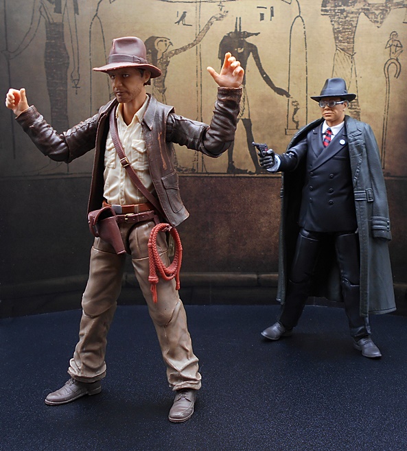
Just last week I was telling one of my toy collector buddies how I thought Hasbro was probably done with Indiana Jones after this wave and the few exclusives we’ve seen. And then Hasbro went apeshit and showed off something like two-dozen more figures, so boy was I wrong. I guess it makes sense, as The Dial of Destiny has got to be the really, really last time they’re going to wring any money from this license. Also, that newest trailer did not do much for my anticipation. I mean, I adore the first three Indy films, but everything about that trailer seemed tired and old. Will I see it? Yup. And hopefully I’ll be wrong on that count too. Anyway…The rest of the Raiders of the Lost Ark wave from Hasbro’s Indiana Jones 6-inch Adventure Series arrived from Hasbro Pulse, so I’m going to check out the rest of figures in pairs. Today I’ll have a look at the baddies with Renee Belloq and Major Toht and then I’ll swing back next week to look at Sallah and Marion and the Build-A-Ark.

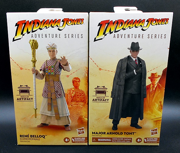
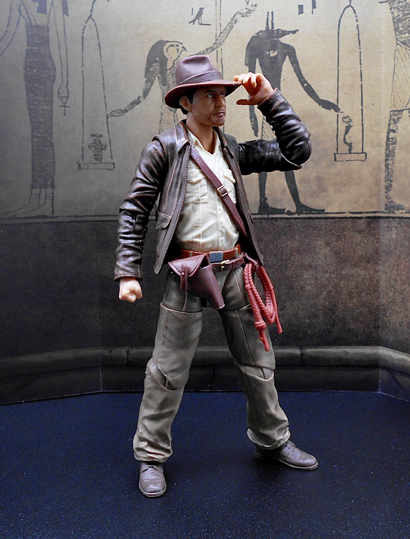
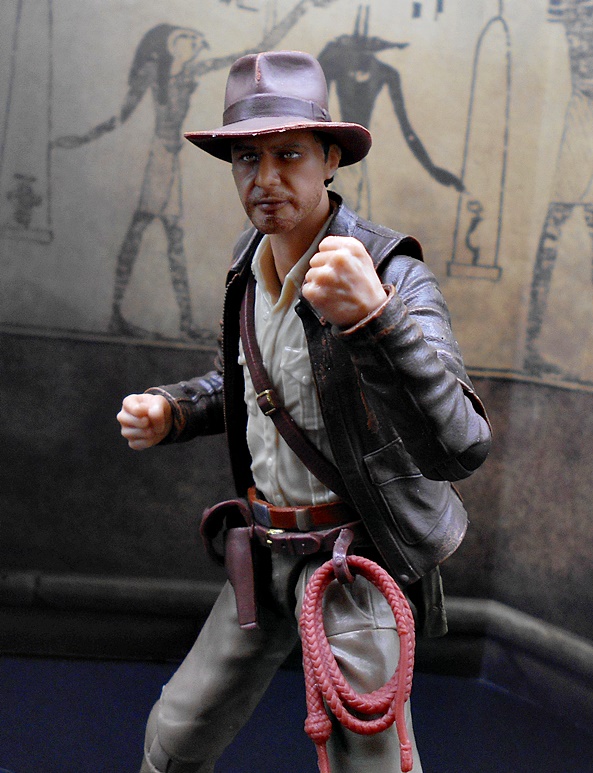
The packaging is the same as what we saw last time with fully enclosed boxes. Inside, the figures comes wrapped in tissue paper with a map printed on it in gold and the accessories and the Build-An-Artifact parts are in a separate bag. I commented about my issues with these enclosed boxes when I looked at Indy, so I won’t go into it again now. I will say that of all the windowless boxes Hasbro has used, I like the look of this series the most. The art design really invokes the film, even if the pictures of the figures can be misleading. Let’s start off with Toht!

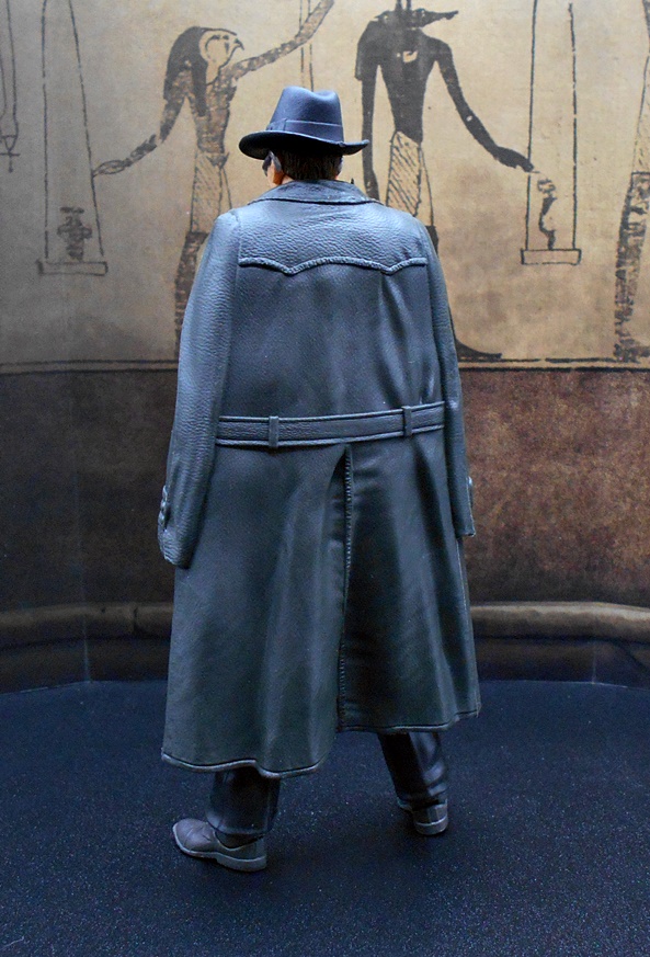
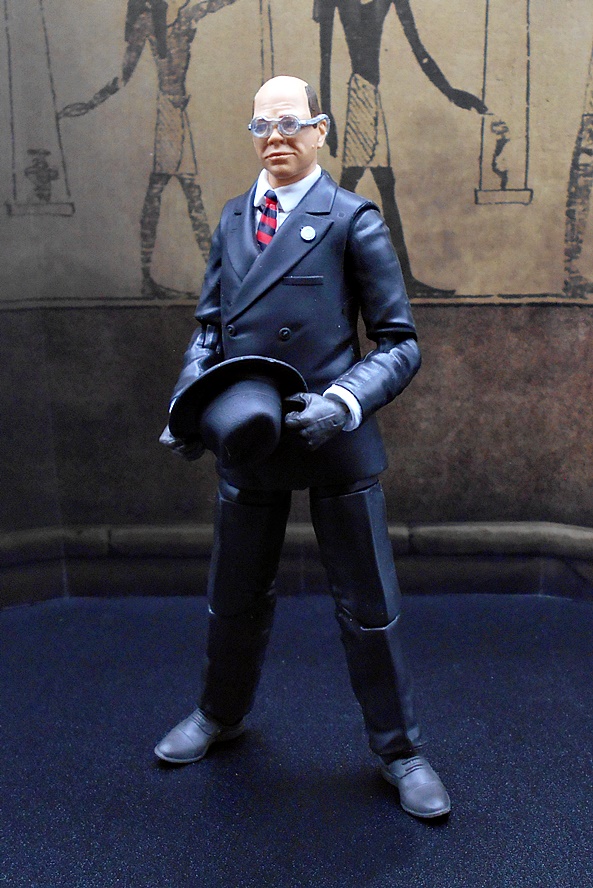
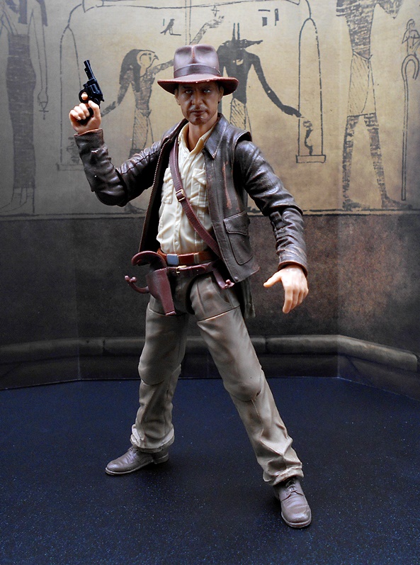
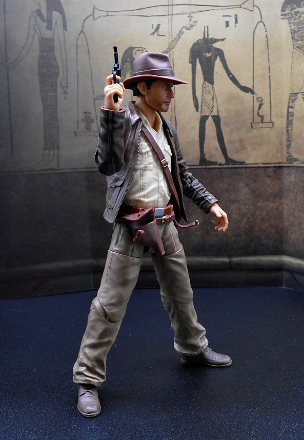
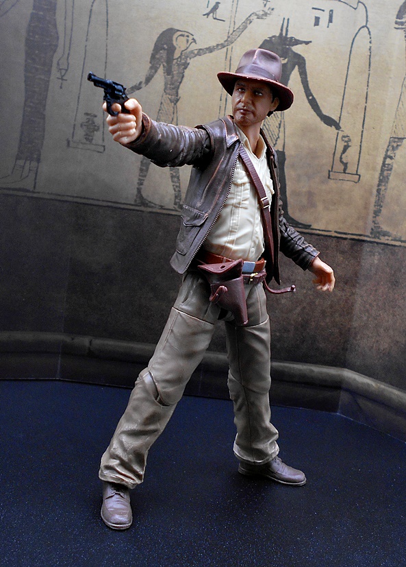
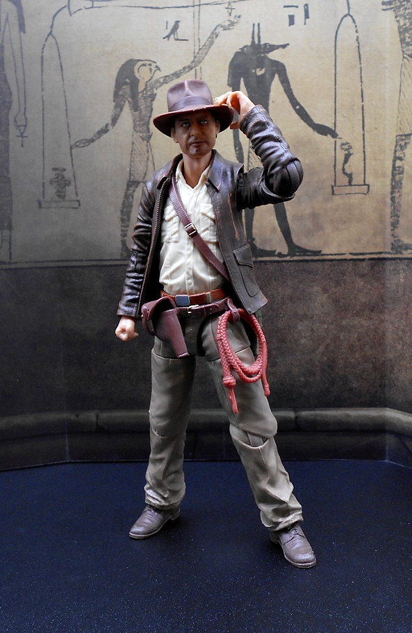
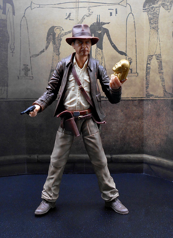
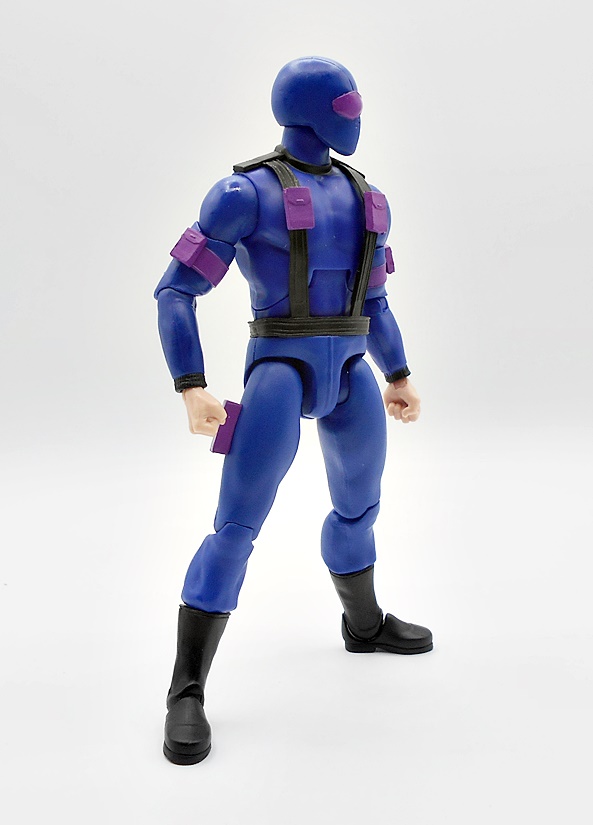
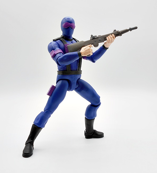
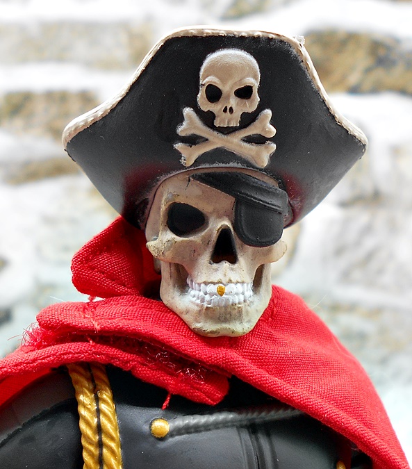
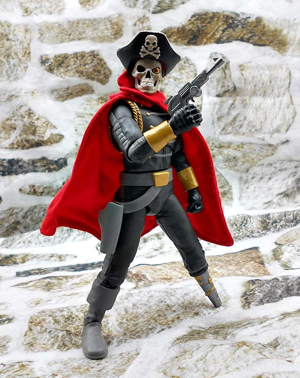
I have to admit, I didn’t think Hasbro had the balls to do it, but here we are: A 6-inch scale figure of a Nazi Gestapo torturer is swinging on the pegs down your local toy aisle. I’m also a little amazed that community outrage hasn’t recalled him yet, but it’s hard for me to understand the spectrum of over-sensitivity that the world runs on these days. I found Major Arnold Ernst Toht was one of the more memorable characters in Raiders. He served as both intimidating villain and comic relief, and he had a twisted sense of humor, with lots of memorable moments. There’s a great scene where Indy stops the German caravan and threatens to blow up everyone with a rocket launcher and in the background you can see Toht just walk over to a rock and sit down, like he’s just tired of all this shit and thankful for the rest. I laugh every time! And maybe the reason I’m gassing on about film memories is because I don’t have a lot to say about this figure. It’s an evil guy in a black suit. He has a soft plastic trench coat that fits over his shoulders, very similar to what the vintage Kenner figure had, and looks really good on the figure. It has a little texturing and decent detail in the sleeves and tailoring.

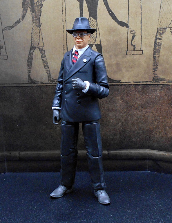
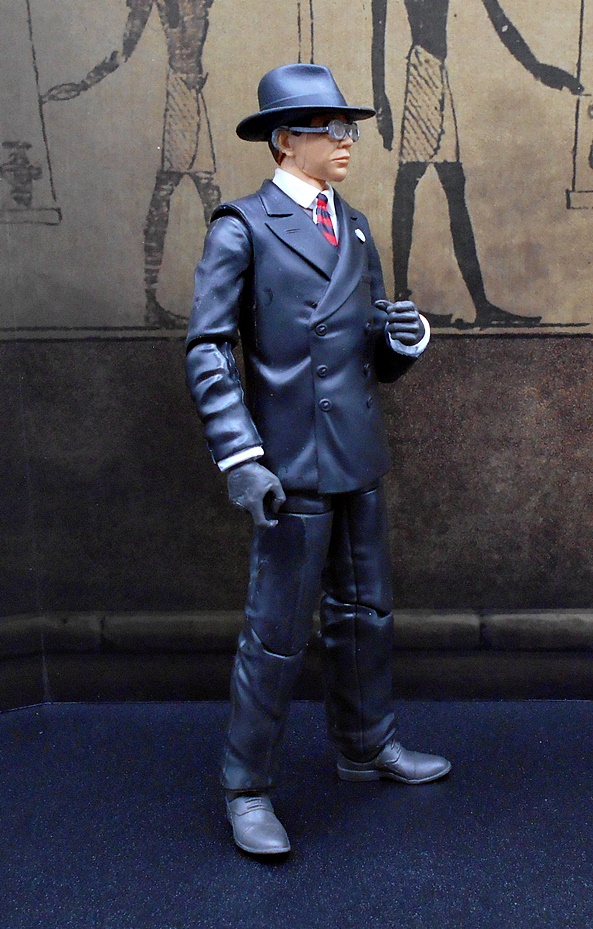
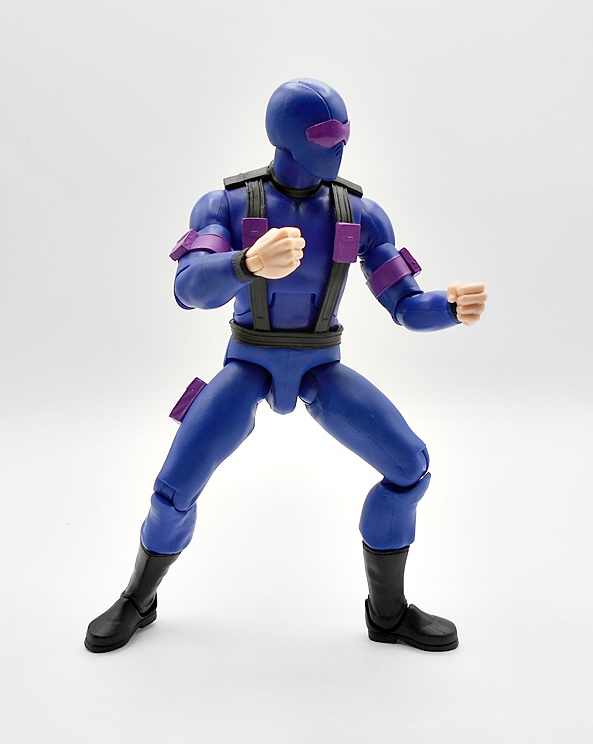
On first pass I think the figure looks good, albeit this is not a figure that required a lot of paint or even sculpted detail. Like I said, it’s a guy in a black suit. I like the exposed white shirt cuffs peeking out from the jacket sleeves, and the white collar and red striped tie looks good too. They did sculpt the tiny pin on the side of his chest, but it is understandably scrubbed of any actual details showing Nazi insignia. He’s got black gloves, with a trigger finger on the right and an accessory holding hand on the left. There’s nothing spectacular here, it’s all very serviceable. But, even the wrath of God couldn’t get Toht’s elbows and knees to bend, so I had to soak him in hot water for about five minutes. I honestly don’t understand it here, because there’s no paint in those areas, just black plastic. What the hell is sticking on these figures? Anyway, the articulation is similar to what we saw with Indy, and while the rotating hinges for the elbows and knees were disappointing for him, they seem a little more appropriate here.

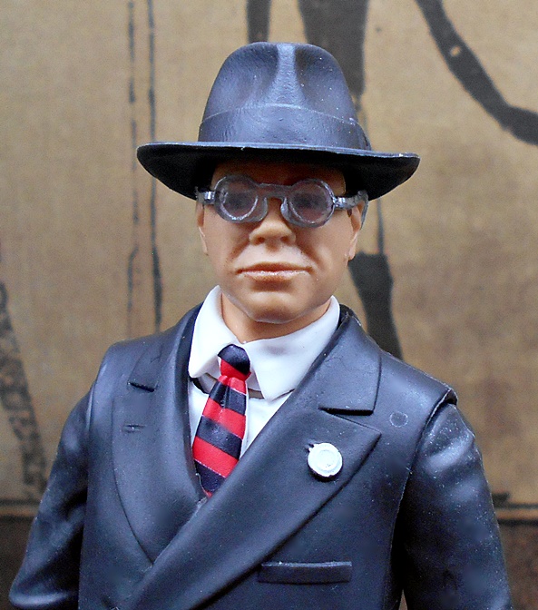
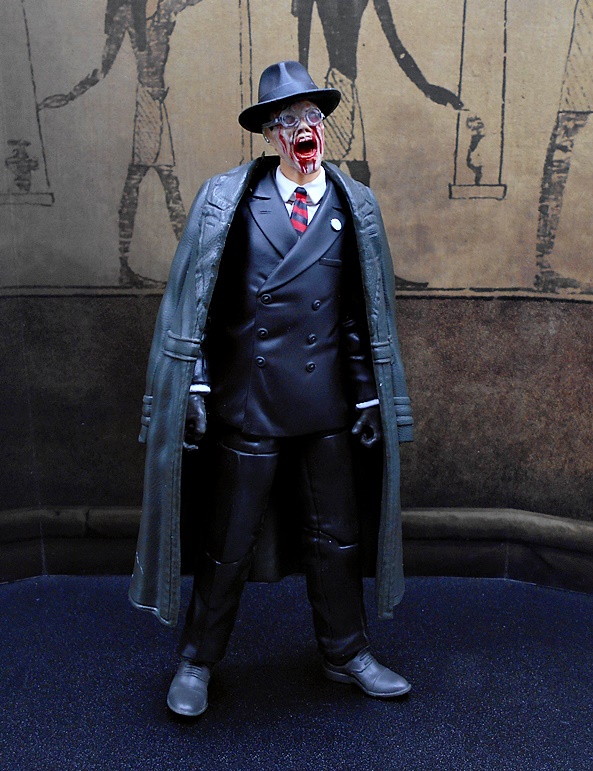
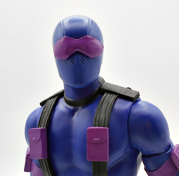
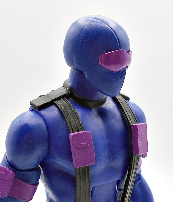
The portrait isn’t bad, but it does fall victim to the fact that it’s hard to do wire-frame glasses well in this scale. The arms of the glasses are kind of thick and the paint isn’t as sharp as it could be. Yeah, those specs look awful. The portrait is a passable likeness for the actor, especially when viewed from straight on. But, there are some horrendous molding seams running up the side of his face that really bring the whole thing down. When I first saw these, I honestly thought the face was detachable and that the swap-out melted face wasn’t the whole head. Lately, the issues of mold flashing and seam lines is something Hasbro needs to get there arms around.

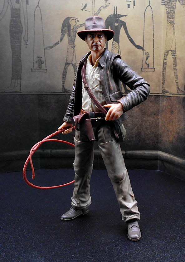
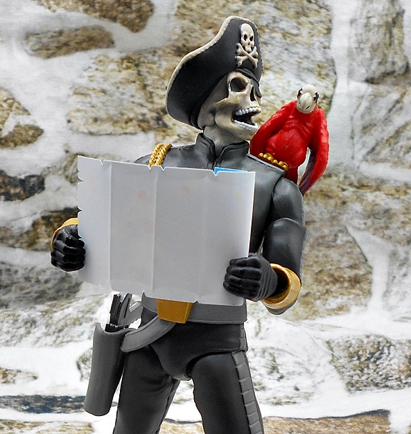
I do find it kind of strange that they made his hat removable, while Indy’s was not, but whatever. It reminds me of the scene where he takes his hat off to wipe his head revealing his male pattern baldness. Let’s move on to accessories!

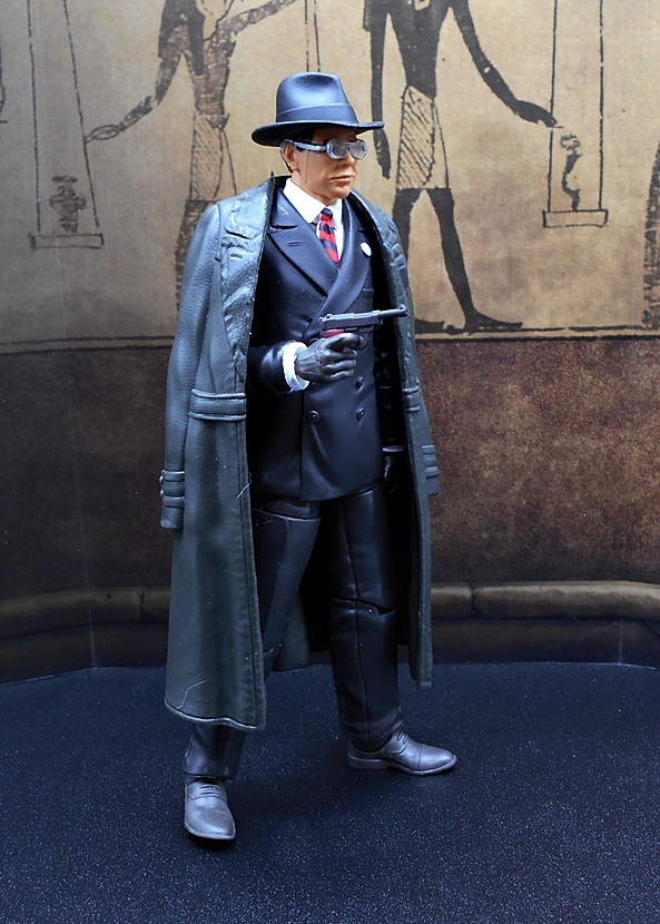
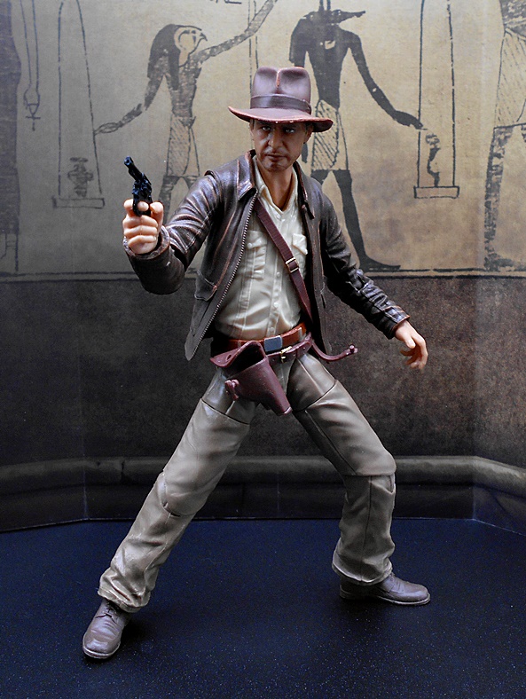
Toht comes with a Luger pistol, which has a bit more detail than Indy’s revolver. You even get painted grips, which is nice. It’s still very soft and gummy plastic though.

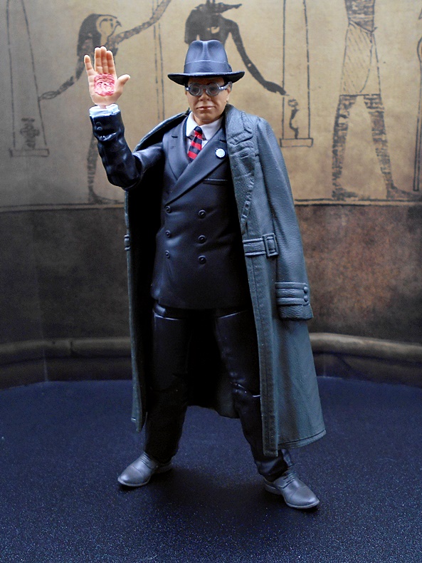
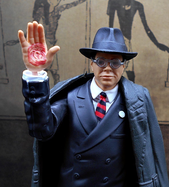
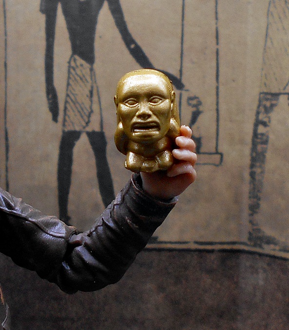
Secondly, you get a swap out right hand with Marion’s Medallion burned into it. I think the sculpting and paint look really good on this piece, but it doesn’t go into the wrist peg all the way and so it looks pretty bad with the peg sticking up like that. I could probably go in there with a razor and shave out the socket in the hand a bit, but I can’t be bothered. Seriously, Hasbro. How do you screw up something as simple as this?

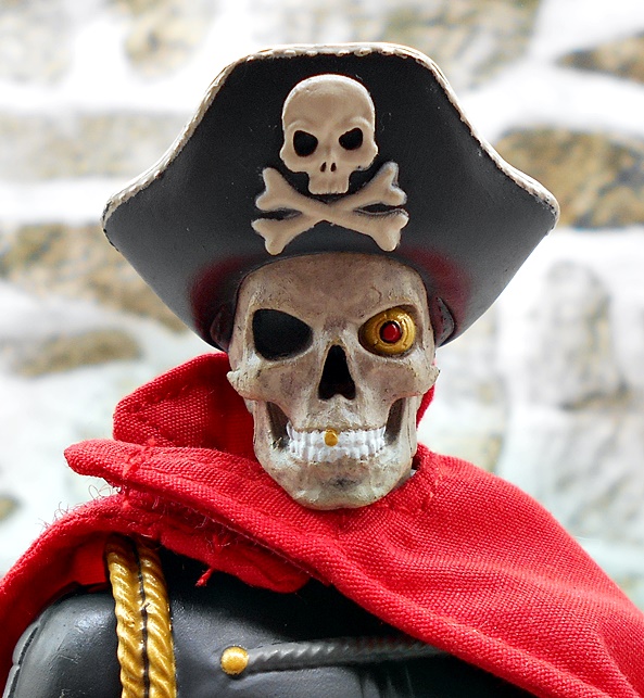
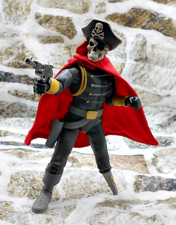
The final accessory is an alternate head with the face melting away, and this is really well done. Sure, the glasses still look bad, but I still think the sculpt and paint look great, and I am absolutely stunned that Hasbro had the balls to include something this grizzly in with the figure. It almost makes up for the shitty fit on the extra hand.

Ultimately, I think Toht is pretty average. There’s a few areas where he excels and a few more where he fails. I definitely think he could have used a few more accessories, like maybe the poker from the bar in Nepal, or the coat hanger that looked like a torture device. Hell, they could have included the actual Medallion with him too. Maybe the extra head ate up the cost on any more accessories. OK, let’s move on to Belloq.

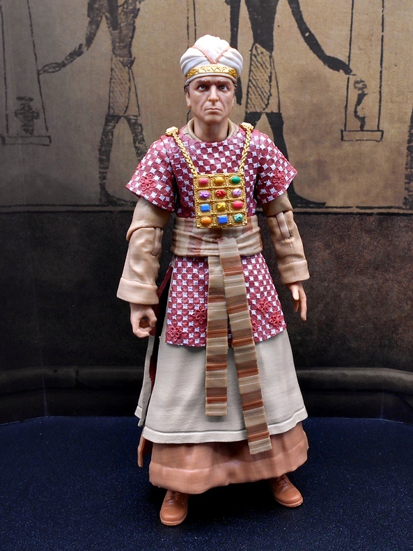
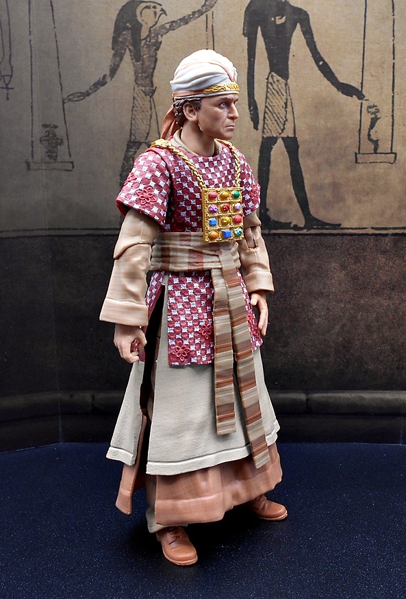
This is Belloq in the Hebrew ceremonial outfit he wore while opening the Ark. We got a similar figure in the original Kenner line and I believe Hasbro did him in the 3 3/4-inch line that came out with Crystal Skull. I’m tempted to say I would have rather had Indy’s rival in his regular clothes and not something this scene specific, but I’ll just come right out and say that this figure looks so good, I guess I’m glad they did it. Sure, this costume gave Hasbro a lot more to work with than Toht’s black suit, but it feels like they just poured the love into this one.

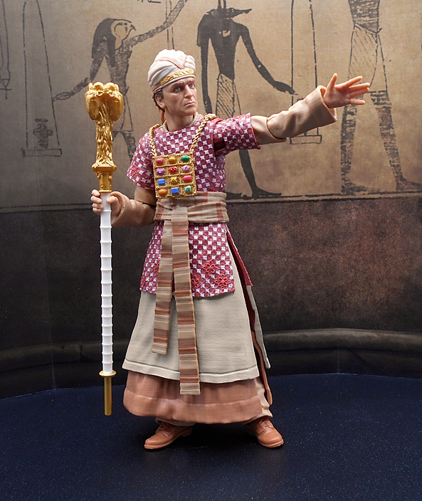
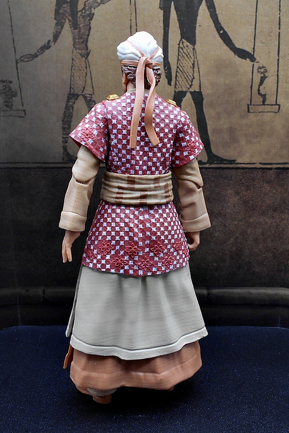
The sculpted robes have a great layered look and the checkered tunic is outstanding. In addition to the sharp paint, there’s some excellent texturing and sculpted floral motifs here and there. The sash is sculpted separately and hangs down the front, and the jeweled chest board is also separate and attached with sculpted gold chains at the shoulders. The paint on the various colored stones looks great! I was expecting the boots and legs to be reused from Indy, but to my surprise they aren’t. Also, there are slits up both sides of the robes so as not to inhibit the leg articulation, and that’s nice, but it’s not like Belloq was doing a lot action poses in this scene.

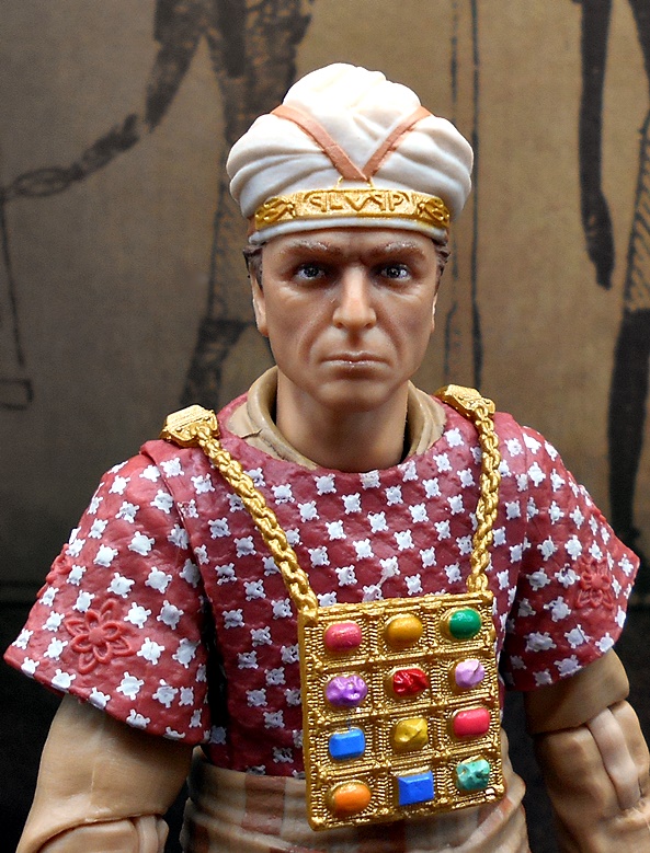
I think the portrait here is excellent. The likeness is there and you get some incredible definition in the facial sculpt. The creasing around the eyes is particularly impressive. The head wrap has some sculpted Hebrew lettering on the gold plate, and while there’s a little overspray from the gold paint, you have to get in pretty close to notice it. Also, the grim expression just oozes character.

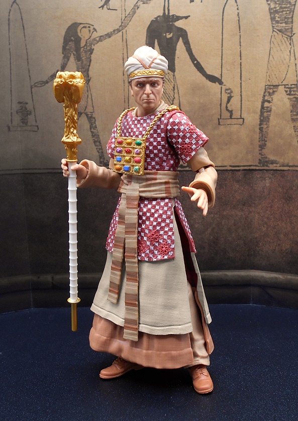
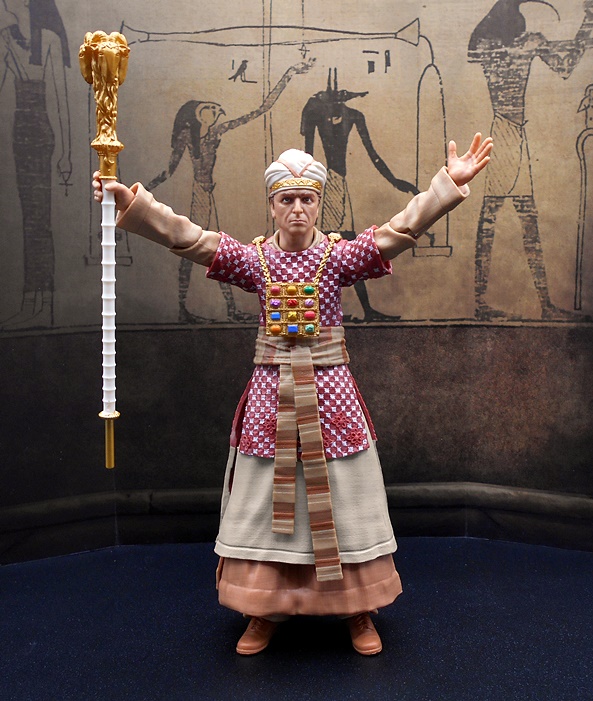
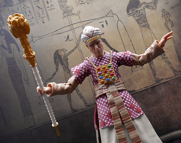
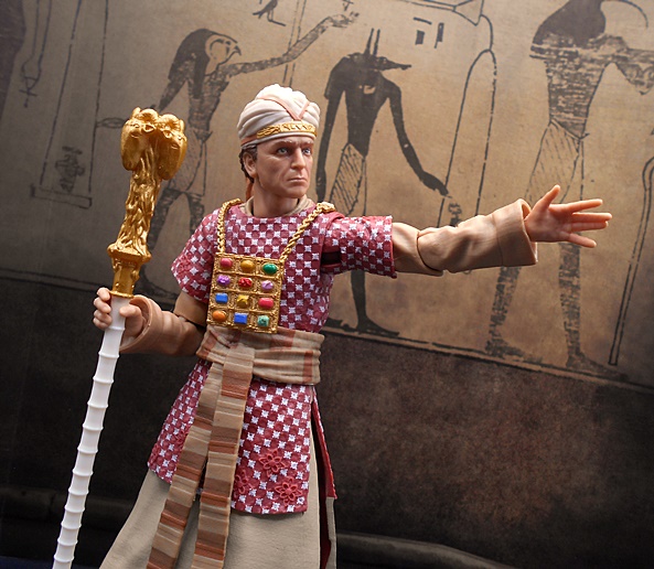
Belloq comes with one accessory, and that’s the Ram’s Head ceremonial staff. The right hand is designed to hold it, while the left hand is flat and evocative of the scene where he holds it over the Ark while reciting the Hebrew liturgy. It’s a great looking accessory with a white ribbed grip running down most of its length and really nice detail in the golden head piece. I do wish we got a second head sculpt with this figure. I realize it would be tough to sculpt Belloq’s head exploding, but I would have loved to see his terrified expression right before it happened. It would look pretty cool displayed next to melted face Toht. Of course, I’d be surprised to get Herman Dietrich, so we couldn’t display all three together anyway, which is a shame.

And that’s the villains for this wave. Toht is merely OK. I don’t hate the figure, but I don’t really love him either. A lot of my issues with him would have been fine on a 3 3/4-inch release, but this is a premium $25 6-inch figure, so I expected more polish. Belloq, on the other hand, turned out to be the breakout star here. The sculpt and paint are top notch, and I love the head sculpt. And since we found out this weekend that we are getting a plain clothes Cairo version of Belloq, I’m happier with this release even more! Next week, I’ll finish off the wave with a look at Marion and Sallah, and we’ll hunt down the Ark of the Covenant!

Silverhawks Ultimates: Bluegrass and Sideman by Super7

Last week, I dipped into the first assortment of Silverhawks figures with a look at Mon-Star and his throne. Today, I’m checking out the first of the Silverhawks themselves. Wave two actually shipped out before wave one, so we got Bluegrass and Steelwill in this assortment. I decided to go with Bluegrass first, because he’s one of my favorites and he’s kind of unique among the Silverhawk team in that he didn’t have to get quite as much body horror surgery done to him to travel to the Limbo Galaxy. He also doesn’t have a face shield and he doesn’t have retractable wings like his comrades. He is, however, an ace pilot and he flies the Silverhawks‘ spaceship, The Miraj. So while the others launch into battle he usually stays behind and strums his guitar or gets into a Battle of the Bands with Melodia! Please, Super7… give us Melodia in the next wave!

By now we know what to expect from Super7’s Ultimates packaging. There’s a foil window box with a foil sleeve that lifts off the top. Mon-Star’s Mob has red foil packages while the Silverhawks have… well, you know. The window shows off the figure and alternate heads very nicely and there’s a second tray nested beneath the top one with even more goodies! I rarely save my action figure boxes, but I dig Super7’s presentation so much that I’ve saved them all. And in terms of storage space, they add up real fast!

When it was first revealed, one of the big controversies about this line was the lack of reflective mental finish on the figures. The original toys by Kenner were vac-metalized and looked quite striking, but even as a kid I was a little bummed that they didn’t look like the cartoon. I think the paint that Super7 went with does a fine job of recreating the way they looked on show, and that’s what I was looking for with these figures. Still, clearly it’s not going to please everyone and think it comes down to a matter of personal taste. Maybe Super7 could do a ReAction line with vac-metal finishes.

In terms of sculpt and paint, Bluegrass reflects an extremely clean and simple design. The body is mostly smooth with some muscle showing, particularly on his back. You get some smooth contours and a few panel lines, but not much of anything else. I absolutely love the color blue they used, which has a subtle sheen to it but really does match the cartoon beautifully. His right arm is exposed from the bicep down, so you get some flesh tone there. The only flourish here is the red neckerchief that hangs around his neck. This is sculpted separately and while it does lay pretty well, it can get displaced when he’s posing. Articulation is precisely what we get with other Super7 Ultimates, which means rotating hinges where double-hinges would have been more welcome. Still, the joints feel good, and I didn’t have any issues with stuck parts. I did, however, get an unfortunate bit of paint rubbing on the right shoulder. It’s only really visible when the joint is extended, but it looks like something that should not have been let out of the factory, so that’s a bummer.

Bluegrass has three different portraits, which include a neutral expression, a smirk, and a smile and a wink. They’re all very nice, but I prefer the later two which do a perfect job of reflecting his personality. I think I’ll get the least use out of the first, and most out of the middle one. The paint on the face is pretty simple, but again, we’re going for a cartoon look and it conveys that pretty well. The paint lines around the contours of the face are particularly sharp. As I mentioned earlier, he doesn’t have a masked mode in the cartoon, but his yellow cowboy hat is removable, and I always loved Bluegrass’ metal mohawk. Unfortunately, poor QC strikes again as there’s some paint rubbing on the mohawk on one of my heads, but at least I’ll have it covered with the hat most of the time.

You get a ridiculous number of hands with this figure. I’m never going to complain about extras, but at some point I have to wonder how many people actually get a lot of use out of so many hands! The basics include fists, relaxed, thumbs up, gripping hands, and some designed to work with his guitar. All of these are really easy to swap out without any fear of snapped joints.

Bluegrass’ main accessory is his trusty guitar, and this is based off the one he used in the cartoon, as opposed to the one that came with the Kenner figure, but more on that later. It’s got some nice detailing on it, and the paint on the tiny strings is amazingly sharp and clean. There’s a soft plastic strap that can be attached so it can hang over his shoulder while he’s playing. The strumming and fret hands work really well with this piece. A always thought it was so wonderfully meta to have Bluegrass actually play the guitar portion of the theme song during the intro.

You get two effect parts that plug into the end of the guitar. The first has become one of my favorite effect parts in recent memory. It’s part blue and part clear plastic with musical notes sculpted into it and it looks exactly like the effect drawn in the cartoon. I love the way this looks so damn much!

The other effect part is just a blue laser, which is still cool, but it’s not laser-made-out-of-pure-music kinda cool. I actually think this is the same effect part we’ll see used as the shoulder lasers for the rest of the Silverhawks.

Bluegrass also comes with two lasso accessories, and unfortunately these aren’t impressive. One is coiled and the other is designed to loop around a figure to capture them. Both are cast in the same gray plastic as the guitar strap. I would have rather the lasso just been a piece of gray wire. These will mostly be staying in the box.

You get no less than three versions of Bluegrass’ avian sidekick, Sideman: Perched, in flight, and in guitar mode. Yes, in the Kenner toyline, each Silverhawk came with a simple bird-themed buddy with some kind of play gimmick. In the cartoon, Tallyhawk was the only bird buddy on the team for quite a while. Eventually, Mon-Star duplicated an army of Sky Shadow, and the Steelheart Twins developed birds for each of the Silverhawks to help combat the flood of Sky Shadows. Sideman’s original toy turned into his guitar and Super7 did a nice job conveying all of those modes separately, instead of trying to give us a toy that transformed.

In the two bird modes, his back is basically the body of a guitar, which kind of reminds me of when jet Transformers just wore the jet mode on their back. I absolutely love these two bird modes, because the original toy was extremely simple, with little to no paint. And while Sideman didn’t feature prominently in the cartoon, it’s still cool to get a fully painted and nicely sculpted version from the animation. These are both static pieces, but the talons are soft enough to cling to Bluegrass’ arm. I’m impressed that he can hold both with his arm out and still balance on his own.

And finally, you get Sideman in his guitar mode. This is a bit smaller than his cartoon accurate guitar, but has some excellent paint and has the bird features throughout, with the wings “folded” behind the guitar’s main body. You also get a shoulder strap for this guitar and the fret and strum hands work well with this guitar too. My only complaint here is that it is not compatible with the effect parts. Mostly likely, I’ll always be displaying Bluegrass with the cartoon guitar and the perched version of Sideman beside him.

While fans of the Kenner toyline may scoff, I really dig what Super7 is doing with this line. Bluegrass looks like he stepped right out of the cartoon, and that’s exactly what I was looking for. I also really appreciate how they are still paying homage to the bird companions, even though they didn’t get introduced until late in the TV series. I will toss out the one caveat that the QC could have used a bit more polish. There’s nothing here that egregious, but paint rubs on the shoulder and the mohawk really do hamper things a bit, and from what I hear some of the figures are shipping with a lot worse. I’ll have more to say about the QC when I check out Steelwill, but hopefully, Super7 can get that sort of stuff under control when the intended first wave finally ships.

DC Multiverse: Death Metal Batman and Batcycle by McFarlane

Hey look! McFarlane made a Batman figure! Can you believe it? Sure you can, because the DC Multiverse line has been focused on Batman since the beginning, and while I think it’s gotten better at diversifying, it’s hard to collect this line without getting a bunch of The Batmans. Today I’m checking out the Dark Knight as he appeared in the book Dark Knights Death Metal from a couple years back, along with his rather unique looking Batcycle. I haven’t read the book, but I may remedy that some day. Oddly enough, I picked up the Batcycle last year before I even started collecting DC Multiverse, because it was down to $9 and I gave it to some of my Mythic Legions vampires to ride. But when I started collecting Multiverse, I decided to pick up Death Metal Batman to go with it. Let’s start with the figure!

As always the packaging is clean and simple, giving you a good look at the figure inside. The source that the figure is based on is printed on the side of the box, and I do wish they would list it down at the bottom too, rather than just say Batman, because there’s too many Batmans!!! There’s a simple figure stand and a collector card, but those are staying put for now, because you have to tear the bubble off the backing to get at them.

The grimdark filter of the Death Metal concept doesn’t really work for me with all the DC characters, but it sure does work for Batman here. The design is like something an angst-ridden 14yo would doodle on their Trapper Keeper while bored out of their mind in Sociology. And I mean that as a compliment in every possible sense, and McFarlane did an amazing job with the detail on this figure. The gray body suit with bold bat symbol is about the only thing standard here, while every thing else on the figure is badassery amped up to 11. And everyone knows the Badassery Scale only goes up to 10. There’s a trench coat has studded shoulders and heavy straps with silver painted buckles running down the front. It’s split down the middle in the back, most likely to help him mount his Batcycle. I dig how the back of the shoulders sort of forms another bat symbol, but not quite. The black boots are just rows of straps with bat-shaped knee guards. His arm bracers are silver with some gnarly looking spikes, and he even has studs on the knuckles of his black gloves. The belt has a silver bat symbol for a buckle and silver skulls with chains hanging down. Everything in the sculpted detail here is just beyond impressive.

The head sculpt is on point with the lower half of the exposed face forged into a scowl, which is conveyed mostly in the facial creases that frame the straight, horizontal slit of a mouth. I like the iron jaw and the wrinkle in the nose that carries through the mask. The ears are reduced to tiny bumps and the eye mask forms some harsh downturned brows of disapproval. I’ve been a bit critical of some of the McFarlane Batman portraits for being a tad soft, but this one is absolutely great.

Articulation is right in line with the DC Multiverse standards. Eventually I will stop running through the points, because it just gets redundant, but let’s do it here anyway. You get rotating hinges in the shoulders and wrists, with double-hinges in the elbows. The legs are ball jointed in the hips, with rotating hinges in the ankles, and double-hinged knees. There’s a ball joint under the chest and another in the neck. Everything here is serviceable and with the cut in the back of the coat, it doesn’t hinder the range of movement at all. The hands are designed to hold his accessory, as well as the handlebars of the Batcycle, but they can work as fists given the right perspective. The gray hinges between the black knee guards and boots is a bit distracting, but it ain’t terrible.

The accessory I mentioned is a giant scythe and it sure adds a lot of menace to the figure when on display. The contoured staff is sculpted to look like it’s wrapped from top to bottom in brown leather strips, which offers a lot of detail to what could otherwise just have been a brown stick. The blade is black with silver edges and forms what looks like a single batwing, or half of a bat insignia. Let’s check out the Batcycle!

The bike comes in an elongated box with a window to show off the goods. The styling is similar to the figure packaging with the outside being black and a blue background inside. You even get a collector card with the vehicle, which is pretty cool, but again it’s staying secured in the package for now.

And wow is this thing absolutely ridiculous and cool at the same time! It’s like someone took a motorcycle and grafted a giant bat skeleton onto it. The head forms the front, with the open jaw framing the back half of the front wheel. The ribcage wraps around the gas tank and the front of the engine, while there’s a little more bone sculpted behind the seat and over the back wheel. The bone is conveyed both in the sculpt and the superb paintwork and it looks pretty damn convincing to me. There’s an almost hypnotic swirl sculpted into the ears and the eyes are just creepy milky yellow orbs. There’s a wonderful contrast between the bright off-white of the bone and the dingy gray and black of the rest of the bike. You get some amazing detail in the engine and the tires too. I love the bat symbol inside the front tire, and how fat the back tire is. Wow, this thing looks cool. It’s like something that would be painted on the cover of a Meat Loaf album!

Thanks to that split in the trench coat, Batman can mount the bike perfectly. His hands form a good grip on the handlebars and his feat can rest on the pedals below. The exhaust pipes on the bike do reach the ground, so there’s no need for a kickstand to keep this thing vertical.

After having the Batcycle kicking around my collection for almost a year, I’m happy to have finally united it with its proper driver. McFarlane has been killing it with these small vehicles, offering them up at around $22-25, I think they’re some of the best values on the toy shelves. Even more so, considering I picked up mine for $9. The figure was actually $28, which is by far the most I’ve paid for a DC Multiverse figure. I think he’s been off the shelves for a while, which is why I had to pay a little extra. Still, I think it was worth it. Despite not having any real ties to the comic source material, I am thrilled to have this figure and bike displayed on my shelf! I don’t know if I’ll go for any of the other Death Metal figures, but I do have a certain giant Death Metal Batman Monster Truck on the way!

By figurefanzero

Indiana Jones Adventure Series: Indiana Jones(Raiders of the Lost Ark) by Hasbro

Back when Kingdom of the Crystal Skull came out, Hasbro went wild with their 3 3/4-inch Indiana Jones line. We got figures from all the films, as well as mini playsets, vehicles, and even a big playset. The line was not terribly popular with collectors as the paint apps had a habit of being rather rough, but I absolutely loved the line for being super fun and very expansive. I still maintain that it was the best thing to come out of what was a pretty poor film. Fast forward to now and we have yet another Indiana Jones film on the horizon and one which I am really dubious about. But hey… more Indy toys! This time we’re getting 6-inch and 3 3/4-inch retro lines. The first pair of the 6-inch Adventure Series figures have arrived, so let’s start with the man himself. If adventure has a name, it must be Indiana Jones!

Yeah, I have no words for how much I love Raiders of the Lost Ark. It’s on a short list of what I consider to be perfect films. It’s not a move I can have on in the background either. If it’s on, it has my total attention, even though I know it by heart. Adventure Series Indy comes in a fully enclosed box, which looks nice, but also illustrates the problem with these boxes. The figure pictured on the front just isn’t what’s in the box, mostly because of the portrait. And I’m not talking about paint flubs or QC issues. We’re clearly seeing a pre-production figure as opposed to what actually shipped, and that’s where you wander into the nefarious Temple of False Advertising. Inside the box the figure comes wrapped in a paper bag with the accessories in a second bag. Both bags have maps printed on them, which is a nice touch. This wave is also doing a Build-An-Artifact thing, so Indy comes with the two angels from the top of the Ark of the Covenant. But I’ll save those for when I check out the last figure and have all the pieces.

At casual glace, everything looks fairly solid. Indy comes in his trademark leather jacket, which is cast in soft plastic with the sleeves sculpted as part of the arms. The sleeves don’t really match up with the arm holes well enough, making it really obvious that they aren’t part of the jacket, but that’s often the case with this trick. There’s a button-down shirt sculpted under that and his satchel is worn with the shoulder strap under the jacket. You can easily remove the satchel if you want. The detail on the shirt is very nice and there’s some great weathering on the jacket. The khaki trousers have rumpling down by the cuffs and there’s some sharp detail in his boots. I really don’t have any complaints about the body sculpt.

The head sculpt features a permanently attached fedora, which I don’t really mind that much, although for a $25 figure, not having it be removable does hurt the value a bit. There’s also some bad mold flashing on the brim of my figure’s hat. As for the portrait itself, I don’t think it’s bad, but it’s a far cry from what’s on the box. The more I handle the figure, the more I like it. Had the figure been sold in a window box, I don’t think I would have a problem with it at all, but when compared to the picture on the box it still feels like a bit of bait and switch. I actually think it most resembles Indy from some the painted movie posters, and that’s not a bad thing. Hasbro has certainly done some better likenesses in this scale, but they’ve done a lot that have been far worse too. The nose and mouth are undeniably Harrison Ford and they even worked his chin scar into the likeness. After a few days of mulling it over, and not looking at the photo on the box, I ended up liking this portrait quite a bit.

Nearly every joint on my figure was fused right out of the box, so Indy had to take a bath in the Hot Tub to get him limbered up. I sure didn’t want to snap any joints. The articulation feels like it takes a step back from some of Hasbro’s other offerings in this scale. You get rotating hinges in the shoulders, elbows, knees, and ankles. The hips are ball jointed, there are swivels in the thighs, a ball joint in the waist, and another for the neck. The hands are on dog bone-style double ball joints so they can be swapped out, with the peg in the arm and not in the hand, which is weird. You get a pair of fists, a gun-holding right hand, a whip-holding right hand, an idol-holding left hand, and a relaxed left hand. The elbows can do slightly better than 90-degrees, but boy do I wish they were double-hinged. The knee joints work alright, but they look absolutely awful when bent. Even the elbow joints look a bit bulbous when bent. Let’s look at accessories!

You get two versions of the iconic whip, one coiled to hang from his belt loop and one for action. The coiled whip looks very nice with some excellent sculpted braiding. Unfortunately, it is damn near impossible to close the loop and keep it closed. The peg is really soft and either doesn’t want to go into the hole or just pulls out a few seconds later. I was honestly amazed I was able to get any pictures at all with the loop closed around the whip. Sometimes the whip will stay in place for a while even after the loop’s peg pulls out, but eventually it will just fall to the floor. Something this simple should not be this poorly implemented, and especially not on a $25 figure.

The other whip is rubbery and wants to keep returning to a semi-coiled state. I can sometimes get a good pose with it, but it won’t do what I want it to do. I was thinking back to the Super7 ThunderCats Tygra figure, where his bolo whip would hold a shape and this one will not. I can’t believe Hasbro couldn’t work something out with a poseable wire, because that’s really what this accessory needed. And it’s no fun that it can’t be latched onto anything very well to make like he’s swinging. There were a bunch of different directions Hasbro could have gone with this version of the whip, but this just doesn’t work for me. At least this one still has the excellent braided sculpt as the coiled one.

Beside the whips, you get Indy’s revolver, which fits in his holster. The peg on the strap that holds the holster closed is almost as frustrating as the whip loop peg, but at least if it doesn’t stay pegged in, the gun can still stay in the holster. The sculpt for the gun is passable, but it’s real rubbery and kind of just blah. It does work well with the trigger-finger hand.

Finally, you get the fertility idol that Indy recovered from the temple at the beginning of Raiders. This is a nice little sculpt and while the gold plastic isn’t super vibrant, it looks good enough for me. Sadly, the hand that is designed to hold it really doesn’t work. I had to use a piece of poster putty to get it to stay in his hand for these photos.

Indiana Jones and the Death of A Thousand Cuts. It makes for an intriguing title, but a disappointing figure. I’m hard pressed to remember opening a figure that I wanted to love more, and yet there are just so many little things wrong with this one that it makes me kind of sad. Am I sorry I bought it? No. Indy is one of my favorite film characters and I’ll always buy him when he’s released as an action figure. This figure is by no means awful, but at $25, some of the aspects needed to be thought out a lot better, and I guess I had my hopes set high. It’s a rough start to the wave, doubly so since he’s the star, but we’ll see how the rest of the assortment pans out next time with Toht. Holy shit, they actually made a figure of the Nazi Gestapo agent Toht!

Transformers: Legacy Evolution Shrapnel by Hasbro

Last year, Hasbro gave us Kickback and the promise of getting the Insecticon band back together with new versions. I absolutely adore the Insecticons, and so this made me happy. Then Kickback came out and I absolutely loved him, and that made me happy. But as the old saying goes, fool me once! Because the last time Hasbro did the Insecticons, they started strong and we ended up with a team that didn’t really look like they belonged together. I was worried the same thing would happen here, and so I waited with baited breath for the second release, and here he is. Let’s check out Shrapnel.

We’ve seen the Legacy packaging before, and while I admit it’s rather eye catching in all it’s crazy colors, it doesn’t really scream Transformers to me. All I need in my Transformers packaging is a grid pattern, and either some purple or red to denote faction. Also, what’s this Evolution business? I still don’t know. Hasbro is still refusing to put plastic windows on the boxes, because of saving the planet or whatever, but I get my Transformers online, so there aren’t any kids to put their sticky fingers on my toy or wipe boogers on them. Now the Amazon employees do that. I am pleased to see that somehow Hasbro secured Shrapnel’s name again, as last time I think he was called Skrapnel. Also, the packaged shot showcases the thing about this figure that triggers me the most. Can you guess what it is?

Here’s Shrapnel’s beetle mode and it’s pretty good! But let’s get that one thing that triggers me out of the way first. Somewhere along the way, Hasbro decided to not paint the antenna-slash-pincers silver like it is in the solicitation photos. Instead they left them bare gray and it looks positively awful. I understand that if you read the fine print on the package it actually states that final production appearance may vary, but it still pisses me off, particularly when you look at the price hikes on these little Deluxes. I will give Hasbro credit on two points: First, it’s not a fully enclosed box so at least you can see what you’re getting if you buy him in the store. Secondly, they actually reflect the change in the official package shot online. Of course, I pre-ordered, so the first whiff I got of the change was when I took him out of the shipping box and looked at him.

Other than all of that bitching, I think the alt-mode here is fine. It locks together well and I like how the pincers will open and close without revealing the robot head. The translucent yellow chest plate with the silver plastic behind it and the Decepticon logo stamped on top looks fantastic. Plus, you get that most regal of all Decepticon colors: Black and purple. I also appreciate the use of gloss black paint on the body, as it resembles the diecast of the original toy. There’s some nice silver, red, and blue trim here and there and if it weren’t for that gray plastic, this little bug bot would be a total home run.

Shrapnel comes with two weapons, and you can peg them into his back to weaponize the beetle mode. And look, the G1-inspired gun is actually painted silver, making the ugly gray pincers stand out even more. Yeah, I know. I should get over it. Let’s get him transformed into his robot mode.

Hasbro didn’t muck up the rather simple transformation design from the original figures. Sure, it’s a bit more complex, but it’s still in the spirit of the original toy and it’s still quick, easy, and comfy. Like the beetle mode, Shrapnel’s robot form is a pitch perfect homage to the G1 toy only with better proportions and more articulation. Hey, did I mention how bad the pincers look without silver paint? Oh yeah. I did. Everything else here is just superbly done. You get most of the same beautiful colors on display in his bug mode, and that wonderful yellow chest plate is front and center. I could complain that the upper legs aren’t painted silver too, but that really doesn’t bother me at all. Just the pincers. See… I’m reasonable! From the back, he’s pretty well filled out, except for the hollow upper legs and backs of the pincers.

The head sculpt is also spot on perfect from his big red visor to his silver painted face. You had the silver paint out, Hasbro. It was on the table. You just had to use some more of it on those pincers, dammit!

The two guns are pretty cool, but I’ll mainly just be displaying him with the G1-inspired silver weapon. The purple one can be combined with it a couple of different ways, which is fun, but I don’t like how either of them look enough to go with it.

So, I was really pissed when I opened this figure and saw the pincers, but you probably get that from having read the same complaint over and over again. What I did not expect to happen was to get past it, but get past it I eventually did. At some point the rest of the figure’s merits won me over and I was willing to let it go. And since, Hasbro did something different with Kickback’s wings instead of painting them silver, the two figures do pair up pretty well and look great together. So all that’s left is to see what Hasbro is going to do with Bombshell. If they paint his head cannon silver it’ll make Shrapnel look worse, so I guess the only thing to do is to embrace the gray plastic. We’ll see. But for now, I’m actually really happy with these two, although I won’t be retiring my third party bug bots by Bad Cube any time soon.

G. I. JOE Ultimates Snake Eyes and Timber by Super7

I’m keeping this Super7 train rolling along with the third straight Ultimates review! This time I’m digging into my first look at the initial wave of Super7’s Sunbow cartoon inspired figures. It’s crazy to think how long we’ve gone with absolutely no GI JOE toys to speak of, and now we’ve got Hasbro shooting out Classified figures and Super7 on board with the ReAction and Ultimates releases. It seems like it was a damn long wait to get these in hand, so let’s kick things off with a look at Snake Eyes!

If you have any Ultimates figures in your collection, the packaging will be somewhat familiar, as you have a window box with a slipcover that lifts off the tip. And oh boy do I love what they did waith the art design on this package. You get a green camo deco with some silver scuffing and scraping to make it look like a metal container. The GI JOE logo is printed proudly across the front, and you get a dog tag type graphic down at the bottom with Snake Eyes Elite Commando on the back. YES, COMMANDO… NOT NINJA! Sorry, but that’s been a sticking point with me since I was a kid. Lift off the slipcase and you can see the figure inside and all the goodies on a clear tray against the vintage Real American Hero style explosion for a background.

The colors! Yes, these figures are based on the 80’s cartoon appearances, more specifically from the original Mini Series, which means Snake Eyes is all decked out in his blue commando outfit with purple patches, black harness and boots, and no gloves. The colors here really pop beautifully, and they go a long way to make up for the fact that there is not a lot of sculpted detail on this figure, to convey the simpler cartoon design. The shoulder straps are cast in soft plastic and worn by the figure, while the purple arm bands are secured directly to the biceps. Hot damn… this figure looks outstanding!

The blue masked portrait is as simple as it gets, with some stitching lines sculpted along the top of his head, and some breathing holes in front of his nose. The visor is painted purple to match the pouches, and has a really nice glossy finish that comes close to being reflective.

An obvious sticking point on these figures is going to be the articulation, which follows Super7’s usual Ultimates pattern. The arms have rotating hinges in the shoulders and elbows, with swivels in the biceps and pegged hinges for the wrists. The pegged wrists allow you to swap out the myriad of hands, which include sets of: Fists, trigger hands, wide grip hands, tighter grip hands, and relaxed hands for a total of five pairs! The legs are ball jointed at the hips, have rotating hinges in the knees, and swivel hinges in the ankles. You get an ab crunch hinge and a ball jointed neck. All the joints on my figure feel great with none being stuck or too loose. These are clearly figures that are going for the cartoon aesthetic over being super articulated, and I’m actually fine with that, because I have Classified as the more poseable option.

Also included is the Timber companion figure, and I’m pretty lukewarm on this doggo. Overall he looks OK. The sculpting is pretty smooth in a lot of areas, which makes the fur a little less than convincing. The head sculpt is OK, but I would have liked to have an alternate growling of Cobra-chomping head. Maybe that’s asking for too much. The articulation here is really off, though. The neck has two points of articulation, but it doesn’t feel like it’s designed to give all that much. The front legs have a little lateral movement for a wider stance in the front, but the back legs just rotate, and the paws don’t really seat well on the ground. The body also appears to be hollow, giving him less heft than he feels like he should have. I don’t have Hasbro’s Classified Timber on hand to compare (I’m not even sure I ever got around to opening that Snake Eyes), but I suspect that one is going to be the better wolf.

Snake Eyes comes with the iconic Sunbow-style laser rifle, which is a design I really dig. As a kid, I used to wish Hasbro would release an accessory pack with like ten of these for my RAH figures. It’s a great looking sculpt with a bit of paint, and the trigger finger and tight or loose grip hands work well with it. I’ve seen some reports of these rifles coming out of the package warped, but this one is straight as an arrow. Hopefully Duke’s will be too.

He also comes with a little walkie talkie, which has a frequency display and a dial on the bottom. It’s a simple accessory, but it looks good, and works perfectly with the wider grip hands.

Next up is the Cobra cannister, which contains the radioactive crystals needed to power the MASS Device. It has a Cobra emblem printed on the top, and it does not open or contain any crystals. Which is a good thing, because if it did and you opened it, you would die of radiation sickness, unless you had some bullshit leaves that somehow absorb the radiation and doesn’t spread it when you burn them and… WHAT????

Snake Eyes’ final weapon is a laser pistol. I actually don’t remember this one at all from the cartoon, but it has a cool design with a winged back. It’s cast all in black.

And last but not least you get a big purple jet pack which is pretty damn sweet.

Ultimates Snake Eyes turned out great! It seems like he doesn’t come with nearly as much stuff as the other figures in the wave, but considering that Timber is somewhat articulated figure and the jet pack is pretty big, I think Super7 went for the less is more strategy on this release. And to be fair, there really isn’t anything conspicuously absent. And while I have no complaints about Snake Eyes himself, I think Timber could have been better. He’s not awful by any means, but he doesn’t feel as polished as he could have been!

By figurefanzero

Silverhawks Ultimates: Mon-Star and Throne by Super7

I was positively giddy when Super7 announced they were doing Silverhawks figures! While admittedly nowhere near as solid as its younger toon cousin, ThunderCats, Silverhawks was one of the last cartoons I really got into before succumbing to the “I’m too cool for cartoons” teenage years. And it’s rare that I have an excuse to gas on about this cartoon, so pardon me if I get a little longwinded. The series featured the same amazing level of animation as ThunderCats, some even more colorful and bizarre characters, and a lot of the same voice actors. Larry Kenney, Lion-O himself, even narrates the opening of the pilot episode and introduces us to the characters. It follows a very similar formula to its catcentric cartoon cousin, and I’ve even read somewhere that it was intended to take place in the same universe. I’ll get more into the Silverhawks themselves when I have a look at Bluegrass next week, but today we’re looking at the reason the Silverhawks have jobs, and that’s the evil Limbo Mob Kingpin, Mon-Star!

Technically, we’re starting with the second wave, because the planned first wave was delayed. Mon-Star comes in an elongated window box to house all his extras, but the package design is similar to what we saw for the ThunderCats Ultimates, with a slipcase that lifts off to reveal the goods. The slipcase and box have a beautiful crimson foil finish and the front of the slipcase has Mon-Star’s ugly mug in his powered-up form. Much like Mumm-Ra, Mon-Star had a regular form and a powered up form, which he attained by absorbing the power of the Moon Star and reciting the incantation… “Moon Star of Limbo, give me the might, the muscle, the menace of Mon-Star!” He’s also the leader of the Limbo Galaxy’s most notorious mob of gangsters. Today we’re looking at his regular form, which unlike Mumm-Ra is pretty damn impressive all by himself! Inside the box, you get the figure, two additional heads, no less than five pairs of hands, and two versions of his buddy Sky Shadow. Also included in this wave is his throne, which is packaged separately.

Here’s Mon-Star out of the box, and like I said, he’s pretty intimidating before he even gains that might and muscle of the Moon Star! This is also the very first time we’re getting an actual figure based on this form, as the original Kenner figure was based on his powered up form, with only a changeable face to show the transformation. Mon-Star is quite literally a beast of a figure, content with waring very little in the way of clothes. He has a furry diaper to protect his mon-star modesty, although, I suppose that could just be his natural hair, because has some similar fringe coming off his forearms. And if true, that’s kind of gross. He also has some armor on his upper chest, and two shoulder pieces with spikes angled outward. He’s a savage looking creature with some chiseled muscles, all brought out in what is a solid, albeit basic sculpt. He does, however, have some pretty good detail in them monster feets. His skin is mostly black with some maroon wash here and there, a maroon finish to his armor, and some flame red touches on his furry bits.

The portraits are huge, mainly because of his wild and copious coif of lion-like hair, and it is a glorious mane. The plastic pouf radiates outward from his face with alternating red and black strands. Mon-Star also has a long tuft of red hair protruding from his chin. He’s an ugly sonuvagun with a squished nose and jagged teeth protruding from his closed lips. One piercing eye gazes forward while his left eye is covered by a patch, and bares the Light Star, one of his fiercest weapons.

The second option gives us an even wilder hair sculpt and his mouth slightly parted. I never knew what was up with that middle tooth that looks like it’s growing up out of the top of his jaw, but it sure is faithful to the cartoon. There’s a sharper angle to his right brow on this head, showing that he is more than mildly displeased.

And finally you get his Oh, shit, he’s really pissed head. The hair is even wilder, and you get a little more black wash in the red areas. His mouth is further agape, his exposed eye is wide with range, and the Light Star on his patch is clearly active. In the cartoon, the Light Star was a beam weapon, which had the power to immobilize or even take control of his targets. All three of these heads are excellent, and with the bulk of the figure being a little plain, it’s nice to see Super7 poured the sculpted detail into these portraits. As for which one to display on the figure? That’s a tough one, but chances are I’ll mostly go with the second one.

The articulation here should hold no surprises if you’ve handled any of Super7’s Ultimates. It’s not exceptional, but it gets the job done. The arms have rotating hinges in the shoulders and elbows with the wrists on hinged pegs so you can swap out the hands. The legs are ball jointed up in the hips and have rotating hinges in the knees and ankles. There’s a ball joint under his chest and a ball joint in his neck. The joints all feel great and while it would have been nice to have a better range of motion in the elbows, I can still have plenty of fun with him.

The number of hands here is absolutely ridiculous! You get five sets: Fists, accessory holding hands, pointing finger hands, grasping hands, and somewhat relaxed hands. It’s pretty luxurious to get a full pair of pointing fingers, and I’m not entirely sure what the accessory holding hands are for, but it’s nice to cover all the bases. He also comes with a single right trigger hand. Again, he has no weapon, but I suppose he can borrow one from his cohorts, so that’s cool.

The only accessories here are the two versions of Sky Shadow. This companion beast was introduced in Episode 9, when Mon-Star asked one of his cronies, Hardware, to make himself a cyborg bird capable of thwarting the Silverhawks spy, Tallyhawk. In the toy line, and eventually the cartoon, each character had their own bird-buddy. Sky Shadow was a sort of space dragon that was captured by Hardware and converted into a cyborg, which is just a sample of the kind of body horror that this cartoon flippantly engages in. The first version depicts Sky Shadow before getting all borged up. He’s a little bit cuter here than he was in the cartoon and looks more like a baby dragon than a vicious bird creature. It’s a nice bonus, even though he was only seen in this form briefly before he had the horrific surgeries forced upon him.

The second version is Cyborg Sky Shadow, but he’s closed up in his perched mode. It’s not the Sky Shadow that everybody wants, but that one will be included with the powered up version of Mon-Star. Indeed, this isn’t much of an accessory, as it’s kind of just a jumble of cyborg bird parts all rolled up with two lobster claws showing through. And that brings us to the throne!

This throne comes in a window box without a slipcase cover. It’s called the Transformation Chamber Throne, but I don’t remember him having to be in it to change form. Indeed, I pulled out my DVD set and watched a bunch of episodes since these figues came in and I only recall seeing the throne a few times.

And it is indeed just a big chair, but a pretty nice one. The sculpt has some granite-like fissures throughout the surface with some cutouts running up the inside back and fronts of the armrests. The back has ribbed cable-like tubes coming off and ending on the floor, presumably connecting the chair to the Transformation Chamber. It’s a cool design with a very organic and almost HR Giger feel to it. The color has a nice stone and light blue swirly look to it.

Mon-Star fits in it pretty well, with his feet firmly planted on the ground and his hands stretched out to the arm rests looking like he’s ready to start berating Yes-Man or crying about how the cursed Silverhawks defeated him yet again. For some reason, I think he looks really good seated in it with his angry head and pointing hand. Is the chair worth it? Well, at $45, I’m kind of iffy about that. It’s not nearly as iconic to me as say Mumm-Ra’s tomb, and while it is a very solid piece and looks great, I’m not sure that there’s really $45 of value here. I mainly got mine because I just pre-ordered the whole wave, which I think knocked ten bucks off of it. I’m not sorry I got it, but I wouldn’t have hunted one down if it wasn’t included in the assortment.

And while the throne is simply OK, I couldn’t be happier with how Mon-Star turned out. I’m really thrilled to finally have a figure of this version of the character, since the cartoon features him like this a lot. Not having this Mon-Star seemed like a huge gap in the original figure line. This is a beautiful figure that comes close to rivaling powered up Mumm-Ra in size, which makes me extra excited to see how big his powered up version will be when the intended first wave actually ships in a month or so. So far this line is off to a great start! I’ll try to carve out a slot for next week to take a look at the first of the Silverhawks, starting with Bluegrass!

The Worst: Captain Deadstar by Super7

You’re going to see a lot of Super7 reviews coming down the pike in the weeks ahead, as I just got in new waves of their GI JOE, Silverhawks, I still have ThunderCats to cover, and somehow I’m going to find a way to photograph the ThunderTank for a review, but not sure how yet. Anyway, I believe The Worst is an original concept property by Super7, which started as ReAction figures and have since been bumped up to the Ultimates treatment. I think it’s a great idea for action figure companies to produce some of their own stuff, as it lets their imaginations fly and they don’t have to pay out licensing fees. I pre-ordered a couple of these because I liked the character designs, and the first one to arrive was Captain Deadstar!

The packaging here is very similar to the ThunderCats Ultimates, with a window box concealed by a sleeve that lifts off the top. You get some really bitchin character art on the front of the package, which frankly I think is frame-worthy. The coloring and tone here reminds me of some of the old Hammer Horror posters in the 70’s. I freaking love it! The back panel has the same art, because it’s so nice, gotta use it twice! It also has a blurb about Deadstar, who is the proclaimed Cosmic Ghoul Renegade! He’s a SPACE pirate, and them thar is the best kind!

Here’s Deadstar out of his box and adorned with his softgoods cape, which I’ll have on and off throughout the review. The aesthetic here is very simple and cartoony, making him look like he’s the lead villain from a forgotten Saturday morning cartoon, and oh boy do I dig that! The uniform is black and gray with gold braid on his right shoulder and four aiguillettes running across his chest. A pistol belt with a simple gold buckle supports a holster on his right hip, gold bracers adorn his wrists, a gray buccaneer boot on his right foot, and a high-tech peg leg in place of his left foot. What makes a peg leg high tech? Panel lines and gold circuitry what else?

The red cape is crafted of a rather thick and luxurious material, with thick reinforced stitching along the edges and a wire running throughout to give it that windswept look. It has a popped collar around the neck, and it secures onto the figure with velcro across the front. It’s a little puffy in the neck area, but I think it looks good, and it can be dramatically cast off when Deadstar is ready to pull his pistol and blade and get down to the business of pirating!

You get no less than three portraits with the figure, all skulls wearing a traditional three-point hat with the skull and crossbones sculpted into the top. I’m not sure if that’s thematically redundant, but it looks good. All three skulls have a really nice chalky finish to the paint that is pretty convincing as old bone, with some flakes here and there that suggest remnants of peeling rotted flesh. There’s also one gold tooth front and center, and two of the three heads have an eyepatch over the left socket. There’s no articulation in the jaw, but if you want an open mouth, the second head has you covered…

That’s pretty much the only difference here, but I love how weirdly expressive it is. I’ll probably end up displaying him with this one a lot more than the first.

The third option has closed mouth but no eye-patch, and subverts expectations by revealing a gold cybernetic eye in that socket, with a red iris. This one is pretty badass too, and it’ll probably spend a lot of time displayed on the figure. I will note that the head is mounted on a double ball jointed dogbone piece and you have to be really careful not to pull it out of the neck, because it is not meant to come out, and getting it back in took a lot of effort and frustration. I really recommend squeezing the neck closed with your fingers when you pop the head.

So, let’s talk articulation. If you’ve played around with any of Super7’s Ultimates figures, you should know what to expect, but here’s the rundown. The arms have rotating hinges at the shoulders and elbows, swivels in the biceps, and rotating hinges on pegs for the wrists. The legs are ball jointed at the hips, have rotating hinges in the knees, and a hinge and lateral rocker in his one foot. There’s a swivel in the waist and a ball joint under the chest. The elbow joints will do about 90-degrees, and you get a little swivel up in the thighs. It’s all decent, but I wouldn’t call this super articulated. On the downside, the joints on this figure are crazy loose, especially in the elbows and wrists. I haven’t run into this problem with any of the ThunderCats Ultimates, and I was frankly shocked to see how bad it is here. It’s not quite bad enough to ruin the figure for me, but it is disappointing. Deadstar comes with three sets of hands, which include fists, open grip, and slightly closed grip. The later two are intended to work with his various accessories. And he does come with a butt load of accessories, so let’s run through them…

First up you get two versions of Deadstar’s parrot, one with wings closed and one with them open. I’m not sure if this guy has a name, but it isn’t listed in his bio. The parrots peg into a slot on Deadstar’s left shoulder and it holds pretty well. The sculpt is pretty good, and I love the X’d out eyes that reinforce the cartoony style. The head is also painted all white to signify a parrot skull, I guess? These are definitely fun accessories, with the one drawback being that you have to remove the cape to display it on him.

Next up we get Deadstar’s Shit List and a quill pen to cross people’s names off of it, or perhaps add more. The sculpted spiral-bound notebook shows a great sense of humor, even if it isn’t the most practical of accessories. He really doesn’t have a hand suited for the pen, but I was able to make it work. It also looks like he might have plucked that quill from his own parrot’s arse. He really is the worst!

You get this thing, which looks like a thermal detonator, but may be meant to be a space cannonball. I’m really not sure. It has a little sculpted detail and a painted red light on it.

Even a dead pirate needs his rum, so you get a bottle of booze, and a turkey leg to go with it.

You get a gold skeleton key. But what does it open?

Well, presumably this chest. And no, the key doesn’t actually fit in the lock. The chest is big enough to hold most of the accessories, which is pretty cool.

You also get this space pirate map, which is printed on some kind of stiff paper and can be folded to help Deadstar hold it by the edges.

And last, but not least, let’s talk weapons. Captain Deadstar comes with a laser pistol that fits into his holster and can be wielded in either of his hands. The pistol is cast in gray plastic and has some really nice detail in the sculpt. The design has a great retro Flash Gordon kind of feel to it.

And finally, he comes with a flaming cutlass! The hilt is cast in gray plastic and the flame effect is very cartoony to match the rest of the figure. I’m not sure if this is supposed to actually have a blade, or maybe it’s just a hilt that generates an energy blade. It looks cool, but I wish there was a way to wear it. It does have a loop, so I guess I could attach it to him with some string.

Captain Deadstar has a lot of great stuff going for him. The character design is fantastic and toony, the head sculpts are excellent, and a lot of imagination went into his massive assortment of fun accessories. All in all, I’m happy to have him in my collection. But, at $55, there is simply no excuse for the loosey goosey jointing. He has no problems standing up, even with the peg leg, but half the time his elbows can’t even hold up his weapons. If I weren’t already being selective in this line, the loose joints would make me think twice about going all in. And that’s me done for the week… come on back on Monday, when I’ll be looking at the first of the Silverhawks, and we’ll make it a Super7 trifecta with a GI JOE Ultimates figure on Wednesday!

By figurefanzero

DC Multiverse (Rebirth): Lobo by McFarlane

As promised, the DC Multiverse reviews are going to be ramping up, as I have spent the last month or so plunging head first into this line and grabbing a bunch of figures on clearance. And it seemed like the perfect time to get into the line as Todd put up the very impressive looking 89-style Batmobile for pre-order just last week. But for now, I’m delving back into the Rebirth era with a look at everyone’s favorite cigar-chomping, genocidal asshole bounty hunter, Lobo.

Here he is in the package, and boy do I have a lot of these big and beefy Multiverse boxes stacking up around here. Storing all of these figures in their packages is sheer folly, as I will eventually fill up an entire bookcase, but for now that’s what I’m doing to make it easier to see what I’ve picked up so far. I like these boxes, even if they aren’t all that visually striking. The blue behind the tray looks nice, you get some artwork on the back panel, and while removing the figure itself is collector friendly, you have to rip the backer to get to the figure stand and trading card. For now I’m leaving those be. I never did pony up for any of the Mattel versions of Lobo, so I’m pretty excited to get this guy opened!

Generally speaking, I like the costume designs that came with Rebirth, and Lobo is no exception. Indeed, while I was largely fine with The New 52, its depiction of Lobo was a huge wrong turn, something which Rebirth set right again. Here, Lobo is quite a beast of a figure sporting a suitably chonky build and lots of great detail in the sculpt. He’s got a ribbed tank top worn under a leather jacket, with the sleeves absolutely shredded off of it, revealing some jacked up arms with some bulging veins. The texturing on both the shirt and jacket is superb, with some tears, and what look like bullet holes in the shirt. He’s got a studded belt with a skull belt buckle, and super tight blue jeans with sculpted pockets, tailoring and all the little wrinkles and rumples to make them look great. The lower leg armor has forged skulls protecting the knees and sharp spikes running down the sides. These grieves are sculpted all around the leg and with straps, but the backs and straps are just painted blue like the jeans. Yeah, these would have looked much better if they were painted all around. I mean, that steel paint on the fronts really is nice. Finally, he has a pair of fingerless gloves painted onto his hands, and some massive shit-kickers on his feet with steel plated toes for kicking that shit!

The head sculpt is solid, and different enough from Mattel’s versions to make comparison’s kind of tough. This one is a bit more stylized, with some exaggerated wrinkling in the forehead to make him look more like a proper alien, and even a bit evocative of a vampire. I love the way his red eyes are partially shrouded under that plunging brow line, and even his nose is wrinkled into a permanent snarl. His sculpted beard follows his jawline, jutting out with a prominent chin, and his teeth are on full display through his wicked grimace. The blue highlights to his wild hair is an interesting choice, at first I was a little iffy on them, but they’ve grown on me. All in all, this is great stuff!

The back of the jacket is a fun nod to the 1992 cover of Lobo’s Back with the “BITE ME FAN BOY” winged skull logo. This stuff is partially sculpted into the jacket as well, and it looks great. If this extra paint is why the paint on the backs of the leg armor didn’t cost out, than I’m totally fine with that. Once again, the texturing and detail on the jacket is superb, and those spikes on his epaulets are pretty sharp!

Despite being a powerhouse, Lobo’s articulation is pretty much in line with the DC Multiverse standards. Granted, because of his bulging muscles, those double-hinged elbows don’t get quite the range of motion as normal, but they can do a bit better than 90-degrees. Everything else is solid, with some especially wide stances up in them hips, double hinges in the knees, and a ball joint under that chest. All these joints feel super solid and are fun to play around with. I don’t know if it’s still the thrill of a new figure line, but I think these Multiverse figures feel fantastic in hand.

Lobo comes with one accessory and that’s his coiled chain blade. The chain is sculpted to be coiled around his wrist when he holds it, and it works OK, but the Mattel figure wins this round for having an actual chain attached to it, which would have been a lot more fun. Still, this looks pretty good in his hand, and the sculpted weathering on the hook is a nice touch.

McFarlane has to abide by Warner Bros’ no gun policy, but you can pick up one of the weapons packs to skirt that silly regulation and give Lobo some firepower. I only have the second weapon pack, and to be honest, most of the shooters are too small for Lobo’s extreme manly meathooks, but this one looks OK.

Lobo was one of the first McFarlane figures I picked up, after getting that Booster and Beetle two-pack, and it was spending some time playing around with this guy that really affirmed my decision to start collecting this line hard. This is a big and beefy badass of a figure, that I managed to pick up for about $17 and that’s a deal that you can’t shake a Czarnian stick at. This brute has been on my desk for weeks, and he is just loads of fun to pick up and play around with, even if you do have to be careful with some of those sharp spikes!

Transformers (Studio Series 86) Sludge by Hasbro

How about we start the week with some Transformers, eh? Seems like a little while since I checked back in with Hasbro’s Change-o-Bots! With Hasbro’s reveal that Snarl is coming, it has occurred to me that I am not current on reviewing the previous giant metal dinosaur convertobots. I have checked out Grimlock and Slag (SLAG, I SAYS!), so let’s get caught up with the last of the original Dinobot trio and have a look at Sludge!

The packaging has changed a bit since Slag’s release. The window is gone and Sludge comes in a fully enclosed box with some fantastic character art on the front showing Sludge battling it out with some Sharkticons in his dinosaur mode. It’s kind of interesting that they went with the dino mode on the front, seeing as how the window boxes used to show off the figure in the robot mode. Either way, this works fine. Also worth mentioning is that Sludge does not come with a companion figure. Grimlock came with a semi-articulated Wheelie and Slag came with Daniel in his Exo-Suit. And that’s fine, because I didn’t particularly care for either of those figures and they quickly got pitched into the dreaded Tote of Forgotten Accessories. But naturally Hasbro used the plastic saved here to include swords for everybody, right? No! No, they didn’t. Let’s start with Sludge’s dino mode.

Naturally, Sludge’s alt mode is still a Brontosaurus, or whatever they call this type of dinosaur nowadays. Them science types have been up to a lot of revisionist history since I was in school. Straightaway, I’m going to say that I think Sludge has the best looking alt mode of any of the Studio Series Dinobots so far. They’ve all been good, but Grimlock had some proportion issues and Slag had a bit of a patchwork look to him, but Sludge here is mostly comprised of a really nice and well-rounded shell. He’s got a lot of dark gray with some silver panels making up his hump and tail, a little red showing near his hind legs, and some beautiful satin gold paint on his back, undercarriage and finally his head. Slag let me down a bit with that cream colored plastic they used for his cowl, but all the coloring on Sludge just looks fantastic. The panel lining on Sludge’s hide is especially nice, with all sorts of cybernetic bits and bobs. Almost every inch of this guy has some detail to take in.

The head sculpt is also superb. There’s so much personality in that snap-dragon of a head! I dig the narrow blue eyes, and the nasty looking serrated teeth. With the past Dinobots, I have lamented Hasbro abandoning the translucent yellow plastic of the G1 toys, but I honestly don’t miss it here. I think the satin gold used for the head and upper neck just looks so beautiful in its place. You also get a decent amount of articulation here with not only the hinged jaw and side to side rotation, but the ability for the head to look down. The legs rotate where they connect to the body and have hinges midway down, giving him just enough poseability that I would expect.

I guess if I had to nitpick something with Sludge’s dino mode, it would be the seam on his back can be a bit tough to keep closed, and even when it is closed up, it’s designed to still look like there’s a bit of a gap there. His belly hangs really low to the ground too because of his golden bot-mode toes being down there. But that’s not a big deal. There’s a compartment under there to store his weapon, since unlike Slag, it isn’t incorporated into his dino mode. And while I’m still nitpicking, last time I commented about how I thought Slag’s transformation was a bit needlessly complex. The original Dinobot designs had some elegant engineering, which I would argue could be modernized without messing with them all that much. Sludge here still feels like they went out of their way to make his transformation more complex. Now, I know that some people expect more complex engineering with the bigger and more expensive figures, so that’s not necessarily going to be a sticking point for a lot of people. And to be fair it isn’t really that big of one for me either. After a few goes, I was able to do the transformation without any difficulty.

Getting Sludge converted, reveals a robot mode that is as faithful as the previous two Studio Series Dinobot releases. Sludge is an absolute tank of a robot, very befitting of the original design. In fact, I’d say this one cleans up the best as far as modernizations go. The proportions are all smoothed out, and his wings are a more full and robust than the G1 toy. There’s some impressive packing going on in the lower legs, but I am glad they left the tail sections on the outside of the legs, as it beefs them up. Unfortunately, Sludge does still have the weird elbow hinges, where the hinges are all the way to the front. There’s something about that design that doesn’t sit right with me, but it’s certainly not a deal-breaker. The backside is just a solid slab of robot, with the dino head and neck hanging straight down. It looks very nice and finished, making for a solid and highly playable figure. As for the coloring, it’s all most of what we saw in the dinosaur mode, only with more red revealed in the torso. This is just a fantastic looking figure all the way around!

The portraits have been great in this group so far, and Sludge is no exception His “helmet” is black with the two little angled slats on each side and a large silver coffin-shaped plate on his forehead. The silver paint looks good, but mine has some wear on the forehead plate, giving him an unintentionally weathered look. His blue eyes came out really nice, and makes me wish there was some light piping on these. I also love the bold and crisp Autobot emblem stamped on his chest.

I’ve already established that there’s no sword, which continues to be a huge oversight by Hasbro, leaving third parties to pick up the slack. Sludge does, however, come with a gun and it’s pretty damn nice. It’s cast in black plastic with some gold paint on the barrel and ont he scope.

I’m pretty sure I said this last time, but it still confounds me that Takara never produced a full set of Masterpiece Dinobots. Grimlock’s MP figure went through a whole bunch of releases and seemed like he was always in demand. I can’t imagine that Slag and Sludge would have done any worse. Then Power of the Primes came along and gave us some nice looking versions, which were way too small and sacrificed way too much for what I thought was a terrible and unnecessary combiner mode. So, thank Primus for these Studio Series releases. Sludge marks the first time since G2 that we got a solid set of this trio from Hasbro based on the original designs, and I am extremely pleased with how they all came out. They are appropriately sized, look great in both modes, and having all three together on the shelf makes for an absolutely awesome display! Now bring on Snarl and Swoop!