Transformers Generations: War For Cybertron Soundwave by Hasbro

If you aren’t a Transformers fan and you still managed to muscle through the last week here, I’m afraid I don’t have any good news for you. While I’m going to specify another theme for this week, it’s still going to be mostly about Transformers. I’ve still got a few on my shelf that I need to get to and through the course of this week I’m going to have a whole bunch more rolling in. I’ll try to break things up midweek with something different, but I won’t make any promises. -FF

So, I got sick and tired of waiting for Soundwave to show up on the pegs so I broke down and ordered him online. I seriously had a nightmare that I missed him at retail and the only way he could be had was on Ebay for $50. No joke. These are the things I have angst about. I actually got him quite a few days ago, but every time I sit down to start writing up a post on him I wind up staring slackjawed in wonder at what an amazingly gorgeous figure he is. And just when I think I can’t love him any more, I stand him up next to Universe 2.0 Ravage or some of the Seekers or Galvatron and Cyclonus, and I just fall in love all over again. If you don’t feel like reading a lot of sappy gushing over a little piece of plastic, you can quit now, because that’s all you’re going to get here today.

Awww yeah, War For Cybetron Soundwave even makes the mediocre Generations card look awesome. Amazingly, this is one of the few times I’ve ordered a carded Transformer from Walmart’s website and it didn’t arrive with the card all beat to hell. He comes packaged in robot mode, so you can see him in all his Soundwave glory. If ever I was going to buy an extra Transformer to keep carded, this would be that figure. The reverse panel shows off photos of the toy in both forms and has a little blurb about the character, but he’s Soundwave, what more do you need to know about him?


Even though he comes in robot form, I’m going to start with Soundwave’s vehicle mode. Yep, if you haven’t played War For Cybertron yet, you may be surprised to see that Soundwave now transforms into a vehicle even though his robot form is pretty close to the original G1 version. I don’t know what you would compare his vehicle form to on Earth, because it sort of looks like an angular blob on wheels. I guess it’s like a little van, but with huge ramming teeth on the front and weapons mounted on the sides. The “tape door” has been reworked into his front windscreen, which can be opened and used to store his two weapons. And yep, they still look like a pair of batteries. The alt mode works beautifully. It’s more fun than a tape deck and it sure beats that stupid Cybertron “tower” mode shown in the More than Meets the Eye miniseries.

Moving on to Soundwave’s robot mode. Ahhh. Let me take a minute. Mmmm. Oh yeah. That’s good robot. He’s so damn amazing. The headsculpt is pure G1 Soundwave. It looks great, although I’m puzzled as to why Hasbro dropped a lightpiping plug into his head when his visor is painted. That’s ok, though. His angular shoulders are dead sexy and his chest opens up just like old Soundwave. His blue and grey deco is exactly what you would expect, although I love the only added gold is around his tape door as if to really rub our faces into the fanwank “tape door.” Simply awesome. As with the original G1 toy, you can plug one of his guns into his shoulder and the other can be held in either hand.

Soundwave is a solid figure with excellent articulation. His head is ball jointed. His arms are ball jointed at the shoulders, swivels in the biceps and wrists and hinged elbows. His legs are ball jointed at the hips, hinged at the knees and ball jointed again at the ankles. He stands great and he’s tons of fun to play around with and pose.

Ok, I do have one criticism to lay on Soundwave’s door. Hasbro should have found some way to incorporate Universe 2.0 Ravage into his design. I guess he’s too small for that, but that’s ok, Ravage still looks great standing next to him. I suppose I could have asked that he be a bigger figure, but then I love having all of my Classic themed Transformers figures in one size, and Deluxe just works fine. Soundwave here just reminds me that it’s such a sweet time to be a Transformers fan and collector. And with awesome forthcoming figures like Kup, Wreck Gar and Scourge and Laser Rod Optimus, we’ve got some great months ahead of us, that is until the new movie line comes along and… well… you know.

GI JOE 25th Anniversary Collection: Sgt. Airborne and Croc Master by Hasbro

What do these two figures have in common? They were two of the last figures I needed from this collection and I found them both on clearance at Marshall’s last week. Seriously, if you haven’t been to your local Marshall’s lately, it’s been transformed (HA!) into a wonderland of clearanced GI Joe and Transformers toys from yesteryear. I could go on and on, but today we’re just here to talk about the two I picked up on this particular visit.

The recent Star Wars Vintage Collection is all well and good, but oh God, these 25th Anni. cardbacks are awesome. I love the artwork, I love the smaller bubbles, and even the back of the card is similar to the way things used to be, complete with vintage style filecards. I can’t tell you how close this line brought me to starting a second mint-on-card collection just to decorate my wall. I really had to utilize every fiber of my resistence to not do it. Anyway, I tore these bastards open as soon as I got home.

Sgt. Airborne is a really nice update from the vintage figure, although that’s based a lot on my fuzzy nostalgia because It’s been a really long time since I owned the vintage one. I do remember him being among my top tiers of Joes to draw from when I was playing with them, and he often took the back seat in my SkyStriker. I can’t say a lot about his character from the cartoon. All I really remember about him was he had some wacked out brother who got kidnapped by Cobra so they could turn his ESP into some kind of crazy super-weapon. Wow, do I need to watch some of those episodes again.

Airborne’s sculpt is a home run and he’s got plenty of added gear to enhance the figure even further. His vest is removable, as are his belt and leg straps, and his helmet. His backpack is also a separate piece and pegs into his back. I actually had to do some shaving on the peg to get it to fit in. His sculpted gear include a combat knife and a grenade on the vest and he’s got a working holster sculpted on his hip for his pistol. He comes with a personalized figure stand, an assault rifle with bayonet, and an automatic pistol.

And then there’s The Croc Master, also a brilliant figure. In his case, I never owned the vintage one and I only vaguely remember him from the comic. I don’t recall him ever being in the cartoon. Still, you need only look at his file card to see his impressive pedigree. As founder of Gator Guard Inc. he wanted to sell alligators to people for use as home security. Wait, what? Is he Croc Master or Gator Master? Either way, it’s obviously that kind of thinking that Cobra values. Interestingly enough, I already owned a variant of this sculpt as it was reused for the Viper that was packed in with the Mole Pod in the Rise of Cobra line.

The sculpt here is pretty nice. He’s got textured reptile skin making up his vest, boots and holster. The mask is cool and has a hose that comes out of the mouth and runs to an oxygen tank on his back. The holster holds his grey revolver and he also comes with a whip, because apparently he whips his gators? Or crocodiles? It’s all very confusing. He also comes with a personalized figure stand.

The croc figure is awesome. Instead of being just a hunk of plastic, he actually has a hinged jaw so you can have him clamp down on your Joes. The paint apps on him are also surprisingly well done and he’s got a spiked collar and leash, which can be removed. Hasbro easily could have half-assed this piece, but instead it got some pretty good loving.

Both Airborne and Croc Master have the same level of articulation. They have ball joints in the neck. The arms have ball jointed shoulders and elbows and swivel wrists. The legs feature ball jointed hips, double hinged knees and ball jointed ankles. There’s also the ubiquitous swivel and ab crunch in torsos.

These guys set me back a whopping $3.99 each, which was the price of all their single carded 25th Anni figures. It was all I could do to resist grabbing a shopping cart and filling it with figures. If you’re looking for

Doctor Who: Smiler, Francesco the Vampire and Dalek Drone by Character Options

It’s been a while, but we’re finally getting the next wave of carded Doctor Who figures from Series 5 in the States. As much as I love me my Doctor Who figures, I did some serious cherry picking on this assortment, opting out of buying The Roman Auton (already got him with the Underhenge set), The Looping Angel (I must be the only Who fan that doesn’t like the Weeping Angels all that much), The Progenitor Guardian Dalek (Got me enough regular Daleks, thank you), or Prisoner Zero (Seriously, CO? That’s an accessory, not an action figure!). Add to that, one of the figures I did buy, The Smiler, I mistaken thought was the forthcoming figure with both faces, so I probably could have skipped that one too. Plus, the Drone Dalek is a duplicate of the one I got in the Underhenge set, just because I wanted two. That leaves Francesco as the only figure I was really excited about. Yeah, so this wasn’t exactly a stellar assortment of figures.

The packaging is the same as we saw on the Wave 1 assortment from Series 5. The cards are a lot shorter and the bubbles are wider. The blue pattern more closely matches the vortex from the new opening credits, and of course it has the new series logo too. The back panel shows photos of the above mentioned figures. These cards are still something of a novelty to me, since I’ve only bought a handful of Series 5single carded figures this year. I still like it, especially since it’s a lot easier to get into than the clamshells that CO is still using for the Classics figures.

Let’s get the Dalek Drone out of the way first, since I’ve already reviewed this figure as part of the Underhenge Set and I don’t have a lot more to say other than he’s exactly the same and I still love him. Seriously, this figure has made me reconsider my whole distain for the New Paradigm Daleks. They may look kind of goofy on the screen, but they make awesome action figures. He’s just so pretty and his glossy paintjob looks amazing and there’s zero slop or bleeding. Seriously, CO, you should paint all your Dalek figures this well. Supposedly, CO has wised up and is bringing all the Power Ranger Daleks out in single carded versions, and I couldn’t be happy. I’ll take a case, please.

Next up is The Smiler from Episode 2, The Beast Below. Again, CO has a new version of this figure coming out in the next assortment that should have one face on each side, which is the one I really thought I was getting when I ordered it. My God, CO, you’ve released four figures from this episode (Hawthorne, Peter the Winder, Smiler #1 and Smiler #2) and still no Liz Ten. Wow. Just, wow. Plus, if this were the old days, you just know CO would have produced a deluxe version of this figure with a booth. But, I digress. The Smiler is a very nice figure for what it is. The head sculpt is excellent and he even has that little electrical component thing on the side. As expected, there isn’t a lot of detail to work with on the rest of the figure. He’s wearing soft plastic sculpted robes, so there isn’t a lot else to see on him.

The Smiler’s articulation is severely hampered by his robes. He has hinged knees and swivels in the thighs, but there’s not much you can do with his legs. His arms rotate at the shoulders and are hinged at the elbow and swivel at the wrist. His head rotates too. It’s not up to par with most of the DW figures released these days, but that’s more because of the figure’s design elements than fault on CO’s part.

Last up is Francesco the Vampire, as his name appears on the card. Kind of odd, since technically he wasn’t a vampire but actually an alien fishman from Saturn. But, seeing as how the episode was entitiled Vampires in Venice, I guess we get where CO was going with this one. At first, I was waffling on whether to get this one or not, but having him in hand, I’m really glad I did, because he looks absolutely great. CO spared no expense in their attention to the details of his Renaissance garb. I really like the attention to detail on his tunic and his sword belt. Original production shots of this figure showed him having a scabbard, but I guess this got taken out for the final figure. You can still slide his rapier into the belt, though, and it looks good. The head sculpt is excellent, and the paint apps are clean. I think the teeth could have been accentuated a bit more in the sculpt and paint just because they should have been more dominant looking.

Francesco has standard articulation for the current figures. His head rotates, his arms rotate at the shoulders, have hinged elbows and swivels in the biceps and wrists. His legs have universal joints in the hips, but his tunic inhibits most of the movement here. He does have swivels in the thighs and hinged knees.

With the exception of the Dalek Drone, I can’t say any of these figures are must-have additions to every collection. The Smiler is a solid figure, but he’s certainly not destined to be an iconic Doctor Who baddie. Francesco is an excellent figure, but being the one-off villain that he is, some collectors may want to pass on him. The good news is that these figures seem to be retailing for a lot less than the first Series 5 wave, which certainly may influence a lot of purchases.

Star Wars Vintage Collection: Mail Away Boba Fett by Hasbro

This isn’t going to be any kind of in-depth look at the figure because I ain’t opening him, but I finally got my Rocket-Firing Boba Fett in the mail a few days ago so I thought I’d post a few pictures. Although I’m guessing that everybody and their grandmother probably got this guy before I did.  

Turns out I was lucky for the delay because I got mine after Hasbro instituted their new packing procedures. Instead of tossing his flimsy box into a mailer and chucking him to the postal winds to get the shit beaten out of him, they finally started to double box him. Honestly, it really didn’t matter to me either way. If mine was beat to hell I would have been happy to open him, but since he showed up this way I just sealed him in a starcase to hang him on my wall.

Even though I was around and actually playing with Star Wars figures back when this figure was supposed to be released, I can’t say as I ever felt like any great part of my childhood was robbed because my Fett couldn’t fire his rocket. I guess even back then I wasn’t much into the whole firing missile gimmick. Anyway, he’s a nice looking figure and a really nice fanwank to us older collectors.

Tron Legacy: Sam Flynn’s Lightcycle and Sam Flynn Core Figure by Spin Master

Folks, I can’t tell you how much I waffled on whether or not to pick up any of these new Tron toys. Why wouldn’t I? Well, a big sticking point is that the movie isn’t out yet, and considering what a sacred part of my childhood the original Tron was, there’s a chance I might end up alienated. I’m already a bit iffy on the new designs, but I think I’m ultimately going to do my best to love it. Then there’s the other little problem. Who the hell is Spin Master? Ok, so I looked them up and was surprised that I was already familiar with many of their products, but there’s nothing really there that told me they new how to make a good action figure line. Considering I have such fond memories of the old Rip Cord Lightcycle and Kevin Flynn figure, I decided to go ahead and pick up one of these new Lightcycles and a 3 3/4″ Sam Flynn Core figure to go with it. Let’s see if it was a mistake…

Let’s get the Sam Flynn Core figure out of the way, because I don’t have a whole lot to say about him. Keep in mind, this is the 3 3/4″ as opposed to the two larger versions being produced at the same time. He comes carded in a very nice package and it’s so nice to see the neon Tron logo branded on a toy package again. It’s a generic card, with an illustrated paper insert in the bubble to customize it to the character. The bubble shows the figure off very well, along with his two accessories. There’s also a Try Me window so you can see how well the lights work before you buy the figure. The back panel of the card shows off the other figures in the line.

Ok, I’ll get the worst thing about Sam out of the way first… I hate his head. I have no idea what the bulbous plastic shield is all about over his head, but I haven’t seen him wearing that in any of the film clips. I’ll write that off to not seeing the movie yet, but I really wish it came off. I mean, I’ve spent time trying to pry it off the goddamn figure. I hate the way it looks and the way it distorts the head sculpt underneith. There’s also a horrible bit of paint slop right on the front of this face shield, which I’m amazed I didn’t notice when I grabbed him off the peg.
The good news is, almost everything else about this figure is quite good. The sculpt seems fine from what I’ve seen in the film clips. Most of the light bars on his suit are executed with paint apps, except for the two middle ones in his torso, which light up when you press the button on his back. I didn’t think this feature would be at all impressive in the small 3 3/4″ figures, but I was wrong. It’s very bright, and very cool looking.

The figure comes with three accessories. He has a figure stand, a Lightcycle baton, and his Ident Disc. The figure stand is a nice bonus and is designed to look similar to the Ident Disc. The Lightcycle baton is just a small plastic rod that is supposed to clip onto his leg, but my baton is so warped it won’t go on. I’m not going to fault Spin Master on this one since the piece is required to be so ridculously small. The Ident Disc is decent and he can hold it fine in either or both hands, but sadly it can’t be clipped onto his back. I would have liked the katana that is included with the larger scale figure, but no biggie.

Sam is very well articulated. He has a ball jointed head, which easily pops off (more on that later). His arms have ball jointed shoulders, elbows with hinges and swivels, and swivel wrists. His legs have ball joints in the hips, hinges and swivels in the knees, and hinges and swivels in the ankles. There’s no articulation in his torso, but that’s obviously because of the lighting effects. So, yeah, his articulation is fine.

Ultimately, Sam’s head is the only issue I have with this figure, and part of that is just quality control on my particular figure, which I should have noticed before I bought him. Silly me, when I buy a brand new toy, I expect it to be perfect. But with solid articulation and a great lighting effect, I would have no qualms about picking up the rest of the figures in this line.

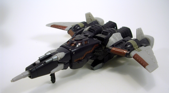
On to the lightcycle. The packaging on this piece is really nice and at the risk of repeating myself, I love seeing the neon Tron logo branded on a toy package again. The box is far bigger than it needs to be, but that’s in order to accomodate a viewmaster-type hologram gimmick. It was almost cool enough to get me to keep the package, but the jagged edges made it too frustrating for me to open it carefully and I wound up shredding it to pieces to get at my toy. But seriously, look at the picture and realize that everything in the package is in that little window area, which only takes up like 30 percent of the entire package. Why am I going on about this? I don’t know. Spin Master either really cares about presentation or isn’t very savvy when it comes to curtailing production costs.

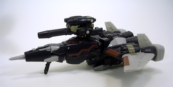
One of the confusing things about this toy is the figure. It looks like it’s sculpted onto the Lightcycle and yet the package proclaims that the Cycle works with the 3 3/4″ Core Figures. The answer is that the figure on the Cycle is a pre-posed stand-in, which is a really nice bonus, because you don’t really have to buy the separate Sam figure if you aren’t commiting yourself to the line and just want the Lightcycle. The figure doesn’t have the same sculpted details or paint apps as the carded figure, but he looks fine on the Cycle. He also has the Cycle helmet head that you’ll need to swap out with your Core Sam Flynn if you want to put him on the vehicle.

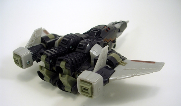
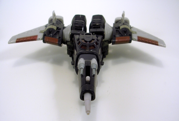
The Cycle itself is really awesome. I love the new design and the toy captures it perfectly. It features three articulated airbrakes on the back and it rolls along nicely and turns the little engine piece in the center of the bike as it rolls. The figure is tough to get out, but once you do, you can pop off his head and swap it with your Sam Flynn head and than put him on the bike for an even better looking setup. Like I said earlier, it’s not necessary to display the piece, but the Core figure does look marginally better on the bike than the included figure. Plus it gives me an opportunity to get rid of my Sam figure’s shitty head.

The lighting and sound effects on the Cycle are extremely well done. The lighting is around the edge of both wheels and the center engine window. You can activate the lights and sound by pressing in the button on the side, or by rolling it along a smooth surface. I believe the design of the cycle is supposed to activate the Core figure’s lights when you plug him in, but this feature doesn’t really work well, but that’s ok, since his chest lights are hard to see when he’s on the Lightcycle anyway.

I picked up the Sam figure for $7.99 and the Lightcycle was $19.99. I think both are pretty fairly priced. Eight bucks is about what most 3 3/4″ figures sell for these days, and these have added lights, so it’s hard to complain about the cost of the figures. The fact that the Lightcycle comes with a stand-in figure and excellent lights and sound also makes it seem like a pretty good deal, especially with the flashy presentation of the packaging. Ultimately, I was concerned about the quality control of these toys, but now that I have them, I’m overall pretty impressed, Sam Flynn’s head notwithstanding. I’ll definitely be picking up some more toys in this line. I’m really hoping this line sells well enough to produce another wave of figures so I can get my hands on Olivia Wilde more great Tron figures!

Transformers Universe 2.0: Targetmaster Cyclonus with Nightstick by Hasbro

It’s Friday, and that means it’s Transformers Classics week is just about up. I’ve got time to throw in one more figure before calling it quits so let’s take a look at the only Targetmaster to be released in the line so far: Cyclonus with Nightstick. He’s definitely a figure that needed an update badly as the original toy was pretty rough, at least in his robot mode. He was one of those new designs from the 86 movie with a rounder, more organic look that just could not be done justice in the old toy line. I know I had plenty of fun playing with him as a kid, but now it’s tough to look back at his original toy without cringing. How did the Universe 2.0 version treat us? Let’s find out…

tfucyc11

tfucyc12

Cyclonus came carded in his space cruiser mode, so let’s start there. The roots of the ship design are certainly on display here, but it’s clear that a lot of sacrifices had to be made in order to help the transformation along. It’s not quite as sleek as the original toy design. You get a lot of disjointed hinging and segmentation and that retracting nose cone is particularly unsightly. The back half of the body doesn’t lock together and when viewed from the back it’s just downright f’ugly. That all having been said, I think they did the best with what they had, and if sacrifices had to be made, I’m glad they did it in the alt mode and not the robot mode. On the upside, Cyclonus has a hinged set of front landing gear and a socket in the top so you can plug in Nightstick and give him some extra firepower.

tfucyc14

tfucyc13

The conversion process is pretty simple and yet very clever. I really like the way the entire nosecone assembly folds away into the torso. The engineering in the legs is very cool as well. He’s lots of fun to transform and not at all overly complicated.

tfucyc9

tfucyc8

In contrast to the alt mode, Cyclonus’ robot form is excellent and very close to his animated counterpart. He hits all the points of the character’s great design elements. I love that Hasbro managed to remain faithful to the sleeker and more organic contours of the 86 movie look, which is something the G1 toys could never properly replicate. On the downside, I’m not sure what Hasbro was thinking for the colors here. The blue seems way too dark and the bare grey plastic doesn’t look that great. It’s passable enough for the wings, but the unpainted face just looks cheap and unfinished. That’s a shame because the sculpt of the portrait is great and the light piping in the eyes is particularly effective.

tfucyc10

Cyclonus has all the articulation you could want in an action figure. His head rotates. His arms rotate at the shoulder, have some lateral movement in the biceps, as well as hinged and swivel elbows. His legs are ball jointed at the hips, hinged at the knees and ankles and have swivels in the biceps. One of the greatest things about these updates is that we finally get these characters as fully realized action figures and Cyclonus sure is fun to pose and mess around with.

tfucyc3

tfucyc7

Nightstick is Cyclonus’ little Nebulon buddy who transforms into a gun/cannon. I loved this idea back in the day and I’m happy to see Hasbro begin including these in the retro-line. It’s a pretty simple transformation, but his robot form looks pretty good for a guy this size. His articulation is actually pretty good too, even if most of it is just there to accomodate his transformation. For some reason, Cyclonus only has a peg hole in his right hand.

tfucyc6

tfucyc5

tfucyc4

Remember what I said about Astrotrain? Well it applies here too. If you don’t have Cyclonus and are looking to pick him up, spend the extra money and get the Henkei version. The colors are excellent and a toy this good really deserves the better paint job, than the unfinished grey parts on this Hasbro version. He’s not as bad a color variation as Astrotrain, though, so that’s saying something. You could also check out the Rodimus and Cyclonus two-pack that Hasbro did as it’s intended to be more a more cartoon accurate deco. Either way, Cyclonus is one of my favorite of all the Classics inspired figures. He looks amazing, has great articulation and is so much fun to play around with. If you don’t have him, get him.

tfucyc1

tfucyc2

And that wraps it up for Transformers Classics week. I didn’t quite get to all the figures I wanted to get to, but I had a pretty good run at it. I was considering extending through to Saturday just to get a few more posts in, but I’ve got other toys piling up, [Some of which are more Transformers… yay! -FF] so I’m going to just move on and revisit the ones I missed at some point in the coming weeks.

Transformers Classics: Grimlock by Hasbro

No doubt top on the list of many a fan’s wishlist for the Classics line was Grimlock. Hasbro did right by us all by getting him out of the way sooner rather than later. Afterall, considering how insanely popular he is among the fandom, Grimlock and the Dinobots haven’t gotten a lot of love throughout the years. [No, the Universe Dinobots don’t count, because true Dinobots shouldn’t look like real dinosaurs, they should look like robot dinosaurs. -FF] So, I wanted to make sure I gave Grimlock here his props during Classics Week.

Me, Grimlock think me should have been biggerer.

Yeah, I agree. Generations seems to be shunning the larger sized toys in favor of being a Deluxe Class only property [I’m still unclear whether Grapple will be in Generations or Hunt for the Decepticons packaging -FF], but back in the days of Classics and Universe 2.0, we did get some of the larger size toys. I really think Grimlock would have made a great Voyager Class. It’s not that I think the sculpt or the aesthetics of the figure would have been that much improved, but he should have been able to stand at least as tall as Optimus Prime.

That having been said, I think Hasbro did an amazing job upgrading Grimlock’s dino mode. There’s a little more rounding to the sculpt, but not enough to give him too much of an organic look. The head is awesome and the mouth opens up nice and wide so he can chomp on Decepticon fools or eat Minicons like popcorn. There’s also a ton of sculpted panel lines and other details all over his body. The biggest departure here from his original mode is the back-mounted missile launcher, which can be taken off if you’d like a more old-school look. The colors are excellent and faithful to the original. He looks like he has some wash over his primary grey color and the gold is great looking. The amount of articulation in the tail alone is pretty respecable too. Grimlock’s dino mode is just a great looking and really fun toy.

Transforming Grimlock is surprisingly different than his original version, and I’m wondering if Hasbro did the figure a disservice by over complicating things, or inexplicably trying to get away from the old style conversion. Normally, I wouldn’t care, but it effects the design of the figure with the head splitting apart to become the feet. I think that by keeping the original style of conversion, [Which was subsequently used for the Animated Grimlock. -FF], would have resulted in a much better homage to the G1 toy. How about it, Grimlock?

Me, Grimlock have teeth for toes! Why? Why have teeth for toes?

I have no idea, Grimlock. The new conversion just seems needlessly complex and fidgity, but it goes pretty quick if you know what you’r doing. Unfortunately, it also results in removing the tail, which the figure can hold as some kind of sword/bludgeon weapon. I absolutely hate when parts are removed from Transformers to make them work and then turned into shitty afterthought weapons to make it seem like a good idea.

Me, Grimlock not like holding own ass.

Nobody does, Grimlock. So let’s cast the tail aside and look at the figure. It’s not bad. It definitely shares some design elements with the original toy and the animated, but it also deviates a bit too much for my taste. The gold chest is nice effort, but that huge red orb in his chest was a strange choice. I already commented on the head splitting into the feet. If it were any other figure, it would be fine, but I don’t like it on my G1 inspired Grimlock. The shoulders suffer from the same backward assembly as my Ironhide and Ratchet, showing off the ugly screws. The head sculpt is excellent, though, and the light piping works really well on this figure.

His articulation is good, with rotating shoulders that have some lateral movement and hinged elbows. His head turns, but is very tight on my figure. His hips are ball jointed and his knees are hinged. You can get some decent poses out of him.

Honestly, I wish Hasbro had taken a different route with this figure and stuck more with the original look. They could have kept the original transformation while still adding articulation and updating the sculpt and I would have been much happier. On the other hand, he’s a really nice looking and fun figure on his own right. He’s definitely worth hunting down and buying, especially since this character hasn’t really received his due over the years.

Transformers Universe 2.0 Ironhide and Ratchet by Hasbro

Even as a wee G1 lad, it was tough to wrap my head around what the hell was going on with Ironhide and Ratchet’s robot modes. I can remember seeing these guys on the shelves and wanting them so bad because I loved the characters so much. But then there were those pictures on the box. Could the figures really look like that? How is that possible? Is that really supposed to be their faces? I was never about to risk a chance to get a new Transformer on such a gamble, but one Christmas, my uncle got my the pair of them, and so I finally found out for myself that yes, these guys were all sorts of jacked up.

So, needless to say a lot of us have been waiting for these figures to get a proper update in the G1 style for a very long time. It took Universe 2.0 to do what seemed to be not such a big deal: Turn a van SUV into a decent robot. After all, Hasbro has been able to make passable Transformers out of motorcycles, a biplane, and even a goddamn toaster. How hard could it be to get these guys right? Well, the U2.0 releases come a lot close to getting the job done. These figures still have numerous issues, and I definitely think Hasbro could have done better. Let’s see what we got…

Ironhide and Ratchet are both the exact same figure, save for different head sculpts and coloring, so I’m going to start with Ironhide and then just cover the differences seen in Ratchet.

Ok, so Ironhide isn’t quite a van, he’s more of an SUV. That’s close enough to me and this alt form would be awesome, if it weren’t for the web of cracks and seams running all over his broadsides or a few other noteworthy problems. Ok, this alt form could never have been awesome. The seaming is unsightly as all hell and makes me reconsider my disdain for shell-former designs. I also don’t like the mix between clear windows and painted ones, it looks terrible. Some nice touches include the rambar on the front and “OREGON” on the rear license plate. The original G1 Ironhide figure had a great van mode and horrible robot mode, here we have the reverse. I guess we can’t have both.

Transforming Ironhide is a bitch and a half. There’s a lot of stuff you have to pack into his torso and just about every time I convert him, I’m afraid I’m going to break something. I also find it impossible to convert him without him pulling apart into two halves, so I just consider that part of the transformation, it’s just easier that way.

Ironhide’s robot mode is a mixed bag to say the least. The best thing about him is that he’s finally a humanoid. His head sculpt is also very G1 accurate. I know some don’t dig the powder blue face paint, but it doesn’t really bother me at all. The plate that moves up behind his windshield chest is a brilliant little gimmick and looks great. It feature excellent sculpting and an Autobot insignia. Ironhide is also a pretty stable figure that stands and poses well. So what’s the bad stuff? His shoulders are backwards and show off his unsightly screws. There’s also a problem with his transformation that causes his head to be looking down. There’s apparently a way to fix this by taking the figure apart, but it hasn’t bothered me enough to try. There isn’t a lot of paintwork on this figure, he’s mostly red with some black and grey, but that’s how he should be.

So, let’s take a quick look at Ratchet. The only structural difference in his ambulance mode is the lightbar stuck on top, all the other changes are found in the color scheme. The white and red works really well and I don’t mind the painted windows quite as much on Ratchet as I did with Ironhide. The seaming is still ugly as hell, though. If the license plate reads “H3L PU2” which I can only come away with as meaning Help You Too or perhaps it’s a plea to support Bono. I don’t know.

In robot mode, we see that Ratchet has a nice new head sculpt, which again is a very good likeness of the G1 character. Like Ironhide, Ratchet has the same plate that comes up behind his windshield chest, this time painted black but with the same Autobot insignia. He unfortunately suffers from the same reversed shoulder pieces, showing off his awesome unfinished screws. Apart from that, his deco works really nicely. I’m not a big fan of figures molded in white plastic, but Ratchet seems to be an exception. He just pops.

Both figures have weapons that can store underneith their SUV modes, between their rear wheels. These weaposn can be converted into a gatling gun looking weapon or a small bladed energon dagger.

Despite the shitty vehicle modes and a bunch of issues with the robot modes, I still can’t bring myself to dislike these figures. Granted, they spend ZERO time displayed in their alt forms. I’m just happy enough to have G1 versions of the characters in somewhat decent robot modes. If you’re fans of these characters or are looking to complete your updated Autobot ranks, I defintely recommend picking them up. If you don’t give a crap about Ironhide and Ratchet, than I would definitely skip this pair.

Transformers Universe 2.0: Rodimus Prime by Hasbro

I am not a big fan of Rodimus Prime. Hot Rod was ok. Every kids series needs a young, cocky, hell-for-leather guy that the kids can relate to as he learns life’s lessons about being responsible. Rodimus, on the other hand, was just a whiney douchebag who didn’t deserve to lead the Autobots. I mean, seriously, Matrix, you got Ultra Magnus standing there, who’s name alone should qualify him for the job[Not to mention he’s Robert F*cking Stack!! -FF] but instead we give it to the kid. The figure, on the other hand, has always been pretty cool, so let’s see how Rodimus fared in his Universe 2.0 update…


Roddy’s vehicle mode is as close to perfect as I could hope to see. Yeah, he doesn’t have his trailer, but he’s a Deluxe, so I wasn’t expecting it. The colors are perfect and the flame decos are beautifully applied. Very sharp and nice looking. The silver on the engine, wheels and side piping really looks great. I also love that his windshield is translucent. It looks much better than if it were painted. Rodimus’ gun stores under him, between his back wheels. You can plug his flame missile in to make it look like he’s spewing fire out of his exhaust. Nice. The vehicle holds together beautifully and rolls along really well.

In robot form, Rodimus looks mighty good. His design is very close to the original G1 character and the colors are still pretty much spot on perfect. The flames on his chest are applied with precision, as is the paint on his face. The light piping is also really effective on this figure giving him nice glowy blue eyes. So, yeah he looks great, but, there are a bunch of little issues that nag me about this guy. The sculpted engine piece on his chest runs up a little too high and obscures the bottom of his face a bit. I’m not sure if this is making the head look too small, but it does seem smaller than it should be.

I also have some issues with his articulation. The head rotates. His shoulders roate, and offer a very little bit of lateral movement. I absolutely HATE his elbow joints, which are just hinged on the end and look terrible. His legs at the hips have universal movement, but the plates that hang off his hips interfere with these joints a lot. Finally, his knees and ankles are hinged. You can definitely get Rodimus into some nice poses, but a little better design would have gone a long way with improving his articulation.

I think the reason I am so picky about this figure is because it really is so close to being perfect in a lot of ways. The headsculpt is almost perfect, but it needs to be bigger. The articulation is good, but the elbow joints are an abomination. It seems like almost every up has a down. Still, he’s a fine figure and well worth picking up, even if you’re like me and aren’t a fan of the character. Afterall, Galvatron needs somebody to kick around.

Transformers Universe 2.0: Galvatron by Hasbro

When I first saw pictures of U2.0 Galvatron, I thought he was going to be a Voyager Class figure. The detail of the sculpt and the complexity of the figure looked way too over the top to be a Deluxe. When he finally came out, I was kind of disappointed. If Optimus Prime and Megsy could get Voyager Class toys, why not Galvatron? Ah, but he was afterall in the same scale as Rodimus, so I tried to get over it. Unfortunately, I was still left with a Deluxe sized figure with Voyager sized complexity and a whole host of issues. The fact remains that this figure may be way too complex and fidgity for it’s own good. Let’s take a look…

tfugalv7

tfugalv10

Galvatron’s new alt form is a tank, and I LOVE it. Call it sacriledge, but I really liked the original G1 Galvatron’s alt mode, but then I was never a fan of that figure in any way, shape or form. Sure, the tank has been the go-to form for Megatron in the past, so there’s not a lot of originality at work here, but like Megatron, the alt form suits this guy very well. As I’ve already mentioned, the sculpt is highly detailed, with nice little touches like missiles on the sides, ventilation ports and even tiny molded gas tank hatches. There’s a little missile pod hanging off the back of the turret, and the cannon looks a lot like the G1 Galvy’s awesome translucent yellow gun. Yeah, baby, you know where that’s going when he’s all transformed! The tank is very solid, holds together quite well, and rolls along nicely on wheels concealed under the faux sculpted treads. The turret turns 360 degrees, but the gun doesn’t elevate. The coloring is mostly grey with silver accents, which is great. There are some unsightly neon orange bits, which are pretty unfortunate, but not enough to ruin the mode. Lastly, you get some cool military style stencils on the sides of the cannon that read, “GALV 25.” Yup, this figure may have its share of problems, but this alt mode ain’t one of them.

tfugalv9
No, the problems start with the tranformation. Tranforming Galvatron into his robot mode is a total bitch, although getting him back into tank mode is even worse. If you aren’t methodical about it, you can be left with a big floppy mess of dangling parts. He’s also very prone to ball joint popping, which really doesn’t help the frustration factor. The left arm on my figure will not stay on for love or money. It usually pulls off just when I’m posing him, so you can imagine how many times it drops off when I’m wrestling with the transformation. I’ve learned to just pull it off and leave it off until I’m done with the conversion. His lower legs also have a habit of popping off too. Sheesh! Could any figure be worth all this madness?
tfugalv1
tfugalv2
Um… sort of? I actually do like Galvatron’s robot mode a lot, so long as I’m just admiring him on the shelf and not touching him. But that’s not to say he doesn’t have some poor design elements working against him. The hinged backpack for example, which I’ve heard is packed with parts for a vistigial third mode that was never declared as official, doesn’t really lock into place. You can try to compact it down and get it out of the way, but it ultimately winds up flopping all over the place. His arm cannon looks great, but the way it’s postioned on his arm obscures the shoulder joint. The color scheme, mostly grey and purple with some pretty silver accents would be perfect if it weren’t for those ugly neon orange parts. Seriously, why is that color even in the mix, Hasbro? Now, with all that having been said, I still can’t bring myself to hate on it too badly. The head sculpt alone is victory.
tfugalv5
tfugalv4Galvatron’s articulation is decent, but once again the design causes some problems. He has a ball jointed neck. His left arm has a ball jointed shoulder and a double hinged elbow. His gun arm rotates at the shoulder, but you can’t get much lateral movement out of it. There’s also a hinge on the elbow. His legs rotate at the hips, as well as move laterally and he has hinged knees. Galvatron can also pivot at the waist.

tfugalv3

tfugalv6

There’s no doubt about it, this figure is not for everyone. I know a lot of people that hate him. Hell, I think most collectors hate him. Even I was less than impressed with him when I first got him, but ultimately there’s enough for me to like here that I can look past the problems. He’s not a terribly fun figure to play with, he’s a chore to transform, and quite frankly an update to a character as important as Galvatron deserved so much better than what we got here. I wouldn’t recommend him if you’re easily frustrated or if any of the things I describe bother you, but I am really glad to have him in my collection. And yeah, I still wish he were a Voyager Class.