Batman (1989): Batwing and Batman (Batman Returns) by Spinmaster

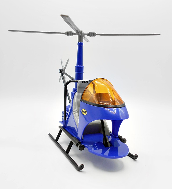
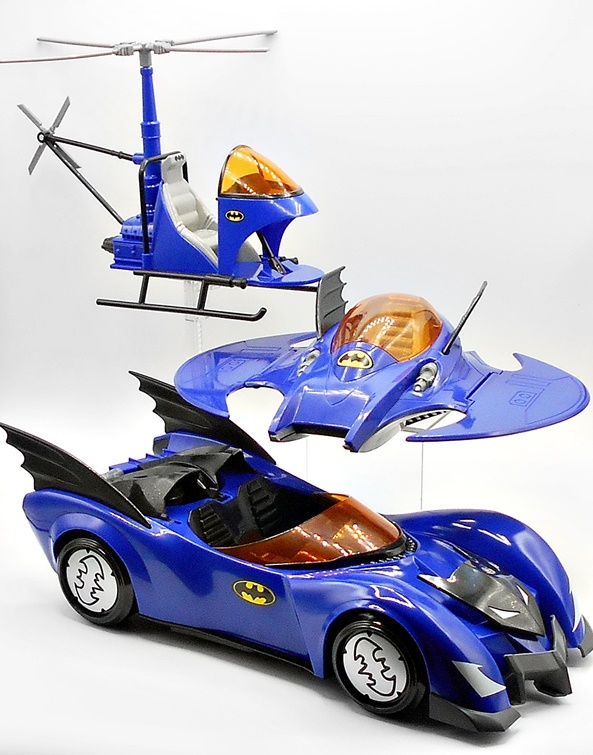
A little while ago Spinmaster put out a 4-inch Batwing and Batman figure for The Flash movie. I picked it up, but never got around to reviewing it. It was OK, but overall kind of underwhelming. Then again, I also picked up the massive McFarlane one and never looked at that one here either, and it is freaking awesome! Anyway, fast forward to now and Spinmaster is still cranking out some assorted Batman toys in a rather hodge-podge mixed bag of a line. And if you want an example of this kind of craziness, look no further than today’s spotlight..

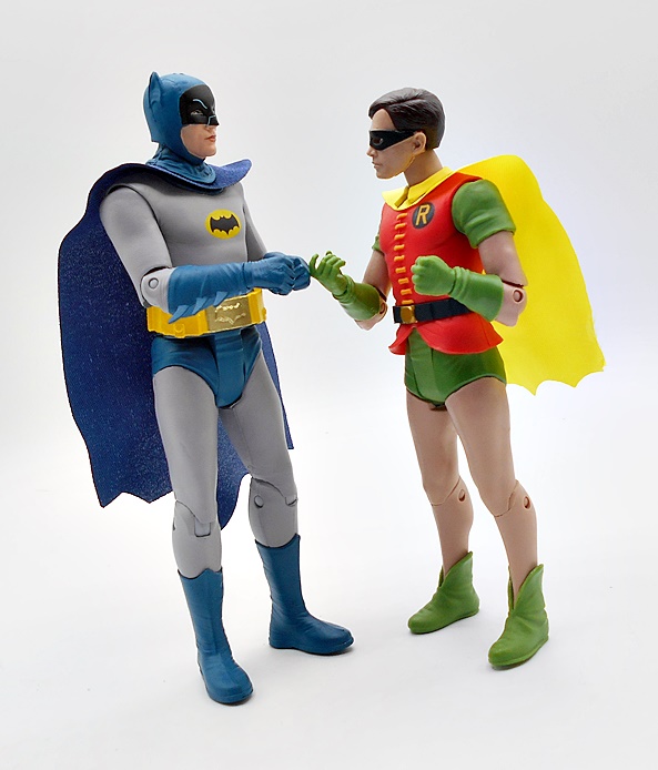
Yes, folks, this is the Batwing from the 1989 movie bundled with a Batman figure from the 1992 Batman Returns film and WHAT??? Why? What is going on over at Spinmaster? Why would you bundle a vehicle from one film and a figure from the next? Now, if I’m being honest, they probably could have just called the figure 1989 Batman and I wouldn’t have known the difference, but they didn’t and it’s all very, very weird. It’s got to be something to do with licensing rights. Like maybe they can do vehicles from the 89 film but not a 4-inch figure? Whatever the case, the goods come in a fully enclosed box and it’s really pretty ugly, so let’s not dwell on it. We’ll start with the figure.

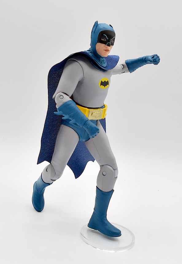
Yeah, this is nothing special, but I would fall short of calling it terrible. It’s not a figure that would hold up if sold on the pegs by itself, although I believe Spinmaster is selling single carded figures like this right now. You get minimal detail and some yellow paint on the belt and chest emblem. I will say that I can definitely see a little Keaton in that head sculpt, so that’s something. The eyes are pretty well done, but the ears are way too chonky. They went with a softgoods cape, which was smart because he’s got to go in the Batwing, but there’s very little effort here. It’s just a strip of black cloth that’s scalloped at the bottom and has a bewildering giant hole in the back. The whole thing is way too narrow, as it won’t even wrap around his shoulders like it should.

The articulation is decent. There’s a ball joint in the neck, ball joints in the hips, and rotating hinges in the shoulders, elbows and knees. Heck, there are even thigh swivels. Still, nothing in the waist, wrists, or ankles. I’ll give Spinmaster props for giving him more articulation than he needed, as a simple 5-POA figure would have been fine to slide into the cockpit. As a kid, I would probably have had a blast carrying a figure like this around in my pocket all day, but as a collector it’s not really noteworthy other than to have him pilot the Batwing. Also, there’s the whole Batman Returns angle. I realize there are differences in the suits used between the two films, but if you handed me this figure out of the blue, I couldn’t tell you which of the two films he came from, so yeah I’m still thinking it was a licensing issue. Let’s move on to the Batwing!

So, I was kind of expecting something similar to their Batwing from The Flash, and there are some similarities, but also some marked improvements. Some of that has to do with differences in the vehicle design, but I also think Spinmaster put a little more effort into this one as well. They are definitely two distinct molds, so that’s good. They are both made of the same lightweight plastic, and that’s not so great. I don’t know how to describe the plastic, other than it feels soft and cheap, but not flimsy or delicate. It does have a matte finish, which is appropriate and despite being soft, it holds the cut panel lines pretty well. The undercarriage is hollow around the wings, but you do get some more panel lines to help it look a bit more finished. Meanwhile, the body has three flip down landing gear.

There’s more in the way of paint apps here than on The Flash Batwing, but they’re still used pretty sparingly. You get some silver and yellow hits on the wings and body. The most notable is the red and silver paint on the missiles peeking out on each side of the cockpit. All in all, I’d say it’s a good looking toy based on a truly cool looking and iconic design and sparse use of paint apps is appropriate to the look of the vehicle.

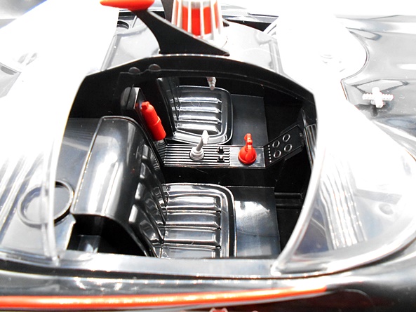
The clear cockpit is hinged at the back and the figure fits into the cockpit easily and I’d say the scale isn’t too bad for a toy like this. The dashboard detail is achieved with a sticker, but you do get some sculpted controls in the arms of the seat. I also dig the beveling in the cockpit that actually makes it look like it has some silver paint on the edges, when it really doesn’t. A flight stand would have been cool so that I don’t have to balance it on a glass. But considering the price point, I can understand why one wasn’t included.

And here’s a quick couple of shots comparing Spinmasters’ The Flash and ’89 Batwings. The wing design on The Flash toy makes it look a bit bigger and definitely more aggressive, but I still dig the older design a lot more. The cockpit is also better designed in the ’89 version as The Flash version has him kind of laying in there. And obviously the ’89 version is scaled better as The Flash Batwing wasn’t a single-person craft.

The big appeal here is the price, as you can’t really find a lot of cool vehicles bundled with an action figure at $19.99 these days. And this one is still available at places like Amazon. I’ve wanted an 89 Batwing in my collection for a while, and this one fits the bill. There’s certainly stuff to nitpick here, like the wings being hollow underneath and the lightweight plastic, but it’s still a fairly rugged toy and it looks pretty damn nice displayed on the shelf. Your other option would be hunting down a vintage Toy Biz version, and if I’m being honest, I think this one looks better, and it’ll certainly cost you a lot less. I haven’t seen this one at any stores, but definitely worth picking up if you aren’t too particular.

Batman (1966 Retro Series): Joker, Penguin & Riddler by McFarlane

Late last year I started digging into McFarlane’s Retro 66 Batman line by checking out Boxing Batman and Riddler, as well as The Dynamic Duo and The Batmobile. And since then, I’ve let this line fall to the wayside and it’s long past time I get back to looking at some of these figures again. I’ve waxed nostalgic in those previous reviews with my love for the TV series, so I won’t go through it again here. I would imagine that people who didn’t grow up with it don’t know quite what to make of it’s goofiness. You kind of just had to be there. Nonetheless, I’ve been sitting on a lot of these figures and vehicles for a while, so today I’m going to serve up a look at a triple trifecta of terrors in the form of Joker, The Penguin, and The Riddler!

As we saw last time, these figures come on colorful generic cardbacks with bubbles that showcase each figure quite nicely. Beside the figures are the accessories, which in this case all amount to just the fighting exposition balloons that you can clip onto their wrists. I don’t hate these, but I would have rather we got something else in terms of accessories. We certainly didn’t need them with every damn figure. Either way, take a good look because we’ve already seen what these are all about and I won’t be showcasing them much in the review. These packages are not collector friendly, so let’s get to tearing. I’ll start with Joker, move on to Penguin, and I’ll just touch on Riddler a little bit since I already checked out the Boxing version. Also, I’ll be staging these figures in McFarlane’s Villains Lair playset, which I may or may not come back to review in the future.

Cesar Romero will always be the first person that comes to mind when I think about The Joker, although I can happily acknowledge that we’ve certainly had some great versions and performances since. Here, Joker comes wearing his rather iconic pink suit. There’s some nice layering here to the sculpt with the jacket and waist coat worn over the sculpted green shirt and cravat. I also love how the coat tails hang down the back in the old-timey style. There’s some sculpted detail in the jacket, including lapels, a chest pocket, and buttons, but only the buttons on the waist coat are painted black. He’s got black shoes and the gloves are painted purple and feature some decent detail to the stitching.

The head sculpt is excellent and sports a solid likeness of Romero. My only nitpick is that they didn’t sculpt his mustache, which they used to just paint over with the clown makeup, but that’s a minor thing. The green hair is sculpted separately from the head, giving it an immaculate hairline. I love that they sculpted him in the middle of an open mouth laugh, and the printing for the makeup, eyes, and eyebrows is all sharp. McFarlane isn’t always known for great likenesses, but they definitely nailed it here.

The retro-style nature of these figures comes in the limited articulation, but that’s not to say it’s simple 5-POA. You actually get rotating hinges in the knees, shoulders, elbows, and wrists, a swivel in the waist and a ball joint in the neck. The most archaic and limiting thing here is the T-crotch, which offers no lateral movement, and the complete lack of articulation in the ankles. It’s also worth noting that Joker’s coat tails keep him from sitting down. There’s still fun to be had with here, but the limitations can be frustrating, especially if you’re used to McFarlane’s DC Multiverse offerings. And if you want to pose them in anything like an action pose, stands are recommended.

Need I say it? When I think about The Penguin, the image in my mind will always be Burgess Meredith. You have to understand that I was almost 20 years old by the time anyone else had portrayed these villainous roles as live action characters. And talk about perfect casting, Burgess was a master at his craft in being over the top sinister. Here he is sculpted in his tuxedo with an open coat and a white, untucked shirt. He’s got white spats sculpted onto his black shoes and white gloves. The outfit is rounded out by a pink bow tie. Because bow ties are cool… QUACK! The sculpted details on his white shirt are pretty soft, but it is textured, so that’s something. They got his portly dimensions down perfectly too.

As for the head sculpt, this isn’t the slam dunk that we got with The Joker, but it’s still very good. The paint and facial printing is decent and I like that the monocle is a separate piece of clear plastic attached over the eye. The smile looks good, and yes, it’s a shame we couldn’t get his cigarette holder poking out of there, but I’m guessing that was prohibited by Warner Bros. The purple top hat is sculpted separately from the head and permanently attached.

The articulation is the same as we saw with The Joker, but for some reason Penguin doesn’t have peg holes in his feet, so that’s annoying. And he’s another character with coat tails, so he can’t sit down. McFarlane really should have considered that when they put out a playset for these figures that centered around a table and chairs! Also, it’s pretty unforgivable that he didn’t come with his umbrella. How do you release The Penguin without his umbrella??? They did include one in the Villains Lair playset, and I’ve included that with the figure in the above shot. Neither of his hands are sculpted to hold it, but you can hook it around his wrist.

Finally, three’s Frank Gorshin as The Riddler, and yup… he’ll always be MY Riddler, but he hasn’t exactly had a lot of competition since. This is essentially the same figure we saw as a Boxing variant, only sans the sculpted trunks and boxing gloves. The rest of the costume is identical and looks good. I liked when Riddler wore the suit and bowler hat, but I think this tended to be the more iconic look for him in the show. The question marks are crisply printed against the green body suit, and I love that they sculpted his loafers. He does have peg holes in the feet and since there’s no coat tails, he can actually sit down… finally someone can!

This is definitely the weakest head sculpt of the three. It’s a passable likeness, but the sculpt is rather soft and it’s not a terribly iconic expression. The hair is sculpted as part of the head, but the mask is separate, so that adds some nice depth to the portrait there. Maybe part of the problem here is that Gorshin doesn’t have as many over the top characteristics to pin the sculpt to, but in the end I think it’s serviceable for the scope and price point of line.

These figures retailed for about $17.99 each, which isn’t bad for the scale and quality, and I think most of them have been reissued since the original releases. In my experience these could be tough to find in the wild, because the pegs were often clogged up with some of the less desirable variants. I really enjoy these figures and I respect the commitment that McFarlane has made to keeping this line going. It’s undoubtedly a niche market, being retro-style figures based off a show from the 1960’s and that makes it all the more impressive that the line has been so expansive. Obviously, these aren’t going to be everyone’s cup of tea, but I’m thrilled to have these villains on my shelf and inhabiting their lair. But we’re not done with the villainy yet. Next week I’ll be back with four more baddies to join the cabal. Same Bat Time, Same Bat Channel!

DC Multiverse (Plastic Man Wave): Superman, Batman & Plastic Man by McFarlane

We started this week with the DC Multiverse Plastic Man Wave, so we might as well finish with it too. If you’re just joining me, feel free to click on back to Monday to get caught up, otherwise we have two more figures to check out and then we can cobble together the Collect-To-Build Plastic Man and put this whole wave to bed. Let’s go…

As I mentioned last time, this assortment is supposed to be JLA inspired, but it’s pretty inconsistent on that front. Aquaman was a perfect fit, but John Stewart didn’t belong here, and we’re kind of going to have a similar issue today, but I’m getting ahead of myself. The figures come in the usual big window boxes and while I love these packages, I don’t have the room to keep them, so they get recycled. And that’s just as well since you have to rip apart that beautiful blue backing to get at the figure stand and collector card anyway. As for the Collect-To-Build figure, we got the regular arms and legs with the last two figures, and this time we’re getting Plastic Man’s torso, two heads, and some extra arms. Let’s start with Superman!

I can’t say I was the biggest fan of the stories involving Superman divided into his Red and Blue suits, but I do think these make for some beautiful action figures, and that is certainly the case here. Supes’ blue energy suit is achieved entirely through paint and colored plastic, as this is just a generic figure buck, but boy does the deco really sell this one! The electric blue plastic is so vibrant and when you mix it with the super bright white paint and jagged S-shields, both front and back, you get a figure that can really demand attention on the shelf, even without any unique sculpting on the body. The paint lines are nice and sharp and you get the outer pins painted as they should be, which may sound like a strange thing to point out, but it’s something Hasbro often doesn’t get right in Marvel Legends.

The head sculpt is superb. I thought this one might be re-sculpted from Firestorm, but I haven’t opened him yet to really check. His skin is painted a paler blue than the suit with a shock of electric blue hair up top. The face has some wonderfully defined features, with the white cowl shaping the edges and accentuating his cheek bones, and a slight wrinkle to the brow. The white, pupil-less eyes give him an otherworldly visage. The eyebrows are neatly painted and there’s a slightly darker shade of blue for the lips. So far, this wave is definitely three out of three when it comes to the portraits.

There’s no surprises in the articulation and you only get the single pair of hands, both balled up into fists as they should be. You do, however, get four electric effect parts which are designed to attach to the figure’s limbs. I’m pretty sure these are recycled, perhaps from one of The Flash figures, only recast in translucent white plastic. I wouldn’t say these were necessary, but I think they’re a good inclusion and look very nice on the figure. So many of my effect parts wind up in a bin, but I may actually display these on the figure.

I missed out on Mattel’s DC Universe Classics version of this Superman, and while that’s bugged me for a while, I’m OK with it now. I just like the look of this one so much better. A flight stand would have been a nice inclusion but I don’t think we tend to get those in Collect-To-Build Waves. I’ll also point out how odd it is that the collector card doesn’t reflect this version of Superman in any way, but hey… McFarlane gonna McFarlane. And speaking of which, Todd decided to make the Red Suit counterpart a Platinum Exclusive and it’s going for crazy money on the secondary market, so thanks so much for that! Moving on to Batman…

I’m sure I wasn’t the only one disappointed to see that the JLA version of Batman included in this wave was just a straight repaint of The Three Jokers Batman. With early teased images hitting, I was hoping that we’d at least get some retooling and a new head, but nope… this is a straight repaint and that’s just crazy lazy on McFarlane’s part. And with that being said, it pains me to admit how much I dig this release. Don’t get me wrong, this really doesn’t work for me as the intended version, but I just love the way the black and brighter yellow looks on this figure. I have yet to review the previous release of this mold, but I will drop in a comparison shot at the end.

A new head sculpt would have helped, as the little bat nub ears don’t work at all and it could have used a lot less texturing on the cowl. I’m sure there’s another Bats head out there that would have worked better. But you would have to re-sculpt the arms and lower legs too, and I doubt any of that was ever on the table. I dig the sculpt on the lower half of the face, offering a very pouty and super serious caped crusader.

And to add recycled insult to repacked injury, you get the bat grapple gun that we’ve seen a bunch of times already bundled in with the figure. I feel like I have a dozen of these, but in reality probably only two or three.

I don’t hate this figure at all. I actually kind of love it, but I also don’t like the business practice behind it. It’s just a lazy way to toss a figure into the assortment with some new paint and pretend it fits the theme you’re going for. Plus, it probably means we won’t be seeing a proper JLA styled Batman in this line for a while. When you consider how this line butters its bread with Batman variants, it’s a shame McFarlane couldn’t have put some effort into this one. OK, onward to the real reason this wave had me all excited… Plastic Man!

My original love for Plastic Man didn’t come from his comic book appearances, but rather from the Ruby/Spears Plastic Man Comedy Adventure Show. Granted, Plastic Man, and his smoking hot wife Penny, was only part of the show, as it also featured segments of Mighty Man and Yukk, Fangface and Fangpuss, and Rickety Rocket. And the real treat came when it hit syndication and you got surreal intros and outros featuring a live action Plastic Man. Like Blue Energy Superman, I missed out on getting Mattel’s DC Universe Classics version of Plastic Man back in the day, so grabbing this one was a big deal for me. And for the most part, this figure definitely scratches that itch. The edges between the suit and his skin is sculpted, as are the laces, and that’s the case both on the upper body and the abs. The feet are probably new too. I’m not sure how I feel about the break in the torso for the ball joint. It definitely improves articulation, but it messes with the flow of the chest sculpt. I might have been fine with him just having a ball joint in the waist to clean that up, but either way it’s a compromise. The flesh tone looks good, as does the bright red for the suit. He’s got some yellow striping on the black belt and the black laces over his chest are pretty sharp.

You get two heads to choose from and both are full of that patented Plastic Man charm. The first one offers a big toothy grin with his trademark white rimmed goggles. The black lenses have some stylized reflections painted onto them, which looks good. The hair is sculpted separately from the rest of the head, giving him a clean hairline. I love what we got here, but I don’t love the huge gap where the neck fits into the body. What happened here? Why is the neck hole so big? It just looks weird.

The second head has a crazy curvy neck and a pretty comical scowl on Plastic Man’s plastic puss. One of his goggled eyes is popped while the other is narrowed. It’s a wonderful caricature while also showing off his plasticky skills. And lest you thought the neck hole was big to accommodate this head… nope. The base of the neck is no thicker here and that gap is still there and as distracting as ever. I honestly can’t imagine what happened there.

Plastic Man features all the usual DC Multiverse articulation. The arms and legs assemble to the body easily and they stay put just fine. You get just the one set of hands to work with his regular arms, with the right being a fist and the left a grippy hand, despite him not coming with any accessories to hold.

But you do get a pair of swap out stretch effect arms. These are pretty cool and are really what justifies him being a Collect-To-Build figure. The right arm is formed into a makeshift lasso, while the left arm is stretched out and the hand is enlarged. These are fun to mess around with, although I can’t help but wonder if we’ll see this figure released with even more limbs as a stand alone somewhere down the road.

Obviously I’m a big fan of DC Multiverse, as I have a ton of these figures, but this wave is a great example of why McFarlane gets a lot of justifiable hate. Tossing a JLA Wave out there with a mismatched Green Lantern and a straight repaint of a Batman figure that doesn’t work as the version you’re portraying just reeks of lazy cash grab. It’s even more heinous when you make them part of a Collect-To-Build wave that everyone is going to want to complete. And sure, in my case it worked, partly because I absolutely needed this Plastic Man, and partly because I still genuinely like all the figures in this wave. Call me part of the problem if you must, I wanted better, but I’m still pretty happy with what we got here.

DC Multiverse (Mr. Freeze Wave) Batgirl, Poison Ivy, and Mr. Freeze by McFarlane

As promised on Friday, I’m back to finish up with McFarlane’s send up to the 1997 schlock classic, Batman & Robin. I already checked out The Dynamic Duo, so let’s jump right in and have a look at Batgirl, Poison Ivy, and the Collect-To-Build Mr. Freeze!

The packaging is the same as what we saw last time, and standard stuff for the DC Multiverse CTB Waves. Each figure comes with a standard black disk figure stand, a collector card with a promotional image from of the character from the film, and parts to build Freeze. Batman & Robin came with Freeze’s limbs, while Ivy comes with the torso and Batgirl comes with the head, shoulders, and freeze gun. There were also some icy effect parts scattered throughout the wave. Let’s start with Batgirl!

Batgirl’s one-off appearance in these films was portrayed by Alicia Silverstone and I think I would have been a lot happier with that if they at least made her a redhead. Oh yeah, and she was Alfred’s niece for some reason. I wasn’t a fan of any of this, but she sure did look good in the suit. And I do indeed love this suit! The sculpt here is really good, but there are some minor unintentional color variances because of the different materials used. As a result some parts are glossy while others are very dull matte. The only thing about this that is off-putting is how it makes the diaper-piece stand out more than it should, otherwise I dig what we got here. The cape is sculpted exceptionally well and I love the way all the folds and rumples look in it from the back.

The head sculpt is passable, but I think it’s let down the most by the flat paintwork. Honestly, I’d have no idea who this was supposed to be without the context of the mask and suit. Like Robin, the mask is sculpted separately which makes for some clean lines between it and her face, but the same can’t be said about her collar, where there is some overspray of flesh tone on the suit. There’s also a bit of black smudging on her neck. The hair is also sculpted as a separate piece and looks good, but it does inhibit her neck articulation quite a bit and sort of just hovers over the front. It’s a far cry from what Hasbro is doing with their Legends portraits, but I think we can all agree that DC Multiverse is at it’s best with comic based portraits and not actor likenesses.

You do get the same level of articulation here as with the Dynamic Duo and I always love that this line doesn’t discriminate when it comes to poseability, unlike Hasbro’s Legends. They added a bit of chonk to Batgirl’s heels to help her be a little more stable and that helps, but she can still be a little tough to keep standing in dynamic poses, especially with the weight of the cape pulling her back. This is definitely one that will need her stand to keep her upright on my shelf. As with Batman and Robin, she comes with fists attached and no other hands. I like her a lot, but I think the other two Caped Crusaders turned out better. Moving on to Ivy..

I’ll start by tossing out an unpopular opinion bomb and stating that I’m not a big fan of Uma Thurman. Part of that is me just not liking a lot of film’s she’s been in, but also I just don’t find her to be that charismatic or appealing. With that having been said, she seemed to have a good time playing Ivy in this flick and she sure put a lot more energy into it than Silverstone did Batgirl, so I’ll give credit where it’s due. She had a bunch of different looks in the film and if I know Todd, he’ll find a way to capitalize on that, but for now we get the one that’s most like her more iconic comic appearances. She’s wearing a one piece which is beautifully sculpted out of leaves and given a nice wash to bring out the detail. The outfit also features a pair of light green sleeves, and tights that start out dark green and gradually go to black when they reach her high heeled boots. There’s some ivy sculpted onto her left leg and I think this outfit turned out looking great!

This portrait is easily the best of the wave and while that may sound like a loaded compliment, it really is just all around excellent. The bright orange hair features a really nice sculpt and the ivy half-mask over her eyes are separate sculpts giving this portrait some nice depth. The paint for the eyes and lips are also sharp and clean. This may be some of McFarlane’s best work when it comes to action figure portraiture.

And once again, we get standard DC Multiverse articulation, although the hair really gets in the way of her head movement. Her heels have less chonks than Batgirls, but she has no cape dragging her back, so it’s possible to get her to stand, but it can still be tricky so she will also be using her figure stand to stay up on my shelf. Ivy is the only figure in the wave to not have two fists, instead she has an accessory holding hand on the right and an open hand on the left. I dig that they sculpted a leaf into her open hand, that’s a cool little touch. This figure turned out great, and I wasn’t surprised to see her sell out fast at some of the online retailers that I usually frequent. And now… The Iceman Cometh…

It’s safe to say that Schwarzenegger’s Iceman is the main reason I ever re-watch this film. It’s so stupidly over the top it just screams 1966 Batman with a budget. Beyond that Arnold seems like he’s having an absolute blast and his suit and makeup are both works of art. I honestly think you’d need Hot Toys working at the top of their game to really pull off anything that comes close to this on screen glory in action figure form, but for a 7-inch entry, what we got here ain’t bad at all… but I’d fall just short of calling it great. The sculpting is excellent and there is a lot of detail packed into this suit. I also like the proportions of the body, especially the big shit-kicking boots. The head seems a little small, but it is a guy in a power suit, so it’s permissible. What’s really missing here is the paint. You get a vibrant blue on the panels that were lit in the movie, located on his lower and upper legs, biceps, and chest, but everything else is cast in silvery plastic. It has a decent finish, but would have looked so much better with some silver foil paint, or even just a wash to bring out more of that wonderful detail.

The head sculpt is very good, and the use of that translucent blue plastic for the helmet looks exquisite. It’s a shame we couldn’t get more of that effect for the lit panels on the suit. The flesh tone of the face doesn’t quite jibe with the on screen makeup, as Freeze had more of a sparkly face, but it still looks good. I will note that if you look closely, the paint on the lips doesn’t really match the sculpt of the mouth, but that’s not something that’s really obvious when viewed with the figure in hand. The shoulder pieces are cast in a softer plastic and so the silver there doesn’t look as vibrant as the rest of the suit.

The articulation here is fairly similar to a regular packaged DC Multiverse figure, although you do only get single hinges in the knees and elbows. Everything else is textbook right down to the hinges in the feet. The arms can just about do a 90-degree elbow bend, and the shoulders plates are designed to hinge up and down to allow for decent range of movement there. I initially had some problems with the legs detaching, but I don’t think they were in all the way. A little heat and pressure got them seated better and they stay put pretty well now.

Freeze comes with two accessories: A freeze gun and an ice blast effect part for it. I have absolutely no idea what happened to my effect part. I can see it in the packaged shot, but I haven’t seen it since. It’s possible one of the cats carried it off to their Treasures Den under one of the sofas. The gun sculpt is excellent and his right hand is designed to hold it perfectly, along with the foregrip for the left hand. DC seems to be giving McFarlane a little slack lately when it comes to including sci-fi themed guns. Overall, I like this figure a lot. There are certainly opportunities for improvement, and who knows? Maybe McFarlane will release him as a Gold Label with a better deco, like they did with Collect-To-Build Bane and the coat. Part of me would like to see what a Gold Label version would look like, while part of me doesn’t want to endorse that kind of scummy business practice.

Oh yeah, you also get a four other ice effect parts, which I think are meant to go on the other figures to make it look like they have been frozen. Two of these are obviously meant to go over the hands, the other two are a little more nebulous in their intent. I really need to hunt around and see what some other collectors have done with these.

And that’s the DC Multiverse Batman & Robin wave! All in all this is a nice set of figures, and I’m really glad McFarlane took a risk on these, and even happier that the risk seems to have paid off. While these have been going in and out of stock at some retailers, you can probably still assemble the wave at retail cost if you hunt around a bit. At the time I’m posting this, Amazon has them all available for just a few dollars above retail each. A lot of the Ebay listings I have seen seem to be without the Freeze parts. More than half the time I’m willing to play the waiting game on DC Multiverse, but this was one assortment I pre-ordered and I’m glad I did. I would love to see a Gold Label Ivy, repainted as one of her other outfits in the movie, and I’m hoping to see some more figures from these wacky films.

DC Multiverse (Mr. Freeze Wave) Batman and Robin by McFarlane

A lot of people sure hated the 1997 comic book extravaganza that was Batman & Robin. On one hand, it’s easy to see why. Batman just came off of two excellent grimdark films and then completely flipped the script on the third and fourth. On the other hand, it’s basically a case of “What if we did goofy 1966 style Batman with a big budget and lots of stars?” And yeah, I was all for that, so screw the haters. It’s a terrible movie on so many levels, and yet I adore it. Heck, I probably love it even more because so many people hate it. And can I say that I will forever mix up the titles of the third and fourth movies. Is it just me, or does it seem more natural to go from Batman & Robin as the film that introduces Robin and then go to Batman Forever for the next installment? Anyone else with me on that?

Normally, the idea of this film getting a toy revival would be insane, but welcome to the 2020’s where nostalgia driven adults drive toy sales and literally anything is fair game. Enter McFarlane Toys with a wave of four figures and a Collect-To-Build Schwarzenegger Freeze, and we’re in business! And much to my surprise, the collectors were on board for it and these figures sold out fast at a lot of online retailers. The wave consists of four figures, which include Batman, Robin, Batgirl, and Poison Ivy, and each contain parts for the Mr. Freeze figure. These come in your basic DC Multiverse packaging, enlarged to contain the CTB parts and each figure comes with a standard black disk stand and a trading card with a movie still of the character. Let’s start with Batman!

You know the deal: Keaton skipped out after the first two, Val Kilmer was on board for just the one, so George Clooney was hauled in to don the cowl for the 1997 film. I think he played a better Bruce Wayne than Batman, but he certainly isn’t one of this film’s biggest problems. The suit got a redesign with more black, less yellow, and the nipples are still here from Batman Forever’s first suit. Even with the Batnips, I like this suit a lot. From the chiseled abs to the sculpted bat symbol in the chest, McFarlane did a nice job bringing out the details in it. I’m not sure I ever noticed the sculpted bat shields on the front of the boots before, but they make for a nice touch. The cape flows well off the shoulders and spreads out a bit as it reaches the floor, looking full but not too obtrusive.

The portrait is solid, but not exceptional. Honestly, that could be anyone under that cowl, but with rotating actors playing the role at this point, I’m not that hung up on the likeness. I do like the way the sculpt distinguishes the holes around the eyes and where the face is painted to maintain the continuity. The ears bend in at the tips more than they should, which is probably more a side effect of them being bendy, rather than an intentional design choice. The biggest detractor here are the seams running up the sides of the head, which aren’t nearly as apparent when not punched in with the camera.

Standard McFarlane articulation is the order of the day, and while that’s mostly good, I will forever gripe about the lack of thigh swivels. The ball joints in the ankles are usually a problem for me too, but because of the all black suit, they aren’t as big of an eyesore here. Everything else is fine, and I found this figure to be lots of fun to play around with. There are no extra hands, so Batman gets by with his punchy fists and that works. So, how about that Boy Wonder?

Holy Holdovers, Batman, Christopher O’Donnell survived the shakeup and returned as Robin for the 1997 film, and he got treated to a very Nightwing inspired suit. I didn’t mind his look in Batman Forever, but I really prefer this one. A lot of it is sculpted to match Batman’s from the belt buckle to the Bat shields on the boots, but here we get a splash of color in the crimson bat symbol on the chest, which carries over to the shoulders. The cape is more understated than Batman’s with it dropping only about to the knees and giving a little swish to the left.

The head sculpt isn’t bad. I think they got his lower face down pretty well, especially the jaw structure. The eyes are let down by some very basic paint. I do love that the mask appears to be sculpted as a separate piece making for a sharp outline against his face. The hair is also separately sculpt and sports some nice detail and a clean hairline. I’ll rate this one higher than Batman’s, but they’re both fine.

Robin’s articulation is identical to his partner, making him equally as fun to play with. He also only comes with the attached fists, so no extra hands. The joints on both figures worked well straight out of the box, but I don’t usually have issues with stuck or loose joints on McFarlane’s figures, so no surprises there.

Obviously, this isn’t the first time we’ve seen this pair in plastic, as Hasbro pumped out toys for the film back in the day. But it is cool to see them getting released as more detailed and better articulated figures for the collector market. And obviously there was a market for these, with some retailers beginning to restock them, so there should be enough to go around. It will be interesting to see if McFarlane capitalizes on that with some more suits from these films. In the meantime, I’ll be stopping back on Monday to check out the second half of this wave: Poison Ivy and Batgirl, as well as the Collect-To-Build Mr. Freeze! Have a great weekend!

DC Multiverse (Atrocitus Wave) Black Lantern Superman & Batman and Collect-To-Build Atrocitus by McFarlane

As promised, I’m back for part two of my look at the Blackest Night themed wave of DC Multiverse. If you need to get caught up, I checked out Kyle Rayner and Deathstorm a couple days back. This wave has been out there for a little while, and you are likely to see some older DC Multiverse reviews turning up here from time to time as I try to get caught up on a stupidly huge backlog.

The packaging is standard DC Multiverse stuff, but the Collect-To-Build assortments come in wider boxes to accommodate the extra body parts. As always you get the figure stand and collector card sealed to the back of the cardboard tray, otherwise these window boxes are collector friendly. I’m a big fan of the Blackest Night story and was happy to collect the DC Universe Classics releases, so needless to say I’m excited to be opening these as the boxes have been lined up on my shelf for a while now. Let’s start with Superman!

As far as nightmare versions of Superman go, this one is pretty damn freaky. The black suit is covered with that basketball-style texture that’s become synonymous with modern superhero costumes these days. The silver trim against the black makes for quite the striking combo, especially since the silver paint is so shiny and vibrant. He’s got segmented bracers on his forearms and a gross necrotic yellow tint to his skin, which is followed up by sculpted veins and fissures in the arms. His cape is a shredded mess, falling off the back in several strips and looking ragged near the bottom edge. I like that the bold S-emblem on his chest is all sculpted in an extremely pronounced fashion, giving it some wonderful depth. About the only thing I don’t like here are the ball-shaped ankle joints, which break up the flow of the boots, and are left as unpainted gray plastic.

The head sculpt is fantastic, with more of the necrotic flesh and a nice bit of paint wash to bring out some of the details and create some shadows. The creases and cracks in the skin are appropriately gross, his nose is completely rotted off, and the sunken black around the red eyes look like he’s literally burned the area out with excessive use of his heat vision. A familiar hint of his trademark cowlick makes the whole visage even more unsettling. And the real winning feature here are the corn kernel teeth! This is just great stuff!

I’m passed the point of running down the articulation for this line, as it remains constant throughout. Suffice it to say, it’s pretty damn good and Supes is fun to play around with. He does not come with any accessories, and his only set of hands are balled into fists, which works for me! Next up… Batman!

Black Lantern Batman is an equally imposing bit of horror with an absolutely stellar costume sculpt. The gray suit has more of that texture sculpted throughout, as well as some seemingly purposeless straps that run from his thighs up to connect at his abs at a point. There are some pouches sculpted on his belt, and both the bat symbol and the Black Lantern Corps emblem are sculpted as well as painted, which is a wonderful touch. The silver emblem really pops on what is an otherwise muted deco. The blue boots and gloves are segmented and have jagged blades coming off of them. Ah, but what I really love here are the spikey bits growing out of his shoulders that look like partially mutated bat wings, which give him a really creepy silhouette. The rest of the cape is tattered at the edges.

The head sculpt here is OK, but it’s a big step down from Superman’s. You get the same yellowed necrotic skin showing around the lower half of the face, and the mouth is open in a perpetual scream, showing rotting teeth and some nice depth to he bat-maw. It’s creepy for sure, but nothing about this sculpt reaches the sharpness or complexity of Superman’s and the white pupils on the eyes feels like an afterthought. It’s not terrible, but this one just feels like it was sculpted and painted on a Friday afternoon.

Again, you get some solid articulation here and no accessories. His hands are both sculpted in a grasping or reaching fashion, which is pretty good for displaying him in shambling zombie-like poses. Both Bats and Supes are solid figures. Oddly enough, I’d say I like Batman’s body the best and Superman’s head sculpt the best, but either way the compliment each other really well. Now let’s build Atrocitus!

The last time I got an Atrocitus figure was twelve years ago as part of Mattel’s DC Signature Collection and that review is worth a click just to see how unbelievably shitty my photographs were back then, as opposed to average and passable now. Anyway, this Atrocitus is a straightforward build with the body, head, shoulder piece, and four limbs making up the parts. I had a ridiculously difficult time getting one of his arms to peg in before noticing that it was because the loose shoulder ring was backwards. Once I popped that out and corrected it everything went fine. I really appreciate McFarlane’s approach to doing only four figures for their Collect-To-Build stuff, but these can be a lot harder to get together than Mattel’s old line. With that having been said, Atrocitus is together and looking big, imposing, and pretty damn fine!

The black suit is textured and you get some nice sculpted panel lines in the boots and gauntlets, which can be easily overlooked in all that bright red plastic. There’s some extra glossy red paint used for the tabard that runs down his chest, and the snappy silver Red Lantern Corps emblem is sculpted as well as painted. I particularly like the way the abs piece hangs down over the pelvis to avoid that rubber diaper look that this line is known for. The black and red deco looks amazing and conspire to create a superb deco.

The head sculpt is pretty good, although the huge wall of teeth feels a little lacking. I’m not sure if it’s the paint or sculpt or both, but I feel like it could have been better. With that said, I like the texturing to the skin and the various creases and crevices in the downturned brow and the piercing golden eyes. The face is bookended by armor cheek pieces and that is surrounded by the high collar on the shoulder armor.

Despite being a big and bulky, cobbled together rage monster, Atrocitus sports all the articulation points of the regular figures and I didn’t have any problems with the limbs coming apart at the connection points. He has his right hand balled into a fist and his left hand open and kind of relaxed, which work well for posing and he’s just a whole bunch of fun.

I think this was a pretty solid wave of figures, and one where I would have easily purchased each one even if the Collect-To-Build incentive wasn’t there. Indeed, I’m hoping that we get another Blackest Night themed wave eventually or at least some more Red Lanterns, because I really loved how Mattel gave us quite a few. Granted, with Necron being a Mega Fig release, the next logical Collect-To-Build is already taken. Which reminds me, I still need to pick that one up. The MSRP on these figures is $24.99 each and at the time I’m writing this review, this wave is pretty widely available at discount. Heck, even a while back I was able to pick them up for under $20 each. I’m certainly glad I did, but I would have been just as happy getting them at full price.

Batman (1966 Retro Series): Batman & Robin and The Batmobile by McFarlane

I have so much McFarlane stuff to look at, it’s really going to have to become a semi-weekly thing next year. There’s Retro 66 Batman, DC Multiverse, Warhammer 40k… I mean, holy crap I really went ham on these lines in 2024. I already dipped into the Retro 66 Batman pool a short while ago with a look at Boxing Batman and Riddler, but today I’m going to go back to basics by checking out the Dynamic Duo and their bitchin ride. Let’s start with the figures…

I won’t gas on and on about what the 66 Batman TV Series meant to me, as I already did that in the above referenced review. I will point out that I’m looking at the re-issues of this pair, as the originals sold out a while ago and climbed to some crazy prices on the aftermarket. I actually decided to skip the line entirely because of that, but Todd got smart and made them available again. I don’t know if there’s any differences in the packaging, but it looks to be pretty much the same. The front of the cards are generic, but the back have some character specific pictures. It’s a bright and colorful presentation, just like the show, but it also kind of leans toward that deliciously cheap rack toy motif that I find irresistible and makes me want to keep them carded. And so I picked up doubles of just these two to have carded examples of the line. We’ve pretty much seen a lot of this Batman figure when I looked at the Boxer variant from the episode Ring Around The Riddler, so I’m just going to tackle both of these figures together…

McFarlane is calling these Retro figures, but they really don’t match the styling and poseability of any vintage figures that I remember. The sculpts are certainly modern and all around quite excellent, so I think the retro moniker which means they have less articulation than the DC Multiverse. But we aren’t talking 5-POA here. The arms have rotating hinges in the shoulders, single hinges in the elbows, and rotatin in the wrists. There’s an old-timey T-crotch for the hips, but you get hinges in the knees. The necks are ball jointed and you get a swivel in the waists. Really, the only thing keeping them from fully modern articulation are what’s missing in the ankles and torso, and maybe some bicep swivels.

As for styling, I think the only thing that detracts from Batman is the bulk of his utility belt, otherwise everything looks fantastic. But surprisingly, I think Robin is the real winner here. His costume just looks so damn on point with some wonderful sculpting flares like the tops of his boots and the fasteners running down the center of his tunic. Both figures have super sharp paint and the colors really pop. I think my biggest gripe with both figures are the capes are a little on the cheap side. But hey… RETRO! Throw that word into your toy line and it can explain anything away as intentional!

As for the head sculpts, both are decent, but again I think Robin comes out on top. Neither are slam dunks in terms of likeness, but I see a lot more of Burt Ward in Robin than I do Adam West in Batman. But, toss in the iconic cowl and mask and it works just fine. I think it’s the depth of sculpt on Robin that impresses me more. The way his domino mask looks like it’s actually sculpted onto the head with the eyes fully sculpted and painted behind it just looks superb. The paint doesn’t hold up quite as nicely when you punch in really close with the camera, but it looks fine in hand.

As for accessories, you get comic-style punching effects that clip onto the figure’s wrists, just like we saw with the Boxing figures. Batman comes with POW!! and KAPOW! and Robin comes with BAM! and WHAMM!! and I appreciate what they were going for here, but I would have rather had figure stands or actual accessories like batarangs, bat grapple hooks, etc. Mattel’s 66 Batman line combined these familiar comic visuals with the figure stands and that was a good idea, but it’s not like McFarlane could have copied that.

I dig these figures a lot and there’s a lot of give and take if I’m comparing them to the older Mattel line. Obviously the articulation is more limited, but I think the sculpts and coloring are either on par or in some cases better. They look so iconic together and display really well on the shelf. But how about that Batmobile…

So let me just say straightaway that McFarlane’s 66 Batmobile is a step down in every conceivable way from Mattel’s release. But to be fair Mattel’s version was an absolute gem of a toy. Even when I off-loaded most of Mattel’s 66 Batman line in one of my seasonal toy purges, I couldn’t bring myself to part with that Batmobile and the Batman & Robin (and Batgirl) figures. That does not mean that McFarlane’s is bad, but there are aspects of it that really push the whole retro toy concept and that’s found mainly in how small it scales to the figures. But I’m getting ahead of myself. The Batmobile comes in some of the absolute worst packaging I could imagine: A box that leaves the toy completely open to the elements. If you buy this in the store there are probably boogers stuck to it. People have coughed on it. And there are probably sticky gummi-worm finger prints on it. This is awful packaging and it should be outlawed by the Hague Convention on the Just and Humane Treatment of Toys. That having been said, mine came from a reputable online retailer and it arrived clean and unscathed.

The sculpt here is pretty nice, and like Mattel’s it is a big plastic shell rolling on wheels, and there’s nothing wrong with that. You get a subdued black plastic sheen on the body with the right amount of red trim and the bat emblems printed on the doors. The front and back canopy pieces are clear plastic with just a bit of frost to them and just about all the added sculpted bits to the top, like the exhaust pipes and aerials are cast in very soft rubber. It’s understandable, but there are lots of potential problems when you consider the open packaging and the possibility of them warping. Overall, the pieces on mine look fairly straight and I’m glad for that. The backside has the sculpted parachute pouches, which is a great touch, but that turbine is just itching for a flame effect part that wasn’t included.

The interior has a lot of detail, but again comes up short when compared to Mattel’s. Still, you get some detailed cushions sculpted on the seats, the Bat Fire Extinguisher and Bat Phone, both in red plastic, and some gauges and a shifter handle, as well as the handle protruding from the roof bar. This all looks pretty good.

It’s really the scale here that is such a downer. The figures are a tough fit, and they look way too big for it. The roof bar is at their shoulder line and their heads wind up just above the windscreen. So, here’s where that retro moniker really works as an all-excuses pass, because the scaling here really is pretty close to the scaling between MEGO’s vintage Batmobile and the figures in the line. And admittedly, there’s certainly some relative charm to it, especially if you’re like me and grew up playing with those toys. Honestly, the scaling here is actually a little better than what we saw with MEGO’s toys, but that’s still a pretty flimsy excuse to make an under-sized Batmobile.

In all fairness, I knew about the size thing when I bought the Batmobile. I was originally going to just use the Mattel one to display with these figures, but then I decided I was going all in with this line, so I picked it up. With a $30 MSRP, it’s almost half the price of the Mattel Batmobile, and that’s not counting for inflation on a toy that came out about eight years ago. Granted, I got my Mattel Batmobile on clearance for $22, but that was just a really lucky grab! Knowing what I was getting going in, I’m not at all sorry I picked it up, but if you do already own the Mattel version, you may want to give this one a pass! On the other hand, that toy is going for quite a bit these days so this might be a decent cheaper alternative, especially if you just want a Batmobile to display on your shelf. It’s one of those give-and-take scenerios. I am excited to see how this will look with McFarlane’s Batcave playset when I eventually get to opening it. But next time I revisit this line, we’ll check out some of Batman’s Rogue Gallery!

DC Super Powers: Whirlybat by McFarlane

McFarlane has been dishing out some great stuff with their 3 3/4-inch Super Powers line up. The retro-style figures are pretty cool, but I’ll admit it’s the addition of vehicles that really sold me on this line and made me commit. So far, I’ve checked out The Batwing, The Batmobile, and Wonder Woman’s Invisible Jet. Today I’m having a look at the latest addition to the Batcave’s garage… The Whirlybat!

Like the previous vehicles, The Whirlybat comes in a fully enclosed box with that oh-so-beautiful retro-style deco and the Super Powers logo coming at you in a burst of stars. The front of the box shows some simple artwork while the back shows the toy and some features. This one requires a fair bit of assembly as the skids, stabilizer tail, and rotor blades all have to be put together, but I was happy to see that the toy can easily come apart again if you want to store it in the box.

And here it is all assembled and looking pretty damn cool. I’m fairly certain that this is an original design by McFarlane. It’s sort of a What If the old Kenner line had a batcopter, and I think the end result is pretty convincing. It’s a single seater and a serviceable design that manages to be fun, but not as outlandish as some of the old Super Powers vehicles tended to be. Oh, I’ll get to that Supermobile eventually! The deco shares the same beautiful glossy blue plastic McFarlane used for the other Bat vehicles in the line and with the black trim and yellow-tinted windscreen, it looks right at home parked in the batcave between the Batwing and Batmobile. I love this deco so much and I’m glad they have been sticking with it! And while McFarlane showcases the Whirlybat with their 89-style Batman figure released in the most recent wave, I think the deco fits much better with the previous blue and gray style Batman.

The sculpting here is pretty basic, maintaining the simplistic retro feel. You get a little bit of detail in the engine and in the seat cushions. Otherwise, it’s just smooth and pretty plastic. On the other hand, there are some very nicely done stickers for the dashboard controls.

Batman fits in the pilot seat with or without his cape, but I prefer to take it off, because having a flapping cape nearby a helicopter rotor seems like a really bad life choice. There are wedges to represent foot pedals where his feet can rest and while his fists can’t actually grip the control yoke, it looks close enough. Pumping the black piece of the engine in the back will make the main rotor over batman’s head spin so you can whoosh it around the room on the hunt for The Joker.

My gosh, these are some pretty toys! It would have been cool to see the Batcopter from the Adam West Batman movie released in McFarlane’s 66 Retro line, but this Super Powers release makes for a decent consolation prize. With an MSRP of $20, it’s a very simple and yet surprisingly fun toy that fits perfectly in this reimagined line and I have to say I would have played with this like crazy if I had it back in 1984. And here we are 40 years later and I’ll still probably play with it like crazy! Now we really need a vehicle for the Joker to try to escape in!

DC Super Powers: Batman & Robin and Batmobile by McFarlane

McFarlane has been absolutely killing it with their retro 3 3/4-inch DC Super Powers revival. Now, I am not going for a complete set of these figures, as some of the modern versions just don’t appeal to me in this format, but I sure am going for all the vehicles and whatever figures I need to toss into them. So far, I’ve checked out the first assortment of figures and The Batwing along with Wonder Woman and her Invisible Jet. Today I’m checking out a new Batman release as well as Robin and the Batmobile. Atomic Batteries to Power… Turbines to Speed… Let’s start with the figures!

Here’s the dynamic duo on their cards and these look absolutely gorgeous. The recreation of the old Super Powers deco is so on point, it’s enough to make my memory water. The character art is really nice too and I’ll admit to having shed a tear when tearing these open. I actually kept the second release of Wonder Woman carded so I’d have at least one example of this packaging. I’d be tempted to get another of this Batman and do the same, but he’s been tough to find. One big improvement here is that the cloth capes are no longer secured to the tray with a plastic piece, so it’s nice to know that McFarlane listened to that feedback.

Nothing against the first Batman we got in this line, but this is the one I really wanted and I’m glad he got added to the roster so soon. I was also surprised to see that he’s not a straight repaint but rather features new sculpting. The lighter gray and blue suit looks awesome with the blue coming across as particularly snappy and the yellow utility belt and black and yellow oval bat symbol rounding out a wonderfully classic look. My only real gripe here is that the cape is a little rough around the edges at the shoulders, but that may just be the case with the one I got. As usual, these figures have seven points of articulation, meaning the basic five plus knee hinges.

Robin is looking every bit as good as Batman with a gob-smacking, retina melting deco of bright red, green, and yellow with some black thrown in for the boots and the R-symbol. Again, it’s just pure classical design goodness. The head sculpt looks a tad chonky, but I do love the hair sculpt and the mask is part of the sculpt and not just painted on. Both of these figures are just fantastic, and now all we need is a bitchin ride to put them in.

And here we are, the Super Powers Batmobile! The vehicle comes in a fully enclosed box with more of that gorgeous Super Powers art design. You get an illustration of the Batmobile on the front and some photos calling out the features on the back. There’s a little assembly required, popping on the rear fins, and they are designed to pop off again so it can be stored back in the box. It may be a trivial thing for some, but I love it because then I don’t feel guilty about keeping the packaging! Are you ready for me to get gushing? Let’s get gushing!

Because, I am absolutely blown away by how drop dead gorgeous this toy is. I had some pretty cool Batmobiles growing up. The MEGO one in particular comes to mind. But if I had this toy when I was a kid, I would have absolutely lost my little mind. I am not at all exaggerating when I say for me this toy totally upstages the two 89 Batman Batmobiles that McFarlane released. Not to take away from those, because I love them, but this! This is just rocking hot retro-style bat sex in toy car form. It takes the basics of the vintage Kenner Super Powers Batmobile (which was basically the Challenge of the Super Friends design) and adds bodacious curves in all the right spots. It also takes the Bat Mask hood and turns it into a shield on the front of the car, which I think looks much cooler. The windshield is one sweeping horseshoe of transparent orange plastic, the wheels are silver disks with black bat symbol outlines and the raised bat fins give this roadster a sporty ass. This design is just bat car perfection.

And the colors! The midnight blue body and black trim are cast in super shiny plastic making this car look like it belongs slowly rotating on a turntable under the showroom lights. You get a bit more of a matte finish on the front bumpers, ramming bar, and bat mask shield, but everything else is pure sheen. The back of the car has red tail lights and orange thrust stickers to add a splash more color. Oh yeah, I really dig the extra bat mask sculpted into the rear end. The oval yellow and black bat symbols on the doors is the icing on this automotive bat cake!

There are two play gimmicks built into the Batmobile. The first is the extended ramming bar, which springs out when you press the Bat Mask on the hood. The mechanism works well, and it seems to hold in the retracted mode pretty solid. I like this design much better than a capture claw and I could just see this thing smashing through a wall of plastic cups in an 80’s toy commercial.

The second play feature are the added boosters which pop out the back when you lift the engine compartment cover. This is really cool, although some paint or flame stickers would really made the thrusters pop.

I also have to call out the amazing attention to detail in the cockpit. Sure it’s all stickers, except for the bat-shaped steering wheel, but the stickers look amazing with all sorts of controls, gauges and knobs. All fo these are pre-applied and they are nice and straight.

The Batman and Robin figures fit perfectly into the seats, with or without their capes. And boy do they look great in there!

I am absolutely beside myself over how beautiful this toy is. It is a pitch perfect blending of old and new, taking that boxy old design and giving it sensual curves and some inspired design tweaks. Everything about this Batmobile just oozes toyetic charm and it may indeed be my favorite Batmobile toy to date. Yeah, that’s saying a lot! It’s been on my desk since I opened it and I’ve been pushing it around, screeching its tires, and just admiring how bad ass it is with the figures inside. It is just a stupendously gorgeous toy that makes me wish I was 10 years old again. It’s still readily available at many online retailers at $29.99 and I can’t recommend it enough.

DC Multiverse (Dark Knight Trilogy): Joker, Two-Face and Bane by McFarlane

A couple weeks back I checked out the first half of McFarlane’s Dark Knight Trilogy figures with Batman and Scarecrow. Today, I’m looking at the second half of that wave with Joker and Two-Face, which also gives me the rest of the Collect-To-Build pieces to finish off Bane! The night is darkest just before the dawn, so let’s go…

I’ve got nothing new to say about the packaging, other than if it weren’t for the Bane figure parts, I probably would have just picked up Joker and Batman in this wave. But then I was very happy with how Scarecrow came out, so I have no regrets yet. I should note that I opened these figures a while ago and am using McFarlane’s official solicitation packaged shots, which shows a weird, almost metallic paint scheme for Joker and that’s obviously not what we got on the final figure. Two-Face comes with Bane’s torso and Joker comes with Bane’s head and three sets of his hands. Let’s start with Two-Face…

So, this is the figure in the wave that I was probably least excited about, but now that he’s in hand, I think he’s a pretty cool figure. Sure, he’s a guy in a suit, but I really like what McFarlane did with the damage to the jacket, which is both sculpted and painted on. Overall, I like McFarlane’s suit body a bit better than Hasbro’s Marvel Legends version, but I’d say they’re both more or less on the same level. The sculpted sleeves on the arms definitely match up with the suit-vest a lot better here. The jacket has a nice trim fit and the slacks have a hint of a crease running down the legs. The ball joint under the chest is handled well and the tie being sculpted separately looks great. You even get a little texture to the suit, shirt, and tie for that added pop.

Of course, the head sculpt is the main draw here and it has it’s ups and downs. McFarlane’s portraits work great for comic characters, but they definitely fall short when it comes to their movie figures. There isn’t much of a likeness to Eckhart and the paint on that side of the face is too basic to look all that realistic. The damaged side is pretty horrific, and I mean that in a good way, although I think it could have used a glossy wash to bring out some of that gore. I think this portrait works fine for having a Two-Face in my DC Multiverse collection, but it’s probably going to disappoint people looking for a solid version from the film.

Articulation is standard stuff here for the Multiverse line, which is as solid as always. Dent’s left hand is sculpted with his coin, which was a great choice, while his right hand is sculpted with a trigger finger. Of course, you’ll have to pick up one of McFarlane’s gun-packs to give him a shooter for that hand. All in all, I like this figure a lot, but he didn’t surprise me into loving him , like Scarecrow did. If not for the Bane piece, I would have happily gambled on picking him up at clearance, but I’m sure not angry at picking him up at full price. Moving on to Joker…

This is the figure I was looking forward to the most in this wave and he does not disappoint. I’ve seen a lot of gripes about how he turned out, and I honestly can’t understand them, because I think he looks fantastic. I really dig the billowy sculpt to his purple trench coat and the sculpted sleeves blend with it pretty well. The green vest and shirt collar and tie are all sculpted together, which still looks fine, although they are missing the patterns from the screen worn costume. Finally, the baggie purple striped pants lead down to his brown shoes. There’s also a sculpted gold chain leading from under the vest.

I think the portrait was a sticking point with some collectors’ early reactions, but I like how it turned out. It’s certainly not perfect. The makeup should have been more spotty and rough, but I’m still very happy with what we got. In terms of movie based likenesses, I’d say this is one of McFarlane’s better ones.

Like Two-Face, Joker comes with a trigger hand but no gun. Honestly, if McFarlane couldn’t give us a gun, they should have just given us a knife instead, which feels conspicuously absent from this set. Even a hand with a playing card sculpted into it would have been welcome. The left hand is sculpted into a fist.

You do, however, get a big pile of cash, which is a damn cool accessory, and works great as a throne for him to sit on. So yeah, I’m going to go against the grain and say that I love how this figure turned out. A few tweaks could have made it even better, but I dig him. And that brings us to Bane!

I’m a little saltier about this figure since McFarlane revealed the Gold Label Bane with his coat. It sold out fast and even if it didn’t, I wasn’t about to drop another $45 just to get the coat. I think it was a pretty shitty use of the Gold Label line and companies need to watch how they screw over collectors by reissuing better versions of figures so soon after the initial offerings. With that said, this one looks pretty good. The tactical vest has some pretty sharp detail, I love the wrappings around his right wrist and hand, and the rugged pants are replete with sculpted pockets. All in all pretty nice work!

The portrait is pretty good. It actually looks like the eyes are printed rather than painted. There’s also some nice dry brush weathering on the mask. The lines between his skin and the mask have a little slop here and there, but you have to punch in pretty close for it to be a problem.

Despite being a Collect-To-Build, Bane has all the usual articulation seen in the Multiverse line. I did have some issues with the legs staying put with this figure, but after a lot of cursing and excessive force, I think I finally got them to stay put. You get three sets of hands with Bane, which feels a little excessive. These include fists, relaxed hands, and gesturing hands. I would have much rather we got a knife or playing card hand with Joker rather than these, but I’ll take them anyway.

I don’t buy a lot of Multiverse Waves when they first come out, but this one I jumped on and I’m still glad I did. Especially since these don’t seem to be dropping in price as fast as some of these figures tend to do. While I’m not as big a fan of these movies as most, I do love these versions of the characters and they are certainly a massive step up from the shitty Mattel ones I have from forever ago. Oh wait… we’re not quite done yet…

Yeah, I also bought the Gold Label Joker for some reason. It’s made even more ridiculous by the fact that this is a Jokerized Joker. Yup. I’m probably not going to open this one, and all I can say is it must have been the product of one of those nights of heavy drinking and retail therapy, because otherwise I’m not really sure why I bought it. I do really like the paint on this figure’s portrait, so that’s something. Also the Jokerized Bane head is kind of cool too. But I certainly will not picking up any of the other Jokerized figures in this wave.