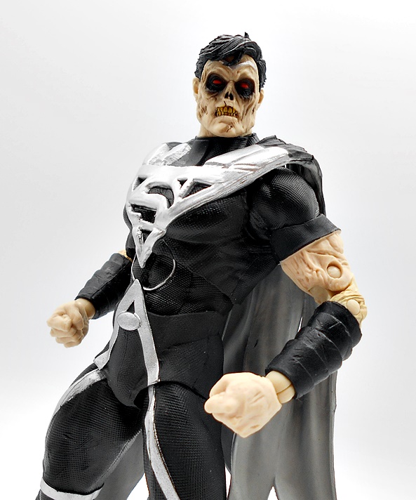
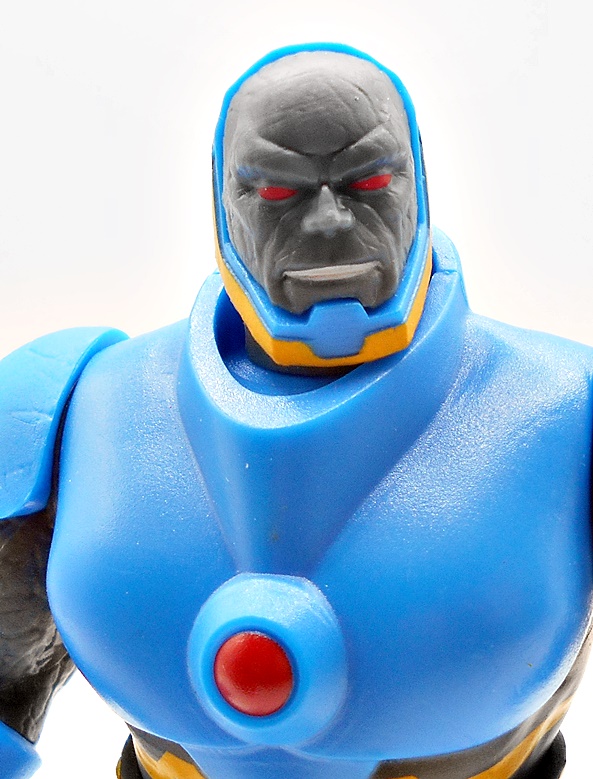
Oh boy, is my DC Multiverse collection backing up with new arrivals! The stacks of boxes are continuing to pile higher and I think I’m just going to have to do another opening party one night this week. I may even have to double up on these guys in the weeks ahead just to try to get sort of current. At this point deciding which one to check out next is just down to random grabs and today that turned out to be Cyborg Superman from The New 52!
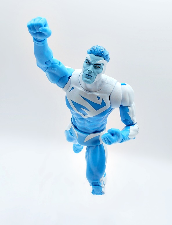
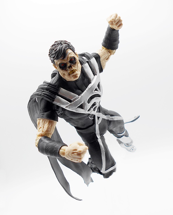
Everyone seems to loathe The New 52, but it came along for me at a time when I had been out of DC Comics for a little bit and I used the reboot as a point to jump back on, as it was intended. I enjoyed most of it, but I will admit that a lot of the books I liked the most met with early cancellations. Supergirl was one of the longer lived books that I read regularly, which also introduced us to Zor-El as Cyborg Superman. Certainly not the version that most people wanted to see hit the DC Multiverse, but that’s Todd for ya.
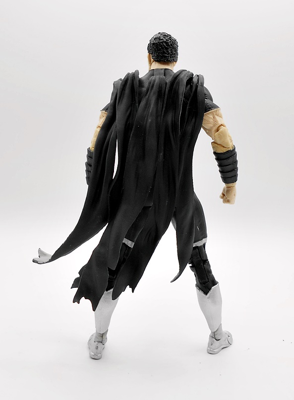
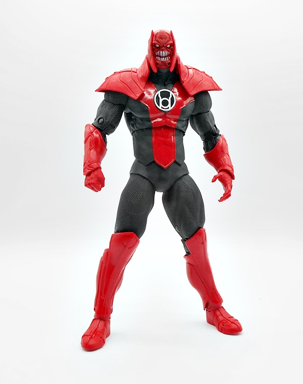
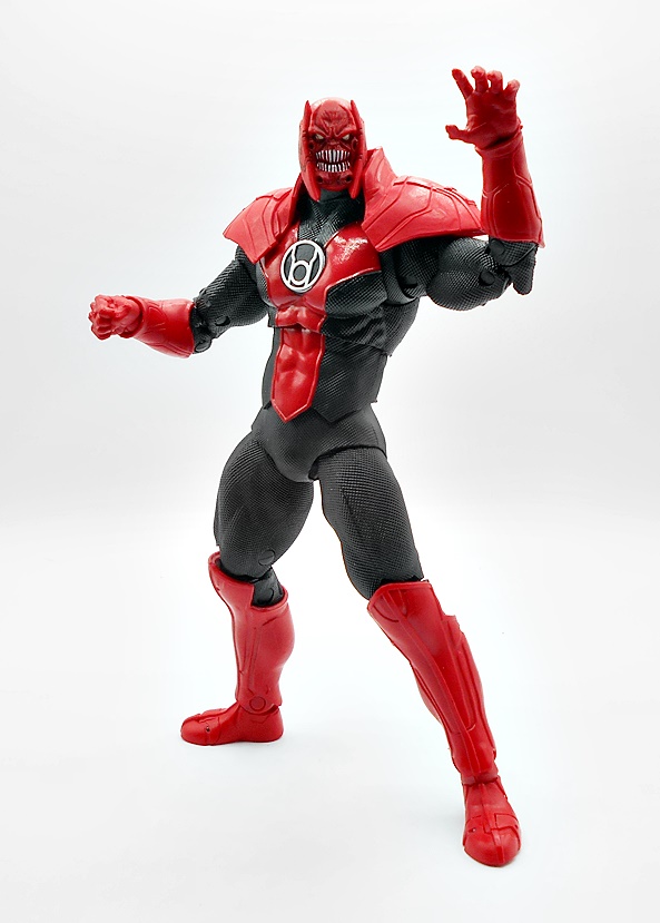
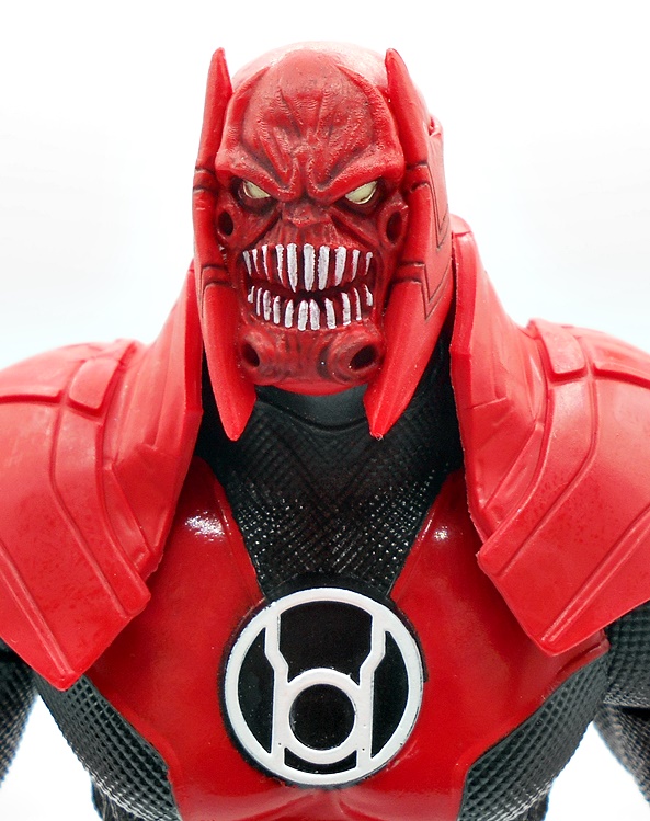
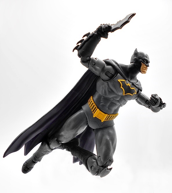
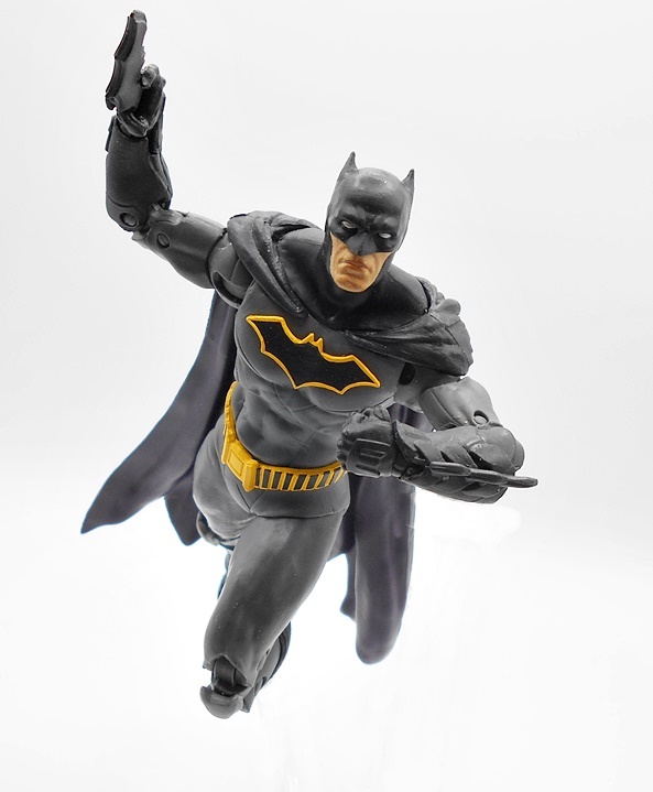
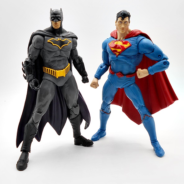
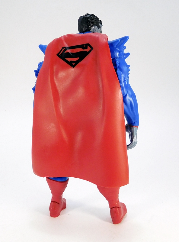
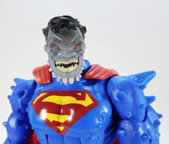
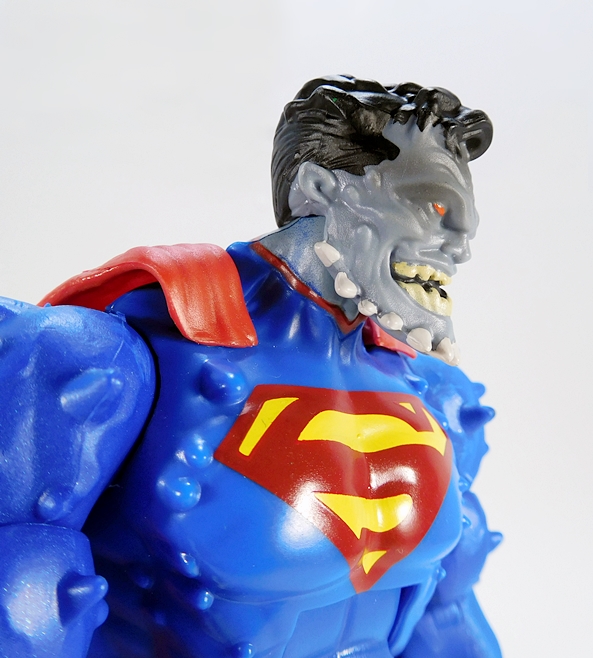
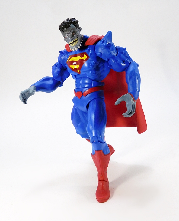
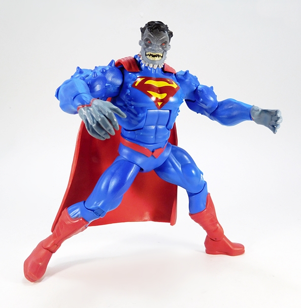
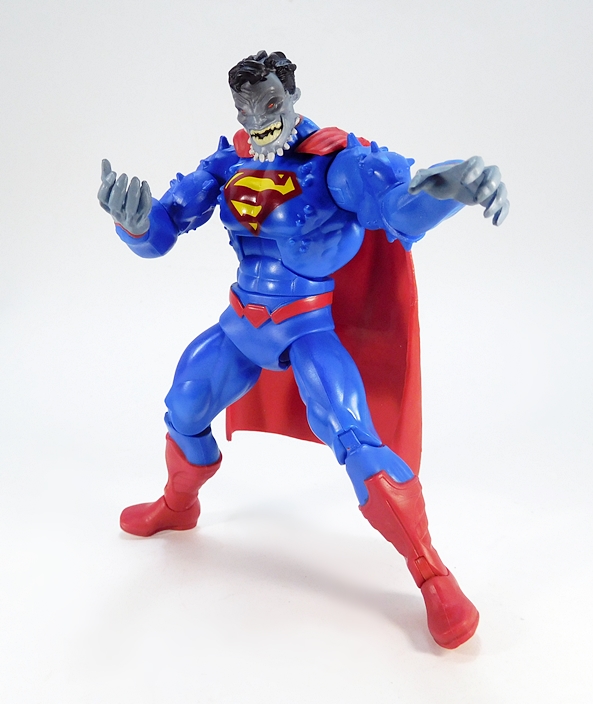
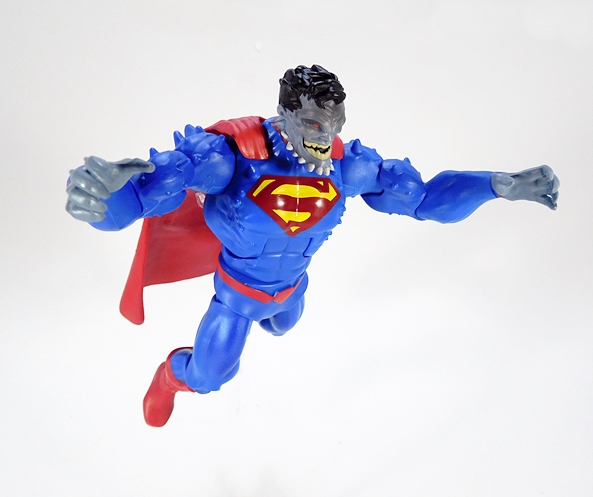
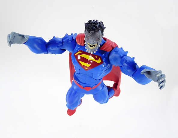
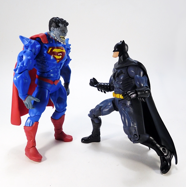
Straightaway, this is just an amazing sculpt. The lower half retains the blue suit, but the sculpt is still all borgified with some deep crevices and techno-organic contours. Some red bleeds into the lower legs and the feet are very robotic looking. The upper torso is all bare metal with a sculpted S-shield on the front in red and yellow and the cape attaching at the front of the shoulders. The exposed silver has a crumpled aluminum look to it with some more intricate detail in the neck. The arms have parts of the suit cut away to expose the mechanical body with some mechanized sinew in the shoulders and upper arms. The right arm has some spiked fins, and an exposed robotic elbow joint, and ends with an elongated claw, while the left hand ends in a crumpled fist. Finally, the red cape is tattered and torn. From the sculpt to the colors, this is great stuff!
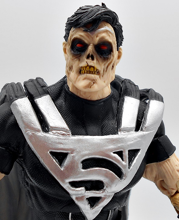
The head sculpt is pretty grizzly with the upper head looking like business as usual and the flesh on the lower jaw completely gone. There’s a subtle bit of silver marking to the flesh around the forehead and brow region, which makes it look like the flesh is starting to wear off. The eyes are painted red and the coif is sculpted separately giving him an immaculate hair line.
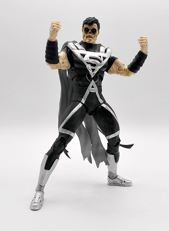
The articulation is nearly identical to what we’re used to seeing in this line, which makes this Supe Borg a lot of fun to play with. The one deviation is the right arm, which only has a single hinge in the elbow. I’m guessing this was to accommodate the aesthetics of the big robot hinge. It would have been cool to get some articulation in the claw’s fingers, but they’re probably too thin to make that work. Instead, they have a bit of a bendy quality to them, making it still useful for grabbing other figures.
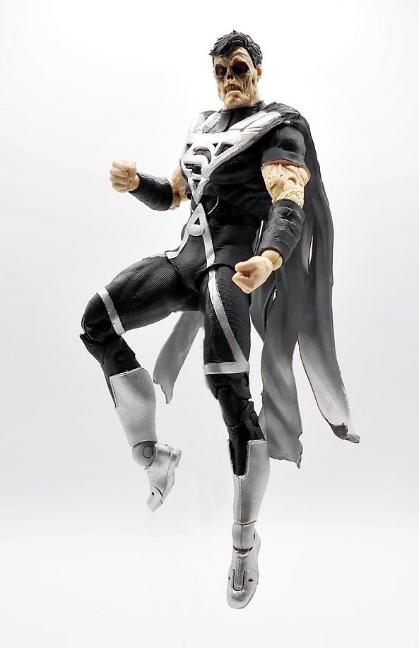
Zor-El doesn’t come with any traditional accessories, although you do get a flight stand, which is always a nice bonus, as well as the usual collector card. The flight stand also has a peg on the base, so you can detach the post and use it as a regular stand.
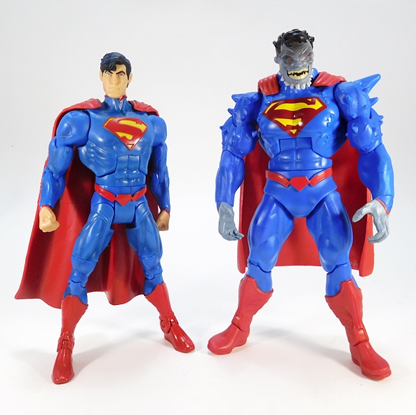
I was excited enough about this release to preorder him, and I’m certainly glad I did. It’s no secret that DC Multiverse gets by with its fair share of generic painted bucks to save on budget, so when we get a figure with this kind of intricate sculpting it really feels like a treat. It’s a damn cool figure, and I think it’s a worthy pick up even for collectors who weren’t into the New 52 Supergirl book. There was a Platinum variant of this figure offered, but I generally don’t chase those down. But, if we do get a Hank Henshaw version of Cyborg Supes released down the road, I will definitely pick him up.
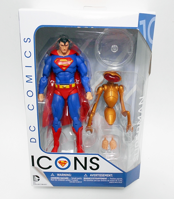
In addition to their extremely prolific action figure line, McFarlane has been spinning the DC Multiverse brand into statues here and there. I haven’t gone very deep on these, but I did check out the 89-style Batman they did from that Flash movie and liked it a lot… the statue, not the movie! And when I saw the first teasers for this Jim Lee style Superman, I knew it had to be an instant preorder. But, I guess this isn’t really DC Multiverse as it’s branded as McFarlane Toys Digital and also bears the DC Direct logo.
This roughly Sixth-Scale statue comes in a wrap-around window box with another light on top to showcase the figure really well, but it doesn’t follow the usual DC Multiverse box design. You also get an ugly Digital Card pressed up against the front window, which is a shame because otherwise this would display in the box very nicely. I think the card is redeemable for the digital version of the figure. Look, I’m an old man and I don’t understand the appeal of any of this NFT shit. If they want to throw a code into the box, that’s fine, but I’m not a fan of it imposing itself on the presentation of the physical collectible. And as we’ll see, this continues to be a problem. Anyway, the box is collector friendly, but I’m definitely tossing it. You do get a standard McFarlane collectible card stuck to the back tray and the only assembly required for the statue is plugging it into the base.
Here he is all set up, and I’m going to do something I never do with statues and talk about the base first. The bit of sculpture that he’s standing on is part of the figure, while the base is just the black disk. Unfortunately, Todd decided to print McFarlane Toys Digital on it along with their logo and it goes a long way to wreck the whole thing. I mean, Why? Why in the blessed name of Ma Kent would they do this? Even Todd has to realize that the majority of the people buying this doesn’t give a crap about the digital aspect, so why plaster it on the base? Grrr… I hate it.
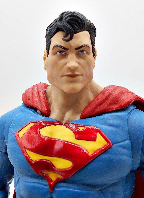
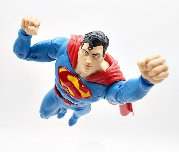
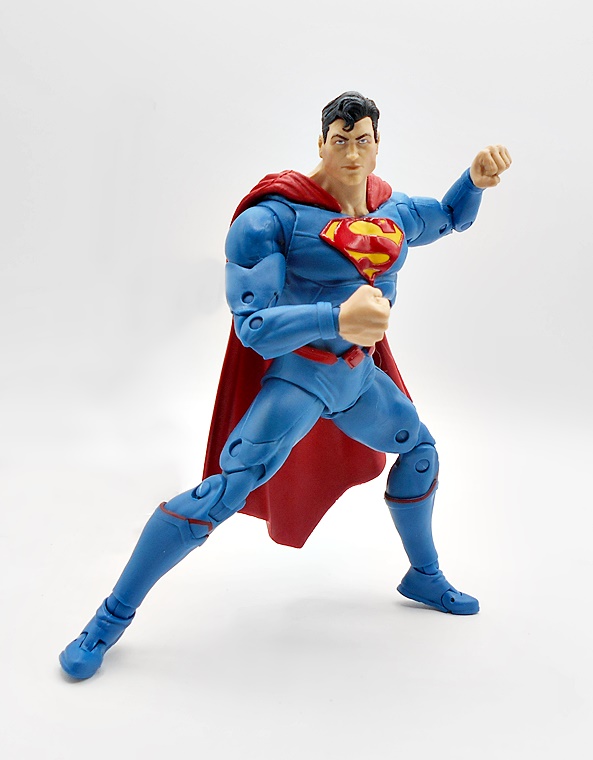
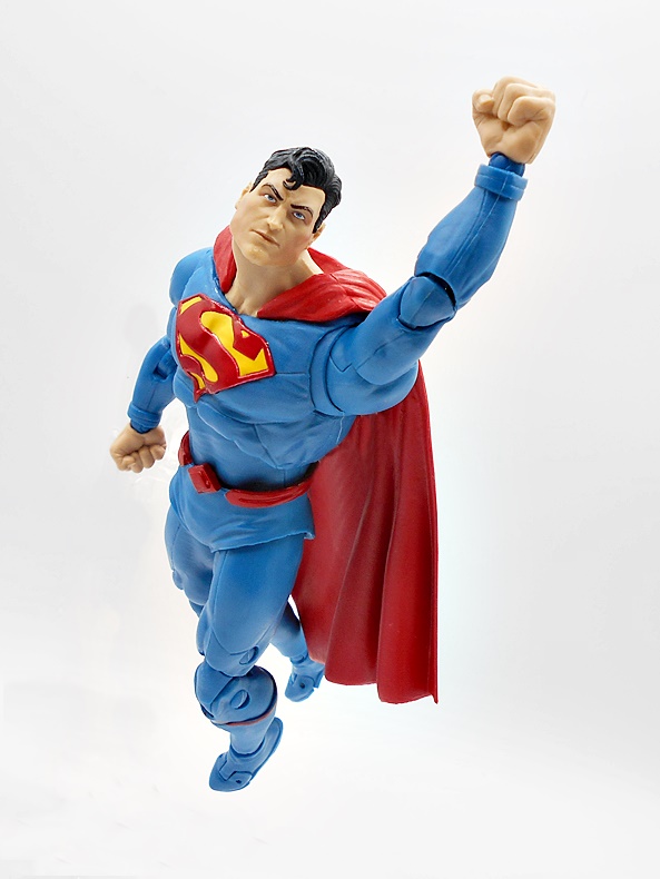
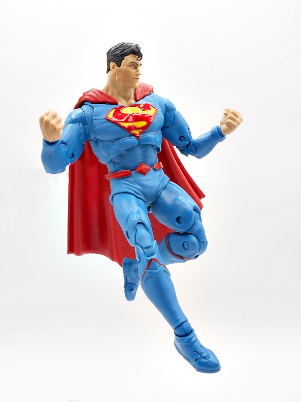
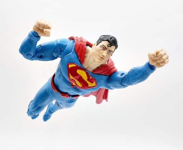
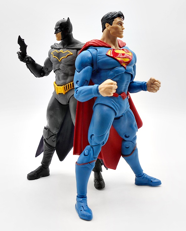
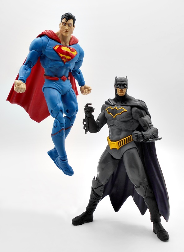
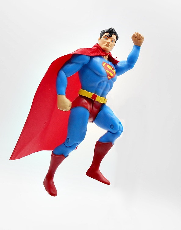
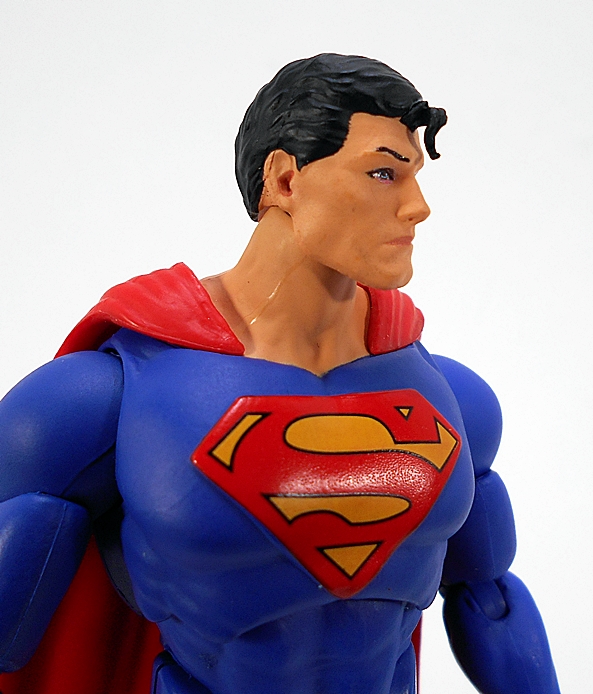
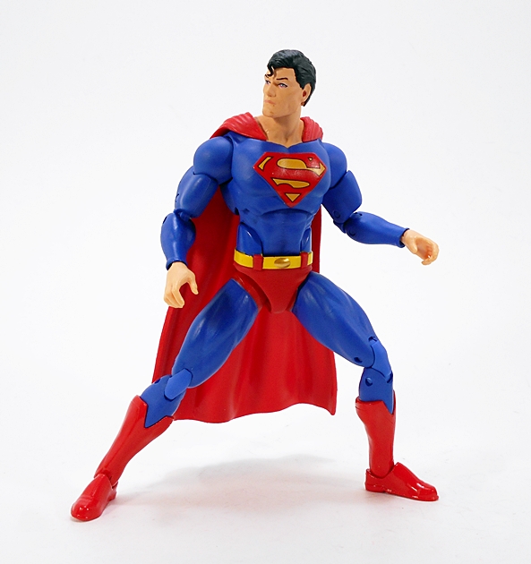
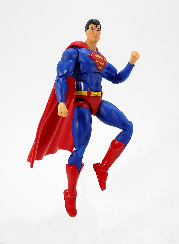
But as for the figure itself, well I love it! He’s appropriately beefy with his barrel chest pushed out presenting the fully sculpted S-Shield. There’s some subtle texture to the beautiful blue suit, along with the underlying musculature on full display. You get crisp red paint for the boots and undies, and a hint of more yellow for the belt. It’s a lovely classic Superman look, which I’m always happy to get represented on my shelf. The pose mimics the Jim Lee art perfectly, with Supes’ left leg up on the bird sculpture, his arms cocked back at the elbows, and both hands balled into fists. Every bit of this pose suggests some evil-doer is about to get a well-deserved ass-whooping. And then there’s the cape, but I’ll come back to that in a second…
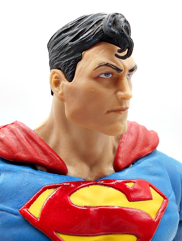
The portrait to me is a real homerun. I’ll be the first to point out that human portraits are not usually McFarlane’s strong suit. They have been getting better, and they’ve turned out some decent efforts in their figures as of late. The statues, on the other hand can be hit or miss, but I’d score this one as a direct hit. The chiseled features, the angular jaw, the slight dimple in the jutting chin, the strong cheekbones, and the powerful, furled brow are all just fantastic. The hair is sculpted separately from the head, giving an immaculate hairline, and I dig the spikey bits and cowlick. What’s more, the eyes and eyebrows are painted perfectly. There is a gap between the neck and costume, but that’s to allow the fabric cape to be secured between. It looks a bit jarring up close, but I don’t find it to be a problem under normal viewing.
And there’s that glorious red fabric cape with the wire running throughout the edge. This garment is so much fun to pose, making me so glad they decided to go with mixed media on this piece. In addition to achieving a great approximation of the cape’s behavior in the source art, it can also be customized to your liking. Whether it be billowing out behind him or flapping off to the other side, you can do a lot of different things with it.
As for that base, well I’m going to have to do something to fix it. Whether that be painting over it, taping over it, covering it with a Superman logo sticker, there’s no way I’m going to display that logo and nonsense. Because the pegs are located in the base, it is possible to display Supes without the base at all, so that’s at least an option. Albeit one that increases the chance of him toppling over. At least he’s a solid slab of plastic, so I doubt the Man of Steel would incur any damage taking a shelf dive.
Desecrated base not withstanding, this is an excellent statue and with an MSRP of $50, I’d say it’s definitely one of the best values on the collectible statue market right now. I can think of several times where I’ve spent more than twice as much and didn’t get something as beautiful as this piece. Originally, I was planning on putting him on one of my DC Multiverse shelves, but he wound up landing on the corner of my desk, and I do believe that’s where he’ll stay for a while. The Jim Lee Wonder Woman should be arriving any day now, and I’m excited to get the two side by side!
A short while ago, McFarlane put up a Bizarro/Batzarro 2-pack for preorder and I went for it. But little by little the details has me rethinking that purchase for a number of reasons. Ultimately it was the very cartoonish portrait on Bizarro and the ham-fistedly reworked bat symbol on Batzarro that made me deep six that preorder before release. I was still hankering for a Bizarro, though, so I hunted down the Rebirth version that was released shortly before I fell into the delightfully bottomless pit of collecting this line.
Here he is in the packaging, just a regular release with no Collect-To-Build business to deal with. I also like that he’s from the Rebirth comics, because that happens to be one my favorite Superman figures on my shelf right now, so they’ll look good together duking it out. As usual, the packaging is mostly collector friendly, although you’ll have to tear the stand and the collector card off the cardboard backing to get them out. Also, there’s no flight stand included, which had me a little disappointed. The McFarlane flight stands aren’t great, but they are a fun way to display the flyers on the shelf and add a lot of value to the package.
As expected, the body is lifted directly from the regular Rebirth Superman, but using a darker blue for the suit. He also has a blue diamond panel in the middle of his belt buckle and the red trim at the tops of his boots actually match the sculpt, unlike the lazy-ass paint on the Superman figure where they tried to strongarm the right paint onto the wrong sculpt. The S-Shield is properly reversed, which was probably easy to do here since it was sculpted separately on Superman and attached to the figure. Reversed or not, the shape of the shield is the same, so they were able to pop the new one right in there. It’s not quite as polished as the shield on Superman, but it looks good.
The cape is completely different, and I’m almost certain it’s been lifted from another figure. It’s much longer than Supes’ cape, reaching down to Bizarro’s ankles, and it has various holes worn into it. There’s some subtle texturing to the surface and it’s a tad darker shade of red than what we saw on Superman.
The head sculpt is excellent. I realize that the highly stylized head on the newer two-pack is going for a very specific look, but this is definitely my preferred portrait for Bizarro. The enlarged jowls and smaller dome makes him into a bit of a pinhead and I love the shock of hair at the top of his head and the sides being clean shaven. The skin is gray with some subtle green bits of wash that make him look moldy and gross. There are some fissures sculpted into his skin, giving him a desiccated, zombie-like appearance and the hints of teeth in his downturned, parted mouth look great. All around, nice work!
Bizarro’s articulation conforms to the unswerving DC Multiverse standard, and that’s a pretty good thing. Everything here is serviceable and the joints work smoothly. I can’t recall having an issue with stuck joints on any of these figures and they are always lots of fun to play around with. I’d still love to see thigh swivels added, and you could argue that the pins are getting prehistoric, but I don’t mind. Bizarro also comes with an extra set of swappable hands, so you can replace his fists with graspy hands.
I’m glad I cancelled the Bizarro/Batzarro two-pack in favor of this guy. Sure, I would have preferred something more classic, but I do like the Rebirth designs and I am happy to have a Bizarro that pairs very well with one of my existing Superman figures. His price was a bit up there at a number of retailers and resellers, but a little patience netted him for about $20, which I believe was right around the original MSRP. All in all, another great addition to my DC Multiverse shelves!
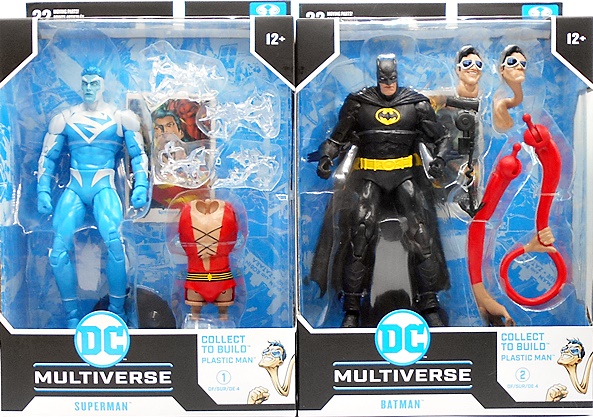
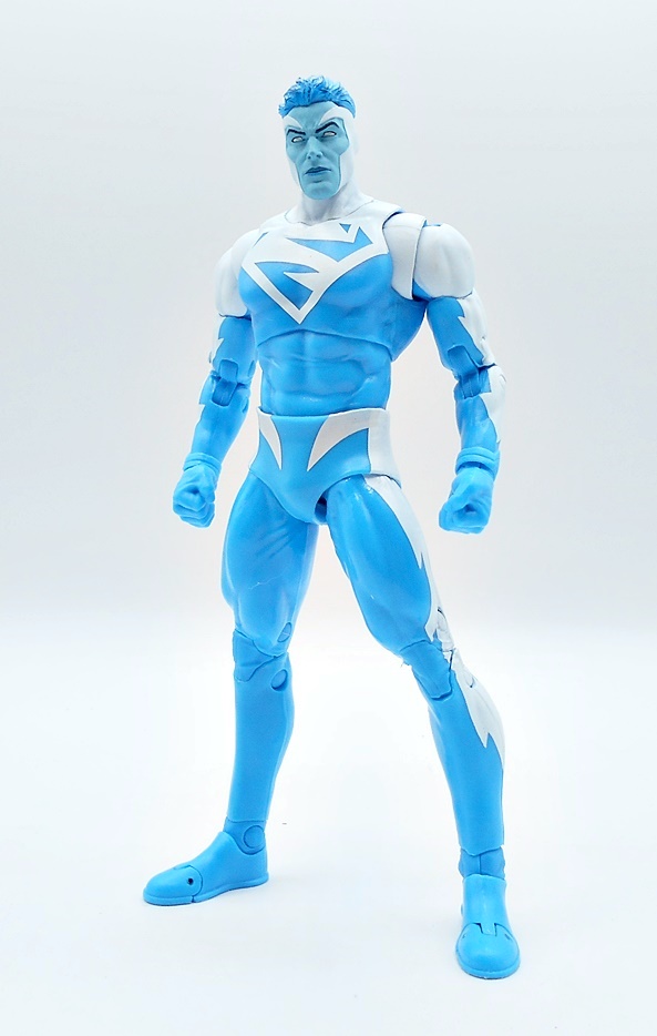
We started this week with the DC Multiverse Plastic Man Wave, so we might as well finish with it too. If you’re just joining me, feel free to click on back to Monday to get caught up, otherwise we have two more figures to check out and then we can cobble together the Collect-To-Build Plastic Man and put this whole wave to bed. Let’s go…
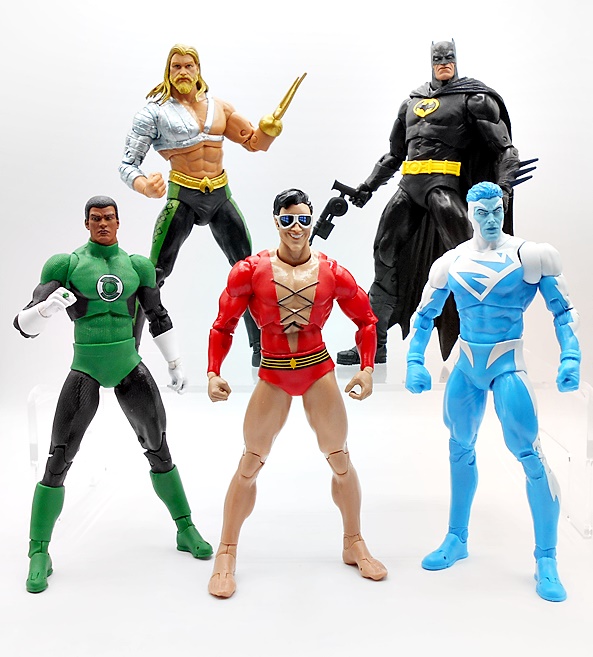
As I mentioned last time, this assortment is supposed to be JLA inspired, but it’s pretty inconsistent on that front. Aquaman was a perfect fit, but John Stewart didn’t belong here, and we’re kind of going to have a similar issue today, but I’m getting ahead of myself. The figures come in the usual big window boxes and while I love these packages, I don’t have the room to keep them, so they get recycled. And that’s just as well since you have to rip apart that beautiful blue backing to get at the figure stand and collector card anyway. As for the Collect-To-Build figure, we got the regular arms and legs with the last two figures, and this time we’re getting Plastic Man’s torso, two heads, and some extra arms. Let’s start with Superman!
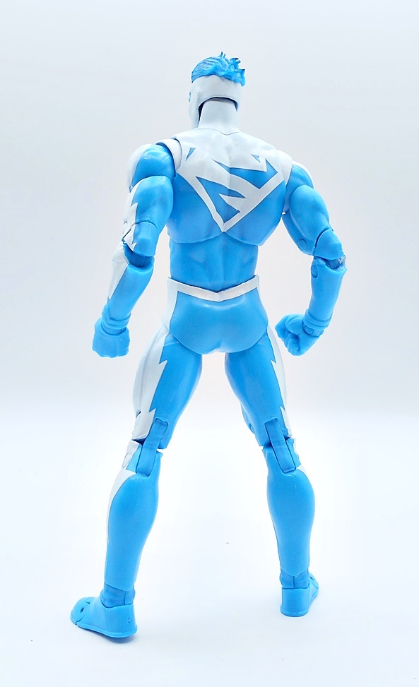
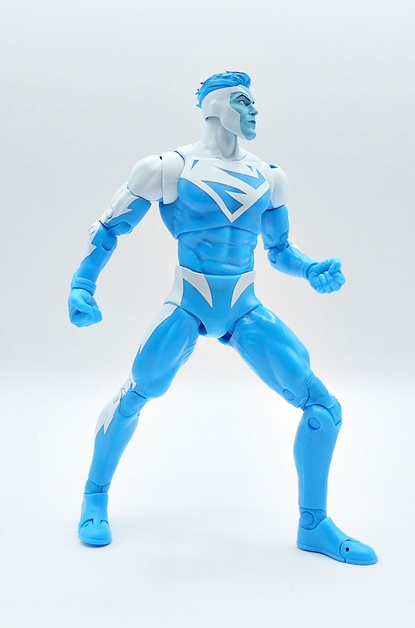
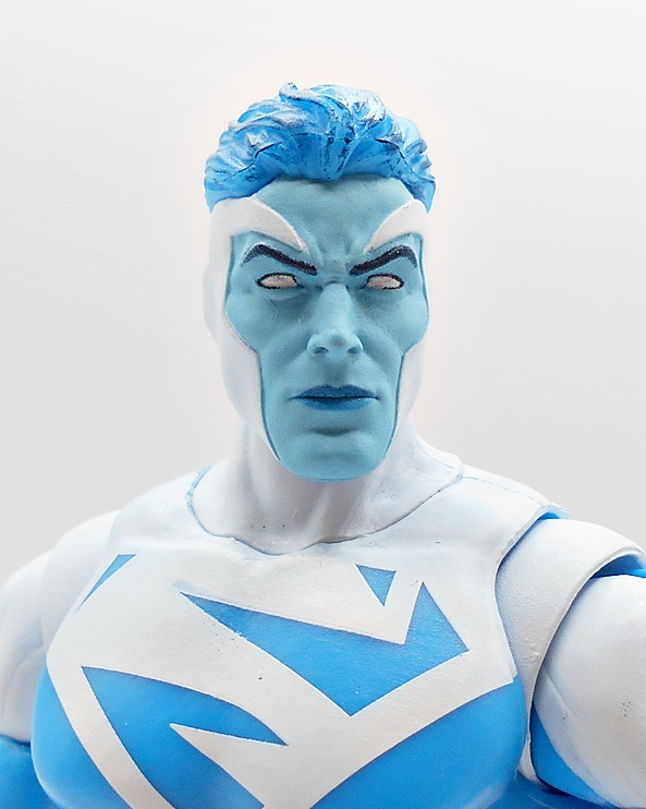
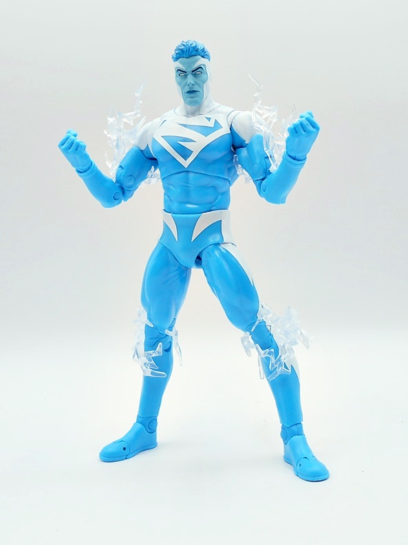
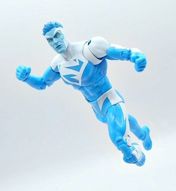
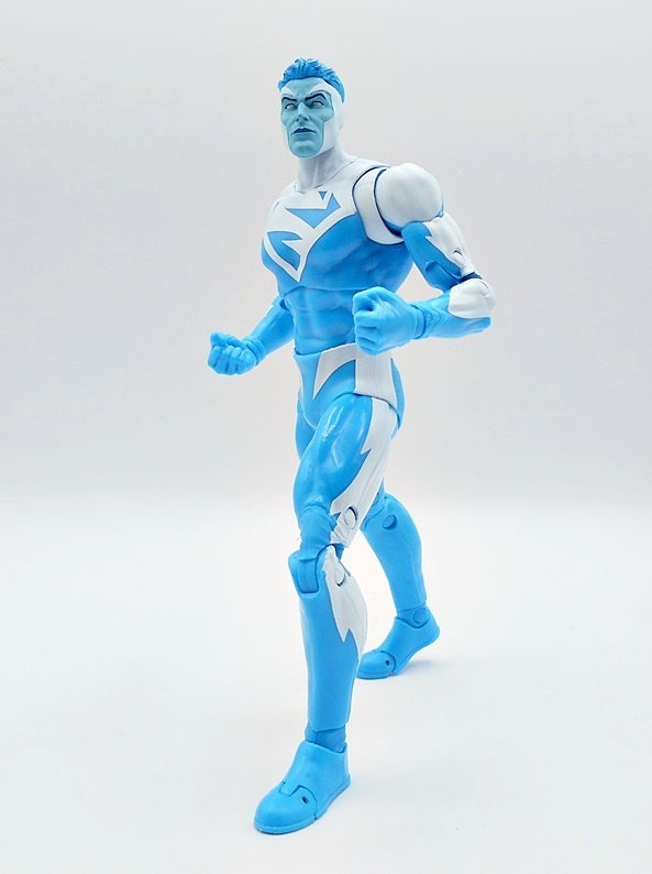
I can’t say I was the biggest fan of the stories involving Superman divided into his Red and Blue suits, but I do think these make for some beautiful action figures, and that is certainly the case here. Supes’ blue energy suit is achieved entirely through paint and colored plastic, as this is just a generic figure buck, but boy does the deco really sell this one! The electric blue plastic is so vibrant and when you mix it with the super bright white paint and jagged S-shields, both front and back, you get a figure that can really demand attention on the shelf, even without any unique sculpting on the body. The paint lines are nice and sharp and you get the outer pins painted as they should be, which may sound like a strange thing to point out, but it’s something Hasbro often doesn’t get right in Marvel Legends.
The head sculpt is superb. I thought this one might be re-sculpted from Firestorm, but I haven’t opened him yet to really check. His skin is painted a paler blue than the suit with a shock of electric blue hair up top. The face has some wonderfully defined features, with the white cowl shaping the edges and accentuating his cheek bones, and a slight wrinkle to the brow. The white, pupil-less eyes give him an otherworldly visage. The eyebrows are neatly painted and there’s a slightly darker shade of blue for the lips. So far, this wave is definitely three out of three when it comes to the portraits.
There’s no surprises in the articulation and you only get the single pair of hands, both balled up into fists as they should be. You do, however, get four electric effect parts which are designed to attach to the figure’s limbs. I’m pretty sure these are recycled, perhaps from one of The Flash figures, only recast in translucent white plastic. I wouldn’t say these were necessary, but I think they’re a good inclusion and look very nice on the figure. So many of my effect parts wind up in a bin, but I may actually display these on the figure.
I missed out on Mattel’s DC Universe Classics version of this Superman, and while that’s bugged me for a while, I’m OK with it now. I just like the look of this one so much better. A flight stand would have been a nice inclusion but I don’t think we tend to get those in Collect-To-Build Waves. I’ll also point out how odd it is that the collector card doesn’t reflect this version of Superman in any way, but hey… McFarlane gonna McFarlane. And speaking of which, Todd decided to make the Red Suit counterpart a Platinum Exclusive and it’s going for crazy money on the secondary market, so thanks so much for that! Moving on to Batman…
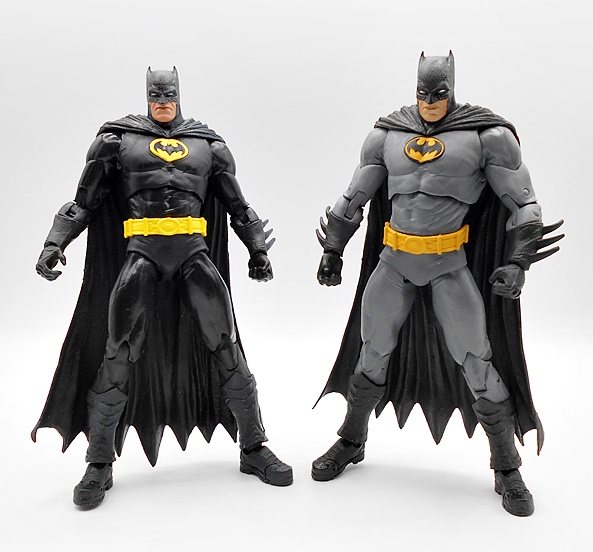
I’m sure I wasn’t the only one disappointed to see that the JLA version of Batman included in this wave was just a straight repaint of The Three Jokers Batman. With early teased images hitting, I was hoping that we’d at least get some retooling and a new head, but nope… this is a straight repaint and that’s just crazy lazy on McFarlane’s part. And with that being said, it pains me to admit how much I dig this release. Don’t get me wrong, this really doesn’t work for me as the intended version, but I just love the way the black and brighter yellow looks on this figure. I have yet to review the previous release of this mold, but I will drop in a comparison shot at the end.
A new head sculpt would have helped, as the little bat nub ears don’t work at all and it could have used a lot less texturing on the cowl. I’m sure there’s another Bats head out there that would have worked better. But you would have to re-sculpt the arms and lower legs too, and I doubt any of that was ever on the table. I dig the sculpt on the lower half of the face, offering a very pouty and super serious caped crusader.
And to add recycled insult to repacked injury, you get the bat grapple gun that we’ve seen a bunch of times already bundled in with the figure. I feel like I have a dozen of these, but in reality probably only two or three.
I don’t hate this figure at all. I actually kind of love it, but I also don’t like the business practice behind it. It’s just a lazy way to toss a figure into the assortment with some new paint and pretend it fits the theme you’re going for. Plus, it probably means we won’t be seeing a proper JLA styled Batman in this line for a while. When you consider how this line butters its bread with Batman variants, it’s a shame McFarlane couldn’t have put some effort into this one. OK, onward to the real reason this wave had me all excited… Plastic Man!
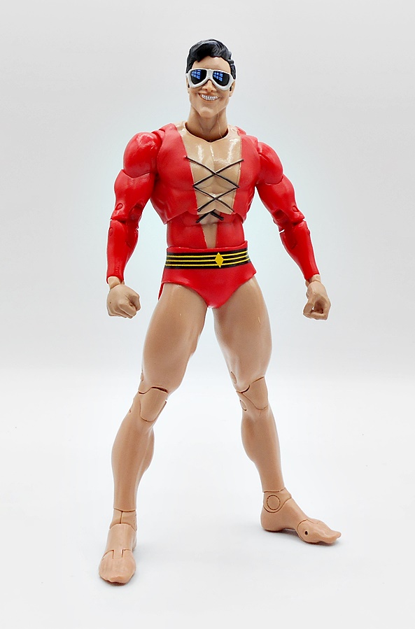
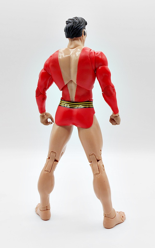
My original love for Plastic Man didn’t come from his comic book appearances, but rather from the Ruby/Spears Plastic Man Comedy Adventure Show. Granted, Plastic Man, and his smoking hot wife Penny, was only part of the show, as it also featured segments of Mighty Man and Yukk, Fangface and Fangpuss, and Rickety Rocket. And the real treat came when it hit syndication and you got surreal intros and outros featuring a live action Plastic Man. Like Blue Energy Superman, I missed out on getting Mattel’s DC Universe Classics version of Plastic Man back in the day, so grabbing this one was a big deal for me. And for the most part, this figure definitely scratches that itch. The edges between the suit and his skin is sculpted, as are the laces, and that’s the case both on the upper body and the abs. The feet are probably new too. I’m not sure how I feel about the break in the torso for the ball joint. It definitely improves articulation, but it messes with the flow of the chest sculpt. I might have been fine with him just having a ball joint in the waist to clean that up, but either way it’s a compromise. The flesh tone looks good, as does the bright red for the suit. He’s got some yellow striping on the black belt and the black laces over his chest are pretty sharp.
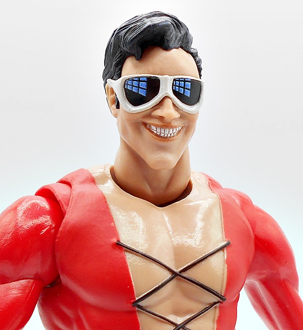
You get two heads to choose from and both are full of that patented Plastic Man charm. The first one offers a big toothy grin with his trademark white rimmed goggles. The black lenses have some stylized reflections painted onto them, which looks good. The hair is sculpted separately from the rest of the head, giving him a clean hairline. I love what we got here, but I don’t love the huge gap where the neck fits into the body. What happened here? Why is the neck hole so big? It just looks weird.
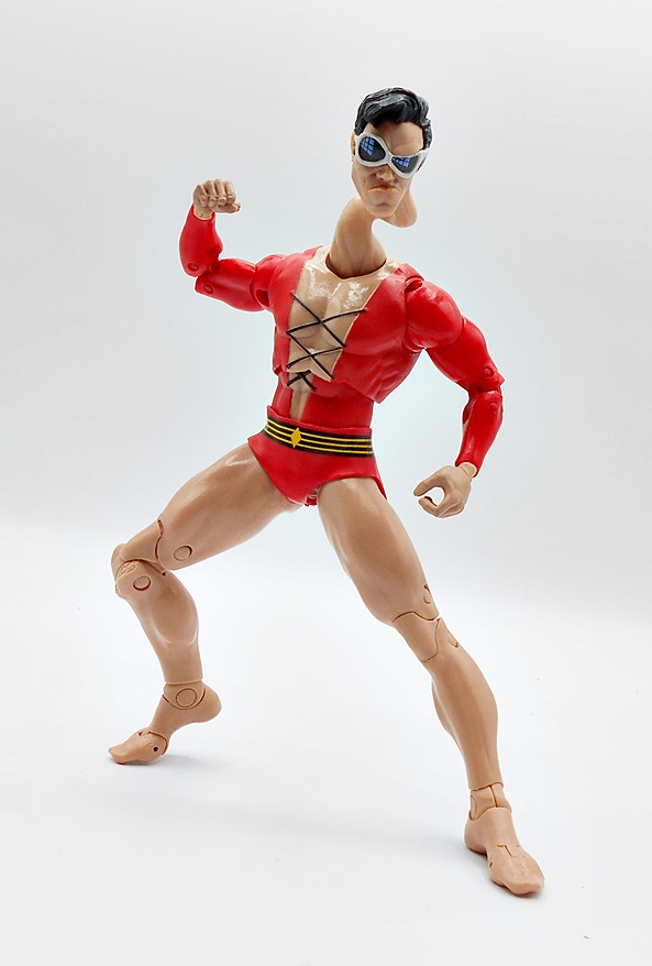
The second head has a crazy curvy neck and a pretty comical scowl on Plastic Man’s plastic puss. One of his goggled eyes is popped while the other is narrowed. It’s a wonderful caricature while also showing off his plasticky skills. And lest you thought the neck hole was big to accommodate this head… nope. The base of the neck is no thicker here and that gap is still there and as distracting as ever. I honestly can’t imagine what happened there.
Plastic Man features all the usual DC Multiverse articulation. The arms and legs assemble to the body easily and they stay put just fine. You get just the one set of hands to work with his regular arms, with the right being a fist and the left a grippy hand, despite him not coming with any accessories to hold.
But you do get a pair of swap out stretch effect arms. These are pretty cool and are really what justifies him being a Collect-To-Build figure. The right arm is formed into a makeshift lasso, while the left arm is stretched out and the hand is enlarged. These are fun to mess around with, although I can’t help but wonder if we’ll see this figure released with even more limbs as a stand alone somewhere down the road.
Obviously I’m a big fan of DC Multiverse, as I have a ton of these figures, but this wave is a great example of why McFarlane gets a lot of justifiable hate. Tossing a JLA Wave out there with a mismatched Green Lantern and a straight repaint of a Batman figure that doesn’t work as the version you’re portraying just reeks of lazy cash grab. It’s even more heinous when you make them part of a Collect-To-Build wave that everyone is going to want to complete. And sure, in my case it worked, partly because I absolutely needed this Plastic Man, and partly because I still genuinely like all the figures in this wave. Call me part of the problem if you must, I wanted better, but I’m still pretty happy with what we got here.
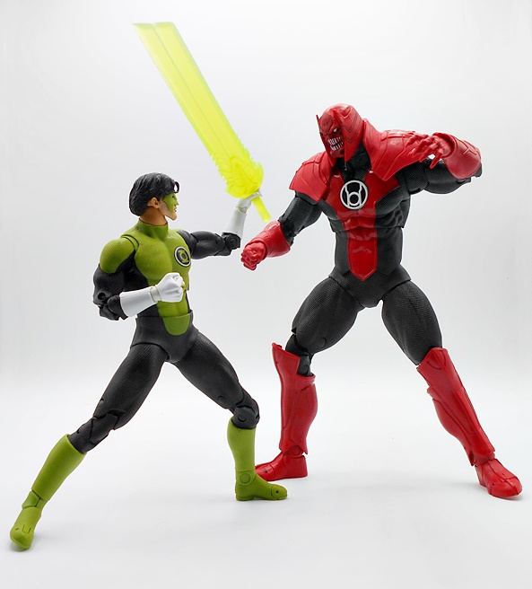
As promised, I’m back for part two of my look at the Blackest Night themed wave of DC Multiverse. If you need to get caught up, I checked out Kyle Rayner and Deathstorm a couple days back. This wave has been out there for a little while, and you are likely to see some older DC Multiverse reviews turning up here from time to time as I try to get caught up on a stupidly huge backlog.
The packaging is standard DC Multiverse stuff, but the Collect-To-Build assortments come in wider boxes to accommodate the extra body parts. As always you get the figure stand and collector card sealed to the back of the cardboard tray, otherwise these window boxes are collector friendly. I’m a big fan of the Blackest Night story and was happy to collect the DC Universe Classics releases, so needless to say I’m excited to be opening these as the boxes have been lined up on my shelf for a while now. Let’s start with Superman!
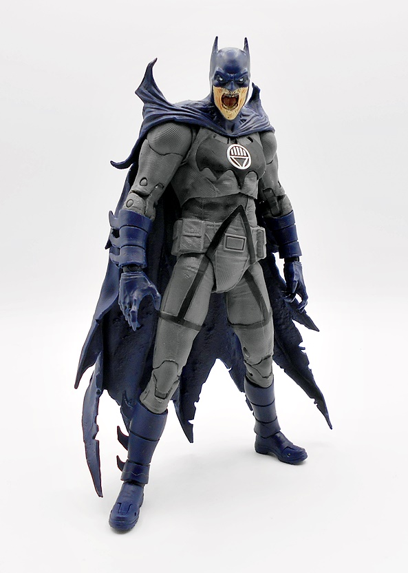
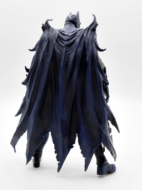
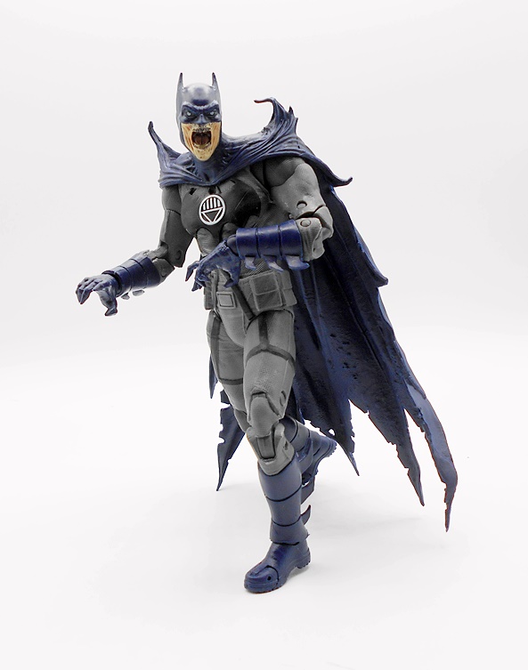
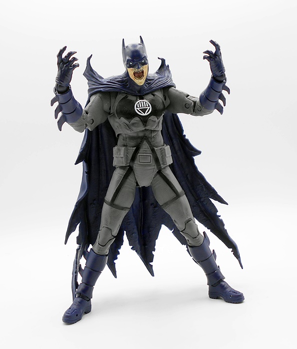
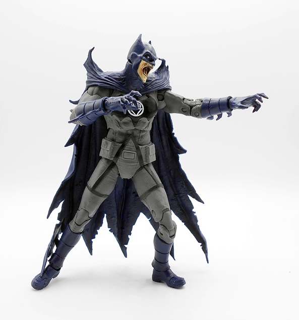
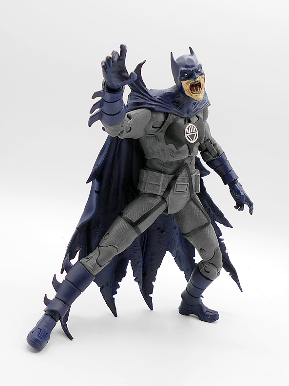
As far as nightmare versions of Superman go, this one is pretty damn freaky. The black suit is covered with that basketball-style texture that’s become synonymous with modern superhero costumes these days. The silver trim against the black makes for quite the striking combo, especially since the silver paint is so shiny and vibrant. He’s got segmented bracers on his forearms and a gross necrotic yellow tint to his skin, which is followed up by sculpted veins and fissures in the arms. His cape is a shredded mess, falling off the back in several strips and looking ragged near the bottom edge. I like that the bold S-emblem on his chest is all sculpted in an extremely pronounced fashion, giving it some wonderful depth. About the only thing I don’t like here are the ball-shaped ankle joints, which break up the flow of the boots, and are left as unpainted gray plastic.
The head sculpt is fantastic, with more of the necrotic flesh and a nice bit of paint wash to bring out some of the details and create some shadows. The creases and cracks in the skin are appropriately gross, his nose is completely rotted off, and the sunken black around the red eyes look like he’s literally burned the area out with excessive use of his heat vision. A familiar hint of his trademark cowlick makes the whole visage even more unsettling. And the real winning feature here are the corn kernel teeth! This is just great stuff!
I’m passed the point of running down the articulation for this line, as it remains constant throughout. Suffice it to say, it’s pretty damn good and Supes is fun to play around with. He does not come with any accessories, and his only set of hands are balled into fists, which works for me! Next up… Batman!
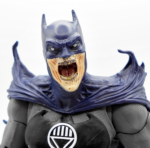
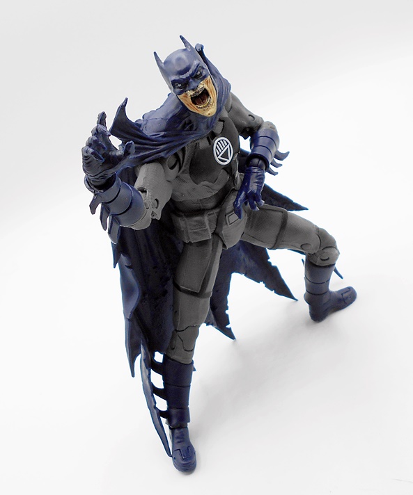
Black Lantern Batman is an equally imposing bit of horror with an absolutely stellar costume sculpt. The gray suit has more of that texture sculpted throughout, as well as some seemingly purposeless straps that run from his thighs up to connect at his abs at a point. There are some pouches sculpted on his belt, and both the bat symbol and the Black Lantern Corps emblem are sculpted as well as painted, which is a wonderful touch. The silver emblem really pops on what is an otherwise muted deco. The blue boots and gloves are segmented and have jagged blades coming off of them. Ah, but what I really love here are the spikey bits growing out of his shoulders that look like partially mutated bat wings, which give him a really creepy silhouette. The rest of the cape is tattered at the edges.
The head sculpt here is OK, but it’s a big step down from Superman’s. You get the same yellowed necrotic skin showing around the lower half of the face, and the mouth is open in a perpetual scream, showing rotting teeth and some nice depth to he bat-maw. It’s creepy for sure, but nothing about this sculpt reaches the sharpness or complexity of Superman’s and the white pupils on the eyes feels like an afterthought. It’s not terrible, but this one just feels like it was sculpted and painted on a Friday afternoon.
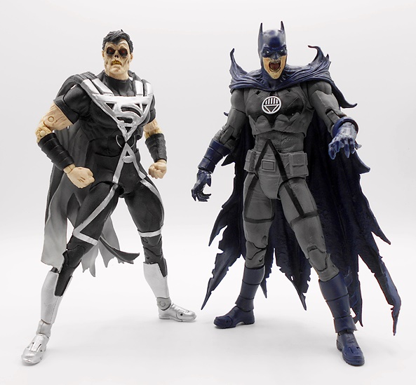
Again, you get some solid articulation here and no accessories. His hands are both sculpted in a grasping or reaching fashion, which is pretty good for displaying him in shambling zombie-like poses. Both Bats and Supes are solid figures. Oddly enough, I’d say I like Batman’s body the best and Superman’s head sculpt the best, but either way the compliment each other really well. Now let’s build Atrocitus!
The last time I got an Atrocitus figure was twelve years ago as part of Mattel’s DC Signature Collection and that review is worth a click just to see how unbelievably shitty my photographs were back then, as opposed to average and passable now. Anyway, this Atrocitus is a straightforward build with the body, head, shoulder piece, and four limbs making up the parts. I had a ridiculously difficult time getting one of his arms to peg in before noticing that it was because the loose shoulder ring was backwards. Once I popped that out and corrected it everything went fine. I really appreciate McFarlane’s approach to doing only four figures for their Collect-To-Build stuff, but these can be a lot harder to get together than Mattel’s old line. With that having been said, Atrocitus is together and looking big, imposing, and pretty damn fine!
The black suit is textured and you get some nice sculpted panel lines in the boots and gauntlets, which can be easily overlooked in all that bright red plastic. There’s some extra glossy red paint used for the tabard that runs down his chest, and the snappy silver Red Lantern Corps emblem is sculpted as well as painted. I particularly like the way the abs piece hangs down over the pelvis to avoid that rubber diaper look that this line is known for. The black and red deco looks amazing and conspire to create a superb deco.
The head sculpt is pretty good, although the huge wall of teeth feels a little lacking. I’m not sure if it’s the paint or sculpt or both, but I feel like it could have been better. With that said, I like the texturing to the skin and the various creases and crevices in the downturned brow and the piercing golden eyes. The face is bookended by armor cheek pieces and that is surrounded by the high collar on the shoulder armor.
Despite being a big and bulky, cobbled together rage monster, Atrocitus sports all the articulation points of the regular figures and I didn’t have any problems with the limbs coming apart at the connection points. He has his right hand balled into a fist and his left hand open and kind of relaxed, which work well for posing and he’s just a whole bunch of fun.
I think this was a pretty solid wave of figures, and one where I would have easily purchased each one even if the Collect-To-Build incentive wasn’t there. Indeed, I’m hoping that we get another Blackest Night themed wave eventually or at least some more Red Lanterns, because I really loved how Mattel gave us quite a few. Granted, with Necron being a Mega Fig release, the next logical Collect-To-Build is already taken. Which reminds me, I still need to pick that one up. The MSRP on these figures is $24.99 each and at the time I’m writing this review, this wave is pretty widely available at discount. Heck, even a while back I was able to pick them up for under $20 each. I’m certainly glad I did, but I would have been just as happy getting them at full price.
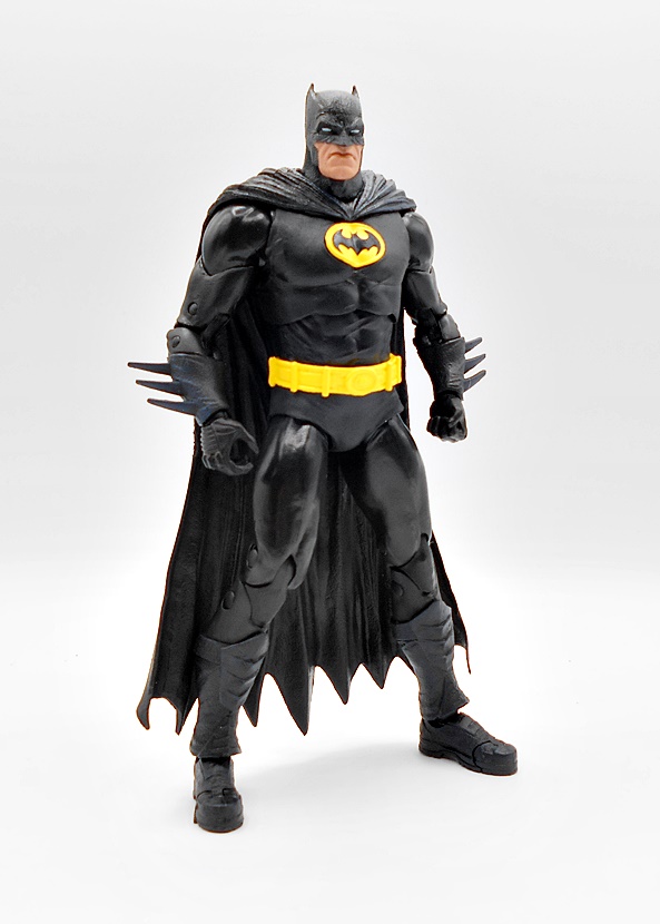
A little while back, I popped my cherry on McFarlane’s DC Multiverse line with a look at the Blue Beetle and Booster Gold two-pack, and now I’m going to start unloading on reviews for this line, because I bought a whole hell of a lot of them on various sales. Of course, this line is very Batman-heavy and otherwise pretty scattershot when it comes to the comic period and costumes, which can be infuriating when trying to build a team, but otherwise fun if you’re just looking at individual figures. And, coming into a line late in the game also has it’s ups and downs as well. Some figures have gone on deep discount, while others have gone up in value on the secondary market. Right now I’m still in the looking for good deals phase, but eventually I’ll probably hunt down some specific releases. With all that having been said, let’s have a look at Batman and Superman in their Rebirth costumes!
The packaging here is consistent with what we’ve been seeing in the line. I really dig how the bright blue interiors contrast with the black boxes. I’ve never really enjoyed how grimdark modern DC has become in the mainstream, so I think these packages stride the line nicely. Each figure comes with a collector card and a stand. Batman comes with the regular disk stand, while Superman actually comes with a clear flight stand. I bring these up now, because for the time being, I will not be removing the cards or stands from the boxes, as it damages the trays. Eventually, I will get short on space and have to pitch all these boxes, but for now I’m keeping the figures in them. Let’s start with Batman!
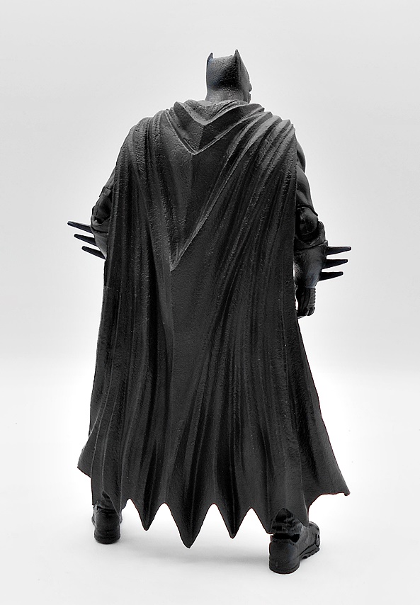
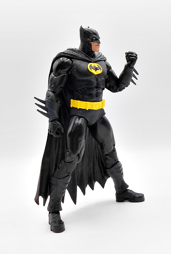
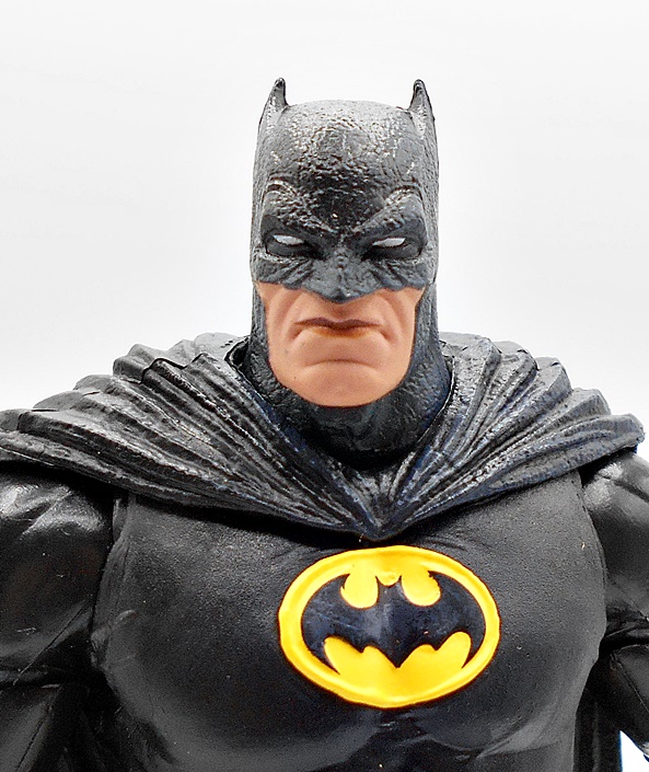
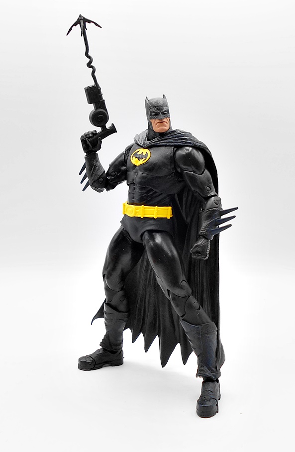
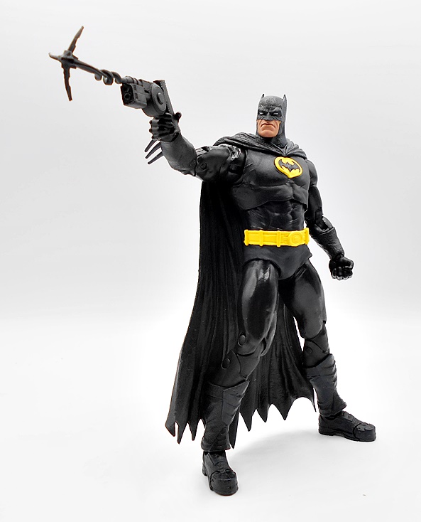
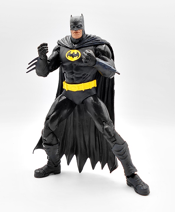
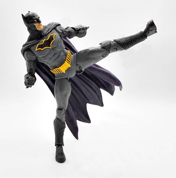
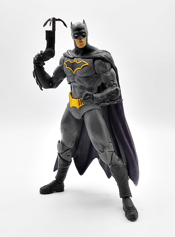
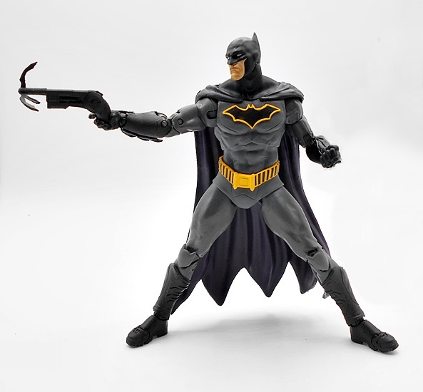
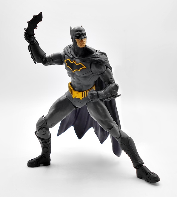
Cards on the table, I really loved the New 52 Batman costume, so I was a little apprehensive when Rebirth came along. Turned out that I really liked this one too. Maybe not loved, but it’s not bad at all. The dark gray suit looks great against the black of the boots, gauntlets, cape and cowl. The big change here is the brighter yellow belt and yellow outline around the chest symbol, both add a nice little pop. The suit has a few panel lines, but it doesn’t overdo it, and that sort of detail is mostly reserved for the boots and gauntlets. The serrated blades on the gauntlets are awesome, and I absolutely love how the bat symbol is sculpted and not just printed on. I’m not a huge fan of the bat-head knee guards, but they’re not too distracting. The cape is sculpted so that it stays fairly tight with the body and not fanning out too much. I do tend to prefer this to the dynamic, windblown effect, which I think is best saved for statues and not action figures. All in all, this is a great looking suit and McFarlane executed it beautifully for the figure.
The head sculpt, on the other hand, is nothing to get excited about. The lower half of the face is a pretty soft sculpt. So much so that my shitty camera took half a dozen shots to finally get somewhat focused on it. I do dig the cowl, as it gives me a bit of 89 Batman vibes, and the whited out eyes look fine. There’s nothing really bad here, but I just don’t find it exceptional.
The articulation is exactly what we saw with Beetle and Booster. Eventually, I’ll get to the same point as I did with Marvel Legends and just stop surveying the points of articulation on these. When it doesn’t change from figure to figure, it gets old to recount it all every time. But these bodies are still new to me, so let’s give it a rundown. The arms have rotating hinges in the shoulders, swivels in the biceps, double-hinged elbows, and ball hinges in the wrists. I really have no complaints about the arms at all, and I love how tight the elbows will go! The legs have rotating hinges in the hips, which offer a pretty nice range of motion going forward, back, and to the sides… but so very little swivel, it’s practically non existent.. The knees are double-hinged, the ankles have both hinges and lateral rockers, and the feet are hinged for the toes. The one gripe I’ll keep coming back to in the legs is the lack of a thigh swivel. The neck is ball jointed with some nice range of motion, especially for Batman’s constricting cowls. Finally, you get ball joints under the chest and at the waist, which do a fairly decent job. This is a fun figure to pose and play with, even though the cape can make him a bit back heavy.
Batman comes with two accessories: His grapple gun and a batarang. His right hand is sculpted to hold either one, while the left is balled up in a fist. The grapple gun is pretty big and satisfying, with the grapple hook sculpted in place. Getting a string to swing the figure on would have been cool, but this looks good in his hand. There’s no obvious trigger, which I assume is part of Warner Brothers weird obsession with not allowing any guns or anything even remotely trigger-y. Quite frankly, I’m surprised McFarlane got away with this accessory at all.
The batarang is simple enough, but a pretty nice sculpt. It can be a little tough for him to hold it, but squeezing it between the fingers seems to work fairly well. If you’ve been around here a while, you may know that I’m not a huge Batman fanatic, and I’m not going to buying the majority of the ones released in DC Multiverse. But, I do indeed love this figure, and considering the insane number of Batman figures in this line, I’m glad I started out with this one. Let’s move on to Superman…
Unlike Batman, I’m always down for a new Superman figure, so I was really excited to get this one opened and check him out. Happily, he does not disappoint. Rebirth Superman’s costume didn’t stray too far from his New 52 look, and while I like it a lot, I still think it was a step down. I mainly miss the red boots here, as you now only get some red striping at the tops of blue boots. The cut lines in the suit have been toned down a bit, which is fine. I still like the red belt with the floating diamond buckle. And like Batman, I absolutely love that the chest shield is sculpted and not just printed on the figure. The coloring here is extremely nice, with the blue and red playing off each other brilliantly, and the glossy sheen on the chest shield is gorgeous. I do wish the striping under the knees were a little more vibrant, and I really would have preferred if the ball joints in the wrists were flesh colored and not blue. The cape is mostly tamed behind him, although there’s a little bit of flutter to his left side.
The head sculpt here is much sharper than Batman’s, but in fairness they had a lot more to work with. Overall, I like the portrait, but looking straight on there’s definitely an extra helping of jawline. I like the furled brow and intense gaze, which makes him look just a bit perturbed at the whatever injustice he is perceiving. I don’t like my Superman to be too angry, so this works for me. The cleft chin and the cowling are also wonderful little touches.
The articulation here is identical to Batman, so I won’t run through it all again. I will say how much I appreciate the upward range of motion in Superman’s head, which is perfect for flying poses. It’s ridiculous how many flight capable super hero action figures get this wrong. There are no accessories with Superman, unless you count the flight stand, which I suppose is a really nice bonus. And since he has nothing to hold, his hands are both sculpted as fists, which once again works great for those flight poses, or just punching villains.
I have to say, I’m having an absolute blast dipping my toe into McFarlane’s DC Multiverse. Rebirth Batman and Superman are both excellent figures, and I’ll wager they will reside on my desk within arm’s reach for a while before getting put up on the shelf. They are tons of fun to play around with and I couldn’t be happier with the way they turned out. I was able to pick this pair up for just $16 each, which is a helluva deal, and I’ve already got a few more Rebirth era figures to check out! Boy, does it feel great to be buying DC figures again!
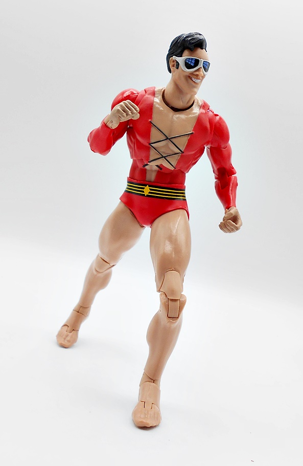
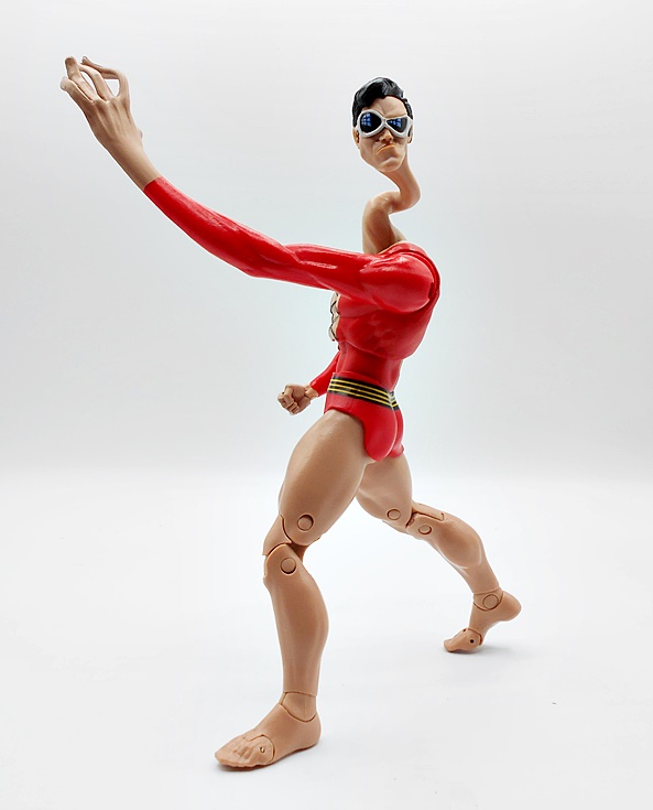
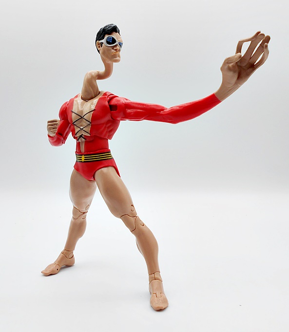
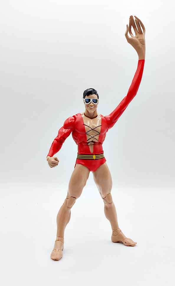
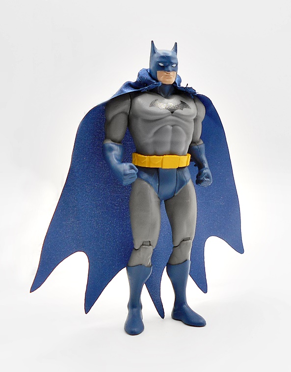
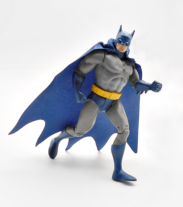
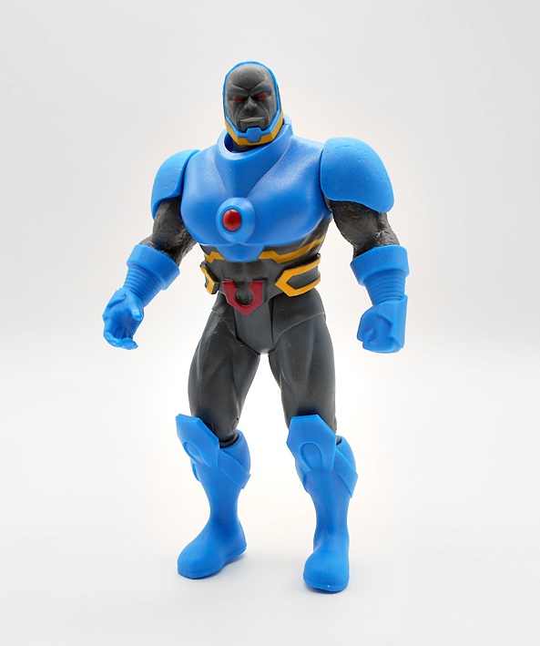
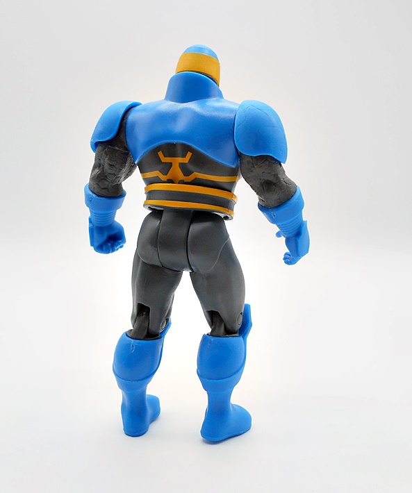
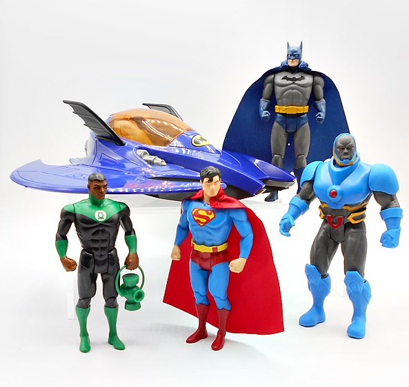
New takes on retro action figures is a huge thing these days. I think a lot of the credit (or blame) on the resurgence of vintage and 5POA figures can go to Funko and Super7’s ReAction lines, but since then a lot of companies have jumped on board. And while McFarlane is already producing a dizzying array of regular DC figures in their Multiverse line, they’ve found the time to reintroduce the world to Kenner’s old DC Super Powers Collection. These aren’t exact reproductions of those figures, instead some are new versions of the characters done in the old style. And unfortunately, these are all Walmart Exclusives, so I was pretty surprised to find any of them at all, let alone the whole wave. Let’s start with the figures and then I’ll have a look at one of the vehicles!
The first wave consisted of three figures: Superman, Batman, and Darkseid, but since I managed to find Jon Stewart Green Lantern from the second wave, I’m throwing him in here as well. The second wave also included The Flash and Batman Who Laughs, and I’ll only be picking up the Flash out of those two. Obviously, the packaging is going for pure nostalgia with some pretty close approximations of the old Kenner card backs. They look great, but they are definitely not collector friendly. And I was tempted not to open these at all, but my willpower is shite, and I tore into all of them. The wave one figures were on clearance, so I may pick up a second Batman and Supes to keep carded, if there are still any left. We’ll start with The Man of Steel!
Superman is the only one of the bunch that’s pretty close to the original Kenner figure, at least in terms of costume design. He’s got his bright blue suit with red boots and undies, yellow belt, and S-shield. I dig the proportions on this figure, and the sculpted muscles look really nice. The coloring is also outstanding with bright yellow, vibrant blue, and crisp red, he looks like he flew right off the pages of a DC funnybook. The head sculpt is a tad soft in the facial features, but they really captured his trademark cowlick, and I like the bright blue eyes.
The cape is like a cross between paper and cloth. It’s stiff, but looks good, and has a wire running through the collar, which is the only way it attaches to the figure. It hangs on well, and my only gripe here is that the cape was secured to the bubble with a wire, which left a tiny hole in the cape. This won’t be an issue for mint-on-card collectors, but it bugs the hell out of me. As with all the figures in this line, Superman has seven points of articulation. The head turns, the shoulders rotate, the T-crotch allows the legs to move forward at the hips, and the knees are hinged. The figures do not retain the Kenner action gimmick that made them punch when you squeezed their legs.
Unlike Supes, Batman is a completely different version than the original Kenner figure. I think this design is based on the Hush comic, which admittedly isn’t a huge departure. Instead of having the yellow and black bat symbol on his chest, he just has the black. It’s disappointing to me, but not a deal breaker. Otherwise, the figure looks fine with a mix of new sculpting and recycled parts. The cape works the same as Superman’s and yes it still has a tiny hole in it from the wire. Batman is by no means a bad figure, but he’s definitely my least favorite of the four.
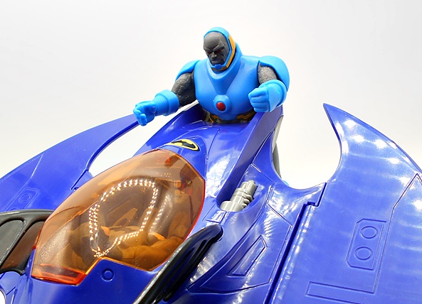
Darkseid is also pretty different from the original Kenner figure, with this being the New 52 version, which is nice nod for me because I happen to like this look a lot. Darkseid is the biggest and most complex figure here with a lot of great sculpting for a figure in this scale. The armor bits give him a lot of heft, and I love the detail to his belt. You even get a little sculpted fissures in the skin on his arms and his face. Even the coloring here is fun and vibrant with the bright blue and yellow contrasting nicely with the dark skin. Darkseid has one hand sculpted into a fist and the other able to grab other figures. I love this guy!
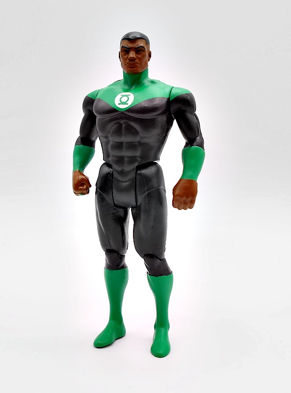
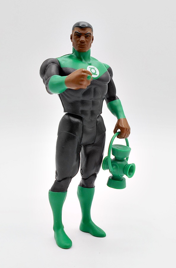
Last, but not least is Jon Stewart, who did not get a release in the original Super Powers, as Kenner only produced Hal Jordan as Green Lantern. And oh boy, is this figure outstanding! The costume is pretty simple with a mostly black bodysuit and green boots, bracers, and shoulders, with the lantern emblem on his chest in green and white. The head sculpt is an absolute homerun here! The facial sculpt is so good that it doesn’t feel like it belongs in the same line as Batman and Superman. Jon’s right hand is sculpted in a fist and has his power ring clearly represented, while his left hand is designed to hold his lantern accessory. Wow, what a great figure!
There’s a part of me that would have liked to see McFarlane do the Kenner versions of these figures, but then New 52 Darkseid and Jon Stewart Green Lantern are so great, I’ll happily stick with what we got. Despite being cherry-picked from across the DC Multiverse, these figures still manage to capture the charm and fun of the original Kenner efforts. What’s more, they certainly don’t feel like quick and dirty nostalgia cash grabs, but rather damn fine figures for their scale and style. Even more so at less than $10 a pop. But we’re not done yet… let’s move on to the Batwing!
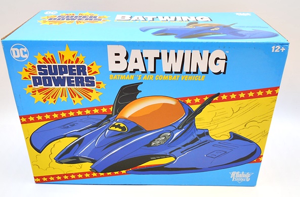
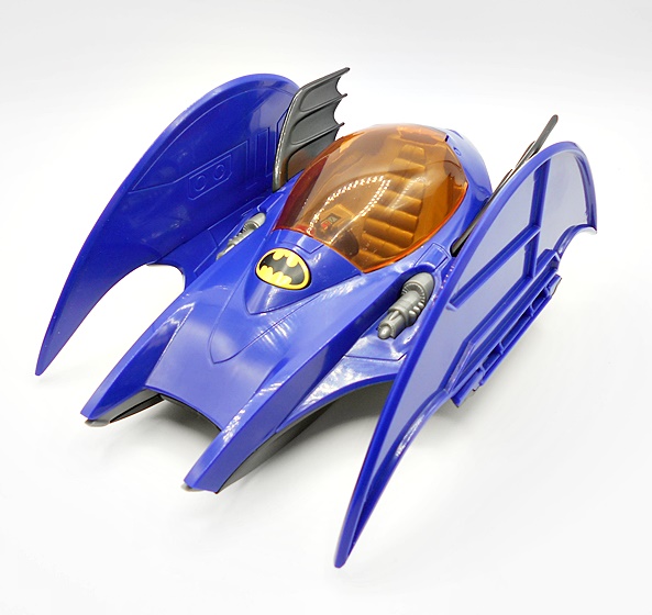
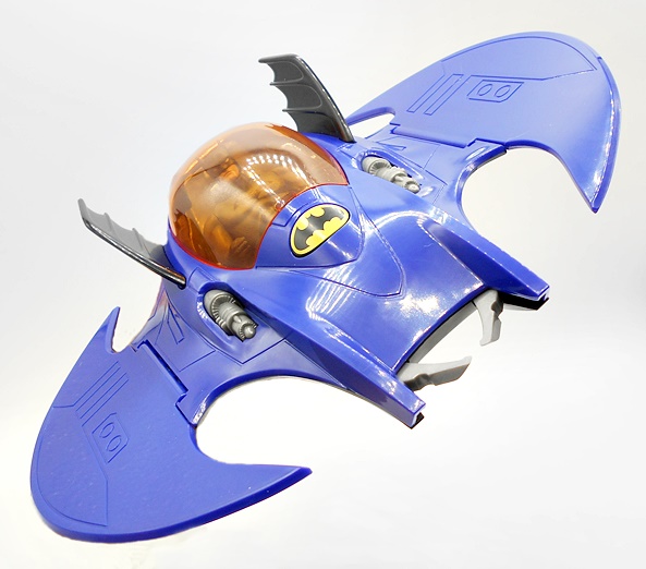
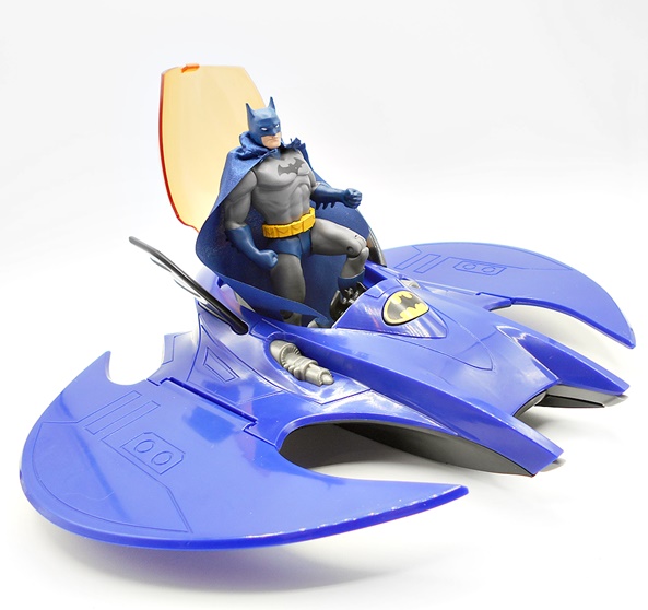
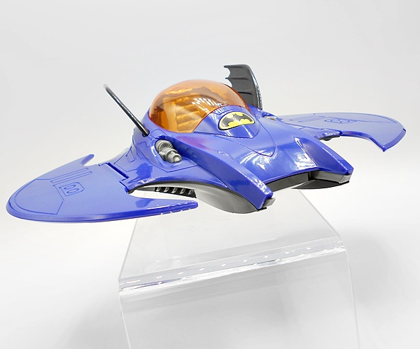
Kenner Super Powers gave us the Batmobile and the Batcopter, but this Batwing is an original design for this line, borrowing heavily from the 1989 Batman film and retro-fitting it perfectly for the vintage Kenner style. The jet comes in a fully enclosed box that mimics the vintage vehicles for more of that sweet, sweet nostalgia. You get artwork on the front and some shots of the Batwing on the other panels.
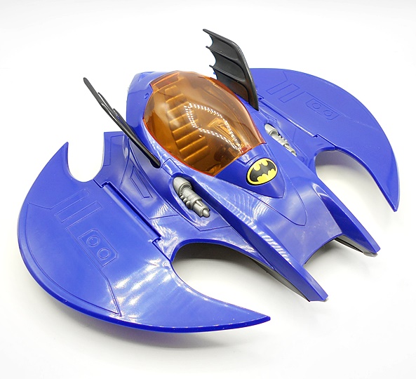
The Batwing comes out of the box fully assembled, but with the wings folded up. I’m not sure if this is supposed to be a play feature, or just a method of getting a big toy into a small box. Either way, I dig it, as it’s similar to how some vintage aircraft would fold up the wings for storage on carriers. I’d like to think that this is how the Batwing travels up an elevator to be deployed out of a concealed hanger on the top of the Batcave.
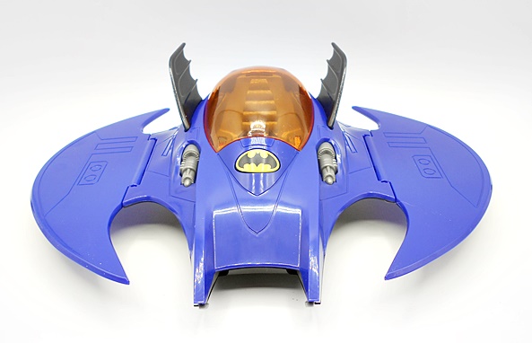
With the wings folded down, we can get a better look at the jet, and it’s a damn cool little vehicle. Again, the similarities to the 89 Batman jet can’t be overstated. This one is a little smaller and cast mostly in blue plastic with black bat wings jutting up from each side of the translucent orange cockpit. There’s a little bit of panel lining, and two gray machine guns, at least that’s what I’m calling them, and finally a very classic black and yellow bat symbol, which doubles as a button to spring open the canopy. The back has a gray thruster cone, and there’s a trigger on the undercarriage to activate the capture claw hidden on the front. I really love the design of this little toy, especially how anachronistic it is. The way it takes a newer design and makes it feel totally at home in this retro line is just genius.
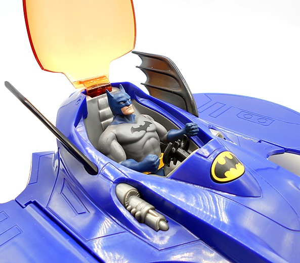
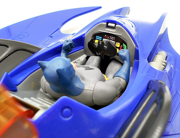
Batman is a bit of a snug fit in the cockpit, but it works! I prefer to remove his cape, just so it doesn’t get all bunched up in there. The cockpit is detailed with some very colorful pre-applied stickers for the consoles, and a bat-shaped yoke for steering.
The capture claw feels right at home as a Super Powers action gimmick, while also employing a feature seen on the 89 Batwing. I can practically see a kid in a vintage commercial swooping in for the grab while shouting, “YOU’RE FINISHED, DARKSEID!” Every bit of this toy just oozes 80’s Kenner charm!
Now, I will confess to some Batwing sticker shock, as for some reason I was convinced that these vehicles were $20, but in fact they were $29.99 at my Walmart. I’m not going to say it’s totally outrageous, but it is a lot for what is a pretty small and simple vehicle. But, obviously it wasn’t too much, because I came home with it. Still, I wish it had been on clearance like the figures! Nonetheless, I have no regrets. This line is just tons of fun and looks great on display in a little corner of my Comic Room. I’m not sure how deep I’m going to go with collecting it, but I am hunting Flash and Wonder Woman now, and I will probably break down and pick up the Superman vehicle as well. It would be great to see Kalibak and Steppenwolf, as those were some of my favorites in the Kenner line, but even if we do get them, who knows what versions they will be. And that’s really just my one nitpick here is that I would have enjoyed more of a cohesive selection of character versions.
It’s been pretty slow for me on the DC collecting front, so I’ve decided to continue running through a complete wave of Mattel’s Multiverse line while I’m waiting for some new statues to roll in. This is also helpful, since I just wrapped up another extra long work week and all I want to do is curl up in bed with a bottle of Jameson for at least 12 hours. Last time on DC Friday, I looked at DCTV’s Supergirl and was less than impressed. This time I’m checking out Superman from the 2014 story arc, Superman: Doomed. Will this figure be any good? Or will it be doomed to… ah f’ck it. Never mind the easy puns. let’s just check him out…
The packaging is the same we saw last time for Supergirl. It’s collector friendly, it gives you a good look at the figure inside, and my favorite thing about it is the character art and little bio blurb on the side panel. If I were saving these packages, I could line them all up on the shelf and no exactly who is who. As the package indicates, this is Superman infected by the virus he inhaled from Doomsday’s defeated body. I found it to be a pretty average story, although it was elevated by the fact that most of New 52’s Superman book before it was not my cup of tea. Look, I actually enjoyed several books from the New 52, but I thought Supes’ book was pretty lame. Doomed, on the other hand, well at least it presented something interesting.
So, at first glance, I like what I see. It’s a slightly beefier Superman in his New 52 outfit with some decent red and blue coloring. Some of the costume, like the boots and the belt are sculpted on, while the S-Shield is merely a tampo. This is one of the first times I can remember a New 52 Superman figure violating the New 52 art direction guide that the emblem should always be 3D and never just painted on. Seriously, that shit is printed in at least one of the comics! I’m pretty sure it was Justice League. At this point, however, I guess nobody cares anymore. Hey, at least the S-Shield is very printed very sharply, and the colors are bright and snappy. The figure does have a little bit of a cheap feel to it. It’s not junky per-say, but it feels more like those Total Heroes figures than it does a DC Universe Classics or Unlimited or All-Stars or whatever Mattel was last calling their DC collectors’ line. So far so good, pretty solid.
Of course from the waist upward, the figure takes on a more unique visage and exhibits some of those Doomsday characteristics from the virus. You get bumpy spikes in the arms and torso and those gray grasping monster hands. And that brings us to the head, which is pretty well done. I’m sure I’ve gone on record as saying that I’m not a huge fan of Doomsday’s design, but it looks pretty cool here when presented as a Kryptonian-Doomsday hybrid. Supes is sporting a wide grin with a mouthful of nasty teeth, more or those horn-bumps on his chin and jaw, and some wicked red demon eyes. Not too shabby. He’s still got his regular hair, more or less, but he also has little tufted ears. I like what they did here a lot.
Unfortunately, this figure’s articulation lets it down, and like Supergirl, it isn’t necessarily because the points aren’t there, rather there isn’t just a great range of motion to any of them. The arms feature rotating hinges in the shoulders and elbows, and swivels in the wrists and biceps. Those hinges in the elbows can’t do much and the lack of hinges in the wrists is disappointing. The legs have rotating hinges in the hips and swivels up there too, but again, there just isn’t a lot you can do with them. There are hinges in the knees and ankles and that’s all well and good, but again there’s very little range of motion in the knee hinges, and there are no ankle rockers. At least his torso fares well with a waist swivel and a decent ab crunch. Lastly, the neck is ball jointed. On paper, most of this sounds passable, but in hand, the figure just isn’t a lot of fun to pose.
I do like how he scales with Mattel’s earlier lines. Here he is alongside Mattel’s DC Universe “All Stars” New 52 Superman from 2012. He’s a little bit bigger, but then he is supposed to be, so I’d say it’s a pretty good match. You can also see that the Doomed version is missing the panel lines of the costume. That’s something I didn’t even notice until I put them side by side, and now I’m bummed out by it.
Overall, I like this figure better than the DCTV Supergirl, but I really need to qualify that. Supergirl had some great sculpting and paint in the costume, but fell short on everything else. Doomed Superman is a lot less ambitious. It aims lower and as a result doesn’t fail quite so badly. It’s also a comic based figure, which requires less in the way of realism, particularly in the portrait, and that was the Achilles Heel of that Supergirl figure. So, no… don’t take this as a ringing endorsement. This Superman is not a great figure, but I don’t think he’s terrible either. If I ever get my DC Universe Classics collection set up on display again, I’ll have no qualms about putting him in there. Of course, keep in mind, that I picked up the figures in this wave for around $8 a pop, so I’m going to be a lot more forgiving when it comes to value. Plus, I’m one limb closer to building my Doomsday figure!
It’s DC Friday again and what better way to spend it than looking at another of DC Collectibles’ newest DC Icons figures? Today I’m checking out Superman! The fact that he’s appearing for the first time in Wave 3 is a great indicator of how diverse this line is. Think about it. We got Earth 2 Mister Miracle before Superman! It’s a risky move and I commend DCC for making it, as opposed to just flooding the pegs with A-Listers like Batmans, Supermans and Harley Quinns. Um, Harley Quinn was in this wave of DC Icons, so… SHUT UP!!! Anyway, hopefully it’s paying off for them.
We’ve seen the packaging before and it’s as attractive and collector friendly as ever. The blue and white coloring looks sharp and I dig the placement of the S-Shield in the “O” of ICONS. The box indicates that Superman is the tenth release in the series and calls out that this is Superman as pulled from the pages of John Byrne’s landmark “Man of Steel” miniseries way back in 1986. The big window not only gives a good look at Supes, but also the other figure he comes with, Krytonian helper-robot, Kelex!
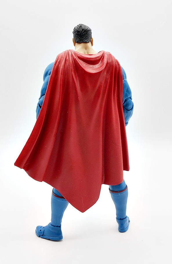
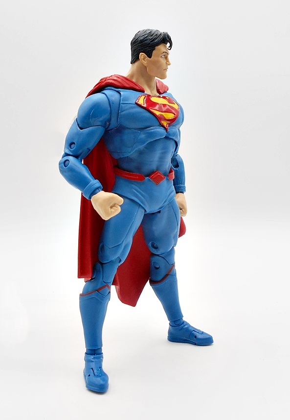
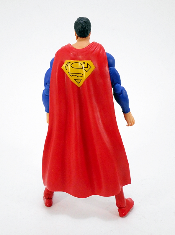
And this is indeed honest-to-goodness Classic Man of Steel! Before they took away his red undies, textured his suit, and turned him into a brooding shit. As has been the case with this line, everything about the suit is part of the sculpt. And while that doesn’t really amount to much here, it’s nice to see it in the raised S-Shield, the sculpted belt buckle and loops, and the top edges of the boots. Even the S-Shield on his cape is sculpted on. The costume features some gorgeous red and blue coloring with some welcome variations, like the use of matte red on the undies and cape, and gloss red on the boots. There’s just something about this costume that does it for me every time, and everything here looks so bright and vibrant and the applications are sharp and clean.
The cape flows out from the front of his shoulders and hangs close to the body. It’s just the right size and heft so as not to throw off his balance or get in the way of articulation.
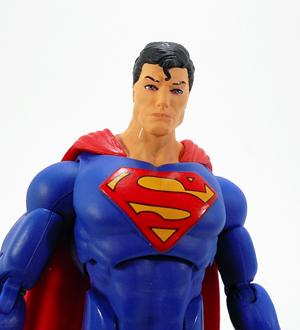
The portraits in this line have been good, but not always exceptional. In this case, I’m very happy with what we got. The detail in the structure of the face is very impressive and I dig the stoic expression. There’s a little bit of red in his eyes, and while I doubt it was the intention, I’m just going to assume he’s charging up that heat vision! Probably the best thing is how they did his protruding cowlick, it’s epic! Note to self. Rename my band, Epic Cowlick!
Superman holds no surprises in his articulation. We’ve been getting pretty much the same thing across the board in the Icons series. Here you get rotating hinges in the shoulders and wrists, double hinges in the elbows and knees, ball joints in the hips and neck, swivels in the biceps, and both hinges and lateral rockers in the ankles. There’s an ab crunch hinge in the abdomen and a ball joint just under the chest. Normally, I complain about the lack of thigh swivels, but here I’ll point out that an added hinge in the neck would have been very welcome so Supes could look up when flying.
Superman himself only comes with an extra pair of hands, so you get fists and relaxed open hands. That can, however, be forgiven because you also get this…
Kelex is more of a bonus figure than an accessory. He’s big and he does have some limited articulation, with a ball jointed neck and rotating shoulders. He also comes with a clear display stand to allow him to “hover.” I can’t say he was high on my want list, but I’ve always liked this design a lot, so I’m happy to get him.
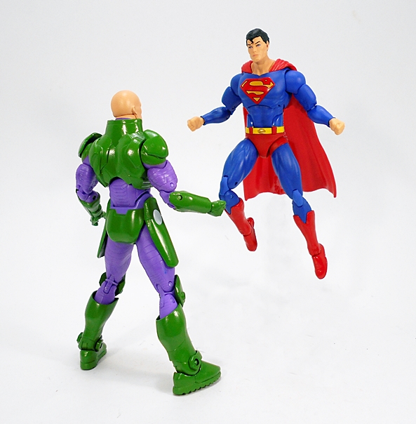
I don’t know if it’s the attractive coloring of his costume or how much the character meant to me as a kid, but I get excited every time I pick up a new Superman figure. I can still remember getting the DC Universe Classics version and smiling ear to ear. Needless to say this getting this figure has been no different. I’ve had him within reach for the last few days to fiddle around with while I work and he and Lex have been slugging it out for supremacy of my desk. Superman is a refreshingly simple and classic release and he’ll find a place of honor on my expanding DC Icons shelf!
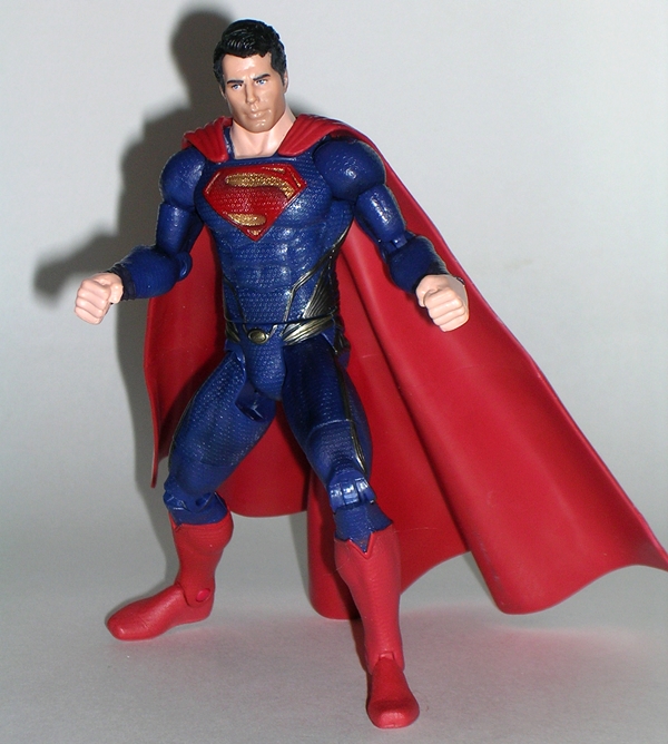
I’ve scrapped the intro to this feature twice because both times it deteriorated into a rant on the new Man of Steel movie. Kicking movies that I don’t like is not something I enjoy doing, so I’m happy to abstain from it. The film is obviously a unique take on the character and one that doesn’t jive with what the character means to me. Fair enough. In the multiverse of Infinite Earth’s I’m perfectly fine setting aside one for the Zack Snyder Superman to reside on, so long as I don’t have to visit it ever again. Anyway, if there’s one thing I did like it’s the design of Supes himself, and so I still wanted a figure for my collection, and that’s what we’re here to talk about, so enough said about the movie… let’s talk toys.
Mattel went with a very cool presentation for this line. The “Man of Steel” title is seriously underplayed. It’s type is even smaller than the “Adult Collector” label on the top of the card. The rest of the card features a large “S” Shield, making up the back of the bubble and a flowing red cape motif. The bubble is large and shaped like Superman’s shield crest. The insert follows along with the cape motif and has “Superman” printed across it in large lettering. The package certainly works for Supes, but I think the diminished title of the movie may be a little odd for the Jor-El and Zod figures. Whatever the case, this is an attractive package and it certainly draws one’s eye to the pegs.
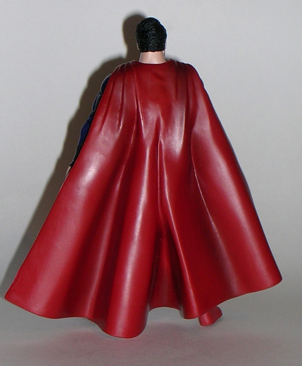
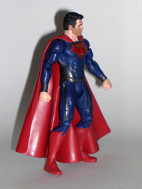
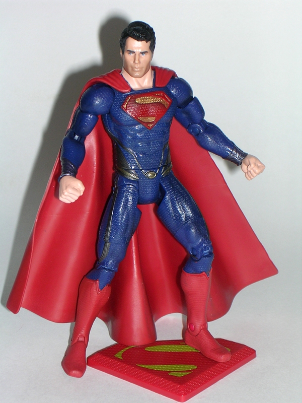
As I already mentioned, I really like the movie version of Supe’s costume. It draws a bit on the “New 52” design in that he isn’t wearing his red undies. On the other hand, instead of the panel lined light blue suit, we get a darker blue suit with a basketball like texture. There’s also some dark grey piping that runs along the sides and the back. I like it, as it gives the suit a little bit of an alien motif, although most of it is concealed by his cape. The “S” Shield on his chest is actually sculpted into the figure. It’s textured like the rest of the costume and features some nice metallic gold paint. The cape is especially well done. It attaches over the front of his shoulders and flows wide behind him. I do miss the “S” Shield on the back of the cape, but I can live without it.
The portrait is surprisingly good for a figure based on a real-world likeness. I may have a number of issues with the movie, but one thing that I can’t deny is that Cavill looks good in the suit and Mattel’s sculptors did a fine job reproducing his likeness in the head sculpt. It’s not the spitting image of the actor, but it’s closer than I would have expected. I’d dare say it’s one of their best.
The articulation here is very close to the DCUC style, with just one real notable omission. There are ball joints in the neck and shoulders. The arms feature swivels in the biceps and wrists, and have hinged elbows. The legs have the usual DCUC style hip joints, swivels in the thighs, and hinges in the knees and ankles. Superman can also swivel at the waist. The missing POA is the chest ab-crunch. It was probably sacrificed in favor of the added sculpting detail of the suit, and I’m fine with that.
Superman comes with an “S” Shield figure stand. I’m always happy to get a figure stand, but I’m not sure that I’ll use it, as he stands just fine on his own. There are no other accessories. If you want a motorcycle for him to rip apart, you’ll need to look to the 3.75” line.
If you want a Man of Steel figure for your shelf, you can’t go wrong with Supes here. He is an exceptionally nice figure with a great sculpt, excellent paint apps, and no QC issues to speak of. Can this really be a movie toy? From Mattel? Well, in fairness Mattel’s Movie Masters figures are usually solid efforts and Superman raises the bar a little higher. That having been said, this is probably the only figure I’ll buy from this line, because I’m not at all keen on the other character designs. Ok, maybe I’ll pick up Zod, just so I can have Superman punch him through a city block and thoughtlessly murder hundreds of human bystanders.
On a side note, while buying Superman, I also thought I might as well get a movie version of Batman to go with him, so I picked up the Movie Master version of Batman from The Dark Knight Rises… we’ll check him out tomorrow.