DC Multiverse (Collector Edition): Starfire by McFarlane

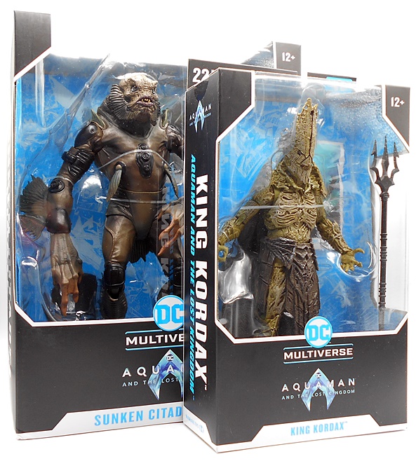
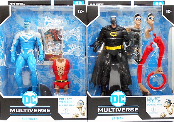
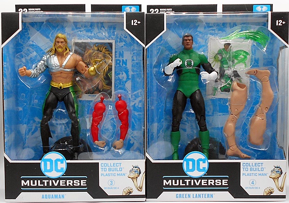
A little while back I checked out my first Collector Edition figure from McFarlane’s DC Multiverse series. I liked the figure well enough, but questioned why it was billed as a premium Collector Edition release with a ten dollar price increase. In the end I came away deciding that I was going to be very selective with which characters I buy in this sub-line, and so far there haven’t been many. I did, however, preorder this Rebirth version of Starfire, mainly because she looked great and I wanted her on my Teen Titans shelf. All I can say is Todd must know what he’s doing, because this figure sold out fast, although it has been recently coming back up for preorder. So, is this irresistible Princess of Tamaran worth it? Let’s find out.

Kori comes in a window box very similar to all the other DC Multiverse figures on the market, from the black deco on the box to the blue tray behind the figure. The big difference here is the foil lettering running beside the window exclaiming this to be a Collector Edition release. Also, instead of being sealed to the blue backer tray, the collector card is front and center, held in a special display stand. It’s almost collector friendly, but you do have to tear the stand off the backer tray to get it. And instead of the typical black disk figure stand you get a translucent flight stand that needs to be snapped together.

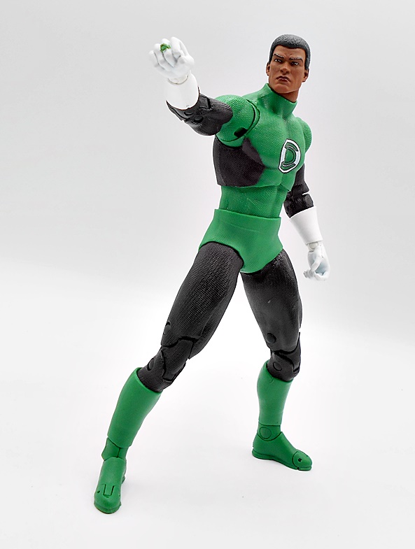
I’ll always be partial to Starfire’s space bikinis, but in the last decade or so Kori’s outfits have become less revealing. Why can’t we have nice things any more, DC? The Rebirth costume is similar to her 2015 Amanda Conner look, but they even had to cover up her midriff. At least we get a flash of shoulders and thighs. And with that out of my system, I actually still like this outfit quite a bit. The purple and lavender of the deco compliment each other nicely and pay respects to the older costume colors, while also contrasting well with her orange skin. A lot of the costume details here are achieved with paint, but you do get some sculped flourishes, like the raised disks above her thighs, the rumpled knee guards, and the green stone in the center of her chest. There are sculpted lines at the tops of her boots and ends of her sleeves, and she’s sporting some elegant high heels. Unfortunately, the paint lines between the purple and lavendar on her one-piece are just sprayed on, and I would have liked to see those a lot sharper. That’s why sculpted lines in these costumes are always the best, albeit not the cheapest, way to go.

The portrait here is quite solid, with maybe just a hint of Jennifer Aniston in there. Kori has a pretty strong jawline, but I still think she comes across as pretty. The lips and eyebrows are perfectly painted, there’s some nice gradient work in her skin tone, and the painted eyes are absolutely gorgeous. They have a haunting glow that could legitimately be mistaken for some kind of light piping and that’s impressive. I might have liked a little smile, as the expression is very somber, but I still dig it a lot. The hair sculpt is also well done, as it snakes down her back and almost down to her knees. The strands around her face are a little chonky, but I still think it works fine, and the coloring gradually goes from red at the top to orange at the end of her copious coif.

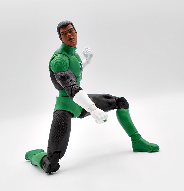
The articulation here is mostly what we’re used to seeing out of the DC Multiverse ladies, which is good. Although I will say that I absolutely hate the ball-style wrists. Not only are they kind of ugly, but they are extremely fragile. I’ve had one come apart on me once. It’s easy to pop it back together, but it’s a really bad design. Ironically, I usually complain about the balls in the ankles, but here they actually look OK, and haven’t given me any problems. As expected, the balance on this figure isn’t great, as her high heels and heavy hair does make her a challenge to stand. Kori does not come with any extra hands, so you’re stuck with just the fists and frankly that’s inexcusable for a Collector Edition figure that costs $10 more than the main line. I really wanted some relaxed hands for her, and maybe some power projecting hands as well.

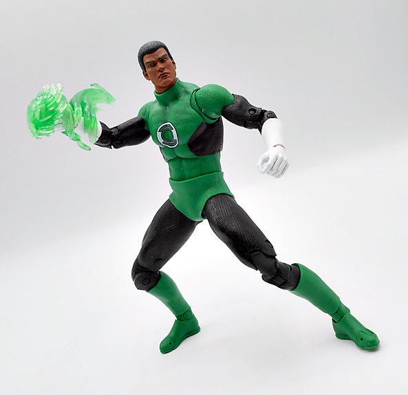
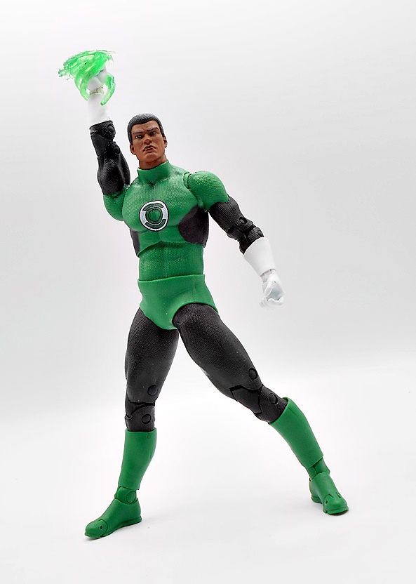
Starfire does come with two power effect parts, which slip onto her fists. These are cast in a bright neon yellow and they look really nice. On the other hand, they fit very loosely on her tiny fists, so I’m pretty sure these are maybe recycled from another figure. Normally, I don’t have a big problem with that, but when they don’t fit the figure, Todd, you probably shouldn’t use them.

I am happy that we got the flight stand. I know these aren’t popular with some collectors, as they can feel a bit flimsy. If McFarlane were selling these separately I would agree, but as a pack-in accessory I like them a lot. We see them every now and then in the main line, so I think bundling one in with Collector Edition flyers should be essential. You also get the collector card stand, which is the one stand out extra in these premium releases, but certainly not worth the extra ten bucks. Todd is infamous for packing in collector cards that don’t match the figure. Here, the suit is pretty close, but the hair isn’t.

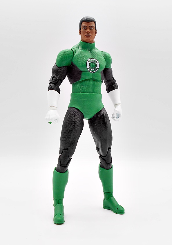
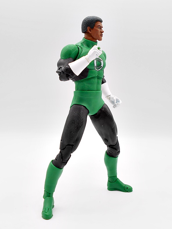
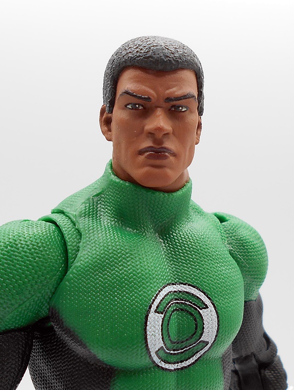
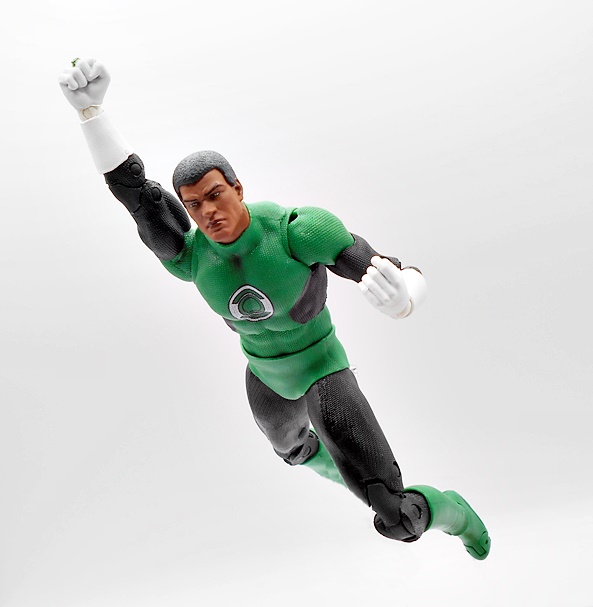
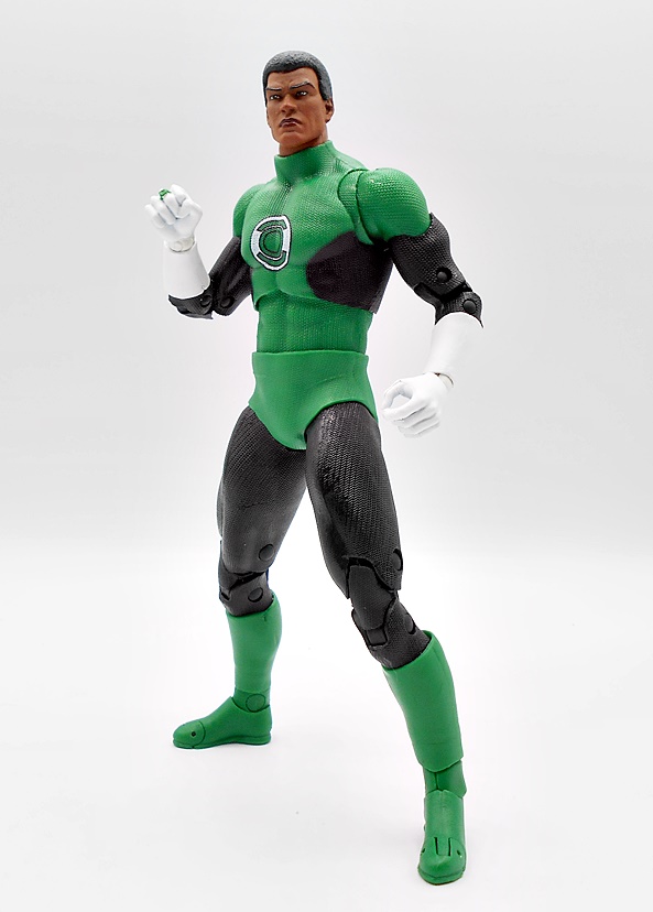
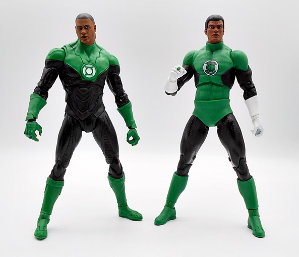
Starfire is a great looking figure and I’m happy to have her with my Titans, but I have the same problems here as when I reviewed the Collector Edition Green Lantern… the money doesn’t add up. In this case, with flimsy wrists, no extra hands, recycled effect parts, and some sprayed paint lines, it’s hard to see how this is a premium figure. She’d be a solid release for the regular line, but I’m just not seeing where my extra ten bucks went. I’ve said it before, I think Todd is just stacking this premium line with regular figures of characters that they think are in demand enough to sell at the higher price point. And I’d say it’s probably working, because I rarely see these go on clearance, so either the demand is there or they aren’t producing as many.

DC Multiverse: Bizarro (Rebirth) by McFarlane

A short while ago, McFarlane put up a Bizarro/Batzarro 2-pack for preorder and I went for it. But little by little the details has me rethinking that purchase for a number of reasons. Ultimately it was the very cartoonish portrait on Bizarro and the ham-fistedly reworked bat symbol on Batzarro that made me deep six that preorder before release. I was still hankering for a Bizarro, though, so I hunted down the Rebirth version that was released shortly before I fell into the delightfully bottomless pit of collecting this line.

Here he is in the packaging, just a regular release with no Collect-To-Build business to deal with. I also like that he’s from the Rebirth comics, because that happens to be one my favorite Superman figures on my shelf right now, so they’ll look good together duking it out. As usual, the packaging is mostly collector friendly, although you’ll have to tear the stand and the collector card off the cardboard backing to get them out. Also, there’s no flight stand included, which had me a little disappointed. The McFarlane flight stands aren’t great, but they are a fun way to display the flyers on the shelf and add a lot of value to the package.

As expected, the body is lifted directly from the regular Rebirth Superman, but using a darker blue for the suit. He also has a blue diamond panel in the middle of his belt buckle and the red trim at the tops of his boots actually match the sculpt, unlike the lazy-ass paint on the Superman figure where they tried to strongarm the right paint onto the wrong sculpt. The S-Shield is properly reversed, which was probably easy to do here since it was sculpted separately on Superman and attached to the figure. Reversed or not, the shape of the shield is the same, so they were able to pop the new one right in there. It’s not quite as polished as the shield on Superman, but it looks good.

The cape is completely different, and I’m almost certain it’s been lifted from another figure. It’s much longer than Supes’ cape, reaching down to Bizarro’s ankles, and it has various holes worn into it. There’s some subtle texturing to the surface and it’s a tad darker shade of red than what we saw on Superman.

The head sculpt is excellent. I realize that the highly stylized head on the newer two-pack is going for a very specific look, but this is definitely my preferred portrait for Bizarro. The enlarged jowls and smaller dome makes him into a bit of a pinhead and I love the shock of hair at the top of his head and the sides being clean shaven. The skin is gray with some subtle green bits of wash that make him look moldy and gross. There are some fissures sculpted into his skin, giving him a desiccated, zombie-like appearance and the hints of teeth in his downturned, parted mouth look great. All around, nice work!

Bizarro’s articulation conforms to the unswerving DC Multiverse standard, and that’s a pretty good thing. Everything here is serviceable and the joints work smoothly. I can’t recall having an issue with stuck joints on any of these figures and they are always lots of fun to play around with. I’d still love to see thigh swivels added, and you could argue that the pins are getting prehistoric, but I don’t mind. Bizarro also comes with an extra set of swappable hands, so you can replace his fists with graspy hands.

I’m glad I cancelled the Bizarro/Batzarro two-pack in favor of this guy. Sure, I would have preferred something more classic, but I do like the Rebirth designs and I am happy to have a Bizarro that pairs very well with one of my existing Superman figures. His price was a bit up there at a number of retailers and resellers, but a little patience netted him for about $20, which I believe was right around the original MSRP. All in all, another great addition to my DC Multiverse shelves!

DC Multiverse (Aquaman and the Lost Kingdom): Sunken Citadel Pirate & King Kordax by McFarlane

I wouldn’t call the first Aquaman movie a great film, but I went in with low expectations and a healthy level of intoxication and came out of it having had a pretty good time. I didn’t bother seeing Lost Kingdom, but someday I may remedy that, as it looks pretty bonkers. Nonetheless, I was attracted to today’s cool looking figures despite not seeing the film, and it didn’t hurt that these were on deep (no pun intended) discount. Understandable, since the merchandising push crumbled about as badly as the film’s hopes for making a decent profit. As I understand it, it was one of the DCEU’s better recent performers, but when put up against the likes of Black Adam and Shazam, that’s not exactly high praise. At least I’m pretty sure it broke even. Anyway, I was happy to see McFarlane latched onto some of the creative creature designs for this movie, and I would have liked to see more.

The pair I’m looking at today consists of King Kordax and the Sunken Citadel Pirate Mega Figure. I believe, Kordax was the major villain of the film and the Pirate was just a background character from the diverse population of the Sunken Citadel. These, and the Seahorse Mount, are the only figures I picked up from the film, but if a Mamoa Aquaman in his classic armor and Black Manta get cheap enough, I’ll likely grab them too. These figures come in the usual DC Multiverse style window boxes, although they are branded with the movie logo on the lower front. They are mostly collector friendly, although you will have to tear the figure stand and collector cards off of the cardboard backings to get at them. Let’s start with the big guy…

I love McFarlane’s Mega Figs, mainly because you don’t see regular retail figures this big released all that often these days. Plus, Todd has really nailed down a compromise between creating an impressively sized and great looking figure while still keeping costs somewhat reasonable. What we have here is just a giant fish guy in some kind of pressure suit, and I don’t know why, but the idea of fish wearing clothes underwater kind of tickles me. His hands and feet are left bare, showing off some of the delightful anatomy of this creature’s extremities. His legs kind of have the structure of a dog’s hind legs, providing him rather high ankle joints, while his elongated and webbed hands give him quite an impressive reach. The suit has some reinforced pads and what look like pressure valves or hose attachments, but mostly it’s just smooth plastic. I like how it’s designed to let his various fins stick out, including the two little articulated flippers on his chest. The coloring here is mostly various shades of brown, and I would have liked to see more variety between the color of the suit and the actual fish guy itself, but maybe that’s screen accurate, I don’t know. I also think a glossier wash over the suit would have added to the wet and underwater feel. Still, I like what we got just the same.

The head represents some wonderful sculpting, offering plenty of detail to all his fishy parts. It’s a pretty cool design, with the fins forming a sort of beard and mutton chops, the slightly open mouth showing a mess of teeth, and the tiny piercing eyes peeking out past a slab of brow ridge. The head represents the most variety to the color palate, but it’s still just shades of brown with a bit of wash over the boney parts of the face.

The Pirate features a lot of the usual points of articulation found in McFarlane’s Mega Figs, but because of his bizarre anatomy some of it works differently. The arms have rotating hinges in the shoulders, swivels up at the top of the biceps, single hinged elbows, and rotating hinges in the wrists. The legs have rotating hinges in the hips, double hinged knees, and as I mentioned earlier, his ankle hinges are up higher than usual, offering rotation and a hinge, but not much in the way of lateral rockers. There’s a ball joint in the waist and while the neck is articulated, the head can really just pivot side to side like a dog hearing a strange noise, rather than actually rotate. Many of the hinges here are on heavy ratchets making sure they can hold whatever pose you put them in. There are no accessories or extra hands, but this guy really doesn’t need much more, he’s damned impressive all on his own.

The Sunken Citadel Pirate is an outstanding figure, and while he’ll likely take up residence on the regular Aquaman portion of my DC Multiverse shelf, there’s so much crossover potential here. He would make a great Doctor Who monster, and I could even see him fighting some of my fantasy themed figures like Mythic Legions or AD&D. The original MRSP on this behemoth was $40, but I got him for half that and I’m certainly glad I did! Now, let’s move on to King Kordax…

So, I guess the DCEU version of Kordax was the main villain of the film, but spent most of it confined to a magical prison. He possessed Black Manta and influenced a lot of what happened, but really just showed up in person for the big final fight when he was finally released. And I gather he’s basically an undead Atlantean in crustacean armor. And while the figure looks pretty badass, I will say that the coloring on this one seems to really be at odds with the clips I’ve seen of his on screen appearance. Maybe it was just the lighting, but he looked more blackish-green and had green energy spilling out from inside him. None of that is really replicated here, as the armor is mostly tan brown with a bone colored wash and some black for the skirt pieces.

That’s not to say he isn’t a cool looking figure, because he sure as hell is. The sculpting for the armor is excellent with some crazy intricate detail. The chest has a slight ribcage motif, but the bulk of the armor just looks like it was grown like barnacles on the hull of a ship. Even the tattered cape has some detail that looks like ancient organic sea growth.

The elongated helmet is creepy as all hell, with narrow, barely visible eye slits and a mouth exposing a wall of nasty teeth. If you look closely, you can see some portions of his actual head peaking out around the jawline, as well as his ears. These are painted in a sickly, pea soup green and given a hint of gloss. What’s really creepy are all the filaments of growth snaking their way off the back of the helmet and top of the shoulder pieces like tendrils.

Despite his bizarre look, Kordax holds true to the usual DCM system of articulation and he’s pretty fun to pose and play with. The shoulder armor does inhibit the movement up there a little bit, but the arms will simply unplug from the sockets, rather than allow anything to break, if you go beyond what they are intended to do. There’s a single pair of hands, with the left somewhat open and the right closed up in a tight grip to wield his one accessory.

And that accessory is his Black Trident, which I guess was a big deal in the movie. Here, it’s not terribly impressive and it’s cast out of some super soft plastic. Mine was warped straight out of the box and it’s been tough to get it to straighten out for any amount of time before it starts warping again. That’s kind of a shame!

I feel like if you were a fan of the movie and bought this figure sight unseen you might be disappointed with the final result, mainly because of the coloring. Granted, that’s not a problem for me, and I dig him a lot. On the one hand, I think it’s a pity McFarlane put all this work into the figure only to have the movie flop, but then again if nothing else, we still got this cool figure out of the deal, and that ain’t a bad thing! And like the Pirate, I was able to grab this guy for super cheap at just $13.

If you want some cool fish people for your action figure display, I can’t recommend this pair enough. McFarlane poured the love into these sculpts, creating something good out of the movie in the end. Hell, the Pirate is so good, I’d have to show some serious willpower to keep from picking up another if he drops in price much more. I think the real shame here is that there were some other very cool creature designs in the film that would have made for great figures. I’m specifically thinking about the Hammerhead Shark Guards in the Sunken Citadel. I would have definitely been down for a pair of those! Maybe if the film had performed better there would have been a second wave. I guess we’ll never know!

DC Multiverse (Plastic Man Wave): Superman, Batman & Plastic Man by McFarlane

We started this week with the DC Multiverse Plastic Man Wave, so we might as well finish with it too. If you’re just joining me, feel free to click on back to Monday to get caught up, otherwise we have two more figures to check out and then we can cobble together the Collect-To-Build Plastic Man and put this whole wave to bed. Let’s go…

As I mentioned last time, this assortment is supposed to be JLA inspired, but it’s pretty inconsistent on that front. Aquaman was a perfect fit, but John Stewart didn’t belong here, and we’re kind of going to have a similar issue today, but I’m getting ahead of myself. The figures come in the usual big window boxes and while I love these packages, I don’t have the room to keep them, so they get recycled. And that’s just as well since you have to rip apart that beautiful blue backing to get at the figure stand and collector card anyway. As for the Collect-To-Build figure, we got the regular arms and legs with the last two figures, and this time we’re getting Plastic Man’s torso, two heads, and some extra arms. Let’s start with Superman!

I can’t say I was the biggest fan of the stories involving Superman divided into his Red and Blue suits, but I do think these make for some beautiful action figures, and that is certainly the case here. Supes’ blue energy suit is achieved entirely through paint and colored plastic, as this is just a generic figure buck, but boy does the deco really sell this one! The electric blue plastic is so vibrant and when you mix it with the super bright white paint and jagged S-shields, both front and back, you get a figure that can really demand attention on the shelf, even without any unique sculpting on the body. The paint lines are nice and sharp and you get the outer pins painted as they should be, which may sound like a strange thing to point out, but it’s something Hasbro often doesn’t get right in Marvel Legends.

The head sculpt is superb. I thought this one might be re-sculpted from Firestorm, but I haven’t opened him yet to really check. His skin is painted a paler blue than the suit with a shock of electric blue hair up top. The face has some wonderfully defined features, with the white cowl shaping the edges and accentuating his cheek bones, and a slight wrinkle to the brow. The white, pupil-less eyes give him an otherworldly visage. The eyebrows are neatly painted and there’s a slightly darker shade of blue for the lips. So far, this wave is definitely three out of three when it comes to the portraits.

There’s no surprises in the articulation and you only get the single pair of hands, both balled up into fists as they should be. You do, however, get four electric effect parts which are designed to attach to the figure’s limbs. I’m pretty sure these are recycled, perhaps from one of The Flash figures, only recast in translucent white plastic. I wouldn’t say these were necessary, but I think they’re a good inclusion and look very nice on the figure. So many of my effect parts wind up in a bin, but I may actually display these on the figure.

I missed out on Mattel’s DC Universe Classics version of this Superman, and while that’s bugged me for a while, I’m OK with it now. I just like the look of this one so much better. A flight stand would have been a nice inclusion but I don’t think we tend to get those in Collect-To-Build Waves. I’ll also point out how odd it is that the collector card doesn’t reflect this version of Superman in any way, but hey… McFarlane gonna McFarlane. And speaking of which, Todd decided to make the Red Suit counterpart a Platinum Exclusive and it’s going for crazy money on the secondary market, so thanks so much for that! Moving on to Batman…

I’m sure I wasn’t the only one disappointed to see that the JLA version of Batman included in this wave was just a straight repaint of The Three Jokers Batman. With early teased images hitting, I was hoping that we’d at least get some retooling and a new head, but nope… this is a straight repaint and that’s just crazy lazy on McFarlane’s part. And with that being said, it pains me to admit how much I dig this release. Don’t get me wrong, this really doesn’t work for me as the intended version, but I just love the way the black and brighter yellow looks on this figure. I have yet to review the previous release of this mold, but I will drop in a comparison shot at the end.

A new head sculpt would have helped, as the little bat nub ears don’t work at all and it could have used a lot less texturing on the cowl. I’m sure there’s another Bats head out there that would have worked better. But you would have to re-sculpt the arms and lower legs too, and I doubt any of that was ever on the table. I dig the sculpt on the lower half of the face, offering a very pouty and super serious caped crusader.

And to add recycled insult to repacked injury, you get the bat grapple gun that we’ve seen a bunch of times already bundled in with the figure. I feel like I have a dozen of these, but in reality probably only two or three.

I don’t hate this figure at all. I actually kind of love it, but I also don’t like the business practice behind it. It’s just a lazy way to toss a figure into the assortment with some new paint and pretend it fits the theme you’re going for. Plus, it probably means we won’t be seeing a proper JLA styled Batman in this line for a while. When you consider how this line butters its bread with Batman variants, it’s a shame McFarlane couldn’t have put some effort into this one. OK, onward to the real reason this wave had me all excited… Plastic Man!

My original love for Plastic Man didn’t come from his comic book appearances, but rather from the Ruby/Spears Plastic Man Comedy Adventure Show. Granted, Plastic Man, and his smoking hot wife Penny, was only part of the show, as it also featured segments of Mighty Man and Yukk, Fangface and Fangpuss, and Rickety Rocket. And the real treat came when it hit syndication and you got surreal intros and outros featuring a live action Plastic Man. Like Blue Energy Superman, I missed out on getting Mattel’s DC Universe Classics version of Plastic Man back in the day, so grabbing this one was a big deal for me. And for the most part, this figure definitely scratches that itch. The edges between the suit and his skin is sculpted, as are the laces, and that’s the case both on the upper body and the abs. The feet are probably new too. I’m not sure how I feel about the break in the torso for the ball joint. It definitely improves articulation, but it messes with the flow of the chest sculpt. I might have been fine with him just having a ball joint in the waist to clean that up, but either way it’s a compromise. The flesh tone looks good, as does the bright red for the suit. He’s got some yellow striping on the black belt and the black laces over his chest are pretty sharp.

You get two heads to choose from and both are full of that patented Plastic Man charm. The first one offers a big toothy grin with his trademark white rimmed goggles. The black lenses have some stylized reflections painted onto them, which looks good. The hair is sculpted separately from the rest of the head, giving him a clean hairline. I love what we got here, but I don’t love the huge gap where the neck fits into the body. What happened here? Why is the neck hole so big? It just looks weird.

The second head has a crazy curvy neck and a pretty comical scowl on Plastic Man’s plastic puss. One of his goggled eyes is popped while the other is narrowed. It’s a wonderful caricature while also showing off his plasticky skills. And lest you thought the neck hole was big to accommodate this head… nope. The base of the neck is no thicker here and that gap is still there and as distracting as ever. I honestly can’t imagine what happened there.

Plastic Man features all the usual DC Multiverse articulation. The arms and legs assemble to the body easily and they stay put just fine. You get just the one set of hands to work with his regular arms, with the right being a fist and the left a grippy hand, despite him not coming with any accessories to hold.

But you do get a pair of swap out stretch effect arms. These are pretty cool and are really what justifies him being a Collect-To-Build figure. The right arm is formed into a makeshift lasso, while the left arm is stretched out and the hand is enlarged. These are fun to mess around with, although I can’t help but wonder if we’ll see this figure released with even more limbs as a stand alone somewhere down the road.

Obviously I’m a big fan of DC Multiverse, as I have a ton of these figures, but this wave is a great example of why McFarlane gets a lot of justifiable hate. Tossing a JLA Wave out there with a mismatched Green Lantern and a straight repaint of a Batman figure that doesn’t work as the version you’re portraying just reeks of lazy cash grab. It’s even more heinous when you make them part of a Collect-To-Build wave that everyone is going to want to complete. And sure, in my case it worked, partly because I absolutely needed this Plastic Man, and partly because I still genuinely like all the figures in this wave. Call me part of the problem if you must, I wanted better, but I’m still pretty happy with what we got here.

DC Multiverse (Plastic Man Wave): Aquaman & John Stewart Green Lantern by McFarlane

Talk about a fast turnaround! It feels like the Plastic Man Wave went from reveal to preorder to arriving pretty damn quick. I went with Amazon on this one and while they did wind up sending each figure individually, they all arrived within a week of each other no fuss, no muss. Which is more than I can say for the Superman and Krypto that I preordered the moment it dropped back in February. Every week I get another delay notice on that one, until it will likely eventually get cancelled. They even had the nerve to put up another preorder for him since then. What’s that? Oh yeah… The Plastic Man Wave is here! Let’s check it out.

I’ll do this wave in two parts and we’re starting with Aquaman and Green Lantern. The package is standard stuff, and as always I love these boxes with the blue backdrops behind the trays. The windows are large and show off the goods and you get some top and side window to let in more light. These packages are mostly collector friendly, but you know the drill, if you want the character card and stand, you gotta get to ripping! In addition to the Collect-To-Build parts, this wave is has been solicited as a 1990’s JLA themed assortment, which begs the question, why is John Stewart in there? Well, in fairness we did just get a Kyle Rayner with Kilowog, but that’s not really an answer. I guess the only answer is because… McFarlane! So, let’s start with John…

Both of today’s characters were last seen as different versions in the Endless Winter Wave. And while I have not yet reviewed either of those, I will include some comparison shots at the end. This release of Green Lantern features a pretty classic looking suit and I sure dig that. It is interesting seeing it with the modern texturing, but that’s also kind of cool. I also like that the boots and gloves are sculpted separately from the suit and these are not textured. The McFarlane diaper vibe is a bit strong here, and that’s not usually something that bothers me, but it’s just hitting me hard with this figure. Not ideal, but not enough to ruin the figure for me. Obviously, you get the power ring sculpted and painted on his right fist. His left hand can grip, but surprisingly there is no lantern battery for him to hold, which is kind of weird.

The head sculpt is exceptionally good. John has a strong jawline, a noble brow with a little furl to it, and a slightly concerned expression, as if he’s about to go into a serious fight. This is definitely one of McFarlane’s better portraits. The lantern symbol printed on his chest is a little odd. I’d love to know what the reference art for that was.

Articulation is standard McFarlane fare, and that’s mostly a good thing. I’ll always be salty about not having thigh swivels, but everything else is great. One of the great things about McFarlane is that I don’t think I ever had issues with any of their figures’ joints, and that’s something I can’t say about Hasbro. These guys handle great right out of the box and Stewart is fun to pose and play with.

You get two effect parts, and they’re strangely not constructs, but just energy effects. One fits over the fist and I like the way it looks a lot. The other is just a weird energy swoosh, that I think is meant to go on the bicep, but it really doesn’t fit well. I’m all but sure that at least that one is recycled from another figure and it doesn’t do much for me here. Both are cast in a nice translucent emerald green plastic.

This John Stewart is a decent figure, but if it weren’t for the Plastic Man parts, I probably would have waited until he hit discount. It’s just such a strange choice to take up one of the four slots in this assortment. Still, I like the suit design here better than what we got from Endless Winter, so he may wind up bumping that figure off my Green Lantern shelf, but I’m sure both will be represented somewhere. Let’s head under the sea and check out Aquaman.

There’s no doubt the 90’s gave Aquaman a badass makeover. I’ll confess the more classic look will always be my preferred design for the character, but that’s because it’s the one I grew up with. But nothing escaped the 90’s without being EXTREME, so Arthur grew a beard, donned some half-armor, and got his hand gnawed off by insane piranhas so he could replace it with a goddamned hook. And I’ll say that McFarlane’s figure does this version proud. Things are pretty classic from the waist down with the black and metallic green leggings and gold belt. There are some crisp scale patterns printed on the sides of the legs, and fins jutting out the back of his calves. And from the waist up we go all extreme with three quarters showing skin and the shoulder and sleeve of silver armor on the right side. The straps over and under the left shoulder are part of the body sculpt. I think these would have looked better painted brown or black for a little variety, otherwise it all looks good. There’s some great muscle definition sculpted into his abs, cut segments in the armor sleeve, and various dings and pitting sculpted into the armor itself.

As for the head sculpt, well we’re two for two in this review, because Arthur’s is another absolute banger of a portrait. The beard is sculpted and painted so well and they’ve even allowed for his hair to float a bit above the shoulders to allow for neck articulation. Normally, this might look a bit weird, but I can write it off to those strands just floating while he’s under water. This may be my favorite Aquaman portrait of any figure in my collection right now.

Aquaman is the only figure in this assortment that doesn’t come with any accessories or effect parts, but he does have his harpoon hand, so that’s pretty cool. This is also the only point of difference when it comes to the figure’s articulation, since there’s no wrist on that arm. The elbow is the usual double hinge and you get the bicep swivel, but you also get an added swivel where the harpoon socket meets the arm.

These are both solid figures, but Aquaman takes the prize as my favorite out of this pair. I honestly didn’t think I needed to pick up any more Aquaman figures since the Endless Winter version is such a solid and iconic look, but this version has grown on me a lot over the years, so having both represented on the shelves ain’t a bad thing. Indeed, even if the Plastic Man parts weren’t included, I probably would have preordered this figure. He looked amazing in the solicitation shots, and the actual figure absolutely delivers.

And with a set of arms and legs, that gets us halfway to building Plastic Man! Overall, I’m very pleased with both of these figures, and I’ll come back to this wave at the end of the week to check out Superman, Batman, and put together Plastic Man. Sure, John Stewart is the odd man out here, but he’s still a welcome addition to my Multiverse shelf, and I can’t recommend Aquaman enough, especially if you grew up with this version. These guys retail at the regular $24.99 and for the moment they seem to still be widely available at most McFarlane online retailers. They each also have Platinum chase variants, but I’m not getting into all that, but I will be bitching about it in the next review!

DC Super Powers: Brainiac & Skull Ship by McFarlane

To me, McFarlane’s DC Super Powers revival continues to be one of the coolest things in toys introduced last year. I’d go so far as to say this series is near perfect, or would be if it weren’t for the occasional exclusive that seems to be impossible to find anywhere at reasonable prices. Yeah, Black Manta and Reverse Flash are on the top of that list. Because why make them obtainable, right? But, as I get older I’ve learned to let things go and not obsess over a figure missed here and there. Beyond that, I’m loving this line so much and today I’m rolling out another reason why… Brainiac and his High-Tech Space Craft, The Skull Ship!

Here are the figure and vehicle in their packages and the presentation is still as gorgeous as ever! You get the bright blue and yellow deco with red stripes and the Super Powers logo with exploding stars that evokes the Kenner line and milks that nostalgia for all it’s worth. This is retro-style packaging done right! Well, almost… the cards and bubbles used for the figures are not collector friendly, so I’ll have to tear Brainiac out of there. Fortunately, most of the vehicles can be returned to their packaging, and I’ll definitely be keeping all of those boxes. Ironically, if it weren’t for the vehicles, I probably would have been collecting this line mint-on-card, but because we’ve had so many fun vehicles, I’ve gotta open them up and play with them! Let’s start with Brainiac…

Kenner’s Brainiac was all chromed out and undeniably cool, but here we’re getting something more akin to his original appearance in Challenge of the Superfriends before he got the metal makeover. And I’m not complaining, as this is indeed my preferred version of Brainiac. The colors aren’t an exact match, but I really dig what we got here: Green skin, pink shirt with preppie collar, white belt, boots, and arm bracers, and black undies. The sculpt is fairly simple and lets the vibrant colors do the talking, but you do get some nice attention to detail on the belt, the portrait is excellent, and he has his neural network sculpted onto the top of his head. This figure looks great!

Brainiac has the standard articulation for the line, which includes your basic 5-POA plus hinges in the knees. The feet have peg holes and these figures work really well with any Kenner Star Wars compatible stands you may have lying around to help with running or action poses. The Kenner action gimmick where you squeeze the legs or arms to throw punches or kicks has not been brought over to this new line, and that’s fine by me as it probably helps to keep costs down. There are no accessories included, which I think is this line’s only real drawback, but Brainiac has both hands balled up into fists, so he couldn’t hold anything anyway.

The Skull Ship is a thing of ridiculous beauty and really captures the somewhat goofy concepts of the Kenner line’s vehicles. There is a little assembly required here, as each of the tentacles have to be snapped on, and each one is designated for a specific location. This version of the Skull Ship takes the much, MUCH larger and rather iconic design from the cartoon and shrinks it down into a more manageable and toyetic one-man ride. More like a Skull Shuttle, or a Skull Mini-Rig, to keep the Kenner analogy going. The bulk of the toy is cast in some very nice glossy silver plastic representing a giant robot skull octopus, with the cabin cast in a white plastic frame all set on a purple base. The side panels are kitted out with some beautiful light blue translucent plastic with a sculpted hexagonal pattern making it look like some kind of energy forcefield. Under the right light, it actually looks like these are lit up! The black eyes have two horizontal red slits, which I would presume are capable of firing laser blasts. I also really dig the exhaust pipes that flank the mouth grill and also sweep around to the back of the little ship.

While it’s supposed to be a space ship, the toy is designed to roll along the ground, which causes its chubby, segmented tentacles to wiggle back and forth. It’s a simple action gimmick that manages to look both silly and creepy at the same time! The control panel is represented by a colorful and nicely detailed pre-applied sticker.

There is a peg inside the cockpit to secure Brainiac, so this is something that he flies around while standing, despite the art on the side of the box showing a silhouette of a figure sitting inside. He looks really cool manning the controls, although he does need to bend down a bit to reach them, so it’s a good thing he has those knee hinges. And if he gets tired he can rest his butt against the back rim of the vehicle like a seat. I’ll confess, this thing would look pretty silly creeping across the ground, but whooshing it around the room firing pretend lasers at Superman has me feeling like a kid again!

Just seeing this figure and vehicle together puts a huge smile on my face! I seem to recall that a Skull Ship was originally planned to be released in the Kenner Super Powers line, but it never happened, so this is an extra special release for me. And just like nearly all of the vehicles released in this line, I think McFarlane’s version captures every bit of the spirit of that vintage Kenner goodness. It’s much smaller and simpler than Blue Beetle’s Bug Ship, but I like that we’re getting a couple different size classes in this line as well. It looks like the next vehicles will be black repaints of the Whirly-Bat and Bat Wing, but I’m really hoping to see a release of Lex Luthor and the the Lex-Soar 7!

DC Multiverse (Gold Label): Kilowog and Kyle Rayner by McFarlane

I should have a lot of DC Multiverse figure reviews popping up, as I’ve been spending a lot of time opening my backlog and getting them up on the display shelves. A lot of these will be older figures, but I’m not against pushing some newer releases to the head of the line. Like today’s Green Lantern Corps set featuring a Mega Figure of Kilowog and another release of Kyle Rayner Green Lantern!

This box is bigger than your average DC Multiverse two-pack, enlarged to contain a whole Kilo of ‘Wog plus the regular sized figure and a fair number of accessories. It’s a Gold Label release, meaning that it is a retailer exclusive, and in this case that retailer is Amazon. I do enjoy Amazon exclusives, because they tend to be easy to get and actually ship on time, whereas I have almost no chance of even ordering most Walmart Exclusives and as for Target, they just issue about twenty “Approve Delay” emails before cancelling it anyway. The last Kilowog figure I had was Mattles Collect-and-Connect version from DC Universe Classics, so I am very excited to get an updated release! And sure, Kyle Rayner too? Why not. Let’s start with him.

Of course, we already got a Kyle Rayner Green Lantern in DC Multiverse not too long ago, but this time we’re getting him in his debut costume. And while I’ll be the first to admit that this design never really struck a chord in me as a Green Lantern uniform, I do like to get characters in their first appearance costumes so I am pretty happy to get this release. There’s a fair amount of reuse from that previous figure giving him the same textured body suit, albeit repainted in black and white with a Lantern Corps emblem on the left side of his chest. The boots and gauntlets are new, with a smooth and organic armored design and provide the bulk of the green in this costume’s color palette. And I do indeed like the emerald green used on this costume a lot more than the pea soup green used on the last release.

The head sculpt is borrowed directly from the last figure, which is good and bad. It’s good because I actually like this portrait a lot. The strands of hair are a bit chunky, but I like his cheesy grin and the fact that the mask is sculpted separately from the face. Also, you get more of that emerald green for the mask. The bad is, well it’s a Gold Label figure with a lot of reuse in the body so, I dunno, maybe you could have splurged for a new head, Todd. Eh, it’s fine.

And speaking of reuse, you get two recycled accessories as well. Both the large sword and the lantern are lifted straight from the Atrocitus Wave Rayner. But they are both cast in translucent emerald green plastic and once again, these look better than the clear pea soup plastic. Kyle also comes with an extra right hand designed to grip so he can wield the large blade construct with both hands. I’m a little less salty about these recycled accessories, because you also get two new ones…

The Samurai-style armor and sword constructs are pretty damn cool. The armor simply slips over the head and rests on the shoulders. And despite being a translucent plastic piece, it has a lot of nice detail in the sculpt. The sword is a lot more sensibly sized and goes really well with the armor. I’ll admit getting a first appearance Rayner makes me willing to overlook the reuse here to a degree, but if only there were an absolutely bitchin Kilowog figure included in this set to smooth things out…

And there is! Kilowog is an appropriately big bruiser with some intricate texturing all over his uniform. He’s got a nearly even mix of green and black deco, with the black found on his arms, legs, and hands. He’s got chonky boots, armored bracers on his forearms, and his Lantern chest emblem is green against a white background. Naturally, he also has his ring sculpted onto the finger of his right fist. The proportions here are really nice and he looks like an absolute powerhouse. This is a big departure from the super smooth costume on my DC Universe Classics Kilowog, making for a truly modern looking update.

The head sculpt is really nice with a complexion that reminds me of pink silly putty. His eyes are set very deep, nestled under a severe brow ridge. His downturned mouth is parted just a bit to flash a few teeth and I can’t overstate how cool and casual the depth to that mouth looks. There’s also plenty of creases and lines in his alien flesh, and the only thing I can pick at here is that a little bit of added paint wash would have made the sculpt look even better.

The normal Mega Figure articulation applies here, which is to say, it’s very good, albeit with the expected abbreviated range in those elbows. Still, he sports double hinges in the knees, a wide range of motion up in those hips and shoulders, and he even has the toe hinges. Kilowog has an excellent balance and he is lots of fun to pose around and play with. He also feels heftier than Mongul, the most recent Mega Figure I checked out.

Naturally, Kilowog includes his lantern battery and it is pretty big! The accessory is cast in the same translucent green color as Kyle’s and it looks great in hand or displayed beside the figure.

And you also get a hammer construct, which looks like a medieval meat tenderizes. There’s some sharp detail in the sculpt, despite the translucent plastic and I love the studded surface of the heads. It’s not overly huge, but big enough that it fits the figure pretty well.

Man, I really do dig this set a lot. I think a good percentage of collectors would have rather seen Kilowog released as a stand alone Mega Figure, and I can certainly understand that. But I’m fine with the two-pack since it got me the first appearance Kyle Rayner costume, which I would have picked up as a single release anyway. And like it or not, that’s the way the game is played. Companies squeeze more money out of existing tooling in order to bankroll new figures. The MSRP here is $69.00, which breaks down to about $50 for Kilowog and $20 for Rayner and that’s about right for McFarlane’s pricing. Granted, there’s no diorama-style figure stand here like we often get in these two-packs, but I don’t tend to use those anyway. Maybe tossing in a couple of card holders would have been a nice idea, but again… not something I tend to use so I don’t miss them.

DC Multiverse (Mega Figure) Mongul by McFarlane

My DC Multiverse collection has really ballooned in the short time I’ve been collecting it, and a lot of that has to do with the frequency that these figures go on sale. And one of my favorite types of Multiverse sale pick ups are the Mega Figures, which tend to show up at deep discounts. I like that McFarlane does these, as they tend to outclass the Collect-To-Build figures by quite a bit and they usually look pretty damn impressive on the shelf. Plus, Mongul has always a favorite of mine, so I was glad to pick this one up at about half price. Let’s check him out…

The Mega Figures come in huge window boxes, which are generally just XXL versions of the regular Multiverse releases. You get the same clean black box with the blue comic panel collage background behind the tray. It’s mostly collector friendly, but you will have to tear the collector card and the stand off the backing if you want to get at them. The windows on the top and right panels let in more light, making MIB a great display option here, but these boxes are way too big for me to keep, so I pitch them. The collector card art is repeated on the back of the box and it’s a great piece of work, but doesn’t match the version of Mongul we get in the box. Indeed, I really have no idea what version of Mongul they were going for here, as he feels like an original design that borrows from a number of different appearances. Sometimes, the source material will be called out on the side panel, but in this case it’s just labeled Superman’s Villains.

The Ruler of War World comes out of the box looking to be quite the imposing brute. Despite his large size, he’s a little light on the heft as I suspect the torso is hollow. That’s not really a knock against the figure, as the quality and build still feels great. He’s rocking the sleeveless look to show off his big orange vein-popping guns and sports a dark blue one piece with purple leggings. He’s got a high-tech silver shoulder harness with an energy source pulsing in the center, and matching silver belt and boots. The ensemble is finished off with a pair of green bracers on his forearms. The coloring here is very well done with the darker purple and blue contrasting beautifully with the very premium silver finish. And of course the orange skin and green bracers add a lot of pop to this palette. As for gripes, I would have loved to see a paint wash over the skin to bring out some of that sculpted detail, and my figure has a bit of silver paint transfer from the armor to the skin on his shoulders.

The head sculpt is fantastic with some excellent creases in the forehead and bridge of the nose to give him some expressive character. The deep set eyes are blood red and there’s some black paint around the edges, making it look like the skin is charred from the immense power contained within those peepers. But, I think the real showcase on this portrait is the evil smile and wall of nasty teeth. The sculpt and paintwork are absolutely on point here! The window in his armor, on the other hand, could have used some more flare. I’m assuming they were going for a pulsing glow, but it just looks like a white dot on a green platform. Some translucent plastic would have looked great here, but barring that it just needed a bit more work to make that painted area more convincing.

As for articulation, Mongul has all the right points, but some of them don’t offer as much range of motion as I would like. And the biggest offenders are those elbows. They’re set on simple hinges and because the sculpted biceps and those arm bracers are at odds, he can’t even pull of a 90-degree bend. The legs make out much better with a decent range of motion in the hips, double hinges in the knees, hinges and rockers in the ankles, and hinges in the toes. There’s a ball joint in the waist and neck. There are no extra hands, but with a left fist and a right graspy hand, he’s got some different display options covered. Even with the limitations, this guy is still a lot of fun to play around with.

I think the design of this figure looks great, but I’d love to know where McFarlane used as their source material because I’ve known Mongul since the 80s and I don’t recall ever seeing him look exactly like this. It’s certainly possible he’s from a more recent appearance that I haven’t encountered, but as I mentioned earlier, sometimes I think McFarlane just comes up with original designs that are amalgamations of past appearances. And that begs the question, why not just pick an iconic appearance and go with that one? But in the end, there’s no question of who it is, and I ended up really digging this figure a lot. And since I have no shortage of Superman figures in my DC Multiverse collection, he’s going to look damn good duking it out with The Man of Steel on my shelf. It also doesn’t hurt that I picked him up for about $20!

Cover Girls of the DC Universe (J. Scott Campbell) Catwoman by McFarlane/DC Direct

It’s safe to say that I’ve been a long time collector of the DC Cover Girls line of statues. I’ve reviewed over 20 of them here on FFZ over the past ten years or so and while some have since left my collection, I still have quite a few and always have a shelf with a dozen or so of these lovely ladies on rotation. And naturally, Selina Kyle has turned up as a DC Cover Girl more than once! Indeed, this line has been around long enough to be rebranded from DC Direct to DC Collectibles, and now back to DC Direct and licensed to McFarlane Toys. Likewise, the series has showcased different artists over the years from Joelle Jones to Stanley Lau and while I have loved each and every one of those, it’s about time my main man, J. Scott Campbell got his turn, with Catwoman here in the lead and both Wonder Woman and Zatanna coming up next.

One thing that hasn’t changed much over the years is the packaging. Catwoman comes in a fully enclosed box with a clean white and black deco and some pictures of the statue front and back. This line hasn’t always been the best about showcasing the artist front and center, but here we get Mr. Campbell’s name right on the front. The statue measures about 10-inches tall, cast in resin, and comes encased between two styrofoam bricks. And I gotta say I have never had this much trouble getting the styrofoam out of the box before. I literally had to open it from both ends and push it through and even then it was crazy tight. So weird! Anyway, Catwoman comes out of the box with her whip in her hands. All you have to do is plug her foot post into the base and there’s a peg to help anchor the whip as well. So let’s let this cat out of the bag…

Selina presents herself somewhere between a museum pose and a little cheesecake tease. One leg is drawn up at the knee, resting the toe of her left boot on the ground. Her arms bent at the elbows and holding up her whip across her at neck level, as if inviting you to play. She dons a very classic blueish-purple bodysuit that is oh, so very tight and I’m going to say straightaway the curves on display here are this statue’s greatest win. The contours of Selina’s body are so lovingly sculpted here that the sheer simplicity of her suit works in the figure’s favor. The only real detail is on the zipper that tracks all the way down from her neck and stops just above her kitty’s lair with a large silver pull resting at the top. Otherwise, you do get some very subtle and sparing wrinkles, and just a hint of her underlying muscle definition. I dig this sculpt and composition a lot, especially the way it lets her curves do all the talking.

The paint would be simple if not for the pearlescent finish to the suit and the slight wash. In bright light it looks warm and even, almost like a second skin, but give her a turn and you can see some of the underlying sparkles come to life. You also get some high gloss black for her short gloves and low cut boots and a hint of bright purple for the boot linings. A lick of silver rounds things out below the neck.

The portrait is… well, it isn’t what we were promised in the solicitation photos. Not even close. And yes, that’s disappointing. That’s not to say I don’t like it, but there were clearly some major revisions done between pre-order and arrival, and that’s surprising considering how fast the turnaround on this statue was. The biggest change is the mouth, which was better sculpted and painted in the initial images. What we got shows too much teeth, and by that I mean just white paint with no real detail. Close up, it lets the statue down, but isn’t so bad when viewed with the statue on the shelf. The rest of the portrait’s paint turned out more basic, but I think it works for a comic or animated look. The lines are sharp there’s some nice gradient work in the skin tone, and I like the gloss finish used for the mask. It’s not the best rendering of J. Scott Campbell’s style in my collection, but it’s far from the worst.

The whip is cast in a soft, pliable black plastic with a glossy sheen. I like the way it coils up on the base, spilling over the side a bit. The peg that anchors it to the base doesn’t fit very tightly so it’s likely to pop out when handling the statue, but it works well enough when on display. You get a little texture to the grip at the end of the whip and there’s a sculpted loop hanging off of it.

The base is a clean and classy raised black disk with a Catwoman logo in purple and gold, and a purple ring striping the side of the platform. The underside of the base has the hand numbered limitation. The statue is limited to a production run of 920 with mine being 484. That’s a huge reduction from the old line, where these pieces were usually given 5000 to 5200 runs. Although, I’m not sure what the significance of the rather specific 920 is.

Finally, you also get a collector card with the statue and this is basically the same sort of thing Todd throws in with his DC Multiverse figures. Note, the stand is not included. I borrowed that from one of the figures for display here. Although, if they can throw that in with a $30 figure, it makes me wonder why they can’t do it with a $130 limited edition statue. Either way, the card is a forgettable bonus, and I would have much rather they included a numbered limitation card like Diamond does with their Premier Edition Statues and Busts, which fall in at about the same price range.

I really like this piece a lot, but I don’t remember there being this much disparity between the solicitation photos and the actual product back when DC Direct/Collectibles were their own thing. So, I’m definitely going to call out McFarlane on that point. I understand that final products rarely make for perfect matches to what is initially shown, but in this case the mouth got a complete redesign, and that’s a sticking point for me. Truth be told, I would have still happily purchased this piece if McFarlane had just shown what we were actually getting. And with how quick the turn around here was, I have to believe the statue was already well into production when it was solicited. Either way, I’m thrilled to have a J Scott Campbell Catwoman in my Cover Girls collection and I’m looking forward to seeing Wonder Woman next!

DC Multiverse (Rebirth): Supergirl by McFarlane

Holy shit has Todd been busy this year! It seems like every other day we’re getting more reveals of DC Multiverse figures as well as some amazing Super Powers stuff. For the most part, I tend to play the waiting game on this line, as many of the figures do wind up on deep discount, but there have been quite a few releases that I’ve been pre-ordering as of late and Supergirl here was one of them!

This is at least the third version of Supergirl released by McFarlane in this format. We also got an Injustice 2 version based on the video game and a version from The Flash film. Neither of those interested me at all, but I’m definitely down for anything they do from the Rebirth comics. Kara Zor El comes in the standard DC Multiverse window box. She’s a Gold Label release, which I originally thought made her a Target Exclusive, but I’m sure I’ve seen her pop up at some other online retailers since. As usual, the box displays the figure really well and the side panel calls her out as the Rebirth version. And, it’s sort of collector friendly packaging. You can get the figure out, but if you want the stands and the collector card, you’re going to have to rip them off the cardboard backer.

And here she is out of the box and there’s a lot to like here, but I do have some quibbles. The biggest one is the decision to go with what look like boots going up all the way to her skirt. The Supergirl that I remember from Rebirth had boots that went up past her knees and then you got a little flash of bare thigh before the skirt. Maybe she adopted this look later on? I don’t know, but I’d prefer the look that I associate with the character more than what we got here. With that having been said, I think she looks pretty good for what she is and the rest of the figure looks pretty close to the Rebirth character design. I like the shade of blue they used for her top, the S-Shield is printed very sharply, and the red looks great. The sculpted belt is painted gold and the cape is actually softgoods, which is a welcome treat.

The portrait looks good, although I don’t really think it depicts any specific artists’ style from the book. The hair is sculpted really well and I like the way it curls down at her shoulders. Obviously, it impacts the neck articulation, but not as bad as I expected. The facial printing is sharp, she’s got pretty blue eyes and a cute little smirk. McFarlane can be really hit and miss on their comic based portraits, but I think this one is pretty solid.

The articulation follows the standard DC Multiverse formula, which is mostly excellent, but is held back here by the skirt. There are no slits in the sides, so it really hinders her hip articulation and keeps her from achieving any wide stances. And as always I will bemoan the lack of thigh swivels and those bulbous ankle joints, which tend to look really bad on the ladies. As you might expect, her hair gets in the way of looking up for those flying poses. Everything else is fine and her double hinged elbows and knees can get some really tight bends. Kara only comes with one set of hands and those are fists, which is fine by me as they work for flying or for punching.

In addition to the standard black disk stand, you also get the clear flight stand that turns up every now and then. These have an adjustable grabber to wrap around the figure’s waist. A lot of people seem to like to rag on these, but I’m always happy to find it included. It is a little flimsy, but still a decent bonus for a $20 figure, and it works just fine to display the flyers in nice hovering pose. You can also remove the grabber and just use the base as it has a peg hole to stand the figure.

If I had to level one major nitpick against McFarlane’s comic figures is they tend to take liberties when translating the artwork into action figure. And granted, Kara here gets the look about 80% right, if I’m using my highly precise, and not at all arbitrary, scientific scale of deducting 10% off for each thigh that should have been bare. Again, maybe this was the leg look she adopted at some point during the Rebirth run, but it wasn’t in any of the books I read. No, seeing a flash of plastic skin isn’t that important to me, but why not stay accurate to the costume, eh? Either way, I dig this figure a lot and I’m glad I picked her up. Even if she is a far cry from the absolutely fantastic DC Icons Rebirth Supergirl figure, which I should never have let leave my collection. Yeah, always going to regret letting that one go…