Cover Girls of the DC Universe: Bleez by DC Collectibles

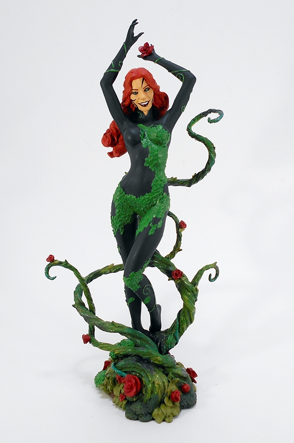
A few weeks ago, I remember lamenting the fact that Cover Girls was already awarding second versions of statues to A-listers like Wonder Woman and Catwoman when there were still so many lesser known characters that hadn’t been done at all. Well, behold the counter-argument: Red Lantern Bleez! With a tragic history and muddled allegiances, I best came to know Bleez in the pages of New Guardians. She’s a delightfully odd choice for a slot in the Cover Girls line, and you know what’s even odder? She’s quite possibly the best statue this line has produced.

dccgbleez17

This box is huge! It dwarfs even the largest Cover Girls box I have in my storage. Aside from that, there isn’t a whole lot else to say about it. It’s fully enclosed and houses a brick of styrofoam that protects the statue inside. The only assembly required is to peg the figure into the base, and this was a little trickier than usual. It was a tight fit and single metal peg did not want to go all the way in. Eventually, I settled for getting it most of the way in. For all I know, that’s as far as it’s meant to go and at least the statue feels perfectly stable.

dccgbleez1

dccgbleez2

dccgbleez6

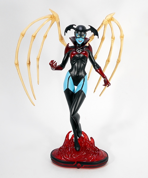
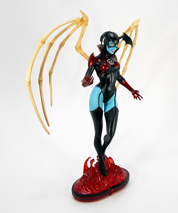
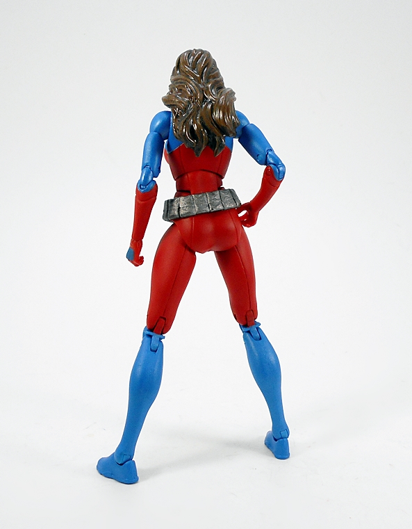
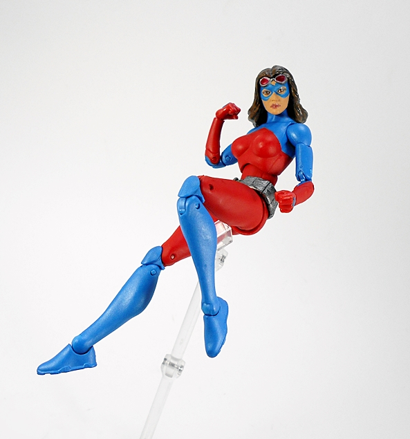
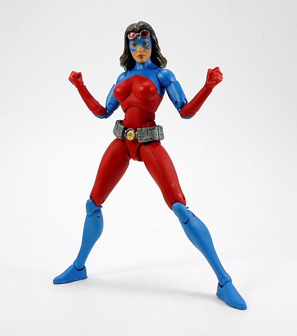
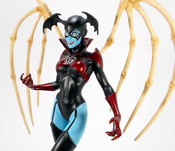
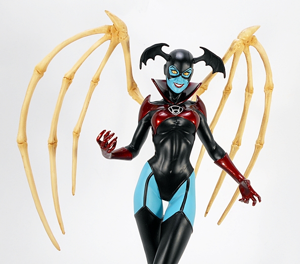
All set up, Bleez is an impressive sight to behold. While she’s still scaled with the other Cover Girls releases, her elevated pose clocks her in at almost 11 1/2-inches as opposed to the 9 to 10-inch average of the rest of the line. She floats above a sea of flames with one knee drawn up in front of the other and the grizzly vestiges of her once magnificent wings fanned out behind her. She dons her own seductive take on the Red Lantern uniform with long black leggings connected to her one-piece with sculpted straps. The paint on this piece is stunning, both in quality and application. The matte black is coupled with a sumptuous metallic crimson on her gloves, breast cross-straps, and pointed shoulders and it contrasts nicely with the soft blue of her skin. The Red Lantern Corps emblem is sculpted into the center of her chest and flawlessly painted. There’s some great muscle definition sculpted into her abs and, well let’s just say that the rest of the tight costume leaves little to the imagination, despite covering most of her up pretty well.

dccgbleez5

dccgbleez4

dccgbleez3

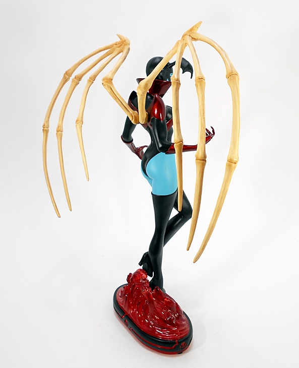
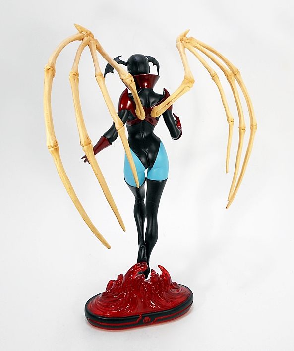
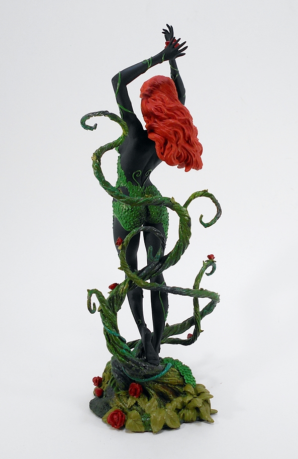
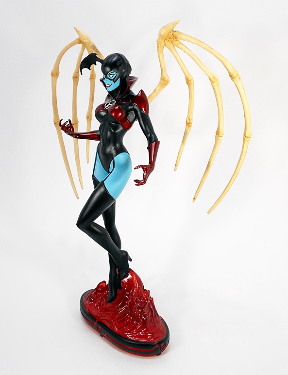
The skeletal wings are a huge draw for this piece. While the bulk of the statue is the typical cold cast porcelain we’ve seen in this line, the wings feel like resin. Obviously this was a good choice. I don’t know if it’s even possible to produce something like these bones in porcelain, but this way they’re far less likely to snap and help to alleviate some weight from the back. What’s here feels fairly sturdy and the coloring is just perfect.

dccgbleez15

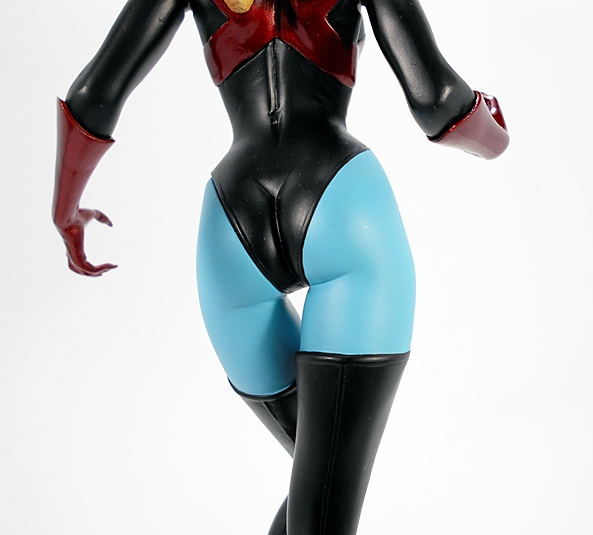
I particularly like how they sculpted the seams in the backs of her boots and leggings and… nah, just kidding. This is really just a gratuitous butt shot.

dccgbleez9

dccgbleez10

And then you have the magnificent portrait. Bleez offers a broad smile and flashes her yellow eyes, with her face partially framed by the crimson high collar of her costume. The hood and mask are beautifully sculpted and feature some very sharp paint lines. She also has a pair of bat wings on her head that would make Capcom’s Morrigan and Lilith jealous. Did I mention the paint? Well, let’s bring it up again because it is absolutely superb and definitely some of the best I’ve seen in this line to date.

dccgbleez11

dccgbleez12

dccgbleez13

dccgbleez14

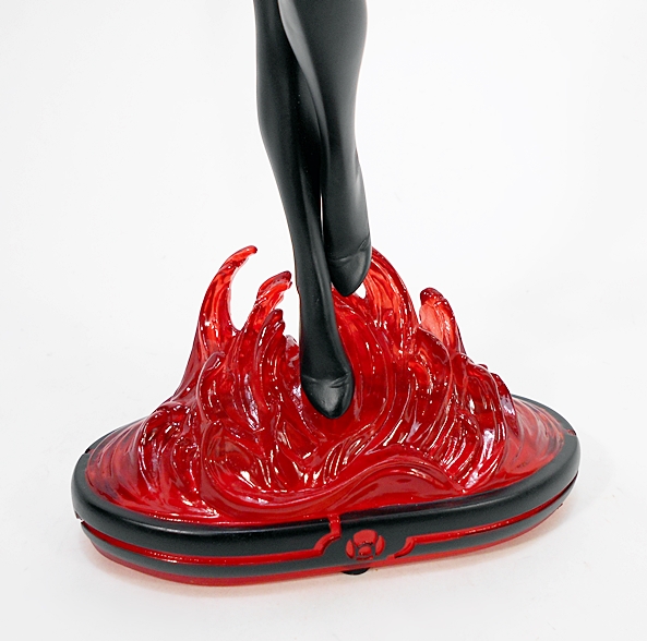
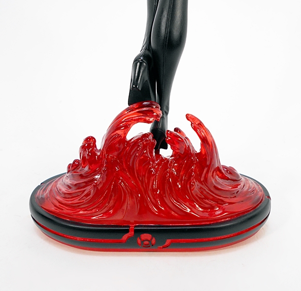
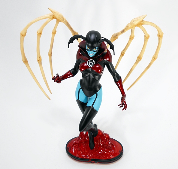
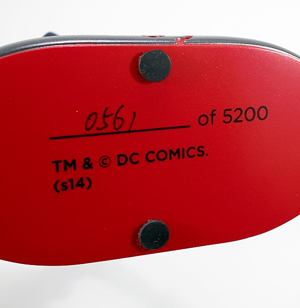
The base features the same standard oval style that we’ve been seeing for a while now, but it’s cast in a beautiful translucent red plastic with the flames licking up around her feet. The metal post is just barely visible from the back of the statue if you get in close, so the levitating effect is pretty cool. You still get the limitation hand numbered on the bottom of the base. Mine is 1,413 of 5,200.

dccgbleez16

dccgbleez7

This iteration of the Cover Girls line has been solid, and I really enjoy collecting it, but few of these ladies have really blown me away like this one has. Everything about this statue shines, from the sculpt, to the paint, to those amazing wings. I was grinning ear to ear from the moment I took her out of the package and set her up. With over a dozen of these ladies on my shelves, this is without a doubt one of the best. The only shame here is that some collectors may pass up this lovely piece because the character is undervalued or perhaps just not well known. And if that’s the case, I’d say Green Lantern: New Guardians is worth a read.

Justice League (New 52) Box Set by DC Collectibles, Part 3: The Flash and Cyborg

It’s DC Friday again and time to wrap up my look at the DC Collectibles’ New 52 Justice League set with The Flash and Cyborg! If you missed out on the last two installments, you can check out the packaging along with Superman, Wonder Woman, and Batman here and Green Lantern and Aquaman here. Let’s start with Barry Allen…

flshbrg1

While The Flash is in no way a terrible figure, I’m sorry to say that I find him to be the weakest of the set. I guess someone had to come out on the bottom, but in this case the few issues I have with him are pretty specific. But first, I’ll say that I like this sculpt a lot. With the New 52 behind us, I can take this opportunity to say that I’ve been perfectly fine with all the Justice League costumes and that goes for Flash as well. Granted, it’s not a huge departure from previous looks. The main difference is the addition of the panel lines and these are all part of the sculpt, as are the lightning bolts on his waist and arms, and his chest insignia. I particularly like the sculpted lines in the boots.

flshbrg2

The coloring on this figure is overall quite good. The plastic used for the bulk of his suit is rich and vibrant and it contrasts nicely with the bright glossy yellow used on the boots and lightning bolts.

flshbrg3

flshbrg4

The portrait is where I think this figure starts to falter. The mouth is just weird. I do like the sculpted detail in the hood and chin cup. God, everyone seems to have hated that chin cup. It wasn’t such a big deal to me. The wings on the hood are made of pretty hard plastic, so they won’t warp, but that also means they feel really fragile. It probably wouldn’t take much to snap them off. The paint around the mask and face is fairly straight and clean. I wish I could say the same for the emblem on his chest. It’s easily the weakest paint work in the entire set.

flshbrg5

The articulation here is the same as we saw on the previous figures. That includes rotating hinges in the shoulders, swivels in the biceps, hinges in the elbows and knees, a T-crotch for the hips, and a ball joint in the neck. It’s nothing outrageous, but I can still get Barry into a decent running pose. I will note that the right bicep swivel on my figure has a little pull to it leaving a gap between the joints. Bummer. Let’s move on to Cyborg!

flshbrg6

Cyborg is an appropriately large figure. He’s not only bulky, but stands almost a head taller than the rest of The League. The figure features a clean and somewhat simple sculpt with some deep cut panel lines as well as some segmented sections between the joints and on the sides of his torso. I really prefer this over-sized look for the character as opposed to the leaner and more human proportioned renditions.

flshbrg7

The paint here is well done, but I’m surprised they didn’t go for a metallic finish. I mean, they did it for Green Lantern and Aquaman’s scalemail shirt, it seems like they could have ponied up for it here as well. Then again, it might have been an artistic choice and I’ll concede that the more satiny finish doesn’t look bad, by any means. From the neck down this is mostly a monochrome look with just the bright red domes in the chest, back, and hips to make the deco pop.

flshbrg8

flshbrg9

They did a really solid job with the portrait here. The high collar looks great and I like the exposed segmented part of the neck. You also get some more detailed panel lines in the cybernetic half of his face. The paintwork here is fairly good. The hairline could have been sharper, but it’s not too bad either.

flshbrg10

Cyborg is the one figure that adds a bit of articulation over the rest and that’s additional swivels in his forearms. It’s odd that he should get extra points, as I consider him to be the least agile of the bunch. On the other hand, even with those extra swivels, there’s not a whole lot you can do with him when it comes to posing.

flshbrg11

flshbrg12

It was fun for me to give this set a once over now that the New 52 is behind us and even with a few disappointing things about The Flash, I’d say this is a fine collection of figures, so long as you aren’t in the market for anything super pose-able. Personally, I plan on keeping this set displayed in a box up on top of one of my display cases where it looks fantastic. Either way, I think it’s a fitting end tribute to the action figures from this era of DC Comics, and while a few New 52 appearances are bound to still turn up in DC Icons and maybe some statues, it’s probably safe to say that by next year it’ll be phased out for either ReBirth designs or more classic looks. While I drifted in and out of lots of different books across the New 52, The Justice League was one of the books where I never missed an issue. It wasn’t always great, but I think it was almost always good. Although, I’d still rank Wonder Woman as my favorite New 52 title. With that having been said, next week I’ll be checking out another one of the Cover Girls statue, which will land us right back in this era.

Justice League (New 52) Box Set by DC Collectibles, Part 2: Aquaman and Green Lantern

It’s been another killer of a week for me at work, folks, but the show must go on here at FFZ. Fortunately the figures I have on tap for today won’t require a lot of time from me, so I can crawl back into bed with a bottle of Jameson and some comic books. On the last DC Friday, I started checking out DC Collectibles’ New 52 Justice League set with Superman, Wonder Woman, and Batman. Today, I’m pressing on with a look at Aquaman and Hal Jordan. If you want a refresher on the packaging, have a look back at Part 1, otherwise, let’s start with Aquaman…

aqlant2

It may be the New 52 look, but Aquaman’s costume still retained much of its classic and timeless design. The figure features the scale armor tunic with some gorgeous metallic golden-copper paint, a stylishly sculpted belt, green gauntlets, and the green leggings with sculpted fins on the backs of his calves. As far as the costume itself goes, there’s nothing really groundbreaking here, but when it comes to this costume, I always love the contrast between the dark matte hunter green and the glittery top and this figure showcases that perfectly.

aqlant4

There are a couple of nice touches that make this figure rather distinctive. First, he has a pretty cool necklace hanging around his neck. Secondly, his trident is attached to his belt with a gold chain. The trident itself is nothing special, just a simple sculpt cast in gold plastic, but the chain is a cool addition, that is unless you want to display the figure without the trident, because it’s clearly not meant to be taken off.

aqlant6

aqlant3

The portrait here is fantastic, somewhat unconventional, and easily one of the best looks for the character I’ve seen in action figure form. I just love the scruffy beard and sideburns over his usual clean shaven look. He has a fairly pissed off expression. the paint used for the skin tone is excellent, and I really love what they did with his hair. Moving on to Hal…

aqlant7

aqlant8

Green Lantern features one of the simpler sculpts in this set. He does feature some cut panel lines in the shoulders as well as his chest emblem being sculpted. Other then that you mainly just get some nice muscle definition. The costume features a mix of matte black, metallic green, and some lovely pearlescent white for the gloves and face of the chest emblem. The metallic green paint on this guy is quite the eye catcher and it reminds me a lot of the finish Kotobukiya used on their excellent ArtFX+ Hal Jordan only not quite as brilliant.

aqlant10

They did a particularly nice job with his ring. It’s both well defined and neatly painted.

aqlant9

The head sculpt here doesn’t impress me as much as Aquaman’s, but it is very good. It features a rather stern expression, the mask is part of the sculpt, and the paint is all on point. I like the stray wisps of hair over his forehead and more of that lovely green paint on the mask.

aqlant5

aqlant11

The articulation is identical for both of these figures. You get rotating hinges in the shoulders, swivels in the biceps, hinges in the elbows and knees, ball joints in the necks, and t-crotches for the hips. These aren’t super pose-able by any means, but I can still have a little fun with them.

aqlant12

So, overall there aren’t a lot of surprises with this pair, but what’s here is exceptionally well done. The sculpts are solid, the portraits are excellent, and while they aren’t going to feature the play value of DC Icons or even Mattel’s 6-inch DC lines, they look fantastic up on my shelf, especially when displayed with the rest of the Justice League. I believe these are pretty much the same as the individually boxed releases, but I have yet to see those in person, so there may be some variations at work. On the next DC Friday, I’ll wrap up this set with a look at The Flash and Cyborg!

Justice League (New 52) Box Set by DC Collectibles, Part 1

It’s DC Friday, I’m almost caught up on my DC backlog, and so it’s time to dig deep and go into the reserves. I’ve had this set sitting around for what seems like forever. It feels weird to be getting to it only now that the New 52 has been rebooted to ReBirth. Still, this set was a nice way to snatch up the entire New 52 Justice League in one shot and, if you managed to get the original “We Can Be Heroes” release of this set, you were not only getting the figures before they were released individually, but also helping the relief efforts against drought and famine in Africa. I’m going to go through this set in three parts. Now, while this was the first way to get these figures, I actually did a Feature on the later released, Trinity War box set, which included a variant version of this Superman along with straight repacks of Batman and Wonder Woman. So, today I’ll start out with a look at the package and a quick comparison of those figures to the later Trinity War releases, and then tackle the other figures, two at a time, in the following couple of weeks.

dcwcbh1

When you’re getting seven 7-inch scale figures in a single box, you know it’s going to be sizable. In this case DCC put the figures all in one epic lineup and into a long window box. The box’s deco is very simple and mostly white with a blue slash down the far right side showing some of the characters in silhouette. The set is also set apart from the original release by not having the “We Can Be Heroes” motto printed above the word “Justice.” This box is one of those cases where the packaging itself would be totally forgettable if the figures didn’t look so damn good all lined up like that. It’s a box that makes a statement and arguably displays the figures just as well as if they were lined up loose and on the shelf. Happily everything is collector friendly. You just slit the tape on the side flap and pull out the tray. There’s a clear plastic cover over the tray to keep the figures in place, but no pesky ties to worry about. I like that my set happens to have Wonder Woman looking at Superman, Superman discretely looking back at her, and all the while Batman looks off to the other side as if pretending not to notice. Anyway, this is most definitely a box that I’ll be keeping to display the figures in. I’m going to start with Superman, because he’s really the only one that’s different from the one in the Trinity War box.

dcwcbh2

From the neck down, the sculpt here is identical to what I showed off December of last year. The only difference in the costume is that the metallic paint has been replaced with a more appropriate flat matte look. Now, I really did dig the metallic version a lot. It felt like a cool callback to Kotobukiya’s ArtFX+ Supes. Of course, the deco was more about giving collectors who already owned the figure an excuse to buy the set, then it was about anything to do with Superman’s appearance in the Trinity War story arc. Here we have a more conventional paint and just a beautiful representation of Krypton’s Last Son in his New 52 outfit. And yes, I do really love this outfit. Every detail on the outfit is part of the actual sculpt, from the panel lines and edges of the boots, right down to the belt and S-Shield. The colors, which consist of rich and vibrant blue, red, and yellow are absolutely gorgeous. I’m just totally in love with the look of this figure.

dcwcbh3

The cape cascades over Superman’s shoulders and stops right about at the tops of his boots. It’s a fairly pliable plastic and doesn’t throw the figure off balance at all. The back of the cape features a black S-Shield stamped right in the middle.

dcwcbh4

The portrait is the only difference in sculpt between this release and the Trinity War figure, which had Superman offering up a goofy smile. I was pretty happy with the Trinity War portrait, but this one just blows it out of the water. It’s definitely a more stern look, but I think it’s a great 3D likeness of Jim Lee’s art from the book. The paint is very clean and the hair is more neatly sculpted on this version.

dcwcbh6

dcwcbh5

The articulation is pretty standard stuff when it comes to the earlier days of DC Collectibles’ figures. You get rotating hinges in the shoulders, swivels in the biceps, hinges in the elbows and knees, a ball joint in the head, and a simple T-crotch. You can tweak a few different poses out of him, but nothing too crazy. Moving on to Wonder Woman…

dcwcbh8

I loved this Wonder Woman figure when I got her in the other set, and I still do. This is a great look for her and the sculpt really brings out the details in the costume beautifully. Yes, for all the guff that the New 52 costumes got, and some of it was well deserved, this version of Diana’s digs is just fine with me. I still find it odd, however, that DCC never gave us the costume with the pants, but that’s a discussion for another time. Once again, every detail in the costume is part of the sculpt.

dcwcbh9

The paint here is nice and clean and pretty consistent with the later Trinity War release. The blue and red is darker than what we saw on Superman, but it has that silver and a little white to help lighten things up. Even the skin tone, which is achieved through bare flesh colored plastic, is smooth and warm. The articulation here is identical to that of Superman, so it’s not all that fantastic, but at least Diana got herself some swivel biceps. That’s not always a sure thing when it comes to the female figures.

dcwcbh18

dcwcbh10

Diana comes with her golden lasso sculpted on her right hip and her left hand is sculpted to hold the sword she doesn’t come with. Now, that surprised me, as it was also vacant from the Trinity War set. Apparently the only way to get her sword was to buy the individually boxed figure or the set that paired her with Katana. Now, it’s bad enough to buy the same figure twice, but three times? That would be crazy, right? Well, I’m not saying I did, but I may be getting around to looking at that Wonder Woman/Katana two-pack at some point. Just saying.

dcwcbh11

When I did my Trinity War Feature, I suggested that Wonder Woman was sporting a new head sculpt, but it turns out that isn’t the case. There are some natural variances in the paint, but they’re quite subtle and it is the very same portrait. I’d say I like this one a little more, just because the eyes are a wee bit straighter, but otherwise they’re both fine and very attractive. I really like the detail and paint on both the choker and the tiara. And oh, look! Bewbs!

dcwcbh12

And last but not least, we have Batman. Like Wonder Woman, this figure is exactly the same as the one released in the Trinity War set and I’m going to irk a lot of people by once again saying that I really like this costume a lot. Granted, it’s not a huge departure from some of Batman’s iconic looks. You get the same sculpted detail as the other figures, right down to the panel lines and mesh material at the joints, and some very spiffy high gloss black paint for the boots, gloves, and cowl. It makes for a striking contrast against the matte gray finish of the suit. Just lovely!

dcwcbh13

The cape falls beautifully behind the figure and the scalloped edges drag on the ground. It’s a bit heavier than Superman’s and I love the way the folds are sculpted up near the top. It looks as much like a shroud as it does a cape, and that’s certainly appropriate. The articulation here is identical to Superman and Wonder Woman, so there are options, but I really can’t get any super cool fight poses out of him.

dcwcbh14

dcwcbh15

Once again, a really solid head sculpt with a beautiful contrast between the skin tones of the face and the gloss black paint of the cowl. Batman sports a grim expression, which is quite fitting. Let’s check out some quick comparison shots of the figures with the Trinity War releases on the right and the figures from this set on the left…

dcwcbh16

dcwcbh19

dcwcbh7

dcwcbh17

I knew when I was going in that I was going to be double dipping on some of these figures, but that was OK by me, because I didn’t have any of the other members of the Justice League in this set. And besides, the Superman is different, so it was really just two figures that were already in my collection. And while the set was originally about a hundred bucks, I found mine for a ridiculous $45. And if you hunt around, the set can still be had for very close to that price. They aren’t the most articulated figures out there, but the sculpts and paint on these three are truly fantastic. On the next DC Friday, I’ll have a look at Aquaman and Green Lantern!

DC Icons: (#12) Atomica by DC Collectibles

It’s another DC Friday and I’m winding my way through the most recent wave of DC Icons figures. I’ve already checked out Superman and Harley Quinn and today I’m opening up that traitorous bitch, Atomica! And yes, that’s a spoiler for an old comic.

dcitomica15

The packaging is the same as we’ve been seeing throughout the run of this series. It denotes that Atomica is the twelfth figure in the line and that she hails from the pages of Forever Evil, although she was in the company of The Justice League for a while before that. It was right before Forever Evil that she showed her true colors as a mole who was sent ahead to assist in allowing the Crime Syndicate to escape their Earth and conquer our own. Where the hell does The Atom fit into all this? Ray Palmer was busy screwing around in the pages of Frankenstein: Agents of SHADE, a book that got shit-canned after 16 issues, and if you ask me deservedly so. But don’t worry, Ray is in this box too… and so is Ryan Choi!

dcitomica7

dcitomica8

The beautiful and sadistic Rhonda Pineda dons her striking red and blue outfit, which gets by with very little in the way of sculpted detail other than the new belt. Now, with the first two ladies appearing in this assortment, it would be understandable to assume they were straight repaints of the same buck, but that’s actually not the case. The Harley figure features a number of slight rumples and wrinkles on her costume, whereas Atomica’s is totally smooth and skin tight, with just a handful of subtle sculpted lines. That’s not to say the lack of detail is an oversight, as the figure’s appearance is quite faithful to the costume as it appears in the panels and thanks to the vibrant colors, this is a beautiful figure in hand.

dcitomica9

And speaking of beautiful, the head sculpt here is no slouch. Her mask is part of the sculpt and she has her goggles up on her forehead. The hair is also nicely done, but as expected it can get in the way of the neck articulation. That can be frustrating at any time, but a little more here, since Atomica is a flyer and she can’t look up. I’ll also note here that the paint on the face is really curious in that through the lens, it looks really mottled up close, but in hand it looks really good. I noticed that a bit with Harley too. Weird!

dcitomica11

The rest of the articulation is unhindered and features everything we’ve seen in this line before. The arms have rotating hinges at the shoulders and wrists, swivels in the biceps, and double hinges in the elbows. The legs are ball jointed at the hips, double hinged at the knees, and feature both hinges and lateral rockers in the ankles. The neck, is ball jointed, there’s another ball joint just below the chest, and there’s an ab crunch hinge just above the waist. Still no swivels in the legs… Insert sigh here.

dcitomica10

Atomica’s only accessories are an extra pair of hands. These are sort of gripping hands, but not quite. Truth be told, they aren’t really different enough from the fists that come attached to the figure, so I doubt I’ll be swapping these out a lot.

dcitomica4

dcitomica5

You do, however, get two additional figures in the box, or at least one figure and one display piece. The figure is a mid-sized version of Ryan Choi. Both the paint and the sculpt on this little fella is pretty damn impressive considering his size. He also features a standard 5-POA articulation with points in the hips, shoulders, and neck.

dcitomica2

dcitomica3

And lastly, you get a super teeny-tiny Ray Palmer with a stand and translucent atom shrinking effect.  I really love the way this guy looks. The paint isn’t as clean as the other figures. Mine actually has a stroke of blue paint on the face, but considering the size and how close you need to get in to see any issues, I’m not bothered by it. I am, however, going to go on record and just say that I’d rather they given us a midsize and small versions of Atomica herself, as opposed to the other Atoms. Given the context of this figure, it just seems more appropriate.

dcitomica6

dcitomica13

dcitomica12

And so we have another DC Icons release, and another very solid figure. Of course, with this particular character, the mileage may vary. With a wave that includes very classic versions of A-Listers like Aquaman, Superman, and Harley Quinn, Atomica definitely feels like the odd figure out. As for me? While I was admittedly disappointed by the payoff of the whole Pandora’s Box thing in The New 52, I actually enjoyed Forever Evil and Trinity War quite a bit. The reveal of Atomica’s true nature was a neat little twist and both she and Johnny Quick were memorable characters to me, because they were just so damn twisted. In other words, I am very happy to get her, but also bummed that we’ll probably never see a Johnny Quick in this line to go with her. On the flipside, in DC Collectibles’ regular New 52 line, we got a Johnny Quick, but no Atomica. Bummer.

Cover Girls of the DC Universe: Katana by DC Collectibles

It’s Friday! Let’s check out some DC Comics stuff! This week I’m staying on with the Cover Girls statues line and opening up one of the more recent releases, Katana! She’s a cool character, who I believe is going to be getting a lot more merch in the days ahead, so long as the Suicide Squad movie performs well. This version is from the recently defunct New 52 continuity, which is appropriate, as that was where she got her first solo book. I also rather enjoyed her time in Birds of Prey.

covgkat10

There’s not much new to say about the box. With nearly a dozen of these statues on my shelf, I’ve showcased the packaging quite a bit and not much has changed. Katana comes in an enclosed red and white box with various shots of the statue and some teasers of what’s coming up or also available on the back panel. The statue is wrapped in plastic and encased between two pieces of styrofoam. The only assembly required is to peg Katana’s feet into the base and they fit in quite easily.

covgkat1

covgkat2

The Cover Girls line has been a hearty mix of museum-style poses along with some hints of action and on that scale of things Katana comes close to going for all out action. She stands with feet apart and her sword, Soultaker, drawn up to her shoulder and ready to strike. And yet, it still passes for something like a staged shot and I don’t think it goes too far off point. She still looks perfectly at home when displayed with her fellow Cover Girls. Besides, this is a pose that really conveys so much of Katana’s character, and so in terms of composition, I’d say she’s damn near perfect.

covgkat3

covgkat4

The costume features her New 52 armored body suit that looks great without the need for a whole lot of sculpted detail and does it’s best to show off her lovely curves. You do get panel lines running throughout and a cool and consistent metallic charcoal paint that meshes beautifully with the rich matte crimson on her lower leg armor and the quilted sleeve on her right arm. The body suit also features some exposed ribbed black areas in the joints and down the spine, presumably to give her more flexibility. Her scabbard hangs off her back and you also get some sculpted pouches on the small of her back. While the paint scheme and overall sculpt are fairly simple here, everything looks exceptionally clean and this is arguable the best paint I’ve seen in the line to date.

covgkat5

covgkat7

All that praise applies to the head sculpt as well. The beautifully sculpted portrait is two-tone with the lower face painted in matte gray, just a tad slighter than the suit, and the top half in white with the Rising Sun on her forehead. Her blue eyes are sharp and straight and her short hair ruffles ever so slightly in an imagined breeze. I love how her expression offers just a hint of joyful anticipation at the fight that’s about to come.

covgkat6

covgkat8

Katana’s sword looks good, although the sculpt for the hilt is a little on the soft side. Hey, I’m really looking for things to complain about and that’s the best that I can come up with. The blade is straight and while I’m going to be sure and be careful with it, it doesn’t feel overly fragile.

covgkat9

covgkat12

The base consists of the now standard oval with a charcoal and crimson deco to match Katana’s costume. The emblem on the sides consists of a simple red disc suggestive of the Rising Sun. The limitation is hand numbered on the bottom of the base, with mine being 561 of 5,200 statues produced. I think this may be the lowest number Cover Girl I own.

covgkat11

Katana is a wonderful addition to my Cover Girls shelf and definitely a triumph for this line. What’s even better is at the time I publish this Feature, she’s readily available at a few online retailers at close to half the original MSRP. I picked up mine for $55, and damn was that a steal! Considering that DCC has already started doing second versions of some of the gals in this line (Poison Ivy, Harley Quinn, Wonder Woman) it’s nice to see that they’re also hitting on some of the less high-profile characters like Katana here. She’s a great release for the line and a worthy pick up for folks who just love the character.


Cover Girls of the DC Universe: Poison Ivy (Ver. 1) by DC Collectibles

I’m switching it back to the statue scene this week on DC Friday and heading all the way back to the beginning of the second series of the Cover Girls line. I wasn’t all that smitten with this first version of Poison Ivy, especially when compared with what came later, but it’s one of the few early releases that I didn’t have, it’s become a bit pricey on the secondary market, and I was made an offer on this one I couldn’t refuse. Does Ivy manage to win me over? Let’s find out!

cgpoivy2

The packaging hasn’t changed much since the line was rebooted. You get the same fully enclosed box. It’s mostly white and it has some shots of the statue. Inside, the statue comes wrapped in plastic and between two styrofoam bricks. There’s no assembly required and there’s no statement of limitation on this one. It wasn’t until later releases that DCC began limiting the runs to 5,200 and hand numbering them.

cgpivy1

And this is indeed the New 52 version of Ivy and it’s a design that I never really understood or much cared for. Just what’s up with the black leotard? To me it doesn’t fit with the whole plant motif. And the leaves and vines on top of it? Are they sewn in? Does she grow them around it after she puts on the leotard? It’s just a weird design. With that having been said, I’m OK with the pose here. It’s designed to show off the curves of her body and with both arms over her head, she holds a single rose bud in her left hand.

cgpivy2

cgpivy3

cgpivy4

The costume design here is relatively simple, as it’s just a lot of matte black. There isn’t a lot of muscle definition showing through, but the shapes and curves are certainly pleasing. But with all that simple space, I would have hoped the sculptor would have paid more attention to the clusters of leaves. In some areas, they’re well defined, but in others they just look like mush. On the plus side, the green paint is applied well and there’s hardly any slop to speak of.

cgpivy6

cgpivy9

And that brings us to the portrait and this is the part of the statue that could have probably won me over, but it just doesn’t. Again, part of this has to do with my lack of enthusiasm for this version of the character. The black and green eyes are a little too demonic for me, and the black patterns on the face are as weird a choice as the black leotard. There’s something a little too sinister about this portrait. I know, she’s a villain, but here she looks like some kind of Deadite. The expression looks a little too forced as well. Again, the paint here is pretty solid, though, so my issues here are more from the design than the technical merits of the piece.

cgpivy5

cgpivy7

cgpivy8

Easily my favorite thing about this statue is the base. Currently the Cover Girls line utilizes uniform oval bases, but early on in the reboot, the statues featured personalized environment style bases and DCC did some pretty cool things with them, as showcased here. I really dig the way the vines sprout up from the ground and weave their way around her body. It’s a really cool effect for a statue in this price range and I think they pulled it off wonderfully. As for the base itself, it showcases some of the best sculpting and paint on the entire statue. It feels like there was a lot of love put into this aspect of the statue and it makes me wonder if the line would have been better off sticking with these environmental bases.

cgpivy10

cgpivy12

cgpoivy1

Admittedly, I’m not the target audience for this piece, as I’ve admitted to not being a big fan of this look for Ivy, so the fact that this statue leaves me a little cold, should be taken with a grain of salt. There’s nothing inherently wrong with it. The paint is sharp and clean on the figure and fairly exceptional on the base. The sculpting is solid work, although the leaves on the costume could have used better definition. I don’t dislike it, but I don’t love it either. And none of that is surprising, considering my rather odd motivations for buying it. I mainly wanted it to complete my trio of Batman femme fatales from the early days of the reboot, and at $65, she was an extremely good deal for a Cover Girls statue that has been out of circulation for a while.

DC Comics: Deluxe “New 52” Swamp Thing by DC Collectibles

The New 52 is winding down and the time of ReBirth is upon us. Now, that doesn’t mean an end to New 52 figures around these parts, because I’ve got tons of them still to get through. Quite the contrary, if anything it’s going to light a fire under me to get through more of them and more quickly. Today’s figure has been sitting in the corner waiting to be opened since late last year… it’s Swamp Thing!

n52swamp1

When they say Deluxe, they ain’t kidding around. This is a pretty damn big box. To qualify that, it isn’t as big as the Deluxe Darkseid, nor is the figure itself even much taller than the DC Universe Classics version of Swamp Thing. Still, it’s a big box and it needs to be to hold such an imposing figure. I don’t have a lot to say about the package itself. It’s really just a big window box that let’s the figure inside do the talking. The back panel advertises the Super Heroes Vs Super-Villains boxed set, which I’ll get around to Featuring eventually. The packaging is collector friendly, so long as you’re patient getting him out. Getting those wings out through the slit in the tray was a project in and of itself.

n52swamp2

Wait, wings? Yeah, it’s pretty obvious that this isn’t your daddy’s Swamp Thing, particularly if your daddy happens to be Alan Moore. Now I’ll confess, while I’ve stuck it out to the end with quite a few New 52 books, Swamp Thing wasn’t one of them. On the other hand, I am a big fan of character re-imaginings and I think this is a pretty cool design by itself, just not necessarily one that I was interested in seeing in my ongoing Swamp Thing book. At some point, I may still pick up the collected edition and give it another whirl. Anyway, the look they were going for here was part Warrior, part Avenging Angel and if nothing else, I think it makes for a striking action figure and measuring in at about 9 1/2-inches tall and with a 15-inch wingspan, this guy would be hard to miss on any display shelf.

n52swamp3

The sculpting here is excellent and it’s only broken up by those rather jarring ball joints in the hips. Otherwise, there’s hardly any space on the figure that isn’t covered in texture, mostly bark and patches of moss. He also has that adorable little pink flower sprouting on the back of his right leg. The wings are a work of art in themselves with the main body of the wings textured to look like moss and the “feathers” bark. Granted, the figure doesn’t have that same gee-whiz feel of the rubber skinned DCUC figure, but it’s still an absolutely striking piece. All that sculpting is backed up by a pretty solid paint job of mingling greens and browns and varying shades and intensities.

n52swamp4

The portrait is also fantastic. I can definitely see some Classic Swamp Thing in there, and he almost has a bark helmet integrated into his face. The antlers are cool, as they remind me of the sort of ornaments that could sometimes be seen on knights’ helmets. He also has some rather vicious looking barbs protruding from the top of his head. And the eyes… those deep set eyes are painted with a metallic red that is rather haunting.

n52swamp5

n52swamp9

The articulation here is pretty good. You get rotating hinges in the shoulders, swivels in the biceps, hinges in the elbows, and swivels in the wrists. The legs are ball jointed at the hips, with swivels at the top of the legs. The knees are double hinged and the feet themselves are on rotating hinges below the ankle, which allows to adjust for stability. There is no articulation in the torso, the neck is ball jointed, and the wings swivel where they peg in and each have a hinge. It’s worth noting that the left elbow on my figure is fused due to being painted over and while I may give him a little heat treatment eventually, for now I’ve opted to leave it that way.

n52swamp8

n52swamp6

n52swamp7

Swamp Thing actually comes with two accessories, his sword and shield. These are designed to appear as if they grew out of him and attach to his arms via tabs. When not in use, there are bark pieces with twigs coming off of them to tab into the holes and hide them.

n52swamp11

n52swamp10

n52swamp12

n52swamp14

n52swamp13

This is an amazing figure. In fact, I’d dare say it’s a work of art. While DC Collectibles doesn’t churn out figures in the quantity of a Hasbro or a Mattel, I’d still consider their product to be mass market, and you just don’t see this kind of craftsmanship in these kinds of figures very often. The sculpt and coloring are just off the charts. That makes it kind of sad that this guy didn’t sell well. With an MSRP of $50, I can’t say he isn’t worth it and yet he’s still hanging around many online retailers at pretty deeply discounted prices. I’d like to credit that to a lot of people butt hurt over the new design, rather than the appeal of the workmanship here. No, he isn’t going to replace my Classic Swamp Thing from Mattel, but he is going to look damn nice on the shelf… or at least he will when I can find the space to accommodate that wingspan.

DC Icons: (#07) Black Adam by DC Collectibles

I’m a naughty DC Fan. Today’s DC Friday update is late because I had friends over for pizza and beer and a screening of the Deadpool Blu-Ray. But we got here eventually and today sees me finally get all caught up with the DC Icons line… at least until Wave 3 hits in a little while. This has been a long run, so let’s finish off Wave 2 with Black Adam!

dcibadam1

We’ve seen the packaging for this line plenty of times now, so I’m not going to dwell on it. This is the seventh figure in the line, and like the Icons Lex Luthor figure, Black Adam here is drawn from “Forever Evil,” which followed “Trinity War” in the New 52 run. With ReBirth coming, it’ll be interesting what DC Icons does vis-a-vis the other continuities, but my guess is we will likely see a lot of stuff based on the new run.

dcibadam2

And here is Black Adam out of the package. Late last year, I featured this character in the DC Collectibles Super-Villains series, which was a great looking figure with fairly restrictive articulation. In terms of sculpt, this Icons version gets the slight nod as some of the costume features, like the cape clasps and belt, look less chunky and more reasonably proportioned. It’s a stylistic preference on my part, to be sure, but even beyond that I’d say the costume sculpt on this version is exceptionally good. Every detail of the costume is part of the sculpt from the subtle panel lines on the vest to the impressive musculature and the chest emblem is raised and hangs off his chest toward the bottom.

dcibadam3

The cape is cast in very soft and pliable plastic and doesn’t add a lot of weight to throw the figure off balance. It’s not sculpted to look ragged like on the Super-Villains figure. The hood is sculpted down behind the back of the head. The paint here is really phenomenal. Sure, he’s mostly black, but the gold leaf paint used for his boots, bracers, belt, and other decorations is carefully applied and looks brilliant. Even the gold borders around the cape is splendid. I also really dig the Kirby Krackle printed in the center of his emblem.

dcibadam4

The portrait features what I think is one of the better head sculpts in the line so far, but keep in mind, this hasn’t been Icons’ strongest point. Is it better than the Super-Villains figure? Hmm… that other head was a tough act to follow. I’ll cop out and just say it’s different. This is more of a passive expression than the crazy-evil expression of the previous release. The pupil-less eyes are pretty creepy and there are some especially nice and sharp contours in the face. I’ll just say that I like what we got here and leave it at that.

dcibadam5

dcibadam7

dcibadam8

Articulation is exactly what we’ve been seeing all along with the Icons line. The arms feature rotating hinges in the shoulders and wrists, there are swivels in the biceps and double hinges in the elbows. The legs are ball jointed at the hips, double hinged at the knees, and have swivels at the tops of the boots. The ankles are hinged and have lateral rockers. There’s a torso hinge down low by the waist and a ball joint in the chest, and lastly a ball joint in the neck.

dcibadam6

dcibadam9

dcibadam10

For accessories, you get three pairs of hands. Black Adam comes out of the package with fists attached, you also get a pair of graspy hands and finally a pair of lightning shooting hands, which are pretty damn cool. Many of you know I’m not all that much for effect parts, but these are extremely well done and look great on the figure.

dcibadam14

dcibadam13

dcibadam11

I came into this line apprehensive about the new scale and starting over, but nine figures later, I’m mighty glad I got in. With solid accessories and articulation aimed at having fun, the only thing that this line has working against it is the scattershot approach to character selection. If you’re out to build teams, it could be a long time before you get any resolution on that quest. On the other hand, this line seems to have no boundaries. There’s new and old, New 52 and Classic, anything seems possible and we’ve already seen some figures, like Earth 2 Mister Miracle, that haven’t been given figure form before. If DC Collectibles throws enough love behind it, DC Icons could be more than a worthy successor to DC Universe Classics, but only time will tell. Meanwhile, bring on Waves 3 and 4!

DC Icons: (#08) Lex Luthor by DC Collectibles

It’s been a while since I checked out the first wave of DC Collectibles’ new DC Icons line, but after a long detour into some statues and a few other things, I’m ready to bring DC Friday back around to look at what Wave 2 has to offer. Today I’m kicking things off with a look at Lex Luthor, because for some reason (I can’t imagine why), I have a powerful need to look at a traditional and faithful treatment of the character. Yeah, I know, this is the New 52 version, but compared to what we’ve seen on the big screen recently, this is still pretty damn traditional.

dcilex1

The packaging has not changed from what we saw in the first wave. You get a collector friendly window box with a snazzy angle on the window indicating the figure’s name and number in the series. Lex is actually #8, so while I am going to cover all of Wave 2 over the next month or so, I’m not going in order. The side panel also has the name and number of the figure, along with the story he’s pulled from, in this case the “Forever Evil” mini-series by Geoff Johns. If you like to keep your packages, you couldn’t ask for more than this. It displays all the accessories in the tray and they look great lined up on the shelf. If I had the space, I’d be keeping these, but as you all probably know, I don’t.

dcilex2

I like this look for Lex a lot. It’s vaguely reminiscent of his armored costumes from Super Powers and even the DC Universe Classics figure, only a lot less bulky. The sculpting of the costume conveys the idea that he’s wearing armor pieces over a bodysuit and overall it’s fairly faithful to the David Finch art. The armor itself has some rather nice contours, particularly in the chest and shoulders.

dcilex3

The coloring on this figure is stellar. The green and purple not only scream Lex Luthor to me, but the vibrant shade of the purple suit matched with the super slick, glossy green paint on the armor is pure eye candy. The extra white hits do a good job mimicking the light up features from the panel art. Based on the costume alone, this is without a doubt a great looking figure.

dcilex7

The head sculpt is solid, but not exceptional. It’s a very simple sculpt without a lot of depth to it. The eyes seem off to me and the jawline is way too severe. I’m also unsure of what expression they were going for, other than passive and bland. I would have liked something with more energy and emotion. In general, I don’t think the portraits in the DC Icons line have been up there with some of T4H’s work on DCUC and this figure continues that trend.

dcilex4

dcilex6

dcilex5

Articulation, on the other hand, is really wear this line is at and Lex brings it. You get double hinges in both the elbows and knees. The legs are ball jointed at the hips and the ankles feature both hinges and lateral rockers. The arms have rotating hinges in the shoulders and wrists and swivels in the biceps. The torso features both an ab crunch hinge and a ball joint under the chest. Finally, the neck is ball jointed, although the high collar does inhibit the head movement a bit.

dcilex10

dcilex12

dcilex11

Accessories are also a big focus in this line, although I have to admit I find Lex’s collection of extras a little bland. If you’ve been reading FFZ for a while then you know I don’t often go ga-ga over a lot of swap out hands, and that’s mostly what Lex’s extras have to offer. Besides the standard pair of fists and relaxed hands, you also get a hand holding his lighting rod and another projecting an energy screen. These are decent enough display options, but nothing that gets me too excited.

dcilex8

dcilex9

You also get this little wrist blade that clips on over the wrist. It’s probably my favorite accessory in the box, but that’s not saying a lot.

dcilex15

dcilex14

dcilex13

If I sound a little underwhelmed by Mr. Luthor, that’s not really the case. He is a solid figure through and through and he’s got a lot of great qualities, including the fun articulation and rather beautiful paint job. Not to mention, I think this is a look for the character that even a lot of those rabid New 52-haters could get behind. In the end, I just felt the extras left a little to be desired, but that’s coming from someone who can rarely be bothered to swap out hands all that often. But in the end, this is another accomplished entry in what has proven to be an extremely fun line of figures. And if anything, having Lex on my shelf is making me very excited to pick up the Wave 3 Superman figure.