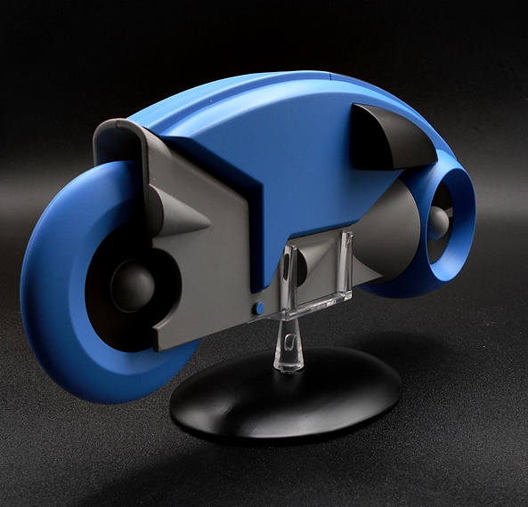
TRON Light Cycle (1st Generation) by Eaglemoss

I’m really pressed for time this week, so I was looking for something quick and easy to review, and Eaglemoss’ Light Cycle jumped right out at me. Indeed, back when I got this model I only opened it to inspect it for defects before popping it back in the box to later find a display space for it. As a result, I feel as if I’m really getting to see this for the first time as I’m spotlighting it here. It’s a bittersweet review, as Eaglemoss recently filed for bankruptcy and while reorganization is always possible, I have my doubts that they’ll rebound from it, and as a result, I believe this Light Cycle may be among the last batch of models they released before closing shop.

As always, these bigger models come in fully enclosed boxes made of pretty robust cardboard with the model encased in Styrofoam inside. The tape on the flap was pretty miffed when I got it, making me think someone else has been inside to take a peak, but everything looks new to me, so I’m not too bothered by it. I really love the design of the box, although it’s kind of sad that they noted this as a 1st Generation Light Cycle, as it makes me think they had plans to do the ones from TRON: Legacy as well. The model comes completely assembled, all you have to do is attach the post to the display base and you’re all set for the Game Grid! Sadly, there is no accompanying magazine.

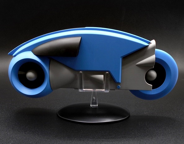
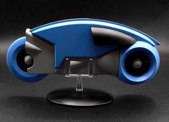
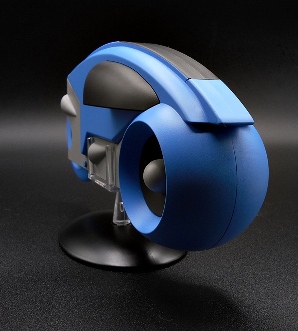
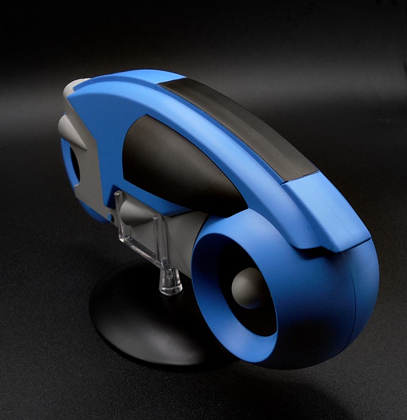
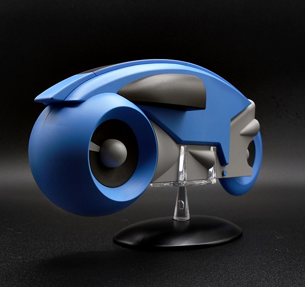
So, make no mistake, this is an extremely simple model. It has no moving parts and no articulation at all. And heck, the designs from the first TRON film are so simple, that this piece doesn’t even showcase any intricate sculpting or detail. And yet I’m really a bit in awe of how beautiful this piece came out. The smooth surfaces and sleek curves mimic the computer generated on-screen vehicle absolutely perfectly. And boy is this still a dead sexy design! As much as I can appreciate the Legacy Light Cycle redesign, this original concept is just so iconic to me. The deco is a simple triple-play of sumptuous blue with black and gray. Everything has an even matte finish, and the paint is very near flawless on my model. It’s interesting to me that Eaglemoss went for the evil blue Light Cycle as their first offering, although I’m sure they were ready to cash in on the yellow, orange, and white repaints as follow ups. Still, it’s hard to argue with that beautiful blue when I look at it.

Eaglemoss models are usually a mix of plastic and diecast, and I’m assuming that’s still the case here, but the diecast isn’t really apparent to me. The model certainly has a quality feel to it, but it doesn’t have a really significant heft. That’s not so much a gripe as it just an observation. In terms of scale, this feels a little too big to go with the old Tomy figures, and a bit too small to go with Diamond’s recent TRON figures, but I’ll include a comparison shot with the later at the end.

The stand is the usual diecast base with a transparent post, which we see with all Eaglemoss models. In this case, the support is a platform with four posts to secure the vehicle and it works really well. And yes, the stand is required as the Light Cycle will not stay upright on its own.

In the end, I am blown away by the quality of this model. It looks absolutely amazing and as much as I love it, it also makes me a little sad, because I know the chances of getting the other colors are pretty much nil. If only they had this out last year, we might have at least seen one more, but I guess I should be happy we got this one. I believe the original retail price was $59.99, but I got mine when Eaglemoss was blowing stuff out of the Amazon store at half-off. I was actually surprised it applied to this one, because it was such a new release. Either way, it’s gorgeous, and I’m glad Eaglemoss got it out before they crumbled.

Star Trek “Starships Collection:” Deep Space Nine by Eaglemoss

What’s this? Two consecutive weeks of Star Trek content? Well, as our beloved Doctor McCoy once jested, “It never rains, but it pours!” Today’s review has been on my mind for two reasons. Firstly, Eaglemoss has fallen on bad financial times, and the outlook for the company seems pretty dire. I guess we had plenty of clues, what with them running such deep discounts on product lately. Also, Deep Space Nine departed Netflix at the beginning of this month, and so I spent a great deal of June binging my favorite episodes, and I guess I’ll just have to hunt down a used set of the DVDs, because there’s no way in hell I’m paying for CBS/Paramount’s streaming service and have even the slightest possibility of any of their current garbage Trek shows violating the sanctity my home. Ahem… rant over. Let’s take a look at Eaglemoss’ Deep Space Nine model!

I titled this review as being part of their Starship Collection, but I don’t know if that’s accurate, since DS9 obviously isn’t a Starship, but let’s just go with that as an umbrella title covering all their Trek models. This is one of their big boys, with the model itself measuring at roughly 6-inches across. It’s too small to be in scale with Eaglemoss’ smaller ships, but if you have some Trek Micro Machines lying around, that will be a little closer. I’ve actually seen pictures of this model with a tiny Enterprise-D docked at it, but I’m not sure if that was an exclusive, or just something that didn’t make it into the final release. The station comes in a fully enclosed box and nestled between two styrofoam bricks. The only assembly required involves popping the stand together, and you get a nice color magazine-style booklet detailing some lore about the station, both behind the scenes, and in front of the camera.

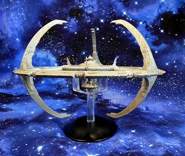
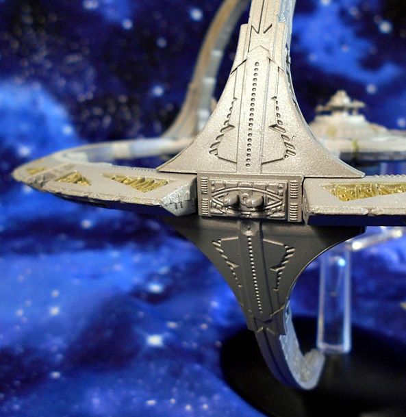
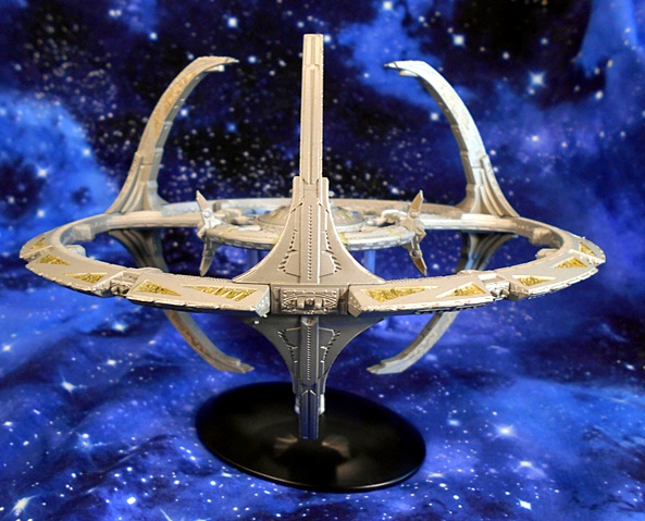
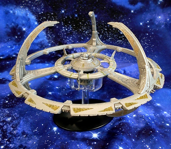
And here’s DS9 all set up, and it’s amazing to me just how iconic this old Cardassian station has become to me. One look, and I can’t help but hear the melancholy, yet slightly triumphant, theme song swell up in my ears. And I can imagine a tiny Chief O’Brian running around inside trying to hold the thing together. The show creators took a lot of risks, not only setting this series on a space station rather than a starship, but on an alien station, stripping the show of almost any Federation comfort and familiarity. It sure was a gamble, and it paid off in spades. This old station saw some unprecedented growth for the Trek franchise, and showed us a new side of the Trek Universe, which TNG could only hint at. Suffice it to say, I absolutely love the design of Terok Nor, with it’s inhospitable arching tendrils, concentric circles, and jagged edges. It looks like some kind of bizarre sea creature floating in space. And boy, did Eaglemoss do a great job bringing that design to this model!

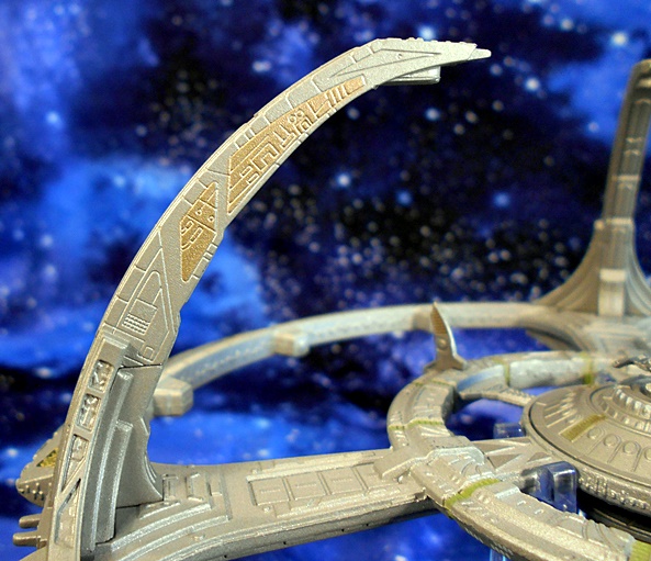
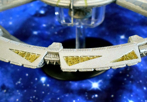
The mix of diecast metal and plastic gives the model a nice heft, while still allowing for some very sharp detail. Each of the tiny docking ports are present around the outer ring, you get the tiny hatches on the inner towers, signifying the hidden location of the torpedo launchers, and some really nice sculpting around the inner habitat ring. I think my favorite details on the whole model are the painted triangular cut-outs that show some more intricate details inside.

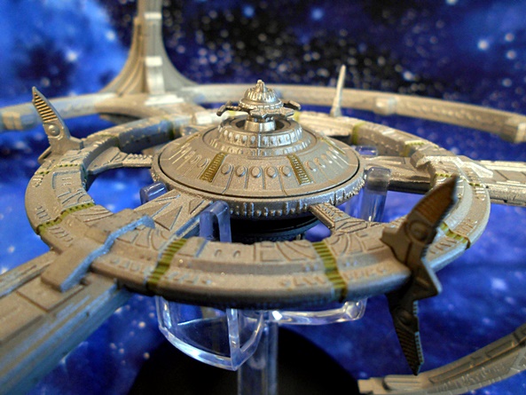
Eaglemoss really punched things up for the central core and Ops area. The three tiny deflector shield emitters are present, and actually a bit fragile too! I had to straighten mine a bit when it came out of the box. You can even make out the tiny windows of The Promenade, from where so many of the inhabitants have watched the Wormhole open and close.

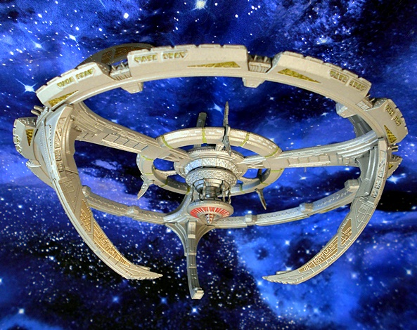
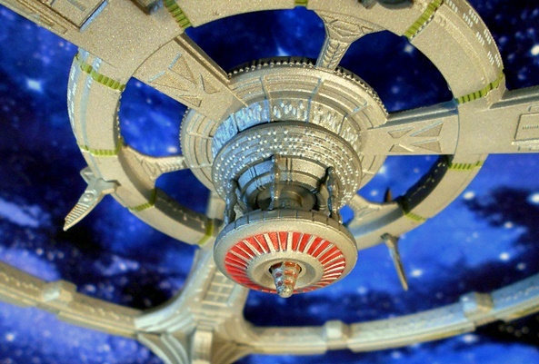
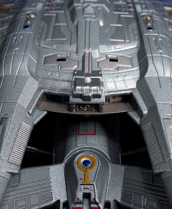
flip down to the undercarriage, and I found this area particularly interesting, since we didn’t often get a good look at it in the series. Here the station’s main fusion reactor hangs down, suspended by the power transfer conduit. We get some nice red paint surrounding this area, along with a central nub jutting out from the middle. The stand here is very well done, and consists of the same combination of translucent plastic stand and black diecast base, which cradles the station underneath, offering sturdy support without interfering with the look of the model.

I’ve been after a new Deep Space Nine model ever since I lost my Playmates version when moving from NJ to Florida way back when. That was a very nice representation, and it included some lights and sounds, but I’m content to have this beauty take its place. I find that the size of this model is a perfect balance between being large enough to offer a good bit of detail, but small enough to fit on a shelf and not take up too much real estate. The original MSRP for the station was around $80, but I picked mine up during one of the half-off sales, and that was a deal that even a Ferengi would be envious of! I’ll be very sad to see Eaglemoss go, assuming they can’t restructure, but happily I’ve still got a whole lot of their models to check out here in the future!

Battlestar Galactica: Classic Colonial Viper Mk I by Eaglemoss

Eaglemoss continues to run some pretty irresistible sales on Amazon every month or so, which means I’ve been stocking knocking a bunch of their ships off my Want List. A lot of them have been Starships from Star Trek, but today we’re taking a trip back to the Classic Battlestar Galactica series and having a look at the Colonial Viper Mk I!

This is one of the big boys, measuring in at a little over ten inches long, so naturally it comes in a fairly beefy box. The package is collector friendly, with the Viper coming fully assembled and secured between two halves of a styrofoam brick. All you need to do is pop the stand together, but if you’re like me, you’ll be whooshing this around the room before you even get to the stand. You also get a full color booklet that has some technical and behind the scenes info about this iconic ship. I don’t always bother with these books, but I thoroughly enjoyed reading this one.

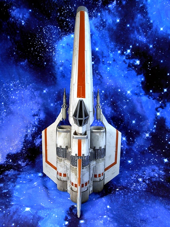
And this ship is indeed so damn iconic to me. As a kid, BSG blew my little mind, as it truly felt like all the flash and spectacle of Star Wars, but as an ongoing series right in our living room. Hell, I can still marvel at how good the ships and battles look for the time. And while I’m sure it may be sacrilege to some, I would personally hold the design of this Colonial Viper up against that of the X-Wing any day of the week. It may not be quite as distinctive as Incom’s fighter, but I always thought this design looked more realistic and made more sense. It’s basically three big engines attached to a cockpit and fuselage. There’s something about it that just looks more rugged and durable.

The Viper is comprised of both Diecast metal and plastic, but despite it’s size there isn’t a whole lot of heft to this ship, so let’s say mostly plastic. That’s not necessarily a mark against it for me, but considering how heavy some of the Trek ships feel, this one just feels more like a plastic model garage kit. The paint is absolutely exquisite, particularly the weathering work, which really sells this thing. The hull is splotched with wear and tear that looks convincing enough for a studio model. There’s scorch marks around the engine intakes, possible scarring from Cylon laser hits, and of course you get the beautiful deep crimson striping and accents.

And the sculpt is certainly no slouch either. There’s panel lines with interlocking catches, rivets, pipes coming from the exposed parts of the engines, vents, and intakes. I love the cutouts were the front wings almost meet up with the fuselage, and the fact that the laser cannons just sort of float off the wing sections, leaving a stylish gap. I expected the canopy glass to be just painted black, but it’s actually a dark smoked transparent plastic. In just the right light you can almost see inside.

The stand is well designed, with angled transparent arms that slip just in front of the each lower engine. It offers a snug hold on the ship, ensuring that it won’t slip out or topple over, while not obstructing the view of the ship. But because it is pretty tight, it’s probably best to not remove it from the stand too many times as it could lead to some paint wear at the contact point.

I couldn’t be happier that Eaglemoss is doing Classic Battlestar Galactica ships, as I haven’t had an example of this Viper in my collection since I had Mattel’s little version as a kid. It’s perfectly sized to bring out the detail and really get noticed on the shelf, and the quality and craftsmanship is top notch. The MSRP on this fighter is around $70, but I got in on a Buy 2, Get 50% Off Deal, so I paired it up with the Classic Cylon Fighter, only paying $35 for each. And yeah, I’ll try to squeeze a look at the Cylon ship into the mix in the next couple of weeks!

Star Trek “Starships Collection:” USS Pegasus NCC-53847 (XL) by Eaglemoss

I was hoping to get back and wrap up a wave of Marvel Legends this week, but I’ve been a little pressed for time and so instead I decided to dig into one of the many Eaglemoss ships I picked up during the crazy sale they’ve been running and snap some pictures. So, let’s check out another of the big boys, and have a chat about the XL model of the USS Pegasus!

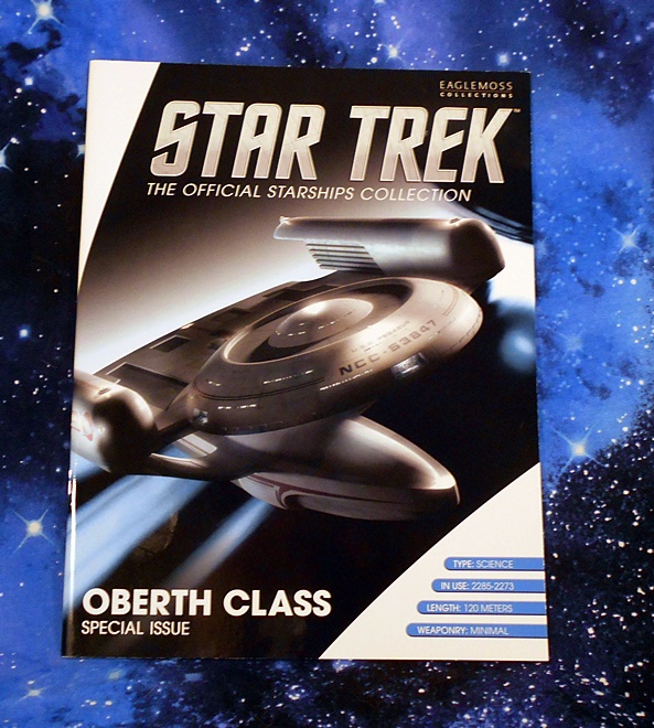
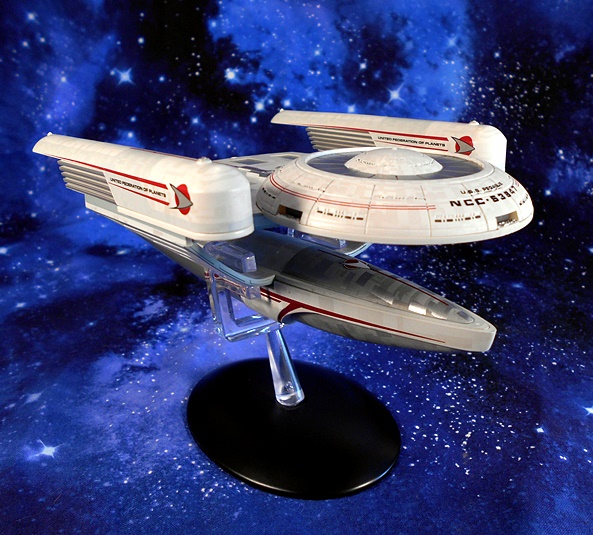
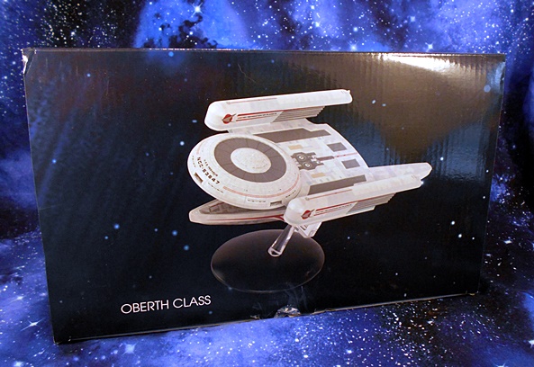
I confess, I mostly love reviewing these models because it gives me a chance to talk about Trek Starships! We were first introduced to the Oberth Class vessel in Star Trek III, when the poor USS Grissom got absolutely savaged by a Klingon Bird of Prey and taken out with a single torpedo. The Oberth would later pop up from time to time in The Next Generation. It was even featured in the very first regular episode when the Enterprise encountered the USS Tsiolkovsky in The Naked Now. But today’s model, The Pegasus, was the titular ship in a Season 7 story involving a top secret experiment to mate a cloaking device with a Federation Starship. And yeah, it didn’t go well. The ship comes in a fully enclosed box and includes a beautiful glossy magazine with some info about the ship and the episode. The model itself comes fully assembled, you just need to set up the stand and you’re good to go!

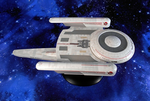
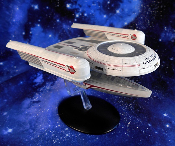
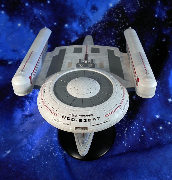
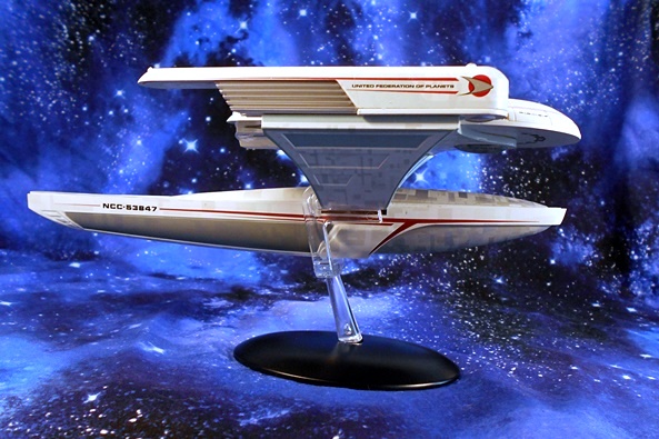
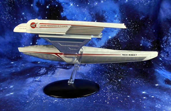
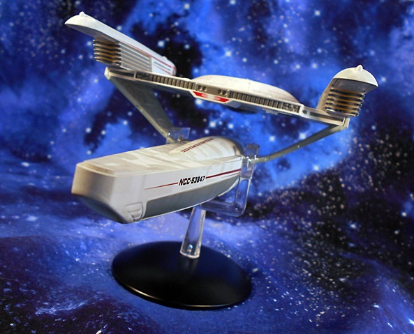
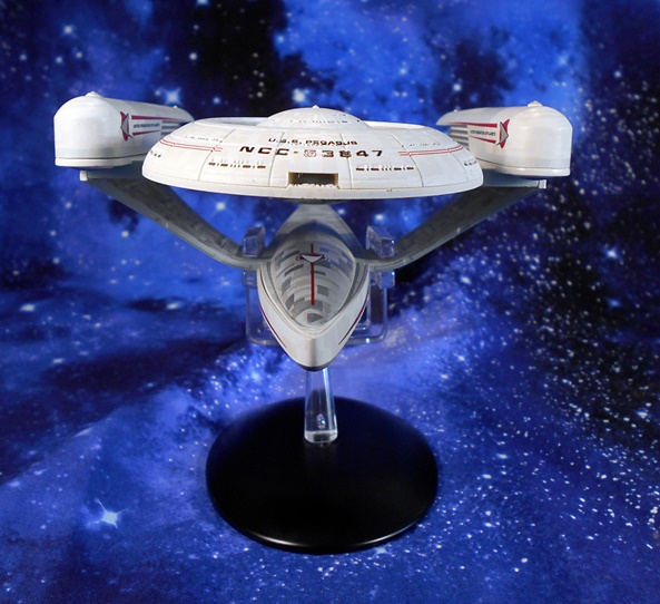
The Oberth Class is certainly an atypical design for Starfleet, but I must have watched the Grissom get blown up a hundred times over and so I consider this design rather iconic and instantly familiar. And boy is this an absolutely beautiful model of the ship. As usual, you’re getting a combination of plastic and diecast, with most of the diecast here being in the Primary Hull. It gives the model a very satisfying heft and the diecast parts blend quite well with the plastic bits. The paint is gorgeous, and I am particularly impressed by the aztec pattern on the hull, which is conveyed in a few different shades and really makes the ship look like it’s comprised of hundreds of smaller plates. Everything about the hull coloring just screams quality here!

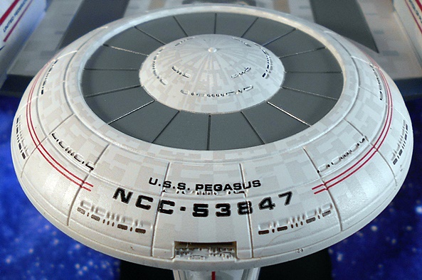
Of course, the Pegasus still has a saucer of sorts, it’s just smaller and integrated into a shelf that connects the two warp nacelles. You get some pretty crisp printing on the front declaring the ship’s name and registry number, as well as some red pinstriping on the outer arcs of the saucer. I can’t really talk a lot about the particulars of this ship design, because I’ve never had a proper look at the schematics. It’s a controversial design, as it often had fans speculating how crewmembers traveled between the Primary and Secondary Hulls without the traditional neck connecting them. Did they beam across? I’m sure the explanation consists of some kind of Turbolift shaft running through the nacelle supports, but it’s fun to wonder about it.

I became pretty familiar with this ship through the FASA tabletop game, and I’m pretty sure it was among the miniatures I had when I was younger. The registry is printed towards the back of the ship’s tail-like Secondary Hull, along with more of that beautiful red pin-striping. The Starfleet Delta is printed on the sides of the warp nacelles, with United Federation of Planets. I really dig the atypical stylings of the warp nacelle’s here, which are rather stubby and feature a grill-like structure that doesn’t conform to what we’re used to seeing on the Motion Picture ship designs, or really anything since. The stand here is quite effective, as it grabs the ship from behind the two nacelle pylons. The connection is rock solid and the clear support allows it to hold the ship without obscuring any details.

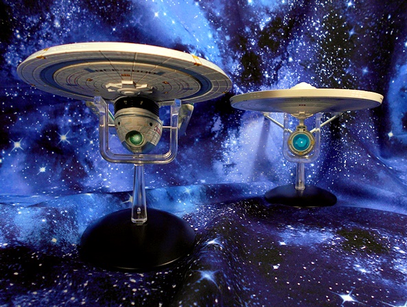
If you aren’t familiar with the XL ships, they are quite large, but do not conform to any relative scale. As a result, the roughly 9-inch long XL Pegasus looks massive when displayed next to the XL Refit Enterprise or Excelsior. Here are some shots of her next to the regular sized USS Grissom model, which not only show the size difference, but some of the subtle variances between the Grissom and Pegasus designs.

I love this design, and it’s nice to see the Oberth Class get the XL treatment, even if it is best displayed alone, so as not to dwarf the ships that are supposed to be much bigger. Of course, you have to be pretty dedicated to add this ship to your collection at the full retail price of $79.99. I’m not saying it isn’t worth it, as it’s a substantial model with some absolutely striking attention to detail, but it’s still a lot of gold pressed latinum to put a one-off Starship on your desk. Luckily, it’s been going up as part of the big sales Eaglemoss has been running, and I was able to get this lovely for $26, and that ain’t a bad deal at all! It was too hard to pass up, and I recommend it, but whatever you do, don’t activate the cloaking device!

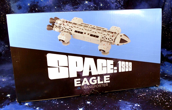
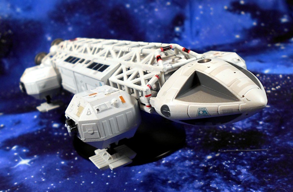
Space 1999: Eagle-1 Transporter by Eaglemoss

Last week Eaglemoss ran some sales, which persuaded me to pick up some of their models for the first time in a little while. I got some Star Trek and some Doctor Who, but today I’m going to check out their Eagle Transporter from Space 1999! I think this is probably the first time anything from Space 1999 has been featured here on FFZ. It’s a property that hasn’t stood up in the public eye nearly as well as some of its contemporaries, and that’s a shame because it’s a fantastic series, especially the first season! My first exposure to it was when I was young and my Uncle gave me his Eagle-1 Transporter from Mattel and I was blown away by the thing! It was HUGE, it had plenty of great play features, and came with three action figures. I played with that thing for years until most of it got lost or eventually broken, and I hadn’t even seen the show yet! Later on when I was a teenager, I started watching reruns of it on one of the local channels and it hooked me. It didn’t have the same polished charm or optimism of Star Trek, but it was gripping stuff, nonetheless. And at times, I even found it to be downright terrifying. What’s more the sets and the props were absolutely amazing! And while I’m not as fond of the second season changes, it did add Catherine Schell as Maya, which was reason enough to watch!

Eaglemoss’ model comes in a fully enclosed box with a color magazine offering some great information about the series and the Eagle Transporters. The Eagles were certainly not as sexy as anything in Star Trek or Battlestar Galactica, but I found the designs to be every bit as iconic. They were the workhorses of Moonbase Alpha, and able to be refit with different equipment packages for a various degree of specialties. From hauling cargo to mobile laboratory, these things could do it all. They could even engage in battle when necessary. Space 1999 had a rather unique take on space exploration, as the Moon itself was blasted out of orbit after a nuclear accident and sent hurdling through the Galaxy. The Eagle Transporters allowed them to launch exploratory, scientific, and resupply expeditions to the planets that they passed.

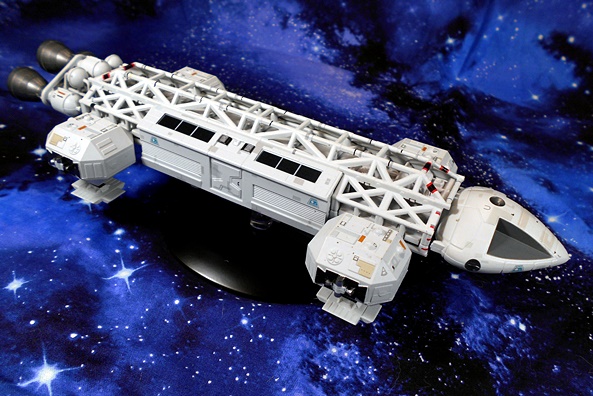
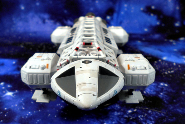
And here she is out of the box! As with all Eaglemoss models, The Eagle-1 uses a combination of diecast metal and plastic, giving it the best of both worlds. You get the heft of the diecast parts and the fine sculpting that can better be achieved in plastic. It’s a fully finished model, without any assembly required. And at about 10-inches in scale, this ship is the perfect size to offer a great level of detail, without requiring a crazy amount of shelf space. The Eagle-1 includes a black diecast stand with a clear plastic post and platform to rest the ship on. The stand doesn’t actually secure itself to the ship in any way, but it holds it sure and steady. Just try not to bump it!

I think my favorite thing about the Eagle-1 design is just how seated in realism it is. With it’s exposed framework on the top, fixed landing gear, and array of thruster cones on the back and undercarriage, everything here is so utilitarian. As a kid, this design looked totally credible to me as something we would be using to explore space in the distant year of 1999! For a show about people travelling through space on the moon, these Eagle designs were remarkably grounded.

The bulk of the model is presented in an off-white finish, with some occasional panels painted differently to make it look like it’s constructed of hundreds of panels. It’s not as complex as the aztec patterns we see on later Star Trek ships, but it works to add that extra level of realism to the finish. Other paint operations include the black and red striping on the front and back of the dorsal frame, the black windows above the center cabin, and the gunmetal gray used for the thrusters. You also get some sharp, printed Moonbase Alpha insignia on various points of the hull. It feels like every time I take a moment to study it, some new little detail is brought to my attention and I love that! This is an excellent representation of the ship in every way! Alas, the cockpit and booster sections don’t detach and connect like they did in the Mattel toy, but that wasn’t canon anyway.

It’s probably worth mentioning that Space 1999 has an unbelievably dedicated modeling fandom, and there have been a number of absolutely stellar Eagle-1 models available, both as professional and hobby grade builds. I’ve spent many a night haunting forums and drooling over some of the amazing work that’s been done recreating these intrepid Eagles in all their variants. In light of that, Eaglemoss’ release is far from the best you can get, especially if price is not an option! But with that being said, I couldn’t be happier that I added this ship to my collection. It’s the perfect size and the level of detail is quite impressive. There are a few different model variations available, but I’d love to see Eaglemoss release one in the vintage Mattel colors. I’d probably jump on that in a heartbeat! I seem to recall the MRSP on this model being around $80, but it was being blown out at $25 for the sale, and I couldn’t say no to that!

Star Trek Starship Collection: Enterprise NX-01 Refit (XL) by Eaglemoss

I don’t like to piss in other people’s Raktajino, but it’s hard for me to think of anything more depressing than CBS’s vision of modern Star Trek. But in an effort to practice the optimism of Gene Roddenberry, I can say that it has given me a new appreciation of some of the past Trek series that didn’t always get my full attention. For example, I always liked Enterprise, but in recent re-watches, I’ve come to actually love it. And after re-watching a few great episodes this week, I thought I’d have a look at another one of Eaglemoss’ larger XL ships: The Enterprise refit!

The SS Enterprise comes in a fully enclosed box and sandwiched between two styrofoam blocks. The only assembly required is putting the stand together. But what’s this you say? This isn’t the Enterprise from the series? Correct! This refit was intended to represent the eventual evolution of this Warp-5 ship design. As the included magazine details, the NX-01 was originally designed with this refit in mind, so that it could be easily integrated when the time came. Maybe in Season 5? But sadly it never happened in the show. Nonetheless, it shows how perfectly the ship’s evolution would lead into the Constitution Class from The Original Series.

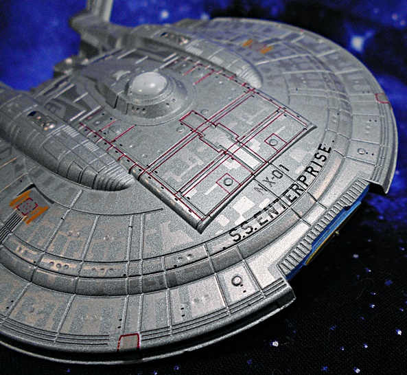
The XL indicates that this beautiful ship is one of the big boys. These special editions are more than twice the size of Eaglemoss’ regular ships of the line, allowing for more detail in the sculpt and paint applications, and I have to say everything about this model came together brilliantly. It’s given a pewter-like finish that nicely reflects the rather distinctive coloring of the NX-01’s hull in the series, while still maintaining those subtle, but oh so lovely, aztec patterns, which were introduced in the motion pictures. Furthermore, the sculpted detail on this ship is positively off the charts. From the panel lines to the tiny windows and ports, the sculptors did a phenomenal job taking every advantage of this model’s larger size. And one of the coolest things about this refit design is that the ship can still be viewed from certain angles without being able to tell it’s the refit. That’s how seamless the design incorporates this change. But view it from the right sweet spot, and the projected lineage of this ship is clear!

So, what’s new? Well, the most obvious is the addition of a secondary hull similar to what we would eventually get in the Constitution Class. Here it’s a little atrophied in comparison to what would come, and it’s nestled a bit more directly under the saucer. As one might imagine, this addition adds a tremendous amount to the ship’s power capabilities, crew compliment, and additional systems. Besides the neck attachment to the saucer, the secondary hull component is also supported by extending the warp nacelle struts further down and into it. It all looks so natural, and indeed the only thing about this design that I find peculiar was the decision to retain the deflector dish on the hull when a larger one dominates the front of the new drive section. Maybe it was just not worth the effort of removing it, and it could stand to serve as a replacement if the new one gets damaged.

Let’s take a quick spin around some of the more stand out points of interest on the ship. There are some sharp paint applications worth noting, especially the red wireframe that begins at the two forward phase cannon hatches and extend back to just behind the bridge dome. You also get some yellow and red paint on the cargo loading hatches positioned to the port and starboard of the bridge. The deuterium resupply assemblies on those twin humps are painted in a slightly more copper finish, and of course the registry NX-01 and SS Enterprise is printed neatly on the dorsal front of the saucer. The flipside of the saucer is every bit as detailed.

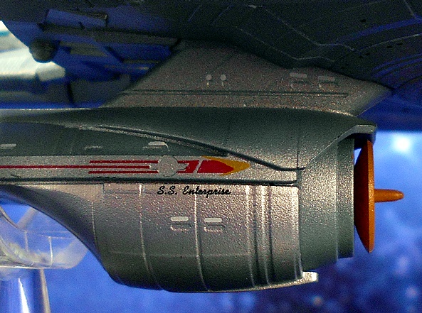
Moving elsewhere, I love the paintwork on the nacelles, where you get the registry at the center of a red racing stripe, which terminates in an orange delta at the front. The interior nacelles feature some translucent blue plastic and the bussard assemblies are molded in translucent orange plastic and have the cool points coming off of them. The broadsides of the secondary hull have the three pronged racing stripes terminating in the orange delta, and the SS Enterprise printed in cursive script is really damn cool. I will note that the secondary hull has a bit less detail than the rest of the ship. I’m not sure if this was intentional, or just because this piece was designed off of something with less reference material. Either way, I don’t think it hurts the model at all. The I think if I have one nitpick on the model, it would be the new deflector dish, which looks a little too plasticy and low-detail when compared to the rest of the ship. Then again, it does give it a bit of that retro-charm of The Original Series Connie Class.

As always, this ship comes with a display stand, which features a heavy black metal base and a translucent armature that grabs the model behind the saucer and lovingly cradles it for your viewing pleasure. I also dig that they went for an understated look for the base, rather than go a gimmicky route and making it a Delta insignia. I think this design just looks more classy and doesn’t detract from the model itself. These display stands really do feel premium, complete with a felt pad on the underside. Would it have been cool to put a name plate on the base? Hmm… maybe. I suppose the name and registry on the hull does that job well enough.

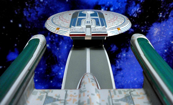
I absolutely love this ship! Funny story, but I actually ordered this one online thinking it was the regular NX-01 from the series. When I got it, I was surprised to find otherwise. For a moment, I was tempted to send it back, but I wound up opening it and falling in love with it. I really wish they had upgraded to this design in the series. It actually would have made sense right before the Xindi Excursion, and it’s a shame that we’ll never see this baby in action on the screen. It really would have threaded the needle from this prequel series to The Original Series. But at least I have this kick ass model of it, and she sure does look nice lined up on the shelf with the other ships of the line!

Star Trek “Starships Collection:” USS Excelsior NCC-2000 (XL) by Eaglemoss

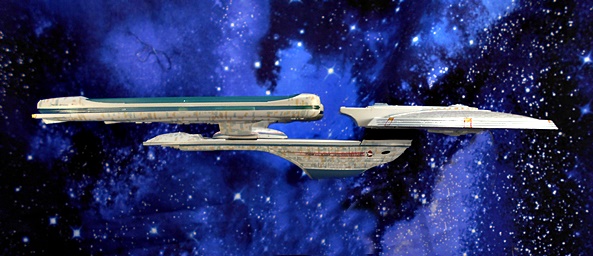
It’s Wednesday, it’s been a tough week for me so far. So how about I pour a drink and we take a day to enjoy some Starship Porn! I’ve gassed on a plenty about my love for the Excelsior Class Starship. For more of that you can look back at my review of Diamond’s Starship Legends NX-2000. Suffice it to say, as a kid I was blown away by the reveal of The Excelsior in Star Trek III. You have to realize that before The Next Generation, we only got hints and illustrations about Starfleet’s other Starship Classes. The Reliant in Star Trek II was pretty much it, and that one borrowed heavily from the Constitution Class Refit’s design elements. The Excelsior was so new and so fresh and yet still so Star Trek. It was never going to replace that PERFECT Connie Refit in my eyes, but it was still pretty damn cool. We saw it numerous times in the spin-off series, and it finally got its true moment to shine in Star Trek VI under the command of Hikaru Sulu.

And it is indeed the NCC-2000 from Star Trek VI that Eaglemoss decided to base this model on. Yeah, I would have preferred the NX, but that’s fine. This release is part of the special XL releases, which means this ship measures about ten inches long, making it about twice the size of Eaglemoss’ regular ship releases. It’s constructed of both plastic and die-cast metal giving it a nice heft. The model comes in a fully enclosed box with the ship nestled between two bricks of Styrofoam. There’s no assembly required, other than putting it on its stand, so let’s get this beauty out of Space Dock and give her a shakedown cruise.


I consider myself to be fairly familiar with this design, having lusted after it in books and various other models, and I’m immediately impressed with what we got here. The design lacks that certain noble poetry of the Constitution Refit and instead strikes me as being more technical in her angled struts and diminished profile. It’s a design from the future’s future, intended to look more advanced than the Connie and it does indeed. But that doesn’t make it prettier in my mind. Sleek? Yes. Prettier? No. But who’s to say I can’t love both ships, eh? As with the Enterprise XL model,  the Excelsior features a die-cast saucer, which does make it a bit front-heavy, but it also makes it feel like a quality piece. The plastic warp nacelles are a little bit springy on their struts, but they are straight, parallel and look great.

The nacelles on this version got a bit of a redesign from the NX version, possibly from when they scrapped the Transwarp Drive, and they now have flared platforms at the ends. The vanes that bisect the nacelles, as well as the top cut-outs, are cast in a translucent blue plastic, which can catch the light rather nicely at times. The Deflector Dish is also cast in the same plastic, and while it’s a little harder to get it to catch the light because it’s recessed under the hull, it’s still capable of some nice light reflection.

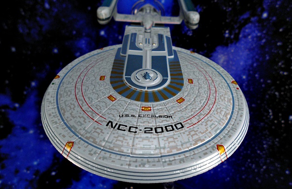
I remember being very impressed by the aztec patterns on the XL Enterprise, and you get more of the same here. The Excelsior’s pattern is a little less subtle, but I think that’s in line with the screen appearance. You get some nice paintwork around the platform that connects the bridge to the Impulse Engines, including some blue-gray panels and the rather Egyptian-looking gold striping that makes up the horseshoe around this platform. The top surface of the Secondary Hull is painted gray with some additional applications around the vents on the connecting struts. The ventral section shows more blue-gray paint and a lot more of the rather busy aztec patterns.

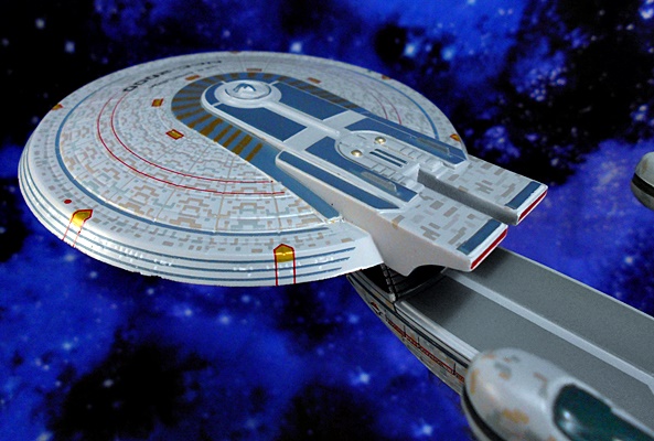
The saucer features deep cut panel lines and a down-slope to the edges, with concentric rings painted in blue along the slope. Six thrusters are placed around the edge, each one outlined in red and painted yellow, and we get a similar deco for the five sets of phaser banks placed around the horseshoe. The ship’s name and registry is printed with crisp lettering and framed by a pair of red stripes that circle back to the rear of the saucer. The saucer’s undercarriage reveals more of the same, only with a wide blue circle about three-quarters of the way in from the edge and the emergency landing gear panels also painted blue. Finally, the cluster around the Lower Navigational Dome is really pronounced on this ship and that’s reflected on this model.

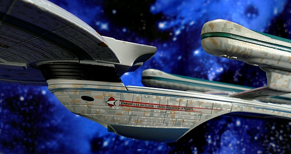
The sides of the Secondary Hull features the lettering “Starship U.S.S. Excelsior” and “United Federation of Planets” along with the delta and a set of racing stripes. The stout neck connecting the Primary and Secondary Hull is black and segmented and includes the two recessed Photon Torpedo tubes.

From the aft view, we can see the compartment in the Secondary Hull. I’ve seen so many back-and-forth discussions over what this thing is. Personally, I always assumed it was a Shuttle Bay, but I’ve also heard that in the NX version it was supposed to house the Transwarp Drive. Perhaps, it was repurposed for the Shuttle Bay after the ship underwent changes after being commissioned. Most blueprints I’ve looked at seem to suggest this to be the case. Either way it’s one of those rather distinctive features of this ship’s design.

The model includes a display stand, which does a fine job of holding the ship without obstructing too much of it from view. The base is made of die-cast metal and it has a felt bottom. so there’s no worries about it toppling over. Clear plastic arms grab the ship from the back of the saucer to suspend it. It’s designed very well in allowing the ship to be picked up and put back without a fuss. My only worry is that the friction will cause some paint wear over time if the ship is removed and replaced from the stand too many times.

As I’m sure I mentioned last time, I wasn’t immediately sold on these XL models when I first saw them advertised. At about $75 a pop for a model with no lights or electronics of any kind made me wonder how much value I was getting for my money. But after getting a ship like this in hand, it’s easy to see where that money goes. It may not have the flashy lights or voice clips and sound effects of Diamond’s ships, but these are still superior in every possible way. The size of the ship is just big enough to allow for the kind of detail I’m looking for, yet small enough that I can display several of these in the space required for just one of the DST Starship Legends. The attention to detail is fantastic, the paint work and printed lettering is excellent, and it just feels so satisfying to hold in my hand and maybe even woosh around the room a bit. But I suppose the best endorsement I can give is that while the Excelsior here was only my second XL Starship, but I’ve picked up at least half a dozen since then. And I’m excited about sharing each and every one of them here in the future!

Star Trek “Starship Collection:” The Next Generation Edition (Part 1) by Eaglemoss

A little while ago I embarked on reviewing Eaglemoss’ Starship Collection with a look at the XL Enterprise-A. And before coming back to open some more of the larger ships, I thought I’d detour into some ships from the regular-sized fleet. And because these are smaller (roughly five inches long) and a little less detailed, I figured I’d cram as many as I could into one review. To get started, I selected five ships that I feel are the most iconic ships of The Next Generation, and also a pretty good survey of the different space powers. I’m also calling this Part 1 because, while I don’t know when Part 2 will come along, or what will be in it, I do know there will be plenty more TNG ships to look at later on down the road.

And here are they are! The Federation Flagship, The Romulan Warbird, The Klingon Vor’Cha Class Battlecruiser, The Ferengi Marauder, and the Cardassian Galor Class Cruiser. As you can see these come in two styles of packaging. The Enterprise and Warbird came in window boxes that are specific to the ship inside and include some nice artwork and a Collect Them All layout for the back panels. The other three ships come in generic boxes with no tops, just the clear cover for the plastic tray. I dig the window boxes more, but I have to respect the others that just let the models do all the talking. The Enterprise and Warbird come with booklets inside the boxes, while the others come with regular size magazines, usually in a bag with the box. The magazines are kind of hit or miss with me. I like the ones that focus on the ship, but clearly not all ships have enough backstory and details to fill a magazine so some just talk about the aliens or the stories they were featured in. Let’s start with the Flagship!

I’m going to save my long-winded opinions on the 1701-D, it’s design, and what the ship means to me for when I spotlight the XL version in the near future. For now let me just say that I’m blown away by the amount of detail Eaglemoss packed into this little ship. For the longest time, I didn’t collect this line because I just didn’t think the scale was capable of retaining the kind of details and quality of sculpt I was looking for. And we’ll see in a little bit that prejudice wasn’t entirely unfounded, but when it comes to this Enterprise, boy was I wrong! Just look at that saucer! Check out all the tiny windows individually painted either lit or dark! And escape pods! The crisp registry and sharp paint on the phaser ring! You even get some oh so subtle aztec-patterns. Granted, the Enterprise-D’s saucer is a pretty wide canvas to work on, but it’s still damn impressive.
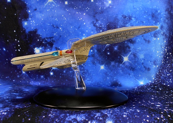
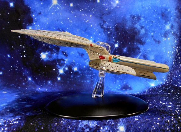
They really nailed the profile of the ship as well. The tiny windows continue on to the Stardrive Section. You also get some purdy red and blue translucent plastic used in the warp nacelles and super tiny registry printed on the struts. If you look closely you can even see that they applied some of the subtle panel shading to the nacelles themselves. I’d also like to acknowledge that they did a nice job hiding the seams on this ship in plain sight by putting them in appropriate spots. The model is part metal, but mostly plastic and while it has a nice heft to it, those warp nacelles feel fragile!
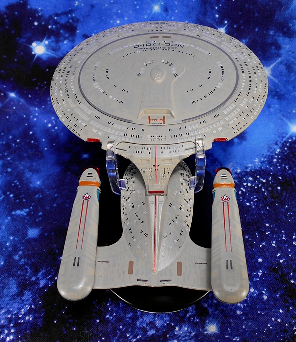
The same red translucent plastic used for the fronts of the warp nacelles is used for the three impulse engines. And there’s a sharp red racing stripe bisecting the ship from the saucer all the way down to the aft torpedo launcher. You also get the Deltas and racing stripes on tops of each warp nacelle the name printed on the horizontal face of the struts, and the name and registry printed in front of the Primary Shuttlebay Door. Want me to complain about something? The Shuttlebay Doors could have been more detailed. That’s all I got!
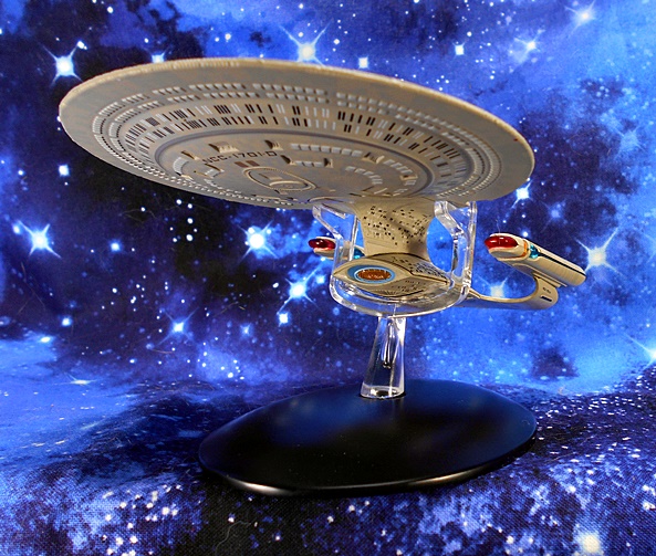
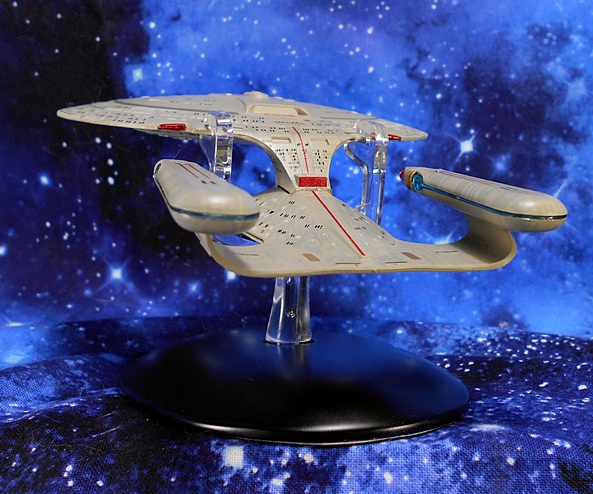
The deflector dish is comprised of more of that lovely red and blue translucent plastic, and the ventral side of the ship shares all the great detail as the dorsal section, complete with individually painted windows, and registry printed on the underside of the saucer. And before moving on to the next ship, this is also as good a place as any to talk about the stand, which is very high quality and very well designed. The base is heavy and made of metal with a felt bottom. The device that holds the ship up grabs the saucer beside each of the saucer impulse engines and also has notches for the Stardrive Section to rest on. It’s clear so it tries to obscure the view of the ship as little as possible. I took some issues with this style of stand when I looked at the XL Enterprise-A, but for a ship this size, I think it’s a pretty solid design that also lets you detach the ship and handle it without much trouble. Let’s have a look at the Romulan Warbird next.

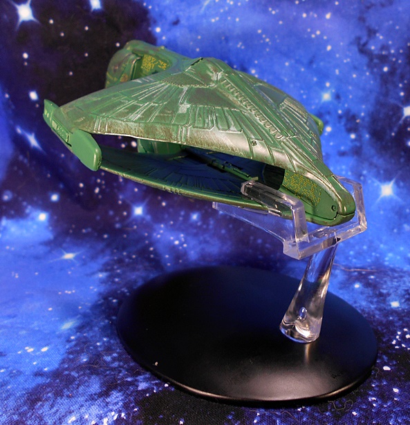
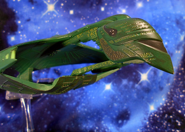
Oh boy do I love this design! Introduced in the Season 1 Finale, The D’deridex Class was fresh, original, menacing, and unlike anything we’ve seen before. And yet it has since become as iconic a Romulan ship design to me as the original Romulan Bird of Prey that I grew up with. And once again, Eaglemoss has done an amazing job recreating this behemoth battleship in a nearly pocket-sized scale. The green finish has a nice metallic sheen but it’s also washed over in some parts to help bring out some of the sculpted details and give it a bit of a weathered look, particularly along the rear edges of the top and bottom hulls. The ship always looked a little too new on the small screen, but this more seasoned version looks like it would have been at home on the big screen if the Warbird had ever made it into any of the TNG films.
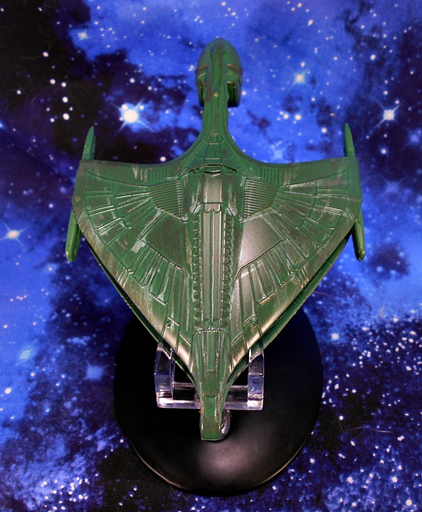
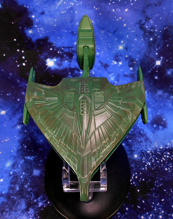
There are panel lines a plenty on the outside and inside recreating a fanning feather-like pattern, as well as a segmented spine that runs up the center of the ship’s mighty back. It evokes the predatory bird motif without having to be quite as on the nose, and some might say cheesy, as the 1960’s Bird of Prey design.
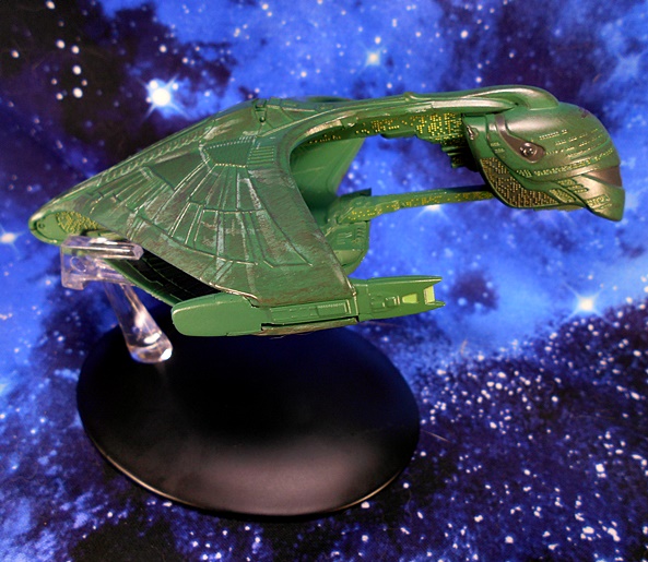
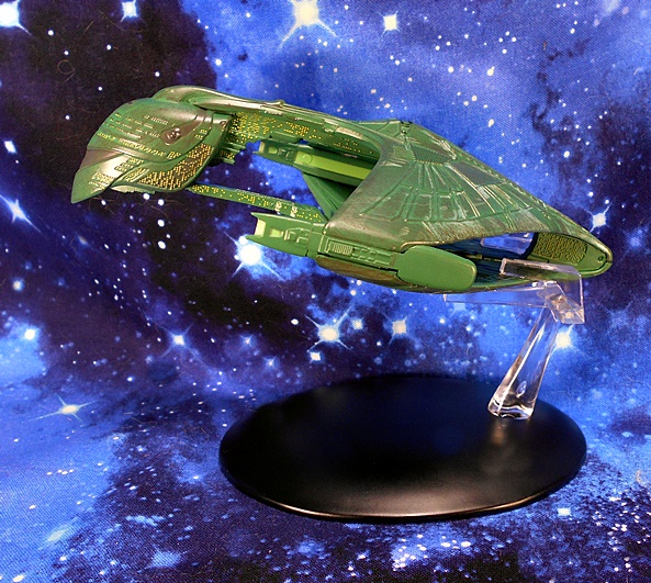
And much like the Enterprise, the craftsman of this model didn’t spare any expense when it came to windows. The hull is positively littered with them and it goes a long way to illustrating just how gigantic this ship is. Just look at all the windows on the strut connecting the bottom of the forward section to the bottom hull. Wow, this is a big ship! I was hoping we would get a little of that translucent plastic in the warp nacelles, but here it’s just a greenish-yellow paint. It looks fine, but it could have looked better.
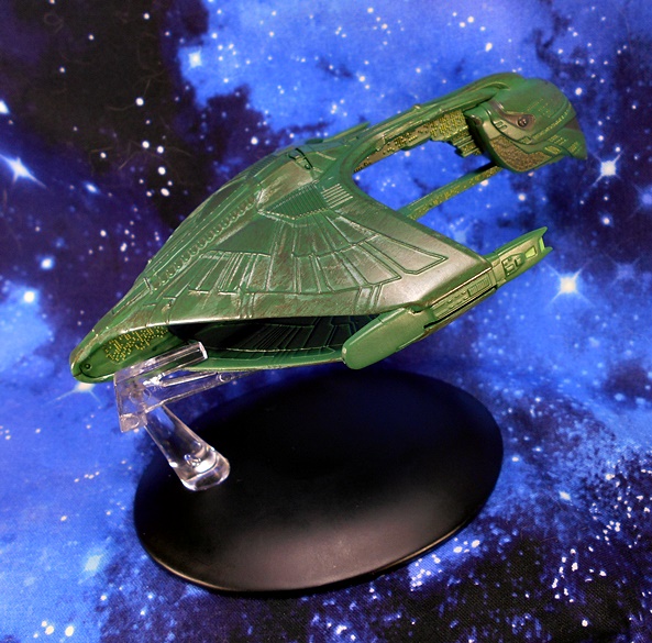
The stand here mirrors the particulars of the Enterprise stand, although this one is a lot less obtrusive, as it grabs the ship from behind and gives it an upward incline. As a result you can view the ship on the stand from some of its best angles and not have to worry about it getting in the way. On the downside, my stand will not stay in the base, which is only a problem if I forget and go to pick up the ship, as the clear piece and ship will come right out of the base. But stand malfunction set aside, this is a great model of this fierce Romulan Warship. And from one mighty Empire to another, let’s turn next to the Klingon Vor’cha Class Battlecruiser!

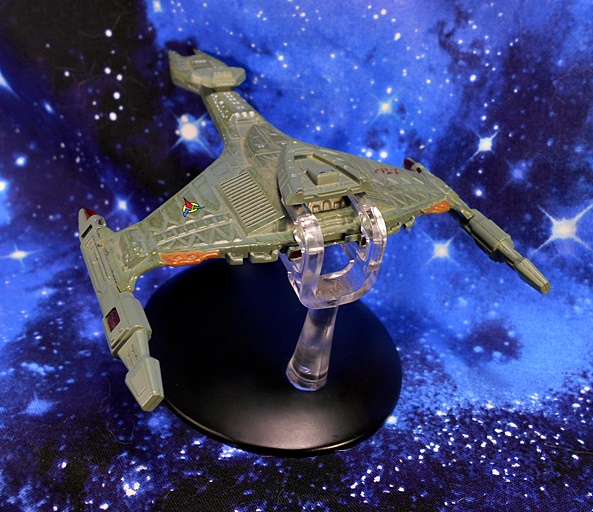
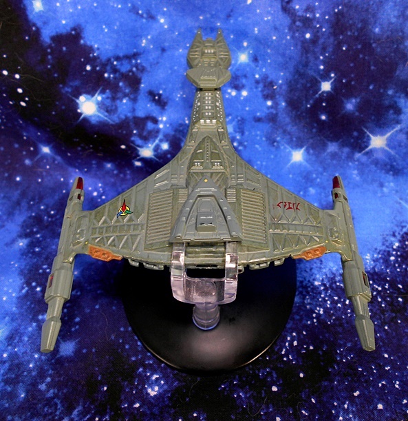
It’s no secret that TNG relied too heavily on the Klingon Bird of Prey. Oh, it’s an amazing ship design, but after being featured so prominently in Star Trek III, Star Trek IV, Star Trek V, Star Trek VI, oh yeah and Star Trek: Generations, it was nice to see a brand new Klingon ship eventually turn up in TNG, even if we had to wait until the 4th Season to get it. And The Vor’cha was an excellent design that invoked familiar Klingon elements while changing it up enough to make it still seem fresh to me. The Vor’cha is like a D7 on steroids with beefier engines and where the Command Deck on the D7 was at the terminal end of the boom, here it’s tacked on top and preceded by a Weapons Pod that looks like the Klingon equivalent of a giant Type-1 Hand Phaser. Ok, I guess that would be a Type-1 Hand Disruptor. But hopefully you get the point.
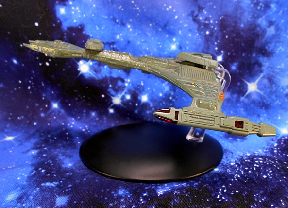
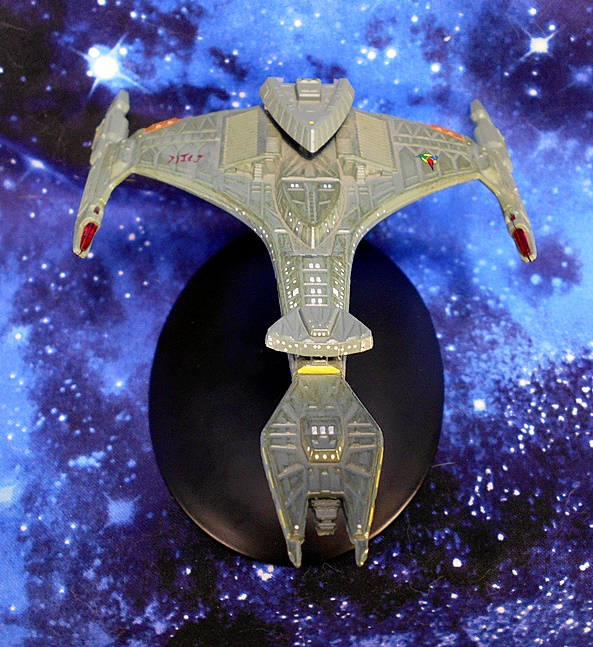
Once again there’s some excellent detailing on this little ship, although I’ll say straightaway that it doesn’t look quite as sharp or polished as either the Enterprise or the Warbird. Of course, that just may be that the Klingon ships tend to look a little grittier and less refined. The hull features very traditional Klingon Shield Plates, particularly in the wings leading out to the warp nacelles and in the area surrounding the Weapons Pod. In addition to lots of individual painted windows, you get the emblem of the Klingon Empire printed on the left wing and what I presume is the ship’s registry printed in Klingon on the right wing. Both of these last two details are also present on the undercarriage of the ship.

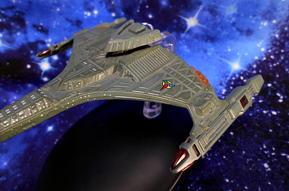
The warp nacelles makes use of that lovely red translucent plastic in the nacelles and it looks great, particularly with some light piping through them. You also get some orange paint on the Emergency Plasma Purge Vents located at the back edge of each wing. And like the Warbird, the Vor’cha has a wash that not only helps pick out the details in the sculpt but also gives it a well-weathered look suggesting that this Battleship has seen some action.
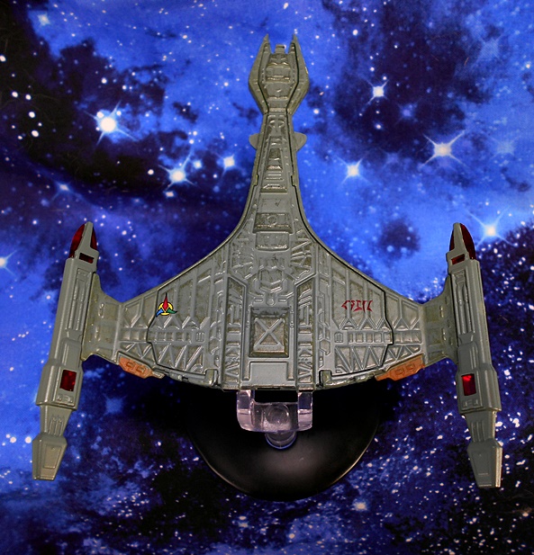
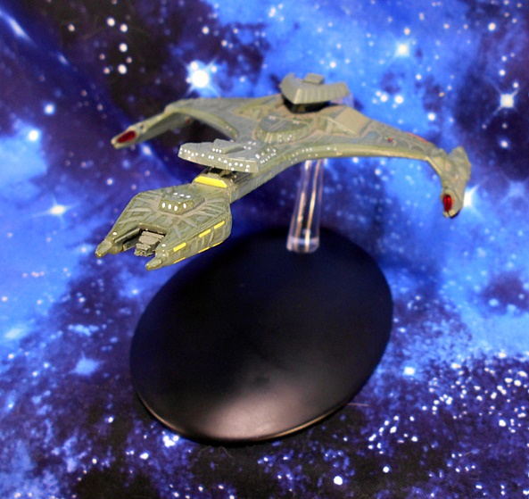
The stand here is very similar to the one used for the Warbird in that it grabs the ship from behind and allows you to view it from some of its best angles without getting in the way. And happily this stand holds together quite well. While this model doesn’t look as crisp as the first two ships, it certainly has a rugged and seasoned flavor about it that suits a ship in the Klingon Navy. And now that we’ve covered The Big Three, let’s work our way down to a couple of the lesser powers… starting with the Cardassian Galor Class Cruiser.
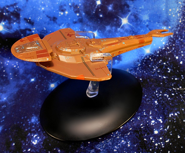
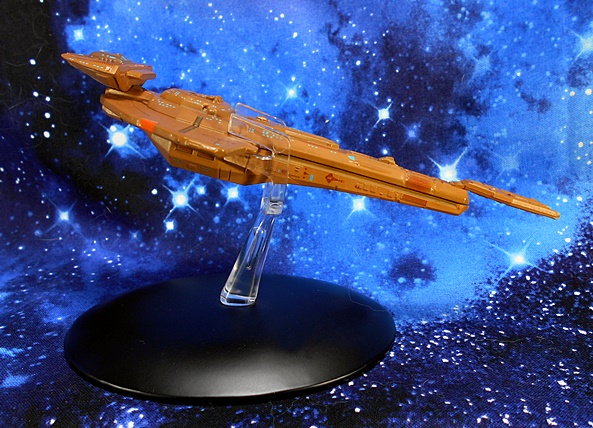
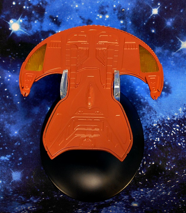
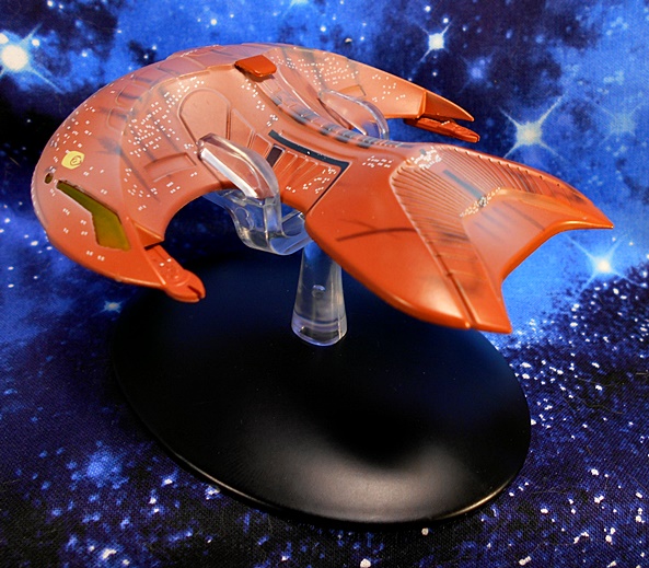
I was tempted to not include the Galor in this piece on iconic TNG ships because to me this ship really didn’t become iconic until Deep Space Nine and the Cardassians didn’t even show up until TNG was more than half over. Nonetheless, it first appeared in this series, so I’m throwing it in. I’ll also confess I was rather excited to look at it since I’ve never owned a model or toy of this ship before. The Galor is a very cool design, resembling an earwig and automatically giving me the willies. My only real nitpicks with it is that it doesn’t have that one sweet spot for a beauty shot like most other ships do. It doesn’t look like much when viewed at level profile or from dead on. Nonetheless, this is another great model for the line. On the surface, I thought this ship lacked detail, perhaps because it’s hull isn’t covered in panel lines. But once I got in close with the camera, it’s still got the same level of detail as the other ships including tiny windows, insignia and registry markings.

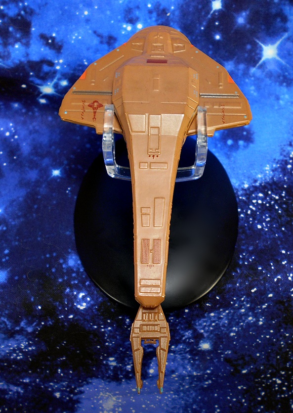
I really don’t know much about this ship’s anatomy, so I perused a set of blueprints so I could better understand I’m seeing. I presumed the orange triangles are weapon, but those are actually called out as the Warp Engines. How that works, I’m not sure, but cool! The model uses red translucent plastic for the Main Disruptor cannon, which apparently doubles as a Deflector Dish. Again, I’m not sure how that works, but cool! I really dig the hatches tucked under the wings, which are apparently for offloading cargo or troops.
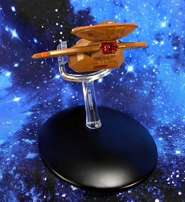
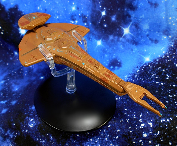
Once again, we have the same type of stand, only hear it’s designed to grab the ship from behind it’s wings. It does obstruct the view a bit, but that’s why it’s cast in clear plastic. And to be fair, there’s really nowhere else it could have grabbed the ship and adequately supported it. And that brings me to my last stop on this trek…
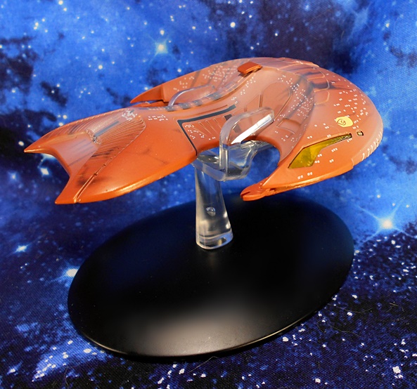
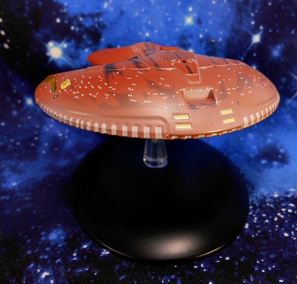
I was in love with the Ferengi Marauder the first time I saw it. It’s a shame the Ferengi didn’t work out quite as the writers had planned and we rarely got to see this ship, because I think it’s a really cool design. The model favors paint applications over actual sculpted detail, with most of the hull being smooth. And I’d say that’s probably a fair representation of the screen appearance. And like the Warbird, the painted windows on this ship do a fine job of portraying just how big this ship is supposed to be. Still, I don’t think it would be unfair to say that this survey of ships is offering diminishing returns when it comes to the amount of detail injected into them. I didn’t really plan it that way, but there you go!
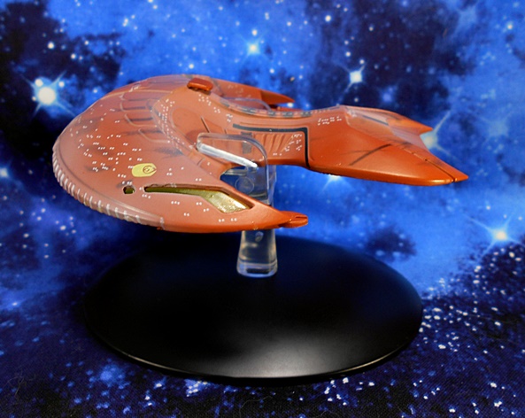
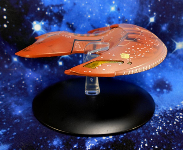
The model makes use of translucent yellow plastic used for the warp engines, which can be seen from the sides and the undercarriage as well and look pretty damn sharp. You also get the emblem of the Ferengi Alliance printed on each side just above these engines. The weapon emitters at the tips of the wings look like little pincers, and the notches that run alongside the bottom edge of the ship’s aft hump are all painted.
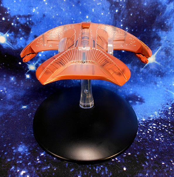
Unfortunately, there are two things about this model that really bug me. The first is that when viewed from the front, the crescent hump that makes up the back section of the ship doesn’t look tall or steep enough. The screen appearance makes it look a lot more pronounced when compared to the Command Section. Now, maybe that’s just me or maybe a trick of the camera, because I’m sure these models are based on detailed research, but it just doesn’t quite look right to me. Secondly, and less subjective, is the white wash they used. It dulls the color of the hull and I can’t comprehend what kind of effect they were going for here. It bothers me a lot with the ship in hand and even in my pictures it looks like the results of harsh lighting. At least the other wash they did to denote weathering looks great. I’d be keen to see them take a stab at this ship in the larger XL line and without the white wash.
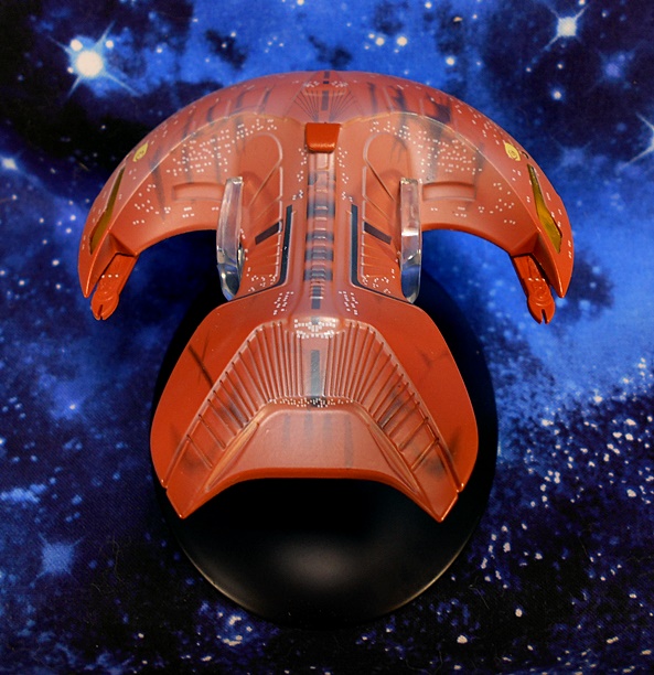
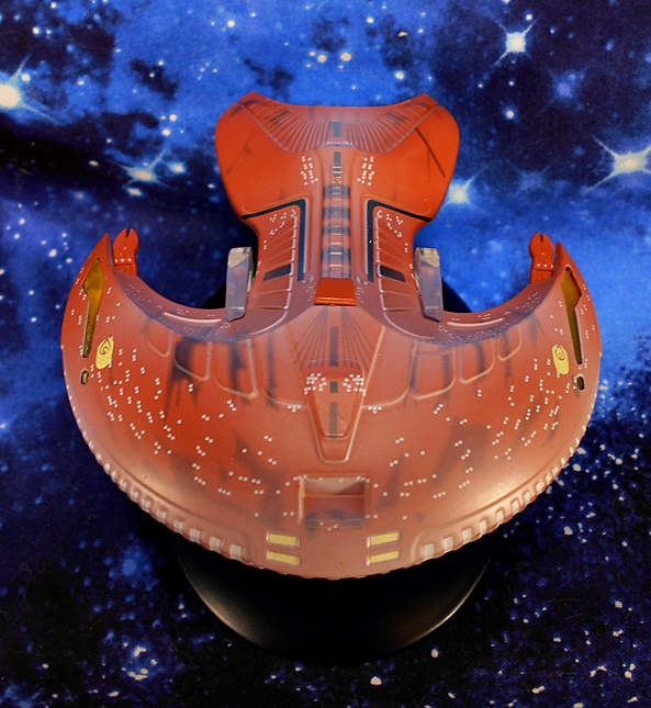
The stand grabs the ship from the front of it’s crescent and does a good job holding it and not being too obtrusive. I will, however, point out that, in the cases of all the stands, I worry about friction and how much taking the ships off and putting them back on will cause paint rubbing.

And there you have it, five iconic ships from The Next Generation all presented by Eaglemoss and, for the most part, they’re all very well done. Even the Marauder would be fine if they gave it a simple repaint. As a FASA miniature junkie from days long past, I’m always up for building me a fleet of little collectible Starships and Eaglemoss has me covered quite nicely with this series. These models are great examples of quality and craftsmanship and offer a fine alternative to fleet building if you’re looking for something more substantial than Micromachines and more varied than any other toy or model company has churned out. The magazines are a nice bonus, but they aren’t the high point of this line to me. The five ships I showcased today ran me between $17 and $25, which sure isn’t bad if you have that one (or handful of) special ship(s) you want to put on your desk. It does, however get rather pricey when you’re looking to Collect Them All, or at least a good chunk of them. On the other hand, it’s a big break from spending seventy-five bucks a pop for the bigger XL ships.

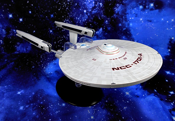
Star Trek “Starships Collection:” USS Enterprise NCC-1701-A (XL) by Eaglemoss

It’s safe to say that I’m not a fan of what passes for Star Trek these days. For me the only good thing to come out of Discovery and Picard was that they reignited in me a desire to go back and watch the real stuff. Hell, even the worst of Voyager seems like a masterpiece now! I’ve also been building me a fleet of Eaglemoss ships and it’s long past time I open some of these up! And where else to start but with my favorite ship design in all of science fiction history… the singularly majestic Refit Enterprise!
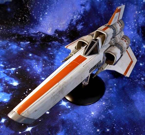
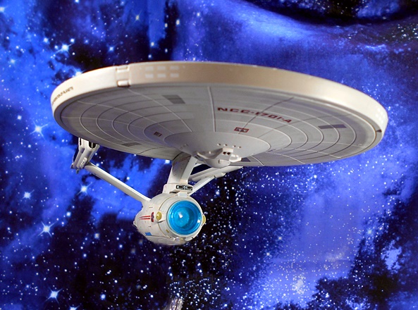
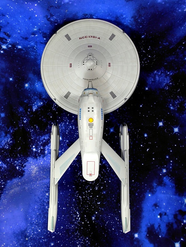
My preference would have been to go with the original 1701, but I happened to find the 1701-A at a really good price and decided to compromise. This is the XL version, which makes it more than twice as big as Eaglemoss’ standard ships (in this case about 10 1/2-inches long), but it still features die-cast metal and plastic construction. It comes in a fully enclosed box with some pictures, including the fail of using a reversed image on the front, rendering the registry on the hull backwards. Ooops! Inside the box, The Enterprise is sandwiched between two styrofoam bricks, and the only assembly required is putting the stand together. Oh, and I’m shooting the ship without the stand for most of the review, for reasons I’ll get to at the end.
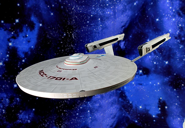
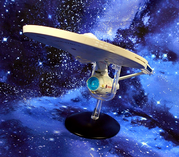
Oh what a beauty! I could pour myself a glass of Jameson and gaze lovingly at this ship for hours. When I call this my favorite ship design in sci-fi history, that’s not hyperbole. Them’s the facts. I just love to get lost in its iconic profile and the noble human drive for discovery that it represents. And boy is this a great model! The top half of the saucer is die-cast, giving this ship a hefty, albeit very front-heavy, feel. And if you’ve had some experience collecting Enterprise models, you may know one of the biggest fails tends to be the warp nacelles not aligning properly. Here, they are perfectly straight and parallel, giving the model a gorgeous three-quarter view.

The grills (thermal regulator system) laid into the nacelles looked black to me at first glance, which is how they are usually depicted on most models of this ship that I’ve owned. But much to my surprise, they’re actually cast in transparent blue plastic, which makes for a cool effect when held up to the light. The deflector dish is also cast in transparent blue plastic, which reflects light quite nicely. It doesn’t really resemble a glowing effect, but it does make it stand out. Meanwhile, the hull of the ship is a beautiful off-white, which is smooth and even throughout.

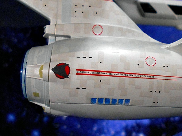
One of the things that really shows the model maker is committed to detail is the aztec pattern in the hull. Here it’s exquisitely executed and manages to be both easy to see and yet equally subtle. Additional paint applications are applied sparingly, but all the most notable points of interest are here. Particular stand outs include the bright yellow Antimatter Fill Port Hatch and the bright blue dual rows of observation windows. The dome on the impulse engine is painted blue, and they even printed the red outline for the cargo hatch under the shuttlebay. Other details include the gray paint on the emergency landing pads on the bottom of the saucer section, and the individual phaser turrets.

The sides of the secondary hull also include the delta emblems pointing toward the deflector dish, as well as the red racing stripes with some damn tiny printing between them. Here you can also see the two circular docking ports, circled by red rings in four segments. There are also some black painted windows scattered around the secondary hull.

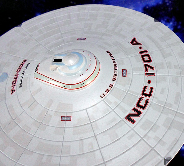
The printed lettering on the saucer is sharp and crisp. Each character of both the registry and the name are outlined in red. A close up of the bridge module shows some more blue and red trim, some more tiny windows. The VIP lounge windows can be seen on the back of the bridge module, as well as the tiny bridge docking port. You also get more tiny printing along the edges of the saucer section.

That’s not to say this model is perfect. There are some details omitted, particularly around the edge of the saucer, and there is an unfortunate seam along the bottom of the secondary hull just below the observation windows. And yeah, now I’m really nitpicking. Because all in all, for a ship in this scale, I think they hit all the right points.

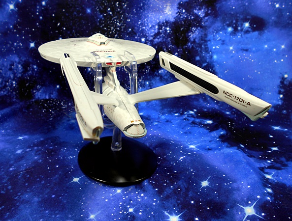
Finally, there’s the stand. I both love it and hate it! I love it because it is pretty rock solid and holds the model firmly. There’s no chance of this toppling over. Also, the bottom of the base is covered in swanky felt. On the downside, even though the stand is transparent, I don’t like how it ruins the profile. That’s why I didn’t use it for most of the pictures in this review. Also, sliding it on and off the saucer section makes me worry about scratches. That’s a problem because I constantly want to pick this thing up!

And for all the gushing I’ve done over this model, it had better be damn good, because it set me back $75. Was it worth it? Absolutely. I only need refer you back to what is sadly one of my most viewed reviews, where I trashed the Diamond Select Starship Legends Wrath of Khan Enterprise, and how disappointed I was with it. It was probably the single most disappointing purchase I’ve made in all my toy collecting years. I got into these XL Eaglemoss ships to finally replace that piece of junk and I’m so very glad I did. Sure, this Enterprise is smaller and has no electronics, but it’s beautifully made, extremely durable, and most importantly it looks so good on display. Maybe too good, because I’ve been keeping it on my computer desk for a few weeks now, and I constantly find myself picking it up and wooshing it around. For a non-articulated hunk of metal and plastic, this thing is still loads of fun to me.