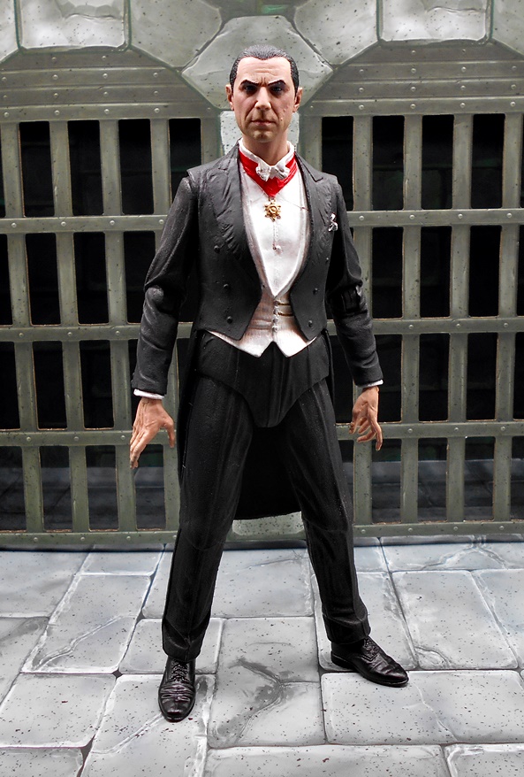
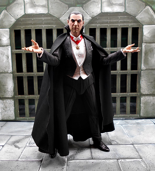
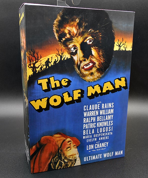
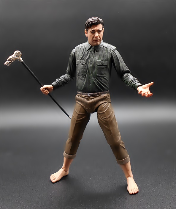
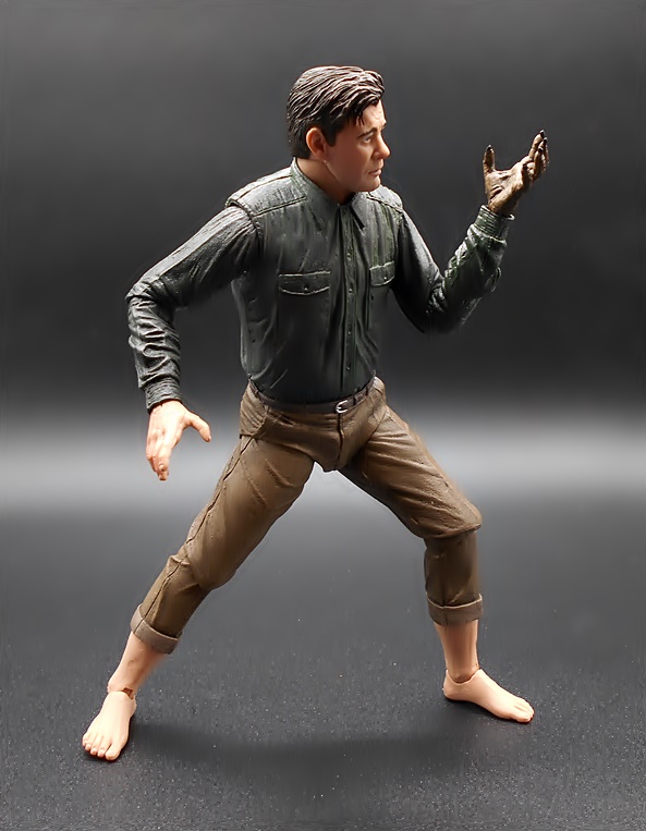
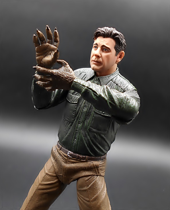
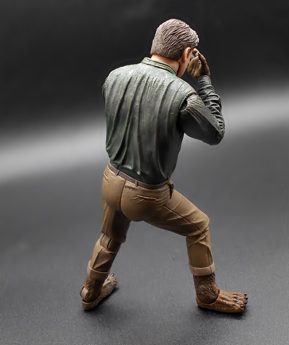
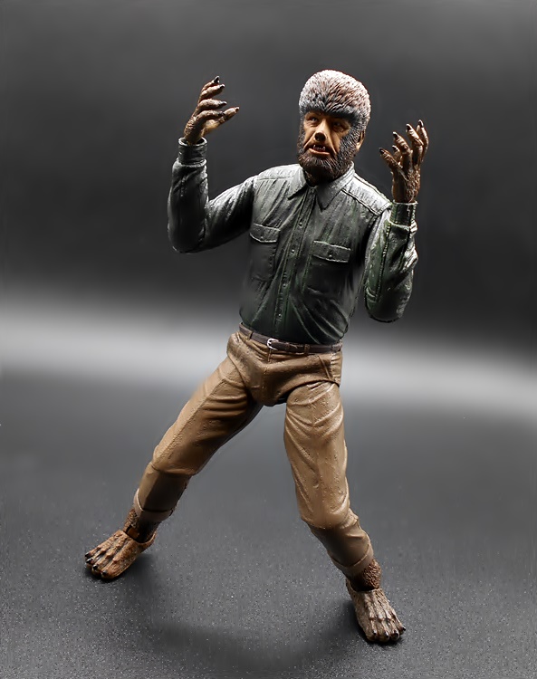
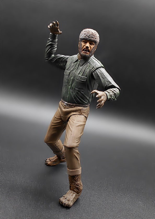
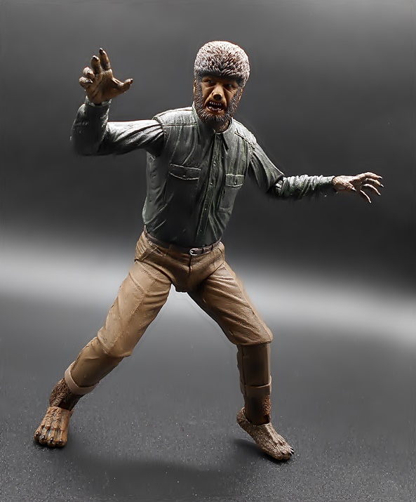
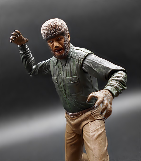
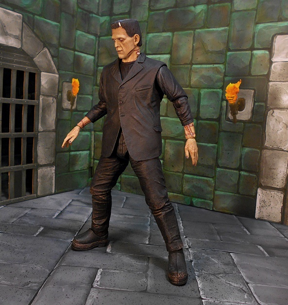
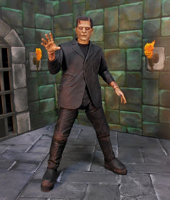
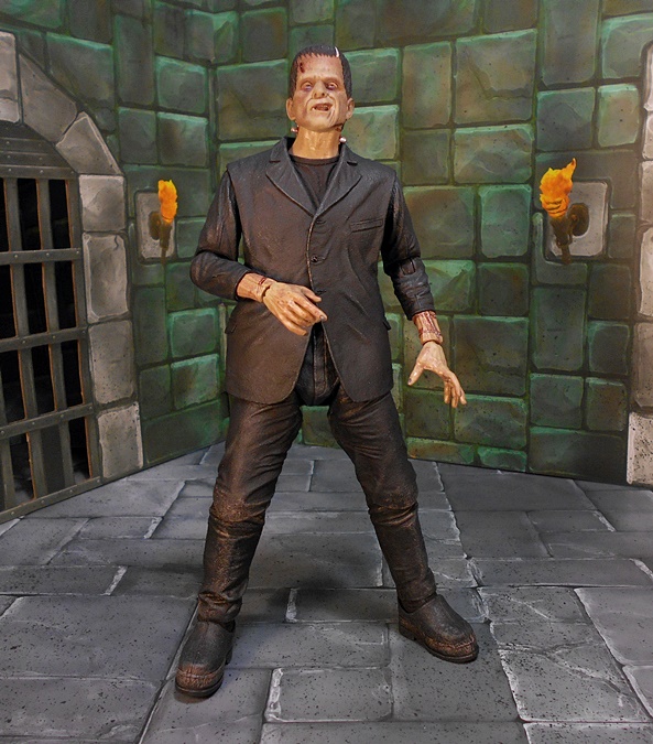
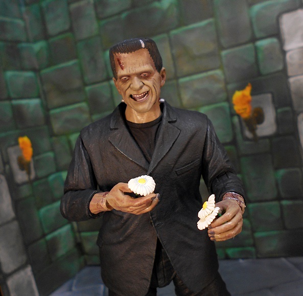
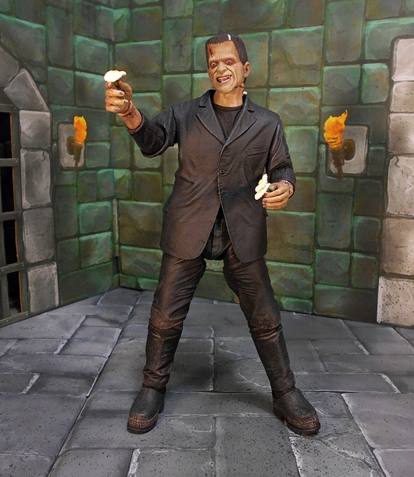
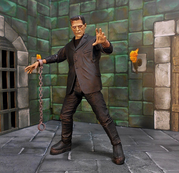
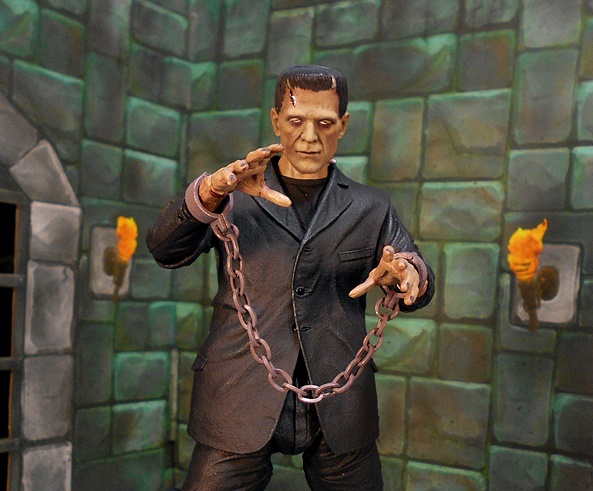
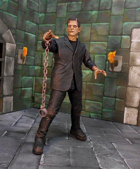
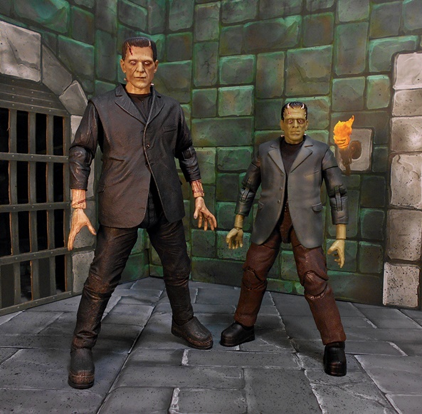
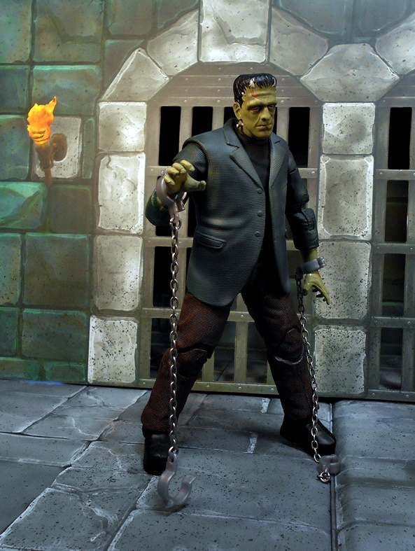
It may be November but here at FFZ, the Halloween spookiness is just getting started! I’ve covered all of the NECA Ultimate Universal Monsters figures in my collection so far, but NECA also pumped out a few Accessory Sets and we can’t leave those out! Today’s set is meant to compliment their Ultimate Frankenstein Monster release, and I have to say this one straddles that line where it almost feels like a playset, but not quite. I’ll have some more thoughts at the end about what NECA could have done to nudge it more in the right direction, but that’s me getting way ahead of myself!

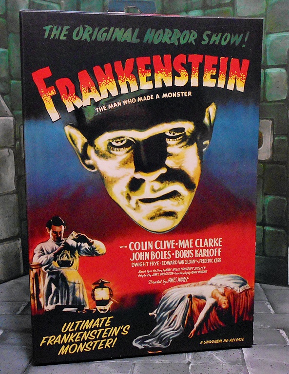
The set comes in a fully enclosed box with some nice artwork and shots of what you get inside. Of course, I can’t stress enough that, unlike The Bride of Frankenstein Chair, there ain’t no figure in this box, so you’ll definitely want to pick up The Monster to go with this set. Inside the box you get the operating table with restraints, a bandaged head for The Monster, a torch, a sculpted towel to hang on the table, a tri-fold cardboard backdrop, and a cloth blanket to partially cover The Monster. I also need to emphasize that the table requires quite a bit of assembly and let me tell you that I can’t imagine it could be any tougher to actually build a living creature from corpses than it was to put this thing together. What the hell, NECA? It was a confusing endeavor and there were a lot of fragile pieces. Add that up and you’ve got a pretty stressful situation on your hands. But, eventually I was able to get it together so let’s see what we’ve got.


Here’s the assembled table with The Monster figure secured to it. The table is finished to look like bare steel, it’s big, and it looks great! I especially love all the slides and wheels and mechanisms under it, which are designed to allow it to be adjusted. Alas, none of these things actually do anything, other than gave me anxiety when putting it all together, but the detail adds a lot to the table and it is appreciated. Other details include the brackets and sculpted bolts that secure the table to the base frame and there are some holes in the corners of the frame, maybe in case someone wants to actually secure it to a diorama base.


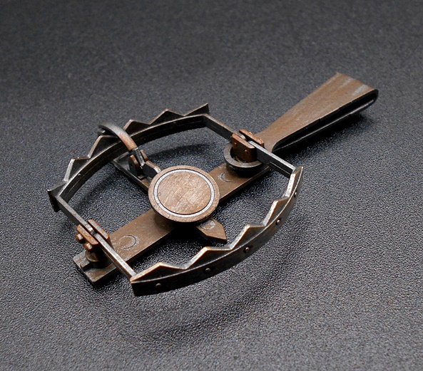
The restraints include steel bands for the ankles, biceps, and three for the torso. These simply slot into the table and are pushed down to keep your Monster secured and they fit really well. There’s even a cradle to rest The Monster’s head on, although it doesn’t look like it would be very comfortable.

The white cloth sheet simply drapes over The Monster. It is not long enough to cover all of him, so his head and feet stick out the ends. I’m assuming it was like this in the film, but off-hand I just can’t remember.

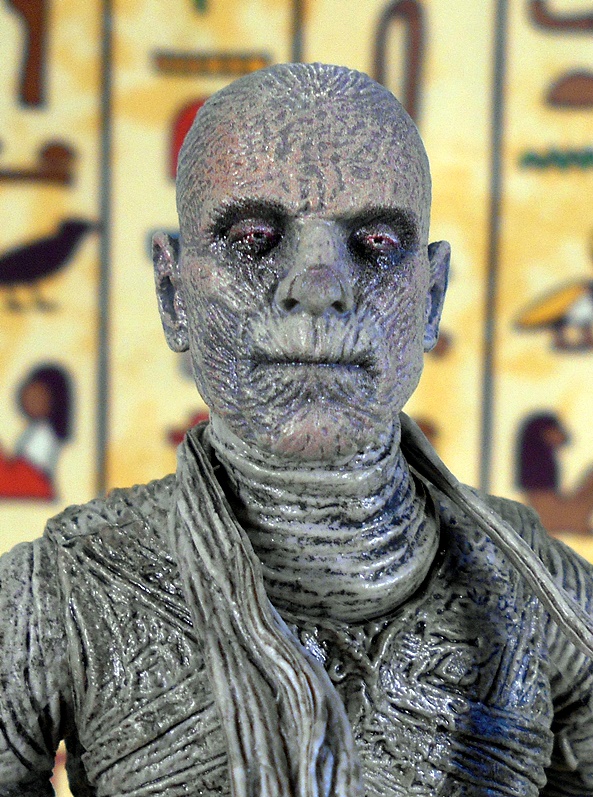
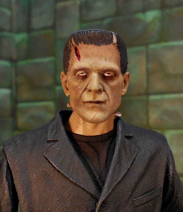
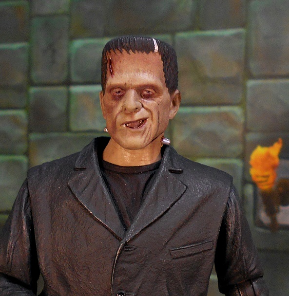
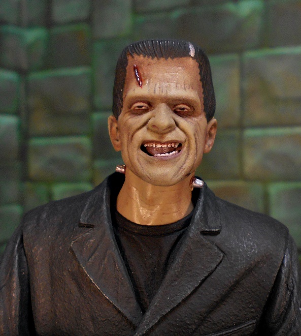
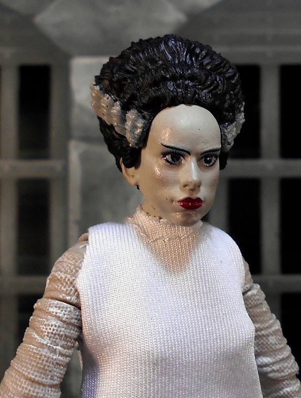
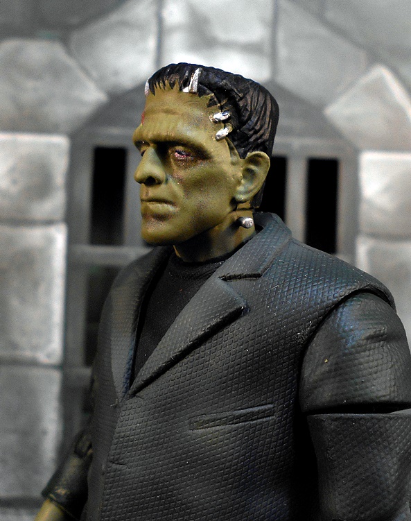
The bandaged head is a nice bonus, especially when displaying The Monster on the table. The khaki bandages feature a very detailed sculpt and some painted clips to hold it in place. It definitely makes for a creepy vibe.

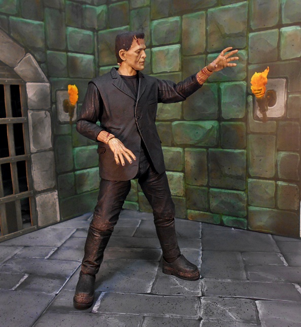
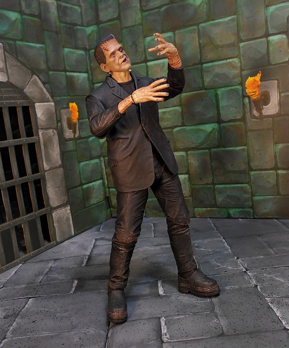
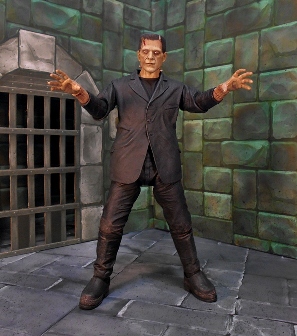
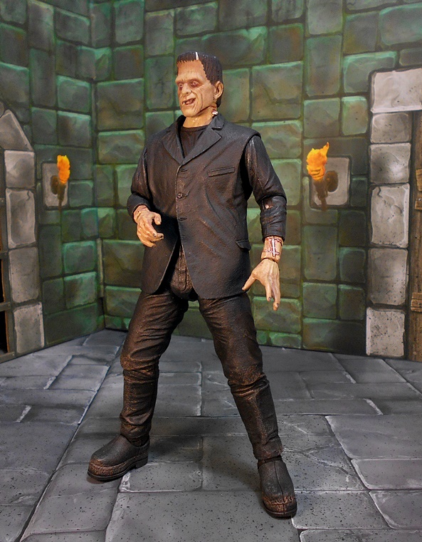
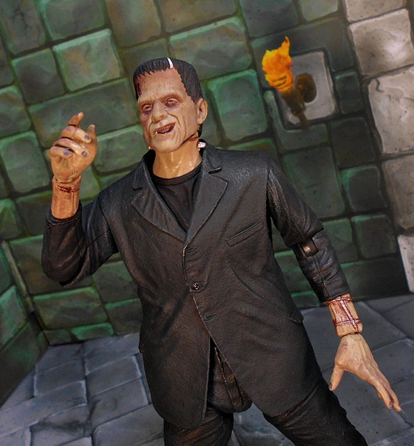
The backdrop is printed on heavy cardboard stock and folds at the ends to help it stand up. It’s got a dank castle wall pattern with an open doorway to the left and a bank of instruments to the right. The center has some more instruments and the device Frankenstein used for channeling electricity into The Monster. There’s no floor, so I had to use my own.

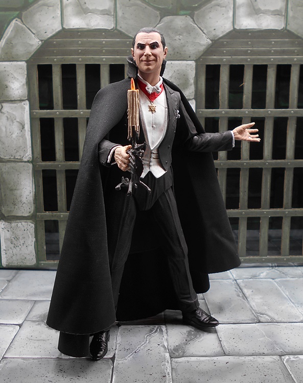
Finally, you get a torch, which feels like it’s tossed in there to beef up the contents. There’s nowhere to hang it and who’s going to hold it? The Monster? Even the picture on the box just shows an anonymous hand coming into the frame to scare The monster with it. I’m sure I can put it to good use somewhere in my collection, but it doesn’t do much to enhance this set.


Despite a lot of initial frustration, I really am quite happy with this set. It even brought me back to the days of trying my best to build those wonderful Aurora model kits as a kid. The table makes for a very cool display option for your Monster and the extra head has made me strongly consider picking up a second figure just to go with this set. But, at $35 I think the price is pretty borderline. The table is big and impressive, but some of it is pretty fragile. It’s also something that I would not dare take apart and return to the box for storage. So, considering the price point, I really wish NECA had just sold it as pre-built. I also wish NECA had gone just a little bit further to make it an actual playset. The backdrop helps, but a base would have been nice too. Throw in a smaller table with some lab equipment and I would have happily paid $50. Still, if you’re in the market for it and finding it sold out at most retailers, it can be had pretty easily on Ebay for right around the original MSRP.