Star Trek “The Wrath of Khan:” Khan Collector Figure by Diamond Select

If you follow me on Twitter than you know that I’ve had a lot of Star Trek on the brain lately, and it’s all because of CBS’ new series Discovery. Now, it’s not what you might think. You see, I hate the show. In fact, I’m not sure hate is even a strong enough word. But in a way I’m almost thankful for it, because it’s gotten me so worked up about Star Trek that I’ve been back into watching one or two episodes a night of everything from The Original Series to Voyager and I’ve been falling in love all over again. I’m not sure how much of any of that really factors into today’s review, because truth be told DST’s Khan Noonian Singh just popped up in my Amazon Recommendations for a crazy good price, so I bought him. Probably would have happened anyway.

If you’re not familiar with these Trek Select releases, they fall somewhere between action figures and statues, and favor swappable parts over articulation. In fact, Khan here actually has less articulation than the Original Series Kirk and Spock sets that were released earlier. I reviewed the Kirk set over four years ago and it left me a little befuddled. To be honest, I bought this one mainly for the Movie Era Captain’s Chair. But I’m getting ahead of myself. Let’s talk packaging… I have been pretty critical of DST’s action figure packaging in the past, particularly with their Muppets line, because it’s so big and wasteful. Here, I think it’s totally warranted because there’s a whole lot of stuff in this box and I don’t think they could have crammed it into a smaller bubble. The cardback features a wrap-around with a picture of Khan on the side panel and the Star Trek 50th Anniversary logo running up the front. The back of the card has a satisfying and lengthy piece of background copy and shows some of the other figures in this line. Also, check out the picture of the Reliant on the bubble insert. That sure looks like it might be a painted prototype of a Starship Legends Defiant. WHERE IS MY STARSHIP LEGENDS DEFIANT, DIAMOND???

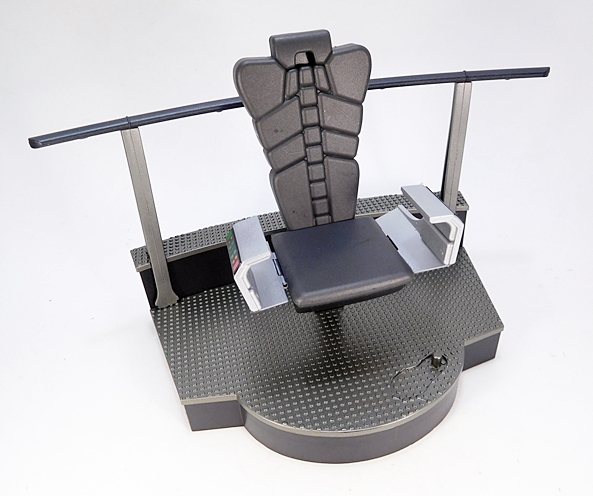
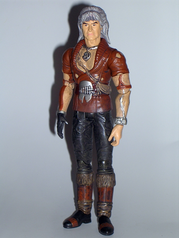
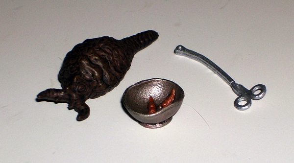
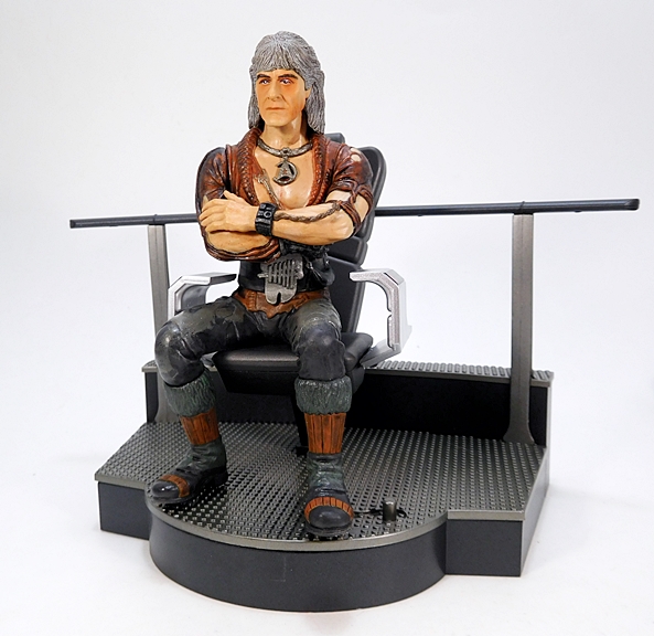
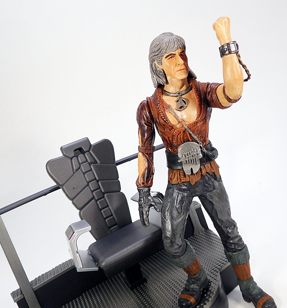
Did I mention I bought this mainly for the chair? Well, the chair is quite nice. The deck piece is made out of very sturdy plastic with slots to plug in the chair and the railing. It features a textured deck plate, which looks great, and a rather unfortunate footprint and peg to show you where to put Khan’s foot, which doesn’t look so great. The chair doesn’t swivel, but it does feature two hinged armrests with painted controls panels. DST has been including some cardboard pieces with some of their sets, most notably the Kirk with Engineering section in this line and their Seven of Nine Femme Fatales statue. It would have been cool to get a standee showing the back of the bridge behind the chair, but alas, it was not to be. I guess we might as well take a look at the Khan figure too. I’ll start him off in his standing pose.

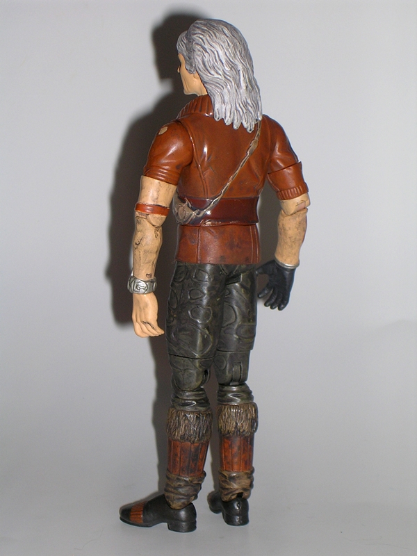
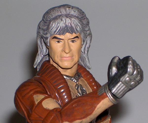
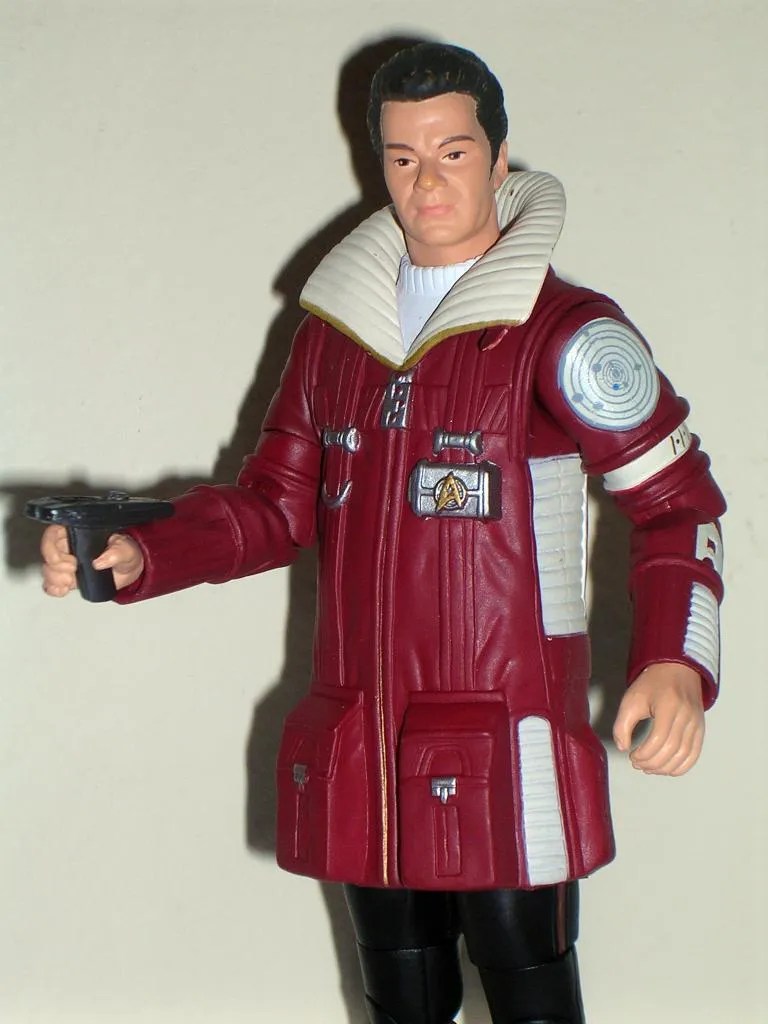
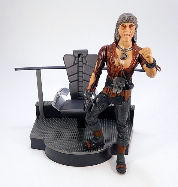
We’ve got to start somewhere, so here he is proffering, “I make you a counter-proposal, I will agree to your terms, if…” and pointing his finger in the air. Overall, I think this is a really solid sculpt, but I’ll talk about it more at the end, when I do some comparisons with DST’s actual Khan figure from 2007 or so. For now I just want to run through all the different combinations of poses and parts!

Here I simply swapped out the calm head for the angrier portrait and traded his left pointing hand for a fist. Not a huge difference, but it does change up the scene a little bit. I’m a bigger fan of the calmer face over this one, although I think it’s passable. Let’s try swapping out both arms and going back to the calmer portrait…

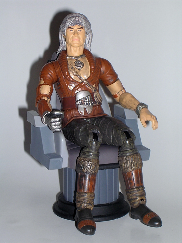
Now this look I dig a lot. The folded arms are first thing we’ve seen that an articulated action figure would not have been able to do, and I think this pose looks great. Chances are I’m going to be giving the chair to Kirk, but if I do wind up displaying Khan, this is most likely the look I’ll be going for. Now let’s pop the legs off at the waist and get him seated in the chair…

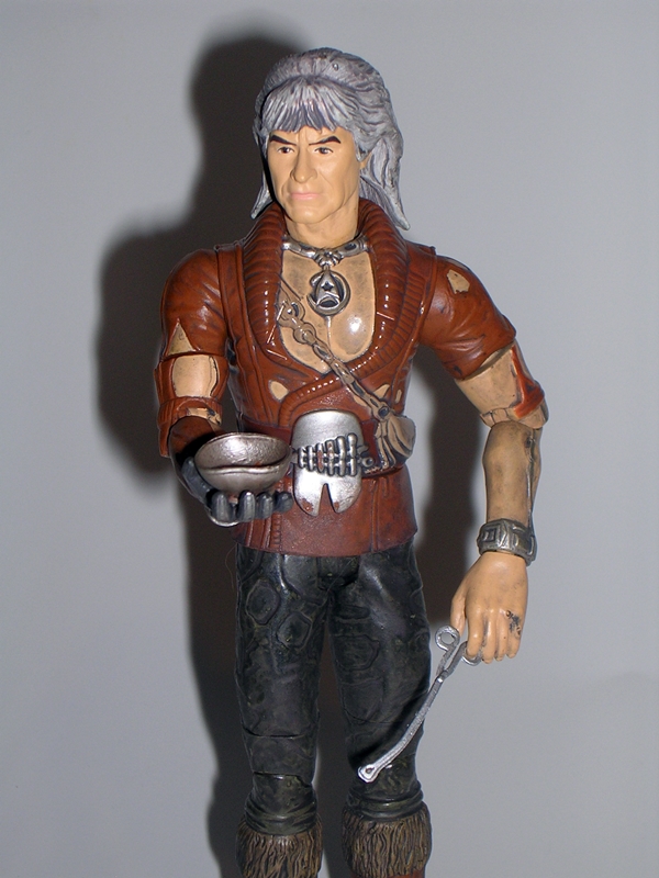
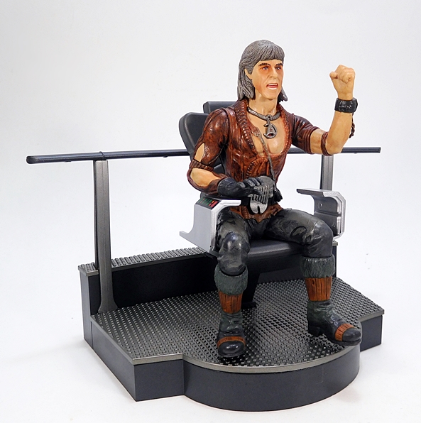
He fits into the chair pretty well, but considering he was sculpted specifically to sit in it, I think it could have been a bit of a better fit. He has a right arm that is made specifically to rest atop the armrest and his left arm looks pretty good resting the elbow with his fist clenched in anticipation. He looks pretty good in the chair, but displaying him this way shows just what a bad design choice that footprint and peg in the deck-plate was. The footprint is totally unnecessary and it would have been much better to just put the peg in the foot and a less unsightly hole in the deck.

Swapping out the head and left hand and rotating the arm up at the shoulder offers a couple different gestures and expressions. I think both of these look pretty good.

You can also go with the crossed arms while he’s in the chair. Not bad at all. And so while clearly not an action figure, I was able to get at least seven fairly unique display options out of him with the parts provided. I’ve got to admit, it’s kind of fun seeing what you can do, but not so much fun that I’m a big advocate of this concept. As I mentioned earlier, the Kirk and Spock figures had full articulation in their arms, but were static below the waist. Here, the only purposeful articulation is in the ball jointed neck, while the rest are just rotating cuts as a byproduct of the parts swapping.

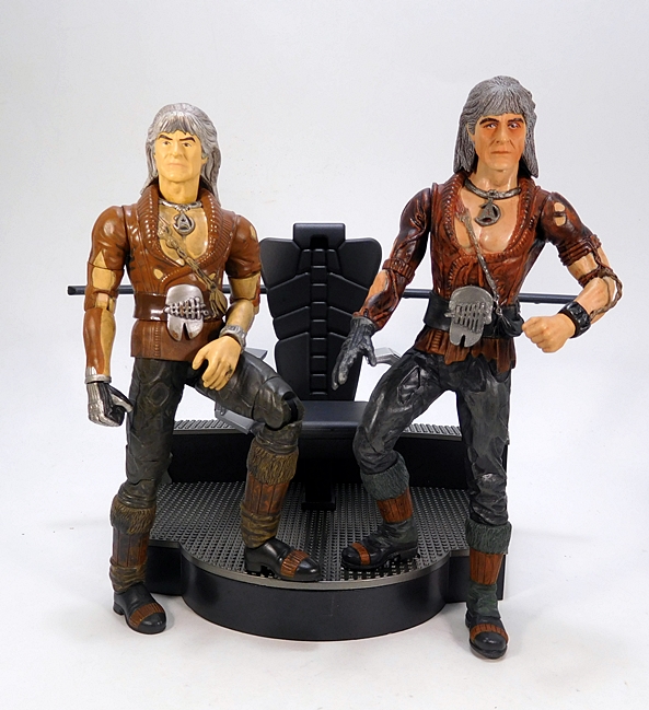
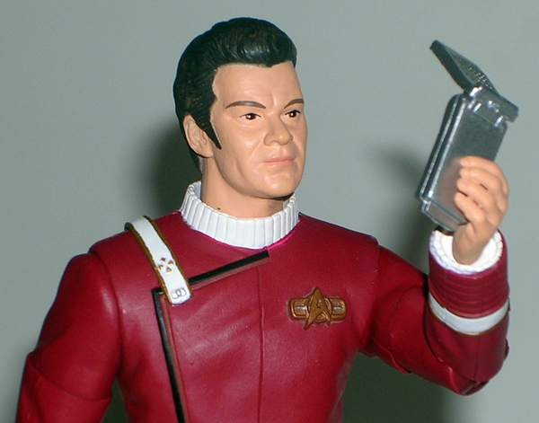
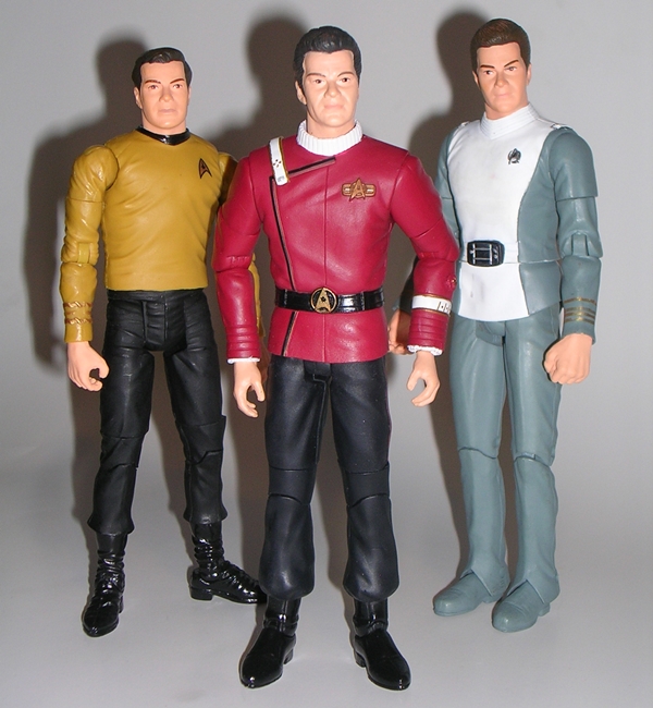
So, here’s a shot of this guy with the original, and fully articulated, DST Khan figure. In terms of sculpt and paintwork, I think the new one is an improvement on just about every level, but then again we’re talking about a difference of ten years. The tunic on the new one properly reflects the wear and tear a lot better, the glove is more screen accurate, as is his wrist communicator and delta necklace. The flesh tones on the chest of the older figure are not painted very well at all, whereas the new one is much improved.

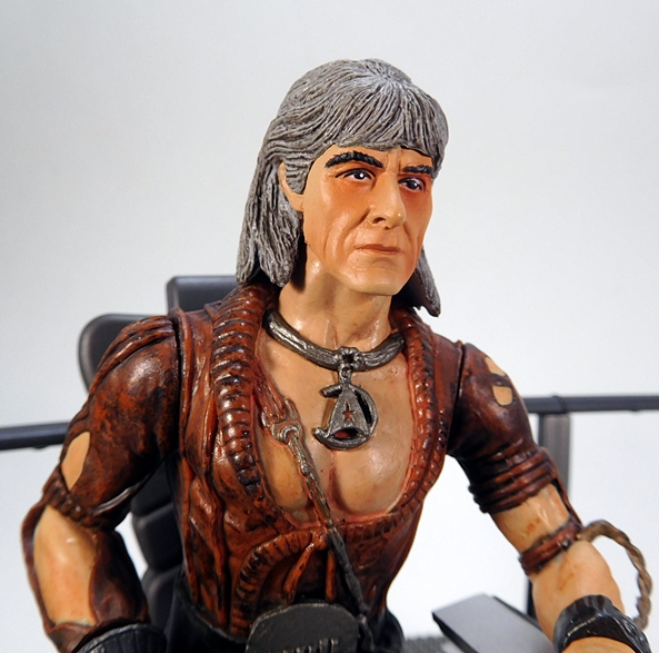
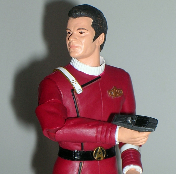
The portraits are overall better and more detailed too, although they work for me from some angles and not so well from others. I think the calm expression head is far more successful than the angry one. The features are much sharper on the new sculpts, both in the facial features and hair. I also really appreciate the better attention to paint in the face, even if it is a little heavy handed around the eyes. But again, nearly ten years separate these figures, so these improvements aren’t so much a triumph of craftsmanship, but more an expected march of improvements.

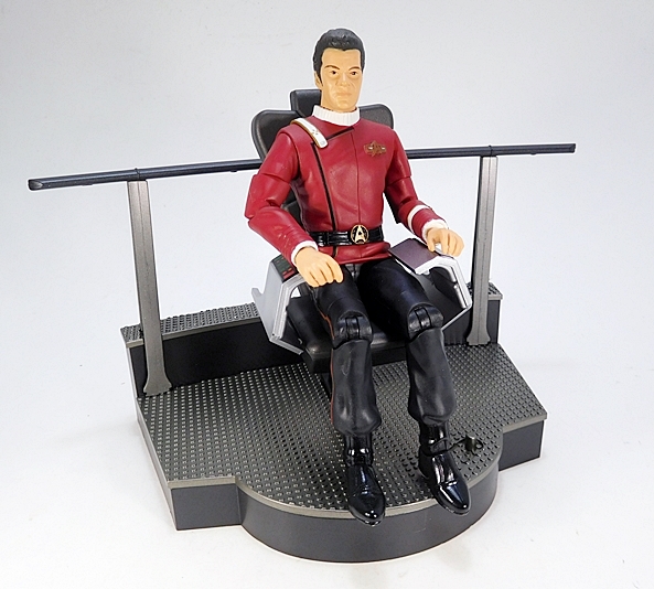
And while this version of Khan scales slightly bigger than the original DST Wrath of Khan figures, the chair does indeed make for a good fit with those previous releases. Indeed, I think the articulated Khan actually fits a bit better in the chair than the one designed for it. And since the command chairs in the Reliant and Enterprise were basically the same, I’m happy to pop Admiral Kirk in there.

Back when I reviewed the original Kirk set, I came away saying I didn’t really understand its purpose and that still applies here. And it must be repeated that I did buy this mainly for the chair and also because it was on deep discount at Amazon. I’m glad I bought it, the chair was definitely worth the thirteen bucks I paid, and the Khan figure has its charms too. But if you want an actual Khan figure, the original release can still be had for surprisingly low prices if you hunt around on Ebay. Sadly, that’s more than can be said about the rest of the crew!

Star Trek II The Wrath of Khan: Khan Noonien Singh by Art Asylum

And we’re back with Day Two of Trek Week! The key to crafting any great screen rivalry is to create a villain worthy of the hero. In the case of Kirk, that wasn’t an easy task. But, thanks to a performance crafted by master thespian and scenery chewer, Ricardo Montalban, Khan not only held his own against Kirk on the big screen, but has become one of the quintessential villains in modern cinema. He’s so friggin formidable they made a whole movie just about his goddamn wrath. But we’re not here to talk about the movie, we’re here to talk about toys, so let’s take a look at Art Asylum’s take on Mr. Khan Noonian Singh.

kns9

It’s the exact same packaging that we saw yesterday with Admiral Kirk. The only difference is the bottom insert in the card is personalized with Khan’s name. Again, the presentation here is fantastic. I love the Starfleet insignia shaped bubble and the card art really takes me back to the 80’s movie poster stylings.

kns10

Yep, the back of the card is the same too! Lots of figures and many are now very expensive. One of these days I will have a full crew. I vow it… I will have the full crew!

wok1-vert

Anyway… moving on to the figure…

kns3

kns4

Khan’s portrait fares much better than Kirk’s. The head sculpt is a pretty solid representation of Montalban from the film, right down to his outrageous 80’s David Bowie hair. It must have been a challenge to sculpt hair like that, but I think the guys at AA did a solid effort. I also appreciate that the long hair doesn’t impede Khan’s neck articulation.

kns5

The rest of the figure is ok, but I think it stumbles in a few areas and mostly the paintwork is at fault. His ragged Ceti Alpha 5 outfit is reproduced with nice detail. He has all sorts of patchwork bits on his tunic and the Starfleet pendant he wore around his neck is sculpted into the chest. He has his one gloved hand, because it was the 80’s and cool people wore only one glove. I also dig his wrist communicator with the sculpted wire running up his arm. His boots have sculpted fur lining and are surprisingly detailed, considering I don’t remember ever getting a good look at them in the film.

The paintwork, on the other hand, makes use of too much gloss, particularly on his tunic and his bare chest. It’s just not right and it’s at odds with the matte dirty finish on the bare arms and the matte paint on the face. It also makes him look more toyish than the Starfleet figures in the line, which make an effort to distinguish matte from gloss.

kns1

kns2

Khan features the same articulation as Admiral Kirk. You get a ball joint in the neck. The arms are ball jointed at the shoulders, hinged at the elbows, and have swivels in the wrists and elbows. The hips feature a t-crotch, and the legs have hinges in the knees and ankles, and swivels in the thighs. Again, there’s no articulation in the torso at all.

kns8

Accessories! Khan comes with one extra opened glove hand to swap out his fist. You also get his Ceti Alpha eel, a bowl of baby eels, and a pair of forceps. The eel and bowl are about what you would expect. They’re ok for what they are. The forceps should have been sculpted into an extra left hand, because it’s really tough to get him to hold them in any convincing manner. Still, apart from bundling him with a Genesis torpedo, I can’t think of anything else they could have given him.

kns6

kns7

If it sounds like I’m picking on Khan, I don’t mean to. He’s actually a pretty cool figure. Khan has got a great head sculpt and an ok body, which makes him the opposite of the Kirk figure. And, hey, if you have any kind of customizing skills and some matte paint, you can probably fix most of the paint issues with this figure by getting rid of the inappropriate gloss. I picked up my Khan figure at a Toy Show from the same dealer I got Kirk and he was also $20. Not bad. If you aren’t willing to spend deeply on a bunch of WoK figures, but want some representations of the movie on your shelf, Khan and Kirk are a great way to go.

Star Trek II The Wrath of Khan: Admiral Kirk by Art Asylum

Folks, I’ve got Star Trek on the brain this week. What with the new movie opening this past weekend, I wanted to balance it out with some Classic Trek cinema, so I busted out my Wrath of Khan Blu-Ray and now I’m all ready to talk some Trek toys. So, what the hell, let’s call the rest of this week Star Trek Week! To kick things off, we’re going to Art Asylum and their line of figures based on the second and greatest Trek movie of all time. And who better to go with than the hero and the villain of the piece. I’ve had this pair for a little while now, and I decided the time was right to open them up and get them on display. Today we’re going to check out Admiral Kirk and tomorrow we’ll swing back with a looksee at his nemesis, Khaaaaaaaaaaaaan.

admk1

I really dig the packaging here. Kirk comes on a huge card with a bubble shaped like the familiar Starfleet insignia. To the left of the bubble is an illustration of The Enterprise and to the upper right corner is a nice piece of art depicting Kirk, Spock, McCoy, and Khan. The artwork almost has a vintage feel to it, which really fits the flick incredibly well. It just reminds me of early 80’s movie poster art. The bubble has an insert with the 25th Anniversary (holy shit, I’m so old!) Wrath of Khan logo and another insert with Kirk’s name on it.

admk9

The flipside of the card shows stills of the characters that are available in Series I and II. It also taunts you with the fact that four members of the bridge crew are SDCC Exclusives and so if you want them you’re screwed. Actually, you can still nab some of these figures for around $30 on Ebay from time to time, but others have crept closer to that three-digit mark. Suffice it to say if you’re looking for a full set, you better be ready to dig deep. Ok, let’s bust out Kirk and check him out…

admk2

Hot damn, I adore the Classic Trek movie uniforms: The burgundy tunic with that front flap, the shoulder strap with the rank insignia medal, the gold plated Starfleet insignia on the breast and matching belt buckle. These uniforms were clearly the pinnacle of Starfleet fashion design and I remember being so disappointed when The Next Generation premiered and dragged Starfleet kicking and screaming back to jumpsuits… although, I eventually succumbed to their old school charm. Anyway, this figure does the uniform justice in every way. The black piping is sculpted into the tunic, as is the seam running down the center of the chest. The insignia are painted onto the arm band and the sculpted Starfleet insignia on the left of the chest and on the belt buckle are both things of beauty. Overall, the paintwork is solid, and I like how they used matte black for the pants and high gloss for the boots.

admk3

You may recall a while back I looked at “Regula-1” Kirk from the same series and I was less than impressed with the head sculpt. Well, regular Kirk here uses the same head sculpt. It isn’t terrible, but there’s something definitely off about it. I think it looks like much older Shatner. His eyes seemed to get squintier the older he got, and that’s what I’m seeing here.

admk10

Kirk features decent enough articulation. You get a ball joint in the neck. The arms are ball jointed at the shoulders, hinged at the elbows, and swivel at the biceps and wrists. His hips feature a standard t-crotch, his knees and ankles are hinged, and he has swivels in the lower thighs. I’m glad they didn’t go for any torso articulation, as it would have messed up the look of the tunic. Speaking of the tunic, because the lower part of it is made of rubbery plastic, Kirk can actually sit down. I am, however, somewhat hesitant to leave him in a sitting position, since it will likely crease the plastic. It’s not like there’s a proper movie captain’s chair for him to sit in anyway. Although, the Defiant chair that came with Playmate’s 5” Sisko will work in a pinch.

admk6

admk8

Kirk comes with an extra pair of hands and the basic Starfleet gear: A phaser and a communicator. The hands are nice, but I didn’t find them really necessary. I use the ones designed to hold his equipment and don’t bother with the others. Both pieces of gear are nice tiny representations of the props in the film. I’m pretty fond of this model phaser, and this one appears to be a repaint of the accessory used for the Admiral Kirk figure from The Motion Picture. The communicators in Wrath of Khan, on the other hand, were shit. In fact, they were probably the only bad thing about that entire movie. Seriously, how did Starfleet go from using wrist communicators in TMP to these ugly behemoths? They look like some kind of scratch built transistor radios.

admk7

admk5

And that’s Admiral James T Kirk. He’s a really nice figure. The portrait of the head sculpt could have been better, but it’s not a deal breaker. He’s also one of the WoK figures that won’t cost you an arm and a leg. I got mine at a Toy Show for $20, which is about right. And, if one Kirk isn’t enough for you, you can also track down Kirk with the bloody handprint on his tunic, put there by Scotty’s dying nephew. Hey, Scotty, the dude is dying… WTF did you bring him up to the bridge for? Take that shit to Sickbay and maybe he’d have a chance to live. Oh yeah, there’s also another variant with Kirk doing the Khan scream. Happy hunting! Tomorrow, I’ll be back with the most Noonien of Singhs… Khan himself.

Star Trek Starship Legends: USS Enterprise NCC-1701 (“Wrath of Khan”) by Diamond Select

Science fiction has given us countless space faring vessels over the decades. Many have been one shot wonders, while select few have come to be considered iconic. But for my money there has never been a space ship more iconic, more graceful, or more beautifully designed than the Constitution Class Refit Enterprise. The ship made its debut in Star Trek: The Motion Picture, but it wasn’t until Star Trek II: The Wrath of Khan that we really got to see the ship in all its glory, both trekking through the stars and slugging it out ship-to-ship in a bitter fight to the death. If I were to use one word to describe this incarnation of the Enterprise, that word would be “noble.” I can’t say exactly why, but she has a glorious nobility to her that has always embodied the values of Star Trek to me. And now, I finally have the Starship Legends version of this ship in my collection. Yep… too bad it’s a piece of garbage. Now would be a good time to remind you of my colorful language disclaimer. Ok, let’s do this… Set phasers to maximum disappointment. 

DSCN0467

We’ve recently seen the Starship Legends packaging for the Enterprise-D and the Bird of Prey, so this Enterprises’ box should look pretty familiar, although it is a lot more compact and while the other ships came completely assembled, the WoK Enterprise requires you to attach the warp nacelles. This worried me at first, as I like the option of storing the ship in the box. Fortunately, the nacelles can be easily removed again for storage. You get that same blue starfield deco, which looks ok, but doesn’t really convey the Star Trek franchise to me and the combination of the Classic Series font and the image of Kirk in his Classic Series uniform just feels out of place for a ship based on the feature films. The box is fairly collector friendly, although the two pieces of the stand are sealed under plastic, so you will have to tear them up to get those pieces out. Still, you can do it with minimal damage and return everything to the box, which is a good thing, because this is a toy that I’m not anxious to display.

dstwok1

dstwok4

dstwok3

Let’s start with the few good things I have to say about this Enterprise: First, let’s talk about the sculpt. The sculpted detail on this piece is bewilderingly awesome. From the tiny panel lines to the faint Aztec pattern, Diamond obviously did their research and meticulously etched it all into the hull of this toy. Second, let’s talk about the hull’s finish. I wasn’t too sure how much I’d like the pearlescent finish on the plastic, but in person, it really brings out all that detail in the sculpt. If you manipulate the ship in your hands and shift the light around its surface, it really brings out all of those amazing and intricate little patterns. Lastly, there’s the lettering. The lettering on the ship all looks crisp and clear. From the large and obvious printing on the top of the saucer section to the minuscule “United Federation of Planets” on the sides of the saucer and the sides of the primary hull. The lettering is excellent. That’s it, folks… the rest is all downhill from here.

dstwok2

The quality of the plastic on this piece is downright terrible. It feels flimsy and cheap like a ten dollar model kit. There’s a huge gulf separating the quality of this plastic and the stuff used for Diamond’s most recent Bird of Prey. If you silhouette this ship against a light, you can practically see right through it. Seriously, I can see my fingers right through the saucer section! That’s bad enough, but when you activate the lights, they bleed through the flimsy plastic hull and make for a terrible effect. But we’ll get to the electronics in a bit. I’m not done harping on the shitty plastic yet. The top rear of one of the nacelles looks like it was repaired with some kind of gloppy glue and it looks like crap. That right there is a complete absence of quality control. If I purchased this second hand on Ebay, I would accused the seller of shenanigans. Seriously, Diamond? You’ve got to be kidding me with this shit.

dstwok13

dstwok11

The paintwork on the ship is also pretty bad. There’s bleeding and slop all over the place and the deflector dish is painted black. Yes, black. Holy fucking shit on a tribble, why in the name of all the holy mother-fucking Gamesters of Triskelion would you paint the goddamn deflector dish black? Looking at it, it’s hard to imagine it wasn’t a decision that was made to deliberately ruin the whole thing, especially since this the toy is designed to light up.

dstwok10

dstwok8

Which brings me to the electronics. I could take this opportunity to bitch that there’s no option to display the ship with just the lights on, like there was with the Enterprise-D or the Bird of Prey. But that’s ok, because the light effects are so terrible, I wouldn’t want to. They basically just come on in sequence with the sound effects. Diamond made no effort to simulate actual running lights or any of the Enterprise’s on screen lighting effects whatsoever. The back of the bridge lights up, the impulse engine lights up, the area around that shitty black painted deflector dish lights up, and the interior of the warp nacelles light up. Virtually all of the lights that you see are actually just bleeding through the cheap plastic. The ship doesn’t look that great as it is, but it looks worse with the lighting effects illuminated. That’s quite an achievement.

dstwok16

dstwok11

dstwok14

The sound is a mix of sound effects and voice clips from the movie. I suppose I could bitch about the fact that most of the quotes are taken from instances that don’t actually take place on the Enterprise, but this thing is such a mess, I’m going to give it a pass. Here’s the rundown on the audio…

  • Kirk: “Fire!” [ship phaser effects]
  • Khan: “From hell’s heart, I stab at thee!”
  • SFX: Warp
  • Kirk: “I don’t like to lose.”
  • SFX: Alert Claxon
  • Khan: “Let them eat static.”
  • SFX: Impulse
  • Khan: “Fire!” [ship phasers effects]
  • SFX: Hand phaser(!) … What. The. Fuck?
  • Khan: “Times up, Admiral.”
  • Kirk: “Lock phasers on target and await my command.”
  • SFX: Ship Phasers
  • Khan: “Time is a luxury you don’t have.”
  • SFX: Explosion
  • Kirk: “Kirk to Spock.”
  • SFX: Transporter Effect
  • Kirk: “I don’t believe in a no win scenario.”
  • Kirk: Khan scream! 

Wrath of Khan is a highly quotable film, so there’s some good material here, and I’m also a huge fan of the film’s sound effects. The transporters and the phasers sound particularly good.

dstwok12

I took a lot of issue with the stands included with The Enterprise-D. Well, the stand that comes with this ship is in some ways better and in some ways worse. Oh, don’t get me wrong, the stand itself is unbelievably cheap. The other stands featured two sides coming up from the Starfleet insignia base, making up a triangular cross-section, whereas this one only has one, making it seem like a totally deliberate way to shave a couple pennies of cost out of this thing. When I first took it out of the box I  literally thought I was missing a piece. I mean it really is insulting and shameful to have a stand this shitty for a $60 collectible. On the plus side, the ball joint will actually hold the ship upright, which I attribute mostly to this Enterprise weighing a lot less than the Enterprise-D. There is an extra battery cover, which can be swapped out so the bottom of the ship doesn’t have the hole in it for the stand. It seems like a nice bonus, but than I realize the hole for the stand is the least part of this ship’s problems.

dstwok9

I have had nothing but good experiences with Diamond Select and Art Asylum in the past, which is probably why I’m so incredibly surprised and irritated over what a terrible ship this is. It’s so far beneath the other releases in the Starship Legends line, that it feels like it’s some kind of terrible and cruel joke. It just fails on so many levels that it’s almost inconceivable that Diamond would have the nerve to pack it into a box and sell it for $60. SIXTY DOLLARS!!!! Even at a third of the price, I couldn’t have been happy with this thing. I just look at it and think, what a waste of money! Even the novelty packaging Enterprise model that holds my 2009 Star Trek Blu-Ray is better quality collectible than this unfortunate piece of garbage.

dstwok7

Computer, initiate destruct sequence… I’m going to get some Romulan Ale and drink to forget.

This Feature was Re-Shot on 4/23/15

Star Trek II The Wrath of Khan: “Regula-1” Kirk by Art Asylum

I realize that I’m not being terribly original when I say that Wrath of Khan is my favorite Star Trek movie, but it’s also one of my favorite go-to films when I want to watch a good sci-fi flick. I love the story, the script, and most of all, I absolutely adore the costumes and props. Ok, the communicators are shit, but apart from that, this movie is represents the High Renaissance of the Star Trek Universe for me. It was the meeting of the gritty old stylings with newer flashier special effects, and it was glorious. The transporter and phaser effects are breathtaking, but the Starfleet uniforms! God damn, I love these uniforms. But we’ll talk about those another time. Today we’re looking at “Regula-1 Kirk”, and he’s all about that bad-ass Landing Party jacket. I picked up this figure at the Show loose. He was baggied with all his parts, but no packaging, so instead of packaging, we’re going to take a look at the movie poster, which is something else I picked up from this Dealer.

The poster I got is a repro, and it’s still rolled up in a tube, but that’s it pictured above. By, God, but that was the right way to do the poster for Star Trek II. It was Paramount’s way of saying, “We know the first movie bored you to the point where you wanted to commit suicide in your theater seats. But check this shit out!” It’s got explosions and phaser fire and some dude we don’t know yet who looks like he may have just stabbed the hell out of Kirk. There’s mysterious desert people and I’ll be damned if that ain’t Paul Winfield screaming his ass off in a space suit. I saw the poster at the theater when I was about 11 years old and it almost blew my little mind, because I wanted to see what was going on so bad. This poster just captured everything that it meant to be Star Trek and awesome at a time where Starship bridges weren’t carpeted and Earl Gray Tea was served at book clubs and not on Starships. God, I love this movie!


Art Asylum did a lot of versions of Kirk from Wrath of Khan, and eventually I hope to look at all of them. But, as you can see, this one is called “Regula-1” Kirk as it’s based off the scenes where he beamed onto the Regula-1 Space Station only to find out that Khan had tortured and murdered the shit out of everyone. The idea of having special gear for landing party duty wasn’t often explored in the original show, but it made sense to me, and that’s where this jacket comes in. The jacket is just bad ass and Kirk being Kirk needs to wear it with the collar up to make him look a little extra bad ass. The jacket is wonderfully recreated here, with all its little patches and pockets and stitching and some very nice paint detailing. Like so many of the designs for TWOK, this thing not only looks cool, but also totally functional. Ok, except maybe for that huge pouch over the ass. How would you get anything out of that? The large Starfleet shoulder patch is present as are the rank insignia on the sleeve, the distinctive diamond pattern on the back, and the Starfleet insignia on the chest. The legs are pretty much the same as the ones used on the regular Wrath of Khan Kirk, with the red piping down the sides and high gloss black paint used for the boots.


And then there’s the head sculpt. Yeah… there’s definitely some Shatner in there, but it isn’t one of Art Asylum’s best pieces of work. One of the running themes of TWOK was about Kirk getting old, and that’s kind of ironic in retrospect, since it wasn’t so much a theme more than 10 years later when he was still chasing around the galaxy. I mention it here, because at certain angles, this Kirk head looks a bit older than Kirk from Star Trek II. Everything else here is pretty good and the painted flesh tone is thankfully free of any dirt or smudging. Kirk even has his trademark 24th Century (read early 80’s) pointed sideburns.

Alas, as good as the jacket looks; it really destroys a lot of the figure’s articulation. The head and arms are fine, as you get a ball jointed neck, ball jointed shoulders, swivels in the biceps and wrists, and hinged elbows. The leg articulation is all still there, and includes swivels in the thighs and hinged knees, but with the jacket extending down to his legs, you really can’t do anything useful with it. It’s kind of ironic, since this is supposed to be the action-packed, “I’m gonna beam down and kick your ass!” Kirk, but given the way the figure is built, I guess it’s understandable.

“Regula-1” Kirk comes with lots of extra hands. You get two replacement sets, and as is often the case with extra hands, I don’t find a lot of need for them. One is sculpted with the comm bracelet that he takes off of Chekov and screams the infamous“KHAAAAAAAAN!” line into. It’s a cool bonus. The other set seems to be slightly better at holding the gear, but not enough to make me want to swap them out. As for the other accessories, you get a phaser and a communicator. The phaser seems to be the same one that came with my Motion Picture Kirk and Spock, which is fine because the prop was more or less the same. The communicator actually opens and closes, and it feels like it’s sized down a bit, which turned out great because the communicators in the movie were ridiculously large and clunky.    
                                                                           

I love this figure as much as I always knew I would, but I also knew that once I bought one Wrath of Khan figure, I would be committed to getting the whole set, and considering that a lot of them were SDCC Exclusives, these figures tend to be more expensive than your average Diamond Select Trek figure. I was able to get MOC Khan and regular Kirk from the same dealer, without getting beat up too badly (I won’t get to those this week, but soon), but those were regular releases and not exclusives. I’ll probably just try to hunt down one of these a month until I’m done.  

Tomorrow, we’ll wrap up the week by looking at a couple more of Playmates’ Classic Trek figures: Harry Mudd and The Mugatu!

Star Trek: Hot Wheels USS Enterprise and USS Reliant by Mattel

I’ve always been a fan of the starship designs in the various Star Trek series, but the original films were always my favorites. Designs like the Motion Picture Enterprise, The Reliant, The Excellcior were all just so cool. Its obvious that the various toy companies who have held the Trek license over the years have had different ideas on how to market these massive vehicles and I can appreciate the problem. When they make them really big (like Playmates or Diamond Select has), they become pricey as well as difficult to collect and display, and apart from the lights and sounds, these ships don’t really do anything to make them exciting toys. Its not like they have any moving parts or firing missile launchers and there’s no way to make them in scale to interact with figures. On the flipside, in the 90s Micro Machines tried to shrink them and make them highly collectible, but in turn they lost a lot of their detail. Not to mention the bendy plastic meant storing them often resulting in the bad kind of warping. It was like Star Trek meets MUSCLE figures. There was the Johnny Lightning line, too, which was a pretty good size, but poor distribution made them almost impossible to find.

Well, here comes Hot Wheels, of all brands, to try their luck at the franchise with a small selection of collectible plastic and diecast metal ships. Hey, if Matchbox could make Voltron toys back in the day, why not Hot Wheels and Star Trek? The initial waves include the Original Motion Picture Enterprise as seen in the first three Trek movies, The Reliant, as seen in Wrath of Khan, the Enterprise-D, as seen in The Next Generation, and a Klingon Bird of Prey as seen in just about every film that had the Klingons in it. They are supposedly releasing one of the 2009 Movie Enterprise, and while I’ve yet to actually see it in stores, it has been up for sale at a few online retailers. The Romulan ship from the new movie is also scheduled as Coming Soon, but I’ll gladly buy anyone reading this an icy cold Coke if that ever happens. There’s simply no way that mess of a ship design could be rendered in plastic and diecast on this scale. It just wouldn’t work.So far, I’ve picked up both the Reliant and the Enterprise.

022110H

All in all, I think the scale on these is about perfect. The Enterprise measures about five or six inches long, making them almost twice the size of the Johnny Lightning Starships. They’re just big enough to show off the finer details. The Enterprise’s primary hull is diecast and the rest is plastic, while the Reliant’s saucer section is diecast and the rest is plastic. The diecast is just enough to give these models some heft and the plastic used is quite good and sturdy and not cheap and bendy.

022110I

There aren’t a lot of paint apps on these, but that’s because both ships are pretty uniform in color. The Enterprise does have some greyish blue near the deflector dish and where the nacelle struts enter the primary hull. I’m not a big fan of this two-tone as its not screen accurate, but it doesn’t look bad, either. Both ships have some paintwork on their warp and impulse engines and shuttle bays. The lettering and numbering on the hulls is inked directly on and it is clear and crisp.

The Enterprise and the Reliant are both in scale with each other, but that’s not the case with all the ships. The Bird of Prey seems a bit oversized, although to be fair, there were supposed to be various versions of that exact same design. The Enterprise-D, on the other hand is way out of scale with these two. It should be much bigger. This was a big deciding factor in me not picking up either of those ships.

All the ships come with plastic black stands with a Starfleet insignia. The stands connect with the ship with a ball and socket so that the ship can be positioned in a number of directions. Its a nice touch, but I’m not sure it was really necessary with ships this small, since you can easily pick them up, take them off the stand, or just move them around.

Ultimately, the only downside on these models is the price… $14.99 is just really, really steep. I realize diecast is expensive, and these are pretty nice models, but I just can’t equate one of these being worth fifteen bucks, and I think that sentiment will sink this line before it gets too big. In fact, I honestly doubt we’ll see any more of these released past the new movie Enterprise, as it seems like a lot of retailers are clearancing these out. I can’t say as I’d be devastated, since I’ve been picky in the ones I’ve purchased thus far, but it would be cool to see The Excelcior or the Constitution Class Enterprise released before the line dies.