Half-Life 2: Gordon Freeman by NECA

1999 was a rough year for me, and I’m not just talking about the release of The Phantom Menace. HA! No, seriously. I was working a full time job while also trying to get my own business off the ground, and living in a shitty apartment with a difficult roommate. My downtime consisted of weekends playing games on my computer, which was propped up in the corner of my mostly unfurnished bedroom on a computer table made out of plastic totes and a wooden board. My PC was one of the few things of value that I owned that wasn’t in storage and it was my only means of escaping my dreary surroundings. Thank god, Half-Life came out when it did, because I was able to lose myself in it. It was the only thing that I looked forward to when I got home from work and playing it got me through a tough time. So, besides being such a mind-blowingly influential game for its time, it’ll always be extra special to me. Why did I gas on about all this in the intro? Because sometimes I like to point out that some of these bits of plastic that I collect do indeed have special meaning to me.

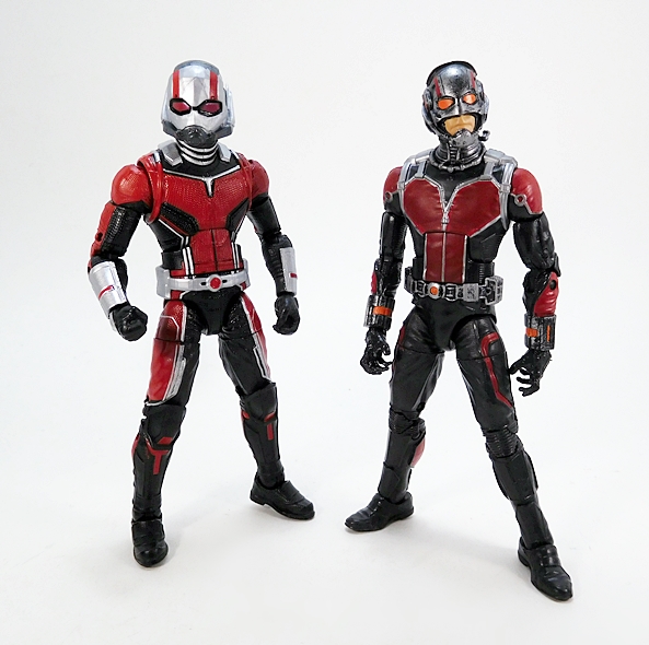
And here comes NECA giving the intrepid Gordon Freeman the action figure treatment. This is actually a re-issue of their original figure, and as you can see from the packaged shot, he’s based off of Gordon in Half-Life 2, a great game to be sure, but one that doesn’t instill as many strong memories for me as the first one does. Indeed, I’m drawing a blank on most of what happens in it and seriously considering giving it another play-through. So, yes, I would have rather had a new figure from the original game, but I’ll happily take this one as a consolation prize. And hell, it’s still amazing to me just how iconic Gordon Freeman has become despite him starring in a First-Person Shooter where you hardly ever see him. Anyway… enough about the games, let’s get this figure open and check him out!

Gordon comes wearing his trusty Black Mesa HEV (Hostile Environment) Suit. It’s still totally recognizable as the iconic suit from the original game, which was a Mark IV, but with some notable changes (both cosmetic and functional), upgrading it to a Mark V. Suffice it to say, NECA did an amazing job recreating the suit in 7-inch scale plastic form. Despite being all cast as part of the buck, it has a convincing layered look to its construction. The mesh under-suit can be seen between the armor pieces on the arms and legs, and it’s sculpted to have a very fine chain-mail-like texture. The armor plates feature various cut lines and the lambda logo on his chest is actually sculpted as well as painted.

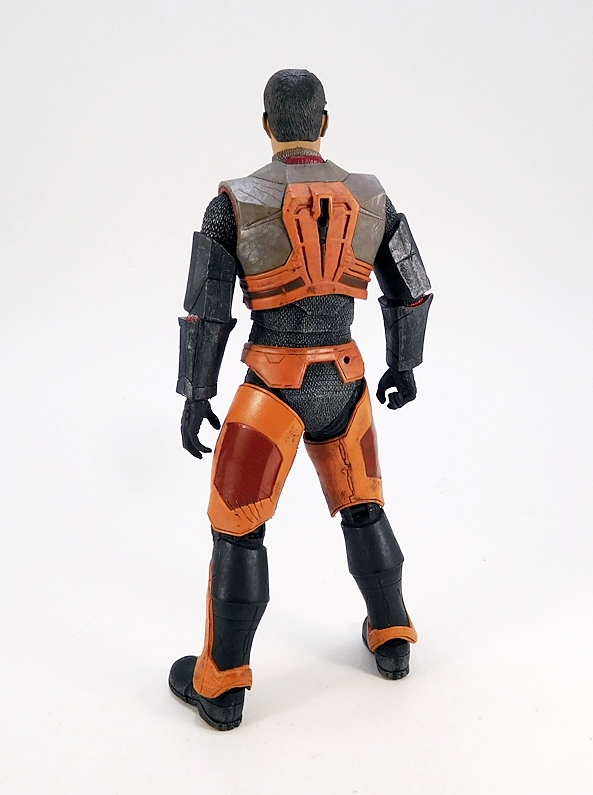
The suit’s deco is darker and less polished looking than the Mark IV he wore at Dark Mesa, but it definitely fits the darker and dystopian feel of the second game. There’s less orange, but still enough to keep the sense of connection to the older suit. Most of it is done in matte colors, but you do get a little gloss on the red panels on the leg armor. I really like what NECA did with the finish on the shoulder armor as it has a cool unfinished metal patina to it. It really invokes an old medieval suit of armor feel to it, which again meshes well with the feel of the sequel. You get more of that rough metal finish to the armor pieces on the arm, only much darker. I especially like the hint of red padding that can be seen picking through the shoulder sockets. Finally, NECA did some nice weathering in both the sculpt and paint, including some scratching and scarring on the orange plates. This is a well-worn suit that shows off the wear-and-tear of Gordon’s adventures.

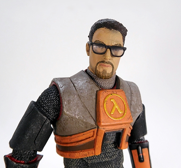
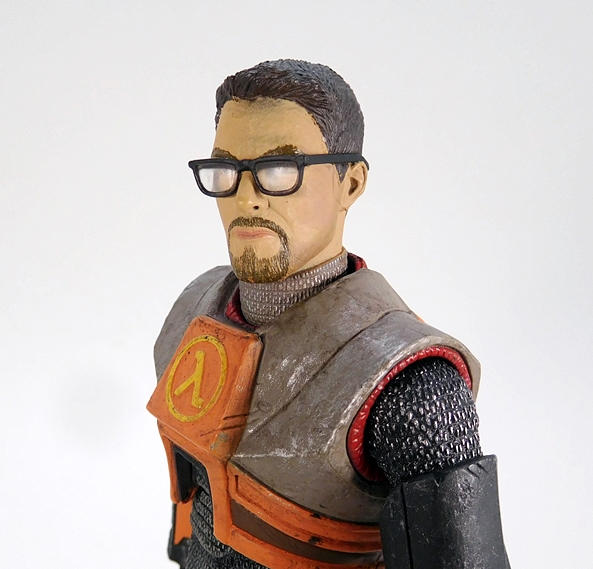
The portrait is excellent. This is definitely the slightly gruffer Gordon from HL2, but he hasn’t changed that much. He still sports the clean haircut and the neatly trimmed goatee. One of Gordon’s most iconic features has always been his nerd glasses and they are extremely well done here. Glasses on figures often come off as too large or bulky, but these are perfect. They’re cast in a separate piece, permanently attached to the head, and feature actual lenses. There’s a little bit of spray from the hair on his forehead, but it’s nothing too bad and looks more like dirt than anything else.

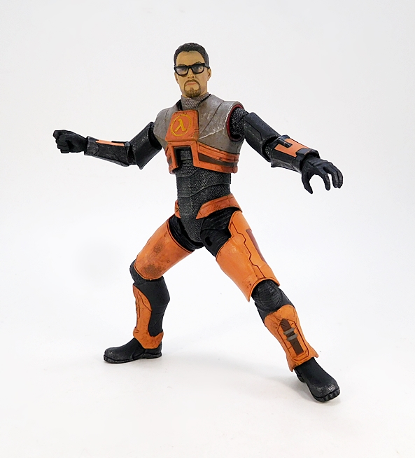
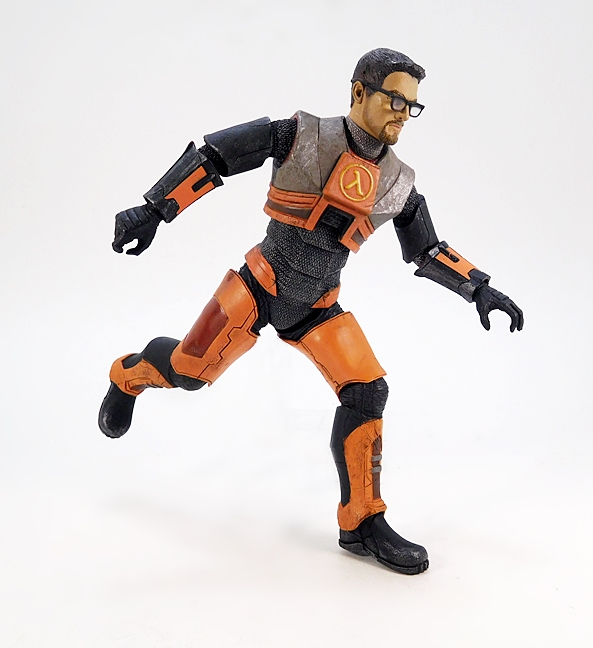
The articulation here is pretty solid, although a few of the points are a bit unconventional. The arms feature rotating hinges in the shoulders and elbows, with the wrists attached using ball joints to allow the hands to swap out with his two additional accessory-holding hands. The torso features a ball joint under the chest and another set deep in the base of the neck. The odd bit I was referring to earlier are the hips, which feature pins running from the front and back to form a rotating hinge. They work fine, but they still always look weird to me, and these certainly do their part to identify Gordon as the reissue of an earlier release. Finally, the legs feature rotating hinges in the knees and ankles, and swivels in the thighs. Let’s move on to accessories!

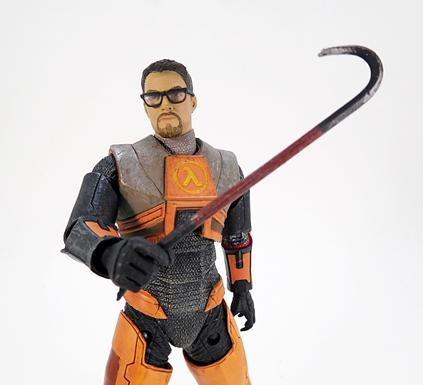
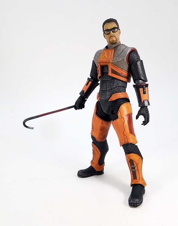
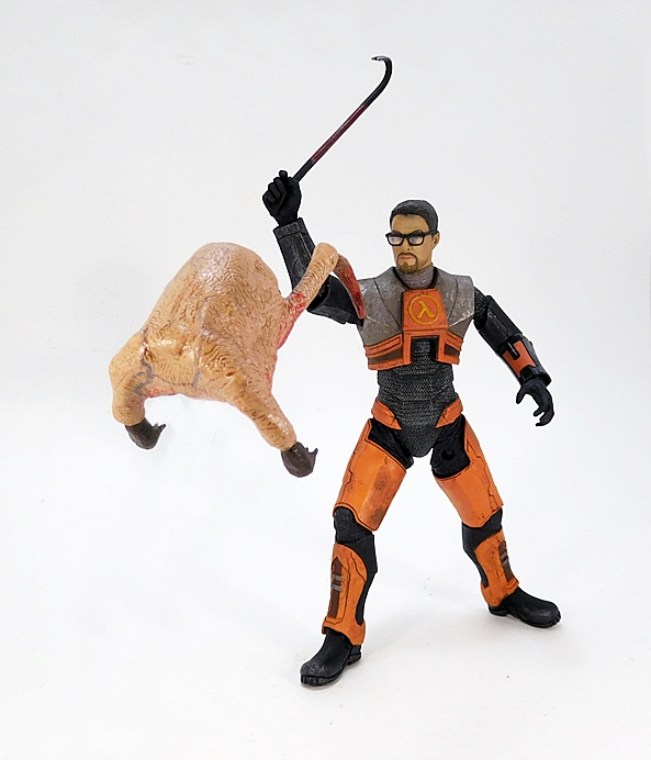
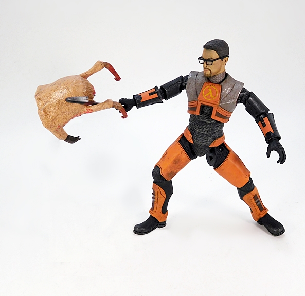
Let’s face it, Gordon Freeman and his crowbar go together like King Arthur and Excalibur. Whether I was busting apart crates or putting the beat-down on head crabs, this trusty tool was always by my side. It’s not just an implement and a melee weapon, but it’s a symbol that Gordon Freeman is the average schlub turned action hero. Well, assuming your average schlub has a Ph.D in theoretical physics from MIT. Anyway, the crowbar is… well, it’s a crowbar. It’s an essential accessory, it sure comes in handy when you run out of ammo, but there isn’t a lot to say about it as an accessory. It has a nice weathered finish and you can see some of the red paint that’s been worn off of the handle. The right hand that comes on the figure can grip it nice and tight.

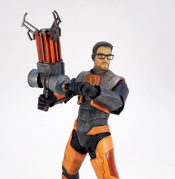
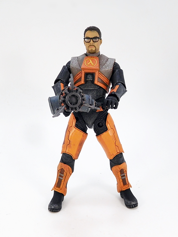
More interesting, and more central to HL2 is the Zero Point Energy Field Manipulator and boy is that a mouthful! The Manipulator was created as a lifting tool, but it has the power to hurl heavy objects at enemies, which allows it to be classified as a pretty deadly weapon. Gordon’s second set of hands are designed specifically to hold the Manipulator and they do the job perfectly. This is a great looking piece with a lot of attention to detail, although I would advise caution when dealing with the mandibles at the end of the device as they appear to be frail. I’ll likely wind up keeping the box for Gordon, because I don’t want to risk bagging that accessory and having those mandibles wind up breaking or warping.

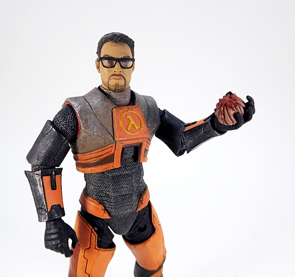
And Gordon also comes with a Pheropod, which he could use in the game to summon the Antlions to attack his targets. It’s a well-sculpted little ball that fits into one of Gordon’s left hands. A cool addition to be sure!

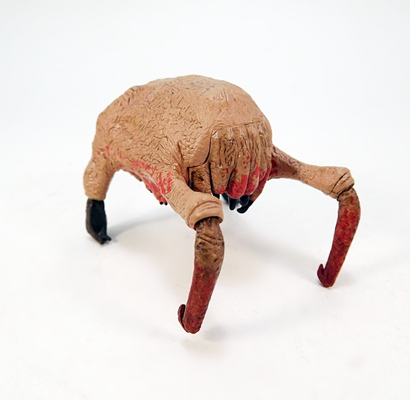
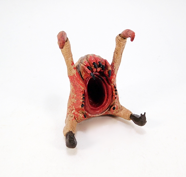
Finally, Gordon comes with a headcrab, which to me remains the all-time best copy of the Alien facehugger. These things were so damn annoying in the game and were equally creepy when you saw them attach themselves to unfortunate Black Mesa scientists and convert them into unwilling zombies. They kind of look like mutant roasted turkeys, and NECA did a fine job on this little static figure. From the blue veins that run under their golden roasted turkey skin to the unsettling orifice underneath that is meant to wrap around a person’s head and basically turn them into a bipedal murder vehicle. Ugh, it’s really disgusting inside that thing!

As grateful as I am to NECA for re-releasing this fantastic figure, I’m actually quite surprised they did. Sure, the prospect of a coveted Half-Life 3 is forever lurking in the dark corners of the PC Gaming community, but it’s been a long time since Half-Life 2 and sadly Gordon Freeman isn’t the household name he used to be. And as great as this figure is, I think this may be one of those figures where you really have to be centered on the character to appreciate how great it is. But for me, Gordon Freeman is monumental in his importance. He introduced the idea of the everyman protagonist to video games, which in turn made it easy for me to identify and put myself into the game. But most of all, he’ll always be a cherished character who was a symbol of relief in a rather rough year of my life, and I’m very happy to be able to add this figure to my shelf. I was on the fence over picking up their Chell reissue from Portal 2, but now I’m thinking I may go ahead and pick her up too.

Transformers “Power of the Primes:” Moonracer by Hasbro

My quest for finding new Transformers has been hard fought, but it’s finally started to produce some results. Last week I checked out the first of the Terrorcons, Rippernsapper, and today I’m having a look at Autobabe Moonracer. I’ll confess that I’ve wanting figures of Moonracer and her cohorts ever since I first saw The Search for Alpha Trion. I was also disappointed we didn’t get more of her and her companions in the cartoon. Well, here we are decades later and Hasbro has begun to turn up the love for the femmebots. We got Arcee and Chromia a few years back, and now we’re getting Moonracer and Elita-1 in Power of the Primes. Was it worth the wait… Mmmm, maybe?  Oh yeah, apologies in advance for the pictures. I didn’t realize at the time how badly her white parts were going to blend into the white background. I really should have shot her with a gray or black backing, but I didn’t have time to do a complete re-shoot.

Here she is in the package and the character art looks great… but boy is it misleading. If you look closely you can see Moonracer has a rather shapely femmebot profile that somewhat matches her animated look. You can also see that in no way does she have a crippling block of kibble welded to her back. You can, however, kind of see from the packaged figure that isn’t really the case and believe me you ain’t seen nothing yet. But I’m getting ahead of myself. Let’s start with her alt mode.

Moonracer is a futuristic car and not a bad one. She’s very long and pretty thin and has a pretty sleek styling that is a bit reminscent of a Formula-1 car. There are a number of tinted blue panels on the top, making it hard for me to decide which is the canopy for the driver’s compartment, because none of them open like on the Titans Return figures. I’m guessing it’s the one near the front. Or maybe none of them are, since this is probably supposed to be a Cybertronian vehicle? In addition to those tinted blue pieces, the bulk of the car’s deco consists of teal plastic with some white plastic in the back and some lavender paint hits. I don’t think she has the personality of Arcee’s convertible mode or the sexiness of Chromia’s lightcycle mode, but it’s fine.

I like the front, especially the addition of the yellow paint apps for the headlights. She also has an Autobot insignia printed on her hood. There’s a very obvious socket in the front of the car that hints at her combiner capabilities, but I dig it as just part of the car’s weird design. I will say that she doesn’t roll all that well, as some of the undercarriage hangs pretty close to the ground.

The back is a little hollow and f’ugly and you can see her hands folded up there too. There are some peg holes at the back where you can equip her rifle as a weapon on the car. You can also add her Prime Armor piece back here to fill things out, so let’s see how that looks…

Well it fills out that hollow space a bit, but it also makes her longer, which is something she didn’t need. The only advantage is that you now have two additional ports to arm her with her gun, but I don’t think it’s really worth it. You can also attach the Prime Armor to the front of the car, but I’m not even going to go there. Let’s move on to her robot mode…

From the front, Moonracer isn’t too bad, but she’s still got some issues. For starters, you can see in her mid-section where they sculpted the hourglass shape that they wanted her to have, but behind it you can see that it’s just faked out and she’s got a rather blocky torso. The legs are fine, and they have that nice rounded organic look to them, but she has those two awkward quarter-panel shells from her alt mode just jutting out on each of her lower legs. Hey, at least they help to make her enormous feet look a little smaller. I’m also not a fan of having those windshield pieces on the bottoms of her feet. As for the deco, well the teal and white goes well together and she also has a splash of lavender and a tinted blue cockpit showing in her midsection. I think the coloring is a nice approximation of her animated look from the original cartoon.

Switching to the back and here’s where things fall apart more. There’s really no semblance at all of her femmebot form from the back. Her legs look very kibble-heavy and the backpack looks very boxy. Now, I understand that some will argue there’s no reason for femmebots to be all svelte and curvy and I ain’t trying to body-shame no bots. I am, however, going by their own character art and the character design from the cartoon, so I don’t think I’m out of order bringing these things up. And things only get worse when you view her from the side…

As a rule, I don’t have a problem with my Transformers wearing backpacks. It’s a convenient place to pack away kibble, but this? Yeah, this just isn’t acceptable to me. Poor Moonracer’s backpack is so damn big that she had to be mis-transformed in the package so the figure would fit in the bubble. When I opened her up, I was shocked at this amount of back kibble and then I realized that I still had to fold another piece into it and make it bigger. Surprisingly, she’s not too back-heavy. I’m thinking that those quarter-panels that protrude off the sides of her legs help to counterbalance her a bit.

I do like the head sculpt a lot. The “helmet” has a curved design that matches the Sunbow femmebots and also has a certain flavor from the animated movie designs. The eyes are big and blue, although they do look a little too scared to fit her character. She was kind of the wisecracker and here she just looks worried or surprised about something. Alas, the paint on my figure’s lips is pretty uneven. It looks like they just blotted it on there without much thought. In fairness, you do have to get in pretty close to see it.

And if Moonracer isn’t bulky enough for you, you can always take her Prime Armor piece and attach it to her chest. The less that I say about this gimmick the better.

Moonracer comes with a pretty cool blaster, which we already saw in her alt mode. It features a scope and she can hold it in either hand and I really don’t have much else to say about it. Before wrapping up, let’s do a little side-by-side look with another femmebot…

I couldn’t put my hands on my Chromia in time for this review, but here’s a shot of Generations Arcee with Moonracer. Obviously, Arcee isn’t perfect and she’s got a sizable backpack as well, but I just like the way they dealt with it so much better. It’s completely separate of her body, which still manages to capture the animated femmebot aesthetics. Plus even her backpack features contours and curves, making it feel more like part of the design. Granted, Arcee is a shell-former and Moonracer is a combiner, and that has to add a lot of obstacles to the design, which is all the more reason I wish she wasn’t.

After such a long wait, I want to say that Moonracer is pretty disappointing. But at the same time, I can’t say that I have buyer’s remorse. I’ve wanted a figure of this character for a long time, and I have to sympathize with the challenges that Hasbro had designing a Deluxe Class figure that could match the animated look of the character and still transform and fit their (weird and IMO unnecessary) rule that all Deluxes have to be combiners in this line. Moonracer isn’t a total dud. There are things I dig about her, but when you consider that Hasbro could have redesigned her car mode to look like anything, maybe they could have met in the middle with a better compromise between robot and alt mode. In the end, it’s cool that they made her and I’m happy to have her, but boy am I glad I didn’t wind up paying a premium for her.

Marvel Legends (Cull Obsidian Wave): Ant-Man by Hasbro

Who’s ready for another Marvel movie, eh? Getting tired of them yet. I’m honestly not, although lately I’ve been a little more excited for the more peripheral films rather than the Avengers-centric stuff. Well, Ant-Man and The Wasp hits theaters this week and I’ve already got my tickets lined up for Thursday night and this is one that I’m really looking forward to. To celebrate, I’m putting the Wheel of Marvel Legends aside and casting randomness to the wind. Instead, I’m pulling out the eponymous stars of this flick for the next today and the next Marvel Monday. So today let’s have a look at Scott Lang in his new Ant-Man suit, and next Monday we’ll check out Hope Van Dyne in her Wasp costume.

Egads, how I love the font they used for the title of this flick. It’s so bold and exciting and goofy and comic booky. Putting it on the box is almost enough to make me save the package, but I need room for more toys, so that’s not going to happen. I’ll also toss out how much I dig the idea of combining figures of different MCU movies into one wave. In this case, the Cull Obsidian Wave is mixed with Infinity War and this pair from Ant-Man and The Wasp. I think it allows them to spread the love, and let’s face it… there’s usually enough MCU films making their rounds at around the same time so that wave sharing can still feel fresh. Scott Lang comes packaged unmasked, but I’m going to kick things off by looking at him with the helmet on, because I really need to get a running start to tackle that Paul Rudd head.

So, straight away I’ll say that I do prefer the Ant-Man costume from the original film over this one and the one that debuted in Civil War. This one feels even more streamlined than the last one and it’s not that I don’t like this one, I really do, but there was something extra cool about the more complex and less polished look of the original. The belt is a separate piece now, but there isn’t a whole lot of detail going on there. Most of the lines separating the red and black parts of the suit are part of the sculpt, which is always a big plus for me. You get the same mix of black, red, and silver as on the original, as well as that lovely texturing all over the suit. Overall, the coloring is nice and the paint application is pretty clean. There are a few lines where the silver could have been a wee bit sharper, but nothing terrible. And yes, there are some unpainted pegs in the knee and elbow hinges, so if that pisses you off… well, prepare to be pissed off, I guess.

Once again, I dig the old style helmet a lot more than this one, which is a lot more streamlined. The helmet sculpt looks solid enough, but maybe a little rough around the edges as I get in close. As many of you know I’m not a big fan of this swirly gray plastic Hasbro likes to use. It’s a shame that they couldn’t have painted the helmet with the same silver they use for the rest of the suit. Hell, even the stuff they used for Deathlok’s arms looked a lot better than this. Another shame is that they couldn’t have gone with sculpted eyes and tinted clear lenses for the mask. They did it for the Ant-Man BAF from Civil War and as we’ll see next week they did it for Wasp too. Moving on to the alternate head…

I swear to God I saw pictures of this head in pre-production that looked absolutely amazing, but this isn’t it. I’m not sure what happened between then and now, but I think the final head came out too elongated. Maybe it got pinched in the molding process. I mean, it’s definitely Paul Rudd, but it comes off looking more like a caricature of him and not so much a realistic portrait. Besides the fact that it looks elongated, I’m going to chalk a lot of it up to the expression they went with. The shit-eating smirk kind of fits the character, and it’s a nice attempt at endowing the figure with a lot of personality, but it just comes off as creepy and weird to me. I’m going to go with points for trying here, but I don’t think they quite hit the mark.

The articulation is everything I’ve come to expect from my Marvel Legends figures. The arms feature rotating hinges in the shoulders and wrists, double hinges in the elbows, and swivels in the biceps. It’s worth noting that the shoulder articulation is a tad more limited from the sculpt and even the elbows don’t bend as far as I would have liked. The legs are ball jointed at the hips, have swivels in the thighs, double hinges in the knees, and the ankles have both hinges and lateral rockers. You get a swivel in the waist, an ab-crunch hinge under the chest and the head is both ball jointed and hinged. A bit better range of motion in the arms would have been appreciated, but not bad.

Scott Lang has been one of the most pleasant surprises for me in the MCU and I’m happy to see him getting a figure from each one of his appearances. The unmasked head is a bit of a hiccup, but I give them high marks for trying and I’ll still likely display the figure with it from time to time. And yes, I’m going to happily pick up the Marvel Studios: First 10 Years two-pack because it not only nets me a Civil War version of Lang in normal size, but it also comes with what looks like a better unmasked head. And also a figure of Yellowjacket, which is something I’ve wanted for a long, long time, especially since Hot Toys’ version never made it past prototype. Join me again next week, when I’ll have seen the flick and have a look at The Wasp!