
Doctor Who Countdown: Nine!

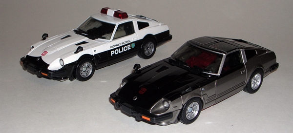
Tonight I’m going to over indulge in beer and wings and then hit the movies to go see Thor: The Dark World. The only thing that has to do with today’s feature is that I’m once again having to be rather brief because pesky social commitments are intruding on my life of scribbling madly about toys. Of course, it’s Transformers Thursday, so what better opportunity to pull out a wee Optimus Prime from the Spychanger line. The Spychangers deserve a feature all to their own and I will get to that someday, but for today, let’s just point out that they originated from the Generation 2 line where they were ironically called Gobots. Robots in Disguise was a frankensteined line that introduced new molds but also robbed a lot of older Transformers lines, and so the Spychangers were born. In addition to a baffling number of repainted G2 Gobots, we also got RiD Optimus Prime in Spychanger scale. He’s tiny, he’s portable and if you carry him around with you chicks will often ask, “Is that a fire truck in you pocket or are you just happy to see me?”

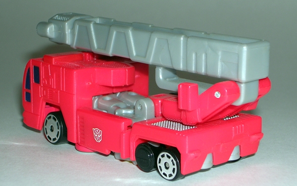
Prime’s fire truck mode is a nice approximation of the large toy in this diminished scale. It’s a solid vehicle mode cast mostly in bright red plastic with some nice sculpted panel lines, painted windows, and tiny Autobot symbols stamped on the sides. The ladder rotates at the base and can angle up and down and this little guy rolls along great just like he was a slightly larger matchbox car. I always thought it was weird that they left two of the wheels black, but whatever. There’s really not much else to say about his alt mode.

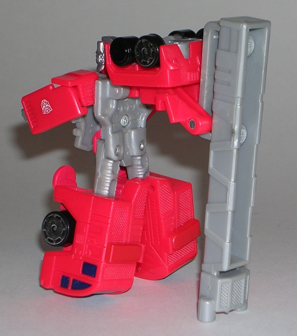
Transformation here is as simple as you would expect. Although if you’re a young’un that cut your teeth on the current crop of relatively complex Cyberverse figures than you might expect a lot more. The original RiD Prime had a regular and a super-charged robot mode, whereas this little guy just goes straight for the bigger bot form. His robot mode looks Ok from the front, but if you turn him around you can see that his ladder sticks out pretty far and forms an unacceptable amount of back kibble. On the plus side, that ladder is about the only thing keeping him upright. That’s right, ladies, Spychanger Optimus Prime is a veritable tripod! Wow, that’s two dick jokes. I’m on a roll! Still, the head sculpt is remarkable for such a tiny guy, there’s a good deal of sculpted detail here, and you do get a wee bit of articulation in the shoulders and the legs can do a wide stance. Also, he’s about twice as tall as a regular Spychanger, which I think makes him pretty appropriately scaled.
Prime here is obviously a lot stronger in his vehicle mode, but I’m not going to nitpick his robot mode too badly. Truth is I have a real soft spot for tiny Transformers that you can stuff into your pocket and take on adventures and this guy certainly fits that category. Besides, Hasbro took on quite a challenge taking a figure as large and complex as RiD Prime and shrinking him down to this scale and still making it work on some level, so I’m willing to give them a lot of credit here. I was originally going to look at Spychanger Ultra Magnus today too, but he wasn’t in the same drawer and I didn’t have time to go hunting for him, so we’ll save him and the rest of the Spychangers for another day!

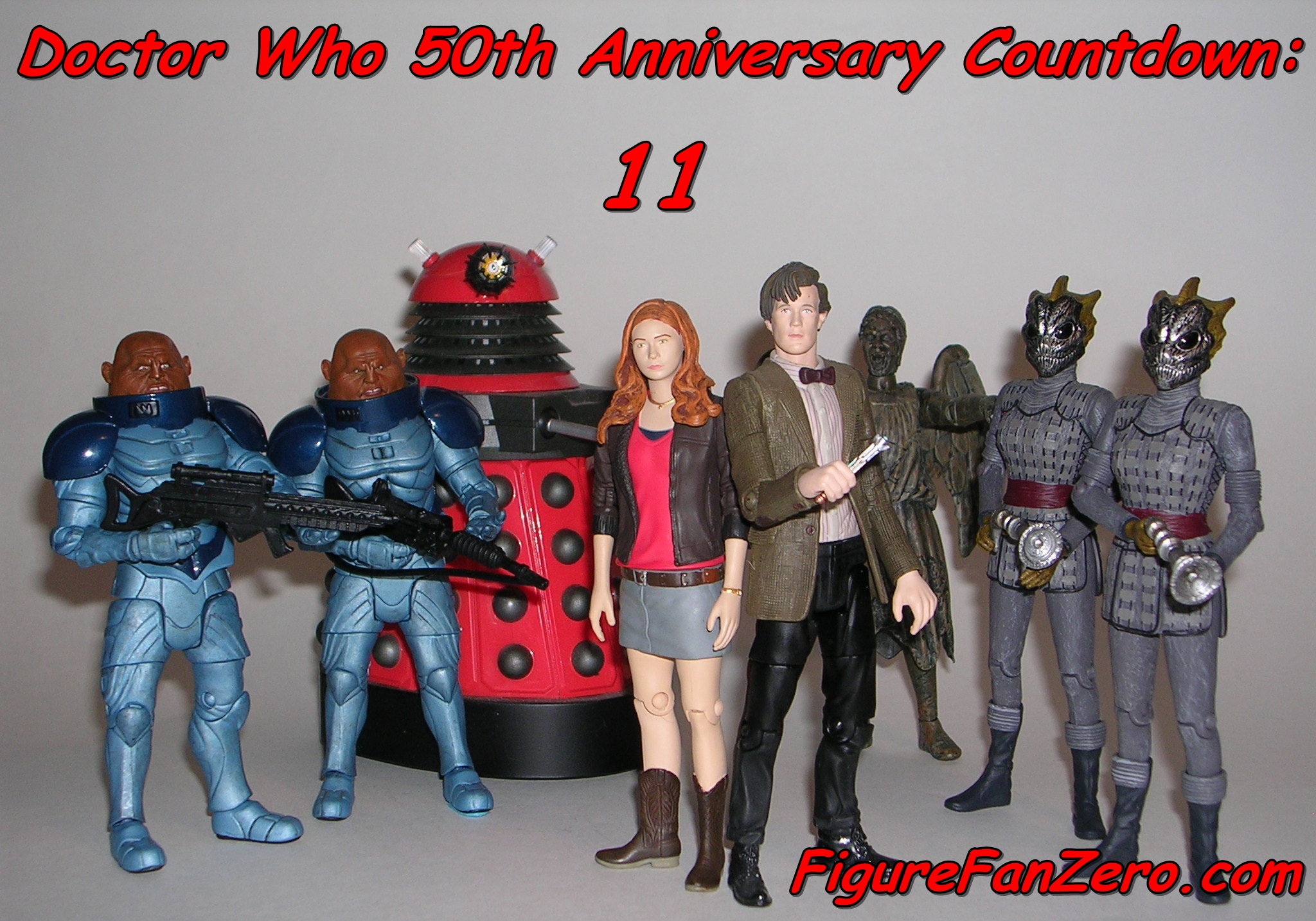
Oh boy… we’re exactly ten days away from the 50th Anniversary of Doctor Who and I’m trying to pay some respects to the Character Options line as we head into the home stretch. Today we’re checking out a set of two figures from the 4th Doctor story “City of Death,” which originally aired back in 1979. It’s a fantastic episode and probably one of the most universally loved stories from the era. And why not? Because besides the great story that spans millennia, there really is a lot to love in this production. It’s got location filming (in Paris), which was a very rare thing for the show, a superb musical score by Dudley Simpson. Tom Baker and Lalla Ward bring their A-game and are joined by the delightful antics of Tom Chadbon as the punchy Duggan. This story also manages to tie Doctor Who into so many other nerd properties that it’s almost ridiculous. You’ve got the always delicious Catherine Schell (Space 1999) as The Countess, but more importantly… JULIAN F’CKING GLOVER in a mind bending bit of casting that ties Doctor Who, James Bond, Blakes 7, Star Wars, and Indiana Jones all together in a neat package of nerdgasmic glory. Not enough? Well let’s not forget that it was co-written by Douglas Adams of Hitchhikers Guide to the Galaxy and Dirk Gently fame!
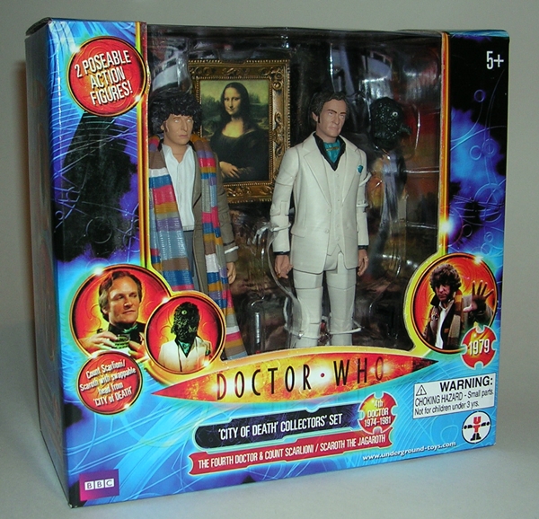
The compact little window box should be familiar to most collectors of this line, but the deco is a blast from the past. This set is from before the turnover to the 70’s style logo, so we get the Nu-Who logo that was used throughout the Eccelsten and Tennant periods. It may seem strange to see the modern logo on a Classic Who figure set, but back then all the toys and figures that CO turned out for Doctor Who were branded under the format of the new series and it makes sense to me that they would want to keep the brand recognition going for the modern incarnation of the property. The window shows off the two figures nicely, and as we can see it contains yet another version of Tom Baker as the 4th Doctor and Julian Glover as The Count Scarlioni… or is he Scaroth the last survivor of an alien race called the Jagaroth?? Stay tuned!

Oh bugger, the back of the package kind of spoils it. Yes, you get some stills of the characters and a nice blurb about the story. The box is totally collector friendly and features an illustrated backdrop that you can use to display the figures if that kind of thing floats your boat. If Doctor Who was all I collected, I’d still have all of these boxes. But space is a rare commodity and so I’ve got to pitch them. It pains me to do so, because the backdrop features the awesome Jagaroth spaceship resting on the desolate landscape of the Earth long before humankind developed. I love the design of that ship!


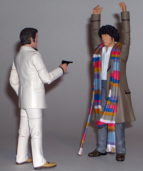
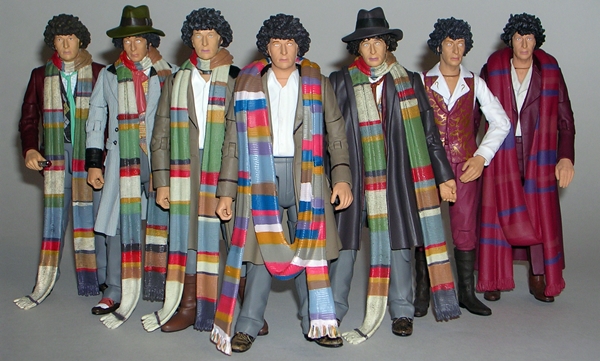
Let’s start with The Doctor, because I don’t have a lot to say about him. I’ve been a die-hard fan of this show for about 30 years and I grew up with Tom Baker in the role, but even I have trouble telling apart the little variations in his wardrobe. Ask me to describe his iconic costume and it’s no brainer that you’ll get: Well, he has a long coat, a really long scarf, and sometimes a fedora. But there have been a lot of subtle, and some not so subtle, variations in that formula over his long tenure on the show. Suffice it to say, this version of The Doctor doesn’t represent the stand-out variant that we saw last time with “The Seeds of Doom” set. In fact, he’s extremely similar to the version we got in the “Destiny of the Daleks” set, and that makes sense because the two stories were broadcast fairly closely to one another.


The DotD Doctor is wearing his buccaneer boots, whereas this one has just regular shoes, otherwise the two bodies are virtually identical. The only other difference I can see is the CoD Doctor has his little artisan pin painted onto his lapel, but even that is totally concealed by his scarf. And speaking of the scarf, it hangs loose around his shoulders, rather than being wrapped tightly around his neck. At first, I thought it was a repaint of the scarf used for the Warrior’s Gate Doctor, and while they are very similar, this one does seem to be a unique sculpt. But don’t let the subtleties of this figure fool you into thinking I don’t love it. It’s a another fantastic rendition of The Doctor. He may not be a “must have” for the casual collectors of the line, but then I have to ask myself, are there really any casual collectors of a Classic Doctor Who action figure line? Probably not.
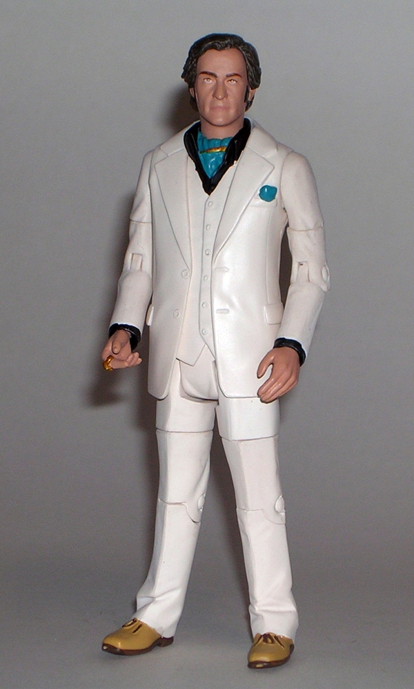
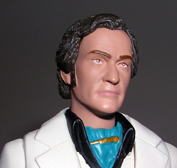

And then there’s Scarlioni. He was a great character in that he was somewhat sympathetic in his goals to undo his critical mistake and save his race, but he was also quite clearly a suave bastard that was willing to prevent the human race from ever existing to succeed. He remains one of my favorite of all the one-off Doctor Who villains, so it’s very cool to have a figure of him, even if it really just a guy in a white leisure suit. The portrait is a good likeness to Glover and while there have been plenty of reports of the paint being a mess on this figure, I’m happy to report that mine, while not precise, is still pretty good. Scarlioni comes with a very tiny gun, which he can hold in one hand.

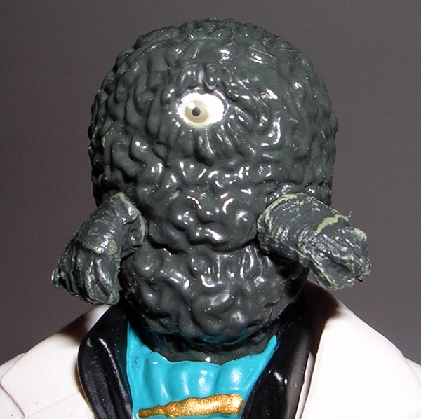
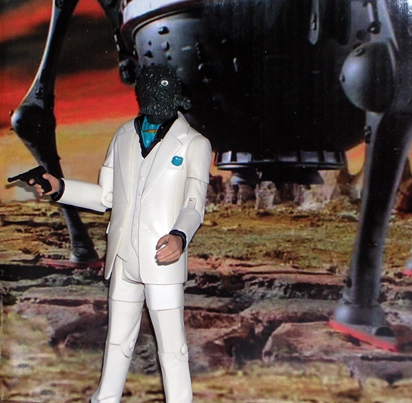
Of course, Scarlioni was also Scaroth and under that dapper Julian Glover countenance existed his true form… an improbably large green squiggly head with one big eye. CO gives us the ability to do the same by popping off the Glover head and popping on the Scaroth head. Even in a show where rubber monsters were the order of the day, Scaroth still strikes me as one of the weaker aliens of the era, but the story is so brilliant it manages to pull it off with aplomb. Unfortunately, I’m not all that impressed with the Scaroth head. It’s definitely not some of CO’s best work, and I haven’t decided yet which head I’ll use for regular display.
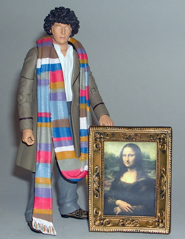
But wait, that’s not all. You also get a 5-inch scale Mona Lisa, which is an amazingly cool little accessory. The frame is sculpted and if you flip it over, even the wood grain on the backing boards is detailed in the sculpt. Plus, if you hold it to the light just right you can just make out the words, “This is a Fake” under the picture. Why? [Deep breath] You see, in the story Scaroth was splintered into a bunch of different aspects of himself and scattered through time, and in order to finance his time experiments so that he could eventually reunite all his splintered selves each Scaroth was both advancing the technology of the planet so he can create a machine that would eventually be used to age a chicken to death, while also raising capital to pay for the experiments and one of the ways he did this was to have his 16th Century self commission Leonardo DaVinci to paint a whole bunch of Mona Lisas so that back in the 20th Century he could sell them on the black market and make the money he needed, but when The Doctor traveled back in time to DaVinci’s workshop he wrote “This is a Fake” on all the blank canvases and left a note for DaVinci to just paint over them. [EXHALES!] Phew! Savy? So that’s why you get a Mona Lisa in the set.
The biggest knock I have on this set is the same rather tired old song. It was a missed opportunity to give us Romana. Granted, the decision to instead hit us with another 4th Doctor variant probably goes beyond the ability to reuse parts. Securing the rights to actors and actresses can be at best expensive and sometimes literally impossible. I have no insider information about whether or not CO has gone after Lalla Ward’s likeness and failed, or if they didn’t bother. I’ll give them the benefit of the doubt, since a Romana figure would sell like crazy and assume that they tried and just weren’t able to do it. It’s a shame, but that’s one of the annoying legal snafus that sometimes hurt us most as action figure collectors. The truth is that with CO slowing way down on this line, it’s very likely we’ve already seen most of the companions that we’re going to get. Yes, that can be depressing, but I prefer to be thankful for what we did get, rather than sorry for what we didn’t.
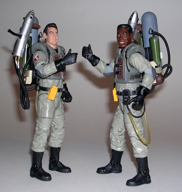
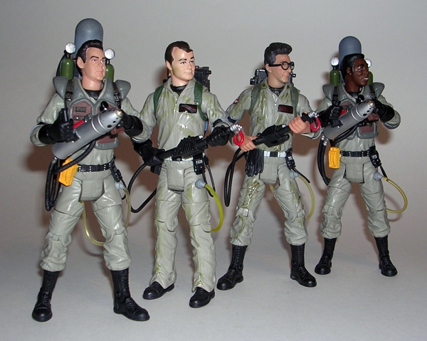
So a couple of weeks ago I picked up Mattel’s Ghostbusters 2 Ray and Winston from a comic shop of all places. On Halloween I put the spotlight on Winston, saying he deserved his own feature because he doesn’t get enough love. The real reason was so I could drag Ray out some other day when I was going out and I needed a quick feature. That’s today, folks, because I’m going out for drinksies with some friends and my buddy Ray here is going to get me out the door a lot quicker because we’ve basically seen this figure before.

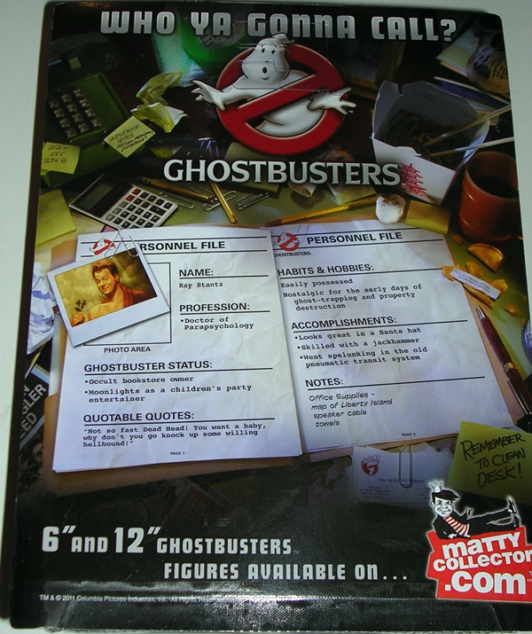
There’s the packaging and I think it’s pretty fabulous. It displays the figures wonderfully and features a very familiar deco with a lot of the things we loved from the first movie and not a lot from the second movie because, well it wasn’t anywhere near as good. You do get the Ghostbusters 2 logo embossed on the top of the bubble with a color insert. It’s a nice touch to differentiate these guys from the first movie and it’s a little example of Matty going the extra mile for the presentation. Of course, if you’re like me and you’re just going to shred the packaging anyway, they really needn’t have bothered. The back of the package features the pseudo file card, with some lame information about Ray that to me really comes off as being rather cringe-worthy.

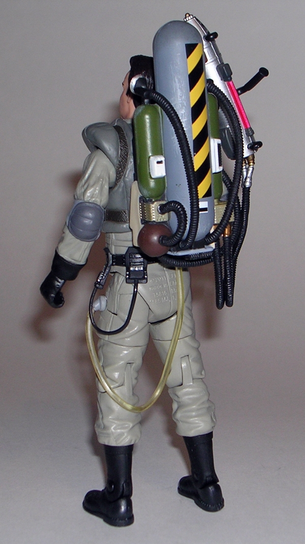
When I looked at Winston I gave Matty a little pat on the back for investing a lot more new tooling in this figure then they probably had to. Here’s where Matty got to see that pay off because they were able to turn around and release the figure twice with only a quick head swap. Yes, from the neck down this is the exact same figure we saw last week. The sculpt, the paint, the articulation, everything is identical right down to the Slime Blower on his back. Hey, I’m not going to hammer on them for doing it. it’s a nice looking figure, and I’m not sure what they could have done differently, apart from actually building the figures off of individual bucks like they should have done in the first place. But even here the bulky vest does a little to hide the fact that Ray and Winston are suddenly sharing the same body type.
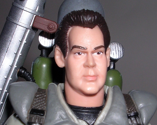
What I will happily give Matty crap over is the fact that they used the original Ray headsculpt as opposed to the one on the “Ready to Believe You” figure. The RTBY version of Ray was drastic improvement over the first portrait and I gave Matty credit for getting us a new Ackroyd noggin. You’d think they’d use it again here, but nope, we’re back to the unfortunate pinch-headed Ray that looks like he’s working on growing a George Lucas goiter. This is more a caricature portrait of Ackroyd and while it still sort of works for me on some level, it still baffles me as to why Mattel wouldn’t have selected what was clearly the better portrait. Was this figure released before the lab coat version? If it was, I guess I’ll just shut up about it.

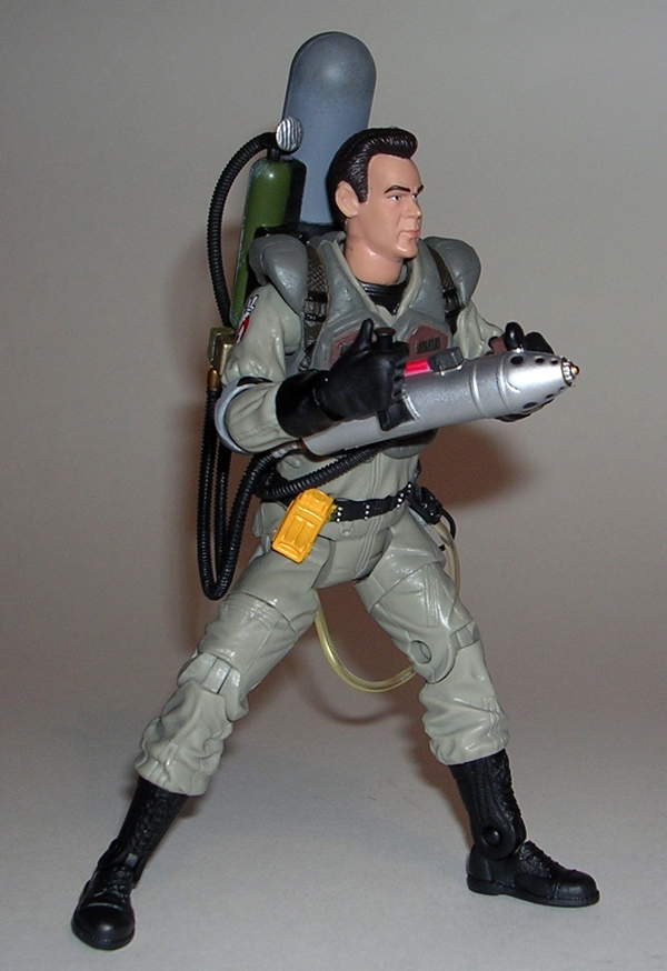

I’ll echo what I said in the Winston feature that I wasn’t a big fan of the Slime Blower over the Proton Pack, but Mattel did a very nice job recreating it for the 6-inch scale. The sculpted detail and paintwork are all top notch. I would have liked someway to attach the want to the tank, but it can kind of just float there next to it when he isn’t holding it.

One of the best reasons to pick up this figure is to add another ghost to your menagerie. Ray comes with a “Cinema” ghost, which I imagine is another one from the ghostbusting-montages. I don’t remember this guy, but he is a damn cool looking figure. He’s got three pairs of eyes and a big mouth of ragged teeth. He has two arms that split at the elbows to form two pairs of hands. You get ball joints in the shoulders and hinges in the elbows. There’s also a swivel cut in the tail. This ghostie is cast in a translucent purple plastic with some nice pink paint apps. He comes with the same clear plastic stand that we got with Slimer and all the other ghosts.

When I finished work on FFZ’s Index, I was really surprised to see how little Ghostbusters was represented. I have several figures in this line that I haven’t looked at yet and I still have some others that I picked up on the cheap and have yet to open, so it’s now inevitable that you’ll be seeing some more of Mattel’s Ghostbusters here in the weeks ahead. It’s also inspired me to call my brother and have him send me the box of Real Ghostbusters figures that he and I had when we were kids. Unfortunately, I might have to fly up there and kick his ass before he agrees to give them up.
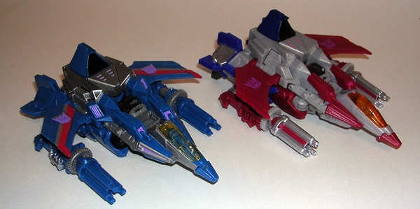
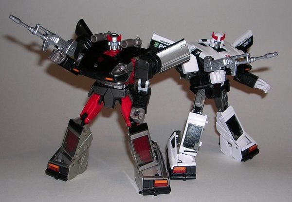
I don’t have a lot of patience for repaints these days, but when it comes to the Seeker Trinity, I will always open my wallet. That’s why it irks me when Hasbro releases a new Seeker mold and takes so long to release all three. We all remember what it was like when Classics/Universe 2.0 Skywarp was only released in a Target Exclusive 2-pack with Ultra Magnus, right? And even then it took forever to get Generations Thundercracker. Well, this time around Fall of Cybertron Thundercracker is following pretty closely on the original Starscream release. And thank Primus for that. He was my first Decepticon figure way back in 1984, so I’m always excited to get a new version of him.
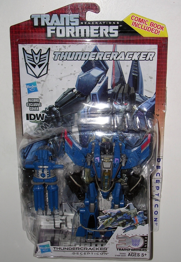
I believe this is the sixth IDW Comic Pack that I’ve featured here so I’ll try to refrain myself from gushing over how much I love the presentation. You get Thundercracker carded in his robot mode in front of a reprint Spotlight comic and a G1-inspired grid-deco on the card. This is wonderful stuff, as always and opening it gives me a head rush from one of the greatest smells ever. Someone really needs to make cologne that blends the odors of new toy and comic book. And speaking of comics… the one included here is pretty good. It’s tied in with Autocracy, a book that I have still not read, so I’m coming at it as a one-shot. Thundercracker tries to hunt down Metroplex, but with his own secret agenda. Ironically, one of the coolest things about this comic for me was that it featured cameos by the old Deluxe Insecticons, like Venom and Chop Shop. Hasbro… Do these guys in IDW Comic Packs… Please!
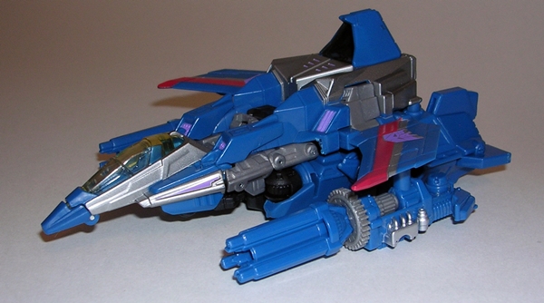
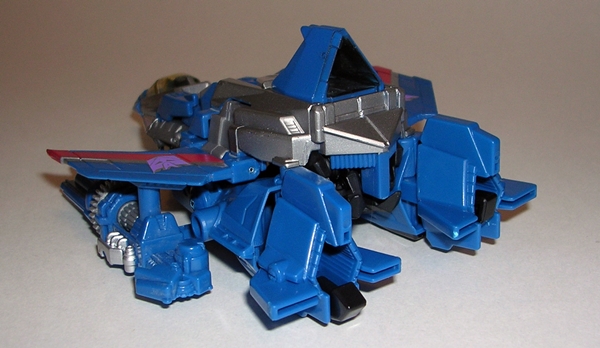
Kicking things off with Thundercracker’s alt mode, it shares all the same highs and lows of the Starscream jet, but overall I find it to be a pretty cool design. Yeah, it’s a little chunky, but it does harken back a little bit to the old Cybertronian Tetra-Jet design. I think the biggest flaw is the fact that you can see through the top of it where the head folds in. On the other hand, everything locks together quite well, making it a fun and sturdy little toy.
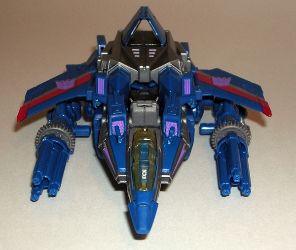
I seem to recall my biggest issues with Starscream was the general lack of sculpted detail, particularly there aren’t too many panel lines, and the coloring was a little drab. Thundercracker doesn’t have any additional sculpting, but his deco goes a long way to help me to overlook that. The blue and grey plastic used here just pops a lot better than the drab grey used on Screamer. Cracker also has some more prominent paint apps, like the striping on his wings and the beautiful little purple apps on his vents. Even his Decepticon wing insignia are outlined in silver to make them stand out better than Starscream’s.
Thundercracker comes with repaints of the exact same chaingun style weapons as Starscream. Part of me thinks they could have tried something new, but then I also think these guys should have uniform weapons, so I’m Ok with it. However, the weapons are the only part of Cracker where the paint doesn’t outshine Starscream. Hasbro didn’t even bother to paint he barrels.
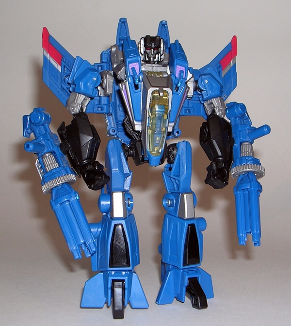
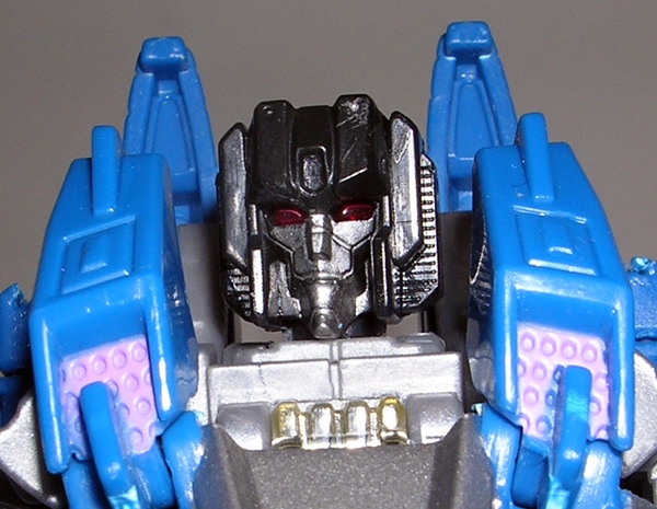
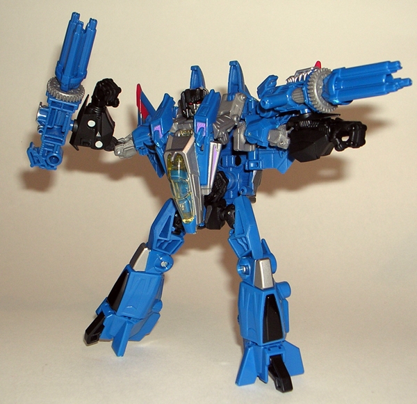
The transformation here is extremely simple, which isn’t always a bad thing. I would have really appreciated this transformation as a kid, because you could go from playing with him as a jet or robot pretty quickly. As a repaint, there are no surprises in the robot mode. I still dig this bot form quite a bit, although it has its issues. The feet are rather awkward and make it difficult for him to stand, especially in wide stances and the torso still has that hollow look to it if you aren’t viewing him from dead on. It’s also worth noting that we didn’t get a head re-sculpt, but considering Starscream didn’t have his trademark douchebag smirk, I kind of assumed Hasbro would be using the stock head for all three. Once again, I’m Ok with it, because it is a very nice head and the light piping is pretty spectacular when you hit it just right. Obviously, the deco on Thundercracker still shines in his robot mode, making him a lot more attractive and interesting to look at than Screamer.
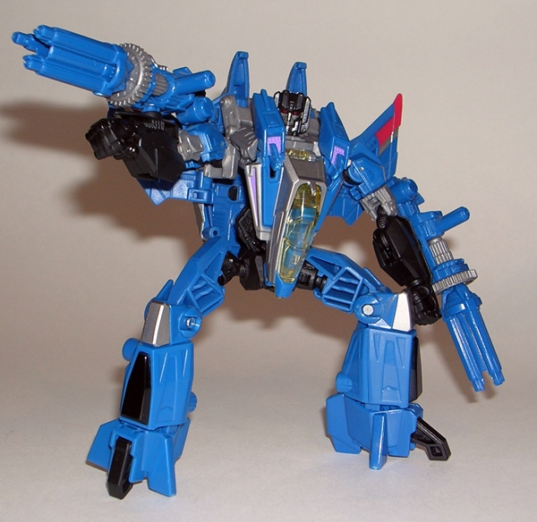
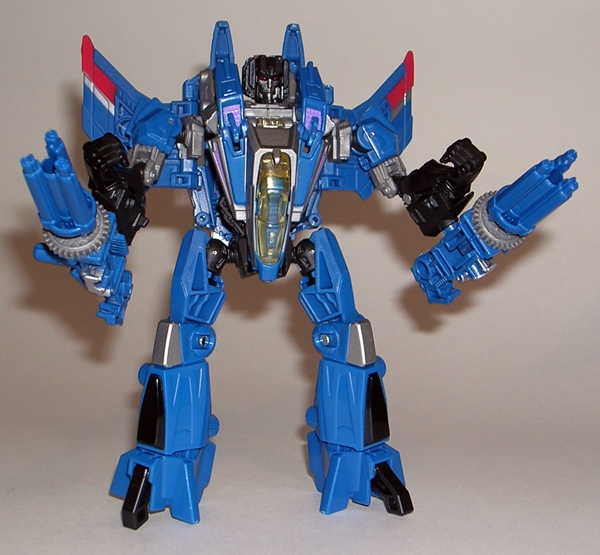
You have a few different options on how Thundercracker can wield his weapons. Each one has two pegs and they can either be pegged into his forearms or he can hold them like guns. They’re large and sometimes awkward, but if I plug them into his forearms just right, I like having them slung under his arms so he can just sweep the room with firepower. Sweet!
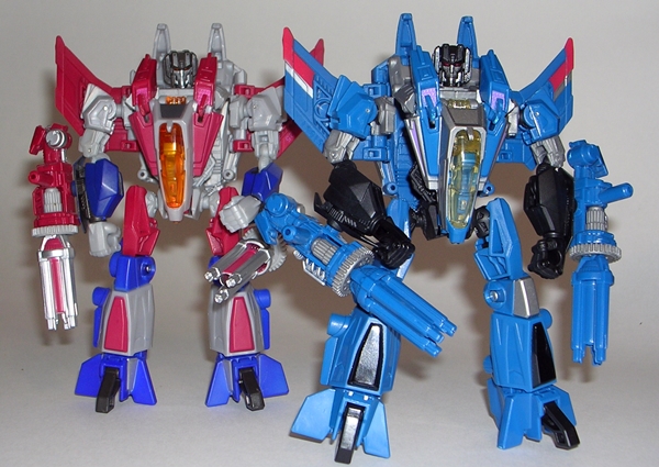
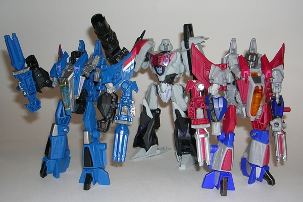
In the end Thundercracker is one of those figures that shouldn’t surprise anyone. It’s a straight repaint, but a very good one at that. The paintwork here really brings out the strengths of the mold and makes up for some of the lack of detail in the sculpt. I can liken it to the differences between the original Classics release of Starscream and the original Generations release of Thundercracker. It was an instance of the exact same mold taken to two extremes by different paint jobs. It’s not just an issue of the deco either. Cracker is just an example of better and more detailed coloring and for me that would make this the one to own if you only want to own this mold once. On the other hand, I can’t imagine just having one of the Seekers. Even now, I’m trying to resist paying top dollar for the Takara Skywarp, in hopes that he’ll be coming to the States via Hasbro at some point in time.
Just bored and screwing around…
Speeding along, hot on the trail of his Autobot brother Prowl, comes the second in Takara’s line of Masterpiece Datsuns: Bluestreak… or just Streak if you prefer. It took me a lot of hemming and hawing before deciding to buy Prowl, mainly because of Takara’s less than stellar Quality Control on these toys, and I’d be lying if I said that wasn’t also the case with Bluestreak here. Nonetheless, I rolled the dice, hoping that since my Prowl had some issues, maybe it was my chance to get lucky here and the gamble paid off! Normally, I do special releases like this in two parts, but since Bluestreak is a straight repaint of Prowl with a new head, I think we can do him justice in one day, particularly if I can just assume that you’ve come equipped and have already read the feature on Prowl.


As expected, we get the same style of enclosed box as Prowl. The layout and deco are all identical. Streak comes packaged in his auto mode with his gun beside him. The package isn’t flashy, but I do enjoy the collector friendly simplicity of it. It’s durable and should serve collectors well for storage. Inside you also get a pouch with a folded instruction sheet and a profile card. If you opted to pay a little extra, you might even have a collector coin!

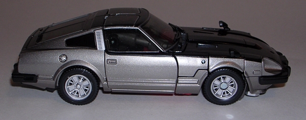
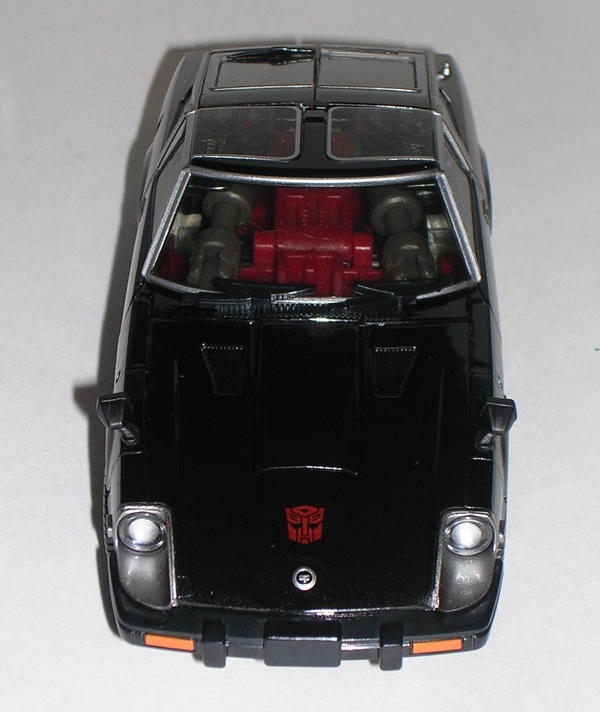
So, first thing’s first. My Streak arrived without any of the QC issues that I feared. In fact, I’d dare say that the paint on this guy is just about perfect. This is the kind of quality that I like to see on a Masterpiece figure. Well done, Takara. Next up, the deco is just dead sexy. The combination of metallic silver and high gloss black really does it for me in spades. Just calling it metallic silver doesn’t do it justice. It’s some kind of grey-silver mix that looks just outstanding in person. As for the rest of the paint, well the lines are crisp and clean, right down to the Autobot emblem stamped on the hood and, speaking of the hood, I do love that tiny little Nissan emblem on the front of the bonnet. Gone is the police light bar on the roof and in its place we get the stylish T-Roof with some nice silver striping. Other than that, the sculpt here is identical to Prowl right down to the side view mirrors on the front fenders. Marvelous!

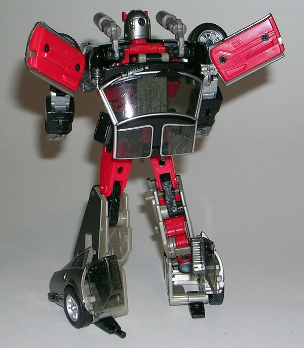
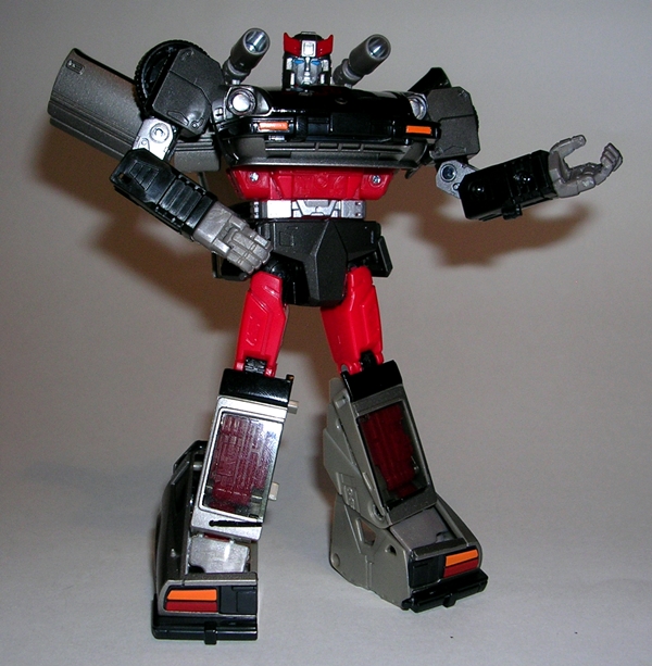
As gorgeous as Streak’s auto mode is, I still think it’s in robot mode that this guy really shines. You still get all that great silver and glossy black paint with some red plastic thrown in to make the figure pop. I really dig the way the bright red shows through his chest, particularly at the shoulders and around the neck. It’s somehow both a dark and vibrant mix that would probably be more suited for a Decepticon, but here it just makes Streak look like a bit of a badass. Of course, the sculpt is just as breathtaking here as it is on Prowl. The proportions on the figure are wonderful and the way the door wings can be positioned straight out to mimic the original toy or angled up for that little bit of animated/comic style, well that’s just a lovely touch. Yup, the legs are still hollow from the back, but if you can look at this figure and still nitpick something like that, then I feel sorry for you, because you obviously have no joy in your black little heart.

The new head sculpt gives Streak plenty of personality and serves to set him a little apart from Prowl. He has a wider crest on the top of his head and a chin plate. I’d say it’s a slightly more youthful or playful looking visage. I also think Streak’s shoulder cannons look a lot better than Prowl’s. Sure they’re the same sculpt, but the grey plastic makes all the difference over the white. It’s a good thing too, because displaying Prowl without his cannons and Streak with his deployed makes for that nice extra touch of variety when they’re standing together on the shelf.


Of course Streak comes ready for action with his rifle, the same rifle that came with Prowl, and with weapon in hand he is loads of fun to play with and pose. The joints on my Streak are nice and tight, even more so than on Prowl and the articulation is just as excellent. I particularly dig the rockers in the feet, which allow Streak to hold a wide stance and still keep his feet flat on the floor. It still amazes me that Takara’s engineers were able to get a design that looks this good and is still so delightfuly articulated.

My inner dialogue argued with me over whether I was really going to spend $80 on a straight repaint of Prowl. I’ll concede that for a while I was considering skipping Streak until Smokescreen came along. Bluestreak was always the odd bot out of this trio and I never really had any love for the character, at least not like I do for Prowl and Smokescreen. Then the OCD part of my brain barged in on the conversation and pointed out that we have no choice. We simply cannot just have two of the three on the shelf. That would be clearly unacceptable. In the end, Mr. OCD was right. These guys look spectacular together, and with a deco so drastically different, I didn’t get a single ounce of repaint fatigue when opening up Streak and checking him out. What’s more, with the beautiful paintwork on Streak, I’ll be going into the Smokescreen release with a lot more confidence than I had going into the purchase of Prowl. Bring him on, Takara!
Mantenna is a great example of my relationship with the MOTU Classics line. I have no love for this character and he was as annoying as hell in the cartoon, but he’s such a creative and bizarre design and the figure is so wonderfully executed, that I absolutely had to have him on my shelf. Mantenna was released the same month as the Horde Troopers, which meant that there was a lot of new tooling invested in the October product. Normally, I would say they should have split it up better and spread all this goodness out over a couple of months, but then I was lucky enough to be home on that day to get them, so I’ll just keep my mouth shut.

The packaging is the usual Greyskull-inspired card and bubble. I thought Mantenna might warrant something bigger because of his odd configuration, but Mattel was able to get him into the standard package quite comfortably. He’s carded with his regular eyes in place and his extra set of peepers are concealed at the bottom behind the insert. There’s a Horde sticker on the bubble. There’s not a lot else to say about the presentation here, except that it’s as awesome as ever and I am now going to destroy it.

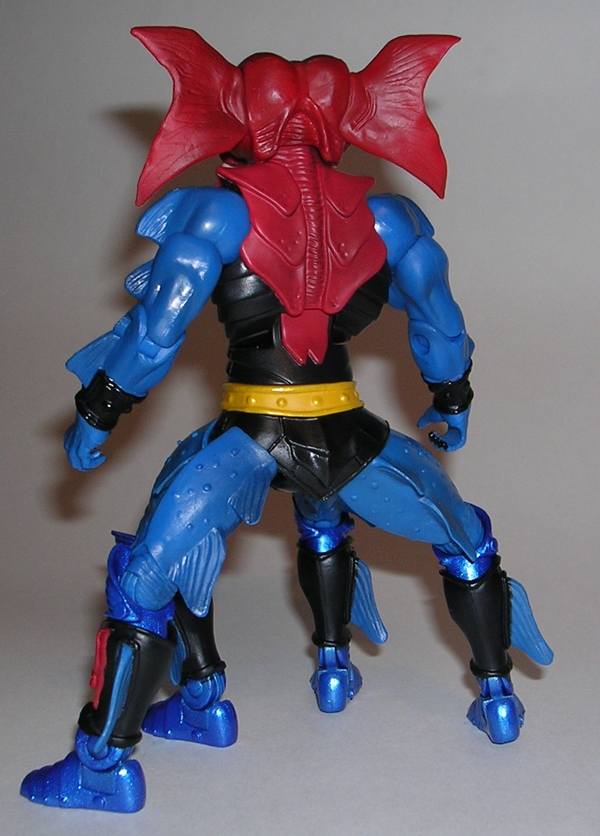
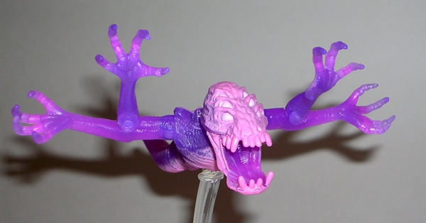
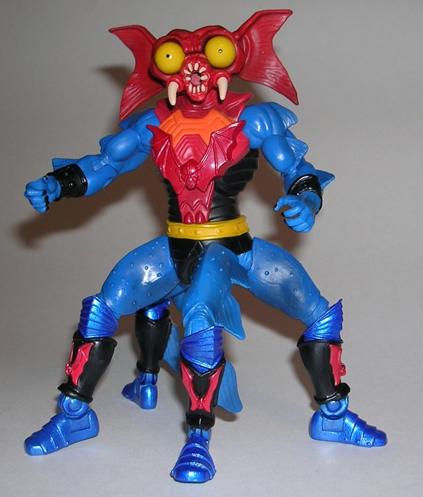
There’s no doubt that Eternia and Etheria are full of a bunch of freaks, but most of them have some basis in logic. Oh, look that guy’s a “beast man!” That chick looks like a scorpion. There’s a fellow with three eyes! Mantenna, however, takes the Etherian Handbook of Freaks and tosses it straight out the window. His design is pure imagination and it works splendidly. He’s also a delightful blend of goofiness and sheer horror. He may be a bumbling goon, but if you woke up and this thing was standing at the foot of your bed, you’d have some sheets to launder because you will have shat in them. But it’s not just this guy’s creative anatomy that makes him special… everything on this guy is just fantastic. Even the armor is gorgeous with the Horde emblem brilliantly sculpted into his chest and again on each of his four grieves.

But it’s not just the design that makes me love Mantenna, it’s the absolutely brilliant way Matty crafted him into action figure form. The Classics version is a satisfying mix of vintage toy and 200x design. The head sculpt is a nightmare circus of bulging jaundiced eyes, a toothy vagina for a mouth and vestigial tusks. Toss in some deformed Mogwai ears and you’ve got yourself an undeniably gorgeous piece of work. He’s in a class all by himself and his portrait alone will make him stand his own against even the strangest figures in most collections.

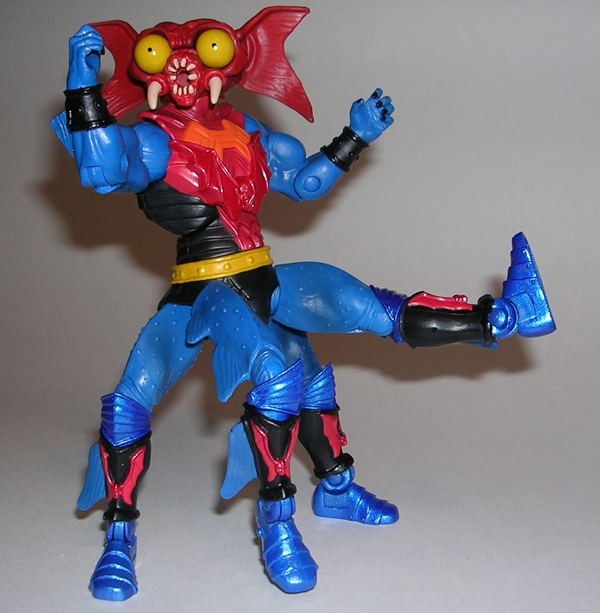
Naturally, the other thing that makes Mantenna distinctive is his two sets of legs. Both pairs are scaled just like regular MOTUC legs and attached to a specially sculpted double-pelvis so as not to mess with articulation. It looks great and wonderfully wrong at the same time, rather like staring at the Geometry of the Old Gods. I’d love to see someone do a stop-motion video of this guy skittering along, because it would probably freak me the hell out. With four legs, now is as good a time to talk articulation as any. From the waist up, things are what you would expect from a MOTUC figure, but the legs are a little different. You get ball joints and swivels at the hips and at the knees. The ankles have hinges and rocker joints as well. It’s great to see that Matty didn’t cheap out and Mantenna is every bit as poseable as he should be while keeping him at a regular monthly figure price point.
Beyond the bizarre design and excellent sculpt, I’ve got to say that Mantenna represents a beautiful selection of colors. The bright red, yellow, and orange contrast wondrfully with the darker blues and blacks. The use of a high gloss metallic blue for his boots and knee armor is a nice surprise and it makes those pieces stand out from his blue skin.

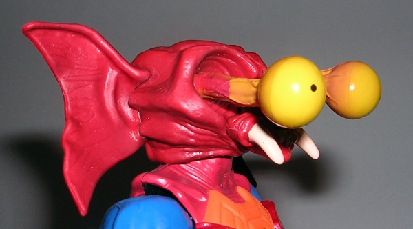

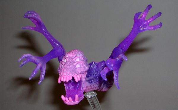
Of course, Mantenna can also stick out his peepers to ridiculous lengths and Matty reproduced this gimmick in the figure by providing a pair of swappable extended eyes. Making the switch is easy, as all you need to do is pull off the mouth and then pop out the one set of eyes and peg in the others. If you didn’t think this guy was unsettling enough, try looking into the soulless abyss of his face without his mouth or eyes attached. And the result of pegging in his popping eyes makes an already freaky figure even more bizarre and disturbing. The eye stalks are disgusting and veiny and take what was an innocent, goofy toy gimmick and elevate it to an artful form of anatomical gore. It’s simply splendid. The figure wouldn’t be Mantenna without this feature, but I doubt I’ll ever display him with the eyes popping out. My MOTUC collection is currently residing on some shelves in my bedroom and quite frankly, I like to sleep at night, thank you very much.


In addition to the extra set of eyes, Mantenna comes with the ubiquitous Horde crossbow. Obviously everyone got one of these at orientation. Mantenna’s has an awesome sculpt and a nice metallic silver painted finish. He can hold it in either hand.


October was a crazy-awesome month for Club Eternia and Mantenna is a big part of the reason why. I had very high expectations for him and he managed to exceed them with all his freaky charm. I love everything about this figure: It’s design, sculpt, coloring, articulation… it’s all fantastic. He’s one of those cases where I don’t even think about how expensive these things are getting with shipping because the end justifies the means. Had I missed him on Sale Day, I would have had no choice but scramble to get him on the secondary market, and I shudder to think how high I would have gone. All this, mind you, for a character I don’t even care much about. To me, that’s how good Matty is making some of these figures. This Summer, after a great deal of hand wringing, I eventually caved and subbed Club Eternia for next year. I’ve reassessed that decision many times since, but October’s releases make me so very glad I did. With Two-Bad and Modulok following in Mantenna’s wake, I think it was the right decision!
