Marvel Legends: Jean Grey by Hasbro

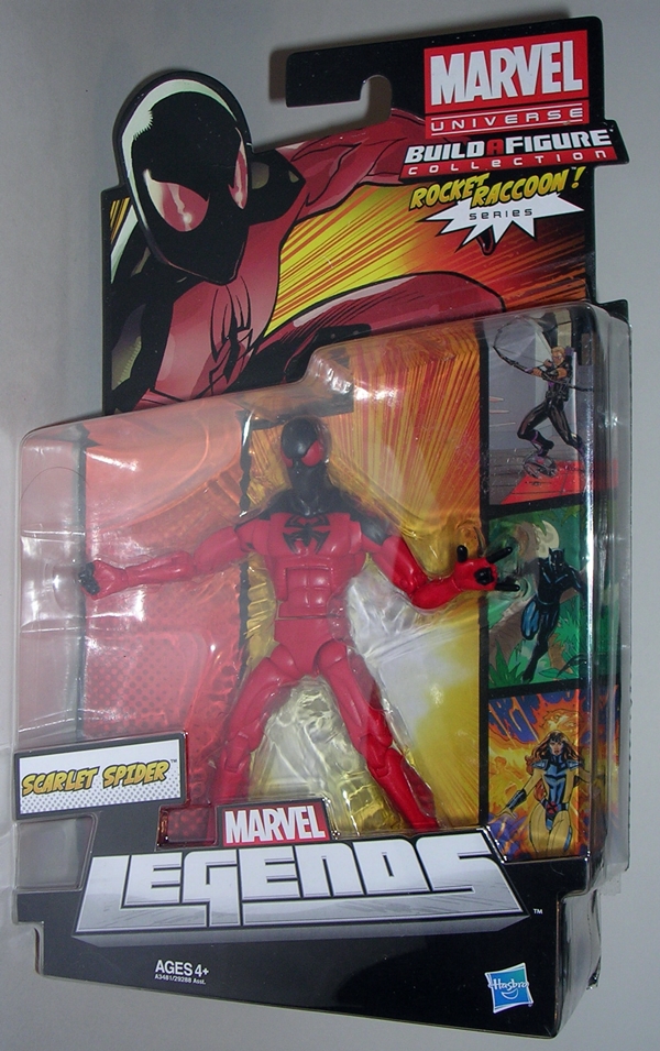
I’m pressing on with my look at the Rocket Raccoon wave of Hasbro’s Marvel Legends. Today it’s all about Jean Grey. Back in the 90’s when I was an X-Men whore, I couldn’t get enough of this character. That fondness has dulled a bit, along with my X-Men fetish, but that doesn’t mean I’m not happy to add her to my Legends shelf… especially since this is the long awaited Jim Lee version. Forgive me if today is brief and incoherent, but I’m coming to you all with absolutely no sleep in the last 28 hours… Yay!

mljgrey1

Here’s the Marvel Legends packaging and I don’t have a lot new to say about it. Word is that Hasbro was planning three variants as running changes for this figure, but only the one version of Jean appears on the card art. Jean comes packaged beside a raccoon body and tail! Let’s get Jean out of the package and we’ll set the raccoon parts aside for a later feature…

mljgrey2

mljgrey3

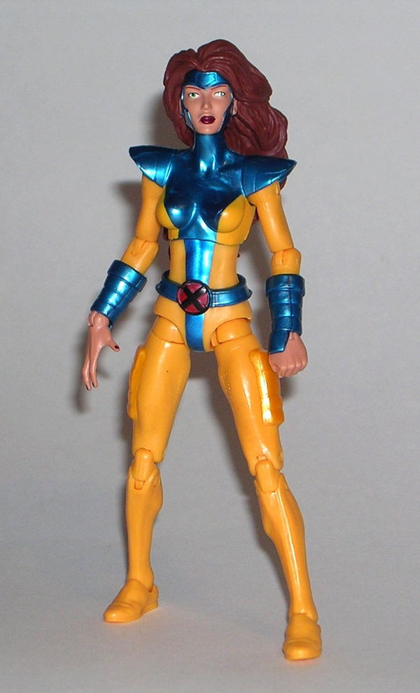
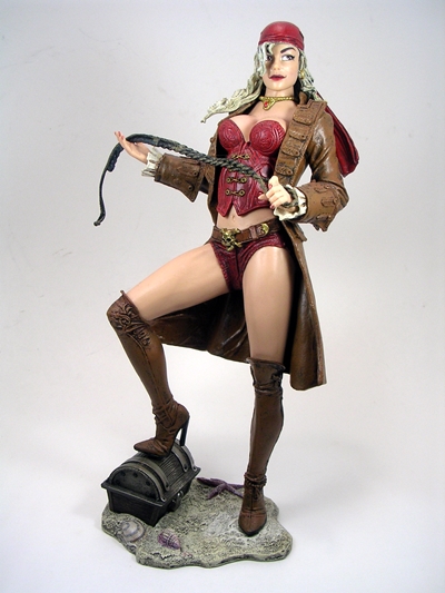
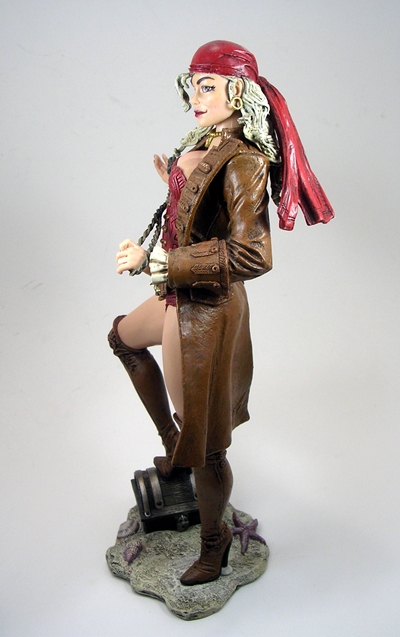
Wow, am I torn on this figure so let me start there. When I first got her open, I went round and round in my head over the buck used here. After seeing the magnificent female buck used for the Thunderbolts ladies, this one seems scrawny and ill-proportioned by comparison. But then I flipped through some of my old X-Men comics and I’m thinking… No, if we’re going by the art, the body used here actually works. I’ll come back to some of my issues with the buck when I talk articulation.

mljgrey5

Jean looks pretty good. There isn’t a ton of original sculpting here. You get pouches sculpted into her thighs, bracers on her wrists, and the shoulder pads, all of which look fine. The combination of yellow plastic and yellow paint looks great. Hasbro, why can’t you use this yellow plastic for your Bumblebee figures? And the pearlescent blue used for the other half of her deco really makes the figure pop. It just goes to show you there’s a right time and place for this swirly plastic. I hated it on Ultron, but I loved it on Iron Monger, and I love it here too. The subtle metallic paint on the thigh pouches is a pretty nice little touch.

mljgrey9

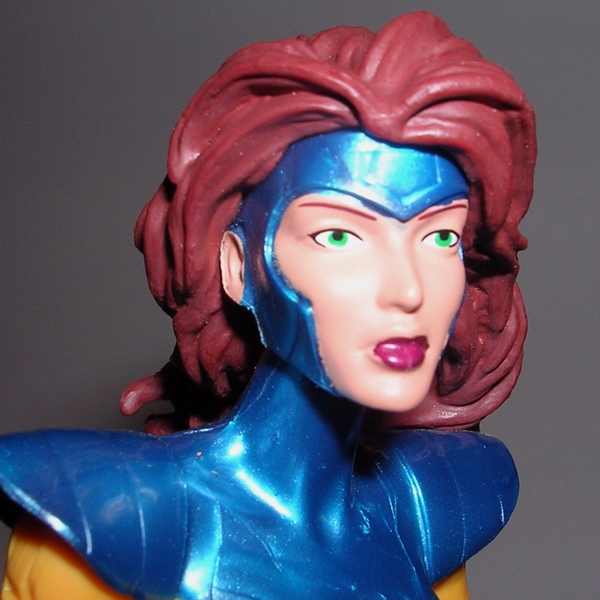
The head sculpt is OK. I am not crazy about her eyes. They’re narrow and they look like she just woke up. The rest of it, however, is fine. The copious hair looks great and I dig the way her hood is executed. It all conspires with the long neck to make for a very iconic looking figure. Her hands are sculpted with one in a fist and one in a “I’m using telekinesis on you” manner. The open hand seems a tad big, but it’s not something that ruins the figure for me.

mljgrey4

mljgrey8

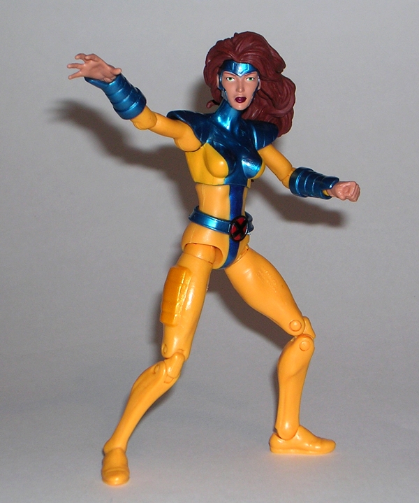
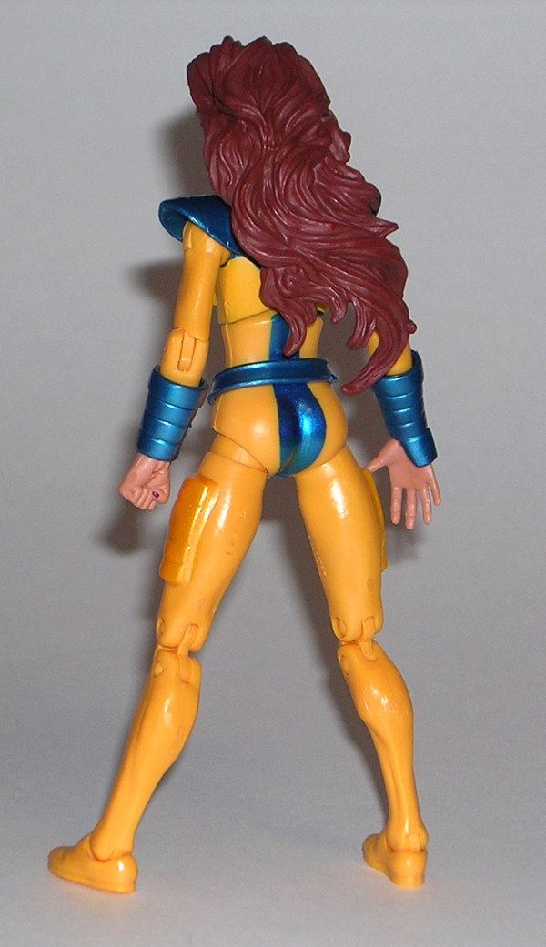
Ok, so here’s the breakdown on articulation. The arms have ball joints in the shoulders, hinges in the knees, and swivels in the wrists. The legs feature those crazy ball joints in the hips, swivels at the hips, double hinged knees, and hinges and rockers in the ankles. Her torso features a ball joint and her neck is ball jointed. There’s obviously some stuff missing here, and the biggest offender for me is the lack of bicep swivels. Hasbro, bicep swivels in a six-inch scale figure should be mandatory now… even if it is a female! I also find the lack of hinge in the neck rather conspicuous. She’s also very top heavy, which makes her not a lot of fun to play around with because she just keeps falling over. Thankfully, I have a lot of stands from a previous Legends wave.

mljgrey7

It may not sound like it, but I dig this figure well enough. Since it’s rebirth, Legends for me has had three main categories. There have been a good number of Triple-A releases, there have been a larger number of adequate releases, and just a few total duds. Jean falls squarely in the adequate releases. She looks fine standing on my shelf amidst the other figures, but unlike the top tier releases, I don’t want to have her on my desk to play with. If I was still a huge fan of the character, I suppose I would be a tad disappointed, but there’s nothing terribly wrong with her either.

Femme Fatales: Anne Bonny by Diamond Select

If there’s one undeniable thing about Diamond’s Femme Fatales line of statues is that it draws its source material from a deep well. So far I’ve looked at one original design, one comic based figure, and now we’re digging into the pages of history itself with the 18th Century bad girl of the seas, Irish pirate lass Anne Bonny. In my experience thus far, I’ve found this series to dabble between excellence and mediocrity, so let’s see where Anne falls along the spectrum. I should warn you, however, I enjoy me some pirates and sexy ladies, so this piece is starting off with bonus points. Warnings aside, let me also apologize. Cat hair is the bane of my collection, and copious amounts of it have snuck its way into a couple of these pictures. I didn’t see it until editing the shots. Anne’s whip and boobs seemed to be particularly prone to it. I’ll reshoot when I have time.

bonnyff1

bonnyff2

Anne comes in a window box that is identical in style to the last two Femme Fatales statues I featured. The front window shows off the statue fairly well and the top window lets some light in. The back panel has a blurb about the character and a shot of the statue itself. The credit for this piece goes to Uriel Caton for the design and the great Jean St. Jean as the sculptor. The box is totally collector friendly and the piece comes nestled between two plastic trays. Let’s get her out and set her up… ARRRRRRRR!

bonnyff3

bonnyff4

bonnyff5

Anne comes out of the package attached to her base and all ready for display. She is also followed by a pungent aroma of plastic and paint. If you think opening a NECA or McFarlane clamshell is bad, you need to experience this! It’s rather overpowering and not something I experienced when opening Lexi or Ariel. It is, however, historically accurate, as I understand 18th Century pirates didn’t bathe very often. Right off the bat, it’s worth noting that this is a large piece. She’s only about half a head taller than Lexi and the base doesn’t gain her much height, but she just looks a lot more imposing. She is, however, still scaled fairly well, so if you display the two together, Lexi just looks petite.

bonnyff6

bonnyff7

Anne strikes a classic Captain Morgan pose with one stiletto-heeled boot on a treasure chest. She’s holding either a whip or a piece of rope in her hands. It’s a very effective pose, albeit rather clichéd. The outfit, on the other hand, does not consist of any of the typical pirate duds that I’ve seen in history books. In addition to the aforementioned boots, Anne is donning the 18th Century equivalent of hot pants, a rather revealing red corset and a long brown naval greatcoat. Her hair is tied in a red bandanna. For obvious reasons, I’m a big fan of this costume’s design. Sure, it shows off a lot of skin, but it isn’t totally off the wall and just a little part of me, the part that doesn’t have a Masters Degree in History, would like to think that pirate chicks actually roamed the seas dressed like this.

bonnyff12

bonnyff13

ARRRR… THERE BE CAT HAIR IN THAT THAR PICTURE!!! The sculpt here is quite good, and that’s something I was worried about. Normally, I would have picked up a statue like this without hesitation, but there are very few photos of her at e-tailers that do her justice and I’ve never seen the statue in person at a comic shop or convention. In person, it looks great and the detail work on her outfit is particularly nice. The boots and coat show all the proper creasing and wear, you can make out the little line of sculpted fringe along her shorts, and the scrollwork on her corset are great little touches.

bonnyff10

ARRR… BY NEPTUNE’S BEARD… ENOUGH WITH THE CAT HAIR YE SCURVY DOG! The portrait is very distinctive. Anne is wearing a devilish smirk and glancing out of the corner of her eyes. The nose is surprisingly evocative of J. Scott Campbell’s work, not a bad thing as far as I’m concerned, and the little sculpted dimples are a nice touch. She has one ear exposed and fitted with a gold earring, and her hair is ratty with some of her bangs coming down out of the bandanna to cover her right eye.

bonnyff8

The paintwork here is rather subdued. Apart from a lot of flesh tone, you get the same brown on her boots, her coat, and the rope, and the same red on her shorts, bandanna and top. There is a little gold paint on her belt buckle, corset laces and necklace, as well as the white frilly cuffs on the jacket help to mix things up a little. What’s here is good, but I think there are some missed opportunities. The fringe on the front of her greatcoat could have been painted, and there’s a bangle around her left ankle that also could have used a little brushwork. It just seems like if you’re going to take the trouble to sculpt those little details you should draw attention to them with some paint. I will note that there was a very limited NY Comic Con exclusive version of Anne with a far more colorful deco and one which has the paint apps I feel are missing here.

bonnyff9

The base is just big enough to support the figure and it features a nice patch of sea washed sand with a couple of shells and a starfish, as well as the treasure chest. They put a lot of work into the chest sculpt, which is a nice surprise because it’s one of the last things that draws the eye. It’s also a little ironic that the paintwork on the shells is some of the best on the entire piece.

bonnyff11

I picked up Anne on clearance for $20. It seems like very few of these statues hold their value, as I’ve yet to pay more than $25 for any and they all start out closer to $40. I think she’s definitely worth the money. She’s a satisfyingly large piece with a great sculpt and an adequate paint job. I’ll even go so far as to say that I don’t think I would have been disappointed paying full retail for her. In a market that’s flooded with anime statues and comic book characters, it’s kind of refreshing to see something like Anne come along every once and a while, and while the Femme Fatales portion of my shelf is starting to look mighty eclectic, that’s not necessarily a bad thing.

Batman (Classic TV Series): The Joker by Mattel

A few memorable actors have walked in The Joker’s clown shoes since the 1966 Batman TV Series and they’ve all left their mark on the character. But while the younger fans of Ledger and Nicholson and Hammill all argue for their individual champions, they tend to overlook the pioneer work of Cesar Romero. For the first half of my life, Romero was The Joker. By the time Nicholson donned the white grease paint in 1989, I was already nearly 20 years old. Toss in the fact that Romero played The Joker in something like 20 episodes and a movie, the truth is he will always be the most familiar portrayal of the character that I fall back on. And it doesn’t hurt that Romero did a f’cking fantastic job with the role. This figure is long overdue.

bctvsjoker1

bctvsjoker2

The Joker comes on the same style of card that we saw earlier this week when looking at Batman. There’s a new Robin quote on the front and the back of the card is character specific. The artwork is based on the animated opening credits. I think it works better for Batman and Robin than it does for The Joker here. Apart from that, there’s nothing new to talk about here, so let’s just bust him open.

bctvsjoker3

bctvsjoker4

I’m not going to mince words… I love this figure, but that does not mean it does not have its share of issues. The outfit matches his regular purple suit rather well and it’s layered on with soft plastic to give the figure some convincing depth and allow his coat tails to hang down the back of his legs. The downside of that is that he looks too bulky to me in his top half. Also, so much of his black tie is showing through his coat that it’s hard to tell he’s not just wearing a black top under that, when in fact he has a green shirt peeking out as well. These are not crippling issues, just things I think worth mentioning. If I wasn’t as starved as I am for this figure, I might be less forgiving.

bctvsjoker7

The head sculpt is great, although it’s worth noting that Mattel didn’t follow through on Romero’s sculpted mustache. A little detail like that was a big selling point for this line with collectors and the fact that it was cut in the end is a tad disappointing. Mattel still makes the nod with a little paint app under his nose. It works OK, but it’s not quite the same. Still, everything else about The Joker’s mug works so well for me that I’m willing to accept the change. His expression is just priceless!

bctvsjoker6

Lastly, I do think the one pointing finger is a strange choice. I’ll grant you, it’s amazing how many poses you can make it work in. I think a swap-out hand would have been a great idea here. I do like the idea of the pointing finger, but not so much if it’s my only option.

bctvsjoker5

Joker retains most of the articulation we saw with the Batman figures. He has ball joints in his shoulders, swivels in his biceps and wrists, and hinges in his elbows. His legs have the DCUC style hip joint, swivels in the thighs, and hinges in the knees and ankles. He can swivel at the waist and his neck is ball jointed. He may have an ab-crunch buried under that suit, but if he does it’s rendered useless.

bctvsjoker10

Joker comes with his own collectible card and I absolutely love it. It’s a great illustration and it reminds me of the kind of collectible Lobby Cards they used to have at the cinema ages and ages ago. It can also be flipped around to form the third panel of the Batmobile display for the figure stand.

bctvsjoker12

bctvsjoker11

Yes, Joker also has the same style figure stand as the two Batman figures. His says, “ZAP!!” I’m not sure if I’ll be using these in my display, but I do really dig that Mattel included them with the figures.

bctvsjoker8

bctvsjoker9

bctvsjokes

I could be a lot more critical of this figure, but the truth is nostalgia is blinding me here. Sure, there’s always room for improvement and I’ve pointed out all those particular areas that I thought could have been tweaked. That having been said, this is still, more or less, The Joker figure that I was hoping for. He definitely looks the part and he displays wonderfully next to his nemesis, Batman. I can’t wait to get him set up with some of his partners in crime. Next week, I’ll try to get to both Penguin and Riddler.

Transformers Robots in Disguise: Prowl by Hasbro

I know, we just looked at a Transformer figure yesterday, but he was new and Transformers Thursday is all about the figures of yesteryear. This week we’re wrapping up the Autobot Car Brothers with Prowl. I saved him for last because I recall him being my favorite. It’s been a year or so since I’ve had him out, so let’s see if that holds up! Like the others, he was released in two versions during the Robots in Disguise run and it looks like I kept the original, which is odd because I recall liking the deco on the second version better. Sometimes I don’t even understand myself.

ridprowl8

ridprowl9

In alt mode, Prowl is a Lamborghini police car, which is only odd if you have problems accepting G1 Red Alert as a Lamborghini Fire vehicle. Like his brothers, Prowl features a pretty realistic looking car mode, complete with clear windows, chromed out wheels, and real rubber tires, which are stamped “Transformers” on the sides. If you look inside the car, you can see that even his robot feet are sculpted to look like carseats. I love that! He has a rear spoiler and a police-style lightbar on the roof.

ridprowl10

ridprowl11

Prowl has a similar deco to the G1 Datsun version of the character, as he’s mostly white with a little black around the bottom. He also has Japanese lettering on the doors, which I was never all that keen on. Now, if he had the markings from G1 Prowl’s doors, I would have lost my shit with delight. Other than an Autobot insignia stamped on the hood, there isn’t much else to the deco here. Prowl comes with two missile launchers and you can clip these onto the spoiler to give him some added firepower in vehicle mode.

ridprowl2

ridprowl6

And there he is in robot mode… Wow, do I remember this guy differently. He’s still got a lot going for him, but for some reason I recalled him being the least kibbly of the trio, but my memory was being rather generous. Let’s look at the good stuff first. I like his torso, particularly the way the two tailpipes slant back and the way his chest looks like a giant engine block with an Autobot emblem on it. That’s classy. The shoulders are pretty cool. They’re stylish and there’s a lot of great sculpted detail in them. The legs might be a little scrawny for that big torso, but other than that they’re fine.

ridprowl7

Yes, Prowl wears part of his car as a shield. All three of the Car Brothers seem to have been born with deformed left arms. In this case, it’s not so bad. It actually looks like shield being worn on his arm, and not like poor X-Brawn, where it looks like his arm is a snake digesting the front of an SUV. Surprisingly, my biggest issues with this figure are the doors and the way they hang off his hips. They’re on double ball joints, so you can move them all over the place, but nothing really seems to get them out of the goddamn way.

ridprowl3

ridprowl4

Prowl’s missile launchers can both be clipped to his right arm and they look good there and do a nice job complementing the shield. However, you can also clip them to the spoiler on the shield and give him one giant double barreled super weapon. Both ways have their merits, I suppose.

ridprowl5

As with his brothers, Prowl features a lot of ball joints, which makes him a fun figure to pose, at least in theory. In practice, I find his kibble interferes a lot with what he can do. Again, it’s mainly the fault of those damn door hips. CURSE YOU DOOR HIPS!!!

ridprowl12

ridprowl1

Obviously, hindsight in this case wasn’t 20-20. I was blinded by a lot of nostalgia and Prowl isn’t quite the amazing figure I remembered him to be. In fact, I don’t even think he’s my favorite of the three anymore. On the other hand, it’s hard to pick from this kibbletastic trio. I can’t hate on any one of them, but Prowl disappointed me the most and that’s probably because I remembered having such low opinions of Side Burn and X-Brawn. These figures each still have some charm for me nowadays, but I guess I’m glad this chapter in Transformers history was a short lived one.

I’m not done with Robots in Disguise yet… next week we’ll take a look at some Decepticons from the line.

Transformers Generations: Bumblebee (IDW Comic Pack) by Hasbro

You know it’s been a busy couple of weeks here at FigureFan Central when I let a bunch of Transformers comic packs sit around unopened. Yes, I’ve had a lot of stuff rolling in and I’m trying to get to everything in a reasonable amount of time. Well, I’m starting to catch up a bit so let’s tear open another one of these today… hey, look it’s Bumblebee!

tfg30bee1

Wow, this is an impressive piece of packaging. Bumblebee is carded in robot mode and between him and his weapons, he fills out the bubble admirably. You also get the comic book behind him with the exclusive Hasbro cover. This is award winning packaging. When I see it on the pegs, I want to buy it, even though I already have own it. I’m extra pleased to get the comic, because I wasn’t following this run when it was out. Bumblebee isn’t really in More Than Meets The Eye much, and I’ve only started reading Robots In Disguise where he’s been reformatted into a different body back on Cybertron. The comic is decent enough. It’s been tough for me to adopt the idea of Bumblebee as Autobot leader, and this issue addresses some of that a bit. On the other hand, it features two of my favorite Transformers, Thundercracker and Prowl, so I found it to be a good read even though it didn’t send me scrambling to Comixology to download more. Let’s start with Bumblebee’s alt mode.

tfg30bee10

tfg30bee11

Drawing from the comic design, which makes some nods to the Bayformer design, Bumblebee is for all intents and purposes a concept Chevy Camero. The design certainly has some cool features, like the split spoiler in the back and the flared hood, which makes it look like a powerful machine. Little touches include the dual tailpipes, detailed headlights, and the rather nicely sculpted wheels. The clear windows and windshield are always a plus in my book, even if the rear window is painted on. I’ll also point out that Bumblebee is a nicely sized vehicle for a Deluxe. While he doesn’t dwarf any of the TF: Prime Deluxes, if you put him next to a figure like Cliffjumper or Bumblebee, he is noticeably bigger.

tfg30bee12

While size has improved, I’m still not completely satisfied with the deco, or to be more accurate, the plastic. There’s something about the yellow plastic used here that doesn’t do it for me. It’s similar to the stuff used for Prime Bumblebee, but in this case it’s lighter and looks a little worse. It doesn’t feel cheap, but it kind of looks like it. More paint apps would have probably helped, and while this vehicle makes out a little better than Prime Bumblebee in that department, it still feels like it could have used a little more something in the deco.

tfg30bee13

Bumblebee’s weapons can peg into the ports located on each side near his spoiler giving him some firepower while in his alt mode. I approve, but then I’m a pretty big fan of cars loaded out to deal damage. Your mileage may vary.

tfg30bee3

tfg30bee4

Transforming Bumblebee to robot mode is easy. Getting him back into vehicle mode is a pain in the ass because of some subtle shifting that occurs with his rear window. Nonetheless, once in robot mode Bumblebee has his ups and his downs. Hasbro certainly did a nice job converting the comic design into a working Transformer. Yes, Bee uses some trickery. The chest, which is obviously supposed to be the hood is faked out, but I’m willing to cut them some slack for having to reverse engineer this guy. I like the proportions a lot. He’s a pretty clean looking robot. The head sculpt is very cool and very G1 inspired.

tfg30bee8

My biggest issue here is the shoulders, in that I wish they were stationary. When you move Bee’s arms, the whole shoulder assembly moves with them and it’s kind of awkward. The way the doors become wings is a nice homage to the Bayformer design and to some extent classic Autobot design as well, but if the shoulders were fixed, this figure would have turned out a lot better for me. I’ve had a lot of fun playing with and posing most of the recent Transformers releases, but Bee here just isn’t one of them. On a brighter note, a lot of the deco issues I have with Bee’s alt mode are toned down in his robot mode. He has more black showing and grey thighs. It helps to break up the shabby looking yellow plastic a bit and make him a lot more interesting.

tfg30bee7

tfg30bee5

tfg30bee6

Bumblebee’s weapons can be wielded in either of his hands, or you can clip them together to make one really cool looking cannon. Peg ports on the forearms would have been a nice option, but that’s OK, because I’d still probably prefer to display him with the big cannon.

tfg30bee9

tfg30bee2

I’ve been up and down on this figure. When I saw the first official pictures of him, I thought I was going to love him. When I had the package in hand, I waffled a bit. Now that I’ve had him out and played with him a bit, I’m happy to say I’m a fan. The shoulders aren’t technical issues; they’re intentionally designed that way, so my attitude toward them is just a personal preference and not a flaw in the figure’s design. The plastic is what it is. Like I said, it doesn’t feel cheap, it just looks kind of cheap. But again, maybe that’s just me.

Marvel Legends: Scarlet Spider by Hasbro

Last time I had to deal with Scarlet Spider, it was his Marvel Universe release. I seem to recall describing the Clone Saga as being akin to having a dead rat in the middle of the living room… love it, hate it… you just can’t ignore it. Far be it from me to argue with myself, but I’ve managed to bury it away most of the time quite nicely until something like this comes up. This was not a figure I wanted in my collection, but I picked up a complete set of this wave online to build Rocket Raccoon. Little did I know at the time that he doesn’t even contain a BAF part. D’oh!!!

mlscarspid1

There’s the Marvel Legends packaging and I’m still loving it. Best of all, if you’re buying these in a store you can clearly see the lack of raccoon parts and decide for yourself whether you need this guy in your collection. I’ll give kudos to Hasbro, this is the one figure in the wave that I thought for sure would have a BAF part in order to force people to buy him. Nice to know they didn’t go that route. Too bad I didn’t research it before ordering.

mlscarspid2

mlscarspid3

Ok, so it should be obvious that this is a straight repaint of the Big Time Spider-Man and Future Foundation Spider-Man figures. Hasbro is determined to get their money’s worth out of this mold! And therein lies my issue with this figure. It’s too big. Take the figure on its own and it looks great. It’s got great articulation, it’s a good sculpt, the deco is fine, but as soon as I put it on my Legends shelf, he seems ridiculously out of scale with everyone else.

mlscarspid7

The deco is even simpler than the one used for FF Spidey. The figure is cast in red plastic, there’s a black spider emblem on the chest and there’s black on the shoulders and head. The eyes are painted red. I’m not a fan of this costume at all. At least the hoodie and ankle-pouch wearing outfit was made interesting by its very outlandishness. This one just looks blah! I guess Hasbro did an OK job with what they had to work with.

mlscarspid5

mlscarspid4

On the upswing, the articulation on this figure is excellent. The arms feature ball joints in the shoulders, double hinges in the elbows, swivels in the biceps and ball jointed wrists. The legs are ball jointed at the hips, have swivels in the thighs, double hinged at the knees and hinged at the ankles. The torso features a swivel at the waist, an ab-crunch hinge and those awesome shoulder crunches. The neck is hinged and ball jointed. This is the kind of articulation that a good Spidey figure needs, if only the buck weren’t so big!

mlscarspid6

mlscarspid8

And that’s all I’ve got to say about this guy. I can’t deny that he’s a lot of fun to play with and pose. But, even if I were a huge fan of Scarlet Spider, this figure wouldn’t have worked for me, at least not as part of a cohesive series of figures like Marvel Legends. At this point, I should probably just pick up Big Time Spidey and move the whole trio to their own little display nook. They really aren’t bad figures on their own, but they look awkwardly large on my display shelf amongst their peers.

I screwed up!

So, apparently this weekend while I was laying out and uploading the week’s features, I accidently scheduled today’s Batman piece for yesterday. So, if you didn’t bother checking here on Sunday, you’ve still got something new to read if you scroll down a bit. If you did stop by here Sunday, then you got a free trip to the future to read today’s feature a day early. The “Happy Monday” in the opening paragraph should have tipped you off. I blame this mishap on a combination of whatever virus it is that’s been dogging me for the last week and the copious amounts of alcohol I’m using to try to knock it out of me.

So tomorrow things should be back to normal. In the meantime, I’m taking a sick day to huddle under a comforter, do Nyquil shots, wipe snot on my cat, and spend some quality time with an old friend…

scv4

See ya later, Space Cowboys…

Batman (Classic TV Series): Batman and “Surf’s Up” Batman by Mattel

WHAT’S THIS??? A NEW WEEK OF FIGUREFAN’S FIENDISHLY FRESH FEATURES OF FIGURES?

Sorry, I couldn’t resist… Happy Monday. As a kid, the old Adam West Batman series was a big deal to me. I used to watch it in re-runs every single day when I got home from school. Every episode served up a weird mix of comic book style, camp, sexual ambiguity, latex fetish, and predicament bondage that both confused and delighted my impressionable little brain. It was also one of the few times my brother and I could sit down to watch TV and not have it come to blows over what we were going to watch. My brother is about as far from a geek as you could get, but even he couldn’t get enough of 1960’s Batman and Star Trek. Anyway, as a kid I had the Mego Batman figures and the Batmobile and whatever else I could get my parents to shell out for. It’s sad that there’s been such a long void of toys based on this classic series, but I suppose it makes it all the sweeter now that they’re actually here.

ctvsbatman1

Obviously, I picked up the entire wave in one fell swoop. It consists of Batman, Joker, Penguin, Riddler, and Robin. Oh… no. It doesn’t have Robin. It has Surf’s Up Batman. Why? Because Mattel wanted to make sure that if you bought this as a set, you got stuck with a remold of a figure you probably don’t want. And if you do want Robin you have to buy a two-pack with another Batman. Well, screw you Mattel, I’m not biting. I’ll do just fine without a Robin. I’m not buying that two-pack… Yeah, I’ll probably buy the two pack. Anyway, Surf’s Up Batman doesn’t deserve his own feature, so I’m going to look at both of them today. Let’s start off with the man himself…

ctvsbatman2

I love the packaging here. It’s obvious that the guys at Mattel had fun with this design and it really captures the spirit of the show. The front of the card is generic with only Robin’s speech bubble changed for each figure. There is, however, an insert in the bubble with the individual figure’s name. The bubble is also embossed with ‘BAM!” “POW!!” and “WHAMM!!” Maybe it’s a little too forced, but I definitely like it. Either way, I’m still just tearing it open and throwing the package away. If you are a mint-on-card collector, the die cut edges of the card are likely going to drive you crazy. Batman’s head juts out the side and will likely be very prone to bending and creasing either in shipment or on the pegs.

ctvsbatman4

The back of the card is a little more character specific. The artwork is patterned after the opening animation, which was probably good thinking for the look they were going for. There’s a blurb about the character as well. The bottom of the card shows the rest of the wave, plus Catwoman who should be following later on in a revision wave. Ok, let’s tear open Bats and see what he’s all about.

ctvsbatman6

ctvsbatman7

The sculpt is simple, but effective. The head is the best thing about it, as I really think Mattel nailed Adam West in the cowl as best as we could expect in this scale and price range. The paint apps for the eyebrows and nose are also clean and well executed. The rest of the costume fits the part, and by that I mean it conforms to my memory after not having seen the show in about two decades. The utlity belt seems off, but again, I’m working on vague memories here and that having been said, I’m very happy with how the figure turned out.

ctvsbatman13

And then there’s the cloth cape. I’m still not sure about this. It looks OK on the figure, and I imagine it was done to let him sit in the Batmobile. I’m pretty sure I would have liked it better in soft plastic, but I don’t hate what we got. I suppose I’ll like it a lot more if I ever do buy the Batmobile.

ctvsbatman10

ctvsbatman12

ctvsbatman11

Despite featuring a brand new buck, Batman sports articulation very similar to what we saw in the DCUC line. The arms feature ball jointed shoulders, swivels in the biceps and wrists, and hinges in the elbows. The legs have the usual DCUC style hip joints, swivels in the thighs, and hinges in the knees and ankles. Batman can swivel at the waist, he has an ab-crunch hinge in the torso, and his neck is ball jointed. Oh yeah, my Batman has a stuck thigh swivel in his right leg. I’ll likely try freezing it to see if I can get it to give. The last time I had this problem was with my DCUC Raven figure and her leg twisted right off. I suppose if that happens, it’s more incentive to buy the Batman & Robin two-pack. UPDATE: Yup, freezing worked!

ctvsbatman8

ctvsbatman9

Batman comes with a colorful figure stand with “POW!” printed on it. I’m not sure if I’ll use it for display, but it’s a very nice thing to have. You also get a Collector Card. I honestly thought it was the shitty little card showing through on the side of the bubble, but nope, there’s actually a very large card printed on heavy cardboard stock with artwork on both sides. I’m not going to say it’s any kind of major added value, but it beats the hell out of Hasbro’s Marvel Universe “Comic Shots.” It’s also designed to fit into the stand and make a backdrop, although you can’t really see it with the figure on the stand.

ctvsbatman14

Ok, let’s run through Surf’s Up Batman super-fast. Here’s the packaging, front and back.

ctvsbatman3

ctvsbatman5

Again, not much new on the front. Just a different dopey Robin quote. The back of the card, however, is specific to this figure.

ctvsbatman17

It’s the same goddamn figure only wearing yellow swim trunks! Apart from the newly sculpted trunks, there are no other changes. He does retain all his hip and leg articulation despite his new swimwear.

ctvsbatman15

ctvsbatman16

And, yes, he also has a big surfboard. The surfboard looks good, but it’s kind of flimsy and made of softer plastic. It has two pegs on it so you can stand the figure on it pretty well, but with the fin in the bottom, it’s kind of heard to display him riding it, unless you balance the board on something else.  I joke about Mattel sticking us with this tweaked repack, but truth is you’re getting a lot more for your money with this figure than you are with regular Batman, so long as you don’t mind your Batman wearing swim trunks and carrying a skateboard.

ctvsbatman19

ctvsbatman18

You also still get a new collector car and a new figure stand. This time the card has Batman and the Joker surfing and the stand says “BIFF!!!” It also reveals that the backs of the cards are meant to form a single backdrop when the stands are put side by side. In this case, it’s the Batmobile parked in the Batcave. It’s a cool idea, but there’s a huge gap between the backdrops, and again, with the cape, you really can’t see the backdrops behind the figure when they’re plugged into the stands.

ctvsbatman20

No doubt, Batman is a solid figure. Hell, I even have to admit to digging Surf’s Up Batman just because he’s so ridiculous that he captures the spirit of the show. Part of me still wishes NECA could have procured the master license, rather than for just the quarter-scale figures, but even still Batman and Mattel have always been a pretty good fit. Despite the Adult Collectible moniker on the packages, these definitely feel more like toys than collectibles, but I’m OK with that. I’m ultimately happy with what we got so far, although I still think it’s inexcuseable to not have a single-carded Robin.

bctvsbats

Anyway, give me a few days to cover some other stuff, and I’ll swing back at the end of the week with The Joker.

Doctor Who: “Pyramids of Mars” Priory Set by Character Options

I’m sure I’ve espoused my love for the Tom Baker story “Pyramids of Mars” here on at least one previous occasion, so I’ll spare you any more of it. Suffice it to say it’s one of my favorite Fourth Doctor stories right up there with “Robots of Death” “Horror of Fang Rock” and “Hand of Fear” and about half a dozen others. Nonetheless, even I find it interesting that Character Options has devoted so much attention to this one story in their Classics line. We’ve already had a single carded release of the Servo Mummy Robot, a previous boxed set with three figures, and a special version of The Fourth Doctor was even released in the UK. Now we have another release from the story and it’s one that goes totally off the reservation when it comes to CO’s usual pattern of releases.

dwpomps2

dwpomps3

For starters, there’s no window box this time. No sir. Instead, you get a completely enclosed cardboard box with images of the goods on the front. Unless you count something like the Eleventh Doctor’s TARDIS playset, this is the first time we’ve had a release in an enclosed box like this in the Classic figure line.

dwpomps1

Open the box and you slide out a big plastic tray with the all the goodies and a triangular shaped cardboard tray underneath with parts to build your own Osirian War Rocket. The tray contains two figures, Professor Marcus Scarman and a masked version of Sutekh. You also get two Canopic jars, a Coordinants Selector, and two halves of the sarcophagus that served as the Space-Time Corridor between Sutekh and his minions. Hot damn, this is a cool set! Let’s start out by looking at the figures.

dwpomps10

Professor Marcus Scarman was wonderfully portrayed by the late Bernard Archard. If you’re a fan of British TV, you’ve probably seen him before. If not, get yourself a copy of the 1983 Sci-Fi flick, Krull, and you can spot him in there. Or better yet, just watch “Pyramids of Mars” goddammit! While Scarman is one of the villains of the piece, he’s a tragic one as he spends most of the story as a reanimated corpse and Sutekh’s undead slave. As crazy as it sounds, I think this is one of CO’s best likenesses. It not only captures Archard pretty damn well, but also manages to replicate the vacant, zombie-like countenance of the character. Of course, if you have no familiarity with the character, then this is just an old dude in an early 20th century suit, but he is an exceptionally nice one!

dwpomps13

CO has been all over the road with the articulation in their 5” line and while Scarman lacks the ball jointed shoulders of some of the most recent releases, he makes out fine everywhere else. The arms rotate at the shoulders and wrists and have hinged elbows. The legs rotate at the hips and they do have a little lateral movement, but I think that’s just from play in the joint. He has swivels in the thighs and hinges in the knees. His head can also rotate. He’s not super-articulated by today’s standards, but just how limber do you need your undead Egyptology professor to be, eh?

dwpomps6

dwpomps7

And that brings us to Sutekh, and this is where CO is making us do a little double dipping. The previous “Pyramids of Mars” set included Sutekh, but it was an unmasked version with his native Osirian Jackal head. This version has him wearing the mask that he has on for the bulk of the episode. The body is identical to the other figure. A lot of collectors were weary when CO released the jackal headed version first, suspecting that we’d be offered a masked one later on down the road. Well, they were right! I’m not too offended by this, as I like the option to display him both ways and I can always use the unmasked one as a fellow Osiran. But before we cry foul and say CO could have just released a figure with swappable heads, I submit to you… LIGHT UP EYES!!!

dwpomps8

Yes,  CO did go the extra mile and give him a pair of beautiful light up eyes. In the story, Sutekh’s eyes lit up green when he was exercising what little powers he had left and particularly when he was dispensing pain to The Doctor. The effect is activated by a little button on the back of the figure’s head and it is bright and looks fantastic! If making us buy two versions of this figure allowed CO to cost out this cool feature, I’m very happy they did it.

dwpomps9

dwpomps12

Next up is the Sarcophagus, which stood in Marcus’ study and served as a Space-Time corridor linking Sutekh’s prison in Egypt. The sculpting and paint on this piece is quite nice and the reason it opens is to reveal the lenticular sticker, which simulates the Space-Time Corridor effect from the show remarkably well.

dwpomps14

You also get some other little bits and pieces. The Canopic Jars are similar to the ones that came with the single carded Servo Mummy a while back. They have different lids, and they do not open. You also get the Coordinate Selector, a device that Sutekh sent to Scarman so that he could program their War Rocket to destroy the power source on Mars that was keeping him a prisoner in Egypt. Wait… did someone say Osiran War Rocket?

dwpomps5

Yup, there’s a cardboard model of the pyramid-like War Rocket. It’s an extremely simple model, with a pre-made cardboard base that is extremely sturdy. You just fold the pyramid plug it into the base, put on the ramp, and attach some velcro dots to hold the hatch open. While I would have been happy with a simple backdrop of the library and a raised space for the sarcophagus, I think this thing is pretty great too. Nothing needs to be glued or taped, so you can easily disassemble it for storage, which is good because it’s a big piece and I don’t have anywhere to display it right now.

dwpomps11

dwpomps4

Everything about this set is rather unconventional. There’s no Doctor, no companions, just a couple of figures from a specific story, some accessories, and a cardboard diorama… and I love it! There’s nothing in this set that I didn’t want. Even with Sutekh featuring a completely reused body, I’m still happy to have him. It retails at about $50 and when you consider the going rate for some of the two-packs has been $35-40, I think the set is priced well. Yes, it’s likely to separate the hardcore Who collectors from the casual buyers, but that’s probably a good thing.

Oh yeah, last time we looked at a Classic Doctor Who figure, the word on the street was that the line was done after this year. That seems to have been premature. The official word now is that we will be getting two or three releases a year, possibly including the SDCC release. I’m hoping that this set is a test run of the kind of things they want to do with a lighter release schedule. If we can get two or three sets like this in a year, I’ll be perfectly happy with that.

DC Universe Signature Series: Fire by Mattel

Yes, Club Infinite Earths is dead, but its animated corpse still shuffles on, at least for a few more months. August gave us Brazillian bombshell Fire, a character that many, including myself, were eager to see released in the DCUC style. Naturally, Matty took this opportunity to pull a really clever move (or douchebag move, depending on your point of view) and release only Fire this year and save her partner Ice for the 2014 Sub. Of course, now we know there will be no 2014 Sub so we can only hope that somewhere and somehow Matty will let us buy Ice for a lot more than she’s worth just so we can complete the duo.

dcfire1

dcfire2

Fire comes in the same compact little window box that we’ve been getting all year from CIE. The character art is quite good and there’s a little bio on the back. The box is totally collector friendly, but in the interest of space, I’ll be clipping off the back panel for keepsies and pitching the rest of it.

dcfire6

dcfire7

Out of the package and Fire is a pretty nice looking figure. I have some issues, but nothing terribly crippling. Her two-tone green costume consists of a pair of smooth and featureless pants, heeled boots, a pair of appropriately uneven gloves, and a boob wrap… for lack of a better term. She also has a gold and green belt that hangs from one hip. I dig the work Matty did on the costume. I think her top should have extended a little lower, like maybe just to the ab-crunch, but I’m picking nits on what is overall a solid effort.

dcfire11

The head sculpt, I’m not totally keen on. She looks a little less super model and a little more severe. The hair is full on 80’s, which makes her look like she would belong jamming with Jem and the Holograms as much as fighting in The JLI. Again, I’m nitpicking, but in truth the sculpt works ok for me. The paintwork on her face is crisp and sharp and I like the wash they did on her hair.

dcfire10

Running through the articulation, Fire does pretty well for a female DCUC buck. You get ball joints in the neck and shoulders. Her arms have swivels in the biceps and wrists, and hinged elbows. Her legs feature the usual DCUC style hip joints, swivels just above the knees, and hinges in the knees and ankles. She can swivel at the waist and has an ab-crunch hinge. No complaints here.

dcfire8

dcfire9

Fire does come with an effect part, which is a translucent green flame that can fit over either of her fists. As far as effect parts go, it’s not bad.

dcfire3

dcfire4

dcfire5

Yes, it’s a bitter time for Club Infinite Earths and Fire doesn’t help matters much. She’s a truly solid figure, and I am a big JLI fan, so I’m very happy to have her. But having her in hand makes me wonder how Ice will ever make it out and whether she’ll be difficult to get or expensive. It seems like the least Matty could have done was ship Ice to those who subbed as a consolation prize. I would have been totally fine with that in lieu of a refund, which still hasn’t shown up in my bank account. Anyway, I suppose it’s nice to know we have a few figures left to look forward to before Batzarro ships at the end of the year and makes me wonder whether the Sub dying wasn’t such a bad thing after all.