ThunderCats Ultimates: Hachiman by Super7

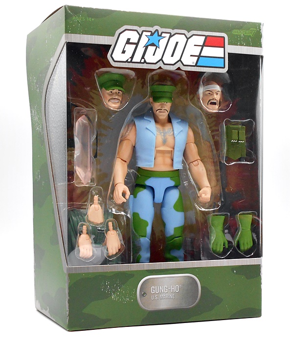
Last week I embarked on a look at the eighth wave of Super7’s ThunderCats Ultimates with a look at Wilykit, and today I’m pushing forward with the Samurai from The Red Sun Planet! Hachiman first showed up well into the first season of the cartoon, when he was summoned by Mumm-Ra and tricked into fighting the ThunderCats, but he and Lion-O eventually became allies… until many episodes later Mumm-Ra summoned him again, put a spell on him, and made him fight the ThunderCats… again! One of the recurring themes in the cartoon was making friends out of potential adversaries, and I think that was a good message to send kids, but maybe the writers hit that well a few too many times at the expense of Hachiman’s gullibility. Either way, Hachiman would turn up in a total of maybe a half-dozen or so episodes, enough for LJN to give him a figure back in the day.

Here he is in the package, and just like last time, we no longer get an outer mailer box or a slipcover. I don’t mind the mailer going away, as I always pitched them, but the fact that we’re not getting the slipcovers anymore has just about convinced me to not keep these boxes. The presentation is still really nice, but at this point I’m just looking for excuses to get rid of action figure boxes in storage and recover some space. The back panel still has some character art and you get a little blurb about Hachiman as well.

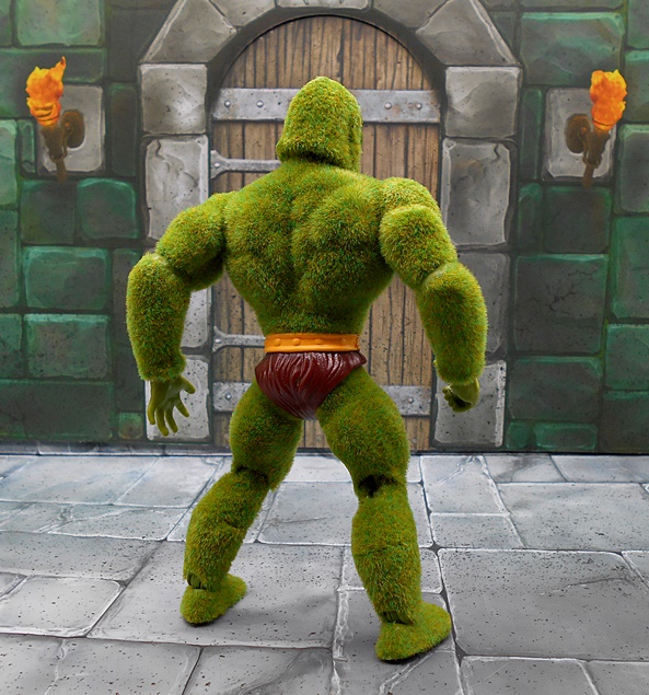
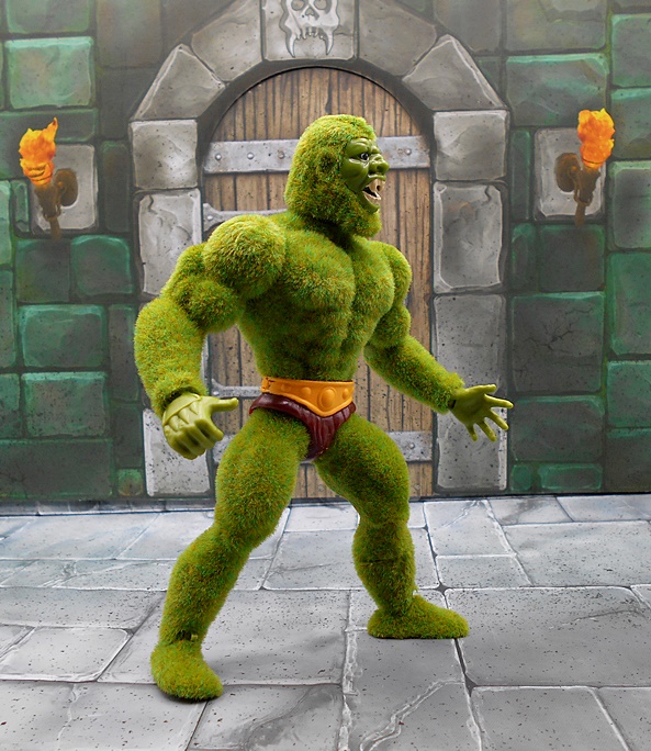
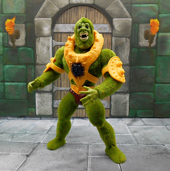
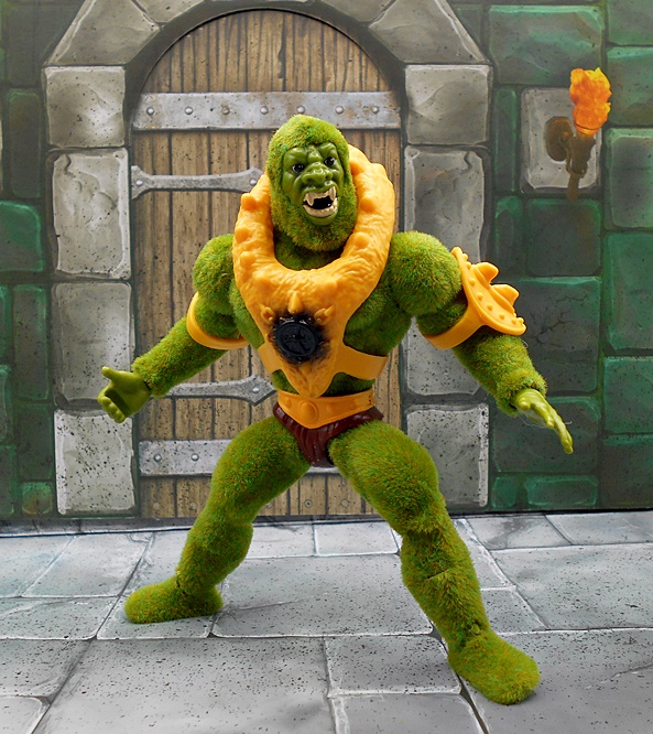
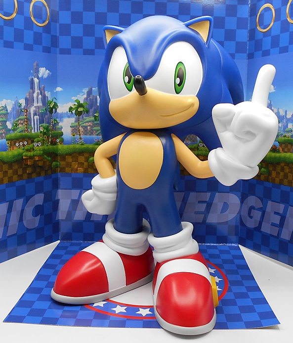
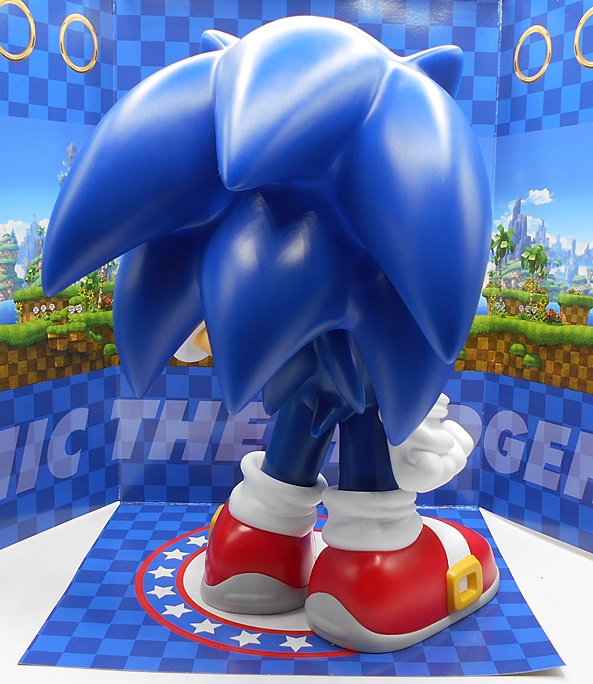
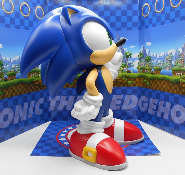
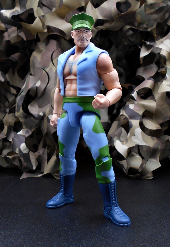
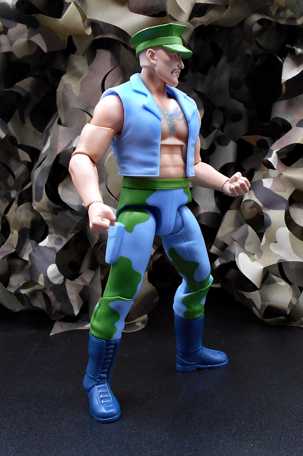
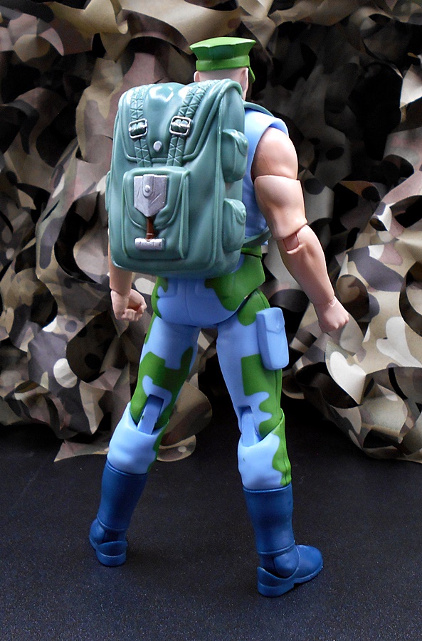
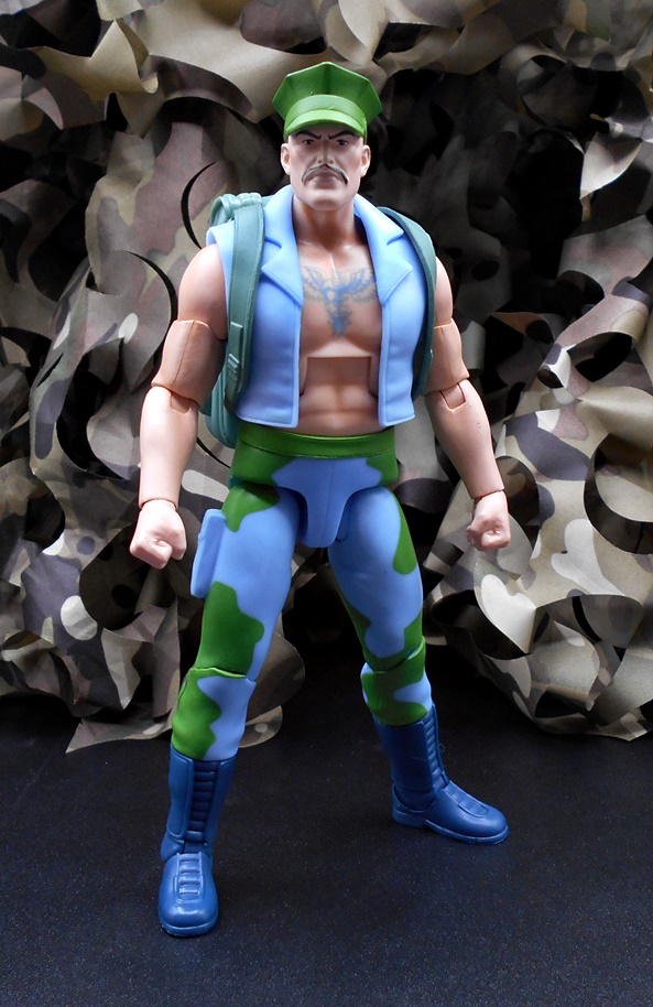
Out of the box, Hachiman is looking pretty faithful to his animated counterpart. He has blue Samurai armor with a little black and red trim, worn over a sculpted brown bodysuit. The armor is confined to the front, which I’d like to think is because a brave warrior like Hachiman does not turn his back on the enemy. From the back you can see the sculpted red cords that hold his chest piece on and just more of his sculpted brown undersuit. I was pleasantly surprised to see that the plates on his hips and shoulders are not too restrictive of his articulation. His chest armor has a swap out panel, one with an emblem on it and one without. I don’t remember him ever having that emblem on his chest in the cartoon and the LJN figure didn’t have it either, so I’m not sure the source of that piece. I can’t say as I remember every episode he was in, so maybe it appeared in one of the later ones. Despite being more cartoon accurate without it, I have to say I kind of dig what it adds to the look of the armor.

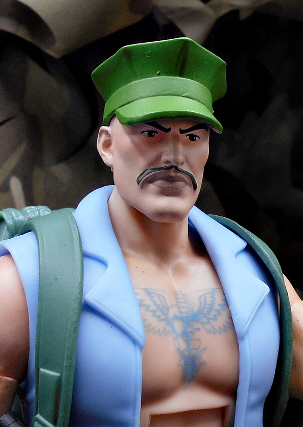
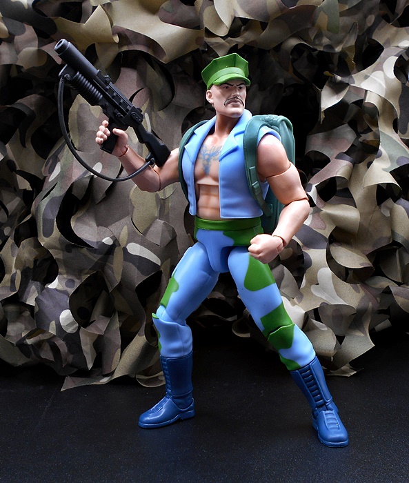
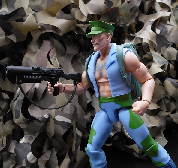
You get two head sculpts, one with the helmet and one without. The helmeted head looks great with some pretty nice depth of sculpt between the mask and his underlying face and he’s depicted as gritting his teeth in the heat of battle. The gold leaf paint on the trim and crest looks good, but could have had some sharper paint lines. I like that they went with two heads, rather than a removable helmet, because I don’t think this design would have worked as well had it been an accessory.

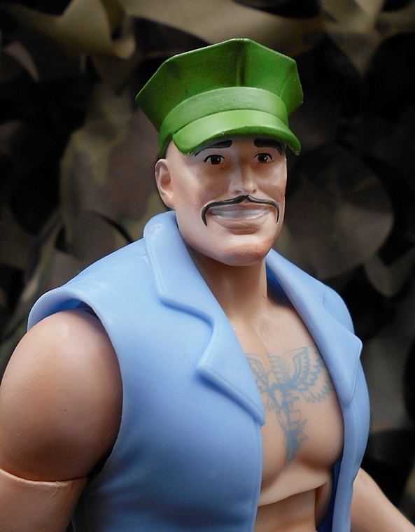
The sculpting for the unmasked head also looks pretty good and offers a more stoic and determined expression. His brow is furled and his tightly drawn lips are slightly downturned. The hair sculpt is rather soft and the paint on the head band shows some slop. My figure also has a stray black mark on the left side of his face, which I will try to wipe off at some point. Overall, I think the paint could have been a lot better on this head, but I’ll concede that the flubs are amplified by the camera close ups and it’s not as egregious with the naked eye. On the other hand, it is a $55 collector figure so, it should have been better. Do better, Super7!

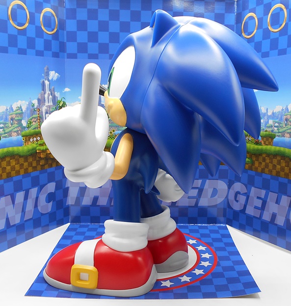
Hachiman has a scabbard for his mighty sword, Thunder-Cutter, which pegs into his belt sash with a key-type tab. If I peg it in and put the figure on the shelf, it’ll stay put, but as soon as I start fiddling with him, the scabbard pops off, so I find it’s best to just leave it off until I’m done posing him and then attach it. It’s rather annoying, but I can’t really think of a better way to do it and still have the scabbard be removable. The scabbard has a gold handle and some sculpted with wraps and it fits the sword blade pretty well. Hachiman has hands for holding both the sword and the scabbard, along with relaxed hands, fists, and a pointing finger hand.

Released from its scabbard, Thunder-Cutter has a painted silver blade, black sculpted wrap on the handle, and the pommel and tsuba are both painted gold. It may not be as flashy as the Sword of Omens, but it’s still an attractive and elegant looking sword.

You also get a second version of Thunder-Cutter with a semi-translucent energy webbing effect piece wrapped around the blade. It’s actually the exact same sword and the effect piece is removable, so I’m not sure why they didn’t just include the effect piece, but hey… extra sword! The effect piece also has a hole for the pointing finger hand so you can recreate the scene where Hachiman asked Thunder-Cutter which way to go and it acted like a compass to point him in the right direction, while balancing on his finger.

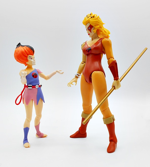
I’m glad they finally worked Hachiman into one of these waves, because he was a great recurring character on the cartoon and he makes for a fun action figure. Yes, I would have appreciated a bit more care on the paintwork, especially the unhelmeted head, but what we got isn’t so bad that it ruins the figure for me. Getting him in hand does make me extra sad that we don’t yet have Nadya, the Warrior Maiden that he sort of bonded with and referred to as Little Sister in the cartoon, but the line does appear to still be going strong, so I have hope!

Defenders of the Earth: Flash Gordon and The Phantom by NECA

NECA’s held the Flash Gordon license for a little while now and has been exploring it in a few different ways. A couple years back I checked out their Flash and Ming figures from the original King Features comic series. More recently, I’ve had a look at the figures based on the 1980 Dino De Laurentis film, and now it’s time to give Defenders of the Earth its turn. These figures are based on the 1986 cartoon, which had Flash join up with the stars of a couple of other King Comics franchises, The Phantom and Mandrake the Magician, to form an Avengers-like team and set out to well… defend the Earth! The cartoon is available to stream for free on a few services and I think it’s still worth checking out. It was probably among the last cartoons that I watched as a teenager before moving on to more adult pursuits. I picked up these figures as they were released and it’s long past time I open them up and give them some love…

These releases do not fall under NECA’s Ultimate series, so they come in straight up window boxes similar to what we got for the Flash Gordon: The Original Superhero line. And there’s nothing wrong with that, because the presentation here is excellent. The boxes have an animated starfield deco with character art on the lower left side, all very reminiscent of vintage 80s toy presentation. Galoob had the license for these figures back in the day and NECA even reworked their logo to copy the Galoob logo, which is a wonderful little touch. The blue and yellow deco is also an homage to the Galoob cardbacks. The left side panels have a headshot of the figure and the colorful series logo, while the right panel has the number of each figure. The Phantom is #01 and Flash is #02. Let’s start with The Phantom!

The Kit Walker that appears in Defenders is a bit different than what we saw in the comics. Most notably, he traded in his pistols for supernatural powers, but his overall appearance has remained pretty close to the Walker family roots. He still wears a skin tight purple body suit with a hood, along with shiny black boots, a wide black belt, and his black domino mask. This is a slightly reworked body that NECA used for The Original Superhero Flash Gordon with some changes to the collar area and sleeve cuffs. His trademark signet rings are sculpted on each of the fists that come on the figure. This was no doubt a very budget-friendly figure for NECA, as it gets by with a lot of recolor and reuse, but it certainly works for the character, so I’m not complaining. The musculature on this figure is beautifully sculpted, particularly on the chest and back, and the proportions are overall excellent.

The head sculpt is a great representation of his animated counterpart. The domino mask and hood have some clearly defined sculpted lines separating them from the face. Alas, the paint could have been cleaner as there’s a bit of flesh tone slopped onto the mask and hood. The facial features are sharp, with very high cheek bones, a strong jawline, and a stoic expression. It’s a solid portrait if not exceptional.

The articulation is identical to what we saw with The Original Superhero Flash Gordon figure and that is every bit a good thing. The legs are ball jointed at the hips, have double-hinged knees, swivels at the tops of the boots, hinges and lateral rockers in the ankles, and hinges in the toes. There’s a swivel in the waist, an ab-crunch hinge in the torso, and a ball joint in the neck. The arms have rotating hinges in the shoulders, swivels in the biceps, double-hinged elbows, and the wrists have hinged pegs to allow you to swap hands. Both of the two additional hands are right hands: One is to hold his pistol and the other is for the energy blast from his ring. The joints are all nice and smooth and I had no issues with anything frozen or sticking.

The energy blast for the ring pegs into a hole in the extra right fist, which works really well. It’s cast in pale blue translucent plastic and I love the way this effect looks. I do wish they had actually sculpted the ring on this hand, but I suppose with the energy part inserted, it’s hard to tell it’s not there. Still, why not just use the same hand and bore a hole into the ring?

The Phantom also comes with a laser pistol and boy do I love the design of this thing. It’s got an angled trigger guard that meets the bottom of the grip and all sorts of bits and bobs protruding from the receiver. Off hand, I can’t recall the designs of the guns from the cartoon, so I’m not sure if this is accurate, but it’s a damn cool sci-fi weapon that invokes the swashbuckling Flash Gordon design that I love so much.

You get two blast effect pieces for the gun, both cast in the same translucent blue plastic as the signet ring effect piece. These socket around the barrel of the gun and work very well. One is a long blast and the other is just a muzzle blast. I’m pretty sure these are the exact same pieces that came with the previous Flash Gordon and Ming figures, only recolored from yellow to blue. I only shot pictures of the long effect piece here, but you’ll get to see the other one when we look at Flash.

Finally, The Phantom comes with Zuffy the Zuffoid! Because every one of these cartoons had to have an adorable animal sidekick to appeal to the little kiddos, Flash’s son Rick befriended this annoying little shit on Mongo. It’s a really nice sculpt for such a small figure and he even has some articulation, with ball joints in the shoulders, hips, and neck. The eyes are impressively lifelike, thanks to a high gloss finish, and he’s sculpted holding a Mongo crystal, which contains the personality data from Flash Gordon’s dead wife. The crystal was eventually used as the personality matrix of the team’s super computer. I doubt there was ever a chance NECA was going to make figures of Rick Gordon and the other kids, so they paired Zuffy up with The Phantom, because… the beasts call him brother? OK, let’s move on to Flash Gordon!

Flash shares a lot of the same body as The Phantom, right down to the boots and sleeve cuffs. You do get re-sculpted shoulders with the gold armor pieces, as well as the epaulettes and collar. The same wide black belt is used, but this time with a new Flash-branded belt buckle. The red plastic used for the suit has a nice wash to it that really brings out the sculpting in the muscles. What’s not as nice is the ankle hinges have been cast in red plastic and really stand out against the glossy black of the boots. What a shame. Otherwise, this is a great recreation of Gordon’s look on the cartoon.

I was expecting a reissue of the un-helmeted head from TOS Flash Gordon, but we actually get a completely new head sculpt here to better resemble the cartoon version. This is a fantastic portrait that reflects the character very well. From the strong chin and contours of the cheeks, to the blonde hair and high arches of the eyebrows, it just oozes classic Flash Gordon in every way. I love it!

The same body as The Phantom means the same articulation, so i won’t run through it all again. I do, however have to report that my figure has stuck joints in the feet, making his toes curl up ever so slightly. I have yet to try to fix this with some heat, as it doesn’t really effect his ability to stand, but so far, this is a figure that carries all its problems in its boots. As for extra hands, Flash comes with a set of fists, a set of accessory holding hands, and a left trigger finger hand.

All the accessories included with Flash are recycled and reworked from somewhere else. The sword is the same sculpt as the one that came with TOS Flash, but the hilt has been repainted and it’s been given a cool translucent yellow energy blade. The gold and blue used for the original hilt has been changed to black, gray, and silver, with painted red disks in the crossguard. It’s a nice update to the weapon that gives it a very 80’s sci-fi feel and gels nicely with the cartoon aesthetic.

The pistol is the same one that we just saw with The Phantom, but given a purple metallic paintjob, which looks rather snazzy. You also get the same two blast effect pieces that we got with The Phantom, both cast in the same transparent blue plastic. As I noted above, you do only get a left hand for the gun, and I really would have liked to get a right one too. He can hold the gun in the sword hand, but it’s not quite the same.

Aside from some issues with Flash’s boots, these figures turned out great and it’s really cool to see this old cartoon getting some love from NECA. As I mentioned earlier, it’s a stand out series to me because it’s one of the last cartoons I watched as a kid, and while I was aware of the toys released for it, I was drifting away from toys by that age and never actually had any. Coming back to it as a collector is like a satisfying shot of nostalgia and I’m eager to start digging into the rest of these releases! And while these figures were released a little while ago, they do seem to still be readily available at most online NECA retailers, and if you hunt around you may even find some pretty good discounts.


DC Multiverse: Bizarro (Rebirth) by McFarlane

A short while ago, McFarlane put up a Bizarro/Batzarro 2-pack for preorder and I went for it. But little by little the details has me rethinking that purchase for a number of reasons. Ultimately it was the very cartoonish portrait on Bizarro and the ham-fistedly reworked bat symbol on Batzarro that made me deep six that preorder before release. I was still hankering for a Bizarro, though, so I hunted down the Rebirth version that was released shortly before I fell into the delightfully bottomless pit of collecting this line.

Here he is in the packaging, just a regular release with no Collect-To-Build business to deal with. I also like that he’s from the Rebirth comics, because that happens to be one my favorite Superman figures on my shelf right now, so they’ll look good together duking it out. As usual, the packaging is mostly collector friendly, although you’ll have to tear the stand and the collector card off the cardboard backing to get them out. Also, there’s no flight stand included, which had me a little disappointed. The McFarlane flight stands aren’t great, but they are a fun way to display the flyers on the shelf and add a lot of value to the package.

As expected, the body is lifted directly from the regular Rebirth Superman, but using a darker blue for the suit. He also has a blue diamond panel in the middle of his belt buckle and the red trim at the tops of his boots actually match the sculpt, unlike the lazy-ass paint on the Superman figure where they tried to strongarm the right paint onto the wrong sculpt. The S-Shield is properly reversed, which was probably easy to do here since it was sculpted separately on Superman and attached to the figure. Reversed or not, the shape of the shield is the same, so they were able to pop the new one right in there. It’s not quite as polished as the shield on Superman, but it looks good.

The cape is completely different, and I’m almost certain it’s been lifted from another figure. It’s much longer than Supes’ cape, reaching down to Bizarro’s ankles, and it has various holes worn into it. There’s some subtle texturing to the surface and it’s a tad darker shade of red than what we saw on Superman.

The head sculpt is excellent. I realize that the highly stylized head on the newer two-pack is going for a very specific look, but this is definitely my preferred portrait for Bizarro. The enlarged jowls and smaller dome makes him into a bit of a pinhead and I love the shock of hair at the top of his head and the sides being clean shaven. The skin is gray with some subtle green bits of wash that make him look moldy and gross. There are some fissures sculpted into his skin, giving him a desiccated, zombie-like appearance and the hints of teeth in his downturned, parted mouth look great. All around, nice work!

Bizarro’s articulation conforms to the unswerving DC Multiverse standard, and that’s a pretty good thing. Everything here is serviceable and the joints work smoothly. I can’t recall having an issue with stuck joints on any of these figures and they are always lots of fun to play around with. I’d still love to see thigh swivels added, and you could argue that the pins are getting prehistoric, but I don’t mind. Bizarro also comes with an extra set of swappable hands, so you can replace his fists with graspy hands.

I’m glad I cancelled the Bizarro/Batzarro two-pack in favor of this guy. Sure, I would have preferred something more classic, but I do like the Rebirth designs and I am happy to have a Bizarro that pairs very well with one of my existing Superman figures. His price was a bit up there at a number of retailers and resellers, but a little patience netted him for about $20, which I believe was right around the original MSRP. All in all, another great addition to my DC Multiverse shelves!

G. I. JOE Classified: Cobra Ferret ATV and Ferret Scout by Hasbro

I’ll confess, I feel so guilty pushing new Classified releases to the head of the review line when I have so many older figures to look at here. But then again the new Cobra Ferrets rolled in this past weekend and how could I not? This Combat ATV was first introduced to the Cobra arsenal back in 1985, and was just another prime example of how many cool toys this line had that were still small and affordable. And by affordable I mean that if I was really good and tagged along with my Dad when he went to Sears on Saturday morning to get a tool, I might have a chance of talking him into getting me a FANG, a SNAKE Armor, a FERRET. or some other small vehicle. These were also featured several times in the Sunbow cartoon, which just made them all the more desirable, probably because of hidden subliminal messages.

And behold, the new Classified Ferret. No longer a little impulse item, this new Cobra ATV is scaled for the 6-inch line, is big enough to carry a couple of riders, and is bristling with weaponry. This release was a Hasbro Pulse Exclusive and sold out fairly quickly, and there is a Target Exclusive JOE version on the way. You get a colorful box with some great artwork and shots of the toy. And unlike the original RAH version, this one comes with a dedicated driver, The Cobra Ferret Scout, visible through a window panel on the front of the box. Oh, and hello! It’s a lady! The Ferret requires a bit of assembly, and make sure you take note of the direction of those tire treads, because once you put them on, they’re a bitch to take off again. I bought two and learned my lesson putting together the the first. Let’s start with the figure!

The Ferret Scout is a repaint of the Cobra Valkyries that came in a two-pack not that long ago. The previously black and blue fatigues are now light grey and dark grey, with some black, blue and trim added. It’s a rather unique deco that is very pleasing to the eye and maybe leans into an urban camo vibe for me. The belt, bicep strap, and holster rig are all borrowed directly from the Valkyrie, but an ankle sheath has been added to the left leg. There’s also an additional vest piece that’s worn by the figure providing a little armor to the vital bits, and stamped with a red Cobra emblem on the front.

The head is also borrowed from one of the noggins that came with the Valks, but it now includes a riding helmet. This piece is cast in soft plastic and encompasses the entire head with an opening for the eyes. The design is awesome, with a snakehead motif forming the top of the visor, complete with snake fangs, and a pair of painted fangs over the mouth guard. It fits the figure very well and it’s nice to have the option to remove it, rather than have a sculpted helmet head.

As for weapons, the Ferret Scout gets by with two automatic pistols and a combat knife. The combat knife is small and cast all in black plastic. It’s nothing special, but a nice addition, since the Valks didn’t come with one. No doubt useful for taking care of any JOE that jumps onto the Ferret, by stabbing them in the neck with it. Yeah, I went dark with that one! The pistols are the same pair that came with the Valks, with one worn in a cross-draw holster on the left hip and the other on the right thigh rig. These are also cast all in black and have sockets in the barrels for blast effect parts, although none are included with this set.

I really love this figure, which should come as no surprise, as I was a big fan of the Valks. The recolor and rework done here makes her stand out on her own and I think the overall design works wonderfully for a dedicated Ferret driver that we never got in the original RAH series. A rifle and some blast effect parts would have been cool, but I can always dig into my copious box of Classified accessories if I need to kit them out a bit more. Now, let’s move onto the Ferret itself!

As we’ve seen time and again, the Classified version takes the original RAH design and updates it for scale and maybe just a little bit of realism. The coloring remains blue and black with red trim and all the design beats are still here, from the side mounted rockets to the pivoting front guns, and the large side-mounted cannon. This new version feels a more chonky and durable, as it no longer has an exposed engine compartment where you could see through to the other side. You do, however, get some exposed sections of the engine, which are painted over in silver. There’s a ton of tampo’d lettering on this thing, many of which are lifted directly from the original toy, like the X02 under the steering column or the Caution Exhaust on the rear pipes. Even the tires are branded!

The front of the vehicle has a non-working winch, protected by a cage, the steering wheel has a detailed instrument panel and can turn, but it is not connected to the front wheels. You do, however, get working independent suspension in each wheel, which is very cool. The side rockets, originally called COM-BAT laser-seeking rockets, have the same weird double sided design, which I never really understood, and this new version looks even more confusing. Either way, these simply peg into the launch carrier and I’d nitpick about not getting a launch effect piece, but when the rocket has two nosecone and no exhaust, where would you even plug it in? I will say that the rockets are kind of rubbery, which is a bit disappointing.

The side cannon pegs into a clip, which in turn clips onto the cage, allowing you to mount it on either side of the vehicle. It also allows it to be easily removed for a figure to fire it when it’s off the vehicle. The system of attachment allows it to raise and lower as well as pivot. I’m thankful that you can remove the cannon by the peg attachment, because constantly removing and attaching that clip will probably cause stress to the plastic, so I don’t want to do that. .

Despite coming with just the one driver, the Ferret was always designed to carry two figures, and this one is no different. The gun hands do a good job grabbing the handlebars. I did find the leg placement a little awkward, but you can definitely make it work, and there’s no trouble getting a second figure on the back.

Of course, I always had my Crimson Twins riding the Ferret together when I was a kid! The Ferret was released at about the same time as the Tomax and Xamot set and it was colored to match their outfits, so I always assumed it was intended as their unofficial vehicle. I’m pretty sure I got the twins and the Ferret pretty close to each other and it was theirs from that moment on.

The Ferret sold for $55, placing it right in line with the Trouble Bubble and Televiper bundle, a set that I have yet to review here and I really need to remedy that! I’ve seen some complaints over the price, but with a bundled figure, I don’t think it’s that bad, although I did limit myself to just two, whereas I really wanted to pick up three. I guess I do have a little bit of willpower left. Either way, the Ferret sold out pretty quickly, and it seems to be going for around $80 to $100 on the second hand market. I haven’t seen anything from Hasbro about planning a restock, but Hasbro really needs to get on that, because I’d now that I’ve played around with it, I’d probably pick up a third. As I mentioned earlier, the mold has been recycled into the Target Exclusive GI JOE Tiger Paw. I generally skip the Tiger Force stuff, but I did break down and preorder that one, so maybe I spoke too soon about that willpower. And yeah, that one seems to have sold out too.

ThunderCats Ultimates: WilyKit by Super7

I’m trying to space out the Super7 stuff as much as possible, but with me trying to get caught up on GI JOE Ultimates and new waves of ThunderCats and Silverhawks, it’s just a lot of stuff to try to squeeze into each week and still offer some variety. Anyway, just to refresh everyone’s memory, Matty Collector started ThunderCats and Super7 took it over. And while Super7 technically finished the main ThunderCats team a while ago, the Thunder Kittens were released by Mattel as SDCC Exclusives and were not easy to get. Naturally fans who missed them have been waiting for Super7 to do them, and now they have! WilyKit arrived as part of Wave 8 and WilyKat has already shipped as part of Wave 9. Since I already reviewed Matty’s set, I’ll be focusing on comparisons for today’s look!

I’m usually not a fan of cartoons inserting the young characters for kids to relate to, but I really do love the Thunder Kittens. They’re fun, they’re not too annoying, and their mischief works well as the inciting incident for a lot of episodes. Matty’s Kittens came in some really cool packaging, but that’s to be expected for a special SDCC release. Here we get the standard S7 ThunderCats Ultimates packaging after all the cost cutting. So, no more outer mailer and no more slipcover. You do still get some nice character art on the back panel as well as a little blurb about the character. Even with the cut backs, the presentation here is still gorgeous and everything is collector friendly, but I’m leaning toward not keeping these boxes any longer.

Before I even did an in hand direct comparison, I could tell that this new version of Wilykit was a huge improvement over Mattel’s. She looks crisper and more colorful, and surprisingly more polished than the previous release. Her dress is more of a purple and pink combo, where Matty’s was more blue and lavender. The skin tone is a lot lighter and uses bare plastic rather than paint, making her look a lot cleaner. And yes, it is an entirely new sculpt! She’s only a bit shorter than the Matty figure, but her proportions are slighter and more alike to what we saw in the cartoon. The belt is now red instead of brown and still has her braces of pill bombs sculpted in. These along with the belt buckle are sculpted sharper and painted in bright silver, as is the sculpted cuff on her right bicep. Finally, her toes are more claw like and accurate to the cartoon, whereas Matty’s, looked more human.

You get two heads to choose from, where Matty’s only came with one. The neutral head has much paler skin than the Matty release and the difference between the white painted inner part of the face and the the surrounding area is more subtle. The eyes are printed much more sharply and are colored orange rather than red, as is the hair. The hair shape has been reworked so it’s less pointy on the top, which is where most of the difference in height comes from. Whether this is more or less screen accurate kind of depended on which episode I was watching. I think the brightness of the hair could have been taken down a notch, but I still dig it. Everything about this portrait just looks so much brighter and cleaner than Matty’s.

The additional head offers a wink and a smile and is a very welcome bonus. Wilykit is now showing off her pearly whites and has her right eye closed into a knowing wink. It’s playful and mischievous and really presents the character very well.

The articulation here is nearly identical to Matty’s, meaning you get lots of rotating hinges, and not as tight a bend in the elbow as most would probably like. With that having been said, the one big improvement here is that the waist is now ball jointed, where it was merely a swivel on the Matty figure. The skirt is a tad restrictive of the hips. You can still get her into a pretty wide stance, but I think Matty’s could do slightly better in that regards. The joints are a bit delicate due to the smaller nature of the figures’s limbs, but not so much that I was worried about breakage while playing with her.

WilyKit comes with a pair of relaxed hands attached and you get only three additional hands to swap out. These include one set of gripping hands for her lasso and one right hand sculpted with one of her pill bombs between her fingers. I love that they included the pill throwing hand and I’ll likely display her with it. But, it still feels like she came up pretty light in the extra hand department. Considering how small a figure she is, that feels a tad cheap.

Just like the previous release, WilyKit comes with two versions of her rope: One to store on her belt, and one all unfurled into a lasso. This is one aspect where the S7 figure takes a step back from Matty’s, as this one has a real problem staying put when you peg it into her belt. Matty’s wasn’t perfect, but it used a much chonkier tab to connect and it just worked better. On the other hand, S7’s is still more accurate to the episodes I’ve watched recently.

And of course, WilyKit comes with her Space Board, and this is also an entirely new sculpt. The board is about as long as WilyKit is tall and it’s a lot fatter and rounder than Matty’s. It’s also painted much, much better. There’s a single peg on the top to support the figure as well as a sculpted Eye of Thundera. Meanwhile the flipside has some sculpted thruster jets and a socket to plug in the flight stand.

The stand plugs into the bottom and has a ball joint so you can angle the board different ways. It’s a clear cone with a smoked effect on the bottom. All in all it looks good and does its job well. The foot peg makes a secure connection with Wilykit and she stays on a lot better than Matty’s figure does.

And here are some comparison pics with the Matty figure, where you can really see the differences to the hair sculpt from behind.

Apart from some spotty QC issues, I was pretty favorable toward the SDCC Thunder Kittens when I reviewed them back in the day. I would have been perfectly fine having them continue on in my ThunderCats display if S7 opted out of making them. But, with that having been said, I think this new WilyKit is an improvement on nearly all fronts. Of course, the previous WilyKit is nearly nine years old now, so I expected better, but even still, I prefer the color choices, the changes to the hair, and even the design of the Space Board. Yeah, she stumbles a bit with the lasso belt attachment, but it’s a minor thing on an otherwise great figure. Her brother is already on his way to me as we speak, and we’ll get these two Kittens together as soon as I am done looking at the rest of this wave.

G. I. JOE Ultimates: Storm Shadow by Super7

If you know me, you know that I wasn’t a fan of Ninjas taking over my GI JOE. But Ninjas were all the rage in the late 80s and into the 90s, and I was already getting out of GI JOE by the time of the invasion, so it wasn’t that big a deal to me. Of course, for a while Storm Shadow was the only token Ninja and I didn’t mind that. Indeed, I thought he was pretty damn cool in the cartoon and since I always regarded Snake Eyes as a Commando and not a Ninja (FIGHT ME!), Storm Shadow was a unique force to be reckoned with when playing with my figures. So let’s head back into Wave 3 of GI JOE Ultimates and check out Cobra’s specialty assassin!

In the third wave we were still getting the top slipcover as part of the packaging, but the box itself loses that metallic glossy finish from the earlier waves in exchange for a dull matte. The deco is done in a striking blue camo pattern with some weathering effect to simulate paint rubbing off steel and a bold crimson Cobra emblem front and center. The back panel has some shots of Storm Shadow from the cartoon and a little bio blurb. This is still a very nice presentation and it’s collector friendly too! But, the running changes here have convinced me to not keep the boxes for these figures. And my closets rejoiced!

Out of the box, Storm Shadow is a damn fine representation of what we got in the Sunbow cartoon. He’s dressed all in white, including white forearm bindings on his otherwise bare arms. He’s got a super crisp Cobra emblem stamped on the left side of his chest and black waist belt and black shoulder strap with an ornate silver buckle. The only thing about the costume here that I’ll nitpick is I think the tops of the sleeve cutouts should be flared out just a little more to hang over the tops of his shoulders. The shoulder strap secures the panoply of weapon storage on his back. This includes a quiver with three arrows, scabbards for his two swords, and his bow, which is secured around the quiver by the string. It doesn’t look like this gear is designed to come off, and I’m not going to risk trying, but it would have been nice to make it easily removable.

There are two silver shuriken sculpted into his belt and room to insert one of the three loose shuriken that come with the figure. I really love how they did this, as he was usually depicted with the shuriken tucked in there, but being able to have one removable is a nice little touch.

The head sculpt is about as simple as things get, and yet still a great recreation of his animated counterpart. The mask is all but featureless and cast in beautiful, pure white, just like the rest of the outfit. The cut out for the eyes shows some crisp printed facial features.

You also get an alternate head with a scuba mask. This was featured in the episode Excalibur in which Storm Shadow’s Rattler was shot down, forcing him to ditch it in a lake in Great Britain. He ejected underwater only to find the Lady of the Lake at the bottom and the legendary blade, Excalibur. Because that was just the sort of thing that could happen in any given episode of the GI JOE cartoon! Hell, it probably doesn’t even make the Top 20 of the Craziest Shit That Happened in GI JOE list. The head is a pretty cool option with a clear plastic shield over his face and a little breathing cylinder under the chin. Will I ever display the figure with it? Nope!

Articulation in this line has been a sticking point with many collectors, although I usually don’t mind the limitations. I did, however, expect to be really bothered about it with Storm Shadow, and in the end I both was and wasn’t. On the one hand, he’s a Ninja so the lack of superb agility is troublesome. On the other hand, I was pretty happy with some of the poses I was able to get him in. I’d be lying if I said I wouldn’t have liked to see more range of motion in his arms at least, but I was still able to have a lot of fun with him. He comes with a lot of hands, including fists, chopping hands, a left hand for holding the bow and a right hand for knocking the arrow, gesturing hands, a left hand for holding a shuriken, and a pair of accessory gripping hands.

You also get a swap out right forearm, which has his wrappings partially removed to reveal his Arashikage tattoo. It’s a cool bonus, but I never really associated that tatt with his cartoon version. I’m also a little embarrassed to admit that I thought I got cheated out of his right accessory gripping hand, before realizing it was attached to this forearm! D’oh!

As an assassin, it’s only fair that Storm Shadow comes with a lot of weapons to do his job! Many of these are updates to the gear from the original Real American Hero figure, while others are added from the cartoon. Starting small, we already saw the shuriken, and those are followed up by a tanto knife. The shuriken specific left hand works really well to hold them, but if you want him to hold them in his right hand, the arrow knocking hand works well for that too by tucking it between the fingers. The tanto has a black hilt and silver painted blade. It looks great, but there’s nowhere for him to store it on his person when not wielding it.

The bow is cast in black plastic and has an actual string, which is a huge win in my book. I absolutely hate when these action figure bows get useless, chonky plastic “strings.” There are three pale gray arrows, which can all be stored in his quiver, and I was pleased that even with the limited range of motion in those elbows, I was still able to get him to knock the arrow and prepare to fire.

His twin swords match the tanto, with black hilts and silver painted blades. These fit very well in the scabbards on his back and he looks great wielding them!

And you can’t have Storm Shadow without a pair of nun-chucks. These are extremely cool in that they have an actual metal chain connecting them. Some loops on his belt to hold these would have been helpful, but if we’re going by cartoon accuracy, I think these pretty much just appeared out of thin air when he needed them.

Next up, you get a blue sniper rifle. I’m sure this was referenced in the cartoon or comic, but I can’t remember the specific instance. This is the one accessory where his articulation really lets me down, because he can’t really hold it like he’s going to fire it. I can’t say I was planning on displaying him with it anyway. The sculpt is pretty nice, but the bright blue is kind of weird.

And finally, Storm Shadow comes with Excalibur, from the previously mentioned titular episode. It’s a really nice recreation of the sword from the cartoon with a gold and bejeweled hilt and a sort of glowy pale blue blade. In the episode, Storm Shadow found that the sword cut through anything and even made a cool lightsaber sound when he swung it. Destro determined that the sword was invincible and wanted it for himself so badly, that he tried to kill Storm Shadow with a rocket launcher, but sneezed and missed. I’m not lying about any of this… watch the damn episode!

There’s no doubt that Classified Storm Shadow is the better Ninja figure when it comes to crazy poses, and it’s occurred to me that I still have to get around to showcasing that figure here. Maybe when I do, I’ll do a comparison. But, all in all, I was still really pleased with how much fun this guy turned out. His weapons are all well thought out, and he can carry several, albeit not all of them. But it’s the pitch-perfect cartoon aesthetic that really sells this figure to me, and I was happy with how well he could interact with most of his accessories, especially the bow. He’s a great addition to my Sunbow Cobra shelf! One Ninja is fine, but I’m prepared to leave it at that!

Masters of the Universe Origins: Moss Man by Mattel

It was a busy week for MOTU Origins around here. Not only did I get a few of the new Cartoon Series figures in, but I also cleaned up on some old business with the main Origins line. Moss Man was a Wal-Mart Exclusive, which meant I never had a chance of seeing him at the stores here. A lot of people must have been in the same boat because he was going for crazy money on Ebay and the like. And then inexplicably he started turning up on Clearance and even at places like Ollies. And that’s a beautiful illustration of horrible distribution and why these exclusives are a terrible idea. In the end, people started scalping the figures they found on Clearance and in the end that meant I was able to get him for the original price, even with shipping. So let’s check him out!

Moss Man is a Deluxe, but instead of coming in one of those oversized cards and bubbles, he comes boxed and this makes for some very nice presentation. The window shows off the figure and all the extras inside while you still get an elongated back flap with some of that gorgeous retro-inspired artwork. But then turn the box over and and let your peepers be assaulted by even more vintage art goodness. The box also touts him as a Collectors Edition with pine scent, making me wonder if a sealed card would have been the better way to go in order to lock in all that pine freshness! Everything here is collector friendly, and while I love the box, I haven’t decided whether to keep it or not.

Moss Man comes with armor, and we’ll get to that in a bit, but let’s first check him out as God intended, with just his belt and furry diaper. Besides, I don’t want any of that armor to get in the way of the beauty that is this flock job, and I mean that in every conceivable way. For starters, the coverage here is superb. From the front, you can barely see any of the jointing, and even from the back it’s mostly just evident in the knee and ankle joints. Sure, the more extreme you work the hinges, the more of that plastic will peek through, but it really is an amazing piece of work, especially for a retail figure. I also really dig the way the musculature in the chest and back still shows through the flocking. And finally, the coloring of the flocking itself is wonderfully dynamic. The closer you get, the more you can make out the mixes of green with a little brown. It’s also strangely soothing to stroke his mossy fur with my finger. As for that pine sent, it’s evident but not overwhelming. The question will be how long will it last?

The yellow armor pieces are repaints of Beast Man’s armor, just like Moss Man was a flocked Beast Man. I’m far from an expert on vintage MOTU, but as I understand it the yellow Beast Man armor was included in a weapons pack and tended to gravitate toward Moss Man figures in many collectors. Enough that it became associated with him. The chest and collar piece tabs together in the back and the bicep armor just slides on with friction keeping them on. It’s all cast in the same yellow plastic and there’s some black paint apps on the chest piece making it look like it’s been burned. I do think these look really good on the figure, but I’m not sure whether I will display him with the armor or not.

You get two heads to choose from, and this is kind of a no-brainer for me. The stock head is very similar to a flocked Beast Man head, without being a straight repurpose, and this is the one that will always be on my figure. The flocking encompasses the whole head, minus the face and just like the body, it looks great. I’ve gone on record in the past by saying the vintage Beast Man head sculpt is one of the ugliest and most unintentionally funny action figure noggins I can remember, and that still holds true here, but I think the unified green color scheme helps it along. The big difference between Beast Man and this Moss Man is the mouth bearing his copious fangs. The eyes are painted in with large black pupils, and I’m really impressed at how sharp the line around the face between plastic and flock turned out.

Now, that’s not to say the alternate head isn’t really good. In fact, it’s quite awesome. It’s full of character and basically looks like a green gorilla with mutton chops. That ain’t a bad thing! The mouth is open a lot wider, showing off those awesome teeth, and the bald head and slight forehead ridge gives me some slight Klingon vibes. I love what we got here, but it just isn’t Moss Man to me. Had the figure been more widely available, I might have picked up a second to leave unarmored and wearing this had as just some mossy minion.

Moss Man comes with two weapons, and an extra left gripping hand so he can dual wield. The first weapon, a brown flanged mace, is a nod to the vintage figure’s accessory. It has a diamond-shaped ring at the pommel and a knuckle guard loop around the grip.

Additionally, you get the spiked ball flail that we’ve seen a few times before in this line, and it’s always nice to see this weapon turn up, especially as an extra piece. I did find that the gripping hands on my figure are a little loose on these accessories and squeezing them shut a bit more helps keep them in his hands.

As much as I adore this line, I have a rule with MOTU Origins, that I’m not playing Mattel’s game and hunting down exclusives at stores or online at Mattel Creations, and I’m not feeding scalpers and paying premiums. I already jumped through a lot of hoops to get a nearly complete set of MOTU Classics and I’m not doing it all over again. Case in point, I didn’t even bother going after Night Stalker yesterday. I have Stridor and I’m content with that. Now, I guess you could argue that in this case I did feed a scalper by paying regular retail for a figure he probably got for $6 at an Ollies, but I was willing to make an exception since it was still a little less than original retail. And I’m glad I did, because this figure is absolutely amazing. And don’t worry, I still have more than a few figures in this line to check out here, but next time we’ll switch over to the Cartoon Series for a bit!

DC Multiverse (Aquaman and the Lost Kingdom): Sunken Citadel Pirate & King Kordax by McFarlane

I wouldn’t call the first Aquaman movie a great film, but I went in with low expectations and a healthy level of intoxication and came out of it having had a pretty good time. I didn’t bother seeing Lost Kingdom, but someday I may remedy that, as it looks pretty bonkers. Nonetheless, I was attracted to today’s cool looking figures despite not seeing the film, and it didn’t hurt that these were on deep (no pun intended) discount. Understandable, since the merchandising push crumbled about as badly as the film’s hopes for making a decent profit. As I understand it, it was one of the DCEU’s better recent performers, but when put up against the likes of Black Adam and Shazam, that’s not exactly high praise. At least I’m pretty sure it broke even. Anyway, I was happy to see McFarlane latched onto some of the creative creature designs for this movie, and I would have liked to see more.

The pair I’m looking at today consists of King Kordax and the Sunken Citadel Pirate Mega Figure. I believe, Kordax was the major villain of the film and the Pirate was just a background character from the diverse population of the Sunken Citadel. These, and the Seahorse Mount, are the only figures I picked up from the film, but if a Mamoa Aquaman in his classic armor and Black Manta get cheap enough, I’ll likely grab them too. These figures come in the usual DC Multiverse style window boxes, although they are branded with the movie logo on the lower front. They are mostly collector friendly, although you will have to tear the figure stand and collector cards off of the cardboard backings to get at them. Let’s start with the big guy…

I love McFarlane’s Mega Figs, mainly because you don’t see regular retail figures this big released all that often these days. Plus, Todd has really nailed down a compromise between creating an impressively sized and great looking figure while still keeping costs somewhat reasonable. What we have here is just a giant fish guy in some kind of pressure suit, and I don’t know why, but the idea of fish wearing clothes underwater kind of tickles me. His hands and feet are left bare, showing off some of the delightful anatomy of this creature’s extremities. His legs kind of have the structure of a dog’s hind legs, providing him rather high ankle joints, while his elongated and webbed hands give him quite an impressive reach. The suit has some reinforced pads and what look like pressure valves or hose attachments, but mostly it’s just smooth plastic. I like how it’s designed to let his various fins stick out, including the two little articulated flippers on his chest. The coloring here is mostly various shades of brown, and I would have liked to see more variety between the color of the suit and the actual fish guy itself, but maybe that’s screen accurate, I don’t know. I also think a glossier wash over the suit would have added to the wet and underwater feel. Still, I like what we got just the same.

The head represents some wonderful sculpting, offering plenty of detail to all his fishy parts. It’s a pretty cool design, with the fins forming a sort of beard and mutton chops, the slightly open mouth showing a mess of teeth, and the tiny piercing eyes peeking out past a slab of brow ridge. The head represents the most variety to the color palate, but it’s still just shades of brown with a bit of wash over the boney parts of the face.

The Pirate features a lot of the usual points of articulation found in McFarlane’s Mega Figs, but because of his bizarre anatomy some of it works differently. The arms have rotating hinges in the shoulders, swivels up at the top of the biceps, single hinged elbows, and rotating hinges in the wrists. The legs have rotating hinges in the hips, double hinged knees, and as I mentioned earlier, his ankle hinges are up higher than usual, offering rotation and a hinge, but not much in the way of lateral rockers. There’s a ball joint in the waist and while the neck is articulated, the head can really just pivot side to side like a dog hearing a strange noise, rather than actually rotate. Many of the hinges here are on heavy ratchets making sure they can hold whatever pose you put them in. There are no accessories or extra hands, but this guy really doesn’t need much more, he’s damned impressive all on his own.

The Sunken Citadel Pirate is an outstanding figure, and while he’ll likely take up residence on the regular Aquaman portion of my DC Multiverse shelf, there’s so much crossover potential here. He would make a great Doctor Who monster, and I could even see him fighting some of my fantasy themed figures like Mythic Legions or AD&D. The original MRSP on this behemoth was $40, but I got him for half that and I’m certainly glad I did! Now, let’s move on to King Kordax…

So, I guess the DCEU version of Kordax was the main villain of the film, but spent most of it confined to a magical prison. He possessed Black Manta and influenced a lot of what happened, but really just showed up in person for the big final fight when he was finally released. And I gather he’s basically an undead Atlantean in crustacean armor. And while the figure looks pretty badass, I will say that the coloring on this one seems to really be at odds with the clips I’ve seen of his on screen appearance. Maybe it was just the lighting, but he looked more blackish-green and had green energy spilling out from inside him. None of that is really replicated here, as the armor is mostly tan brown with a bone colored wash and some black for the skirt pieces.

That’s not to say he isn’t a cool looking figure, because he sure as hell is. The sculpting for the armor is excellent with some crazy intricate detail. The chest has a slight ribcage motif, but the bulk of the armor just looks like it was grown like barnacles on the hull of a ship. Even the tattered cape has some detail that looks like ancient organic sea growth.

The elongated helmet is creepy as all hell, with narrow, barely visible eye slits and a mouth exposing a wall of nasty teeth. If you look closely, you can see some portions of his actual head peaking out around the jawline, as well as his ears. These are painted in a sickly, pea soup green and given a hint of gloss. What’s really creepy are all the filaments of growth snaking their way off the back of the helmet and top of the shoulder pieces like tendrils.

Despite his bizarre look, Kordax holds true to the usual DCM system of articulation and he’s pretty fun to pose and play with. The shoulder armor does inhibit the movement up there a little bit, but the arms will simply unplug from the sockets, rather than allow anything to break, if you go beyond what they are intended to do. There’s a single pair of hands, with the left somewhat open and the right closed up in a tight grip to wield his one accessory.

And that accessory is his Black Trident, which I guess was a big deal in the movie. Here, it’s not terribly impressive and it’s cast out of some super soft plastic. Mine was warped straight out of the box and it’s been tough to get it to straighten out for any amount of time before it starts warping again. That’s kind of a shame!

I feel like if you were a fan of the movie and bought this figure sight unseen you might be disappointed with the final result, mainly because of the coloring. Granted, that’s not a problem for me, and I dig him a lot. On the one hand, I think it’s a pity McFarlane put all this work into the figure only to have the movie flop, but then again if nothing else, we still got this cool figure out of the deal, and that ain’t a bad thing! And like the Pirate, I was able to grab this guy for super cheap at just $13.

If you want some cool fish people for your action figure display, I can’t recommend this pair enough. McFarlane poured the love into these sculpts, creating something good out of the movie in the end. Hell, the Pirate is so good, I’d have to show some serious willpower to keep from picking up another if he drops in price much more. I think the real shame here is that there were some other very cool creature designs in the film that would have made for great figures. I’m specifically thinking about the Hammerhead Shark Guards in the Sunken Citadel. I would have definitely been down for a pair of those! Maybe if the film had performed better there would have been a second wave. I guess we’ll never know!

Sonic The Hedgehog: SoftB Sonic Figure by Bellfine

It’s been a little while since I checked out any Sonic the Hedgehog collectibles here. I’ve enjoyed the JAKKS Pacific line, but that has kind of dried up, or at least I haven’t seen any new sets turning up at Target. Nonetheless, The Blue Hog’s 33rd Anniversary is coming up FAST and I’ve been playing some Sonic on the SEGA Genesis this week, so… let’s dig into my backlog to look at something plastic, blue, and hedgehog shaped. And that brings us to the SoftB Sonic Vinyl figure by Bellfine, and I don’t know what most of that means. I thought Bellfine was some kind of trashy E-girl who sells her bathwater to simps, but apparently it’s a company that seems to produce mostly anime-related scaled figures. And SoftB appears to be their line of large vinyl video game figures. Sonic is the only one of these I knew about, but when I was researching it, I found out they did a Pac-Man SoftB vinyl, and I really wish I didn’t know that, because I can’t not buy it, so expect to see that show up here sometime soon.

This is a large figure, measuring in at about 12-inches tall, so it’s only natural that he that comes in an appropriately large box! And what a beautiful box it is! The front has a large window showing off the figure inside with a smaller window on top to let some light in. There’s a piece of diecut character art on the bottom right corner and some beautiful photos of the figure on the back and side panels. It’s an import, so a lot of the lettering is in Japanese, but you do get some smatterings of English here and there. There’s a thin cardboard insert behind the figure with some illustrations of the Green Hills Zone and blue checkering, which makes for an excellent backdrop if you want to display the figure with it on the shelf.

Wow, this figure feels great in hand, with a decent amount of heft for what is largely a hollow vinyl. I also can’t help but appreciate how amazing this character design works as a vinyl sculpt. I’m not always the biggest fan of this type of figure, but pairing it with retro game character designs is clearly a match made in heaven. In a pose ripped directly from the title screen of the first game, Sonic stands triumphantly, a vinyl god among hedgehogs, with his right hand on his non-existent hip, and his other scolding you with his pointy finger. It was an age of ‘Tude, and Sonic had it in spades. He chastised you just for loading up his cartridge and thinking you had the blue balls to challenge his game. This figure captures everything about Sonic perfectly, right down to the bizarre spiky back which still gives me a laugh to this day. It’s like an angle of the character that was never meant to be seen, but eventually the onset of 3D graphics and merchandising demanded it and the artists did their best. As a vinyl figure, this is decidedly a statue, with the only real points of articulation being swivels in his ankles so you can angle his feet. I’m not sure if that was intentional to help him stand, but he does that just fine without any tweaking.

The coloring here is excellent, from the royal blue of his smooth plastic fur to the pop of his giant red sneakers and yellow side buckles. His mouth, arms, and tummy are all flesh toned and you get plenty of clean white on his giant gloved hands, sock cuffs, and the bands on his shoes. The paint lines are overall pretty clean, but there are a few that could have been a bit sharper considering the price of the figure and the rather large canvas they had to work with, but it’s all still pretty good.

The portrait is a total slam dunk of ‘tudy spunk. His green eyes are perfectly printed on those vast fields of white, his black nose juts out between them, and his shallow line of a mouth forms a cocky smirk against his left cheek. The only blemish on the head is the seam that runs across behind the ears separating his face from the spikey back hemisphere. It doesn’t really detract from the figure much and I’m guessing it’s a necessary evil of working with such a big vinyl hedgehog noggin.

And if you’re looking for scale, here is SoftB Sonic towering over one of JAKKS’ 2.5-inch Sonic figures. SoftB Sonic could literally crush him under his foot like a hedgehog kaiju.

He also displays really well with the JAKKS posable Mario plush if you don’t mind putting rivals on the shelf together! Why can’t we all just get along and enjoy great games?

It feels like Sonic’s 10th Anniversary was just a short while ago, which means I’m getting old and the years are just flying by. I’ll likely pose this figure alongside the coin and soundtrack portfolio that I got way back when. These SoftB figures seem to sell at around $100 a pop. Honestly, the only reason I bought this one was because it went up for half-price around Christmas time, and I was in full-on retail-therapy mode to get me through the crushing Holiday depression. And let’s face it, $50 for a full 12-inches of vinyl hedgehog is a lot cheaper than an hour at the therapist. It probably made me a lot happier too. So, yeah, this one has been sitting around here for a while, and I decided it was well past his time in the spotlight. A very nice figure indeed, and even nicer at half the price! Even with a fair bit of plastic Sonic representation on my shelves, this one is the stand out piece in every way.

G. I. JOE Ultimates: Gung-Ho by Super7

So, where am I with GI JOE Ultimates? Well, I’ve checked out all of Waves 1 and 2 here, and dipped into Wave 3 with Scarlett. I was going to finish Wave 3, but let’s go nuts, jump ahead to Wave 4, and check out everyone’s favorite gumbo-slurping jarhead, Gung-Ho! I was only 11yo when the original RAH version of Gung-Ho came out. I’m pretty sure I got him for Christmas along with the Dragonfly, because I remember constantly having him hanging off the landing skids as Wild Bill flew him into battle. I really liked his figure a lot, and constantly had him casting off his grenade launcher and punching out Cobra’s left and right. I was also a big fan of him in the Sunbow cartoon because he was tough but kind of a goof. Needless to say, I was glad to see him land in Wave 4 and I’m excited to check him out!

Super7’s packaging for this line has been suffering a death by a thousand cost-cuts. Originally, they came in brown cardboard mailers and with illustrated camo sleeves over the window box, but now both of those have been nixed. Also, the boxes themselves are now matte and no longer have that plastic sheen. It’s kind of a shame, but then these running changes convinced me to dump the packages for this line, so at least I have more space as a result. In fairness, the presentation still looks solid, you still get some nice character art and a bio blurb on the back panel, and the window shows off the figure and all the extras really well.

And here he is out of the box and looking like he jumped off a Sunbow animation cell. From the waist down, he’s got his trademark blue and green camo trousers with high laced boots, and a pouch sculpted to his right thigh. From the waist up, he’s bare armed, bare chested and wearing only a blue vest to match his trousers. The vest is cast in soft plastic and actually worn by the figure, which looks great. It looks like it would be not a big problem to get it off, but I’m content to not try. And of course, we get his chest tattoo printed onto his already intimidating physique.

You get three heads to choose from, including a neutral expression and a smiling expression, both with his green Marine cap as part of the sculpt. The first really nails his look in the cartoon wonderfully. The second head is pretty cheesy, but in a charming sort of way. We’re back to the fully painted skin tone and the facial features are sharp.

The third head features a shouting expression and comes without his hat and with a headband in its place, and I can’t for the life of me remember what episode of the cartoon or issue of the comic this look is based on. Hopefully someone will help me out on that. I do tend to watch an episode of the GI JOE cartoon almost every week, but there are a handful of episodes I will watch over and over and obviously, the episode this head appeared in isn’t one of them. Either way, it’s a great sculpt, but I would have rather had the shouty head with his regular hat on.

There are no surprises in the articulation, as it sticks close to what we’ve been seeing for most of the guys, for better and for worse. As usual, all the points are there, but you don’t get those double-hinges in the knees and ankles like you do with Classified. I was curious to see how the ab crunch hinge would look on his bare upper body, and with the vest concealing most of it, it looks just fine. I had no issues with any of the joints on my figure, with nothing stuck or too loose. Naturally, you get a bunch of hands, which include fists, relaxed hands, a right gun-holding hand, and a pair of green gloved hands. Sadly, he does not come with a hand to thumb his nose at Cobra Commander, but even if he did, I’m not sure the articulation would have allowed it.

Moving on to his gear, Gung-Ho comes with a large backpack, modeled after the one that came with his original figure and it’s even colored in a blue-green finish to match the original accessory, rather than match the more cartoon accurate fatigues. The securing straps and configuration of the side pockets match the original accessory and the folding entrenching tool is present on the lower, back pouch but here it’s actually painted in silver and brown. Like all the previous backpacks we’ve seen in this line, this one is actually worn by the figure with shoulder straps, and I dig that so much more than it just pegging into a hole in the back.

Also referencing the original figure is his grenade launcher, and it is a pretty faithful update to that weapon. It’s cast all in black plastic, has a soft plastic carry strap, and a ribbed fore grip. I don’t recall him ever really having this in the cartoon, but it certainly was his trademark weapon when it came to the figures, and my Gung-Ho blew the piss out of a lot of Cobra troopers with it!

If you want to arm him with something more traditional, he also comes with the M16 style rifle, and yes we’ve seen this same accessory packed in with Scarlett. It’s a great looking weapon, despite being a little warpy in the barrel. At the same time, it feels a little out of place with the cartoon aesthetic, and I would have rather had another one of the laser rifles instead, or in addition to.

Finally, you get a pair of episode specific accessories from the cartoon. The first comes from the original Miniseries, and it’s the little toy Wolverine tank, which Gung Ho picked up and started playing with while the JOEs were trying to fool cobra into thinking they were surrendering by filming a miniature scale diorama. I’m really glad they included this, because that’s just such a fantastic scene! The cartoon definitely had a tendency to go too goofy, but this was a case where I think it was just the perfect level of goofiness.

Next is a big crystal, which I’m thinking is supposed to be one of Cobra’s explosive crystals from Captives of Cobra, where Cobra brainwashed a bunch of the JOEs families and Gung-Ho had to drive the explosive crystals to a safe place without them blowing up. I’m also thinking that the gloved hands were made for handling the crystal, as they seem to be sculpted to cradle it.

And that’s our lovable jarhead from the bayou. I think this figure came out great and he looks amazing displayed with the rest of the Super7 JOEs. My only real nitpick is that I wish the shouting head had his regular hat sculpted on it, because I don’t have much use for the one with the headband. And yeah, I would have liked the standard issue JOE laser rifle, even though the M16 is pretty cool. Honestly, Gung-Ho’s load out felt like it could have used a third weapon anyway. I think this wave was part of Super7’s attempt to push collectors to go all in on the wave in order to get a bonus accessory pack, so maybe that’s part of it. Still, I’m really happy to add Gung-Ho to the Ultimates shelf! And since I jumped ahead to Wave 4 for today’s review, I’ll have to backtrack to Wave 3 next week!