DC Super Powers: Green Lanterns and Sinestro by McFarlane

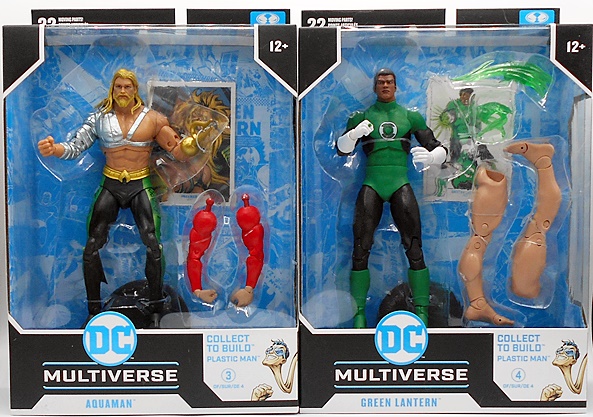
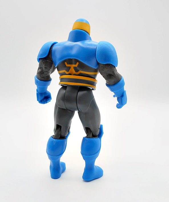
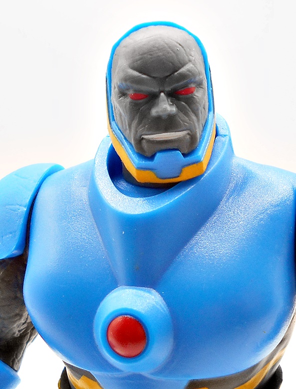
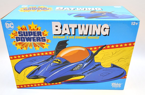
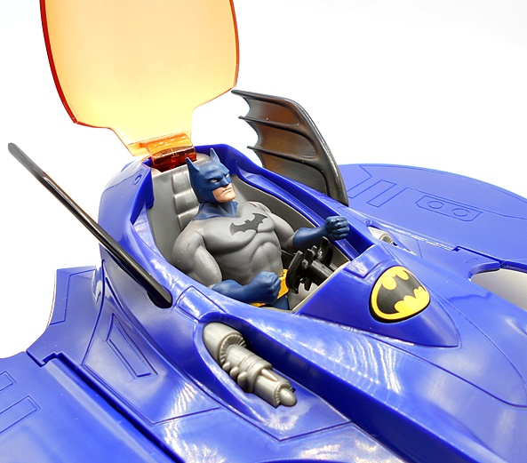
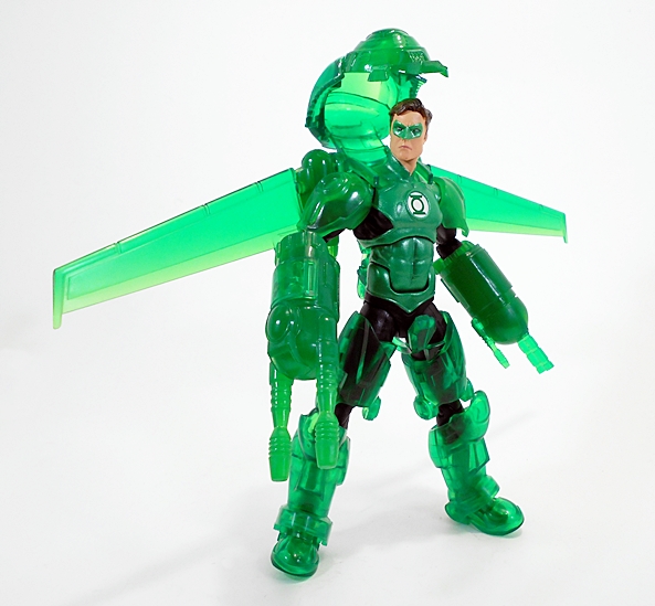
It’s been more than a few months since I checked in on McFarlane’s Super Powers line, but I have still been collecting them! The truth is, I don’t usually review the individual figures unless I have a vehicle to bring along. As much as I love these guys, there’s only so much I can say about and do with 5-POA figures. But, seeing as how McFarlane dropped a bunch of Green Lanterns on us in the last few waves, I thought I’d just check them all out at once. Especially since I’ve been looking for an excuse to sit down and open them all! Not to mention McFarlane’s weird crowdfunding project for some new Super Powers vehicles and figures just ended and thanks to some shenanigans, we’ll actually be getting those!

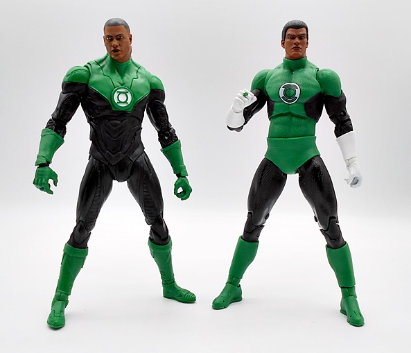
The packaging for this line is so damn fine it really makes me sad to open them. And believe me it takes every scrap of my admittedly poor willpower to keep from buying doubles of every figure. And yeah, I do have a couple of extras from the first wave that I kept carded just to have an example of the packaging for display. The original Super Powers package design gives me about as much a nostalgic dopamine hit as the vintage packages for Star Wars, G.I. JOE and Transformers, and that’s saying a lot. That blinding blue and yellow deco with the red trim, the logo nestled in an exploding field of stars, it created a hypnotic state of excitement that triggered kids to beg their parents for them. McFarlane has done a beautiful job paying homage to it here without quite doing a straight up copy and the character art on each card looks fabulous. The assortment I’m looking at today includes Guy Gardner, Hal Jordan, Kilowog, and Sinestro. Hal was produced in the original Kenner line, but I don’t believe we ever got Gardner or Sinestro, and the line closed up shop just before Kilowog was introduced in the comics. And yeah, four figures is more than I usually tackle in one review, but I’ll be quick! Let’s start with Hal!

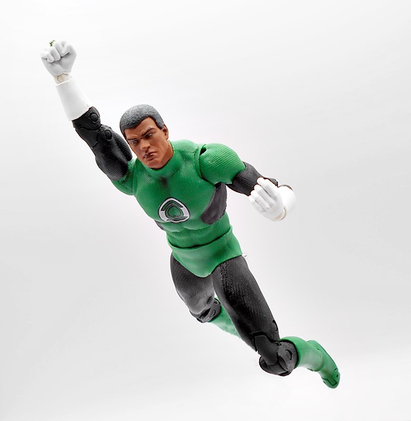
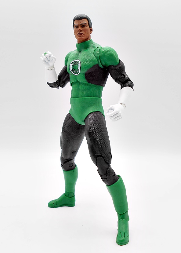
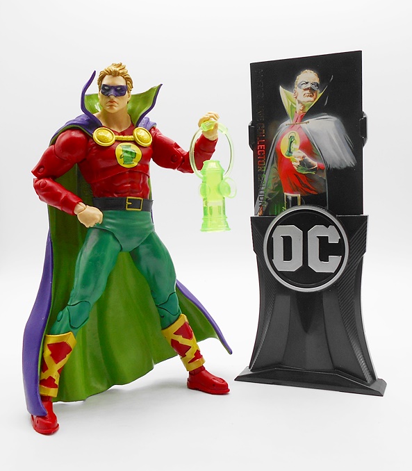
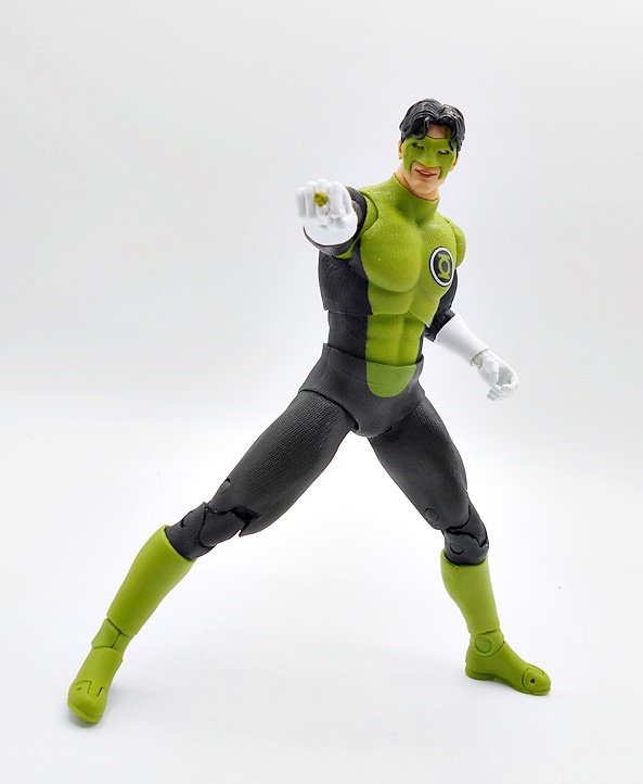
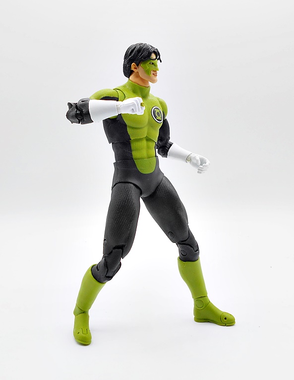
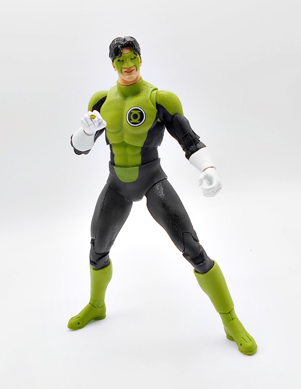
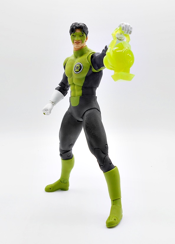
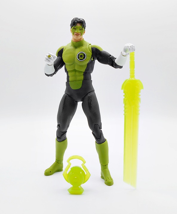
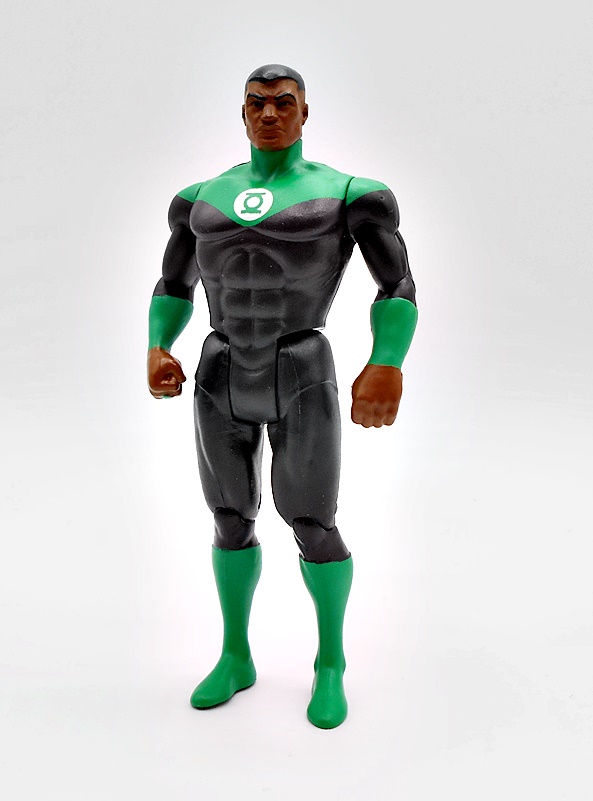
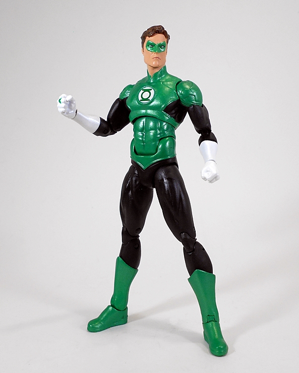
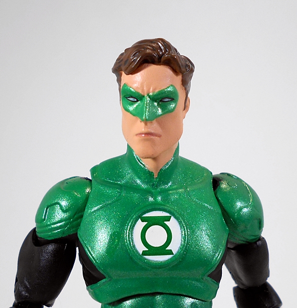
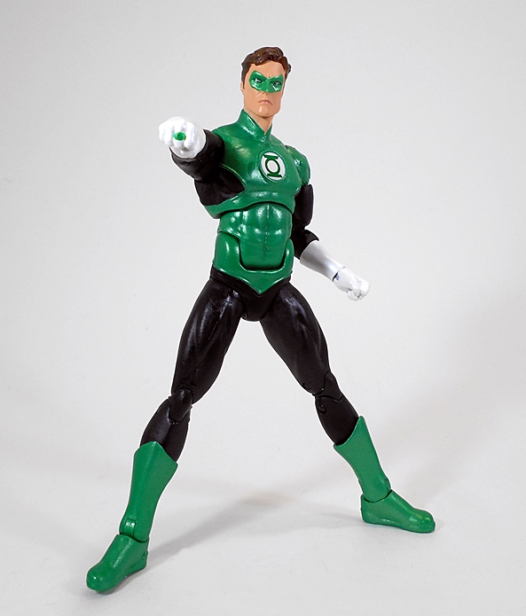
McFarlane’s Hal Jordan is not all that different from the original Kenner figure. It’s the same costume with just a bit of change to the shade of green. It hits all the same classic costume beats with the green top and undies, shoulders and boots. Add to that the black sleeves and leggings, white gloves, and crisp Lantern Corps emblem on his chest and you’ve got a pretty conservative update. I want to say the original had sculpted lines for the shoulders and edges at the top of the leggings, but this one just has paint lines. You do, however get some sculpted lines at the tops of the boots. There are definitely similarities with the head sculpt, but I think this one is much better. You also get a very prominently sculpted ring on his right hand.

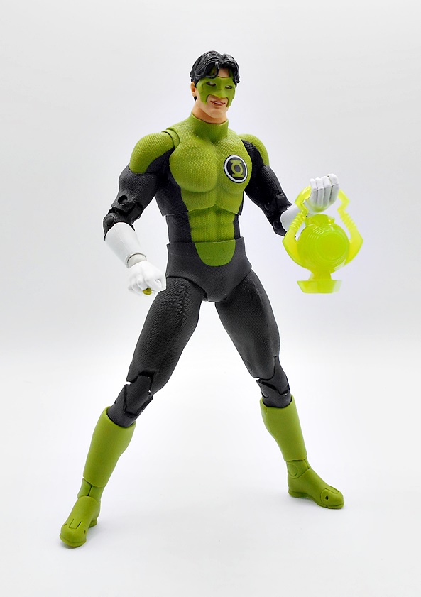
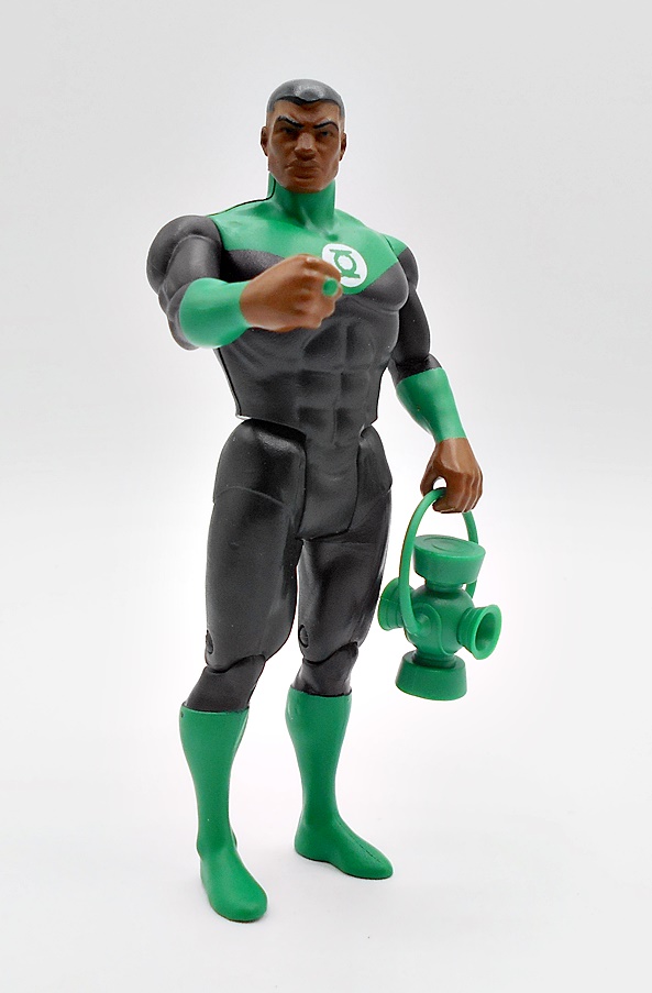
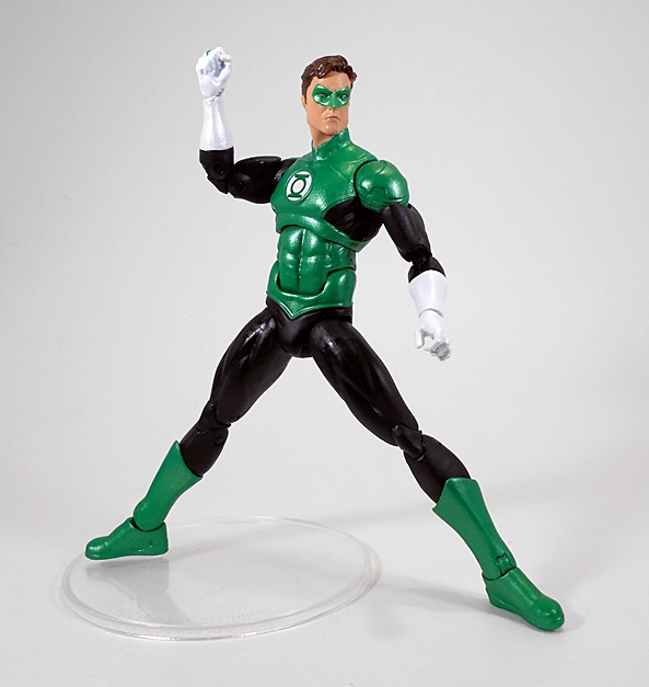
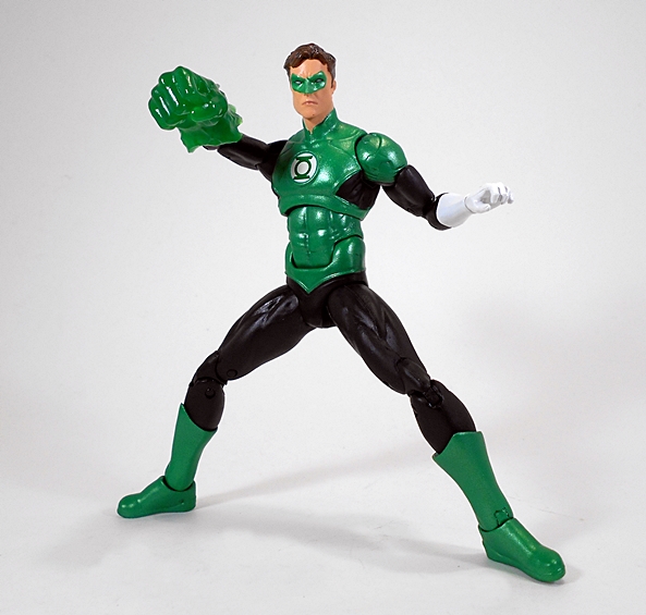
As we’ve seen before, this line keeps the articulation of the vintage figures, so you get the classic five-points, plus hinges in the knees. The original figures usually had an action gimmick, but that’s been nixed from this modern line, and I can’t say as I really miss it. Hal comes with a lantern battery, which he can hold in his left hand. This is such a fantastic homage to that original Kenner figure, it’s almost like having a minty fresh original.

Moving on to Guy Gardner, this is a character I would have loved to see in the Kenner line and I think McFarlane did a great job imagining what that figure might have been like. The black, green, and white deco matches Hal’s pretty closely, but you do get a fair bit of new sculpting here, including unique boots, the collar and lapels of his jacket, along with his belt and gauntlets. He even has sculpted detail on his turtleneck.

The head sculpt is a nice balance between retro and modern-retro. The sculpt is better than we would have seen back in the day, even nailing his bowl cut. But, the eye printing really evokes that old vintage Kenner charm. Like Hal, he has a ring sculpted and painted on his right hand, and his left hand is designed to hold an accessory, but no battery for him.

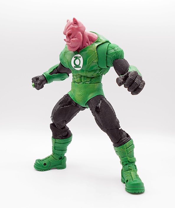
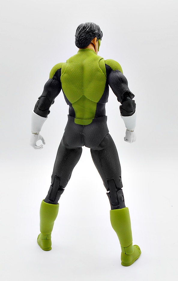
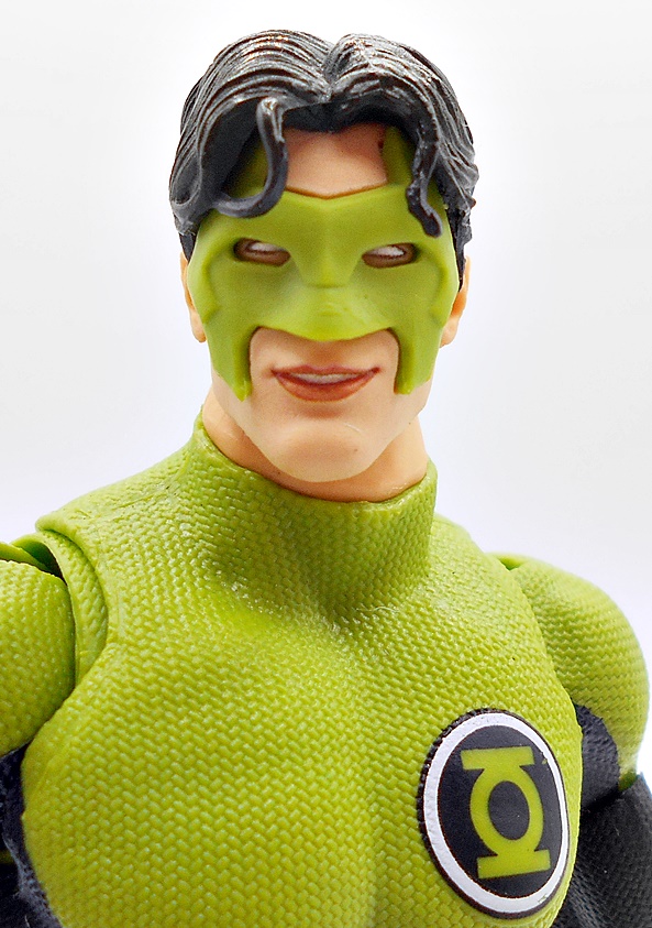
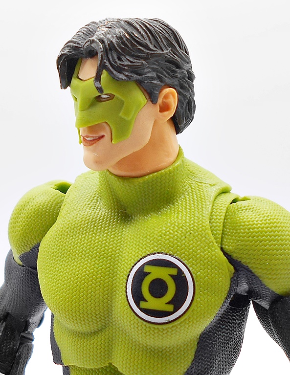
The last of this assortment of Green Lanterns is Kilowog and this may be my favorite of what is a really strong collection of figures. He’s a beautiful slab of retro-styled plastic with chiseled muscles giving him just an all around magnificent shelf presence. You get sculped edges on the boots, gloves, collar, and shoulders, with just paint lines at the tops of his black leggings. The head sculpt is fantastic, and if I were to nitpick anything here it’s that the portrait looks a little too good to be a genuine retro figure. And yeah, that’s more of a compliment than a gripe. The deep set eyes look superb! Kilowog doesn’t come with any accessories, both hands are balled into giant fists, and he does have his ring sculpted and painted on his right hand.

And finally, we get a lovely classic blue-suited Sinestro, and I’ll confess I was surprised to find, when I poked around in the old Kenner catalogs, that he didn’t get a release in the original line. Here we get sculpted boots, belt, bracers, and high collar, while the pattern on his chest is simply painted on. The black and blue looks great together and there’s some white trim along the top and bottom of the belt. His purple skin color is wonderfully vibrant and really makes the figure pop on the shelf.

Once again, the head sculpt here is probably a little too good to really evoke the vintage Kenner line. His pinched face is just perfect, as is his immaculate hair. But we do get the retro-style eyes which helps keep the Kenner spirit alive. His pointed ears look sharp and even the raised eyebrows are sculpted as well as painted. Sinestro dons a sculpted and painted yellow ring on his left hand and his right hand is sculpted to hold his yellow lantern battery.

This is a great assortment of figures and represents why I love this line so much! Add these to the excellent Jon Stewart that we got in the first wave and we’ve certainly had some love for the Green Lantern Corps! And as much as I dig having a minty Super Powers Hal Jordan, it’s the classic characters we haven’t seen before that really get me excited. I’m not sure I can pick a favorite here, but I’m actually leaning a bit toward Sinestro. McFarlane initially released him in his more modern yellow suit, which may have been an exclusive, because I didn’t see it anywhere until the scalpers got him. And all I can say is I’m so very happy that the classic blue suited release wasn’t the more limited release, because this one is perfect.

DC Multiverse (Plastic Man Wave): Aquaman & John Stewart Green Lantern by McFarlane

Talk about a fast turnaround! It feels like the Plastic Man Wave went from reveal to preorder to arriving pretty damn quick. I went with Amazon on this one and while they did wind up sending each figure individually, they all arrived within a week of each other no fuss, no muss. Which is more than I can say for the Superman and Krypto that I preordered the moment it dropped back in February. Every week I get another delay notice on that one, until it will likely eventually get cancelled. They even had the nerve to put up another preorder for him since then. What’s that? Oh yeah… The Plastic Man Wave is here! Let’s check it out.

I’ll do this wave in two parts and we’re starting with Aquaman and Green Lantern. The package is standard stuff, and as always I love these boxes with the blue backdrops behind the trays. The windows are large and show off the goods and you get some top and side window to let in more light. These packages are mostly collector friendly, but you know the drill, if you want the character card and stand, you gotta get to ripping! In addition to the Collect-To-Build parts, this wave is has been solicited as a 1990’s JLA themed assortment, which begs the question, why is John Stewart in there? Well, in fairness we did just get a Kyle Rayner with Kilowog, but that’s not really an answer. I guess the only answer is because… McFarlane! So, let’s start with John…

Both of today’s characters were last seen as different versions in the Endless Winter Wave. And while I have not yet reviewed either of those, I will include some comparison shots at the end. This release of Green Lantern features a pretty classic looking suit and I sure dig that. It is interesting seeing it with the modern texturing, but that’s also kind of cool. I also like that the boots and gloves are sculpted separately from the suit and these are not textured. The McFarlane diaper vibe is a bit strong here, and that’s not usually something that bothers me, but it’s just hitting me hard with this figure. Not ideal, but not enough to ruin the figure for me. Obviously, you get the power ring sculpted and painted on his right fist. His left hand can grip, but surprisingly there is no lantern battery for him to hold, which is kind of weird.

The head sculpt is exceptionally good. John has a strong jawline, a noble brow with a little furl to it, and a slightly concerned expression, as if he’s about to go into a serious fight. This is definitely one of McFarlane’s better portraits. The lantern symbol printed on his chest is a little odd. I’d love to know what the reference art for that was.

Articulation is standard McFarlane fare, and that’s mostly a good thing. I’ll always be salty about not having thigh swivels, but everything else is great. One of the great things about McFarlane is that I don’t think I ever had issues with any of their figures’ joints, and that’s something I can’t say about Hasbro. These guys handle great right out of the box and Stewart is fun to pose and play with.

You get two effect parts, and they’re strangely not constructs, but just energy effects. One fits over the fist and I like the way it looks a lot. The other is just a weird energy swoosh, that I think is meant to go on the bicep, but it really doesn’t fit well. I’m all but sure that at least that one is recycled from another figure and it doesn’t do much for me here. Both are cast in a nice translucent emerald green plastic.

This John Stewart is a decent figure, but if it weren’t for the Plastic Man parts, I probably would have waited until he hit discount. It’s just such a strange choice to take up one of the four slots in this assortment. Still, I like the suit design here better than what we got from Endless Winter, so he may wind up bumping that figure off my Green Lantern shelf, but I’m sure both will be represented somewhere. Let’s head under the sea and check out Aquaman.

There’s no doubt the 90’s gave Aquaman a badass makeover. I’ll confess the more classic look will always be my preferred design for the character, but that’s because it’s the one I grew up with. But nothing escaped the 90’s without being EXTREME, so Arthur grew a beard, donned some half-armor, and got his hand gnawed off by insane piranhas so he could replace it with a goddamned hook. And I’ll say that McFarlane’s figure does this version proud. Things are pretty classic from the waist down with the black and metallic green leggings and gold belt. There are some crisp scale patterns printed on the sides of the legs, and fins jutting out the back of his calves. And from the waist up we go all extreme with three quarters showing skin and the shoulder and sleeve of silver armor on the right side. The straps over and under the left shoulder are part of the body sculpt. I think these would have looked better painted brown or black for a little variety, otherwise it all looks good. There’s some great muscle definition sculpted into his abs, cut segments in the armor sleeve, and various dings and pitting sculpted into the armor itself.

As for the head sculpt, well we’re two for two in this review, because Arthur’s is another absolute banger of a portrait. The beard is sculpted and painted so well and they’ve even allowed for his hair to float a bit above the shoulders to allow for neck articulation. Normally, this might look a bit weird, but I can write it off to those strands just floating while he’s under water. This may be my favorite Aquaman portrait of any figure in my collection right now.

Aquaman is the only figure in this assortment that doesn’t come with any accessories or effect parts, but he does have his harpoon hand, so that’s pretty cool. This is also the only point of difference when it comes to the figure’s articulation, since there’s no wrist on that arm. The elbow is the usual double hinge and you get the bicep swivel, but you also get an added swivel where the harpoon socket meets the arm.

These are both solid figures, but Aquaman takes the prize as my favorite out of this pair. I honestly didn’t think I needed to pick up any more Aquaman figures since the Endless Winter version is such a solid and iconic look, but this version has grown on me a lot over the years, so having both represented on the shelves ain’t a bad thing. Indeed, even if the Plastic Man parts weren’t included, I probably would have preordered this figure. He looked amazing in the solicitation shots, and the actual figure absolutely delivers.

And with a set of arms and legs, that gets us halfway to building Plastic Man! Overall, I’m very pleased with both of these figures, and I’ll come back to this wave at the end of the week to check out Superman, Batman, and put together Plastic Man. Sure, John Stewart is the odd man out here, but he’s still a welcome addition to my Multiverse shelf, and I can’t recommend Aquaman enough, especially if you grew up with this version. These guys retail at the regular $24.99 and for the moment they seem to still be widely available at most McFarlane online retailers. They each also have Platinum chase variants, but I’m not getting into all that, but I will be bitching about it in the next review!

DC Multiverse (Gold Label): Kilowog and Kyle Rayner by McFarlane

I should have a lot of DC Multiverse figure reviews popping up, as I’ve been spending a lot of time opening my backlog and getting them up on the display shelves. A lot of these will be older figures, but I’m not against pushing some newer releases to the head of the line. Like today’s Green Lantern Corps set featuring a Mega Figure of Kilowog and another release of Kyle Rayner Green Lantern!

This box is bigger than your average DC Multiverse two-pack, enlarged to contain a whole Kilo of ‘Wog plus the regular sized figure and a fair number of accessories. It’s a Gold Label release, meaning that it is a retailer exclusive, and in this case that retailer is Amazon. I do enjoy Amazon exclusives, because they tend to be easy to get and actually ship on time, whereas I have almost no chance of even ordering most Walmart Exclusives and as for Target, they just issue about twenty “Approve Delay” emails before cancelling it anyway. The last Kilowog figure I had was Mattles Collect-and-Connect version from DC Universe Classics, so I am very excited to get an updated release! And sure, Kyle Rayner too? Why not. Let’s start with him.

Of course, we already got a Kyle Rayner Green Lantern in DC Multiverse not too long ago, but this time we’re getting him in his debut costume. And while I’ll be the first to admit that this design never really struck a chord in me as a Green Lantern uniform, I do like to get characters in their first appearance costumes so I am pretty happy to get this release. There’s a fair amount of reuse from that previous figure giving him the same textured body suit, albeit repainted in black and white with a Lantern Corps emblem on the left side of his chest. The boots and gauntlets are new, with a smooth and organic armored design and provide the bulk of the green in this costume’s color palette. And I do indeed like the emerald green used on this costume a lot more than the pea soup green used on the last release.

The head sculpt is borrowed directly from the last figure, which is good and bad. It’s good because I actually like this portrait a lot. The strands of hair are a bit chunky, but I like his cheesy grin and the fact that the mask is sculpted separately from the face. Also, you get more of that emerald green for the mask. The bad is, well it’s a Gold Label figure with a lot of reuse in the body so, I dunno, maybe you could have splurged for a new head, Todd. Eh, it’s fine.

And speaking of reuse, you get two recycled accessories as well. Both the large sword and the lantern are lifted straight from the Atrocitus Wave Rayner. But they are both cast in translucent emerald green plastic and once again, these look better than the clear pea soup plastic. Kyle also comes with an extra right hand designed to grip so he can wield the large blade construct with both hands. I’m a little less salty about these recycled accessories, because you also get two new ones…

The Samurai-style armor and sword constructs are pretty damn cool. The armor simply slips over the head and rests on the shoulders. And despite being a translucent plastic piece, it has a lot of nice detail in the sculpt. The sword is a lot more sensibly sized and goes really well with the armor. I’ll admit getting a first appearance Rayner makes me willing to overlook the reuse here to a degree, but if only there were an absolutely bitchin Kilowog figure included in this set to smooth things out…

And there is! Kilowog is an appropriately big bruiser with some intricate texturing all over his uniform. He’s got a nearly even mix of green and black deco, with the black found on his arms, legs, and hands. He’s got chonky boots, armored bracers on his forearms, and his Lantern chest emblem is green against a white background. Naturally, he also has his ring sculpted onto the finger of his right fist. The proportions here are really nice and he looks like an absolute powerhouse. This is a big departure from the super smooth costume on my DC Universe Classics Kilowog, making for a truly modern looking update.

The head sculpt is really nice with a complexion that reminds me of pink silly putty. His eyes are set very deep, nestled under a severe brow ridge. His downturned mouth is parted just a bit to flash a few teeth and I can’t overstate how cool and casual the depth to that mouth looks. There’s also plenty of creases and lines in his alien flesh, and the only thing I can pick at here is that a little bit of added paint wash would have made the sculpt look even better.

The normal Mega Figure articulation applies here, which is to say, it’s very good, albeit with the expected abbreviated range in those elbows. Still, he sports double hinges in the knees, a wide range of motion up in those hips and shoulders, and he even has the toe hinges. Kilowog has an excellent balance and he is lots of fun to pose around and play with. He also feels heftier than Mongul, the most recent Mega Figure I checked out.

Naturally, Kilowog includes his lantern battery and it is pretty big! The accessory is cast in the same translucent green color as Kyle’s and it looks great in hand or displayed beside the figure.

And you also get a hammer construct, which looks like a medieval meat tenderizes. There’s some sharp detail in the sculpt, despite the translucent plastic and I love the studded surface of the heads. It’s not overly huge, but big enough that it fits the figure pretty well.

Man, I really do dig this set a lot. I think a good percentage of collectors would have rather seen Kilowog released as a stand alone Mega Figure, and I can certainly understand that. But I’m fine with the two-pack since it got me the first appearance Kyle Rayner costume, which I would have picked up as a single release anyway. And like it or not, that’s the way the game is played. Companies squeeze more money out of existing tooling in order to bankroll new figures. The MSRP here is $69.00, which breaks down to about $50 for Kilowog and $20 for Rayner and that’s about right for McFarlane’s pricing. Granted, there’s no diorama-style figure stand here like we often get in these two-packs, but I don’t tend to use those anyway. Maybe tossing in a couple of card holders would have been a nice idea, but again… not something I tend to use so I don’t miss them.

DC Multiverse (Collector Edition) Alan Scott Green Lantern by McFarlane

Just last year, McFarlane unleashed the new Collector Edition figures onto the market with a hefty $10 price jump over the regular DC Multiverse releases. I was all ready to make my first foray into these pricier figures to see if they seem worth it when McFarlane goes and drops an online store exclusive Infinite Crisis wave for $40 a pop, and I was like holy heck, what are they smoking over there? I mean, I’ll admit that I’m the king of dropping too much money on toys, and even I am not tempted by these kinds of figures at that price. Were they hoping to make these Collector Edition releases seem cheap by comparison? I honestly don’t know, but I’m really interested to see what the collector backlash is going to be like. But for now, let’s get back to the Collector Editions… These seem to be based on more classic or essential versions of characters in the DC Multiverse for an added premium. I was skeptical about how this whole thing was was going to turn out, but decided to give it a try with the first character that really tempted me… Alan Scott! Growing up on Hal Jordan, I can still remember when my uncle blew my little mind by telling me there was another Green Lantern before him and giving me some of his ratty old comics and I devoured the hell out of them. In retrospect, that was probably one of my first realizations that a whole DC Universe had existed for decades before I discovered it. What can I say? I was still really young and dumb and relatively new to reading comics that weren’t Spider-Man or The Fantastic Four.

The packaging is similar to the regular DC Multiverse releases, what with the black box and blue insert behind the tray. “McFarlane Collector Edition” is printed in silver foil lettering up the left side of the front panel and the collector card is now displayed on the tray in its own display stand. On first inspection, that card display is the only thing that really seems to call out that this release is anything special that should make it pricier, and I’ll talk about at the end.

Out of the box, is there anything that really sets this figure apart from the regular releases? Nope. You get the same basic body type and articulation that we’ve been seeing all along. Now, that’s not to say this isn’t a very nice figure, because it certainly is! Apart from the boots, belt, and cape, the figure uses a generic body, but you do get his ring sculpted on his right hand. The colors are beautiful with a deep red for the top and boots, a hunter green used for the pants, and some gold paint for the trim on the boots, belt buckle, and cape clasps. The lantern emblem on his chest is just printed on, but it’s nice and sharp. Factor in the purple and lighter green on the cape, and you have a dazzling deco straight from the comic panels of the Golden Age.

The portrait is very solid, giving Scott some well defined facial features and a rather determined expression. I love the way the high collar on the cape frames his face with one corner licking over a bit more than the other. The mask is sculpted with lots of depth, and the hair is separate from the head giving him a clean hairline. There’s a bit of overspray of the mask’s purple paint onto my figure’s left eye, which is ironically a bigger paint gaff than I’ve had on any of the regular releases. It’s not terribly noticeable unless I punch in close, but still pretty unwelcome for a higher priced Collector figure.

Alan comes with two accessories: His lantern and a power effect part. The lantern can be held in his left hand, while the effect part fits over his right fist. There are no additional hands included, which seems a bit weak for a pricier collector figure. With that having been said, the accessories are quite nice and are cast in a bright neon green semi-translucent plastic.

And then you have the collector card with the stand and as I said earlier, this is the only thing about this whole package that feels really different than a regular Multiverse release. Was anyone asking for this sort of thing? I certainly wasn’t. My cards go into sleeves in a binder and get forgotten about. And quite frankly I’m betting that a lot of these cards just get thrown away with the packaging by figure collectors who just don’t care about them. The cards are cool bonuses, but putting them on a stand takes up about as much shelf real estate as another figure, and like a lot of collectors, I can’t spare that room. Now, I will say that I think Alan Scott is one of the nicer DC Multiverse figures I’ve picked up last year, but there is simply nothing about the figure itself, be it additional paint apps or sculpting, that would justify being sold at a premium. And since I tend to pick up a lot of my regular Multiverse figures on sale, I’m not willing to put up $30 a pop for these unless it’s a figure that I really can’t live without. My biggest concern is that Todd will be using these premium editions for the classic and iconic versions of legacy characters that a lot of collectors have been asking for from this line, when they really should be done as regular releases. I have no doubt you’ll see a few of these Collector Editions land on FFZ in the future, but they will probably be few and far between. And you sure as hell won’t be seeing any figures from that $40 each wave until they hit deep discount bundles on Todd’s site.

DC Multiverse (Atrocitus Wave) Kyle Rayner and Deathstorm by McFarlane

I’m going to try to make McFarlane a semi-regular weekly thing going forward, because I’ve barely scratched the surface of showcasing those figures here. So, let’s get things started with a look at one of the Collect-To-Build waves. McFarlane has streamlined this process a lot when compared to Marvel Legends or the old DC Universe Classics line, by requiring the purchase of only four figures to complete a CTB figure. I like that because it not only means less money, but it lowers the chances of having to buy a figure I don’t want in order to get all the CTB parts in a wave. Well, at least statistically. Today I’m going after the Blackest Night themed wave with the parts needed to build Atrocitus, and I’m starting with Kyle Rayner and Deathstorm.

The packaging is a little wider than normal in order to accommodate the extra figure parts, but otherwise it’s the same old DC Multiverse window boxes. These display the figures and extra parts beautifully and would be collector friendly if it weren’t for the figure stand and collector card being sealed against the cardboard backdrop. That used to bother me, but then I realized I didn’t have room for these big boxes so I have initiated the great purge to recycle them all. Kyle comes with Atrocitus’ torso and Deathstorm has his head and shoulder armor. Let’s start with Kyle!

I really like Kyle Rayner, but he’s still pretty far down there on my list of favorite Green Lanterns. Still, I was happy to be getting him on my DC Multiverse shelf and all in all I think this is a pretty solid figure. My first impressions left me not liking the shade of green they went with. It’s more of a lime-olive than the emerald I’m used to seeing on the Green Lantern Corps. It’s grown on me a bit since, I think it looks good, but it still doesn’t feel quite right. There isn’t a whole lot of sculpted detail on this costume apart from the basketball texturing, but you do get sculpted tops of the boots and gauntlets, and his ring is sculpted onto his right fist.

I like this portrait a lot, especially Rayner’s cheesy grin. The mask is sculpted separately from the face, which adds a lot of depth and makes it look like something the figure is actually wearing. The hair sculpt is also separate, allowing for some of the strands from his bangs to dangle over the mask. I dig it!

The figure sports the standard Multiverse articulation. The joints all feel great, but I’m always going to lament the absence of thigh swivels in these figures. There are no extra hands, and the figure comes with the right hand balled into a fist to show off his ring and the left hand sculpted to grip his accessories: The lantern and a sword power construct.

Both the lantern and the sword are cast in some extremely bright lime colored semi-translucent plastic, which makes for a nice glowy energy effect. I do like the sword a lot, but given Kyle’s abilities to come up with some extra creative constructs, it seems a little pedestrian, but that’s OK. Let’s move on to Deathstorm…

Oh wow, is this a departure from the bright and grinning visage of Kyle. Deathstorm has long been a favorite design of mine from the Brightest Day run and this figure does a great job bringing him off the page and into plastic! The costume is fairly simple with a mostly smooth body that gives way to sculpted corruption as it gets closer to the head. You get some sculpted arm bracers and sculpting for the boots. The silver bands that wrap around his thighs and come to a point below his chest are sculpted as well as painted, as is the chest emblem and the lines radiating from it. The shoulder armor flares at the edges, giving him a really cool silhouette.

Oh and that head sculpt is really something special! The rictus grin and piercing eyes are so damn cool. The skull itself has some great sculpted detail brought out by a charcoal black wash, which compliments it beautifully. And the grayish-almost purple semi-translucent flame effect coming off the head just ties it all together so perfectly. Holy crap, this looks so damn good!

The articulation holds no surprises, and you get only the stock pair of hands. The left is sculpted in a sort of grasping motion, while the right is designed to hold his one accessory: His Lantern. The Lantern is simple enough, but it looks good with a matte silver finish.

Seeing as how much I loved collecting the various Lantern Corps in the DC Universe Classics line, I was mighty excited to get this assortment, and so far I think it’s off to a great start. I’m a bit at odds as to whether I like this Kyle better than the DCUC release. I think the detail and portrait are better here, but I like the coloring of the uniform on Mattel’s figure more. On the other hand, we never did get a Deathstorm out of the DCUC line, and even if we did, it’s hard to imagine this one wouldn’t totally trump it, because it is absolutely awesome. I’ll swing back on Friday for the second part of this wave, and we’ll check out the CTB Atrocitus as well!

DC Super Powers: Superman, Green Lantern, Batman, Darkseid and Batwing by McFarlane

New takes on retro action figures is a huge thing these days. I think a lot of the credit (or blame) on the resurgence of vintage and 5POA figures can go to Funko and Super7’s ReAction lines, but since then a lot of companies have jumped on board. And while McFarlane is already producing a dizzying array of regular DC figures in their Multiverse line, they’ve found the time to reintroduce the world to Kenner’s old DC Super Powers Collection. These aren’t exact reproductions of those figures, instead some are new versions of the characters done in the old style. And unfortunately, these are all Walmart Exclusives, so I was pretty surprised to find any of them at all, let alone the whole wave. Let’s start with the figures and then I’ll have a look at one of the vehicles!

The first wave consisted of three figures: Superman, Batman, and Darkseid, but since I managed to find Jon Stewart Green Lantern from the second wave, I’m throwing him in here as well. The second wave also included The Flash and Batman Who Laughs, and I’ll only be picking up the Flash out of those two. Obviously, the packaging is going for pure nostalgia with some pretty close approximations of the old Kenner card backs. They look great, but they are definitely not collector friendly. And I was tempted not to open these at all, but my willpower is shite, and I tore into all of them. The wave one figures were on clearance, so I may pick up a second Batman and Supes to keep carded, if there are still any left. We’ll start with The Man of Steel!

Superman is the only one of the bunch that’s pretty close to the original Kenner figure, at least in terms of costume design. He’s got his bright blue suit with red boots and undies, yellow belt, and S-shield. I dig the proportions on this figure, and the sculpted muscles look really nice. The coloring is also outstanding with bright yellow, vibrant blue, and crisp red, he looks like he flew right off the pages of a DC funnybook. The head sculpt is a tad soft in the facial features, but they really captured his trademark cowlick, and I like the bright blue eyes.

The cape is like a cross between paper and cloth. It’s stiff, but looks good, and has a wire running through the collar, which is the only way it attaches to the figure. It hangs on well, and my only gripe here is that the cape was secured to the bubble with a wire, which left a tiny hole in the cape. This won’t be an issue for mint-on-card collectors, but it bugs the hell out of me. As with all the figures in this line, Superman has seven points of articulation. The head turns, the shoulders rotate, the T-crotch allows the legs to move forward at the hips, and the knees are hinged. The figures do not retain the Kenner action gimmick that made them punch when you squeezed their legs.

Unlike Supes, Batman is a completely different version than the original Kenner figure. I think this design is based on the Hush comic, which admittedly isn’t a huge departure. Instead of having the yellow and black bat symbol on his chest, he just has the black. It’s disappointing to me, but not a deal breaker. Otherwise, the figure looks fine with a mix of new sculpting and recycled parts. The cape works the same as Superman’s and yes it still has a tiny hole in it from the wire. Batman is by no means a bad figure, but he’s definitely my least favorite of the four.

Darkseid is also pretty different from the original Kenner figure, with this being the New 52 version, which is nice nod for me because I happen to like this look a lot. Darkseid is the biggest and most complex figure here with a lot of great sculpting for a figure in this scale. The armor bits give him a lot of heft, and I love the detail to his belt. You even get a little sculpted fissures in the skin on his arms and his face. Even the coloring here is fun and vibrant with the bright blue and yellow contrasting nicely with the dark skin. Darkseid has one hand sculpted into a fist and the other able to grab other figures. I love this guy!

Last, but not least is Jon Stewart, who did not get a release in the original Super Powers, as Kenner only produced Hal Jordan as Green Lantern. And oh boy, is this figure outstanding! The costume is pretty simple with a mostly black bodysuit and green boots, bracers, and shoulders, with the lantern emblem on his chest in green and white. The head sculpt is an absolute homerun here! The facial sculpt is so good that it doesn’t feel like it belongs in the same line as Batman and Superman. Jon’s right hand is sculpted in a fist and has his power ring clearly represented, while his left hand is designed to hold his lantern accessory. Wow, what a great figure!

There’s a part of me that would have liked to see McFarlane do the Kenner versions of these figures, but then New 52 Darkseid and Jon Stewart Green Lantern are so great, I’ll happily stick with what we got. Despite being cherry-picked from across the DC Multiverse, these figures still manage to capture the charm and fun of the original Kenner efforts. What’s more, they certainly don’t feel like quick and dirty nostalgia cash grabs, but rather damn fine figures for their scale and style. Even more so at less than $10 a pop. But we’re not done yet… let’s move on to the Batwing!

Kenner Super Powers gave us the Batmobile and the Batcopter, but this Batwing is an original design for this line, borrowing heavily from the 1989 Batman film and retro-fitting it perfectly for the vintage Kenner style. The jet comes in a fully enclosed box that mimics the vintage vehicles for more of that sweet, sweet nostalgia. You get artwork on the front and some shots of the Batwing on the other panels.

The Batwing comes out of the box fully assembled, but with the wings folded up. I’m not sure if this is supposed to be a play feature, or just a method of getting a big toy into a small box. Either way, I dig it, as it’s similar to how some vintage aircraft would fold up the wings for storage on carriers. I’d like to think that this is how the Batwing travels up an elevator to be deployed out of a concealed hanger on the top of the Batcave.

With the wings folded down, we can get a better look at the jet, and it’s a damn cool little vehicle. Again, the similarities to the 89 Batman jet can’t be overstated. This one is a little smaller and cast mostly in blue plastic with black bat wings jutting up from each side of the translucent orange cockpit. There’s a little bit of panel lining, and two gray machine guns, at least that’s what I’m calling them, and finally a very classic black and yellow bat symbol, which doubles as a button to spring open the canopy. The back has a gray thruster cone, and there’s a trigger on the undercarriage to activate the capture claw hidden on the front. I really love the design of this little toy, especially how anachronistic it is. The way it takes a newer design and makes it feel totally at home in this retro line is just genius.

Batman is a bit of a snug fit in the cockpit, but it works! I prefer to remove his cape, just so it doesn’t get all bunched up in there. The cockpit is detailed with some very colorful pre-applied stickers for the consoles, and a bat-shaped yoke for steering.

The capture claw feels right at home as a Super Powers action gimmick, while also employing a feature seen on the 89 Batwing. I can practically see a kid in a vintage commercial swooping in for the grab while shouting, “YOU’RE FINISHED, DARKSEID!” Every bit of this toy just oozes 80’s Kenner charm!

Now, I will confess to some Batwing sticker shock, as for some reason I was convinced that these vehicles were $20, but in fact they were $29.99 at my Walmart. I’m not going to say it’s totally outrageous, but it is a lot for what is a pretty small and simple vehicle. But, obviously it wasn’t too much, because I came home with it. Still, I wish it had been on clearance like the figures! Nonetheless, I have no regrets. This line is just tons of fun and looks great on display in a little corner of my Comic Room. I’m not sure how deep I’m going to go with collecting it, but I am hunting Flash and Wonder Woman now, and I will probably break down and pick up the Superman vehicle as well. It would be great to see Kalibak and Steppenwolf, as those were some of my favorites in the Kenner line, but even if we do get them, who knows what versions they will be. And that’s really just my one nitpick here is that I would have enjoyed more of a cohesive selection of character versions.

Blackest Night (Series 2): Indigo by DC Direct

It’s another DC Friday and today I’m digging all the way back to DC Direct’s Blackest Night series with a look at Indigo. I bought this one a few months back when I was re-reading the collected trades of Green Lantern to get all caught up for ReBirth and realized that Inroque was a character that I didn’t have in my collection. Like a lot of Lanterns, she didn’t get a DC Universe Classics release and so I had to make do with DC Direct. These DC Direct figures tend to be hit or miss for me, so let’s see what we’ve got…

dcdind1

Ahh, the bad old days of the sealed clamshell. They’re OK if you want to cover your walls in MOC figures, but they don’t do me any favors. In this case, the packaging is also pretty wasteful, but I think they did that to accommodate some of the larger characters. Anyway, it’s attractive enough and shows the other figures on the back of the insert. Using a sticker on the outside of the bubble wasn’t a great call, as it tends to peel at the edges. Try to drum up a little empathy for me as I go find my razor and hack my way into this package.

dcdind2

Generally speaking, I felt the sculpts were the high points of most of the later DC Direct figures and Indigo here reflects that. This figure captures her unnaturally lithe alien form quite nicely. Every part of her costume is part of the sculpt, from her soft plastic loin cloth to her short top. The arm wrappings even have some loose strands coming off to make them a little more convincing. It’s all very nice and very faithful to the character.

dcdind3

If there’s one place that DC Direct has often let me down, it’s the paint, but that’s not really the case with Indigo. The whites and flesh tones, which have a habit of looking dirty and rubbed actually look quite good here. Her skin looks nice and even and the white paint used on the wrappings is clean and evenly applied. The metallic blue and silver used for her outfit makes for a striking contrast against the matte of her skin. Lastly, her blue tattoos are crisp and straight. I really don’t have a lot of complaints here.

dcdind6

dcdind5

dcdind4

And yes, I’m even very fond of the portrait. The alien shape of the face looks spot on, and I dig the way they did her tendril-like hair cascading neatly down the back and spilling onto her shoulders. Her narrow black eyes look characteristically creepy under those sweeping eyebrows, the little touch of makeup over the eyes is a great touch, and the small pursed mouth is perfect.

dcdind10

Articulation has never been DC Direct’s strong point and so I don’t expect much in that area. What we get here includes ball joints in the shoulders and neck, hinges in the knees and ankles, and a “V” crotch in the hips, which allows for limited forward movement, but a fair deal of backward movement. At this late point in DC Direct’s game, I can’t imagine anyone was buying these figures and expecting a great deal of pose-ability. You can do some different things with her arms, but the legs are pretty limited.

dcdind11

dcdind9

Indigo comes with two accessories: Her staff and a figure stand. The staff is nicely done and includes a transparent blue crystal in the head. She can hold it very firmly in her left hand.

dcdind14

dcdind13

The stand is a blue transparent disk with the Indigo Tribe emblem outlined in white. And that brings me to one weird thing about Indigo and that’s the fact that her left leg is so notably shorter than her right. You may have noticed that all my pictures have her standing with one leg in front of the other. That’s because if I peg her into the base with her feet together, her left foot just levitates above the stand. I’m not sure if that’s just an issue with my figure or all of them, but it’s an odd oversight.

dcdind15

dcdind16

dcdind17

DC Direct’s Indigo turned out to be a pleasant surprise. And that’s a good thing because the character hasn’t been made available in any of the other DC lines. While these are generally not intended to scale with Mattel’s DC Universe Classics figures, I find that the alien Lanterns will display well enough with the DCUC figures. I was able to pick her up for $20 shipped, which was about what the original MSRP would have been. The Blackest Night series tends to be all over the place, with some selling well below the original retail, and others quite a lot more, so I’ll consider myself lucky.

DC Icons: (#09) Green Lantern (Hal Jordan) by DC Collectibles

Today’s Feature is running a little late, because I just got back from seeing Captain America: Civil War. I want to talk about it, I want to review tons of Marvel figures and bask in all the Marvel greatness, but in a bitter turn of irony, it happens to be DC Friday. That means I’m going to do the right thing and open up another DC Icons figure, this time the Wave 2, Deluxe Green Lantern! Hey, Green Lantern had a movie, didn’t he? Oooooh. Riiiight…

dcihal3

While the style of packaging is the same as the previous Icons releases, Green Lantern is a Deluxe, which means he costs a little more and comes in bigger box with a bunch more stuff. The larger tray has the figure to the right and all his construct parts spread out beside him. It’s an impressive set that boasts 26 pieces. The side panel notes that this version of Hal comes from the Dark Days story arc, which I found very adequate, but not as good as as the preceding stint by Geof Johns. Anyway, considering the number of pieces here, I may actually hold on to this box just to have somewhere to keep all this stuff.

dcihal9

So, obviously Hal sports his New 52 design, which isn’t all that big a break from many of his previous looks. I dig it, but then I didn’t have much of a problem with any of the New 52 costumes. Just about every detail in the costume is actually part of the sculpt from the borders of his green “vest” to the tops of his boots and his Lantern Corps emblem is printed on the raised disk in his chest. And of course, his power ring is sculpted and painted on his finger.

dcihal10

The paint here is overall quite good, with the only exception being an extra dollop of green on his chest to the right of his emblem. I’m not sure if that was added to correct a flaw or just a drip, but it’s worth noting all the same, especially since the paint on this line has been more or less flawless so far. The metallic green looks great and contrasts nicely with the black matte and white gloves.

dcihal11

The portrait is sold enough and probably one of the better ones I’ve seen in this series. If you’ve been reading my Features on this line, you know I’m not overly enamored with the head sculpts. With that having been said, the hair looks good, I like the furled brow, and the mask is part of the sculpt as well as painted. Hal is wearing a rather determined face, which fits the book this figure is pulled from.

dcihal19

dcihal13

dcihal17

Articulation is right in line with what we’ve been seeing in this series. The arms are ball jointed at the shoulders and wrists. The elbows have double hinges, and there are swivels both in the biceps and in the forearms. The legs are ball jointed at the hips, have double hinged knees, and the ankles are hinged and feature lateral rockers. The torso sports a hinge, which is set down by the waist, and there’s a ball joint in the chest. Finally, the neck is ball jointed.

dcihal14

While the base figure is quite good, the real draw here comes from all those extra goodies in the box. For starters, Hal comes with two pairs of hands: One set of fists and one set of grabby hands. He also comes with his Green Lantern battery.

dcihal16

dcihal15

You get one stand-alone construct, which is a giant fist cast in beautiful translucent green plastic. This piece looks fantastic, but is a little problematic. It fits right over Hal’s right hand, but to accommodate his construct armor, his forearms can be un-pegged and the connection is a little weak. If you can’t see where this is going… putting the fist construct on all the way over the fist means that when you pull it off, the arm is going to un-peg and stay stuck in the fist. At this point, it’s frustrating to get it out, so I try not to put it all the way on.

dcihal1

dcihal4

dcihal5

And then you have the full set of construct armor and it is absolutely amazing. It’s all cast in the same translucent green plastic and features boots, upper leg pieces, the arm weapons, shoulder pieces, the torso and helmet harness, and a removable backpack with removable wings. The boots and legs come apart to fully enclose around the legs, the front of the torso is hinged to open, the jetpack is hinged, and the wings on the jetpack are ball jointed.

dcihal8

dcihal6

dcihal2

The fit of the pieces are designed so as not to interfere with the articulation, and that’s quite a clever feat of design. The only thing that’s really lost are the ankle rockers. It’s also impressive how most everything more or less stays put when he’s wearing it. Sometimes I have to re-position the torso piece and sometimes the shoulders will pop off, but otherwise, it fits and stays on really well. The translucent plastic with the figure visible inside creates a beautiful effect and is pretty damn convincing as a ring construct.

dcihal18

dcihal12

dcihal20

Hal is the first Deluxe in the line and as such, he set me back an extra ten bucks, which isn’t a bad deal considering how much is in the box. In fact, I think it’s safe to say that this is my favorite Hal Jordan figure in my collection, and that’s saying something because he’s represented in a fair number of different lines. As a normal release, Hal would have been a perfectly solid and worthwhile figure, but when DC Collectibles threw in that lovely set of armor, they really went above and beyond with this one. I’ve got only one more Icons figure to check out before I’m all up to date and waiting on Wave 3, so next Friday I’ll take a look at Black Adam!

DC Unlimited: Injustice Green Lantern by Mattel

It’s Friday, it’s been a long week and I have a long working weekend ahead of me. Next week is going to be something of a themed week so I was hoping to squeeze in MOTUC’s Battle Lion today and that didn’t happen. I haven’t even gotten around to opening him yet and I needed something quicker and easier for today so I could start drinking earlier than usual. Oh, hello Injustice Green Lantern! You’ve been sitting in the corner of the closet since before Christmas. Let’s open you up and check you out. This shouldn’t take long.

injgl1

Ah, it’s refreshing to see this packaging again! I really do miss my 6-inch DC figure fix. Sure I’m planning on buying a lot of DC Collectibles figures this year, but on some level it just isn’t quite the same. As far as I’m concerned, the Unlimited off-shoot of DC Universe Classics had the best package design. That added panel of character art on the front really ties the whole thing together beautifully. I’ll note here that I still have not played Injustice, but I do have it and it is sitting on my rather copious pile of games. Maybe when I get tired of Dark Souls kicking my ass, I’ll finally unwrap it and pop it in. Anyway, I absolutely loved the Injustice Batman figure so I’ve got some high expectations for Green Lantern…

injgl2

injgl3

Oh… Ok. Obviously these figures are beholden to their character designs in the game and while Batman’s new digs were downright awesome, Green Lantern’s are a lot less exciting. No, scratch that. Injustice Green Lantern is just downright boring to me and that’s certainly going to color my reception of this figure. The redesign of his Lantern costume is kind of lazy. His shirt has been turned into a tunic with shoulder pads and side straps to hold it on, while the arms and legs are covered with exaggerated ribbed muscles. I just don’t find the redesign in any way creative or cool looking. Maybe the outfit doesn’t lend itself to the bad boy treatment as well as the others. Of course, even if you do like the design, this figure still isn’t all that great.

injgl8

The portrait, for example, is another big stumbling block for me. The face sculpt is very soft for a DCUC figure. None of the detailing in the nose or mouth is very well defined at all. The paint around the mask and hairline is also pretty sloppy for a 6-inch figure. But beyond that the entire portrait just doesn’t work for me. This doesn’t look like Hal Jordan, it looks like the guy with the receding hairline that comes up from IT to fix the copier.

injgl6

injgl4

Aside from some sloppiness on the head, the paint on the figure is pretty solid overall. I’ll definitely give props to the way they painted his tunic around the Lantern emblem. The way the green gets darker as it moves away from the emblem does create a cool effect that the Lantern is actually illuminated. You also get some sharp emblems on his arm bracers and the power ring is painted.

injgl5

injgl7

The articulation is in line with Injustice Batman, which means it’s missing some key points from the DCUC style. There’s no ab crunch, but more importantly there are no swivel cuts in the biceps. Those bicep swivels are pretty much non-negotiable for me and my 6-inch figures and it really pisses me off that Mattel nixed them from these figures. Hal comes off as feeling rather stiff and while you can certainly get him into some different poses, none of them are all that exciting.

injgl9

injgl10

injgl11

So, considering I only dropped about six bucks on this figure, I’m not too bummed out about it. He’s not terrible. Oh, we’ve seen some real shitty Green Lantern figures out of Mattel back when that movie was out and this figure doesn’t come close to being as bad as any of them. But it isn’t a figure that grabs me in any way. The real kicker is that Mattel only produced a handful of figures based on the Injustice video game and with all the cool character designs in that game, Green Lantern is one of the few they decided to produce. I would have much rather seen figures of Aquaman or Wonder Woman. But for figures of those characters, I’ll have to turn to those tiny DC Collectibles sets.

Blackest Night: Red Lantern Mera by DC Direct

I warned y’all that I was backfilling my DCUC shelves and would have a number of older DC figures to feature, but not all of them are going to actually be DCUC figures. I’m at the point where I’m willing to concede that it’ll be a while before Mattel gets around to doing certain characters (if ever) and so I’m willing to incorporate some more of the DC Direct figures onto my DCUC shelves. Today we’re looking at Red Lantern Mera from the Blackest Night, Series Seven. I’ll confess, I didn’t have a burning need to have her on my shelves, but I picked up my last bunch of comic TPBs from Amazon and I’ve been feeling a little guilty about not supporting the local comic shop. So, I took a trip the day before yesterday and picked up a couple of the DCD figures he’s had on the shelves for a long while. Today, we’ll check out Mera and tomorrow we’ll look at the other one.

dcdmera1

There’s the packaged shot… mine is pretty bent, but I care not! Soon, it will be ravaged by scissors! The package is the usual DCD affair with a sealed clamshell and a printed insert. The presentation is nice enough and the back panel shows the other figures in the series and little bio blurbs for all of them. Obviously, this isn’t collector friendly packaging, but it does give you a nice hit of plastic fumes when you open it.

dcmera3

dcmera4

Wow, she’s gorgeous. I mean, I’m no newcomer to DCD’s sculpts. I have a bunch of their figures, but still… Wow! Of course, I don’t mean gorgeous in the traditional sense. She’s got demon eyes and she’s clearly preparing to barf napalm right into my face, but this is really nice sculpting for a figure in this scale. Where to begin? Let’s start with the portrait: A masterful blend of beauty and evil. Beavil? Whatever you call it, I love what they did with her. Beside the great expression and free tickets to the boob show, the wild, blown hair looks fantastic and I really dig the way her briny shoulder armor frames her face. The tiara appears to be sculpted from a separate piece and sports a gorgeous metallic red paint job. Spendid!

dcmera7

Mera is clad in skintight red scale armor, with every tiny little scale lovingly recreated. It not only looks amazing, but it gives the figure a wonderful texture when you handle it. She has red withered fins on her calves and more briny armor bits protruding from her arms and her cuffs. The outfit is topped off with a Red Lantern disc attached just under her chest. It’s a simple enough costume design, but the sculpted scales and the gorgeous red metallic finish make it appear to be so much more.

dcmera6

Articulation? Uh oh… here’s where the barnacle crumbles. It’s DC Direct, so you know things are going to be limited. In this case, you get ball joints in the shoulders, swivels in the hips, and hinges in the knees and elbows. Is the neck ball jointed? It seems to be, but my figure’s head won’t move, and I’m not forcing it. It seems like there isn’t much room to move with the sculpted hair anyway.  Swivels in the biceps and/or wrists would have helped a lot, especially for posing her with her trident. And speaking of her trident…

dcmera5

dcmera6

Accessories! Mera comes with a cool assortment of goodies. The trident is a nice and simple piece, and she also comes with her Red Lantern battery. And Dex-Starr! She comes with the most hate-filled cat in the universe. He’s a completely static piece and smaller than the one that came in the Green Lantern Classics 3-pack and he’s sculpted specifically to be propped up against a figure’s leg. On the other hand, the sculpt is superb. From his crazy ass expression to the little pads on his feet, the guys at DCD went all out on him, and It’s much appreciated. Mera also comes with a Red Lantern disc stand.

dcmera2

dcmera8

Compromise! Why does everything have to be a compromise? If only we could get this level of sculpting and paintwork on a figure with the DCUC level of articulation, it would start raining puppies and lollipops, and all would be right with the world. Sadly, that’s not likely to happen. So, she may not be well articulated… Mera is still a fantastic display piece, and while she’s just a smidge too tall (she’s a wee bit taller than my Signature Series Atrocitus), she still makes a nice compliment to my Red Lantern ranks. Tomorrow we’ll check out a character that is long overdue for the Mattel lines…  Psycho Pirate!