Transformers Reveal The Shield: Wreck Gar by Hasbro

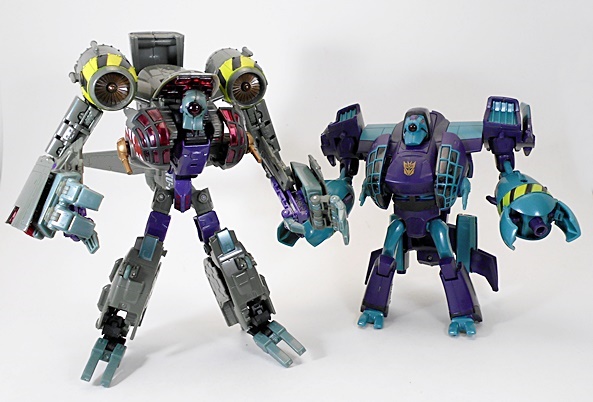
Holy crap, I hit the mother lode today at Ross. I went in looking for some goddamn pet food bowls and came out with a couple of bags full of Transformers that I had all but given up on ever getting. I’ve lamented enough here on FigureFan about how criminal the distribution on these Reveal The Shield figures was, but karma’s come round to help a brutha out as I was able to pick up almost all the remaining figures today at a nice deep discount off their regular MSRP, much less the scalper prices they sell for online. So we might as well go ahead and call it Reveal The Shield Weekend, because it’ll take me the next four days or so to check these guys out. Today, we’ll kick things off with everyone’s favorite Junkion: Wreck-Gar.

There’s the packaging for the RTS Deluxe Assortment, we last saw back when I looked at Perceptor. They had him too at Ross, and sure I could have made a couple of bucks turning him on Ebay, but I always do the right thing and I left him for another collector, even though chances are a scalper will get him. Anyway, the packaging isn’t all that different from the Hunt for the Decepticons, but it does point out the Rub Sign gimmick and gave us a little teaser into what the Generations packaging deco was going to be all about. The back has the pictures of the toy in both modes and a little bio blurb. Wreck-Gar comes packaged in his motorcycle mode, so we’ll start there.
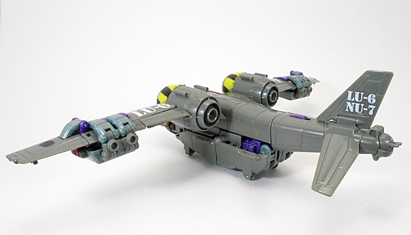
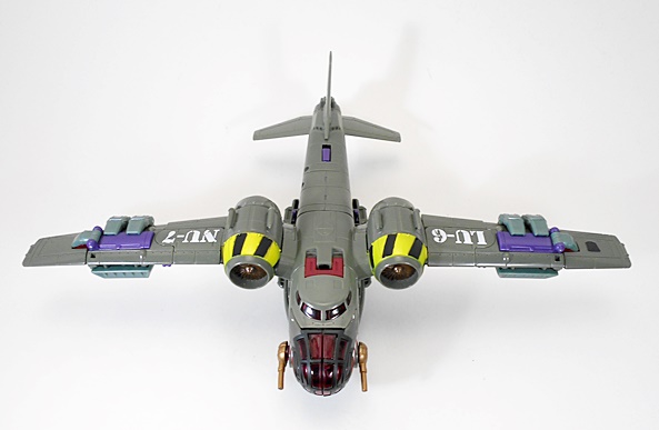
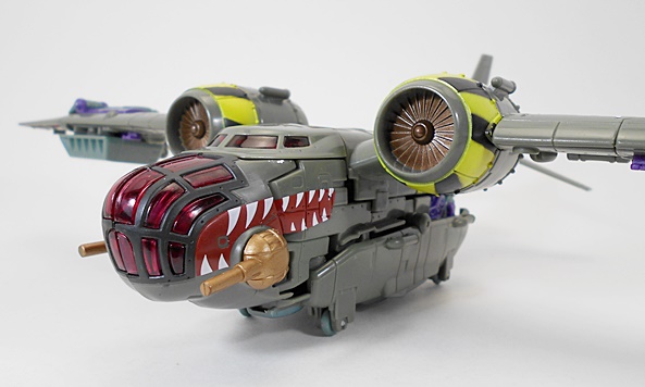
In the world of Transformers, motorcycles aren’t exactly the easiest concept to work with. Sure, there have been some decent ones, but a whole lot of really shitty motorcycle Transformers have popped up on the pegs over the years. Traditionally speaking you either have to make strong sacrifices to the bike mode or the robot mode. Wreck-Gar here makes mostly sacrifices the bike mode and I’m very glad for that. That’s not to say it’s terrible, but the proportioning on it seems a little out of whack. It’s pretty obvious that you’re looking at Wreck-Gar’s hands and pelvis right there in the middle of the bike. On the flipside, it’s a pretty solid motorcycle that stands well on it’s own thanks to a flip down kick stand. The coloring is definitely faithful to the G1 homage and the Rub Sign is right up front near the handle bars, but it feels like some of the grey could have used a little extra help with paint more paint apps. Even the license plate is left completely blank. Oh… and yes, if you have two Wreck-Gars, one can ride the other.
Transforming Wreck-Gar goes easier from bike to robot. Going the other way is mainly a matter of remembering to do some funky fiddling with his pelvic and hip joints in order to get everything to pack back in where it should be.
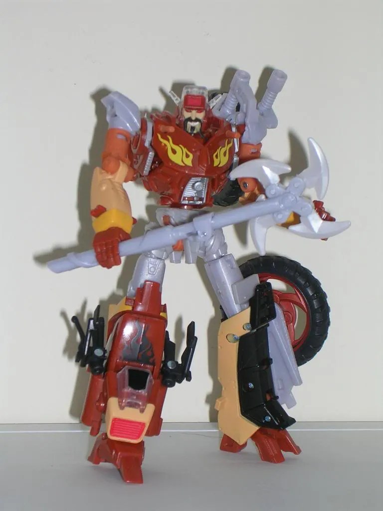
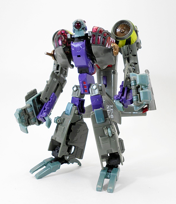
So, I wasn’t sure how I felt about Wreck Gar’s robot mode when I saw Hasbro’s initial photos. In hand, I’m a lot happier about the final product. Thrilled, even. I think my biggest issue was the way the design puts both wheels on his left side. I thought they would have balanced the figure out better if they were staggered left and right. I also thought the design should have allowed one of the wheels to detach and become a shield. Nonetheless, what we got is actually really cool, and the figure’s anti-symmetry really contributes to the idea that he’s made out of junk.
Everything else here is great stuff. The head sculpt is spot on stupendous. He looks absolutely demented. The head definitely strikes me as one of the better, if not the best, movie based homages Hasbro has done. I  really enjoy the way the flame decos appear on his chest as do the small guns pay homage to the nipple guns on the original G1 design. The mismatched legs again drive home his intentionally junky appearance, and while I was afraid his lower legs would be too bulky and ungainly, Wreck Gar’s overall proportions are actually pretty solid and he is wonderfully poseable. The battle axe is a real nice touch as well.
Ultimately, I think I was trying to convince myself to not like this figure a lot because I had missed out on it and wasn’t going to pay a premium for him online. In hand, I think he really is fantastic, even with the slightly dodgy motorcycle mode. The design is a perfect blending of old and new, and another great update to a G1 toy that always ranked rather high in my book. He’s absolutely worth picking up if you find him at one of the Toy Graveyards out there, and he’s probably even worth picking up at a bit of a premium. So, get him if you find him, and always remember, you can dare to be stupid.

Marvel Universe: The Fantastic Four by Hasbro

I really had to fight some inner collector rage to buy this set. I already own the single carded Ben Grimm and I have the Richard Reed from the Secret Wars pack, so really HERBIE and Sue Storm were the only characters here I didn’t already have in my collection. But the more I thought about it, the more I realized that this was the team in matching uniforms, plus the Richard Reed is a far better figure than the Secret Wars version. I was actually halfway out of TRU when I begrudgingly decided to admit that Hasbro had suckered me out of more money, and go back and pick this set up. In the end, it was probably always going to happen just because I love The Fantastic Four so much.

This is essentially the same assortment class of set as the other MU three-packs that have been on the market. Yeah, HERBIE makes four, and while I don’t want to discard him out of hand, he’s hardly enough to bump this set into a higher tax bracket. The packaging is very nice, with a good-sized window to show off the figures against an background of cosmic rays.
Since Sue is the brand new figure here, let’s look at her first. She’s a standard MU female buck with paintwork used to distinguish her uniform. The uniform looks… dare I say… fantastic. It’s the lighter shade of blue with some nice black piping and the crisp 4 on the front. I’m particularly happy with Sue’s head sculpt and am actually surprised to say its one of the best MU females out there.
Richard Reed is a massive improvement over the Secret Wars version, and I’m not just talking about personal preference in the uniform. He’s taller and his body has a slight elongated look that almost looks like its designed to hint at his rubbery powers. Best of all his head sculpt is completely new. I was never happy with the head sculpt Hasbro gave us for the Secret Wars version, but this one works fine for me. Granted most of the comic pack figures were made on the cheap compared to the single carded figures, but these two still really show how far this line has come since it began.
The Thing is a mix of old and new sculpting from the single carded figure that I already own. From the waist up, there are some subtle differences in the paint job, but the sculpt is otherwise the same. The big difference here is with the legs as this version of Grimm is just sporting a pair of shorts , whereas the single carded has pants and boots. I do prefer the version in this pack, but I am glad that the shade of blue used for the uniforms in this set allow for either of these Thing figures to be displayed.

I’m a little disappointed in the articulation featured here, or at least for the Sue Storm and Richard Reed figures. The Thing is fine and HERBIE has a ball jointed neck, which is honestly more than I expected. Now, certainly Sue and Richard have passable poseability for 3 3/4″ scale figures, but it isn’t up to snuff with the more recent releases in MU or GI JOE. Granted, this is a value pack, so I should probably reign in my expectations and temper my disappointment.
I’m sure a lot of Marvel Universe collectors are on the fence over this one. It’s a shame that we didn’t get the FF released like this in the first place. On the bright side, the set retails for only $20. That’s not a bad deal for three MU figures plus a little bonus. Keep in mind this set also exists as a variant of the team in their brand new, white, FF style outfits, and if I ever stumble upon that one, I guess I’ll be buying it again, especially since it looks like we’re going to be getting a single carded Spider-Man in his FF costume. Cool!

Star Wars: 30th Anniversary Collection: Darth Vader’s Sith Starfighter by Hasbro

Holy hell, folks, we’re actually going to talk some Star Wars this week. It doesn’t happen that often here on FigureFan. Why not? Well, I hit overload on Star Wars a few years back and stopped collecting it with any real gusto. I even wound up unloading about three-quarters of my ludicrously huge collection to make room and generate a little extra cash. Obviously, I still pick up a Star Wars figure or ship here and there when it strikes my fancy, but I sure don’t focus on it like I used to. Nonetheless, I was taking a pass through my toy closet this week, looking for things to feature here during this slow week, and I thought I’d give Star Wars some much needed love. Let’s start out with Darth Vader’s Jedi Starfighter.

The ship came out boxed as part of the 30th Anniversary Collection. The packaging is ok, but it followed after the Original Trilogy Collection, which featured some amazing vintage-style packages that I don’t think can ever be outdone. The deco here gets the job done, but I think the best thing about it is the amazing artwork of the ship on the front. Look familiar? Sure it does! This Sith Starfighter is just another in a looong line of repaints of this heavily reused Jedi Starfighter toy. I first bought this style of ship back when it was originally released as Obi Wan’s Starfighter in the Revenge of the Sith line. I didn’t have any desire to own the slew or other repaints until this one came out. It’s pretty much an Expanded Universe ship as Vader never actually piloted it in the movies, but it seems logical enough that he would have made use of this design in the years before the Tie Fighter came into service. Despite being named as Darth Vader’s personal fighter, I actually use this as a general Sith fighter and wound up giving it to my Galen Malek figure.
I absolutely love the design of this ship. It’s intended to be a transitional design between the Jedi Starfighters seen in Attack of the Clones and the Tie Fighters that would appear in A New Hope. I really dig the segmented front window on the cockpit that would become the iconic Tie Fighter windshield, as well as the way the wings deploy to hint at the solar panel wings of the subsequent Imperial fighter design. There are dual barreled wing-mounted cannons as well as a firing torpedo on each of the wings. Underneith you get retractable landing gear, which supports the ship nicely, but only when the wings are folded up. The ship supports an Astromech droid and actually comes with a convincing enough dummy droid head that can be removed to reveal a socket that holds an actual Astromech figure. I always thought that was a cool option. The cockpit flips open and is roomy enough to hold most figures, but as I mentioned above, mine is reserved for Galen Malek.
Beyond the design of the ship, what really grabbed me about this particular release was the fab repaint. The ship is two-tone black and gunmetal grey, which just looks badass on this design. What’s more there’s some brilliant weathering done on the wing symbols and along the paintwork on the front of the hull. Granted, I don’t buy a lot of Star Wars ships these days, but I’ll still say that Hasbro could benefit from checking out some of this work and implementing it on their newer releases. Naturally, you also get a sticker sheet, which is great for me because applying stickers is something I always love to do. It lets me bond with my new toy.
The Sith Starfighter set ran me $20 back in the day. I don’t think it’s been re-released, but it shouldn’t be too hard to find on Ebay. Nowadays vehicles in this size class go for between $25-30, so even if the price is inflated, you’ve got some wiggle room before you’re paying more than it would be on the shelf today. It’s a great looking piece and loads of fun to display and play with. If you want a great little starfighter with an amazingly cool deco, this is definitely a ship you want in your collection. And screw Vader, I’m sure you’ve got a couple of other Sith figures kicking around that would like a ride of their own.

Captain America: Battlefield Cap (Comic Series) by Hasbro

It pains me greatly that I never got around to seeing Captain America in the theaters. What can I say? I’m always drinking working so I just never got a chance and before I knew it, it was gone. But, hey, that’s what my BD Player and huge TV are for. Nonetheless, watching Thor again this week got me craving some new Marvel movie stuff and that included a bunch of Captain America figures. I was mainly going to cherry pick this line for characters other than Cap, but when I saw this version, I just couldn’t resist.

I’ll reiterate what I said about the packaging for the Thor figure review. The movie Marvel cards are pretty sweet and I like Captain America’s the best. You get an image of Cap up in the left corner and the Avengers Assemble icon over in the right. Cap is carded with both his weapons displayed and his shield beside him. The best thing I can say about any carded figure is that I was sorry to rip him open. I might actually pick up an extra of this guy to hang carded on my wall. He really does look that great in the package.
Battlefield Cap is out of the package and… damn. He’s an amazing sculpt. Sure, he’s basically a standard modern Hasbro 3 3/4″ body, but his entire suit is textured, and there’s a ton of little details like the treads on his boots and the flap and buttons on his tunic.  The pounches are sculpted and even the star on his chest is sculpted on rather than just a tampo or paint app. His web gear is a separate, removable piece, with a working holster, sculpted ammo pouches and canteen. Nice! The head sculpt is nice, with a grey mask/hood and his blue combat helmet is removable. This figure would be a Triple-A slam dunk, if it weren’t for how soft the plastic in his legs is. It’s not a dealbreaker for me, since everything else about Cap is amazing, but it is annoyingly soft.
The paintwork is just as good as the sculpt. He’s mostly blue with some red trim and green and brown on his boots and the red and white striping on his mid section. I’m most impressed by the fact that every single one of the little buttons and buckles on him is painted silver. There’s no slop or bleeding either. Nice!
Articulation is standard modern 3 3/4″ Hasbro with a few nice surprises. Cap’s neck is ball jointed. His arms are ball jointed in the shoulders, hinged at the elbows, there are swivels in the biceps, and even ball joints in the wrists. His legs have those annoyingly awkward ball joints in the hips, double hinged knees, swivels at the tops of his boots, and his ankles feature both regular hinges, and lateral rockers to keep his feet flat at wide stances. His torso features that standard Hasbro ab ball joint.
Cap’s accessories include an automatic pistol, a Thompson machine gun and his trusty shield. The shield clips onto his wrist, but also has a peg that allows him to store it onto his back. You can even tuck his Thompson into his web gear strap and store it on his back and the pistol fits into his holster.
In a line that is stuffed with predictably awful variations on poor Cap, this Battlefield version stands out as being an absolutely amazing figure. Seriously, stand him next to the likes of whatever Desert or Arctic flavor Cap figure from the line you want and tell me he really looks like he’s some kind of special exclusive stand alone release. Sculpt, paint, accessories, articulation: This figure hits all the points dead on and suffers only from some unfortunate use of soft plastic in the legs. I picked him up for just under eight bucks, and what a deal it was. He won’t satisfy anyone looking for a standard Cap to stand in with your Avengers, but if you’re a fan of Steve Rogers, you really should have this one on your shelf.

Thor: Sword Spike Thor by Hasbro

Thor came out this week on Blu-Ray, and I had a great time watching it again. It also put the Marvel movie figure buying bug in me and so while I was picking up groceries at Walmart this weekend, I went a little crazy with the Thor and Captain America figures. As much as I loved Thor, I really had no intention of buying the figures, but after watching it again this week, I decided that I should at least have a movie Thor figure in my collection.

If you’ve read any of my features on the Iron Man 2 figures, than you know that I really dig Hasbro’s package designs for their Marvel movie figures. You get a picture of Thor in the upper left corner, an Avengers Assemble emblem in the right hand corner and a big bubble to show off the figure and his accessories. It’s attractive, functional and pretty much everything you could possibly want in a carded 3 3/4″ figure. The back panel shows off the figure’s gimmicks, has a little blurb about the character, and some images of other figures in the line. Not too shabby.
There are plenty of Thor’s on the pegs right now, so which one to choose when you only want to buy one? I chose the one with the least intrusive gimmick. The other Thor figures feature electronics in the hammer and less articulation, whereas Sword Spike Thor may sound like the dumbest idea for a Thor, but it takes all the gimmickry and confines it into one convenient throw-away accessory. Cool!
Back when Thor was in production, I was more than a little worried about what his modern outfit would look like, but in the end I liked his design and this figure really delivers on it well. The headsculpt bears a great likeness to actor Chris Hemsworth with some pretty complex yet precise paintwork. Not something I always expect to see in a Hasbro 3 3/4″ figure these days. I really thought I would have a problem with a Thor not wearing his iconic helmet, but I really don’t miss it that much. The body sculpt is extremely detailed from the scales on his armor sleeves to the scrollwork on his modernized chestplate. His cape is removable as it simply pegs into his back, and by removable I mean it sometimes likes to remove itself and fall off. It’s a little off putting to see Thor not as buffed out as usual, but in terms of the source material, I really have no complaints, the figure turned out great.
Thor’s articulation is great in theory, but stumbles a bit in practice. You get almost all the points we’ve come to expect from Hasbro’s modern 3 3/4″ figure bodies. As always, the neck is ball jointed. The arms feature ball joints in the shoulders and elbows and swivels in the wrists. The usual bicep swivel is missing, which irks me a bit. The legs feature ball joints in the thighs, double hinges in the knees, and ball jointed ankles. Thor doesn’t swivel at the waist, but he does have that funky universal ab joint that Hasbro features in all their modern 3 3/4″ figures nowadays. I really have grown to dislike the style of ball joints Hasbro is using for the hips. They’re too difficult to work and don’t give a really effective range of motion.
How about them accessories? Well, it wouldn’t be Thor without Mjolnir, and while the sculpt lacks the scrollwork on the sides of the hammer, it still looks mighty nice. On the other hand, you have the ridiculous transforming sword with the stupid looking extra thick blade that springs open at the press of a button to reveal some kind of blue rod. I dont’ want to beat up on this too bad, because a) It’s for kids, and they might think its cool, and b) considering the scale, I’m sure Hasbro did the best they could with such a smallish accessory. Like I said earlier, I’m happy to toss the sword into the dreaded “Tote of Accessories That I Shall Never Look Upon Again!!!” Mwahahahaha!  At least it doesn’t impact on the figure at all. Oh yeah, no figure stand. Grrrr!
So yeah, toss aside his “Sword Spike” and this Thor is a great figure on just about all levels. I take some issues with his articulation, particularly those awful hip joints, but that’s something that Hasbro needs to work out across most of their modern 3 3/4″ figures. It’s not by any means a dealbreaker, just something that I think could be done better. I was hoping by now these figures would be clearancing themselves out, but I guess Hasbro and retailers were hanging on for dopes like me that suddenly want them after watching the Blu-Ray. He ran me just under eight bucks at Walmart, and hey, considering the sculpt, paint and articulation, that’s a heck of a lot better than the ten bucks I’m paying for Mattel’s Young Justice figures.

GI JOE Pursuit of Cobra: Arctic Destro by Hasbro

[Howdy, Figure Fans, I’m tossing in a quickie for today’s update. It’s a departure from what I had planned, but I managed to really mess up my back this weekend and sitting at my computer desk for any length of time is absolute torture. Considering I wrote a fair portion of today’s feature in agony, I may have been a little bit hard on poor Destro here. Nonetheless, I’m hoping it’ll either start mending or I can get my hands on some decent painkillers before I’m back in the saddle tomorrow. -FF]

I’ve featured some of the Pursuit of Cobra vehicles on FigureFan in the past, but no doubt some people are wondering why I haven’t been looking at any of the carded figures. Well, I’ll grant you they look like amazing figures, but as far as I’m concerned the 25th Anni. Collection are the definitive versions of these characters and I decided that I was not going to collect a whole new line of the same guys and gals. I have to draw the line somewhere. Nonetheless, I’ve been meaning to pick up Destro here for a little while, mainly just to put him in my Arctic HISS. So, last week, I was ordering some figures from Amazon and I came in just a couple of bucks under the minimum for free shipping, so I threw Destro on to tilt the scale in my favor. I know, not exactly a ringing endorsement for why I bought him, but let’s check him out anyway…

The gorgeous retro cards for the 25th Anni. line are a hard act to follow, but Pursuit of Cobra has made a valiant effort. The cards are more dark and gritty, but they still look absolutely fantastic and display the figure beautifully. The back panel shows off an amazing photo diorama of the figures and toys in action. There’s also a filecard that you can clip and save, but it lacks the meaty content of the vintage filecards. The filecard also lists a piece of “mission specific equipment” that the figure doesn’t even come with. I usually have no qualms about tearing open my figures, but Destro here actually gave me pause. Hmm… maybe I should start collecting these just to hang them on my wall.
Opening up the bubble you see that the pack includes Destro, a figure stand, a tightly wadded up catalog-slash-poster, and a shitload of accessories. I’m going to break convention and start with the accessories, because there’s a lot of them and I don’t know what half of them really are. You get a pair of what looks like ice climbing spikes; You get a freeze gun with a hose and backpack; A couple of pieces of ice, which I assume are to attach to the figure Destro is shooting with the ice gun; A pair of goggles; An ice drill; Something that looks like a Star Wars Scout Trooper gun; And a standard Cobra figure stand with “Destro” printed on it. I don’t have a lot to say about a lot of this stuff, except the backpack for the ice gun doesn’t peg into his back very well, and I don’t like the way the hose comes out of the top. I don’t usually complain about accessories, but I just feel like Hasbro went for quantity over quality here.
Destro himself is wearing arctic gear with a soft plastic jacket and hood. The body looks nice and the snowy wash looks really good for a figure in this scale and price range. I’m not all that crazy about the head and I can’t really put my finger on what it is that turns me off. The eyes might be too big. It does have a pretty cool snowy finish on the top half as if his mask is freezing over. The goggles fit really well either up on his forehead or down over his eyes. I don’t have a lot else to say about this guy. The realism of the sculpt is very good, but there’s just nothing about him that stands out.
Articulation is what we’ve come to expect from the modern 3 3/4″ Hasbro figures. You get universal movement in the shoulders and hips; A ball jointed neck; Hinges in the elbows and double hinges in the knees; swivel cuts in the wrists; Swivels and hinges in the ankles; and the universal joint in the torso.
I got Destro for my Arctic HISS, and he’ll be fine for that, but I’m actually surprised at how little this figure impresses me. There’s nothing specific that I can really beef about, but he’s just a bland figure with an overkill of underwhelming accessories. I still think he looks incredible on the card and I wouldn’t be opposed to picking up more of these figures to keep carded, but only if I got them on the cheap. I’m sure Destro isn’t the best of this line, but he certainly doesn’t make me want to run out and buy more. Maybe I’ll start jumping back on board with the 30th Anniversary stuff.

Transformers Reveal The Shield: Lugnut by Hasbro

Hasbro’s Reveal The Shield Transformers have been turning up at Ross stores lately, so I’ve been making more frequent trips there hoping to find Grappel, or possibly even some of the carded Deluxe figures. Last time I found Deep Dive, but I took a pass on him because I already own Seaspray and while I love him, I decided that I don’t need two versions of that mold. Yes, folks, I’m a recovering completest! This last visit I still struck out on Grappel, but I did find Lugnut and decided that he was worth checking out for the price.

rtslugs13

I don’t know that I ever saw too many Reveal the Shield boxed figure at retail, but then again I never saw any of the carded figures either. Lugnut comes packaged in his robot form and the box’s design is pretty close to the ones used for the Hunt for the Decepticons toys, complete with the one jagged edge. It’s a nice presentation and includes the figure’s bio on the side panel and shots of Lugnut in both modes on the back. The biggest drawback here is that Lugnut was a total bitch to get out of off of his tray, and that’s even with me not caring how bad I mangled it. I’m going to start out with Lugnut’s aircraft mode, because that’s how I roll…
rtslugs9
rtslugs11
Lugnut’s alt mode is a fictional heavy bomber with a bit of a vintage twang to him. If you haven’t guessed yet he’s also a direct homage to his namesake from Transformers Animated. Remember when Hasbro re-sculpted Animated Lockdown for the Revenge of the Fallen line? Well, this is the same thing. This design reminds me a lot of what Hasbro did with Hunt for the Decepticons Highbrow and in fact the two figures compliment each other really well in their aircraft modes, although in this case Lugnut comes across as looking a bit more realistic and less like something out of a Capcom game.
rtslugs12
rtslugs10
Lugnut is mostly military green, and the nose art is a really nice touch, as are the hazard stripes around the engines, which are a direct reference to the Animated Lugnut’s deco. As the name of the line suggests, Lugnut features a vintage-style rub sign on his wing, which reveals his Decepticon logo when rubbed. Lugnut’s registry numbers “LU-6 NU-7” even spell out his name. Cool.
rtslugs7
Transforming Lugnut is fairly easy, although there are some spring-loaded elements that just tend to get in the way if you aren’t doing all the steps in the right order. In principal, he transforms very similar to Animated Lugnut, with a little more complexity, and the resulting robot mode is fairly close in overall profile to that earlier figure, particularly with the way the nose of the bomber splits open to form his chest. He also has the same basic proportions as Animated Lugnut, with a bulky upper body, long arms, and shorter, diminished legs.
rtslugs4
On the downside, this Lugnut doesn’t handle his back kibble quite as well as his Animated counterpart. The original Lugnut had the option of removing a large piece of his aircraft tail for use as a big weapon. That’s not an option here and so this Lugnut has an awful lot of crap hanging off his back.
rtslugs8
rtslugs5
I’m impressed by how the wings transform into his arms and appear to get bulkier. His three-fingered claws are a lot better fleshed out that Animated Lugnut and there’s even some articulation in those fingers, which is cool. The huge cartoony bombs from Animated Lugnut are replaced by engines on this more realistic counterpart and he wears them on his shoulders, rather than on his hands. They make for an extra imposing robot form. Yeah, he’s got the proportions of a gorilla, but I think it works in his favor.
rtslugs6
Lugnut also share’s his animated counterparts cyclops head and even has a bit of articulation in the mouth.
rtslugs3
rtslugs1
Lugnut was one of the few Reveal The Shield figures I found at retail when they were first released and I passed on him each time. Finding him for half price at Ross, though, was a different story, and all in all I’m glad I picked him up because I overall I do like him, and I absolutely adore his bomber mode. I have a feeling that Lugnut has one of those robot modes that a lot of people aren’t going to dig so much. It’s not clean, it’s not well proportioned, but it does have a lot of character.

Transformers Dark of the Moon: Laserbeak (Deluxe) by Hasbro

Who could have guessed that Laserbeak would have turned out to be the best character in Transformers 3? Well, he was my favorite anyway. Not only did he look awesome, he was a sadistic killer, and actually used his transforming ability to be a “robot in disguise!” I also thought I was going to have a nerdgasm when, in one scene, he actually landed on Soundwave’s arm. So, while I have been cherry picking the DotM toys, getting Laserbeak was always a certainty, and after rummaging through about 100 Deluxes at Walmart the other day, I finally found one.

Laserbeak comes in the standard DotM style package. The figure is mounted in his vehicle mode, which is some kind of fictional VTOL gunship, and his MechTech weapons are mounted beside him. The toy looks great on the card, but the illustration used for the insert is really odd. I’m not sure if its just me, but it looks nothing like the character did in the movie. The usual bio blurb is printed on the cardback and much to my chagrin it says nothing about Laserbeak having a tea party with a little girl right before murdering the shit out of her parents right in front of her.

Getting Laserbeak out of the package, the first thing that came to mind is that he’s way too big. I mean, it’s obvious he’s too big compared to the other Deluxes, but he’s even huge compared to the Voyagers. As a result, you’ve got to look at him as a stand alone figure to really appreciate him. Hopefully, Hasbro, will consider making a Cyberverse version, although I’m pretty sure I saw that a scaled down Laserbeak will be packed in with Human Alliance Soundwave, and that may be close enough.

Laserbeak’s gunship mode is pretty cool, but as we’ll see in a little bit, it isn’t all that different from his robot bird mode. It doesn’t help that his bird feet are barely obscured on the undercarriage and his tail is pretty obvious too. The detail in the sculpt is excellent, particularly in the two VTOL engines. Still, it’s obvious that the alt mode here was sacrificed to preserve the robot bird mode, and I guess I’m fine with that. He even has some bird-inspired nose art painted on either side of his cockpit.

The bird mode is where this figure really shines, although transforming him is very easy. You basically just pull out the head, wings, tail and feet, and do some minor repositioning. The head sculpt is pretty close to the on screen version and he can even open and close his mouth, albeit without any screen accurate cyber-slobber. My only real complaint here is the red wings, which I think should have been left grey or black. I think Hasbro went this route to make the to more colorful and appealing to kids, but it just doesn’t look very film accurate. I think the color change would be too subtle for a repaint, although a more muted version repackaged as Buzzsaw could get me to part with another ten bucks.

Laserbeak’s MechTech weapons consist of two machine guns, which can connect together to form one large BFG. The two guns can be mounted above or below the VTOL engines in either the gunship or bird modes. They’re a little big and bulky to go on top, but I think they look pretty good when mounted under the engines of the gunship. I really prefer to leave them off of Laserbeak’s bird mode. The combined gun is pretty cool, but it doesn’t really serve a purpose for Laserbeak, as it’s just too long and cumbersome to look good on him. It does, however, make for a nice weapon for some of the other figures in the line.

As a stand alone figure, Laserbeak is pretty cool, although he could have been better with some different coloring. The real downside here is that he’s just too big to be in scale with any of the other figures. I’ll concede that the smaller scales wouldn’t really have done him justice, though, so I’m still glad that Hasbro gave us this version and for the ten bucks that the average Deluxes sell for these days, he’s well worth picking up.

Marvel Universe: Iron Spider-Man by Hasbro

I still have a few more Marvel Universe figures to look at, but I like to do things in threes, so I’m going to just take a quick look today at one more, Iron Spider-Man, before moving on to some different things for the rest of the week. I wasn’t intentionally hunting this figure down, but at the time I was buying a couple that I was looking for, so I threw him in the cart.

Yuppers, standard Marvel Universe card. Wow, its the HAMMER logo. For some reason, I thought Iron Spider came out after Osborne stopped stamping his nefarious emblem on our MU packages, but I guess not. Either way, Spidey’s got some nice character art on the card. It’s not quite in the same style as the issue the armor first appeared in, but then again, I’m pretty sure he only sported the waldoes on the cover and didn’t use them in the actual issue, either. Of course, the figure isn’t intended as a first appearance, so I’m pretty much just talking out of my ass.

Once out of the package, we see that Iron Spider is comprised mostly of a standard MU male buck with a Tony Stark inspired paint scheme of red and gold. There isn’t a lot of unique sculpting at play on this figure, although he does have the socket box on his back to plug in his waldoes, which are not attached to him in the package. The arms plug into the back with simple ball joints, and while the sculpt looks like they are hinged in two places, they really aren’t. I think that’s probably for the best, though, as they’re quite spindley and would have been very fragile. The ball joints provide some decent articulation for the maniuplators, but they also pop out pretty easily. In fact, I’ve found it just easier to unplug them and plug them back in the way I want them. I guess that’s cool, since it gives you the option to display him with the arms retracted by just pulling them off. The gold paintwork on my figure is surprisingly well done, with no noticeable slop or bleeding.

Apart from the ball joints in his waldoes, you get standard MU style male articulation. The neck is ball jointed and the arms have ball joints in the shoulders, swivels in the biceps and wrists, and hinged elbows. The legs have universal movement in the hips, double hinges in the knees, and hinges and swivels in the ankles. There’s no waist swivel, but you do get that funky universal torso joint that Hasbro loves so much.

Besides the manipulator arms, Iron Spider-Man comes with his personalized display stand and his Top Secret documents.

Overall, I’m pretty happy with this figure. I seem to recall that this version of Spidey wasn’t all that popular and the number of Iron Spider figures hanging on the pegs seems to support that. Still, I’ve become quite a fan of collecting Stark’s various suits since Hasbro’s Iron Man 2 line came out and if nothing else, this figure has a place in that collection. I like the deco and the paintwork is nice and clean.