Transformers Classics: Grimlock by Hasbro

No doubt top on the list of many a fan’s wishlist for the Classics line was Grimlock. Hasbro did right by us all by getting him out of the way sooner rather than later. Afterall, considering how insanely popular he is among the fandom, Grimlock and the Dinobots haven’t gotten a lot of love throughout the years. [No, the Universe Dinobots don’t count, because true Dinobots shouldn’t look like real dinosaurs, they should look like robot dinosaurs. -FF] So, I wanted to make sure I gave Grimlock here his props during Classics Week.

Me, Grimlock think me should have been biggerer.

Yeah, I agree. Generations seems to be shunning the larger sized toys in favor of being a Deluxe Class only property [I’m still unclear whether Grapple will be in Generations or Hunt for the Decepticons packaging -FF], but back in the days of Classics and Universe 2.0, we did get some of the larger size toys. I really think Grimlock would have made a great Voyager Class. It’s not that I think the sculpt or the aesthetics of the figure would have been that much improved, but he should have been able to stand at least as tall as Optimus Prime.

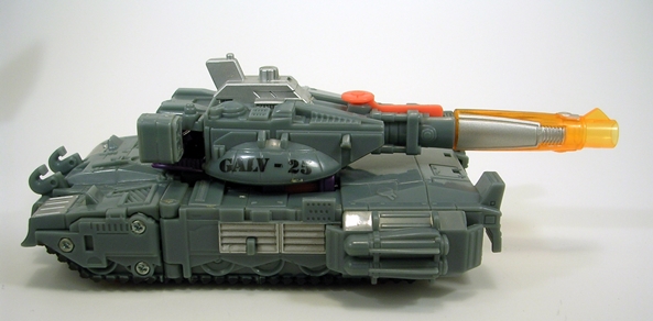
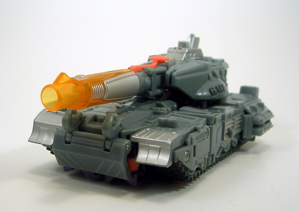
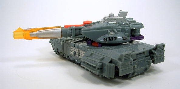
That having been said, I think Hasbro did an amazing job upgrading Grimlock’s dino mode. There’s a little more rounding to the sculpt, but not enough to give him too much of an organic look. The head is awesome and the mouth opens up nice and wide so he can chomp on Decepticon fools or eat Minicons like popcorn. There’s also a ton of sculpted panel lines and other details all over his body. The biggest departure here from his original mode is the back-mounted missile launcher, which can be taken off if you’d like a more old-school look. The colors are excellent and faithful to the original. He looks like he has some wash over his primary grey color and the gold is great looking. The amount of articulation in the tail alone is pretty respecable too. Grimlock’s dino mode is just a great looking and really fun toy.

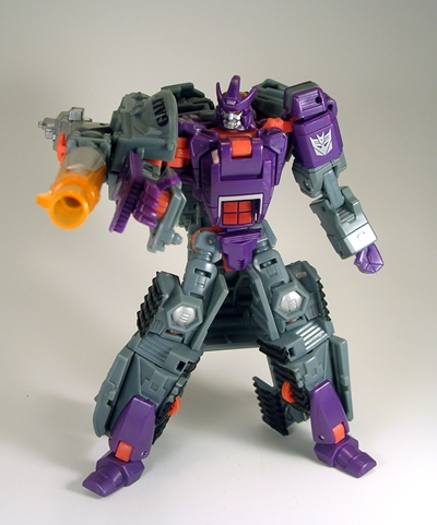
Transforming Grimlock is surprisingly different than his original version, and I’m wondering if Hasbro did the figure a disservice by over complicating things, or inexplicably trying to get away from the old style conversion. Normally, I wouldn’t care, but it effects the design of the figure with the head splitting apart to become the feet. I think that by keeping the original style of conversion, [Which was subsequently used for the Animated Grimlock. -FF], would have resulted in a much better homage to the G1 toy. How about it, Grimlock?

Me, Grimlock have teeth for toes! Why? Why have teeth for toes?

I have no idea, Grimlock. The new conversion just seems needlessly complex and fidgity, but it goes pretty quick if you know what you’r doing. Unfortunately, it also results in removing the tail, which the figure can hold as some kind of sword/bludgeon weapon. I absolutely hate when parts are removed from Transformers to make them work and then turned into shitty afterthought weapons to make it seem like a good idea.

Me, Grimlock not like holding own ass.

Nobody does, Grimlock. So let’s cast the tail aside and look at the figure. It’s not bad. It definitely shares some design elements with the original toy and the animated, but it also deviates a bit too much for my taste. The gold chest is nice effort, but that huge red orb in his chest was a strange choice. I already commented on the head splitting into the feet. If it were any other figure, it would be fine, but I don’t like it on my G1 inspired Grimlock. The shoulders suffer from the same backward assembly as my Ironhide and Ratchet, showing off the ugly screws. The head sculpt is excellent, though, and the light piping works really well on this figure.

His articulation is good, with rotating shoulders that have some lateral movement and hinged elbows. His head turns, but is very tight on my figure. His hips are ball jointed and his knees are hinged. You can get some decent poses out of him.

Honestly, I wish Hasbro had taken a different route with this figure and stuck more with the original look. They could have kept the original transformation while still adding articulation and updating the sculpt and I would have been much happier. On the other hand, he’s a really nice looking and fun figure on his own right. He’s definitely worth hunting down and buying, especially since this character hasn’t really received his due over the years.

Transformers Universe 2.0 Ironhide and Ratchet by Hasbro

Even as a wee G1 lad, it was tough to wrap my head around what the hell was going on with Ironhide and Ratchet’s robot modes. I can remember seeing these guys on the shelves and wanting them so bad because I loved the characters so much. But then there were those pictures on the box. Could the figures really look like that? How is that possible? Is that really supposed to be their faces? I was never about to risk a chance to get a new Transformer on such a gamble, but one Christmas, my uncle got my the pair of them, and so I finally found out for myself that yes, these guys were all sorts of jacked up.

So, needless to say a lot of us have been waiting for these figures to get a proper update in the G1 style for a very long time. It took Universe 2.0 to do what seemed to be not such a big deal: Turn a van SUV into a decent robot. After all, Hasbro has been able to make passable Transformers out of motorcycles, a biplane, and even a goddamn toaster. How hard could it be to get these guys right? Well, the U2.0 releases come a lot close to getting the job done. These figures still have numerous issues, and I definitely think Hasbro could have done better. Let’s see what we got…

Ironhide and Ratchet are both the exact same figure, save for different head sculpts and coloring, so I’m going to start with Ironhide and then just cover the differences seen in Ratchet.

Ok, so Ironhide isn’t quite a van, he’s more of an SUV. That’s close enough to me and this alt form would be awesome, if it weren’t for the web of cracks and seams running all over his broadsides or a few other noteworthy problems. Ok, this alt form could never have been awesome. The seaming is unsightly as all hell and makes me reconsider my disdain for shell-former designs. I also don’t like the mix between clear windows and painted ones, it looks terrible. Some nice touches include the rambar on the front and “OREGON” on the rear license plate. The original G1 Ironhide figure had a great van mode and horrible robot mode, here we have the reverse. I guess we can’t have both.

Transforming Ironhide is a bitch and a half. There’s a lot of stuff you have to pack into his torso and just about every time I convert him, I’m afraid I’m going to break something. I also find it impossible to convert him without him pulling apart into two halves, so I just consider that part of the transformation, it’s just easier that way.

Ironhide’s robot mode is a mixed bag to say the least. The best thing about him is that he’s finally a humanoid. His head sculpt is also very G1 accurate. I know some don’t dig the powder blue face paint, but it doesn’t really bother me at all. The plate that moves up behind his windshield chest is a brilliant little gimmick and looks great. It feature excellent sculpting and an Autobot insignia. Ironhide is also a pretty stable figure that stands and poses well. So what’s the bad stuff? His shoulders are backwards and show off his unsightly screws. There’s also a problem with his transformation that causes his head to be looking down. There’s apparently a way to fix this by taking the figure apart, but it hasn’t bothered me enough to try. There isn’t a lot of paintwork on this figure, he’s mostly red with some black and grey, but that’s how he should be.

So, let’s take a quick look at Ratchet. The only structural difference in his ambulance mode is the lightbar stuck on top, all the other changes are found in the color scheme. The white and red works really well and I don’t mind the painted windows quite as much on Ratchet as I did with Ironhide. The seaming is still ugly as hell, though. If the license plate reads “H3L PU2” which I can only come away with as meaning Help You Too or perhaps it’s a plea to support Bono. I don’t know.

In robot mode, we see that Ratchet has a nice new head sculpt, which again is a very good likeness of the G1 character. Like Ironhide, Ratchet has the same plate that comes up behind his windshield chest, this time painted black but with the same Autobot insignia. He unfortunately suffers from the same reversed shoulder pieces, showing off his awesome unfinished screws. Apart from that, his deco works really nicely. I’m not a big fan of figures molded in white plastic, but Ratchet seems to be an exception. He just pops.

Both figures have weapons that can store underneith their SUV modes, between their rear wheels. These weaposn can be converted into a gatling gun looking weapon or a small bladed energon dagger.

Despite the shitty vehicle modes and a bunch of issues with the robot modes, I still can’t bring myself to dislike these figures. Granted, they spend ZERO time displayed in their alt forms. I’m just happy enough to have G1 versions of the characters in somewhat decent robot modes. If you’re fans of these characters or are looking to complete your updated Autobot ranks, I defintely recommend picking them up. If you don’t give a crap about Ironhide and Ratchet, than I would definitely skip this pair.

Transformers Universe 2.0: Rodimus Prime by Hasbro

I am not a big fan of Rodimus Prime. Hot Rod was ok. Every kids series needs a young, cocky, hell-for-leather guy that the kids can relate to as he learns life’s lessons about being responsible. Rodimus, on the other hand, was just a whiney douchebag who didn’t deserve to lead the Autobots. I mean, seriously, Matrix, you got Ultra Magnus standing there, who’s name alone should qualify him for the job[Not to mention he’s Robert F*cking Stack!! -FF] but instead we give it to the kid. The figure, on the other hand, has always been pretty cool, so let’s see how Rodimus fared in his Universe 2.0 update…


Roddy’s vehicle mode is as close to perfect as I could hope to see. Yeah, he doesn’t have his trailer, but he’s a Deluxe, so I wasn’t expecting it. The colors are perfect and the flame decos are beautifully applied. Very sharp and nice looking. The silver on the engine, wheels and side piping really looks great. I also love that his windshield is translucent. It looks much better than if it were painted. Rodimus’ gun stores under him, between his back wheels. You can plug his flame missile in to make it look like he’s spewing fire out of his exhaust. Nice. The vehicle holds together beautifully and rolls along really well.

In robot form, Rodimus looks mighty good. His design is very close to the original G1 character and the colors are still pretty much spot on perfect. The flames on his chest are applied with precision, as is the paint on his face. The light piping is also really effective on this figure giving him nice glowy blue eyes. So, yeah he looks great, but, there are a bunch of little issues that nag me about this guy. The sculpted engine piece on his chest runs up a little too high and obscures the bottom of his face a bit. I’m not sure if this is making the head look too small, but it does seem smaller than it should be.

I also have some issues with his articulation. The head rotates. His shoulders roate, and offer a very little bit of lateral movement. I absolutely HATE his elbow joints, which are just hinged on the end and look terrible. His legs at the hips have universal movement, but the plates that hang off his hips interfere with these joints a lot. Finally, his knees and ankles are hinged. You can definitely get Rodimus into some nice poses, but a little better design would have gone a long way with improving his articulation.

I think the reason I am so picky about this figure is because it really is so close to being perfect in a lot of ways. The headsculpt is almost perfect, but it needs to be bigger. The articulation is good, but the elbow joints are an abomination. It seems like almost every up has a down. Still, he’s a fine figure and well worth picking up, even if you’re like me and aren’t a fan of the character. Afterall, Galvatron needs somebody to kick around.

Transformers Universe 2.0: Galvatron by Hasbro

When I first saw pictures of U2.0 Galvatron, I thought he was going to be a Voyager Class figure. The detail of the sculpt and the complexity of the figure looked way too over the top to be a Deluxe. When he finally came out, I was kind of disappointed. If Optimus Prime and Megsy could get Voyager Class toys, why not Galvatron? Ah, but he was afterall in the same scale as Rodimus, so I tried to get over it. Unfortunately, I was still left with a Deluxe sized figure with Voyager sized complexity and a whole host of issues. The fact remains that this figure may be way too complex and fidgity for it’s own good. Let’s take a look…

tfugalv7

tfugalv10

Galvatron’s new alt form is a tank, and I LOVE it. Call it sacriledge, but I really liked the original G1 Galvatron’s alt mode, but then I was never a fan of that figure in any way, shape or form. Sure, the tank has been the go-to form for Megatron in the past, so there’s not a lot of originality at work here, but like Megatron, the alt form suits this guy very well. As I’ve already mentioned, the sculpt is highly detailed, with nice little touches like missiles on the sides, ventilation ports and even tiny molded gas tank hatches. There’s a little missile pod hanging off the back of the turret, and the cannon looks a lot like the G1 Galvy’s awesome translucent yellow gun. Yeah, baby, you know where that’s going when he’s all transformed! The tank is very solid, holds together quite well, and rolls along nicely on wheels concealed under the faux sculpted treads. The turret turns 360 degrees, but the gun doesn’t elevate. The coloring is mostly grey with silver accents, which is great. There are some unsightly neon orange bits, which are pretty unfortunate, but not enough to ruin the mode. Lastly, you get some cool military style stencils on the sides of the cannon that read, “GALV 25.” Yup, this figure may have its share of problems, but this alt mode ain’t one of them.

tfugalv9
No, the problems start with the tranformation. Tranforming Galvatron into his robot mode is a total bitch, although getting him back into tank mode is even worse. If you aren’t methodical about it, you can be left with a big floppy mess of dangling parts. He’s also very prone to ball joint popping, which really doesn’t help the frustration factor. The left arm on my figure will not stay on for love or money. It usually pulls off just when I’m posing him, so you can imagine how many times it drops off when I’m wrestling with the transformation. I’ve learned to just pull it off and leave it off until I’m done with the conversion. His lower legs also have a habit of popping off too. Sheesh! Could any figure be worth all this madness?
tfugalv1
tfugalv2
Um… sort of? I actually do like Galvatron’s robot mode a lot, so long as I’m just admiring him on the shelf and not touching him. But that’s not to say he doesn’t have some poor design elements working against him. The hinged backpack for example, which I’ve heard is packed with parts for a vistigial third mode that was never declared as official, doesn’t really lock into place. You can try to compact it down and get it out of the way, but it ultimately winds up flopping all over the place. His arm cannon looks great, but the way it’s postioned on his arm obscures the shoulder joint. The color scheme, mostly grey and purple with some pretty silver accents would be perfect if it weren’t for those ugly neon orange parts. Seriously, why is that color even in the mix, Hasbro? Now, with all that having been said, I still can’t bring myself to hate on it too badly. The head sculpt alone is victory.
tfugalv5
tfugalv4Galvatron’s articulation is decent, but once again the design causes some problems. He has a ball jointed neck. His left arm has a ball jointed shoulder and a double hinged elbow. His gun arm rotates at the shoulder, but you can’t get much lateral movement out of it. There’s also a hinge on the elbow. His legs rotate at the hips, as well as move laterally and he has hinged knees. Galvatron can also pivot at the waist.

tfugalv3

tfugalv6

There’s no doubt about it, this figure is not for everyone. I know a lot of people that hate him. Hell, I think most collectors hate him. Even I was less than impressed with him when I first got him, but ultimately there’s enough for me to like here that I can look past the problems. He’s not a terribly fun figure to play with, he’s a chore to transform, and quite frankly an update to a character as important as Galvatron deserved so much better than what we got here. I wouldn’t recommend him if you’re easily frustrated or if any of the things I describe bother you, but I am really glad to have him in my collection. And yeah, I still wish he were a Voyager Class.

Transformers Classics: Astrotrain by Hasbro

Astrotrain is surely no stranger to fans of the G1 cartoon. He became a pretty major character in the series, and was prominantly featured in The Movie. Besides being one of the popular Triplechanger sub-group, he often served as a shuttle to his Decepticon comrades, ferrying them to different planets, or hauling Energon cubes. I loved his character, and he was front and center in one of my all time favorite episodes, Triple Takeover. So how did he fare as a Classics figure? Let’s see…


So, let’s start off with Astrotrain’s shuttle mode, since this is the mode he came packaged in. Yeah, what was Hasbro thinking, eh? Maybe they were shooting for a color scheme closer to the actual space shuttles, but it was a bad move to deviate so far from the original character’s grey and purple deco. There’s some purple there, on the wings and engines, but not enough to carry the day. I’m also not a fan of Hasbro’s use of unpainted white plastic on these figures. I mentioned it with Prowl, and here we are again. I’m way too paranoid this figure is going to yellow over time. Still, the black and gold look kind of nice and the red stripes on the engines are cool. Astrotrain doesn’t have any Decepticon insignia, but he does have a rubsign planted on the shuttle’s back. Apart from that, I really like the sculpt used here. The train parts aren’t terribly obvious and there’s a nice amount of detail. For a Triplechanger, this is a really solid alt form.


Astrotrain’s locomotive mode is obviously the secondary alt form as it isn’t as polished as the shuttle mode. Unfortunately, it’s also the second faux pas that Hasbro made with this figure. Instead of recreating the original’s old steam engine mode, Hasbro made him a modern bullet train mode. I agree, that this helps the shuttle mode along a lot, but I just can’t identify this form with the G1 character this toy is supposed to be based on. Besides, which, I just find the bullet trains to be boring. It’s just a tube with a nosecone. Apart from that, it’s ok. The shuttle thrusters remaining on the back is a pretty obvious piece of kibble, but it’s cool that you can mount his cannon on the back. [I would have shown that if I had it handy, but alas, Astrotrain’s gun is at the bottom of some other tote. -FF] Overall, this mode just doesn’t do much for me. I really miss the steam engine.

Astrotrain’s robot mode is pretty much on par with his shuttle mode: Great sculpt and design, poor color. Not to beat a dead horse, but this white deco just doesn’t say Astrotrain to me, but he is at least showing more purple than in his shuttle mode, but where’s the grey? Everything else about the figure is spot on. The headsculpt is extremely reminiscent of the G1 animated character and the paint apps on the face are excellent. The shoulder armor can be positioned straight out, or up on an angle, which is the way I like it. The two halves of the train nose shift to the side to reveal his hands, which is a cool idea, but they don’t lock and tend to shift back easily. If you have his gun in one hand, that will keep that arm right.

The articulation is quite good. Astrotrain has a ball jointed neck, his arms have ball jointed shoulders and elbows. His legs have universal movement in the hips and knees with hinges and swivels.

Even with his various flubs, I still really enjoy this figure. That having been said, Astrotrain is one of those figures that you may want to go Japanese with if you don’t yet have him. Buying the Henkei version won’t fix the fact that his train mode is still a modern one and not a steam engine, but it will fix all his color issues, and you’ll also get cool Decepticon insignia on the wings instead of the unsightly rubsign. Considering how good his shuttle and robot forms are, I think it’s worth the extra money to get him in the proper colors, something I defintely plan on doing some day.

Transformers Classics: Starscream, Skywarp and Acid Storm

When I was a kid, a lot of my Transformers frustrated me with their lack of articulation, but none were bigger offenders than the Seekers. Sure, the toys looked fairly close to their animated counterparts, but the fact that they were little more than bricks really sucked. I think it’s safe to say that the Seekers were among the figures I most wanted to see updated in the Classics line and when I first got my hands on Starscream, I was totally blown away his faithfulness to the the animated version and, more importantly, the amazing articulation.

In a just world, Hasbro would have delivered the three Seekers in the very first couple of waves of Classics, right there on the pegs for all fans to get. As it happened, they chose to spread them out all over the place and make it as difficult for us fans to collect as possible. Thanks, Hasbro, for pissing in all our collective coffee. Starscream was the only one of the original Seekers released on a single card, and even he was later updated to a much better paintjob for Universe 2.0. Skywarp came later on in a Target Exclusive boxed 2-pack with Optimus Prime repainted as Ultra Magnus. And then there’s Thundercracker, who was released as part of a ridiculously exclusive Botcon Exclusive set. Yeah.

So, let’s start with looking at Starscream. The sculpt is identical for all three of these figures straight across the board, which is fine because I adore this sculpt. The jet mode is wonderfully faithful to the original toy, minus the diecast of course. There’s lots of sculpted panel lines and the clear translucent cockpit looks awesome. Hasbro thankfully chose to forgo the smaller bomb-shaped missile launchers and go with the null rays, although they are unfortunately way too big, presumeably to meet safety standards. I would have been much happier if they were sized correctly and just didn’t fire, since they’re meant to be guns anyway and not missiles. The other little difference is that there’s landing gear under the nose, just two that flip down closer to the body, but Starscream can sit parked in his jet mode just fine without it.

The only real bummer about this jet is the deco. Part of the problem is the horrible color plastic that he’s molded in. It’s a weaksauce grey that just looks terrible and unfinished. Ok, it doesn’t look quite so bad when Starscream is in jet mode, but just wait until we get to his bot form. The colors don’t really jive with his G1 animated counterpart either and I would have rather had two Decepticon insignia on the wings, rather than the one rubsign.

The transformation on these figures is similar in a lot of ways to the original toys. The conversion of the legs is pretty close to identical. Folding out the arms and the positioning of the cockpit is close too. These guys have fold out fists, rather than them being separate pieces, which is a great improvement. The weapon pods unpeg from under the wings and peg into the arms. All in all these figures really show how little tweaking the original figures really needed to give them the kind of articulation that we all really wanted.

Starscream’s robot form is a thing of beauty. He’s proportional, very close in design to the G1 original, and best of all he’s very well articulated. His head will turn from side to side a little bit. His shoulders rotate and have lateral movement and he’s got hinged elbows. His legs are ball jointed at the hips and hinged at the knees. It’s true that his wings interfere a bit with his arm articulation, but you can flip them out of the way if you need to. Ah, but there’s that darn paint job. The bare grey plastic looks bad, especially on his face which isn’t painted at all. The red and blue looks better, but the red paint is weak and the grey bleeds through here and there.


Unlike Starscream, Skywarp’s paint job is AMAZING. Besides the great looking combination of his black and purple deco, the quality is just way up there. The black is nice and glossy and the silver and purple is crisp. I like the patterns on his wings, although I’d still like to have seen the Decepticon logos on the wings as opposed to the lone rubsign. In robot form, Skywarp’s colors are every bit as gorgeous. Plus, his face is painted silver, which makes all the difference over Starscreams.


And then there’s the third of the Seeker trio, Thundercracker, Acid Storm. Released as part of the Universe 2.0 line, a lot of people hated Acid Storm because getting him and not Thundercracker was like Hasbro was plopping a huge and unsightly turd right into our punchbowl. It was admittedly an interesting nod to an obscure character from the G1 cartoon, but it was still no substitute for Cracker. But if you can get past the hatred and vitriole over the fact that he isn’t Thundercracker, he’s actually not a bad figure. The color scheme is green with a camo deco that mainly just shows through in his jet mode. And hey, look! At least one of these jets have Decepticon insignia on their wings instead of that unsightly rubsign! In bot form, he’s mostly green and black with some yellow trim. It’s not the best color scheme I can think of, but he’s still a decent looking figure, and like Skywarp, at least there are paint apps on his face.

These three figures are among my favorite Transformers released to date, and apart from Starscream’s poor colors, I think these are textbook examples of how to do updated G1 figures. If you are looking to add these to your collection, you should definitely bypass Classics Starscream for the much better Unverse 2.0 Screamer. One of these days, I should really take my own advice and trade up too. Acid Storm is pretty easy to get, and I still think he’s worth it. Sky Warp is out there too, you just have to hunt for him. Now, let’s just hope that Hasbro finally delivers on a carded version of Thundercracker one of these days.

Transformers Classics: Bumblebee and Cliffjumper by Hasbro

Doing a G1 style Bumblebee figure without the blessing of Volkswagon seemed to me like a lost cause. I realize that a whole generation of Transformers fans have grown up since knowing him only as a Camero, but to me, he’ll always be a VW Bug. That having been said, Hasbro did a pretty damn fine job in creating the Classics character without making him a Beetle. Turns out, any old little yellow generic sub-compact works almost as well. As for Cliffjumper, G1 fans understand that despite their similarities, Cliffjumper was not a repaint of Bumblebee. The two did share some parts, but they were different enough. Classics Cliffjumper on the other hand is, in fact, a direct repaint of Bumblebee, with absolutely no changes to the tooling whatsoever. And he still works pretty well.


There’s a lot to like about Bumblebee’s alt mode. It’s obviously not a VW Bug, but it is a sporty little yellow sub-compact, so that’s close enough, I guess. There’s some nice detail on this car, like the sideview mirrors that were missing off of Prowl, Silverstreak and Smokescreen. There’s also a sculpted hood intake and a really nice spoiler. Hasbro decided to spruce up his paint a bit from the all yellow G1 toy by adding some silvery white racing stripes and deco to the rear quarter panels. Unfortunately the striping on the hood of my figure is a little sloppy. Bumblebee also has a raised square on the roof where the rubsign sticker is fixed. One of the coolest things about this car is the way that there are actual seats inside the cabin. Beyond the Alternators line, I can only think of a few figures where Hasbro was able to achieve this, so it’s both a novelty and pretty damn cool as well. Bumblebee has a tow hook on the back, where you can hook up his little jetski trailer.

Cliffjumper’s car deco is red with silver accents. I’m really not crazy about the silver apps on this car. Bumblebees were more subtle, but Cliffjumpers are kind of obnoxious. On the upside, the silver paint apps here are a lot cleaner than the paintwork on Bumblebee.

These figures transform in a manner very similar to their original toys. The hood still folds out to become the feet, and the top of the car still forms the chest. The folding out of the arms is a tad complicated, as is the way the back of the car folds back to reveal the head, but all in all the old conversion is still honored pretty well.


I love the robot mode on these guys. It’s stocky and compact, but that’s pretty cool for what are homages to old Minibots. The doors peg into the arms really nicely to become armor. The head sculpt is fantastic and extremely similar to the G1 animated Bumblebee. The sculpt is clean and detailed and he’s got his trademark horns.

The jetski trailers convert into some kind of winged, jetpack thingy that clips onto the top of the backpack. It looks ok when it’s attached, but I’m not a big fan of this piece and I don’t tend to use it a lot or display it with the figure. I would have rather we got some guns instead.


These figures have nice articulation. The head is ball jointed, as are his shoulders, elbows, and hips. Lots of ball joints! His knees and ankles are hinged. The only downside here is that sometimes the seats/knees interfere with the hood plates on the lower legs.

Both Bumblebee and Cliffjumper are really awesome figures. Granted, if these guys were released today, I think Hasbro would have gone the extra mile and did some resculpting for Cliffjumper, but it’s really not a big deal for me. He works just fine as a straight repaint. They do seem a lot more chunky then the Generations figures being released now, but I think they can still pass pretty well as part of the same collection.

Transformers Classics: Prowl, Silverstreak and Smokescreen by Hasbro

[Just to clarify, while I’m dubbing this the week of Transformers Classics, I’m going to be slipping in figures from Universe 2.0 and maybe even Generations. As far as I’m concerned, it’s all the same line to me! I’m also going to have to forgo any looks at the packaging, since I’ve had these figures in my collection for a while and the packaging has long since become compost! Ok, enough disclaimers, press on and enjoy! -FF]

Way back in the wee dawn of the 80s, 1984 to be exact, a young FigureFan walked into a Toys R Us and saw a cool new line of toys called Transformers. I didn’t know anything about them, the cartoon wasn’t on yet, but it was love at first sight. My first two Transformers were Thundercracker and Prowl. And since I don’t have me a Classics Thundercracker yet we’re going to start the week off looking at Prowl and his sculpt-sharing Autobot bros, Silverstreak and Smokescreen. Let’s Roll Out!
The car modes on these three figures are excellent and they hold together very well and roll along great. The sculpt is somewhat faithful to the original toys, but they’ve been turned a bit more generic and a little less Porsche-y. While they’re all the same sculpt, here’s where we see what a huge difference the paintjob can make.

Prowl is the weakest of the bunch, mainly because the paint doesn’t sufficiently hide the fact that his doors and front quarterpanels are cast in clear plastic. There’s an awful lot of slop on these parts of the car’s paint, making it look dirty and it doesn’t match the parts of the car’s body which are cast in white plastic. On the up side, the lettering on the doors is nice and crisp, as is the Autobot emblem on his hood. Prowl’s lightbar is the only structural difference between all three of these car modes.

Silverstreak has some similar issues as Prowl with the doors and quarterpanels, but the silver paint doesn’t show it as badly. My real issue with Silverstreak’s car mode is that I just think his colors are bland, but then they were on the original figure too. Had Hasbro used a higher gloss on the black, I think this guy would have looked much better in his alt form. He’s got a much larger Autobot emblem on his hood, which is crisp and clear.

True to his original toy, Smokescreen is the most visually striking of all three of these cars. He’s very patriotic looking with his red, white and blue deco, and he’s got the racing number, 38, on both doors and his hood. He’s also got a really cool Autobot emblem on his hood done up with a white outline. Smokescreen’s thick and glossy paintjob also overcomes the dodgy look that Prowl and Silverstreak had on their doors and fenders. There’s a tiny bit of bleed along some of the blue and white borders, but nothing too bad at all.

Transforming these figure’s is fidgity affair, mainly because of those pesky door/quarterpanel pieces. They tend to pop off the ball joint really easy, especially on my Prowl, and you have to do some serious manipulations on them to get them positioned right for the robot modes. As a result, I just tend to pop them off, do what I need to do, and pop them back on. It’s cheating, yeah, but definitely less frustrating than trying in vain to keep them attached. Each figure also stores their gun between their front wheels.

Hasbro did a fantastic job replicating the animated look of the original G1 characters. This has always been my idea of the quintessential Autobot look with the door wings and the front bumper chest, and I still think it looks really great. The door-wings are on ball joints to help position them out of the way and while the configuration of the lower legs is a little different than the original toy designs, it still works well and the overall proportions are excellent. The shoulder cannons are designed so that they flip up, rather than be separate attachable pieces. This is a great design since you don’t have extra pieces to hang on to. Plus you can customize the look of these guys by leaving the guns down, or just flipping one or the other up. The only difference between these guys in robot mode are the paint jobs, so let’s take a look at each one.

Besides being my first Transformer, I always used Prowl as Optimus Prime’s first lieutenant so he’s always been an important figure for me. Prowl’s car mode paint problems mostly go away in his robot mode, as those quarter panels are folded behind his door wings. His black and white deco is very striking, although I find myself worried that the white plastic may start to yellow over time. The silver paint app on his face is fantastic and his eyes feature blue light piping. The only place I take issue with Prowl’s paint in bot form is the lack of any paint apps on his shoulder weapons. These should have at least been painted partially black or silver. Left white as they are they just look unfinished. One of these days I’ll get up the nerve to do it myself.

Silverstreak’s robot deco looks great. The heavier use of black really sets him apart from Prowl and the additional maroon and silver looks nice and very much like the original G1 toy. Silverstreak’s face is painted white and he has the same blue light piping as Prowl. Fortunately, Silverstreak’s shoulder weapons are colored, and in a maroon and silver to match his deco. It really makes all the difference when you look at him standing next to Prowl.

Even in robot mode, Smokescreen is still the most colorful bot of the bunch. His glossy red and blue go well with the molded grey bits. His numbers, 38, are clearly visible on his door-wings and the Autobot emblem on his chest just looks fantastic. His face is painted silver and the blue helmet with yellow horns looks great. Smokescreen’s shoulder weapons are not painted, but they are at least molded in grey plastic, so they don’t look as bland as Prowl’s.

The articulation on these Autobots is solid. The necks rotate, the arms have double hinges at the shoulders so that they can rotate and have lateral movement. The elbows are hinged and the fists can swivel. The legs feature ball joints at the hips and double hinges in the knee. As mentioned, the door wings are also ball jointed. You can get some really nice poses out of these figures, although they do tend to be a little top heavy. Hasbro might have short changed them a bit in the feet department.

Even with the few issues I have with this trio, I still adore them because these are the figures I dreamed about owning as a kid. I can remember watching the cartoon and wondering why my figures couldn’t pose like that, and now they can. I don’t miss the diecast at all, but I do wish that Hasbro had made some different choices in the manufacture, particularly the use of the clear plastic. They would have been better off without any side windows at all like the original toys. But that’s just nitpicking with hindsight. When you get down to it, these three figures are superb updates. They take all the great design and decos of the originals and add loads of articulation and play value. Simply awesome.

Transformers Generations: Darkmount by Hasbro

Yep, I’m finally getting some ‘Cons in my Generations line. Seems like ages ago since I picked up Thrust and still no sign of Dirge or Soundwave in my neck of the woods. But last time we looked at Megatron and today we’re going to take a look at Straxus Darkmount. Wait, so then what’s his fortress called, Straxus? Hmm. I’ve yet to do any research to see why Hasbro named this guy after the fortress and not the Marvel character he’s based on, but I’m sure they had their reasons, (copyright issues?) and it doesn’t matter to me one way or the other. As far as I’m concerned he’s Straxus. I will, however, use his proper Hasbro-given name for this review.


Straxus
 Damn! Darkmount comes on the standard Generations cardback and packaged in his alt mode. As always, the back panel of the card has a little bio on him and shows the toy in both of his modes.

Darkmount’s alt mode can easily be dismissed as a tank, but on closer inspection, it’s actually a halftrack artillery piece, and a blue one at that! The sculpt on this mode is incredibly detailed with lots of panel lines and hatches and other markings. I especially like the two tone color on the treads and wheels that really make the superior sculpt pop. The turret rotates 360 degrees and the cannon can elevate. There are also three grey weapon pods that can be clipped and unclipped at various hardpoints of the vehicle, which allows you to do a little bit of customizing on the figure if you like.

Transforming Darkmount to robot mode is a little tricky and very clever, but not all that frustrating once you realize what’s happening. You can unclip all those weapon pods before doing it, because you’re going to clip those back on in different spots when he’s in robot mode to give him added firepower on his backpack. What is frustrating, however, is getting him back into his halftrack mode, because you need to remember to put the gun back in before closing up the turret.


In robot mode, Darkmount is simply awesome. There’s so much I love about this guy, like the way his front fenders form his shoulder armor, the way part of his tracks form a solid backpack to attach his weapon pods, and the sculpting in his arms. He’s also got working, hinged hands, which allow him to hold his axe in either hand or both. The headsculpt is really cool too. And check out that color scheme! The blue and the grey really look great with the red and gold accents and I really dig those triangular decos on his chest.

In the Marvel comic, Straxus’ trademark weapon was his axe and Darkmount’s cannon transforms into that weapon. Actually, it’s more of a war pick, but you get the idea.

Darkmount’s articulation consists of a rotating neck, ball joints in his shoulders and hips, hinged elbows and knees, swivesl in his wrists, hinged fingers and ball jointed ankles. You can get a lot of great poses out of him. He’s a bit backpack heavy, but I find you can still get him to stand pretty well.

If you can’t tell by now, I love this figure. He really came out of nowhere, but he’s quickly become one of my favorites in the Generations line, and that’s saying a lot, because I’m pretty much crazy over every Generations figure I’ve bought so far. If you’re a fan of the comic character, I think this figure should please you, but even if you’ve never heard of him before, this guy is a must have as far as I’m concerned. He looks great, and he’s ready to melt down some Autobots. I also like to pair him up with Hunt for Decepticons Hailstorm. Hailstorm just looks like he could be Darkmount’s Igor-like assistant who carries his axe around and spends his spare time cleaning out the huge Autobot smelting tanks.

Transformers Generations: Cybertronian Megatron by Hasbro

The War For Cybertron figures have been an awesome part of the new Generations line. I’ve already looked at Optimus Prime and Bumblebee and now it’s time to see how the other half lives with the first Decepticon in this sub-line of figures, Megatron! I’ve got to say it’s pretty bizarre having a Megatron figure as a Deluxe. I know it’s been done before, but it’s certainly a rarety. Still, he fits in fine with WFCOptimus Prime and while that Prime figure felt like a Voyager shrunk down to a Deluxe sized figure, Megatron here is way too simple to have been a Voyager. Is that a bad thing? Let’s find out…

Megsy comes packaged on the now typical Generations style card. As with the other War For Cybertron inspired figures, he is packaged in his robot form. The card is attractive and serviceable enough, but nothing special. It’s also a damn liar, because it says the figure’s difficulty is Level 3 Intermediate, whereas it should be Level -1 Too Easy. The back panel shows off photos of the toy in both modes and has a little bio blurb on the Decepticon leader himself.

Despite the way he was packaged, I’m going to start out with Megsy’s alternate form, because going the other way just feels wrong. Also, because the alt mode here is definitely the weaker this figure’s two modes. Megatron’s alt mode is a Cybertronian tank with a tracked mode and a hover mode, although the hover mode is the same as the tracked mode, only with the treads folded up underneith. The fact is you can barely tell the difference since the sculpted treads are so puny and insubstantial to begin with.

Make no mistake, Megatron’s alt mode is pretty faithful to the one depicted in the video game, but that doesn’t mean it’s a great design. I can appreciate that we’re dealing with completely fictional “vehicles” here, but the fact is that Prime and Bumblebee in their Cybertron alt modes still featured a strong foreshadowing of their Earth alt modes and so Prime basically looked like a futuristic truck and Bumblebee like a futuristic car. Megatron doesn’t so much look like a tank as he does just a giant cannon on a platform. It’s not a terrible mode by any means, but it’s not all that creative either, and I’d have to say it’s one of the weakest alt modes Megatron has ever had.

Transforming this figure is ridiculously simple, but the good news is that despite the simple conversion, it’s the robot mode where this figure really shines. He reminds me a lot of the Transformers Animated Cybertron Megs, but either way he’s readily recognizeable as Megatron. In fact, the only thing I don’t like about his robot mode is that thing hanging off the top of his left shoulder. Considering his alt mode is entirely fictional, you’d think they could have designed him without that annoying piece of alt mode kibble. The headsculpt is particularly worthy of the Megatron and I really like what Hasbro did with the color scheme, as the black and grey and red is all faithful to his G1 original.

I absolutely love the way Hasbro handled his fusion cannon on this figure. It’s positioned on his arm just like his G1 counterpart and it’s also removable, which is really cool. The sculpted detail on it is impressive and it also fires off a missile. It really doesn’t impair Megs’ articulation either, so you can get some great poses of him blasting Autobot fools with it.

Speaking of articulation, Megatron is a highly poseable figure. He has a ball jointed neck. His arms rotate at the shoulders and have some lateral movement as well. His elbows are hinged and also swivel. His legs rotate at the hips and have lateral movement in those joints, just like his shoulders. He has hinged knees and hinged ankles.

Even with the weak alt mode, I absolutely love this figure. His robot mode looks awesome and really does the character proud. He’s also a really solid figure, without any of the popping ball joints and flippy pieces that we’ve seen in some of the modern figures. But above all, he’s just fun to play around with and pose and he looks fantastic on the shelf.