Tekken: Jaycee Bishoujo Statue by Kotobukiya

I’m not proud to admit that I’ve been neglecting Kotobukiya’s Tekken series of Bishoujo statues. It hasn’t been intentional, but Koto is releasing so many of these damned things that I have to have prioritize. When I’m presented with characters from Marvel, DC, and now Street Fighter, Tekken has fallen down toward the bottom of the list. I have been trying to remedy that recently, especially with some of these statues starting to creep up in value on the secondary market. I can’t tell you how glad I am to have picked up Christie Monteiro when she first came out as now she’s commanding upward of $180 in some reselling circles. I was crazy into Tekken 3 and 4 back in the day, but I have long since stopped following the franchise with any real gusto. Of course, that hasn’t stopped me from wanting to pick up the statues and that brings us to today’s feature, Bishoujo Jaycee. I believe Julia Chang first appeared in 2012’s Tekken Tag Tournament 2, a game that is sitting on my shelf, but hasn’t spent a lot of time in my PS3. Needless to say I’m not all that familiar with the character, but she’s a Bishoujo Tekken gal and that’s good enough for me.

bishjayc1

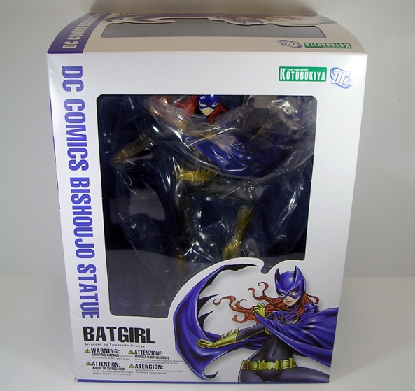
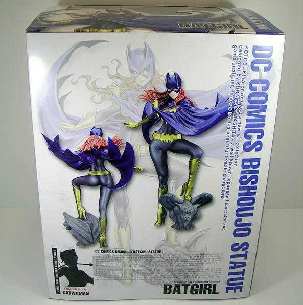
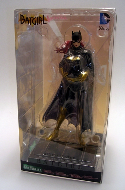
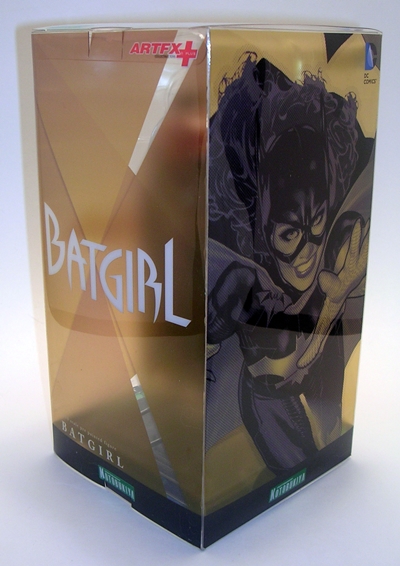
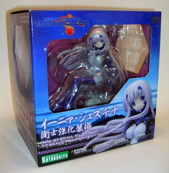
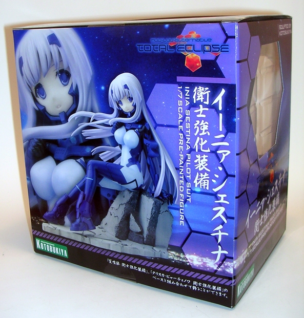
The box is right in line with all of Koto’s Bishoujo offerings. You get a big window in the front and smaller windows on the top and side panel to let some light in. You can get a little peek at the statue inside, and in this case the extra pieces that come with Jaycee. Unlike the predominantly white boxes used for the Marvel and DC statues, Koto has opted to go with a black deco for the Tekken pieces. Finally, you get some gorgeous artwork by Shunya Yamashiti and the Tekken Tag Tournament 2 logo on the front and back. It’s a fairly westernized box with most of the text appearing in English.

bishjayc2

Jaycee comes more or less assembled and ready to go. She is attached to her base, although she is removable if you so desire. Her pony tail has to be pegged into the back of her head and I had a wee bit of difficulty getting it to peg in, but I eventually got there. Aside from the alternate masked portrait, which we’ll get to in a little bit, she has a mask, which she can hold in her right hand or be placed on the base and it’s is a very nice accessory if you choose to go with the unmasked portrait. And with all that out of the way, let’s see how she looks…

bishjayc3

bishjayc4

bishjayc5

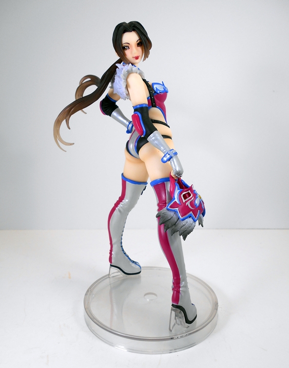
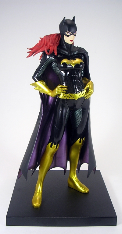
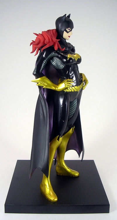
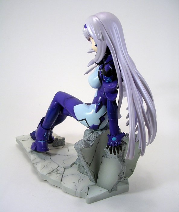
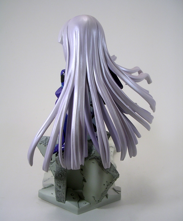
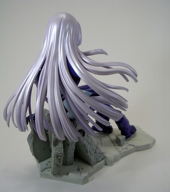
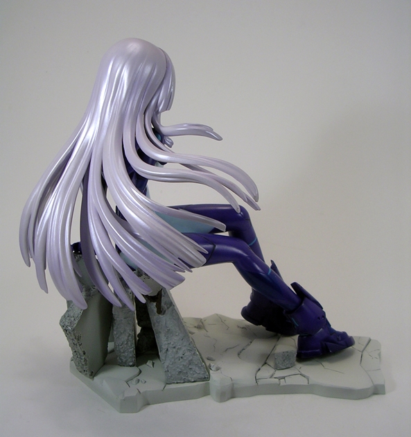
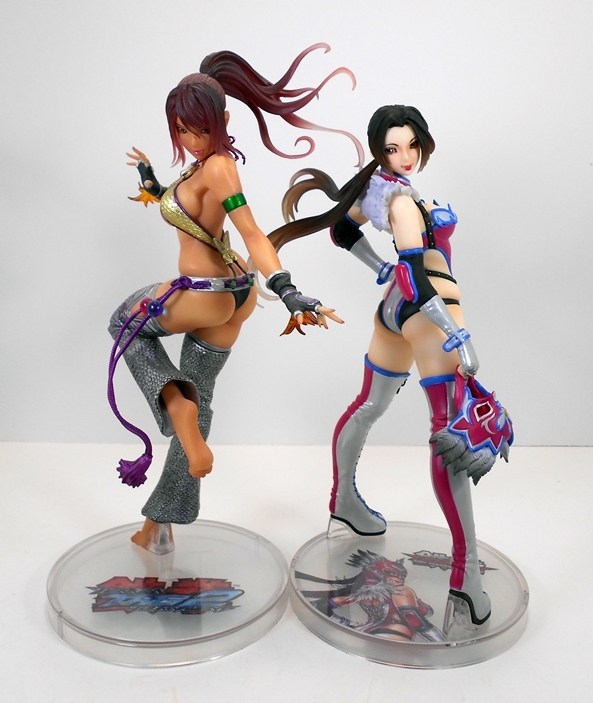
Oh yeah, I can dig it! Jaycee has a very specific pose, which in turn is clearly intended to be viewed from a specific angle. Some may be put off by that, but there’s something to be said for having that one intended sweet spot in a statue’s composition. In this case, she’s best viewed slightly from behind with her head turned and looking over her right shoulder. If a nice tushie is your thing, you shouldn’t have a problem with the view. She has a very wide stance, standing up on her toes, left hand proudly planted on her hip, and her ponytail flowing outward in the breeze. The pose lends itself to the artwork very well, but that’s not to say it isn’t worthwhile to check her out from all the other angles, because a lot of beautiful work went into her costume.

bishjayc6

bishjayc7

bishjayc8

bishjayc9

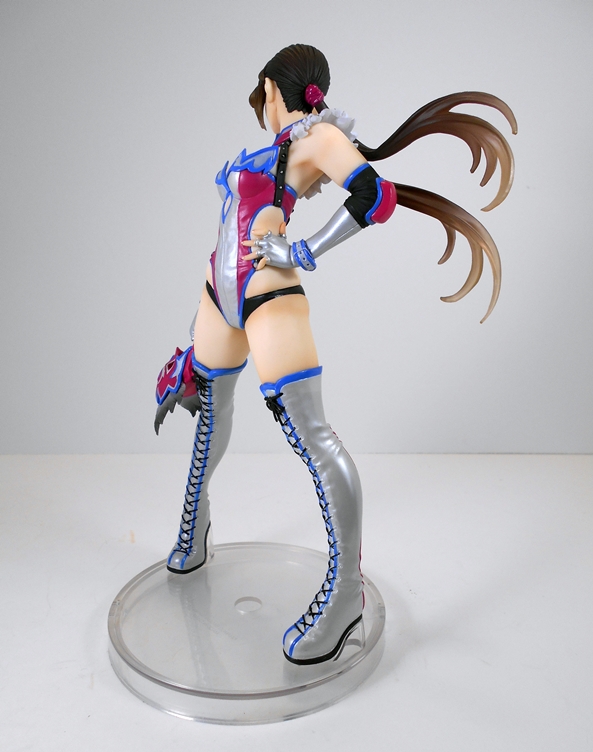
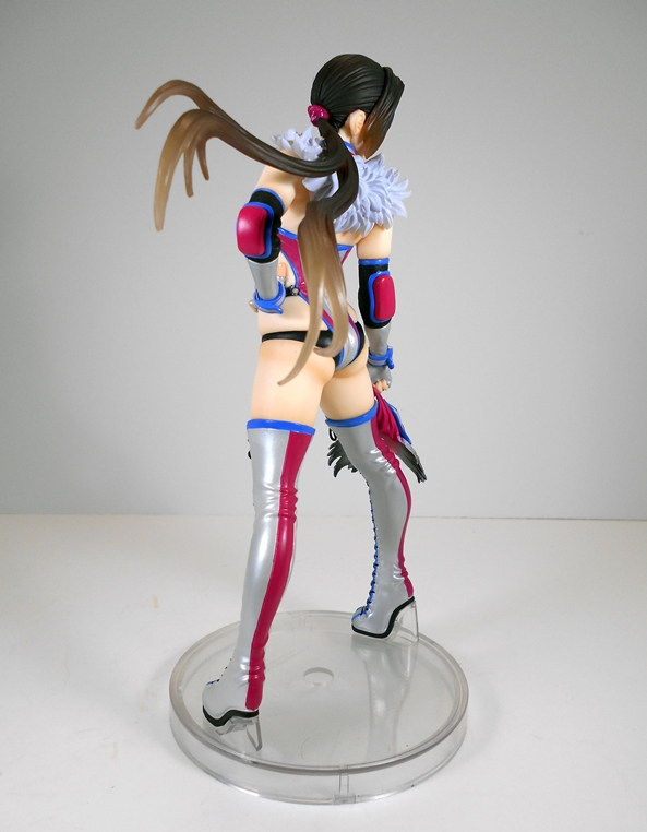
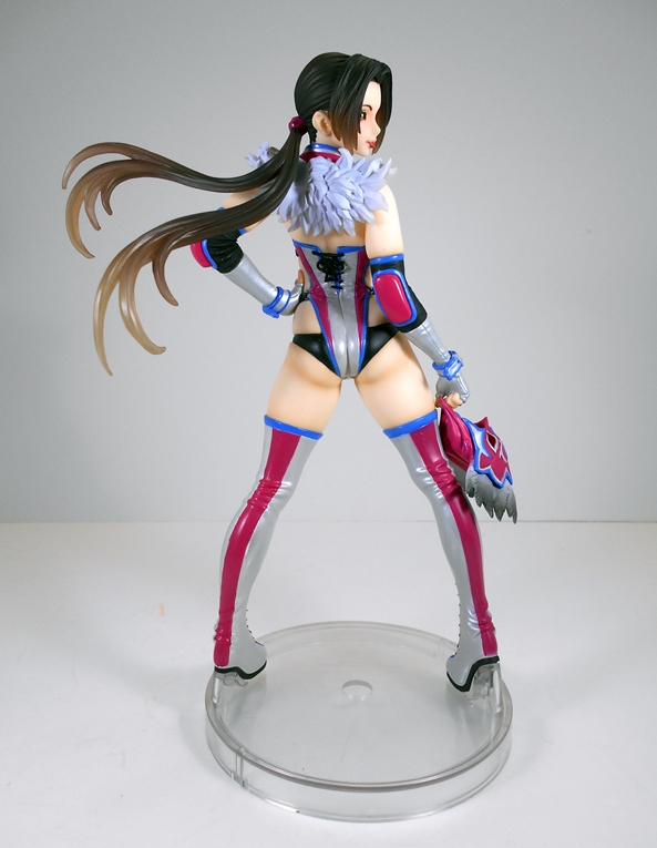
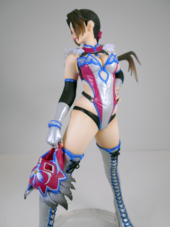
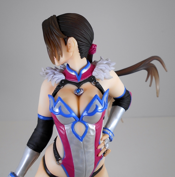
Hailing from Arizona, Jaycee’s Southwestern flare is represented in her luchador costume. In this case, it’s more like luchador lingerie with a pinch of S&M thrown in. Her delightfully skimpy one-piece is held on by leather straps and yet it’s also laced up the back with some feathery, frilly bits around the shoulders. Her long gloves include straps around her wrists and a pair of generous elbow guards. The outfit is rounded out by a pair of thigh-high boots and holy crap it must take her forever to lace those babies up! The coloring on the costume makes for a very striking piece. You get a pearlescent silver mixed with purple and some blue piping and a little black thrown in for good measure. Most of the costume has a subtle glossy finish to it, which contrasts nicely with the soft matte tones of her skin.

bishjayc10

bishjayc12

You do indeed get two portraits with the statue, masked and unmasked. I’ll probably be going with the unmasked look most of the time, which was my focus for most of the pictures. Why? Mainly because this way you can see her face and also see the mask as she’s holding it. It’s kind of the best of both worlds. She has a pretty face with the usual soft features and her big, beautiful eyes are a gorgeous amber color. The only thing that throws me a bit is the darker red paint on her bottom lip. It looks to me like she’s sticking her tongue out, but I think it’s just supposed to be a little pouty. As usual, Koto works their magic with the hair by having it gradually turn transparent toward the edges, an effect that I always appreciate.

bishjayc15

bishjayc16

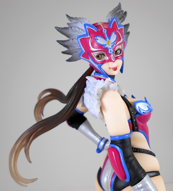
When you swap the head, you do have to swap the ponytail too, which worked a lot better for me the second time around. The exposed parts of her face are a good match for the other head and the wild design of the mask coupled with the same silver, purple, and blue does a nice job of balancing out the costume. Jaycee really does look great with her mask on and this may be a statue that I wind up actually swapping out the head every so often.

bishjayc13

bishjayc19

bishjayc20

bishjayc18

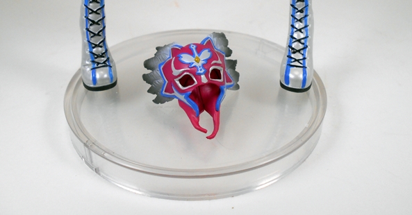
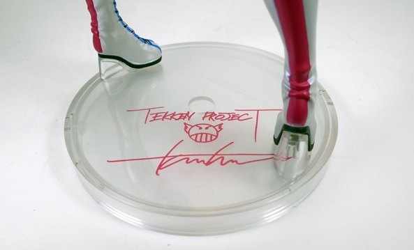
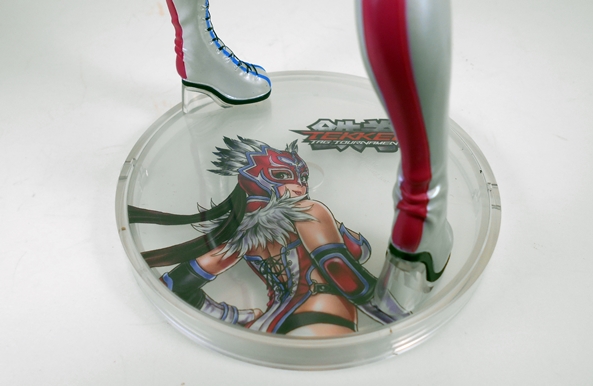
Koto has been using clear bases for their Tekken and Street Fighter statues and Jaycee is no exception. The bottom of the base can be pulled out and you can customize your statue with your choice of the included transparent inserts. You get a signature insert and two with character art, one masked and one unmasked. As long as I’m going with the unmasked head, I’ll probably go with the masked artwork just to mix things up. I’ve been warming up to using the fan art for these because I think it really dresses up the base and compliments the statue beautifully. As for the clear plastic bases, they do tend to show scratches easily, which is disappointing. When I removed my Christie Montiero to shoot with Jaycee, I noticed some scratches on the bottom of her base and that piece has done nothing but stand on my shelf and get picked up every now and again to be admired.

bishjayc11

bishjayc21

chirsjayc

And so here we have another great effort by Koto. Jaycee’s design and sculpt are fantastic and the paintwork is pretty much flawless. I believe Jaycee was the fourth release in Koto’s Tekken sub-series, but as I mentioned earlier, she’s only my second. I was lucky enough to grab Jaycee at her original retail of around fifty bucks and getting her on my shelf has given me just the push I needed to start picking up the rest of the Tekken gals before they start creeping any higher in price. I’ve targeted Asuka for my next purchase, as she’s already commanding upward of $100 in a lot of circles and based solely on the promotional images and reviews I’ve seen, I’ve just got to have her!

The Avengers: Iron Man ArtFX+ Statue by Kotobukiya

This is finally it… Kotobukiya’s ArtFX+ Avengers have finally assembled with the release of the final statue, Iron Man. I’ve been loving each and every piece in this line, but I was getting really excited to finally get the team on display together. Iron Man was available in two decos. You could go for the comic accurate black and gold Marvel NOW! version or the more traditional red and gold variant. I’m actually a fan of the black and gold look, and if this was a stand-alone piece, I probably would have gone for that one. In the end, I picked up the variant only because with Hawkeye, Black Widow, and Thor sporting so much black I wanted to add a little more color to the team display.

afxpim1

afxpim2

I don’t really have anything new to say about the package. It’s a colorful and attractive fully enclosed box that protects the goods really well and looks damn nice on the shelf. I also dig the fact that the variant is what’s actually pictured on the box. Sometimes these things will simply be denoted with a sticker. Inside are two clear plastic trays securing all the parts to build Iron Man, including the torso, head, and all four limbs. Everything fits together snugly and I had no issues assembling my figure.

afxpim3

afxpim4

afxpim5

Koto has been quite conservative with the composition of these statues going more for iconic character poses rather than originality and Iron Man is certainly no exception. He stands with his right arm stretched out about to fire off a blast from his palm repulsor. He has a moderately wide stance and his left arm is balled up into a fist. Sure, we’ve seen Stark in this pose a thousand times, but I still love it and I think it’s particularly effective for a statue meant to be displayed with the entire Avengers team.

afxpim6

afxpim7

I’m also a fan of the style of this Marvel NOW! armor. I can see a lot of influences in it and in a way it strikes me as a more angular Extremis armor with the circular chest repulsor (my favorite) as opposed to the triangle. It features all the necessary segmentation between the plates and rather than go with a bunch of panel lines, the plates themselves are smooth and featureless giving it a very pleasing comic book vibe.

afxpim8

afxpim9

Koto rarely skimps on the paint quality, so it should be no surprise that Iron Man features a gorgeous coat of metallic red paint with gold metallic trim. The paint lines are clean and precise and there’s just a few very minor blemishes that I could spot under close scrutiny. The one area where the coloring on this piece isn’t all it could be are the repulsors on the chest and hips. These appear to be stickers and aren’t terribly convincing. They look rather Hasbro-ish to me, which is a tad disappointing in a fifty dollar collectors piece. Oddly enough, this is one the rarer instances where I think they look better in pictures than in person.

afxpim10

As always, you get the simple black square base. It’s metal and designed to work with the magnets in the statues feet. You can adjust him anywhere you want on the base or even connect the bases together and have him straddle two of them. Of course, Iron Man can stand just fine on his own too.

afxpim11

With the team all assembled, I have to say I’m so very glad that I started down this road last year. While any of these statues would work just fine as stand-alone pieces, nothing beats having them displayed together and Koto designed them with that in mind. There are a few ways to go when displaying the set, but I used the lineup on the back of the boxes as a guide and I think it looks pretty damn great. And they look all the better lined up on the shelf right above my ArtFX+ Justice League!

afxpim12

afxavg

At $50, Iron Man is second only to The Hulk in price and about ten bucks more than I paid for the others. The main reason I paid so much for Iron Man was because I was worried about limitation on the variant so I pre-ordered rather than shop around for a deal. That still seems to be the going price, but that’s subject to change after he’s been out for a little bit and as of now you can still grab all of these statues at or below their original MSRP if you hunt around. Forty to forty-five bucks is definitely the sweet spot for me and these ArtFX+ statues, but I don’t mind going over now and again if I have to because they are indeed awesome display pieces. It’ll be a little while before I revisit the Marvel ArtFX+ collection, but when I do it will be with none other than Deadpool!

The Avengers: Hawkeye ArtFX+ Statue by Kotobukiya

I started collecting Kotobukiya’s Avengers ArtFX+ line back in April of last year with The Hulk and now with only two more statues to go, I’ve reached the home stretch. I’ve been putting off looking at Hawkeye until the release of the final statue, Iron Man, drew closer and now that Mr. Stark has hit my Pile of Loot, I figured it was time to get Hawkeye his due. No disrespect to Hawkeye, but this was the statue in this line that I was least excited about. I don’t mind Hawkeye’s Marvel NOW! Look, but compared to the likes of Hulk, Thor, or even Black Widow, it isn’t the most exciting thing in this lineup to me. Still, there was never any doubt that I would get him to complete the set. Let’s see if this statue can hit my mark.

afxhebx1

afxhebx2

The statue comes in a completely enclosed box with some great shots of the piece itself set against a monochrome collage of comic art. I’ve been a big fan of these boxes as they’re not only collector friendly, but they display really well too. On the downside, each box has been individually sized to fit each statue, so they don’t really stack evenly or line up all that well on the bookshelves. But hey, they’re sturdy and I can rely on them for storage if I ever move or have to rotate these pieces out of my current display and that’s mostly what I’m looking for in my statue packages.

afxhe1

afxhe2

afxhe3

Inside the box, Hawkeye comes pressed between two clear plastic trays and does indeed require some assembly. You have to connect the top and bottom half together at the waist, his left arm at the bicep and equip him with his bow, quiver, and arrows, all of which are separate pieces. Yes… I was delighted to see that each arrow (eight in all) is separate rather than just having the ends molded into the top of the quiver! I may have underestimated just how cool you’re going to be, Hawkeye. The assembly here is a tad more involved than any of the others, mostly because of the bow, but everything still goes together easy-peasy.

afxhe4

afxhe5

afxhe6

With Hawkeye all set up I’ll confess to being surprisingly impressed with the Koto’s execution of this statue. I think what really makes it stand out is the way they did all the gear. The pistol actually looks like it could be removed from the holster (even though it can’t) and the way they designed the bow to peg together in his hand is rather clever. It reminds me of the way they did the lariat for the first Bishoujo Wonder Woman statue. Had they gone with one single assembly for the bow, arrow, and draw arm I don’t think it could have possibly came out as credible looking as it did. Even the way Clint is knocking the arrow (any one of them will do) works beautifully. Hawkeye’s pose has him on the move as he’s preparing to shoot. It’s nothing original, but it works well for the character. At this point, I’d dare say it’s an iconic look for him, and it displays beautifully from virtually any angle.

afxhe11

The portrait is clean and definitely represents a little Marvel NOW! And a little Jeremy Renner. The sunglasses are part of the sculpt and the texturing in the hair looks great. My one complaint here would be the back of the neck where it’s pretty obvoius that the hair is a separate piece as there’s a channel running between hair and skin making it look artificial from the back. Also, as good as the head sculpt looks, I still can’t help be reminded of Albert Wesker from Resident Evil whenever I look at it. That’s not really a criticism of the sculpt, but rather the character design.

afxhe8

afxhe9

The coloring here is mostly black with a little purple to pay fleeting respect to Hawkeye’s classic comic outfit. While the potential was there for the costume to be rather drab and boring, Koto mixed up the black with a matte finish for the outfit itself and a glossy finish for the pouches, belt and holster. You also get a little gray on the buckles and straps. The paint lines are sharp, even around the fingerless gloves and the hairline.

afxhe12

As always, the statue comes with a plain black metal square base that interacts with the magnets in the statues feet to keep him secured while on display. This comes in handy if you want to put all the bases together to make one large platform and have the statues overlap on different bases.

afxhe10

afxhe13

afxhe15

afxhe14

So, yeah, I wasn’t expecting much from this one. I bought Hawkeye mainly to complete the Avengers team, but he turned out to be a very pleasant surprise in the end. In fact, right now I’d probably even rate him in higher standing than Thor, even though I think both are great pieces. The wizards at Koto obviously looked at what made Barton unique and put a lot of their efforts into that aspect of the statue, meaning his bow and arrows. Hawkeye would have been an easy one to phone in, but instead they turned it around and delivered something special. He set me back just a smidge over $40, which makes him a little bit on the low end of what I’m averaging for these pieces and he was well worth every penny. And that brings me to the last release in the ArtFX+ Avengers series. Next week, we’ll check out Iron Man!

DC Comics: Batgirl Bishoujo Statue by Kotobukiya

I’ve only been into statues for about four years now. It’s an aspect of my collecting that still takes a back seat to action figures, but it’s been a growing percentage of my collecting budget ever since. I didn’t pick up my first Bishoujo statue until sometime in 2011 and after I got hooked on this buxom plastic crack, I suddenly realized that there were a number of statues in the line that had come and gone and were now only available at crazy high prices on the secondary market. It’s an old story for collectors, getting into a line late and regretting those pieces that you’ll likely never own. And man, the Bishoujo line has a lot of them: Emma Frost, Rogue, Psylocke, Scarlet Witch, and Phoenix, to name a few. And also Batgirl. While I don’t recall Batgirl ever reaching the crazy prices of Rogue, she still commanded a price that was beyond what I was willing to go for. And now Kotobukiya has re-issued her and she’s finally on my shelf.

bishbg1

Batgirl comes in a window box that should be readily familiar to any collector of this line. You get a large window in front and smaller ones on the top and side to let some light in. As always, this arrangement gives you a glimpse of what you’re getting, but she’s wrapped in plastic, so you really need to bust her out of there to get a good look. The box is mostly white and includes some great full color art from Shunya Yamashita. I particularly like the image on the side panel where Batgirl’s cape is illustrated in the foreground and obscures some of the text in the background.

bishbg2

What’s bugging the hell out of me is the Coming Soon: Catwoman thing on the bottom of the back panel. Of course, Koto always has a look at an upcoming release here, but in this case what we’re seeing is most likely because of a reuse of the Batgirl box. I’m pretty sure Koto has gone on record a few times that they have no plans to re-release Catwoman, but then I never thought we’d see Batgirl again, so maybe it’s still possible. Anyway, I believe Batgirl was the 6th statue released in this line, if you don’t count variants, and I think she may been the first DC Comic character to get Koto’s Bishoujo treatment. She was also available in a black costumed variant, which followed the original blue. The statue comes out of the box fully assembled and ready to go, so let’s check her out.

bishbg3

bishbg4

bishbg5

Dear God, I love these statues! One of my favorite things about a lot of Koto pieces is their ability to convey energy and movement in a static form and that’s certainly the case with Batgirl here. Her pose is pretty simple, she’s got one foot up on a very “Gotham-Style” gargoyle, but it’s the spectacular twirl of her cape that makes the composition here stand out. It’s fanning out all around her and it just looks absolutely stunning. Standing fully erect (ahem), Batgirl stands roughly shoulder to shoulder with most of the other statues in the line, although you could argue she looks a wee bit more demure when displayed next to the likes of Huntress or Power Girl.

bishbg6

bishbg7

Newcomers to the Bishoujo line may find this Batgirl rather tame by comparison to more recent releases. The line has always been about pretty women in tight outfits, but it’s become quite the gratuitous T&A show in recent years. I’m not saying that’s a bad thing, but Batgirl certainly represents a time when the line conveyed a lot more subtlety. Don’t get me wrong, this Batgirl is still dead sexy and her costume still looks like it’s painted on, but it’s not as overtly in-your-face sexualized as say a Starfire, or Spider-Girl, or Powergirl. There’s also a lot less skin than some. Indeed, the motion that Barbara is making with her cape actually obscures her chest almost completely. Although it’s a nice counterbalance that the same motion also serves to showcase her fabulous butt.

bishbg12

bishbg15

The bulk of Batgirl’s outfit is pretty simple, at least the bodysuit part of it, so most of the sculpting here went into the motion of her cape, as well as the belt, gloves, and boots. And, of course, let’s not forget the portrait. Barbara has her head slightly lowered with her red hair escaping from her hood and flowing about her. It’s a pretty simple face sculpt, although the eyes are more defined on this piece and given a bit more depth and I like it a lot.

bishbg8

bishbg9

bishbg10

Batgirl’s costume is predominantly painted with a charcoal paint that somehow manages to be both metallic and matte at the same time. There’s a dull sheen to it that contrasts nicely with the slightly richer gold and the brilliantly blue glossy cape and cowl. And oh god, is the blue on this statue gorgeous! I think the last time I was this impressed by a shade of paint was the red used for Bishoujo Spider-Girl’s outfit. The blue here is so rich and vibrant and manages to capture that new car finish level of brilliance. As is usually the case with Koto’s pieces, the paint on this statue is absolutely flawless. The lines are sharp and there’s no slop to be found anywhere.

bishbg11

bishbg14

The base is a simple black disc with the gargoyle for Batgirl to practice her best Captain Morgan pose on. It’s a hideous little beastie with its tongue sticking out and some really detailed sculpting, especially on the backs of its wings. It’s pretty convincing as a piece of granite done in plastic and it contrasts quite nicely with the smooth sheen of Batgirl’s attire.

bishbg17

bishbg16

bishbg13

This one was a long time coming and after a long time scouring Ebay and Amazon and hoping against hope I’d find a deal, all to no avail, it’s awesome to finally have Bishoujo Batgirl on my shelf. She’s absolutely gorgeous and I’d rank her among some of this line’s best work. What’s crazy about this release is that with an MSRP of around $50 she’s hitting most retailers a good ten to fifteen dollars under what most current releases in this line are starting at. It’s still kind of early to hope that his release will open the floodgates to reissues of the other expensive early Bishoujos, but it certainly does present some possibilities. And even if this is a one-shot deal, it’s still nice to have a statue in my collection that I probably would not have otherwise gotten hold of.

The Avengers: Thor ArtFX+ Statue by Kotobukiya

It was way back in October when I looked at my last acquisition in Koto’s Avengers ArtFX+ Statues. I’m digging this series a lot, but I managed to let the last two releases fall under my radar. Now that the Holiday craziness is past, I took the time to pick up my next two figures in the series… today we’ll be checking out The Mighty Thor!

afxthor12

I was a little surprised by the size of Thor’s box, but it makes sense that it should be a little bigger than Black Widow’s or Cap’s, both because of his bulkier size and the nature of his pose. I’ll go ahead and mention once again that I like these more conventional boxes a lot better than the fragile clear plastic boxes that Koto used for their DC ArtFX+ line. They may not be as flashy or artsy-fartsy, but they’re durable, colorful, and I’ll certainly be keeping them in case I ever need to put the statues in storage or for the next time I move. Inside the box, Thor comes between two plastic trays and in five parts (legs, torso with cape, two arms, and head) with an additional two parts that make up Mjolnir. Yes, as with The Avengers, there is some assembly required. Luckily, Thor is pretty much plug-and-play. Each part features a tab that is shaped to fit in specific socket and while some of the fits are rather tight, everything went together without a hitch.

afxthor1

Cards on the table, Thor’s Marvel NOW! design is not one of my favorite looks for the character, although now that I mention it, Thor is currently a woman, so this version is actually already out of date. Don’t get me wrong, I don’t dislike it at all, I just think the black tunic is a little bland compared to other treatments of the character, especially when everyone else’s costume seems to be getting panel lined up the ass. Also, does The Odinson really need a “T” on his belt buckle? That’s just tacky. But hey, I’m not here to pick apart the character design, but rather take a look at what Koto did with it, and it will probably be no surprise to anyone reading, that I think they did a splendid job.

afxthor7

afxthor6

afxthor5

Some of the high points of the costume sculpt include the chiseled muscles showing through the tunic, as well as the checkered pattern making up the texture on his arm and leg armor. The circular points of armor on his chest look sharp and there’s some truly impressive scrollwork carved into his his belt. The flares at the tops of his boots look great and I really dig the sweeping motion of his cape, which adds just the right amount of energy to what is a powerful, yet static pose. And how about that pose? He’s got Mjolnir held out in front of him and his off-hand balled into a fist. The composition works well when viewed from several angles and I always take that as the sign of a well thought out piece.

afxthor8

The portrait on this statue is possibly a bit narrow, but it’s nicely counterbalanced by the beautiful job they did on his helmet. I love the rivets and panel lines as well as the majestic placement of the side fins. I could have gone for a little more ferocity in his expression, but what’s here works fine for me.

afxthor10

afxthor9

The paintwork on this statue is mostly solid. I’ll nitpick a little that the matte black used for the tunic shows a little inconsistency to the finish. Maybe that conforms to the fact that it’s supposed to be cloth or leather. There are also a few stray black marks on the leg armor. Otherwise the what’s here is pretty great. The metallic silver they used looks spectacular, particularly on the helmet and armor circlets and it all contrasts quite nicely with the matte black of the tunic and red of the cape. The fleshtone is clean and the paintwork on the face is immaculate.

afxthor4

afxthor3

afxthor2

As always, the statue comes with a metallic black square base that works in conjunction with the magnets embedded in Thor’s boots to hold him upright. Although, honestly, Thor is stable enough to stand just fine on his own.

afxthor11

I picked up Thor for right around $40 and that sure is a fantastic price for what you get. If you’re a statue collector on a budget or don’t have the expansive space necessary for the Sixth-Scale or Quarter-Scale pieces this Tenth-Scale line simply can’t be beat. Thor continues the expectation of quality and workmanship in Koto’s Avenger’s ArtFX+ line and I’m as excited as ever to complete this collection. My next look at this line will be Hawkeye, and he’s already in my collection and waiting for his chance at the spotlight. The final release, Iron Man should be following along sometime next month!

DC Comics: Starfire Bishoujo Statue by Kotobukiya

BISHOUJO! Y’all know I love it and it’s been a couple of months since I last checked in on this magnificent line of sexy statues by the great peeps at Kotobukiya. Over the last few months, we’ve seen some amazing teaser artwork and a number of finished pieces coming down the line, but today’s entry is one that I was very excited about because Koriand’r was practically born to be in this line of statues. Indeed, it’s hard to believe it took Koto this long to get around to giving her the Bishoujo makeover. I’m really anxious to get this piece out of the box, so let’s just jump right in, shall we?

bsfire1

bsfire3

If you have any experience with this line than Starfire’s packaging should be readily familiar. You get a mostly white, window box with some glorious and colorful character art by Shunya Yamashita. The Bishoujo boxes vary in size depending on the composition of the individual statues, but I’d say Starfire’s is slightly larger than most. There’s a large window on the front and smaller ones on the top and right side panels to let some light in and give you a tease of what’s inside the box.

bsfire2

I don’t think I’ve ever seen a piece of Shunya Yamashita’s art that I didn’t love, but this one definitely has to be one of my favorites. I mean it’s just absolutely gorgeous. Can the actual statue inside possibly live up to this? We’re about to find out.

bsfire13

bsfire12

bsfire11

Oh, my! Starfire comes out of the box all ready for display. You don’t even have to plug her into the base because… well, she doesn’t really have one. I’ll come back to that in a bit, but let’s start off with the composition. While Koto’s Bishoujo statues have featured many different styles and poses over the years, it’s hard to forget that the foundation of this series has always been one of pure cheesecake and Starfire’s statue embraces that idea wholeheartedly. This here is a good old fashioned T&A show and Starfire looks rather proud of that fact. The young princess from Tamaran is leaning forward on a strategically placed outcropping of alien rock with one foot on the ground and the other bent up behind her. With derriere jutting out prominently behind her and chest squeezed together between her arms, she gazes off to the side with an expression that redefines the word coy. If you’ve been reading Red Hood & The Outlaws then I think you’ll agree that every aspect of this statue fits the current take on Starfire’s character perfectly.

bsfire10

bsfire9

bsfire8

Before I get into the particulars of the costume, or at least what little there is of it, something must be said about how exquisitely Koto tackled Starfire’s hair. These statues have almost always featured the dramatic windblown look when dealing with the subjects’ hair and in this case Starfire gave them a chance to run absolutely wild with it. And yes, the results are quite awesome. The translucent orange hair beautifully frames her face and proceeds to snake down and around the left side of her body and wrapping around to end in curls at the front of the statue’s feet. It adds a wonderful sense of energy to what is an otherwise fairly static pose and the direction of the hair is strategically designed so as not to cover up anything, um… important.

bsfire7

bsfire6

bsfire5

Speaking of covering things up, Starfire’s trademark outfit does very little of that. In fact the bulk of her outfit comes from her thigh high boots and arm bracers. The rest amounts to little more than a very revealing space swimsuit, which seems barely up to the task of containing Starfire’s rather expansive assets. The outfit is painted with a striking iridescent purple with red metallic stones at the tops of her boots as well as in her collar and arm bracers. The purple sheen of her costume contrasts beautifully with the soft orange tones of her alien skin. I will point out that there are a few small areas where the paint lines between the costume and skin aren’t quite as immaculate as I’m used to seeing on the statues in this line, but I’m really nitpicking here, because it’s still far better than the quality of paint I’ve seen on far more expensive statues produced by other companies. Also, these fleeting areas aren’t in prominant locations, so you really need to look to find them.

bsfire15

Last, but not least, I’m very happy with the way the portrait turned out. I’ve commented before that there are some characters that just aren’t suited to the Bishoujo art style and it takes a lot of effort to make it work (I’m still debating whether or not I will pick up the She-Hulk Bishoujo. I almost never skip these releases, but I’m not sold on her yet). Koriand’r, however, is just perfectly suited to the look. I’m absolutely in love with what they did with her eyes, right down to the emerald paint. And just look at her perfect little mouth with lips slightly parted to flash a glimpse of her white teeth. Wonderful stuff! Ok, thanks for humoring me. You can now go back to looking at her butt and ta-ta’s again.

bsfire17

bsfire18

As I mentioned earlier, the statue doesn’t really feature a base, only the rocky formation that she’s leaning on. The rock formation is well done and it reminds me of the deliciously retro styrofoam rocks that were used as set dressing on a lot of the Classic Star Trek episodes. When she came out of the box, Starfire’s right foot featured a clear plastic support, but oddly enough all it seems to do is throw off the statue’s balance. Take it off and Starfire stands perfectly fine on the shelf. I can’t help but wonder why that piece was even included since it doesn’t seem to serve any purpose. At first, I wasn’t sure how I felt about Starfire not having any base at all, but once I got her on the shelf containing my DC Bishoujo’s I found myself totally fine with it. In fact, I kind of appreciate the economy of space it provides, especially when looking at how ridiculously large the base is on my Ghostbusters Bishoujo Lucy statue.

bsfire19

bsfire16

bsfire20

The prices on these statues have been fluctuating a bit between releases, with some shipping in the $50 range and others creeping up as high as $70. Starfire landed at $65, which seems to be the new average, at least for the statues that are shipping and pre-ordering now. Considering how tough it is to find a decent looking statue these days at under $100, I’m still totally comfortable with the retail on these beauties. In fact, I probably would have been just as happy with this piece if I had been forced to pay a bit more, but let’s not tell Kotobukiya that, eh? The box previews Batwoman as a forthcoming release, and I’ve already seen final pictures of the Jubilee Bishoujo. My next acquisition in the line, however, should be rolling in early next month and she is kind of a special one that raises some interesting questions about the line. It’s Batgirl and she is a reissue of a statue that has been out of circulation for a little while.

DC Comics: ArtFX+ Batgirl Statue by Kotobukiya

If you haven’t heard, Batgirl is getting a costume makeover and so I’m starting to snap up whatever statues and figures I can that are based on her previous New 52 design because, well, I really dig it. In fact, it’s probably my favorite New 52 costume. A couple of weeks back we looked at DC Collectibles’ Batgirl figure and now it’s time to look at Kotobukiya’s effort with their ArtFX+ treatment of Babs Gordon. Yeah, I said I was going to stop collecting these once I finished the core Justice League team, but these little 1/10 Scale statues are such a great value for the money I can’t resist them and my ArtFX+ Catwoman was looking rather lonely on the shelf anyway because the Justice League was shunning her.

afxbatgirl1

afxbatgirl2

As with the other DC ArtFX+ statues, Batgirl comes in this clear box that practically doubles as a display case. The left side panel has some translucent artwork and the back panel is frosted over, but otherwise it gives you an unprecidented opportunity to inspect the statue while still new in the box. I really like this packaging design in theory, but it’s not terribly practical. The sides are prone to scratching and the corners are easily crushed and chipped. I usually save my statue boxes, but these just aren’t worth taking up the space because frankly I don’t think they’ll survive storage for any length of time. Unlike some of Koto’s ArtFx+ statues, there’s no assembly required here, you just get her out of the box and stand her on her base.

afxbatgirl9

afxbatgirl8

afxbatgirl7

At 1/10 Scale, Batgirl stands at about seven inches, which is a really comfortable size that allows for just the right amount of detail without taking up a ridiculous amount of space. Koto has kept the DC statues in this range in museum-style poses, which works for me as long as they continue to remain consistent. Batgirl is standing with one hand on her hip and the other on her belt and shifting her weight to one side. It’s a nice, heroic stance and maybe just a wee bit coy. The cape is mostly form fitting, bellowing out a little at the bottom, but her hair is windswept to the side so you do get a little bit of energy conveyed in the composition.

afxbatgirl10

The portrait here is quite good. It still sports a bit of the anime vibe that we’ve been seeing in this line since the beginning. That style made the other characters look appropriately younger, but I think here Batgirl looks older than she should be. Still, that’s the only thing I can gripe about, so all in all not bad.

afxbatgirl6

afxbatgirl5

afxbatgirl4

This line has been pretty great about showcasing the New 52 costumes. Yeah, I get it, not everyone likes them, but I don’t have a big problem with them and I’ve already mentioned that I love this look for Batgirl. The suit features all the sculpted panel lines and scalloped armor, as well as the segmented belt and those adorable little bat cutouts at the tops of her boots. Every detail in the outfit is part of the sculpt, even the bat symbol on her chest, which is something that DC stipulated way back in the first printings of the comics. The bat clasp on her cape is present, but not painted, which is technically not accurate to the art, but I do prefer it. If you glance back at my review of the DCC Batgirl figure, you’ll see I’m not a big fan of having that bit painted.

afxbatgirl3

The DC statues in this line have all featured metallic paint finishes and Batgirl here is no different. The high gloss black for the body suit looks great and it contrasts beautifully with the matte black used for the cowl and cape, with the interior of the cape painted metallic purple. The boots, gauntlets, belt, and insignia are all painted with a beautiful metallic gold. Some may argue that it should be yellow, but in fairness different companies have portrayed it both ways in the past. These were yellow on the DC Collectibles figure, but gold on Mattel’s DC Unlimited figure. Normally, I think I prefer the yellow, but I think the gold works best here given the metallic finish of the piece. The overall paint quality here is almost perfect. My statue had a white spot on the back of her head, which might have been a chip. Either way, it was easy to fix with a black modeling marker.

afxbatgirl11

As always, you get a simple, black square stand, which is made of metal to work with the magnets on the bottom of Batgirl’s feet. It’s nice to get the support, but in this case Batgirl can also stand quite well on her own without the magnetic assistance.

afxbatgirl12

afxbatgirl13

As much as I’m looking forward to Batgirl’s chic new redesign, I’ll still be sad to see this costume get retired. I now have three different examples of it in my collection, and I’ll likely go for the Cover Girls of the DC Universe statue before moving on. As for the DC ArtFx+ line, I’d like to say I’m done with it now, but truth be told when I come across these in the $35 range, they’re just too hard to resist. They’re gorgeous little statues with great craftsmanship for the cost. In fact, I’m still eying up the Supergirl and Nightwing, and the upcoming Green Arrow will be a definite “must have” for my shelf.

Muv Luv Alternative Total Eclipse: Inia Sestina Pilot Suit Statue by Kotobukiya

I promised myself I would try to put some things to bed before the end of the month and that included wrapping up my look at Kotobukiya’s three statues based on the anime series Muv Luv Alternative: Total Eclipse. I started with Yui back in September and then Cryska and now it’s time to look at the younger half of the Scarlet Twins, Inia.

kotoinia1

kotoinia2

By now we know what to expect from the packaging for this line. The box features windows to let you get a peek at the statue inside and the deco relies on pictures of the statue itself, rather than any character art from the anime. It’s also worth noting that these boxes are a lot less Western-friendly than Koto’s Bishoujo and ArtFX+ packaging. In other words there’s very little English apart from the name fo the series and statue. Because of the orientation of the statues, Yui’s box was very tall, Cryska’s was landscaped, and Inia’s is a little bit in between. As always, the box is collector friendly and the statue comes wrapped in plastic and between two clear plastic trays. The only assembly required is attaching the figure to the base.

kotoinia3

kotoinia4

kotoinia5

The composition of this piece has Inia sitting on a little mound of shattered concrete rubble with her legs out in front of her. She has one hand resting on the base and the other drawn up to her left shoulder. I think it’s a great pose because it shows off the suit really well and compliments the other two statues beautifully. Inia is the youngest of the three ladies, and it’s reflected in her slightly smaller stature, but not so much in her rather outrageous measurements.

kotoinia6

kotoinia7

kotoinia8

The Crimson Twins are co-pilots and as such their pilot suits are designed en suite making them almost identical. The only profound difference that I can see is that Inia is missing the pauldron that’s present on Cryska’s left shoulder. Otherwise, you get the same great contrasts of curvy skin-tight latex with the bulkier boots and a few slightly armored bits here and there. I liked this suit a lot on Cryska and it still looks great on Inia.

kotoinia12

The portrait here features Inia’s unmistakable wide and innocent eyes that reflect her younger age. Despite having nearly identical suits, there’s certainly no mistaking which pilot is which. The face sculpt is intentionally soft, as with the other two statues, but the paint used for the eyes is sharp and immaculate. Inia has much longer hair than Cryska and Koto went all out showcasing that. They do love their windblown hair effects and in this case I think they outdid themselves. It splays out all around Inia’s back almost like a cape and it looks fabulous. I especially like the one collection of strands that snakes across her front just below her chin. Inia’s hair is the same pale purple as Cryska’s, but it has more of a silvery metallic sheen to it which looks great.

kotoinia9

kotoinia10

kotoinia11

Speaking of paint, the deco on Inia’s suit is identical to that of Cryska’s. You get the same slight matte purple and black along with high gloss pale blue and some mint green accents. Once again, the paintwork here is excellent just about all the paint lines are incorporated into the sculpt, making them sharp and better defined. It’s not as flashy as Yui’s suit, but it sure does look nice.

kotoinia13

While the bases of the three statues are not inter-connective, it’s obvious that Koto designed these three to display together. Besides the three bases sharing the same appropriate ruined concrete theme, each statue is orientated to a different height from Cryska lying on the ground to Inia reclining on a wall, to Yui standing straight up. It’s a nice bit of planning and I’ll confess that had Koto not done such a great job of coordinating the three pieces, I may have been content to just buy Yui. Of course, if you just fancy the Scarlet Twins, they look mighty good together as set too, but… aw, who am I kidding? I was always compelled to get all three. Unlike Cryska, Inia actually does get secured to her base via a tab in her left hand.

kotoinia14

kotoinia15

If you’ve been kicking around FFZ for any length of time then you probably already know that I’m an unabashed Kotobukiya fanatic. They do amazing workmanship for reasonable prices and they often touch on many of my favorite properties. When I first saw that they were working on statues for Total Eclipse, I knew I was going to have to pick them up. It took me a little while to get around to it, but now that these three ladies are on my shelf I’m so very glad that I did. Kotobukiya also released an additional two pilot suit statues from Muv Luv Alternative, although not from the Total Eclipse series: Meiya Mitsurugi and Kagami Sumika. Unlike Yui, Cryska, and Inia, these are characters that I’m not as familiar with, but I’m still considering adding them to my collection because I think they would look great with the trio I already have. Of course, Figma has also produced some figures based off the ladies of Total Eclipse, but that’s a rabbit hole I’m trying to avoid.


The Avengers: Captain America ArtFX+ Statue by Kotobukiya

I’m double dipping on Marvel this week because The Big M got shafted here for the last couple of weeks. Plus, I’ve had this Cap statue sitting on my receivings pile for so long that the next statue, Hawkeye, has already started shipping. It’s long past time I get Steve here under the FFZ Spotlight. If you haven’t been keeping score, I’ve already looked at Koto’s entire run of Justice League ArtFX+ statues and Cap is the third release in their Avengers Marvel NOW! Line. These statues are roughly 1/10 scale and have been absolutely stunning. If you aren’t up to date with this line, you might want to check out The Hulk and Black Widow first, otherwise let’s jump right in and see what Cap is all about…

arfxcap15

Cap comes in a very traditional and enclosed box. The deco consists of a combination of concept art and photos of the statue with monochrome comic panels making up the backdrop. I know some collectors were smitten with the snazzy clear plastic packaging Koto used for their DC ArtFX+ line, but I much prefer these Marvel boxes. They’re far more sturdy, more collector friendly, and I am keeping them whereas the I pitched all the fragile DC boxes.

arfxcap16

Inside the box are two clear plastic trays which contain the statue’s four pieces and the base. Each piece is carefully wrapped in plastic. Assembly consists of plugging the legs into the torso and the arms into the shoulders. Getting the legs into place made for a rather snug fit, but the arms went in fine. Once together everything stays put, although you can still take the statue apart fairly easily for storage.

arfxcap1

arfxcap2

While the Justice League statues featured what were more or less museum poses, Koto has been having a little more fun with the composition of this Avenger’s line and I like it a lot. Cap strikes a rather heroic pose, leaning forward on his left leg with his shield held down by his hip, but ready for action at a moment’s notice. His left arm is slightly bent at the elbow with his hand balled into a tight fist. His expression is one that I would describe as stoic determination. It’s all about courage and patriotism, soldier! And this statue has it in spades!

arfxcap3

arfxcap4

arfxcap5

The sculpting here is beautiful and really accentuates the tactile nature of his modern costume. The only part of the outfit that isn’t reflected in the sculpt is the midriff area, which gets by with simple paintwork. The pants feature scupted piping, knee pads, and ribbed areas behind the knees. The boots include sculpted laces and what appear to be extended spats. The belt is understated with a selection of small pouches. Ah, but what I really love is the sculpted honeycomb pattern in his chest and shoulders. It not only adds a some complexity to what is a fairly simple costume design, but it makes the star on his chest and back stand out all the more.

arfxcap6

arfxcap7

arfxcap8

The sculpted work on the interior of his shield is also damn amazing. It has a large harness attaching it to his arm and circular bars running around the interior circumference. I’d like to think these are some kind of shock absorbers to give that vibranium a little extra cushion and prevent Cap’s arm from shattering under those particularly hard hitting attacks. Either way, it’s a nice change up from the more traditional straps and it gives the impression that a lot more modern tech went into the design of the shield. I like it!

arfxcap10

arfxcap9

I’ve already talked a little about Cap’s expression, but it’s worth noting that the head sculpt is all around excellent. The helmet is made to look as if it’s separate from the hood and there’s some great detail in the chin strap. The wings and the “A” are not part of the sculpt, but rather just neatly stamped onto the helmet. There’s a tiny bit of transfer of the flesh tone paint around the chin strap, but it’s very minor and it’s the only notable flaw in the paint on the entire piece.

arfxcap12

While the coloring on the statue is naturally limited to red, white and blue, the paint uses various tones to make things more interesting. The pants, for example, are matte blue whereas the chest and shoulder armor are slightly more metallic. One of my favorite little touches on this statue is the way the material that the form fitting hood is matte and contrasts nicely with the metallic finish of the chest armor and helmet. It goes a long way to demonstrate that while the statue is all plastic, the costume is meant to be made of different materials. The white and red used for the midriff and the white on the sleeves are all a simple matte finish as is the brownish red used for his boots and gloves. You get some additional silver paint hits for the buckles on his gloves and the back of the shield. Of course, the front of the shield makes use of high gloss red, white and blue and the paint is flawless. Lastly, the star on his chest and back feature a nice pearlescent white.

arfxcap11

The base is a simple square black slab of metal that works with the magnets in the statues feet to hold him firm, but then if you own any of Koto’s ArtFX+ statues then you should know what to expect here. You can position Cap anywhere on the base that you like or even combine the bases with the other statues and have them overlap and straddle multiple bases if you want the figures displayed in a tighter formation.

arfxcap13

arfxcap14

While I would easily recommend this piece to any fan of Cap, it’s really perfect for that statue collector on a budget. If you fancy a collection of comic based statues but don’t have the funds to drop $250+ on each piece and don’t have the room for a bunch of Premium Formats, the ArtFX+ line is a perfect solution. While I think the MSRP on this is around $50 you should be able to find it in the $40-45 range if you hunt around online. Either way, you get a lot of quality and craftsmanship for your buck, but then that’s been what Kotobukiya has always been all about. And while Cap is a wonderful stand alone piece he looks particularly good displayed alongside Hulk and Natasha. Yup, Koto’s Avengers are certainly shaping up nicely. I’ll give it another week or so and then I’ll swing back to this line to check out Hawkeye!

Muv Luv Alternative Total Eclipse: Cryska Barchenowa Pilot Suit Statue by Kotobukiya

Last month I took a look at the first of Kotobukya’s 1:7 scale statues based on the lovely lady mech pilots of Muv Luv Alternative Total Eclipse. I meant to get back to these sooner, but my receivings pile runneth over and I’ve had tons of new stuff to look at. Let’s remedy that today by checking out my second acquisition in this line, Cryska Barchenowa, the elder of the infamous Scarlet Twins!

kotocryska1

kotocryska2

Cryska comes in the same style window box that we saw last time with Yui. The deco is more pink than yellow and the box is landscape orientated to reflect the horizontal composition of the statue. There’s no character artwork from the series, instead the deco relies solely on photos of the statue. I suppose that’s appropriate, since the windows are rather small and so you don’t really get a good look at the entire piece until you open up the box and get her out. While the box is bi-lingual up to a point, it isn’t as Western friendly as Koto’s Bishoujo and ArtFX packages The statue comes nestled between two clear plastic trays with some minor set up required. All you need to do is put the gun in her hand and lay the figure on the base. As usual, the box is totally collector friendly.

kotocrys1

kotocrys2

kotocrys3

The composition on this piece is an interesting choice. Cryska is reclining on the ground with one hand propping her up and the other holding her sidearm. I like it a lot, but one could argue it doesn’t necessarily suit Cryska’s cold and strong-willed personality. On the other hand, the addition of the gun helps bring it back home and gives me the vibe that this is her posing for the TSF Pilots Calendar. Hey, in the series, the pilots all went out to a tropical island for a photo shoot, why not do one in their suits as well? Either way, it’s certainly a fine display of cheesecake, although not nearly as gratuitous as Koto’s last treatment of Cryska clad only in a red bikini and stockings.

kotocrys4

kotocrys5

kotocrys6

As with Yui, Cryska is tightly encased in her pilot suit, which is a tantalizing mix of skin tight rubber and somewhat bulkier armored parts. In this case, however, I think Cryska’s sensuous curves far outshine the downplayed angular bits that make up her boots, gloves, and shoulder armor. Plus, Cryska’s two greatest assets are pretty much staring the beholder right in the face. Best not to linger, she is an Esper after all and she knows what you’re thinking. Still, the contrast works beautifully and I like to think that the design reflects the synergy of pilot and machine that is stressed so much in the anime.

kotocrys10

The portrait here is quite nice, with Cryska’s face beautifully framed between the chin guard of her suit and her tussled purplish hair. Yes, I really love how they did the coloring on her hair. Her large eyes are beautifully painted as well.

kotocrys7

kotocrys8

Speaking of which, the paintwork on this statue is gorgeous. The base color of the plug suit is a very pale purple with a brilliant glossy sheen. Next up you have a matte purple for the legs and armor bits and trim. The arms feature both matte black and navy blue, and there are some mint green points located around her armor. I also can’t help but love those suggestive tattoo-like markings down near her nethers. The geometric patterns on her back and butt are quite nice too.

kotocrys11

kotocrys9

Cryska’s base simulates ruined concrete and perfectly matches the style of the one used for Yui. This one isn’t as elaborate as it just has one small piece of wall jutting up. Also, unlike Yui’s base, this one has no pegs to attach the figure to. She just lies right on top of it. You do still get some pieces of rubble to place around the base if you so desire. I’ve opted to leave these out for the time being.

kotocrys12

Cryska retails for about $80, which granted is considerably more than Koto’s Bishoujo offerings, but I still think it’s well worth it for the quality and craftsmanship that you’re getting. Since buying these statues, I’ve been having a blast re-watching this series on Cruncyroll, albeit with my busy schedule, now I’m reduced to just a couple of episodes a week so it’ll take me a while to finish it again, but I’m enjoying it every bit as much as I did the first go round. Cryska is a great character and her mysterious nature was a big part of what kept me coming back for more during my initial viewing. Koto produced a beautiful statue here, which makes a fine stand-alone piece, but really begs to be displayed with the other ladies. Speaking of which, next week I’ll circle back and check out the other half of the infamous Scarlet Twins, Inia.